
Smartphones have become an integral part of our daily lives. They’re practically glued to our hands or within arm’s reach around the clock. Consequently, ensuring that your website is fully optimized for mobile devices is not just important; it’s absolutely essential.
In this article, we’ll explore what a mobile-friendly test is, which tools you can use to determine if your website is mobile-friendly or not, and the critical role of mobile-friendly tests in optimizing conversion rates.
Let’s jump in!
What is a mobile-friendly test?
A mobile-friendly test assesses the compatibility and usability of a website on mobile devices.
It evaluates various factors such as responsive design, page loading speed, touch responsiveness, and overall user experience on smartphones and tablets.
Essentially, it determines whether a website is easily navigable, readable, and functional on mobile platforms.
Is my website mobile-friendly? Here's how to test!
There are several reliable tools available to test the mobile-friendliness of your website. Let’s take a look at a few of the many tools.
1. PageSpeed Insights
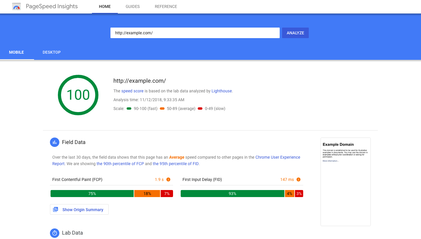
Google’s PageSpeed Insights is a powerful tool that not only evaluates your website’s performance but also provides detailed reports on user experience for both mobile and desktop versions.
By analyzing various metrics such as page loading speed and responsiveness, PageSpeed Insights offers actionable suggestions to optimize your website for faster loading times and improved mobile usability.
2. BrowserStack
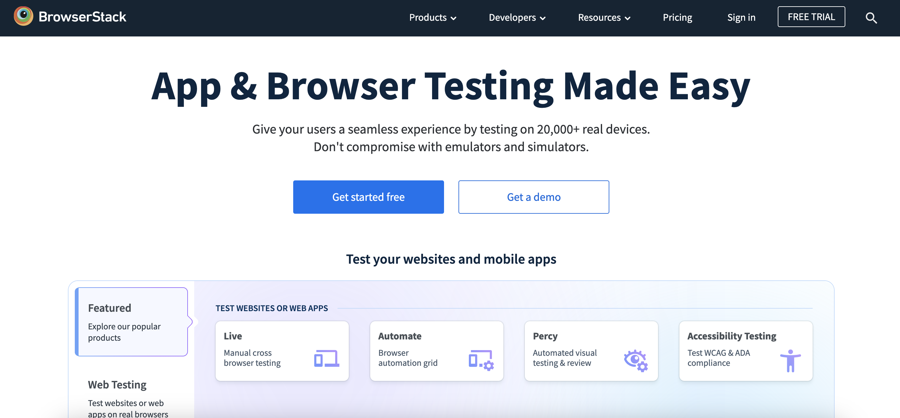
BrowserStack is a mobile-friendly test tool that goes beyond simulated environments by allowing you to test your website on real mobile devices.
This feature provides a more accurate assessment of your website’s performance across different platforms, screen sizes, and device configurations.
By accessing a diverse range of mobile devices, BrowserStack empowers you to identify and address any potential compatibility issues effectively.
3. GTmetrix
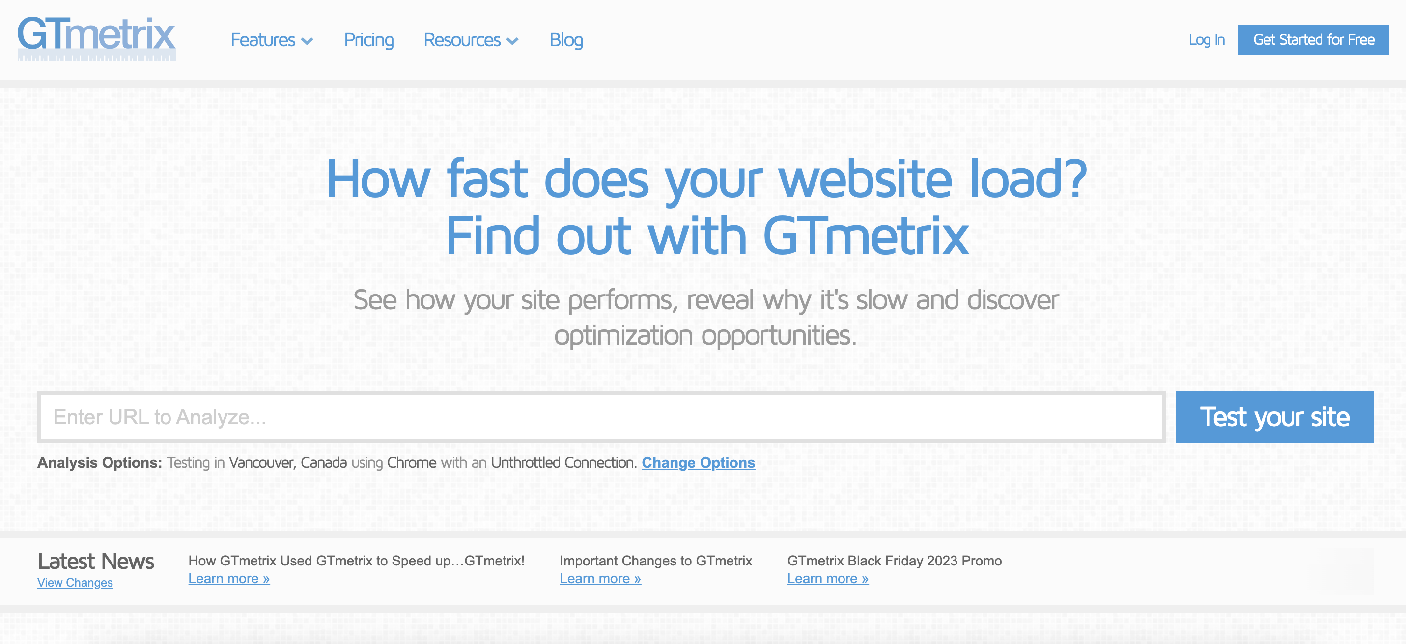
GTmetrix offers a comprehensive suite of tools for assessing website performance, including mobile-friendliness.
In addition to evaluating mobile optimization, GTmetrix provides valuable insights into page loading speed and performance optimization techniques.
By identifying areas for improvement, such as image optimization and server response time, GTmetrix helps enhance the overall user experience for mobile visitors.
4. Pingdom
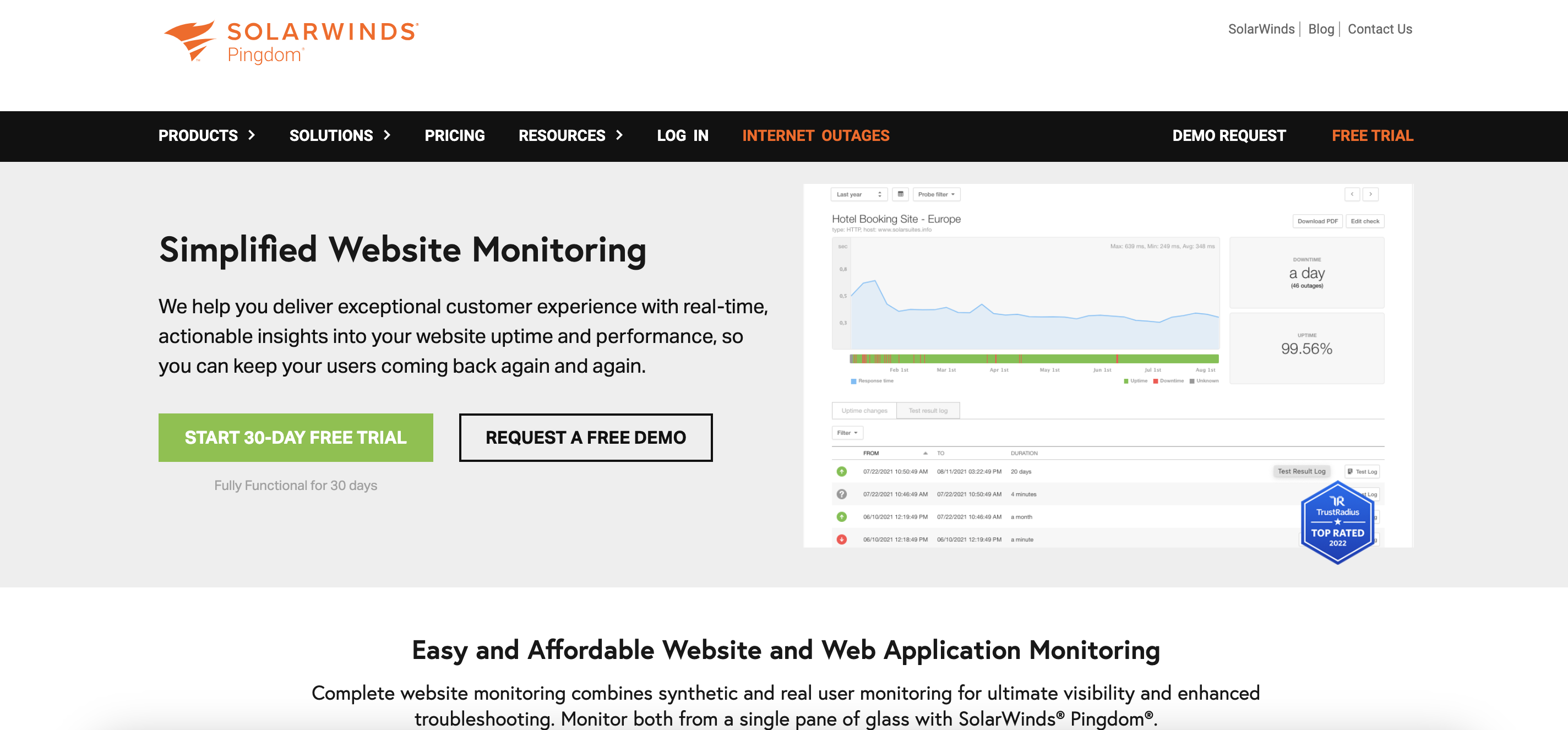
Pingdom’s suite of performance monitoring tools includes a dedicated mobile website speed test.
This mobile-friendly test tool evaluates your website’s loading speed on mobile devices and highlights areas that may be causing delays or performance issues.
By pinpointing bottlenecks and potential optimizations, Pingdom enables you to fine-tune your website for optimal mobile performance.
5. W3C Mobile Checker
The W3C Mobile Checker evaluates your website’s compliance with mobile web standards established by the World Wide Web Consortium (W3C).
By analyzing factors such as markup validity and CSS compatibility, this tool provides detailed suggestions for improving your website’s mobile-friendliness and ensuring adherence to industry best practices.
Incorporating these tools into your testing and optimization process can significantly enhance the mobile-friendliness of your website, leading to improved user satisfaction, higher engagement, and ultimately, increased conversions.
Why is it important to be mobile-first for conversion rate optimization?
Optimizing for mobile devices is a necessity for businesses looking to maximize conversion rates.
Here’s why:
User expectations: With the majority of internet users accessing content on mobile devices, meeting their expectations for seamless mobile experiences is crucial for retaining and converting them.
SEO benefits: Search engines prioritize mobile-friendly websites in their rankings, meaning improved mobile optimization can boost your visibility and traffic.
Reduced bounce rates: A mobile-friendly website enhances user engagement and reduces bounce rates by providing a smooth and intuitive browsing experience.
Competitive advantage: In a competitive online landscape, businesses that prioritize mobile-friendliness gain a significant edge over those that neglect it, capturing more leads and conversions.
5 tips for capturing leads on mobile devices
Now, let’s delve into actionable strategies to maximize lead generation on mobile devices.
These tips are designed to optimize user experience and streamline the conversion process for mobile users.
1. Optimize your forms
Streamlining lead capture forms is essential for mobile users who are often on the go and prefer quick interactions. Simplify forms by minimizing the number of input fields required.
Consider utilizing mobile-friendly input methods such as checkboxes and dropdown menus to make data entry more efficient and user-friendly.
Additionally, ensure that form fields are appropriately sized and spaced to accommodate touchscreen input, making it easier for users to fill out the form accurately.
2. Incorporate click-to-call buttons
One of the most effective ways to facilitate direct communication with potential leads is by incorporating prominent click-to-call buttons throughout your mobile website or app.
These buttons allow users to initiate a phone call with your business instantly, eliminating the need for manual dialing and reducing friction in the conversion process.
Place click-to-call buttons strategically within relevant sections of your website, such as contact pages or product/service listings, to encourage immediate engagement from interested prospects.
3. Use clear CTAs
Clear and compelling calls-to-action (CTAs) are essential for guiding mobile users towards desired actions and driving conversions.
Ensure that your CTA buttons are prominently displayed, easily identifiable, and strategically positioned within the mobile interface.
Use concise and action-oriented language that clearly communicates the desired outcome, such as “Sign Up Now” or “Get Started.”
4. Implement responsive design principles
Responsive design is fundamental for delivering a consistent and user-friendly experience across various screen sizes and devices.
Invest in responsive design principles to ensure that your website or app adapts seamlessly to the unique characteristics of mobile devices, including smartphones and tablets.
This includes optimizing layout, typography, and navigation to accommodate smaller screens and touch-based interactions effectively.
Recommended reading: 8 Mobile Landing Page Examples to Inspire Your Own
5. Minimize page loading times
Page loading speed is a critical factor influencing user experience and conversion rates on a mobile device.
To optimize mobile performance, prioritize strategies to minimize page loading times and ensure fast, seamless browsing experiences.
This includes implementing techniques such as image compression, minification of CSS and JavaScript, and server-side caching to reduce file sizes and improve load times.
FAQ
Why is it important to optimize your website for mobile users?
Mobile-friendliness is crucial because the majority of internet users now access the web through a mobile device. Ensuring your site is optimized for mobile enhances user experience, reduces bounce rates, improves SEO rankings, and ultimately leads to higher conversion rates.
How do mobile-friendly tests benefit my website?
Mobile-friendly tests provide valuable insights into how well your site performs on mobile devices. They help to identify areas for improvement such as page loading speed, responsive design, and touch responsiveness.
What are the key factors to consider for a great experience on a mobile device?
A great mobile experience for website visitors requires a site to be fast, simple, and easy to use, regardless of the device being used.
Are there any free tools available for mobile-friendly testing?
Yes, several free tools are available for testing the mobile-friendliness of your website. Examples include Google’s PageSpeed Insights, W3C Mobile Checker, and Pingdom’s mobile website speed test. These tools offer valuable insights and recommendations to optimize your site for a mobile device.
What happened to Google’s Mobile-Friendly Test?
Google has officially sunset the Mobile-Friendly Test tool on December 4th, 2023. If you relied on this tool for assessing the mobile-friendliness of your website, it’s important to explore alternative testing options mentioned in this article.
Wrapping up
The mobile-friendliness of your website plays a pivotal role in driving conversion rates.
By conducting regular mobile-friendly tests and implementing best practices for mobile optimization, you can enhance user experience, increase engagement, and ultimately boost conversions on mobile devices.
Embracing a mobile-first approach isn’t just a trend; it’s a strategic imperative for staying competitive and achieving sustainable growth in today’s mobile-centric landscape.
Share this
Written by


