Every website that is focused on profit is also focused on getting more conversions out of their visitors: encouraging them to buy… or at least subscribe.
Popups are the best tool to increase conversions, but their effectiveness depends on how they are implemented.
In this article, we will explore five tips for creating popups that enhance user experience and contribute to the overall success of your website and marketing efforts.
Let’s get started!
5 popup tips for improving user experience
Pop-ups can help to increase conversion rates effectively. The results seen by ecommerce stores that start using pop-ups speak for themselves:
Kiss My Keto decreased their cart abandonment rate by 20%
Christopher Cloos improved their conversion rates by 37%
BOOM! by Cindy Joseph grew their ecommerce revenue by $148,297 in just one month
The secret to the success of the campaigns above was their integration with the overall user experience (UX) of each website.
These companies never interrupted users while displaying popups, but instead cleverly set them to appear when they could deliver useful and relevant content at the right time.
If you can pull this off on your site, not only will you avoid disrupting your site’s UX, but you’ll actually improve it.
Let’s look at 5 ways you can do just that, starting with…
1. Don’t use annoying entry popups. Instead, display popups based on engagement
Entry popups can be extremely disrupting.
These are popups that appear as soon as a website loads. Just as a visitor starts to get their bearings and take in all the information on your site, they get interrupted by a popup that comes out of nowhere.
Entry popups also:
- Prevent visitors from getting access to desired content
- Often contain irrelevant content
- Confuse visitors
In sum, they are almost always more annoying than helpful, and they provide a poor user experience.
Instead of bothering your visitors with intrusive popups (traditional entry popups), let them get to know your website first. Then, you can show your popup when their behavior indicates that they’re ready to see a secondary message.
Here are some typical ways of triggering popups based on user engagement:
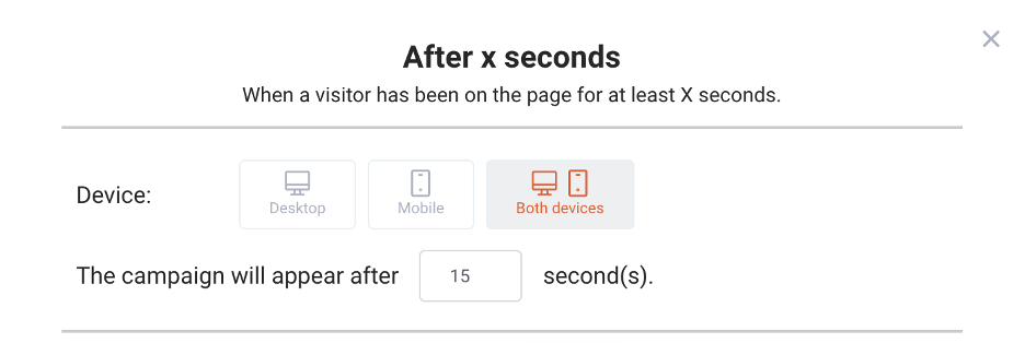
- Display the popup after X seconds: This option gives your visitors some time to browse the page they’re looking at. You can catch their attention after they’ve spent some time on the page.
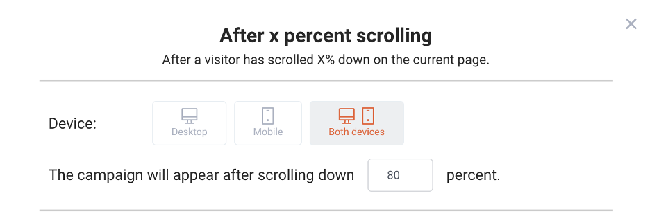
- Show the popup after X percent scrolling: You can set your popups to appear after a visitor has scrolled down a certain percentage of your web page.
For example, you could set a popup that appears when a visitor has reached the end of a blog article, meaning they’re ready for some new content (perhaps by offering a free ebook in exchange for their contact info).
- Display your popup on exit-intent: This way, you’ll catch the attention of visitors who are about to leave your site.
With an exit-intent popup, you can stop someone from leaving without converting and convince them to keep shopping or subscribe to an email list.

It’s also vital that you pay attention to “frequency,” or the maximum number of times the popup is set to appear. Typically, you want to limit this to 1 or 2 times per visitor.
Showing multiple popups can be OK, (as we’ll see below) but seeing the same popup over and over will drive your users crazy.

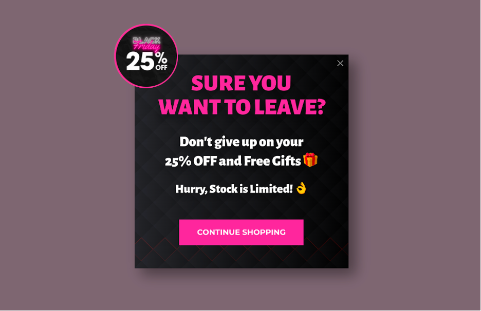
Here’s a good example of how to use lightbox popups based on user engagement. Obvi’s exit-intent popup only appears to visitors who are abandoning the site.
2. Segment your visitors
There’s no one magic popup that’s relevant for all your visitors. That’s because not everyone needs to see the same critical information or discount offer at the same time.
Unfortunately, you can’t identify the solution to each individual’s problems and present them with the solutions in a popup.
Instead, what you can do is segment your visitors into groups that share similar needs and characteristics.
These segments vary by industry and the types of products a store sells. However, all businesses can segment their visitors into groups based on what stage they’re at in the buying process.
Think about your “customer journey”: how people first learn about your brand, how they arrive at your landing page, and how they find the products they want to buy.
Segments at different stages of the customer journey have different needs, and the popups you show them need to reflect that.
Now, let’s look at a few other factors you can use to segment your customers. We’ll also share some campaign ideas for different visitors at different stages of the customer journey.
2.1. Cold vs. hot prospects
“Hot prospects” are customers who are looking to buy something right now, while “cold prospects” are still exploring their options and aren’t quite ready to buy anything.
Instead of treating all your visitors like they’re “hot prospects” who are ready to buy immediately, you should create different conversion goals for hot and cold prospects.
For hot prospects, the conversion goal is simple: buy now. Your messaging needs to push these prospects towards an immediate sale using a time-limited discount or deal.
You’ll need a secondary conversion goal for cold prospects, which is typically getting them to sign up for your email list. After getting their contact details, you’ll be able to communicate with them over time and nurture the relationship until they’re ready to buy.
For this reason, you need to show cold visitors content that makes them want to subscribe, like a downloadable ebook.
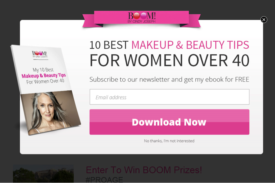
Let’s see how it works in action. Here’s a great example from a couple of BOOM!’s campaigns.
They offer an ebook as a lead magnet for cold prospects who are interested in their product line, but aren’t yet ready to make a purchase:
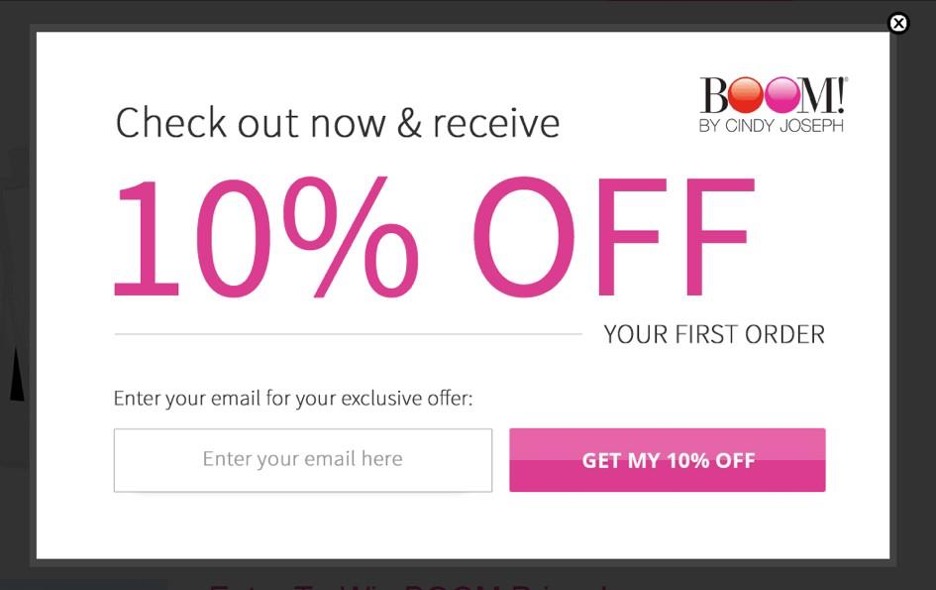
For their hottest prospects (who have expressed the most interest in BOOM!’s content or are about to abandon their cart), they use the offer of a 10% off coupon as an incentive to buy now rather than later.
2.2. Geotargeting
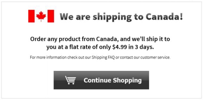
If you sell internationally, location-based targeting or geotargeting can be a great way to boost conversions. With geotargeting, you can create as many different messages for as many target countries as you’d like.
Segmenting your visitors based on their location allows you to provide them with country-specific deals, like offers on shipping. Here’s an example:.
2.3. Target visitors based on their stage in the buying process
Each of your customers moves through the following stages of awareness:
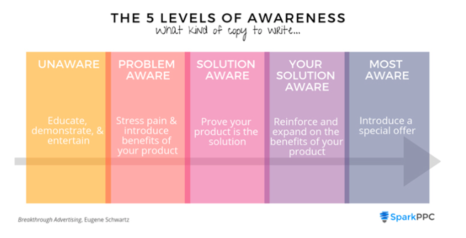
The 5 levels of awareness describe the different mindsets customers will be in as they interact with your site. A customer who just learned that your brand exists will view the same page very differently than a loyal customer.
That’s why you need to communicate different secondary messages through your popups to each of these segments.
Here are a few examples of messages that are tailored to one of these groups.
1. Problem-aware visitors know they have a problem, but they’re still trying to find the best way to solve it. So, at this point, your goal is to help them better understand their problem (whether it’s a skincare issue or the need for a new pair of running shoes) and offer possible solutions.
One way to do this is through blog posts and ebooks. For example, if you have an article about “running tips for beginners,” you could also promote an ebook that gives “how-to” tips on running a 10K.
2. Solution-aware visitors know what type of product will solve their problem and are actively weighing their options (making them a “hotter” prospect than the problem-aware visitors we’ve just discussed). This makes your goal simple: help them find the best product for them on your site.
One proven approach involves showing them the most popular products (or “trending” products) in the category they’re browsing.
3. Most-aware visitors have found a specific product they love that will solve their problem. All they need to do is click “Buy now” and go through the checkout process. Even those these customers are your “hottest” prospects, they’ll often need a final push to make a purchase.
An irresistible special offer that’s only available for a limited time is the best way to convince this segment to buy now rather than later.
2.4. Advanced segmentation
You can also take your visitors’ onsite behavior into account, allowing you to create increasingly specific segments of users. The more specific your segmentation, the more relevant your messaging can be.
You can use the following user-specific behavior to further segment your visitors:
- Have been on the current subpage for at least X seconds
- Are from a specific traffic source
- Are currently browsing a specific page
- Have previously visited a specific page(s)
- Have specific items in their cart
- Have a cart value greater than a specific threshold
This allows you to:
- Display different popups to visitors coming from different traffic sources (e.g., Facebook vs. Google Ads).
- Show certain campaigns to prospects who have visited specific pages but haven’t made a purchase yet.
- Target visitors based on the items they’ve already added to their cart (for upselling and cross-selling).
3. Create personalized messages
As we’ve been saying, “If you’re selling to everyone, you’re selling to no one.” You can take this to the next level with personalization.
Once you’ve separated your visitors into segments based on their interests, demographic or geographic variables, and their stage in the buying process, you can show them the most relevant messages.
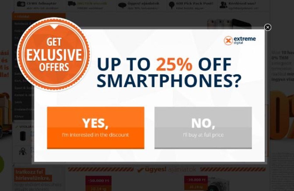
For instance, if you sell electronics and know that a specific visitor is interested in smartphones, “25% OFF Smartphones” is a much more effective message than “25% OFF Selected Products”.

There are four basic levels of customization for the messages in your popups:
- Everyone gets the same message: In other words, you broadcast a general offer to all your website visitors. This is not recommended.
- You make two different offers for hot prospects and cold prospects: That is, you divide your audience into two major segments based on their engagement. Even this simple segmentation can make a difference.
- There are several offers for each of the main visitor groups: In this case, you divide your visitors into several different groups based on relevant variables and reengage them with customized messages for each group.
- Everyone gets a customized message using Dynamic Text Replacement: The most effective popups use Dynamic Text Replacement. This is the highest level of personalization as each message is tailored to the specific individual who sees it.
With Dynamic Text Replacement, the text in your popups will update automatically based on the variables you choose.
This means you can create one template and then alter the content to meet the needs of each visitor audience. Using this approach reduces the amount of effort on your part and ensures each of your visitor segments will see the most relevant content.
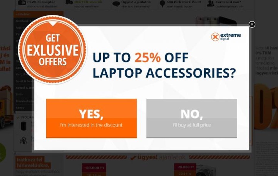
Returning to our example from above, the electronics store promotes “25% OFF Smartphones” when a visitor tries to leave their site from the smartphone category page or an individual product page within the smartphone category.
However, when a visitor is browsing for laptop accessories and tries to leave the site, the word “smartphone” changes automatically to “laptop accessories”—speaking directly to that customer’s needs.
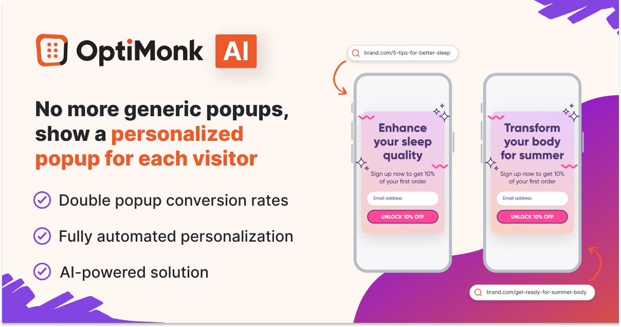
Another great tool for easy popup personalization is OptiMonk’s AI-powered Smart Popups solution.
One of the challenges in delivering personalized messages is the manual effort involved in tailoring content for each visitor. The Smart Popups tool eliminates this hurdle by leveraging AI to automatically customize popup messaging based on individual user interests.
4. Stay focused on one value proposition and goal at a time
To maximize your conversion rate, you should limit yourself to one goal per popup and make sure that its value proposition is persuasive.
A value proposition is a benefit that customers can expect from engaging with your popup or buying your products. The value proposition of an email signup popup might be exclusive access to certain sales or products, while a discount popup’s value comes from the money a visitor can save by using the coupon code.
If you’re trying to achieve multiple goals in the same popup, you’ll decrease the chances of completing any of them. Ultimately, it will muddle your message and confuse visitors about the value of your offer, making conversions and sales less likely.
Several goals can be achieved by using popups, but make sure to limit yourself to pursuing just one of them in each popup.
Here are some common ecommerce goals:
- Driving sales
- Building your email list
- Reducing cart abandonment
- Upselling and cross-selling
- Improving customer experience
5. Don’t ask for too much information
As we’ve just seen, the success of a popup depends on the value it provides to your visitors.
But no matter how valuable your offer is, if taking advantage of it is too difficult, then no one will want to go through the trouble.
That’s why it’s important to avoid asking for too much information. Displaying too many fields in an email signup popup, for instance, will make it look like too much work to most users. Plus, new visitors may be hesitant to provide too much of their personal information.
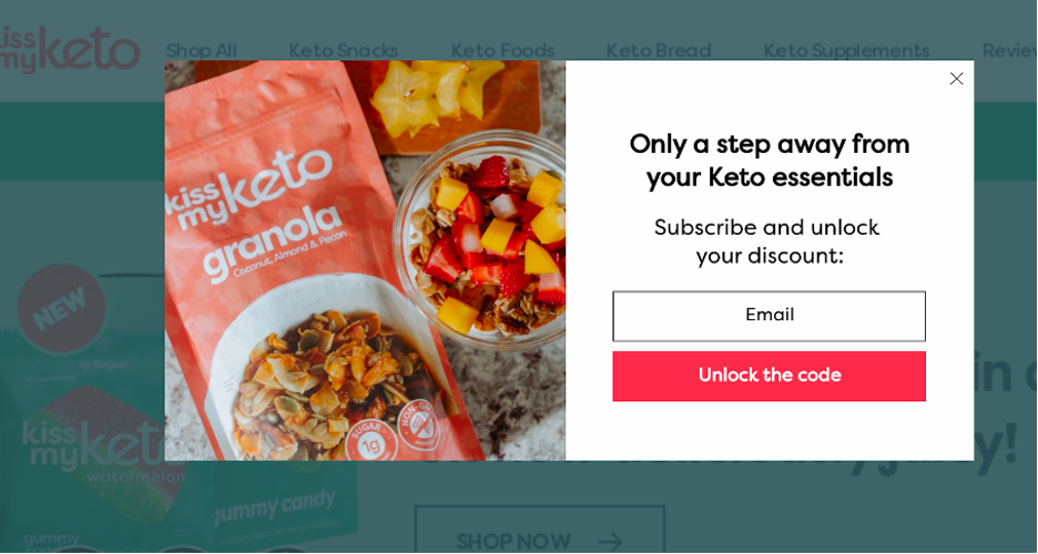
The less data you request, the more conversions you’ll end up with. In many cases, just an email address is enough, like in the example below.
Many sites also ask for a first name to personalize their messages in the future, like in this example from The Oodie.
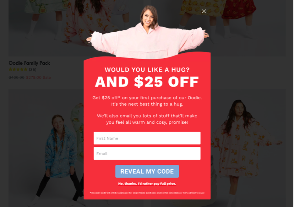
When you do feel the need to request more information, it’s best to use a multi-step popup. That way, you can ask for the most critical information first, then have additional input fields on the second page of your popup.
The Oodie’s popup had a second page where they asked for a phone number as well:
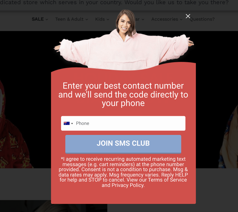
This strategy used by The Oodie is called the “Trojan Horse Method” and it generated $1.9 million extra revenue for The Oodie in just 30 days.
If you’d like to “steal” their strategy, watch our free training.
Don't interrupt users, instead create a great UX with pop-ups
Creating pop-ups like UX designers means thinking about each of your visitors as a human, and carefully considering the state of mind they’ll be in when a popup appears.
That’s why you should never use an entry popup, and instead create popups based on user engagement with your site. Defining user segments and then displaying relevant offers is the next step. And finally, you can personalize your popups using Dynamic Text Replacement to tailor your messages to each user.
By following these best practices, you can improve the user experience on your site, improve your list-building efforts, and increase sales at the same time!
Get started with OptiMonk for free and create stunning popups that improve the user experience in just a few minutes.

