
The best metaphor for choice architecture is designing a maze that you really want someone to solve. At any point along the customer journey, you want to guide people to make choices that bring them closer to making a purchase.
Many marketers have begun to use social psychology and behavioral science to understand how to present complex choices so that more people will choose the outcome that’s good for their online store (or client).
Behavioral economics is a field of study that uses psychological science to influence behavior and help people make beneficial choices, and it’s proven to be incredibly useful for online marketing.
In this article, we’ll examine the behavioral foundations of how decision-makers choose to act online and look at the benefits of structuring complex choices using psychological science.
Having a choice architect on your team can help optimize your website and make the most out of your incoming web traffic!
What is choice architecture?
Choice architecture refers to the practice of strategically designing the way choices are presented to people with the goal of influencing their decisions.
It’s based on the idea that the way options are framed and organized can significantly impact the choices individuals make, often without significantly changing the economic incentives involved.
For example, the US government has begun using choice architecture to incentivize healthier food choices and even organ donation.
Studies have shown that people tend to choose the default option, which means that whether people need to opt in or opt out of being an organ donor makes a big difference.
The status quo bias means that if you’re assumed to be willing to be an organ donor until you explicitly opt out, not many people will actually opt out of the program.
In this way, choice architecture can be used to guide people toward specific decisions while still respecting their freedom and autonomy.
The importance of having a choice architect in CRO
The biggest lesson of choice architecture?
That the particular way we present choices can influence people to do one thing or another.
Humans make imperfect decisions about health, wealth, and everyday things… you just have to understand the patterns behind those choices.
A skilled choice architect can optimize website layouts, user interfaces, and content positioning to influence user behavior positively, leading to higher conversion rates, increased sales, and improved overall performance.
By understanding human psychology and decision-making principles, choice architects can create a seamless, intuitive user experience that maximizes engagement and drives desired outcomes, ultimately contributing to the growth and profitability of the business.
6 choice architecture examples
Although it might sound complicated to use behavioral economics to optimize your website, it’s actually easy to apply some of the basic principles to your website.
After all, choice architecture can be applied to everything from a restaurant menu to public policy, so there’s surely a place for it on your website.
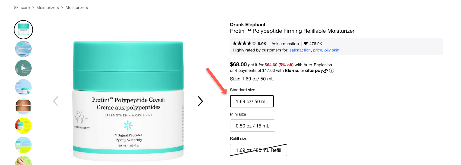
1. Default choice
As mentioned above, a decision maker is much more likely to go with the default choice than make any special consideration to opt out or go with another option.
That means that choice architects will advise you to use the outcome you’d most prefer people to choose as the default option.
Since individuals tend to stick with the status quo due to inertia and the desire to avoid change, far more people will go with your preferred option than take active steps to opt out of it.
In the following example from Sephora, they offer their users multiple sizes of the same product, but the default option is already selected:
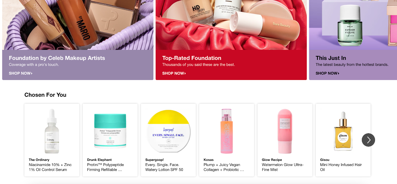
2. Limited options
Any cognitive scientist will tell you that humans have limited mental resources, which means that decision makers can’t consider too many options.
When the choices presented are too complex or exhaustive, there’s a danger of choice overload, which occurs when someone feels overwhelmed by the number of choices on offer.
Providing fewer choices can avoid overwhelming decision makers and make it easier to compare alternatives.
Presenting just a few relevant, personalized product recommendations is a perfect example of limiting the different attributes or products someone needs to consider.
Most ecommerce stores use product recommendations on their homepage, just like Sephora does below, making it easier for visitors to find the best product for them without feeling overwhelmed:
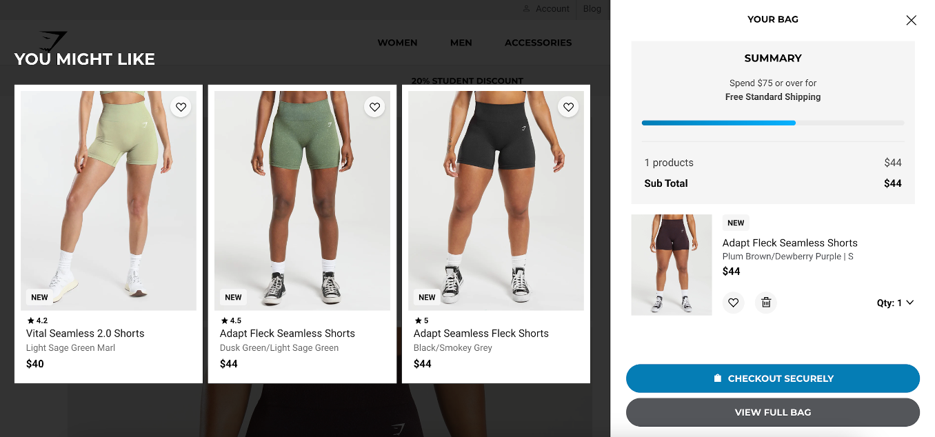
You can also use a product recommendation popup that displays relevant products based on the product(s) someone has added to their cart.
This is an example of using nudge theory to increase your average order value (which makes sending out each order more cost effective for your online business).
Here’s what this strategy looks like:
3. Order of presentation
Another one of the behavioral foundations that choice architects use to impact decision making is the sequence in which choices are presented.
If the first option presented seems very good or very bad, it can affect the way decision makers perceive subsequent options.
You can use this choice architecture principle on your online store by listing higher-priced options first. This will make all your other options seem more affordable by comparison.
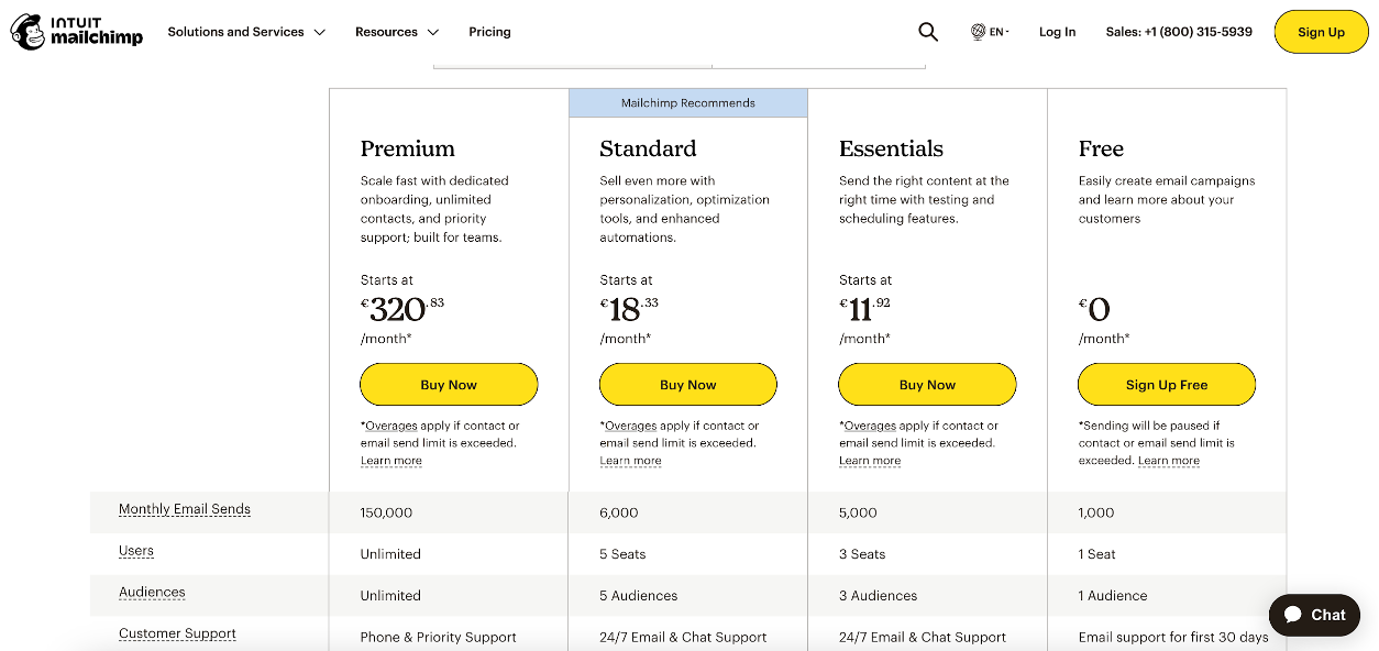
Let’s use a SaaS example here.
While most SaaS companies start with cheaper plans first, Mailchimp does the opposite by listing their premium plan first. All of a sudden, their standard plan seems like a really great deal.
4. Framing
Framing is the principle that different ways of describing choice options can change how likely people are to choose each option.
When you present information in a positive way, you’re focusing on the potential gains of a choice. On the other hand, negative framing focuses on potential losses.
How can you use this aspect of choice architecture in ecommerce?
Well, if you’re trying to upsell users on a premium version of a product, it makes sense to focus on the positive aspects of the choice.
But if you’re trying to sell an extended warranty or if you are trying to promote your asset protection services, you might want to use negative framing to convince customers that protecting their investment is in their best interest.
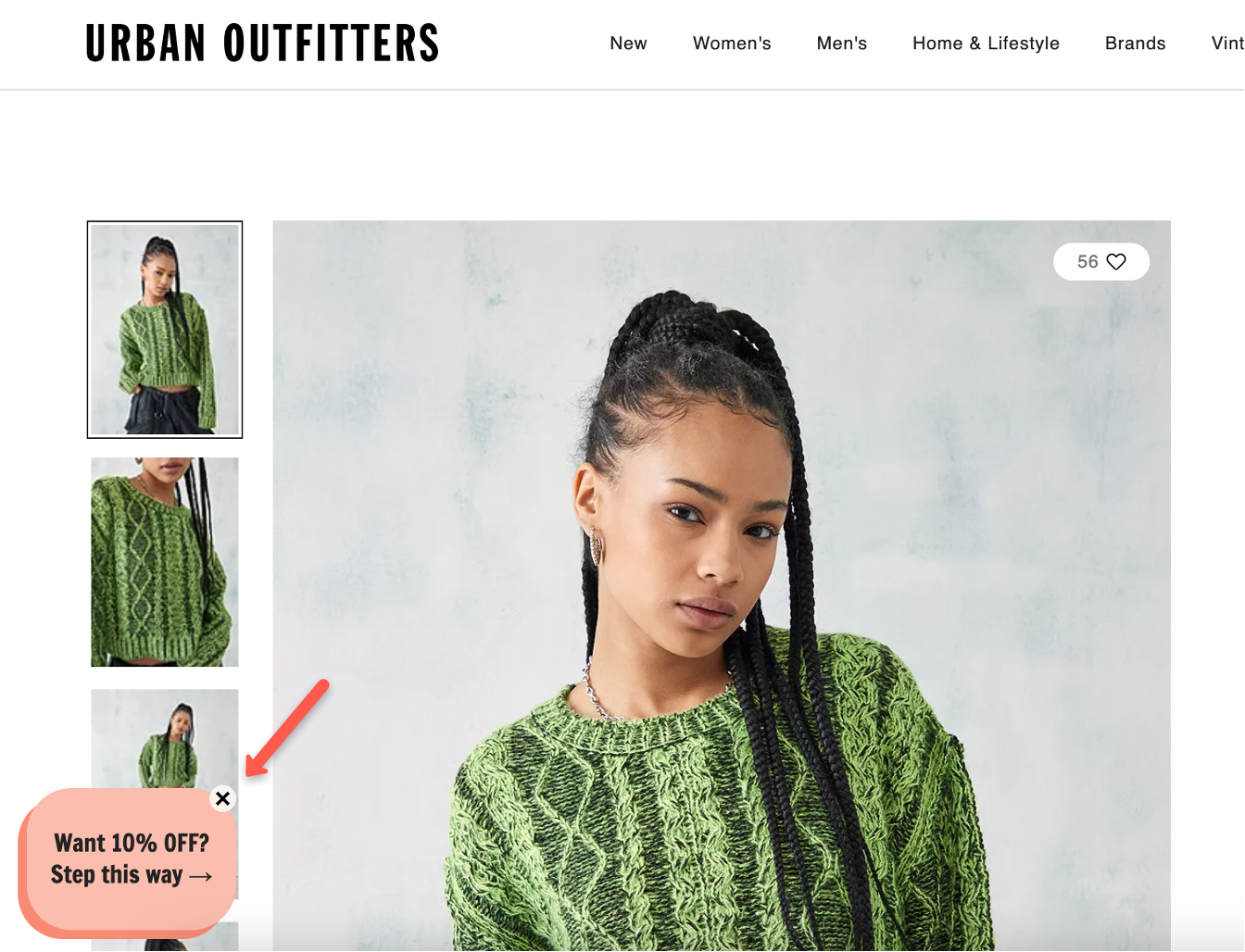
5. Visual cues
Another way of improving decisions is using graphical elements or colors to highlight certain choices.
The more that one option stands out, the more it will draw attention to itself and the more people will end up choosing it.
Check out how Urban Outfitters uses graphical elements to highlight their 10% off:
6. Information disclosure
The amount and format of information presented can affect decisions. This is a very tricky thing to get right because too much information leads to choice overload, but too little information means that people won’t feel informed enough to choose.
That’s why providing clear, relevant information is vital for making informed choices.
If your customers have to make particularly complex choices, then a choice architect would tell you to make sure you present the information in a very straightforward, easy-to-understand way.
How to apply choice architects in your CRO strategy
Now that you’ve seen some examples of how top ecommerce brands have used choice architecture on their sites, let’s get into how you can apply it to your store.
1. Designing user-friendly interfaces and layouts
The first lesson that you can take from behavioral scientists and choice architects is that the way you present choices matters.
When you’re helping people choose where to navigate next on your site, using a simple, organized navigation menu is really helpful. You should highlight important sections to help people get to where they need to go.
On your product and comparison pages, present enough information—but not too much—in a way that’s easy to read and process.
Finally, place CTAs prominently where users are most likely to see them, like above the fold. Using contrasting colors and visually distinct buttons can help make CTAs stand out from the rest of the content.
You can also use visual cues like arrows, icons, and colors to guide users’ attention towards essential elements like CTAs or important messages.
2. Implementing effective default options
You can also use the power of the status quo bias to help people make decisions that align with your goals as an ecommerce store.
When you set up default settings in forms and settings that align with the most common user preferences, you reduce the need for unnecessary decision-making.
For example, if you want to convince users to opt in to your email list, you should try to use presumed consent by making sure that option is already highlighted during your checkout process.
When you’re using this choice architecture tactic, you’ll want to clearly indicate default selections to avoid any confusion. As we’ve covered, very few people will actually opt out, but you need to give them the chance to.
3. Utilizing social proof and testimonials
Leveraging social influence can also drive conversions as a result of the way the information is being framed.
Potential customers tend to trust testimonials from real customers more than what a company says about their own products.
So if you want to build trust and influence people to make a purchase now rather than later, highlight positive reviews and other customer testimonials.
4. Using personalization and dynamic content
When you understand individual differences by utilizing user data and preferences, you can personalize the website experience and show relevant content and product recommendations.
Using advanced conversion rate optimization tools like OptiMonk, you can tailor choices to individual user preferences.
Recommended reading: The Ultimate Guide to Website Personalization
5. A/B testing to optimize choice architecture
Even if you follow all the principles from behavioral scientists when optimizing your website, you should still conduct A/B tests to evaluate different layouts, navigation structures, and CTA placements.
Once you use hard data to determine which design works best for your target audience, you can be sure you’ve identified the most effective design and content elements.
FAQ
How does choice architecture impact conversion rate optimization?
Choice architecture plays a pivotal role in CRO by optimizing the decision-making process on websites or in digital products. By carefully designing the presentation and arrangement of choices, you can improve user engagement, increase conversions, and ultimately improve their bottom line.
What are some key principles of choice architecture?
Key principles include default options, framing, simplicity, social proof, scarcity, and salience. For instance, setting default options that align with desired outcomes, framing choices in a positive light, simplifying decision-making processes, showcasing social proof to influence behavior, creating a sense of urgency through scarcity, and highlighting important options through salient design elements.
Is choice architecture ethical?
While choice architecture can influence behavior, its ethical implications depend on how it’s employed. When used transparently and in the best interest of users, it can empower individuals to make informed decisions. However, it’s crucial to avoid manipulative practices that exploit cognitive biases or deceive users.
How can you implement choice architecture effectively?
You can implement choice architecture effectively by conducting thorough research to understand your target audience, identifying decision points within your user journey, testing different design variations through A/B testing, and continuously refining your approach based on data and user feedback.
What are some common pitfalls to avoid when implementing choice architecture?
Common pitfalls include overloading users with choices, being overly manipulative, disregarding user preferences, neglecting to test and iterate, and failing to provide clear and transparent information. It’s essential to strike a balance between guiding choices and respecting user autonomy.
What are some real-world examples of successful choice architecture implementations?
Such an example would be an ecommerce website using clear product categorization and recommended items to streamline the shopping process, fitness apps employing progress tracking and goal-setting features to motivate users, and financial services offering default enrollment in savings programs to encourage saving behaviors.
Wrapping up
Choice architecture is an essential ingredient in a well-optimized ecommerce operation. Behavioral economics has given us deep insight into the ways you can sell products, gain explicit consent for email marketing, and help your customers find the best products for them.
Choice architecture is not about manipulation—it’s about presenting options in a way that respects individual freedom while nudging customers towards choices that align with their best interests and the company’s goals.
Businesses that recognize the importance of choice architecture in their CRO strategy can reap substantial benefits, including higher conversion rates, increased sales, and improved overall performance.
In the ever-changing landscape of the digital realm, choice architecture stands as a beacon, illuminating the path to better choices and better outcomes for both businesses and customers.
Share this
Written by