Guiding visitors to the products they’re interested in is a challenge for any online store. The more options you have, the more difficult it becomes.
This is a big problem because the longer it takes the average visitor to find what they’re interested in, the less sales you can expect. People get confused and frustrated when they can’t find what they’re looking for, and they might even close the browser window or move on to a more user-friendly site.
Faceted search and navigation play a big role in simplifying the user experience. It’s all about improving the search experience so your products are easy to find.
In this article, we’ll discuss faceted search, share 14 essential faceted search tips, and check out 24 examples of ecommerce stores doing faceted search right.
Let’s get started!
What is faceted search and navigation?
Faceted search, also known as faceted navigation or faceted browsing, is a technique used by ecommerce brands to help users analyze, organize, and filter large sets of product inventory based on filters like size, color, price, and brand.
Wait, so we’re simply talking about filters?
Not quite. Facets are more specific: they apply to the results of a search.
Faceted search requires improving everything from your user interface to how your product descriptions are written. Instead of having a complex structure on your site, everything should be as simple and streamlined as possible.
Why should you use faceted search on your ecommerce site?
Faceted search helps improve your customers’ product search experience.
Some website visitors know exactly what they want. Others want to explore several options before making a decision… but that doesn’t mean they’re interested in your entire product line! Most likely, they’re looking for different options for a specific type of product.
Facets simplify the user experience by letting users quickly and efficiently focus on the options that meet their needs.
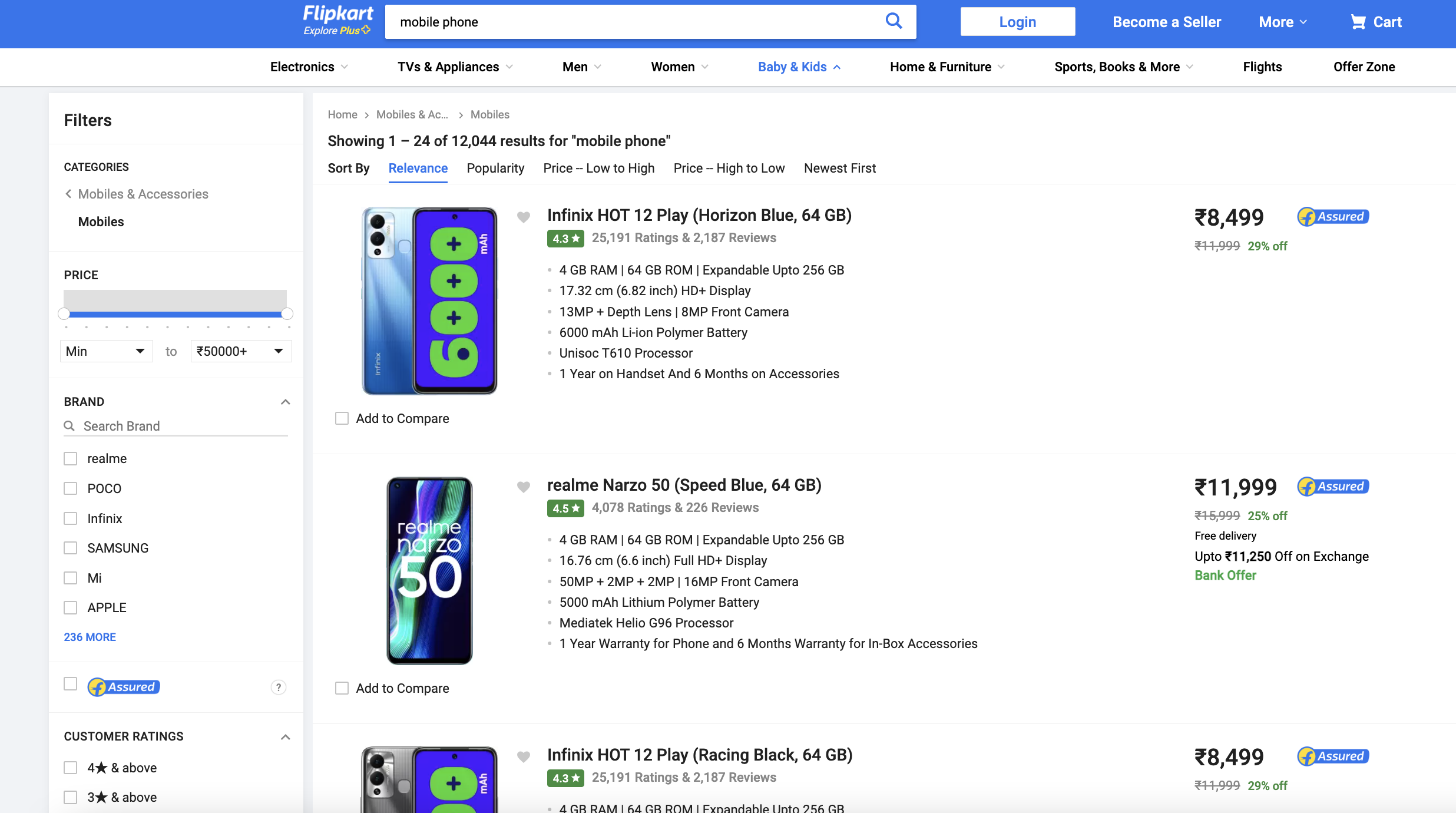
For example, a customer who wants to buy a mobile phone will need to choose from thousands of models with different specs and features. It can be overwhelming, and making a decision can feel impossible.
But look at this faceted search for mobile devices on Flipkart.com. By using faceted filters like brand, price range, and reviews, customers can quickly zero in on just a few models out of the thousands of mobile phones available on the website!
It’s easy to see why almost all major ecommerce players employ faceted navigation on their sites.
Effective faceted navigation systems ensure that customers don’t get lost or overwhelmed, and it can improve your conversion rate by 20%!
14 best practices for faceted search
In this section, we’ll offer 14 tips to maximize the benefits of faceted search and guide you through with great examples of faceted search and navigation.
1. Use relevant filter options
The facets associated with each search (and the options within each facet) should be relevant to the product type.
For example, in the Smart TV category, facet options should include:
- Price,
- Brand,
- Resolution,
- Screen size,
- Features,
- and so on…
Within each facet, provide relevant filters to improve the search results, such as resolution options (HD, Full HD, 4K).
Check out this example from Best Buy:
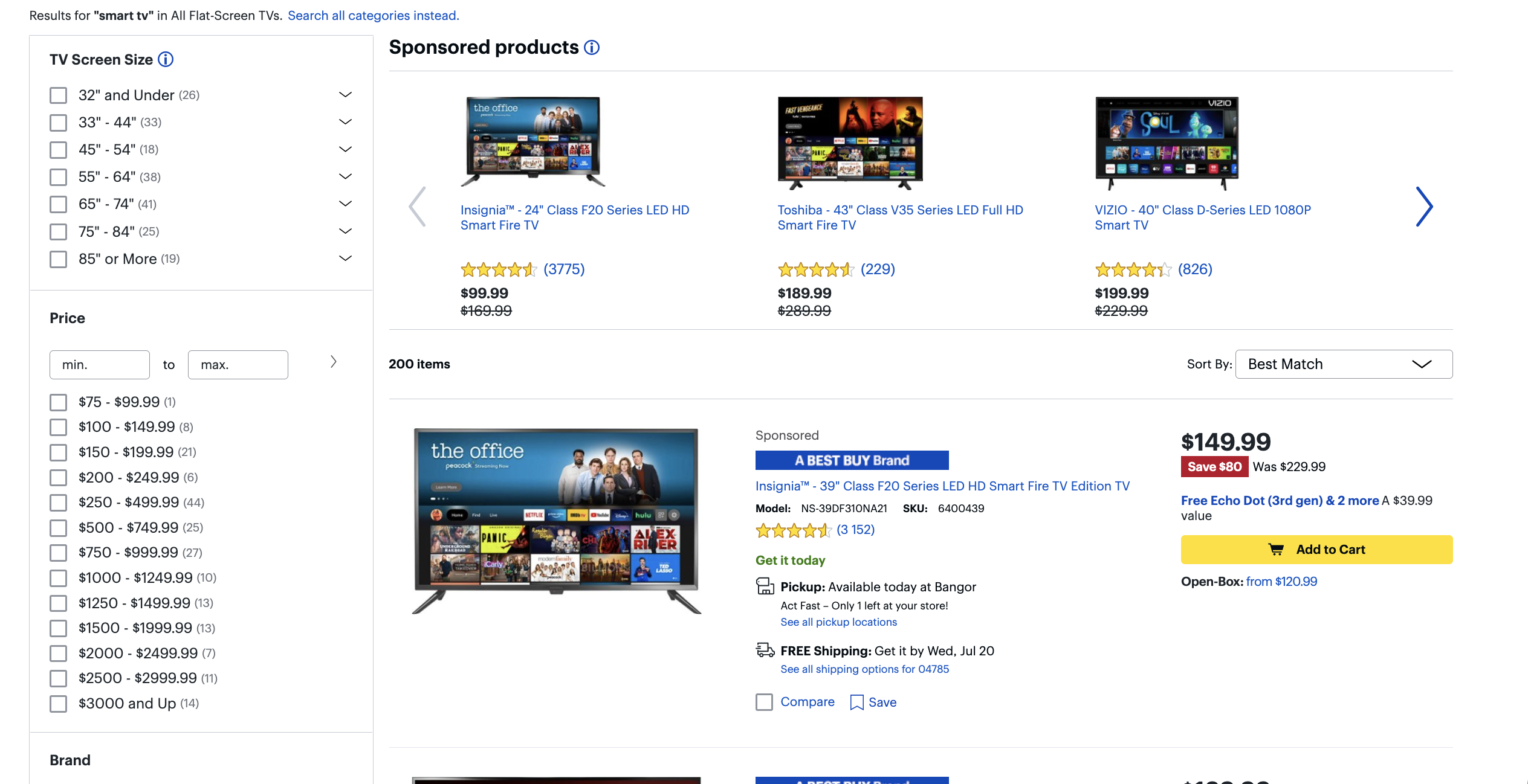
Give customers all the choices they need to narrow down their search results. Price and brand are standard across industries, but remember to include category-specific options, too. For example, in categories like shoes and apparel, color and size options are essential.
To determine appropriate facet and filtering options, you can check out competitor sites, industry leaders’ websites, customer reviews, expert reviews, and commonly searched keywords.
2. Position facets the right way
You can place facets either horizontally or vertically on your search results page.
Horizontal navigation is only appropriate when you have a small number of products with minimal values, like in the example below from asos.com:
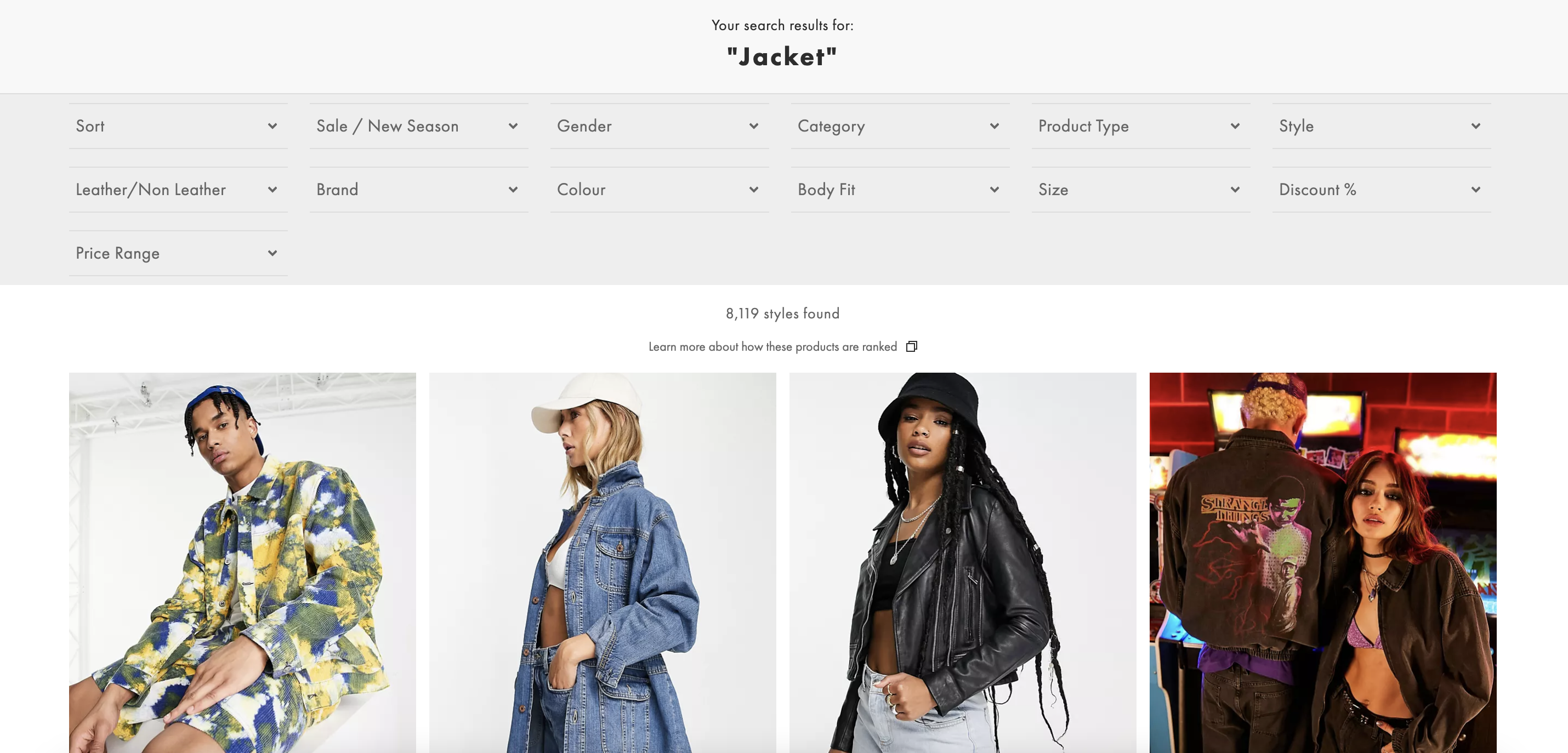
If you have many different products, positioning facets horizontally can make your site look cluttered. It can also compromise the user’s experience, since the filter menu disappears when the user scrolls down the page.
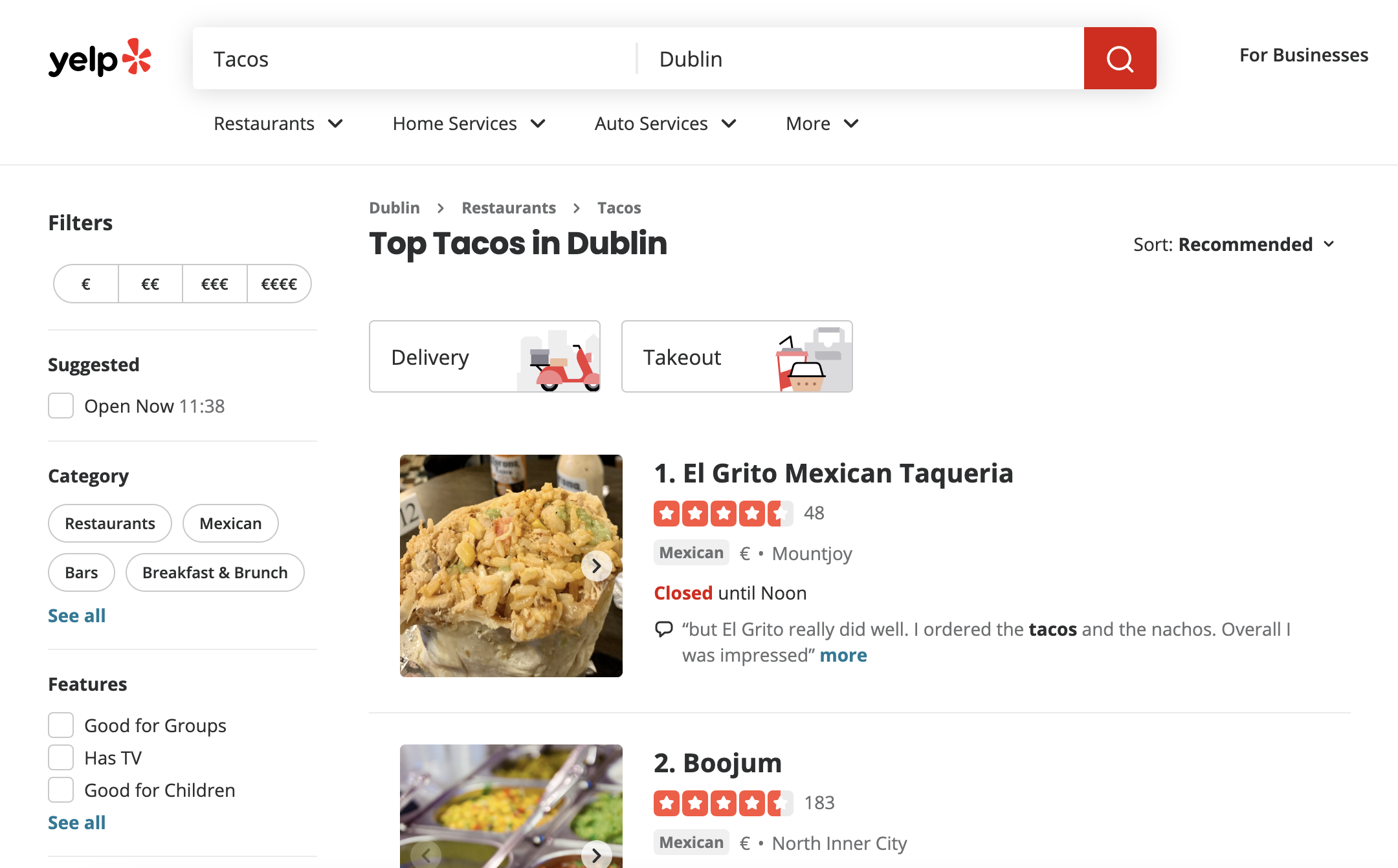
When there are many product and filter options, vertical positioning works best. This way, customers can access the faceted navigation system while scrolling through results.
Here’s an example of vertical facets from Yelp:
3. Present facets for maximum user-friendliness
There are several ways of displaying facet filters. Options include links, sliders, checkboxes, dropdowns, and input fields.
Choose the way you display your facets based on the type of data each one is filtering. A slider makes sense for a price facet filter, but checkboxes are a must-have when it comes to filtering by brand or category.
Amazon uses both lists and checkboxes:
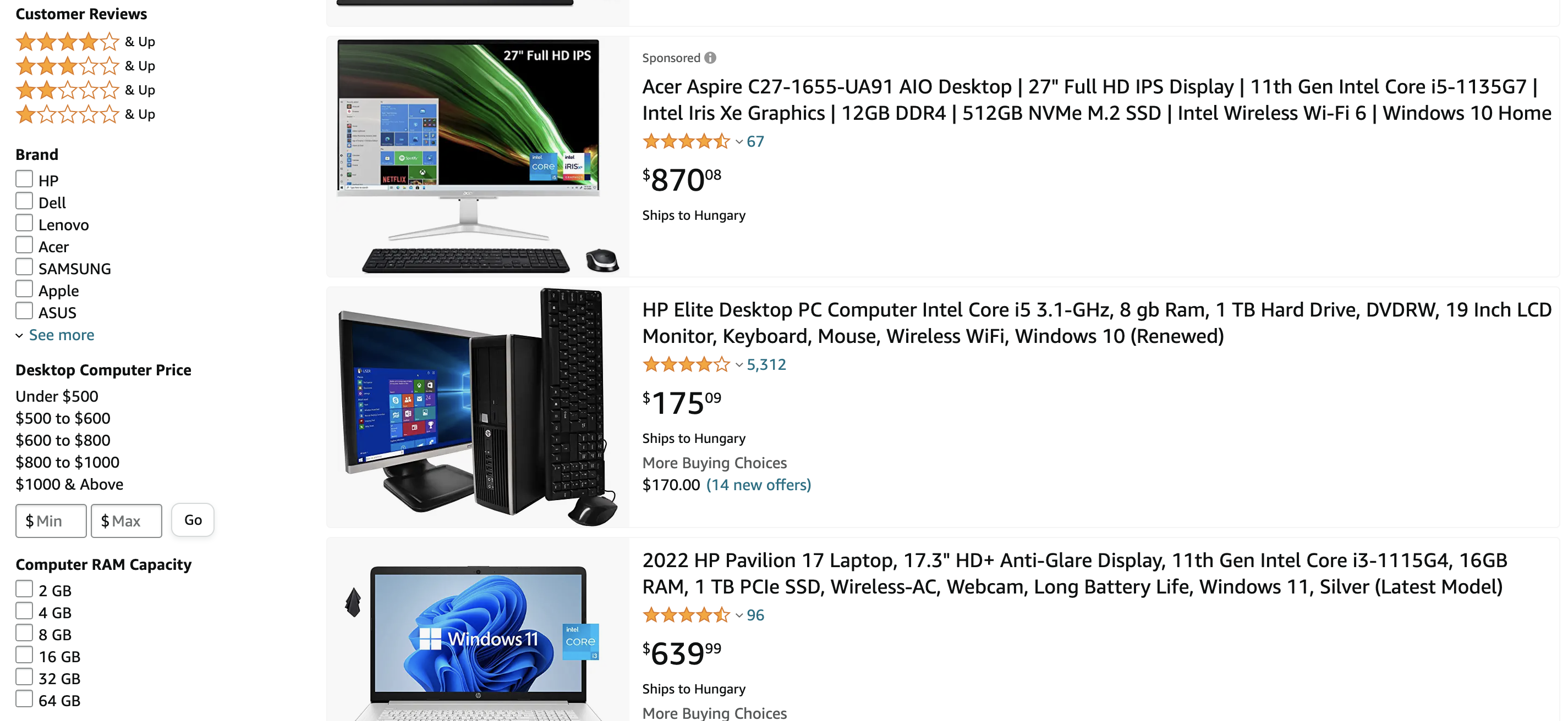
Quick tip for using checkboxes: make the entire area of a particular value or filter (including the text) clickable—this ensures that customers don’t struggle to click on a tiny box.
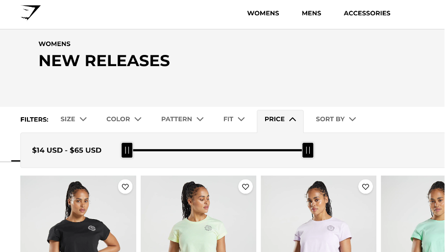
As mentioned, sliders are great for numerical values like price or distance. Check out how Gymshark uses a filter:
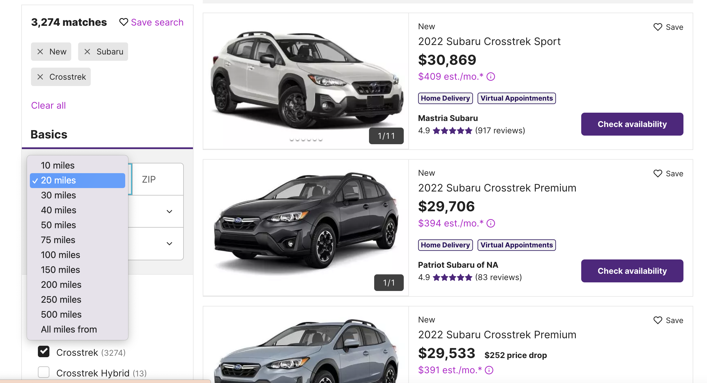
Dropdowns limit the choice to a single option, so they’re best reserved for filters that set a minimum or maximum. Check out how cars.com uses dropdowns:
There’s no single “best” way of displaying facets—combine different options to arrive at the most effective method for your website.
4. Use images
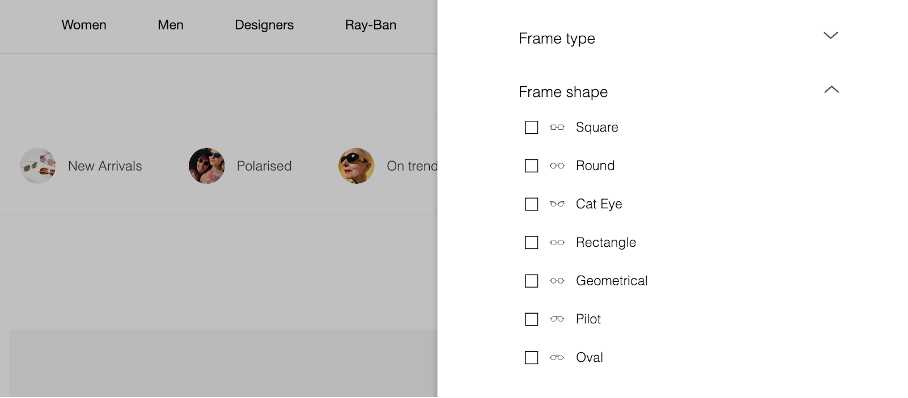
Images (or icons) play a major role in facet usability. They’re ideal for selecting colors, styles, and other options.
Check out how Sunglass Hut makes effective use of icons when showing frame shape options:
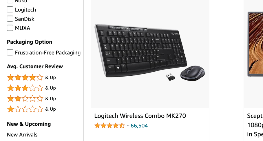
5. Include customer reviews as a facet
Large sites are increasingly using customer reviews as a facet.
For example, Amazon.com displays customer feedback in the form of one to five stars. As a best practice, only use this option if you have lots of reviews or ratings.
6. Display store- or industry-specific facets
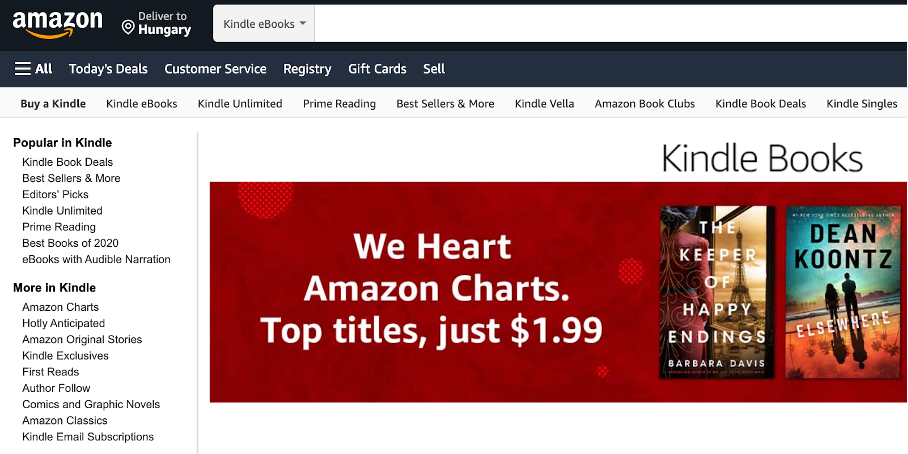
It can be a great idea to create unique facet options based on customer needs, product characteristics, industry requirements, and store-specific options.
Amazon’s Kindle eBooks section has options such as “Prime reading” or “Best books of 2020,” in addition to the standard choices such as author, language, etc. This helps customers make purchase decisions quickly, even when there are thousands of options.
7. Use collapsible or expandable menus
A good faceted search should allow users to collapse or expand the menus. This means they can quickly see the different filtering options, and lets them choose the filters they want to use without getting distracted by the others.
Check out how Sephora uses this option:
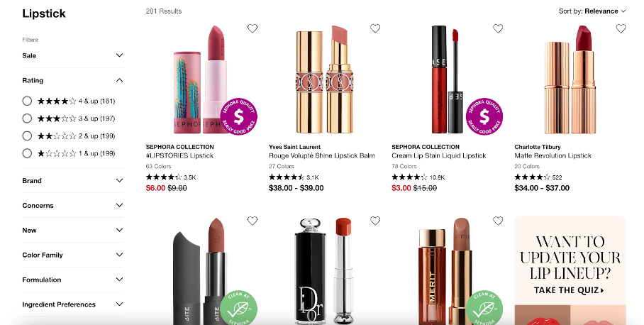
One important consideration is whether to display or hide the options by default. Hiding the filters by default might lower usage, but displaying too many facets might mean users have to scroll more to see all the filtering options. One solution is to expand some facets while collapsing others.
8. Organize values within the facet
It’s difficult to display all the values available within a facet, especially when there are lots of different options. Luckily, there are several different ways to do it!
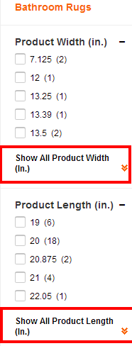
- Inline expand: In this method, the facet displays the first few values by default, and users can view additional values by clicking on “Show More.”
- Scrolling: This is a widely used method. Zappos is a good example.
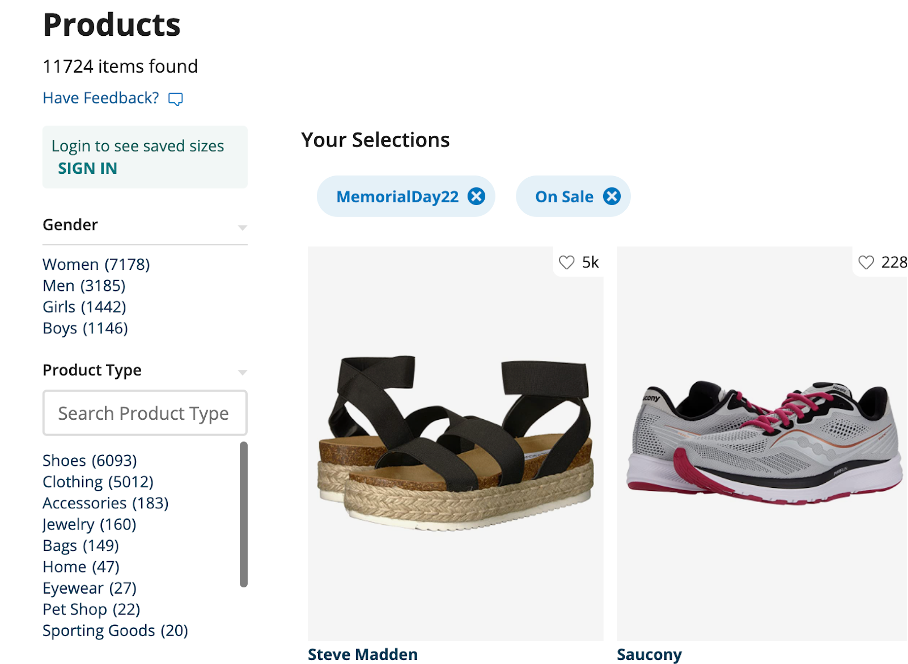
- Popup: In this method, the values display as a popup when the mouse hovers over or clicks on the facet. Colourpop uses this method, which saves space and minimizes clutter in the navigation.
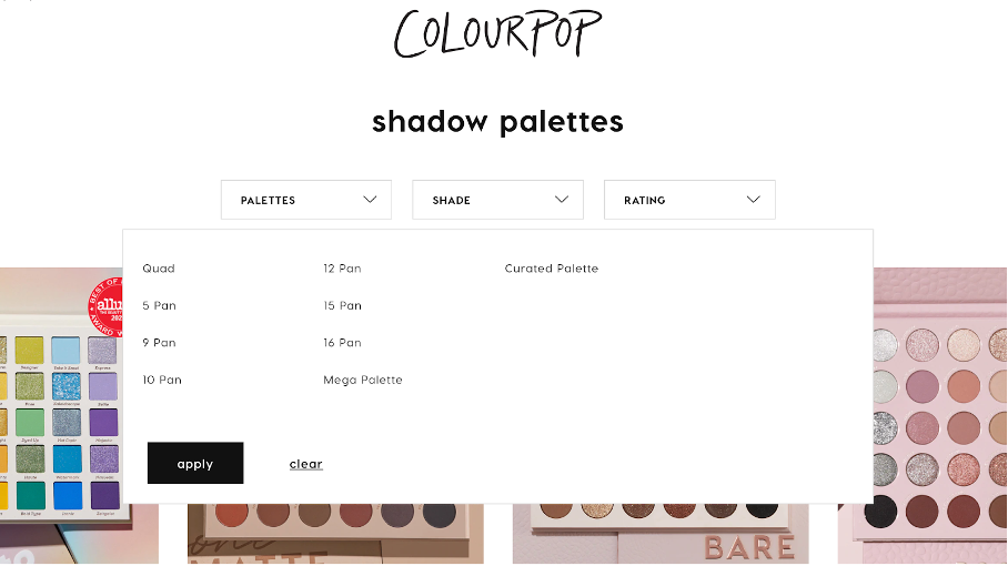
At the end of the day, it’s vital that customers can choose maximum and minimum values with ease. Someone looking for the cheapest option should be able to find it quickly using a faceted search.
9. Sort values within facets logically
When it comes to sorting values within a facet, you can sort by unit count for facets like brands, or by alphabetical order.
Usually, facets like size or price are arranged in ascending order.
Take Amazon’s Kindle eBooks page as an example. Within its “Kindle eBooks” facet, values are sorted alphabetically, from Art & Photography to Biographies, and so forth.

The “language” facet displays values by popularity. For example, “English” appears on top.
The facet for “Average customer review” shows values in descending order, with 4 stars and above on top.

10. Let users choose multiple filters
Customers should have the option to choose more than one filter within a single facet.
For example, a consumer who wants to buy a television may have shortlisted two or three leading brands and might want to know the sizes and price ranges available. These different combinations make your visitors’ decision-making easier.
Allow them to choose multiple options within a facet so they don’t have to perform more than one search to see the products they’re looking for.

11. Display selected values within facets
To get the most out of faceted navigation, values users have selected should stand out from the rest.
This allows customers to check which filters they’re using, and helps them change options easily. You can do this in four different ways:
- Inline: With this approach, the selected value is displayed within the facet. For example, Amazon shows the selected option in bold with a checkbox next to it.
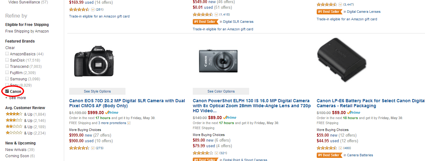
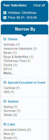
- Breadbox: In this method, all selected features are displayed in a dedicated location, or “breadbox.” See the example below from Oriental Trading. A best practice is to display the facet along with the value, for example, the value “Christmas” is part of the “holidays” facet.
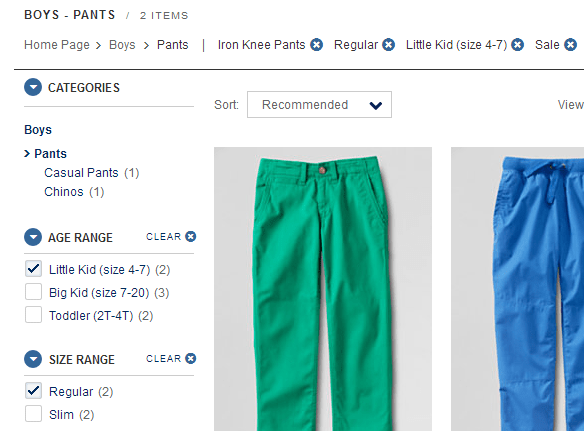
- Breadcrumb trail: This list shows the selected values as a trail of terms. As the user continues choosing, each new selection gets added to this trail. Usually, there’s an “X” icon accompanying each value, which customers can click to remove the selection.
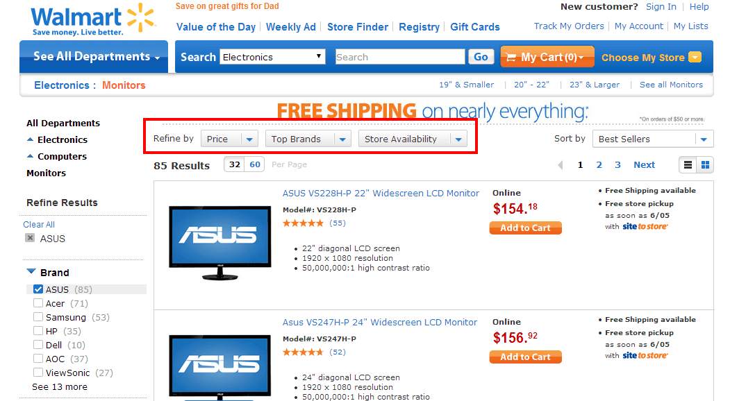
- Integrated faceted breadcrumb: The display is similar to the breadcrumb trail method above. However, this method allows customers to change their selection within the breadcrumb, not simply remove it. Walmart uses this method:
12. Refresh page and search results quickly
According to a study, 47% of consumers expect a site to load in 2 seconds or less. In fact, if the site takes more than 2 seconds to load or refresh, 53% of users will abandon their search!
According to another study, conversion rates peaked at 2-second refresh rates, but every additional second of delay resulted in a 7% loss in conversions.
The use of AJAX technology can improve search result display rates. With AJAX, the entire page doesn’t refresh every time the customer refines their search. Instead, only the selected data is sent, which significantly reduces processing time. However, AJAX is not SEO-friendly, so you should restrict its use to enhance the user experience.


13. Avoid no results
Avoid filter options with no results, as they tend to frustrate the customer.
It can be a disappointing experience for a customer to select an option (say, color or size) only to return no results. Jenson USA displays available options in black, while the rest are grayed out.

14. Improve constantly
As with most things in ecommerce, analyzing the data and tweaking your approach is critical. In faceted search, you should constantly collect data on how customers use facets and filters and use this data to improve your site.
For instance, which are the most widely used facets? Which facets do customers not use at all? This information can help you improve the structure of your faceted navigation and make your site more user friendly.
Recap
Faceted search makes it easy for your customers to find what they’re looking for without having to perform multiple searches or spend a lot of time browsing. A good faceted search can improve the customer experience and boost conversion rates.
To get the most out of faceted search, you’ll have to think about which facets and options to use for different types of products. If you have too few facets, users won’t be able to find what they’re looking for, but too many facets will confuse users.
Hopefully, this list of tips and examples has helped you figure out the best facet types and options to narrow the search results on your site!


