

Black Friday Marketing Strategy: 30 Ideas for 2026
In this article, we'll share 30 actionable Black Friday marketing ideas for ecommerce businesses to make 2026 your most successful yet.
In this guide, we’ll break down what full-screen popups are, explore why they’re worth considering, and show you how to create your own.
In short
A full-screen popup covers the whole screen, so visitors see one offer before they continue browsing. It wins attention and converts better than smaller popups when it's timed well. These 9 examples and 7 tips show how to time it, keep it simple and test it.
Have you heard about the effectiveness of full-screen popups but never used them? You’re not alone. Many marketers are intrigued by the bold impact of these attention-grabbing tools but aren’t quite sure where to start.
If you’ve ever wondered how these full-screen popups work or why they’re so effective, you’re in the right place.
In this guide, we’ll break down what full-screen popups are, explore why they’re worth considering, and show you how to create your own. Plus, we’ll give you real-world examples to get you started.
A full-screen popup is exactly what it sounds like—a popup that covers the entire screen.
Unlike traditional popups that might appear in the corner of a page or in a small window, full-screen popups take over the entire viewing area, effectively capturing the user's attention.
These popups can be used for a variety of purposes, from collecting email addresses to promoting a limited-time offer. Because they cover the entire screen, they’re incredibly effective at grabbing attention, making them a powerful tool in a marketer’s toolkit.
You might be wondering if full-screen popups are worth the potential annoyance they might cause your visitors. The short answer is yes—when done right, they can be incredibly effective.
Full-screen popups can increase sales by creating urgency and driving customer engagement, especially during events like Black Friday.
With their large format, full-screen popups ensure that your message gets seen. No more worrying about whether your popup will be noticed—this type can’t be missed.
Full-screen popups are proven to convert better than smaller popups.
According to our popup statistics, full-screen popups have an average conversion rate of 14.40%, and many of them use countdown timers and strong visuals to prompt immediate action.
That’s a big lift if you want to boost conversions, especially when your current rates are lagging.
Because of the size, you have the space to craft a compelling message that can include images, text, and call-to-action buttons without feeling cramped.
These popups can be triggered based on specific user actions like exit intent, time spent on a page, or scrolling behavior. This allows you to target your audience more effectively.
Ready to check out some examples? Let's see how big brands are doing it!

Earthly Derm’s full-screen popup is a natural extension of their website’s design. They offer $10 off on your first order, which is hard to resist. The clever use of color makes the CTA button pop, ensuring it stands out without clashing with the overall aesthetic.
It’s a great example of how a well-designed popup can enhance the user experience rather than disrupt it.

Sassy Scents hits the mark by offering a $10 discount with their full-screen popup. What’s notable here is the sense of urgency they create with the subheadline, “Save it before it’s gone.”
The minimalist design and clean, modern look makes the offer both appealing and easy to act on. It’s a lesson in how to create urgency without overwhelming the user.

GnomeAngel’s full-screen exit-intent popup is both cute and highly effective. By incorporating a countdown timer, they crank up the FOMO (fear of missing out), encouraging visitors to take action before the offer disappears.
The cheeky opt-out option, “No thanks, I’d rather pay full price,” adds a playful touch that nudges users toward conversion. It’s a brilliant way to inject personality into a popup.
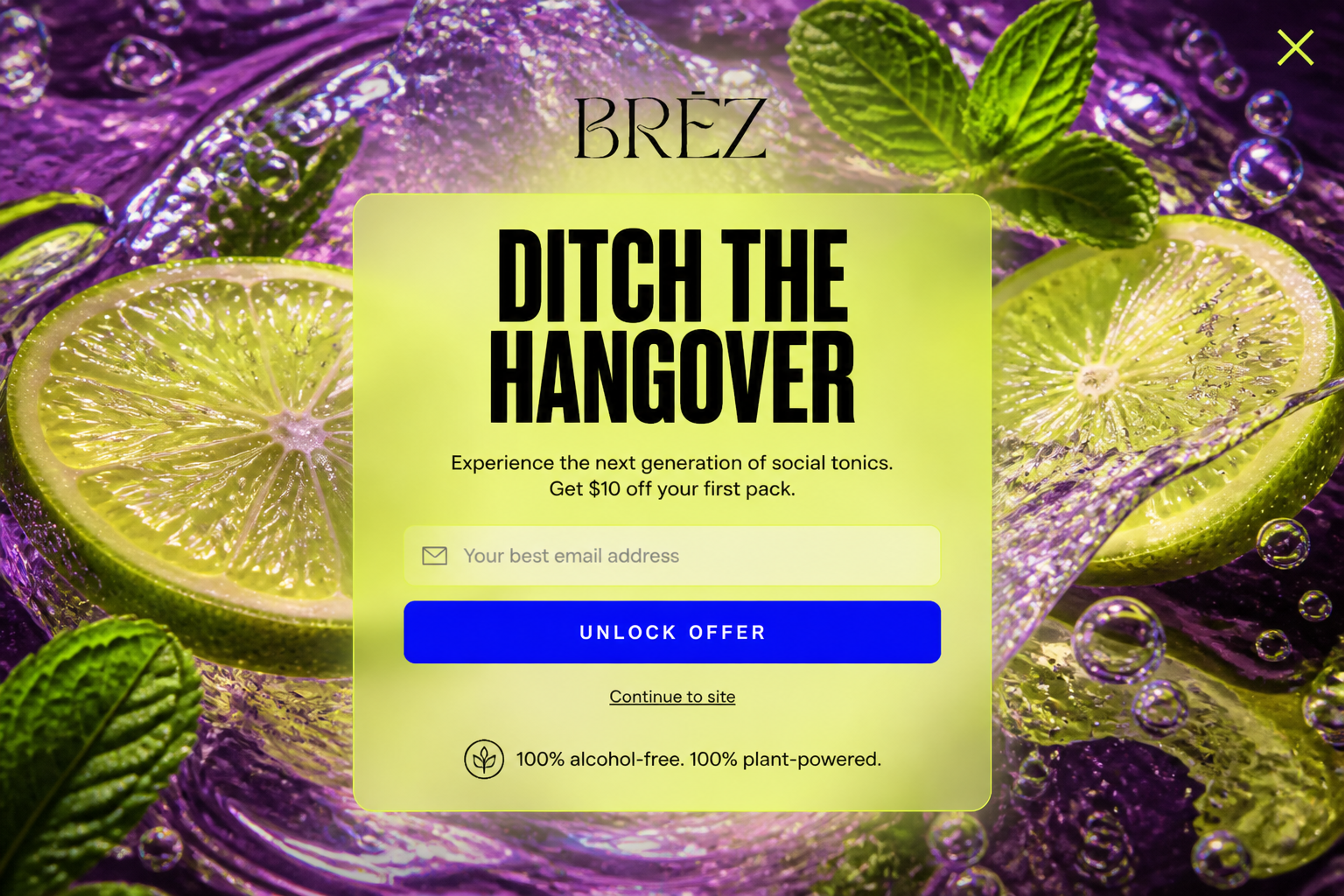
This fullscreen popup has no dimmed backdrop: the whole screen is one bright photo, and the $10 off first-pack offer sits in a see-through panel in the middle. It feels like part of the brand rather than a block over the page.
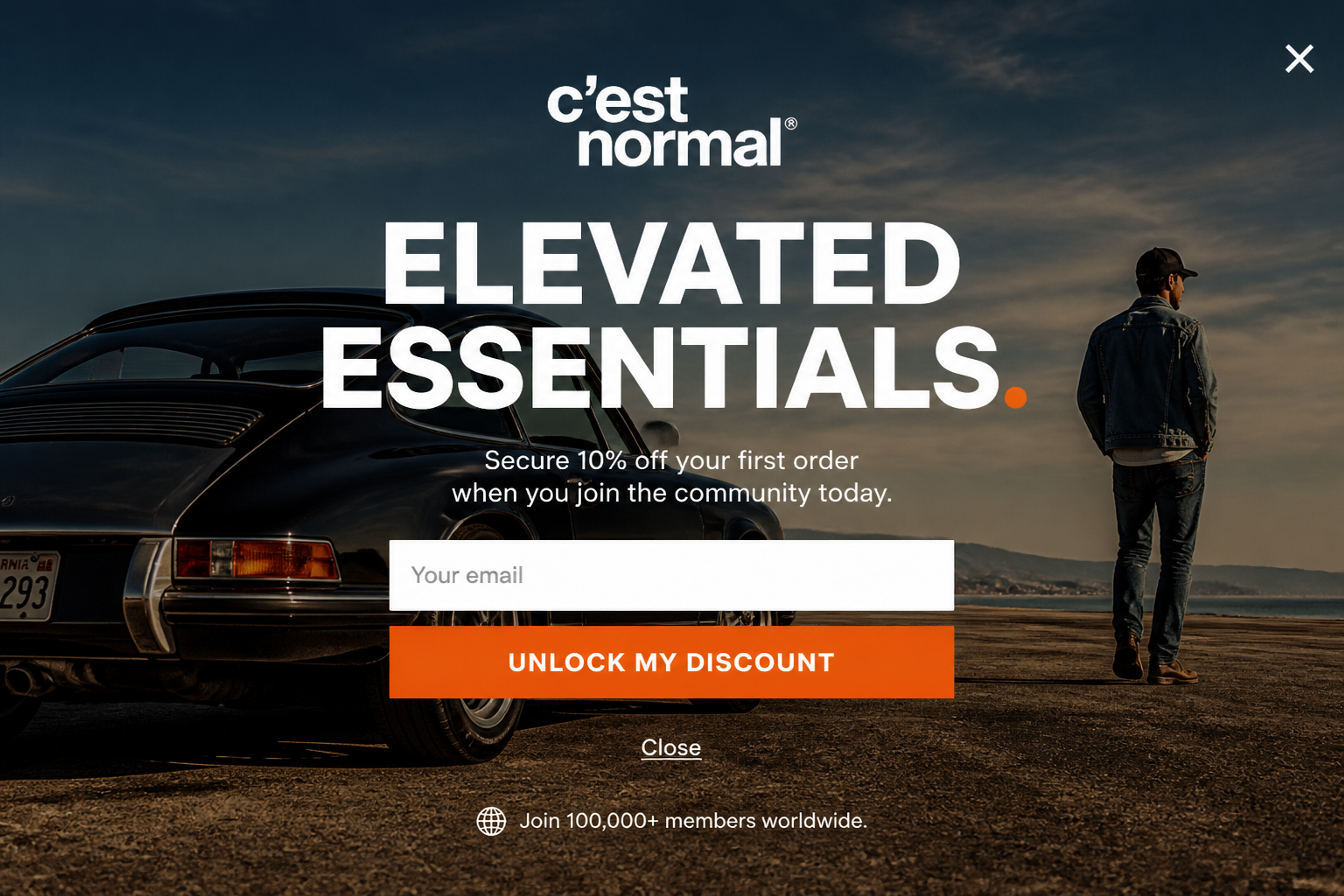
This welcome popup fills the whole screen with one lifestyle photo. The 10% off first-order offer, a single email field and a clear close link sit in the middle of it.

Ecommerce Expo demonstrates how to use full-screen popups for lead generation with finesse. Their popup offers access to valuable presentations—just one click away—in exchange for an email address.
The headline and CTA work in perfect harmony, reinforcing the message and making it easy for visitors to see the value. This is a great example of using strong incentives.

SNOW® Teeth Whitening takes FOMO to the next level with a full-screen popup featuring a countdown timer. The urgency is complemented by customer photos and product images, which add authenticity and relevance to the offer.
It’s a solid strategy for turning visitors into buyers, especially when the visuals are so compelling.
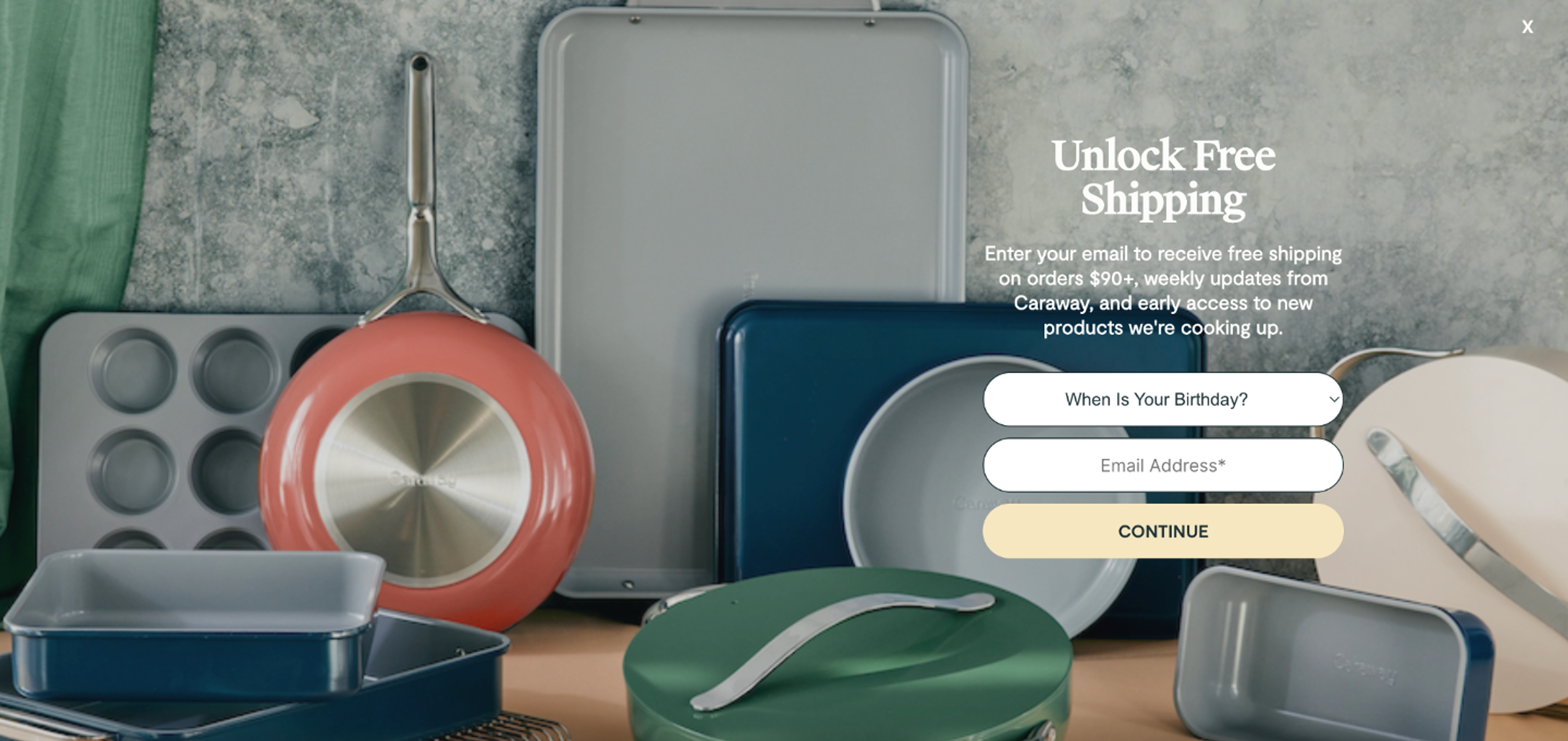
Caraway’s full-screen popup is visually stunning and strategically sound. They not only offer free shipping, but also entice users with weekly updates and early access to new products. The beautiful product imagery, like those eye-catching lids, makes the offer even more irresistible.
It’s a perfect example of how aesthetics and incentives can work together to drive engagement.

Kursyszkolenia’s full-screen popup is a great example of how simplicity can be powerful. The design is calm and clean, with a single, well-integrated CTA button that blends effortlessly with the site’s overall look.
This approach ensures the popup feels like a natural part of the user experience rather than an interruption, encouraging users to take the desired action without hesitation.
Ready to create your own full-screen popup? Let's see step-by-step instructions on how to ensure it converts.
Don’t show the popup immediately. Give visitors a few seconds to engage with your content before the popup appears. Alternatively, use an exit-intent popup to capture attention just as they’re about to leave.
Your call-to-action (CTA) should be the star of the show. Make sure it’s clear, compelling, and easy to find. Use contrasting colors to make your CTA button stand out.
Don’t overload the popup with too much text or too many images. Keep the design clean and the message focused on one goal—whether that’s collecting emails, offering a discount, or promoting a product.
Ensure your full-screen popup is responsive and looks great on all devices, especially mobile. A popup that’s difficult to close on a smartphone is a surefire way to frustrate your users.
Whether it’s a discount, free shipping, or exclusive content, make sure your popup offers something valuable to the user. This increases the likelihood that they’ll take the desired action.
Incorporate high-quality images or engaging graphics that catch the user’s eye and reinforce your message. The visuals should be aligned with your brand and help create a smooth experience that feels more like an integrated part of the site rather than an interruption.
Regularly A/B testing different designs, messaging, and triggers to see what works best for your audience is a key way to ensure your popup converts effectively. Continuously optimize your popups based on the data you collect.
Pick one example from this list, such as a welcome discount with a countdown timer, and describe the full-screen popup in one sentence. The OptiMonk agent designs it, builds the mobile version and sets the targeting.
Free to start. No credit card.

In this article, we'll share 30 actionable Black Friday marketing ideas for ecommerce businesses to make 2026 your most successful yet.
Learn about email marketing frequency for ecommerce stores. Most send 1-3 emails per week, with frequency adjusted by subscriber engagement and store type.
Let's take a look at the 21 best lead generation software for 2026 and discuss the features that any lead generation tool should have.