


Modal vs Popup vs Overlay: What's the Difference?
What separates a modal, a popup and an overlay, how to make a modal accessible, and which one an online store should use when.
Discover how to use interstitial popups effectively to boost conversions without harming the user experience.
In short
An interstitial popup covers the whole screen to deliver one focused message before the visitor continues. It converts well and stays SEO-safe when it waits for engagement. Trigger it on scroll depth, time on page or exit intent, cap it at once per session, and keep closing easy.
Have you heard about interstitial popups, but you're a bit concerned they might ruin your website's user experience?
"Intrusive interstitials" is a term we hear a lot, yet it's surrounded by many misconceptions.
In this article, we're going back to basics: What are interstitial popups? What types exist, and when should each one appear? What makes them intrusive, and how do you avoid the SEO penalty? We'll also show you some best practices and eight real-life examples.
Let's get down to it!
An interstitial popup (a.k.a fullscreen popup or full-page takeover) is an overlay that covers the entire screen, creating a temporary interruption in the user's browsing experience.
Unlike a modal popup (which sits over the page as a smaller overlay while the underlying content remains partially visible) or a banner that quietly occupies the top or bottom of the screen, an interstitial popup demands the visitor's full attention by taking over the entire viewport. This makes it one of the most powerful formats for delivering a single focused message, and one that requires careful execution to avoid frustrating users.
There are various purposes interstitial popups can be used for, including promoting products or services, capturing email addresses, and displaying cookie consent notices. If you're new to popups in general, start with our guide to what a popup window is.
There are five main types of interstitial popups, and each one fires at a different moment in the visitor's journey. The type you choose, and crucially the moment it fires, determines whether it helps or harms your conversion rate.
This fires the moment a visitor lands on the page. It's best suited for time-sensitive announcements, cookie consent notices, or age verification: situations where the popup is either legally required or where the welcome offer is genuinely compelling. On mobile, entry interstitials carry the highest risk of triggering Google's penalty, so they should be used with care or avoided altogether in favor of a short time delay.
Triggered when the visitor signals they're about to leave (cursor moving toward the browser bar on desktop, or idle behavior and back-button presses on mobile), the exit intent popup is one of the safest and most effective trigger types. It turns a near-miss into a final conversion opportunity without interrupting active browsing.
This fires after the visitor has scrolled 50–75% down the page, signaling genuine engagement with the content. Because the visitor has already consumed a significant portion of the page, a well-timed offer feels earned rather than intrusive, and this trigger type is fully compliant with Google's mobile guidelines.
This fires after the visitor has spent 30–60 seconds on the page. The delay filters out low-intent bouncers before the popup appears, which improves both conversion quality and user experience. Combined with a scroll trigger, it's one of the most reliable approaches for non-intrusive popup delivery.
Mobile requires its own consideration. The same interstitial popup that performs well on desktop can become a source of friction on smaller screens. Effective mobile interstitials use delayed or scroll-based triggers, single-field forms, and close buttons with a minimum 44px tap target, always visible and easy to dismiss.
At 14.40% average conversion rate, the upside is real, but so is the downside if you get the implementation wrong.
Not if implemented correctly. Done wrong, though, they absolutely can.
In 2017, Google introduced the Intrusive Interstitials Update, initially targeting mobile search only. By 2021, it was formally incorporated into the Page Experience update alongside Core Web Vitals, giving it broader ranking weight. In February 2022, it was extended to desktop sites as well, meaning today intrusive interstitials are a ranking signal across all devices, not just mobile.
Google's concern has also expanded: beyond frustrating users, intrusive interstitials now make it harder for Google to crawl and understand your content, which can independently hurt your rankings.
The safe approach: delay your interstitial popup until the visitor has had a chance to engage with your content, make the close button impossible to miss, and set a frequency cap so returning visitors aren't shown the same popup repeatedly. Done this way, interstitial popups and strong SEO performance are entirely compatible.
Understanding what interstitial popups are and how they affect SEO is only half the battle. The other half is execution: getting the timing, the offer, the targeting, and the design right so your popup feels like a helpful nudge rather than an unwanted interruption. Here's how to do that.
Popup timing is arguably the single most important factor in whether an interstitial popup helps or hurts your results. The moment your popup fires determines whether it feels like a helpful offer or an unwanted interruption.
Three trigger mechanisms keep you on the right side of both users and Google:
And remember: less is more when it comes to frequency. Limiting how often your popup appears ensures each one is seen as helpful rather than intrusive.
When creating interstitials, it's essential to ensure that they provide users with clear value. The last thing you want is to annoy your audience with irrelevant or uninteresting popups. Instead, aim to offer something that resonates with your users and gives them a compelling reason to engage.
Consider what your audience cares about and tailor your interstitial content accordingly. Whether it's a special deal, exclusive content, or a discount, make sure it's something that will genuinely interest and benefit them.
By providing valuable content, you increase the likelihood that users will engage with your popup rather than dismissing it.
One of the most powerful and underused applications of interstitial popups is segmentation. Rather than showing the same popup to every visitor, tailoring the experience based on who's seeing it dramatically increases relevance and reduces friction.
New visitors might see a welcome discount. Returning visitors who've already dismissed that offer might see a product recommendation or loyalty incentive. Someone on a specific product page gets an offer tied directly to what they're browsing.
This kind of personalization keeps the interstitial popup feeling useful rather than generic, and it's reflected directly in conversion rates.
Mobile is where most interstitial popups get into trouble, and that's where most SEO penalties originate. Mobile users are browsing on smaller screens with less patience for interruptions, so getting the design and timing right matters even more than on desktop.
Instead of firing a fullscreen popup immediately on arrival, consider using a delayed scroll trigger on mobile. Keep forms to a single field, ensure the close button has at least a 44px tap target, and test your design on a real small-screen device before going live.
Now that you know what makes an interstitial popup work: the right trigger, a clear value offer, personalization, and mobile-friendly design. Let's see these principles in action. Here are eight real-life examples that get it right.
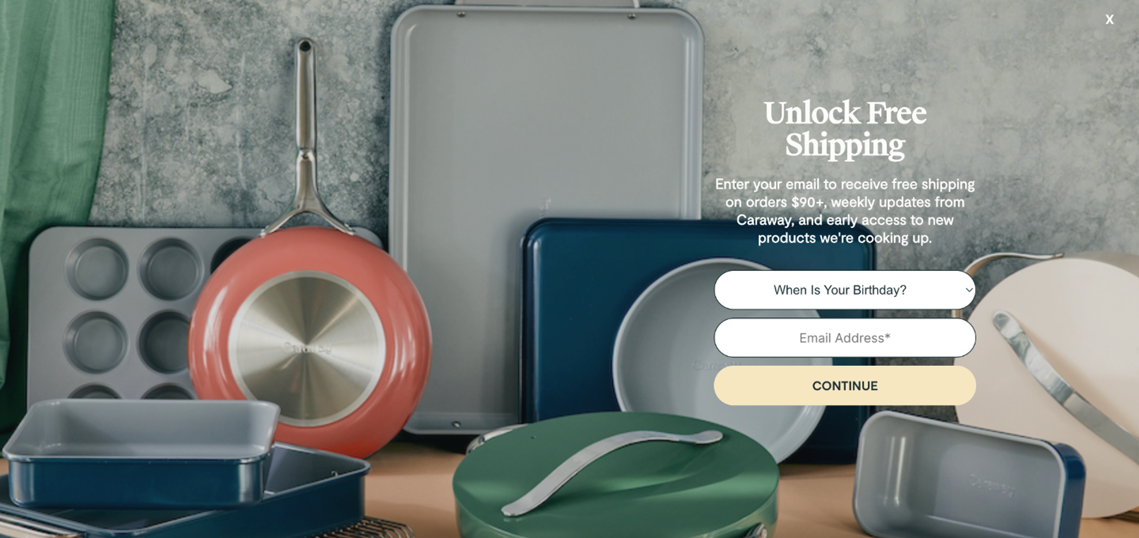
Caraway's popup is a masterclass in blending in: it fills the entire screen yet feels like a natural part of the page.
The popup highlights that the visitor can get free shipping, weekly updates, and early access to new products by signing up for their weekly newsletter. Note that they also ask users about their birthdays, which will allow personalisation in the future.
Why this works: The popup feels like a natural extension of the page rather than an interruption. It's a textbook example of a non-intrusive popup that earns attention through design rather than force.
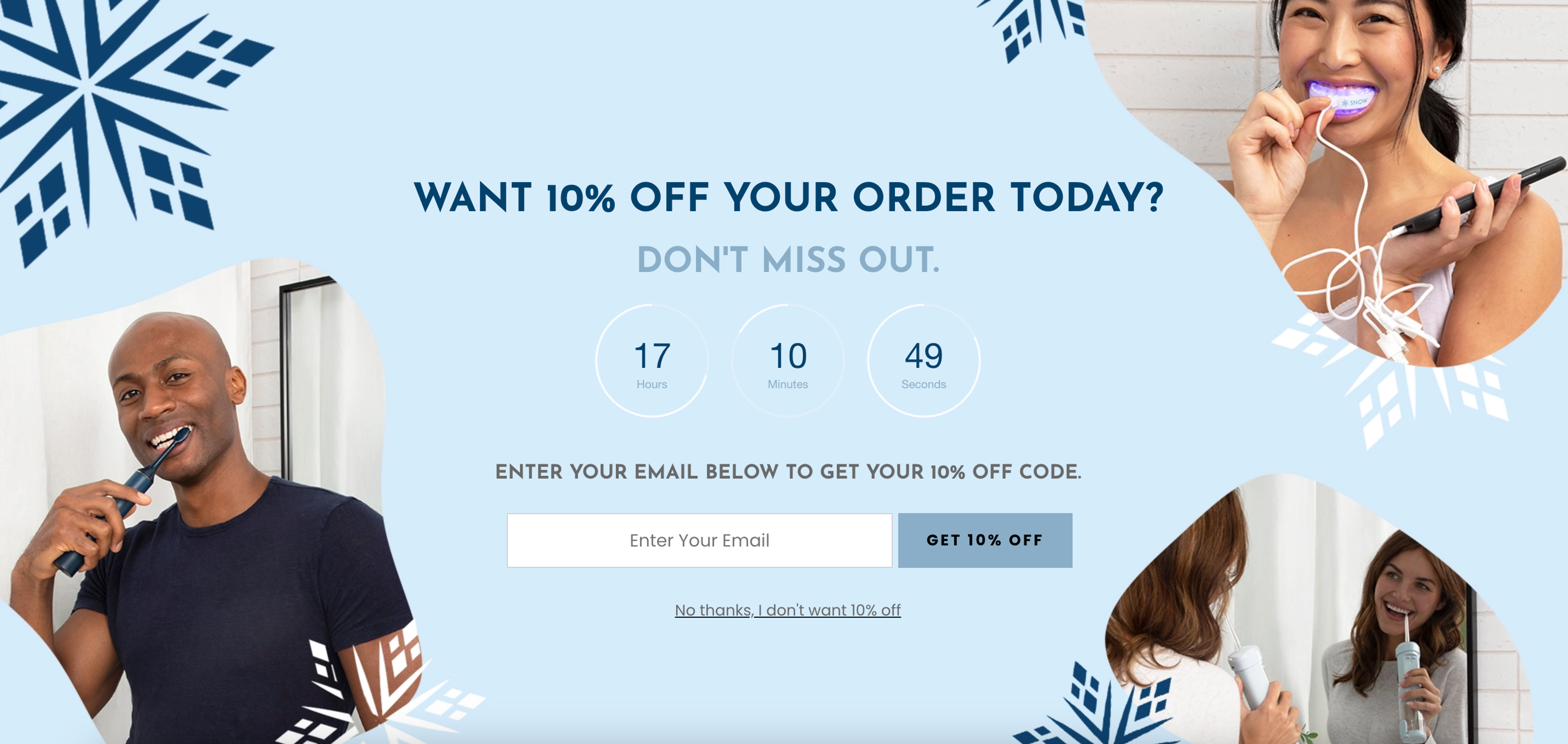
SNOW's popup window is a great example of pairing urgency with aspiration. They require users to fill in their email addresses in exchange for 10% off. The popup effectively engages users with visually appealing images showcasing people using their product. They also use a countdown timer to increase urgency.
Why this works: The countdown timer and product imagery do all the heavy lifting; by the time visitors reach the email field, they're already sold on the offer.
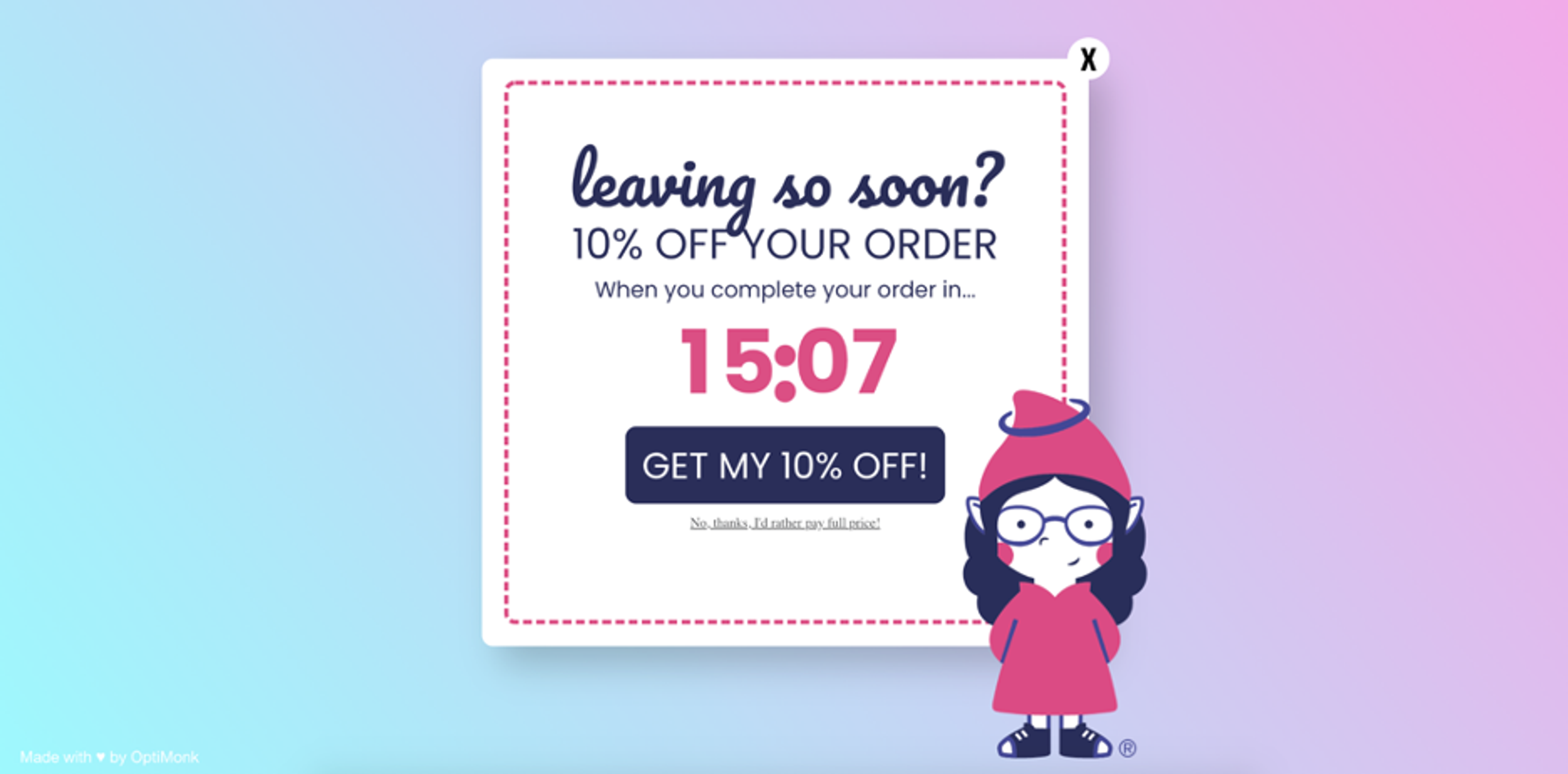
GnomeAngel's approach is a great example of how the right trigger can completely change how a popup feels. Their exit intent popup appears just as a user is about to leave the website, strategically placed on landing pages to capture attention at the right moment. The "leaving so soon?" headline grabs visitors who are about to bail, and the countdown timer reinforces urgency.
Why this works: By the time this popup appears, the visitor has already chosen to leave, so it can't be accused of interrupting anything. What it does instead is pull them back emotionally: the playful headline and imagery soften the moment, while the countdown timer triggers just enough FOMO to make leaving feel like a mistake.
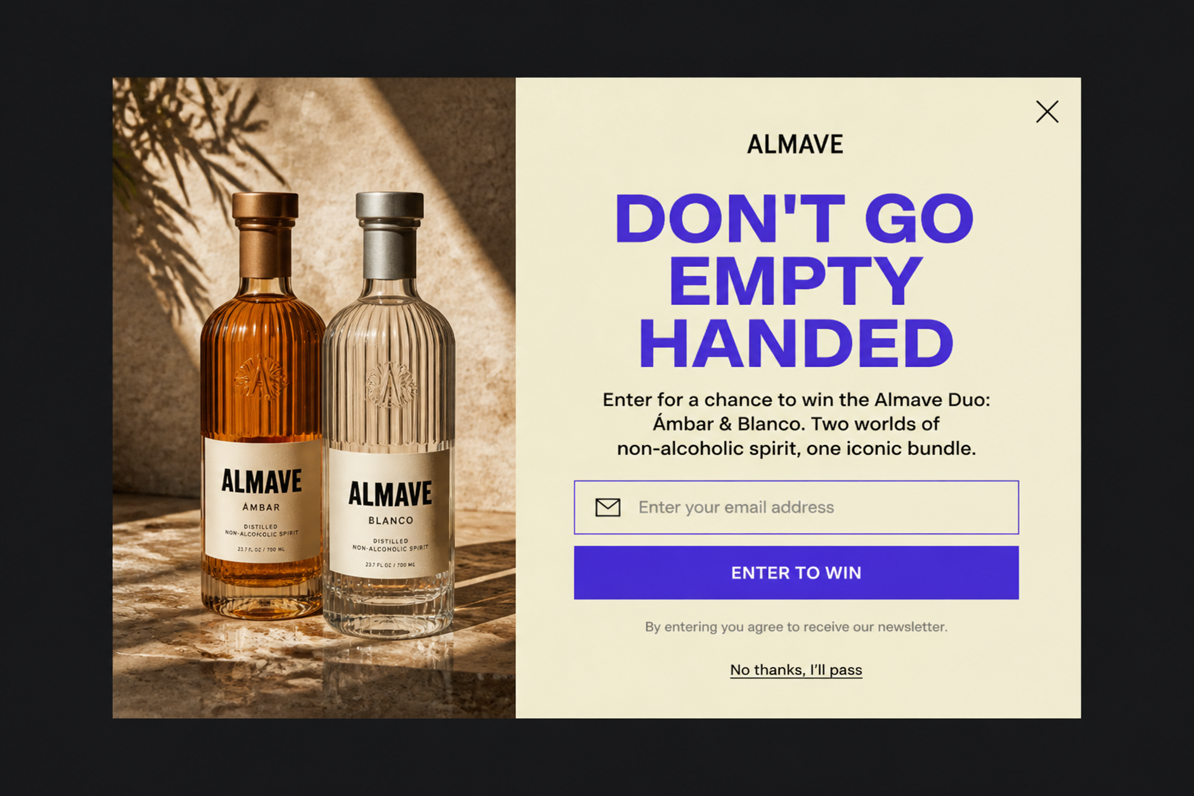
Not every interstitial has to hide the page completely. This exit-intent popup sits in the middle over a dimmed backdrop, so visitors still see the store behind the giveaway and don't feel trapped.

Blume uses an interstitial popup that offers a 20% discount for users in exchange for selecting their primary skincare concern. This type of popup is behavior-driven and aims to collect valuable customer data while delivering personalized promotions based on the user's selection. The user can easily close the popup if they don't want the discount, with a prominent "X" button for dismissal.
Read our full marketing breakdown to know more about Blume’s marketing strategy.
Why this works: In skincare, personalization isn't just a conversion tactic; it's what the category runs on. A popup that asks what you're struggling with before pushing a product feels less like a sales move and more like a consultation. For a first-time visitor still figuring out the brand, that small moment of 'we see you' can be the difference between bouncing and buying.
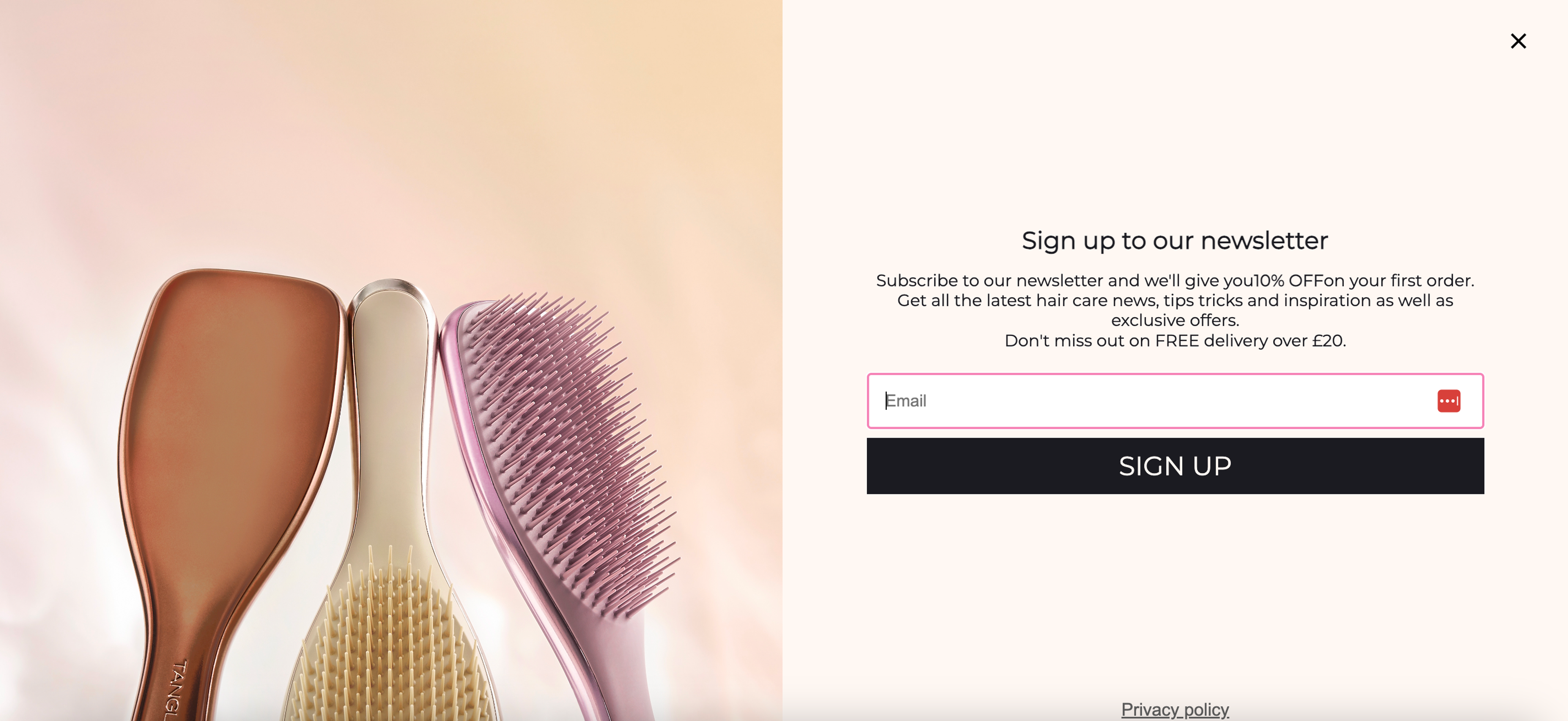
Tangle Teezer's interstitial popup encourages newsletter signups by offering 10% off the first order. It effectively grabs the user's attention with a simple, clean design, showcasing product images alongside the signup form. This type of popup is a great example of incentivizing users to subscribe by offering immediate value while keeping the process smooth and non-intrusive.
Read our full marketing breakdown to know more about Tangle Teezer’s marketing strategy.
Why this works: It's a straightforward win-win: the visitor gets a discount, the store gets an email address. But the timing is what makes it feel fair rather than pushy. Asking for personal information the moment someone lands on your page feels presumptuous; catching them after they've already shown interest in your products is a completely different conversation.
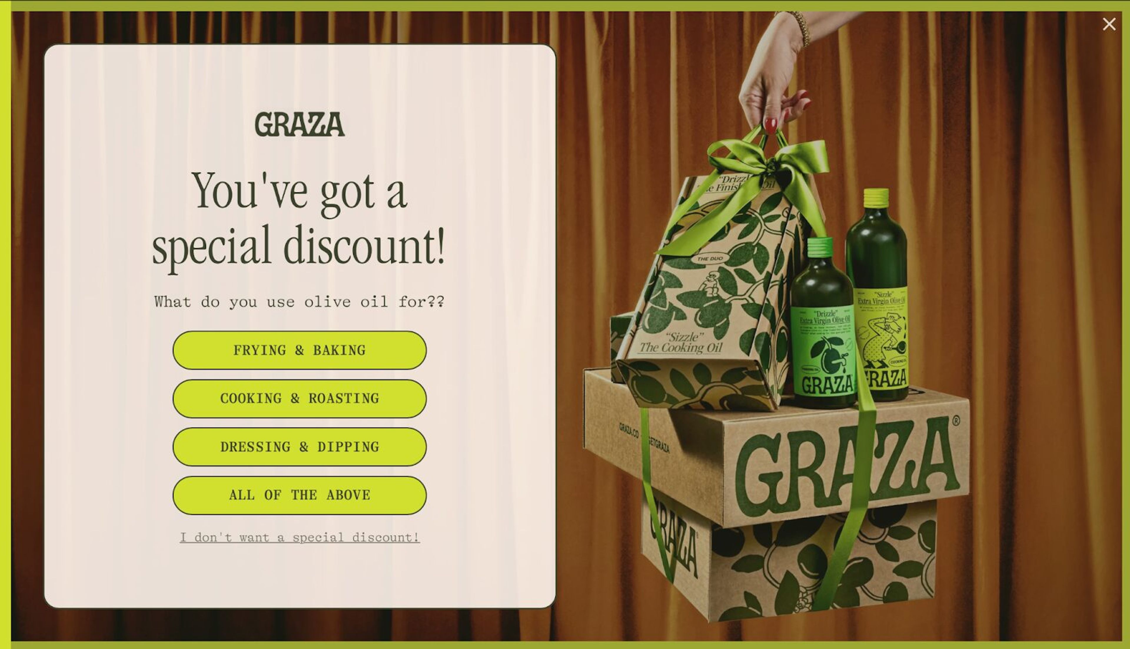
GRAZA's popup example offers a special discount in exchange for engaging the user with a short, simple question: "What do you use olive oil for?" Users can select from options like frying & baking, cooking & roasting, dressing & dipping, or all of the above. This fullscreen popup connects the offer with the user's preferences, making the interaction feel tailored. It also allows users to opt-out with a clear "I don't want a special discount" option.
Read our full marketing breakdown to know more about GRAZA’s marketing strategy.
Why this works: Two clicks and you have a personalized discount. The 'survey' is so lightweight it barely registers as one; visitors feel heard without feeling interrogated, and the effort-to-reward ratio is so lopsided in their favor that completing it feels like the obvious thing to do.

This welcome popup fills the whole screen with one lifestyle photo. The offer, up to 30% off sitewide for an email address, sits on the open side of the image with a single field and a clear close link.
Start with one offer, such as 10% off for newsletter signups, and describe the interstitial popup in one sentence. The OptiMonk agent designs it, builds the mobile version and sets the targeting, for example after 50% scroll depth and once per session.
Free to start. No credit card.
Yes, when timed and targeted correctly, interstitial popups are one of the highest-converting popup formats available. According to OptiMonk's data, they achieve an average 14.40% conversion rate, outperforming standard popup formats. The key is relevance and timing: an interstitial popup that appears at the right moment with a genuinely valuable offer consistently outperforms a generic one that fires on page load.
They can, but only if implemented incorrectly. Google's intrusive interstitials update targets popups that block content immediately on mobile when visitors arrive from search results. Using scroll-depth, time-delay, or exit intent popup triggers instead of immediate page-load triggers keeps you fully within Google's guidelines. Legally required interstitials like cookie consent and age verification are exempt from any penalty.
An interstitial popup covers the entire screen, blocking all underlying content until the visitor takes action or dismisses it. A modal sits over the page as a smaller overlay, so the content behind it remains partially visible. Interstitials demand full attention and typically convert higher; modals are less disruptive but also less impactful. If you're optimizing for maximum visibility with a single offer, the fullscreen popup format wins. If you want to minimize interruption, a modal is the better choice. More on modals, popups and overlays.
As a general rule, once per session, meaning a visitor who has already seen and dismissed your popup shouldn't see it again during the same browsing session. For returning visitors, most brands reset the frequency cap every 30 days. Showing the same popup repeatedly is one of the fastest ways to frustrate visitors and inflate your bounce rate, so when in doubt, err on the side of showing it less.
One of the most common examples is an email capture popup on an ecommerce site: a fullscreen popup offering 10% off in exchange for joining a newsletter. Brands like Tangle Teezer and SNOW use this format effectively: the popup appears after the visitor has spent time browsing, offers clear value, and includes a prominent close button so it never feels like a trap. Another common example is an exit intent popup that appears just as a visitor is about to leave, offering a last-minute discount to recover a potential lost sale.


What separates a modal, a popup and an overlay, how to make a modal accessible, and which one an online store should use when.

50 CTA button texts for online stores and popups, grouped by the shopper's moment, plus what makes a button worth clicking.

40 website welcome message examples for online stores, grouped by situation and industry, ready to copy into a welcome popup.