


50 CTA Button Examples for Online Stores and Popups
50 CTA button texts for online stores and popups, grouped by the shopper's moment, plus what makes a button worth clicking.
What separates a modal, a popup and an overlay, how to make a modal accessible, and which one an online store should use when.
In short
Modal vs popup vs overlay: a modal blocks the page until the visitor acts, a popup is any message that appears on its own, and an overlay is the layer over the page. Blocking costs attention, so use a modal popup for one offer worth the pause.
Designers say modal. Marketers say popup. Developers say dialog.
On an online store, all three usually mean the same card in the middle of the screen. The words still matter, because each answers a different question.
How much of the shopper's focus does it take? Can someone on a keyboard or a screen reader get out of it? Get those right, and the name stops mattering.
A modal is a window that blocks the rest of the page until the visitor acts on it or closes it. A popup is any window that appears without being asked for, modal or not. An overlay is the layer that sits over the page, often the dimmed backdrop behind a modal.
For a store, most email and discount popups are modal popups: a card over a darkened page that waits for a yes or a no. A fullscreen popup is an overlay that covers everything.
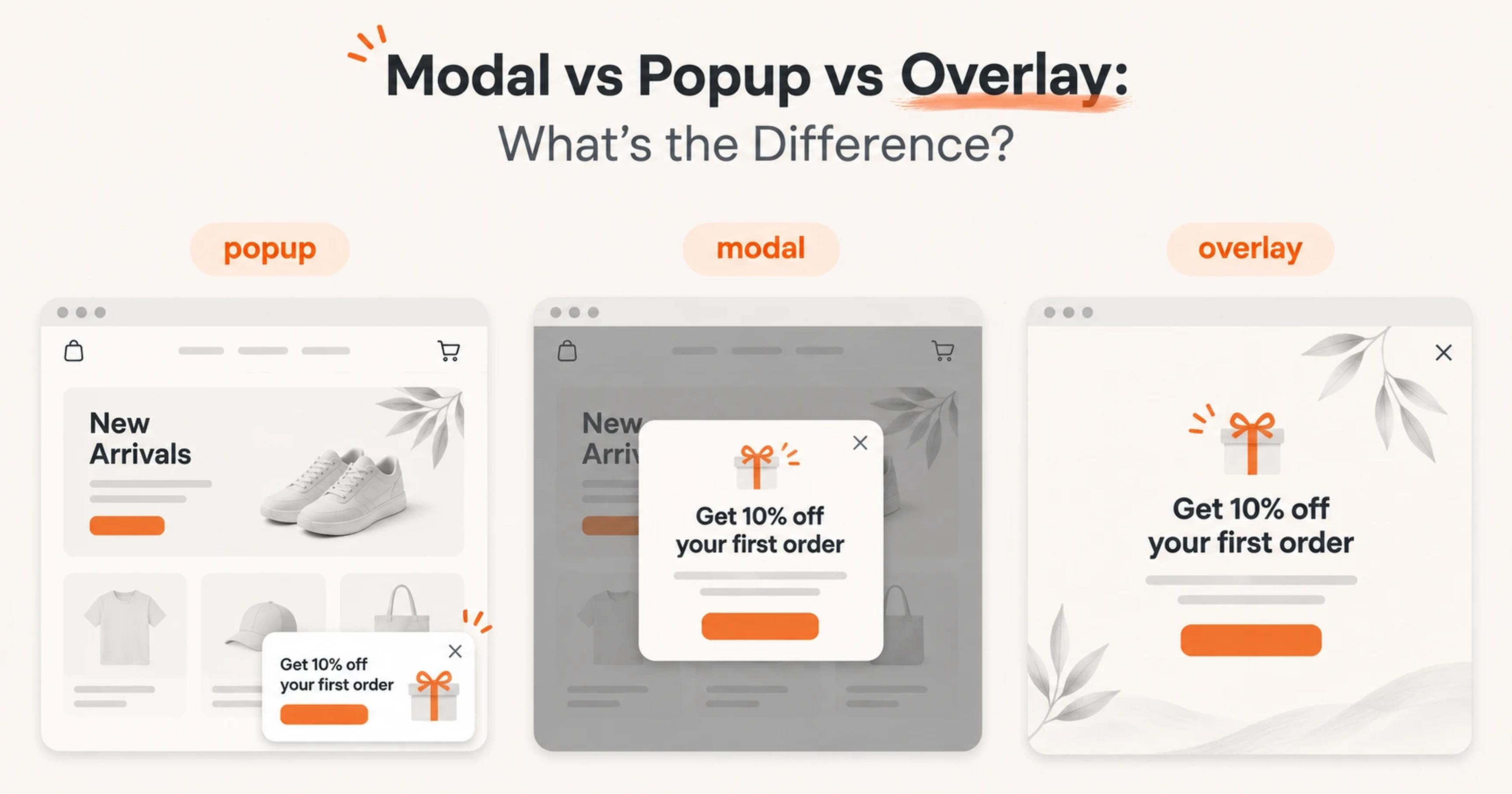
A modal is a window that stops the visitor from using the rest of the page until they respond to it. The W3C's dialog (modal) pattern calls the content under it "inert": you can't click, type or tab into it, and it's usually dimmed or obscured.
The opposite is a non-modal window, which lets you keep using the page while it's open. MDN's guide to the <dialog> element draws the same line: showModal() opens a modal and makes the rest of the page inert, show() opens a non-modal one.
On a store, you meet modals all the time: a size guide over the product page, an "added to cart" confirmation, an age check, a login window or a discount offer over a darkened page. "Dialog" is the developer's word for the same thing.
A popup is the umbrella word for any window that appears on its own, set off by a trigger like time on page, scrolling or exit intent. If you want the full story of the term, see what a popup window is.
Years ago, a popup was a separate browser window, the kind popup blockers stop. Today it opens inside the page itself.
A popup can be modal or not. Most store popups are modal: a card in the center, a dimmed page behind, and one choice to make. A non-modal popup sits in a corner or along an edge, and the visitor can keep browsing while it's there.
An overlay is a layer on top of the page. The word has two meanings, and that's where most of the confusion comes from.
The first is the dimmed backdrop behind a modal, called ::backdrop in CSS. The second is anything placed over the content, including a fullscreen popup.
So an "overlay popup" usually means a popup with a backdrop, or a fullscreen one. See these overlay popup examples.
A modal is defined by what it does (it blocks), a popup by how it arrives (on its own), an overlay by where it sits (on top).
| Modal | Popup | Overlay | |
|---|---|---|---|
| What it is | A window that needs an answer | Any window that appears on its own | The layer over the page |
| Blocks the page? | Yes | Sometimes: modal popups do, corner popups don't | It's what does the blocking, or just a visual layer |
| Who opens it | Usually the visitor (a click) or the site | A trigger: time, scroll, exit intent | Comes with the modal or popup |
| Typical store use | Size guide, add-to-cart confirmation, age check | Welcome offer, exit offer, lucky wheel | Dimmed backdrop, fullscreen offer |
| Must have | Focus inside, Esc to close, a close button | A clear way to close, sensible timing | Enough contrast, no hidden close button |
| Main risk | Interrupting checkout | Showing too often | Covering the content Google wants to see |
A lightbox is a modal popup with a dimmed backdrop; the name comes from photo galleries. More in our guide to the lightbox popup.
An interstitial is a window that covers the whole screen, usually as the page loads. Google's page on interstitials and dialogs asks sites not to obscure the entire page, and when an overlay is legally required, like an age gate, to place it over the content instead of redirecting to a separate page. Our interstitial popup guide covers the rest.
To the shopper, no. To your developer, yes: a modal needs role="dialog" and aria-modal="true" so screen readers treat it as one. To Google, the name doesn't matter at all; how much of the page is covered does.
A modal is accessible when keyboard and screen-reader users can get in, move around, and get out. The W3C's modal dialog pattern and MDN give five rules.
The native <dialog> element opened with showModal() gives you much of this by default: the page behind turns inert, Esc closes it, and it's exposed as aria-modal="true". A custom modal has to do all of it by hand.
No developer needed. Open your store on a laptop, wait for the popup, and go through this list:
A shopper who can't get past your popup can't sign up, and can't buy either.
Use a modal popup when one offer is worth a pause; leave the page alone when the visitor is busy. The moment decides the format:
| Moment | Use | Why |
|---|---|---|
| First visit, after a few seconds | Standard popup (modal) with a welcome offer | One clear choice, and the page is still visible behind it |
| Leaving the site (exit intent) | Standard or fullscreen popup | The visitor is already leaving, so the interruption costs little |
| Cart page, hesitation | Standard popup with a cart reminder | Keeps the cart in view |
| Big launch or sale | Fullscreen popup | Nothing competes with it |
| Lucky wheel or scratch card | Standard popup | The game needs the visitor's full attention |
| Age check required by law | Modal over the content | Google: overlay the content, don't redirect |
| Checkout, typing in a form | Nothing | Never interrupt a task that's already converting |
Three rules keep any of these from annoying people:
For the moments in the table, see welcome popups, the exit-intent popup guide and lucky wheel and scratch card popups.
Each of these was designed by the OptiMonk agent for a real brand. The first two show the difference best: the same brand and exit moment, as a modal card and as a fullscreen overlay.
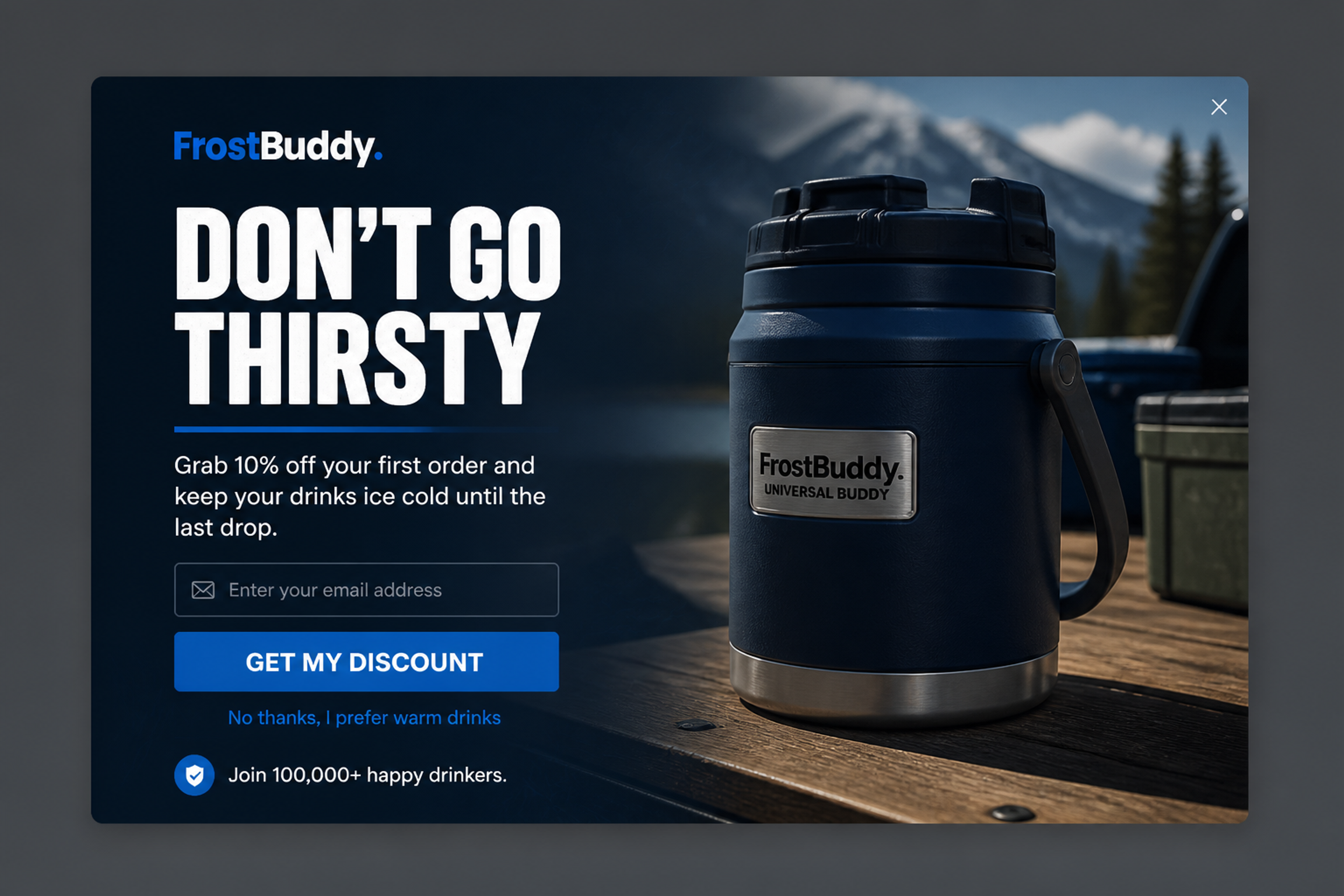
The textbook modal popup: one decision, with the store still visible behind the backdrop. The offer is 10% off the first order for an email.

Same brand, same offer, now as an overlay. There's no dimmed layer: the popup's own image covers the whole screen.
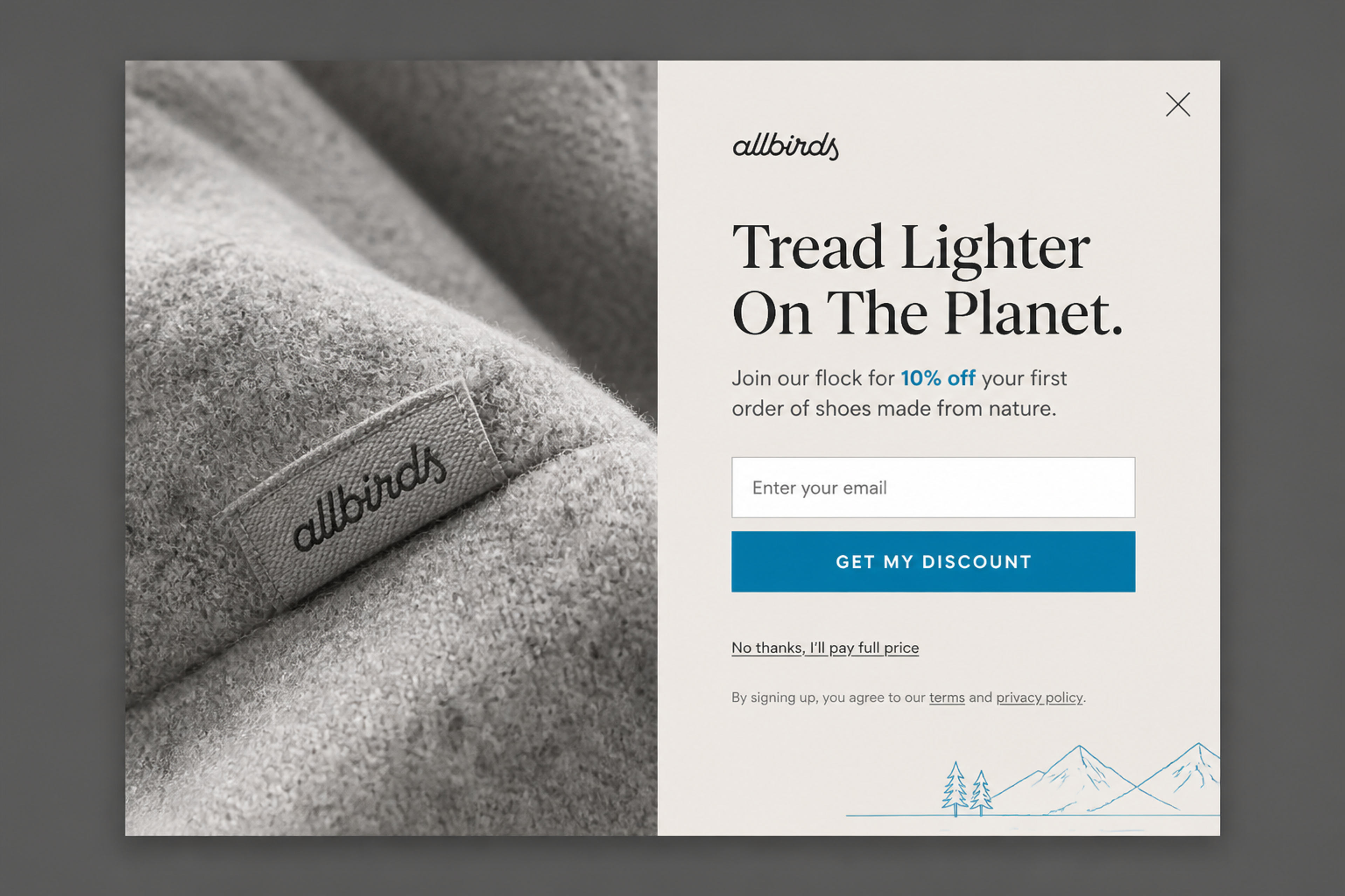
It shows the parts a good modal needs: one headline (what aria-labelledby should point to), one button and two ways out, the close icon and the decline link.
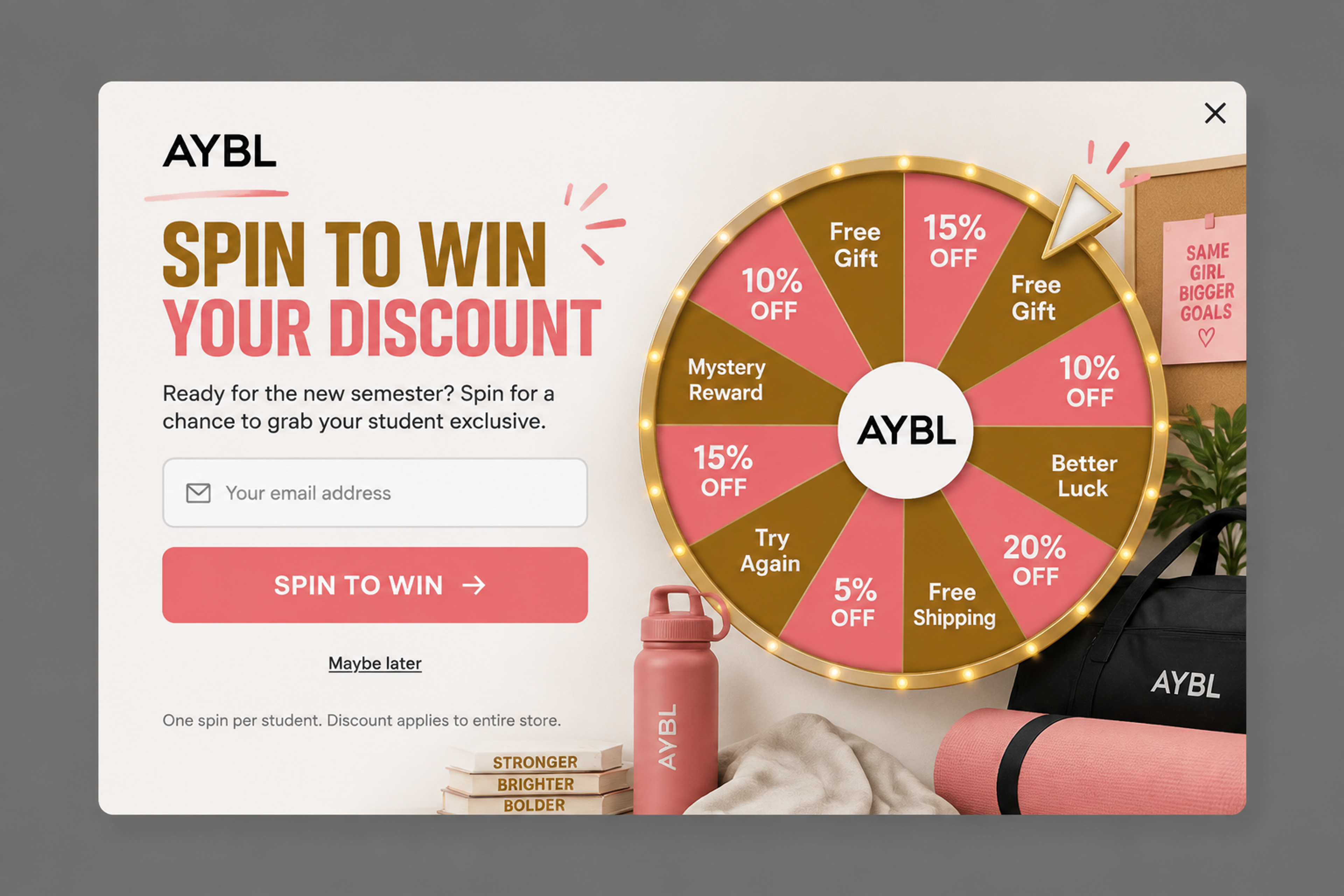
A lucky wheel in a modal card. A game asks for full attention, so blocking the page makes sense, as long as "Maybe later" is easy to find.
Browse more in the modal and fullscreen collections of the Popup Library.
OptiMonk is an agentic popup builder. You describe the popup in one sentence, the AI agent draws four on-brand concepts, builds a separate mobile version of each and sets the targeting. You review it and switch it on.
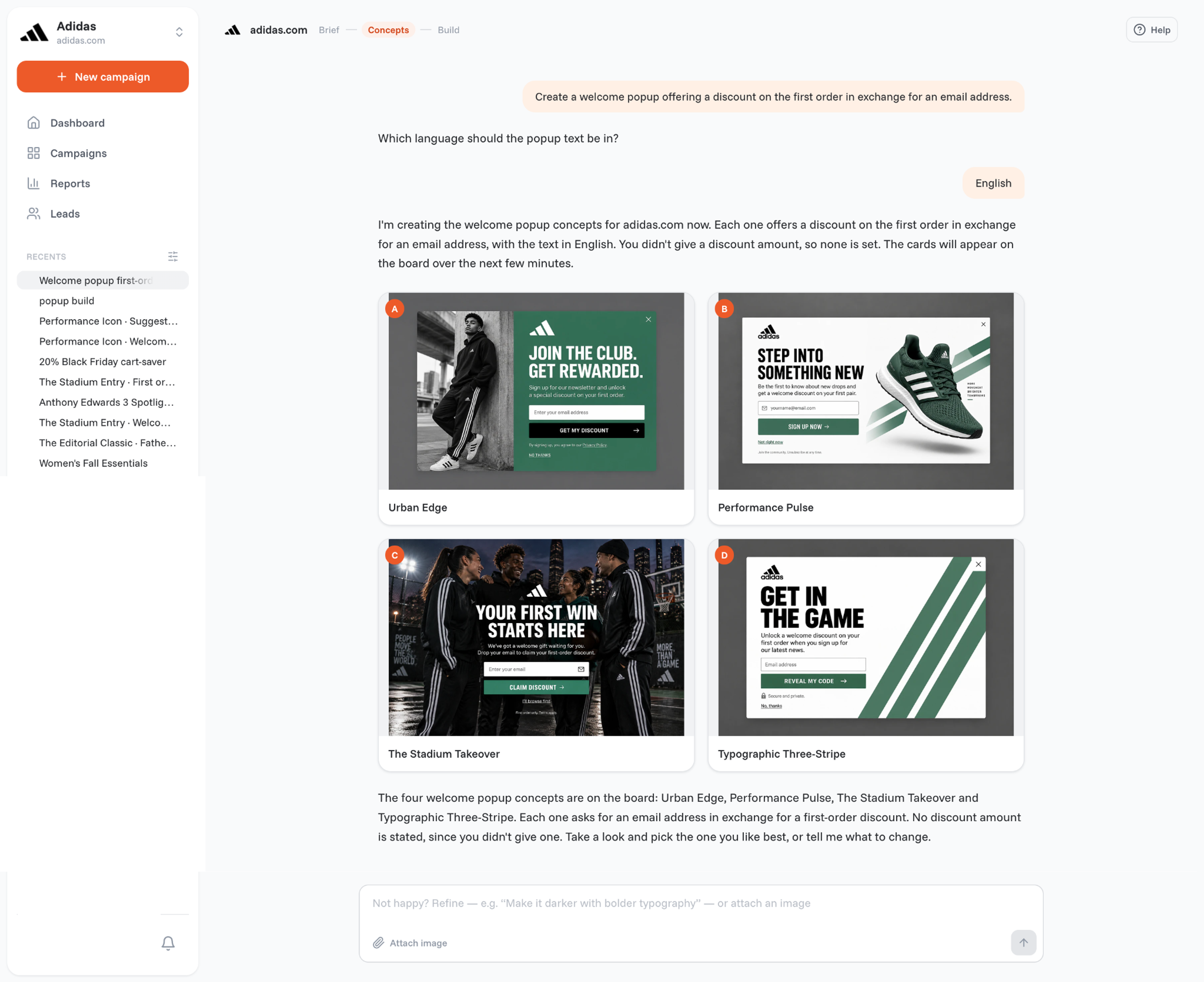
In OptiMonk terms, the modal is the standard popup and the overlay is the fullscreen popup:
A standard popup has room for more than an email field: a lucky wheel, a scratch card, a coupon code, a countdown or product recommendations.
To keep interruptions in check, the User Experience Protector shows a visitor only as many campaigns as the experience can take, the most relevant first. Frequency limits set how often one visitor sees a popup. Exit intent works on desktop and, through mobile triggers, on phones. Visitors can also close an OptiMonk popup with the Esc key.
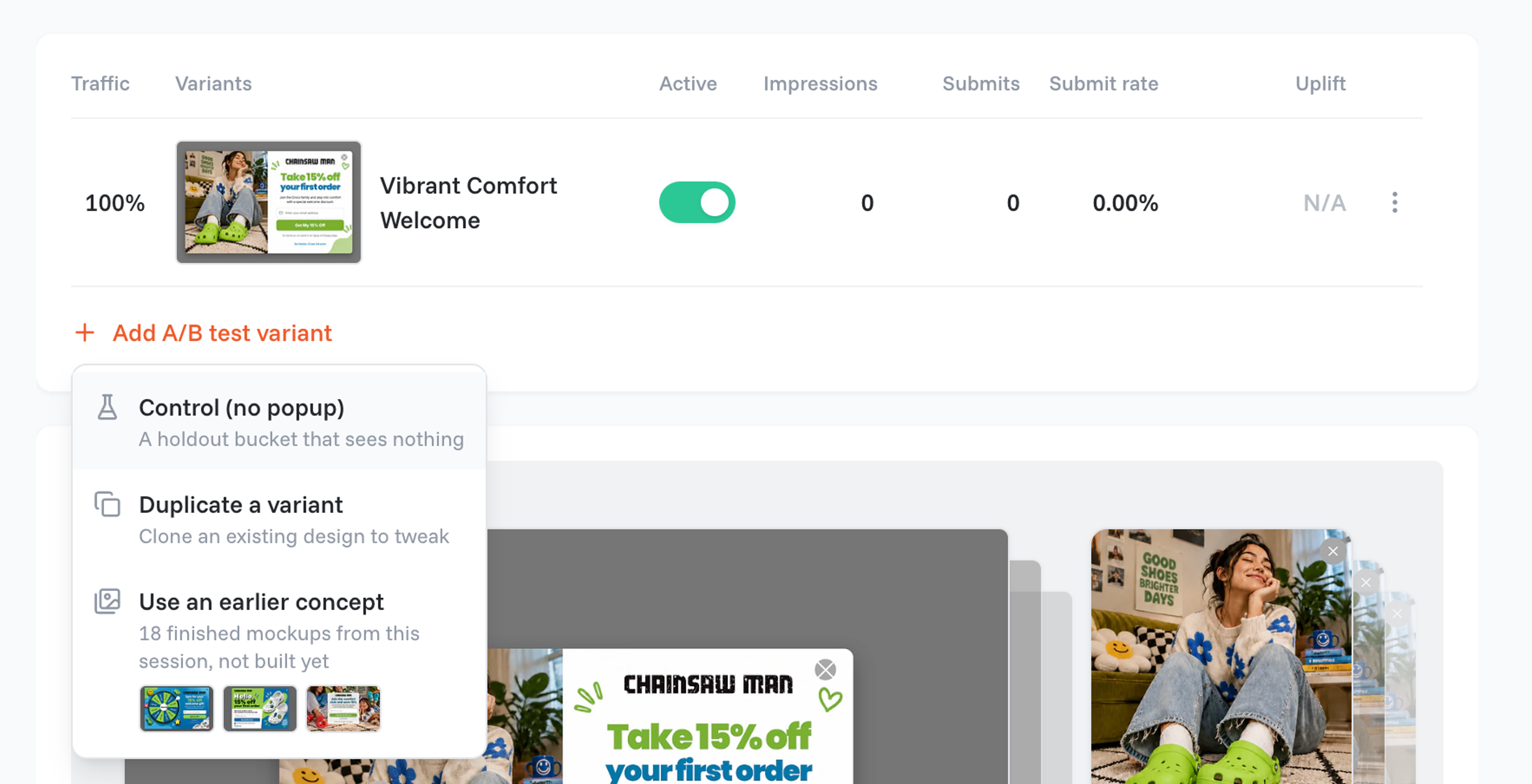
Standard or fullscreen? A variant A/B test can pit whole designs or campaign types against each other, and a holdout test shows whether the popup adds sales at all.
Not always. A popup is modal when it opens over a dimmed page and waits for an answer, as most store popups do. A corner popup that lets people keep scrolling isn't.
The modal is the window; the overlay is the layer behind or around it, like the dimmed backdrop or a fullscreen popup.
Yes. A lightbox is a modal popup over a dimmed backdrop, named after image galleries where a photo opened large over a darkened page.
It's common and helpful, but not enough. The W3C asks for Esc and recommends a visible close button; MDN's closedby attribute lets a developer choose whether a click outside, Esc or only a button closes it.
The name doesn't; how much they cover can. Google's interstitials and dialogs guidance warns against obscuring the entire page. A smaller, timed card is a different case, but no format guarantees rankings. More in our popup UX tips.
An alert is the browser's own message box: window.alert() shows a plain dialog and waits until the user dismisses it. A popup is your store's own designed window.
Describe the popup in one sentence, then decide: standard or fullscreen. Or let the two compete in an A/B test and keep the winner.
Free to start. No credit card.


50 CTA button texts for online stores and popups, grouped by the shopper's moment, plus what makes a button worth clicking.

40 website welcome message examples for online stores, grouped by situation and industry, ready to copy into a welcome popup.

12 Christmas popup examples for online stores, from welcome offers and spin-to-win wheels to gift quizzes and last-chance countdowns.