The importance of optimizing your website conversion rate cannot be overstated. Improving your conversion rates by just a few percent can help you capture significant additional revenue from the same amount of traffic.
We know that watching thousands of people visit your ecommerce site without buying anything can be frustrating. However, if you’re serious about taking your ecommerce business to the next level, then you need to tackle the issue and find ways to increase conversions.
Luckily, there are a number of simple solutions that can boost conversion rates quickly and easily. Personalization, running cart abandonment campaigns, and using social proof can all help you improve the customer journey and increase visitor engagement. And these are only a few of the many ways to achieve higher conversion rates.
In this article, we’ll go over 25 tips to increase your conversion rate and bring more revenue to your online store.
Let’s get started!
Shortcuts ✂️
- Ads should link to landing pages
- Let customers register for product notifications
- Provide sneak peeks of upcoming promotions
- Adopt a cause
- Communicate how you’re different
- Add personality with a story or anecdote
- Have a good FAQ page
- Provide live chat
- Provide an effective navigation menu
- Suggest products when a search returns no results
- Provide filters to improve the browsing experience
- Have a responsive website
- Provide a buying guide
- Use the holidays to increase your conversion rate
- Test your call-to-action copy
- Reduce the steps during checkout
- Use cart abandonment popups
- Offer free samples
- Respond to customer concerns
- Feature user-created content
- Offer great return policies
- Encourage customer reviews
- Highlight cost savings
- Cut price in a different way
- Offer free shipping
25 tips to increase ecommerce conversion rates
When it comes to gaining more customers, ensuring that your website visitors are engaging with your website and messaging is essential. And even if you have a decent conversion rate, you can still benefit by implementing some of the tips and tricks below.
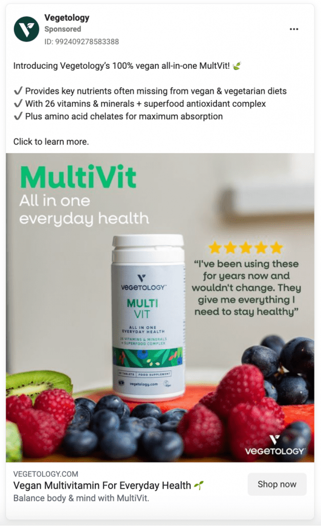
1. Ads should link to landing pages
When running ads online, make sure the ads link to your landing pages and product pages rather than to the home page.
If a group of potential customers has clicked an ad that’s about weight loss, they won’t be interested in seeing content that’s about anything else.
Don’t make your potential customers hunt for the info and product pages that they’re actually interested in. Whenever your website visitors aren’t sure where to go next, your conversion rate will take a hit.
This Facebook ad and landing page combination from Vegetology is a great example.
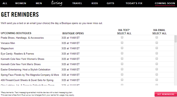
2. Let customers register for product notifications
You can collect individual customer data by asking your website visitors to sign up for product notifications.
This allows them to receive timely alerts about product launches, restocks, or any updates related to their favorite items.
This strategy not only enhances the customer experience but also helps to build your email or SMS list.
Rue La La, a members-only fashion boutique, sends customers notifications about upcoming products and other news via email and SMS.
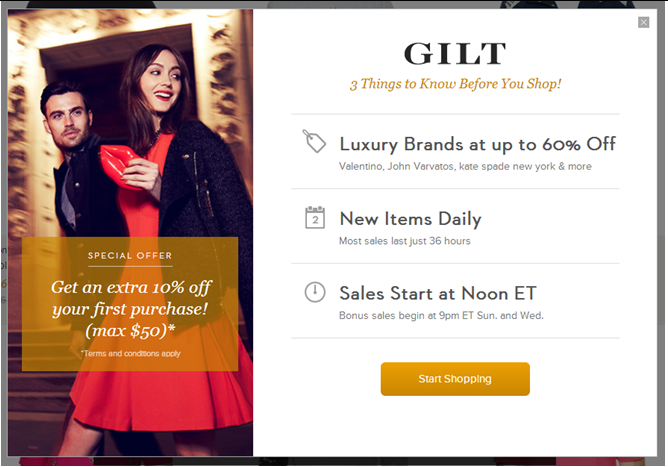
3. Provide sneak peeks of upcoming promotions
Previews can excite customers and increase anticipation about upcoming products or events. This increases the chance that they’ll visit your site repeatedly and complete a desired action (like signing up for an email list or completing a quiz survey).
The Gilt Groupe increases anticipation by informing customers about upcoming sales and scheduling.
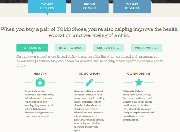
4. Adopt a cause
Consumers are increasingly making purchase decisions based on how well a brand aligns with their values, so companies that stand for something should aim to build loyalty among like-minded visitors.
Standing for a cause can give your target audience a warm, fuzzy feeling that can quickly convert visitors into customers. Think of it as an additional part of your value proposition.
Footwear brand TOMS is a very famous example of this approach. For every pair of shoes they sell, they donate a pair of shoes to a child who needs them.
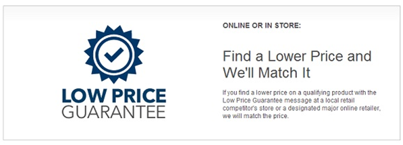
5. Communicate how you’re different
It’s important for your site to have a unique selling proposition that differentiates it from your competitors.
Your customers should never have to go looking for your value proposition. It should be clearly, unmistakably present from the beginning of your conversion funnel.
Best Buy’s USP promises something really unique: an unfettered ability to price match.
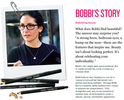
6. Add personality with a story or anecdote
Adding a face and sharing your own story with your visitors will humanize your brand in the eyes of visitors. And visitors who identify with you are less likely to contribute to your bounce rates!
Sharing her own personal story gives Bobbi Brown’s site a personal touch and increases its uniqueness and personality.
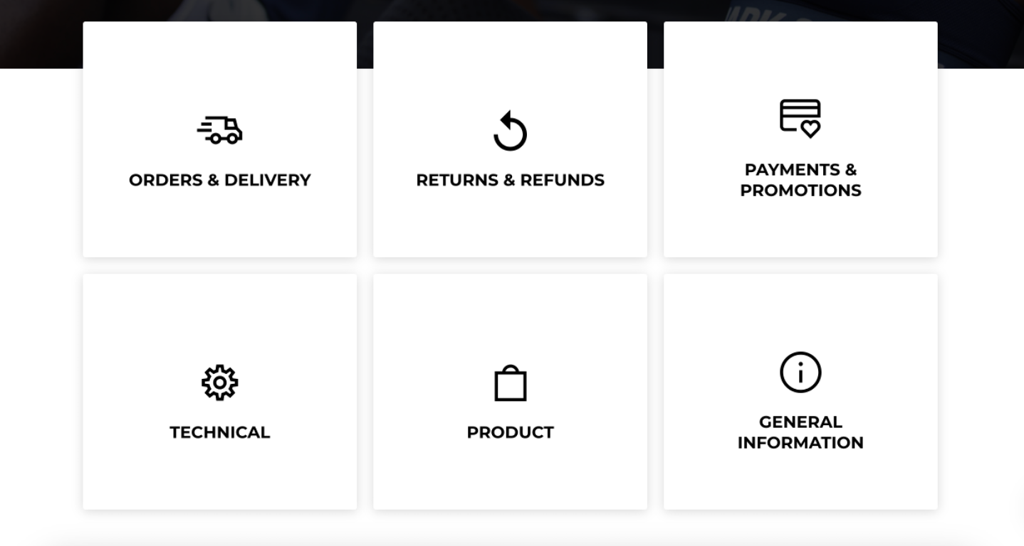
7. Have a good FAQ page
Lack of information is another factor that can hold up website conversions. Site visitors have come to expect a “frequently asked questions” section, which centralizes all information customers typically need in a single location.
Apart from the home page, the FAQ page is one of the most frequently accessed parts of a website.
Here’s what the Gymshark FAQ page looks like.
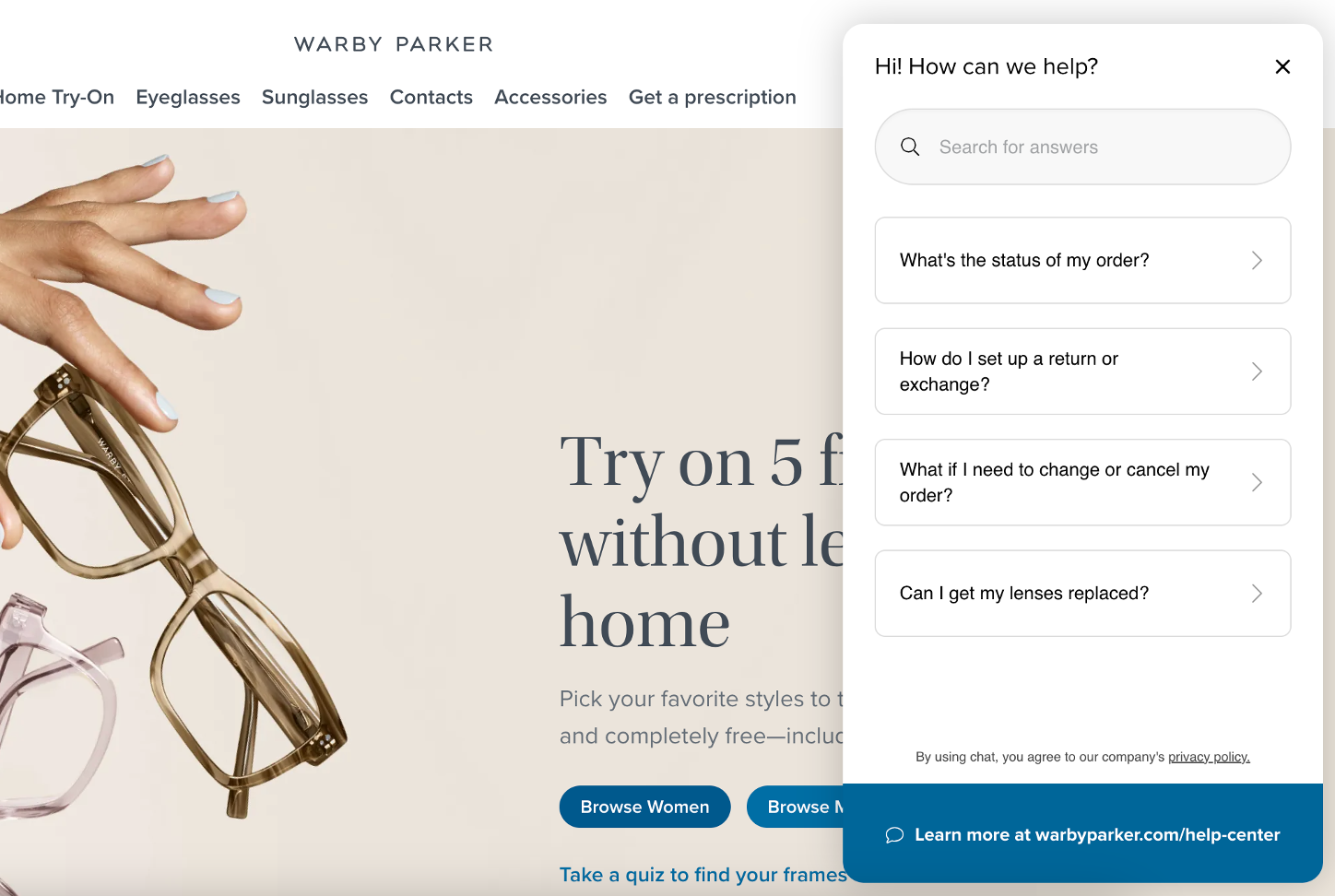
8. Provide live chat
Another way to increase your website conversion rate is by adding a live chat feature.
Visitor needs are often unique, which means it’s not always possible to address every concern in a FAQ section. Most companies let visitors ask questions through email or via a contact form, but nothing beats the immediacy of a live chat tool on your site.
An additional benefit of this approach is the feedback you can gather from your visitors. The more quality feedback you generate, the easier it is to optimize your conversion rate.
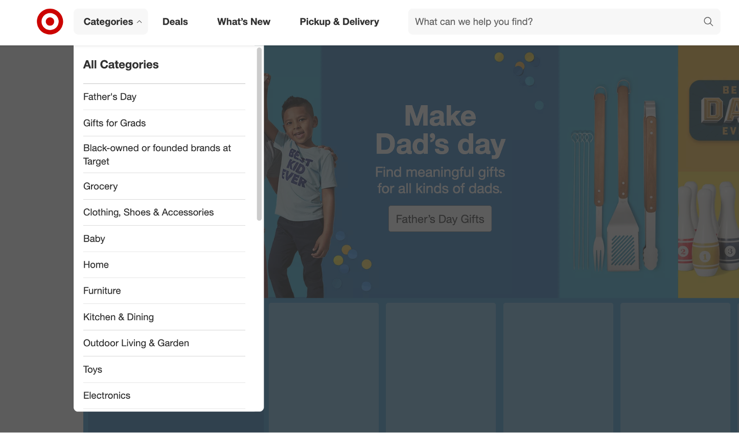
9. Provide an effective navigation menu
An effective menu enables visitors to navigate your site quickly and find the product pages they’re really interested in. The less time users spend figuring out the navigation scheme, the more time they spend shopping.
You should also make sure that mobile users won’t experience any difficulty when navigating your website. Having a functional mobile site is essential for running an ecommerce store in 2025.
Target has a well-organized navigation menu on both their desktop and mobile site.
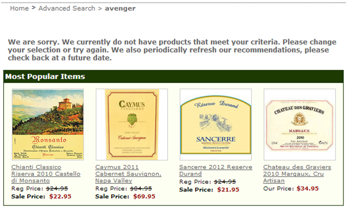
10. Suggest products when a search returns no results
It’s inevitable that some site searches will return zero matches. What you don’t want is for all those visitors to see a blank page and then exit your website.
Even if you have no results to show for a specific search, the results page doesn’t need to be empty. Instead, you can encourage this segment to continue the user journey by displaying product recommendations. Even if these products don’t match the category a user searched for, something may catch their interest!
WineExpress includes its most popular items when a search returns nothing.
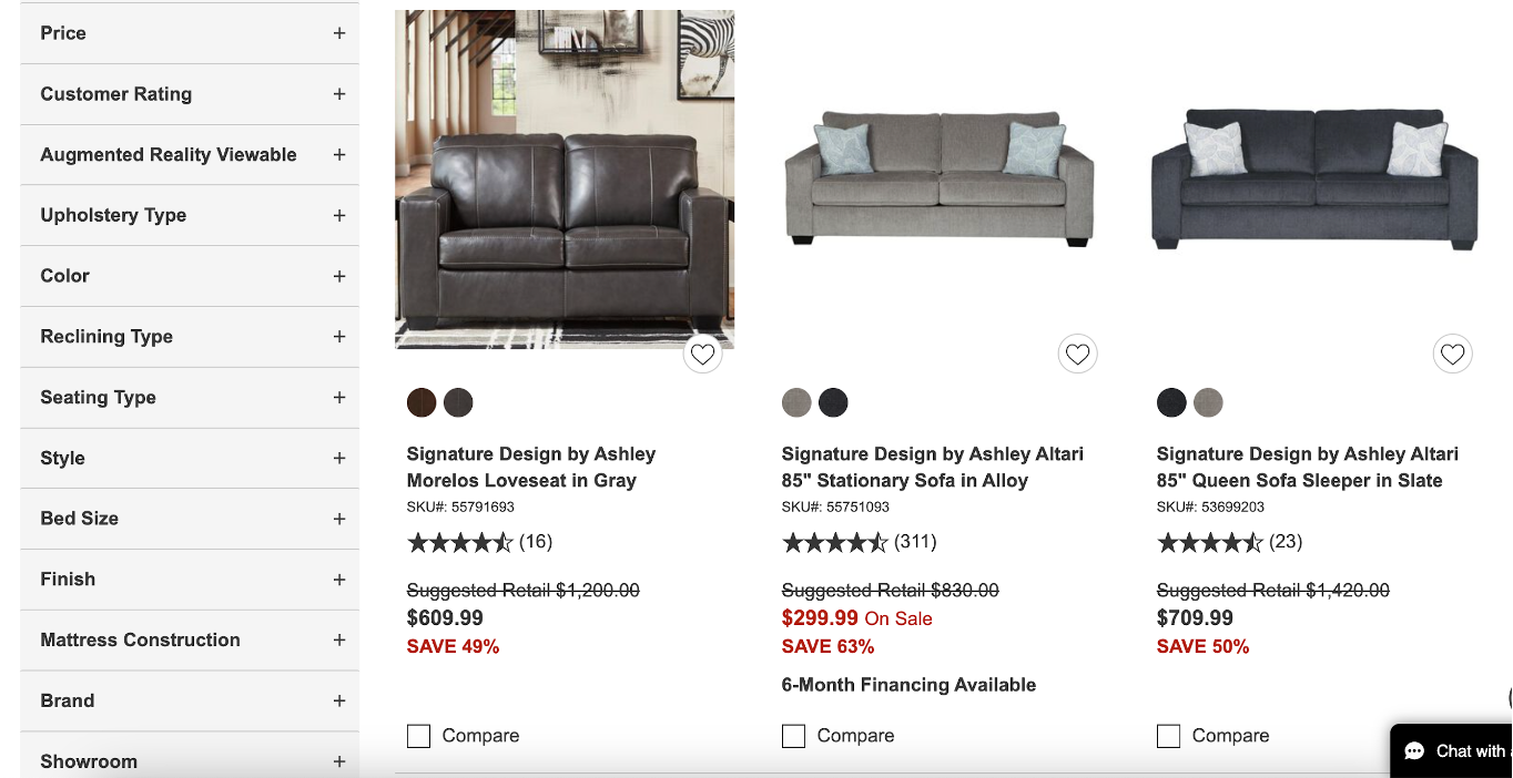
11. Provide filters to improve the browsing experience
When browsing a category or looking through search results for a common term, customers can quickly become overwhelmed by the amount of information available. Filters let them reduce visual clutter and find exactly what they’re looking for.
Nebraska Furniture Mart lets users narrow down their options using various filters including price, color, style, and more. This saves users time and lets them avoid hassles.
12. Have a responsive website
Although design is important, responsiveness is even more important. And obviously, slow-loading pages won’t increase your conversion rate… they’re major pain points in any customer journey.
Making sure your website loads quickly is also an important part of search engine optimization, since Google and other search engines penalize sites with low page speed.
Visitors won’t stick around unless your website is fast and responsive.
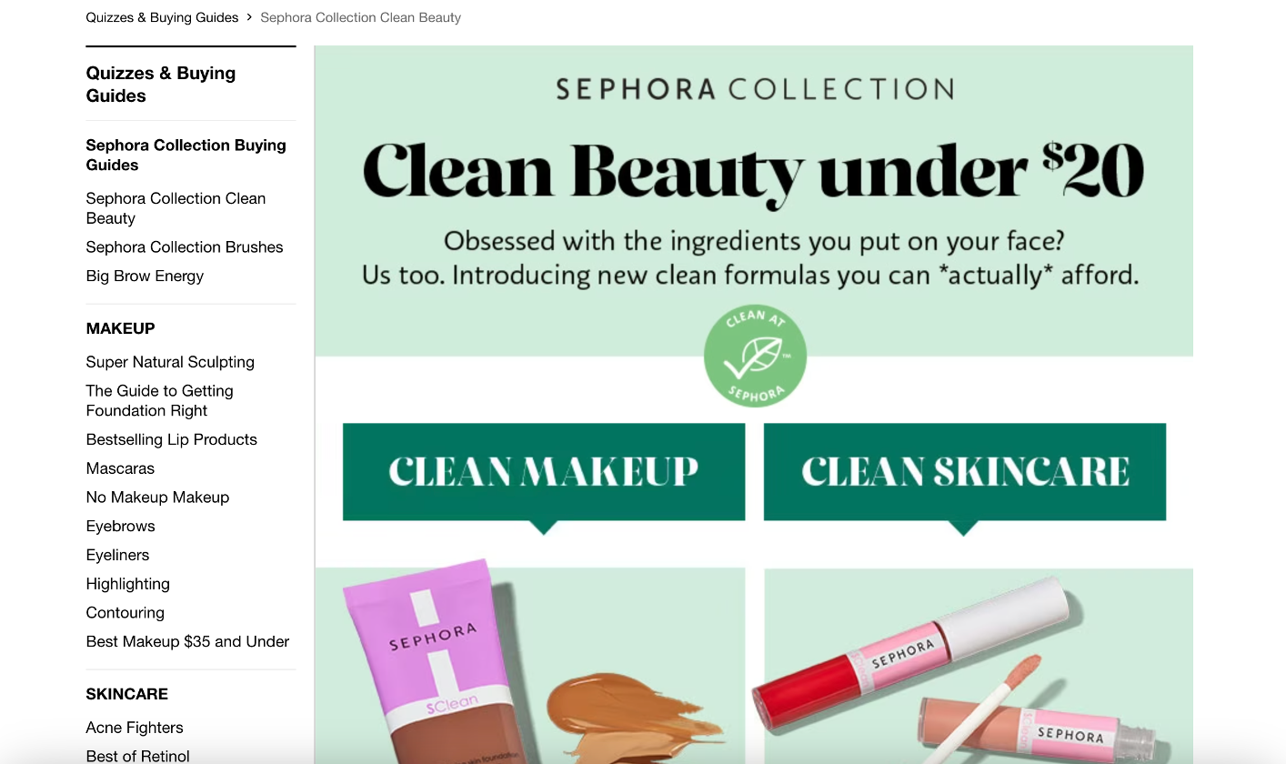
13. Provide a buying guide
Some site visitors are uncertain about what products to buy. You can help them decide with a buying guide, which can be an important page for boosting conversions.
Sephora has multiple buying guides that are really visual and engaging.
14. Use the holidays to increase your conversion rate
Conversion rates naturally spike during the holiday gift-giving period, so make sure you’re taking full advantage of the busy season.
The holiday season, starting from Black Friday/Cyber Monday, is a great time to use sales to attract visitors to your website. Hold a holiday sale or create a holiday gift guide or special holiday-themed sections.
SparkFun Electronics got into the holiday mood with its gift guide for Christmas.

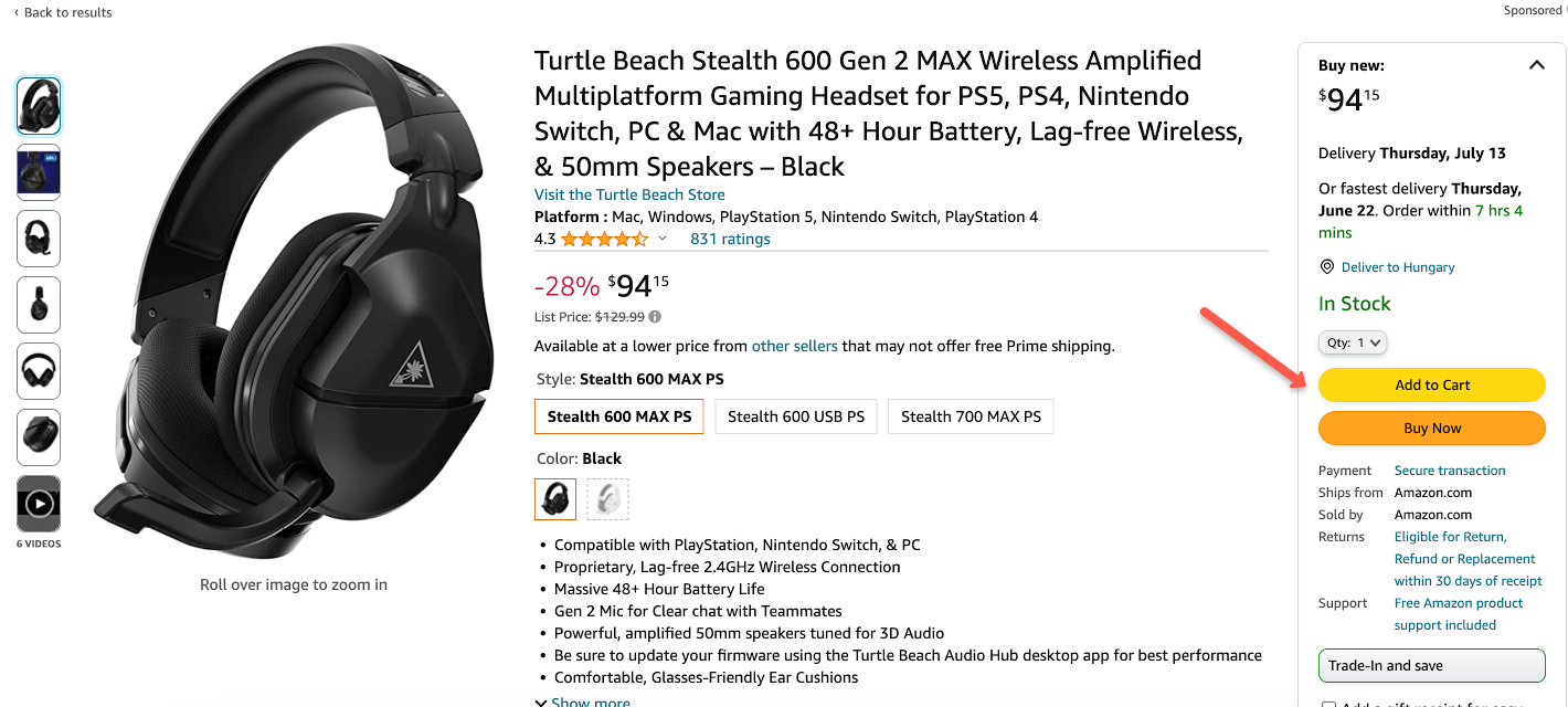
15. Test your call-to-action copy
Your calls-to-action (CTA) are incredibly important, so you want to make sure they’re as effective as possible.
To ensure you have the best combination of graphics and words for conversion on your critical pages, you should conduct A/B testing on your CTA copy.
Amazon has 2 CTAs: “Add to Cart” and “Buy Now.”
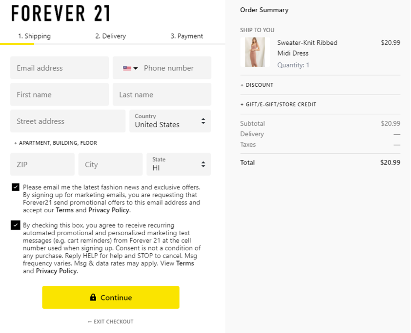
16. Reduce the steps during checkout
Many marketers place a lot of emphasis on the checkout process, which makes sense because it’s a key step.
In order to convert interested visitors into paying customers, make sure that your purchasing process is simple and easy to complete. You don’t want any holdups to get in the way… you want it to be a no-brainer.
This is another place where it pays to make sure the mobile experience is on point.
17. Use cart abandonment popups
Despite your best efforts, some customers will abandon their shopping carts. Something might have interrupted them, they might have found something better, or they might have encountered unexpected costs.
But lowering your cart abandonment rate means more money in your pocket.
That’s why you should track user behavior and be ready to show an exit-intent campaign that can increase conversion rates and help save those visitors:
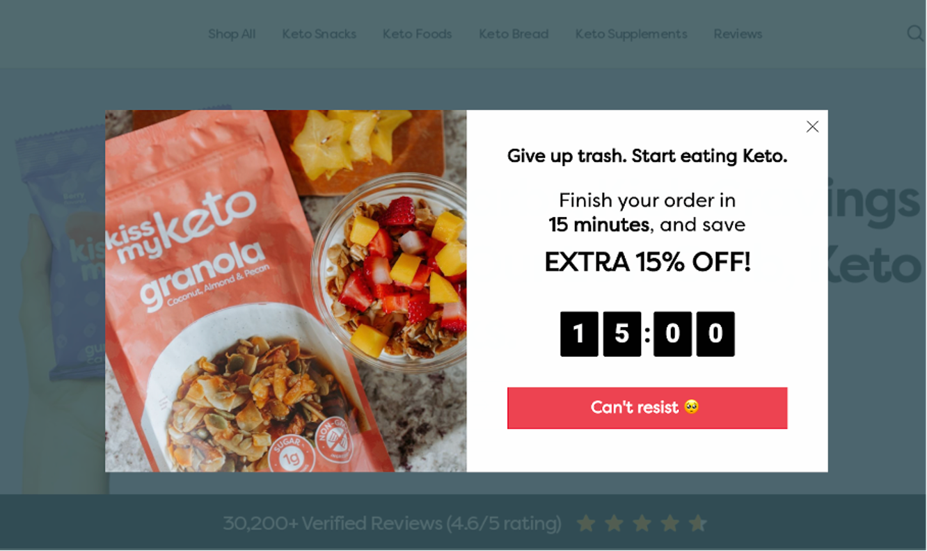
Get started with these cart abandonment popups:
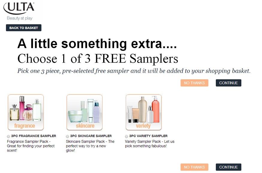
18. Offer free samples
It’s hard to argue with the word “free.” Free samples give prospective customers the chance to try out your product, and if they like what they get, they’ll be back for more.
ULTA Beauty offers free samples to customers who add a product to their cart for the first time.
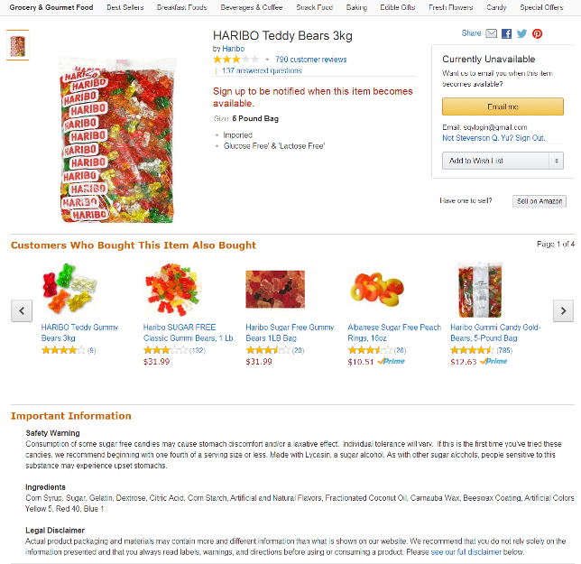
19. Respond to customer concerns
Disgruntled customers are much more vocal than satisfied customers. Modify product descriptions to provide key information and address questions or concerns customers may have.
Haribo responded to customer feedback by adding a safety warning on the risk of consuming too much of its product.
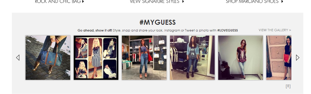
20. Feature user-created content
Social networks like Instagram and Twitter make it simple for customers to share photos of themselves using a product. Capitalize on social proof like this by featuring pictures of people using your products.
Social proof and customer testimonials are usually more effective than company-generated content.
Guess generates social proof by encouraging users to share photos of themselves using Guess products with the hashtags #MYGUESS and #LOVEGUESS.
21. Offer great return policies
A company that has superior return policies compared to the industry norm can build a lot of customer goodwill and give site visitors more confidence to buy.
Money-back guarantees are the gold standard here, but there are lots of ways to increase customer trust and increase revenue.
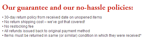
PureFormulas provides better returns than its competitors, with no restocking fees or return shipping fees.
22. Encourage customer reviews
Potential customers will usually check out customer reviews as they’re deciding which products to buy. Visitors consider reviews by actual paying customers to be much more reliable than marketing copy.
More leads will become loyal customers if you empower your sales team to increase your conversion rate by encouraging positive reviews.
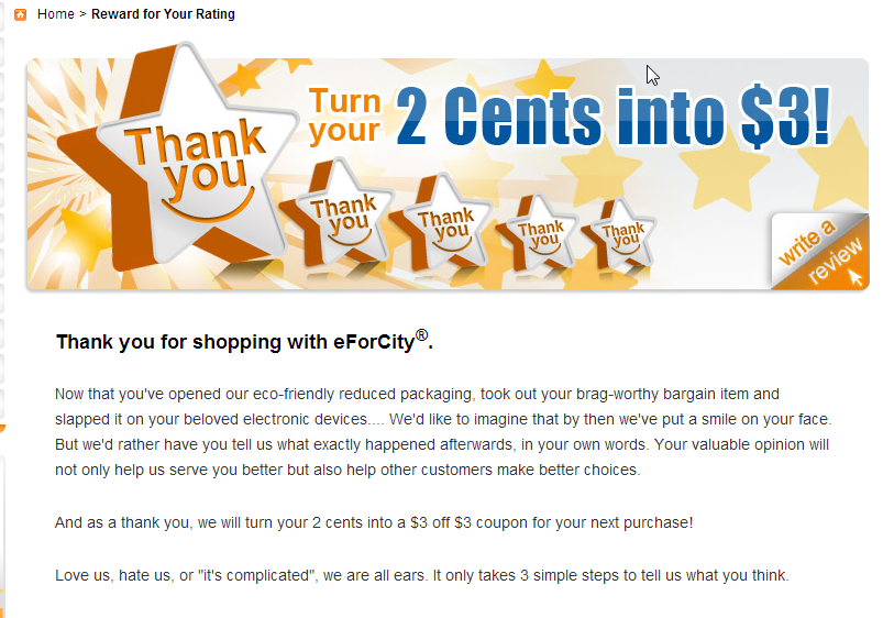
eForCity offers a $3 coupon to customers who review products on third-party sites after purchasing.
23. Highlight cost savings
Hammer home your price advantage by prominently featuring the cost savings your visitors receive if they buy from you instead of your competitors. There are a number of ways to do this effectively.
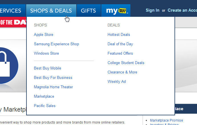
BestBuy incorporates “Deals” into its navigation submenu.
Jimmy Jazz prominently features cost savings on its website.
24. Cut price in a different way
Instead of an outright price cut, consider volume discounts and “buy one get one free” tactics. Although the effect is similar, this helps you move more of your inventory and increase your average order value.
But remember that it’s better to market some products (like software) using discounts, since customers rarely want more than one.
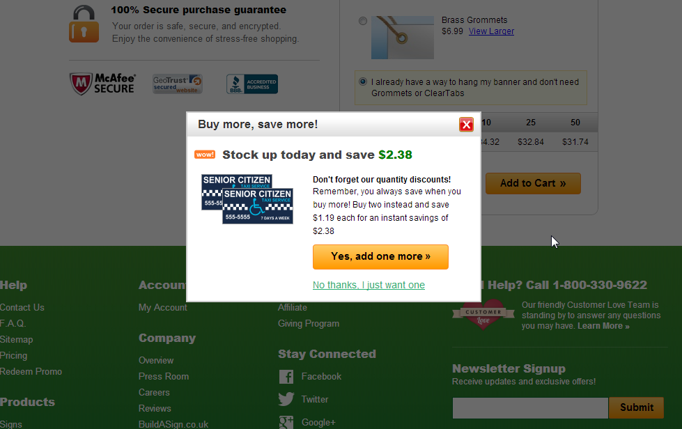
Adding a new item to your cart at BuildaSign.com generates a popup that offers a quantity discount for the second item.
25. Offer free shipping
Free shipping (or a free shipping threshold) is one way to compete on price without actually cutting prices.
You can increase your conversion rate by using a dynamic free shipping bar to highlight how much more your customers need to spend to get free shipping. It’s a simple and effective way to provide personalized content that works to make your site more user friendly and more profitable.
FAQ
What are website conversion rates?
A solid understanding of website conversion rates is a crucial part of running an online business.
In brief, your conversion rate represents the percentage of visitors who took some desired action instead of leaving the page. This action could be making a purchase or signing up for an email list.
Using the simple tactics above, like displaying social proof, ensuring your site is optimized for mobile, and implementing a live chat widget, can go a long way toward increasing your conversion rates.
How to calculate your website’s conversion rate?
In order to calculate your website conversion rate, all you need to do is divide the number of visitors a page receives by the number of people who complete the action you want them to take on that page.
The average conversion rate is a key performance indicator for any online store.
Wrapping up
It’s time to identify areas where you’re losing conversions and start taking steps to plug those leaks. Whether you’re wrestling with a high cart abandonment rate or you have a landing page that isn’t performing very well, there’s always a way to increase your website conversion rates.
We hope you’ve been able to use our list of conversion rate optimization tips and tricks to choose a few steps you can take to start generating more revenue today.


