Conversion rate optimization course
Learn how to optimize ecommerce conversions with A/B testing, popups, and personalization.
Learn how to optimize ecommerce conversions with A/B testing, popups, and personalization.
Hey everyone, welcome to my course on e-commerce conversion rate optimization.
My name is Csaba Zajdo and I’m the CEO and co-founder of OptiMonk. I first started working with e-commerce sites more than 20 years ago and I have about 20 years of e-commerce CRO experience.
I started my first e-commerce agency in 2006 and I actually launched my first course on e-commerce conversion rate optimization in 2008, which was like 16 years ago.
In that past 16 years, I worked with hundreds, if not thousands of e-commerce businesses. So what I realized in the past 16 years is that the principles of conversion optimization haven’t changed that much, but the application of all these tactics, methodologies and techniques that’s needed to optimize and boost conversions is very, very different for small and large enterprises.
And what I’m going to teach you today is how you can best leverage your very limited resources and how you can get the most out of your current traffic and your current marketing.
Before I get started, just a few words about OptiMonk. So OptiMonk is an e-commerce conversion rate optimization platform with all the tools required to boost e-commerce sales from basic popups to advanced AI powered personalization.
There are more than 30,000 e-commerce brands all over the world using OptiMonk and we’ve won all kinds of different awards and we’ve been awarded leader and high performance awards by G2 in the past three years continuously.
So let’s see what I’m going to teach you today.
First, I’m going to introduce you to the key principles of conversion optimization and how all these principles apply to small and medium businesses.
Second, I will introduce you to the key concept and techniques to A/B testing and I will show you in action how you can actually launch meaningful A/B tests for your e-commerce sites.
Third, I will introduce you to popups and other overlays, which I think is probably the most useful technology or set of technologies for small businesses to boost e-commerce sales.
Fourth, I will introduce you to the more advanced concept of personalization, how you can create personalized experiences for your customers, which will not only improve their retention and their customer experience, but it will also improve your bottom lines.
And fifth, I will introduce you to the exact process we are using with our clients to boost their e-commerce conversion rates. Using this practical process and these steps, you will be able to launch your own A/B testing and your own campaign and execute all these CRO tactics on your own.
All right, now let’s start with the introduction to conversion rate optimization.
First of all, let’s see what is conversion rate optimization.
According to Google, it is the practice of increasing the percentage of users who perform a desired action or conversion on a website. So while this is technically true, I like to think about conversion rate optimization in a more generic sense, which is more about basically growing your e-commerce sales.
So I think conversion rate optimization is about growth and about better monetizing your existing traffic. Probably that’s why we usually not just talk about conversion rate optimization, but conversion optimization, with conversion optimization in general, which will not only improve the conversion rates, but it will also help you, as you will see, improve the average order value, increase retention and also improve your margins.
Now let’s talk in general, why do we have to bother with conversion optimization? If we have a look at the interest of your visitors, and we assume that when they click on your ads, their interest is the highest, let’s take it 100%, we will see that as the time goes by, their interest drops significantly.
Even after just a few minutes or one hour, their interest is way down from their original 100%. After a day or a week, it’s only a small fraction of their original interest. And with all the marketing techniques, with all the email SMS marketing, we attack these users, basically with messages, after this initial high interest period.
And with conversion rate optimization, what we can do is really leverage this high interest, and work with the user and help them in this early period, when their interest is still the highest.
Now let’s talk about a couple of myths that I’ve seen around conversion optimization.
The first is there are some magic formulas that always work.
Unfortunately there are no such silver bullets. There are definitely techniques and tactics that we recommend testing out, but still there’s a chance that they will not work for your brand in particular.
The second myth is that conversion rate optimization is just all about A/B testing.
Now A/B testing is important, because you have to test all these conversion rate optimization techniques out. You have to test whether they actually work for you or not. But as you will see, conversion optimization is much more than just A/B testing.
The third myth is that you have to invest a lot to get started.
If you watch a typical CRO course, or you do a certification, you can easily feel that this is the most complicated area or expertise in the world. And yes, it’s true that there’s a lot of complexities that you can get involved to if you want to, but it’s super easy to get started as you will see.
And you can have your first conversion optimization campaigns up and running in a matter of minutes.
The fourth is that it’s something that you have to do only once. Unfortunately, just like as with marketing or with other parts of your business, you cannot just check it once.
While having a one-time conversion optimization campaign can be useful and it can do wonders to your bottom line, ideally it will also build into your habits of your company and you will think about conversion optimization just as you are thinking about traffic generation in general.
The fifth is my favorite is that you don’t have the time or money to do conversion optimization.
I totally accept that you are busy and you have a lot on your plate, but investing a lot of energy in getting people and getting traffic to your site and then just letting them go away without converting, without buying, without actually generating a positive return on your investment is like pouring water into a leaky bucket.
But of course, I’m not saying that conversion optimization has to be your top priority all the time. There are many cases where traffic generation, for example, is a much more important part of your business. If you have a good conversion rate, but you don’t have enough traffic to your website, then of course you have to work on the traffic first.
Now let’s talk about the special challenges you face with e-commerce conversion optimization.
First of all, there’s the issue of quantity, scaling issues. If you have a B2B or a SaaS website, you usually have a couple of pages that you have to optimize.
If you have an e-commerce business with thousands of different products, then of course you have thousands of product pages and often hundreds of category pages that you have to optimize. Running meaningful A/B tests on hundreds or thousands of pages is a very different game than just optimizing one landing page or a few landing pages.
The second is that there can be huge differences in the customer journey and the complexity of the sale, depending on what you sell.
If you are selling low-priced gadgets or you are selling super expensive things like furniture, for example, the whole customer journey can be very, very different. And using the same techniques that often work for low-priced items doesn’t necessarily work the same way for, for example, high-priced products.
The third is there are, of course, logistic and trust issues.
If you are selling a SaaS tool, everything that can be done about that tool or that software can be shown online. But if you are selling a physical product, often it’s challenging to show everything that needs to be shown about that product.
There are also issues about cross-border e-commerce. So if you are selling to multiple countries or all over the world, then it can be a very different game to sell to your people in your own country or to send to people from China, for example.
And the fifth challenge, which I see, is often that the role models are not ideal. For example, copying Amazon for a business is usually a very bad idea.
Amazon is all about speed, choice and price. Three areas where you cannot compete as a small business.
Now let’s see the top three types of conversion rate optimization strategies.
The first is A/B testing, which is probably the most common data-driven optimization strategy in the world.
The second category is what I call popups. It includes all kinds of overlays and techniques which help to nudge the visitors to the desired direction.
The third category is what I call personalization. It’s about improving the relevancy of your messages and creating a more personalized, more tailored user experience to every visitor on your website.
Now let’s see each of these categories one by one.
Let’s talk about A/B testing for e-commerce businesses. So A/B testing is the world’s most widely adopted data-driven approach. It’s about splitting your traffic, splitting your visitors and showing different messages to each segment of your visitor.
Usually we call the original version control and the other tested version variation or challenger version. There are multiple types of A/B testing.
The classic A/B testing is just splitting your visitors into two groups and serving 50-50% different messages.
We also have A/A testing which is basically splitting the visitors into two and serving them the exactly same message and exactly the same content. Why do we do this? We usually just do it to test the platform and the software and the architecture if everything is working correctly.
We also have what we call A/B/n testing.
It’s about serving like A/B/C, A/B/C/D, splitting your traffic into more than two different parts. But the technique and the mathematics behind it is exactly the same as with A/B testing.
And we also have what we call multivariate testing which is about testing multiple things on your website at the same time and testing all kinds of combinations of these different elements on your website.
We can also categorize A/B testing depending what you are actually testing.
When we usually say A/B testing, we often understand the page or web page A/B testing. Having a landing page for example and splitting the traffic that goes to that landing page into two different parts and serving them two different versions of that landing page.
Another part is what we call popup A/B testing, basically having different versions of the overlays of the popups and seeing which one converts better.
And we also have what we call multi-campaign A/B test or journey A/B test when we actually split the visitors into two parts and for one part we show a totally different journey, different pop-ups, different landing pages, different messages than to the other part.
This is the most complex A/B testing technique that you can run on a website.
We can also differentiate A/B testing based on the mathematics that you are actually using. There are two main schools of A/B testing. The one is what we call Frequentist and the other is what we call Bayesian.
I don’t consider it important to understand the underlying differences between the two approach but what I think it’s important to see is that the Bayesian is better suited for small businesses with lower traffic.
So most tools that serve small and medium businesses usually use the Bayesian algorithms.
And there’s another term which you will probably meet if you dig deeper into conversion optimization which is called Statistical Significance.
So A/B testing is very much about chances. When we A/B test a website or a popup for example, we will see that one version performs better than the other. But this better performance, this uplift can be due to the changes that we actually made or it can be due to chance and just pure luck and randomness.
So basically we can never have a 100% probability that one version is better than the other.
We can usually just say that there’s a 99% chance, for example, that the challenger is better than the control. And what you will see in a tool using Bayesian algorithms, for example, OptiMonk also uses Bayesian, is a term called chance to win.
It means, for example, in this case, that there’s a 87% chance that the challenger variant is better than the control, the original version. But it means that also there’s still a 13% chance, roughly, that this uplift, this 4% uplift in this case basically was just purely due to luck and to chance.
Now, the next question is that how many variants should I run parallelly? You can run A, B, C, D and as many variants as you want technically.
But what you need to understand is whenever you run multiple tests at the same time and test multiple versions, you fragment your traffic into multiple pieces.
If you have a website with millions of visitors every month, then of course it doesn’t matter because even if you split your traffic into 10 different pieces, you will have a lot of visitors still left for each different variants.
But if you are a small business with limited traffic, then what we usually recommend is that you shouldn’t split your traffic into too many pieces.
And often it makes better sense to just run an A/B test and test one version against the control. And then if that happens to win or happen to lose, then run another A/B test against the winner of the previous test.
So rather run sequential A/B tests and not run A, B, C, D, N tests at the same time.
The next question is that should I run multivariant tests? Well, it depends how much traffic you have.
If you have 100,000 visitors, which is quite a lot actually a month, then if you test just two elements with just two versions, a control and one challenger variant, it will split your traffic into four pieces. It will result in 25,000 visitors per variant, which is still okay.
But if you test three different elements with three different variations, it will break your visitors into 27 pieces, which will only result in 3,700 visitors. If you have four different elements with four different variations each, it will break and fragment your traffic into 256 pieces with only 400 visitors per variant, which of course doesn’t make any sense.
So I would say that multivariant testing is really for bigger, larger enterprises.
So for small businesses, what we recommend is to run sequential A/B tests instead. Run A/B tests one after the other. So for example, let’s say that you have one A/B test with one challenger version and a control.
If the challenger is a loser, then let’s just discard this challenger version and go to the second version and test this control, the original control against the next challenger, version C for example.
But if this challenger beats the control, then let this new challenger version become the new control and the next A/B test should test this new control basically, the previous challenger against the next challenger.
See? And this is how you can really A/B test the fastest with a limited traffic on your website.
Now the next question is whether you can run multiple A/B tests at the same time. Now an A/B test purist would say that no, you can only run one A/B test at the same time. Yes, it’s true that that’s the ideal case.
And if you have millions of visitors each month, then you can definitely do that just one A/B test one after the each other very quickly. But again, if you are a small business, then often running one A/B test takes time. So in these cases, I think it’s definitely a must and it’s definitely possible to run A/B tests parallelly.
What you have to be careful about is not to have conflicting A/B tests running at the same time. The next question is which conversion goal should you choose for your A/B test? Basically, what you want to optimize for. While it seems obvious that you want to optimize for orders, right? And revenue, it’s not so clear in practice.
Let’s see an example. Let’s assume that you want to A/B test the key banner, for example, on your homepage.
Let’s say that you have 30,000 homepage visitors. And out of that, like 10% of this traffic clicks on the banner, 3,000 clicks. And out of the 3,000, maybe 750 goes and adds a product to cart. And then maybe 250 actually orders that product.
If you pick the orders as a conversion goal, then you will probably need more than 30,000 homepage visitors to decide which banner version actually performs better. But if you choose an upper funnel metric to optimize for, like, say, clicks on the banner, with this 3,000, probably 10,000 homepage visitors will be enough to decide which banner version actually works the best.
And of course, it can be misleading because banner clicks doesn’t necessarily equal revenue and orders.
What I’m just saying is that if you want to A/B test faster, then you have the chance to choose more upper funnel metrics, and then you can just simply learn faster.
The next question that we often get from clients is that, how long should I wait to conclude an A/B test? Now, it’s a very good question, because you very much have to beware of fake losses and fake wins.
There’s a good example which I like on the CXL blog. In this example, after just running it for one day, there was 11 conversions on the control, and there were one conversion in the variation, the challenger.
Based on this one, the chance to beat, the chance to win, basically is 0%, which is not too much. But after a few days, the tide has turned, as you can see, and the variation has 106 conversions, while the control has 87 conversions, meaning that the chance to win became 95% for the variation.
So, to avoid the fake wins and losses, you definitely have to wait until your chance to win is, first of all, more than 90%, but ideally more than 95%.
Second, each variant should have at least 50 plus conversions. If you have like only 10 or 20 conversions per variant, then there’s a huge chance that you conclude too early.
And the third is that you have to run your test for at least a couple of days. If you conclude your test in one day, there’s a huge chance, again, that you are running into a fake positive or negative.
All right, and now that’s about the theory, and now let’s see in practice how to run A/B tests in an e-commerce site.
Let’s start with the easiest thing. How to just A/B test your popups?
Let’s just assume that you have a popup, a list building popup, for example, and you want to A/B test different messages for this popup. This is as easy as it gets, because all you have to do in your OptiMonk account is to set up different variants, basically duplicate the existing variants, change the copied or the other things that you want to A/B test, and then just simply run this campaign.
You can also turn on the automatic evaluation, so basically keep only the winner variant running, meaning that when one of your variants actually loses with a high enough confidence, then the OptiMonk will automatically turn off this variant.
I think this is very useful if you don’t want to check your campaigns on a daily basis. Now let’s see how you can test a popup versus no popups at all.
Why do you want to do this? If you want to decide if your popup actually generates you revenue and extra money, then you can just simply run versus control, which means no popup at all.
This is how it looks like in the OptiMonk interface. This is the variant, you know, the popup, and this is the control version, where there will be actually no variant or no popups will be shown.
The methodology behind it is exactly the same as you are running popups. 50% of the traffic will see popup and the other 50% will not see.
And of course, you can measure the performance of these campaigns, not just on leads and on campaign conversions, which is like subscription, but you can also measure on other goals like visitors with orders, how many people actually bought, how many people actually put something into the cart or view new products.
You can create custom goals if you want, but you can use the built-in goals like the visitors with orders or visitors with carts and optimize for these conversions.
If you need deeper insights, you can always use the campaign analytics. And here in the left, in the campaign analytics, you can actually measure your performance of your campaigns even deeper.
In the visitors with orders tab, you can see and compare your versions and your campaigns based on their effectiveness of turning visitors into actual customers. Or in the visitors with carts tab, you can measure the performance based on their ability to make people add something to the cart.
Or you can even see deeper order metrics like how much money they spent or what was the average order value for each of these segments and see the revenue uplift for each different versions.
Now let’s see the next challenge. How to run a web page A/B test?
Let’s assume that you have a landing page or a homepage or any other important page which where you want to A/B test the copy of your website. For example, this is our homepage and let’s assume that we want to A/B test the key headlines, sub-headlines or even the CTA text.
There are multiple ways to do this, but I’m just going to show you the easiest one.
The easiest one is basically to just go into your OptiMonk account, create a new campaign, click on Optimize Website, click on Smart AB test, just choose the domain or the URL which you want to A/B test. And then first, our AI will find all the different headlines that’s probably worth testing.
For example, here on this homepage, it found 11 different headlines and it will also recommend different versions for each of these headlines to be tested.
Of course, these are just recommendations and you are free to change these recommendations in the next step. If you click on Edit and Preview in the next step, our dynamic content editor will load.
This is how it looks like. You will see with this purple that this element has a recommendation and there’s a change here. And that you will also see that here in the preview, you can basically open the preview and see how it actually looks like all the changes.
If you want to actually see and change the AI generated copy, you just have to click on this element. And here you will see that these are the five different versions that was actually set up as an A/B test by the AI. Again, you can just simply edit them, add new versions of your own or delete these existing versions.
And that’s it. And then just click on Next and you can basically start this A/B test. And our Smart A/B Testing will do everything for you.
Basically, it will run sequential A/B test. If you give five different versions, for example, it will start with the first version. In this case, as you can see, it started in this A/B test against the version number one.
And as you’ve seen, it ran actually 10 days, this first version. And even though there were some uplift in conversion rates, 7% actually, it hasn’t reached statistical significance. It hasn’t reached the 90% chance to win that we require a challenger version to have to be the control.
So basically, it discarded this challenger version and went to challenger version number two. And now here in this example, this second test is running. And here, this new challenger version is actually losing at the moment.
But of course, as you can see, the results are still early. And it starts, stops, evaluates, does everything again for you. So you don’t have to always come in daily and check the results.
And if you come back later, when the Smart A/B test is already finished, this is something that you will see. From here, we can see that yes, the first version was promising, but discarded. The second version actually lost.
And the third version was actually a winner with a 97% probability of beating the original version. So now this third version can be considered the winner. The smart A/B test keeps this third challenger variant running until you hardcode this version and replace the original headline with it.
Now let’s see a third and probably the most difficult example how to A/B test product pages. A/B testing product pages is quite difficult. Why? Well, because most brands have a lot of product pages.
If you want to just test one product at the same time, then of course, it’s easy. But if you want to test all the product pages together and see, for example, if adding an extra summary, short summary will improve conversion rate, it is a very difficult game, except if you have the right A/B testing tools.
Now let’s see how you can do it within OptiMonk.
First of all, you have to open the dynamic content editor and open up just one product page. For example, this is an example product page, which I opened. Now you have to just pick the element where you want to insert the extra element.
So for example, let’s assume that we want to insert a smart element below this headline. After clicking this add the insert smart element, we will see that there are like four different smart elements already configured in this account. Tagline one, tagline two, summary and benefit list.
All we have to make is just click on the use this and this extra headline will be added. And of course, this can be formatted into the look which you prefer. And even though you’ve only added this smart element to just one product page, the system will automatically insert it to all the product pages.
So this way you can very easily A/B test it, very similarly to just one landing page or just one pop-up, having one original, the control version when there’s no AI generated summary. And there will be one version, the challenger versions, where we have the AI generated summary. And again, compare the performance of these campaigns based on any conversion metrics which you prefer.
And then of course, in campaign analytics, you can compare the performance of all these different versions and all these different variants based on any conversion goal and data you want. Based on orders, based on revenue, based on add to cart.
And now let’s get to the next chapter and see how we can use popups to boost conversions.
Hey everyone, now let’s see the second big category of converged optimization, which we call popups and other overlays.
First of all, why do we use popups at all? I think the most important reason is that they are the best tools to take initiative of the customer journey. This is how you can basically nudge the users very slightly or more aggressively, depending on what you want, towards the desired direction.
There are multiple types of popups, as you can see. Often we also consider full-screen style messages as popups, and they are all based on the same overlay technology. The main difference is how assertive they are.
Of course, full-screens are the one that blocks fully the whole page, nothing is working, and it commands absolute focus. While sticky bars or teasers are more subtle, they can just run and be there, and you can use the website while they are there. So they provide a more elegant, less aggressive way to communicate your messages.
Now let’s see what are the rules of using popups the right way, how you can not annoy your visitors. The first and most important is to have the right message. What is the right message? Well, the number one rule for the right message is that the customer has to care about the message.
If the customer doesn’t care about your message, it’s like putting lipstick at a pig. It might look better, but it will still be a pig. Having the right message to the right people is what we call the customer message fit.
If our messages overlap with the customer’s needs, that’s when we have CMF, customer message fit. This is when the customer feels that this message, this offer is exactly what I need.
And of course, if your messages doesn’t meet with the customer needs, then the customer will just say to your message that who cares, and they will leave your site without buying and feeling that this is not what I need.
So this is about showing the right message to the right people. And of course, the challenge is that your customers are different. The most important differentiator, I think, is the customer awareness.
How far, how deep they are in their own customer journey when they visit your website. From the very beginning of they are even unaware of a problem they have, to the fully aware when they already know basically everything.
Let’s see a couple of examples what kind of messages resonate with the different user or customer awareness stages.
For example, if someone is already a product-aware visitor, and they know what your product is about, and they are contemplating buying your product, then having this classic smart discount popup is usually a good way to turn them into customers.
But this is definitely not the ideal message for all visitors. If the user is still very much in their early stages, they are just discovering what your product, your brand is about, then well, this message can feel very much like this lady on stage.
So let’s see what can be ideal for an early stage or problem-aware visitors. Well, for example, if they are just reading your blog about relaxing, then probably providing them information, e-book, or some other lead magnets can be often more effective than offering a 10% discount to buy right away.
Or if they are already solution-aware, for example, and they know what type of product they need, but they are not sure about the right product, then probably helping them choose the right product and nudging them to discover more of your products is probably a better idea than trying to rush the purchase and close the sale right away.
And of course, if someone has already decided, they already know what they want to buy, they are returning visitors and they just want to buy something and they are just back to finish the purchase, then again, no need to offer them a 10% discount and to subscribe.
So for returning visitors, for example, this is a much better alternative to just help them continue where they left off in the previous session. Also, if they are product-aware and you want to keep them on the site and encourage them to finish the purchase, you have still options besides giving them a discount.
For example, you can just remind them of all the products they previously viewed or added to the cart. Or if they already subscribed to your newsletter and get this discount code, usually it’s a very useful best practice to remind them of this discount code until they actually come and finish the purchase.
Okay, now let’s see a couple of best practices to maximize conversions.
First is that it’s very useful to keep your offers relevant and increase somehow the fear of missing out. If your offers feel very generic and the customer feels that, oh, this offer will be here next week and or next month as well, it’s usually less exciting or less desirable.
So just simply packaging, for example, your messages into some seasonal flavor is a very good way to actually boost the efficiency of your messages.
Or using countdowns to increase fear of missing out is also a very well-known and working tactic.
The next advice is to break your popups down to multiple steps. Instead of putting everything on one screen, it makes sense to just break it down to very simple, easy steps.
On the first page, all you need is a commitment that they are interested. They should just click on the button, save 10%. On the second screen, you can ask for the email address.
And on the third page, you can offer them the discount code and you can also already have them start their journey by recommending some product, probably your most popular products.
This is the psychology behind one of the most powerful tactics, what we call the Trojan Horse, which was developed by Jason K. Williamson, a friend of mine. So here on the first page, you just ask for an email address.
On the second page, do you want to upgrade your discount to 15%? Yes or no. If they click on yes, then you ask for the phone number. So instead of just asking for an email and a phone number at the same time, you just separate it into multiple steps.
And this will usually improve the conversion rate of these popups by around 50%. And with this, you will definitely be able to get much more email and SMS subscribers than just, again, asking for everything right away. Next, you should also use smart teasers.
Smart teasers are things, these small widgets, which basically remind the visitors of an offer in a non-aggressive way. They can be displayed before the popup is displayed. This is especially useful if you are using your pop-ups in an exit intent mode, or they can be displayed when the popup is closed.
Usually, they have to improve the conversion rate of your popups by around 15% to 20%.
Again, one small hack is to delay the display of your closing X button. If you only delay it by just like two or three seconds, the customers will not notice that actually it’s not there, but it will stop them with the automatic reflex of clicking on the X button without first actually reading your message.
My next advice is that during your messaging, you should always try to use some kind of emotions. Your visitors are humans, and as humans, they are more prone to respond to messaging which contains some emotions.
Adding some mystery to your messaging is also helpful, especially nowadays when a 10% or 5% discount is quite generic.
Often, it could convert better if you package it into some kind of mystery. All right, so this is about the messaging. And of course, having the right message is important, but you also have to choose the right segment to target and trigger your popup at the right moment.
Some messages are more ideal as a welcome popup, for example, and some messages are much better delayed as an exit popup or after, for example, scrolling down 50% on the page.
One more advice is that you shouldn’t overdo it. In one session, in one minute, there shouldn’t be popups appearing all over.
But of course, if you run multiple popups or campaigns, this can happen, unless if you are using the User Experience Protector, which is a built-in feature of OptiMonk to avoid accidentally overwhelming visitors by more than one popup.
We always recommend keeping them in the normal mode, or if you want to be extra sure that none of your users will get annoyed by too many popups, you can even turn it on the safe mode. So basically, it’s an artificial intelligence running in the background and making sure that your visitors will not get overwhelmed by messages.
And so far, all these advices were about improving the conversion rate of your popups, getting more sign-ups, for example. But according to the data, more than 80% of the sign-ups who require a 10% discount will not actually redeem this discount code.
And there are ways, definitely, to help the user to nudge the visitors to actually redeem this discount code.
One technique is to use what we call coupon auto-redeem. Basically, all you have to do if you are using a Shopify store is to turn this one on, and then when the user gets the discount, it will automatically be applied in their Shopify checkout. The next is to use follow-up campaigns for discount codes.
For example, don’t forget your 10% off. Using this discount code until the purchase actually happens is usually a good way to improve the redemption rate of your discount codes by around 10% to 12%.
And you might think that using a simple, easy-to-remember discount code like Shop10 is the easiest way to make users use it.
The data says that actually using something more unique and generating, for example, automatically a unique discount code for every visitor is a much more effective way if you want to improve the redemption rates.
So these were the most important aspects of building powerful pop-up campaigns. And now in my next session, I will turn to the more advanced personalization tactics.
See you there.
Hey everyone, welcome to the personalization part of my e-commerce CRO course.
So what is website personalization? Well, it’s the process of delivering the best possible experience to every visitor on your website. Basically the right message to the right people at the right moment.
According to Neil Patel, personalization is the new conversion rate optimization, which is true that personalization is probably the most advanced way to improve conversion rates.
As you’ve seen in the popup section, visitors are diverse. Each of your visitors are different. And one of your visitors might be just in their problem aware stage, reading an article and trying to find a solution for their problem.
While the other visitor might be a returning visitor who already knows your product, they know which is the right solution for them, and they have already subscribed to your newsletter.
Of course, these two users will resonate to very different messages. The first one, the problem aware, will probably resonate better with a get a free guide and learn more about the topic type of message, while the product aware visitor will probably better respond to a nudge to finish the purchase.
This is what we call the customer message fit when your messages and the customers actually meet, and in the overlap, this is the customer message feed when the visitor will feel that this is exactly what I need.
But if your messages don’t meet with the customer needs, then the customer will not respond to your messages.
So website personalization is basically about improving the relevancy of your messages. That’s it.
Now personalization is very data intense. So basically you need data about the visitor to be able to personalize your messages based on something.
So let’s see what kind of data do you need and what kind of data do you actually have. You usually have much more data than you would probably assume.
Even when the user has just arrived and they did nothing on your website, you already have a lot of what we call first-party data.
Location, campaign parameters, keywords, landing pages, you already know what they are mostly interested in.
Then, after they start browsing on your site, for example, you already see their browsing history, their searches, how much time they spend on each of your products, for example, what they are scrolling at, what they are interested in.
After they signed up, for example, then you already have their email address, you already know if they previously purchased, you can already ask them questions and basically collect zero-party data about them.
And after the purchase, you have the purchase history, you have the previous interest, you can see how much price sensitivity they have, and so on.
And based on all this, there’s a ton of opportunities to personalize your messages.
Let’s see a couple of examples. One of the easiest way is to personalize your messages based on location. The IP address of each visitor will tell you where they are from.
If you sell cross-border, you can very much personalize any of your messages based on location. Just like BlendJet did with these messages of communicating a different message to UK customers and to Australian customers.
You can also show a different message based on whether a user is a new or returning visitor. For returning visitors, this is one example of showing them some glad to see you again message.
Or you can personalize based on referral. If the user was referred by, for example, a good brand or a big affiliate partner of yours, then you can definitely personalize your welcome message based on this information.
Or personalize based on purchase history. If they’ve already purchased previously and they are a VIP customer, you can treat them so.
Personalized based on traffic source. If all you have is a traffic source that says they are coming from Instagram, for example, then you can still mention this fact and give them a discount because they came from Instagram.
Or you can take it even deeper, and if they were referred by an influencer, for example, then you can personalize the message based on this influencer.
You can also personalize based on zero-party data, meaning that you collect the type of data you actually want or need to personalize. For example, if you are selling custom pictures of your pets, just like Crown and Paw, you can ask a qualification question after they subscribe that, hey, how many pets do you have?
And if they answer, like, two, for example, then you can show them products which are personalized based on the answer.
If they only answer 1 or 3, then of course you will show different products. This is a very easy-to-achieve type of personalization for your welcome popups for example.
Now let’s see a more advanced personalization when you actually personalize the landing page headlines based on the ad copy.
So for example, if you are promoting reverse the signs of aging, then the landing page will say, say goodbye to wrinkles.
But if your ad promotes prevent hair loss and bald spots, then regrow healthy hair fast will be the landing page message.
The landing page is the same and the offer is the same, but the headline is actually much more relevant to the ad that the visitor actually clicked on.
Or if the visitor has seen super collagen protein, then the message will be the best tasting collagen protein.
How can you achieve this? All you have to do is some kind of first-party data based on which you can personalize.
So for example, if you have UTM campaigns and you use custom UTM campaigns for each of your ads, you can personalize this landing page for the UTM campaign equals weight loss with a weight loss message, and of course for the UTM campaigns equals better sleep we’ll see a message that better resonates with a better sleep ad.
And of course, using this method you can personalize based on any demographic property you can use for targeting your ads. For example, even genders or interests, or any other property if you can use it in your UTM campaigns you can use it for personalization.
Here is an example how you can use for example this property to personalize your welcome popups based on the message.
If someone came from an ad that promoted better sleep then of course the popup will promote sleep recovery products. And if someone came from an ad promoting weight loss then the popup will promote weight loss products.
There are ways to personalize your messages without actually having to create all these manual different versions.
Now let’s see how you can add the personalization to any campaign in OptiMonk in practice.
For example, let’s assume that you have this popup campaign which you want to personalize to different segments.
All you have to do is just click on the Smart Personalization in the bottom right corner and then you will already have two experience versions.
This is what we call personalized experiences. This will be an ordered list of experiences. The experience below will be the fallback version and the experience B will be the primary experience version.
And you can decide who you want to personalize this variant for. So here for example you can see that I renamed them to international visitors and US-based visitors, these two experience versions, international visitors will be the primary. So if the country of the visitor doesn’t contain, is not United States, then this international version will happen.
But of course, if the country equals United States, then the US-based version will be shown to the visitor.
Or another more sophisticated example, here as you can see, there are five experience versions, visitors from the US, visitors from Canada, visitors from the UK, visitors from Australia, and rest of the world, for example.
Again it’s a prioritized list of experiences, meaning that first, the system will check whether the conditions of this first experience version meets the visitor.
If it does, then it will show the variant which this experience contains. If the visitor doesn’t meet this condition, then it will go to the second one.
Is it from Canada? No, he is not from Canada, so let’s go to the next one. Is he from UK? Yes, he is from UK, then we will show them the UK version.
And it goes step by step, and if none of the conditions of the first four variants are met, then it will show the fallback, which is the bottom, the rest of the world variant.
Now let’s see an even easier way to personalize your messages.
Let’s say that you want to personalize this popup, that it will not always show 50% discount on all products, but it should be personalized for each category. Then you can use the category name smart tag, which looks like this.
The system will automatically replace this smart tag with the name of the category the visitor is actually browsing at the moment. You can use it, of course, not just for category name, there are multiple smart tags you can use.
For example, you can use it to personalize your messages based on the country. And use the country name smart tag to insert the name of the country the user is browsing from into your popups.
Or you can use the name of the current month smart tag to make your popups seem relevant and always display the actual month in your popups, and for example, in April it will show April special.
You can use this one to create all kind of different messages including showing the January best sellers and always showing the current best sellers fully automatically by using smart tags in the headline and using the most popular products in the product recommendations.
This will create a relevant personalized message which will keep relevant without you actually having to come in and update this message. And if you want more we also have AI that you can use to personalize your messages.
So basically you can create a really truly one-to-one personalized AI-generated headline for each of your popups based on the content, based on the blog article for example the visitor is actually seeing.
This is a more advanced tactic, which I will not get into too deep, but this is the future where we are actually heading.
And now in the next phase, I will put all of these together and I will show you exactly what we are doing when we are optimizing our clients’ websites. See you there.
Hey, welcome back to the final chapter of our e-commerce conversion rate optimization course.
In this chapter, I’m going to walk you through step by step the process we are using to optimize our clients’ websites.
Before we get started, I highly recommend to download our worksheet. This worksheet as you see is a Google Sheet with some very useful information and tabs here.
You will see a summary of the methodology, a sample project plan and some other very useful material which I will cover later.
Okay, but this is the link that you should use. Just open it and make a duplicate version of this worksheet.
All right. Now let’s see the methodology itself.
We use a three-step optimization process. The first step is the analysis. This is where we collect all the ideas that’s worth testing.
The second is the launch. This is where we set up all the campaigns that need to be tested.
And third is the optimization process when we evaluate the results and we make decisions based on the results.
So let’s start with the first step, the analysis part. The very first step of the analysis is what we call the opportunity discovery.
We prefer this name opportunity discovery than finding problems to solve or something like that because each of these problems are basically opportunities to get more sales and more conversions.
The first part is what we call is basically a technical analysis. To see if the website is fast enough, if it’s built up correctly, if it’s not broken.
These are the, I would say, the basics to see if there’s some big technical issue that’s causing the user to abandon the sale.
The second is we check Google Analytics or some other source of data to see what are the starting points for conversions, cart abandonment, sales, and other key metrics.
In Google Analytics, you can also find a lot of data to see where are the problems in your customer journey.
Data is the best way to see that this or that channel for example is converting poorly or that landing page should perform better.
So the data shows you where are the problems, but the customers themselves can tell you exactly what are the problems?
From Google Analytics you will see the key areas where you need improvement, but it will not tell you how you can improve those areas.
So you will need other ways to learn the actual reasons for the poor conversion.
This is where the feedback collection comes in. Feedbacks directly from the customer is usually the most trustworthy data to see what’s the problem.
What is stopping you from buying your glasses for example, and other popups, side messages, and other messages could be an ideal way to get relevant information from your customers.
It can also be like a simple feedback popup. Hey, how satisfied are you with the shipping? Or it could be like an NPS score, Help us improve, after the purchase, or when someone is just trying to leave, just ask them, hey, help us improve, how would you rate your shopping experience.
If they respond with an 8, 9 or 10, you can just thank them and probably ask them to provide a review. But if they rate you somewhat in the lower range, then you can just ask them that, hey, sorry to hear that, what can we do to improve our experience? And provide them an area where they can type their feedback.
If there’s no way to collect direct feedback from your customers, you can still use heatmap or other mouse tracking software and watch the exact customer sessions and look for problems or issues you might solve.
HotJar or Clarity from Microsoft can provide an ideal and easy way to see patterns that might be problematic on your website.
Then you can also talk to your customer support. The customer support is usually the channel where most of the direct customer feedback is collected. You can just ask them that, hey, what are the top 10 reasons which we get from clients regarding the purchase.
You can also do direct customer interviews and ask them directly questions hey what was what were you looking for, what stopped you from buying.
And of course finally what we call heuristic analysis basically gut feeling just based on the experience based on what you know, based on your information and their knowledge about the market what could be stopping the users from buying? How you might be able to improve the user experience?
As an extra, what I would also recommend is to just use this checklist in the worksheet of ours.
Here you will find a list of questions where you can just have to answer yes or no questions.
Basically, it’s a survey with 30 something questions and based on your answers, this checklist will provide you a list of opportunities. And not only just a random list, but it will be prioritized based on RICE score.
This RICE score is one of the most popular prioritizing methods. Reach, impact, confidence, and effort.
This is the exact methodology we are using here. It’s not important to memorize this one, I’m just showing it to you.
And this is how the optimization plan actually looks like. So for example, this is the opportunity, this is the recommended tactic. You can click each tactic, by the way, and it will take you to the exact tactic and how to set it up. And there will be a priority. So you can basically start with the top priority or you can just use it in your own decision making.
So this was the analysis part. Now comes the step number two, launching the top campaigns which you think will provide the best ROI and the biggest impact on your sales.
The campaign creation process in OptiMonk is quite easy. You have to install the code, the JavaScript code. Activate the Shopify app embedded mode if you are using Shopify, it’s rather easy.
Then you just have to create your campaigns. There are basically, we have two editors, one for the popups and other overlays, which looks like this. As you can see, you can edit both on the desktop and the mobile versions.
You can use themes, meaning that you can customize your own template family with your own colors, with your own fonts, and you don’t have to always set it up for every popup for every campaign you are actually using.
And you can also use the so-called saved styles, meaning that you can save any custom formatted button or other element as a unique style and you can reuse these elements later in your other campaigns.
And we also have the other editor which we call the dynamic content editor. This is where you can set up the website A/B test and the website personalization.
Here as you can see you can just open up the page and click on the elements which you want to personalize or A/B test. Just click on them, you can edit them directly, you can edit the style or you can even edit the HTML code of these elements if that’s what you actually wish.
And then you can set up the targeting and triggering. For popups and other overlays, there’s this trigger section.
For the dynamic content, of course, there’s no triggers.
There are multiple triggers you can choose from and of course there’s an abundance of targeting options based on which you can target your messages. I’m not going to go too deep into this one. You can read about all of these in our support portals if needed.
Then we also recommend setting up the user experience protector which is basically an AI that protects the users from unnecessary annoyance.
It will limit the number of messages seen by a visitor in a certain amount of time. So even if you set up a hundred different campaigns or popups which would all appear right after each other, this user experience protector will not let them appear, but it will only allow the most important message to actually appear.
Then of course you have to set up the integration. If you are using other email service providers, you can connect your campaigns directly to these email service providers.
And then when the campaign is ready, this is where you can actually set up the experiment.
Here you can add a new A/B testing variant, which can be, you can actually copy a previous variant if you want to A/B test different versions or you can ask a control variant if you want to A/B test against control against nothing, for example a popup.
This is how it looks like when it’s ready. Then you can choose the conversion goal. This is about how you measure the performance of your campaigns.
You can create new custom conversion goals and new custom conversion events. Create a new conversion goal, for example, based on the page you viewed new products.
If the URL contains new products, then this will be a viewed new products event and you can optimize your campaigns for this particular goal, for this particular event.
So this was the campaign launch. And then comes the optimization.
So once your campaigns are launched, that’s when we can start learning. This is when the data collection will start.
So we usually check our campaigns after the first day just to make sure that the data is collected and there are impressions, there are conversions, everything is working as it should. But usually after one day we cannot make any decisions based on the data.
The second checkpoint is around one week where for bigger brands we usually have enough data to be able to make certain decisions.
After two weeks usually we have enough data even for smaller brands, and after a month we usually have enough data even for the smallest brands to make decisions.
Analyzing the data is rather easy. In campaign analytics, you can analyze your campaigns based on any conversion goal or event including orders, revenue, add-to-cart, and any custom conversion goal you’ve set up.
And once you have confidence that your new version is better than the original, for example, then of course it’s time to conclude.
For example, in this example this is already way overdue so probably this could have been stopped much sooner. And all you have to do is just to stop or discontinue the original version.
What happens if the challenger variant loses? Well, that’s when the learning happens. So we get back to the drawing board and back to the optimization plan.
We might draw up some new ideas, what to test and we can start it over.
What happens if there’s no clear winner? Well, when there’s no clear winner, that usually means that the control wins.
Our Smart A/B testing also works like that. So if the challenger cannot obviously beat the control, then it discards the challenger and gives the winner. That’s usually the safest method.
So, for example, in the Smart A/B test, you could see that this first challenger actually beat the original version by 7% but there was only like 74% chance to win so after 10 days it said that all right let’s discard this one and go to the next one.
And finally, if there’s a clear winner in your dynamic content campaign, so if you run a website A/B test and there’s a clear headline that obviously is better than the original one that’s on your website, then it makes sense to hardcode this winning variant. Not just let the A/B testing tool replace always the original headline with the winning version, but go into the Shopify or to the other landing page builder you are actually using and hardcode this winning version into the page.
And if you concluded and released this experiment, it’s a winner, then celebrate this win, go back to the prioritized list, pick the next idea that you want to test and start it all over.
And in an ideal world, this is an ongoing process where you keep testing newer and newer ideas and keep optimizing your conversion rates, of course, depending on the resources, the time and the people, and other resources you have.
I hope you could see that starting A/B testing and starting optimization is really not rocket science, and you already have the tools necessary to run all kinds of different optimizations.
So I wish you the very best of luck in your conversion optimization journey! Thank you!
Hey, welcome back! In this lesson, we’re going to discuss how to segment your visitors. Let’s get right into it!
Picking the right visitor segments is usually no easy task, since there are nearly unlimited ways to segment your visitors. Now I’ll try to share a couple of best practices that the best online businesses employ when creating separate audiences for personalized messages.
There are three main types of segmentation:
The first is Demographics-based segmentation, which is about grouping your visitors based on factors like location, age, or income.
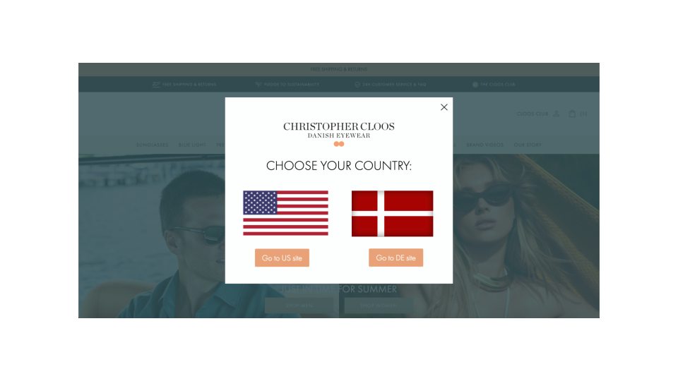
For most online businesses the easiest, always-available factor is location. Based on a visitor’s IP address, you can very much predict the country and sometimes even the city they are browsing from. If you run an international business, creating segments based on location and providing a personalized experience for each major country and language is a surefire way to boost user experience.
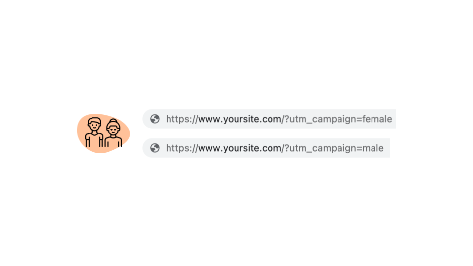
Another way to conduct demographic-based segmentation is to use the same segmentation you use for your Facebook ads. On Facebook, you can target people based on a lot of demographic properties, and with the right UTM tagging, you can carry over this information to your website to provide a personalized experience.
The second main type is Psychographic-based segmentation, which is about segmenting customers based on their interests, attitudes, values, and other lifestyle factors.
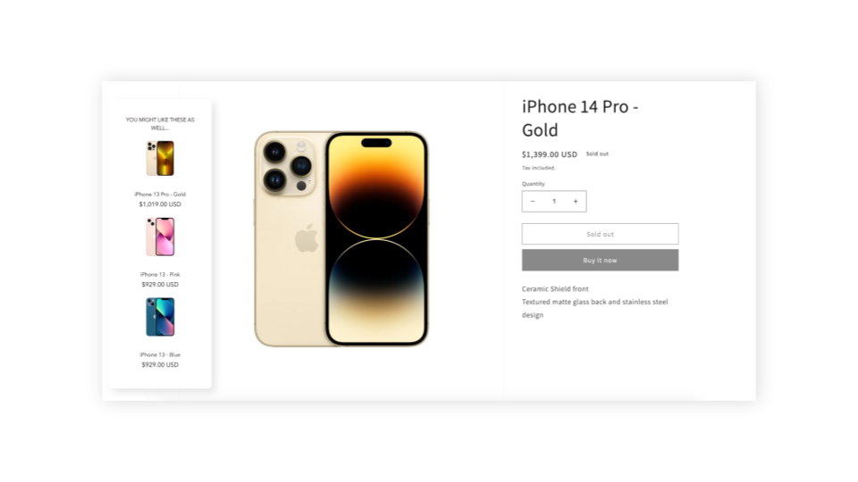
This is usually easiest to do based on their onsite behavior: if someone is browsing iPhones on your website, then you can assume that they’re interested in Apple products. Therefore, you should recommend that visitor other Apple products rather than Samsung products.
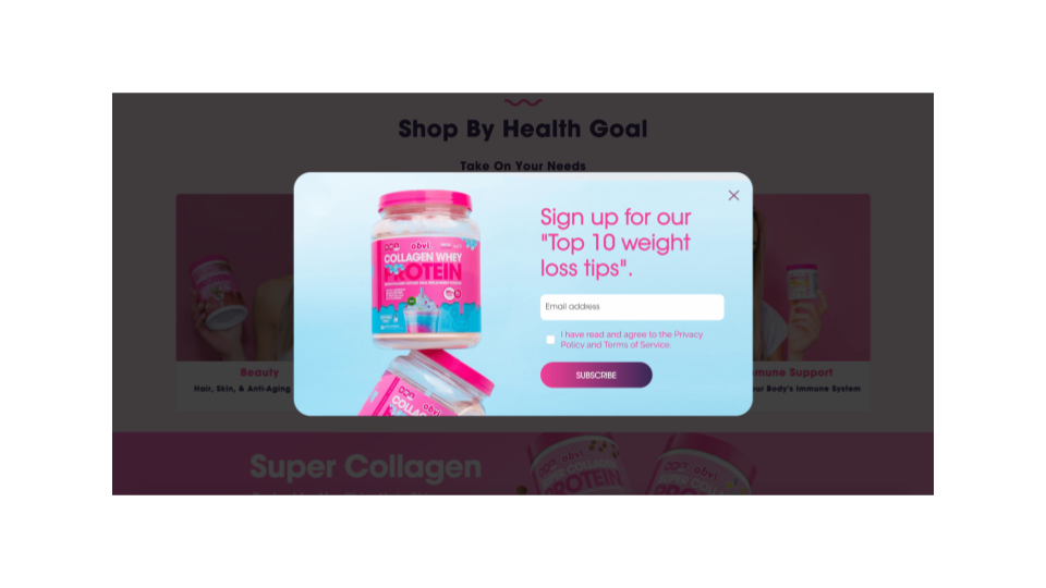
Using your Facebook ads or landing pages for interest-based segmentation is a good idea: if someone clicked on an ad or landed on a page about weight loss, then you can safely assume that he or she is interested in weight loss, and personalize your messages based on this information.
The third type is Intent-based segmentation, where you basically segment the visitors based on where they are in their own customer journey.
It’s sometimes called awareness-based segmentation, since all visitors go through five awareness stages. People with no-awareness or problem-awareness usually have low buying intent and need different types of messages than visitors who are already product- or even fully aware and have high buying intent.
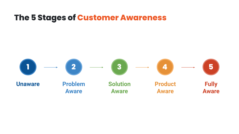
How can you segment visitors based on their awareness level or buying intent? Again, their behavior is the best indicator. You should differentiate between visitors who arrive on your site after searching for low-intent keywords like “how to lose weight” and those who are searching for high-intent keywords like “best weight loss products” or “Hydroxycut prices”. You can also track their content consumption on your website. Are they reading one of your problem-based articles, or actively browsing your products?
Now you might have some ideas on how to segment your audience. In the next lesson, we’ll discuss the timing of your messages: when is the best moment to trigger your personalized messages to these segments? I’ll see you there!
Hey, it’s Csaba, and welcome back! In this lesson, we’re going to discuss how to choose the right moment to display your messages.
If you find a well-defined audience that has a shared problem, and then craft a great message for this particular segment, you’re already halfway towards success. But with website personalization, you have the added luxury of choosing not only the audience and the message, but also the timing of your message. When you get all three right, you’ll have the best results!
Visitors have limited attention that they can devote to your messages, and you can easily overwhelm them by displaying a lot of different messages. Even if they are the greatest, most personalized messages, they will ignore all or most of them. At best, they’ll just pick up on the one that commands the most attention. Worst case scenario, they’ll just leave. This psychological effect of too much choice is called analysis paralysis, and it’s an outcome that marketers dread.
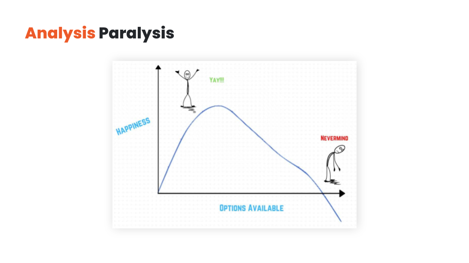
Having self-restraint and prioritizing your messaging is a good start. But you also have the option of delaying some of your messages instead of displaying all of them at the same time.
This approach is called layering. Overlays give you the opportunity to trigger some of your messages later (based on time spent on page, or user activity like exit-intent or like a 50% scroll down).
With layering, you can get visitors to focus on your most important messages first, and then use a secondary message as a backup plan if your primary messages aren’t working.
Let’s say your visitor is searching for “the best weight loss pills for men”.
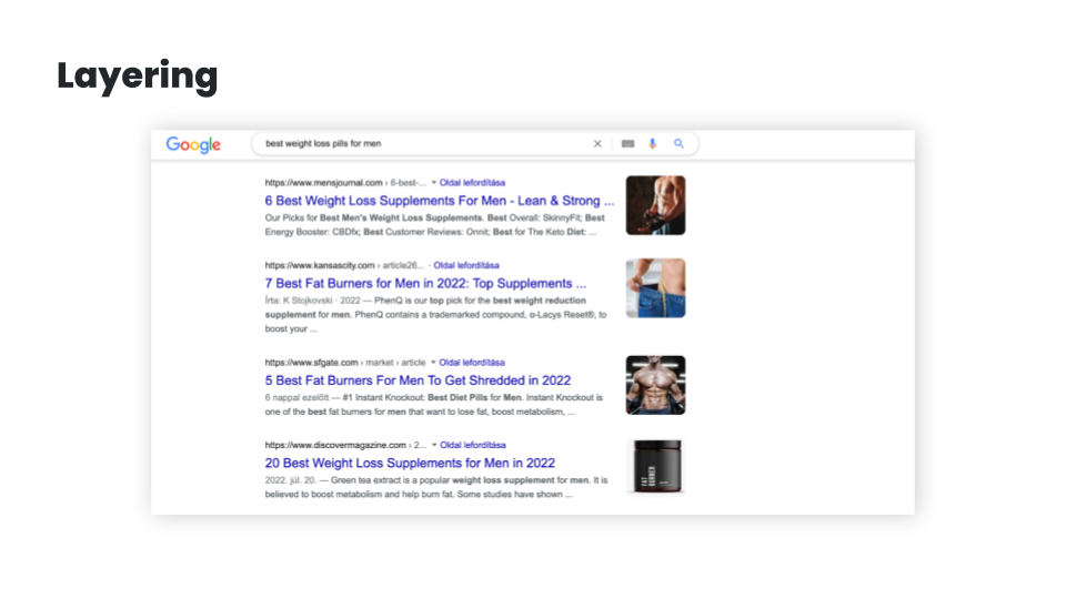
This implies that the visitor is solution-aware and in need of some education about the best products, so your primary content could be a blog article comparing the best weight loss pills for men.
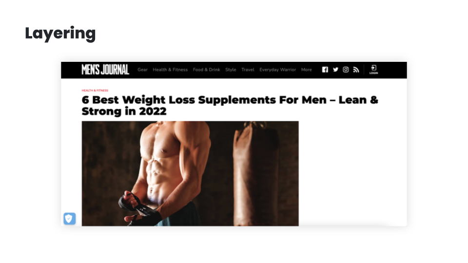
But if they’ve scrolled through 80% of the article, you can assume that they’re becoming increasingly product aware, so it might be a good idea to test for buying intent by showing them a special offer. You could also use some time-limitation (like “this discount is only available for the next 15 minutes”) to increase fear-of-missing-out (FOMO).
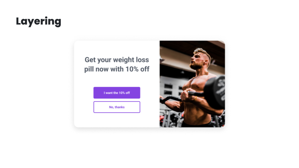
And just in case they’re still not responding, you can still have an exit popup in your back pocket. You can offer your best content in exchange for their email address, and this allows you to build and nurture a relationship with them.
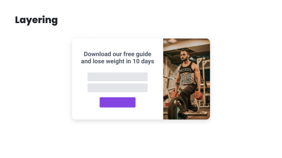
While having all these offers embedded into the main content could work, having them layered like this will significantly improve your chances at getting a conversion.
In the next lesson, I’m going to share the best ecommerce personalization use cases. I’ll see you there!
Hey, it’s Csaba, and welcome back! In this lesson, I’m going to share the top ecommerce personalization use cases. Let’s get started!
Understanding what your customers really want and figuring out how you can help them is the best way to create personalized experiences that are truly meaningful.
But luckily, there are a couple of strategies that most successful ecommerce brands use, each of which can provide you with inspiration for your own personalization strategy.
Let’s have a look at these examples starting at the beginning of the user journey:
First, let’s talk about the landing page.
My number one advice is to change the copy & headline of the landing page based on demographics or interest. As discussed, these factors can most easily be pulled from the ad you’re using to draw traffic to the landing page. For example, if you’re selling a portable blender, like Blendjet, you might have several value propositions.
You’ll most likely experiment with creating ads based on each of these value propositions. If someone clicks through the ad promoting portability, then this is what you should promote on your landing page.
On the other hand, if your ad promotes the Self-cleaning feature, then this could be the main value proposition on the landing page.
If your product can solve more than just one problem, and you run advertising to different customer segments based on their problems, it can be a good idea to personalize the landing page — including the headlines and the product recommendations — based on the segment’s needs and serve different headlines for people who, for instance, want weight loss and for people who want better sleep.
Alright, after the landing page, the next step in the user journey is usually list building, which is generally accomplished through welcome popups.
Of course, you shouldn’t show a list-building welcome popup to those who are already subscribed. With this segment, you can and should move forward to the other personalization use cases.
But for those visitors who aren’t subscribed, you can personalize this welcome popup based on the country they’re visiting from, serving different popups to people from the United Kingdom.
Another option is to use their interest to personalize the popup – in a very similar fashion to the examples seen with landing pages – and serve different value propositions for people who, for instance, want weight loss.
You can also differentiate based on traffic source, and try giving a special welcome to Facebook/Instagram users or to people visiting from a partner’s website or Facebook/Instagram profile. Each of these personalizations can easily boost subscription rates by up to 100%!
And don’t forget about returning visitors: welcoming them back with the products they were browsing on previous visits will not only help them continue where they have left off, but will leave a really nice impression.
The next strategy is to personalize special offers on your website so that they don’t look generic. This will increase their efficiency.
For example, giving your special offer a deadline and inserting a countdown — not just a fake one, but a real one — and providing dynamic discount codes can as much as double the efficiency of an offer.
Or just simply inserting the name of the current month so the offer FEELS more special will increase conversion rates by up to 10%.
Getting the most out of seasonal offers like running a teaser campaign before Black Friday and then communicating it again on the day is also a great way to boost sales.
You can also differentiate your offers based on intent and source: you can decide not to offer discounts to visitors clicking through from Google Shopping or other price comparison sites—since these users already have high buying intent and they’ve already seen your prices. Or if people clicked through from specific campaigns, you should remind them, but only them, of the offers that those ad campaigns communicated.
But the real magic happens when you create real targeted offers to specific segments, like rewarding your VIP customers or reactivating churned and at-risk customers.
And of course, you can also use the interest- or demographics-based personalization: if people want better sleep, well, give them better sleep even in your offers as we’ve seen the examples with landing pages and welcome popups.
Personalization can also be very effectively used for upselling and cross-selling.
Recommending products to users based on their behavior is a basic best practice.
But you can also get more creative, like upselling specific products based on cart value or cart content, promoting the most popular products to people who are in an earlier awareness stage, or making it clear how much extra spending is required to qualify for free shipping. Ideally, these messages should be tailored for each country.
Yet another popular approach is offering free items if the customer’s cart has reached a certain amount/milestone.
Next up is cart abandonment. Decreasing cart abandonment is always a big focus of ecommerce marketers.
Reminding users of their discount codes, while reminding them of the associated deadline is a really good starting point.
Emphasizing limited stocks either in embedded format or in an exit popup can also significantly decrease cart abandonment.
For those visitors who haven’t yet subscribed and are eligible for a discount, you can offer this discount when they try to leave your site empty-handed.
And of course, all these offers can be adjusted based on the value and/or the content of the cart.
In cases where you don’t want to offer discounts, you can experiment with promoting your most popular products, getting a second chance to raise the visitor’s interest.
And here’s the last step in the user journey. Sending your feedback collection messages at just the right moment will ensure you aren’t annoying your customers.
As mentioned, getting feedback about what visitors are missing on product pages or on shipping pages can be a very effective way to get quality user feedback.
Alternatively, you can choose to measure the overall satisfaction with your website followed by extra questions to get more in-depth information based on their answers. You can also use this same technique to get testimonials from satisfied customers!
And finally, the most efficient way to get real attribution data is to ask your customers where they heard about you. It’s especially important if you’re doing a lot of brand building and/or social marketing, where most of the attribution is undetectable through Google Analytics.
As you can see, there are many use cases for personalized messages during different stages of the user journey. In the next module, I’ll show you how to create personalized messages that your visitors will love—and that generate amazing conversion rates. I’ll see you there!
Hey, it’s Csaba, and welcome to the third module. Over the next few lessons, we’ll go over how to create and set up winning personalized messages. In this first lesson, we’ll look at all the different message formats you can choose from. Let’s get right into it!
You can deliver personalized messages on your website in many ways. Each message format has its own advantages and disadvantages.
At a high level, we can rank the different message formats based on how assertively they capture the visitor’s attention. Overlays usually rank higher on this scale than embedded messages, which means that they are a more effective way to get people’s attention and thus they have higher conversion rates.
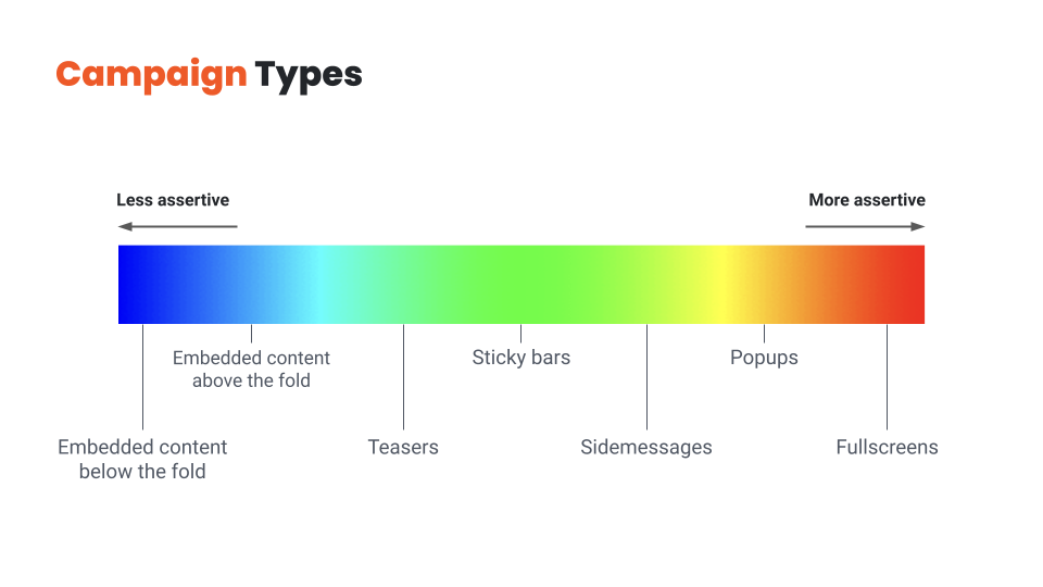
So why shouldn’t you use overlays to deliver all your messages? You guessed it: because they’re also more intrusive, and overdoing them will result in a frustrating user experience.
Finding the right balance between embedded messages and overlays is key.
You should choose overlays for your most important messages and use personalized embedded messages for the rest. If you use only embedded messages, you’ll leave a lot of money on the table, but using only overlays will quickly become annoying for your visitors.
So let’s quickly review these message types from least assertive to most assertive:
Now that we’ve covered all the potential message types, let’s see how we can get the most out of them!
Hey, it’s Csaba, and welcome back! In this lesson, we’re going to discuss how to find the right value proposition for each visitor segment!
There are lots of ways to improve the efficiency of your messaging, but there’s one aspect that stands above all: the customer has to care about the message.
If the main essence of your message—whether it’s an offer or an explanation of your value proposition—doesn’t resonate with the visitor, any tactic you try to increase conversions will be like putting lipstick on a pig.
That’s why understanding your customers and figuring out what their pain points are, and how you could better help them, matters so much.
Given that basic understanding, here are a couple of rules of thumb to help you create messages that really resonate with the user:
Rule no. 1 is to talk about the visitor’s problem.
Everyone has a problem. There may be no better way to get someone’s attention, than starting with a recognition of their problem and pushing their “buttons”. You might have an incredibly compelling offer for a visitor, like offering to win a diamond necklace worth $2,000…. But if the visitor is a guy named Ben, who is looking for a wedding ring for his fiancee, he’s not likely to be interested in winning a necklace. On the other hand, if he gets an offer like “Get 10% off on our exclusive wedding rings”, he’s almost certainly going to sign up to an email list in order to get that discount. It’s also a good idea to focus on the benefits of your offer instead of the offer itself. Say someone is browsing your website to get better sleep, mentioning that problem in the headline instead of leading with “free ebook” will most likely result in better conversion rates.
Rule no. 2. is to give a compelling offer.
If you want your visitors to take some action, you need to give them a compelling enough reason to do so. Even if you’re just trying to get people to sign up for your newsletter, that small action comes with a “cost” to the visitor: they are paying with their time and privacy. So what constitutes a good reason to sign up? For ecommerce stores, the surest way to get someone to sign up for email or SMS is to “bribe” them with a discount. While it’s often the easiest solution from a marketer’s perspective, the offer doesn’t necessarily have to be a discount or even monetary: based on the user’s awareness stage and interest, free content or educational resources can be even more powerful. While a 15% discount doesn’t really need much explanation, other offers can be a little bit more complex. In these cases, you’ll need to be more creative in how you explain the value of your offer in a short and concise manner.
Rule no. 3 is to make the visitor feel special.
Messaging that makes the user feel more special will improve both your results and customer experience. If you’re using a targeted message to a specific visitor segment—which you should—the easiest way to make someone feel special is to make it clear that you’ve created this message just for people like them. One way to do this is by highlighting the name of the segment in your message itself, just like BoomByCindyJospeph did. You can also use the simple tactic of using the visitor’s first name or referring to their country in your welcome messages. A really special offer, only valid for a small group of visitors, can also make a visitor feel like a brand is relating to them as a person. It’s always worth remembering that your visitors are pretty smart: you can claim that your offer is “special”, but if every detail of it shouts that it’s a generic offer—like using a simple discount code like 10OFF—then your visitors will feel like you’re trying to fool them rather than feeling special.
This takes us to rule no. 4, which is to increase the fear of missing out (FOMO).
While trying to rush someone who isn’t ready to make a purchase is generally not a good idea, giving a reason for product- or fully-aware users to buy now rather than later is one of the most efficient psychological tools in an online marketer’s arsenal. The most basic method is making all your offers “seasonal” rather than running generic 10% off all year. You can have Halloween offers, then Black Friday/Cyber Monday offers, then Christmas offers, then Valentine’s sale, and so on. Fortunately, there’s some special holiday or occasion every week, so you never have to run out of seasonal opportunities. Also, you can use simple methods like countdowns and reminders to keep the visitor aware that your offer is limited and so are your products.
And finally, it always helps to put some fun and/or surprise into your messaging.
It can be as simple as a witty headline like TheOodie’s. Or Zendesk’s. Or you can even take it a step further and use self-deprecating humor in your copy. Another way to add an element of mystery to your messaging is as simple as offering a “Mystery discount”. Finally, you can use a suite of gamified messages like Lucky Wheels, scratch cards, or Pick-a-gift campaigns.
Hopefully, you’ve come up with a few new ideas for your value proposition. In the next lesson, we’ll discuss how to refine these ideas into a high-converting message. I’ll see you there!
Hey, it’s Csaba, and welcome back! In this lesson, we’re going to talk about crafting a high-converting message.
Let’s assume you’ve found the right message for the right audience – that’s already half the battle! But there are many small details that can mean the difference between an average and an awesome conversion rate.
Again the specifics vary between industries and specific brands, but there are a few important rules of thumb to remember:
Rule no. 1 is that less is more.
Your customers shouldn’t have to struggle to grasp your message right away, rather, they should immediately understand the value of your offer. When it comes to writing a copy for your website, simplicity is king. You definitely don’t want your visitors to get confused about what the words in your headline or popup mean. Keeping your copy as short as possible is the primary way of ensuring comprehensibility. Your visitors will understand your message best if it only contains the words you need to get your point across. It’s also important to have as few call-to-actions as possible, each of which should be clear and consistent with the messages you’re sending. If you want to craft an effective CTA, a simple “Sign Me Up” or “Send My Discount Now” usually does the trick.
Rule no. 2. is to be human.
It’s always worth remembering that your visitors are humans, and humans are emotional. And to engage with them, the best thing you can do is to get over your fear of the “F-word” – which is “feel” ;). Depending on your goals, you can trigger the right emotion with your messages. Like if you’re trying to encourage them to make a charitable donation, you could use words and images that connect your message to your audience’s hearts. You can also be more human and likable by speaking the language of your target audience. If you’re selling to a young audience, feel free to use slang, but you won’t want to use it for the 65+ demographic. It is also true for images, which brings us to the topic of design.
Rule no. 3. is to use a clear design that puts focus on your main value proposition.
Never use images without a clear reason that goes beyond just making your messages “look better”. Use images to support the message itself rather than to just grab attention. Choose images that reinforce — or at least don’t contradict — what your copy is saying. Mismatched text and images are confusing because your visitors won’t know which message to focus on. Another strategy is to insert visual elements like arrows that point toward the call-to-action button. An arrow encouraging visitors to “Click Here” will always increase the salience of your CTA button. But be careful, it also increases the noise, so use it only sparingly.
Rule no. 4 is to be consistent with your design.
While it might be easy to pick a popup template that somewhat resembles your website’s design, having it match exactly in terms of fonts, colors, and overall style will make both the results and the customer experience much better. It’s even more important if you are using multiple personalized messages on your website. Having a chaotic mix of random embedded and overlay messages will make the visitor feel confused and disoriented.
Once you’ve cut down your copy to just include the essential parts, and made sure that all your copy and images are consistent with your website and also with each other, you have a powerful message in your hands.
That’s the end of module three. In the last module, we’ll talk about evaluating the effectiveness of your personalization efforts, revenue attribution, and A/B testing. I’ll see you there!
Hey, it’s Csaba, and welcome to the final module of OptiMonk’s website personalization course! Over the next lessons, we’ll talk about measuring the performance of your messages and optimizing them to achieve even better results. First, let’s dive into the question of how to evaluate whether your personalization efforts are effective. Let’s get right into it!
For any kind of marketing activity you undertake, there should be a measurable way of deciding whether or not the time and money you put into it were worth it. Measuring the results of personalization efforts is equally as important as measuring the ROI of a Facebook ad campaign.
So how do you go about it?
First of all, you need to decide what numbers you are going to use to measure success. These will be your KPIs or Key Performance Indicators.
You can choose to use any of the leading indicators, like click-throughs or signups (which are based on actions someone takes immediately upon seeing a personalized message), or lagging indicators like revenue or customer lifetime value (which can take some time to show up).
Depending on the nature of your personalization efforts, it can make sense to track your results using each of the KPIs just mentioned. But, you should also be aware that lagging indicators like revenue can be very misleading in some circumstances. For example, if you measure the performance of a signup form based on the extra revenue it generates, you can easily be led astray. Why? Because your store’s bottom line will be influenced by a great many different factors besides your personalized messages.
Once you’ve decided what to measure, you need to find the right tools to measure your KPIs.
For leading indicators like click-throughs and signups, the personalization platform you use will often provide a decent reporting and analytics system.
For more complex lagging indicators, you’ll probably need additional analytics solutions, such as Google Analytics.
But the problem here is that Google Analytics and similar tools are only able to measure anonymous visitor activity over the course of one session. That means you won’t be able to connect the dots between different, longer-term personalization campaigns.
That’s why having a personalization platform like OptiMonk makes sense. It keeps a complete overview of each customer’s journey from the very beginning to the end, which means you can attribute outcomes like revenue to personalized campaigns over longer periods. Thus, you’re able to measure the efficiency of even your most complex personalization efforts.
Given that you’re tracking the right KPIs with the right tools, how can you actually measure the extra revenue that your personalization efforts have generated? By running experiments, which are often called A/B tests.
When you A/B test a personalized message, you compare what actions two different groups of visitors take: the ones who are having a personalized experience, which is often called a test group, versus a group of visitors who only ever see a generic, non-personalized, version of your website, which is usually called the control group.
In the next lesson I’ll introduce you to the world of A/B testing, and teach you how to run successful experiments. I’ll see you in the next lesson!
Hey, it’s Csaba, and welcome back! In this lesson, we’re going to dive into A/B testing.
As discussed in the previous video, there’s no single perfect way to measure the effeciency of your personalization efforts. Nonetheless, A/B testing has proven to be the most time-tested way to scientifically and continuously improve your results.
At a high level, A/B testing—which is also known as split testing—is about splitting your visitors into two or more groups, showing different content to each group, and then measuring which group had more conversions and ended up reaching your chosen goal.
In the personalization world, you’ll usually have an assumption or idea for personalization that you want to test. It’s usually called a hypothesis.
Then, you go ahead and create your personalized message. In order to see if it works, you’ll split the segment you’re targeting in two: showing your new personalized content to one half (which we call the test group) and the previous version to the other half (which is often called the control group).
After you collect enough data about the performance of these two groups (which is usually called statistical significance), you can evaluate the results and decide whether your hypothesis was true or false.
If it was true, your personalized message will result in more conversions or revenue and you can be confident to run this new message variant to 100% of your target audience. If it was false and you’re not making any extra conversions or money, then you can just cancel it, and let the show continue as it was before you tried out your groundbreaking idea.
Running A/B tests is the surest way to victory. Why? Because you have a super-limited downside, but an unlimited upside.
If your hypothesis turns out to be false, then you can just simply stop the experiment. The only loss will be (at most) a couple of conversions among the test group who saw the new message during this short period of time. But if your personalization idea really does improve your conversion rate, then you can run it endlessly and let it create extra value for all eternity.
A/B testing is a great method to fine-tune and optimize your existing messages for the best possible results. You can just easily create new variants and test new offers, copy, and CTAs.
But A/B testing is also a great tool to make decisions about the legitimacy of your new ideas: just create a new A/B test, display this new message to only one-half of your audience, and simply compare the results.
This wraps up OptiMonk’s website personalization course. Everything you’ve learned in this course will help you to get started with website personalization and improve your conversion rates. Thank you for joining me and be sure to like, share, and subscribe for more actionable videos and courses.
I’ll see you in the next course!
You finished the course, and now you’re wondering what’s next? How to get started?
We get it, it can be intimidating. That’s why we created a Website Personalization Worksheet that gives you everything you need to get started with website personalization. Born from our experience with hundreds of successful ecommerce stores, it’s the most valuable website personalization resource you’ll find online.
How to use the worksheet?
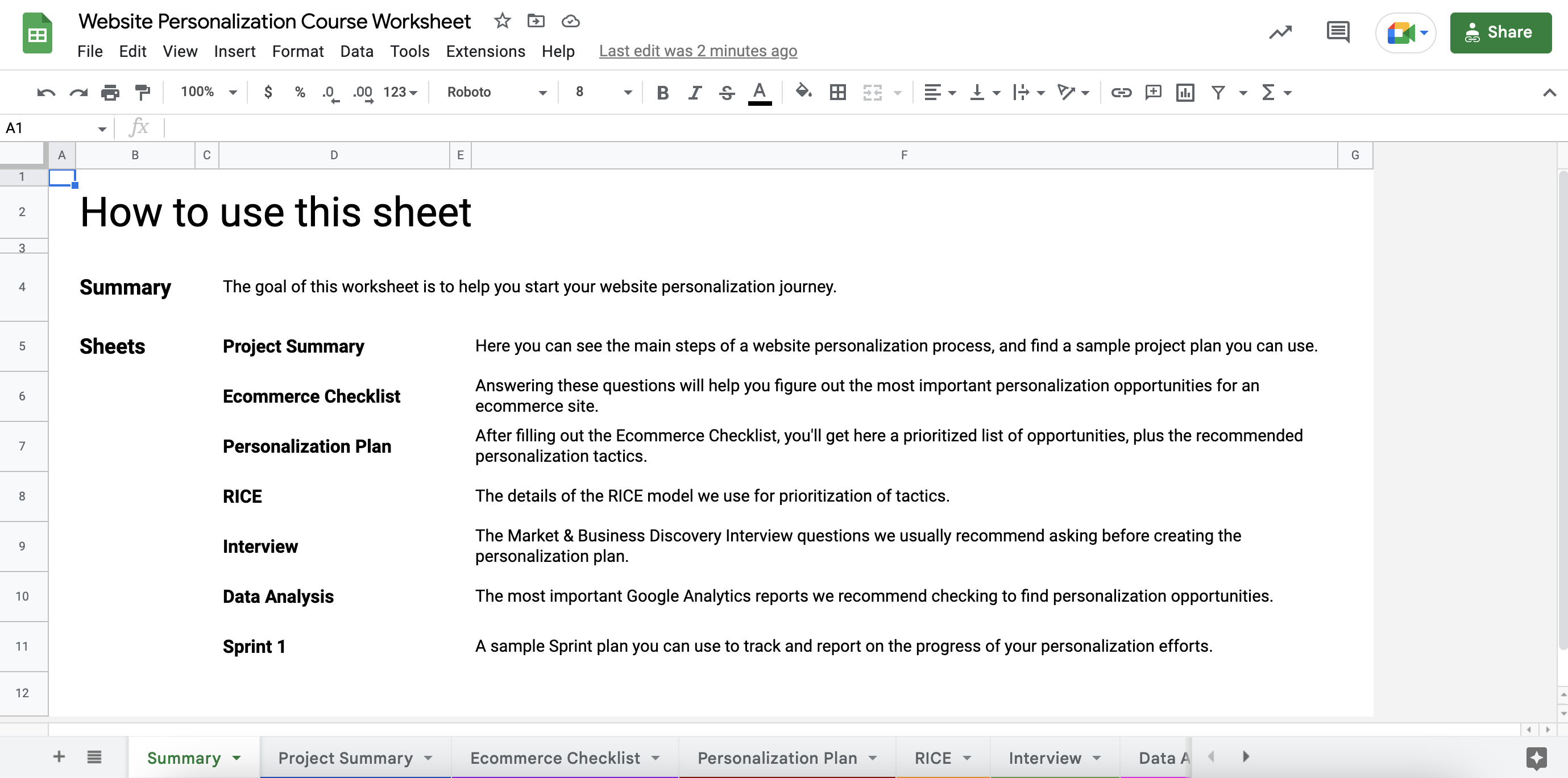
STEP 2: Go to the Ecommerce Checklist sheet and answer all the questions by adding a checkmark to the “Yes” or “No” columns.
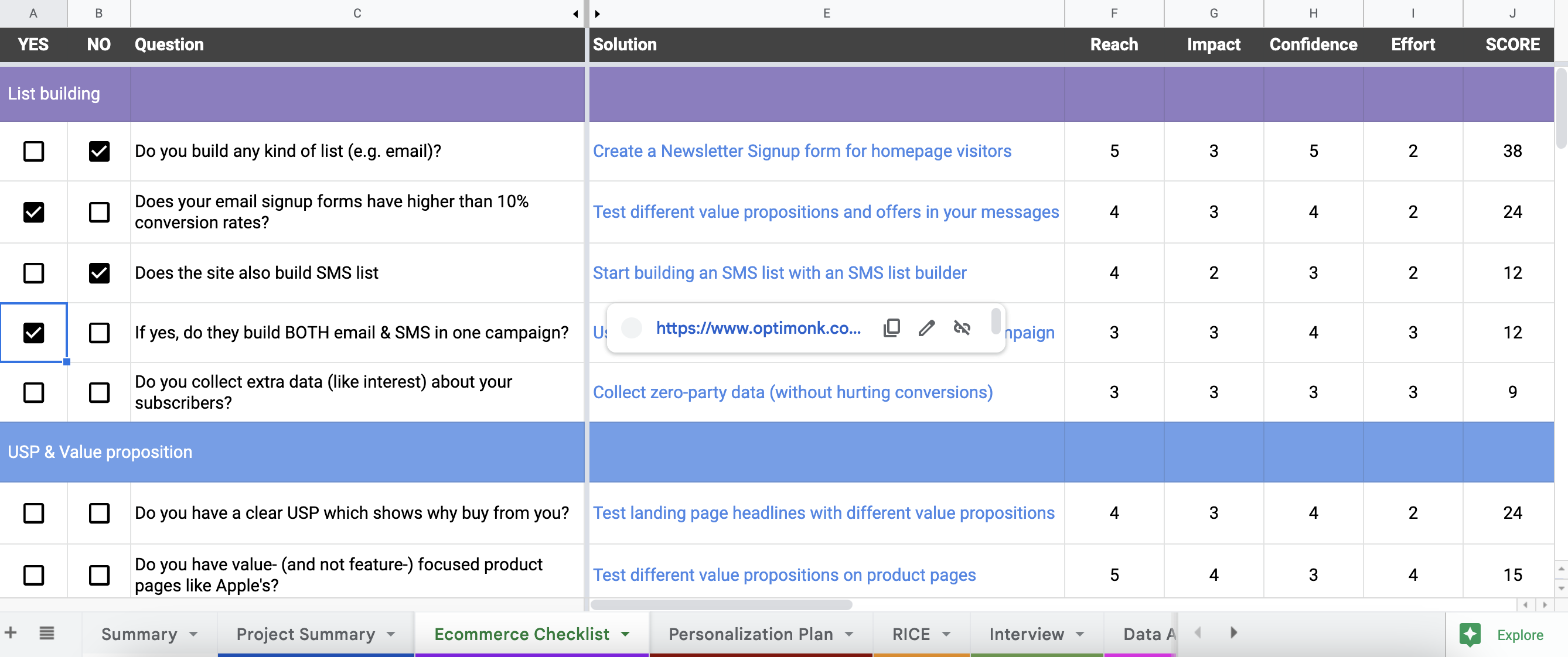
This will help you to uncover all the top personalization opportunities on your website.
STEP 3: Go to the Personalization Plan sheet. Based on your answers, here you’ll see an automatically ranked solution plan (using the RICE scoring method) with a recommended tactic for each opportunity.
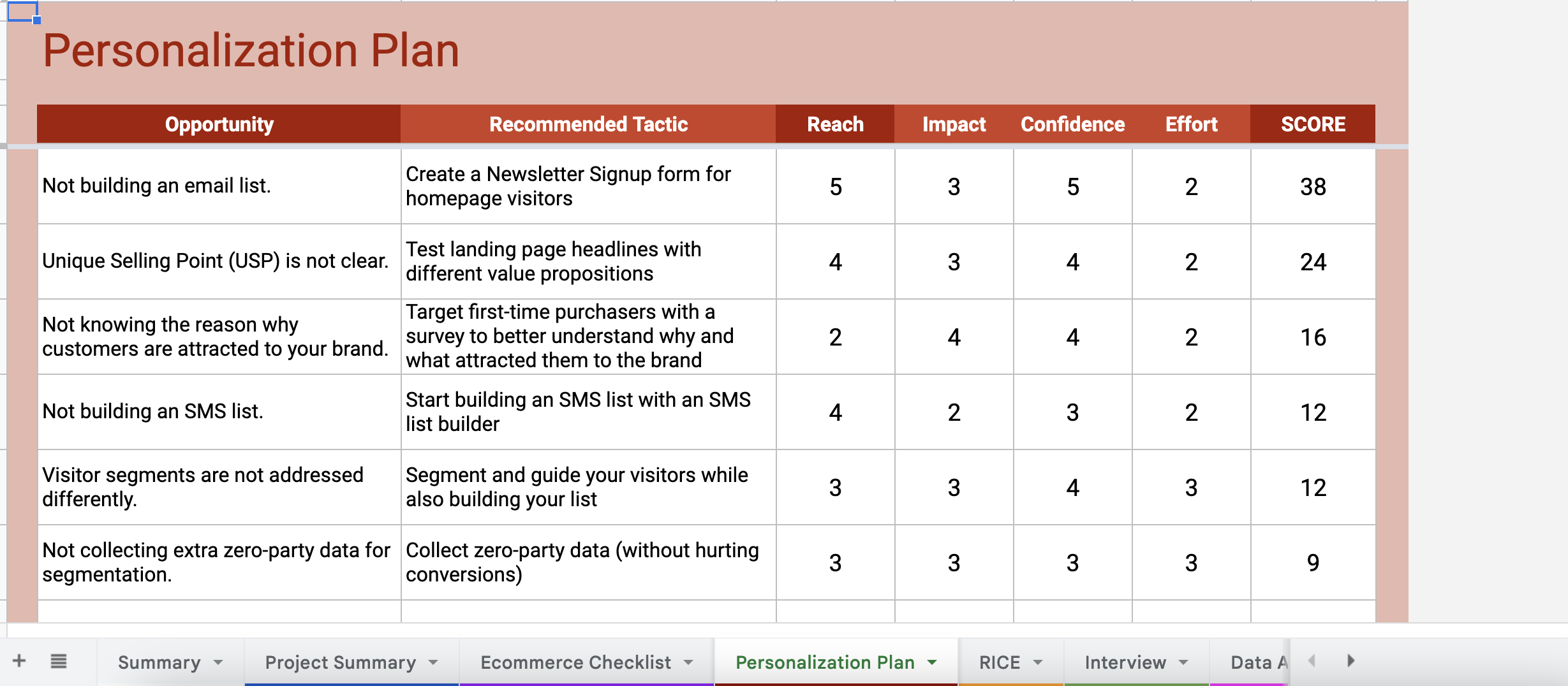
By hovering your cursor over the tactics, you’ll also see a link that gives you detailed guides on how to set up each tactic on your website.

From these links, you’ll be either redirected to a use case landing page full of ready-to-use templates (for basic tactics that are easy-to-setup), or you’ll be redirected to a step-by-step guide on how to set up the tactics (for more advanced tactics).
Besides this personalized plan, the worksheet also includes several useful tools, like a GANTT Chart, Sample Sprint Plan, Discovery Interview questions, and other tools to help you get started.
We hope the course and the worksheet together will help you to get started with web personalization and increase your conversion rates.
Good luck on your website personalization journey!
Get started now and turn traffic into sales!
Product updates: January Release 2025


