


Black Friday Marketing Strategy: 30 Ideas for 2026
In this article, we'll share 30 actionable Black Friday marketing ideas for ecommerce businesses to make 2026 your most successful yet.
15 lead magnet examples for online stores, with when each one works and how to show it in a popup, illustrated with Popup Library examples.
In short
A lead magnet is a free incentive a store offers in exchange for a shopper's email or phone number. This guide covers 15 ecommerce lead magnets, from welcome discounts, free shipping and free samples to quizzes, buying guides, giveaways and early access, when each one works, and how to show it in a popup.
A lead magnet is a free incentive a store offers in exchange for a shopper's email or phone number. In ecommerce, the strongest ones pay off on the first order: a discount, free shipping, a free gift or store credit. Quizzes, buying guides, giveaways and early access work when the shopper needs help choosing.
Below are 15 lead magnet examples for online stores, with when each one works, what to ask for in return and how to show it in a popup.
A lead magnet is something free that a store gives a visitor in return for their contact details, usually an email address or a phone number. The visitor gets the reward right away, and the store gets permission to follow up by email or SMS.
It is the offer at the heart of lead capture. Unlike the B2B kind (ebooks, webinars, consultations), an ecommerce lead magnet is best when it leads straight to the first purchase.
A good ecommerce lead magnet passes three tests:
Shoppers see signup offers on most stores they visit, so a generic "Join our newsletter" gets skipped. Name the reward in the headline and make it specific to what you sell.
Match the lead magnet to the shopper's situation: a first-time visitor, someone browsing products, or someone about to leave a full cart.
| Lead magnet | Best for | What you ask for | Popup format |
|---|---|---|---|
| 1. Welcome discount | New visitors | Card popup or fullscreen | |
| 2. Free shipping on the first order | New visitors, cart abandoners | Card popup or fullscreen | |
| 3. Mystery discount | New visitors | Lucky wheel or scratch card | |
| 4. Product-finder quiz | Browsing shoppers | Quiz answers + email | Survey (quiz) |
| 5. Buying guide or checklist | Browsing shoppers | Card popup or fullscreen | |
| 6. Recipe, care or how-to guide | New visitors, blog readers | Card popup | |
| 7. Giveaway | New visitors | Card popup or fullscreen | |
| 8. Free gift with the first order | New visitors, cart abandoners | Card popup | |
| 9. Free sample | Browsing shoppers | Email (+ address at checkout) | Card popup |
| 10. Store credit | New visitors | Card popup | |
| 11. Loyalty or VIP club | Returning visitors | Card popup | |
| 12. Early access to a drop | Returning visitors, fans | SMS or email | Card popup |
| 13. Free trial | Browsing shoppers | Card popup | |
| 14. Survey with a reward | Returning visitors, customers | Survey answers + email | Survey |
| 15. Bundle offer for subscribers | Browsing shoppers, cart abandoners | Card popup |
The examples with images come from the OptiMonk Popup Library. Each one was designed by the OptiMonk agent for a real store's brand; you can open it and build your own version.
A percentage or fixed amount off the first order is the most common ecommerce lead magnet, because the value is obvious. Keep it to one number in the headline and one email field.
When it works: first-time visitors who are ready to buy and only need a nudge.
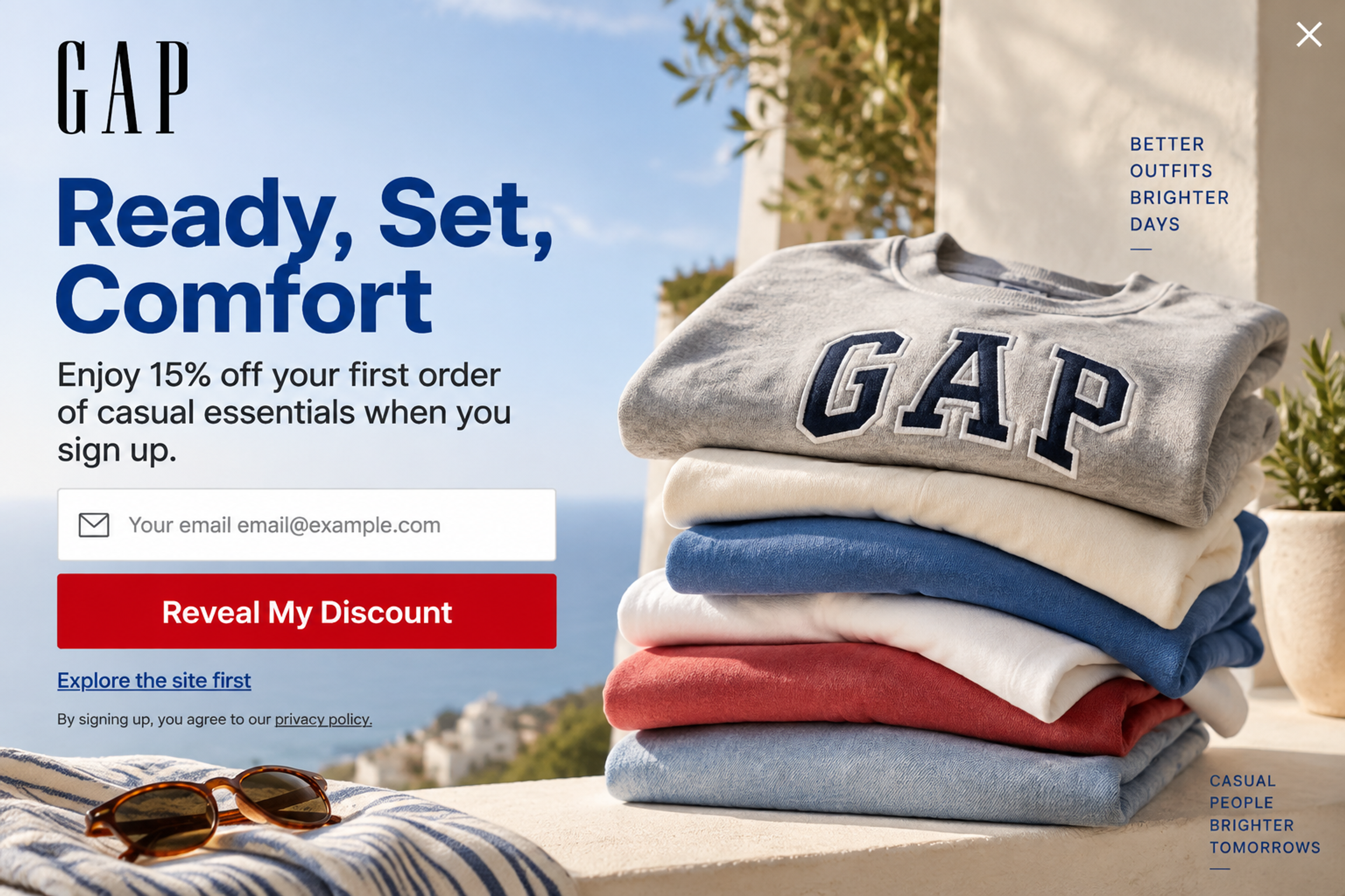
Casual Comfort Takeover, designed for Gap: 15% off the first order of casual essentials, with "Reveal My Discount" as the button and "Explore the site first" as a friendly way out.
More: email popups · welcome popups
Shipping cost is a common reason shoppers hesitate at checkout, so a free shipping code is a strong reason to sign up. It also protects your margin better than a big percentage off.
When it works: stores with a high shipping cost relative to the product price, and shoppers who leave at the cart.
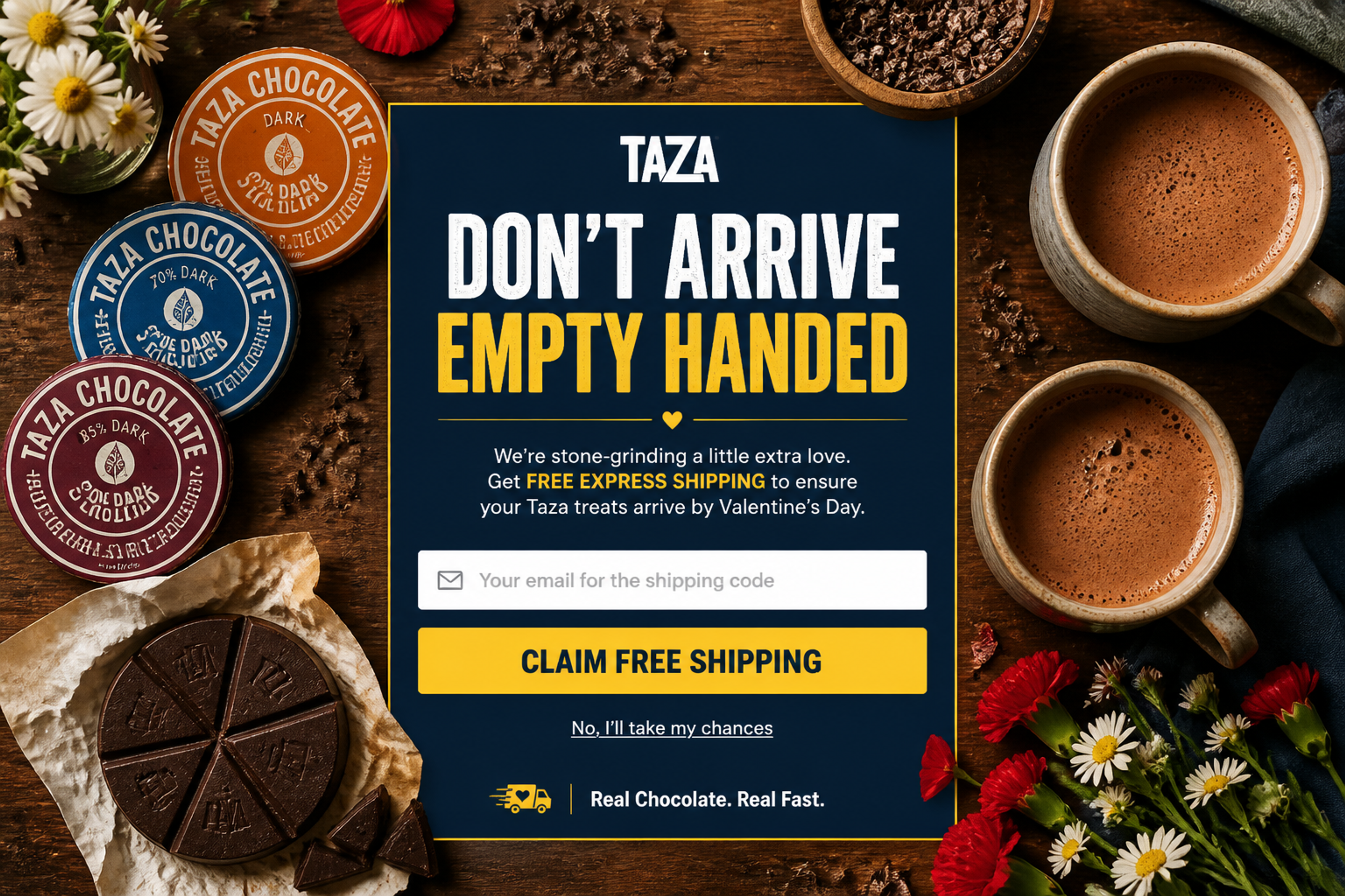
The Fullscreen Reveal, designed for Taza Chocolate: free express shipping before Valentine's Day, delivered as a code to the shopper's email. The deadline gives the offer a reason to act now.
A mystery discount turns the same offer into a small game: the shopper enters an email to spin a wheel or scratch a card and see what they won. Curiosity does the work.
When it works: new visitors on stores with a playful brand, and seasonal campaigns. Make every prize a real one.
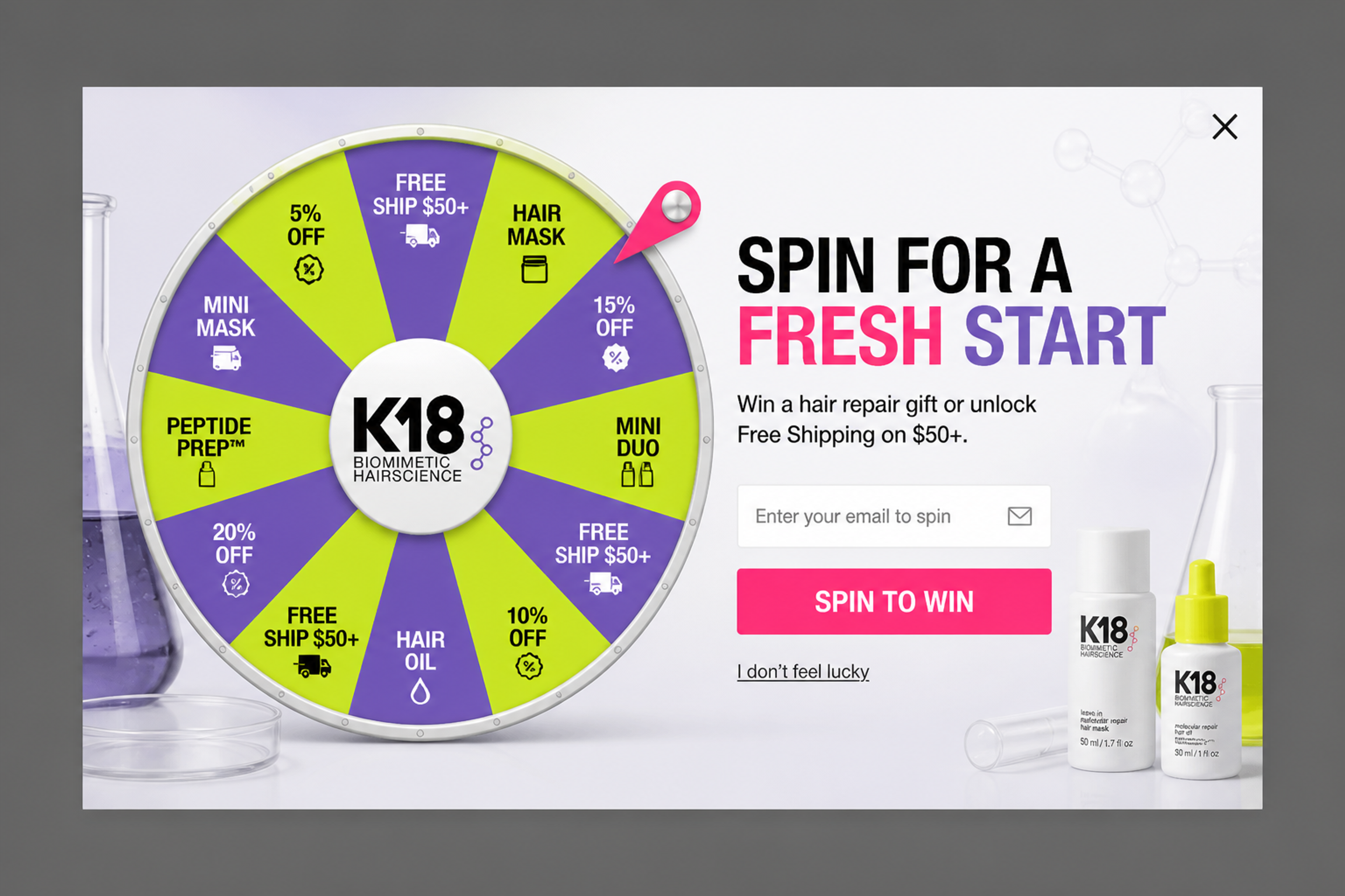
The New Year Wheel, designed for K18: the email field comes before the spin, and the prizes mix a hair repair gift with free shipping over $50.
More: gamification
A quiz asks two or three questions, recommends the right product and asks for an email to send the result. It helps shoppers who are lost in a big catalog, and the answers tell you what to email them later.
When it works: stores with many similar products (coffee, skincare, mattresses, pet food) and browsing shoppers who haven't picked yet.
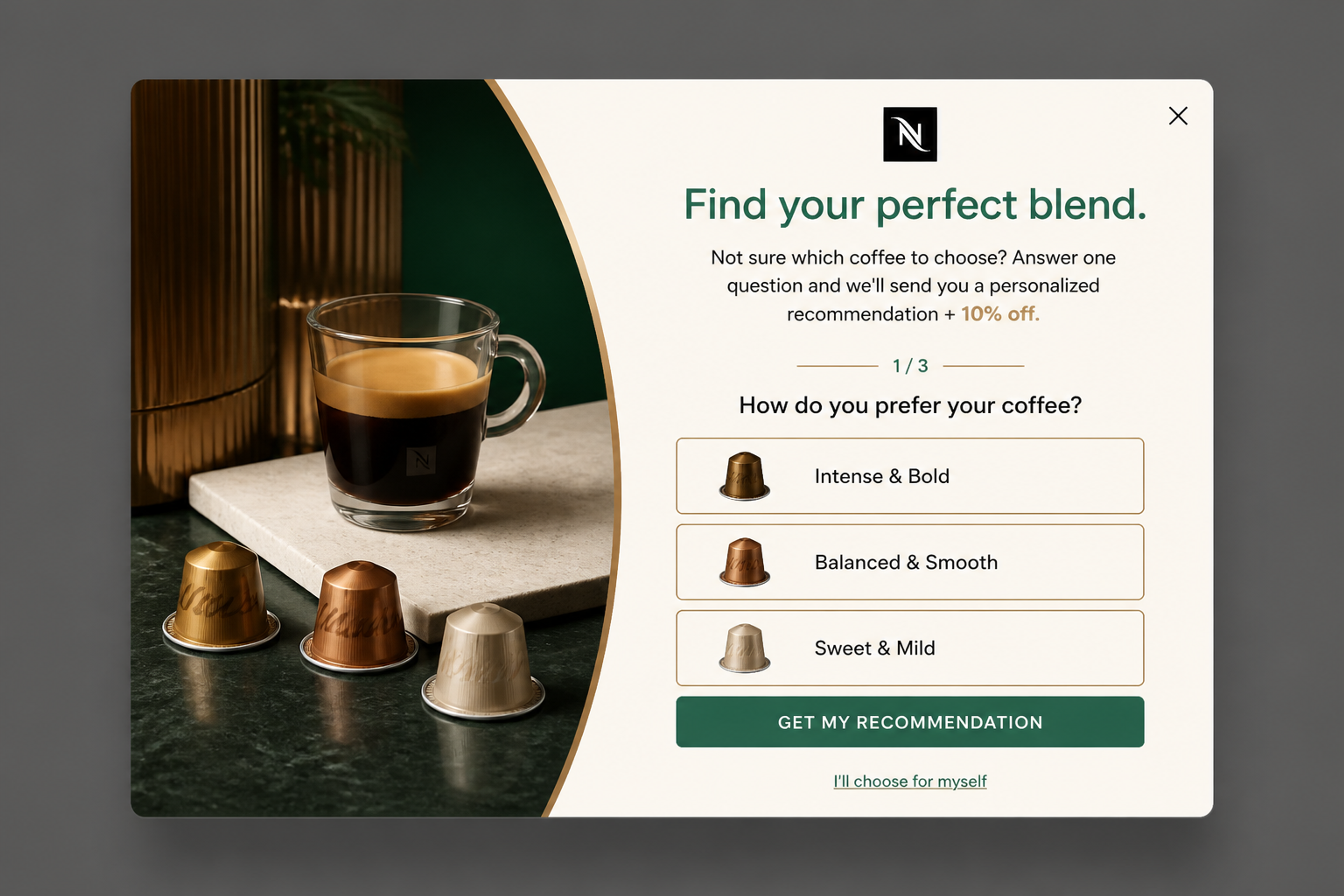
The Barista Choice Quiz, designed for Nespresso: one question ("How do you prefer your coffee?"), then a personalized recommendation plus 10% off by email.
Another one: The Winter Skin Quiz, designed for Bushbalm, sends a winter skincare routine after two questions. For a full playbook, see quiz lead generation.
A buying guide or checklist answers the questions shoppers have before they buy: which size, which material, what to pack. You can build it from your FAQs and product pages.
When it works: considered purchases and seasonal shopping lists, such as back to school or a first apartment.
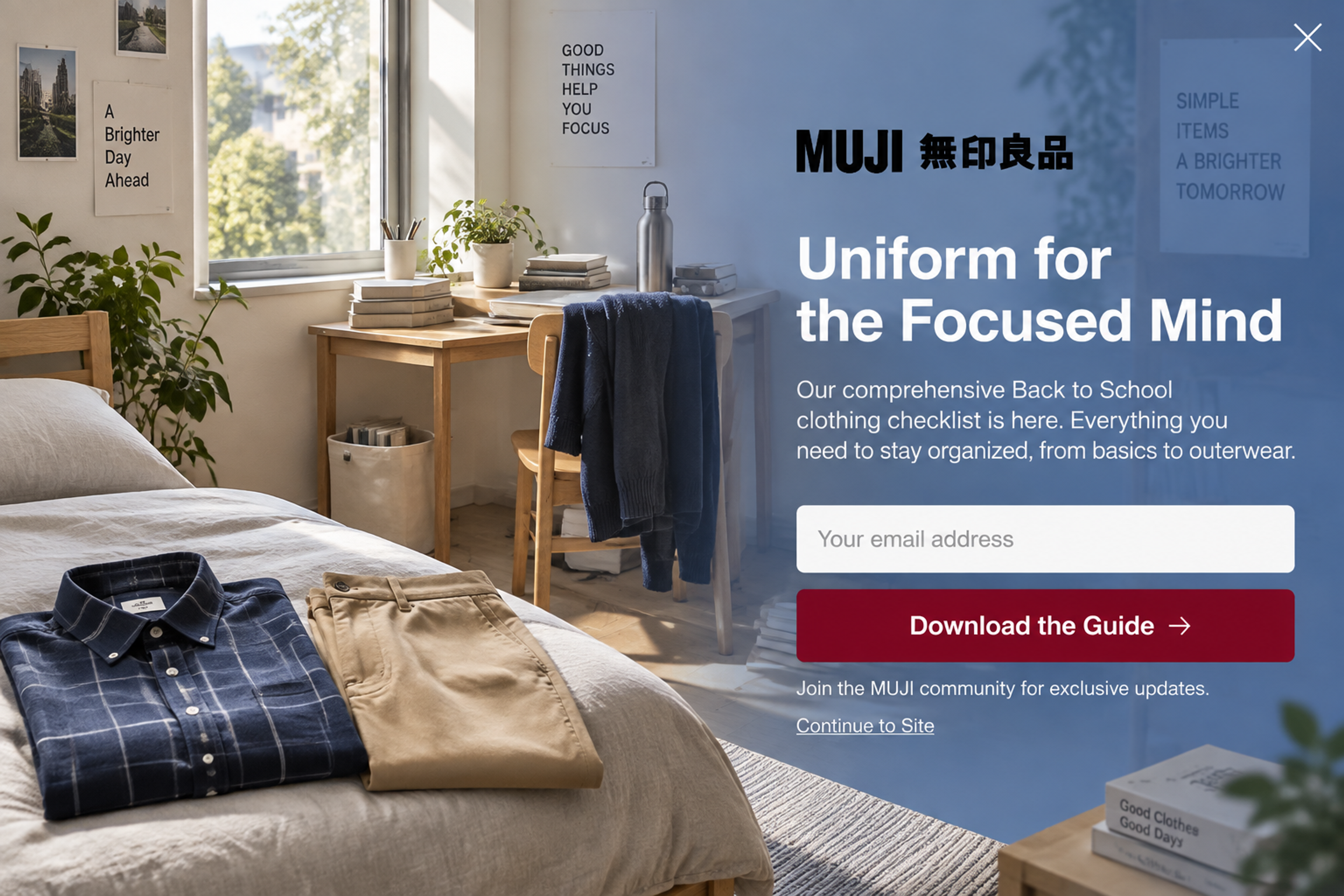
The Blueprint Fullscreen, designed for MUJI: a back-to-school clothing checklist "from basics to outerwear", one email field and a "Download the Guide" button.
A quiz can deliver the checklist too: The Wardrobe Finder, also designed for MUJI, asks three questions and sends a tailored checklist.
A short guide on how to use, cook with or look after your products gives value before the sale and keeps your brand in the inbox. Turn your best blog posts into a downloadable guide instead of writing from scratch.
When it works: food, beauty, home and wellness stores, and visitors reading your blog.
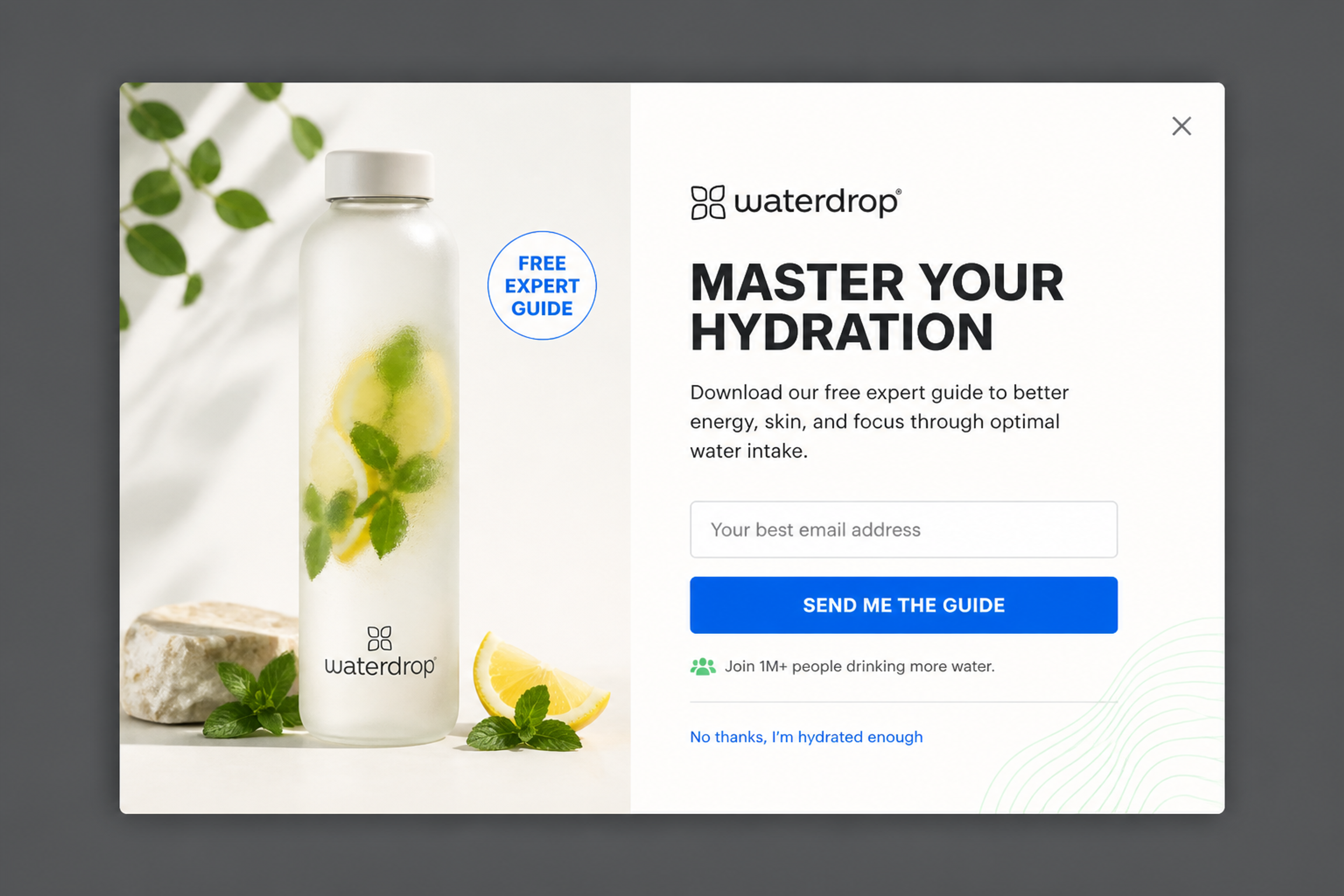
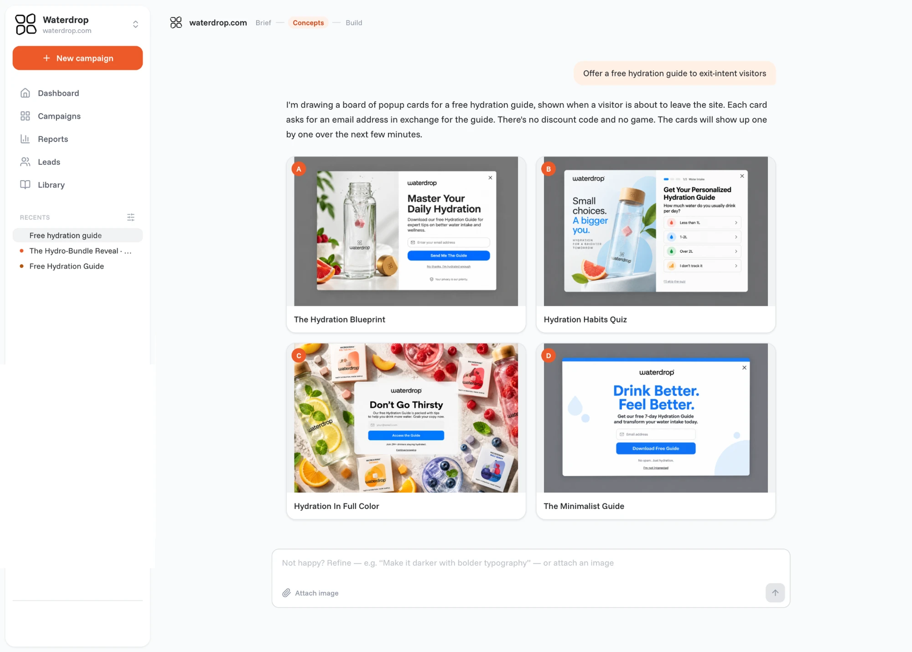
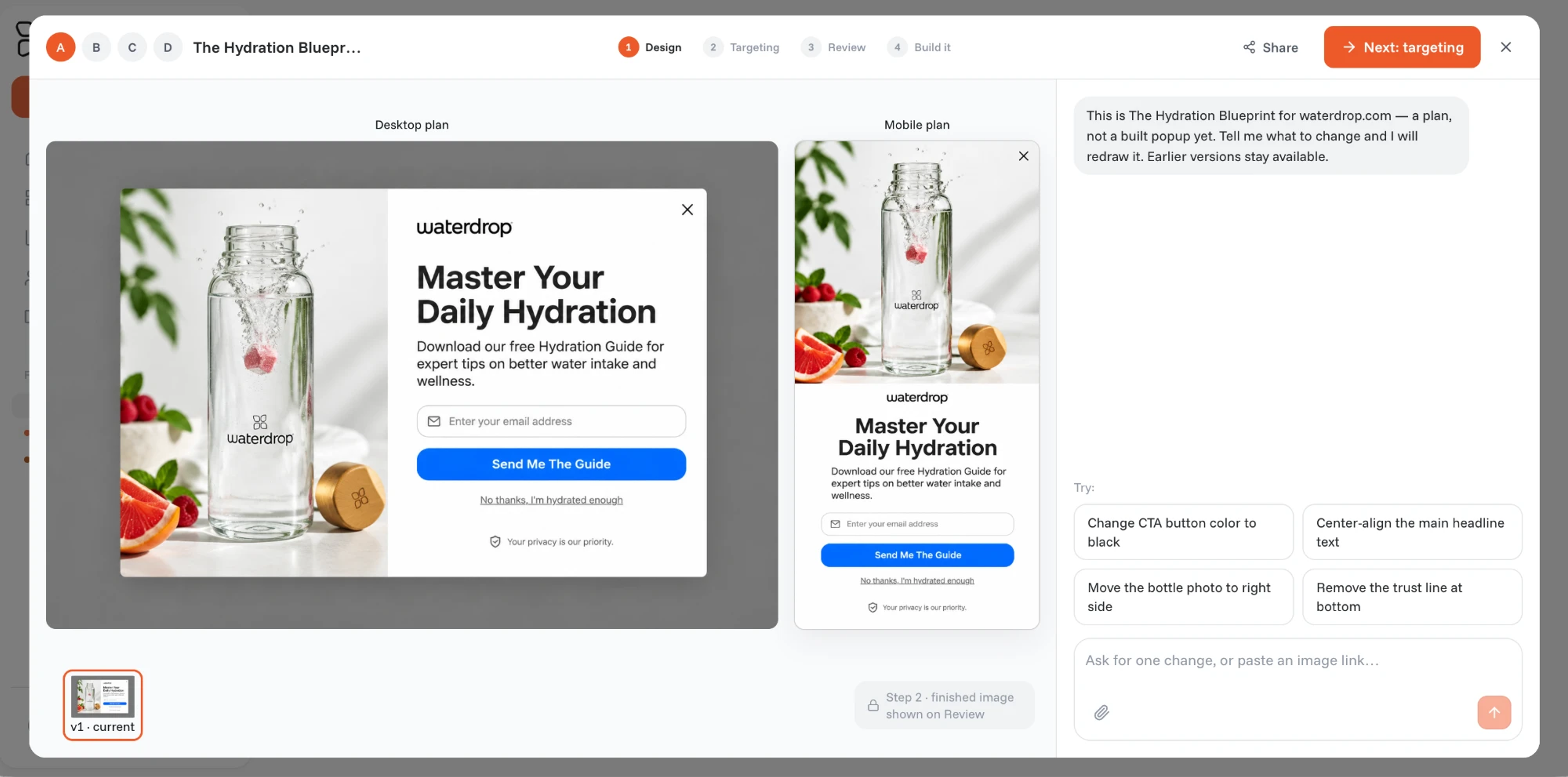
The Editorial Guide, designed for waterdrop: an exit-intent popup with a free expert guide to better hydration and a "Send me the guide" button.
A giveaway offers a chance to win one of your products for an email. Pick a prize only your future customers would want, so the list you build is worth emailing.
When it works: new stores, product launches and seasonal campaigns. Always state the draw date and link the rules.
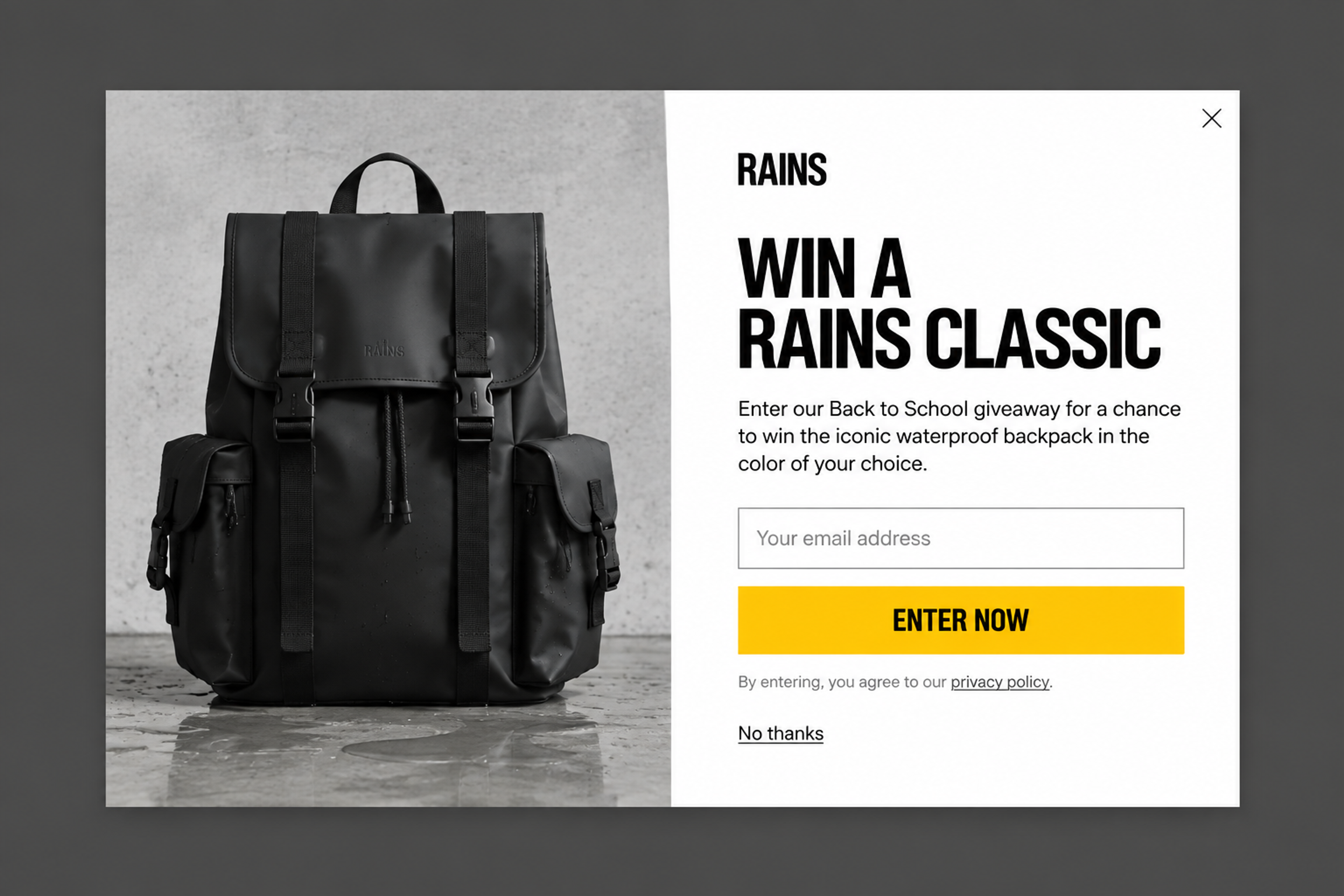
The Minimalist Classic, designed for Rains: "Win a Rains Classic", the brand's own backpack in the color of your choice.
A gift card works as a prize too, and so does a product bundle, like the skincare set in Winter Glow Giveaway, designed for Eucerin.
More ideas: giveaway ideas.
A free gift feels more generous than a discount of the same cost, and it doesn't train shoppers to wait for a code. Tie it to a minimum order value to raise the cart size.
When it works: stores with a low-cost item that people love (a mini size, an accessory), and exit intent on the cart page.
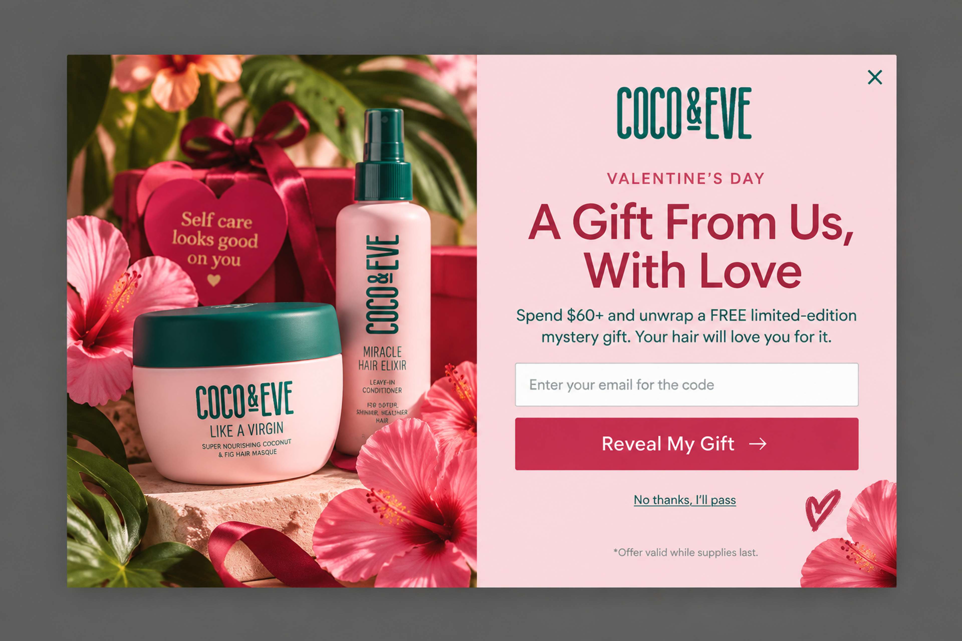
The Romantic Ritual, designed for Coco & Eve: a free limited-edition mystery gift on orders over $60, with the code sent to the shopper's email.
A free sample lets shoppers try before committing to a full-size product. Ask for the email in the popup and send the sample with the first order, or let them pay only for shipping.
When it works: beauty, fragrance, coffee and food, where taste or texture decides the purchase.
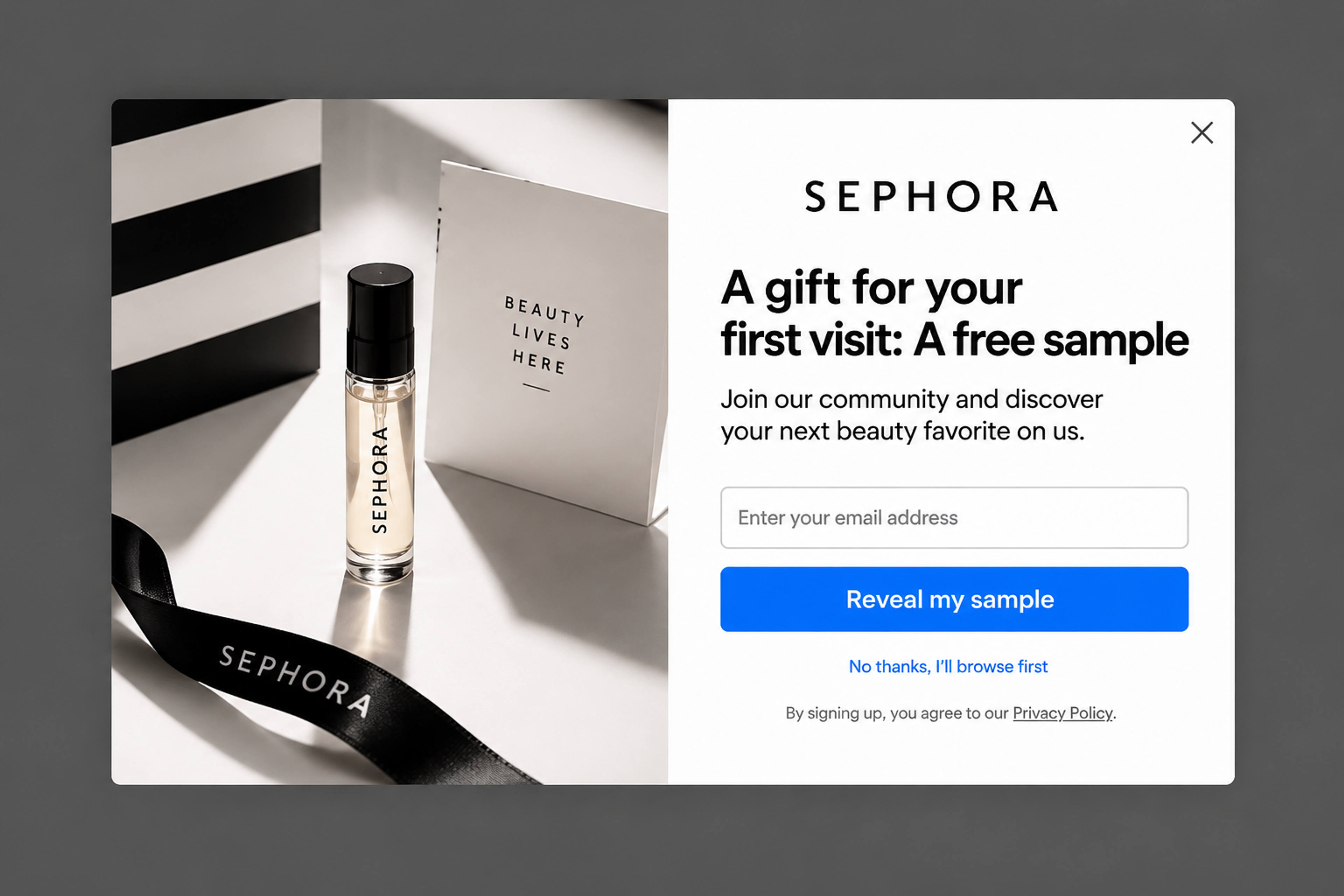
The Essential Sample, designed for Sephora: “A gift for your first visit: a free sample”, with one email field and a “Reveal my sample” button. No discount, just a reason to try something new.
Store credit ("$10 to spend on your first order") works like a discount but feels like money in the shopper's pocket. Shoppers tend to spend it rather than let it expire.
When it works: stores with a higher average order value, where a fixed amount sounds bigger than a percentage.
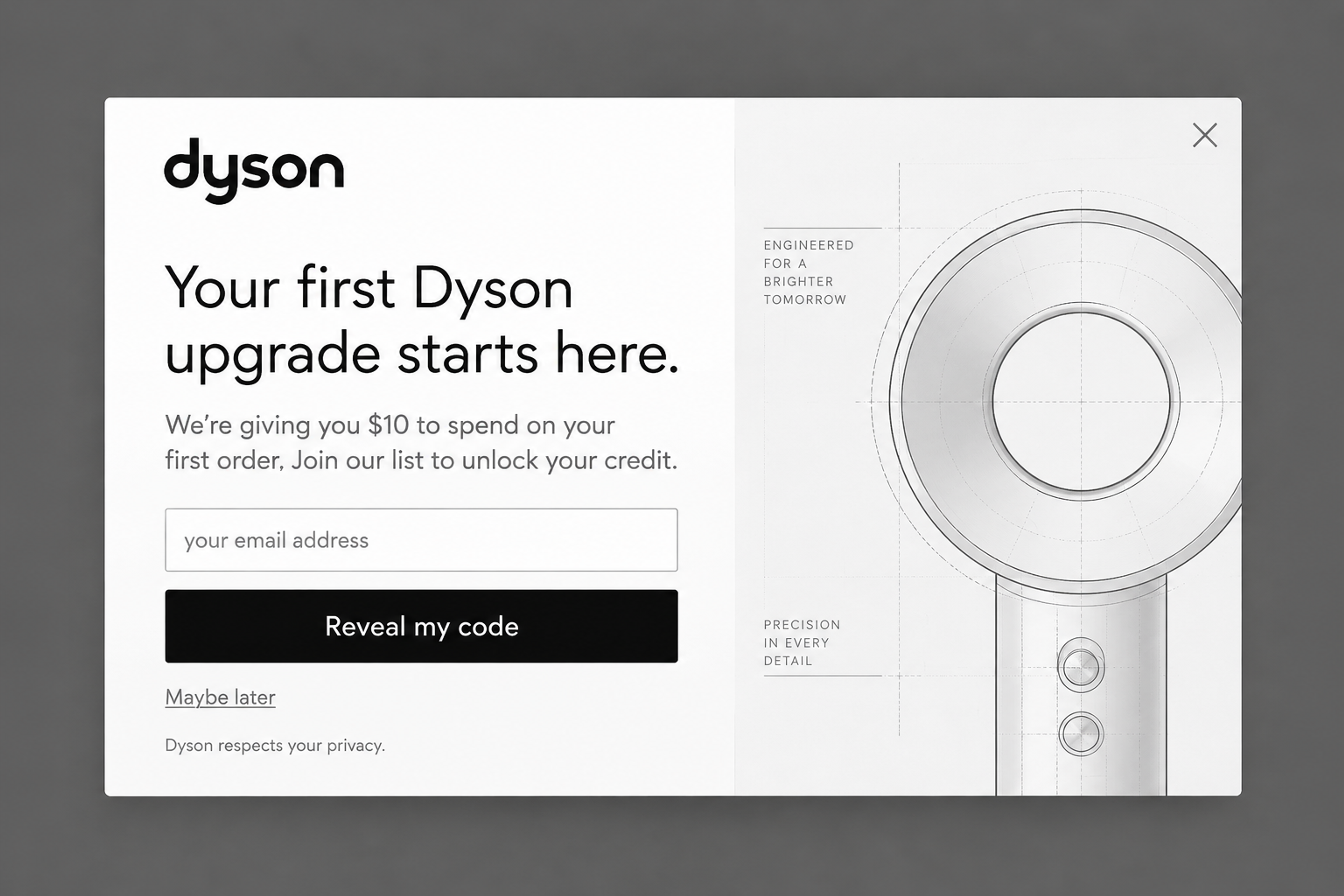
Blueprint Type-Led Reveal, designed for Dyson: “We're giving you $10 to spend on your first order.” On a premium product, a fixed amount reads as a real gift where a small percentage wouldn't.
Instead of a one-off discount, invite visitors to join your loyalty program: points, member prices and a welcome reward when they sign up. It starts a relationship rather than a single sale.
When it works: stores with frequent repeat purchases. Show it to returning visitors, not on a first visit.
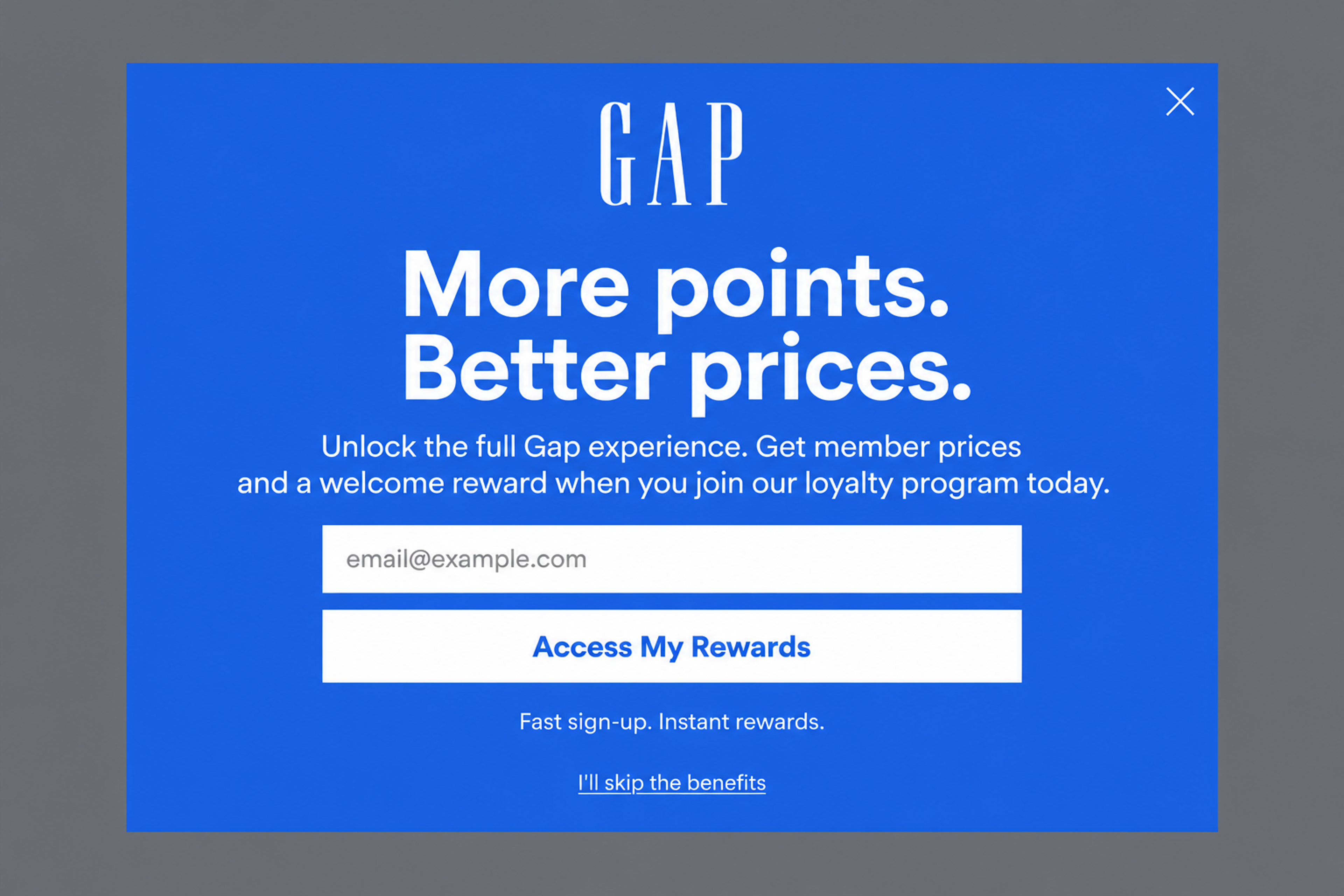
The Modern Minimalist, designed for Gap: “More points. Better prices.” invites visitors to join the loyalty program for member prices and a welcome reward, instead of handing out a one-off code.
More: loyalty program examples
Fans want to be first. Offer early access to a new collection or a limited drop for an email or a phone number, and text them when it goes live.
When it works: fashion, sneakers and beauty brands with launches that sell out.
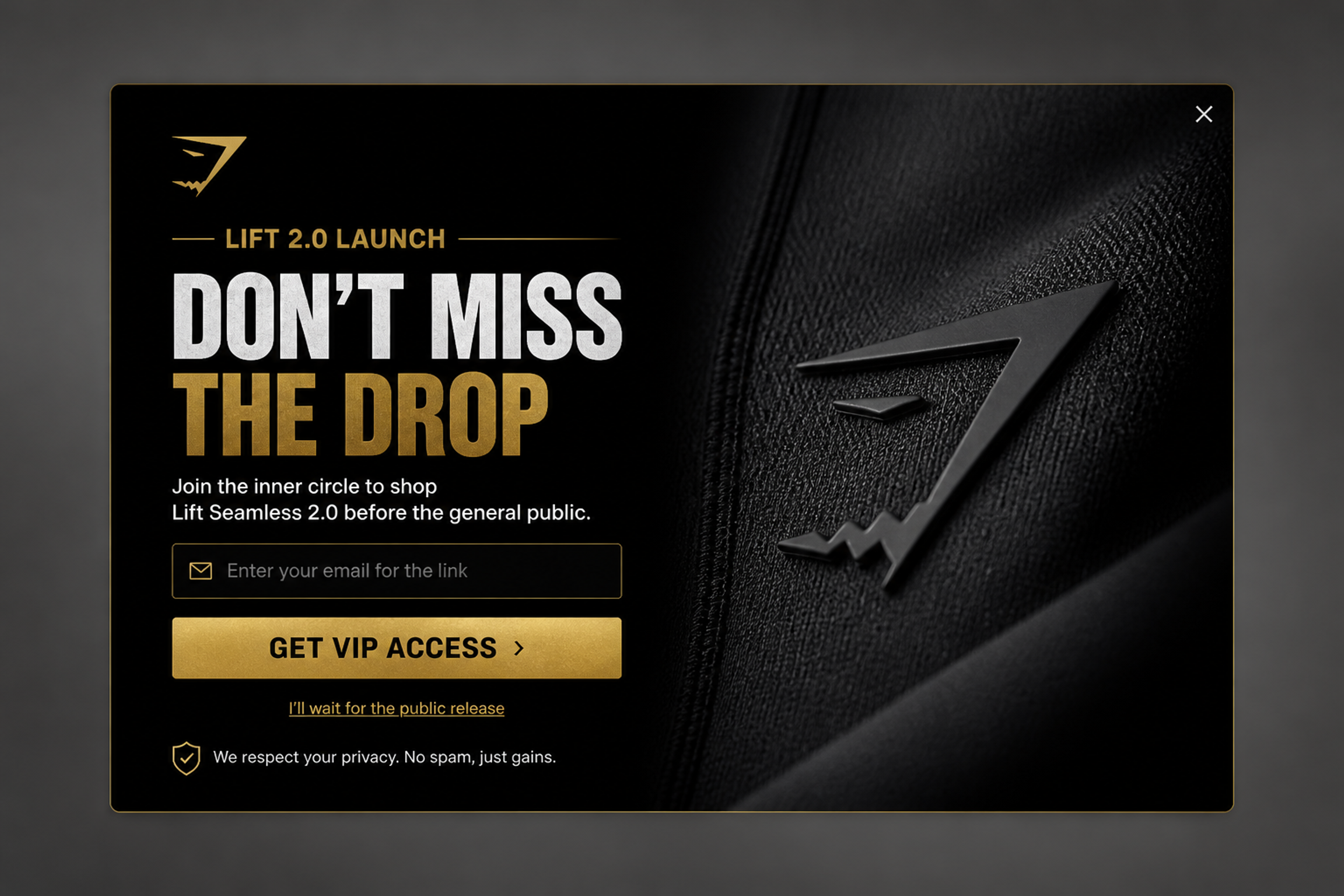
The VIP Early Access, designed for Gymshark: "Don't miss the drop" and early access to a new line before the general public.
For phone numbers, see these SMS popup examples.
A free trial gives a trial-size kit or a first box for free (or for the shipping cost) to shoppers who sign up. It removes the risk from trying a product they would buy every month.
When it works: subscription and replenishment products: skincare, supplements, coffee, pet food.
Ask a short question ("What should we make next?" or "What brought you here today?") and give a small reward for the answer. Shoppers feel heard, and you get data for your next product and your email segments.
When it works: returning visitors and customers, and stores planning a new product line.
Offer a subscriber-only price on a bundle of your best sellers. It raises the first order value and introduces new customers to more than one product.
When it works: stores with products that are used together (a skincare routine, a coffee set) and shoppers comparing several items.
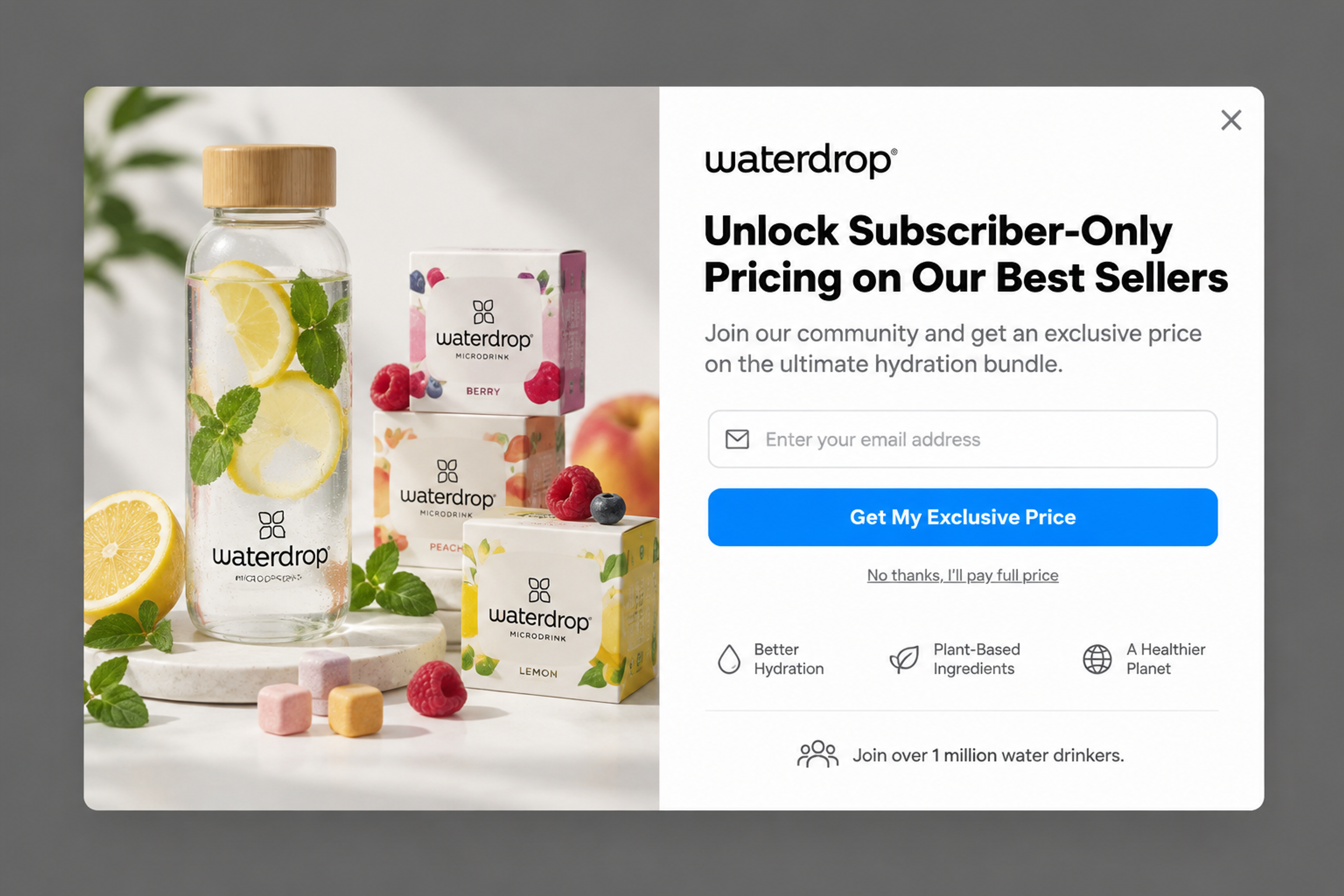
The Hydro-Bundle Reveal, designed for waterdrop: a subscriber-only price on a bundle of best sellers, a bottle and drink cubes. The offer is a set, so the first order starts bigger than a single product.
Start from the reason shoppers don't buy on their first visit, then pick the reward that removes it. Five quick steps:
Not sure which offer wins? Run two and A/B test them.
A popup is the most direct way to show a lead magnet, because it appears at the moment you choose: when a visitor arrives, scrolls, clicks or is about to leave. A form in the footer waits to be found; a popup puts the offer in front of the shopper.
With OptiMonk, you don't build the popup yourself. You describe it, and the agent does the rest:
| Lead magnet | Trigger | Who sees it |
|---|---|---|
| Welcome discount, giveaway | Time delay (e.g. after 5 seconds) | New visitors |
| Guide or checklist | Scroll depth on a blog post or category page | New visitors, not subscribers |
| Free shipping, free gift | Exit intent on the cart page | Cart abandoners |
| Quiz | On click (a "Find your match" button) or time delay | Browsing shoppers |
| Early access, loyalty club | Time delay | Returning visitors |
Hide signup offers from people who already subscribed, and use frequency limits so nobody sees the same popup on every page. If you use Klaviyo, you can target its lists and segments too.
For more designs, see these lead capture popup examples and the OptiMonk Popup Library.
It's a free reward an online store gives in exchange for a shopper's email or phone number, such as a first-order discount, free shipping, a free gift, a product-finder quiz or a buying guide. The best ones lead straight to the first purchase.
For most stores, a first-order offer: a discount, free shipping or a free gift. If shoppers struggle to choose, a product-finder quiz or a buying guide often works better, because it solves the real reason they don't buy.
It depends on your margins and your products. A discount is easier to understand; a free gift protects your prices and can raise the order value if you tie it to a minimum spend. The reliable answer is to A/B test both on your own traffic.
A lead magnet is free and collects contact details (a discount, a quiz, a guide). A tripwire is a low-priced product, such as a mini bundle or a $5 trial, that turns a new subscriber into a paying customer. Use them together: the lead magnet first, then the tripwire in your welcome emails.
Show codes (discount, free shipping, store credit) on the popup's success screen and send them by email too; on Shopify, OptiMonk can create unique codes and apply them automatically at checkout. Send guides, checklists and quiz results in the first email of your welcome flow, within minutes of signup. To pick the tools behind it, see our email list building tools and Shopify form builder apps.
Start with one main offer for new visitors, then add one per situation: a quiz or guide for browsing shoppers, an exit-intent offer for the cart, and early access or loyalty for returning visitors. Use targeting so each visitor sees only one at a time.
Pick the lead magnet that removes your shoppers' biggest reason to wait, and describe it in one sentence. The agent designs the popup for your brand, writes the copy, builds a mobile version and puts it live.
Free to start. No credit card.

In this article, we'll share 30 actionable Black Friday marketing ideas for ecommerce businesses to make 2026 your most successful yet.
Learn about email marketing frequency for ecommerce stores. Most send 1-3 emails per week, with frequency adjusted by subscriber engagement and store type.
Let's take a look at the 21 best lead generation software for 2026 and discuss the features that any lead generation tool should have.