Ecommerce marketing tips
Learn proven ecommerce marketing strategies to increase conversions and sales.
Learn proven ecommerce marketing strategies to increase conversions and sales.
Is your email list stuck? Frustrated that your subscriber count just won’t grow? You’re not alone.
Hi, I’m Radi from OptiMonk, and today I’m here to share 7 strategies to build your email list fast.
Building an email list can feel tough. You stare at your screen, wondering why your tactics aren’t working, and start to think email marketing isn’t worth it.
But wait.
In 2024, email marketing is still one of the best tools to drive sales. What if you could crack the code and quickly grow your subscriber count?
Today, we’re sharing strategies that will transform your email list from blah to lead magnet!
Buckle up, and enjoy the ride!
First, offer a powerful incentive.
This is one of the quickest ways to grow your email list. People love getting something valuable for free or at a discount. Do offer something that matches your audience’s interests. For instance, a welcome popup, with 20% off coupon for your new collection or a free ebook on industry trends can work wonders. Craft incentives that speak directly to their needs.
Next, think seasonal!
People are more likely to engage with something timely. So, create campaigns that fit the current vibe. Think holiday-themed popups during Christmas, New Year’s Eve, and Valentine’s Day – you get the idea!
Here’s the thing: personalization is key in 2024.
We all love to be treated as VIPs, so ditch the generic messages and tailor your messages to each person. Use the data you have to understand what your audience cares about, then craft messages that speak directly to them.
Don’t just blast everyone with the same email – that’s a recipe for unsubscribes.
Smart segmentation can help you with that. Instead of a one-size-fits-all approach, segmentation allows you to divide your audience into smaller groups based on shared characteristics or behaviors.
So while we talk about segmentation, why not do the same thing with your popups?
Country-specific welcome popups can make a big difference. Do customize your popups to reflect local languages, currencies, and cultural differences. This creates a more personal experience and increases sign-up rates. One-size-fits-all popups just feel impersonal, right?
Another great idea? Hosting free webinars or workshops related to your niche.
Not only will you get sign-ups, but you’ll also establish yourself as an expert in your field. Just remember, focus on delivering real value, not just selling your stuff.
Finally, don’t let visitors slip away without a last chance to connect! Use exit-intent pop-ups to capture them right before they bounce. Offer something valuable to keep them in the loop.
And there you have it—powerful strategies to build your email list fast in 2024.
Remember, this isn’t just about numbers, it’s about building a community that loves your brand. Use these tips and watch your engagement and sales take flight!
Thanks for hanging out! Don’t forget to like, subscribe, and hit that notification bell for more ecommerce success secrets.
See you next time!
Did you know that over 70% of website visitors leave without making a purchase?
Yes, we’ve been there and we know that frustration all too well.
But what if I told you that you can turn those near-misses into valuable leads and sales with just one simple tool?
Hi, I’m Radi from OptiMonk, and today, I’m revealing the secret weapon every smart marketer should have in their arsenal: the exit-intent popup.
So, what exactly is an exit-intent popup?
Simply put, it’s an overlay that appears when a visitor is about to leave your website, usually promoting a secondary message.
Exit-intent technology detects when the user’s mouse moves towards the browser’s close button or the back button and triggers a popup that catches their attention right before they leave.
But what is the psychology behind it?
Human psychology responds to sudden changes or surprises.
Exit-intent popups use this by showing a message just as a user is about to leave.
This sudden interruption makes users more likely to notice and respond to the offer, which helps increase conversion rates.
Exit-intent popups can be very effective. They can achieve up to 20-40% conversion rates, which is much higher than the 3-5% average conversion rate of welcome popups.
But the message of your popup is really important, a non-relevant offer won’t achieve high conversion rates.
You thought we’d leave you with just that? Nope!
We brought you 3 short tips on how to increase your own exit-intent popup efficiency.
Let’s check them out.
Hack 1: Delay the appearance of the “X” button
Wanna make sure your message gets across? Delaying the appearance of the X button can help you with that.
This tactic gives them just enough time to catch their attention with your compelling offer or message before they decide to close it.
But remember, don’t overdo it – just a slight delay is enough to make a difference.
Hack 2: Segment your visitors and target them with different messages
Bombarding your visitors with the same message? Stop it.. Like now!
Personalized messages are far more effective.
For example, new visitors might get a discount on the first purchase, while returning customers might get relevant product recommendations based on their previous purchases.
This level of personalization makes your popups more relevant and engaging.
Hack 3: Add a countdown timer
Tick-tack, we all know how a ticking clock makes us feel, right?
Introducing a countdown timer can create urgency, encouraging visitors to take action quickly.
Whether it’s a limited-time discount or a special offer, a ticking clock adds pressure, you need.
And there you have it!
These 3 hacks can help you make the most out of your exit-intent popups.
If you found this video helpful, give it a thumbs up and hit that subscribe button.
Don’t forget to click the bell icon so you never miss out on our latest tips and tricks for optimizing your website.
Thanks for watching, and see you next time!
Are you tired of visitors leaving your Shopify store without making a purchase?
Stay tuned, because today we’re diving into the secret sauce that can double your sales without spending an extra dime on ads!
Hey, Shopify store owners! Welcome back to the OptiMonk YouTube channel.
If you’re new here, hit that subscribe button for the latest tips to boost your online business.
I’m Radi, and today we’re talking about conversion rate optimization or CRO.
We’ll cover what it is and the best practices to turn visitors into customers. Let’s get started!
So, what is conversion rate optimization?
CRO is the process of improving your website to increase the percentage of visitors who complete a desired action, like making a purchase. Imagine having the same traffic but doubling your sales – that’s the power of CRO!
CRO is one of the most cost-effective ways to boost your revenue. Plus, with the rise in ad costs, optimizing your site is more important than ever.
Now you might be wondering: what is a good Shopify conversion rate? This is the million-dollar question every Shopify store owner wants the answer to.
Well, the average conversion rate for Shopify stores is 1.3%.
However, conversion rates vary depending on factors like industry, target audience, and product type.
According to recent data, top-performing Shopify stores can achieve 3-5% conversion rates or even higher.
But don’t panic if you’re not hitting those numbers yet!
Every ecommerce store is different, and there’s always room for improvement.
With that, let’s dive into some best practices to optimize your Shopify store’s conversion rate.
Number 1: Use a discount popup for new visitors.
Offering a small discount can encourage first-time buyers to make a purchase. This is a very common CRO tactic, and for a reason, it’s highly effective. It helps you to build an email list of people who are interested in your brand, and often, a discount is all it takes to convince a visitor to buy immediately.
Number 2: Remind visitors about their active coupons.
Don’t let your customers forget about their coupons. Use reminder sticky bars while they browse your site. It’s a gentle nudge saying, “Hey, don’t forget about your discount!” When people see the reminder, they’re more likely to use their coupons, and your conversion rates go up!
Number 3: Promote a free shipping threshold based on cart value.
Encourage customers to add more items to their cart with a sticky bar. Promoting your free shipping thresholds based on cart value not only boosts conversion rates but also incentivizes larger purchases.
Number 4: Highlight the most relevant products on exit intent.
Capture leaving visitors with exit-intent popups showcasing relevant products. This can draw them back in and entice them to make a purchase, turning a lost visitor into a potential customer.
Number 5: Optimize your product pages.
Your product pages are where the magic happens. Ensure they are clear, engaging, and easy to navigate. High-quality images, detailed descriptions, and customer reviews can make a huge difference.
While product page optimization can be challenging, some AI-powered tools, like OptiMonk AI, can help you automate it.
Number 6: Use A/B testing.
Don’t guess what works – test it! A/B testing involves creating two versions of a webpage and seeing which one performs better. CRO tools like OptiMonk can help with this.
Alright, those are some of the top practices for CRO. Start implementing all of these tips today with OptiMonk.
You can set them up in just a few minutes and then watch your conversion rates soar.
Remember, it’s not just about getting more traffic; it’s about making the most out of every visitor.
If you found this video helpful, give it a thumbs up and share it with your fellow Shopify store owners. Don’t forget to subscribe for more content like this. And if you have any questions or want to share your own CRO tips, drop a comment below. We’d love to hear from you!
Thanks for watching, and happy optimizing!
Ever wonder why some Shopify stores are killing it while others flop? Here’s a clue: 87% of shoppers say clear product info is a must-have before they buy.
That’s right – no more getting away with just pretty pictures and catchy headlines on your product pages.
Hey! I’m Radi from OptiMonk, and I’m here to talk about how to optimize your Shopify product pages and turn them into conversion machines.
As an ecommerce marketer, you know that every second counts. Your audience is busy, picky, and has a super short attention span.
Now for the big question: how do you create product pages that actually convert?
You stop guessing and start strategizing.
Here comes the tricky part: shopping habits have changed. People are skipping homepages and heading straight for product pages, which means your product pages are often the first and last chance you get to convince a customer to buy.
It’s true: your product page is often their very first impression, so the pressure’s on!
How do you craft product pages that make a stellar first impression and close the deal? That’s what we’re going to break down here.
Tip number 1. Create a captivating slogan.
Your slogan is your product’s one-liner. Its job is to hook your customers, so it should be catchy, memorable, and true to the product’s essence. Take a cue from Obvi’s outstanding product page, where they’ve used a slogan that accomplishes all of that: “Delicious and nutritious, super collagen protein powder.”
You really don’t need more than that—you’re looking for one sweet sentence that sums up your product’s magic.
Tip number 2. Use a benefit-driven subheadline.
Next, craft a subheadline that tackles a customer pain point and highlights your product’s benefits. Check out Mounteen’s subheadline as an example: “Four blades for endless culinary creations and easy clean-up.”
No limits to what I can create in the kitchen? No hustle with the cleanup? They’ve shown how their product benefits me and solves a problem. Count me in!
Tip number 3. Craft short, sweet descriptions.
People don’t want to read novels on product pages—keep your descriptions short and impactful. Solagarden does the short product description really well: theirs is concise but highlights the features that matter most, like the fact that their light is durable, weatherproof, and easy to install.
They provide all the essential information without the fuss.
Tip number 4. Use high-quality images.
We live in a highly visual world, and that’s especially true in the online realm.
As customers, we want to see those products in great detail. Hannah And Henry is a good example of quality images—they show their vintage backpack from all angles, and they combine lifestyle images with product photography.
Invest in professional photos that showcase your product in all its glory. And remember to optimize the images for fast loading—no one likes waiting!
Tip number 5. Include a clear call-to-action.
Your product page has one clear goal: to encourage your customer to click the Add to Cart button. Varnish & Vine’s CTA button is noticeable but aligns with its overall design.
Mounteen’s bright yellow add-to-cart button pops out and grabs attention. Use strong words and test different colors to find out what works best for your product page.
Tip number 6. Offer related products.
Why not show off your other products and increase your average order value at the same time?
Check out Goldeluck’s example, where they promoted related products on their product pages using an exit-intent popup. Visitors who were looking at their “Gold Butterfly Explosion Box” product page saw this popup…
While visitors who were looking at their “Chocolate Christmas Tree w/ Donuts” product page saw this popup with related products…
It’s a simple yet effective tactic—in fact, they increased their orders by 13%. Not bad, right?
Tip number 7. Social proof is your friend.
Did you know 93% of shoppers read online reviews before buying?
Take a look at Hannah & Henry, who displayed customer reviews above the fold.
Here’s another example from SolaGarden. Check out how they display star ratings and below that, a written review. This combo is a great way to build trust with customers.
Tip number 8. Embrace subscriptions.
Subscription models can be a game changer. Famous health brand AG1 does monthly subscriptions, which is perfect for products your customers can’t live without.
Tip number 9. Bundle it up.
Bundling products can increase average order value. Take a look at how Waterdrop does it with summer sets and a starter set for beginners with an extra steel thermos. It’s a fantastic way to boost sales and offer amazing value.
Tip number 10. Offer payment flexibility.
Let’s not forget payment options: credit cards, PayPal, Apple Pay, Google Pay – you name it! Obvi offers a wide range of possibilities, which increases the likelihood that their visitors will make a purchase.
“Buy now, pay later” options like Afterpay and Klarna can also work wonders. They break down price barriers and make your products more accessible.
Tip number 11. Speak to your audience directly.
Understanding your customers is the secret sauce to crafting product descriptions that truly resonate. Tailor your language and tone to speak directly to their needs and desires.
Waterdrop keeps it concise yet friendly—they clearly know what their audience wants to see.
Bonus tip: Mobile matters!
More and more people are shopping on their phones; in the US, it’s up to around 60%.
That’s huge, so you definitely have to take this into account when creating your product pages.
Obvi’s product page is a good example. The pictures are visible, the buttons are tappable, and the page is the ideal size, making the whole mobile experience enjoyable.
And there you have it, the recipe for a Shopify product page that sells!
Remember, a great product page is more than just a list of features. It’s a story that connects with your customers on a deep level.
Did you find these tips helpful? Be sure to like and subscribe for more tips and tricks to take your website to the next level!
Ever craved a simple cheeseburger but ended up with a supersized meal, extra-large fries, and a shake?
Or maybe you just wanted a small popcorn, but the jumbo bucket with extra butter and toppings was too tempting to resist?
Yeah, me too. That’s the magic of upselling! It can seriously boost your sales.
And guess what? There are several amazing apps that make it super easy to set up upselling campaigns on Shopify.
I’m Radi from OptiMonk, and today we’re sharing our top 5 upsell popup apps for Shopify. These apps can be a game-changer for your store.
Upselling means suggesting something better or extra when someone’s buying. It’s a great way to make more money from each customer without needing more customers.
These upsell apps are like having a smart assistant that knows what your customers want.
They watch what people buy and suggest things they might love.
Let’s explore our favorite apps!
Number one: OptiMonk.
This isn’t just any app; it’s like a Swiss Army knife for your store.
OptiMonk’s dynamic product recommendations help visitors choose popular items, recently viewed products, and more. And you can upsell both on a popup or embedded into your page.
The app also offers advanced targeting and triggering features, making sure you display the right message at the right time.
Plus, you can A/B test your messages and track results in the campaign analytics. Pretty easy, right?
Number two: Innonic Upsell Recommendations App.
Want product suggestions that feel like magic? This free app delivers.
You can choose from bestsellers, category bestsellers, or intelligent product recommendations, whichever is best for you.
As soon as you install it, start using its powerful features, and watch your sales grow.
Number three: Adoric.
This app is powered by AI, so it gets smarter the more you use it.
Customize campaigns easily with pre-made templates or create your own using the in-built design editor.
Adoric’s dynamic pop-ups are timed perfectly to enhance the user experience, and you can track all your campaign metrics to see what’s working. It’s simple, powerful, and incredibly user-friendly.
Number four: Bold Upsell.
If you’re new to upselling, this app is your friendly guide.
Bold Upsell is a straightforward app that lets you create upsell offers on your cart page.
Encourage customers to upgrade their products or buy higher-priced bundles.
Its standout feature is targeting specific user segments with different offers based on cart value. It’s perfect for those just starting with upselling who want a reliable, easy-to-use tool.
Number five: Candy Rack.
Want to make it super simple for people to buy more? Encourage customers to upgrade their products or buy higher-priced bundles.
Its standout feature is targeting specific user segments with different offers based on cart value.
Those are our top 5 upsell apps for Shopify. Have you tried any of these?
Let us know your favorites in the comments!
Make sure to like, share, and subscribe to the OptiMonk YouTube channel for more store tips. Thanks for watching, and happy selling!
Starbucks, KFC, Nike, VW, and even Duolingo – these brands have something undeniably addictive about them.
You can just put your finger on it, but something really draws you in… What is that?
It’s gamification!
Did you know that companies that use gamification are found to be 7 times more profitable?
We humans are wired for play. It’s in our DNA.
Gamification taps into this primal urge, turning everyday interactions into exciting adventures.
Hi, I’m Radi from OptiMonk. Today, we’re diving into the world of gamification and how it can supercharge your marketing.
Let’s start with the science. Gamification isn’t just about games; it’s about triggering those feel-good chemicals in our brains.
Every time you level up or win a prize, your brain releases dopamine, making you crave more. It’s like a magic potion for engagement!
But wait a minute! It’s more than just adding game elements. Gamification is a strategic approach to solving problems and driving desired behaviors.
Imagine a customer journey: they add items to their cart, but many abandon it before checkout.
With gamification, we can transform this frustrating experience into a fun and rewarding one. By introducing elements like progress bars, rewards, or even friendly competition, we can motivate customers to complete their purchases.
Now, as we’re done with the basics, you want to see some examples, right? Here are six of them.
Example number 1: London Lash’s scratchcard
London Lash is an ecommerce store providing eyelash extension products. They added a dose of fun to their customer journey by showing a virtual scratchcard to first-time visitors.
By offering the thrill of revealing hidden discounts, they not only increased engagement but also converted casual browsers into paying customers.
Example number 2: Sephora’s rewards bazaar
Here comes the ladies’ favorite: Sephora’s Rewards Bazaar!
Feeling rewarded for shopping is what Sephora capitalized on as customers earned points for purchases.
This simple offer, the exclusive perks, and a sense of progress fostered a stronger connection with their customers.
Example number 3: Motion Grey’s Lucky wheel popup
MotionGrey is a Canadian home office company that specializes in providing ergonomic solutions for everyday workspaces.
They used a lucky wheel campaign on their website to grow their email list.
Admit it, we all like to spin the wheel, right?
Their lucky wheel popup transformed website visits into exciting mini-games.
The chance to win prizes increased engagement among email list subscribers and helped build a loyal customer base for Motion Grey.
Example number 4: Nike’s Fitness apps
Staying fit and having fun? Yes, please! Nike turned fitness into a social game.
Their apps, like Nike Run Club and Nike Training Club, have brought together millions of athletes, creating a vibrant community.
Nike supercharged gamification by turning workouts into competitive challenges and offering exclusive rewards and personalized training plans.
Example number 5: Allyoung’s pick a gift popup
Picking a gift? Multiple options? Does it get any better? Allyoung is another ecommerce store, that sells skincare and makeup products.
Their visitors were presented with a selection of virtual gifts and prompted to choose one upon making a purchase.
Allyoung spiced up shopping by letting customers pick their own prizes, making things more fun and memorable.
Example number 6: Duolingo
Learning languages before a short trip? Duolingo is your go to app! Duolingo is mastering gamification by turning language lessons into interactive games.
They’ve made learning fun and effective for millions of people.
That friendly owl isn’t just cute; it’s a gentle reminder to keep practicing.
But it’s the games that really hook you in. From matching words to speaking challenges, Duolingo turns learning into a rewarding experience.
So, you might be thinking, “Alright, alright… but how do I get started with it?”
Let’s look at the steps to ace gamification in marketing!
Step 1: Know your audience
It’s crucial to start with the basics and understand who you’re talking to. Look at their likes, dislikes, and what gets them going. Ask yourself: What do they want? What motivates them?
Once you have the answers to these questions, you’re ready to take the next step.
Step 2: Choose your game
Next, define your goals. What do you want to achieve? More sales? A bigger email list?
Now, map out your customer journey. Where do people drop off? What challenges do they face?
Once you understand these pain points, you can start to think about how gamification can make the experience more enjoyable and drive results.
Step 3: Find the right tools
Look for a platform that matches your style and helps you track results. OptiMonk can be your ally in that, helping you create outstanding gamified popup campaigns.
Step 4: Create and launch
Here comes the exciting part: launching your campaign! If you’re using OptiMonk, you can get started with those ready-to-use templates and only tailor them to your brand.
Step 5: Watch and learn
Don’t forget to monitor its progress. Identify what people like and dislike and make changes to improve it.
That’s a wrap for now you’re all set!
If you enjoyed this video, smash that like button, share it with your friends, and make sure to subscribe to OptiMonk’s YouTube channel for more awesome insights and tips.
Hit the bell icon so you’re always in the loop. Thanks for watching!
Black Friday! Are you feeling the pressure yet? The clock is ticking; every second brings you closer to the biggest ecommerce showdown.
It’s not just another sale; it’s the sale, the one moment to either crush your sales goals or… well, let’s not think about the alternative.
The stakes are high, and the key to success? Preparation.
It’s easy to get overwhelmed with all the tips and strategies out there, so we’ve done the heavy lifting for you.
Here are 11 must-follow tips to make sure you’re not just ready for Black Friday but that you dominate it—from prep to execution and beyond.
1. Start Planning—Yesterday.
If you haven’t started planning, don’t panic, but get moving—fast. Early planning is your golden ticket to a seamless Black Friday campaign.
It’s about setting the stage now so that when the big day hits, you’re not scrambling; you’re executing with precision.
Every detail matters, from the brainstorming sessions to the final tweaks.
2. Build Your List—Your Secret Weapon.
Your email list isn’t just a list; it’s your secret weapon. With ad costs soaring, having a robust email list can make all the difference.
Want a quick win? Focus on well-placed popups to grow that list.
Take a page from Obvi’s playbook—they ran a teaser campaign a week before Black Friday, with the sole mission of collecting as many phone numbers as possible. The genius part? They tapped into FOMO (fear of missing out) by offering early access to deals, complete with a countdown timer to really drive it home.
3. Flash Sales—Create Buzz, Fast.
Flash sales are like a shot of adrenaline for your store—quick, powerful, and incredibly effective.
These short-term, high-energy promos create urgency, driving traffic and sales in a tight window.
The scarcity principle is your best friend here: when customers know an offer is fleeting, they’re far more likely to snap it up. It’s Black Friday; make them feel the pressure.
4. Bundle Deals—Bigger, Better Baskets.
Who doesn’t love a good bundle deal?
Think of it like pairing a burger with fries—it just makes sense.
Bundles not only offer perceived value but also boost your average cart value.
The trick? Pair products that naturally complement each other.
Selling electronics? Bundle that smartphone with a case, screen protector, and charging cable.
And make sure the discount is tempting enough that it’s a no-brainer for your customers.
5. Free Shipping—Remove the Barriers.
Let’s be real—shipping costs are the #1 culprit behind cart abandonment.
Offering free shipping is the magic bullet to eliminate this obstacle.
If you don’t want to offer free shipping, here is another option: use dynamic shipping bars to remind customers how close they are to unlocking free shipping.
For example, if they have $40 worth of items in their cart and your free shipping threshold is $50, a bar saying, “Add $10 more to your cart to qualify for free shipping!” can be just the nudge they need.
6. Cart Abandonment Offers—Seal the Deal.
Cart abandonment is the ghost that haunts every ecommerce store.
But don’t give up just yet!
Exit-intent popups can help you reclaim those lost sales.
A well-timed offer, like a discount or free shipping, can turn those hesitant shoppers into buyers.
Need to give those users a nudge that the deal’s about to end or stock is running low? Obvi does it perfectly with a popup offering 25% off plus free gifts, ramping up the urgency by highlighting the limited stock. It’s all about making that last, crucial push.
7. Personalize, Personalize, Personalize.
Personalization is the name of the game when it comes to converting browsers into buyers.
Tailored product recommendations guide customers toward purchases by tapping into their specific interests and behaviors.
Consider product recommendation popups based on user actions.
If someone lingers on a product page without adding to the cart, a popup suggesting similar items or offering a special deal might be the push they need.
8. Email Campaigns—Time to Shine.
This is where that well-nurtured email list pays off. Send targeted, compelling Black Friday emails that build anticipation, highlight your best deals, and create urgency.
Segmentation is key—tailor your messages to different customer groups.
Loyal customers might get early access to deals, while new subscribers could receive a special welcome discount.
It’s all about hitting the right notes with the right audience.
9. Influencer Partnerships—Your New Best Friends.
If you’ve been eyeing influencer marketing but haven’t jumped in yet, Black Friday is the perfect time to dive in.
Influencers have the power to drive their followers straight to your store. Look at how Gymshark partnered with influencers to build hype before Black Friday.
Remember, it’s not just about follower count; it’s about finding influencers who align with your brand and engage their audience.
10. Streamline the Checkout—Keep It Simple.
A complicated checkout process is a sure way to lose customers at the finish line. Now’s the time to simplify.
Offer guest checkout options, reduce the number of fields in your forms, provide multiple payment options, and if possible, implement one-click checkout for returning customers. Take a note from Allbirds.
The smoother the process, the higher your conversion rates.
11. Follow Up After the Sale.
Black Friday isn’t just a one-time event; it’s the start of a long-term relationship with your customers.
Follow up with thank you emails, ask for reviews, or offer a small discount on their next purchase to keep them engaged.
Consider launching a loyalty program, or reward existing members with extra points during Black Friday to build lasting loyalty.
There you have it—11 power-packed tips to gear up for Black Friday like a pro. Which strategy are you most excited to try? Drop it in the comments below!
And hey, don’t forget to like, share, and smash that subscribe button for more tips on growing your ecommerce empire!
Hey, it’s Csaba, and welcome back! In this lesson, we’re going to discuss how to choose the right moment to display your messages.
If you find a well-defined audience that has a shared problem, and then craft a great message for this particular segment, you’re already halfway towards success. But with website personalization, you have the added luxury of choosing not only the audience and the message, but also the timing of your message. When you get all three right, you’ll have the best results!
Visitors have limited attention that they can devote to your messages, and you can easily overwhelm them by displaying a lot of different messages. Even if they are the greatest, most personalized messages, they will ignore all or most of them. At best, they’ll just pick up on the one that commands the most attention. Worst case scenario, they’ll just leave. This psychological effect of too much choice is called analysis paralysis, and it’s an outcome that marketers dread.
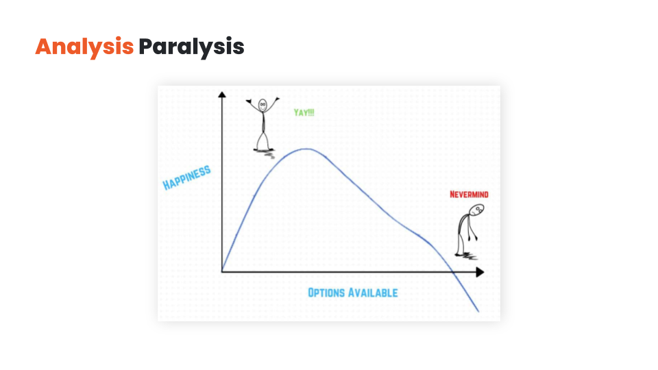
Having self-restraint and prioritizing your messaging is a good start. But you also have the option of delaying some of your messages instead of displaying all of them at the same time.
This approach is called layering. Overlays give you the opportunity to trigger some of your messages later (based on time spent on page, or user activity like exit-intent or like a 50% scroll down).
With layering, you can get visitors to focus on your most important messages first, and then use a secondary message as a backup plan if your primary messages aren’t working.
Let’s say your visitor is searching for “the best weight loss pills for men”.
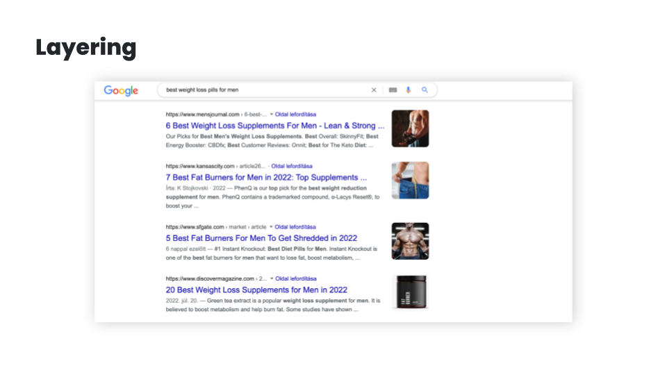
This implies that the visitor is solution-aware and in need of some education about the best products, so your primary content could be a blog article comparing the best weight loss pills for men.
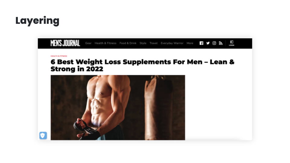
But if they’ve scrolled through 80% of the article, you can assume that they’re becoming increasingly product aware, so it might be a good idea to test for buying intent by showing them a special offer. You could also use some time-limitation (like “this discount is only available for the next 15 minutes”) to increase fear-of-missing-out (FOMO).
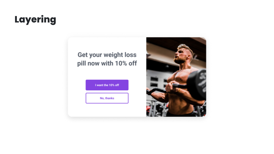
And just in case they’re still not responding, you can still have an exit popup in your back pocket. You can offer your best content in exchange for their email address, and this allows you to build and nurture a relationship with them.
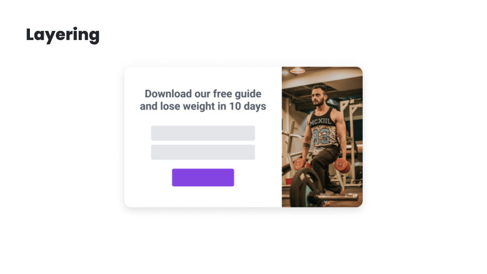
While having all these offers embedded into the main content could work, having them layered like this will significantly improve your chances at getting a conversion.
In the next lesson, I’m going to share the best ecommerce personalization use cases. I’ll see you there!
Hey, it’s Csaba, and welcome back! In this lesson, I’m going to share the top ecommerce personalization use cases. Let’s get started!
Understanding what your customers really want and figuring out how you can help them is the best way to create personalized experiences that are truly meaningful.
But luckily, there are a couple of strategies that most successful ecommerce brands use, each of which can provide you with inspiration for your own personalization strategy.
Let’s have a look at these examples starting at the beginning of the user journey:
First, let’s talk about the landing page.
My number one advice is to change the copy & headline of the landing page based on demographics or interest. As discussed, these factors can most easily be pulled from the ad you’re using to draw traffic to the landing page. For example, if you’re selling a portable blender, like Blendjet, you might have several value propositions.
You’ll most likely experiment with creating ads based on each of these value propositions. If someone clicks through the ad promoting portability, then this is what you should promote on your landing page.
On the other hand, if your ad promotes the Self-cleaning feature, then this could be the main value proposition on the landing page.
If your product can solve more than just one problem, and you run advertising to different customer segments based on their problems, it can be a good idea to personalize the landing page — including the headlines and the product recommendations — based on the segment’s needs and serve different headlines for people who, for instance, want weight loss and for people who want better sleep.
Alright, after the landing page, the next step in the user journey is usually list building, which is generally accomplished through welcome popups.
Of course, you shouldn’t show a list-building welcome popup to those who are already subscribed. With this segment, you can and should move forward to the other personalization use cases.
But for those visitors who aren’t subscribed, you can personalize this welcome popup based on the country they’re visiting from, serving different popups to people from the United Kingdom.
Another option is to use their interest to personalize the popup – in a very similar fashion to the examples seen with landing pages – and serve different value propositions for people who, for instance, want weight loss.
You can also differentiate based on traffic source, and try giving a special welcome to Facebook/Instagram users or to people visiting from a partner’s website or Facebook/Instagram profile. Each of these personalizations can easily boost subscription rates by up to 100%!
And don’t forget about returning visitors: welcoming them back with the products they were browsing on previous visits will not only help them continue where they have left off, but will leave a really nice impression.
The next strategy is to personalize special offers on your website so that they don’t look generic. This will increase their efficiency.
For example, giving your special offer a deadline and inserting a countdown — not just a fake one, but a real one — and providing dynamic discount codes can as much as double the efficiency of an offer.
Or just simply inserting the name of the current month so the offer FEELS more special will increase conversion rates by up to 10%.
Getting the most out of seasonal offers like running a teaser campaign before Black Friday and then communicating it again on the day is also a great way to boost sales.
You can also differentiate your offers based on intent and source: you can decide not to offer discounts to visitors clicking through from Google Shopping or other price comparison sites—since these users already have high buying intent and they’ve already seen your prices. Or if people clicked through from specific campaigns, you should remind them, but only them, of the offers that those ad campaigns communicated.
But the real magic happens when you create real targeted offers to specific segments, like rewarding your VIP customers or reactivating churned and at-risk customers.
And of course, you can also use the interest- or demographics-based personalization: if people want better sleep, well, give them better sleep even in your offers as we’ve seen the examples with landing pages and welcome popups.
Personalization can also be very effectively used for upselling and cross-selling.
Recommending products to users based on their behavior is a basic best practice.
But you can also get more creative, like upselling specific products based on cart value or cart content, promoting the most popular products to people who are in an earlier awareness stage, or making it clear how much extra spending is required to qualify for free shipping. Ideally, these messages should be tailored for each country.
Yet another popular approach is offering free items if the customer’s cart has reached a certain amount/milestone.
Next up is cart abandonment. Decreasing cart abandonment is always a big focus of ecommerce marketers.
Reminding users of their discount codes, while reminding them of the associated deadline is a really good starting point.
Emphasizing limited stocks either in embedded format or in an exit popup can also significantly decrease cart abandonment.
For those visitors who haven’t yet subscribed and are eligible for a discount, you can offer this discount when they try to leave your site empty-handed.
And of course, all these offers can be adjusted based on the value and/or the content of the cart.
In cases where you don’t want to offer discounts, you can experiment with promoting your most popular products, getting a second chance to raise the visitor’s interest.
And here’s the last step in the user journey. Sending your feedback collection messages at just the right moment will ensure you aren’t annoying your customers.
As mentioned, getting feedback about what visitors are missing on product pages or on shipping pages can be a very effective way to get quality user feedback.
Alternatively, you can choose to measure the overall satisfaction with your website followed by extra questions to get more in-depth information based on their answers. You can also use this same technique to get testimonials from satisfied customers!
And finally, the most efficient way to get real attribution data is to ask your customers where they heard about you. It’s especially important if you’re doing a lot of brand building and/or social marketing, where most of the attribution is undetectable through Google Analytics.
As you can see, there are many use cases for personalized messages during different stages of the user journey. In the next module, I’ll show you how to create personalized messages that your visitors will love—and that generate amazing conversion rates. I’ll see you there!
Hey, it’s Csaba, and welcome to the third module. Over the next few lessons, we’ll go over how to create and set up winning personalized messages. In this first lesson, we’ll look at all the different message formats you can choose from. Let’s get right into it!
You can deliver personalized messages on your website in many ways. Each message format has its own advantages and disadvantages.
At a high level, we can rank the different message formats based on how assertively they capture the visitor’s attention. Overlays usually rank higher on this scale than embedded messages, which means that they are a more effective way to get people’s attention and thus they have higher conversion rates.
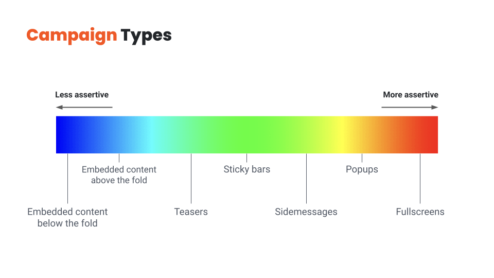
So why shouldn’t you use overlays to deliver all your messages? You guessed it: because they’re also more intrusive, and overdoing them will result in a frustrating user experience.
Finding the right balance between embedded messages and overlays is key.
You should choose overlays for your most important messages and use personalized embedded messages for the rest. If you use only embedded messages, you’ll leave a lot of money on the table, but using only overlays will quickly become annoying for your visitors.
So let’s quickly review these message types from least assertive to most assertive:
Now that we’ve covered all the potential message types, let’s see how we can get the most out of them!
Hey, it’s Csaba, and welcome back! In this lesson, we’re going to discuss how to find the right value proposition for each visitor segment!
There are lots of ways to improve the efficiency of your messaging, but there’s one aspect that stands above all: the customer has to care about the message.
If the main essence of your message—whether it’s an offer or an explanation of your value proposition—doesn’t resonate with the visitor, any tactic you try to increase conversions will be like putting lipstick on a pig.
That’s why understanding your customers and figuring out what their pain points are, and how you could better help them, matters so much.
Given that basic understanding, here are a couple of rules of thumb to help you create messages that really resonate with the user:
Rule no. 1 is to talk about the visitor’s problem.
Everyone has a problem. There may be no better way to get someone’s attention, than starting with a recognition of their problem and pushing their “buttons”. You might have an incredibly compelling offer for a visitor, like offering to win a diamond necklace worth $2,000…. But if the visitor is a guy named Ben, who is looking for a wedding ring for his fiancee, he’s not likely to be interested in winning a necklace. On the other hand, if he gets an offer like “Get 10% off on our exclusive wedding rings”, he’s almost certainly going to sign up to an email list in order to get that discount. It’s also a good idea to focus on the benefits of your offer instead of the offer itself. Say someone is browsing your website to get better sleep, mentioning that problem in the headline instead of leading with “free ebook” will most likely result in better conversion rates.
Rule no. 2. is to give a compelling offer.
If you want your visitors to take some action, you need to give them a compelling enough reason to do so. Even if you’re just trying to get people to sign up for your newsletter, that small action comes with a “cost” to the visitor: they are paying with their time and privacy. So what constitutes a good reason to sign up? For ecommerce stores, the surest way to get someone to sign up for email or SMS is to “bribe” them with a discount. While it’s often the easiest solution from a marketer’s perspective, the offer doesn’t necessarily have to be a discount or even monetary: based on the user’s awareness stage and interest, free content or educational resources can be even more powerful. While a 15% discount doesn’t really need much explanation, other offers can be a little bit more complex. In these cases, you’ll need to be more creative in how you explain the value of your offer in a short and concise manner.
Rule no. 3 is to make the visitor feel special.
Messaging that makes the user feel more special will improve both your results and customer experience. If you’re using a targeted message to a specific visitor segment—which you should—the easiest way to make someone feel special is to make it clear that you’ve created this message just for people like them. One way to do this is by highlighting the name of the segment in your message itself, just like BoomByCindyJospeph did. You can also use the simple tactic of using the visitor’s first name or referring to their country in your welcome messages. A really special offer, only valid for a small group of visitors, can also make a visitor feel like a brand is relating to them as a person. It’s always worth remembering that your visitors are pretty smart: you can claim that your offer is “special”, but if every detail of it shouts that it’s a generic offer—like using a simple discount code like 10OFF—then your visitors will feel like you’re trying to fool them rather than feeling special.
This takes us to rule no. 4, which is to increase the fear of missing out (FOMO).
While trying to rush someone who isn’t ready to make a purchase is generally not a good idea, giving a reason for product- or fully-aware users to buy now rather than later is one of the most efficient psychological tools in an online marketer’s arsenal. The most basic method is making all your offers “seasonal” rather than running generic 10% off all year. You can have Halloween offers, then Black Friday/Cyber Monday offers, then Christmas offers, then Valentine’s sale, and so on. Fortunately, there’s some special holiday or occasion every week, so you never have to run out of seasonal opportunities. Also, you can use simple methods like countdowns and reminders to keep the visitor aware that your offer is limited and so are your products.
And finally, it always helps to put some fun and/or surprise into your messaging.
It can be as simple as a witty headline like TheOodie’s. Or Zendesk’s. Or you can even take it a step further and use self-deprecating humor in your copy. Another way to add an element of mystery to your messaging is as simple as offering a “Mystery discount”. Finally, you can use a suite of gamified messages like Lucky Wheels, scratch cards, or Pick-a-gift campaigns.
Hopefully, you’ve come up with a few new ideas for your value proposition. In the next lesson, we’ll discuss how to refine these ideas into a high-converting message. I’ll see you there!
Hey, it’s Csaba, and welcome back! In this lesson, we’re going to talk about crafting a high-converting message.
Let’s assume you’ve found the right message for the right audience – that’s already half the battle! But there are many small details that can mean the difference between an average and an awesome conversion rate.
Again the specifics vary between industries and specific brands, but there are a few important rules of thumb to remember:
Rule no. 1 is that less is more.
Your customers shouldn’t have to struggle to grasp your message right away, rather, they should immediately understand the value of your offer. When it comes to writing a copy for your website, simplicity is king. You definitely don’t want your visitors to get confused about what the words in your headline or popup mean. Keeping your copy as short as possible is the primary way of ensuring comprehensibility. Your visitors will understand your message best if it only contains the words you need to get your point across. It’s also important to have as few call-to-actions as possible, each of which should be clear and consistent with the messages you’re sending. If you want to craft an effective CTA, a simple “Sign Me Up” or “Send My Discount Now” usually does the trick.
Rule no. 2. is to be human.
It’s always worth remembering that your visitors are humans, and humans are emotional. And to engage with them, the best thing you can do is to get over your fear of the “F-word” – which is “feel” ;). Depending on your goals, you can trigger the right emotion with your messages. Like if you’re trying to encourage them to make a charitable donation, you could use words and images that connect your message to your audience’s hearts. You can also be more human and likable by speaking the language of your target audience. If you’re selling to a young audience, feel free to use slang, but you won’t want to use it for the 65+ demographic. It is also true for images, which brings us to the topic of design.
Rule no. 3. is to use a clear design that puts focus on your main value proposition.
Never use images without a clear reason that goes beyond just making your messages “look better”. Use images to support the message itself rather than to just grab attention. Choose images that reinforce — or at least don’t contradict — what your copy is saying. Mismatched text and images are confusing because your visitors won’t know which message to focus on. Another strategy is to insert visual elements like arrows that point toward the call-to-action button. An arrow encouraging visitors to “Click Here” will always increase the salience of your CTA button. But be careful, it also increases the noise, so use it only sparingly.
Rule no. 4 is to be consistent with your design.
While it might be easy to pick a popup template that somewhat resembles your website’s design, having it match exactly in terms of fonts, colors, and overall style will make both the results and the customer experience much better. It’s even more important if you are using multiple personalized messages on your website. Having a chaotic mix of random embedded and overlay messages will make the visitor feel confused and disoriented.
Once you’ve cut down your copy to just include the essential parts, and made sure that all your copy and images are consistent with your website and also with each other, you have a powerful message in your hands.
That’s the end of module three. In the last module, we’ll talk about evaluating the effectiveness of your personalization efforts, revenue attribution, and A/B testing. I’ll see you there!
Hey, it’s Csaba, and welcome to the final module of OptiMonk’s website personalization course! Over the next lessons, we’ll talk about measuring the performance of your messages and optimizing them to achieve even better results. First, let’s dive into the question of how to evaluate whether your personalization efforts are effective. Let’s get right into it!
For any kind of marketing activity you undertake, there should be a measurable way of deciding whether or not the time and money you put into it were worth it. Measuring the results of personalization efforts is equally as important as measuring the ROI of a Facebook ad campaign.
So how do you go about it?
First of all, you need to decide what numbers you are going to use to measure success. These will be your KPIs or Key Performance Indicators.
You can choose to use any of the leading indicators, like click-throughs or signups (which are based on actions someone takes immediately upon seeing a personalized message), or lagging indicators like revenue or customer lifetime value (which can take some time to show up).
Depending on the nature of your personalization efforts, it can make sense to track your results using each of the KPIs just mentioned. But, you should also be aware that lagging indicators like revenue can be very misleading in some circumstances. For example, if you measure the performance of a signup form based on the extra revenue it generates, you can easily be led astray. Why? Because your store’s bottom line will be influenced by a great many different factors besides your personalized messages.
Once you’ve decided what to measure, you need to find the right tools to measure your KPIs.
For leading indicators like click-throughs and signups, the personalization platform you use will often provide a decent reporting and analytics system.
For more complex lagging indicators, you’ll probably need additional analytics solutions, such as Google Analytics.
But the problem here is that Google Analytics and similar tools are only able to measure anonymous visitor activity over the course of one session. That means you won’t be able to connect the dots between different, longer-term personalization campaigns.
That’s why having a personalization platform like OptiMonk makes sense. It keeps a complete overview of each customer’s journey from the very beginning to the end, which means you can attribute outcomes like revenue to personalized campaigns over longer periods. Thus, you’re able to measure the efficiency of even your most complex personalization efforts.
Given that you’re tracking the right KPIs with the right tools, how can you actually measure the extra revenue that your personalization efforts have generated? By running experiments, which are often called A/B tests.
When you A/B test a personalized message, you compare what actions two different groups of visitors take: the ones who are having a personalized experience, which is often called a test group, versus a group of visitors who only ever see a generic, non-personalized, version of your website, which is usually called the control group.
In the next lesson I’ll introduce you to the world of A/B testing, and teach you how to run successful experiments. I’ll see you in the next lesson!
Hey, it’s Csaba, and welcome back! In this lesson, we’re going to dive into A/B testing.
As discussed in the previous video, there’s no single perfect way to measure the effeciency of your personalization efforts. Nonetheless, A/B testing has proven to be the most time-tested way to scientifically and continuously improve your results.
At a high level, A/B testing—which is also known as split testing—is about splitting your visitors into two or more groups, showing different content to each group, and then measuring which group had more conversions and ended up reaching your chosen goal.
In the personalization world, you’ll usually have an assumption or idea for personalization that you want to test. It’s usually called a hypothesis.
Then, you go ahead and create your personalized message. In order to see if it works, you’ll split the segment you’re targeting in two: showing your new personalized content to one half (which we call the test group) and the previous version to the other half (which is often called the control group).
After you collect enough data about the performance of these two groups (which is usually called statistical significance), you can evaluate the results and decide whether your hypothesis was true or false.
If it was true, your personalized message will result in more conversions or revenue and you can be confident to run this new message variant to 100% of your target audience. If it was false and you’re not making any extra conversions or money, then you can just cancel it, and let the show continue as it was before you tried out your groundbreaking idea.
Running A/B tests is the surest way to victory. Why? Because you have a super-limited downside, but an unlimited upside.
If your hypothesis turns out to be false, then you can just simply stop the experiment. The only loss will be (at most) a couple of conversions among the test group who saw the new message during this short period of time. But if your personalization idea really does improve your conversion rate, then you can run it endlessly and let it create extra value for all eternity.
A/B testing is a great method to fine-tune and optimize your existing messages for the best possible results. You can just easily create new variants and test new offers, copy, and CTAs.
But A/B testing is also a great tool to make decisions about the legitimacy of your new ideas: just create a new A/B test, display this new message to only one-half of your audience, and simply compare the results.
This wraps up OptiMonk’s website personalization course. Everything you’ve learned in this course will help you to get started with website personalization and improve your conversion rates. Thank you for joining me and be sure to like, share, and subscribe for more actionable videos and courses.
I’ll see you in the next course!
You finished the course, and now you’re wondering what’s next? How to get started?
We get it, it can be intimidating. That’s why we created a Website Personalization Worksheet that gives you everything you need to get started with website personalization. Born from our experience with hundreds of successful ecommerce stores, it’s the most valuable website personalization resource you’ll find online.
How to use the worksheet?
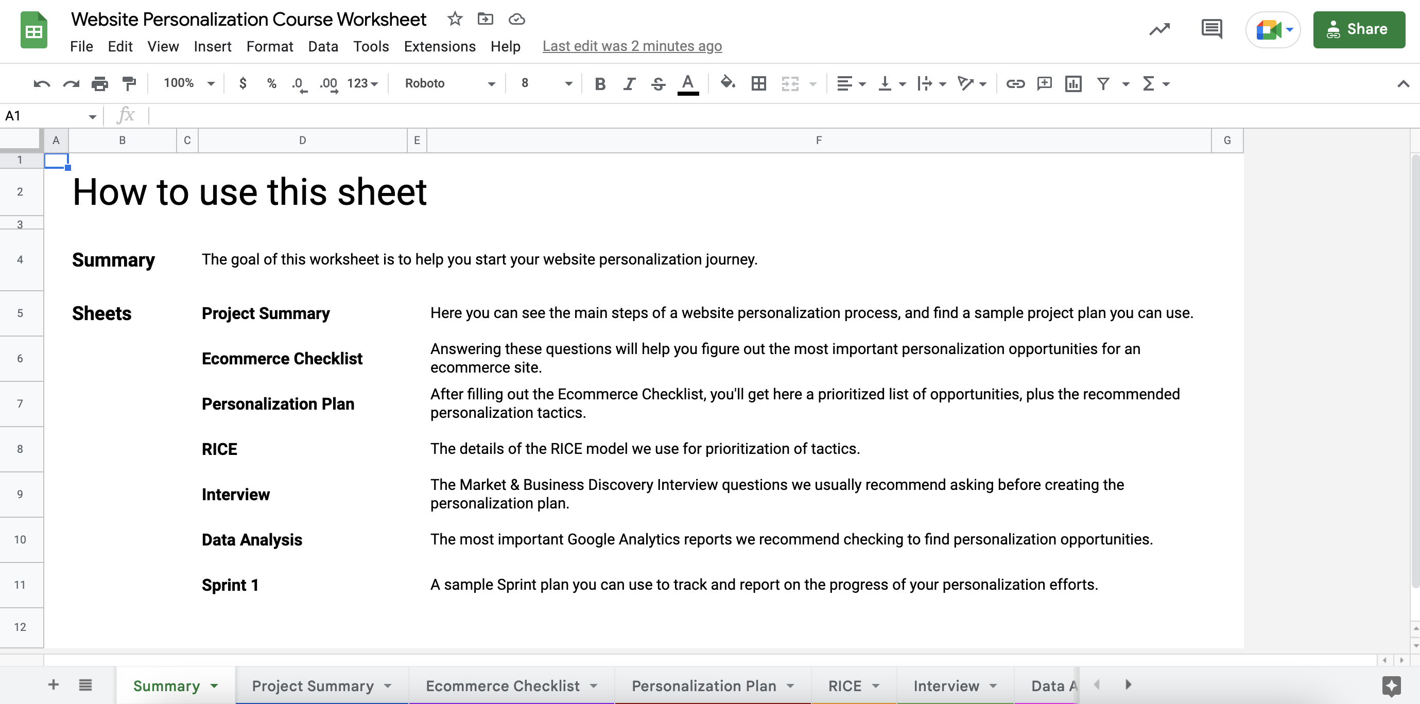
STEP 2: Go to the Ecommerce Checklist sheet and answer all the questions by adding a checkmark to the “Yes” or “No” columns.
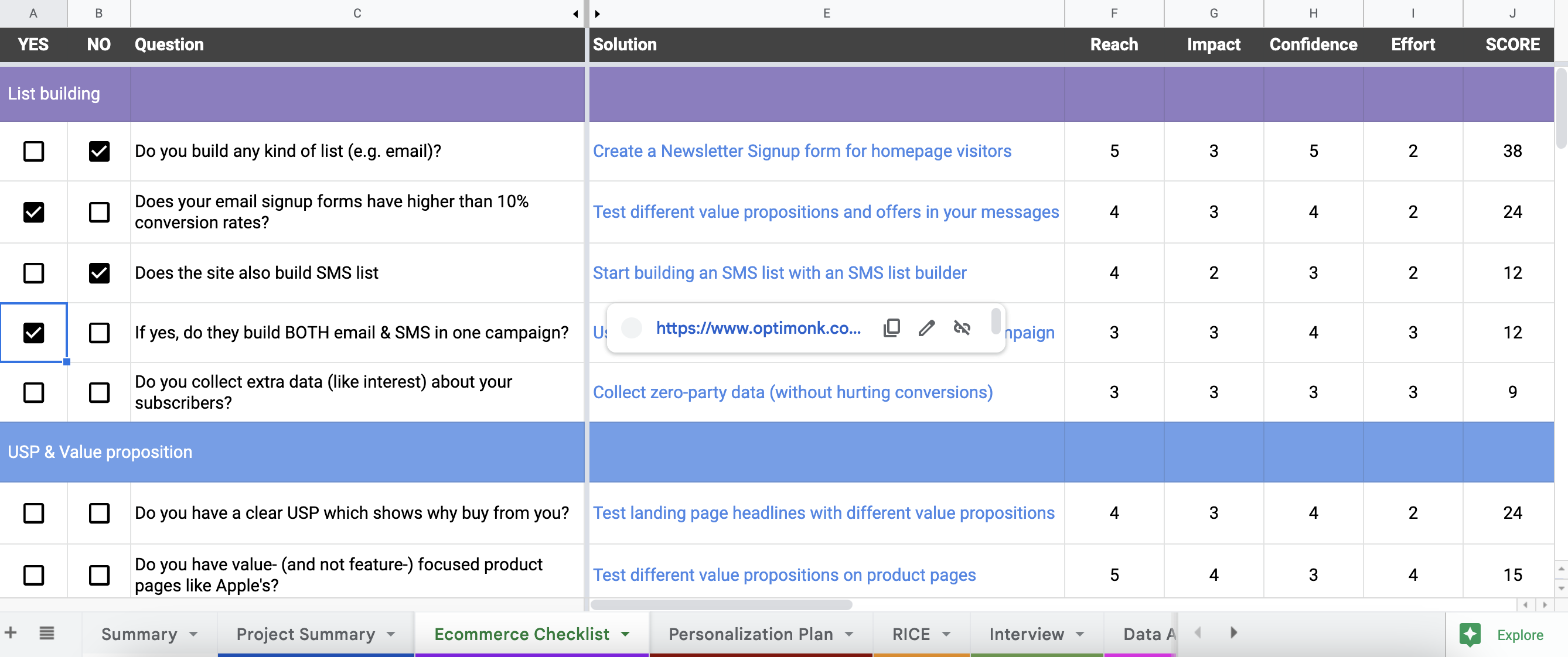
This will help you to uncover all the top personalization opportunities on your website.
STEP 3: Go to the Personalization Plan sheet. Based on your answers, here you’ll see an automatically ranked solution plan (using the RICE scoring method) with a recommended tactic for each opportunity.
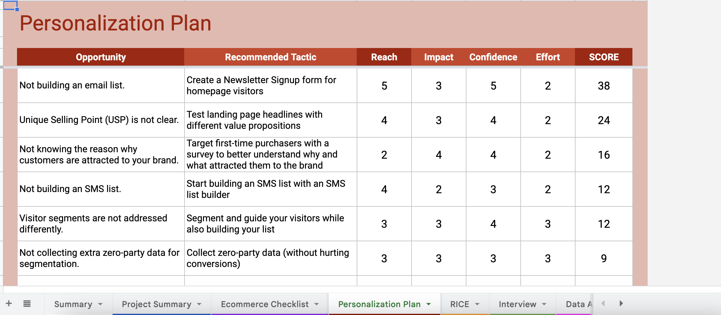
By hovering your cursor over the tactics, you’ll also see a link that gives you detailed guides on how to set up each tactic on your website.

From these links, you’ll be either redirected to a use case landing page full of ready-to-use templates (for basic tactics that are easy-to-setup), or you’ll be redirected to a step-by-step guide on how to set up the tactics (for more advanced tactics).
Besides this personalized plan, the worksheet also includes several useful tools, like a GANTT Chart, Sample Sprint Plan, Discovery Interview questions, and other tools to help you get started.
We hope the course and the worksheet together will help you to get started with web personalization and increase your conversion rates.
Good luck on your website personalization journey!
Get started now and turn traffic into sales!
Product updates: January Release 2025
