Getting started with OptiMonk course
Learn the basics of OptiMonk and launch your first campaign.
Learn the basics of OptiMonk and launch your first campaign.
Hi there and welcome to OptiMonk!
My name is Réka, and in the next 90 seconds, we’re going to be covering what OptiMonk is and how you can use it to get the most out of your ecommerce store or website.
Shall we begin?
OptiMonk is a website personalization platform that allows you to create high-converting personalized messages that don’t annoy your visitors.
Wanna grow your email and SMS list or decrease your cart abandonment rate?
Or maybe you’d like to promote special offers and increase your average cart value with product recommendations?
OptiMonk helps you achieve all of that!
And with our powerful personalization options, you can control precisely when and where your messages appear to your visitors. So you don’t have to worry about showing the same boring message to everyone.
And wait, there’s more.
With OptiMonk, you can launch popup campaigns, embedded content, sticky bars, sidemessages, lucky wheel popups and full screens.
So whether you’re brand new to website personalization or you’re switching from another tool to improve your results, OptiMonk is a smart choice.
If you’d like to dive a bit deeper, I highly recommend watching the rest of this course so you can start launching successful OptiMonk campaigns ASAP.
Good luck!
Welcome to OptiMonk Academy. In this lesson, we’re going to have a look at how to install OptiMonk on your website in a few simple steps. Don’t worry, you won’t need to sharpen your tech skills to do this.
Depending on the platform you use, you have two options to choose from. If you have a custom-built site, you’ll need to access the source code and insert a single line of JavaScript code in the <head> section of each page of your website. You may need a developer to help you with that.
However, if your website is built on WordPress, Magento, or Shopify, we have good news for you! OptiMonk has integrations with these platforms to make setup quick and easy.
Today, I’m going to use a Shopify store as an example.
After logging into your store, you’ll add the OptiMonk app from the Shopify app store.
Choose Apps from the menu and click on “Visit the Shopify App Store.” Once you’re here, search for OptiMonk.
Click on the Add app button to install OptiMonk on your Shopify store. On the next screen, click on ‘Install app’ to finish the setup process. Now the only thing left is to log into your OptiMonk account or create one.
And you’re done! It was that easy. Your Shopify store is ready to be personalized with beautiful onsite messages.
Hey there!
Before you roll up your sleeves and dive into crafting personalized messages, let’s make sure you’re up to speed on the OptiMonk admin so you can find what you need quickly.
When you log in to your OptiMonk account, you’ll see your dashboard right away.
First up, you’ll find some statistics about your campaigns, like
Shopify stores can also see the assisted revenue their campaigns generated.
Scrolling down, you’ll find your top-performing campaigns and their stats.
To check out all your campaigns, either click on the “All campaigns” button on the right, or click on the Campaigns icon in the navigation bar.
On the Campaign list page, you can easily filter or search for specific campaigns.
Lower down on the navigation bar, you’ll find the Audience page, where you’ll see all the subscribers you’ve gathered via OptiMonk campaigns. You can filter them to find specific leads, but what you’ll probably be more interested in is the option to export them into an Excel file or CSV.
Next, you’ll find the Templates menu, where you can browse hundreds of pre-built templates. You can filter them based on your goal, like list building, stopping cart abandonment, recommending products, and so on. You can also filter by seasonality or message type, like Embedded, sticky bar, popup, sidemessage etc. You’ll always see some recommended templates and use cases on the Templates page to help you choose quickly.
Once you have an active campaign, you’ll want to keep an eye on your Campaign Analytics. Keep in mind that assisted revenue information is only available if you have a Shopify store.
And finally, by clicking on the small account icon at the bottom of the navbar, you’ll find key information about your account, like
You can change personal details, billing address, and your payment method by accessing Settings from the account icon.
Alright, that was a lot, but getting familiar with the admin is a very important step towards making the most out of OptiMonk.
Now that you know your way around your OptiMonk account, you can start creating a new campaign. If you’re a design ninja, you can go ahead and create one from scratch, but if you’d rather spend your free time doing something else, you’ll be happy to know we have hundreds of pre-built, professionally-designed templates you can choose from!
We give you many different ways of filtering templates to find what you’re looking for.
When you’re creating a campaign, you have goals in mind that you want to accomplish, right? That’s why we have the option to filter the templates by goal. Whether you want to stop cart abandonment, collect feedback from your visitors, or build your list, you can find the perfect template.
You can also use the Seasonal filter to find templates for a specific season or holiday, like Black Friday or Christmas.
Finally, you can filter by Message type as well. OptiMonk offers a variety of different message types, like embedded (which looks like native content on your website), standard popups, sidemessages, sticky bars and more.
Embedded content is ideal if you want to use personalized offers or messages without disturbing the browsing experience.
Side messages are a great way to ask for feedback.
Sticky bars are most frequently used to communicate free shipping offers.
You’ll probably want to use fullscreen campaigns for special campaigns only, like for Black Friday when you’re launching an irresistible offer that you don’t want anyone to miss.
As I mentioned, you’ll always see some recommended templates and use cases at the top of the Templates page. Templates covering different use cases from your “theme” will be listed here, too. This way you can create a campaign that matches your brand in just a few minutes. Of course, to do that, you’ll have to define your brand settings once— your colors, fonts and corner roundings.
Once you find a template you like, click on “select template” and choose the domain that you’ll use to display the campaign.
Now you’re ready to design your campaign, which is exactly what we’ll cover in the next lesson. See you there!
Welcome back!
After choosing a template, you’re finally ready to get your hands dirty and design your campaign. In this lesson, I’ll walk you through the main functionalities of the OptiMonk Editor, but I also encourage you to explore it on your own because there’s so much you can do here!
On the left side, the first option you see is Theme. Our newest templates are all Themes-compatible, which means that if you define your brand settings here once, the next time you create a campaign from this theme, OptiMonk will remember them. Pretty cool, right?
Display is where the most essential appearance settings live. Under position, you can choose where on the page you’d like your popup to appear. For example, you can set whether your sticky bar appears on the top or the bottom of the page, or set your side message to show up on one side if you already have another important element, like a chat widget, on the other. You can also choose the type of transition to use, (like zoom or fade) and modify the color of the website overlay.
Let’s move on to the heart & soul of campaigns: Elements. The OptiMonk Editor is a drag & drop editor, meaning that you can simply drag new elements into your campaign and drop them exactly where you want them to be placed… just like I did with this input field here. Once you have the element selected, you can see all the options for this element on the right. Here, you can style the element: for example, let’s choose a background and hover color and give its corners some radius.
Under “Add elements,” you’ll find all available elements sorted into groups. You can add input fields to collect phone numbers and first names, create a survey with feedback elements, or add a countdown or discount code element. Here, let’s add a new input element to the campaign to collect our visitors’ first names along with their email addresses. By default, we’ll assume it’s the first name that you want to ask for, but if you’d like to change the input type or the placeholder text, you can do it on the right.
You may have noticed that if you have any text on your campaign selected, you have all these options to style the text. Select the font you want to use, font weight, font size, color etc. You can even add your own font family by clicking on the plus icon.
The last option we have left on the nav bar is Dev mode. This is where you can insert custom CSS and JavaScript.
So now that you have all these elements on your campaign, you need a clear overview of the structure to do some further styling. Here’s a quick tip: anytime you click on the website overlay, you’ll see all the different elements of your campaign listed on the right. If you select any element here, you’ll see all its styling options, you can change its background, adjust its size, and corner rounding.
If you’re creating a campaign that has multiple pages (like a list-building offer and a thank you page), you can select which page you want to edit here at the bottom of the Editor. The last page you’ll see here will always be called “teaser.” The teaser is a small version of a popup that can appear before and after your main popup is displayed. You can edit the campaign displayed here, modify the teaser’s settings, and enable or disable it entirely.
Once we have all pages of our campaign ready, we’re ready to review how it looks on different devices. Luckily, all our templates are responsive. If you’re using any of our pre-made templates, they’ll appear perfectly on both desktop and mobile devices. However, you can always make edits ONLY to the mobile version of your campaign, if you want.
And finally, with Live Preview, you can check your brand new popup over your live site. You can even share this link with your colleagues for approval.
Make sure to save your design once you’re ready!
Congrats on designing your very first campaign. Join me in the next lesson to learn about all your triggering options.
Welcome back! Now that you’ve designed your campaign, it’s time to learn about triggering options.
Triggers are the rules that determine when your campaign will appear. You have six options here. Let’s see what they are!
You can add or edit triggers under the “When will the popup show?” setting. There’s a recommended trigger already set up for each template. You can either leave it as it is, or you can delete it and add another trigger by clicking on the “Add new trigger” button.
Here, you’ll see all the trigger options.
First, you have “On exit-intent”. With this trigger, your campaign will only appear when a visitor attempts to leave your website. This is great for cart or site abandonment popups.
You can also show your campaign when a visitor clicks on a specific part of your page. If you have a lead magnet in your article, you can make it appear only to people who click on a button or banner.
You can decide to only show your campaign after a visitor has scrolled down on your page, or a few seconds after a user has stopped all activity on your site.
You can also display a campaign based on the time spent on your page. This is perfect for email popups.
And finally, you can use a JavaScript event as a trigger.
When you choose a trigger, you’ll have the option to select the devices where you want to show the campaign. And you can even set up multiple triggers, so you might decide to use exit intent on desktop, but use a time-based trigger on mobile.
Well, that’s it for triggers! In the following video, we’ll talk about targeting options, a.k.a who will see your campaign. Ready?
The era of the one-size-fits-all approach is officially over. Customers expect a highly-relevant experience everywhere online. So you’re probably wondering: how do you segment your website visitors in an effective, yet simple way? In this lesson, I’m going to show you exactly how to do it using OptiMonk targeting rules.
Hey there, my name is Réka and I’m about to show you how to select the right segment for any campaign.
Before we get into it, let’s cover the basics first:
Segmenting your audience and displaying a different message to each segment will help you create a more personalized customer experience. OptiMonk has countless targeting options that empower you to dissect your website traffic into smaller visitor segments. If you’re an online seller, these segments could be “Active visitors,” “Returning visitors” and “Just Purchased visitors.” But if you also build email or SMS lists, you might want to focus on “Non-subscribers” or “New home page visitors.”
These segments can be defined by a specific set of targeting rules that – let’s be honest – might be intimidating for new users. That’s why we recommend a pre-defined segment for each template based on its goal. You may want to keep these, modify them, get rid of them, or add new conditions.
You can also save a set of targeting rules and create a Custom Segment to re-use in future campaigns.
When you look at targeting rules more closely, you can see that conditions are grouped into 3 different categories. You can decide when you want your campaign to show up based on:
Let’s look at time & context first.
It’s always a good idea to set a frequency condition to avoid annoying your visitors by displaying the same campaign repeatedly. Here, you can define the maximum amount of times you want your campaign to appear to a visitor with at least – let’s say – 2 hours between appearances.
Another handy rule that I already mentioned allows you to decide whether to show your campaign to New or returning visitors. Simply select one of the two and hit save.
The Country selector condition is useful, for example, if you offer free shipping only to certain countries. You can include or exclude any countries here. Let’s say we’ll have this campaign appear only for people in the USA.
Under Pages and custom rules, you can find behavior-based targeting options. For instance, if your visitor is visiting a given page of your site like a product page, you can have your campaign appear only on that specific URL with the current page rule. I recommend using the contain/doesn’t contain option here to keep things simple. Let’s say we have a product page called /usa-tshirt/, so I’ll simply add the end of the URL here if I want my campaign to be shown only on this specific page.
I saved the best for last: the most powerful option I’ll show you today: Cart rules. If your OptiMonk account is linked to your Shopify or any other store we have a direct integration with, this feature will work automatically and empower you to recover a significant percentage of abandoned carts. Let’s use cart value in our example and select greater than 29 dollars. With this rule, you can offer free shipping only above a certain cart value, offer a discount or free product above a certain number of products, and use an array of techniques to make sure you close the deal, but only if customers are willing to make a big spend.
I hope you found this lesson useful. These are the settings that will help you make the most of your on-site customer journey.
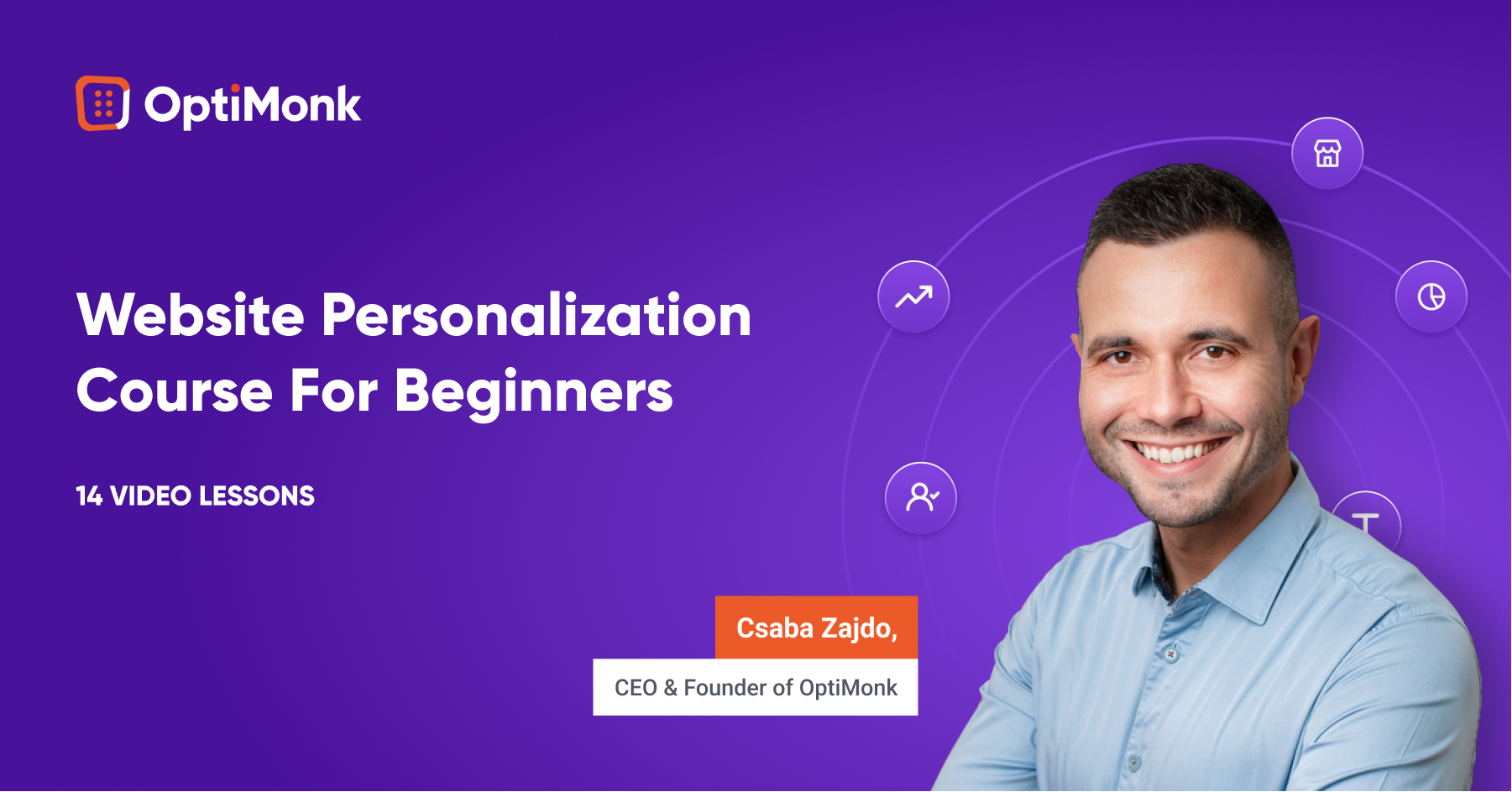
If you’ve rather take the next steps in your personalization journey self-paced, your best bet is our on-demand Personalization Course with our CEO & Founder, Csaba Zajdo. Learn the basics to kick off your web personalization journey and increase conversion rates with a proven website personalization strategy.
Hey, it’s Csaba, and welcome back! In this lesson, I’m going to share the top ecommerce personalization use cases. Let’s get started!
Understanding what your customers really want and figuring out how you can help them is the best way to create personalized experiences that are truly meaningful.
But luckily, there are a couple of strategies that most successful ecommerce brands use, each of which can provide you with inspiration for your own personalization strategy.
Let’s have a look at these examples starting at the beginning of the user journey:
First, let’s talk about the landing page.
My number one advice is to change the copy & headline of the landing page based on demographics or interest. As discussed, these factors can most easily be pulled from the ad you’re using to draw traffic to the landing page. For example, if you’re selling a portable blender, like Blendjet, you might have several value propositions.
You’ll most likely experiment with creating ads based on each of these value propositions. If someone clicks through the ad promoting portability, then this is what you should promote on your landing page.
On the other hand, if your ad promotes the Self-cleaning feature, then this could be the main value proposition on the landing page.
If your product can solve more than just one problem, and you run advertising to different customer segments based on their problems, it can be a good idea to personalize the landing page — including the headlines and the product recommendations — based on the segment’s needs and serve different headlines for people who, for instance, want weight loss and for people who want better sleep.
Alright, after the landing page, the next step in the user journey is usually list building, which is generally accomplished through welcome popups.
Of course, you shouldn’t show a list-building welcome popup to those who are already subscribed. With this segment, you can and should move forward to the other personalization use cases.
But for those visitors who aren’t subscribed, you can personalize this welcome popup based on the country they’re visiting from, serving different popups to people from the United Kingdom.
Another option is to use their interest to personalize the popup – in a very similar fashion to the examples seen with landing pages – and serve different value propositions for people who, for instance, want weight loss.
You can also differentiate based on traffic source, and try giving a special welcome to Facebook/Instagram users or to people visiting from a partner’s website or Facebook/Instagram profile. Each of these personalizations can easily boost subscription rates by up to 100%!
And don’t forget about returning visitors: welcoming them back with the products they were browsing on previous visits will not only help them continue where they have left off, but will leave a really nice impression.
The next strategy is to personalize special offers on your website so that they don’t look generic. This will increase their efficiency.
For example, giving your special offer a deadline and inserting a countdown — not just a fake one, but a real one — and providing dynamic discount codes can as much as double the efficiency of an offer.
Or just simply inserting the name of the current month so the offer FEELS more special will increase conversion rates by up to 10%.
Getting the most out of seasonal offers like running a teaser campaign before Black Friday and then communicating it again on the day is also a great way to boost sales.
You can also differentiate your offers based on intent and source: you can decide not to offer discounts to visitors clicking through from Google Shopping or other price comparison sites—since these users already have high buying intent and they’ve already seen your prices. Or if people clicked through from specific campaigns, you should remind them, but only them, of the offers that those ad campaigns communicated.
But the real magic happens when you create real targeted offers to specific segments, like rewarding your VIP customers or reactivating churned and at-risk customers.
And of course, you can also use the interest- or demographics-based personalization: if people want better sleep, well, give them better sleep even in your offers as we’ve seen the examples with landing pages and welcome popups.
Personalization can also be very effectively used for upselling and cross-selling.
Recommending products to users based on their behavior is a basic best practice.
But you can also get more creative, like upselling specific products based on cart value or cart content, promoting the most popular products to people who are in an earlier awareness stage, or making it clear how much extra spending is required to qualify for free shipping. Ideally, these messages should be tailored for each country.
Yet another popular approach is offering free items if the customer’s cart has reached a certain amount/milestone.
Next up is cart abandonment. Decreasing cart abandonment is always a big focus of ecommerce marketers.
Reminding users of their discount codes, while reminding them of the associated deadline is a really good starting point.
Emphasizing limited stocks either in embedded format or in an exit popup can also significantly decrease cart abandonment.
For those visitors who haven’t yet subscribed and are eligible for a discount, you can offer this discount when they try to leave your site empty-handed.
And of course, all these offers can be adjusted based on the value and/or the content of the cart.
In cases where you don’t want to offer discounts, you can experiment with promoting your most popular products, getting a second chance to raise the visitor’s interest.
And here’s the last step in the user journey. Sending your feedback collection messages at just the right moment will ensure you aren’t annoying your customers.
As mentioned, getting feedback about what visitors are missing on product pages or on shipping pages can be a very effective way to get quality user feedback.
Alternatively, you can choose to measure the overall satisfaction with your website followed by extra questions to get more in-depth information based on their answers. You can also use this same technique to get testimonials from satisfied customers!
And finally, the most efficient way to get real attribution data is to ask your customers where they heard about you. It’s especially important if you’re doing a lot of brand building and/or social marketing, where most of the attribution is undetectable through Google Analytics.
As you can see, there are many use cases for personalized messages during different stages of the user journey. In the next module, I’ll show you how to create personalized messages that your visitors will love—and that generate amazing conversion rates. I’ll see you there!
Hey, it’s Csaba, and welcome to the third module. Over the next few lessons, we’ll go over how to create and set up winning personalized messages. In this first lesson, we’ll look at all the different message formats you can choose from. Let’s get right into it!
You can deliver personalized messages on your website in many ways. Each message format has its own advantages and disadvantages.
At a high level, we can rank the different message formats based on how assertively they capture the visitor’s attention. Overlays usually rank higher on this scale than embedded messages, which means that they are a more effective way to get people’s attention and thus they have higher conversion rates.
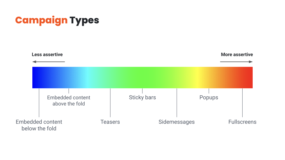
So why shouldn’t you use overlays to deliver all your messages? You guessed it: because they’re also more intrusive, and overdoing them will result in a frustrating user experience.
Finding the right balance between embedded messages and overlays is key.
You should choose overlays for your most important messages and use personalized embedded messages for the rest. If you use only embedded messages, you’ll leave a lot of money on the table, but using only overlays will quickly become annoying for your visitors.
So let’s quickly review these message types from least assertive to most assertive:
Now that we’ve covered all the potential message types, let’s see how we can get the most out of them!
Hey, it’s Csaba, and welcome back! In this lesson, we’re going to discuss how to find the right value proposition for each visitor segment!
There are lots of ways to improve the efficiency of your messaging, but there’s one aspect that stands above all: the customer has to care about the message.
If the main essence of your message—whether it’s an offer or an explanation of your value proposition—doesn’t resonate with the visitor, any tactic you try to increase conversions will be like putting lipstick on a pig.
That’s why understanding your customers and figuring out what their pain points are, and how you could better help them, matters so much.
Given that basic understanding, here are a couple of rules of thumb to help you create messages that really resonate with the user:
Rule no. 1 is to talk about the visitor’s problem.
Everyone has a problem. There may be no better way to get someone’s attention, than starting with a recognition of their problem and pushing their “buttons”. You might have an incredibly compelling offer for a visitor, like offering to win a diamond necklace worth $2,000…. But if the visitor is a guy named Ben, who is looking for a wedding ring for his fiancee, he’s not likely to be interested in winning a necklace. On the other hand, if he gets an offer like “Get 10% off on our exclusive wedding rings”, he’s almost certainly going to sign up to an email list in order to get that discount. It’s also a good idea to focus on the benefits of your offer instead of the offer itself. Say someone is browsing your website to get better sleep, mentioning that problem in the headline instead of leading with “free ebook” will most likely result in better conversion rates.
Rule no. 2. is to give a compelling offer.
If you want your visitors to take some action, you need to give them a compelling enough reason to do so. Even if you’re just trying to get people to sign up for your newsletter, that small action comes with a “cost” to the visitor: they are paying with their time and privacy. So what constitutes a good reason to sign up? For ecommerce stores, the surest way to get someone to sign up for email or SMS is to “bribe” them with a discount. While it’s often the easiest solution from a marketer’s perspective, the offer doesn’t necessarily have to be a discount or even monetary: based on the user’s awareness stage and interest, free content or educational resources can be even more powerful. While a 15% discount doesn’t really need much explanation, other offers can be a little bit more complex. In these cases, you’ll need to be more creative in how you explain the value of your offer in a short and concise manner.
Rule no. 3 is to make the visitor feel special.
Messaging that makes the user feel more special will improve both your results and customer experience. If you’re using a targeted message to a specific visitor segment—which you should—the easiest way to make someone feel special is to make it clear that you’ve created this message just for people like them. One way to do this is by highlighting the name of the segment in your message itself, just like BoomByCindyJospeph did. You can also use the simple tactic of using the visitor’s first name or referring to their country in your welcome messages. A really special offer, only valid for a small group of visitors, can also make a visitor feel like a brand is relating to them as a person. It’s always worth remembering that your visitors are pretty smart: you can claim that your offer is “special”, but if every detail of it shouts that it’s a generic offer—like using a simple discount code like 10OFF—then your visitors will feel like you’re trying to fool them rather than feeling special.
This takes us to rule no. 4, which is to increase the fear of missing out (FOMO).
While trying to rush someone who isn’t ready to make a purchase is generally not a good idea, giving a reason for product- or fully-aware users to buy now rather than later is one of the most efficient psychological tools in an online marketer’s arsenal. The most basic method is making all your offers “seasonal” rather than running generic 10% off all year. You can have Halloween offers, then Black Friday/Cyber Monday offers, then Christmas offers, then Valentine’s sale, and so on. Fortunately, there’s some special holiday or occasion every week, so you never have to run out of seasonal opportunities. Also, you can use simple methods like countdowns and reminders to keep the visitor aware that your offer is limited and so are your products.
And finally, it always helps to put some fun and/or surprise into your messaging.
It can be as simple as a witty headline like TheOodie’s. Or Zendesk’s. Or you can even take it a step further and use self-deprecating humor in your copy. Another way to add an element of mystery to your messaging is as simple as offering a “Mystery discount”. Finally, you can use a suite of gamified messages like Lucky Wheels, scratch cards, or Pick-a-gift campaigns.
Hopefully, you’ve come up with a few new ideas for your value proposition. In the next lesson, we’ll discuss how to refine these ideas into a high-converting message. I’ll see you there!
Hey, it’s Csaba, and welcome back! In this lesson, we’re going to talk about crafting a high-converting message.
Let’s assume you’ve found the right message for the right audience – that’s already half the battle! But there are many small details that can mean the difference between an average and an awesome conversion rate.
Again the specifics vary between industries and specific brands, but there are a few important rules of thumb to remember:
Rule no. 1 is that less is more.
Your customers shouldn’t have to struggle to grasp your message right away, rather, they should immediately understand the value of your offer. When it comes to writing a copy for your website, simplicity is king. You definitely don’t want your visitors to get confused about what the words in your headline or popup mean. Keeping your copy as short as possible is the primary way of ensuring comprehensibility. Your visitors will understand your message best if it only contains the words you need to get your point across. It’s also important to have as few call-to-actions as possible, each of which should be clear and consistent with the messages you’re sending. If you want to craft an effective CTA, a simple “Sign Me Up” or “Send My Discount Now” usually does the trick.
Rule no. 2. is to be human.
It’s always worth remembering that your visitors are humans, and humans are emotional. And to engage with them, the best thing you can do is to get over your fear of the “F-word” – which is “feel” ;). Depending on your goals, you can trigger the right emotion with your messages. Like if you’re trying to encourage them to make a charitable donation, you could use words and images that connect your message to your audience’s hearts. You can also be more human and likable by speaking the language of your target audience. If you’re selling to a young audience, feel free to use slang, but you won’t want to use it for the 65+ demographic. It is also true for images, which brings us to the topic of design.
Rule no. 3. is to use a clear design that puts focus on your main value proposition.
Never use images without a clear reason that goes beyond just making your messages “look better”. Use images to support the message itself rather than to just grab attention. Choose images that reinforce — or at least don’t contradict — what your copy is saying. Mismatched text and images are confusing because your visitors won’t know which message to focus on. Another strategy is to insert visual elements like arrows that point toward the call-to-action button. An arrow encouraging visitors to “Click Here” will always increase the salience of your CTA button. But be careful, it also increases the noise, so use it only sparingly.
Rule no. 4 is to be consistent with your design.
While it might be easy to pick a popup template that somewhat resembles your website’s design, having it match exactly in terms of fonts, colors, and overall style will make both the results and the customer experience much better. It’s even more important if you are using multiple personalized messages on your website. Having a chaotic mix of random embedded and overlay messages will make the visitor feel confused and disoriented.
Once you’ve cut down your copy to just include the essential parts, and made sure that all your copy and images are consistent with your website and also with each other, you have a powerful message in your hands.
That’s the end of module three. In the last module, we’ll talk about evaluating the effectiveness of your personalization efforts, revenue attribution, and A/B testing. I’ll see you there!
Hey, it’s Csaba, and welcome to the final module of OptiMonk’s website personalization course! Over the next lessons, we’ll talk about measuring the performance of your messages and optimizing them to achieve even better results. First, let’s dive into the question of how to evaluate whether your personalization efforts are effective. Let’s get right into it!
For any kind of marketing activity you undertake, there should be a measurable way of deciding whether or not the time and money you put into it were worth it. Measuring the results of personalization efforts is equally as important as measuring the ROI of a Facebook ad campaign.
So how do you go about it?
First of all, you need to decide what numbers you are going to use to measure success. These will be your KPIs or Key Performance Indicators.
You can choose to use any of the leading indicators, like click-throughs or signups (which are based on actions someone takes immediately upon seeing a personalized message), or lagging indicators like revenue or customer lifetime value (which can take some time to show up).
Depending on the nature of your personalization efforts, it can make sense to track your results using each of the KPIs just mentioned. But, you should also be aware that lagging indicators like revenue can be very misleading in some circumstances. For example, if you measure the performance of a signup form based on the extra revenue it generates, you can easily be led astray. Why? Because your store’s bottom line will be influenced by a great many different factors besides your personalized messages.
Once you’ve decided what to measure, you need to find the right tools to measure your KPIs.
For leading indicators like click-throughs and signups, the personalization platform you use will often provide a decent reporting and analytics system.
For more complex lagging indicators, you’ll probably need additional analytics solutions, such as Google Analytics.
But the problem here is that Google Analytics and similar tools are only able to measure anonymous visitor activity over the course of one session. That means you won’t be able to connect the dots between different, longer-term personalization campaigns.
That’s why having a personalization platform like OptiMonk makes sense. It keeps a complete overview of each customer’s journey from the very beginning to the end, which means you can attribute outcomes like revenue to personalized campaigns over longer periods. Thus, you’re able to measure the efficiency of even your most complex personalization efforts.
Given that you’re tracking the right KPIs with the right tools, how can you actually measure the extra revenue that your personalization efforts have generated? By running experiments, which are often called A/B tests.
When you A/B test a personalized message, you compare what actions two different groups of visitors take: the ones who are having a personalized experience, which is often called a test group, versus a group of visitors who only ever see a generic, non-personalized, version of your website, which is usually called the control group.
In the next lesson I’ll introduce you to the world of A/B testing, and teach you how to run successful experiments. I’ll see you in the next lesson!
Hey, it’s Csaba, and welcome back! In this lesson, we’re going to dive into A/B testing.
As discussed in the previous video, there’s no single perfect way to measure the effeciency of your personalization efforts. Nonetheless, A/B testing has proven to be the most time-tested way to scientifically and continuously improve your results.
At a high level, A/B testing—which is also known as split testing—is about splitting your visitors into two or more groups, showing different content to each group, and then measuring which group had more conversions and ended up reaching your chosen goal.
In the personalization world, you’ll usually have an assumption or idea for personalization that you want to test. It’s usually called a hypothesis.
Then, you go ahead and create your personalized message. In order to see if it works, you’ll split the segment you’re targeting in two: showing your new personalized content to one half (which we call the test group) and the previous version to the other half (which is often called the control group).
After you collect enough data about the performance of these two groups (which is usually called statistical significance), you can evaluate the results and decide whether your hypothesis was true or false.
If it was true, your personalized message will result in more conversions or revenue and you can be confident to run this new message variant to 100% of your target audience. If it was false and you’re not making any extra conversions or money, then you can just cancel it, and let the show continue as it was before you tried out your groundbreaking idea.
Running A/B tests is the surest way to victory. Why? Because you have a super-limited downside, but an unlimited upside.
If your hypothesis turns out to be false, then you can just simply stop the experiment. The only loss will be (at most) a couple of conversions among the test group who saw the new message during this short period of time. But if your personalization idea really does improve your conversion rate, then you can run it endlessly and let it create extra value for all eternity.
A/B testing is a great method to fine-tune and optimize your existing messages for the best possible results. You can just easily create new variants and test new offers, copy, and CTAs.
But A/B testing is also a great tool to make decisions about the legitimacy of your new ideas: just create a new A/B test, display this new message to only one-half of your audience, and simply compare the results.
This wraps up OptiMonk’s website personalization course. Everything you’ve learned in this course will help you to get started with website personalization and improve your conversion rates. Thank you for joining me and be sure to like, share, and subscribe for more actionable videos and courses.
I’ll see you in the next course!
You finished the course, and now you’re wondering what’s next? How to get started?
We get it, it can be intimidating. That’s why we created a Website Personalization Worksheet that gives you everything you need to get started with website personalization. Born from our experience with hundreds of successful ecommerce stores, it’s the most valuable website personalization resource you’ll find online.
How to use the worksheet?
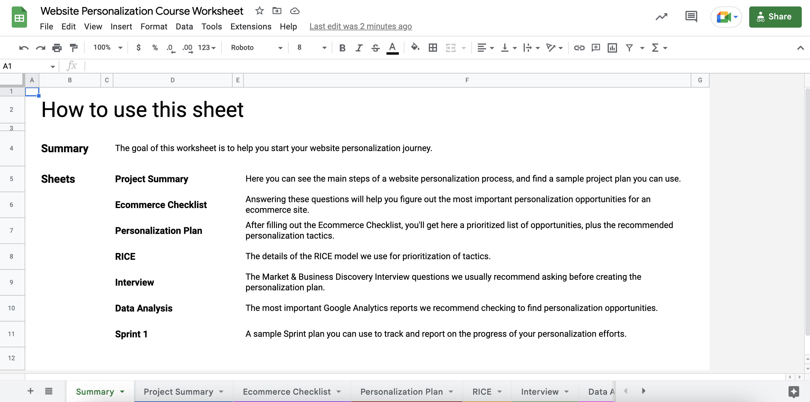
STEP 2: Go to the Ecommerce Checklist sheet and answer all the questions by adding a checkmark to the “Yes” or “No” columns.
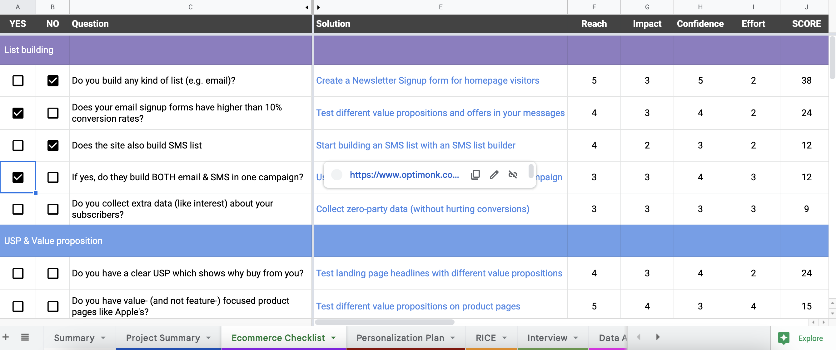
This will help you to uncover all the top personalization opportunities on your website.
STEP 3: Go to the Personalization Plan sheet. Based on your answers, here you’ll see an automatically ranked solution plan (using the RICE scoring method) with a recommended tactic for each opportunity.
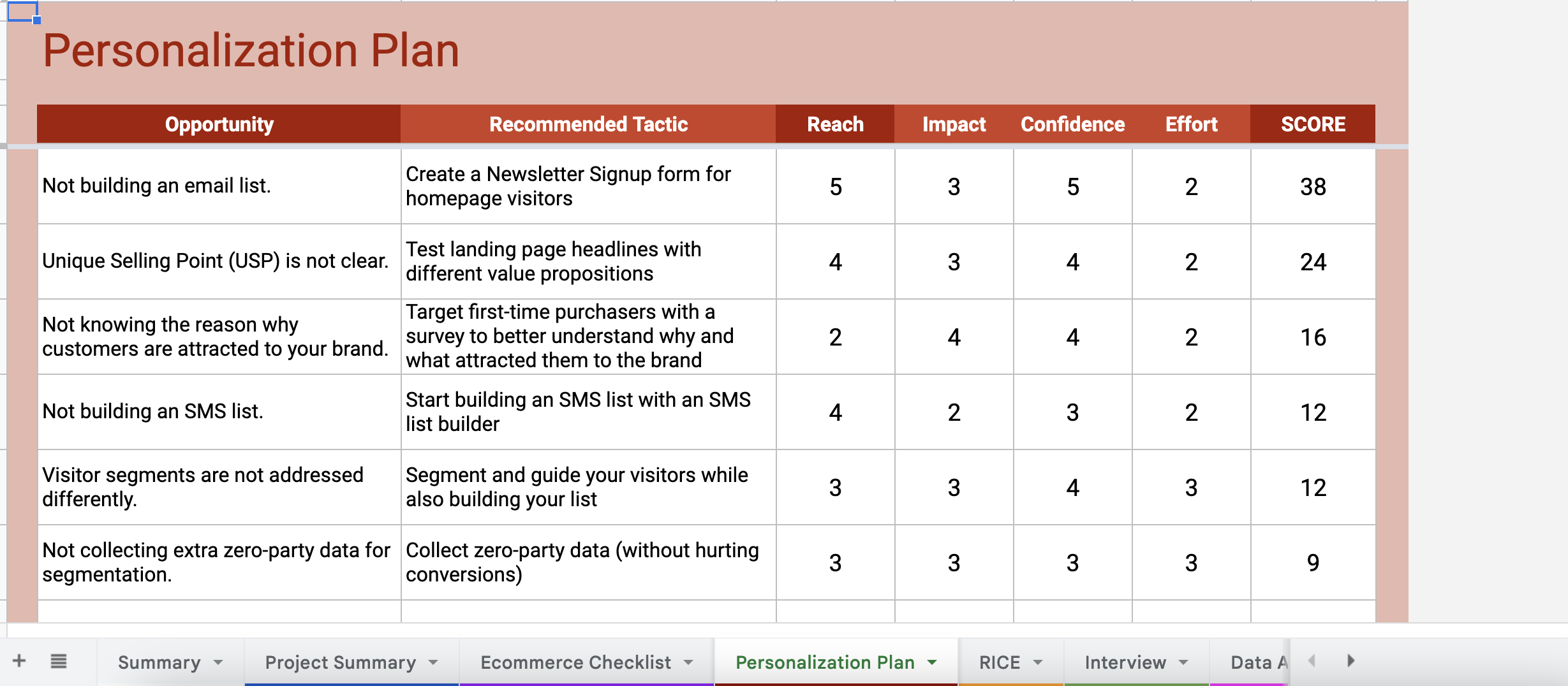
By hovering your cursor over the tactics, you’ll also see a link that gives you detailed guides on how to set up each tactic on your website.

From these links, you’ll be either redirected to a use case landing page full of ready-to-use templates (for basic tactics that are easy-to-setup), or you’ll be redirected to a step-by-step guide on how to set up the tactics (for more advanced tactics).
Besides this personalized plan, the worksheet also includes several useful tools, like a GANTT Chart, Sample Sprint Plan, Discovery Interview questions, and other tools to help you get started.
We hope the course and the worksheet together will help you to get started with web personalization and increase your conversion rates.
Good luck on your website personalization journey!
Get started now and turn traffic into sales!
Product updates: January Release 2025


