You know how important it is to have a strong email marketing game, but how much thought do you put into your email CTAs?
A simple, compelling call-to-action has the power to make your email message stand out and get the results you’re after.
In this article, we’ll look at some aspects to keep in mind as you’re writing your calls-to-action and share a few email CTA examples to inspire you and help you get better results from your email campaigns.
Ready? Let’s talk about how to get your readers to click on your own CTAs!
What is a call-to-action in an email?
A call-to-action (CTA) in an email is a short, simple message that asks your readers to take the desired action. Simply put, an email’s CTA is the text whose purpose is to get a reader to what you want them to do after they’ve read your email.
That could be reading more content on your site, buying your product, liking or sharing something on your social media accounts, etc.
Email CTAs are usually buttons or text links. They should be clear, concise, and never overwhelming or confusing. You want to tell the reader directly what they’re supposed to do.
It’s also important to make sure the CTA copy is interesting enough that it entices the reader to click.
Remember that your emails can have multiple CTAs. These are usually called primary and secondary CTAs. Depending on the goals of your campaigns, it can be smart to include multiple email CTAs.
Let’s move on and check out why it’s so important to create effective email CTAs!
What's the importance of a good email call-to-action?
CTA buttons and action-oriented text are critical parts of any marketing email. They do the heavy lifting when it comes to driving conversions and improving relationships with your readers in the long term.
While it’s true that subject lines and a well-written email body are important aspects too, the CTA’s purpose is to motivate your readers to take action.
That’s exactly why it’s so important to have a great call-to-action. A well-written email paired with a good CTA can be an explosive combo for your business goals!
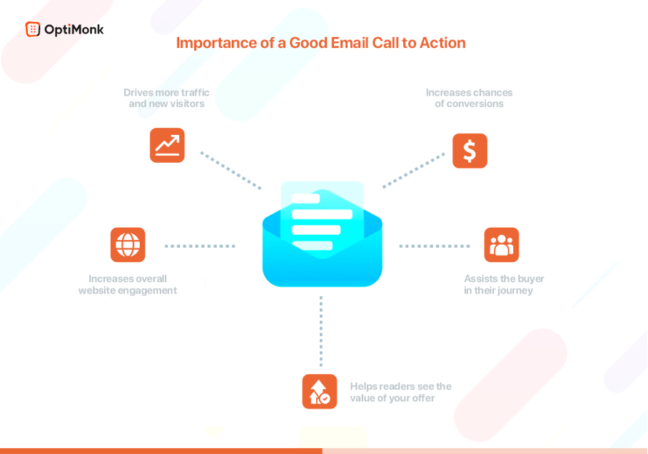
Here are just a few things strong CTAs in your email marketing campaigns can accomplish:
- Increase your chances of converting readers into customers
- Help readers to see the value of your offer
- Move people along the buyer’s journey
- Increase readers’ engagement with your email content
- Appeal to people who are ready to buy
- Increase overall engagement on your site
- Drive more traffic and attract new visitors to your landing pages or blog posts
Ellie Merman, VP of Marketing at Toast has reported that a single CTA increased their clicks by 371%, and as a result, improved their conversion rate by 1617%.
As you can see, one clear, simple CTA can flood your sales funnel and improve your bottom line!
So how can you create strong email CTAs? Let’s take a look.
What makes a good call-to-action in email marketing?
A good call-to-action in email marketing consists of multiple elements which all work together to convert your readers.
Your email call-to-action has to be interesting and compelling enough that your reader simply can’t resist clicking, no matter how hard they might try! 😜
There are lots of factors that define a great call-to-action in email marketing. But there are 7 top elements that are common to most campaigns with above-average click-through rates.
By applying these 7 tips, you’ll make your email call-to-action stand out from the rest and increase your conversion rates:
- Make it crazy eye-popping
- Use the right words
- Personalize your CTA button or text
- What’s on the other side?
- Use emojis
- Leave enough white space
- Test, test, and test again
Let’s break these down.
1. Make it crazy eye-popping
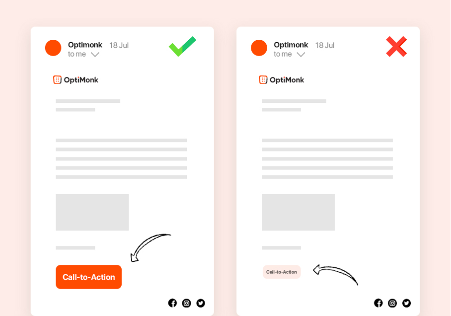
This is one of the most important factors when it comes to creating an effective CTA button: make the CTA stand out! Experiment with sizing, color, and design until it simply can’t be missed.
You’re not going to get a great conversion rate with a bland call-to-action button.
Make sure it’s large enough and that it looks attractive to your readers. If you’re using a plain text call-to-action, make it bold and be sure to separate it from any large blocks of text.
A clear call-to-action that’s instantly visible is crucial if you want to get those clicks!
2. Use the right words
It’s critical to use relevant action words that will trigger a click. You need to give the right amount of information to entice your readers.
Remember, you don’t want them to have to think it over or come back later—you want them to click instantly.
Most marketers add some kind of urgency or scarcity into their CTAs by placing a time constraint on their offer, like “Free shipping this week only.”
This simple tactic is enough to get people clicking and helps solve one of the biggest challenges for email marketing: winning over people who don’t already know or trust your brand.
3. Personalize your CTAs
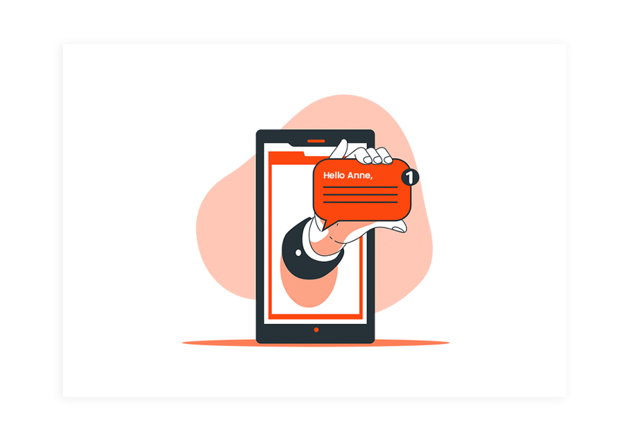
No one likes to be sold to by a robot! Personalizing your emails is another proven way of getting your readers to click your CTA buttons.
People love to feel special, so rather than making your message generic and boring, add the recipient’s name in your CTA copy.
According to Hubspot, personalized CTAs make your audience feel more valued. They improve click-through rates by 14% and can perform better by 202%.
Personalization also increases customer loyalty and helps keep people coming back to your business.
To be able to customize your emails, you’ll need your subscribers’ names, which means you’ll need a tool that allows you to collect them.
When setting up your popup forms, don’t forget to include a “First Name” field, which sets you up to be able to send personalized emails in the future.
4. What’s on the other side of your CTA buttons?
People hate clicking blindly. They want to know exactly what will happen when they do, and it’s your job to tell them.
And of course, there’s the other big question on everyone’s mind: “What’s in it for me?”
A great CTA should answer BOTH questions in one fell swoop.
You want to give your target audience a good reason to follow through on your CTA, and show them what they’ll miss out on if they don’t.
This is an influential psychological trick marketers use because (as we all know) the thought of losing something is much more powerful than the idea of gaining something.
You see, every click is a risk for the reader, because they need to spend their time and effort on something that might not benefit them in the end. Your job as a marketer is to eliminate that risk (wasted time and energy) and make it crystal clear to your reader what’s on the other side of the CTA and why they should want it!
5. Use emojis in your CTA button
Remember how important it is to make your CTA button eye-popping? Well, another way to accomplish this is by using an emoji.
The right emoji can help catch your reader’s attention and make your campaigns more effective. In many cases, they’re even more effective at conveying a message than text. When you combine them with strong CTA text, you’ve got a winning combination!
However, you don’t want to clutter your call-to-action buttons with lots of emojis. Try using just one, and see how your conversion rates improve.
6. Leave enough white space
Adding enough white space between your buttons and your text is crucial for a successful CTA.
The reason is simple: your button needs to stand out from the rest of the text. You want it to be noticeable, so give it plenty of space to breathe— and room to “shine!”
7. Test, test, and test again

To achieve your goals with your email campaigns, it’s fundamental to test, test, and test again.
You can’t create one CTA button and just assume it will convert like crazy.
To get the most out of your efforts, you should push out a few different types of versions and see what performs best. You can do this by A/B testing different elements like:
- CTA wording
- Size of your CTA button
- Placement
- Color(s)
76 email CTA examples to test in your next email marketing campaigns
Need some quick CTA inspiration? Here are 76 email CTA examples to get you started.
This is by no means an exhaustive list, but it’s a great place to start and can help you start A/B testing to see what works best with your email subscribers.
1. Call-to-action examples that incite purchase
- Get Yours Now
- Buy Now & Save
- Grab the Deal!
- Act Now
- I Want It!
- Purchase Today
- Shop Now
- Place Your Order Now
- Buy 2 Get 1 Free
- Limited Time Offer
- Shop Today & Pay Later!
- Shop Now & Save 20%
- Grab Your Discount Code
2. Call-to-action examples that pique curiosity
- Find Out More
- Read More
- Click to Learn More
- Discover Now
- Learn More About Our Company/Product/Service etc.
- Read This Article
- Don’t Miss Out
- Check It Out
- Click for More
3. Call-to-action examples that ask your readers to share something
- Sharing is Caring!
- Tweet It!
- Share This on Facebook
- Add to LinkedIn
- Share & Comment
- Tell a Friend
- Know Someone Who’d Love This?
- Tell Us What You Think
- Spread the Word!
4. Call-to-action examples for lead generation
- Sign Up
- Sign Up – It’s Free!
- Download eBook
- Fill out the Form
- Get the Guide
- Sign Up & Stay in the Loop
- Get a Free Trial
- Grab Your Copy
- Get on the List!
- Try 30 Days Free
- Be the First to Know
- I Want In!
5. Call-to-action examples for social media
- Let’s Connect
- Pin It!
- Pin to Your Favorite Board
- Follow Our Instagram
- Check Out Our TikTok
- Follow Us on Twitter
- Read More on LinkedIn
- Find Us on Facebook
6. Call-to-action examples for video content
- Watch Now
- Watch It Now
- Watch The Story
- See It First
- Click to Watch
- Watch The Testimonial
- View Now
- A Message from our CEO
7. Call-to-action examples that invite your readers to be part of something
- Get Involved!
- Join Our VIP Team
- Become a Member
- Join the Tribe
- Click to Join
- Want In?
8. Call-to-action examples for SaaS/subscription businesses
- Start Trial
- Get Your Free Trial
- Try It Yourself
- 14-Day Free Trial
- Free Trial (No Credit Card!)
- Sign Up for a Free Account
- Sign Up & Save 18%
- Upgrade Now
- Upgrade Now for 10% Off
- Sign Up & Claim Discount Code
- Claim This Offer
Top 10 email CTA best practices to follow
When you’re creating email CTAs, you want to be sure you’re following the latest best practices. In this section, we’ll give you 10 to keep in mind!
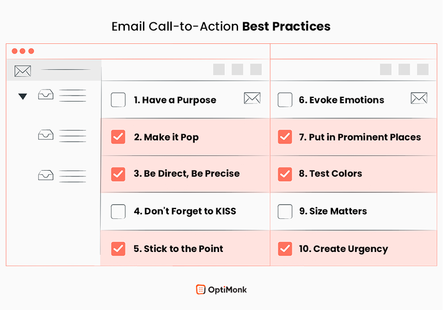
1. Have a purpose
First things first. What’s your purpose for including a CTA text or CTA buttons in your email?
Are you merely trying to get users to visit a landing page, or do you want them to take some specific action on your site, like purchasing a product?
Whatever you want them to do, you need to make it clear and easy for them.
In today’s fast-paced environment, you can’t rely on people to figure out what they’re supposed to do or sort through a large inventory to find something. Typically, if there’s too much effort involved, they’ll simply move on.
Merely using a CTA is not enough. You have to think about what you’re trying to achieve with it, which means you have to know your target audience.
2. Make it pop
You wouldn’t bury a tiny CTA button in the middle of a huge block of text in your email, right? That would be disastrous!
Your emails are competing for attention, and the last thing you want is for your message to get lost in all the noise.
That means you want to make your emails interesting. Forget boring text and bland images—your readers are going to skim right through it anyway!
Try using a contrasting color, negative space, and actionable text to make your email CTAs pop and catch your readers’ attention as they’re skimming.
3. Be direct, be precise
It’s important that you keep your calls to action as direct as possible.
This is not the place for a clever pun or poetic language, and you definitely want to avoid CTAs that are too vague.
Make your CTA an obvious button with compelling text that stands out and says what it needs to for someone to click through.
4. Don’t forget to KISS (Keep It Stupid Simple)
This goes hand in hand with the point above. If there’s one thing people on the internet hate, it’s a complicated, confusing CTA.
Do you think a garish 3D CTA button with a gazillion words on it and flashing neon animation will get more people to click? Not likely!
Keeping things super simple is a lot more effective than you might think. In an online environment where everyone’s screaming “look here!” your simple, direct CTA could be a true breath of fresh air with a great chance of boosting your click-through rate.
5. Stick to the point
When you have limited space to get your marketing message across (like on a CTA button), it’s important that you get strategic.
Cut out as many unnecessary words as possible to make your button look less cluttered.
Be concise and clear, and make sure the copy is descriptive enough for people to know what they’re going to get once they click on it. That’s key: tell them what to expect!
6. Evoke emotions
Behind every action is an emotion.
The more effectively you can trigger the emotion you’re going for, the more likely your user will feel a sense of urgency to act on it.
People’s purchases are driven largely by their moods and emotions, both positive and negative. If you can figure out how to evoke them in your emails, you’ll be well on your way to increasing your click-through rates!
7. Put it in prominent places
This may come as a surprise, but lots of rookie marketers write strong CTAs and then don’t place them correctly.
A call-to-action button that’s too difficult to find or a hyperlink that’s tucked away in the middle of a long email isn’t going to get clicked, no matter how strong the copy.
Keep your primary CTA front and center where it will be easy for your readers to see.
8. Test colors
There are a lot of things you can do to increase click-through rates, and playing with colors is definitely one of them. Many studies have shown that different colors have different effects on readers. The color of a CTA button has been found to make a significant difference in performance.
For example, many marketers agree that a red email CTA can perform better than other colors because red is more noticeable and evokes excitement.
Make sure the color you pick for your email CTA buttons stands out, but remember not to go overboard — you also have to stay on brand!
9. Size matters
A compelling CTA should be large enough to be seen from the distance at which you want your readers to view it. Look at what your competitors are doing in their email campaigns.
When you see a call-to-action button being used, what size is it? Is it large enough to click on, both on desktop and mobile?
Ideally, you want the size of your button to be big enough that the average person can see it but not so big that it gets in the way and disrupts or annoys your readers.
10. Create urgency
Want to improve the results of your sales email? Add in an element of urgency and you might see a significant boost in your click-through rate.
One way of creating urgency in your campaigns is by using a countdown timer plugin or simply emphasizing words that boost urgency, such as, “Limited Time Offer,” “While Supplies Last,” “Two Days Only,” etc…
4 email CTA buttons to get inspired
Now it’s time to take a look at some real-life email CTA examples.
1. Free trial CTA
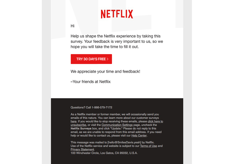
Who doesn’t love a FREE trial before making a purchasing decision? Netflix is a great example of how to use a call-to-action button effectively.
The simple, clean design is perfect. It’s a classic red CTA button that really stands out well against the rest of the content both on their site and in their email as well.
The button doesn’t have too much going on around it, so it’s very noticable.
As we know, free trials perform very well since they’re a great way to drive new leads. According to HighAlpha, B2B companies that offered free trials saw a 66% conversion rate among their users!
2. Welcome gift CTA
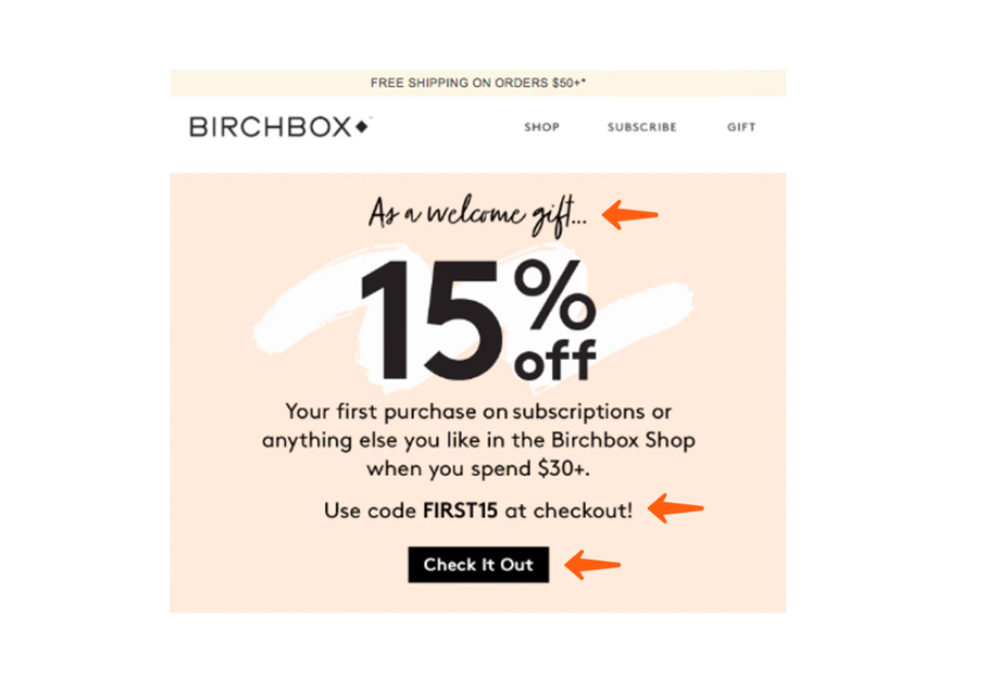
Almost every big brand uses this effective tactic, which we see in the example above from Birchbox. Sometimes, a warm welcome email isn’t enough to turn new subscribers into avid newsletter readers… you need to incentivize them to engage.
Adding a little discount or free gift can have people jumping at the opportunity to make their first purchase or sign up for your service.
Birchbox’s bold, effective CTA in the email above encourages readers to take the desired action (make their first purchase) with a nice discount and language that sounds inviting rather than bossy.
3. Urgency-driven CTA
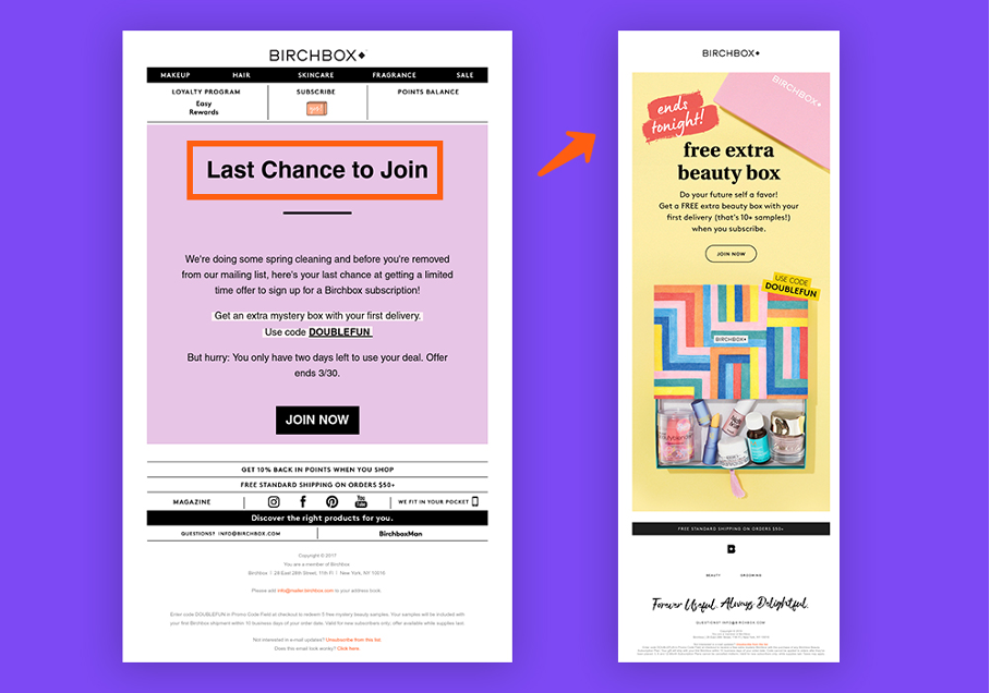
This is a great example of how to use the classic “Don’t miss out!” strategy.
In the two examples above, Birchbox is increasing a sense of urgency to trigger action.
The words they use are simple, direct, and straightforward. They don’t try to be fancy or over-the-top, but instead just let you know that the deal is here but won’t last.
FOMO (fear of missing out) is real… even with low-cost products.
This is why this CTA button works so well. If you see it, you’ll want to click it. That’s the way it works! Scarcity has a huge impact on consumer behavior.
You can use this fact to your advantage by writing urgency-driven CTA buttons that compel your readers to take action quickly before your offer disappears from the market or some other circumstances make them miss the chance altogether.
4. Upgrade with free gifts CTA
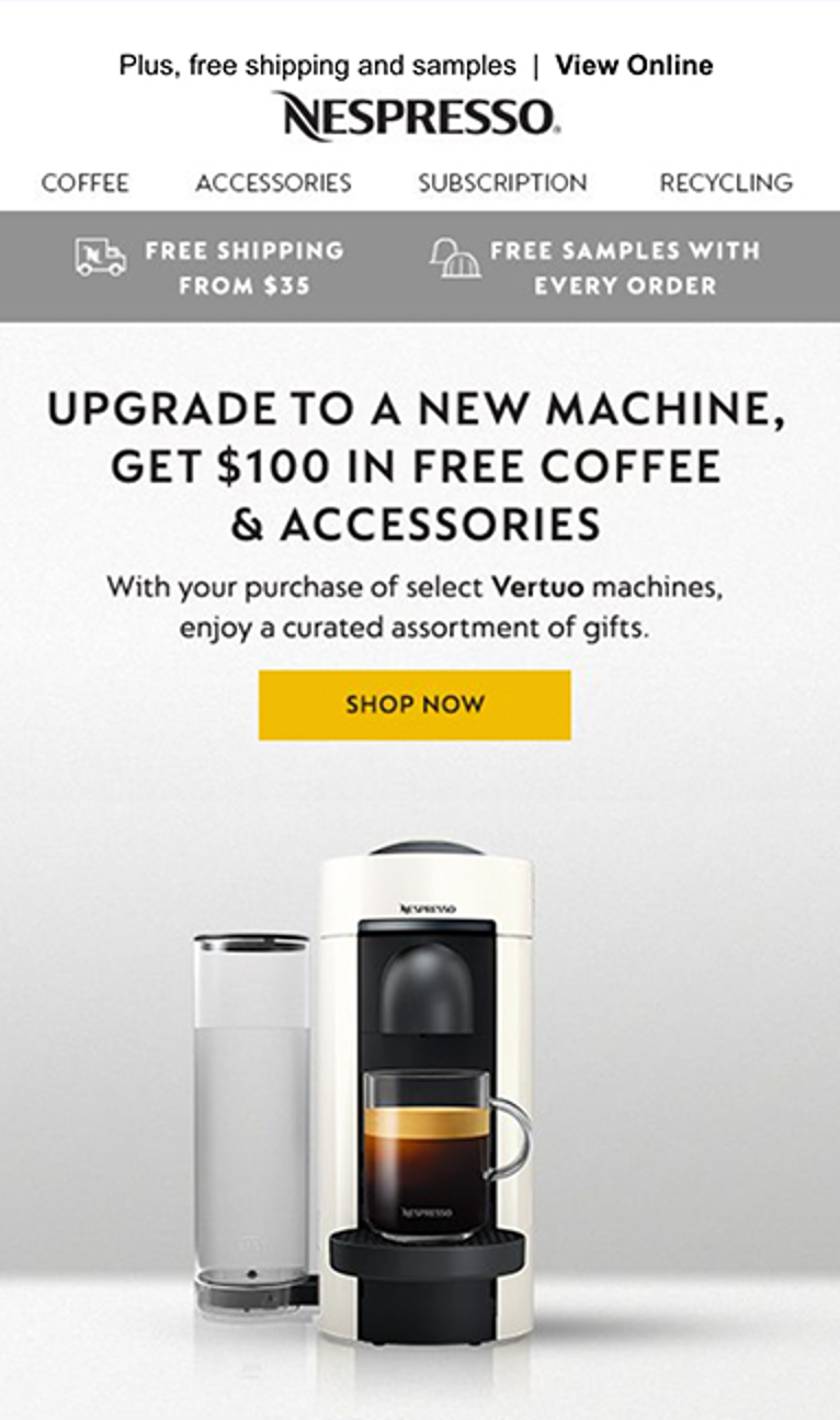
Here, Nespresso is hooking people in before they even know it. This CTA is written in a very creative and intelligent way.
Instead of saying “Upgrade now because our new Vertuo Nespresso machines work better,” they’re offering $100 in free accessories and coffee.
Who wouldn’t want that? This email CTA also shows the importance of building trust and loyalty by offering your customers real value.
This strategy can be very effective if you can offer complementary products or services, and it could generate a lot of money for your business in the future.
Recap
Hopefully, this article has given you some guidance and inspiration for your next email marketing campaign! Email calls-to-action exist for specific purposes and have a pivotal role in driving conversions.
Since people are on their email several times every day, well-designed, compelling call-to-action buttons can do a lot of the work for you in your marketing emails.
Remember that your call-to-action doesn’t have to be flashy or over the top, it can be very simple and direct. By following the tips and best practices above, you’ll ensure your CTAs draw attention and are irresistible!
Share this
Written by

Nat Caesar
Nat Caesar is the Owner & Head of Growth at Myndset, a content marketing solution provider for SaaS & Startups. She is a passionate digital entrepreneur and she’s been building and growing digital assets since 2014. You can connect with her on Twitter