- Blog
- Welcome Popups: 18 Examples & Tips for Boosting Website Engagement
Welcome Popups: 18 Examples & Tips for Boosting Website Engagement
-
Barbara Bartucz
- Conversion
- 6 min read
Table of Contents
You know that feeling when you enter a new group of people and have to introduce yourself? The stakes feel sky high.
Why? Because we all know how important the first impression is—research has shown that within the initial 7 seconds, people will form 11 impressions of you.
That’s what a welcome popup does for your website. As new visitors enter, it welcomes them, gives them a strong impression of your store, and converts them into subscribers.
This article is all about welcome popups: what you need to know about them, 18 eye-catching examples, and tips on how to create your own.
Let’s dive right in!
What is a welcome popup?
A welcome popup message is a small window, or overlay, that appears immediately when a user first visits a website (or a few seconds after).
It usually delivers a message or proposition aimed at captivating first-time visitors and converting them into subscribers or customers.
Welcome popups can take on many forms, ranging from straightforward greetings to compelling incentives and significant announcements.
18 ecommerce welcome popup examples
Let’s take a look at 18 welcome popup examples that serve as a welcome mat for these online brands.
1. Allbirds
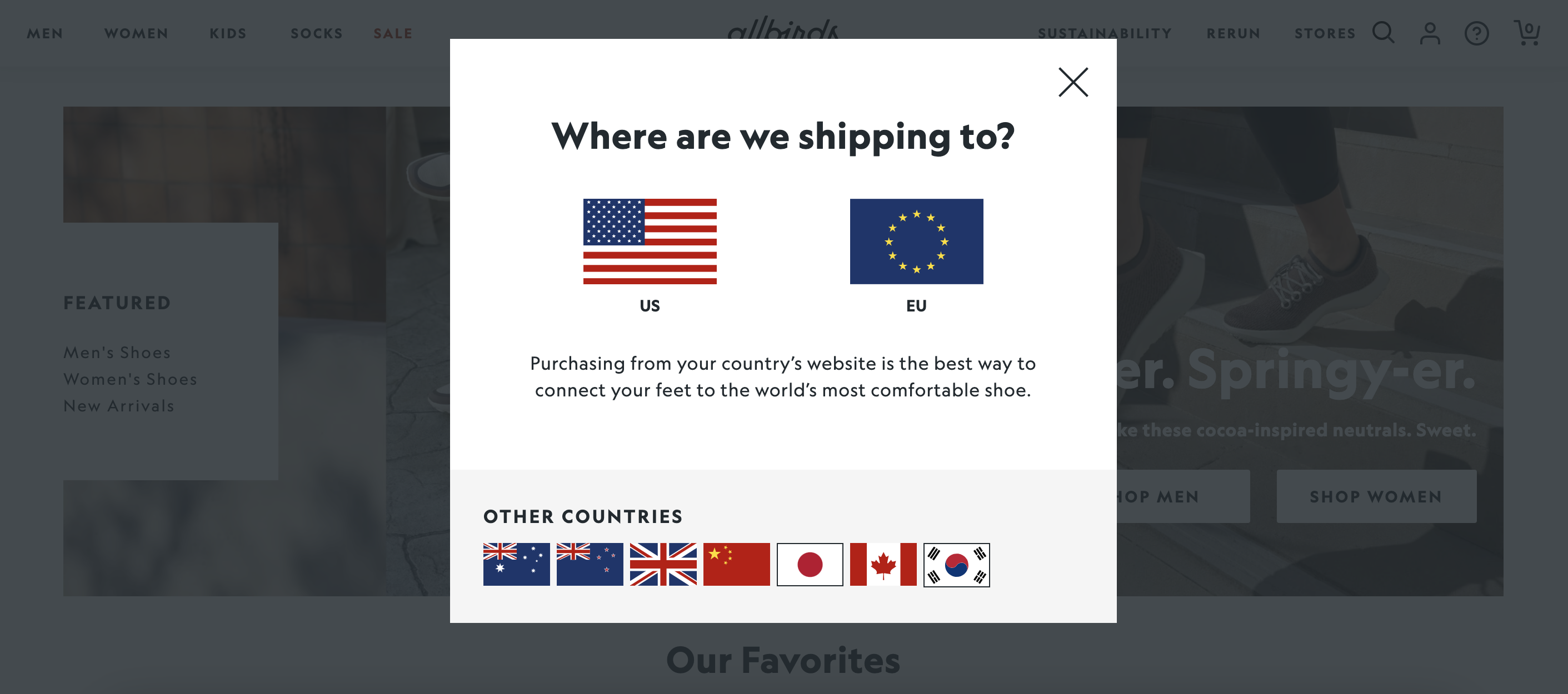
Take a cue from Allbirds‘ welcome message, which asks first-time visitors about their shipping location.
This way, they can guide new visitors to their dedicated site to reduce any friction that might arise, ensuring a smoother user journey.
2. Beneath Your Mask
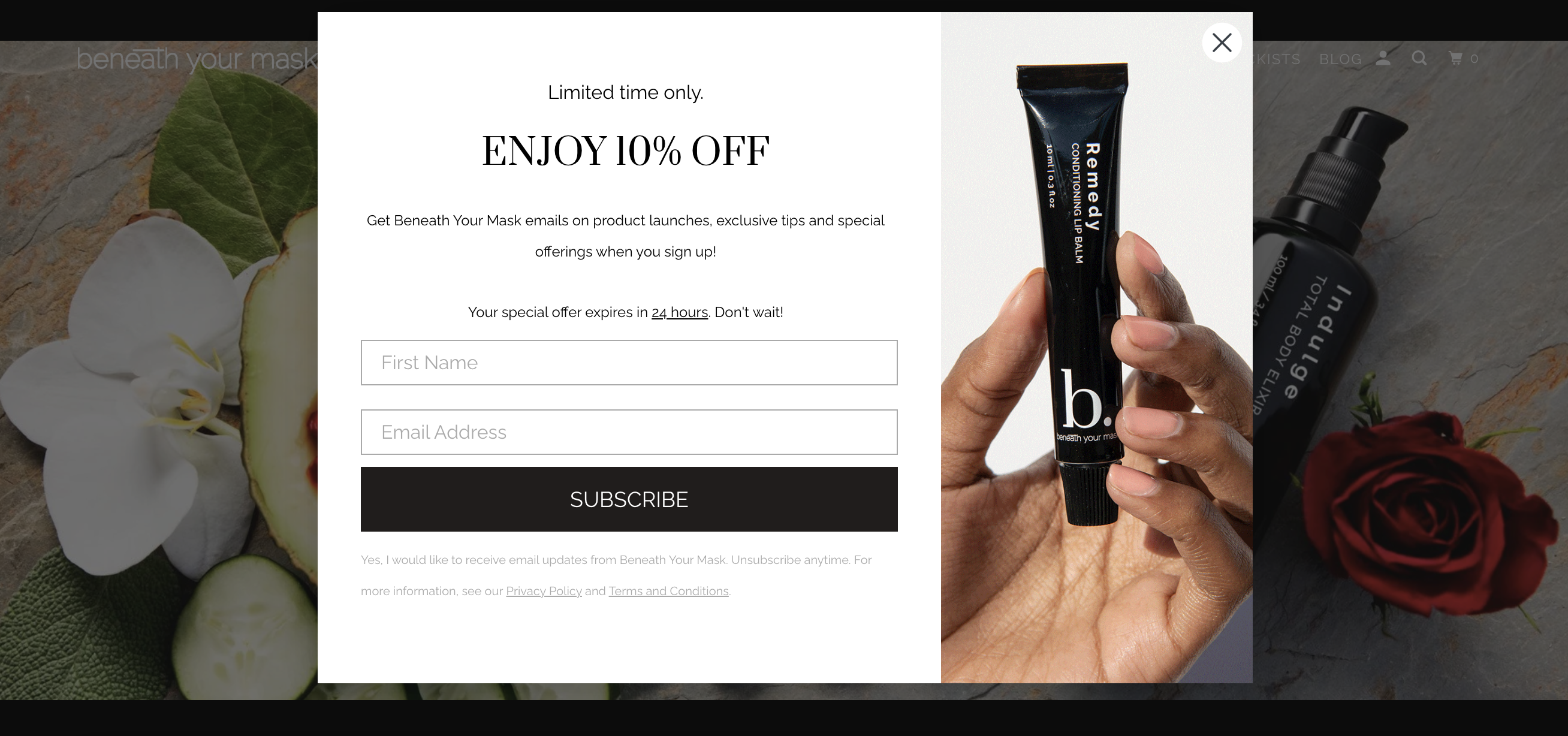
Beneath Your Mask’s welcome popup has a limited-time offer for new subscribers. It lasts for just 24 hours, increasing the sense of urgency and creating a FOMO effect among subscribers.
Their welcome popup is simple and clear, which perfectly matches the brand’s aesthetic.
3. Blume
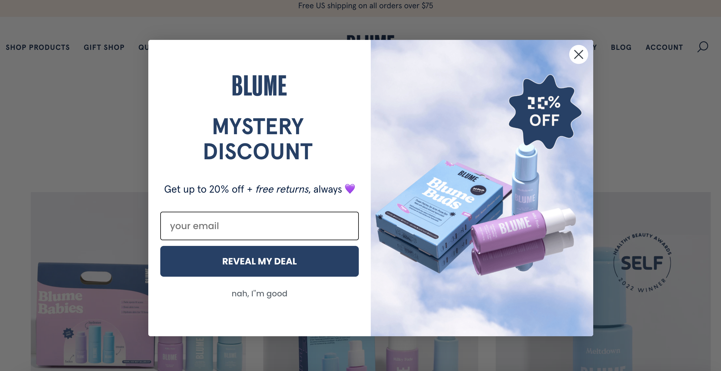
We all love a bit of mystery, and that holds true—as a proven tactic—for Blume’s welcome popup.
They only reveal the exact discount after the visitor signs up for the email newsletter. Mystery discounts are a great way to spice up your general discount and increase your conversion rate.
Note their CTA button: “reveal my deal” which is also synchronized with their offer.
4. Crown & Paw
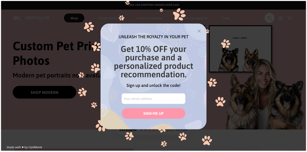
Crown and Paw’s welcome popup not only offers a 10% discount but also promises personalized product recommendations.
Offering exclusive deals to your visitors is a great lead magnet, and can significantly enhance your popup’s performance.
5. Fly By Jing
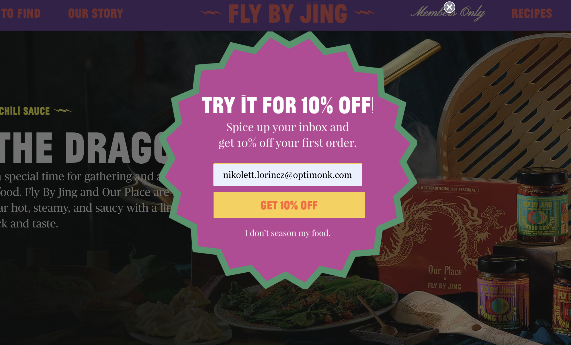
Fly by Jing’s welcome popup uses bright colors and an eye-catching shape, immediately grabbing visitors’ attention as they enter.
Note the on-brand copy they use: “Spice your inbox…” and also, “I don’t season my food,” which is a playful nod to their brand identity.
6. Kiss My Keto
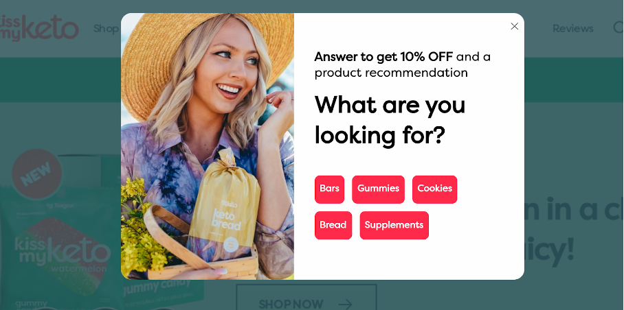
Kiss My Keto’s welcome popup not only offers a 10% discount code but also guides visitors straight to their product pages by segmenting them as a first step.
This helps them grow their email list and also offers tailored product recommendations, which can ultimately increase orders.
7. Maguire
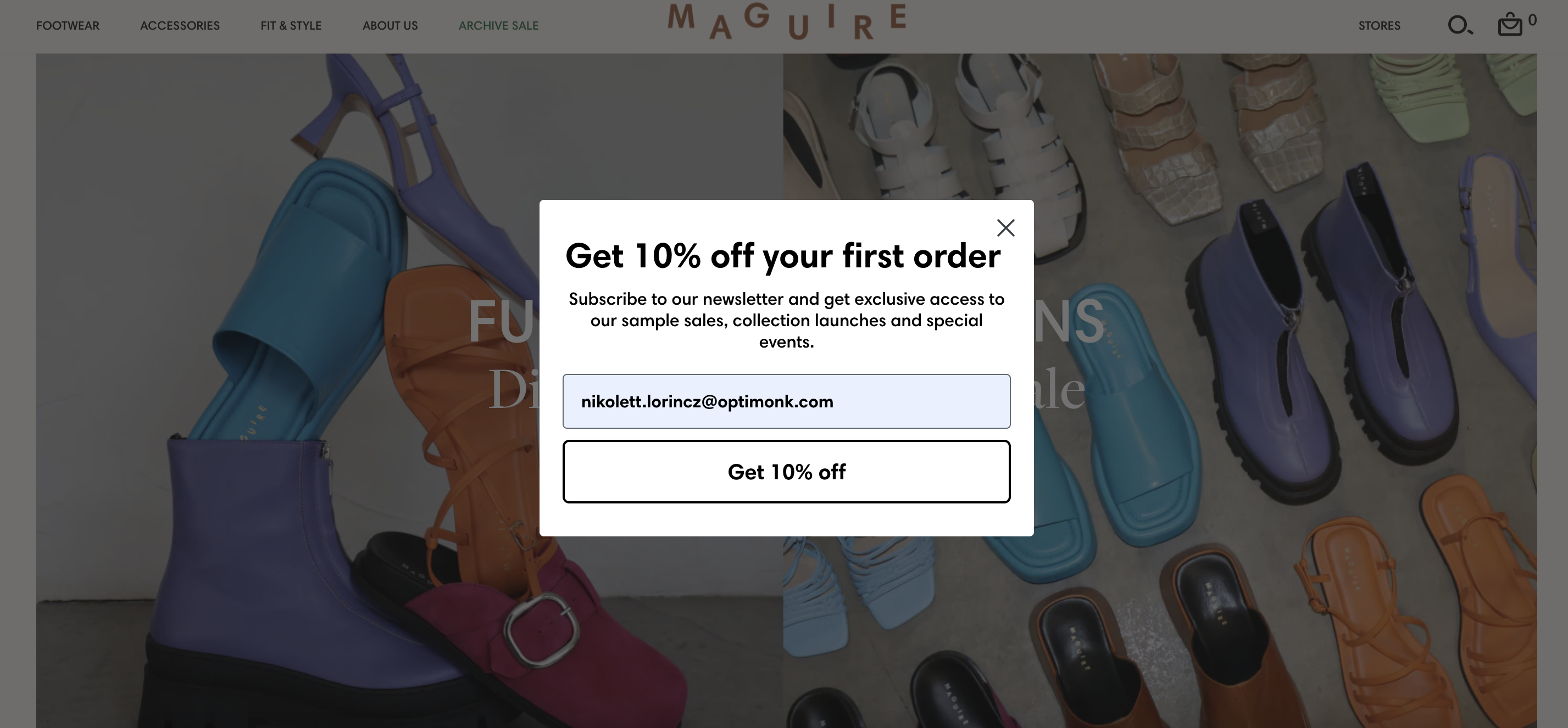
Take inspiration from Maguire’s welcome popup, which strikes a great balance between effectiveness and restraint.
Email subscribers not only enjoy a 10% discount but also gain exclusive access to sample sales and special events, ensuring they feel valued and engaged with the brand beyond just their initial interaction.
8. Silk & Willow
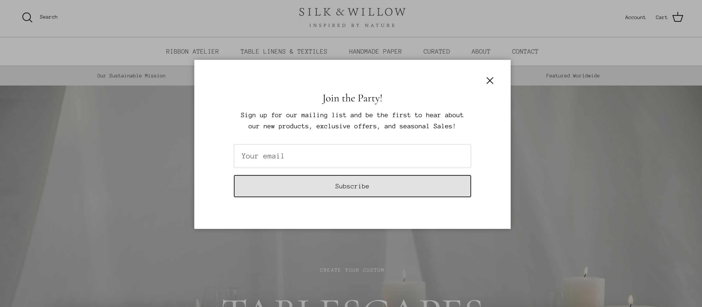
Silk & Willow’s welcome popup is the epitome of simplicity. As new visitors enter the website, they are greeted with this simple-looking popup, which resonates with the entire website’s elegance.
Pay attention to their copy, which says “Join the party.” This helps the customer feel a sense of belonging by subscribing to their email list.
9. Skims
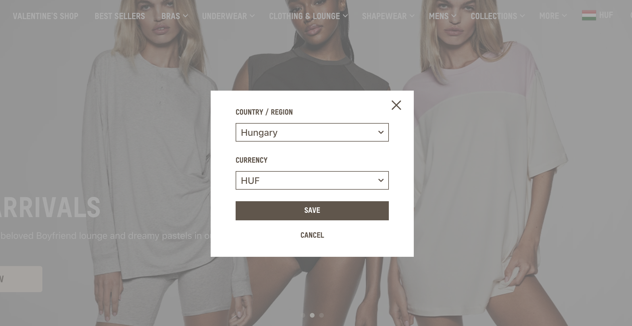
Skims’ welcome popup is all about personalization, which is often used by ecommerce sites.
It allows visitors to see prices displayed in their own currency, and facilitates decision-making regarding their purchase.
10. Tentree
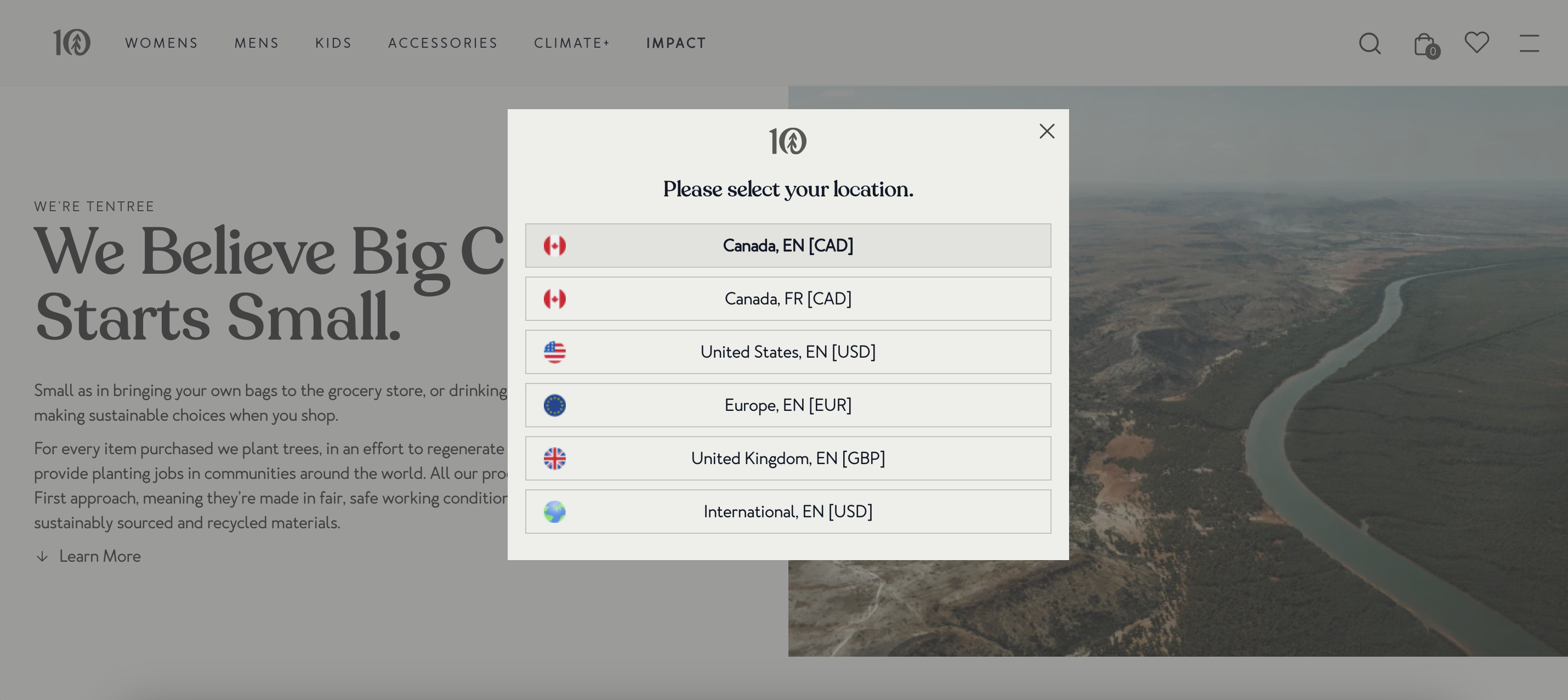
Tentree’s welcome popup prioritizes segmentation right from the start: by inviting visitors to select their country from the list provided, they effectively segment their audience at the initial stage.
This strategic approach ensures that visitors receive tailored content and offers relevant to their location, enhancing their overall experience on the website.
11. Then I Met You
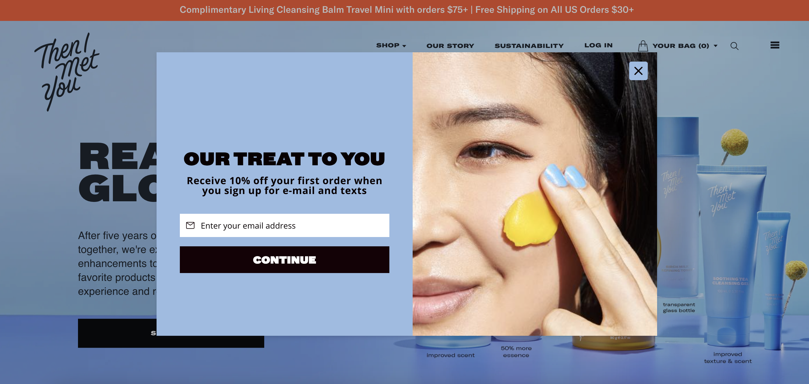
Then I Met You’s welcome popup not only offers a 10% discount but also frames it as a treat.
Note how they use colors and a bold image on their welcome popup, which also matches with the background content.
12. Bearaby popup
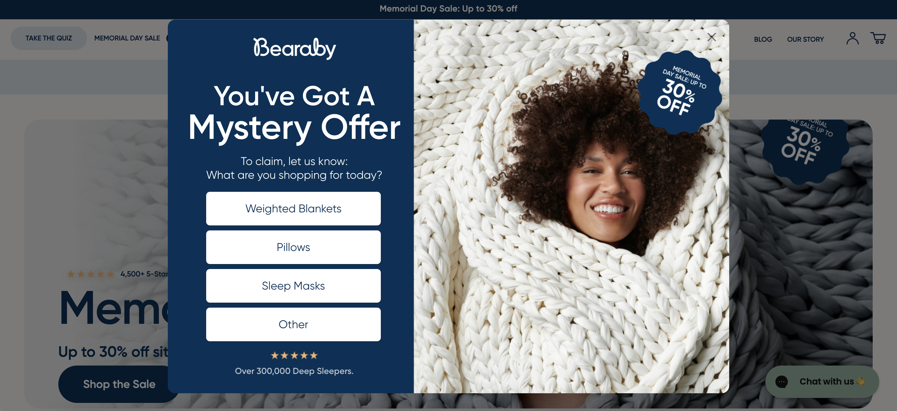
Bearaby adds a clever twist to the typical popup game. Their approach mixes curiosity with personalization by starting with a question: “What are you shopping for?” This helps segment their audience right away.
Then, they throw in a compelling piece of social proof—over 300,000 deep sleepers can’t be wrong. It’s smart, engaging, and makes the visitor feel like they’re joining a well-loved sleep revolution.
13. Lemme
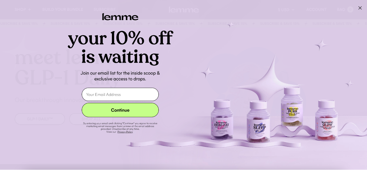
Lemme’s welcome popup is clean, inviting, and completely on-brand. The design mirrors the vibe of the rest of the site, creating a seamless experience.
They’re not just offering a 10% discount for signing up—they’re also dangling insider perks like early access to product drops and exclusive content. That’s more than just a discount—it’s an invitation to join a community.
14. Flourist
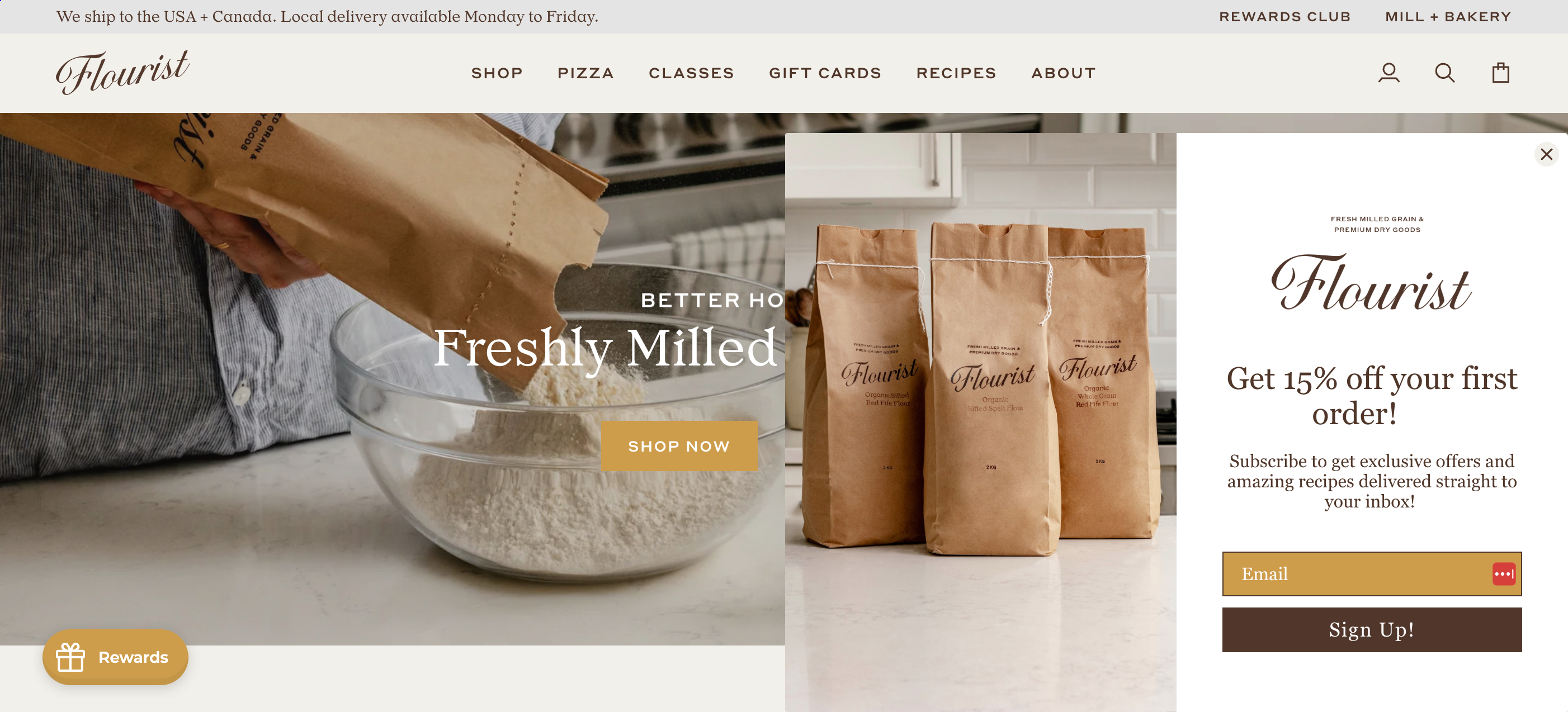
Flourist goes minimal with maximum effect. Instead of a typical popup, they use a sleek sidebar that gently slides in from the right, blending in beautifully with their homepage.
The offer? A 15% discount plus access to unique recipes. It’s simple, tasteful, and adds real value—especially if you’re into cooking or baking.
15. Pela Case
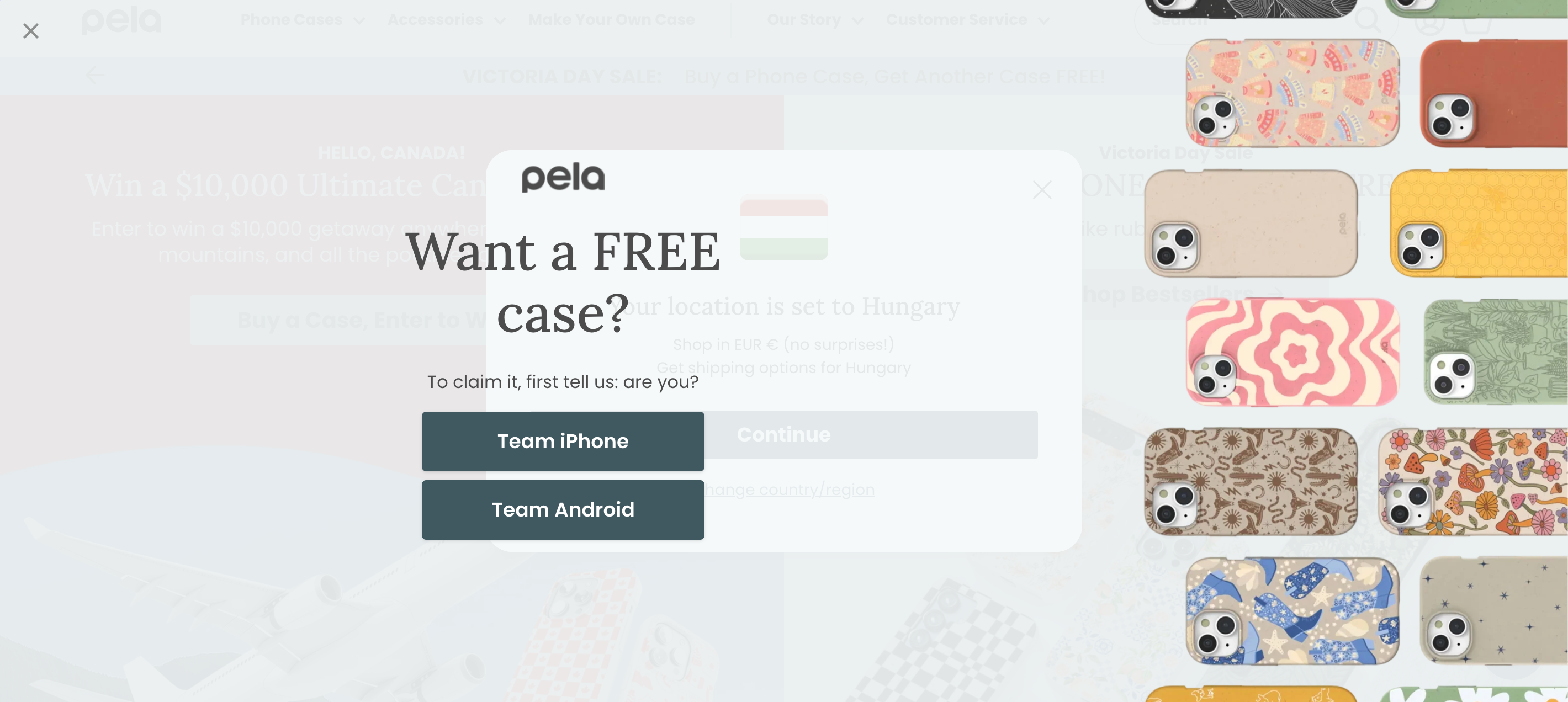
Pela Case takes a bold approach with a full-screen popup that perfectly fits their fun, eco-conscious brand. It starts by asking if you use an iPhone or Android—a smart way to guide shoppers toward personalized product suggestions.
It’s playful, purposeful, and rooted in user experience.
16. Kirrin Finch
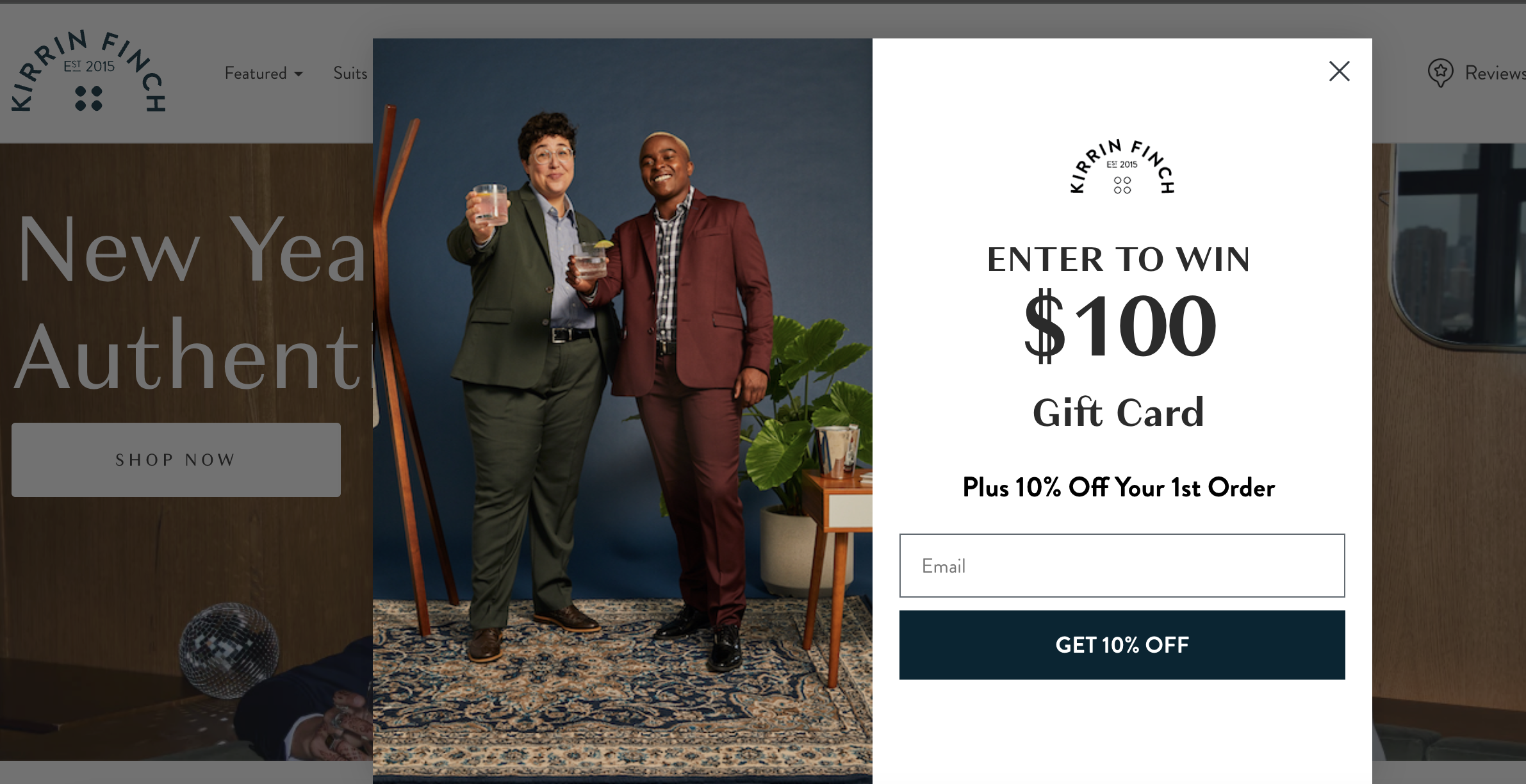
Kirrin Finch taps into our love for freebies with a double incentive: a chance to win a $100 gift card and get 10% off your first order.
It’s a solid mix of excitement and instant gratification. Popups like this don’t just drive signups—they build anticipation and urgency.
17. Cowboy
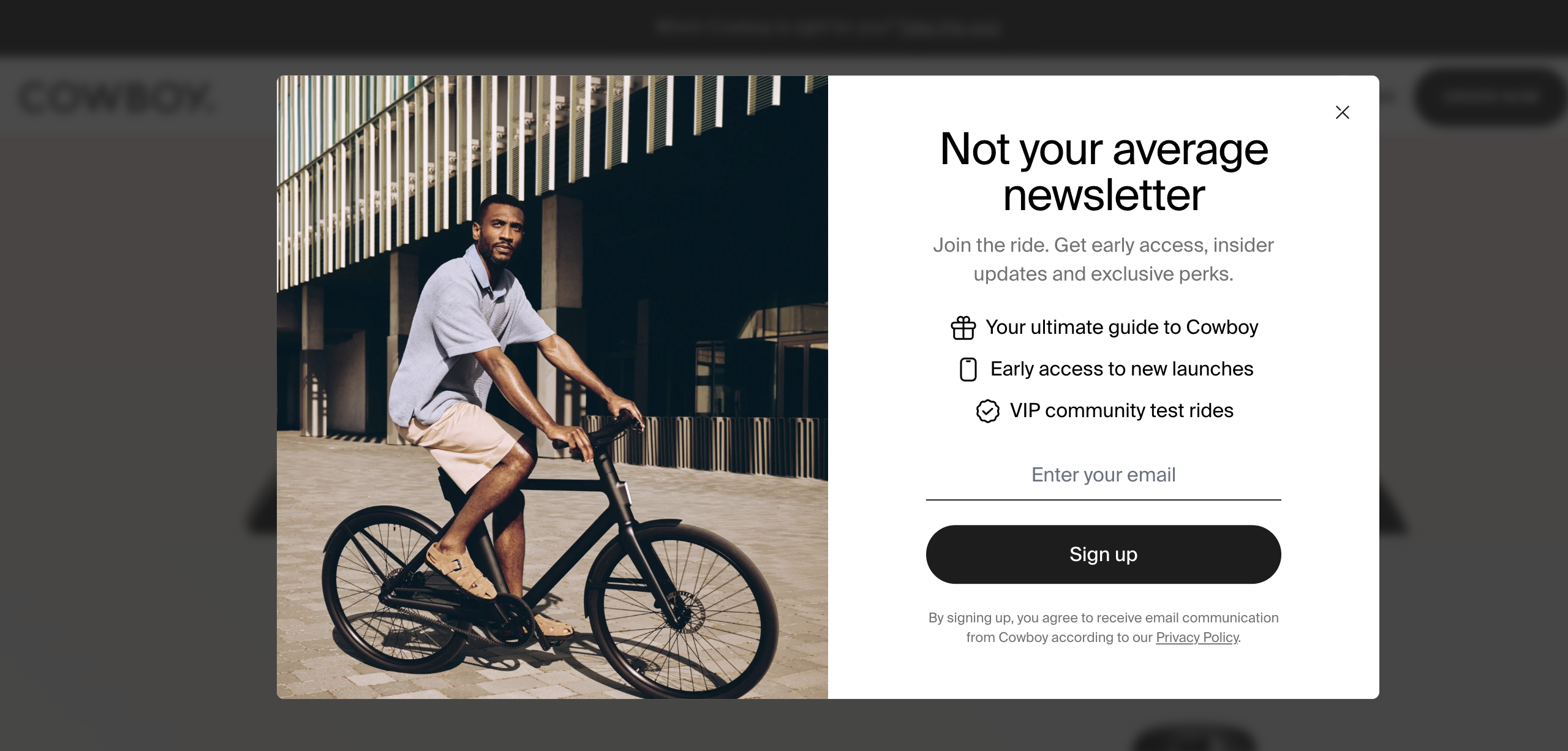
Cowboy understands that a newsletter is only as good as its pitch. Their popup confidently claims “this is not your average newsletter,” then backs it up with stylish visuals and clear, bullet-pointed benefits.
Sign up and you’ll get a bike guide, early access to launches, and even VIP test ride invites. It’s less “sign up” and more “gear up.”
18. Cocofloss
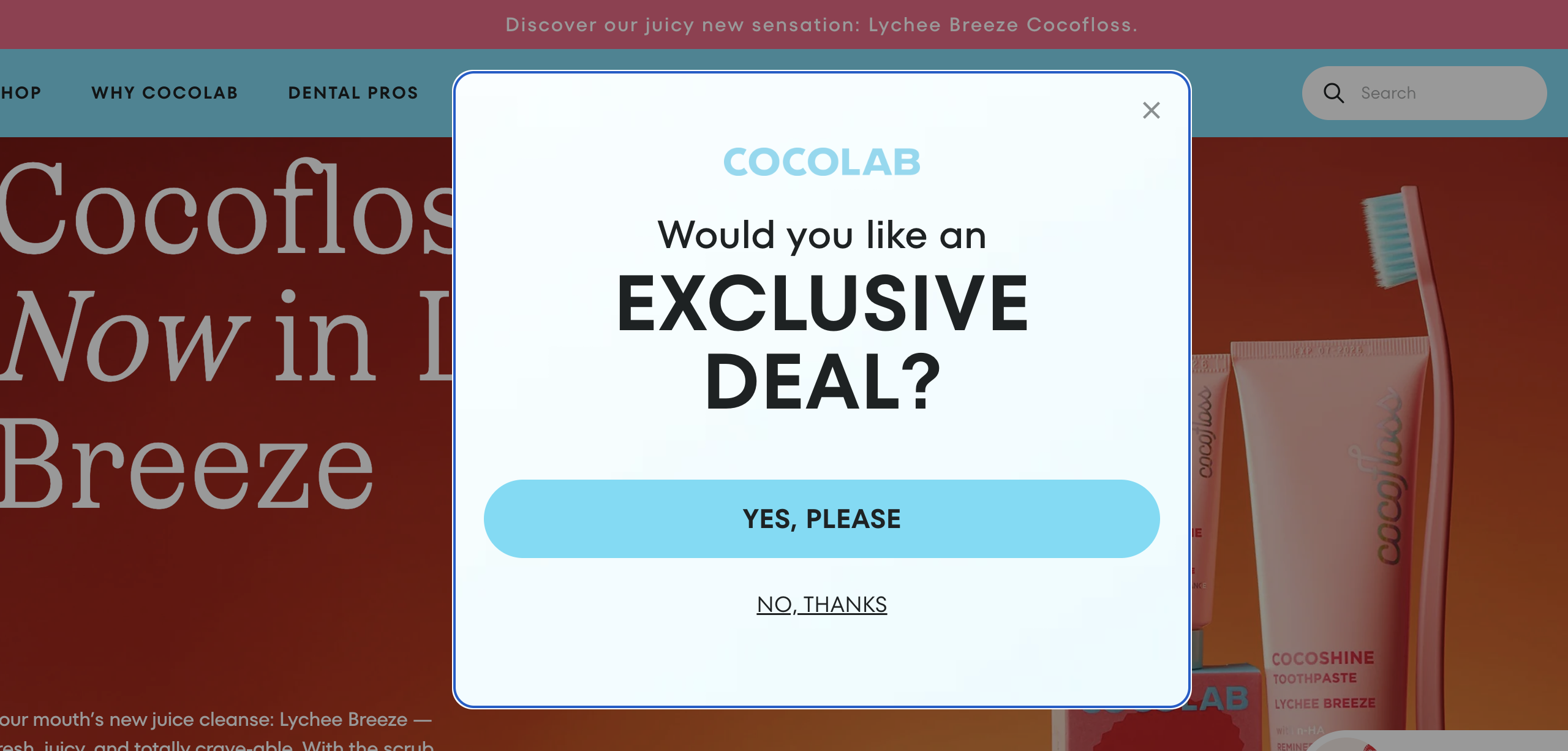
Cocofloss uses a yes/no popup format to lower the signup barrier and keep things fun. Instead of asking for an email upfront, they start with a simple question.
This micro-commitment makes it easier for users to take the first step—no typing needed. It’s an effective strategy that reduces friction and boosts conversion.
9 welcome popup tips to help you convert more website visitors
Now that you’ve seen some outstanding examples, let’s check out 9 helpful tips to make your welcome popup work better and convert more visitors.
1. Offer a mystery discount
You can make your welcome popup more exciting by trying a mystery discount instead of offering a regular 10 or 15% off.
People love surprises, and this simple change can spark their curiosity, get them more interested in what you’re offering, and encourage sign-ups.
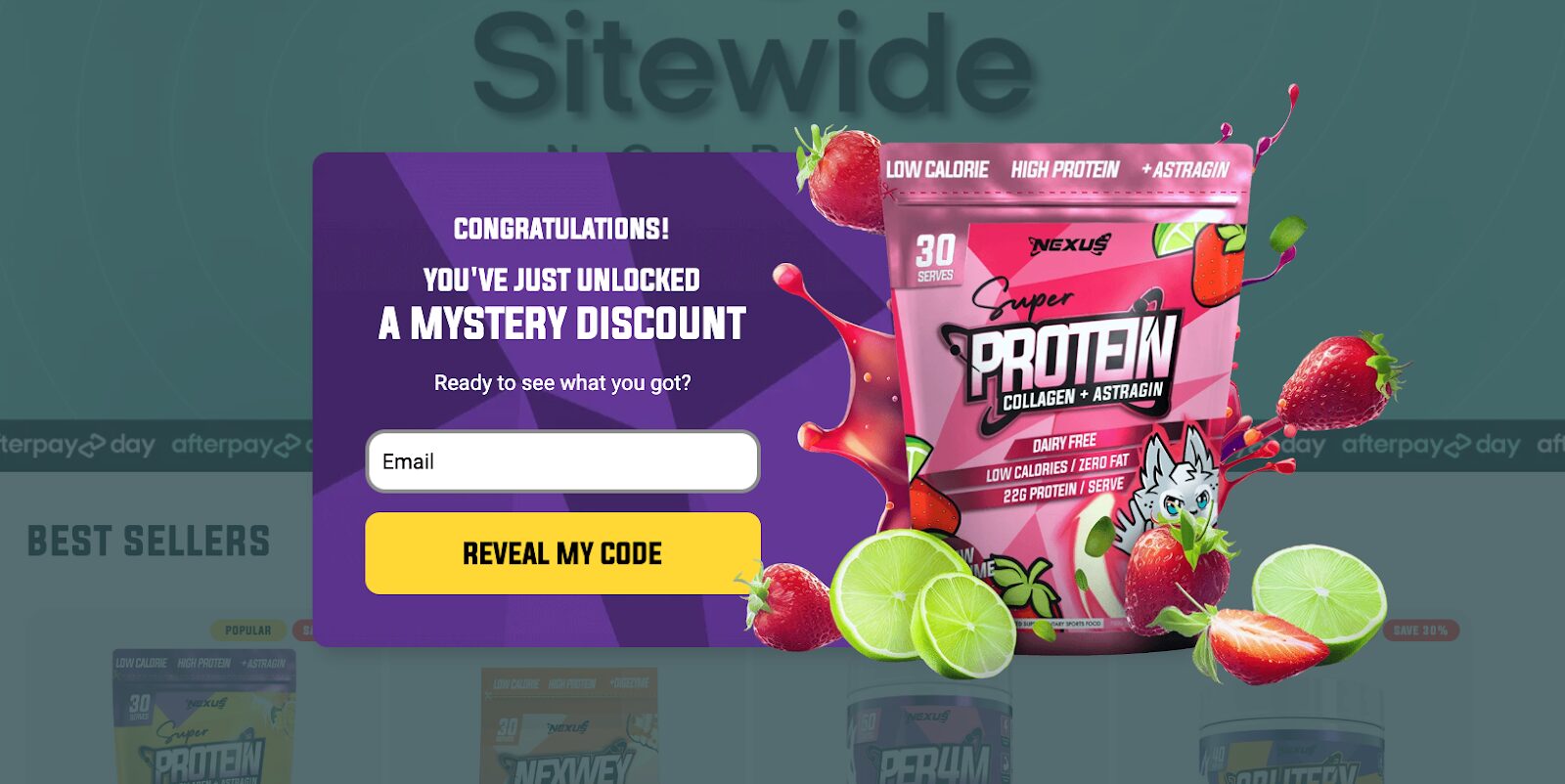
You can even make it interactive by allowing them to spin a wheel or scratch to reveal their discount, adding an element of fun to the experience.
2. Use your logo
Putting your logo on the popup is a fast, simple way to make your website look more trustworthy and professional, helping a new visitor to feel more confident about exploring further.
3. Use a brand value proposition
Don’t just focus on discounts. Use the popup to tell visitors what makes your brand special and why they should choose you over the competition.
Whether it’s your commitment to sustainability, outstanding customer service, or innovative product features, make sure to convey what sets you apart from the crowd.
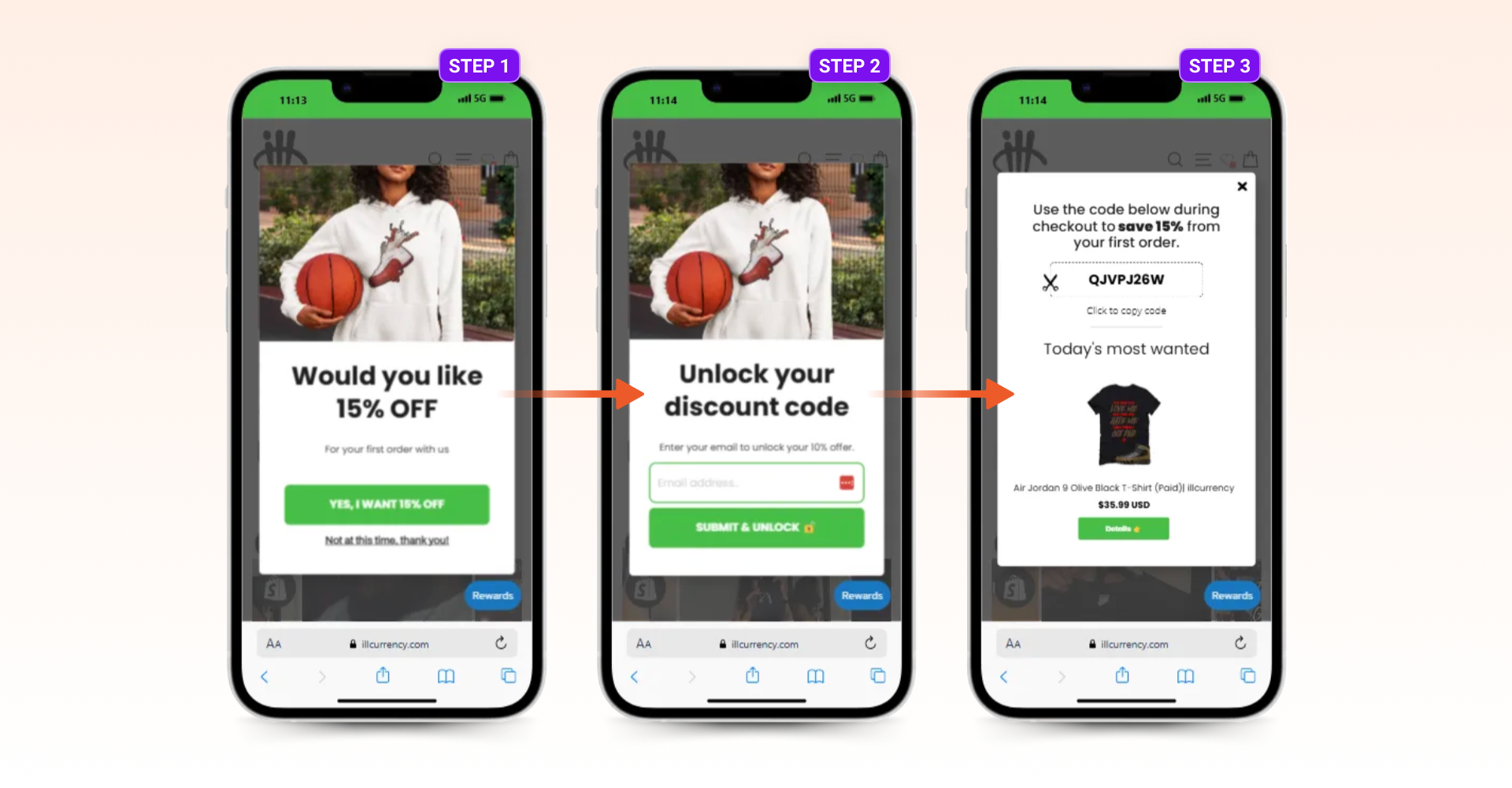
4. Ask for email only
When it comes to input fields, less is more. Asking for just an email address can generate leads and higher conversion rate, while adding extra fields can turn people away.
5. Use a value-driven CTA
Instead of a boring “Sign Up” button, brainstorm different versions of CTAs that speak directly to your target audience.
For example, try “Unlock Your Discount Code” to show them the value they’ll get.
Experiment with different wording and colors to make your call-to-action stand out and encourage more sign-ups.
6. Optimize for mobile
With so many people browsing on their mobile devices, it’s crucial that your popup is mobile friendly.
Make sure it’s fully responsive and easy to use on any screen. Consider using larger font sizes and buttons to accommodate touchscreen users, and ensure a seamless experience to increase your mobile conversion rate.
7. Timing is everything
It’s best to wait at least 5 seconds before showing your welcome popup to give visitors a chance to settle in.
You can experiment with different timing options or even trigger the popup after they’ve scrolled down a bit.
8. Use a sticky teaser
If someone closes the popup without signing up, try using a sticky teaser that follows them around the website.
It’s a subtle reminder of what they’re missing out on and can help keep your offer top-of-mind as they continue to explore your site.
Be sure to design the teaser to be unobtrusive and easy to dismiss for those who aren’t interested.
9. Delay the closing button
Give visitors a bit of time before they can click on the close button, and include a “No Thanks” option right from the start.
This way, they won’t feel pressured, but they’ll be more likely to take a look and consider your offer. Providing a clear and respectful way to decline can leave a positive impression and encourage visitors to return in the future.
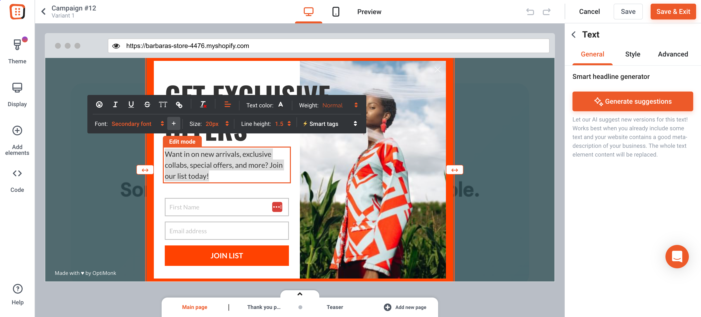
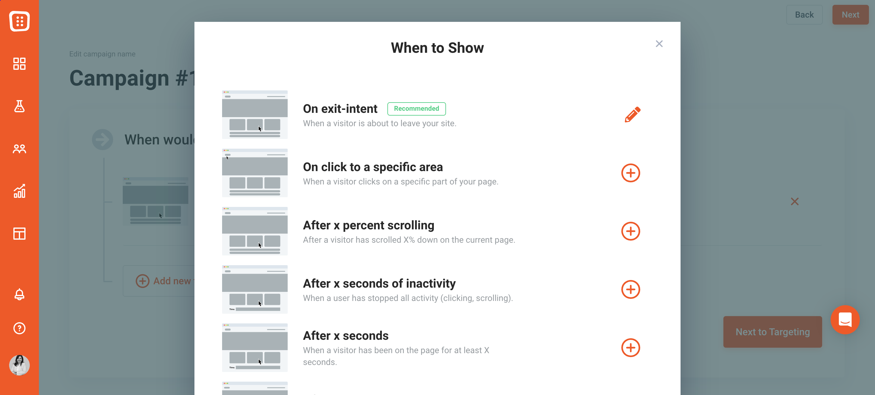
How to create a welcome popup easily?
As a last step of this journey, let’s see how you can create your own welcome popup with the help of OptiMonk.
Step 1: Choose a welcome popup template
Choose a welcome popup template from our extensive library of more than 300 templates.
Step 2: Customize the template
Once you’ve chosen from our popup templates, customize the content of your welcome popup to convey your message effectively and resonate with your target audience.
OptiMonk’s drag-and-drop editor makes it easy to modify text, images, colors, and calls-to-action without any coding required.
Step 3: Set triggering and targeting options
Next, define the triggers and targeting options from the dropdown menu to determine when and where your welcome popup appears to visitors.
Step 4: Set up integrations
To maximize your email signup form, connect it with your email marketing tool. OptiMonk works with all the popular email marketing tools out there including Mailchimp, Klaviyo, Constant Contact, and Aweber—just to mention a few examples.
This integration automates building your email list and ensures new subscribers get your welcome email and future messages.
Step 5: Activate your popup
Now, all that’s left to do is to launch your new campaign, publish your welcome popup, and begin collecting email signups.
FAQ
Are welcome popups effective?
Yes, welcome popups can be highly effective if used strategically. They can grab visitors’ attention, encourage engagement, and boost conversions by offering valuable incentives or guiding users to relevant content. However, it’s crucial to strike the right balance, ensuring your popup is helpful without being too intrusive for positive user experiences.
How can I avoid annoying my website visitors with popups?
To prevent popups from being seen as annoying, consider factors such as timing, frequency, relevance, and the value proposition. Display popups at appropriate moments, limit their frequency to avoid overwhelming visitors, ensure that the content is relevant to their interests or needs, and offer something valuable in exchange for their interaction, such as a discount or exclusive content. Providing a clear and easy way to dismiss the popup also helps prevent frustration.
What are some common elements of a typical welcome popup?
A typical welcome popup often includes a catchy headline to grab attention, a clear call-to-action prompting visitors to take action (such as subscribing or claiming an offer), input fields for collecting visitor information (like name and email address), visually appealing elements to enhance engagement, branding elements to reinforce brand identity, and an easily accessible option to close the popup for those not interested. These elements work together to create an engaging and effective user experience.
Wrapping up
We hope this guide has brought website popups, especially welcome popups, a bit closer to your heart.
These little windows can help you introduce your site and make a great first impression on your visitors when used strategically and wisely.
If you want to get started and create your own email popup, then OptiMonk can be your handy tool. Boost your marketing campaigns with the power of welcome popups and create your free account now.
Migration has never been easier
We made switching a no-brainer with our free, white-glove onboarding service so you can get started in the blink of an eye.

What should you do next?
Thanks for reading till the end. Here are 4 ways we can help you grow your business:
Boost conversions with proven use cases
Explore our Use Case Library, filled with actionable personalization examples and step-by-step guides to unlock your website's full potential. Check out Use Case Library
Create a free OptiMonk account
Create a free OptiMonk account and easily get started with popups and conversion rate optimization. Get OptiMonk free
Get advice from a CRO expert
Schedule a personalized discovery call with one of our experts to explore how OptiMonk can help you grow your business. Book a demo
Join our weekly newsletter
Real CRO insights & marketing tips. No fluff. Straight to your inbox. Subscribe now
Share this article
Written by

Barbara Bartucz
Barbara is a Content Marketer at OptiMonk. She takes pride in creating different forms of content, whether it’s an article, a video, or an e-book.
You may also like
- Posted in
- Conversion
Partner with us
- © OptiMonk. All rights reserved!
- Terms of Use
- Privacy Policy
- Cookie Policy
Product updates: January Release 2025


