
Are you wondering what makes for an awesome ecommerce checkout page?
As an ecommerce store owner, you need a checkout process that’s fast, easy, and secure for your online shoppers.
Often a slow, glitchy checkout experience is the only thing standing in the way of a motivated visitor who wants to complete their purchase.
To make sure your ecommerce checkout page is as effective as it can be, you need to optimize it! And we’ve got you covered.
In this post, we’ll show you the 16 ecommerce checkout best practices to improve your checkout flow.
Let’s dive right in!
What is an ecommerce checkout?
First, let’s cover the basics. An ecommerce checkout is a crucial phase in the online shopping process where customers finalize their purchases.
During checkout, customers:
- input essential details such as shipping and delivery information like their address and contact number,
- select a shipping method,
- and provide payment details.
Additionally, the checkout experience may offer opportunities for customers to modify their shopping cart, apply promotional codes, or consider purchasing additional items suggested through upselling tactics.
16 best practices to improve your checkout process
Read on for 16 proven tactics that you can incorporate into your ecommerce website to take your checkout experience to the next level.
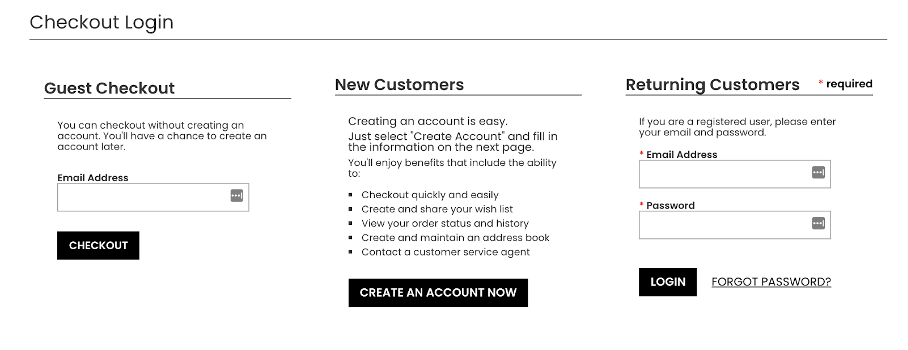
1. Offer a guest checkout page
Picture this:
Your visitor found the product they’re looking for at the perfect price. They’re ready to head through the checkout… and then, they’re hit with a chunky “New customer? Register now!” button.
It can be annoying, and people are often too busy to create an account. This can actually get visitors to click the “X” button even faster.
And that’s why you need to offer a guest checkout option—if you’re ready to level up your checkout flow.
A guest checkout is a win for new visitors, but it’s also useful for returning customers because they often forget their passwords. Although password recovery is always an option, it’s also very time-consuming.
So guest checkout is a smart, fast, and easy solution for all of your online shoppers.
Take a look at how West Elm offers two choices to their new customers:
- Checkout as a guest
- Create account
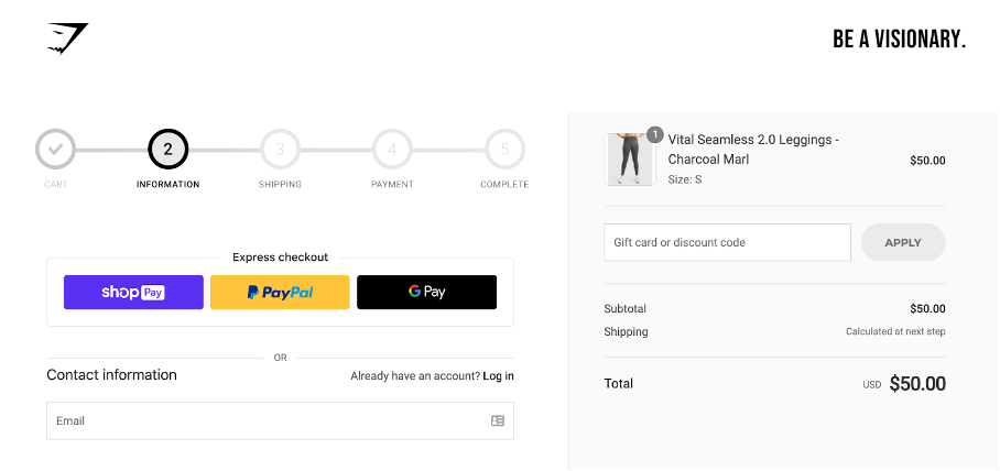
2. Provide an express checkout option
People who enjoy online shopping often use express checkout options like PayPal, Apple Pay, or Google Pay to quickly buy their products, without having to type out their contact and card details. They simply log in to their existing accounts and pay with a single click.
One-click payment systems are fast and seamless, so they help boost your sales.
Check out how Gymshark promotes their express payment options on their checkout page:
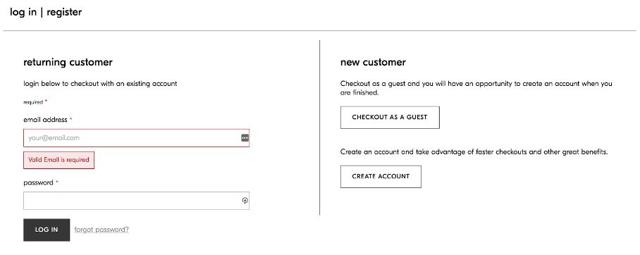
3. Incentivize registration
Providing an incentive for creating an account can motivate customers to register quickly.
Here’s how to do it: List all the benefits of being a registered user on your ecommerce website. You can also use promotional offers to persuade them.
Look at how Penningtons valorizes account creation by showing the advantages in their “New Customers” column:
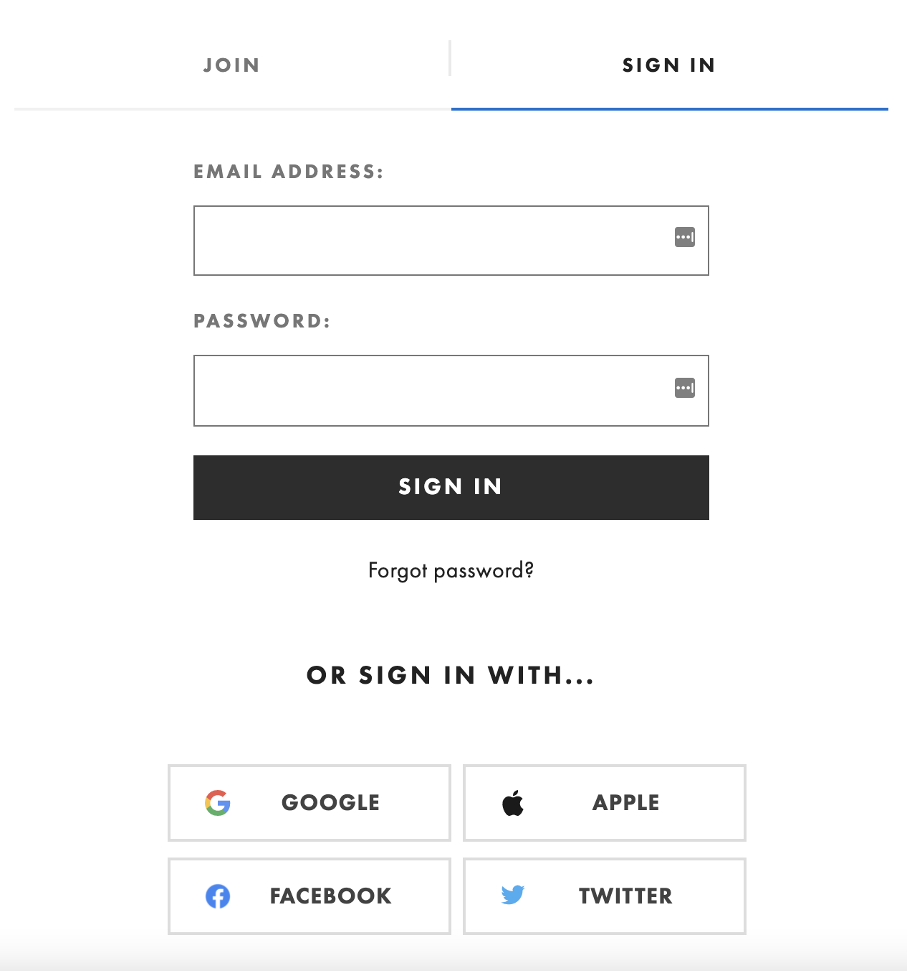
4. Provide a social login option
Allowing your customers to sign in to your online store or register via their social networking accounts is an excellent way to increase account registrations.
People are usually already logged in to their social media accounts, so they can register with just one click. It saves your new users the time and effort of having to fill out long forms.
See how ASOS improves the typical checkout process with some social media sign-in options:
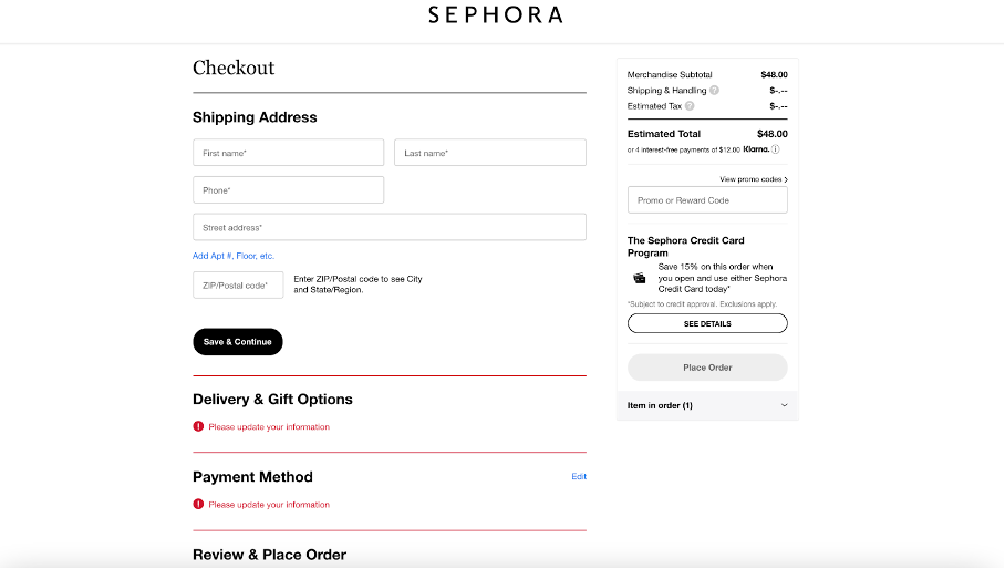
5. Use a vertical checkout flow
The fewer pages you put in between your visitor and their purchase, the better. Keep your checkout flow short and sweet.
From gift options to offering a choice of payment methods, how do you make things as compact as possible?
An elegant way to solve the problem of a long checkout process is to include all the required steps on a single checkout page.
Go for a vertical format with various headings. These features ensure clarity and help your visitors navigate your page as easily as possible. Take a look at how Sephora presents their checkout page:
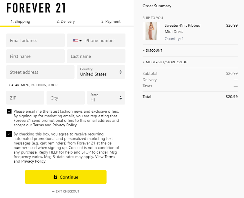
6. Keep distractions to a minimum
A lengthy online checkout process will always make your customers drop their purchases.
Therefore, you should limit your questions to only cover the information you genuinely need to process an order and ship the items.
A minimalist checkout allows your customers to buy instantaneously. This will increase your chances of a sale.
Here’s a great example of how Forever21 helps their customers check out:
7. Offer non-intrusive help if needed
Sometimes your customers have questions that aren’t easily answered if you don’t step in. For example, your ecommerce store visitors may wonder if you deliver to their remote shipping address or what your shipping costs are.
Offer embedded customer assistance at every stage of your checkout process, like on-site messaging or a link to your phone number.
See this example from staples.com:
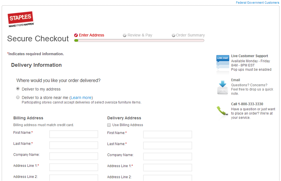
Enabling chat support is another great idea.
By providing in-checkout live chat support, online shoppers have access to immediate assistance for any last-minute concerns they may have before making a purchase.
This feature can help ease customers’ anxieties, provide real-time answers to common questions regarding returns policies, shipping delays, and product details, and ultimately reassure them that they are making the right choice.
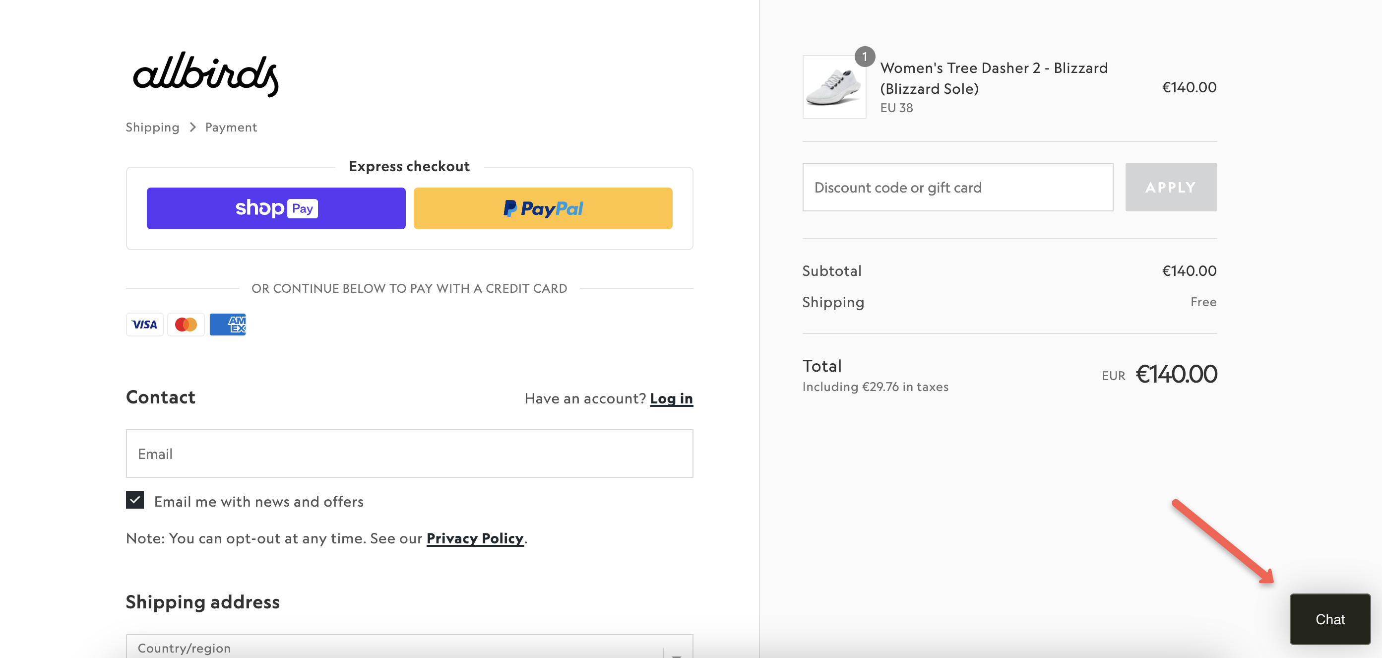
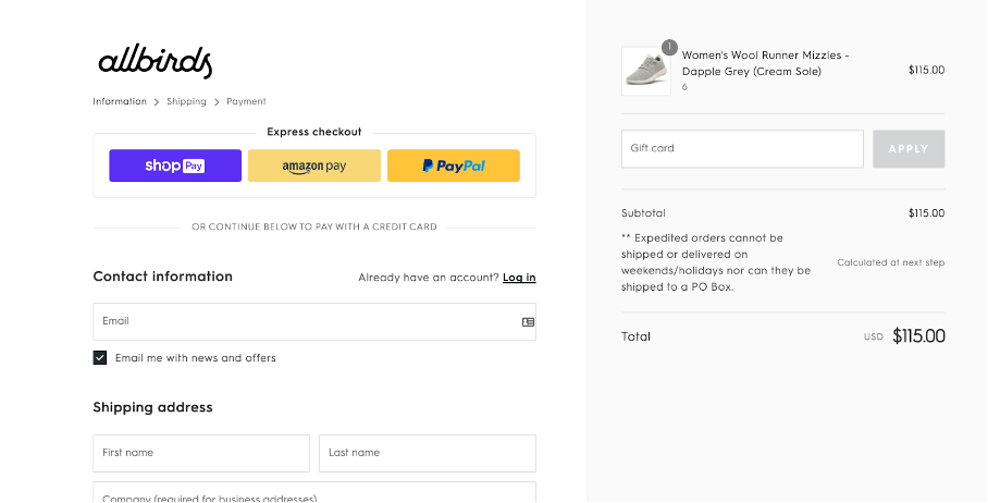
8. The cart content should always be visible
Customers are busy. And they often forget which products they put in their cart or the specifications of those products.
Instead of making them open the cart page in a separate window or navigate back, show their cart content alongside the entire checkout process.
This keeps your visitors engaged and encourages them to move along with their purchases.
Take a look at this example from Allbirds:
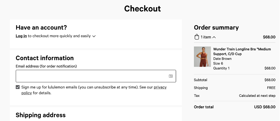
9. Show shipping costs as soon as possible
Unexpected taxes, shipping charges, and packaging and handling costs are the fastest ways to get your visitors to ditch their carts (this is called cart abandonment).
Always make the total cost visible as soon as possible. That way your cart shows your customers that your store is genuinely transparent and trustworthy.
Take notes from Lululemon’s ecommerce website:
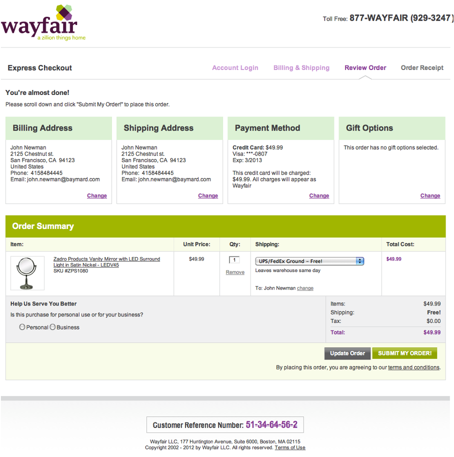
10. Provide an order summary
Let your customers review and edit their orders before they hit the pay button.
This gives them the freedom to control and adjust their items before they spend their cash.
Here’s how Wayfair does it:
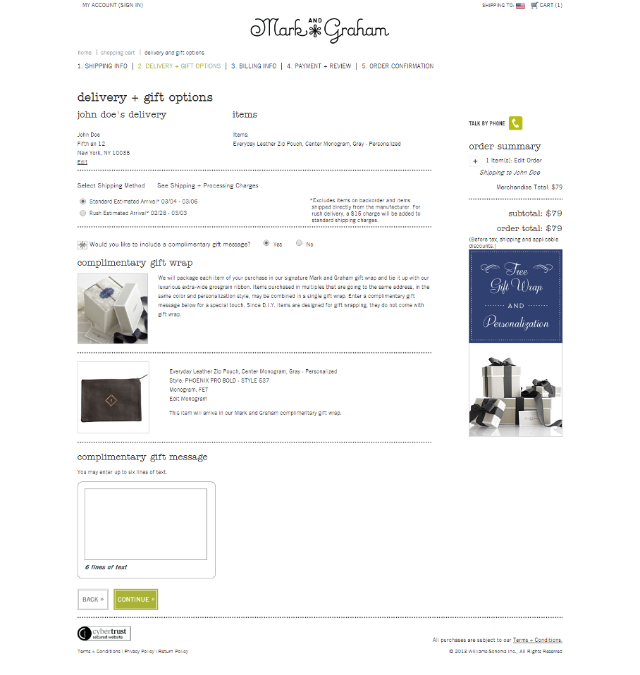
11. Provide gift wrapping or other special add-ons
A great way to impress your customers is with fun gift-wrapping services.
From sleek boxes to biodegradable rainbow confetti and colorful wrapping paper, give your shoppers a chance to impress their friends and family with thoughtful packaging for when they open their gifts.
This is an effective way to drive more sales, and it makes your brand unforgettable.
Here’s a killer example from markandgraham.com:
12. Use exit-intent popups to decrease cart abandonment
Exit-intent popups are a powerful tool in your kit when it comes to beating cart abandonment.
If your visitor leaves the checkout process without buying, you can trigger a popup that offers them an incentive to complete their purchase.
You can also capture their email address by providing a discount on their next purchase or offering another incentivizing deal.
Take a look at our cart abandonment popup templates to get started:
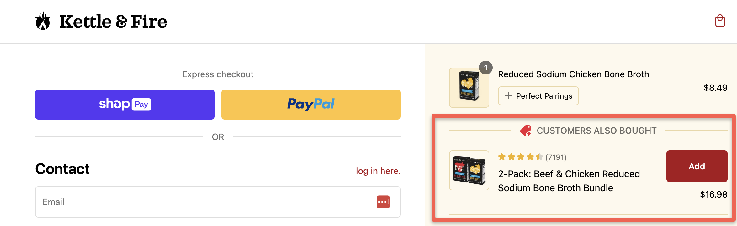
13. Use upselling and cross-selling strategies
Upselling is a sales technique that involves recommending a higher-priced product that is similar to the one already chosen by the customer.
On the other hand, cross-selling involves suggesting additional products that complement the items already being purchased.
Both techniques can greatly enhance the shopping experience and increase your average order value.
Take a look at this example from Kettle & Fire. They promote a complementary product during checkout with a “customers also bought” recommendation.
14. Make your checkout page mobile-friendly
To make your ecommerce checkout process more mobile-friendly, consider the following strategies and techniques:
- Ensure that your checkout pages are optimized for small screens, with automatic resizing to fit mobile devices.
- Implement large, finger-friendly checkout buttons that make it easy for users to tap and navigate.
- Use clear and readable fonts that are conducive to mobile viewing, enhancing the overall user experience.
- Prioritize a seamless and intuitive checkout flow that minimizes friction and encourages potential customers to complete their purchases on mobile.
15. Use trust signals
To reassure customers and enhance customer confidence on the checkout page, you should implement various trust signals in your online store.
Some common trust signals that can be effectively showcased on the checkout page include:
- Incorporating HTTPS certificates to ensure secure data transmission.
- Displaying authentic customer testimonials that highlight positive experiences with the business.
- Leveraging influencer endorsements to add credibility to the brand and its products/services.
- Featuring logos of reputable payment processors to signify secure payment processing.
- Clearly outlining transparent shipping and returns policies to demonstrate a commitment to customer satisfaction.
- By strategically incorporating these elements in your online store (and also on the checkout page), you can instill trust in customers and encourage them to complete their purchase transactions with confidence.
16. Autofill shipping address and billing address
Autofilling shipping and billing addresses is one of the most effective checkout best practices as it can significantly improve the checkout experience by expediting the process and reducing the time spent in the checkout flow.
This also helps to minimize the potential for errors, particularly during mobile checkout.
Boost your sales with an optimized ecommerce checkout experience
Improving the checkout experience is a critical aspect of ecommerce success. In this article, we’ve explored sixteen ecommerce checkout best practices to help you improve your checkout process and your customer’s buying experience.
With our easy-to-implement ecommerce tips, you can significantly decrease checkout abandonment.
With commitment and continuous optimization, these practices can significantly boost your conversion rates and overall business performance, marking a substantial stride towards ecommerce excellence.


