- Blog
- 8 Mobile Landing Page Examples to Inspire Your Own
8 Mobile Landing Page Examples to Inspire Your Own
-
OptiMonk
- Conversion
- 6 min read
Table of Contents
Mobile devices made up 60% of all ecommerce sales globally as of July 2023.
As more and more people choose to use their mobile phones for online shopping, it’s critical to create a seamless mobile experience so you can turn more of that mobile traffic into sales.
But creating a high-converting mobile landing page requires a different approach, skills, and design tactics than what you’d use for its desktop version.
So how do you optimize a mobile landing page and what should you remember when building yours?
To save you time, we’ve gone through hundreds of websites to find the best mobile landing page examples. You’ll see what makes them great, and learn what you can do to replicate their success.
Let’s jump in!
What is the average landing page conversion rate?
According to recent studies, the average conversion rate hovers around 2.35%. However, this figure varies significantly depending on the sector and the quality of the landing page.
While the average conversion rate provides a broad overview, aspiring marketers aim higher by benchmarking against the top performers.
The top 25% of landing pages achieve a conversion rate of 5.31% or higher. This showcases the potential for optimization and improvement.
If your current conversion rate is not close to the average, there’s no need to worry. Achieving high conversion rates can be challenging, especially if you have a significant number of mobile visitors.
Fortunately, there are several simple strategies you can employ to optimize your mobile conversions and quickly boost it. We’ll take a look at those, but first, let’s take a look at a few examples!
8 best examples of mobile landing pages
Let’s check out some examples of great mobile landing pages.
You’ll see that we’ve included their mobile preview, and in some cases, we’ve added supporting screenshots of the desktop version to illustrate important differences between the designs.
1. Simply Chocolate: impressive design performance
Simply Chocolate is an ecommerce brand that sells premium chocolate products. Their landing page is a feast for the eyes, combining stunning graphics, animations, and interactive elements.
With a simple click, you can preview the mouthwatering chocolates as if you were unwrapping them yourself. The goal here is to entice you with a variety of products, leaving you craving for more.
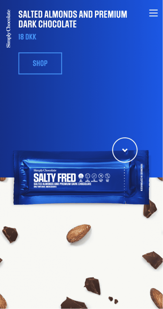
What makes this mobile landing page great:
- A complex design that performs well on mobile: This graphic design project is a masterpiece. It includes animation, high-quality images, and a few interactive elements. These are the elements that you’d expect to decrease your loading speed, but Simply Chocolate has managed to introduce the design in a way that keeps loading speed high without compromising quality.
- A visual pointer: When you click, you see a preview of the product. You can then see the chocolate as if you’d just unwrapped it and taken a bite. That’s enough to convince you to add a few bars to your shopping cart!
- The idea of showcasing products to inspire purchase: The main goal of this landing page is to get you interested in a variety of products. Once you click “Shop Now” you’re directed to an online store where you can add products to your cart. Showcasing products first to inspire purchase is a great way to stand out when thousands of other brands sell similar products.
2. Curology: a CTA that does its job
Curology is a brand that offers custom cosmetics and consultations with dermatologists. This brand uses quizzes to collect information about skin conditions and offer a personalized product.
Offering a free trial for the first 30 days, accompanied by a minimal shipping cost of $4.95, they address common skincare concerns such as uneven tone, whiteheads, breakouts, and wrinkles.
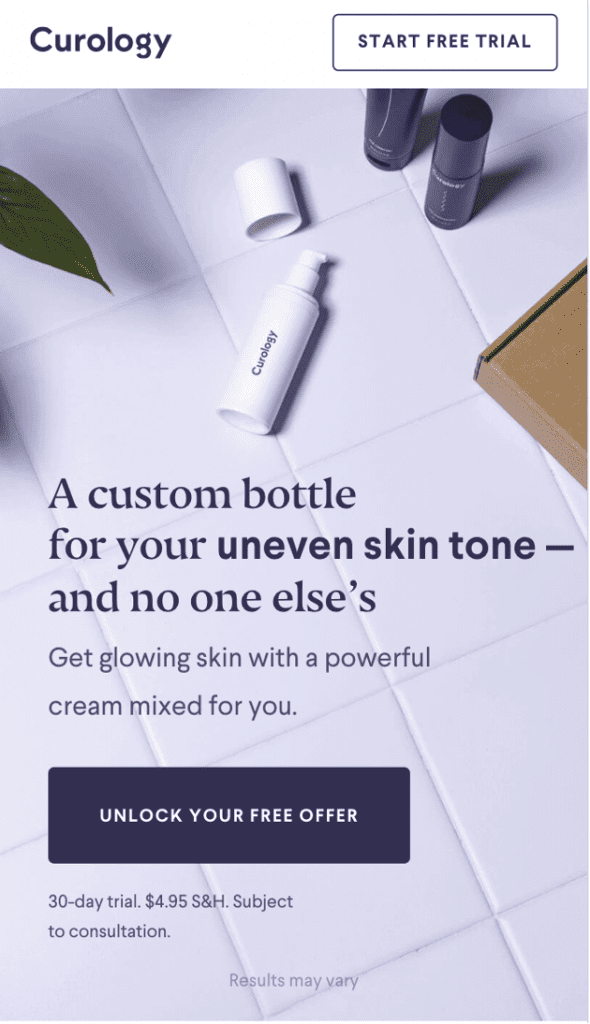
What makes this mobile landing page great:
- A straightforward CTA that communicates a benefit: You can use Curology free of charge for the first 30 days and pay only $4.95 in shipping costs. They optimized the CTA for the mobile page to ensure that it is visible without scrolling, enhancing user experience.
- Dynamic title: The title communicates different problems people have: uneven skin tone, whiteheads, breakouts, wrinkles. That makes the title resonate with everyone.
- Short and succinct copy: They keep their copy short, reducing it to a few lines of text. This way, the visitor quickly grasps what services they offer and what their unique value proposition is.
3. Rover: substituting filters with one button
Rover is a marketplace that connects pet owners with pet sitters looking for jobs.
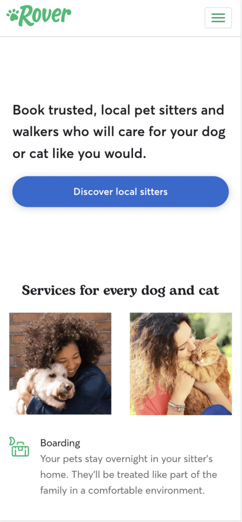
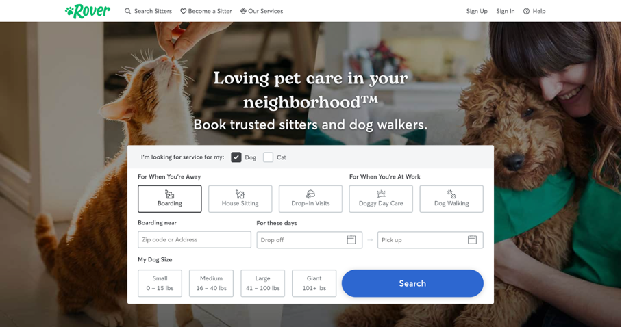
What makes this mobile landing page great:
- Substituting filters with one button: On the desktop version of their website, you see filters that help you define your criteria for a pet sitter. When viewing the website on a small screen, users would face information overload if they saw a similar layout. Rover removes the filters on their mobile site to focus user attention on their value proposition. The filters are shown after clicking the main CTA.
- Moving search options to a separate page: Once you click their main CTA, you are redirected to a separate page where you can apply your criteria. This is a good solution as the form takes up quite a lot of space.
- A clear CTA: Their CTA is very specific, highlighting the exact result a user can expect after clicking the button. They avoid using generic language.
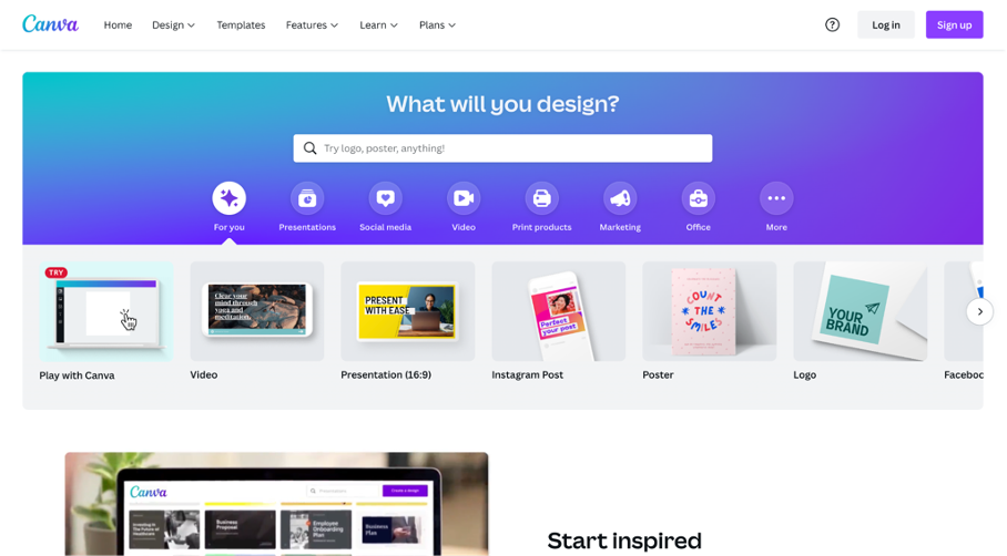
4. Canva: removing complex elements
Canva is an online tool that helps you create professional designs without any graphic design knowledge. Recognizing the importance of simplicity on mobile, Canva streamlines their landing page by removing complex elements.
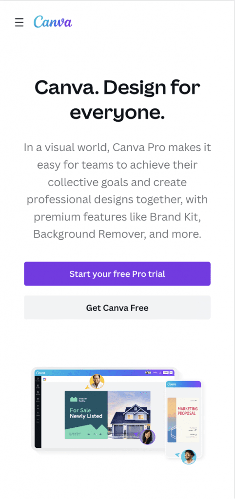
What makes this mobile landing page great:
- Keeping the mobile version simple: If you compare the desktop and mobile versions of the Canva website, you’ll quickly notice that the mobile version lacks the carousel of templates and the search bar. That’s because keeping these elements on a mobile version would make the page cluttered and distract users from Canva’s main goal: getting new users to create an account.
- Highlighting the main CTA: Start your free Pro trial is the core action Canva wants users to take. By highlighting the button in a different color, it stands out from the rest of the content.
- Effective use of white space: Canva introduces more vertical white space, which helps focus users’ attention on the CTA.
5. Mixpanel: establishing trust right away
Mixpanel is a product analytics tool that helps companies understand user behavior by tracking user interactions on web and mobile devices.
Building trust from the start, Mixpanel strategically places logos of high-profile customers higher up on their landing page.
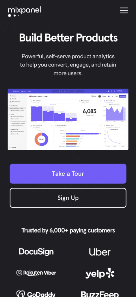
What makes this mobile landing page great:
- Moving logos of high-profile customers higher up on the page: On their mobile version, Mixpanel decided to bring these logos up, so users who’ve just entered the page get an instant boost of confidence to keep exploring Mixpanel.
- Ditching complex animation on mobile: Mixpanel’s desktop version is richer in animation. Some of the animated elements are difficult to transfer to the mobile version and would most likely increase its loading speed, so they’ve been reduced to a minimum.
6. Ballsy: a creative use of mobile popups
Ballsy is an ecommerce brand selling grooming goods for “men’s parts.” In their online shop, you can find body wash, trimmers, deodorants, and other products for men’s hygiene.
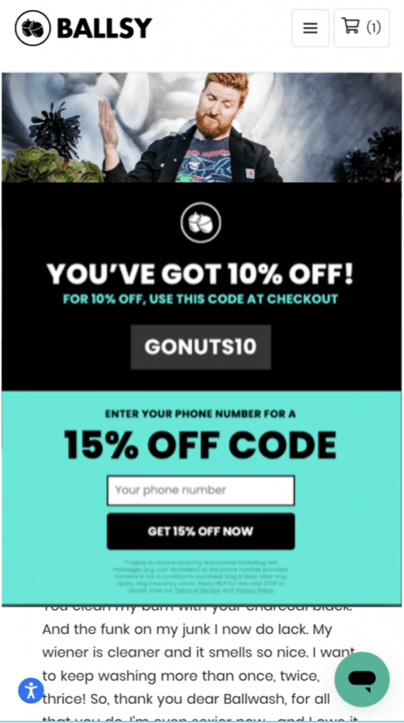
What makes this mobile landing page great:
- Using mobile popups: Ballsy uses popups to collect email addresses and phone numbers of first-time visitors. It’s multi-step: first, the user is offered a 10% discount for entering an email address, and next, they’re given the option to enter a US phone number for an even higher discount of 15%.
- Using an incentive: Some brands still ask for an email address without offering anything in return. As you might guess, the conversion rate of these popups is relatively low. On the contrary, by offering discounts on products in exchange for personal information, Ballsy ensures its popups will have a better conversion rate.
- Getting access to the code right away: You don’t have to check your email or confirm your subscription to access your discount code—Ballsy displays the code immediately after you enter your email or phone number so you can continue shopping right away.
7. MVMT: visual mobile menu
MVMT is an ecommerce brand that sells premium watches, eyewear, and accessories.
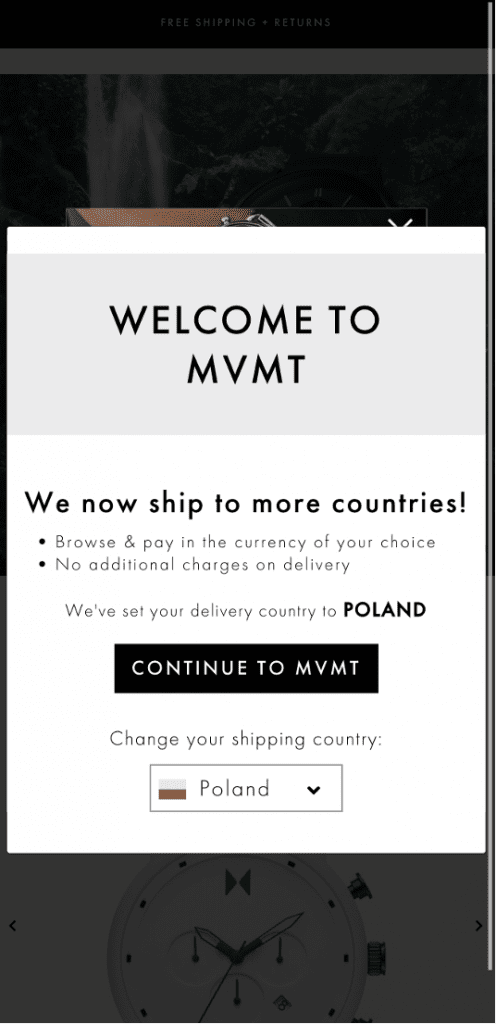
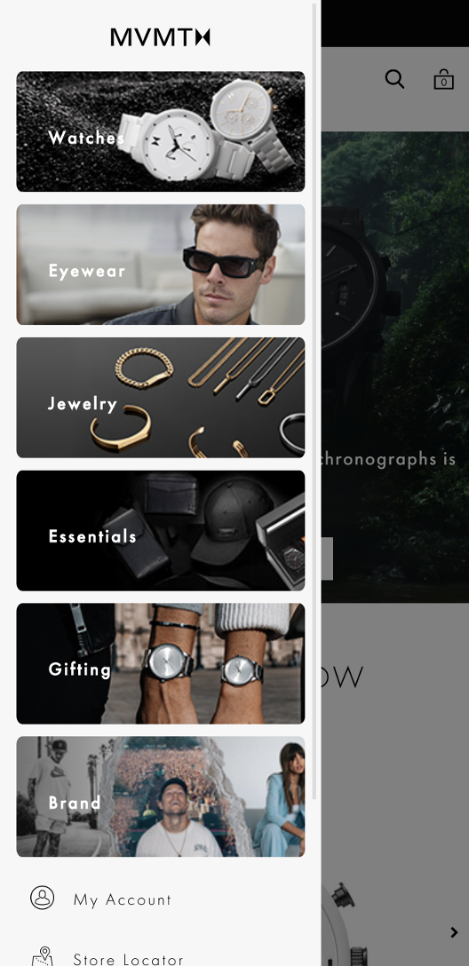
What makes this mobile landing page great:
- Visual menu: They add visual elements to their menu, which means users know what link to click right away, without thinking.
- Geolocation: Users can adjust their shipping country based on location and shop in their local currency.
8. RingCentral: intuitive services screens
RingCentral is one of the most well-known unified communications solutions, helping teams communicate through any device, including computers and smartphones. It’s a substitute for traditional landline phones.
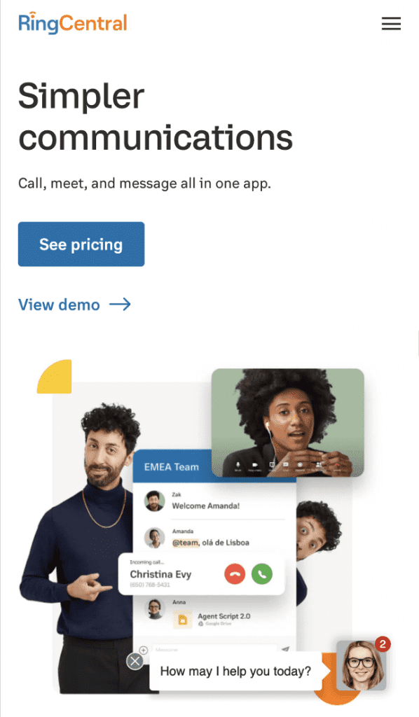
What makes this mobile landing page great:
- Simplifying services screens: They’ve switched out the buttons showcasing services and gone with a drop-down menu. This is a common trick that helps optimize the mobile experience for your users. This way, users can browse services on their mobile devices with the same convenience as on a desktop website.
- Good use of footer links: Their desktop footer menu contains lots of links leading to key product pages. On mobile, including all those footer links would make the page too long. They resolve this by hiding those links in a dropdown menu under core categories.
These examples showcase the versatility and creativity of landing page designs across various industries.
By implementing these best practices, you can create compelling and engaging experiences that drive conversions and leave a lasting impression on visitors.
How to create a high-converting mobile landing page?
Now that you’ve seen some great examples, it’s time to start thinking about your own mobile landing pages.
We’ve gathered some tips and best practices for creating mobile landing pages that you can start following today. Use these guidelines to create your own mobile landing page and maximize conversions.
1. Increase page loading speed
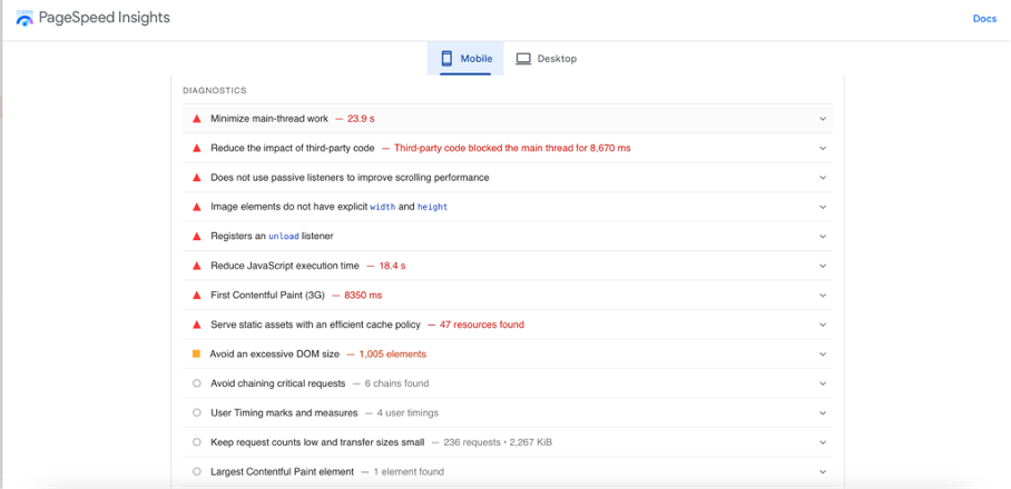
How long will users wait for a page to load? Here’s a hint: they won’t hang around for more than five seconds. No one likes slow pages, and they hurt your conversion rate. So how can you improve loading speed on mobile?
First, check the overall health of your landing page using Google PageSpeed Insights.
Once you add your URL, you’ll get a report on all the critical issues that mobile users experience. You’ll want to work on eliminating them and increasing your page health score.
You can also use this domain scanner to help you identify more technical issues related to DMARC, SPF, DKIM and BIMI records.
2. Be succinct
On smaller mobile screens, including lots of text can make your page too long.
Remember that users’ attention span can be lower when they’re checking your website on the go, like during their commute or when they’re out and about. That’s why it’s important to use a succinct copy.
And remember, your desktop version can also benefit from keeping things concise!
Here are some steps to follow:
- Describe your value proposition in the page headline.
- Write short paragraphs that are easy to understand. Ditch industry jargon and write as if you were telling a story to a ten-year-old.
- Be specific.
- Write short sentences or divide longer sentences into shorter ones.
3. Create a separate design for mobile
When working with a graphic designer on your UX and UI, make sure you add a mobile copy to the brief. Creating a responsive design is not that time-consuming or costly, but it requires UX and UI knowledge to account for all the details.
The best graphic design tools help adjust web versions to mobile ones, and have the capabilities necessary to switch to mobile UI.
In some cases, your mobile version will need a different design solution. In others, you’d just need to simplify your animation elements or reduce the complexity of graphics where necessary.
Using mobile landing page templates can also ensure an optimized user experience on smartphones.
4. Avoid generic language in your CTA
Which button would you click: “Sign up” or “Get your free access”? There is a high chance you’d click a CTA that communicates some value because (like everyone) you ask yourself: “What’s in it for me?”
More generic CTAs like “Sign up” or “Start now” don’t communicate much value to a user and will most likely have a lower conversion rate compared to the button that’s more specific.
Avoid generic language in button text and instead focus on communicating the benefits a user will get if they take the desired action. That’s exactly what Curology does on their mobile landing page:

5. Use mobile popups
If you already use popups for your desktop version, check out how they’ll look on mobile. Make sure they’re responsive and easy to interact with on smaller screens. Keep text to a minimum.
“Remember that you can always create two different options of popups—both for web and mobile versions, so you can account for the size of the screens. As a result, both web and mobile users will find no problems when inputting information in popup fields,” says Farnam Elyasof, Founder of Flex Suits.
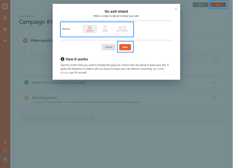
For example, in OptiMonk, you can easily select which devices you want your popups to display on.
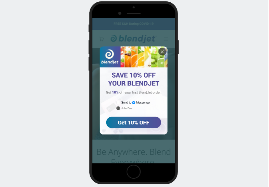
Plus, all OptiMonk popups are mobile-friendly. Check out this mobile popup from BlendJet that was created with OptiMonk:
6. Use short forms
Filling out information on a small screen can become quite frustrating. That’s why asking for too much information in your online forms is a sure way to lose a customer.
If you’re already using contact forms to generate leads, you might be looking for ways to increase their efficiency and conversion rate. Start with making your forms shorter, and ask for only the most important information.
But what if you have to collect more information about your customer and you can’t avoid using more fields?
Then break them down into separate popup screens or “steps,” and add a progress bar.
By using separate popup screens, every field will be large enough for inputting information. And by using a progress bar, your users will always know how close they are to completing the form. As a result, your churn rate at each stage should go down.
7. Don’t forget about consistent branding
If your logo looks too big on a mobile device, or if it’s very complex, you might consider creating another version for use on smaller screens.
There are various ways to adapt logos that look good on a desktop for small screens, but it’s important to remember to use vector images because they’re small, scalable, and editable.

In most cases, you’ll want to work with a designer who will review your company style guide and use their skills to create a logo that’s appropriate for mobile use.
However, if this isn’t an option, here are some tips that can help when making your logo with no graphic design skills:
- Use horizontal logos: move visual elements from above the text to left or right.
- Reduce details: increase legibility by ditching some less important logo elements.
- Remove small text: remove small text in the logo that won’t be legible when displayed on smaller screens.
8. Use mobile-friendly fonts
When it comes to the content of the page on mobile devices, all fonts are not equal. If you’re using a font that’s hard to read, consider substituting it with a more mobile-friendly option like:
- Open Sans
- Roboto
- Montserrat
- Lato
- Adobe Garamond
- Baskerville
- Computer Modern
- Georgia
- Trebuchet
9. Choose a safe “thumb zone”
Trying to click small buttons on an iPhone mini can become a nightmare. You can avoid turning your landing page into a source of frustration for users if you remember to incorporate a safe “thumb zone” in the areas where you expect a user to click.
What is the thumb zone and why are mobile designers so obsessed with this term?
The term “thumb zone” was coined by Steven Hoober in his 2011 book, “Designing Mobile Interfaces.” The thumb zone was defined as the most comfortable area for a user to click when using a phone with one finger.
Here’s where the thumb zone is located for different users:
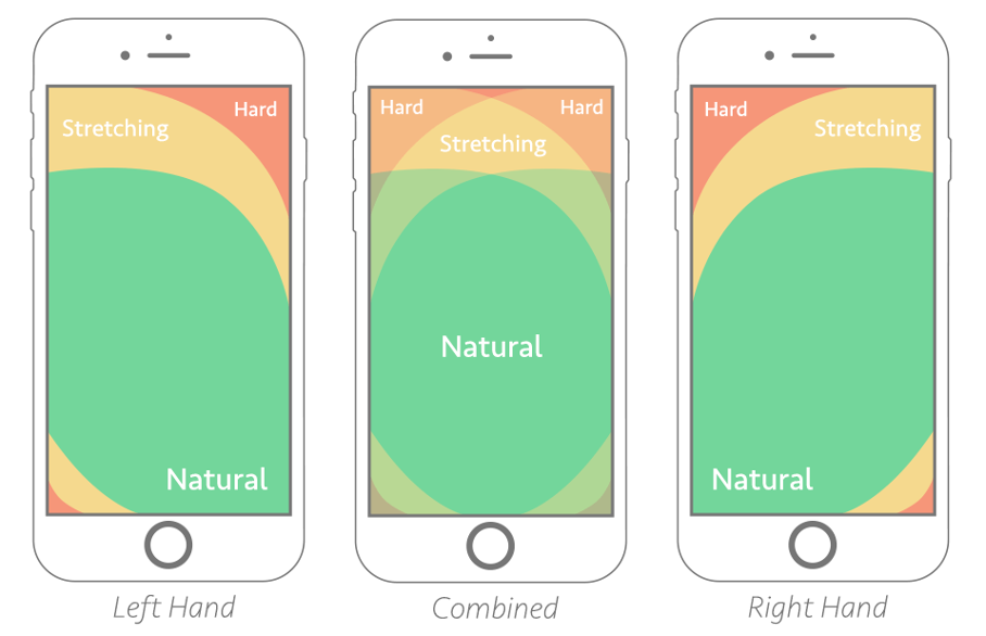
When designing your mobile experience, you have to keep in mind that the elements you want users to click on should be within the “natural” area.
10. Use white space
White space is often perceived as the canvas on which text, images, and other content can be placed. However, it plays a huge role in how users consume content—especially on mobile devices.
So what counts as white space?
These are the areas that are left empty on purpose, like the space between columns, margins, and paddings.
Here are some tips to follow when incorporating white space:
- Add enough white space between click targets (e.g. buttons): the minimum size of a click target should be around 30 to 40 pixels. Make them easy to interact with by adding a sufficient amount of white space between two or more click targets.
- Shift white space vertically on mobile: use white space to separate elements that are following a vertical flow. This is different than on desktop, where white space is introduced both vertically and horizontally.
11. Create a skim-able landing page
You need to cater to the shorter attention spans and limited time that users have when browsing the internet. By presenting information in a way that is easily digestible, users are more likely to engage with the content and take the desired action.
A skim-able landing page ensures that website visitors can quickly scan through the page, comprehending the key points without having to invest a significant amount of time or effort.
This is achieved through various design and content techniques. For instance, incorporating short sentences and using headlines allow users to grasp the main message at a glance, avoiding information overload.
Summary
By optimizing the mobile experience for your users, you’ll ensure customers enjoy using your website and boost your conversion rate on mobile devices.
Make it easy for users to achieve their goals, like browsing and buying your products, signing up for your offers, or taking other actions that bring them closer to converting.
Hopefully, the examples and tips we’ve shared will help you understand what makes a good mobile experience and fast-track your progress as you introduce changes. Now, it’s time to put all those new insights to work!
Migration has never been easier
We made switching a no-brainer with our free, white-glove onboarding service so you can get started in the blink of an eye.
What should you do next?
Thanks for reading till the end. Here are 4 ways we can help you grow your business:
Boost conversions with proven use cases
Explore our Use Case Library, filled with actionable personalization examples and step-by-step guides to unlock your website's full potential. Check out Use Case Library
Create a free OptiMonk account
Create a free OptiMonk account and easily get started with popups and conversion rate optimization. Get OptiMonk free
Get advice from a CRO expert
Schedule a personalized discovery call with one of our experts to explore how OptiMonk can help you grow your business. Book a demo
Join our weekly newsletter
Real CRO insights & marketing tips. No fluff. Straight to your inbox. Subscribe now
Share this article
Written by

You may also like
- Posted in
- Conversion
Partner with us
- © OptiMonk. All rights reserved!
- Terms of Use
- Privacy Policy
- Cookie Policy
Product updates: January Release 2025


