- Blog
- Our Top 3 Popup Fails (and What You Can Learn From Them)
Our Top 3 Popup Fails (and What You Can Learn From Them)
-
Nikolett Lorincz
- Conversion
- 6 min read
Table of Contents
Popups are a fantastic way to engage website visitors—when they work. But let’s face it: not every popup campaign is an instant hit.
Even with thousands of campaigns under our belt, we’ve had our fair share of flops. And you know what? That’s okay.
This article is here to remind you that if your first version of a campaign doesn’t crush it, you’re not alone. The key is to keep tweaking. Often, a small adjustment can transform a mediocre popup into a conversion machine.
To prove it, we’re sharing three popup campaigns we launched last year that flopped at first. But with some edits, they turned into success stories.
Let’s dive into our top 3 popup fails and the lessons you can steal from them.
1. Exit-intent isn’t always the best trigger
We created a discount popup for this brand, triggered by:
- Exit intent for desktop users.
- 20-second delay for mobile users.
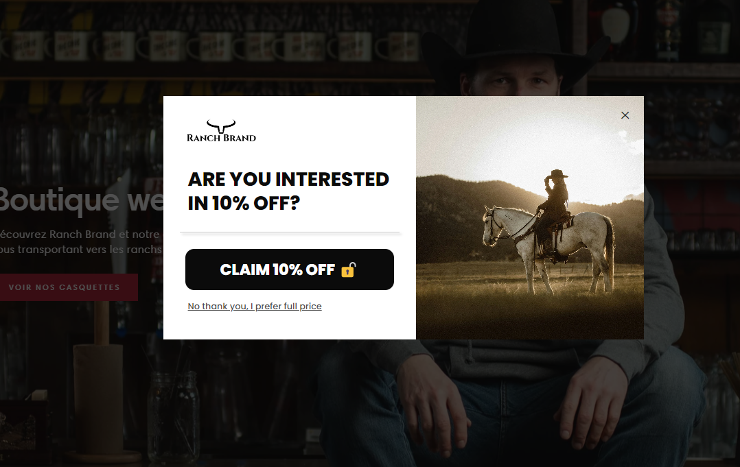
Exit intent is often a go-to for discount popups, but this time, it underperformed. Conversion rates were disappointing, and we knew something had to change.
So, we switched the trigger to show the popup after 15 seconds of browsing on both desktop and mobile. Conversion rates soared almost immediately.
The lesson: Don’t assume exit intent is the best option for every campaign. Experiment with different triggers, such as time-on-page, scroll depth, or inactivity, to see what resonates with your audience.
If you’d like to try a similar campaign, take a look at these popup templates:
2. Promoting just one product? Try three!
For this brand, we created a browsing reminder campaign targeting returning visitors. It showcased a single product they had previously viewed, with the goal of encouraging them to make a purchase.
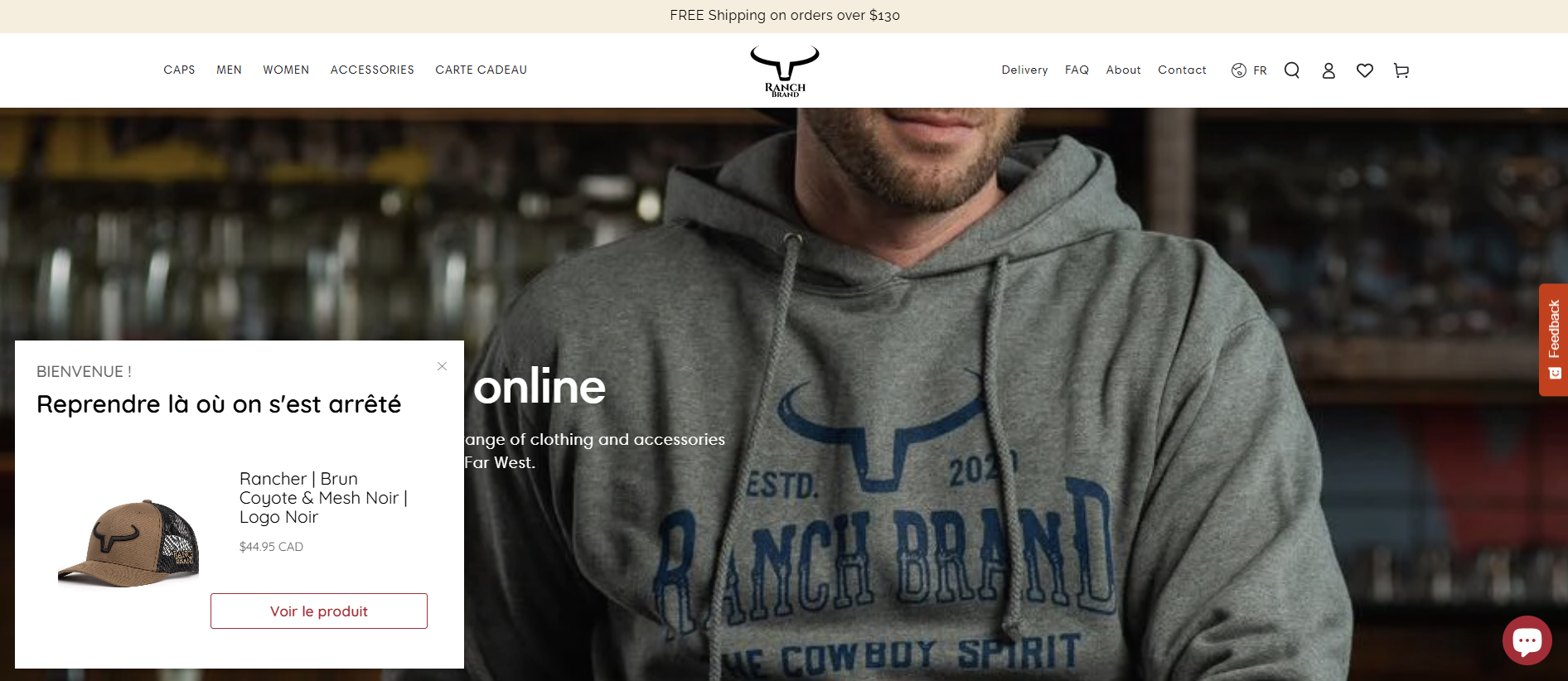
While the campaign performed well, we felt it could do more. Highlighting only one product seemed too limiting.
So, we revamped the popup to showcase three related products instead of one.
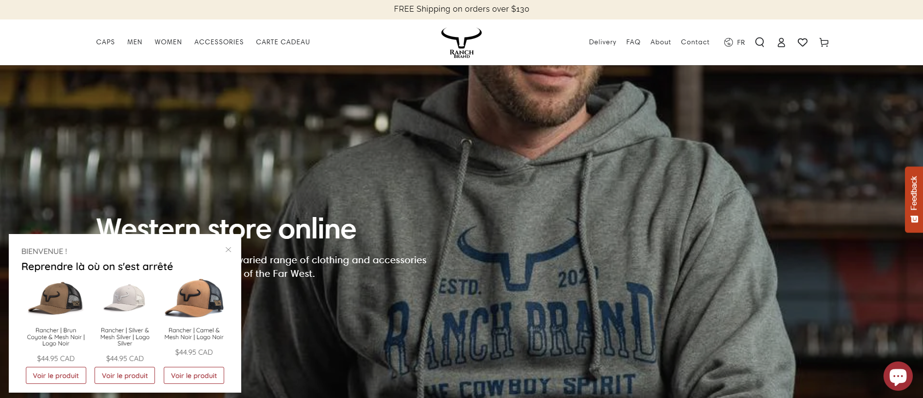
The new design significantly improved click-through rates and conversions.
The lesson: Sometimes, giving visitors more options can make all the difference. Instead of focusing on just one product, test variations that display multiple items to capture broader interest.
If you’d like to try a similar campaign, take a look at these popup templates:
3. Reconsidering cart reminder targeting
This campaign was a cart reminder, originally targeting cart abandoners. The trigger relied on exit intent for desktop and a 20-second delay on mobile. It wouldn’t appear on the cart page but required at least one item in the cart.
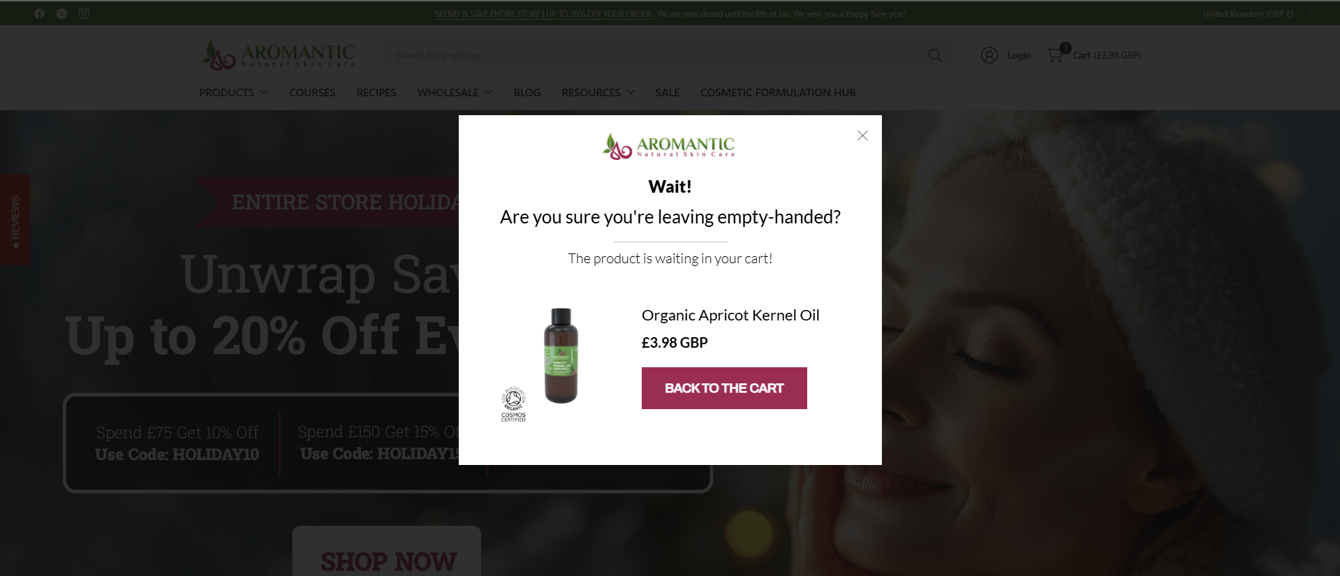
We updated the targeting to focus on inactive users. The trigger now displays after 10 seconds of inactivity or 90 seconds of total browsing time, with all other conditions remaining the same.
This simple adjustment doubled the conversion rate.
The lesson: Targeting is everything. Even minor changes in when your popup appears can dramatically impact how users respond.
If you’d like to try a similar campaign, take a look at these popup templates:
Closing thoughts
Popups are powerful, but they’re rarely perfect on the first try. If your campaign isn’t performing as expected, take it as a challenge to dig deeper. Change a trigger, test a new design, or tweak your messaging.
The takeaway? Success comes from persistence and a willingness to test and adapt. Your next small tweak could be the big breakthrough you’ve been waiting for.
So, what are you testing today? 🚀
Migration has never been easier
We made switching a no-brainer with our free, white-glove onboarding service so you can get started in the blink of an eye.

What should you do next?
Thanks for reading till the end. Here are 4 ways we can help you grow your business:
Boost conversions with proven use cases
Explore our Use Case Library, filled with actionable personalization examples and step-by-step guides to unlock your website's full potential. Check out Use Case Library
Create a free OptiMonk account
Create a free OptiMonk account and easily get started with popups and conversion rate optimization. Get OptiMonk free
Get advice from a CRO expert
Schedule a personalized discovery call with one of our experts to explore how OptiMonk can help you grow your business. Book a demo
Join our weekly newsletter
Real CRO insights & marketing tips. No fluff. Straight to your inbox. Subscribe now
Share this article
Written by

Nikolett Lorincz
Nikolett is the Head of Content at OptiMonk. She is obsessed with content marketing and loves creating educational content for ecommerce store owners. She truly believes in the importance of quality over quantity.
You may also like
- Posted in
- Conversion
Partner with us
- © OptiMonk. All rights reserved!
- Terms of Use
- Privacy Policy
- Cookie Policy
Product updates: January Release 2025


