- Blog
- Exit-Intent Popup Examples, Tips & Strategies: The Ultimate Guide for 2025
Exit-Intent Popup Examples, Tips & Strategies: The Ultimate Guide for 2025
-
Nikolett Lorincz
- Conversion
- 6 min read
Table of Contents
Exit-intent popups are perfect for increasing your conversion rate without disrupting your visitors’ experience. They give you one more chance to turn abandoning visitors into email subscribers or paying customers.
In this ultimate guide, we’re going to share:
- 20 great exit-intent popup examples for inspiration,
- 9 exit popup hacks that can boost the conversion rate of your campaigns,
- A “best practices checklist” to help you optimize your exit popups,
- A step-by-step guide to creating popups, and
- 5 best exit popup software.
Let’s get started!
What is an exit-intent popup?
An exit-intent popup is designed to engage visitors at the moment they are about to leave a website.
Thanks to this exit-intent technology, an exit-intent popup appears at the exact moment when a visitor attempts to bounce.
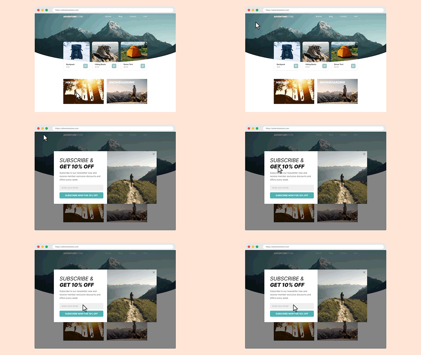
How do exit-intent popups work?
The most common exit-intent popup trigger on desktop is when a user moves their mouse to the top right corner of their screen.
This indicates they’re about to click the “X” button on their browser. At that point, an exit-intent popup will appear.
Do exit-intent popups work on mobile devices?
On mobile devices, there’s no mouse to track. But that doesn’t mean exit popups can’t be used on mobile!
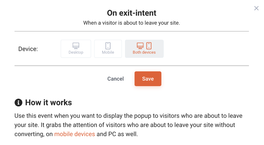
Instead of tracking mouse movements, exit-intent on mobile devices works by deploying the popup when a user switches between tabs or uses the “Back” button. (You can read more about the technical details here.)
OptiMonk’s popup software allows you to decide if you want your exit-intent popup to appear only on desktop, only on mobile, or on both types of devices.
Now that we know how exit popups work, the next question is…
Do exit-intent popups increase conversions?
The short answer to this question is yes!
But it’s important to point out that the type of popup you use and the message you’re sending can have a big impact on your conversion rate.
That’s why quantifying how much exit-intent popups increase conversions is a bit more complicated.
But don’t worry—OptiMonk’s own data can give us a better idea of how often different types of exit-intent popups convert:
- Cart abandonment popups have an average conversion rate of 17.12%.
- Feedback popups have an average conversion rate of 12.62%.
- Email signup popups have an average conversion rate of 5.10-7.65%.
If your popups convert at these levels (or better), it can make a massive difference for your bottom line.
Recommended reading: 18 Popup Statistics You Must Know
20 best exit popup examples that you can copy today
Now it’s time to take a look at some of our favorite exit-intent popup examples so you can learn some strategies for your own store.
1. Theoodie.com
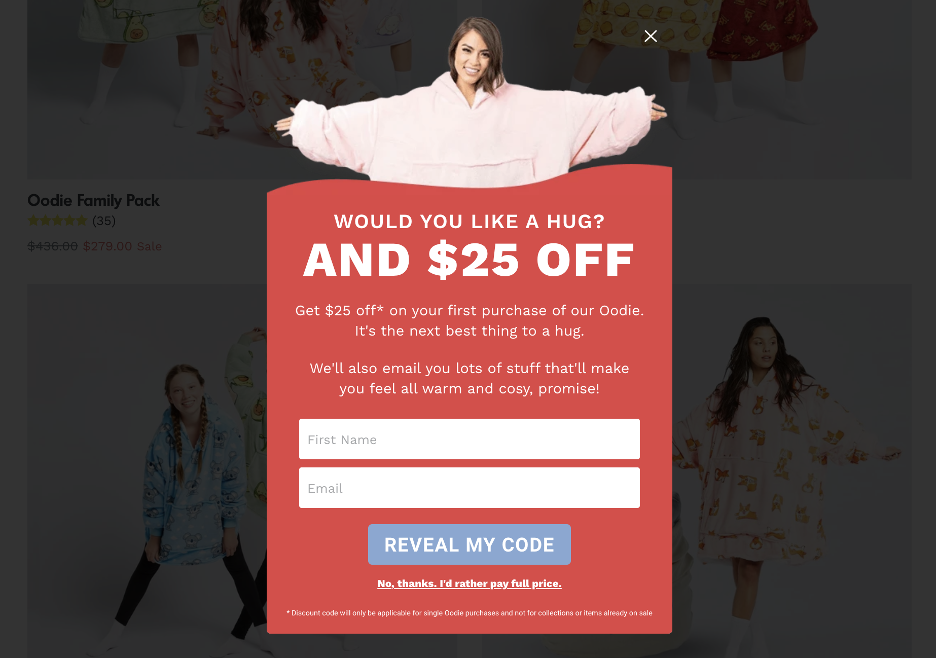
First, let’s take a look at a discount exit popup example from The Oodie.
They use a friendly, engaging approach in their exit popup form. Their message, “Would you like a hug? And $25 OFF,” immediately captures attention with its warm tone.
To access the discount, site visitors only need to enter their first name and email address.
The popup features an image of one of their cozy products, enhancing visual appeal. Additionally, a contrasting color for the call-to-action button ensures it stands out, guiding users to take the desired action easily.
2. Kissmyketo.com
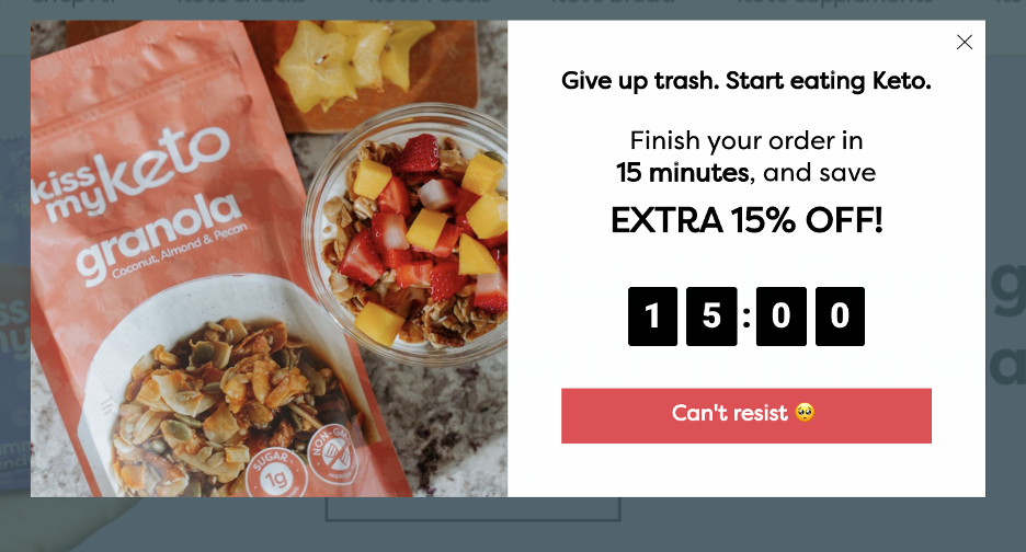
This exit-intent popup example from Kiss My Keto was shown to visitors who attempted to leave after adding items to their cart.
It uses an authoritative call-to-action, “Give up trash. Start eating Keto,” to encourage shoppers to adopt a low-carb lifestyle.
The ticking clock on their exit popup informs customers that they only have 15 minutes to make a decision about their diet (and grab their 15% discount), which increases the sense of urgency.
They also use OptiMonk’s auto-redeem feature, automatically applying the discount code at checkout, so no one forgets to use their coupon.
This effective exit-intent pop-up strategy resulted in a 15.05% conversion rate.
Recommended reading: How Kiss My Keto Decreased Their Cart Abandonment Rate by 20%
3. Christopher-cloos.com
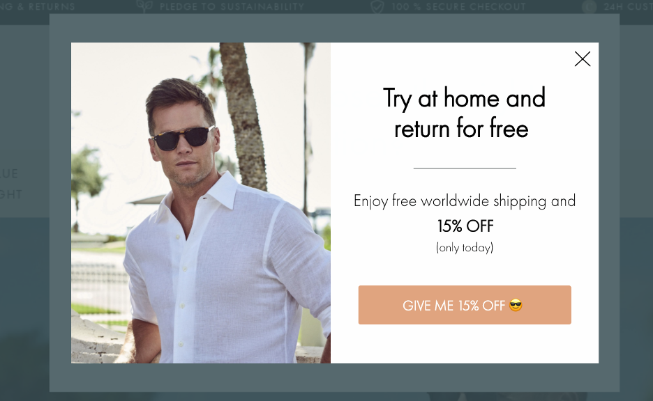
The most compelling exit popups often have a very simple design, like in this great example from Christopher Cloos.
Featuring an image, concise text, and ample white space, this popup overlay is easy to read and visually appealing.
They used a 15% discount as the exit-intent popup offer, and the use of an emoji in the CTA button adds a playful, eye-catching element.
This straightforward design ensures that visitors quickly understand the offer without feeling overwhelmed, making it more likely they’ll stay and complete their purchase.
4. Bibado.co
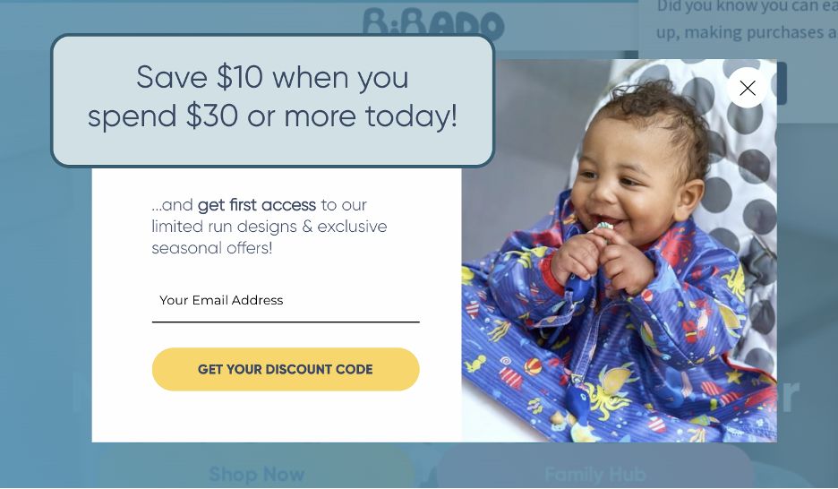
Bibado effectively uses cart value thresholds on their exit-intent popups to motivate customers.
When a visitor tries to leave with items worth $25 in their cart, the popup encourages them to spend a bit more to access a significant discount.
This strategy not only reduces cart abandonment but also boosts the average order value.
Additionally, the promise of getting first access to limited designs and special offers makes the offer even more appealing, compelling visitors to complete their purchase.
5. Ecommerceinfluence.com
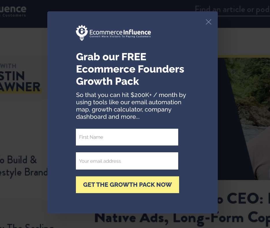
Ecommerce Influence takes a unique approach by offering a free guide instead of a discount.
This exit popup example provides an ecommerce founders growth pack, a valuable resource for their audience. This strategy targets potential customers who are highly interested in their niche, making them likely to become high-quality leads.
It’s a great example of how offering something other than a discount can still create high-converting exit popups, attracting and engaging visitors effectively.
6. Indestructibleshoes.com
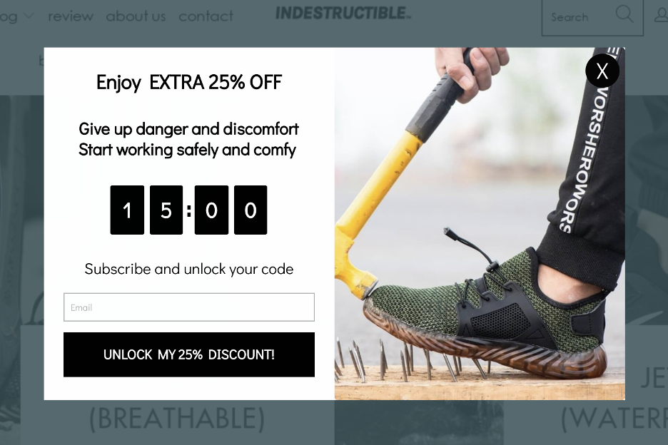
Indestructible Shoes effectively uses an exit popup to promote a discount code for abandoning visitors.
The popup features an image showcasing the durability of their shoes, reinforcing the brand message.
The discount is prominently displayed as “EXTRA 25% OFF” to grab attention, and the CTA, “UNLOCK MY 25% DISCOUNT,” uses a strong action word to motivate customers.
Additionally, a countdown timer increases urgency, leading to more conversions.
7. Tinybeastdesigns.com
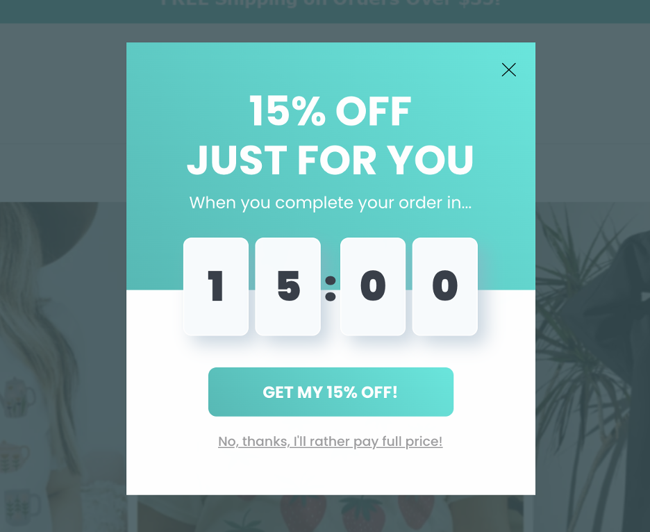
Tiny Beast Designs showcases the power of minimalism in their exit-intent popup.
Focused on a simple 15% discount, the popup uses a clean design with ample white space, making the offer clear and easy to understand. A countdown timer adds urgency, prompting visitors to act quickly.
This straightforward approach proved highly effective, achieving a 23.51% conversion rate. It’s a testament to how a minimalist exit popup works well and drives results.
8. Scarlettos.com.au
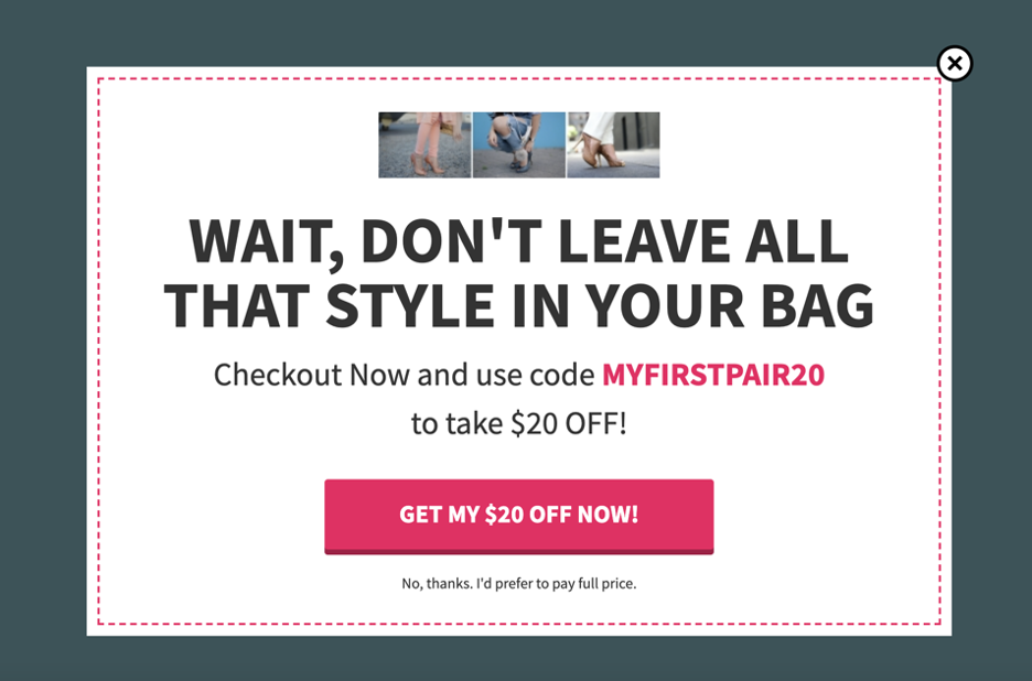
Scarletto’s exit popup effectively reminds shoppers of the items left in their cart with the message, “Wait, don’t leave all that style in your bag.”
They offer a $20 discount targeted at first-time buyers, without requiring an email address. The discount code is displayed directly on the first page of the popup, making it easy for customers to use it immediately.
This straightforward approach can grab the visitor’s attention who is about to leave and significantly reduce cart abandonment.
9. Winternational.co.uk
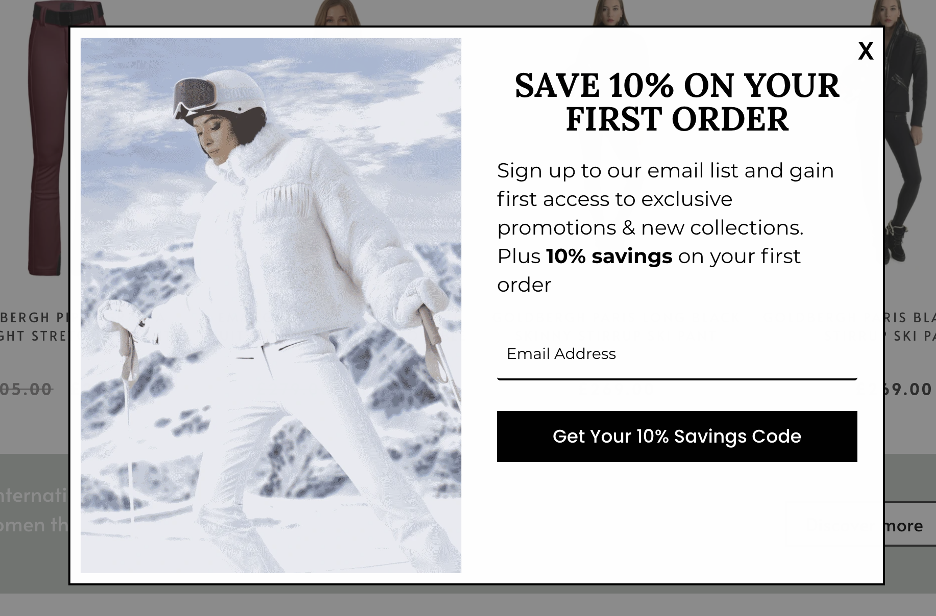
Winternational uses a sleek black-and-white design for their exit popup, offering first-time shoppers a 10% discount.
To access the discount, visitors must subscribe to their email list, which helps generate new leads.
This type of exit popup helps to encourage visitors to join their email list and also prompts them to make a purchase quickly.
10. Qureskincare.com
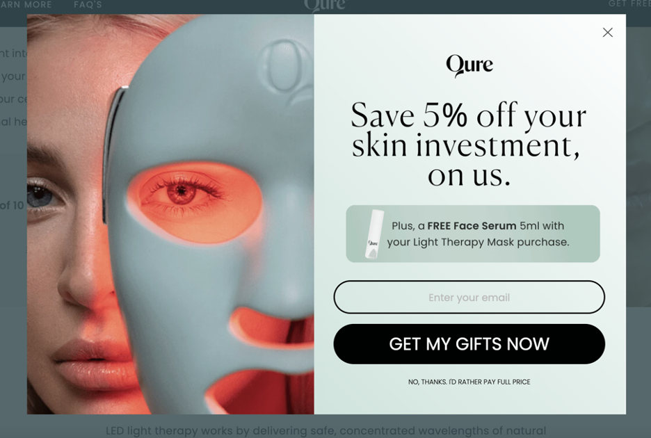
This exit-intent popup example from Qure offers a compelling combination of a 5% discount and a free face serum with each order.
This approach leverages the appeal of free items to motivate potential customers to buy immediately.
An engaging image on the left side of the popup grabs the visitor’s attention, while the “Get my gifts now” CTA drives conversions.
11. Forevercoffeepods.com
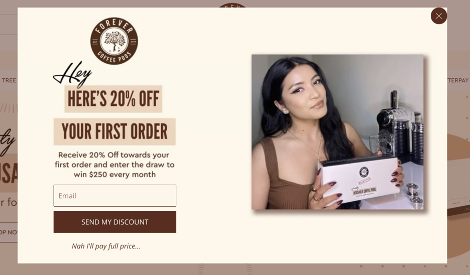
Forever Coffee Pods uses an attractive exit-intent popup to ask for a visitor’s email address in exchange for a 20% discount on their first order.
To add more value, they include a monthly draw to win $250 for those who sign up.
The exit-intent pop-up also features a clever “Nah, I’ll pay full price…” option, encouraging visitors to opt for the discount instead.
This combination of immediate savings and a chance to win a substantial prize helps to effectively convert visitors.
12. Atlantaluxurybags.com
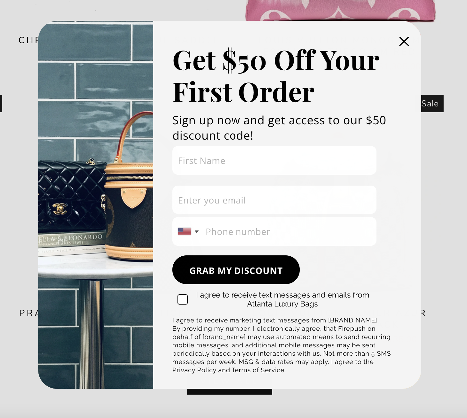
Atlanta Luxury Bags’ exit popup emphasizes a substantial $50 discount, an offer likely to catch any visitor’s attention.
To access the discount, visitors are asked for their first name, email address, and phone number. Collecting phone numbers allows for SMS marketing, an effective channel for engaging customers.
Recommended reading: Ecommerce SMS Marketing: An Ultimate Guide
13. Earthlove.co
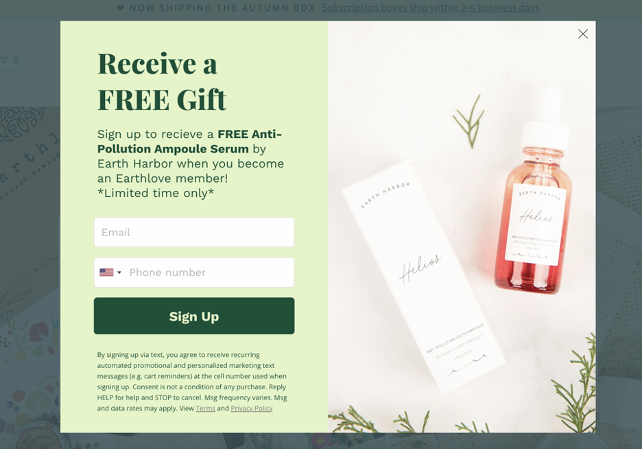
In the skincare space, potential customers often want to try products before making a large purchase. Earthlove’s exit popup effectively taps into this by offering a free sample box with orders.
To receive the free gift, visitors are asked for their email and phone number.
This approach not only provides an enticing incentive for customers to try the products but also helps Earthlove build their email list and engage with customers through SMS marketing.
14. Yesplshealth.com
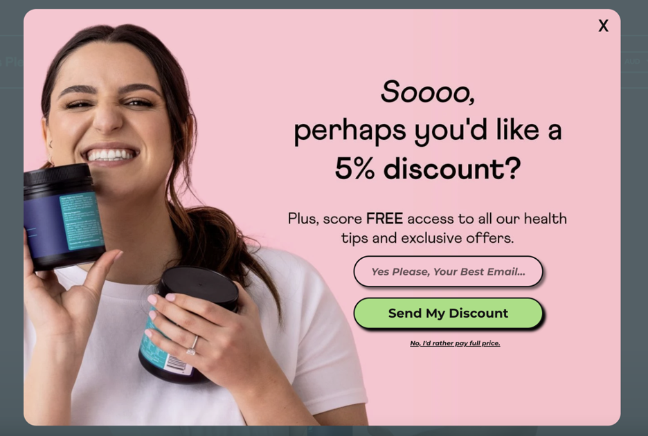
Yes Please Health uses a fun, conversational tone to offer a 5% discount in exchange for a visitor’s email.
Notice how the emphasis stays on the email signup, and the link to close the popup features small text and copy designed to make the visitor think twice before abandoning the offer.
15. Tapestrygirls.com
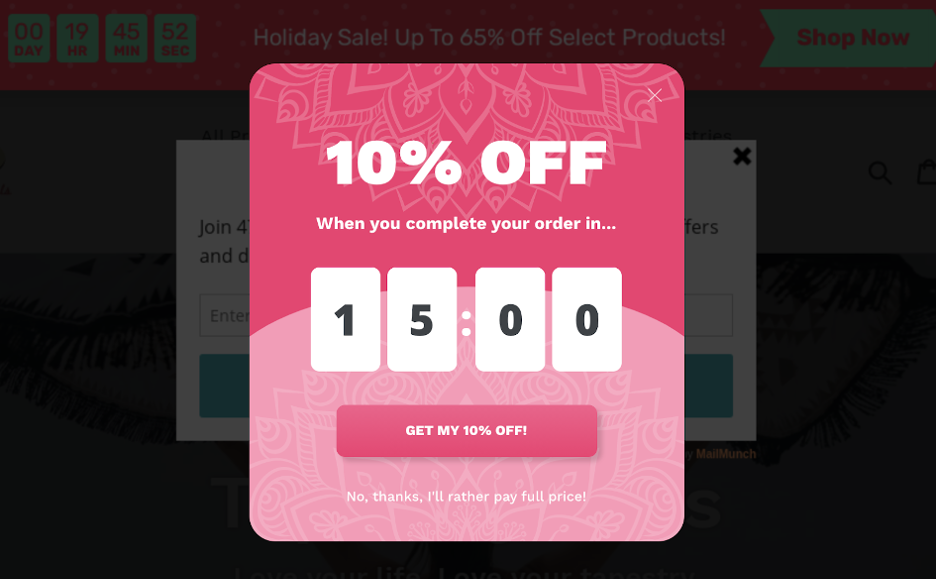
Tapestry Girls effectively fights shopping cart abandonment with an exit-intent popup offering a 10% discount for completing the order within 15 minutes.
They also set up a reminder sticky bar for customers who click on the cart abandonment campaign button.
This dual approach creates a sense of urgency and keeps the discount offer visible, and it helped Tapestry Girls increase their first-time customer conversion rate by 50%.
16. Boombycindyjoseph.com
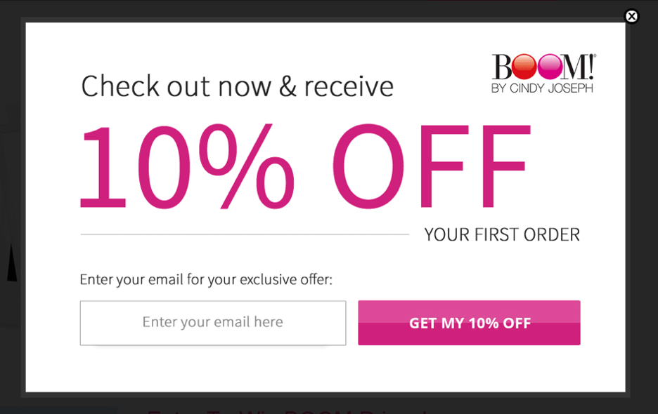
BOOM! by Cindy Joseph uses this exit popup to fight cart abandonment and collect email addresses.
The popup encourages shoppers to “Check out now” and enter their email addresses to receive a 10% discount on their first order.
The prominently displayed “10% OFF” text is hard to miss, making the offer highly visible and enticing.
This exit-intent pop-up strategy proved effective, with nearly 40% of visitors accepting the offer, thanks to its compelling message and precise targeting.
17. Fullersflips.com
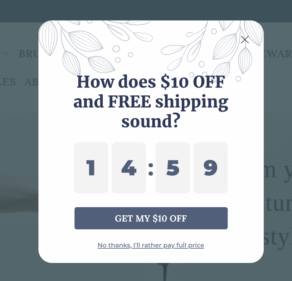
Fuller’s Flips uses a few different exit popup hacks in this simple example.
They offer a compelling combination of free shipping and $10 off, making it hard for users to resist clicking through to the checkout page.
They also incorporated a countdown timer to create a sense of urgency and included a “No thanks” option for users who might still be on the fence.
18. Kettlegifts.com
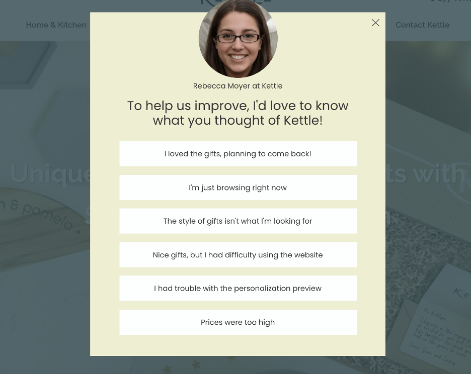
Kettle Gifts uses an exit popup to ask for feedback from visitors. This approach demonstrates their commitment to improving the customer experience by valuing real customer opinions.
By directly engaging with visitors and seeking their input, Kettle Gifts shows they care about meeting customer needs and continuously enhancing their service.
These kinds of exit campaigns provide valuable insights and foster a sense of involvement and loyalty among customers.
19. Naturalvital.hu
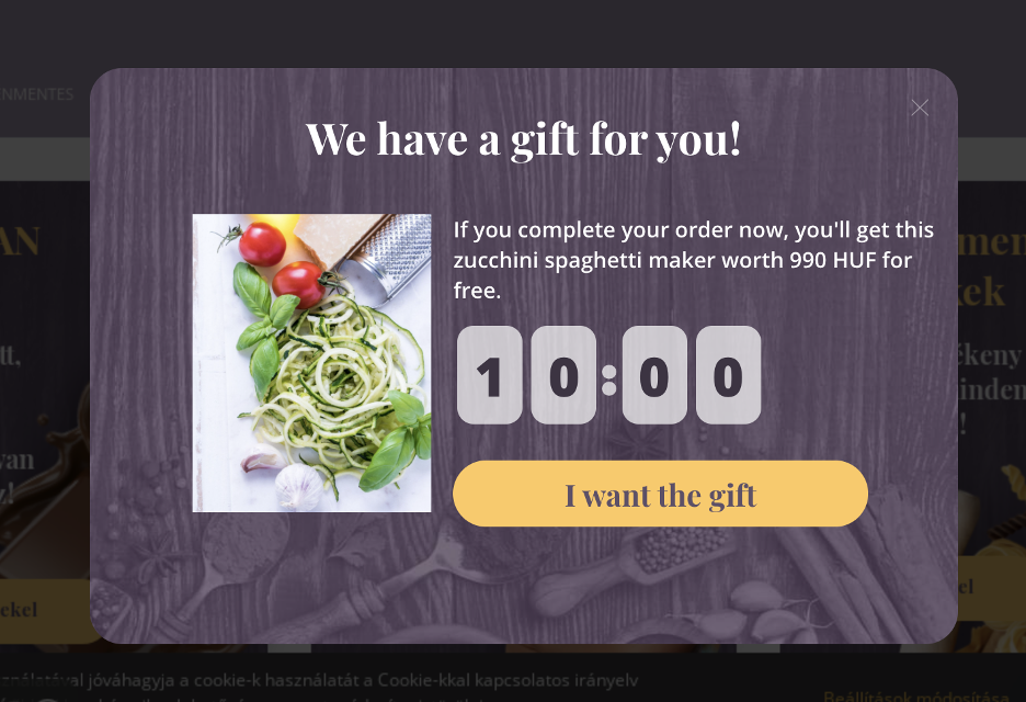
This exit popup from Natural Vital offers a free gift to cart abandoners with a clear call-to-action button: “I want the gift.” Even better, they pair their offer with a timer that encourages people to act right away.
This popup strategy achieved an impressive 31.42% conversion rate, generating an additional 226,498 HUF in revenue during a 26-day test period.
20. Czarekszer.hu
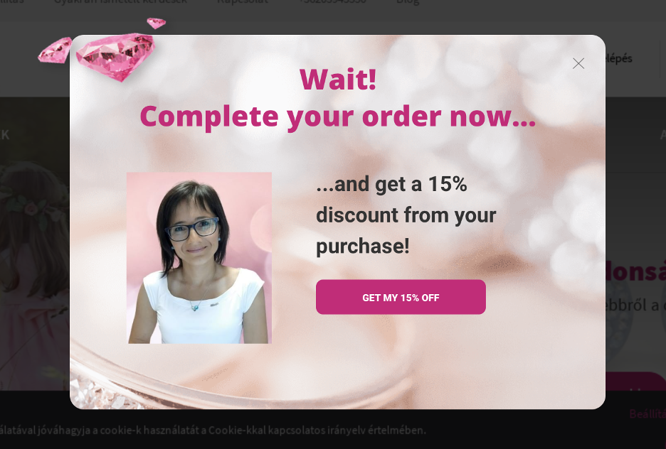
The last one from our exit-intent popup examples is Czar ekszer’s exit-intent popup. It uses enticing language. The large “Wait!” immediately grabs visitors’ attention, focusing them on a 15% discount.
This simple yet powerful approach encourages potential customers to reconsider leaving without making a purchase.
As a result, this campaign generated an additional 1,072 USD in revenue in just one month.
9 exit popup strategies
Now that we’ve seen some great exit popup examples, it’s time to check out nine tips that will help you increase the conversion rate of your exit-intent popups for any target audience and any use case.
1. Provide the chance to opt-out
The typical exit-intent popup design contains a simple opt-in form and one call-to-action button.
But somewhat counterintuitively, you can increase the conversions of your exit-intent popup form by 30-40% by adding an opt-out option.
Why?
Because when saying yes isn’t the only option, your website visitors feel like they have a choice, making them more willing to engage with your offer.
Another option is to frame the “No” option in a way that reinforces the value of saying yes.
For example, if you’re going to offer free shipping, you could add an opt-out link that reads “No thanks, I’d rather not have free shipping.”
When presented this way, a website visitor will naturally think, “Oh, of course I want free shipping! I’d better sign up.”
See some examples below:
2. Delay the appearance of the “X” button
People on the web are so used to seeing exit-intent popups that closing them is almost a reflex for experienced online shoppers. This means that your popup might get closed before most visitors have actually read the content or considered the offer!
You can mitigate this problem by delaying the appearance of the “X” button for a few seconds.
While they’re looking for the exit button, they’ll have the opportunity to take in the value proposition of your exit-intent popup.
And if you’re offering something really great, like significant discount codes or a free sample box, these extra few seconds are all it takes to convince a website visitor to engage with your offer.
This simple, effective method can result in a 20-30% higher conversion rate.
3. Segment your visitors and target them with different messages
It’s essential to group the people who visit your website into segments so that you can deliver messages tailored to the needs of each group.
You have to make sure that all the messages you send are relevant to your visitors, but the truth is that no single message will be relevant to all the shoppers on your webpage.
As a rough guide, you can show different messages to:
- New visitors vs. returning visitors
- Visitors in the early stages of the customer journey vs. visitors further along (who have products in their cart, for instance)
- Email subscribers vs. those who haven’t subscribed yet
Ensuring you don’t bother your returning visitors with the same message over and over is a good place to start. From there, work on providing messages for buyers in different stages of the process for better results.
For example, you could collect emails from abandoning visitors in the early stages of the customer journey using an exit-intent popup.
But for an abandoning visitor that has items in their cart, you’d be wise to use a cart abandonment popup with a highly visible discount offer. That’s because the latter group is further along in the customer journey and closer to making a purchase.
Showing relevant messages to different segments of customers makes a huge difference in how well your popups convert and, as a result, how much they’ll increase sales.
Recommended reading: Top 9 Ecommerce Segments & How to Help Them With Popups
4. Make sure your exit popups load quickly
Exit-intent popups only have a few moments to capture the attention of website visitors.
If your exit popups take too long to load, the abandoning visitor will have closed the page before your message even appears!
Make sure that there’s not too much text to load or—even worse—big high-resolution photos. Keep your message simple and use one good picture to ensure your exit-intent popups load almost instantly.
Luckily, OptiMonk popups are optimized for both desktop and mobile, so they load fast on any device.
And despite the widely-held belief that popups will slow down your website as a whole, they actually help you cut down on the amount of main-page content and avoid problems with “flickering” due to personalization. Thus, not only does your website load faster… the experienced page load time (EPT) will be faster, too.
5. Make your exit popups responsive
In general, a responsive popup will have a higher conversion rate than one that is not designed to render well on a variety of screen sizes and devices. You should follow the same responsive design principles as you would when working on a website.
All OptiMonk popups are responsive and designed to look great on every device.
Responsive design can increase conversions by 10-15%.
6. Add a countdown timer
Using countdown timers in your exit-intent popups will add a sense of urgency and encourage visitors to consider the offer and make a purchase.
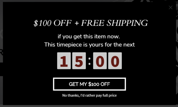
For example, SwissWatchExpo, an online watch retailer, displays an exit-intent popup that offers shoppers a $100 discount and free shipping. But there’s a caveat—the shopper gets a unique coupon code that expires in just 15 minutes. If they don’t use that code during that time, the offer is gone.
Using the countdown timer offer, SwissWatchExpo increased their online transactions by 25% compared to the previous year.
7. Create scarcity
A widely-used, highly-effective sales strategy employed by merchants (both offline and online) is the power of scarcity.
According to social psychologist Robert Cialdini, humans put a higher value on things that are scarce versus things that are abundantly available.
That explains why every year in the US, people line up for Black Friday deals outside their favorite retailers: they know that those once-in-a-year deals will only be available on that day, and it’s usually on a first come, first served basis.
It also explains why Amazon Prime Day (a one-day event) and Singles Day (Alibaba China) are massive for both Amazon and Alibaba. These online shopping bonanzas occur only once a year on a specific day, and consumers don’t want to miss out on new product launches and discounted deals.
Have you ever wondered why Supreme and AirJordan always have a shopping and bidding frenzy? It’s because both brands sell exclusive content in limited quantities for limited time periods (or once every few years). Loyal customers usually line up outside their stores for hours just so they don’t miss out on the chance to own their special-edition streetwear.
Retailers have capitalized on this scarcity principle for decades. There’s just something magical about “limited supply” that makes consumers want to get in on the action!
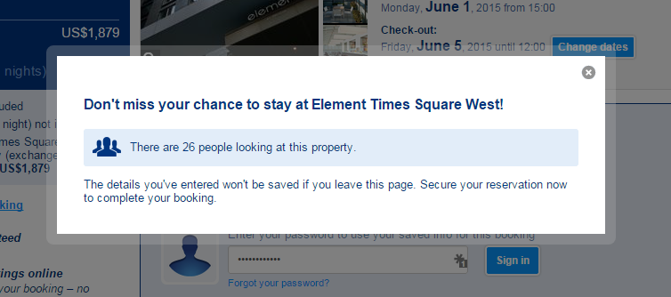
A powerful way to increase the sense of scarcity on your exit-intent popups is to show your visitors how many other people are currently viewing the product they’re interested in.
8. Use the word, “Wait”
Many things go into making an exit-intent popup more effective and convert better:
- Design,
- Offer,
- Image,
- CTA,
- Form fields,
- Etc.
However, any CRO specialist will tell you that the copy is also critical. The words you use in your exit popup (for your headline, description, and call-to-action) have a significant impact on how well your popup performs.
Use attention-grabbing headlines to make the visitor pause and consider the offer. Using strong words like “Limited,” “Free,” and “Special” will often do wonders.
Another simple word that will make a shopper pause? “Wait.” It naturally makes them curious about the rest of the headline and the description.
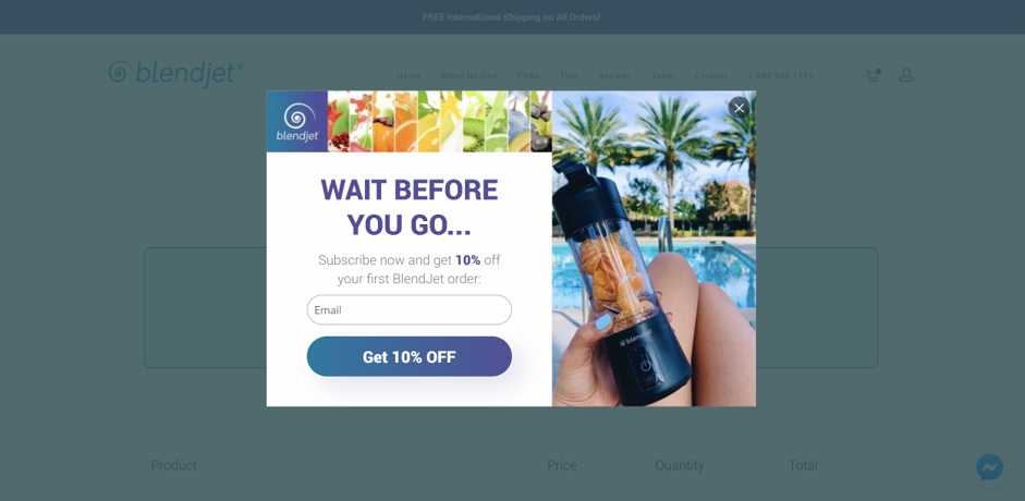
Here’s an exit popup example from BlendJet, an online store selling blenders, that makes good use of the word “Wait.” They displayed the exit-intent popup below to shoppers who were abandoning their carts.
BlendJet offered them a 10% discount in exchange for their email. As a result of this campaign, they collected 15,000 new subscribers.
9. A/B test your messages
This final tip is one you’ve probably heard before— but it’s highly underutilized.
A/B testing is an essential step in the process of conversion optimization. After all, you can’t always predict which versions of a headline will be lead magnets and which will flop!

Using OptiMonk’s built-in A/B testing functionality on your exit-intent popups, you can easily test alternative headlines to find out which messages and CTAs are the most effective for your website traffic.
This is the best way to boost an exit popup’s conversion rate and get the most out of your efforts.
Create attention-grabbing exit popups with this checklist
Ready to start launching high-converting exit popups?
You’re in luck, because we’ve created a checklist of best practices to help you design exit-intent popups that turn visitors into email subscribers and paying customers.
Use the checklist below to increase your conversion rate and save those abandoning visitors.
Optimize your design
- Is your popup’s design clear and attractive?
- Does the color scheme of the popup match the theme of your website?
- Did you use readable fonts with a reasonable font size?
- Does your exit-intent popup look good on a mobile device?
- Did you use a simple sign-up form that only asks for a name and email address?
Choose the right imagery
- Does the image guide the visitor’s eyes to your value proposition?
- Is your image relevant to your offer?
- Does your image complement the headline or show what your visitor will get?
Make your headline stand out
- Does your headline clearly explain what you’re offering?
- Did you use only one value proposition in your headline?
- Did you use power words to motivate your visitors?
Enhance your description
- Is your description short and easy to read?
- Are you expressing yourself clearly?
- Does your exit-intent popup mention how your service or product will benefit customers?
Deliver an inspiring call-to-action
- Is your call-to-action unique and relevant to your value proposition?
- Does the CTA button color contrast with your background and stand out?
- Did you motivate the visitor by starting the sentence with an action verb?
Make your offer irresistible
- Did you add a sense of urgency by giving the visitor a limited-time offer?
- Did you highlight the value your product or service delivers to customers?
Value customer privacy
- Did you let the visitor know you won’t share their data?
Target the right visitors
- Did you exclude people who’ve already subscribed to your newsletter?
- Did you target people based on their engagement with your site? (e.g. new vs. returning visitors, users who browse two or more pages, users accessing specific subpages, etc.)
- Did you target visitors based on the traffic source? (e.g. users who came from Facebook, Google, your newsletter, or another targeted source.)
Run an A/B test
- Did you run an A/B test on two or more versions of your campaign?
- Did you use the version that performs the best with your target audience?
Use the checklist above to design a high-performing exit-intent popup that drives conversions and keeps visitors on your page!
How to create exit-intent popup campaigns in 5 easy steps
And finally, let’s see exactly how you can create exit-intent pop-ups with OptiMonk.
If you haven’t already, register for a free OptiMonk account before following these step-by-step instructions.
Step 1: Choose a template
Browse through our templates below or visit our extensive library of templates to find one that fits your needs.
Whether you’re looking for a sleek design or something more detailed, we have a variety of options to help you get started quickly and efficiently.
Each template has its own campaign goal, like:
- Stopping cart abandonment.
- Collecting feedback.
- Promoting special offers.
Most of the campaign templates also collect users’ email addresses. That way, you can grow your email list while targeting website visitors with an offer.
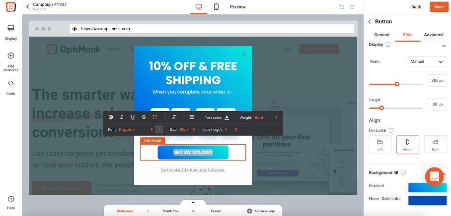
Step 2: Customize your exit popup using our drag-and-drop editor
Use our drag-and-drop popup builder to create stunning, sophisticated popup forms that complement your website’s theme. No coding required!
Step 3: Configure your exit popup
You’ve finished designing your exit popup. Now we’ll show you the best way to target your exit intent visitors.

The recommended settings depend on the template you’ve chosen. In this case, it already uses exit intent trigger.
But you can configure any template to be an exit popup. Here’s how:
- Go to the menu labeled “When would you like the popup to show up?”
- Click “Add more triggers.”
- Choose “on exit-intent.”
- Set the popup to target desktop users, mobile device users, or both.
Step 4: Choose who to target and add your integrations
Now it’s time to tweak your exit popup so you get the most out of your campaign. Start by determining who should see the popup.
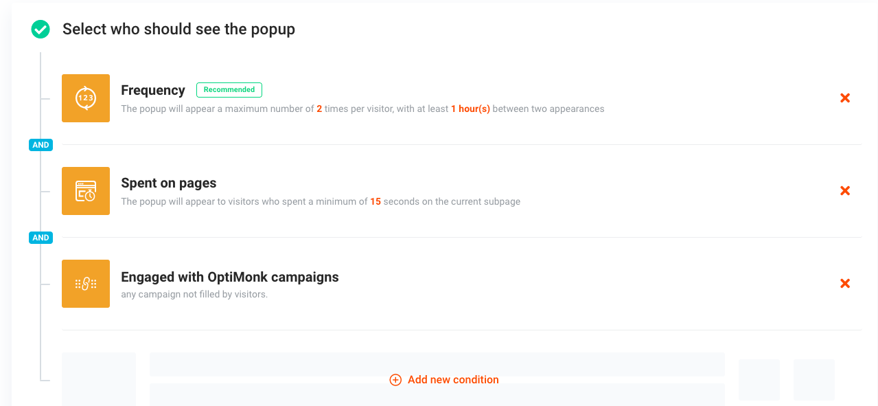
For this exit popup, we’re targeting people who:
- Spend at least 15 seconds on the exit popup page (the web page we’re putting the exit popup on).
- Haven’t engaged with any of our campaigns.
But you can choose from several other targeting options, like:
- Sending personalized popup messages to new website visitors, existing customers, or people from specific countries.
- Targeting newsletter subscribers (or non-subscribers).
Also, don’t forget to add your integrations.

OptiMonk integrates with an extensive range of marketing tools, including:
- Google Analytics,
- Klaviyo,
- Marketo,
- Mailchimp,
- Salesforce,
- and dozens more!
5 best exit popup software
Now, let’s dive into the top 10 exit-intent popup software options available. As you’ll see, each one offers unique features to help you keep your visitors engaged and your sales soaring.
1. OptiMonk
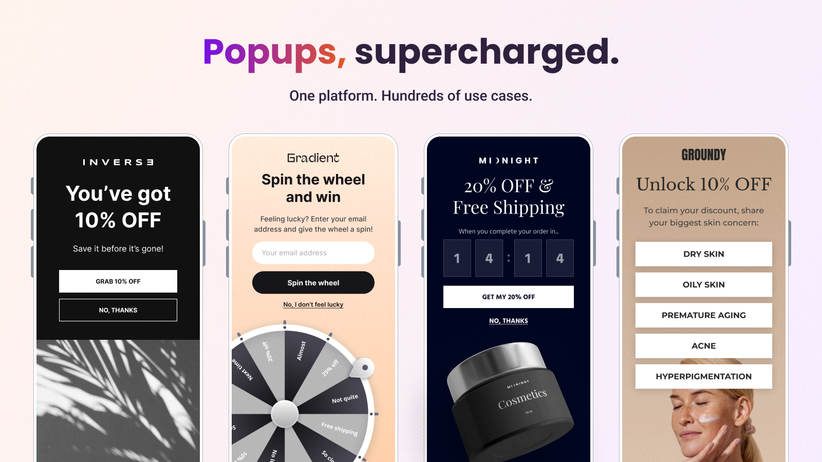
OptiMonk is a leader in the exit-intent popup space, especially for Shopify users. With features like A/B testing, advanced targeting, and a wide variety of customizable templates, OptiMonk makes it easy to create personalized popups that resonate with your audience.
OptiMonk’s seamless integration with email marketing platforms ensures a smooth follow-up process, whether you’re offering a discount or encouraging newsletter sign-ups.
Key features:
- Drag & drop editor: Design stunning, branded popup campaigns quickly and easily without any coding knowledge.
- Use case library: Access pre-designed templates for a wide range of use cases that incorporate proven strategies like discount codes and personalized product recommendations.
- A/B testing: Quickly launch experiments to find the best-performing headlines, offers, or message combinations.
- Personalization: Craft tailored messages for key customer segments to ensure each individual receives the most relevant experience.
- Gamification: Use lucky wheel pop-ups, scratch cards, or pick-a-gift popups to gamify the user experience.
- Analytics: Optimize for real sales with built-in revenue analytics.
If you’re ready to get started with one of the best pop-up tools for free, give these exit pop-up templates a try:
2. Poptin
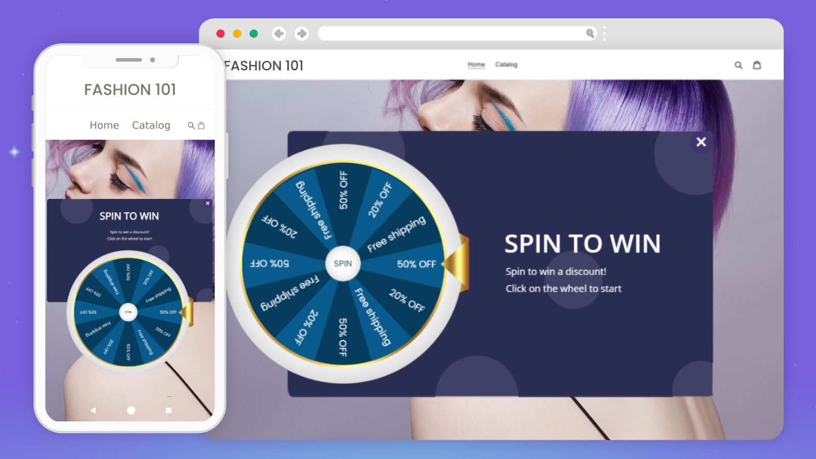
Poptin is perfect for those seeking a user-friendly solution. With its intuitive drag-and-drop editor, even beginners can create professional-looking popups. Poptin’s smart triggers and targeting rules ensure that your popups appear at the right moment, maximizing their effectiveness.
Plus, the built-in analytics make it easy to monitor performance and make data-driven decisions.
Key features:
- Drag-and-drop editor: Effortlessly create and customize popups.
- Smart triggers and targeting: Show popups at the optimal moment to capture attention.
- Exit-intent technology: Prevent users from leaving your site without engaging.
- Built-in reporting: Track and analyze popup performance to refine your strategy.
3. OptinMonster
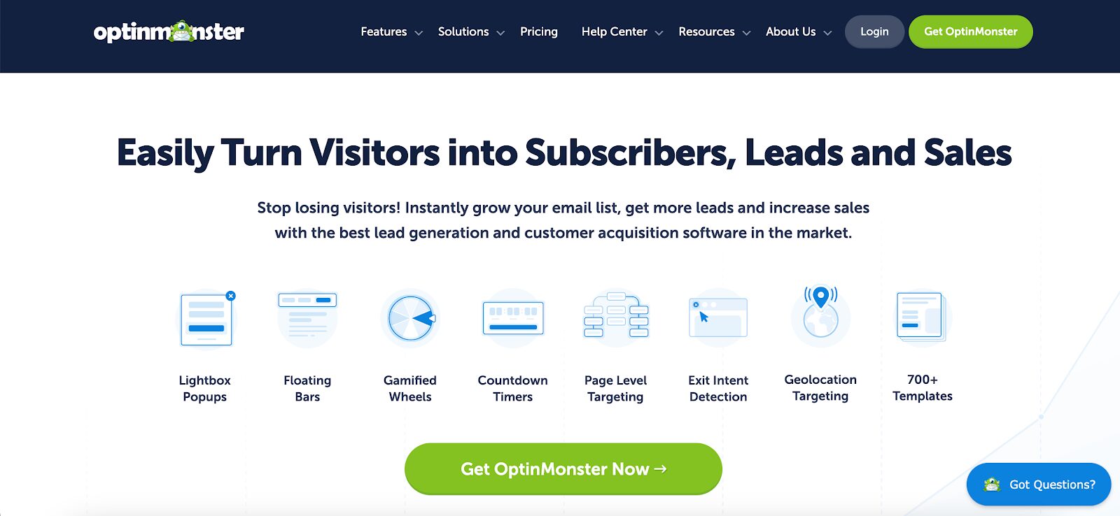
OptinMonster is a powerhouse for businesses looking to maximize conversions. It offers advanced targeting features, real-time behavior automation, and geolocation targeting, allowing you to create highly personalized popups.
Additionally, it includes exit popups with customizable designs and advanced targeting options, which are effective for cart abandonment recovery and gathering customer feedback. If you’re serious about driving results with minimal effort, OptinMonster is the tool for you.
Key features:
- Advanced targeting and segmentation: Reach the right audience with precision.
- Real-time behavior automation: Adapt to user actions as they happen.
- Geolocation targeting: Personalize popups based on the visitor’s location.
- Powerful customization options: Tailor every aspect of your popups to match your brand.
4. Picreel
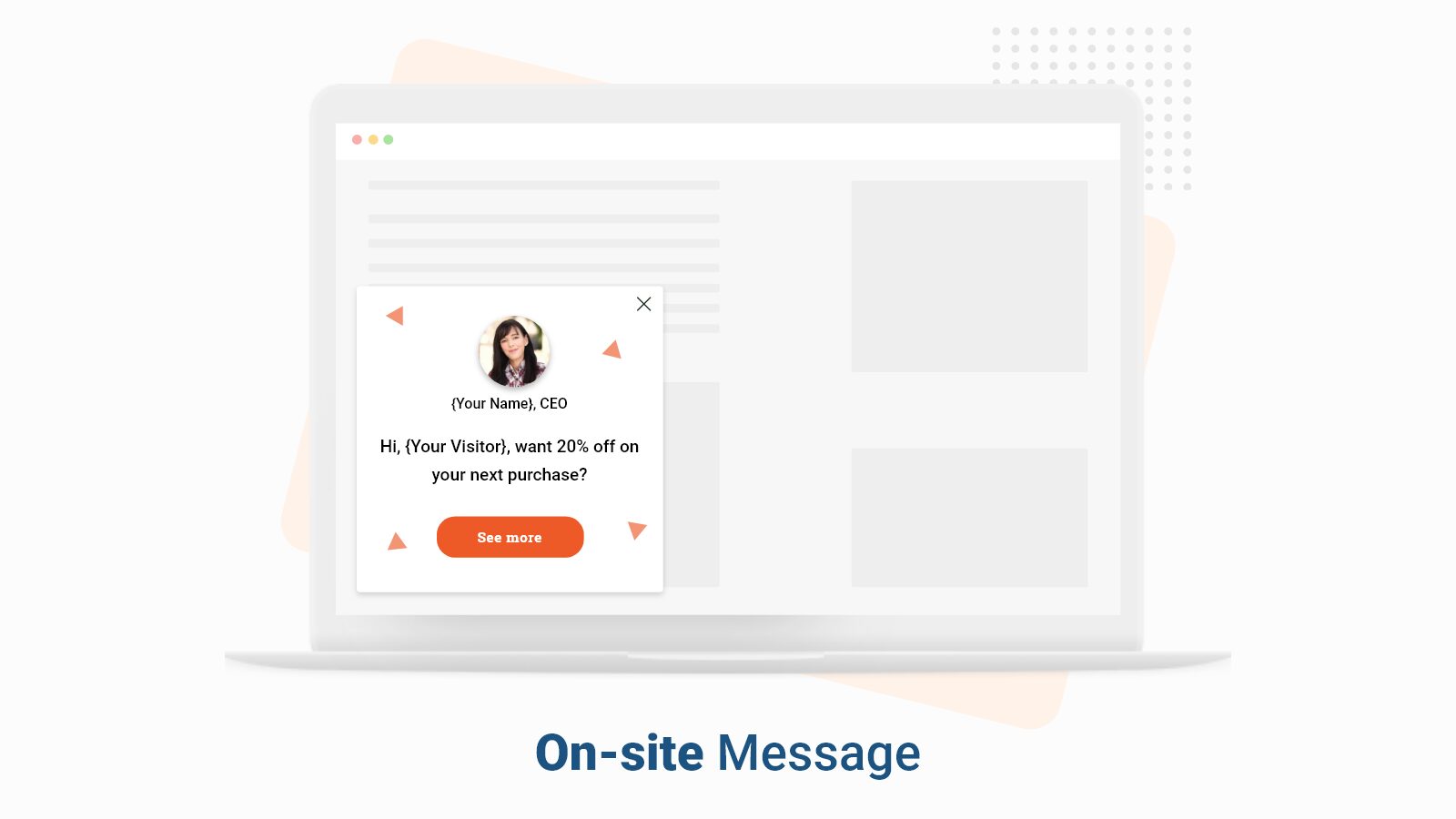
Picreel specializes in exit-intent popups, making it an excellent choice for businesses looking to recapture almost-lost traffic. Picreel offers features such as customizable popups, sticky bars, and notifications that effectively capture leads and enhance user engagement.
With a variety of templates and targeting options, Picreel helps you turn abandoning visitors into customers. It even offers email retargeting so you don’t miss out on potential sales.
Key features:
- Exit-intent technology: Capture attention before visitors leave your site.
- Wide range of popup templates: Choose from a variety of customizable designs.
- Email retargeting: Follow up with visitors who didn’t convert right away.
- Simple setup and use: Get started quickly without a steep learning curve.
5. Wisepops
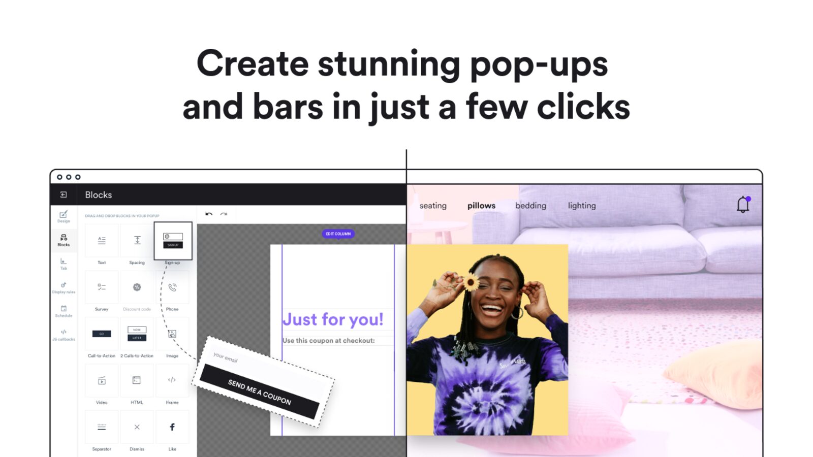
Wisepops is a robust solution for creating exit-intent popups without the hassle. It offers a drag-and-drop builder, custom triggers, and detailed analytics, making it ideal for businesses of all sizes. Whether you’re looking to engage visitors with personalized offers or capture emails, Wisepops has the tools you need.
Key features:
- Drag-and-drop builder: Easily design popups with no coding required.
- Custom triggers and targeting: Show popups based on specific user behaviors.
- Exit-intent technology: Prevent exits and increase conversions.
- Detailed analytics: Measure performance and optimize your campaigns.
FAQ
What is an exit-intent popup?
An exit-intent popup is a type of website overlay that appears when a visitor is about to leave the site. It aims to capture their attention and encourage them to stay or take a specific action, such as completing a purchase, signing up for a newsletter, or receiving a discount.
How to trigger an exit-intent popup?
Exit-intent popups are triggered by detecting user behavior that indicates they are about to leave the site, such as moving the mouse towards the browser’s close button or the back button.
How do exit-intent popups work on mobile?
On mobile devices, exit-intent popups work by detecting actions like scrolling up quickly or hitting the back button. These behaviors indicate that the user is likely to leave the site, prompting the popup to appear and engage the user before they exit.
Wrapping up
At the end of the day, a well-chosen exit-intent popup can help your store benefit from visitors who are about to leave. Whether that benefit comes in the form of lead generation from email lists, valuable feedback, or preventing cart abandonment, exit popups will help your store grow.
We’ve gone over great exit popup examples, some best practices, and a checklist to create the right exit-intent popup for your website.
You’ve got everything you need to create your very first exit intent popup. Why not do it today?
We have an extensive library of popup templates you can use to launch an exit-intent popup in just minutes.
Register for a free OptiMonk account today and see just how easy it is to create exit-intent popups for your ecommerce store!
Related articles
Looking for more tactics for creating high-converting popups? Check out these articles:
Migration has never been easier
We made switching a no-brainer with our free, white-glove onboarding service so you can get started in the blink of an eye.
What should you do next?
Thanks for reading till the end. Here are 4 ways we can help you grow your business:
Boost conversions with proven use cases
Explore our Use Case Library, filled with actionable personalization examples and step-by-step guides to unlock your website's full potential. Check out Use Case Library
Create a free OptiMonk account
Create a free OptiMonk account and easily get started with popups and conversion rate optimization. Get OptiMonk free
Get advice from a CRO expert
Schedule a personalized discovery call with one of our experts to explore how OptiMonk can help you grow your business. Book a demo
Join our weekly newsletter
Real CRO insights & marketing tips. No fluff. Straight to your inbox. Subscribe now
Nikolett Lorincz
- Posted in
- Conversion
Partner with us
- © OptiMonk. All rights reserved!
- Terms of Use
- Privacy Policy
- Cookie Policy
Product updates: January Release 2025

