- Blog
- The Ultimate Guide to Creating High-Converting Popups in 2025
The Ultimate Guide to Creating High-Converting Popups in 2025
-
Csaba Zajdo
- Conversion
- 6 min read
Table of Contents
You hear many people say they “hate popups,” but ecommerce stores still rely on them. The simple reason for this contradiction is that popups work.
In fact, lots of research supports just how effective website popups are.
Our internal data shows that the average popup conversion rate is 11.09%.
Brands like Christopher Cloos and Obvi have used website popups to increase their ecommerce conversion rate by up to 37%.
Despite that, the negativity surrounding popups comes from the idea that they’re annoying. But that’s only true for bad popups.
When a popup provides value for your customers, it helps increase customer engagement and satisfaction. All those good outcomes depend on your strategy, targeting, design, message, and offer.
We’ve learned a lot about the massive difference between a good popup and a bad one from working with hundreds of top ecommerce websites.
In this guide, we’ll show you how to create popups that:
- Are annoyance-free
- Your customers love to see
- Improve user experience
- Increase your standard popup revenue up to 10 times
Let’s get to the actionable techniques for creating high-converting website popups.
What are website pop-ups?
Website pop-ups are overlays that appear on your website based on your visitors’ site behavior.
They display secondary messages that convey crucial information, promote your email list, or encourage the completion of a purchase.
Popups come in many different shapes and sizes. Here are some of the main types that you can use:
1. Standard popups
Standard in-page popups appear as an overlay on top of your webpage rather than a separate browser window. They’re great for delivering promotional messages, as well as collecting information like a customer’s name, phone number, and email address.
2. Sidemessages
Sidemessages appear on the left or right side of a webpage. They aren’t quite as prominent as standard pop-ups, because they don’t interrupt your visitors’ shopping experience.
3. Sticky bars
Sticky bars are used to inform visitors about sales, promotions, and free shipping offers. They appear as a small banner across the top of your webpage.
They remain in view even when your visitor scrolls down the page. That helps grab your visitor’s attention and deliver your message without annoying them or stopping their browsing experience.
4. Fullscreen messages
Fullscreen messages are popups that cover your visitors’ entire screen, which means these popup types are impossible to miss. When you have important messages that you absolutely need your customers to see, fullscreen pop-ups are the way to go.
5. Gamification popups
Gamification popups bring a sense of fun to your popups by encouraging visitors to “play.”
This type of popup features an interactive game like a lucky wheel or scratch card that gives shoppers a chance to win a discount. Visitors need to enter their email addresses to play.
Popup triggers
Pop-ups can also categorized based on triggers. This controls exactly when a pop-up should appear depending on your visitors’ site behavior.
There are many triggering options out there. Every popup requires (at least) one trigger to be displayed. Otherwise, it won’t “know” when to “pop” up.
The most popular types of triggers are those used in entry popups and exit-intent popups.
Entry pop-ups (also known as welcome popups) appear immediately after a visitor lands on-site. They’re usually used to inform visitors of crucial information about sales and other discounts.
If you’d like to learn about welcome popups and how to boost their conversion rates, check out this video:
On the other hand, exit-intent popups are triggered when a visitor tries to leave your webpage. This happens when a visitor moves their mouse to the top right corner of the page to close it. Or, on mobile, scroll up quickly to access the “back” button.
Online stores usually use exit popups to prevent cart abandonment by offering a discount, a free shipping offer, or a simple reminder to complete their checkout process.
There are several other types of popup triggers. These include:
- Scroll-based popups activate after a user has scrolled through a certain amount of your webpage.
- On-click popups activate when a user clicks on a specific area of your webpage.
- Time-based popups activate when a user has spent a certain amount of time on your webpage.
Benefits of using website popups
Using popups on your website or ecommerce store yields so many benefits. That’s because popups can help guide visitors through their customer journey in a logical and engaging manner.
Here are the five biggest benefits of using website popups.
1. You get a second chance to convert
You can think about popups as a “back-up” for your primary message. If a user doesn’t respond to your website’s main message, a popup can give you a second chance to communicate a new offer that resonates better with your users.
2. Decrease distraction
If used right, popups can help people focus only on vital information.
Many websites present lots of options all at once, with multiple CTAs, lots of logos and images, and perhaps even a chatbox.
When you use a popup, you’re cutting through all that noise and delivering just one message on its own. That makes it easier for a customer to pay attention, understand, and respond to it.
You can also start to cut secondary messages off of your webpage entirely and move them to popups instead. This will allow you to feature just one message on each webpage, which will make the customer experience seamless.
3. Efficient list-building
Simply put, there’s no better tool for building your email and SMS marketing lists than popups.
The average rate at which visitors will enter their contact details on a website is 1.95%.
However, if you start using popups for list-building, you can achieve a conversion rate of up to 7.65%.
4. Flexibility
Popups can be used for many goals. As we’ve seen beforehand, they can help grow your email list and increase your revenue. But they can also help collect feedback, provide personalized product recommendations, or they can work as a shopping assistant in your online store.
5. A high return on investment (ROI)
Although it doesn’t cost much, creating great popup campaigns can lead to massive revenue growth.
There are lots of free and paid popup tools available. Compared to the amount of money you’ll have to spend on generating additional traffic through advertising, the ROI on popups is huge.
Make sure you’re fully maximizing the revenue from your current traffic before looking for more.
What’s a good popup conversion rate?
In truth, there’s not really a good answer to this question. Different types of pop-up campaigns will naturally have different conversion rates because they target different users at different points along their customer journeys.
For an absolute average, our internal studies found that the average conversion rate of an OptiMonk popup is 11.09%.
But you shouldn’t be disappointed if your website popup campaign is below this conversion rate.
When and how a pop-up is used makes a big difference to conversion rates. For example, a newsletter pop-up typically converts way less than a cart abandonment pop-up. That’s because customers are in very different stages of your conversion funnel.
When a customer is almost ready to make a purchase and has put items in their cart, they’re so close to buying that our cart abandonment popups convert at 17.2%.
In contrast, an email signup popup displayed to first-time visitors won’t convert nearly as well because many of them aren’t familiar enough with your store to have an interest in receiving marketing messages. These popups usually convert between 5.10% and 7.65% of the time.
We also took a look at the top 10% of our popups to gauge the upper limit of conversion rates that your popups can achieve and they had a 42.35% conversion rate on average!
The 3 principles behind high-converting popups
If you want to achieve high conversion rates on your popups, it’s important to get three basic things right. Each website popup you make should:
- Fit within the context it appears
- Contain a relevant message
- Be personalized for a defined segment of visitors
In this section, we’ll go over how to make each of those happen.
Principle #1: Context
Pop-up ads work best when your message connects with what’s on your webpage. But it shouldn’t merely repeat the same “main message” on your webpage because the customer has already seen that offer.
For example, when a webpage shows that a certain category of products is 10% off, visitors don’t need a popup that says, “X category is 10% off.” That kind of repetition just annoys visitors.
Rather, popups are the perfect tool to take a step back and provide a “backup offer.”
If your customer isn’t interested in buying any of the products they’ve seen so far, try showing them other recommendations or try to capture their contact information for your email marketing list.
You can’t force a user to buy something by repeating the same message over and over again. That’s just being pushy. Instead, provide new incentives that may actually change your customer’s actions.
That’s why the best popups are multi-goal-oriented. For instance, you can offer a limited-time coupon to users who sign up for your email list. This gives them an incentive to buy now (while taking advantage of a deal) and provides you with the opportunity to get in touch later and nurture the relationship.
However, most of your customers are looking for different things and have different budgets. And you need to make sure that your messages and offers are relevant for them. Let’s see how!
Principle #2: Relevance
A pop-up windown is only annoying when it’s not relevant.
When an irrelevant message appears, it takes your visitors out of the flow of shopping so they’ll hit the “x” button to close the popup as soon as possible.
A relevant message, on the other hand, can provide the exact answers to the questions they’ve been wondering.
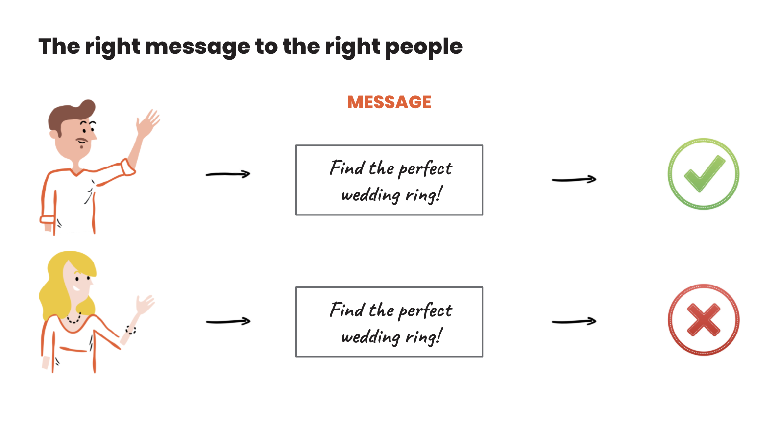
Let’s take a look at this simple example:
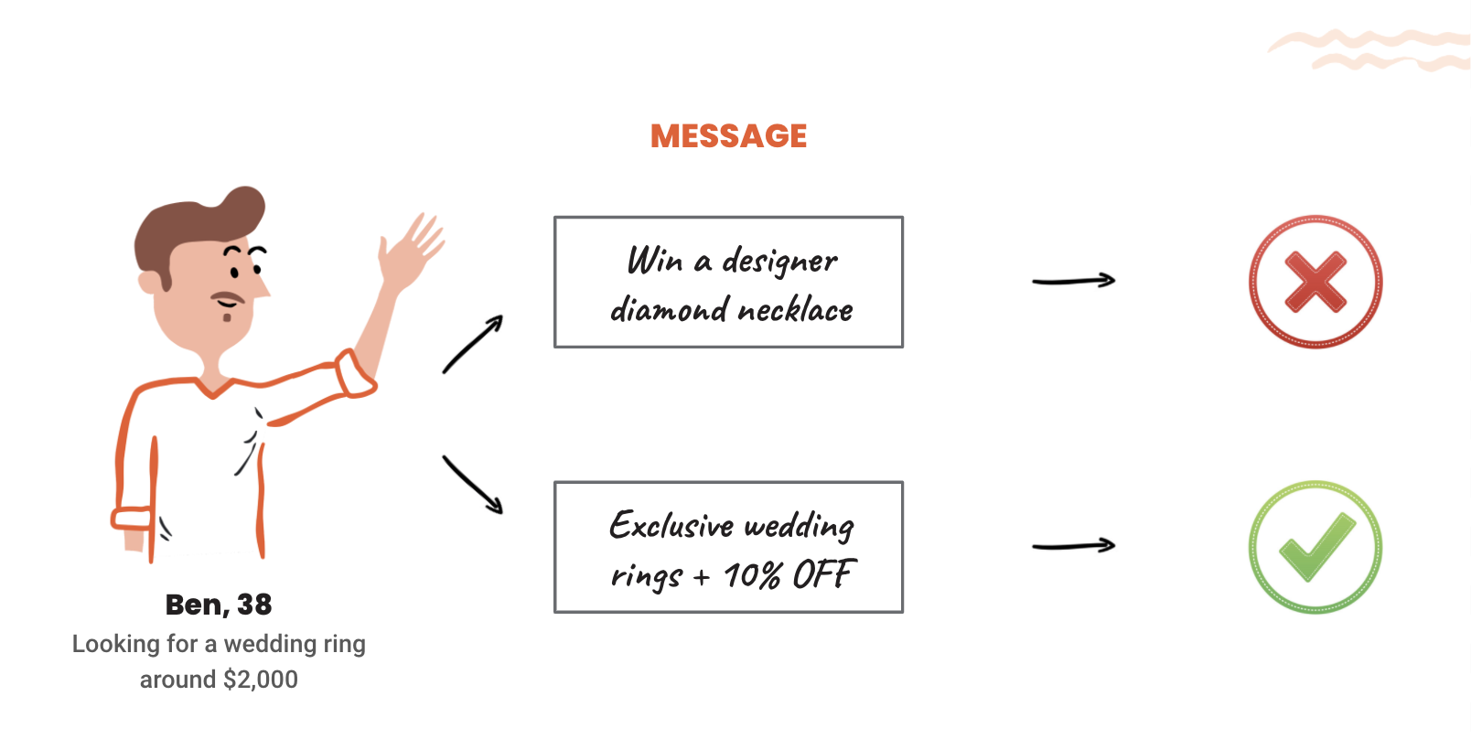
Ben is looking for a wedding ring, so he’s likely arrived at a site via Google search and browsing product pages.
Seeing a pop-up about necklaces being 10% off doesn’t have anything to do with his necessary purchase (since the product doesn’t match what he’s looking for).
Displaying a message on how to find the perfect wedding ring will genuinely help Ben, especially if it leads to helpful resources or product pages. And this message will improve his shopping experience.
We call this overlap between your customers’ needs and marketing messaging “Customer-Message Fit.”
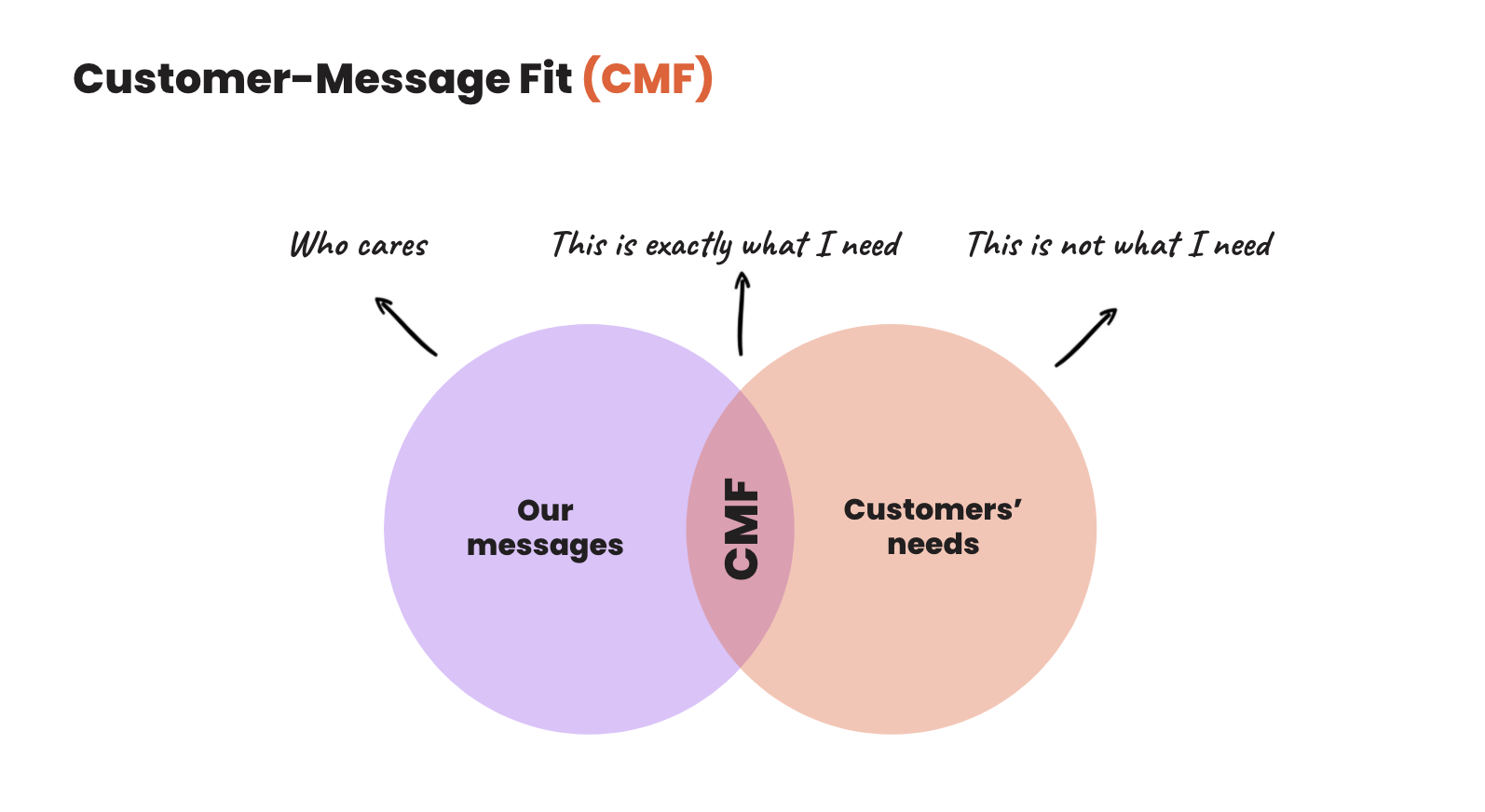
When customers see your message, you want them to think “This is what I need.”
There are several ways to make your messages resonate with your customers’ needs. One of the most impactful ways is by creating personalized popups for each customer segment.
Principle #3: Personalization
Personalization is all about getting the right message to the right person. But it isn’t as simple as it sounds. Different people visit your website every day, and each of them has different interests and needs.
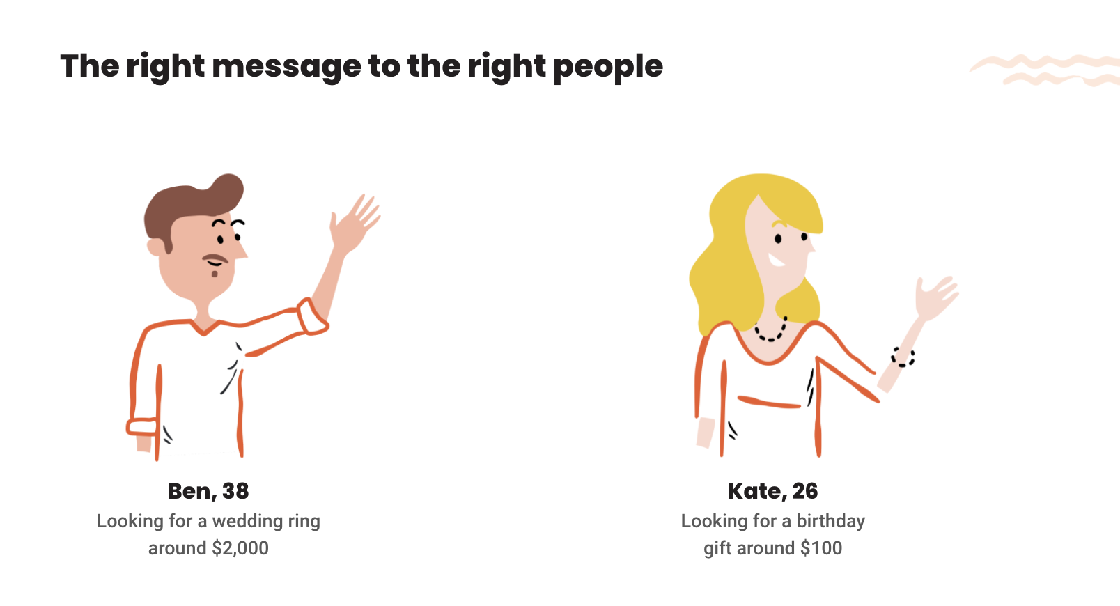
Let’s say that Kate and Ben are shopping in an online jewelry store at the same time. However, Kate isn’t getting married, but she does need to find a reasonably-priced gift for her friend.
Just like Ben wasn’t interested in offers on necklaces, Kate doesn’t need to see popups regarding wedding rings. She’d probably ask, “Why am I seeing this?”
Kate might be more interested in messages about necklaces that are on sale so she can check to see if there are any that fit her $100 budget.
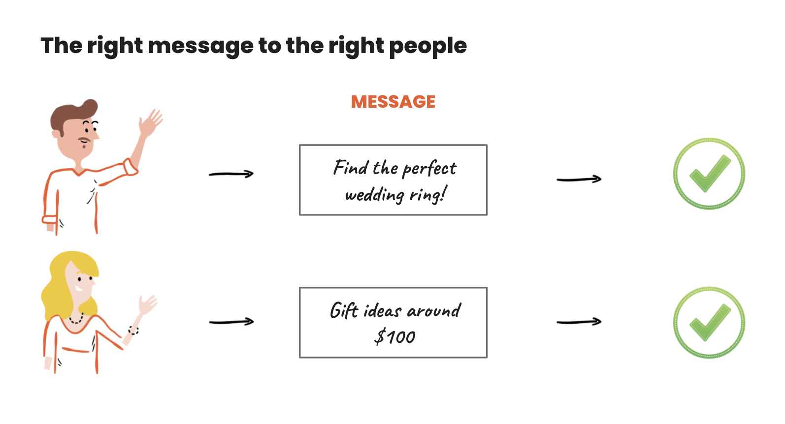
However, more advanced targeting might result in an even stronger Customer-Message fit. Kate would be happy to see a popup that leads to a product category she’s interested in.
You won’t always be able to find a perfect fit between your popups and what your customers are looking for, but there are lots of ways to get a close-fit. For instance, you can show different popups to certain visitors depending on what product category they’re browsing.
We’ll go over the technical aspects of personalizing your popups in the advanced features section of this guide.
It’s not humanly possible for all of your website visitors to be the same. They have different needs, varying budgets per product category, and they’re also at different levels of familiarity with your site. Meaning that there’s no one-size-fits-all “joker message.” That’s why you need to personalize your messages for different visitor segments so that you can achieve a Customer-Message fit.
User segmentation and popups
Ideally, we’d be able to target every single customer with a 100% personalized message.
In reality, that’s not possible since we’d need to create millions of different messages. Instead, you can organize your visitors into segments that share similar attributes and then create unique messages for each segment.
User segmentation is splitting up your web traffic into different groups according to where they’re in their customer journey and based on their needs, interests, and budgets.
Let’s check out the most important ecommerce segments and then get into some campaign recommendations for each segment.
The most important ecommerce segments
One crucial way of segmenting your visitors is by splitting them up according to their customer journey stage.
We often break the customer journey down into different levels of awareness.
If you aren’t familiar with awareness levels in an ecommerce context, you can use this illustration as a “cheat sheet.” In a nutshell, a customer moves through the following stages:
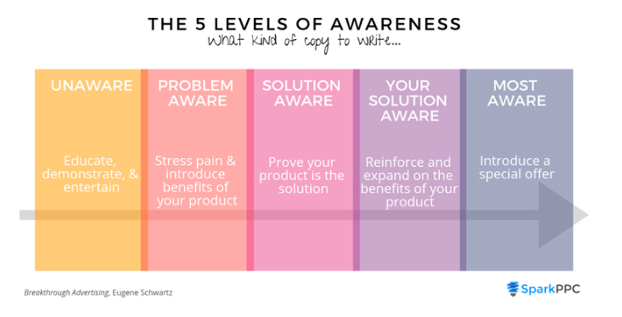
Source: SparkPPC
Popup boxes can be an invaluable tool to help your visitors move to the next customer awareness stage.
Use cases by segments
Now let’s look at each segment one by one. The question is: how can we help users move along smoothly to the next stage of the user journey?
When trying to answer that question, you should adopt a Customer Value Optimization mindset.
That means you need to maximize the lifetime value of all your customers by building lasting relationships with them.
But this process doesn’t begin after your customer makes a purchase: you should be thinking about increasing your average customer value from the very beginning of the customer journey.
Therefore, the messages you send to your customers in the unawareness stage (and the stages after that) must flow towards the post-purchase stage.
By applying the right pop-up use cases for each segment, you’ve already won half the battle of building strong customer relationships and growing your average customer value.
1. Blog article visitors
Blog article visitors are usually “problem aware.”
They’ve come to your site to read about a problem they have (like you’re doing with this guide). Usually, visitors are still researching at this point, and they won’t be ready to buy until they find the right solution for their problem.
Your goal is to help them gain the insight they need for their problem and offer possible solutions. You can do this by recommending a free ebook that offers more information on the subject they’re reading about.
For example, if you have an article about “running tips for beginners,” you could also promote a free ebook that gives tips on how to choose running shoes.
For more ideas, read this article on how to use popups in your blog.
2. New homepage visitors
Visitors who land on your homepage are usually aware of the solution to their problem and are searching for definitive options.
For example, they might have come from a Google search. Or they could’ve read one of your blog posts and then decided to check out your products.
At this stage, your goal is to show them the best products that you have for solving their problem. And you want to make this process as smooth as possible.
A conversational popup is a great way to do that!
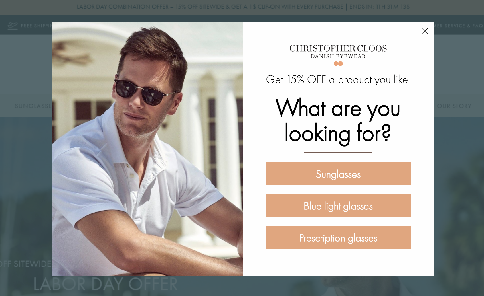
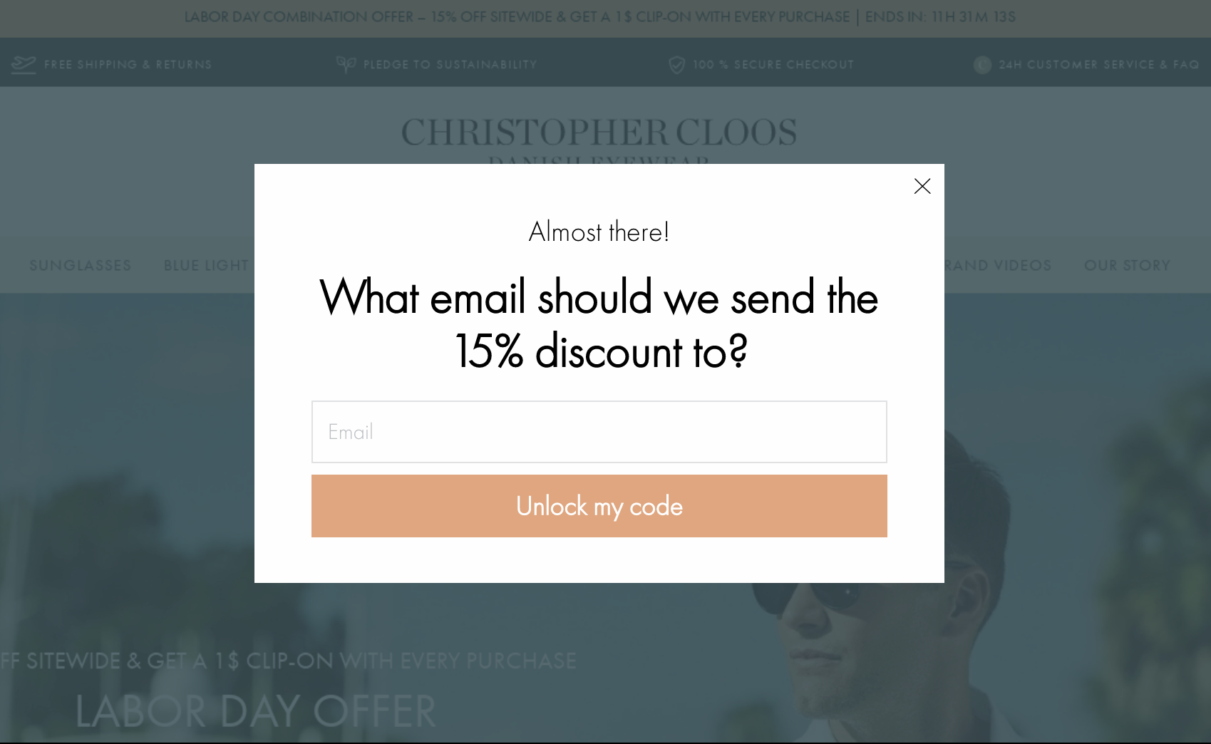
This popup example shows how a conversational popup can kill three birds with one stone:
- On the first popup, users start their customer journey by self-segmenting based on product categories. By choosing between “Sunglasses,” “Blue light glasses,” and “Prescription glasses,” visitors are able to relay valuable information about what they’re in the market for.
- On the next popup, you can give your visitors an incentive to buy now by offering them a discount code. This offer is just like a “gift” because it comes directly after answering the question, and that makes your visitors feel special. Since they’ve also signed up for email marketing, you can follow up with them (preferably based on the segment they picked).
- Finally, on the third popup, you can show product recommendations. These recommendations should respond to the product category the user is most interested in. This kickstarts their shopping process and makes it easier to find a product they want to use their discount code for.
Conversational popups are ideal for making a good first impression on your new webpage visitors who are still learning about your brand.
With OptiMonk, you can create highly customized conversational popups by using templates like the one below.
You can find many more conversational popup templates in OptiMonk’s popup template library.
3. Category page visitors
When a visitor makes it to one of your category pages, they are solution aware.
They usually arrive at your site via a Google search. At this point, they know what type of product will solve their problem and are actively weighing their options.
With this segment, you have two goals:
- Help them find the best product to solve their problem
- And get them to subscribe to your email list
Since you’re already aware of the product category that they’re looking into, you could use a few different approaches here.
For instance: show them the most popular products in their category of interest or your trending products in that category.
This information helps your shopper make the right decision. For that reason, they’ll be happy to engage with popups. Here’s an example:
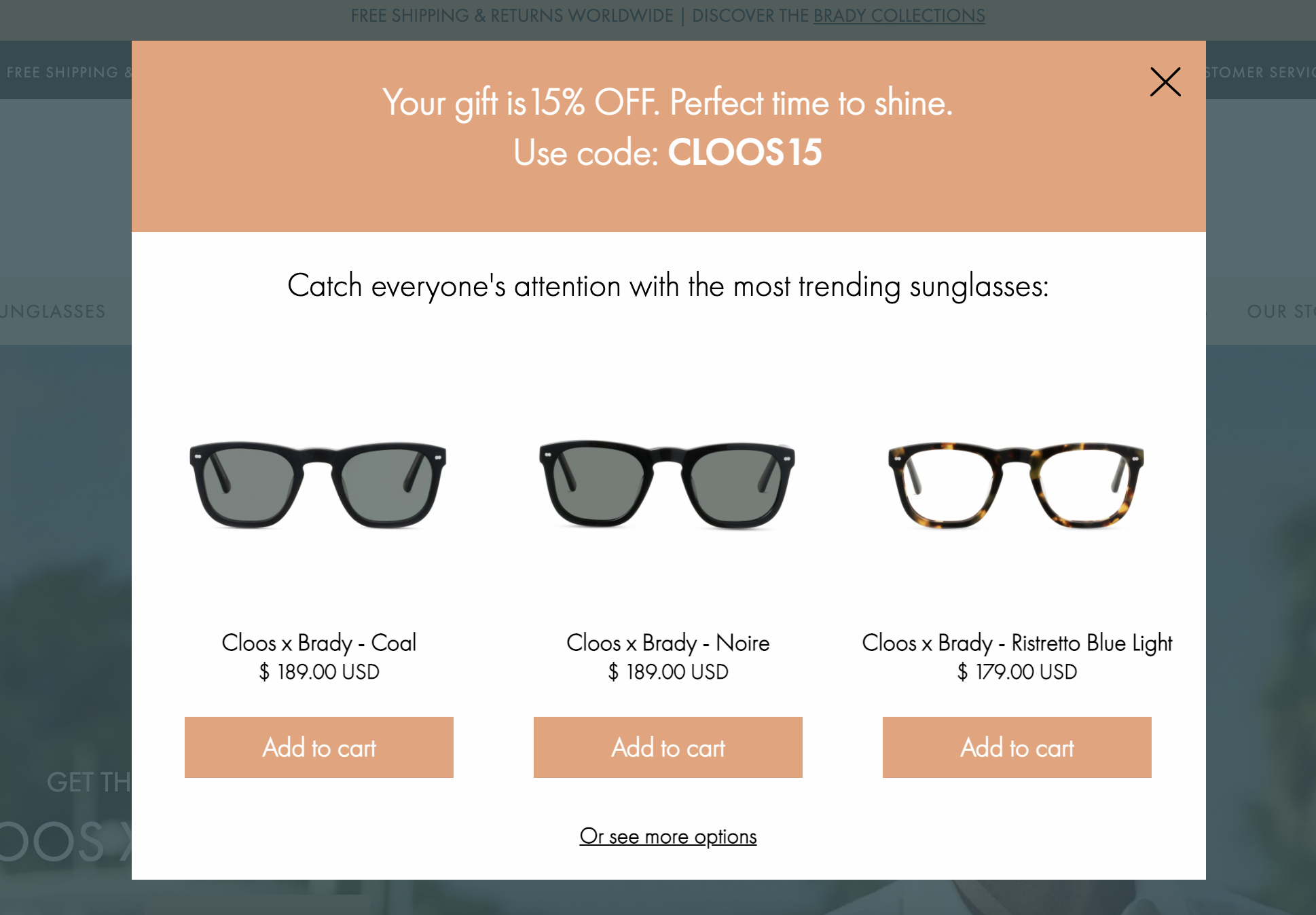
4. Product page visitors
Once visitors have moved from browsing a category page to viewing a specific product page, they become product aware.
This means they know about your product and also understand how it can solve their problem, but they still may not be sure if it’s the best choice for them.
To move this segment of visitors along in your conversion funnel, you need to convince them that the product they’re viewing is the one for them. There are many ways you can “make the sale.”
First, you can give them a good deal on the product they like. By offering a discount or free shipping, you can raise your product above the competition.
You can also increase a visitor’s fear of missing out (FOMO) by using limited-time offers or “while supplies last” messaging. Urgency and scarcity both work to entice visitors to buy now rather than later—which is exactly what you want as a store owner.
Here’s an exit-intent triggered website popup that appears to product page visitors who are about to leave the site. It promotes a special offer that encourages shoppers to choose your product.
5. Returning non-customers
Engaging with returning non-customers can be difficult and easy at the same time. That’s because they’re fully aware of a product but are not willing to make a purchase yet.
This could be for several reasons. Perhaps they felt the need to shop around a bit more or, they didn’t have plans to make a purchase during their last visit.
Whatever the case is, your goal is to welcome them back and remind them about the products they were looking at before. This can make it easier for them to continue shopping because they won’t have to navigate back to those products on their own.
Popups, like the one below, are helpful to returning non-customers and get them back up to speed.
6. Visitors with active coupon
Visitors with an active coupon are fully aware of their problem, your brand, and how your products can solve their problem. They’ve already subscribed to your email list and are continuing to browse through your products.
Your only goal at this point is to convince them to use their coupon code and finish their purchase.
You can follow up with a sticky bar that promotes the active coupon code. Once again, you can increase the effectiveness of your campaign by including a countdown timer that heightens your visitors’ sense of urgency.
You can use the template below to remind users that they have a coupon code available.
7. Cart & checkout abandoners
Visitors who placed items into their cart are also in your “fully aware segment,” even if they want to leave your site without finishing their purchase.
Once they plan to leave your website, it’s time to guide them to complete their purchase by using popups.
At this point, a special offer can convince them to buy now rather than later.
Limited-time offers are the best way to stop cart abandoners in their tracks and ensure that they make a purchase. Here’s a good example:
Check out our article on 5 must-have cart abandonment popups to see more effective examples and templates for this use case.
8. Just purchased
Customers who just made a purchase are one of the most important ecommerce segments. That’s because it costs five times more on average to acquire a new customer than to keep an existing one. Your loyal customers are the lifeblood of your online business.
When someone has finally made a purchase, they’re usually quite happy and looking forward to the delivery. So it’s a great time to plan ahead for future purchases.
You can do this by offering a discount code in exchange for giving feedback on the purchase experience. This way, you’ll gain valuable insights about your website and business, and you’ll also give your shoppers a powerful reason to return to your store.
Here’s a great post-purchase feedback popup template:
9. Returning customers
Returning customers are fully aware of your brand and your items.
They’re now returning to your website to make another purchase, perhaps because they need to restock or they love your product and want to try out more.
You can use a “welcome back” pop-up that displays your newest products or promotes your seasonal sale.
This popup template for returning customers is one of the many options you can find in OptiMonk’s template library:
How to craft an AWESOME popup?
Now that we’ve reviewed what kind of messages work for each segment, it’s time to take a look at how you can craft your popups into high-converting machines (with some website popup examples)!
There are many best practices of popup design and copywriting that can boost your popups’ conversion rates when applied correctly.
We’re going to break down the best popup creation practices into five main categories:
- Clear message and call-to-action
- A motivating value proposition
- Handle objections and fears
- Increase FOMO (fear of missing out)
- Emphasize the value
So let’s take a look at them one by one.
1. Clear message and call-to-action
It’s important to display popups with clear messages. Your customers should grasp your message right away if a popup is meant to inform them about an offer, capture their contact details, or recommend specific products.
They should also immediately understand the value that your offer brings to them.
You can assure that your visitors comprehend your popup message by featuring a call-to-action.
And there are also other practical ways to effectively clarify the purpose of your popup. Let’s take a look.
1.1. Keep it simple
When it comes to writing a copy for your website popup, simplicity is king. Your visitors shouldn’t feel confused about what the words on your pop-up mean.
Keep your copy as short as possible. It’s the primary way of ensuring comprehensibility. Your visitors will understand your message when it contains only the necessary words for conveying your point.
You can also avoid being unclear by using the language your target audience speaks. If you’re selling to a young audience, feel free to use slang, but you won’t want to use it for the 65+ demographic.
Our final tip for ensuring that your popups are understandable has nothing to do with writing.
Rather, it’s about choosing images that reinforce (or at least don’t contradict) what your copy is saying. Mismatched text and images are confusing because your visitors won’t know which message to focus on.
Once you’ve cut down your copy to just include the essential parts, you’ve made a great start to crafting a powerful popup.
However, you also need to make sure that your message is so catchy and engaging that people just can’t get it out of their heads. To get to this level, you have to engage with your visitors as real people, not just “numbers or traffic”—which brings us to our next topic:
1.2. Be human
Humans are emotional. And to engage with them, the best thing you can do is to get over your fear of the “F-word” (feel) ;).
Depending on your goals, you can trigger the right emotion with your messages.
For example, you can spark your visitors’ sense of curiosity if you’re trying to get them to download your ebook. But if you’re trying to encourage them to make a charitable donation, you could use words and images that connect your message to your audience’s hearts.
1.3. Have clear next steps and CTA
Your popup’s call-to-action should be clear and consistent with the messages you’re sending. If you want to craft an effective CTA, a simple “Sign Me Up” or “Send My Discount Now” usually does the trick.
Design-wise, there are lots of ways that you can do to raise your popup’s conversion rates. We’ll go into some more general tips in the very next section, but for now, we’ll just mention the importance of making the call to action itself stand out visually.
For example, you can choose a bright and contrasting color for your CTA button. This will make it more eye-catching and your visitors will be more likely to click it. For instance, if your popup is mostly black, you could consider using orange or hot pink for your call to action button.
Another strategy is to insert visual elements like arrows that point towards the call-to-action button. A big red arrow encouraging visitors to “Click Here” will increase the salience of your CTA button.
1.4. Break the pattern
It’s important that your popups blend with your website theme, yes. However, it’s also crucial that they stand out and catch the eye.
This means that you should use similar enough design elements (fonts, images, etc.) on your website and your popup.
But you need to introduce some contrast. For example, if your pop-up has a dark color, you can use a lighter overlay while it’s onscreen. This ensures that your pop-up will be visible, like in the example below:
Another way of emphasizing your offer through popup design is by using unusual template shapes. These break the pattern of the generic rectangular popups that people see all over the web, and it draws interest simply because they’re unique.
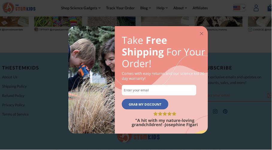
Finally, you need to find high-quality images for your website popup. It’s better to use real photos of your products instead of stock images because it actually gives your visitors a good idea of what you’re selling.
If your products look fun or useful in the photos, people will be more likely to buy them and sign up to your email or SMS lists in exchange for discounts.
2. Motivating value proposition
Although we all love the products we sell and view our offers as very compelling, it’s always important to consider your visitors’ perspectives.
For someone who has just seen your site and items for the first time, does your offer contain a motivating value proposition?
Every popup you make needs to provide a clear answer to the question “What’s in it for me?”
Nobody wants to share their email or SMS information unless they’re getting something valuable in exchange.
In the customer’s reality, the amount of value they’re expecting to get should be greater than the “cost” of engaging with your popup.
For example, a small 5% discount probably won’t convince visitors to go through the trouble of signing up for your list, waiting for your welcome email, and then retrieving their coupon code. But a 15% discount might be worth it.
As you’ll see in the rest of this section, monetary incentives aren’t the only way of providing value to your customers. We’ll examine four ways to pack value into your popups:
- A reward
- Fun and surprise
- Novelty
- A compelling offer
Let’s start by looking at the different types of rewards you can offer to your customers.
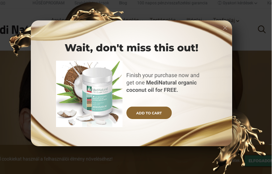
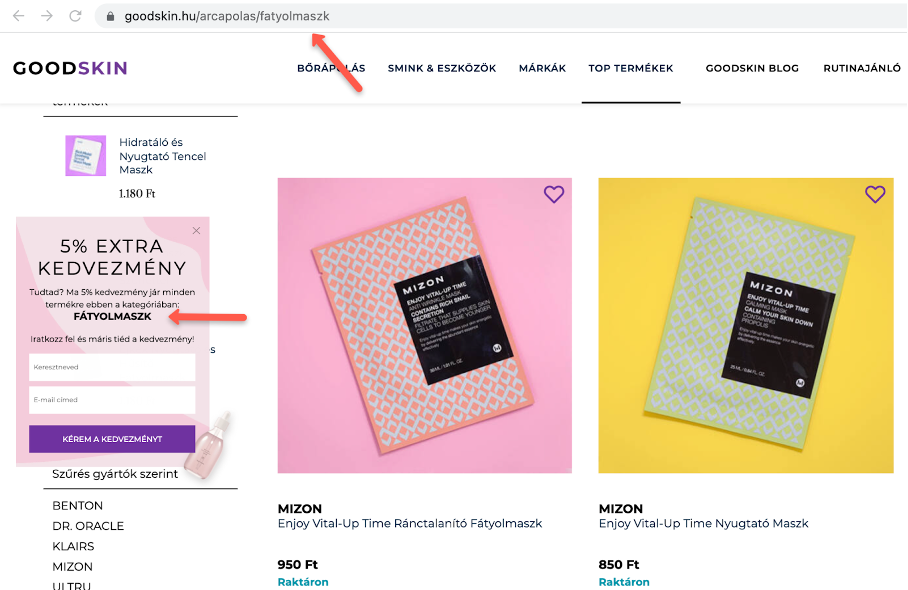
2.1. A non-monetary reward
There are many types of non-monetary rewards you can offer your site visitors.
The first one is a free item from your store. This is a bit like a “buy one, get one free” (BOGO) offer, except that you choose the second product that your customers will receive.
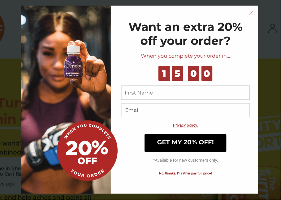
The popup below is a great example of a free product offer. It displays Coconut Oil which is a popular beauty item. It’s also worth noticing the “Wait, don’t miss out” copy, which encourages their visitors to act now rather than later (we’ll get into the importance of triggering FOMO in section 6.4).
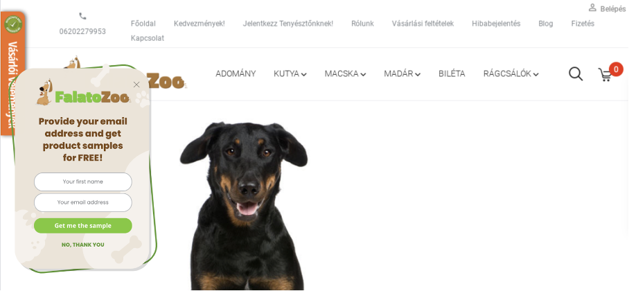
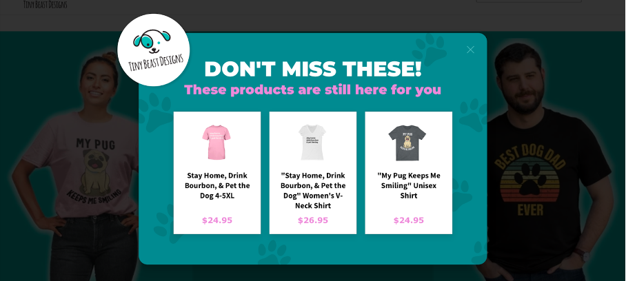
If you don’t wish to offer your visitors a full-sized product, that’s OK. You can opt for free samples instead. They give your shoppers the opportunity to try out multiple items, which increases their chances to find something they really love. This may result in more future purchases.
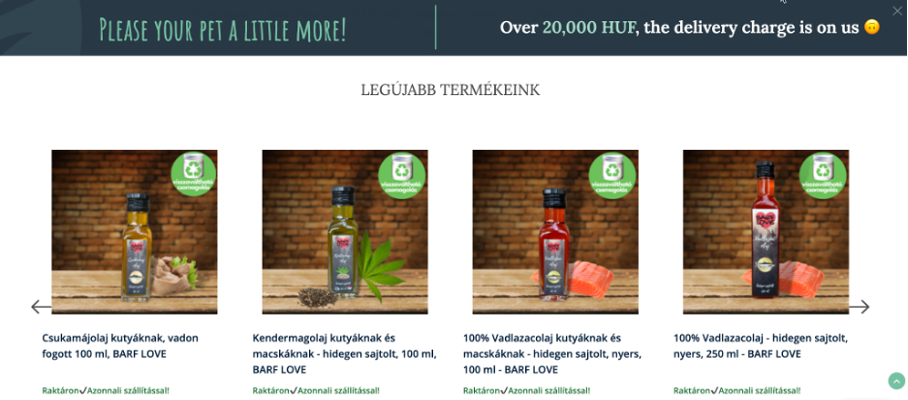
That’s clearly the thinking behind this popup from a Hungarian pet supply company. Their customers can let their dogs try out their products before committing to a large order.
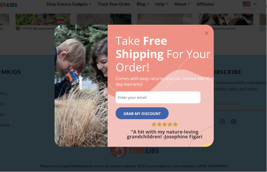
Free shipping is another effective way to provide value to your customers. That’s because shipping costs are one of the biggest barriers to online shopping. Studies have shown that 9 out of 10 online shoppers say that free shipping is the best incentive for making an online purchase.
The popup below uses large, bold text to emphasize their free shipping offer:
Other ways to generate value without offering monetary discounts include:
- An extended warranty or a money-back guarantee
- The chance to get a free consultation
- Giveaways
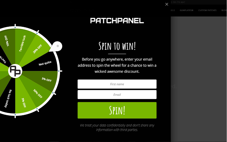
2.2. Fun and surprise
Entertainment value is another route for creating engaging popups.
That’s why OptiMonk has designed a suite of gamified popups that can help you build your list quickly. The template below is just one of the many fun options from OptiMonk’s Template library.
Interestingly, using a lucky wheel with a range of potential discounts is even more effective than a fixed discount.
OptiMonk’s internal research has found that gamified popups convert at much higher rates than classic email signup popups (13.23% vs. 5.10%).
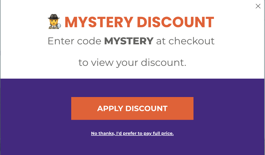
Another unconventional popup idea is the “Mystery Discount,” which taps into people’s natural curiosity.
As soon as there is a mystery discount, people want to find out how much it’s worth. This can motivate people to add items to their cart and proceed to checkout, like the example below:
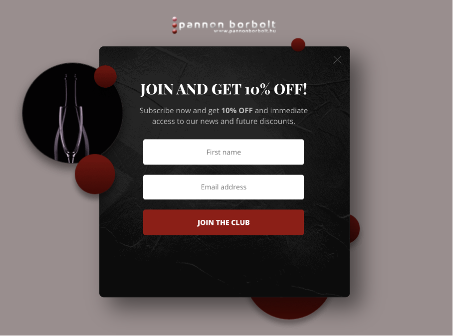
2.3. Novelty and exclusivity
Novelty and exclusivity give your customers early access to new products, deals, or special offers.
Being the first to purchase an item is a source of value because people like to have things that no one else does. That’s why you should offer users early access to your newest products, so they can have the first chance to buy them. And visitors will be excited to take the opportunity if you offer them the chance to be a part of an exclusive “club.”
The popup template below is a great example of this approach. It offers users the chance to join a special club and get 10% off.
You can also use the same technique to promote your seasonal sale and guide users towards products they might want, like this template does:
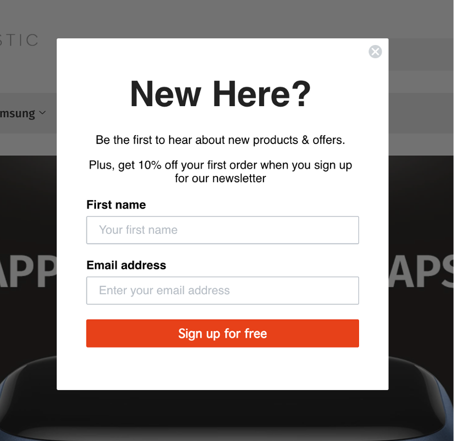
Another idea is to build your email list by targeting your first-time users.
Our next example asks visitors whether they’re “New Here?” and offers them the chance to “be the first to hear about new products & offers.” This popup taps into the desire to stand out from the crowd by getting access to things that no one else has.
2.4. A compelling offer
A discount is a very powerful incentive to buy something—that’s why sales are so popular within ecommerce and traditional brick-and-mortar stores.
The most popular type of monetary discount is the X-percent off deal. Here’s an example:
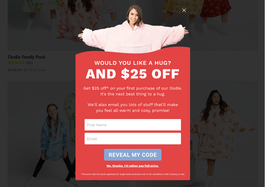
Let’s see another example. With a playful copy and great design, the popup below offers $25 off the visitor’s first purchase.
3. Handling objections and fears
Now that we’ve gone over the four main ways of including a motivating value proposition in your popups, it’s time to go over some other useful messages.
Popups are a great opportunity to proactively address any potential “threats” that might prevent someone from feeling comfortable about making a purchase. This is important because one of the main issues with ecommerce is the inability to actually see and touch the products customers want to buy.
A money-back guarantee is a great way to address these fears since it gives potential customers a chance to buy the product without any risk. Moreover, your shoppers will perceive that you truly believe in the quality of your products.
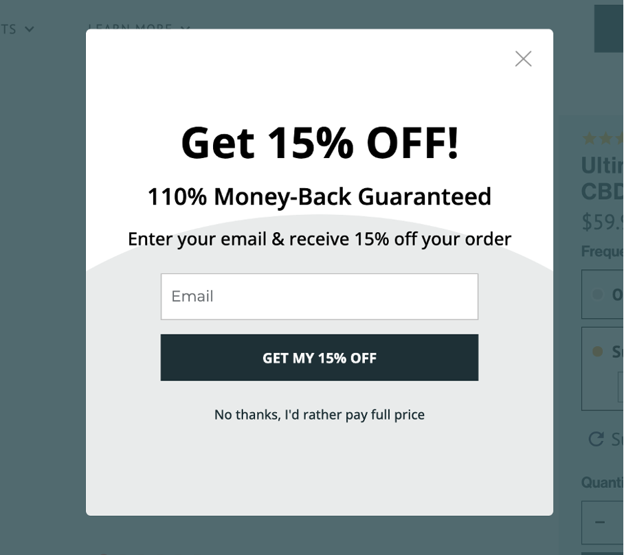
The website popup below pairs a percentage discount with a message about a “110% money-back guarantee.”
Another way to address people’s doubt is to provide social proof regarding the quality and desirability of your products. Seeing other people vouching for a product is always convincing—that’s why people still say that “word of mouth is the best advertising.”
The example below showcases this by specifying the number of people (“30,000+”) who have benefited from using their product.

Additionally, the website popup below takes a more individualized approach to provide social proof. It contains a quote from a five-star review of their product.
4. Increase FOMO
Procrastination is another reason that stops people from making purchases online. So you need to give your potential customers reasons why they should opt-in now rather than later.
FOMO (Fear of Missing Out) is a psychological phenomenon that fights against procrastination—pushing people to act decisively rather than wait around.
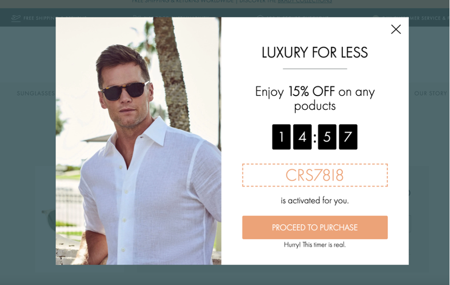
You can increase your site visitors’ FOMO by using limited-time discounts. The idea that a good deal is only available for a certain period of time, changes how a potential customer makes their purchase decision.
Rather than thinking, “well I can buy this next month,” they’ll want to buy it now while there’s a good deal.
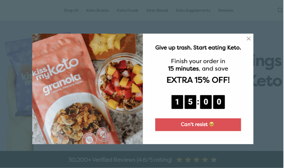
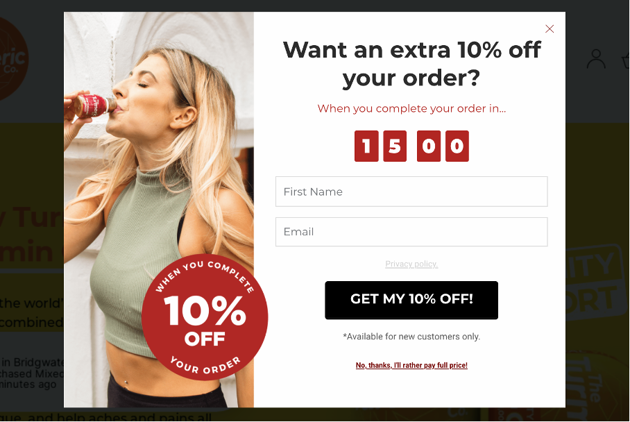
This website popup example uses a very short time window of fifteen minutes to really increase the sense of urgency around making a purchase. A visitor will really internalize that deadline when they see the seconds and minutes ticking away on the countdown clock. And just as a final touch, it says “Hurry! This timer is real.”
Seasonal sales (like the example below) are also effective because they contain a built-in time restriction.
5. Emphasize the value
While some motivating value propositions don’t really need much explanation (like 15% off), other offers are a little bit more complex. In these cases, you’ll have to explain the value your offer holds.
There are a few ways to do this.
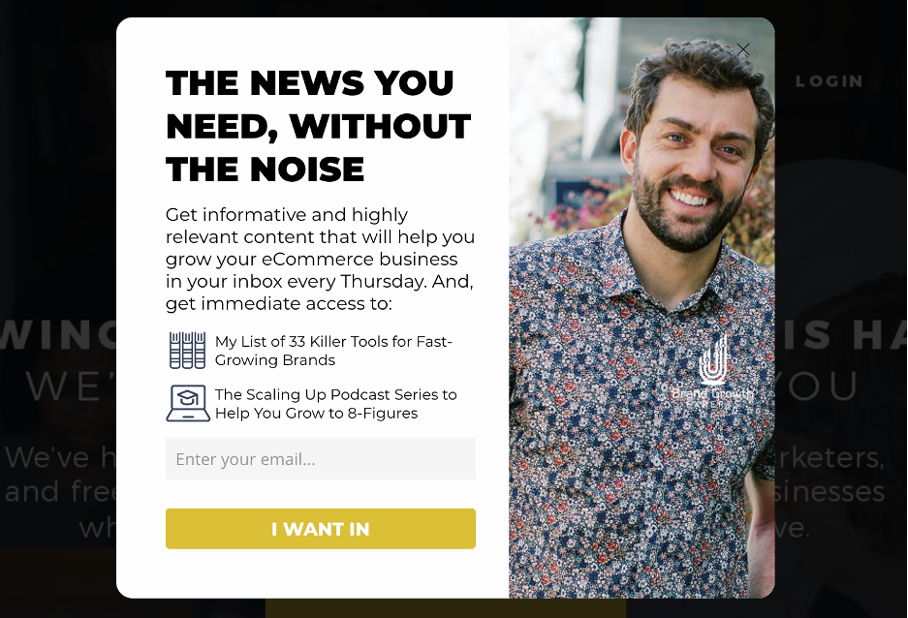
The first (and simplest approach) is to feature a list of benefits that someone can expect from engaging with your popup. Lists are great because they’re short, easy to read, and easily fit onto a popup.
The website popup below is a great example of featuring a unique selling proposition with the headline “The news you need, without the noise.” Even better, the list of benefits makes it clear what their customers can expect from an email subscription: a list of “33 killer tools” and access to a podcast.
Finally, the clever call-to-action button encourages people to opt-in and get access to important news without the noise.
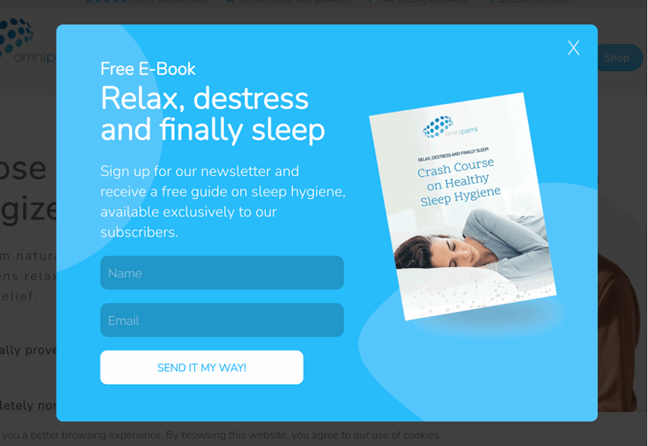
Our next pop-up example doesn’t use a list, but it does use a concise copy to explain what visitors are opting into. The copy makes it clear what they’re getting (a free ebook), what it’s about (sleep hygiene), and that it’s only available to subscribers.
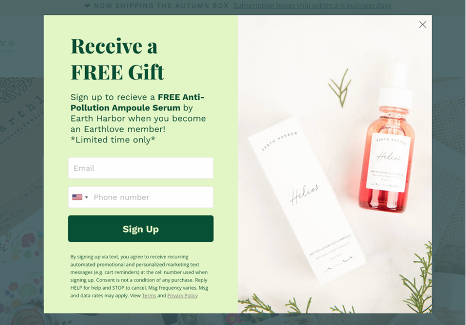
Finally, you can use images instead of words to define the value of your offer.
The pop-up below shows exactly what people can expect to receive as a “FREE gift.” The picture is nicely composed, and it showcases the “anti-pollution serum” to highlight how expensive and valuable the product is.
Advanced tactics
So far, we’ve taken a look at which types of messages you can send to different segments of visitors and how you can make them effective. If you apply all these lessons and tips, your popups will be far ahead of the majority.
But we’ve still got several more advanced tactics to go through that can boost your conversion rates even higher.
So let’s get started on these advanced optimization tactics!
1. Use a teaser
Teasers are small messages that show up in the corner of your visitors’ browser window. They contain the “headline” of one of your campaigns, and visitors can see the full-size version of your popup once they click on the teaser.
These campaigns inform your visitors about your discounts the moment they land on your page, but in a less intrusive way than entry popups.
The fact that the full-size popup only shows up after the user clicks on the teaser gives them the choice to see the popup when they want to.
More importantly—teasers don’t interfere with your customers’ shopping experience. Nonetheless, your customers will still be aware of the availability of a good deal while they’re browsing through your products, which could motivate them to make a purchase.
You can check out this guide to OptiMonk’s updated teaser campaigns for more info.
2. Use follow-up campaigns for coupons
Once a visitor has chosen to submit their contact info to get a discount, you’re halfway to the finish line. You’ve successfully converted your visitor and added a new subscriber to your email list, but they haven’t purchased yet.
A sticky bar that contains your coupon code and a message like “don’t forget your discount code” can help increase your coupon redemption rate and boost your sales by keeping that good deal at the top of your customers’ minds.

3. Personalize based on the cart value
With access to OptiMonk’s personalization features, you can strategically offer different discounts based on cart value. This can raise your conversion rates without impacting your revenue.
You can use this strategy to target cart abandoners. The greater the value of their cart, the bigger the discount they’ll get.
In the example below, cart abandoners between £25-79 are offered a 10% discount:
However, on that same site, someone with a cart value greater than 79£ will get the opportunity to save 20%:
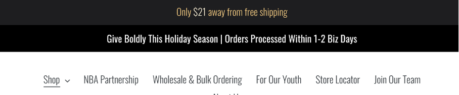
Another strategy is to promote a free shipping threshold.
You can use a sticky bar to inform users about your free shipping policy once they’ve added an item to their cart. But the overall value is below the threshold for free shipping.
Campaigns like this (and the example below) will help increase your Average Order Value (AOV).
OptiMonk also offers “Dynamic Free Shipping Bars,” which are an even more effective way of encouraging your customers to purchase enough items to qualify for free shipping.
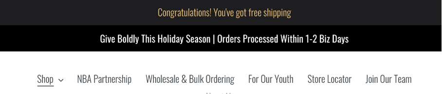
These sticky bars update to display exactly how much more a user needs to spend to reach the free shipping threshold. So if you offer free shipping on orders above $35, the first stage of your campaign will look like this:

Once a visitor adds something to their cart, the message will automatically update. For example, someone who adds a $14 item will see this:
Finally, once someone has added more items to their cart and qualifies for free shipping, the bar updates again:
You can get more details about creating Dynamic Free Shipping Bars here.
4. Use multi-step popups
Sometimes you want to collect more information from a visitor than just their name and email address.
Multi-step popups come in handy because they save you from having to add too many answer fields in your popup forms.
A multi-step popup campaign uses one page to collect your customers’ names and email addresses and another page for phone numbers or mailing addresses. Breaking up your popup into steps allows you to collect detailed information without overwhelming your visitors.
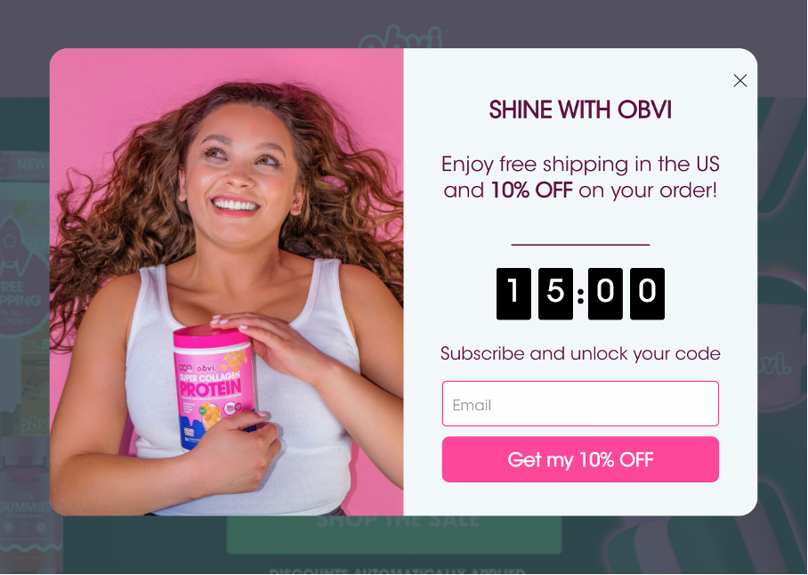
Here’s the first page of a multi-step campaign offering 10% off in exchange for an email address:
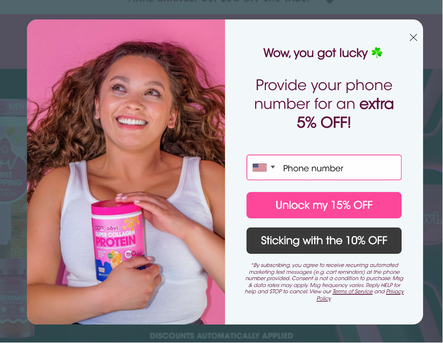
And here’s the second page which provides an extra 5% off as a surprise, in exchange for visitors’ phone numbers:
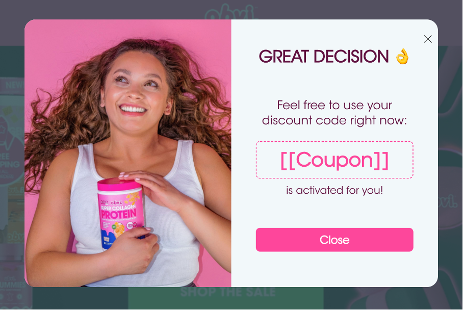
After a user has completed the first two pages, a thank you page with the coupon code appears:
Information about your users is extremely valuable. You can collect more of it with multi-step campaigns like these.
5. Use coupon auto-redeem
OptiMonk’s auto-redeem feature allows you to automatically apply a customer’s coupon code at checkout. This ensures they won’t forget to apply it themselves, and it helps them feel like they’re getting a great deal.
Check out this support page for more info about auto-redeem.
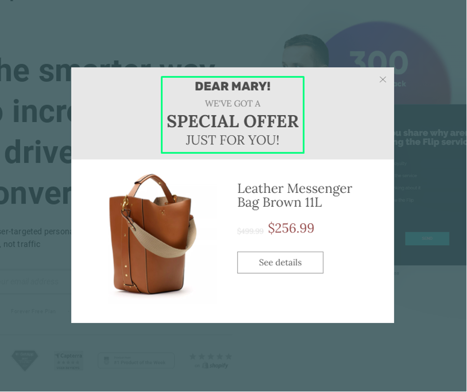
6. Use Dynamic Text Replacement
Dynamic Text Replacement (DTR) takes personalization to the next level. You can use DTR to make the same campaign appear vastly different to certain users based on “custom variables” (i.e. just about any piece of data you have).
For example, you can welcome returning visitors by name if they’ve previously filled out a form on your site. Here’s an example of what that could look like:
Another idea is to display their total cart value in your popup as we saw with Dynamic Free Shipping Bars.
You can also use DTR to display an offer that’s specific to the category a visitor is currently browsing, like in the example below:
There are endless options when it comes to DTR with OptiMonk. To learn more about leveraging your data to personalize your campaigns, check out this support page.
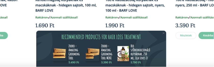
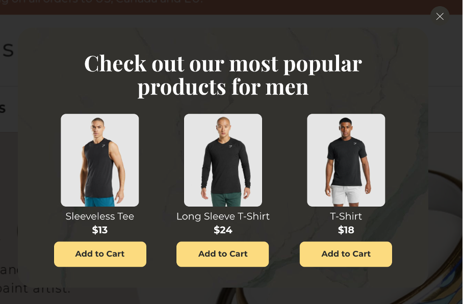
7. Use dynamic product recommendations
Recommending products based on your visitors’ behavior is one of the best ways to ensure a personalized user experience. If a customer has spent all their time on your website browsing swimsuits, it’s not ideal to recommend sunglasses to them.
Through behavioral tracking, OptiMonk’s Dynamic Product Recommendations can help your users solve their problems quickly and easily. The popup below reminds users of products they’ve viewed on previous visits to help them get back up to speed:
You could also showcase your most popular products. This adds social proof to the offer, which can help convince customers to buy what everyone else is buying.
Here’s an example of what this looks like:
You can find more info about our personalized product recommendation popups here.
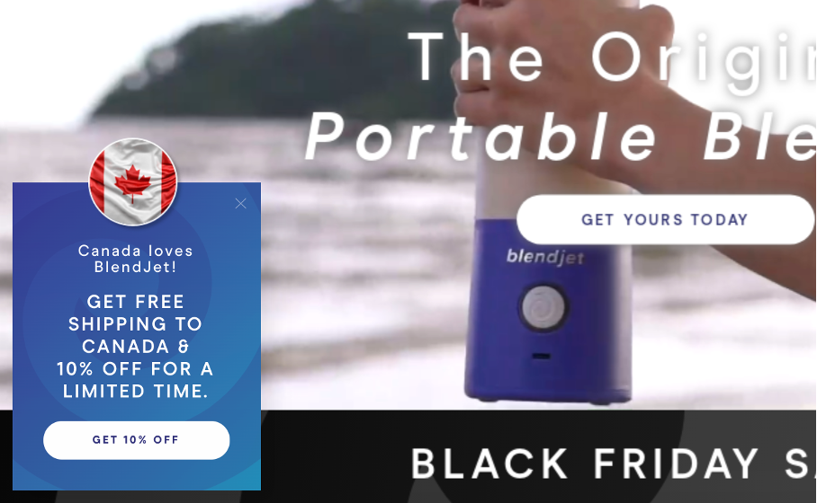
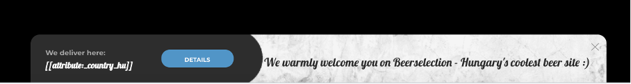
8. Personalize based on country
You can also personalize your messages based on country. This is particularly useful for companies whose shipping policies vary internationally.
Sending personalized shipping information to each visitor allows you to set their expectations accurately.
The example below spells out exactly what Canadian customers can expect:
You can also display this information in a sticky bar:
Using the same segmentation, you can also create multilingual popups to match the languages your customers speak.
Or you can run seasonal promotions based on holidays that are only celebrated in specific countries. That means you can target Americans with Independence Day sales and Australians in the lead-up to Australia Day.
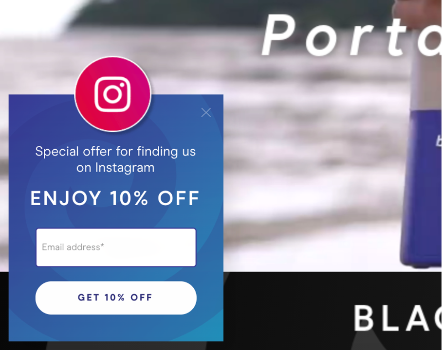
9. Personalize based on traffic source
Targeting users based on traffic sources is another useful way to segment your visitors and personalize your messages.
For example, you might want to offer a special discount to people who arrived on your site from Instagram. Here’s an example of what it could look like:
If visitors arrive by clicking on your Facebook ad or from your email newsletter, you might want to remind them of exactly what they can expect.
10. Personalize based on gender preference
This is a particularly useful strategy for brands in the fashion and lifestyle niches, but many sites can take advantage of this approach.
To do this, you can create different Facebook ads that are targeted towards men or women and add campaign parameters to your URLs (called UTM tagging). You could add “gender=male” as your campaign name. Then, you can set up several popups to recommend different products based on these URLs.
Here’s an example of what it can look like:
You can quickly increase your conversion rates by taking advantage of OptiMonk’s advanced targeting and personalization features.
Where to start?
Although it might seem difficult to get started, you won’t believe how easy it actually is when you go step-by-step.
Step 1: Create a free OptiMonk account
When you sign up with OptiMonk, you’ll gain access to our Template Library and Popup Editor. You’ll be able to choose from more than 300 website popup templates and customize them to fit your brand and website.
Once you have an account, OptiMonk’s customer support team will be happy to help you with any questions you might have about creating popups on our software.
You can register for OptiMonk’s free plan using your Google, Shopify, or email account, without the need to enter any credit card information.
Start the process using this link!
Step 2: Choose from the website popup templates and create your first campaigns
Once you’ve signed up for an account, we recommend starting small by creating a couple of campaigns. It’s a good idea to prioritize the most important segments first—particularly new homepage visitors and cart abandoners.
To get started on creating a campaign, head on over to OptiMonk’s Template Library and pick out a template that works for you. Try sorting the popups by use cases, so you can see all of the same types of popups at once. For example, you’ll be able to see all the cart abandonment options.
Here you can see some of our most popular templates for pop-up windows:
After you choose a template, it’s time to customize it using your own colors, images, and copy. All these changes are easy to make in the Popup Editor.
You should also customize the timing and targeting rules of your popup. But if you don’t know how to start, you can use the configurations we suggested for your chosen template (these suggestions are appropriate for the use case).
Step 3: A/B test and learn what works
As you start to create campaigns, measuring your results is important. That’s the only way you’ll know whether your popups are bringing you the most possible benefit.
The conversion rate of a popup is the most important number, but it doesn’t tell you the full story (discussed in section 3.1). There’s no one “number” to which you can compare the conversion rates of your popups and say, “yes, this one is doing great” and this other one “is doing poorly.”
Instead, you should A/B test different versions of your popups to see how they compare to one another. This allows you to see whether a specific campaign on a certain webpage is delivering you the maximum conversion rate or not. Without A/B testing, you won’t be able to know which popup version will work the best. It’s always better to gather and trust data than relying on what you “think” will work.
OptiMonk’s powerful A/B testing system allows you to compare how different offers, designs, and copies will affect your popups’ performance. As you compare many different variants against one another, you’ll slowly learn what aspects your best performing popups share and those that your worst performing ones all have in common.
Throughout this process, you won’t just be learning about popups. You’ll also be learning about your site visitors: what sort of design works for them, what style of copy they prefer, and what kinds of offers they respond to.
Step 4: Expand and create more campaigns
As you gain experience with the best popup-creating principles and OptiMonk’s powerful customization options, you can create more and more campaigns to address more ecommerce segments.
Each ecommerce segment you address will further tighten up your conversion funnel—efficiently ushering your site visitors to the next stage of their customer journey. As a result, you will see more sales and more loyal customers who return to your store again and again.
Conclusion
Thanks for sticking with us through our ultimate guide to creating popups. We hope that these pop-up examples have inspired you and that you’ve highlighted a few ideas that you can apply to your website today!
Popups are an indispensable tool in ecommerce. They’re flexible enough to perform several roles such as growing your email list and sales. You can use them to provide social proof while recommending your best products.
And now you’ve got unlimited possibilities to grow your business.
It’s also important to see that popups are a part of a larger whole. You should use them to support your ecommerce strategy—moving potential customers from being unaware of your brand towards becoming loyal customers.
When your popups guide visitors toward the solutions they’re looking for, they’ll absolutely love to see them. By making the shopping experience easier to navigate, popup campaigns carry lots of value and can raise your revenues by up to 10 times.
So whether you’re a seasoned popup maker who has just picked up a few new tricks or you’re just about to create your first pop-up campaign, head on over to OptiMonk and get started today!
Migration has never been easier
We made switching a no-brainer with our free, white-glove onboarding service so you can get started in the blink of an eye.

What should you do next?
Thanks for reading till the end. Here are 4 ways we can help you grow your business:
Boost conversions with proven use cases
Explore our Use Case Library, filled with actionable personalization examples and step-by-step guides to unlock your website's full potential. Check out Use Case Library
Create a free OptiMonk account
Create a free OptiMonk account and easily get started with popups and conversion rate optimization. Get OptiMonk free
Get advice from a CRO expert
Schedule a personalized discovery call with one of our experts to explore how OptiMonk can help you grow your business. Book a demo
Join our weekly newsletter
Real CRO insights & marketing tips. No fluff. Straight to your inbox. Subscribe now
Share this article
Written by

Csaba Zajdo
Csaba Zajdo is the founder of OptiMonk. As an ecommerce veteran, Csaba has over 15 years of experience in working with ecommerce stores. His mission is to reinvent the ecommerce industry and help stores, by creating delightful shopping experiences for each customer.
You may also like
- Posted in
- Conversion
Partner with us
- © OptiMonk. All rights reserved!
- Terms of Use
- Privacy Policy
- Cookie Policy
Product updates: January Release 2025


