- Blog
- What Is a Popup Window? Meaning, Examples & How They Work in 2025
What Is a Popup Window? Meaning, Examples & How They Work in 2025
-
Barbara Bartucz
- Conversion
- 6 min read
Table of Contents
If you’re wondering what a pop-up window is, chances are you’re looking for a solution to engage your website visitors, capture leads, or boost conversions.
You’ve likely seen these small windows appear on many websites, but how can they help your business without driving visitors away?
In this article, we’ll dive into what website popups (a.k.a. pop-up windows) are, how they work, and, most importantly, how you can use them effectively to convert visitors into loyal customers without being intrusive.
Let’s jump in!
What is a pop-up?
A pop-up is like a small window that suddenly appears on a user’s screen while they’re browsing. It quite literally “pops up” to promote special offers or ask them to join an email list.
As the average time spent on site is around 53 seconds, popups can help you to communicate your offer effectively during that short window of time.
Now, depending on what you’re aiming for, there are different popups you can use.
These little windows aren’t just one-size-fits-all. They come in all shapes and forms, each with its own goal.
Whether you’re looking to share important updates, gather feedback, or lead your visitors down a certain path, there’s a perfect popup window waiting to lend a hand.
Popup or pop-up?
Now let’s clear up those misunderstandings around the spelling: “popup” and “pop-up” are both popular spellings, and they’re both correct.
Whether you’ve come across pop-up ads or a website popup, you’re essentially describing the same element.
Even in technical documentation, both “popup” and “pop-up” are deemed appropriate when discussing website pop-ups.
The role of pop-up ads in online marketing
Pop-ups have become a cornerstone of online marketing strategies due to their profound impact.
As you’ll see below, it’s no wonder that marketers claim pop-ups are valuable assets. They offer a direct avenue to:
- Gather email addresses and phone numbers
- Facilitate product and service sales
- Captivate attention
- Drive conversions with precision
- Solicit immediate feedback
But popups do more than just grab attention—they actively boost engagement. In fact, the top-performing ones achieved an impressive 42.35% average conversion rate in our analysis.
They cater to various customer segments, encouraging them to take action by using clear messaging, highlighting new content or promotions, and creating a sense of urgency.
The bottom line? Using popups in clever ways can boost sales and make a website more effective.
Pros and cons of using popups
Website pop-ups have both advantages and disadvantages.
To provide clarity, we’ve compiled a list of pros and cons to help you better understand the benefits and drawbacks.
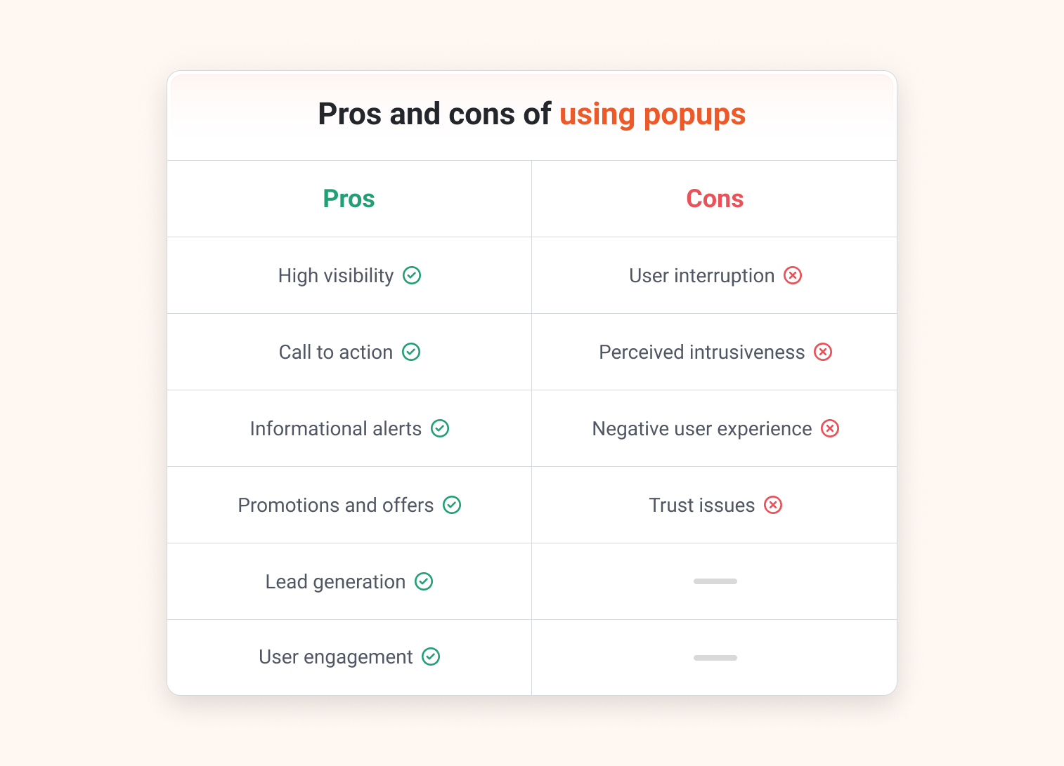
Pros:
- High visibility: Pop-ups stand out and effectively grab users’ attention since they appear prominently on the screen.
- Call to action: They prompt users to take specific actions like signing up for newsletters, making purchases, or giving feedback.
- Informational alerts: Popups can convey important updates, notifications, or warnings, keeping users informed about critical matters.
- Promotions and offers: They’re handy for promoting special deals or limited-time discounts to boost conversions.
- Lead generation: Pop-ups can capture user information through forms or surveys, and you can offer a lead magnet in exchange for subscribing.
- User engagement: Well-designed and targeted pop-ups enhance user engagement by offering relevant content or incentives.
Cons:
- User interruption: Pop-ups can disrupt the user experience, especially if they’re intrusive, frequent, pop up at inconvenient times, or can’t easily be closed.
- Perceived intrusiveness: Some users believe that popups are annoying and may associate them with spam or unwanted ads.
- Negative user experience: Poorly implemented or irrelevant pop-ups can lead to a negative user experience, potentially driving users away and increasing the bounce rate.
- Trust issues: Excessive pop-ups may raise trust concerns, and users might see them as unprofessional or deceptive.
Popups can be a great, highly effective solution if they’re used strategically, but balance is key.
They can help online stores generate leads and attract new customers, but it’s important to learn how to time them appropriately and provide clear value with them.
Diverse pop-up formats and their uses
Pop-ups aren’t a one-size-fits-all solution. They come in various formats, each with unique features and applications.
Broadly, pop-ups can be categorized by layout, by objective, and by trigger.
Let’s delve deeper into each category:
1. By layout
Pop-ups can take on a variety of formats, such as a full-screen popup, a slide-in box, or a pop-up form.
Full-screen pop-ups, as the name suggests, pop up in your browser window and take up the whole screen.
Websites apply them if they want to get customers’ full attention and push them towards taking action. However, because they block everything else on the screen, some visitors might find them annoying.
On the other hand, slide-in boxes offer a more subtle approach.
With these, a small window or banner slides into view from a corner of the page, grabbing attention without blocking the main content. This less intrusive style makes slide-in boxes a popular choice among marketers.
2. By objective
Popups can be used to accomplish a variety of different objectives. These pop-ups are crafted with specific, measurable goals in mind. They serve various online marketing purposes, such as generating clicks, gathering leads, and engaging visitors.
For example, imagine a pop-up that appears on the screen and presents a special offer like a discount code to users who sign up for a newsletter.
This achieves both lead generation and promotional objectives simultaneously.
By carefully considering your marketing goals, you can determine the most suitable type of pop-up for your needs.
3. By trigger
Pop-ups appear based on triggers, or user actions on the website like scrolling, clicking, or intending to exit the tab.
Carefully choosing the triggers for pop-ups enables businesses to strategically prompt user action, generate leads, and boost sales.
For instance, a pop-up offering promo codes might appear on the site when a user hovers their cursor near the browser’s close button (exit intent), effectively reducing cart abandonment and driving conversions.
Best practices for creating effective pop-ups
Crafting a successful pop-up involves both artistry and scientific precision—that’s a fact. It demands a fusion of creativity, comprehension of your audience, and adherence to established principles.
Let’s see all the best practices you need and check out some great pop-up examples.
1. Match your brand
Designing pop-ups should always involve aligning the look with your brand’s identity. This includes incorporating elements such as colors, spacing, and overall aesthetics that are consistent with your brand.
This consistency helps in strengthening your brand’s identity, making it easier for your audience to recognize and trust your brand.
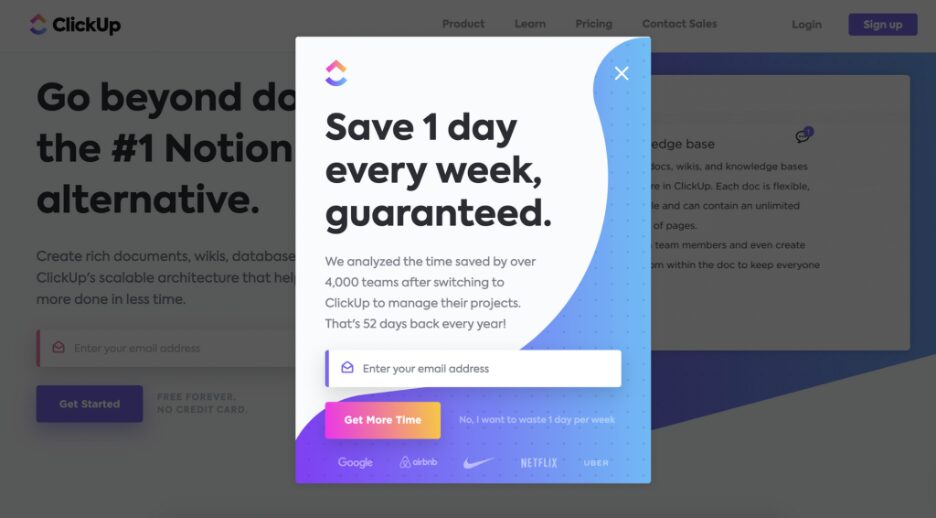
The first pop-up example is from Clickup. As you can see, their pop-up design fully matches their website design:
And when we say “match your brand,” we mean more than just visuals.
The tone and style of your pop-up should echo your brand’s voice.
For instance, if your brand exudes a playful and quirky personality, adopting a formal, buttoned-up tone in your pop-up might feel discordant.
Keep in mind that your pop-up serves as an extension of your brand. It should embody its essence seamlessly!
2. Keep it simple
Effective pop-up design hinges on simplicity. Overly complex pop-ups inundate visitors with too much information, diluting the intended message.
Prioritizing simplicity in design and clarity in messaging is paramount.
For example, if your popups are designed to encourage newsletter sign-ups, opt for a straightforward design featuring a clear headline, a concise description, and an email input field.
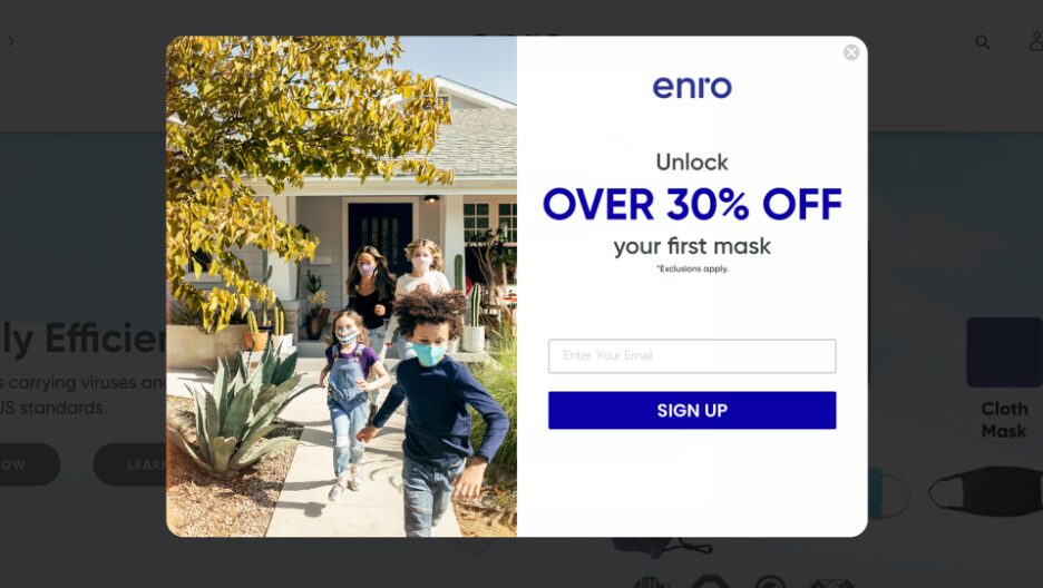
By keeping your pop-ups simple and focused, you can improve user interaction and increase the likelihood of achieving your desired outcomes.
3. Use visuals to emphasize your message
Visuals play a huge part in boosting the effectiveness of your pop-up. They not only make your pop-up more aesthetically pleasing but also help to emphasize your message and make it more memorable.
For instance, if you’re offering a discount on a particular product, including a high-quality image of the product can make the offer more tangible and enticing.
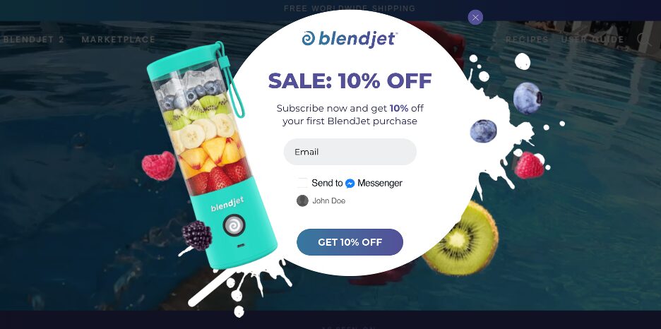
It remains important, though, to align the visuals used with your website’s overall design and your brand style. If your pop-up appears to be a whole different style compared to your brand, it can create a disjointed user experience and undermine its effectiveness.
4. Use a clear call-to-action
A call-to-action (CTA) is arguably the most critical element of your pop-up. It’s the prompt that guides visitors on what you want them to do next, so it’s best to keep it simple and clear.
For example, instead of a vague “Click Here,” try a more specific CTA like “Download Your Free E-book Now.” That way, people know exactly what they’ll get when they click the button, and they’re more likely to do it.
Here’s an example from BOOM, where they’re promoting a downloadable ebook.
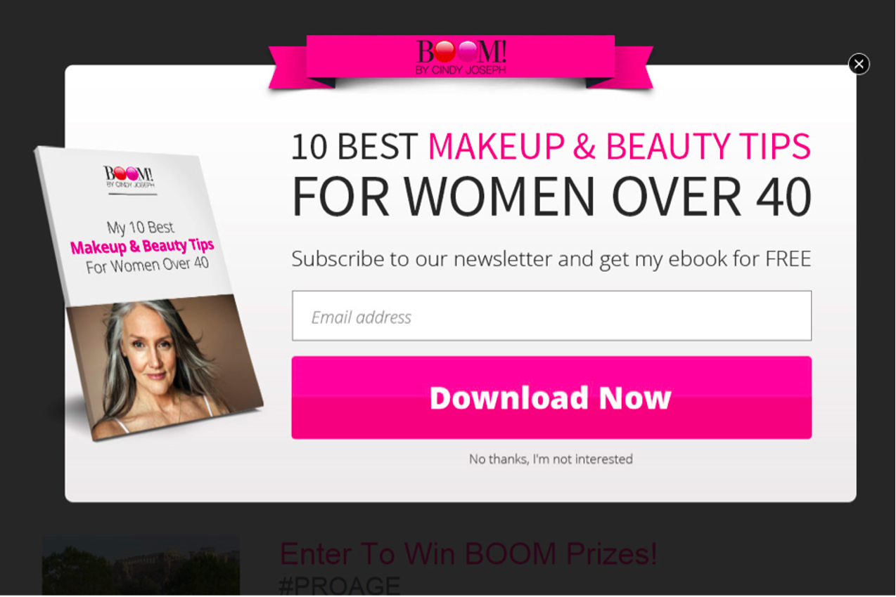
Once the visitor clicks on the “Download Now” CTA, they’re sent to a page where they can download their ebook.
5. Add a motivating value proposition
Want to get more email subscribers? Then offer something valuable in exchange for subscribing.
Providing a discount coupon or free resource adds value, making it more likely that users will engage and take the action you want them to.
Clarity, persuasiveness, and highlighting unique benefits are key elements of a strong value proposition.
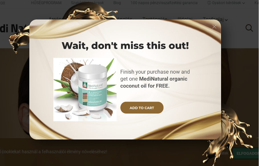
It’s not just about what’s being offered, but also about the reasons why it’s valuable to the visitor.
6. Increase FOMO
FOMO (Fear of Missing Out) is often used on popups. The idea is that this powerful psychological trigger will boost the effectiveness of your campaigns by urging customers to take action sooner.
Let’s see some examples of how you can incorporate a sense of urgency into your popups:
- Show that an offer is only available for a limited time
- Display a countdown timer
- Mention that only a few items are left in stock
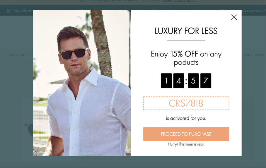
These tactics can create a sense of urgency, pushing users to take immediate action when something suddenly pops up.
However, it’s vital to employ FOMO with integrity and transparency. If you claim an offer is time-limited, ensure that’s genuinely the case.
Misleading customers can damage your brand’s reputation and trustworthiness, and they’ll eventually decide to shop somewhere else if you do this!
7. A/B test your messages and offers
Constantly testing and refining your popups is essential to ensure they reach their maximum potential.
This is where A/B testing, also referred to as split testing, becomes so important. Basically, it involves creating two versions of your pop-up with a single difference (like the headline or the CTA) and showing them to different segments of your audience to see which one performs better.
By analyzing the results of these tests, you can gain insights into what works best for your audience and make data-driven decisions to improve your pop-ups.
For example, Obvi—a D2C company that sells supplements—provides a compelling illustration of this approach.
They found that adding a countdown timer to their popup increased conversion rates by 7.97%.
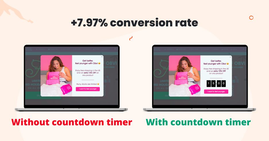
Remember, what works for one website may not work for another, so it’s crucial to test and optimize your pop-ups based on your data and your unique audience.
FAQ
Are pop-ups effective for lead generation?
Yes, pop-ups can be highly effective for lead generation when implemented strategically. By offering valuable incentives such as discounts, free resources, or exclusive access in exchange for email subscriptions, pop-ups can attract and capture leads effectively.
Are pop-ups annoying?
Popups can be perceived as annoying if they’re intrusive, too frequent, or appear at inconvenient times. However, when used strategically and in moderation, they can provide valuable information and offers to website visitors.
How can I avoid negative user experiences with pop-ups?
To avoid negative user experiences with pop-ups, it’s important to ensure they’re not overly intrusive, irrelevant, or deceptive. Additionally, maintaining a balance between promoting offers and respecting users’ browsing experience is crucial.
Wrapping up
These small pop-up windows, appearing suddenly on the screen while browsing, are versatile tools that can effectively communicate messages, promote special offers, or gather feedback from the users: when they are used strategically and with common sense.
We hope that you’ve collected some inspiration from this article, and that you’re now ready to set out on your own popup journey!
Start your journey by creating a free OptiMonk account, and create such a pop-up from scratch, or use our extensive template library, and dive results from today!
Migration has never been easier
We made switching a no-brainer with our free, white-glove onboarding service so you can get started in the blink of an eye.
What should you do next?
Thanks for reading till the end. Here are 4 ways we can help you grow your business:
Boost conversions with proven use cases
Explore our Use Case Library, filled with actionable personalization examples and step-by-step guides to unlock your website's full potential. Check out Use Case Library
Create a free OptiMonk account
Create a free OptiMonk account and easily get started with popups and conversion rate optimization. Get OptiMonk free
Get advice from a CRO expert
Schedule a personalized discovery call with one of our experts to explore how OptiMonk can help you grow your business. Book a demo
Join our weekly newsletter
Real CRO insights & marketing tips. No fluff. Straight to your inbox. Subscribe now
Barbara Bartucz
- Posted in
- Conversion
Partner with us
- © OptiMonk. All rights reserved!
- Terms of Use
- Privacy Policy
- Cookie Policy
Product updates: January Release 2025

