Recently, we stumbled upon a comment on Reddit ranting about pop-ups.
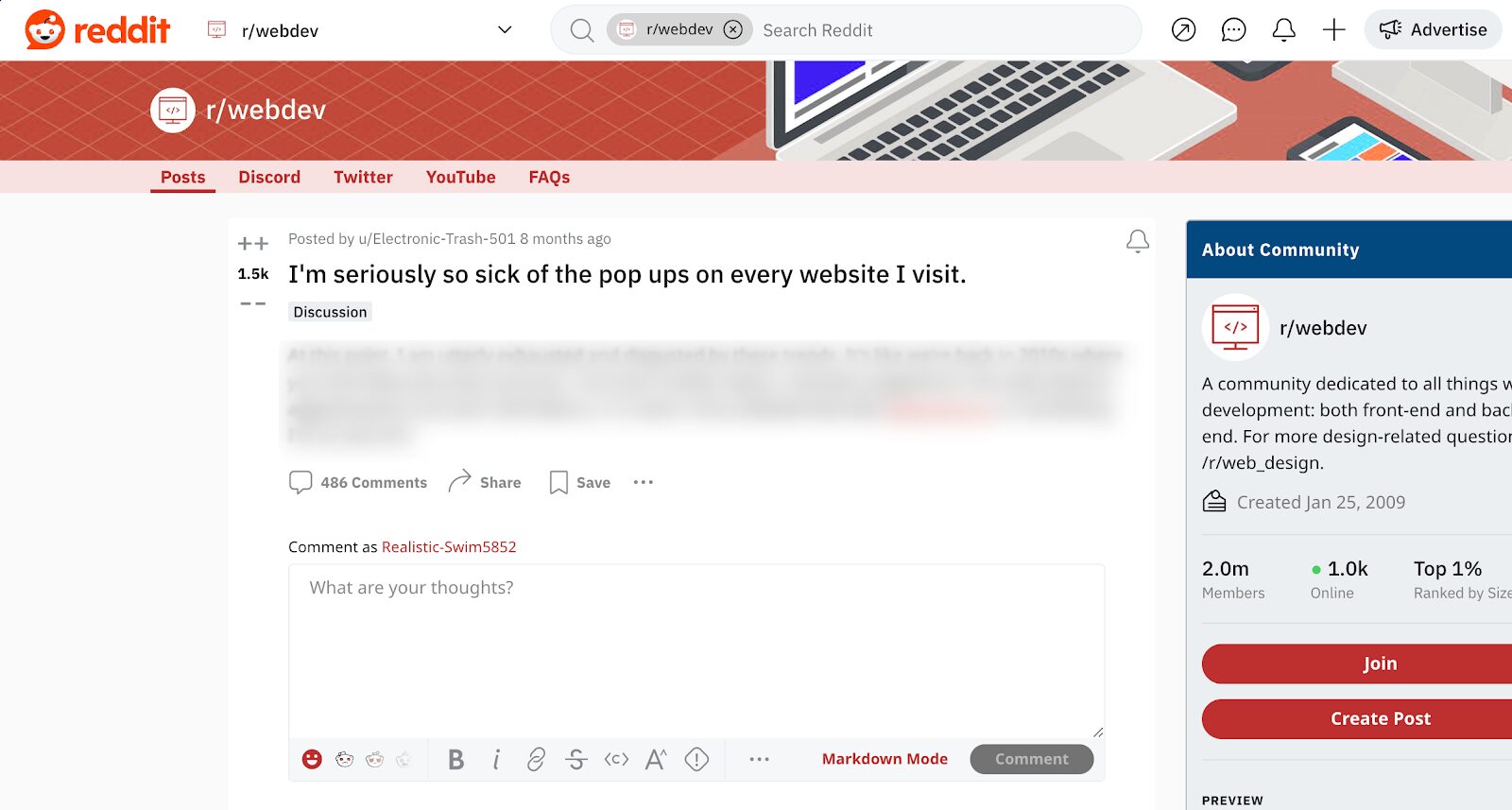
And this is an all-too-common sentiment.
As a conversion rate optimization tool, it might be expected for us to feel defensive about this critique, but the truth is, we understand why pop-ups have gained a bad reputation. Pop-ups can be incredibly annoying when they’re not used the right way.
That’s exactly why we want to help people create pop-ups that visitors actually love. And believe us, using them with sense and strategy can boost your conversion rates like you never even dared to dream!
In this article, we’ll show 7 great examples and bring you some tips and tricks on how to create yours.
Let’s take a look!
What are opt-in pop-ups?
An opt-in popup serves as a versatile tool in online marketing, serving two primary functions. Initially, it showcases the perks of subscribing and then requests a visitor’s email through a form, providing something valuable in return.
These pop-up forms appear as overlays on a webpage, asking users to take specific actions, such as subscribing to a newsletter or accessing exclusive content.
The main idea is to get clear permission, which is why it’s called “opt-in.” Whether it’s giving a discount or sharing useful stuff, the goal is to make users want to share their contact information so the business can get new subscribers.
Opt-in pop-ups are part of good marketing, which involves following rules about privacy and being ethical. They help build an open, positive relationship between businesses and their audience.
How to create the perfect opt-in pop-up?
Crafting opt-in pop-ups that work well involves understanding your audience, skillfully composing a compelling message, and nailing the timing. If you’re utilizing an email marketing service such as Mailchimp or Klaviyo, integrating these strategies becomes even more crucial for effective lead generation and audience engagement.
But how do you go about it? How can you capture the attention of your website visitors, persuade them to subscribe, and, most importantly, ensure they’re pleased to be part of your community?
Rest easy—we’re here to guide you so you can create an opt-in popup that rocks!
1. Clear message and call-to-action
A clear and convincing message in your popup helps people understand the value of subscribing, sparking interest and making them more likely to take action.
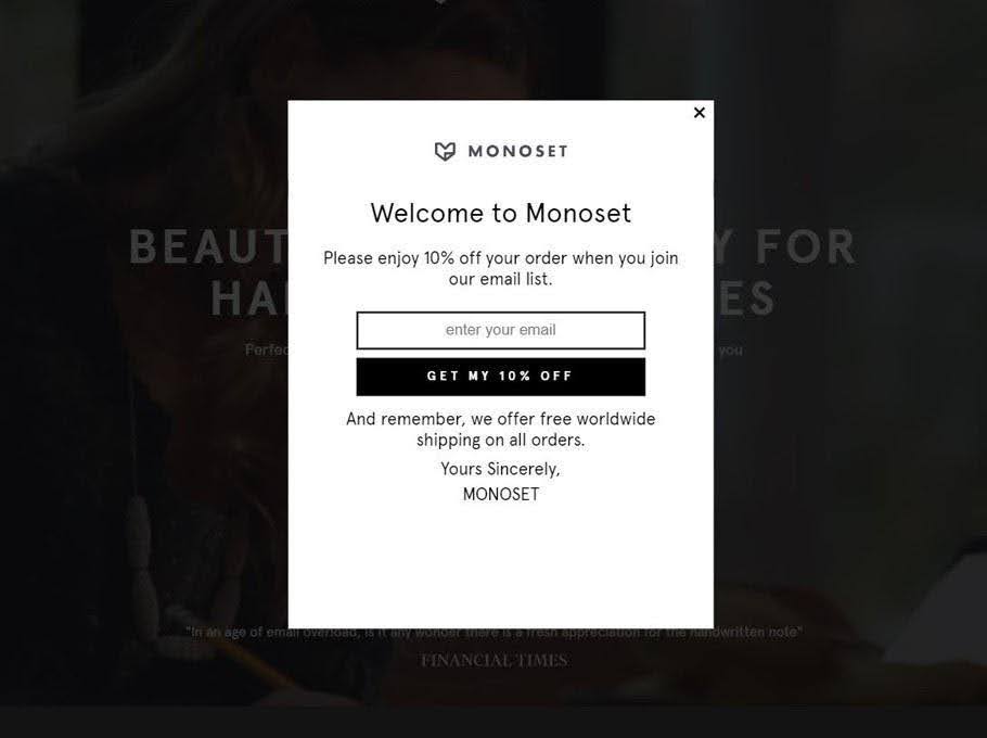
An influential call-to-action (CTA) is the final touch. It acts as a signpost that directs your visitors, prompting them to progress further. It could be as simple as saying “Get my free e-book” or “Start my 15-day free trial!” or “Get my 10% off.” This is the key to turning casual visitors into committed subscribers.
Here is an example from Monoset, where they offer 10% off for email subscribers.
2. A motivating value proposition
What if someone walked up to you on the street and asked you for your email address? You’d probably decline. But what if they offered you a free coffee voucher in return…that changes things, doesn’t it?
That’s what a motivating value proposition does in an opt-in popup. It’s a promise of value that convinces visitors to subscribe.
From immediate discounts to seasonal promotions, an enticing value proposition can make your popup stand out.
Keep it simple, short, and focused on what your audience needs. Use it as a platform to showcase what makes your company special and why visitors would gain by subscribing. Remember, your value proposition is the golden ticket that turns a visitor into a subscriber.
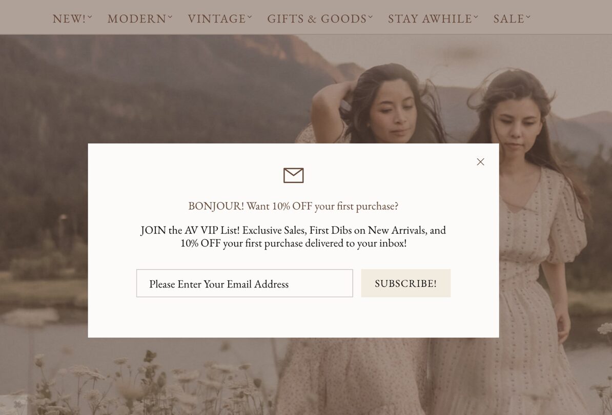
Adored Vintage not only offers 10% off the first order, but also uses creative framing, asking visitors to join their “VIP list,” where they share information about exclusive sales and new arrivals.
3. Create an engaging design that reflects your brand
We all know the saying, “Don’t judge a book by its cover.” But let’s be honest, a well-designed cover does grab attention!
The same applies to your popups. An eye-catching design that mirrors your brand’s identity can effectively engage visitors and spark interest.
The key to a successful design is consistency. From your logo and color scheme to typography and tone, every element should reflect your brand’s personality.
Remember, your opt-in pop-up is an extension of your brand and should feel like a cohesive part of your website. A well-designed popup enhances user experience and strengthens your brand’s image.
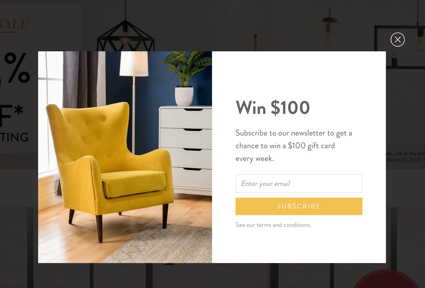
Here’s an example from Structube that looks nice, is easy to understand, offers a great deal, and also displays their product.
4. Handle objections and fears
Objections and fears naturally obstruct the decision-making process. Nonetheless, they can be managed effectively within your popup. When you recognize potential concerns and offer clear, reassuring answers, you can alleviate your visitors’ worries.
For example, people often worry about privacy and spam.
To make your visitors feel more at ease:
- Say you’re committed to protecting their information
- Clearly explain how you’ll use their info
- Include a checkbox for their consent and a link to your privacy policy
Remember, trust is the foundation of any successful relationship, and that includes your relationship with your email subscribers.
5. Increase FOMO
Ever experienced that twinge of regret when you’ve missed a limited-time deal? That’s what makes FOMO—the fear of missing out—so powerful. You can use this strong emotion to create urgency and encourage visitors to act right away.
Presenting limited-time discounts, exclusive deals, or bonus content can trigger FOMO. Including a countdown timer can emphasize the urgency of your offer.
Remember, the goal is to make the visitor feel that by not subscribing, they’re missing out on something valuable.
6. Minimize form fields for a frictionless experience
Filling out forms can be a tedious task. The more information you ask for, the more likely your visitors are to abandon the process. To create a frictionless experience, keep your custom fields to a minimum. Ask only for essential information, which typically means the visitor’s email address.
A simple, direct form enhances the user experience and elevates conversion rates leading to maximum results. Ultimately, the easier it is for visitors to subscribe, the higher the chances that they will. So keep it simple and watch your email list grow!
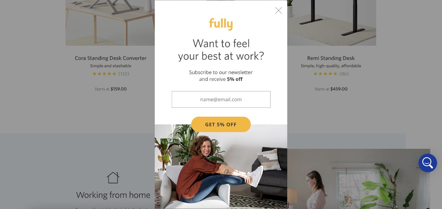
Take a cue from Fully, where they kept it really simple, only asking for the necessary information:
7. Use the right targeting and triggering options
Timing is everything—especially when it comes to opt-in popups. Displaying your popup at the perfect moment can significantly increase your chances of capturing a visitor’s attention and encouraging them to subscribe.
Popular choices include exit-intent triggers, which present the popup as a visitor is on the verge of leaving your site, and time-based triggers, which display the popup after a visitor has been on your site for a predetermined length of time.
Whichever option you choose, remember that your goal is to engage your visitors without disrupting their experience. This ensures that the timing aligns with the visitor’s interaction, making it more likely for them to subscribe to receive specific posts or content.
7 opt-in pop-up examples
Now that we’ve explored the fundamentals of crafting effective opt-in campaigns, it’s time to witness these strategies in real-life scenarios.
We’ve handpicked seven examples of successful opt-in pop-ups from various online businesses.
These opt-ins showcase different email marketing strategies, design aesthetics, and value propositions, providing you with a wealth of inspiration for your own site.
1. TheSTEMKids
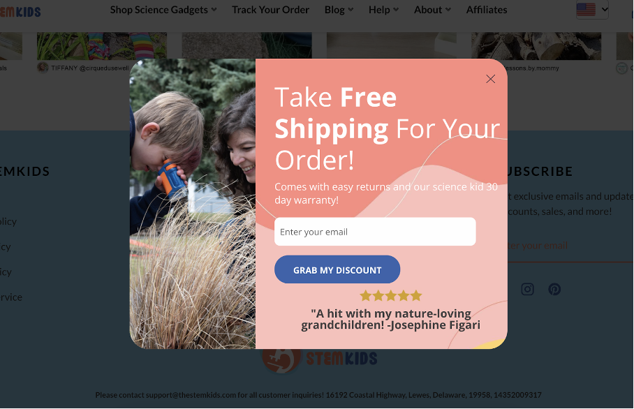
Our first example, TheSTEMKids, demonstrates the power of simplicity. Their opt-in form features a clean, minimalist design that aligns with their brand image.
A clear call-to-action invites visitors to “take free shipping,” providing a tangible incentive that adds value to the visitor’s experience.
TheSTEMKids’ pop-up is not just about acquiring email addresses; it’s about building trust. By highlighting a 5-star review, they effectively turn website traffic into loyal subscribers.
2. PatchPanel
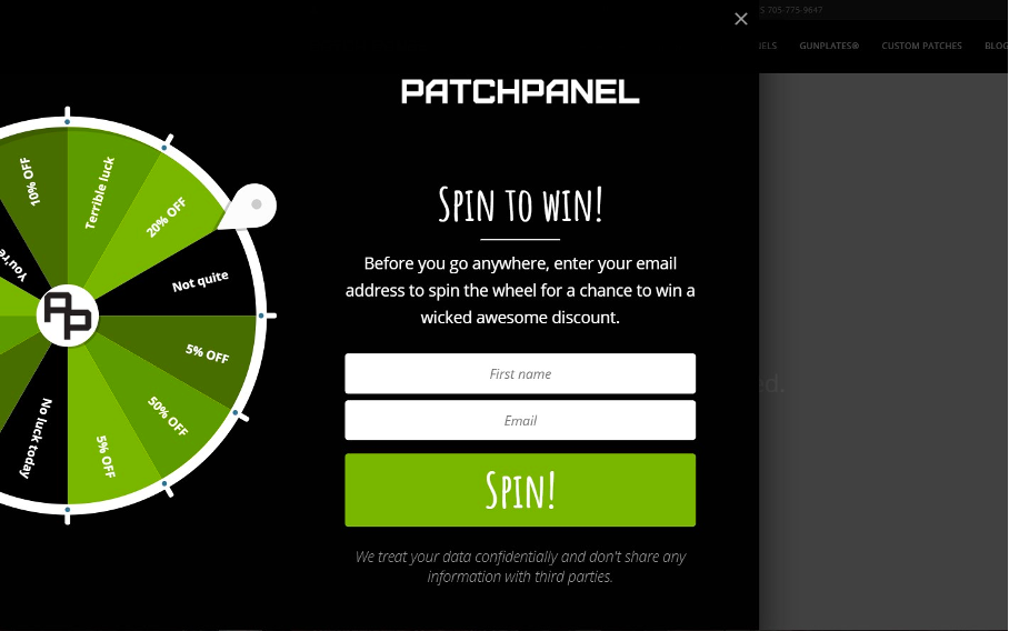
PatchPanel takes a different approach. They decided to gamify the user experience with a lucky wheel popup.
The pop-up offers the chance to win a discount by spinning the wheel. The success of this pop-up lies in the fact that people love to play. It’s a perfect example of how a well-targeted pop-up message can get you more subscribers.
3. The Oodie
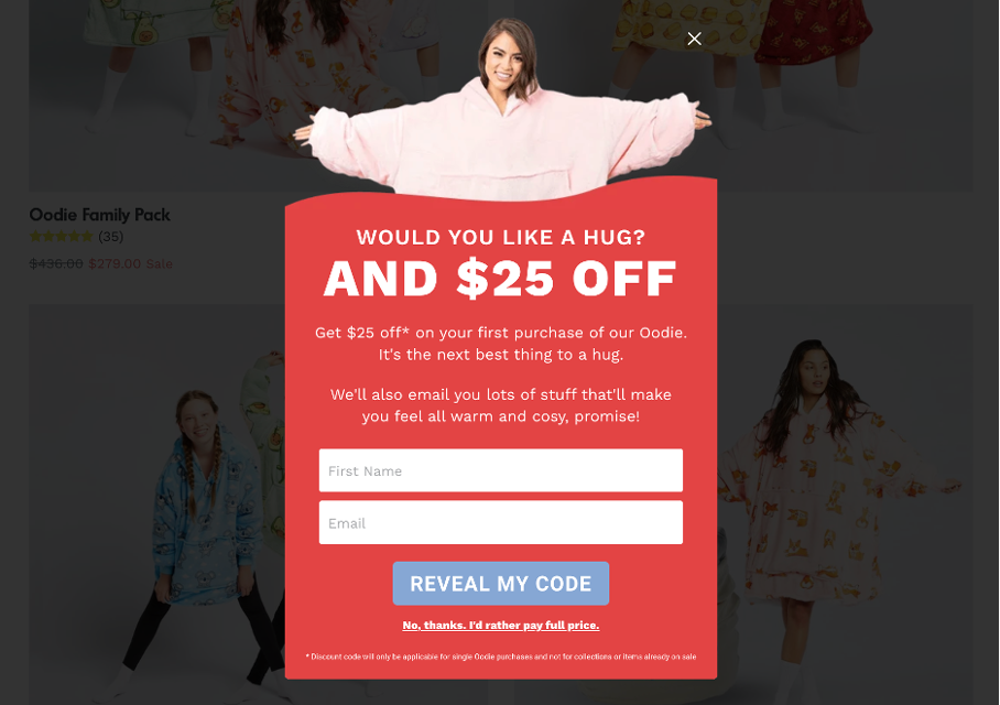
The Oodie’s pop-up is a great example of how to use emotions. The pop-up grabs attention with a question: “Would you like a hug?” and offers an amazing discount as an incentive.
But what sets this pop-up apart is its reassurance about what kind of emails they will send, addressing one of the main concerns people have about subscribing.
This example shows that by addressing potential objections head-on, you can increase trust, lower bounce rates, and encourage new leads to subscribe.
4. Coconut Cloud
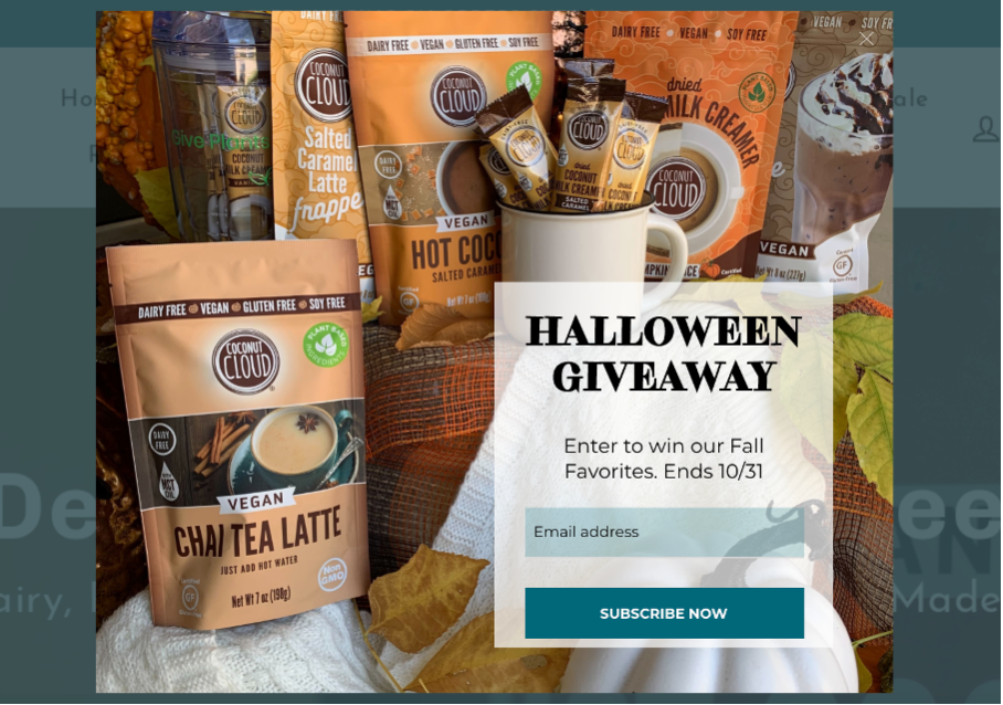
Coconut Cloud’s pop-up is all about creating a sense of urgency with a Halloween giveaway. The pop-up offers a limited-time discount which creates a sense of FOMO, encouraging visitors to subscribe before the offer runs out.
Coconut Cloud’s pop-up is a perfect example of how time-sensitive offers can boost subscriptions. By making visitors feel that they’re about to miss out on a great deal, Coconut Cloud successfully motivates them to take immediate action.
5. Earthlove
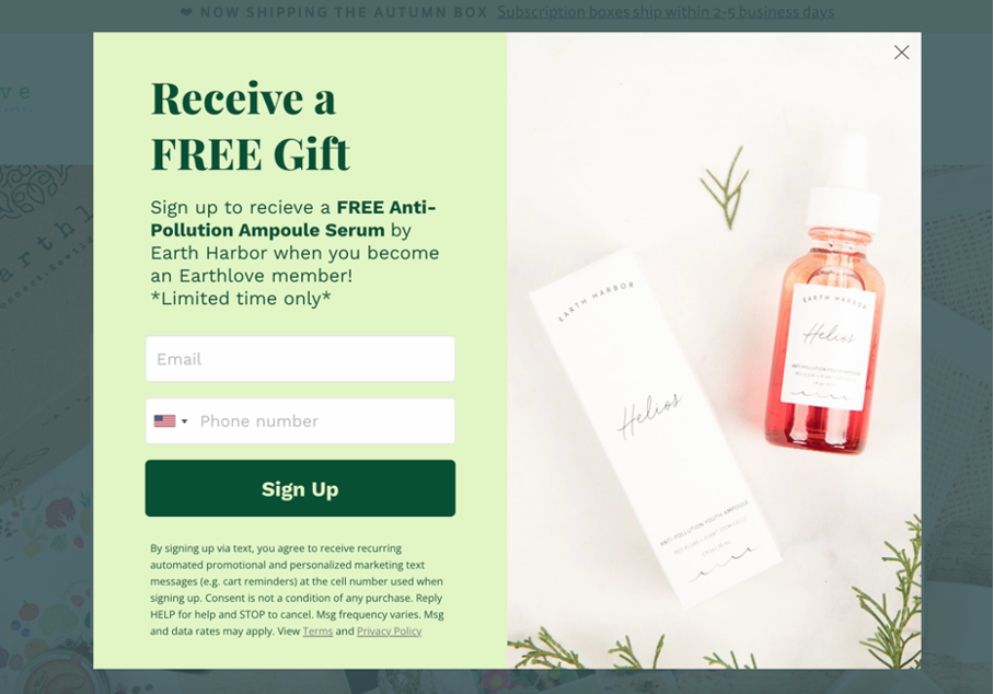
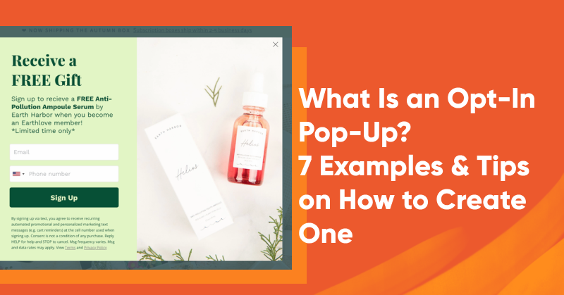
Earthlove’s pop-up is all about a great deal: a free gift. It helps visitors learn more about their product and creates a sense of urgency by saying it’s only available for a short time.
Earthlove cleverly asks for both email addresses and phone numbers at the same time, making it easy for people to share their info. This way, they can stay connected with a wide range of people who are interested in what they have to offer.
6. The Turmeric Co.
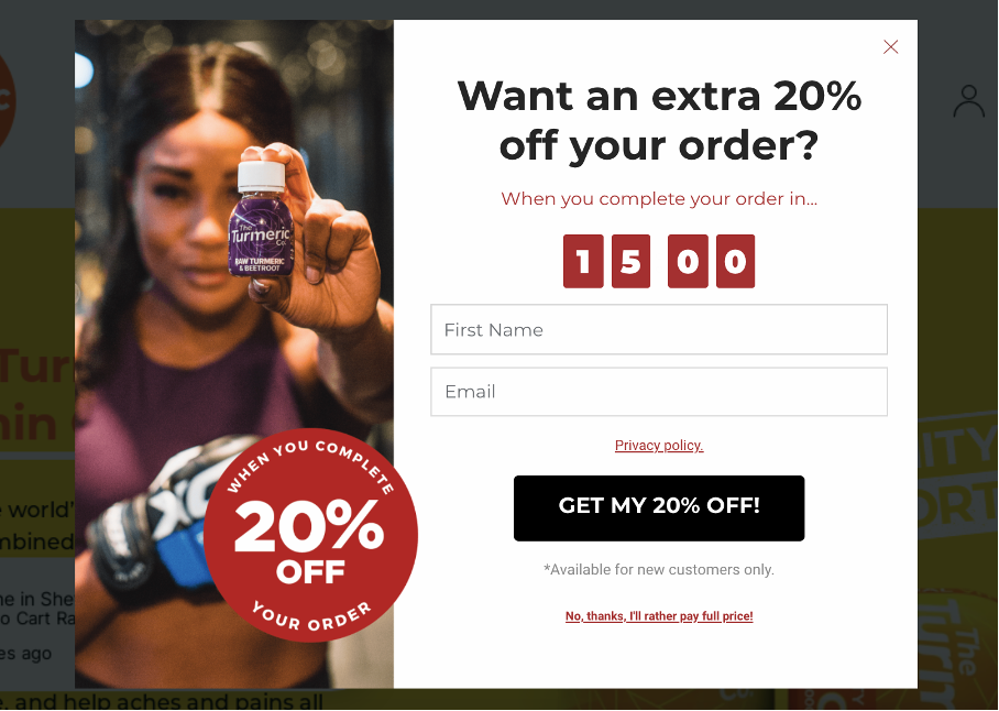
The Turmeric Co. uses an exit-intent trigger to capture cart abandoners on their site, aiming to increase sales.
Just as a visitor is about to leave the site by closing their browser window, the exit intent pop-up appears, offering a discount and a reason to stay longer.
By displaying the pop-up at a critical moment, The Turmeric Co. successfully captures the visitor’s attention and encourages them to subscribe. This instance shows that with well-timed interventions, you can convert abandoning visitors into subscribers and potential customers.
7. Obvi
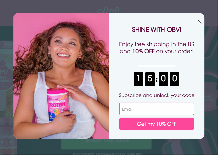
Our final example, Obvi, showcases a combination of effective strategies. The pop-up features visually appealing design, a clear call-to-action, and a generous discount, effectively engaging visitors and encouraging them to subscribe.
Obvi’s pop-up also uses a countdown timer to enhance its credibility and add a sense of urgency, customizing the experience and catering to web traffic at both the top of the funnel and those ready to make a purchase.
FAQ
What is the difference between a landing page and a pop-up?
Landing pages featuring lead magnets provide substantial value and are designed with a single objective in mind: converting visitors.
Popups, on the other hand, appear as overlays on top of a website and can appear intrusive and bothersome to certain visitors. Opting for landing pages allows you to provide value and achieve higher conversion rates.
What is the difference between embedded forms and pop-ups?
When it comes to forms, pop-ups can grab attention but might be seen as intrusive, while embedded forms blend seamlessly with the website but can often be overlooked.
A popup has only one chance to grab attention, while embedded forms stay on the page for users to view repeatedly. This makes embedded forms a good option for announcing new features.
How to create opt-in popups?
If you find yourself inspired to craft your very first opt-in popup, it’s crucial to choose the right tool. OptiMonk offers a user-friendly experience—and signing up is free!
Delve into our extensive collection of 300+ templates, and with the help of our intuitive drag-and-drop editor, you can seamlessly bring your vision to life by creating a personalized and effective opt-in popup.
Wrapping up
Opt-in popups are more than just a tool to capture email addresses. They’re a powerful asset in your digital marketing arsenal.
Crafting a crystal-clear message and using sleek, on-brand design is key to catching your visitors’ attention and turning them into subscribers.
Each of the seven businesses we explored in this article has used these tactics to their advantage, creating successful opt-in popups that have boosted their subscriptions. So, whether you’re just getting started or spicing up your strategy, these examples are a treasure trove of inspiration.
Just keep a few simple tips in mind: understand your audience, deliver value, and make that subscription process silky smooth.
Get started with OptiMonk for free today, and happy crafting!
