- Blog
- How to Create A Sales Popup (With Templates & Examples)
How to Create A Sales Popup (With Templates & Examples)
-
Barbara Bartucz
- Conversion
- 6 min read
Table of Contents
You’ve probably seen sales popups in action—they grab your attention and offer a deal, and sometimes, they’re hard to resist. But when it comes to creating one for your own site, it can feel a bit tricky.
How do you make sure it’s effective without being annoying?
In this article, we’ll walk you through exactly how to create a sales popup that looks great and boosts your conversions.
Ready to dive in? Let’s get started!
What is a sales popup?
A sales popup is an overlay that appears on a website to promote an offer, discount, or product. It’s designed to engage visitors at the perfect moment—like when they’re about to leave or after they’ve been browsing for a while.
Unlike generic ads, these popups are interactive and work by prompting action, whether it’s making a purchase or subscribing to a newsletter.
How to create a sales popup in just a few minutes?
Ready to create a high-performing sales pop-up? Let’s break it down step by step.
Step 1: Choose a template
OptiMonk is a great app that offers a wide range of fully customizable templates, which means you can pick one that’s perfect for your goals and personalize it to align with your brand’s aesthetic.
Whether you’re going for something sleek and modern or bold and colorful, there’s a template for you. Templates save time and provide a solid foundation to build on.
Step 2: Customize your design and copy
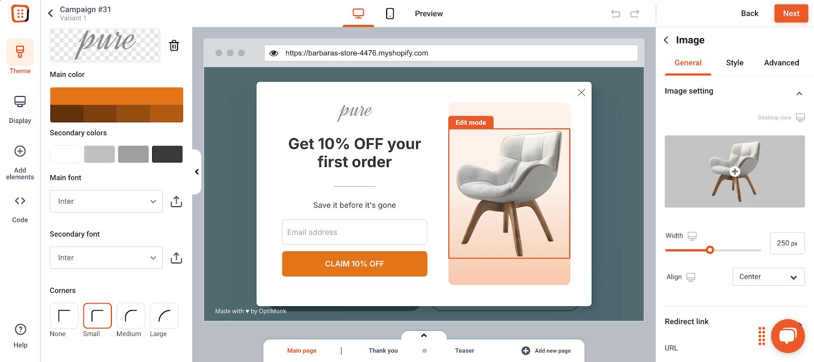
Once you’ve chosen a template, it’s time to make it your own. Use OptiMonk’s drag-and-drop editor to change the colors, images, fonts, and layout so everything matches your brand.
Consistency is key here—your popup should feel like a natural extension of your site, not a random interruption.
Next, work on the copy. Keep it short, clear, and focused on your offer. Every word matters, so make sure you communicate value quickly.
Step 3: Set triggering and targeting rules
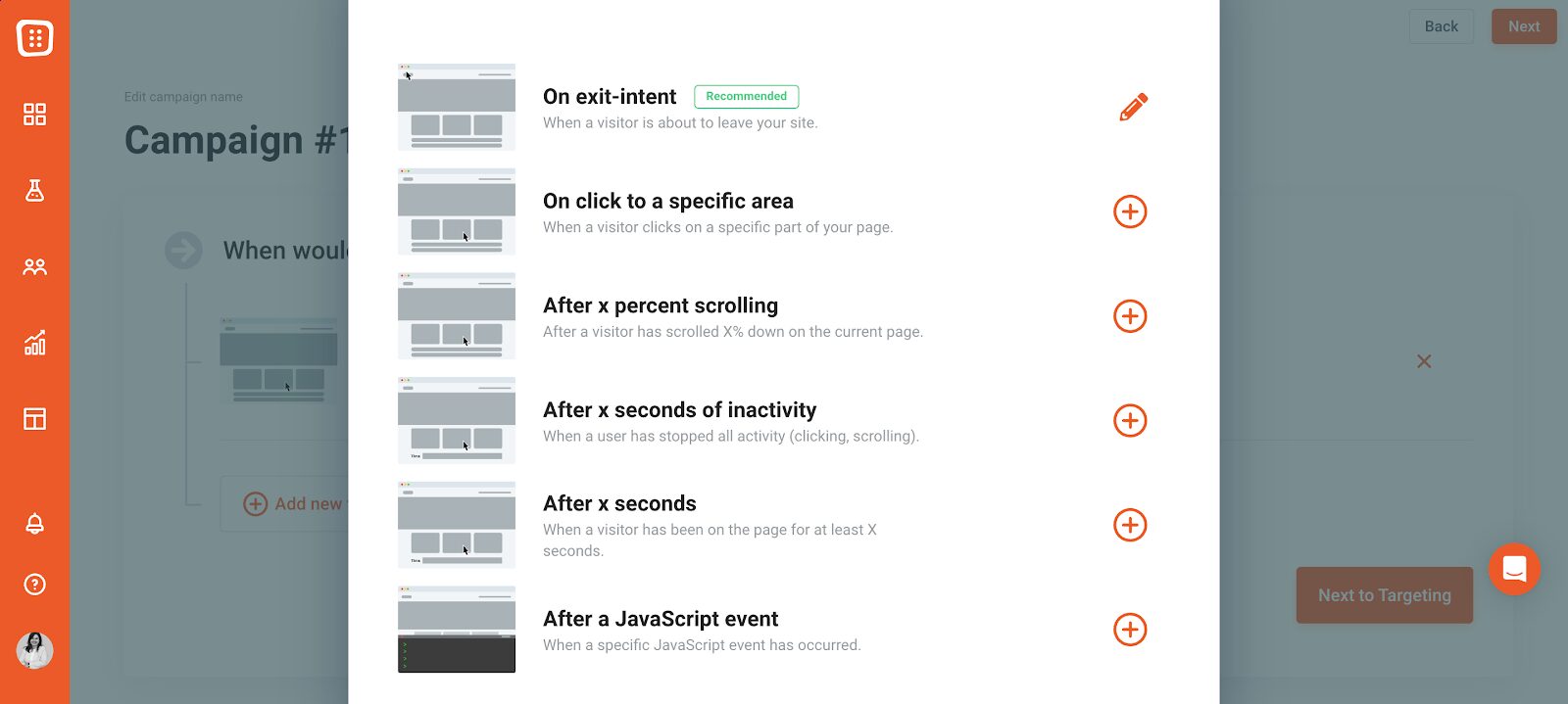
A popup is only effective if it appears at the right time. Set up rules to control when the popup appears and who will see it.
You can target new visitors, returning customers, or even people who are about to leave.
Targeting new store visitors with personalized messages can help establish trust and encourage them to make a purchase.
Step 4: Set up integrations
If you’re collecting emails or customer information, make sure to connect your popup with your CRM or email marketing platform. This ensures that you can easily follow up with leads or segment new subscribers for targeted email campaigns.
Step 5: Publish
Before hitting publish, preview your popup to ensure everything looks perfect. A well-optimized popup will drive more sales and increase your overall revenue.
Once you’re happy, go live and monitor your popup’s performance. Look at metrics like conversion rate and click-through rate to gauge it’s effectiveness.
Key elements of high-converting sales popups to increase sales
Now that you know how to create a sales pop-up, let’s dive into the elements that make it truly effective.
1. Clear, compelling headline
Your headline is your first chance to grab attention, so make it count. A great headline is direct, benefit-driven, and specific. Think about what you’re offering and why it matters. Instead of saying, “Welcome to our site,” try something like, “Unlock 10% Off—Just for You.”
Tips for writing effective headlines:
- Use action words (e.g. “Get,” “Claim,” or “Unlock”).
- Be specific about the benefit (e.g. “20% Off”).
- Keep it short and punchy—ideally under 10 words.
2. Concise and persuasive copy
Once you’ve got their attention, keep it with persuasive copy that highlights your offer’s value. Every word should work hard, as visitors often skim popups. Focus on the benefit and create urgency without overhyping.
How to balance urgency and clarity:
- Emphasize the benefit early on.
- Use urgency phrases like “limited-time offer,” but avoid sounding too pushy.
3. Eye-catching design
The design isn’t just about aesthetics—it’s about guiding the user’s eyes toward the most important elements. Use visual hierarchy to lead visitors from the headline to the call-to-action (CTA).
Visual hierarchy tips:
- Make your headline the most prominent element.
- Use a contrasting color for the CTA button to make it stand out.
- Consider including relevant images that support your message.
4. Irresistible offer with social proof
Your offer is the centerpiece of the popup. Whether it’s a discount, a free gift, or an exclusive deal, it needs to be compelling enough for users to take action.
Displaying recent purchases creates urgency and functions as social proof. This encourages visitors to take advantage of the offer.
Popular offers that drive conversions:
- Percentage discounts (e.g. “20% Off Today”)
- Free shipping
- Buy-one-get-one-free deals
- Free gifts with purchase
5. Strong call-to-action (CTA)
The CTA is the final step that pushes users to act. It should be clear, concise, and action-oriented. Use strong verbs and make sure users know exactly what they’ll get when they click.
Examples of effective CTAs:
- “Claim Your Discount”
- “Get My Free Gift”
- “Shop Now and Save”
- “Join Now for Free”
6 sales pop-up examples to inspire you
Need some real-world examples to spark your creativity? Here are six sales popups that hit the mark:
1. Nexus Nutrition
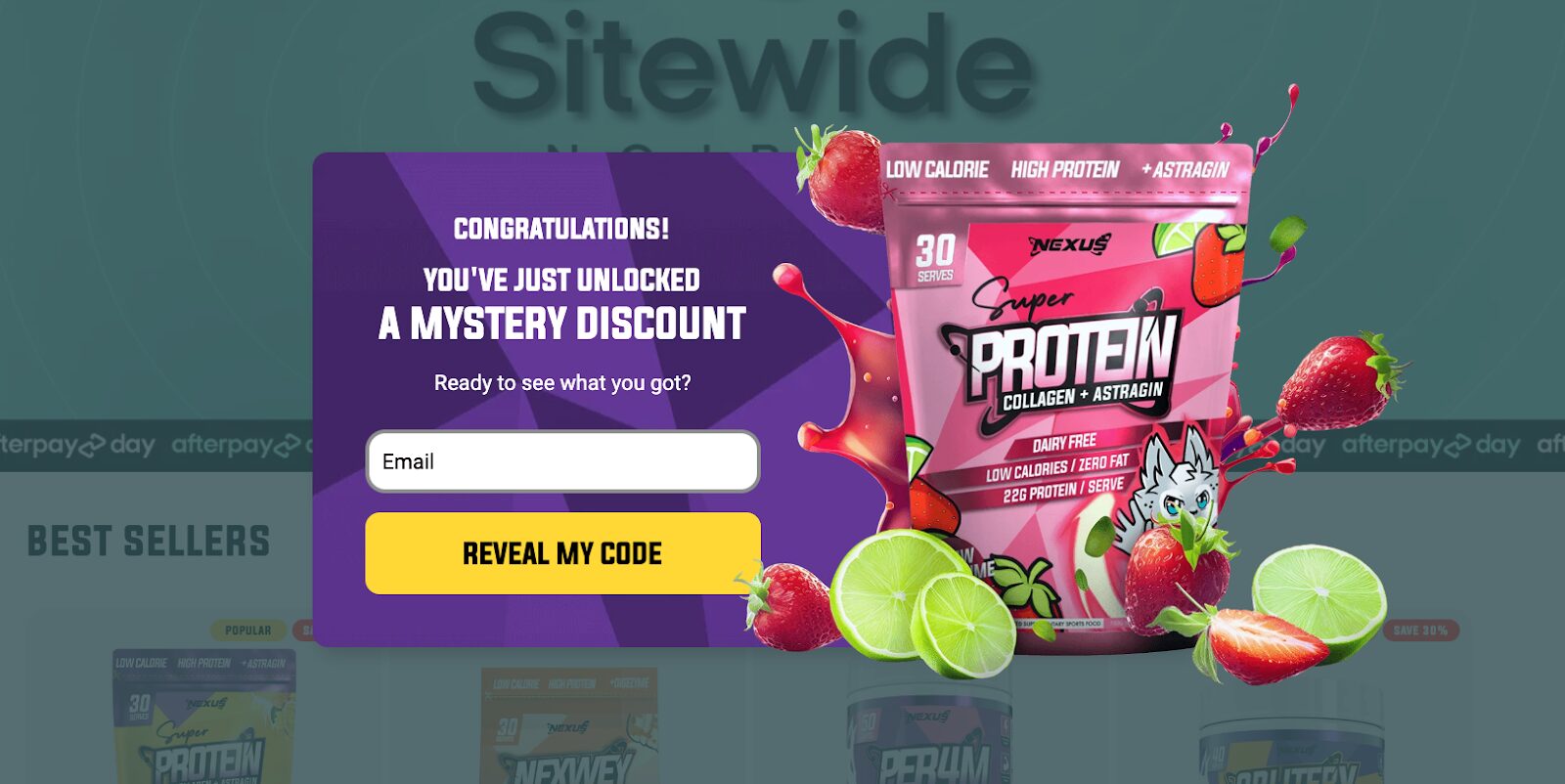
Nexus Nutrition’s mystery discount popup is a conversion powerhouse. Instead of a standard offer, it teases a surprise discount, which piques curiosity and triggers engagement better than a typical deal.
2. OYO Skincare
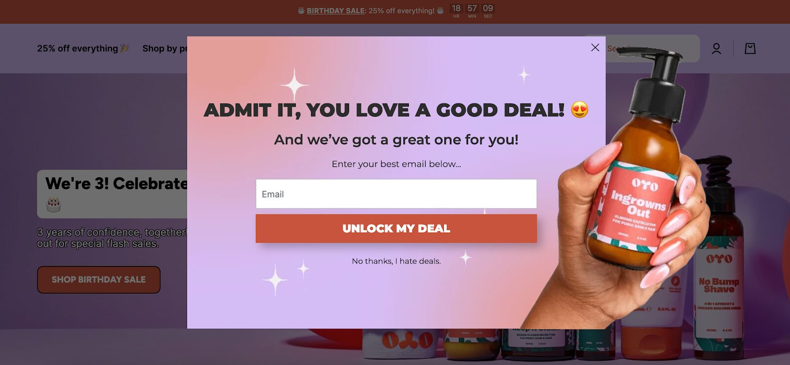
OYO Skincare hooks new visitors with a hidden offer, which is revealed only after opting in. The clever copy includes a playful “No thanks, I hate deals” opt-out message, making users think, “Who actually hates deals?”
3. Sassy Scents
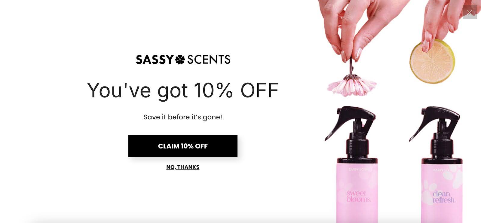
Sassy Scents goes all-in with a fullscreen sales popup that’s hard to ignore. The headline, “Save it before it’s gone,” plays perfectly on FOMO (fear of missing out), nudging visitors to act fast.
4. Vegetology
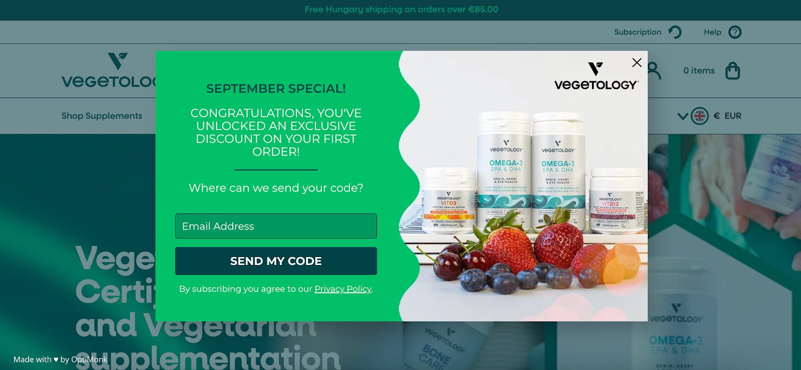
Vegetology ramps up the urgency with their limited-time September discount popup. A clear, time-sensitive offer can create urgency, prompting visitors to take advantage of the deal before it’s too late.
5. Urban Outfitters
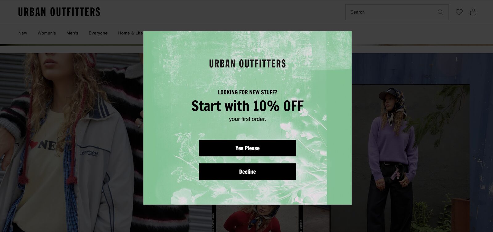
Urban Outfitters pulls visitors in with a simple yes/no question. This low-commitment first step is an easy way to engage users and guide them smoothly through the customer journey.
This type of multi-step popup usually has a better conversion rate than single-step popups.
6. Millie n Me
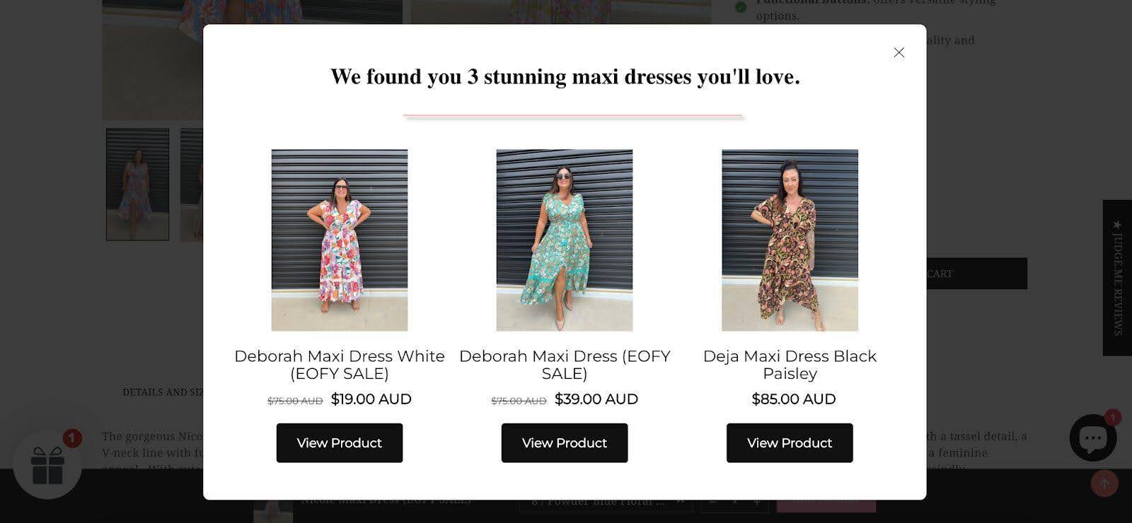
Millie n Me’s product recommendation popup is all about personalization. It suggests tailored products for visitors based on the their browsing behavior, making the experience feel customized. This helps increase the average conversion rate.
Wrapping up
Creating a high-converting sales pop-up is about more than just slapping a message on your landing page. It’s about timing, design, and a well-crafted offer.
By following these steps and taking inspiration from successful examples, you can create a popup that engages visitors and drives conversions.
Remember, it’s all about delivering value at the right moment—so get creative and start experimenting to discover what works best for your audience.
Ready to take your popups to the next level? Create your free OptiMonk account today and start building high-converting sales popups in minutes!
Migration has never been easier
We made switching a no-brainer with our free, white-glove onboarding service so you can get started in the blink of an eye.
What should you do next?
Thanks for reading till the end. Here are 4 ways we can help you grow your business:
Boost conversions with proven use cases
Explore our Use Case Library, filled with actionable personalization examples and step-by-step guides to unlock your website's full potential. Check out Use Case Library
Create a free OptiMonk account
Create a free OptiMonk account and easily get started with popups and conversion rate optimization. Get OptiMonk free
Get advice from a CRO expert
Schedule a personalized discovery call with one of our experts to explore how OptiMonk can help you grow your business. Book a demo
Join our weekly newsletter
Real CRO insights & marketing tips. No fluff. Straight to your inbox. Subscribe now
Barbara Bartucz
- Posted in
- Conversion
Partner with us
- © OptiMonk. All rights reserved!
- Terms of Use
- Privacy Policy
- Cookie Policy
Product updates: January Release 2025

