- Blog
- 10 Newsletter Sign-Up Examples That Drive Results: Learn What Works
10 Newsletter Sign-Up Examples That Drive Results: Learn What Works
-
Barbara Bartucz
- Conversion
- 6 min read
Table of Contents
Have you ever put together a newsletter sign-up form that looks great but just doesn’t get the results you expected? We know the struggle.
But what makes a newsletter signup form not just aesthetic but also practical?
The truth is that creating an effective sign-up form is both an art and a science. We’re here to show you both.
Let’s get down to it!
Why should you collect email addresses from website visitors?
Email marketing is dead. You’ve probably heard that before, right?
Well, it is most certainly not.
Simply put, email marketing remains one of the most effective ways to nurture leads and boost sales.
In fact, email has an average ROI of 4,200%, meaning that for every dollar you spend, you could see a $42 return. That’s not something you want to miss out on!
Collecting email addresses through an effective mailing list signup form establishes a direct line of communication with your audience. You can send updates, promotions, and personalized content that keeps them engaged and coming back for more.
Plus, unlike your social media following (which is at the mercy of ever-changing algorithms), an email list is yours. You control it.
Key elements of an effective newsletter signup form
What makes an email newsletter signup form successful? It’s all about design, messaging, and value.
Let’s break down the key elements that transform casual website visitors into loyal email subscribers.
1. Attention-grabbing headlines
Your headline is the first thing visitors see, so make it count. A great headline piques curiosity and highlights the value of signing up. Instead of a generic “Sign up for our newsletter,” try something like “Get Exclusive Deals and Updates Straight to Your Inbox!” People need to know why they should care.
Additionally, a great signup form that is simple, personalized, and presents a clear offer can significantly enhance user experience and boost engagement.
2. Clear, concise copy
The copy used on your email signup forms should be short and straightforward. People should instantly understand what they’re signing up for and what benefits they’ll receive. This clarity is crucial for reducing hesitation and increasing conversions.
3. Strong call-to-action (CTA)
The CTA is the heart of your form. It’s what gets visitors to take action. A well-crafted CTA should be actionable, benefit-driven, and strategically placed. Instead of a bland “Submit,” use something like “Get 15% Off” or “Join the Club.”
4. Visual appeal
First impressions matter. A visually appealing sign-up form grabs attention and holds it. The design, from color schemes to font choices, should be cohesive with your brand while remaining user-friendly. If your form is cluttered or poorly designed, people simply won’t bother with it.
5. Minimal fields for maximum sign-ups
The more fields you ask visitors to fill out, the higher the chance they’ll abandon the form. Keep it simple—most of the time, you only need an email address. Once they’re on your list, you can always ask for more information later.
6. Optimize for mobile users
With over 81% of people checking emails on their smartphones, optimizing your newsletter sign-up form for mobile is essential. Mobile users often have limited attention spans and expect seamless experiences.
If your email signup form is clunky or slow to load on mobile, potential subscribers will likely abandon it. By optimizing for mobile, you’ll be catering to a massive chunk of your audience and increasing the likelihood of conversions.
10 successful newsletter signup forms to inspire you
Got the basics? Ok! Time to move onto some great newsletter signup examples that drive results.
1. Urban Outfitters
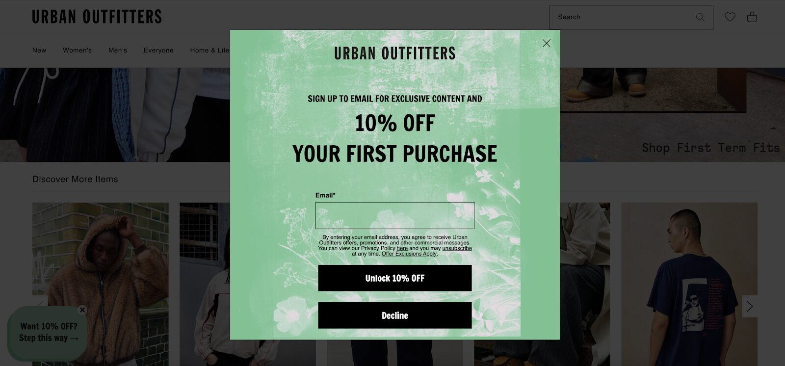
The Urban Outfitters newsletter signup form nails simplicity with a low-commitment approach. Their signup form gives visitors a simple Yes/No choice, which removes decision fatigue.
The less you ask upfront, the more likely people are to engage, and this strategy pays off with higher conversion rates. It’s all about making the process as frictionless as possible.
2. Alo Yoga
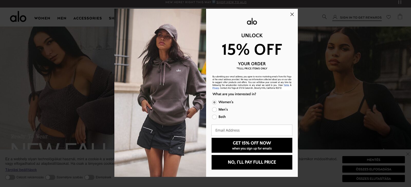
Alo Yoga takes personalization to the next level on their email signup form by asking users what they’re interested in immediately. This not only segments their audience but also helps deliver targeted content based on user preferences.
This signup form example shows how aligning sign up forms with personalized marketing efforts can boost engagement and conversions over time.
3. Athletic Brewing Co.
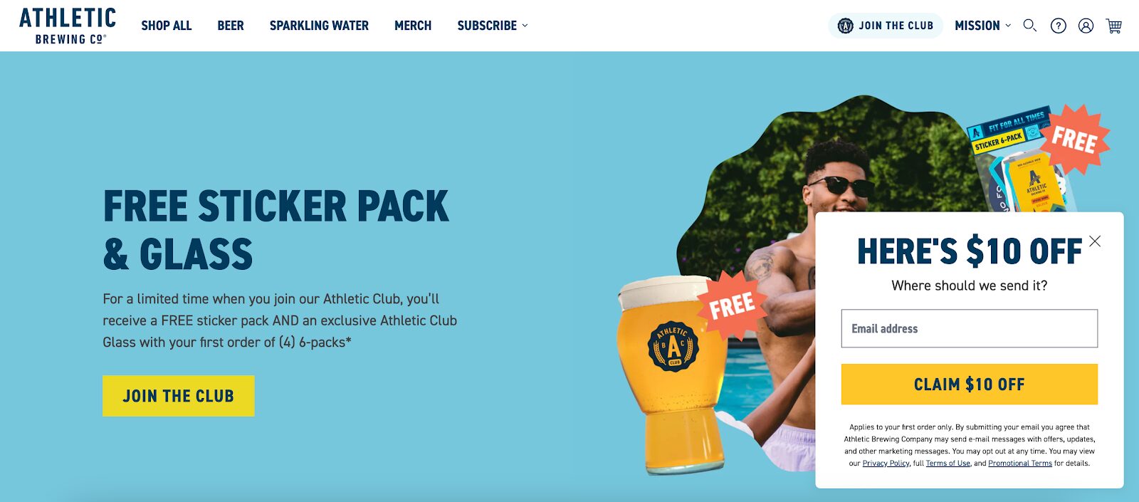
Athletic Brewing Co. goes for a subtle approach with a sidemessage sign-up form.
Instead of interrupting the browsing experience, the newsletter signup form stays at the right side of the home page. The offer—“Here’s $10 Off”—is clear, concise, and attention-grabbing without being too intrusive.
This kind of placement ensures visitors can sign up whenever they’re ready, without feeling pressured.
4. Lululemon
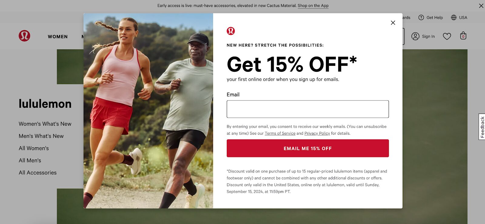
Lululemon’s signup form stands out with the strong value proposition in its CTA button: “Email Me 15% Off.” It’s direct and leaves no room for confusion about what you’ll get when you sign up.
This kind of bold, benefit-driven CTA taps into people’s desire for instant gratification and drives impressive conversion rates.
5. Béis Travel
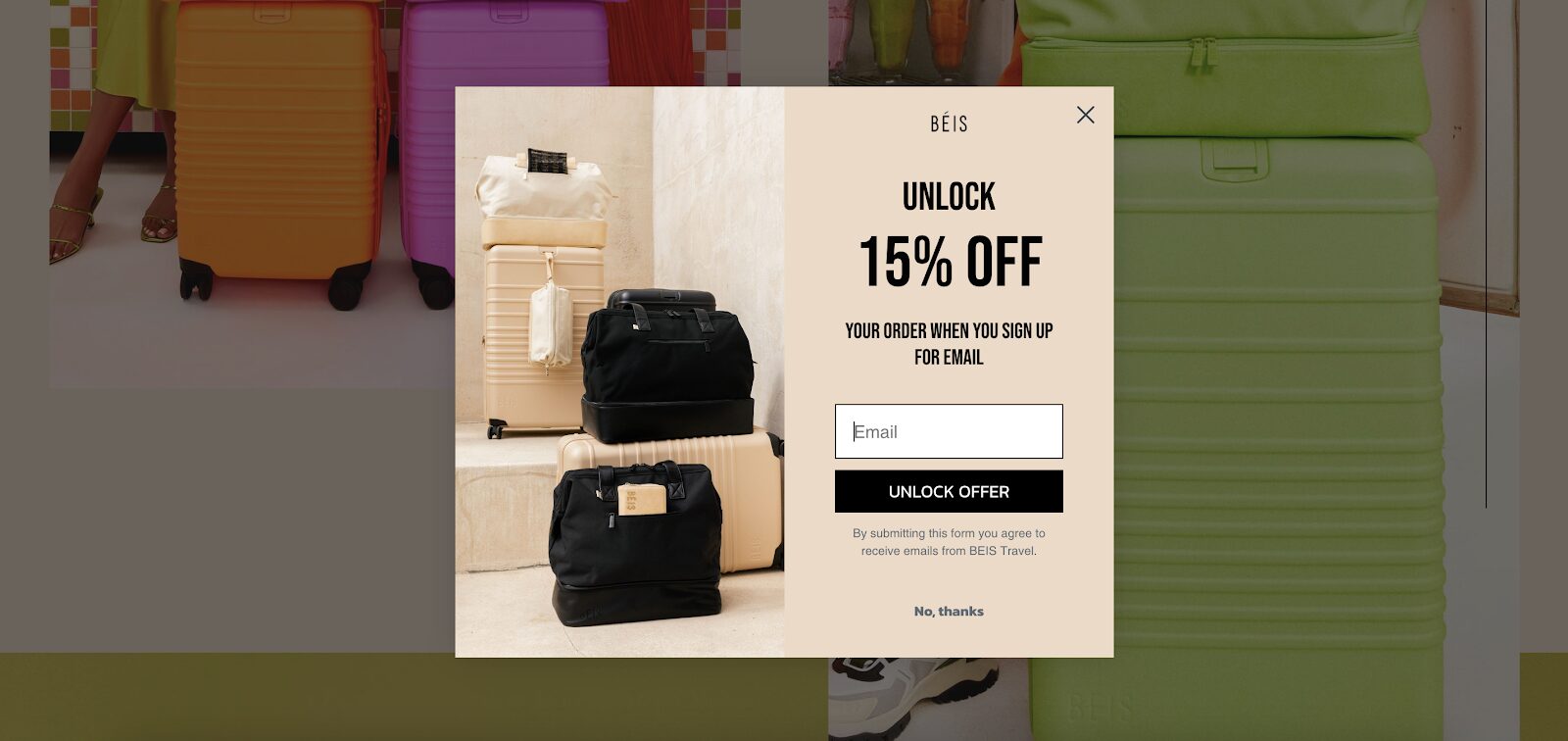
This Béis Travel signup form example shows the power of visuals. It features a sleek product image alongside simple copy. This combination not only catches the visitor’s eye but also subtly reinforces the brand’s identity and product offerings.
It’s a smart way to use aesthetics while keeping the focus on conversions.
6. Bubble Skincare
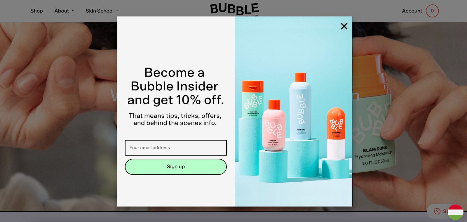
Bubble Skincare knows how to make landing page visitors feel special with their newsletter signup form.
It positions users as “insiders,” offering exclusive content and behind-the-scenes access. This builds a sense of belonging, which can be a powerful motivator for visitors to hand over their email address.
Plus, people who feel like they’re getting VIP treatment are more likely to stick around.
7. Caraway
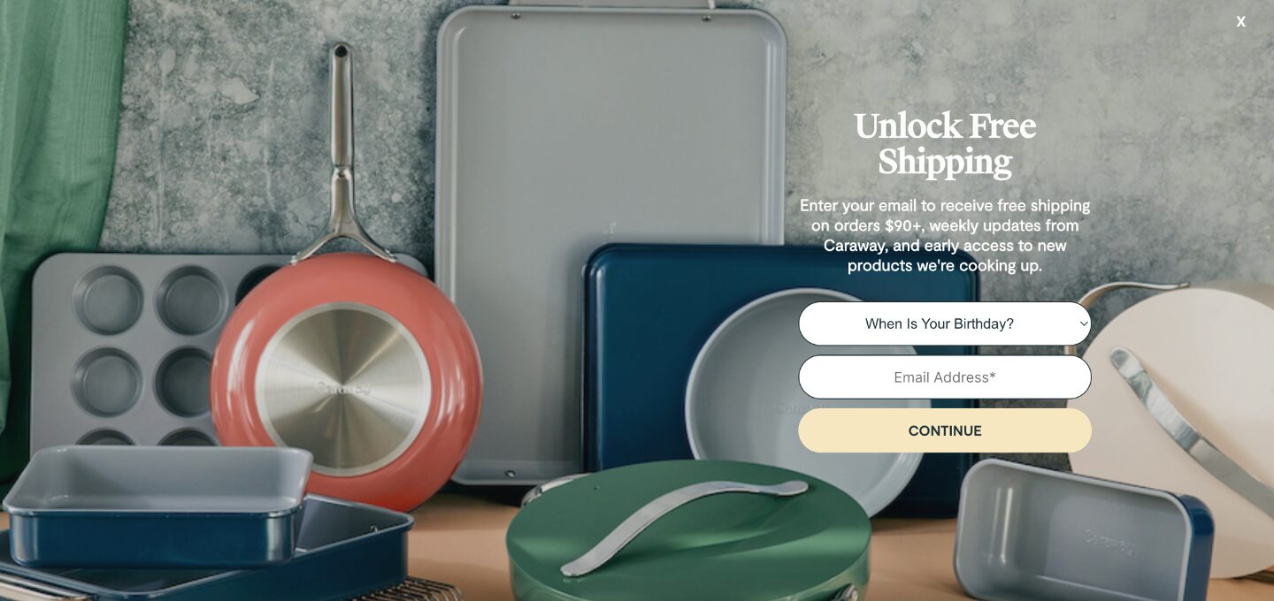
Caraway doesn’t leave any room for visitors to miss their newsletter form—it takes up the entire screen, like a mini landing page.
While this approach might seem aggressive, they balance it with a high-value offer: free shipping. The incentive is significant enough to make people stop and think, “Why not?”
This newsletter signup example shows how solid visuals and a tempting deal make for an effective fullscreen popup.
8. Glossier
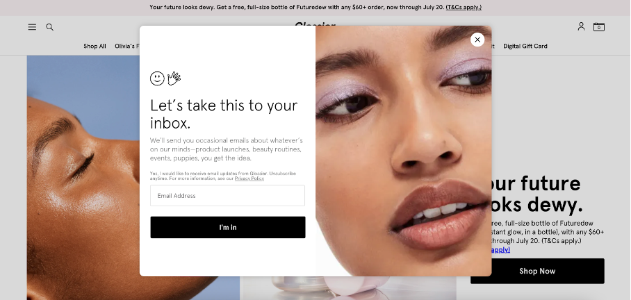
Glossier’s signup form reflects the brand’s personality: fun, friendly, and approachable. They offer early access to product launches, beauty routines, and events, which aligns perfectly with their community-driven ethos.
Glossier’s conversational tone and appealing perks create a sign-up form that feels less like marketing and more like joining a cool club.
9. Vegetology
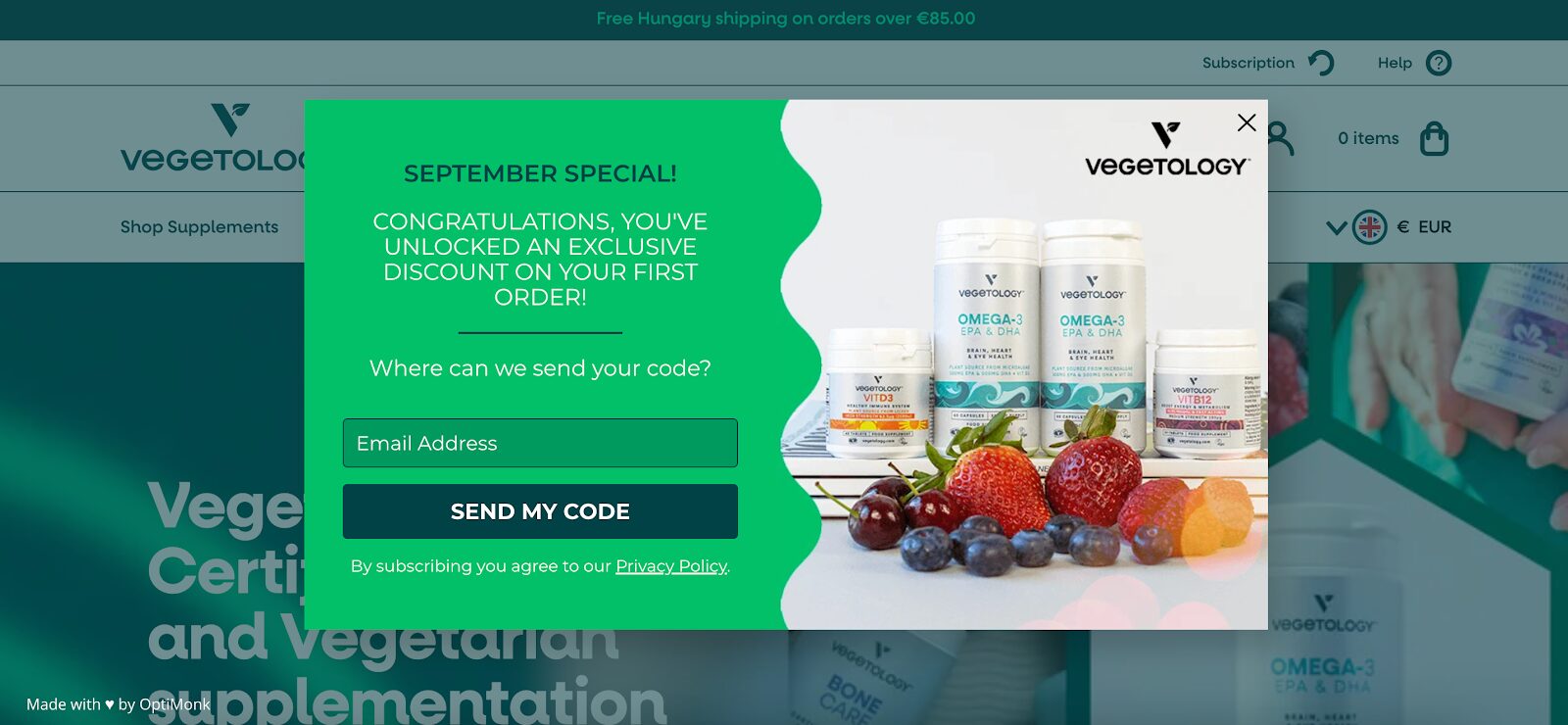
Vegetology uses a time-sensitive offer to drive urgency on their newsletter signup form. Their limited-time ”September special” encourages visitors to act fast, using the psychological principle of FOMO (fear of missing out).
This tactic is a great way to nudge hesitant visitors toward action, especially if they’re on the fence about signing up.
10. Nexus Nutrition
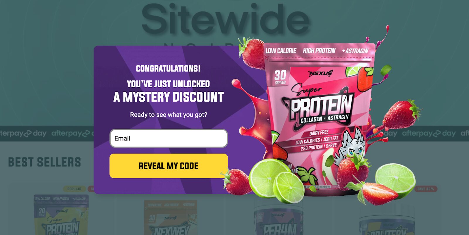
Nexus Nutrition has another great newsletter signup form. It taps into curiosity with a mystery discount.
Their “Reveal My Code” CTA is irresistible because it plays on the human desire to know what’s behind the curtain. This clever use of a psychological trigger encourages visitors to sign up simply because they can’t resist finding out what their deal will be.
FAQ
What is a newsletter signup form?
A newsletter sign-up form, also known as a mailing list signup form, is a digital form on your website that allows visitors to subscribe to your email marketing list. It typically asks for basic information like an email address (and sometimes additional details to help personalize future communication).
How to create a newsletter signup form?
You can create a newsletter signup popup or signup form using popup tools like OptiMonk or email marketing software like Mailchimp, HubSpot, or ConvertKit. These platforms offer customizable templates to help you design a form that fits your brand and integrates seamlessly with your website.
What is a good newsletter sign-up rate?
A good newsletter signup rate can vary by industry, but they typically range between 1% and 5%. If your newsletter subscription form rate is lower, try A/B testing different elements like headlines, CTAs, or offers to improve performance.
Wrapping up
Creating a high-converting newsletter signup form doesn’t have to be complicated. It’s all about offering value, keeping it simple, and making it visually appealing.
Use these newsletter signup examples as inspiration and start experimenting with what works best for your audience.
Ready to boost your email subscriber list? Check out our customizable sign-up popup form templates and start converting your visitors today!
Migration has never been easier
We made switching a no-brainer with our free, white-glove onboarding service so you can get started in the blink of an eye.
What should you do next?
Thanks for reading till the end. Here are 4 ways we can help you grow your business:
Boost conversions with proven use cases
Explore our Use Case Library, filled with actionable personalization examples and step-by-step guides to unlock your website's full potential. Check out Use Case Library
Create a free OptiMonk account
Create a free OptiMonk account and easily get started with popups and conversion rate optimization. Get OptiMonk free
Get advice from a CRO expert
Schedule a personalized discovery call with one of our experts to explore how OptiMonk can help you grow your business. Book a demo
Join our weekly newsletter
Real CRO insights & marketing tips. No fluff. Straight to your inbox. Subscribe now
Barbara Bartucz
- Posted in
- Conversion
Partner with us
- © OptiMonk. All rights reserved!
- Terms of Use
- Privacy Policy
- Cookie Policy
Product updates: January Release 2025
