- Blog
- How to Increase Mobile Conversion Rate: 17 Proven Tips
How to Increase Mobile Conversion Rate: 17 Proven Tips

 Chatgpt
 Perplexity
Table of Contents
Whether we like to admit it or not, our phones have become an extension of ourselves. We do everything from banking to paying for parking on our phones… and shopping online is definitely no exception!
That’s why it’s essential for online store owners to think about the mobile experience and optimize their mobile conversion rate. Mobile shoppers are now used to seeing responsive websites with optimized images and fast loading times. You really need to do the most you can to take advantage of that limited screen space!
In this article, we’re going to discover the best way to reach your mobile audience and cover 17 tips and best practices for increasing your mobile conversion rates.
Let’s do it!
What is the mobile conversion rate?
The mobile conversion rate is the percentage of visitors who complete a desired action, such as making a purchase, signing up for a newsletter, or filling out a form, on a mobile website or mobile app.
You calculate your mobile conversion rate by dividing the number of conversions (on mobile) by the total number of impressions, and then multiplying by 100. This tells you the percentage of mobile users who converted after seeing your page and offer.
The mobile conversion rate measures the effectiveness of your website’s mobile user experience. If you’re able to read your mobile analytics well, you can convert your visitors from casual browsers into engaged users and customers.
Why is mobile conversion rate optimization important?
Mobile conversion optimization can lead to more sales and a more profitable online store.
It’s essential for engaging a wider audience and driving more actions, ensuring a seamless experience that boosts user satisfaction and helps your business grow. By optimizing your mobile website, you’re making the most out of the traffic you already have, meaning you’re gaining a better ROI on the campaigns that brought them there.
Most mobile sites provide a decent experience, but taking it up a notch can convince lots of potential customers to make a purchase right then and there.
How to increase your mobile conversion rate?
Now, let’s break down the process of increasing the mobile conversion rate on your website.
1. Make CTA buttons easily clickable (with thumbs)
While it’s easy for desktop users to click on relatively small buttons, the limitations of interacting with a mobile screen mean that your CTAs should be easy to locate and easy to click with a thumb.
Make sure to use contrasting colors, concise text, and strategically placed CTAs where they are easily accessible on smaller screens. Of course, you should also make sure they’re large enough to see without any trouble.
2. Optimize your website’s speed
Page speed and higher conversion rates are tightly linked, since faster loading pages keep users more engaged. On mobile devices, people simply won’t wait around for a slow website to load.
Page speed also affects where your mobile ecommerce store appears in search rankings, since engines like Google and Bing take overall site speed and bounce rate into account when providing results to users.
You can use online tools to see where you need to improve and take simple steps to boost how fast your ecommerce site runs on a mobile device.
3. Compress images
Images account for about 60% of your site’s load time. Large images can significantly slow down loading time.
You should definitely prioritize compressing images if you’re trying to boost mobile site speed. Optimization tools like TinyPng and Easy-Resize offer free image compression on their websites, making it easy to take this step.
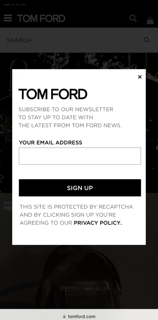
4. Use mobile-friendly popups
Using popups that have been optimized for mobile screens is one of the best ways to increase mobile conversions. They can direct your mobile visitors’ attention towards key information and ensure that they see your call-to-action.
Popup and CRO tools like OptiMonk can help you create mobile responsive popups that display social proof, on-page product recommendations, and discount offers.
Here’s a great example of a nonintrusive mobile popup from Tom Ford designed to collect newsletter subscribers.
5. Break your forms into multiple steps
Another important conversion strategy on mobile sites is simplifying forms by breaking them into multiple steps and keeping form fields to a minimum. If you don’t create forms specifically for your mobile site, filling them out on mobile devices can end up being a real headache for your website visitors.
Ensuring that your mobile forms don’t have too many fields will prevent your visitors from feeling overwhelmed. But remember, if you design your form well, they won’t mind giving a little extra info!
It’s especially important to avoid complicating the checkout process, since a mobile user has to be able to easily complete their purchase.


6. Offer a personalized experience
Tailoring offers and promotions to specific visitors based on factors like user behavior and demographics is a great way to boost the conversion rate on your mobile websites.
A website personalization tool like OptiMonk can help you make the most of user data by providing personalized recommendations and content. When everything a customer sees on a web page resonates with their individual preferences, they’ll be more likely to complete both micro conversions and purchases.
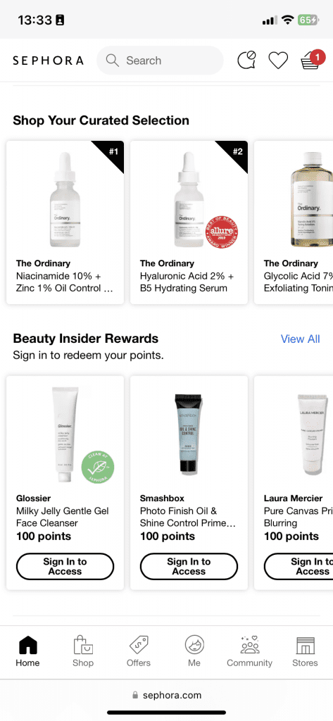
Sephora uses personalization based on browsing history to adapt their mobile site to online shoppers.
7. Include product videos

Video can be an excellent way to connect with your target customers. You can embed short, engaging product videos that showcase features, benefits, and usage scenarios on your mobile site.
Videos can both capture user attention and convey information effectively, meaning that when a visitor lands on your site, a mobile friendly video has a good chance of convincing them to make a purchase.
Kylie Cosmetics uses product videos to show visitors how to use their products.
8. Offer mobile-specific content
Some online stores create content specifically for mobile users by ensuring all text is concise, scannable, and engaging. You can also create mobile phone-focused visuals instead of just adapting whatever you use for your desktop site to your mobile pages.
Finally, you can take advantage of the mobile apps that your visitors already have by suggesting they use features like click to call or location-based services.
9. Focus on mobile SEO
People tend to use Google search differently on their phones and on their computers. When mobile users are out and about, they often seek practical information about nearby businesses.
If you optimize your mobile site for local search by using relevant keywords, schema markup, and location-based information, you’ll see a lot more mobile traffic arrive at your site.
10. Implement auto-complete
Auto-complete search functionality is very important to the mobile experience because typing takes more effort on a phone than on a keyboard. That’s why you should enable auto-complete and predictive search functionalities in your site’s search bar, helping users find products or content quickly.
In the example above, Sephora’s search bar helps users with auto-complete.
11. Integrate digital wallets
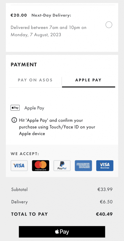
If you’re trying to convince users on mobile to make purchases, you need to offer at least one e-wallet payment method—but the more the merrier!
Digital wallets such as Apple Pay, Android Pay, or PayPal are incredibly popular and offer seamless and secure mobile payments.
Asos supports e-wallet payment methods like Apple Pay and PayPal to simplify mobile checkout as much as possible.
12. Load above-the-fold content first
Prioritize loading above-the-fold content, including key visuals, CTAs, and essential information, before loading other elements. This will make your site feel like it’s loading more quickly and improve the user experience.
13. Be strategic with visual hierarchy
Create a clear visual hierarchy that guides users through your content. Headings, subheadings, bullet points, and whitespace can help break up text and make it easy to scan on smaller screens.
A key page on your mobile site should never cause confusion or overwhelm your users, otherwise you’ll lose out on valuable conversions.
14. Optimize for mobile search
Another important search trend on mobile that’s relevant to conversion rate optimization? The rise of voice assistants.
The popularity of voice search means that you need to optimize your mobile site for spoken queries by using natural language in your content. You should also consider creating FAQ sections in your blog posts to address common voice search queries.
15. Don’t forget location-based targeting
Utilize geolocation features to provide relevant content, offers, and recommendations based on a user’s location. If a user is located in a particular country like Hungary, for example, let them know what your Hungarian shipping policies are.
Taking steps like this can enhance user engagement and increase the likelihood of conversions on your mobile web pages.
16. Try social media integration
Social proof can help you build credibility with your first-time customers. When users who haven’t bought anything from your brand before see that other people have had positive experiences, they’re more likely to overcome their doubts and make a purchase.
Integrate social media sharing and login options to make it easy for users to share your content and products. Social proof and recommendations from friends can positively influence mobile users’ decisions.
17. Ask for feedback from mobile users
Last, but not least, you should consider asking for feedback in order to successfully conduct mobile conversion rate optimization. If you don’t ask your customers for feedback, you’ll have a difficult time knowing for sure what you need to improve on your mobile website.
Successful mobile CRO requires that you continually improve the mobile experience for your customers.
FAQ
How can you measure mobile conversion rate?
Use analytics tools like Google Analytics to track mobile traffic and conversions. Divide the number of conversions on mobile devices by the total mobile visitors and then multiply by 100 to get the conversion rate as a percentage.
What are some common barriers to mobile conversions?
Slow page loading times, complex checkout processes, unresponsive design, and poor user interface are common barriers that can hinder mobile conversions.
Final thoughts
Users interact with brands and their websites differently when they’re on mobile. If you want to increase your mobile conversion rate, you need to keep those differences in mind. As you’ve seen in this article, there are lots of small changes you can make that have a huge impact on the mobile browsing experience.
OptiMonk is an innovative CRO platform that can help you achieve mobile conversion rates you never thought possible.
Sign up for a free account today and start reaching your customers on their mobile devices!
Migration has never been easier
We made switching a no-brainer with our free, white-glove onboarding service so you can get started in the blink of an eye.

What should you do next?
Thanks for reading till the end. Here are 4 ways we can help you grow your business:
Boost conversions with proven use cases
Explore our Use Case Library, filled with actionable personalization examples and step-by-step guides to unlock your website's full potential. Check out Use Case Library
Create a free OptiMonk account
Create a free OptiMonk account and easily get started with popups and conversion rate optimization. Get OptiMonk free
Get advice from a CRO expert
Schedule a personalized discovery call with one of our experts to explore how OptiMonk can help you grow your business. Book a demo
Join our weekly newsletter
Real CRO insights & marketing tips. No fluff. Straight to your inbox. Subscribe now
Share this article
Written by

Barbara Bartucz
Barbara is a Content Marketer at OptiMonk. She takes pride in creating different forms of content, whether it’s an article, a video, or an e-book.
You may also like
- Posted in
- Conversion
Partner with us
Ask AI for a summary of OptiMonk
- © OptiMonk. All rights reserved!
- Terms of Use
- Privacy Policy
- Cookie Policy


