You can find thousands of rules, tips, tricks, and best practices on the Internet for creating high-converting pop-ups.
How do you know what advice to follow? The truth is that the only way to really optimize your popup conversions is with A/B testing.
In this article, we’ll explain what an A/B test is, and how you can do your own A/B testing. Plus, we’ll show you 4 real-life examples to give you some inspiration.
So, let’s begin!
What is A/B testing?
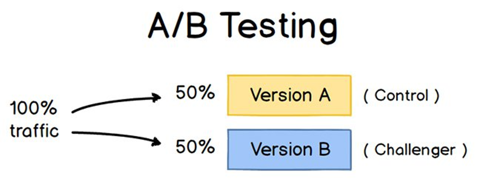
A/B testing (also known as split testing) is one of the most commonly known conversion optimization techniques.
It’s the process of comparing two different versions (or variants) of a page, email – or in this case, popup – by looking at which one drives more conversions.
You split your visitors into two similarly-sized groups and then show version A to one-half of your visitors, and version B to the other. The variant that gets a higher conversion rate is your winner!
Source: HubSpot
What should you A/B test on your pop-ups?
Deciding on which elements to A/B test on your pop-ups can be difficult, especially when you don’t have all the time and resources in the world.
To help you get started, we’ve collected a list of the key elements that you should A/B test.
1. Popup headlines
Since the headline is usually the first thing your visitors will notice on your popup, it’s important to write headlines that really grab attention. The goal is to get them interested, so they read the rest of the popup.
Since it’s such a key piece of your popup, it’s worth testing a few titles to hone in on the perfect one.
So what can you vary? Well, you can try out different lengths, persuasive strategies, or design elements like fonts, sizes, and colors.
2. Calls to action
An effective call to action that visitors can’t resist is necessary for every website… and for every popup. A well-written call to action can work wonders for increasing your conversions and sales.
Here are a few important things you should test on your pop-up’s calls to action:
- The color of your call to action button: a contrasting color helps to stand out from the other elements on the popup. Paletton is a free tool that helps you to find the perfect colors.
- Alignment: where should you place your call-to-action button? Different button placements can have an impact on your conversion.
- Text: don’t forget to include powerful action words in your call-to-action copy. You can vary the copy slightly, e.g. “Get my free e-book” vs. “Get your free e-book”, or test two totally distinct versions.
3. Images
Images can help your visitors understand the offer and make a popup look more appealing. But that doesn’t mean an image makes a popup better in every case.
Are you wondering if you should use an image or not, and what type would work best? Well then, it’s time to A/B test!
You can test different image types, for example:
- stock photos vs. personal photos,
- product images vs. product videos.
The placement of the image on your pop-up is also a great element to test. It’s best if your image guides visitors’ eyes to the value proposition.
4. Forms
Your form has a very important role to play in your subscription process, and a well-optimized form can easily generate new customers.
On the other hand, your form can be frustrating for users if it’s not optimized.
Length is the first thing you should test. For some companies, longer forms work well, especially if they want to qualify their leads. But in most cases, you should aim for a form that’s short and to the point.
It’s especially important to find out when visitors are exiting (or abandoning) your form. You might discover that they don’t want to share their phone numbers with you, for example. In this case, you should eliminate that field to increase your conversions.
5. Offer
Last but not least: your offer… a.k.a. the game changer!
What type of offer will your visitors find irresistible?
You could test a longer, more in-depth e-book against a short, handy checklist. Or if you have an ecommerce store, you could test multiple discount types, like 10% off vs. $10 off, or a set discount vs. free shipping.
You’d be surprised how a few small changes can lead to some really remarkable results!
4 real-life popup A/B tests
Now, let’s take a look at four popup A/B tests that our customers have run and the great results they achieved.
These examples can give you more inspiration about what to test in your own popup campaigns.
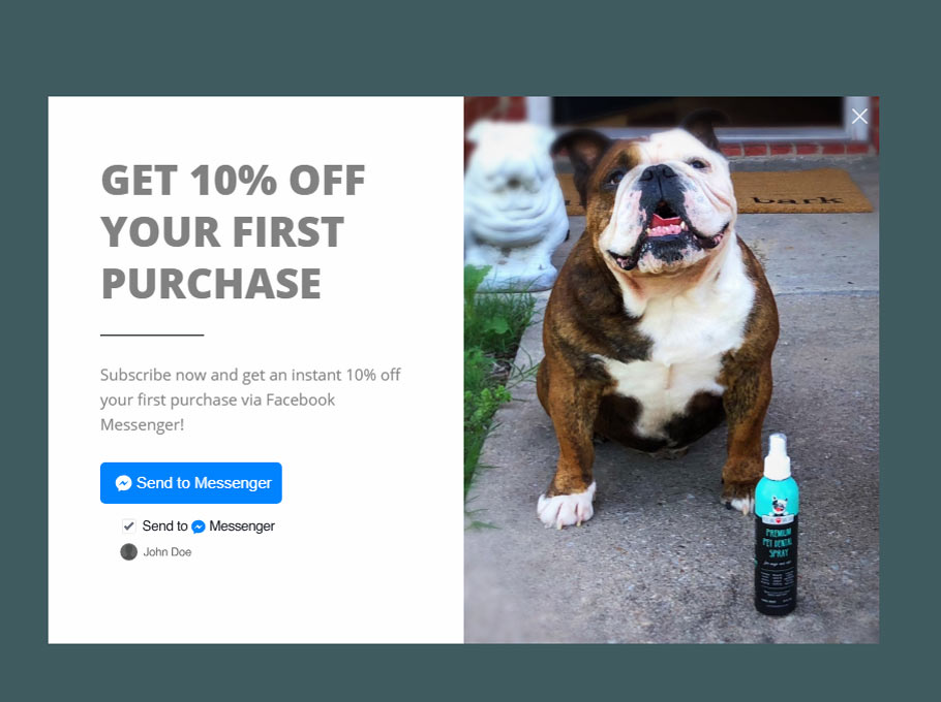
1. Discover which channel is the best to get in touch with your leads
When it comes to subscriptions, most people immediately think of email. But BlendJet, one of the most successful Shopify stores, decided to think outside the box.
They wanted to see which channel their audience prefers, so they created SMS, email, and Messenger subscription campaigns and split-tested them.
Here’s the popup they tested:
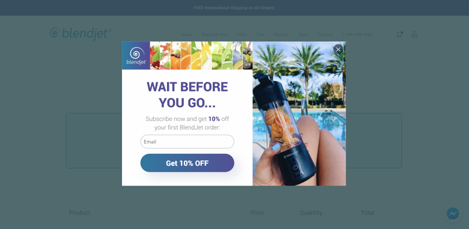
The experiment revealed that BlendJet’s cart abandonment campaign converted 20% better via Messenger than via email. Pretty neat, right?
This test shows how crucial it can be to test different communication channels.
2. Learn which message encourages a response
If you want to build popups that make visitors take action, you need the right copy.
One of our customers, SwissWatchExpo, wanted to figure out what would engage their audience best.
They created two versions of a cart abandonment popup with different copy, to see which would win.
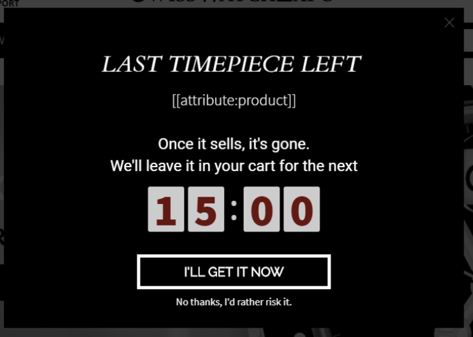
In the first version, they wanted to let their shopper know that the product they were about to buy was the last one. This is a great way of creating urgency, and they were able to increase conversions by 17% with this popup.
In the second version, they changed the copy and offered a discount to visitors. With this version, they doubled their results—achieving a 30%+ conversion rate.
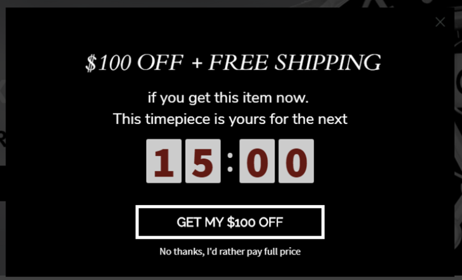
As you can see, the second version was the clear winner.
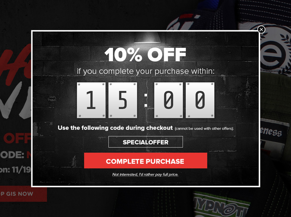
3. Test your offer
BootCuffsSocks decided to create a special campaign for cart abandoners and A/B tested two different offers:
- $4.25 store credit
- 10% off the entire purchase
Let’s take a look at the two offers:
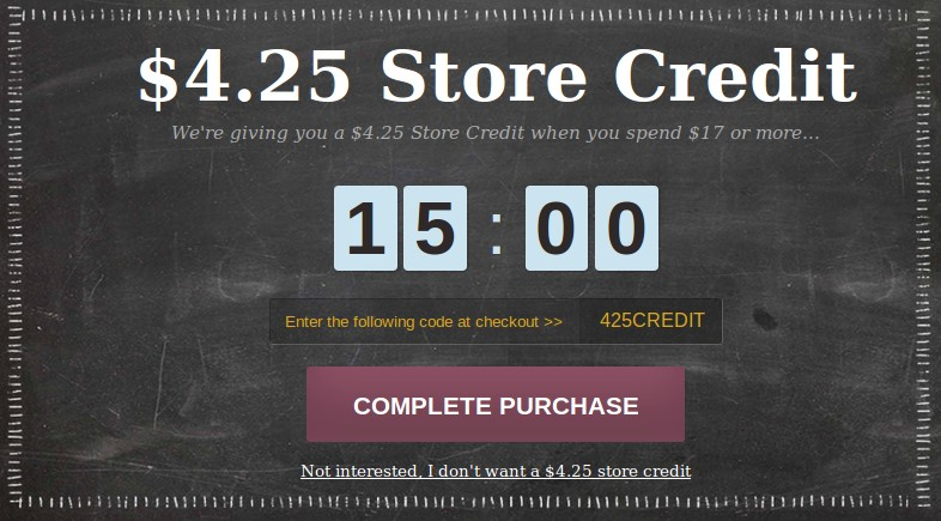
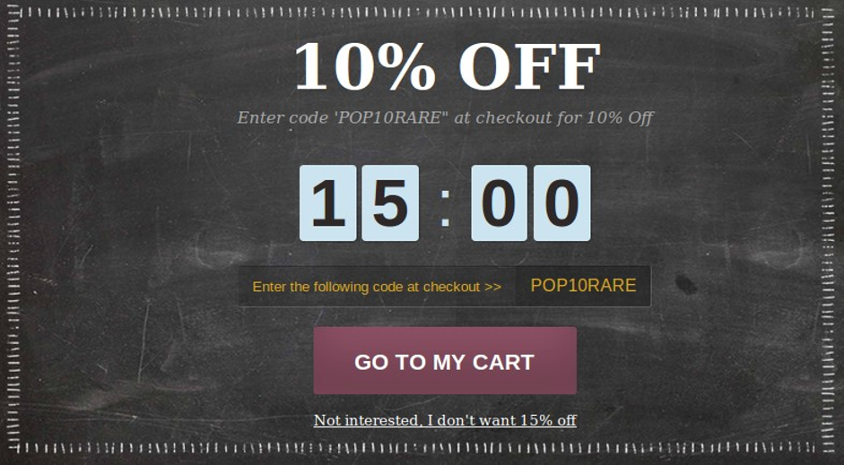
After comparing the two variants against each other for 40 days, they saw that 15% more visitors signed up for the second version (10% off) compared to the first one.
It was clearly the winner.
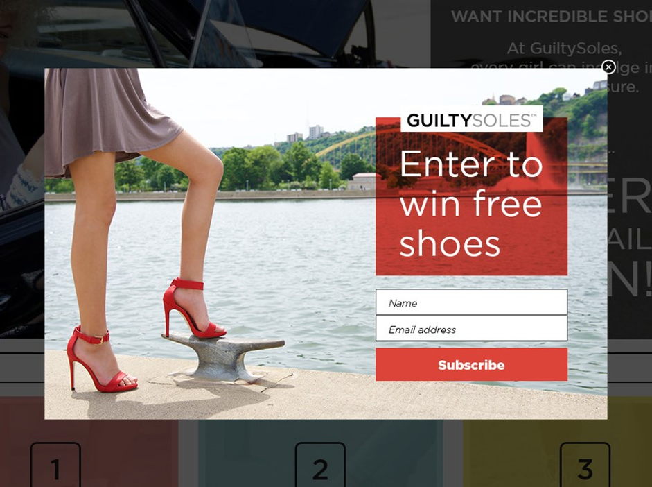
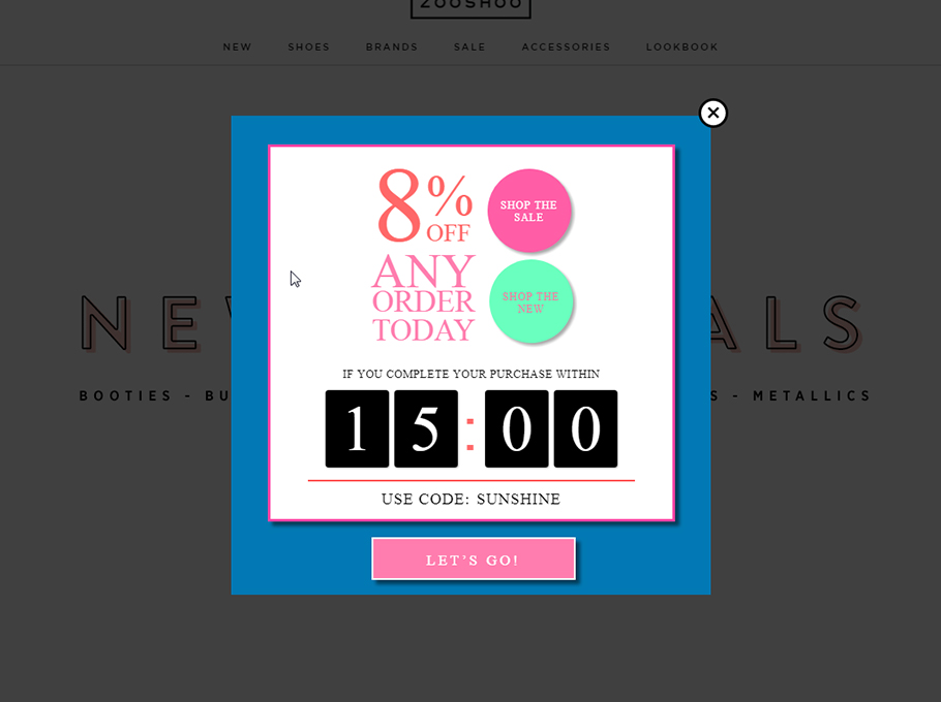
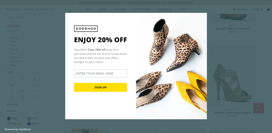
4. Test the look of your popup
Zooshoo has been using OptiMonk for several years now, and they always try to keep their popup campaigns fresh, try new versions, and A/B test variants.
In this case, they wanted to compare two different looks of a subscription popup with the same offer (20% off).
Let’s check out the first, which had a yellow color scheme:
And here’s the second, which had a red color scheme:
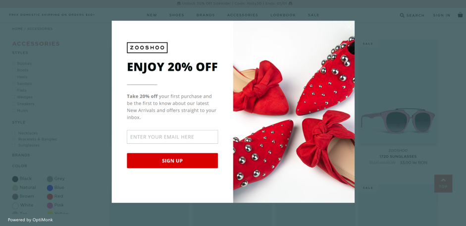
Though both versions had great results, at the end of the day, the yellow look was the winner.
How to A/B test OptiMonk popups
Ok…so you’re ready to start A/B testing using OptiMonk, but you’re not quite sure how to begin. No problem! I’ll share a step-by-step guide to get you started.
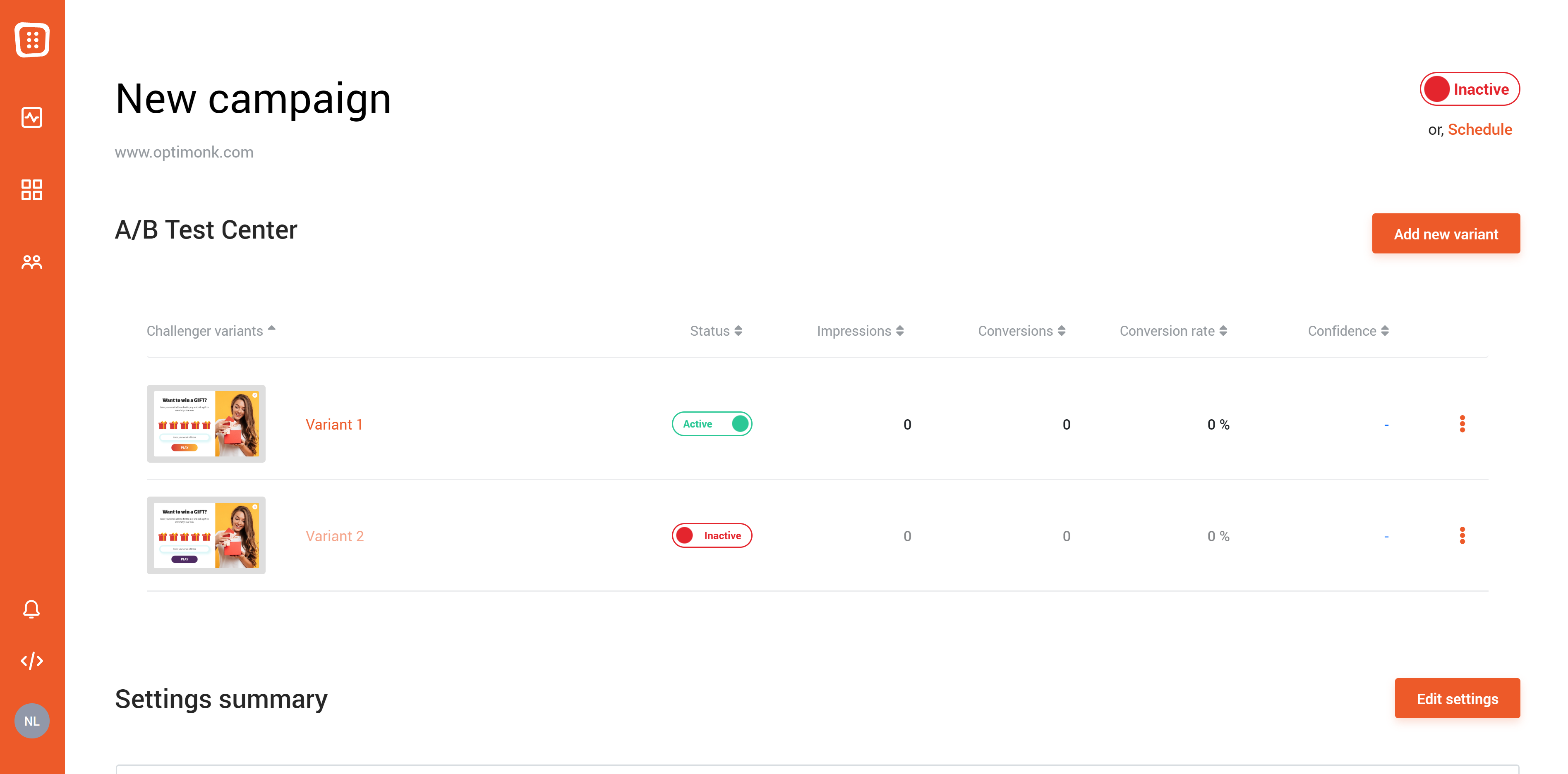
Step 1. First, log in to your OptiMonk account, go to the Campaigns menu, and choose the campaign you want to A/B test.
Now that you’re on the campaign page, you can see “A/B Test Center,” which gives you a hint that you’re in the right place.
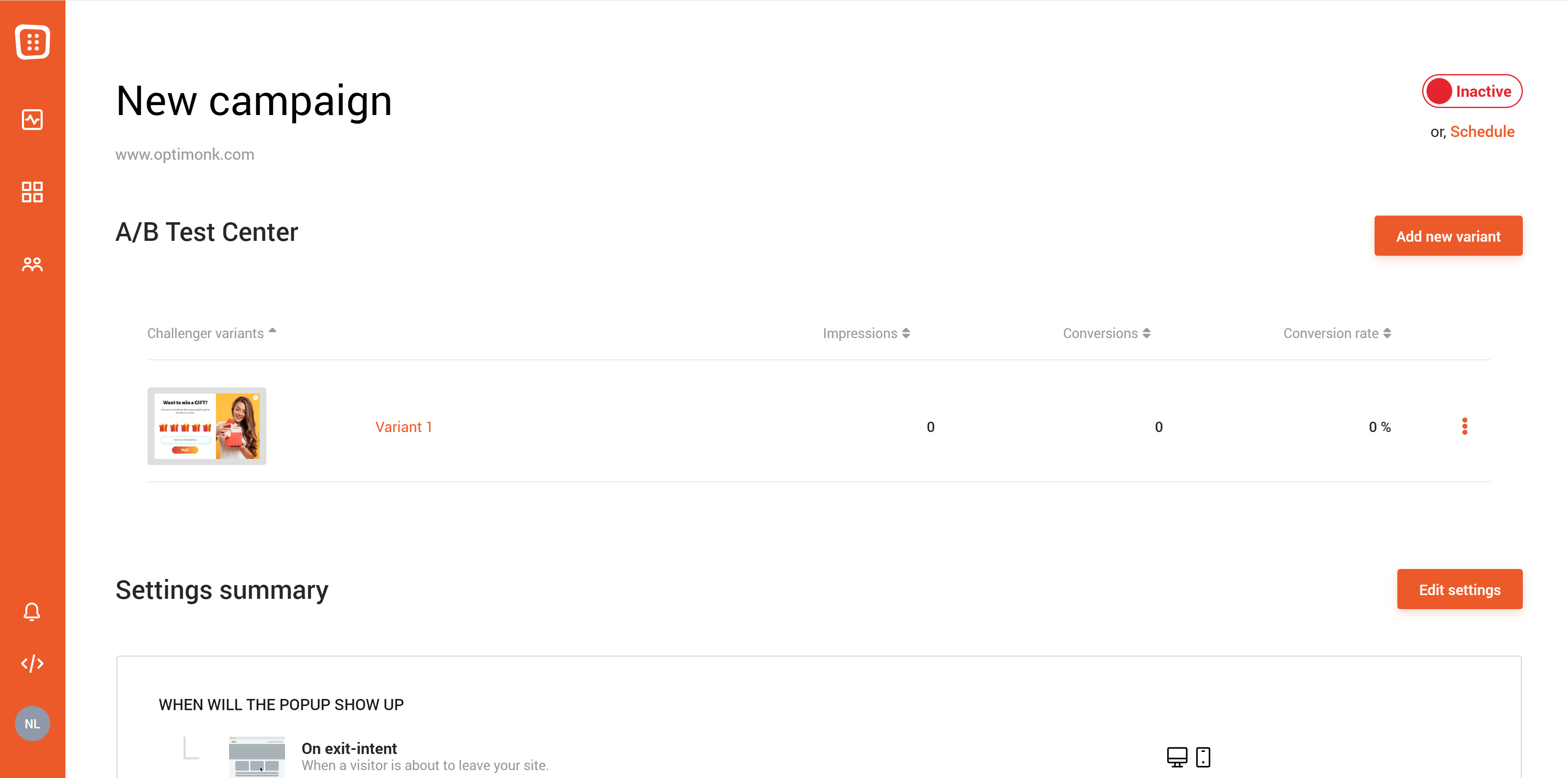
Step 2. Next, click on “Add new variant” and the second variant of your popup will appear immediately. It’s inactive for now.
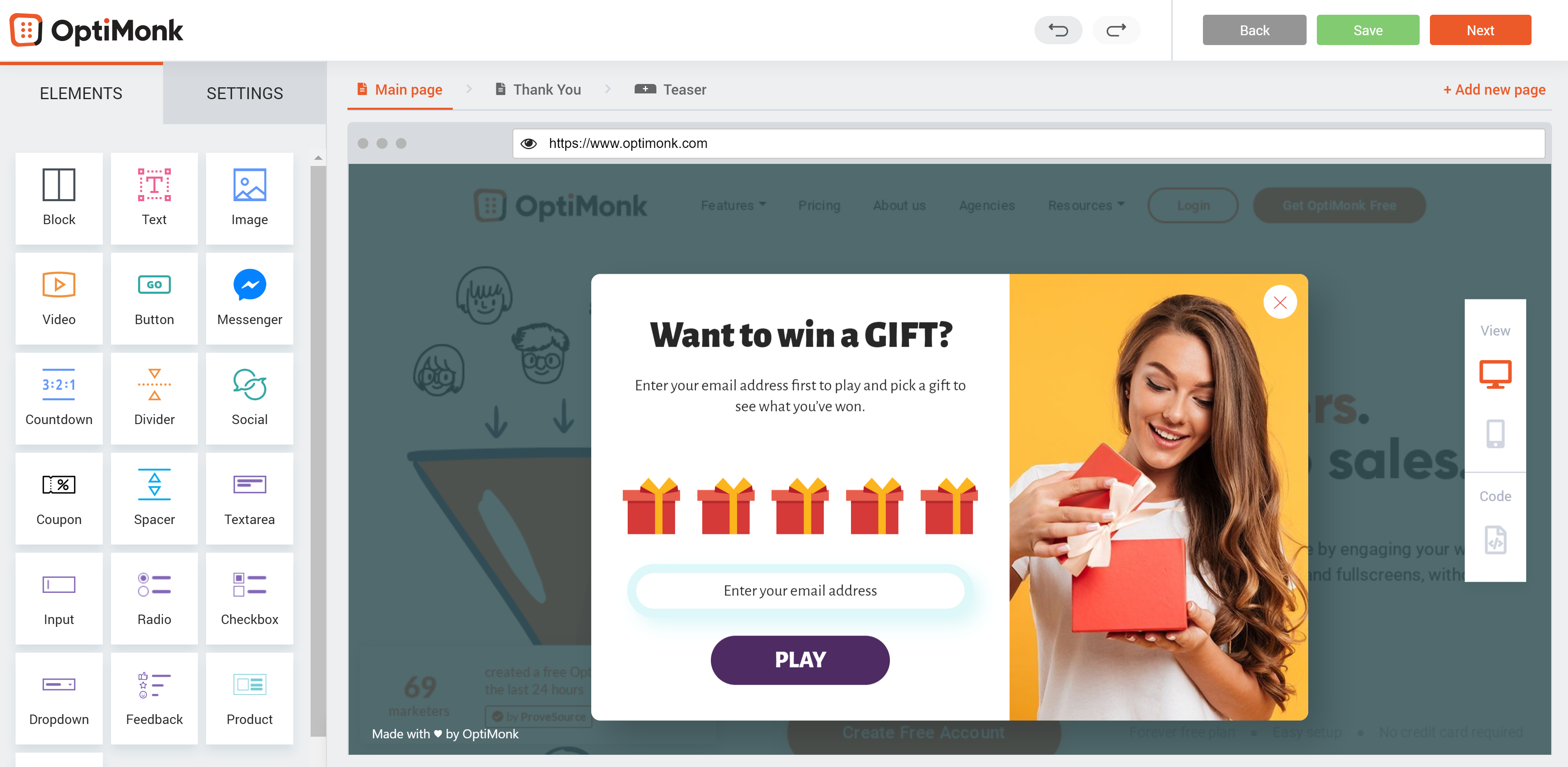
Step 3. Click on the second variant, and you’ll be taken to the Drag & Drop editor. Now, it’s time to modify the element that you want to A/B test. For example, you could change the color of the button.
Step 4. When you’ve made the change, click on the “Next” button, and you’ll be redirected to the campaign page.
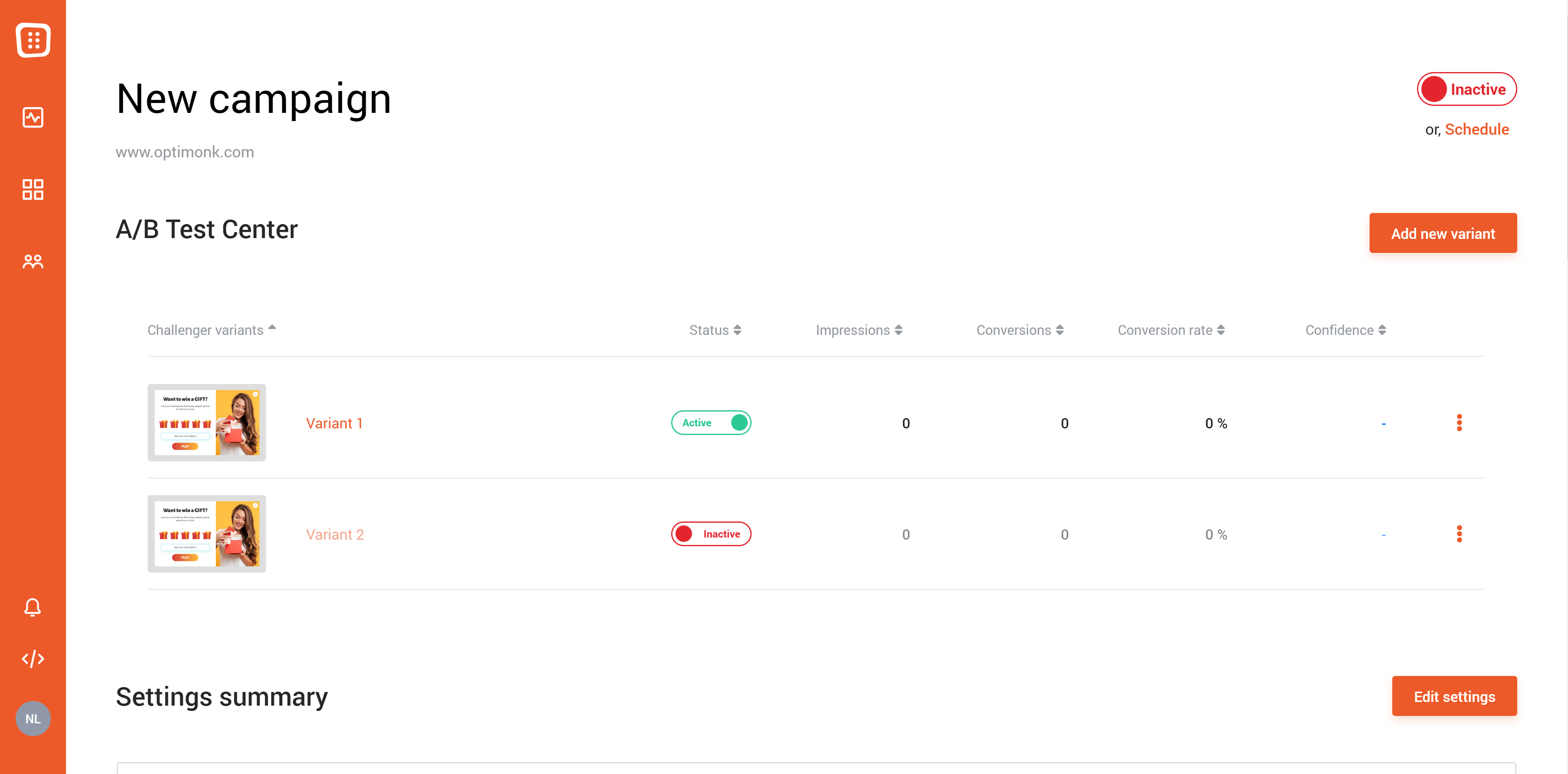
Step 5. Now all that’s left to do is to activate the second version of your popup.
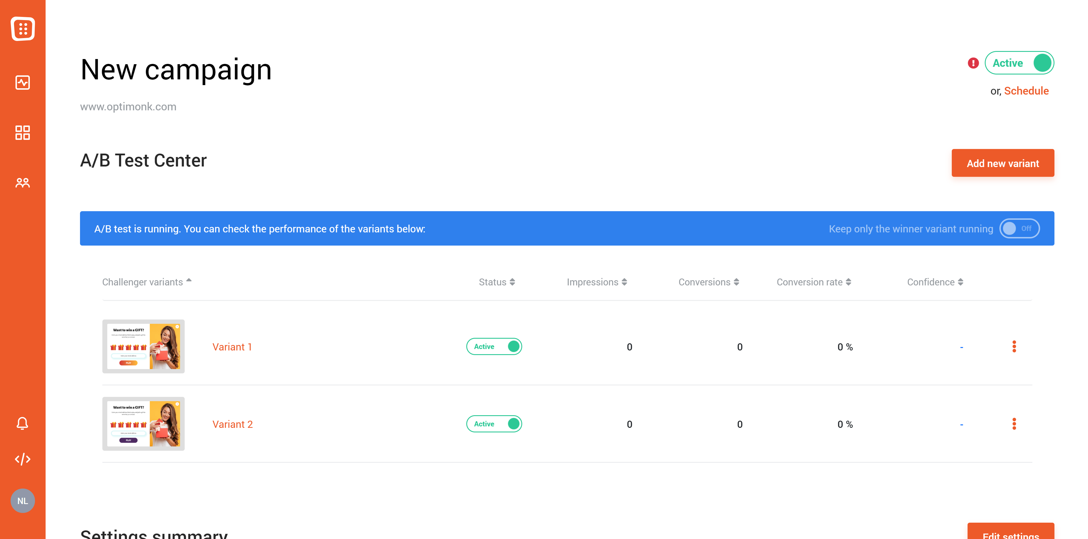
You’ll see that a “Keep only the winner variant running” text shows up in a blue box. If you turn this on, after naming a “Champion,” we’ll automatically deactivate the challenger variants for you.
But when do we name a campaign variant “Champion”? Well, once a variant gets a given number of impressions (50, in our current settings), OptiMonk calculates the statistical significance (which we call “Confidence”) to determine how certain we can be that the campaign’s performance will remain the same.
If a variant has the highest conversion rate and also has a Confidence above 90%, we name it the Champion variant.
That’s it!
Oh, and by the way, you’re not limited to “version A and version B.” You can add as many variants as you’d like.
Now go ahead and try one of the A/B testing ideas we’ve shared with you today, and increase that conversion rate!

Share this
Written by