Increasing the conversion rate on your checkout page by only a few percent can have a huge impact on sales.
Imagine your average cart value is $500. You usually attract 10,000 users who visit a checkout page every month. They convert at the rate of 7%. As a result, you make $350,000.
If you increase your conversion rate from 7% to 8%, you can get 100 more customers and an additional $50,000 monthly. All you have to do is to introduce a few smart changes to your checkout page!
In this article, we’ve prepared a few checkout optimization strategies that will get more customers to complete your checkout process. Let’s review them to see how your ecommerce store can benefit from these changes.
1. Offer multiple payment options
Some customers won’t buy unless you make their preferred payment method available. Sometimes, that payment method might be the only way for them to pay for a purchase.
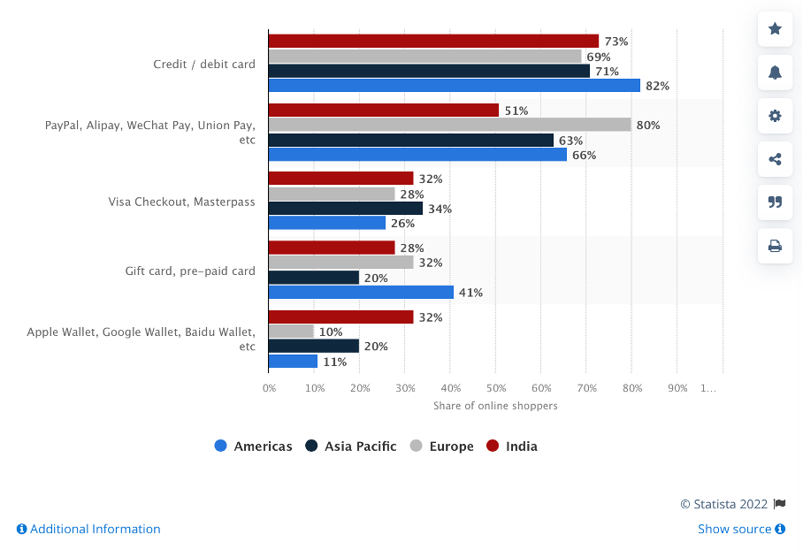
To ensure that your customers have multiple payment methods to choose from, research the most popular payment options among online store customers in your country, region, or worldwide (if you sell internationally).
Customer preferences regarding payment providers depend on the region. For example, European customers prefer Paypal, Alipay, WeChat Pay, and other quick payment options. Do note that these payment providers charge a fee. For eg: if you are using Paypal you can calculate its fee using a paypal fee calculator.
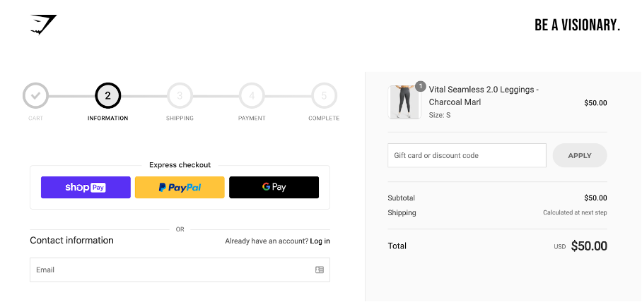
2. Consider guest checkout
Asking customers to register an account to complete a purchase can create additional friction. Registering an account adds more complexity to the process and increases the chances of cart abandonment.
This checkout process can be especially annoying for users who order from mobile devices, as it’s more difficult and time-consuming to fill out all those fields on the go.
To make it easier and faster to purchase from your store, introduce guest checkout or express checkout, as this online store does with Paypal.
3. Communicate additional costs the right way
Some brands surprise their customers with additional shipping or packaging fees during the checkout flow when a customer is about to pay for their purchase. This practice harms your conversion rate and causes online shoppers to abandon their carts when they see the price increase at checkout.
In some cases, online stores can’t offer free shipping, like when the purchase value is too low. However, you should never hide this cost from customers—they’ll find out about it sooner or later!
When it comes to checkout optimization, you should always make it clear what you’re charging customers for. You can show the final price with a breakdown of the costs, like in the checkout page example below.
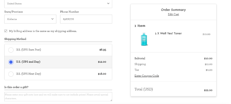
You can consider using a smaller font size to indicate these costs, so they look less alarming for customers.
4. Optimize checkout page speed
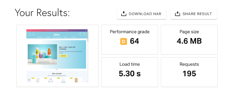
Website speed is crucial—a few-second delay in loading can cause online shoppers to leave right away. That’s why you have to work on increasing your checkout page speed if it’s still too slow. Ideally, your page should load almost instantly. So how can you check your loading speed health?
There are various tools that can help you find out how fast your checkout page loads and identify issues that prevent your page from loading faster.
You can use Google Page Insights or Pingdom. These tools offer all the information you need to improve page performance, including page speed. Here’s an example of a report from Pingdom:
5. Make your checkout process simpler
A long, multi-step checkout page introduces a lot of friction for a customer. It’s common for visitors to lose interest when asked to jump through hoops to complete their purchase. As a result, some customers give up and decide to shop elsewhere.
Brian Lim, CEO of iHeartRaves & INTO THE AM, says “to get more users to complete your checkout form, eliminate unnecessary steps and make your checkout page as simple as possible. Ask only for the information needed to perform a transaction and deliver products to your customer’s doorstep.”
If you don’t have the knowledge necessary to perform a page audit, identify key UX issues, and build an improved page, it’s worth booking a consultation with someone who has that expertise.
The cost of developing your website (or just a few pages) is not that great compared to the trial and error you have to go through along the process. When you work with experts, you’ll get results (e.g. improved conversion rates) much more quickly.
6. Mention your refund policy
Customers usually want to know how they can return products if they need to. Some ecommerce businesses don’t have a transparent refund policy, and some do everything they can to make it difficult for customers to get a refund.
As refunds have become a sensitive topic for some customers, communicating a transparent refund policy on your checkout page helps eliminate friction, encouraging your customers to buy. You can include the link to your refund policy in the footer of the page as a hyperlink.
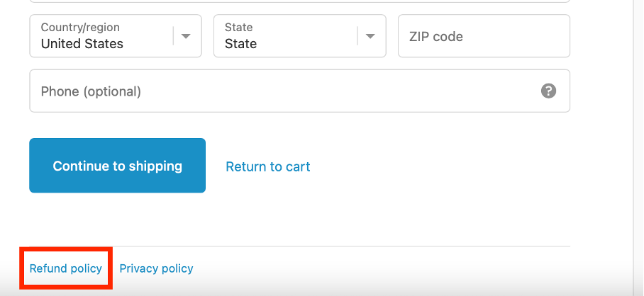
Assuming you don’t make refunds difficult for customers, be sure to mention a money-back guarantee, free returns (if you offer them), or quick refund processing time.
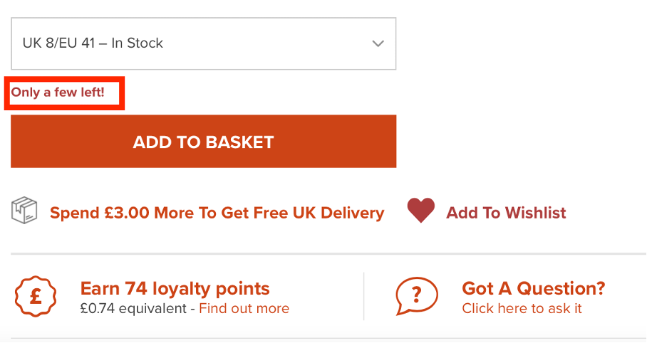
7. Use urgency on the checkout page
People are motivated more by losing something than by gaining: it’s a principle called loss aversion.
By communicating that there are only a few items left in stock, you can create a sense of urgency and motivate people to buy faster. In the example below, you can see how one short sentence highlighted in red can encourage customers to complete their purchases faster.
8. Display an error message
Sometimes, customers abandon their cart due to technical problems they encounter on your ecommerce website. However, your website is not always to blame!
Customers often face these issues when filling out fields in the wrong way. For example, a customer might use special signs that are not allowed in shipping address fields without realizing they’re doing so if it’s not properly highlighted in the form.
When analyzing and optimizing your checkout flow, make sure that users can easily understand where their error occurs. You can highlight fields containing errors in red, making them instantly visible.
9. Communicate benefits in CTA buttons
Instead of choosing a generic CTA for a checkout button such as “Buy Now,” you can rethink its copy to communicate benefits for users. Here are some examples that you could test out:
- Start saving today
- Unlock benefits
- Buy now and enjoy {benefit}
- Get the look
- Treat yourself today
10. Add testimonials
Showing that you already have customers helps build trust. As people tend to replicate the actions of others—a mechanism called social proof—it’s worth adding product reviews to the checkout page to show that buying your products is the right choice to make.
There are various ways of collecting reviews. Here are just a few ideas:
- Through customer feedback surveys
- By email
- On product pages through a review form
- On your Facebook page
- Through external portals such as Trustpilot
- With Google reviews – you can now create your own Google review QR code to make it easier for your customers to leave their testimonials
11. Show a progress bar
A long and complicated checkout process can result in more abandoned carts. This is because online shoppers don’t know how close they are to completing the process.
Instead of using a long checkout form, break the checkout page down into smaller steps. Of course, the shorter your checkout form is, the better it is for conversions!
In certain situations, however, you need to obtain more information from a user to complete the transaction. To avoid overwhelming customers, consider implementing a progress bar showing users how much information or how many steps are left before completing the form.
Here’s an example of how you can implement this visual element on your checkout page:
12. Add trust signals
Consumers need some assurance about website safety, especially when they make a payment and add their credit card details. By highlighting your website security, you can boost consumer trust and improve your ecommerce checkout rate.
There are various ways you can communicate website security. Let’s go through a few.
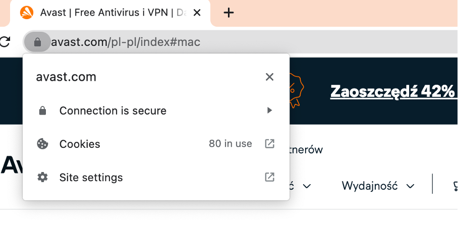
- Implement an SSL certificate. An SSL certificate is a digital certificate that authenticates a website’s identity. Users will see a padlock appearing to the left of the website name.
- Use trust seals to prove a website is secure. People are usually more familiar with the badges of Norton, Google Trusted Store, BBB, and TRUSTe. To get one, you usually have to apply for a review with the selected provider.
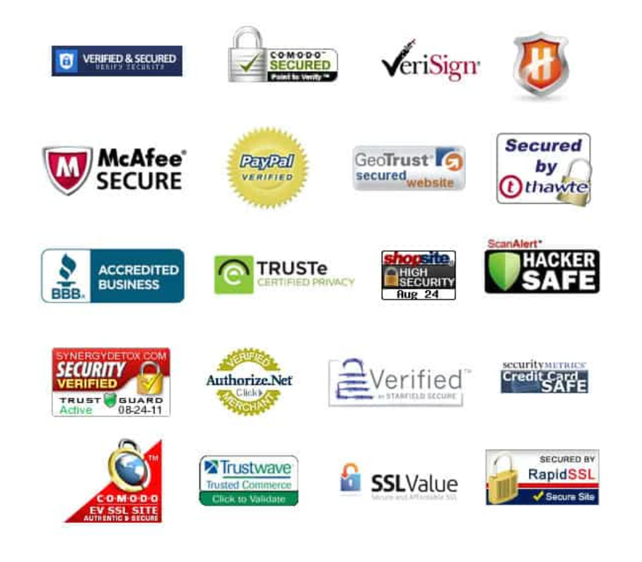
- Add accepted payment badges. Who doesn’t recognize brands such as Visa, Mastercard, or American Express? By adding these badges to your checkout page, you can instantly instill more trust among customers.
- Add a money-back guarantee badge. These badges help eliminate the fear of buying online.
13. Use exit-intent popups
With exit-intent technology, you can identify when a customer leaves a page without completing your checkout process and offer free shipping or any other incentive to encourage that customer to stay.
Although in most cases these customers are no longer interested in the products they were considering, it’s still worth keeping in touch instead of losing contact forever.
To continue communication with a user, you might offer a coupon or some other incentive in exchange for an email address. Display them using exit-intent popups like the examples below.
Once you receive that email address, you can then nurture your potential customer with special offers to encourage them to shop again.
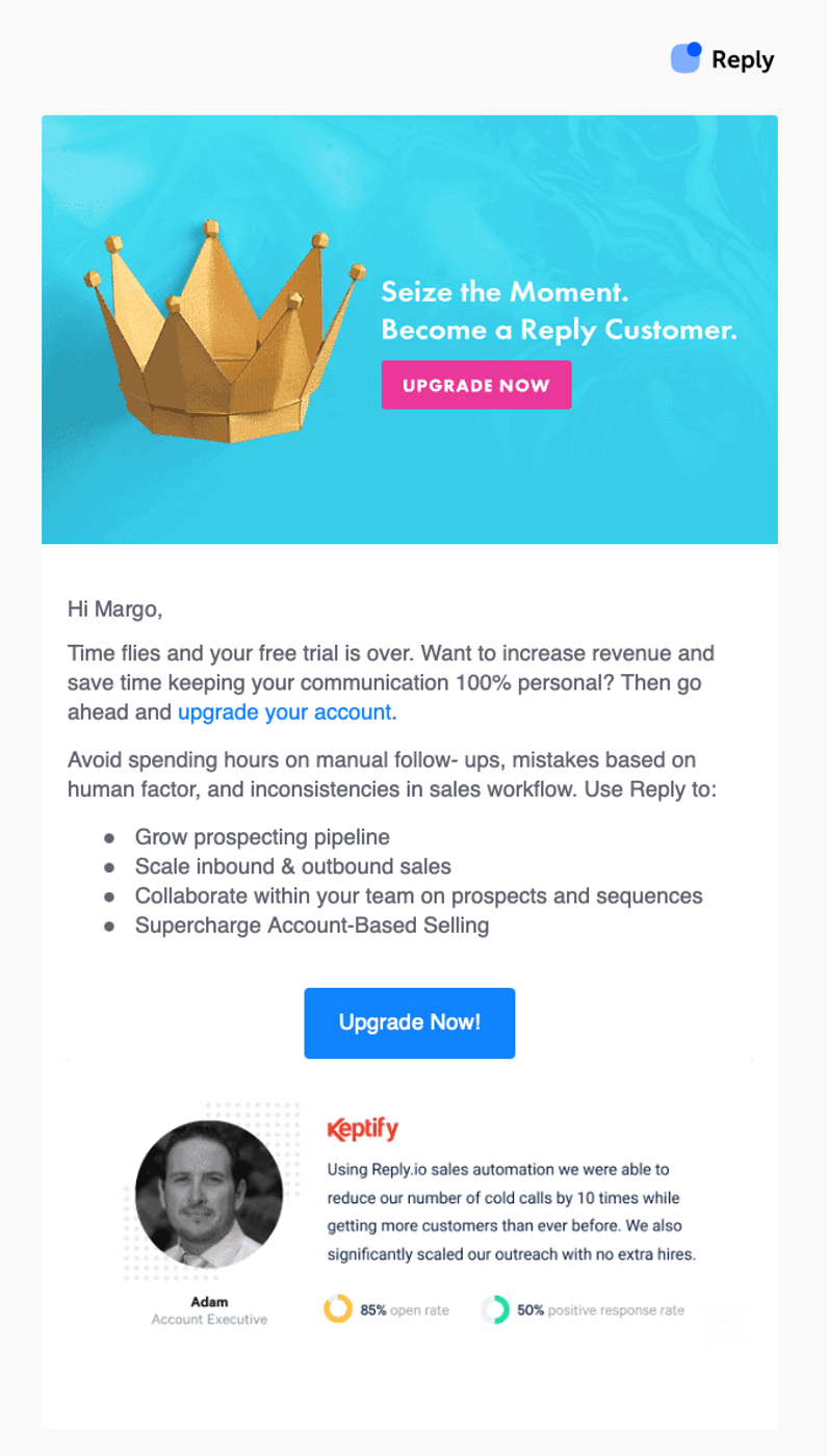
14. Send abandoned cart emails
Sending abandoned cart emails can increase your chances of recovering lost sales, since people often plan to come back and finish a purchase but end up forgetting about it.
For an effective abandoned cart email sequence, send a maximum of three emails with a link to a checkout page. Your first email can be sent in a couple of hours, the second after 24 hours, and the third after 48.
Check out this example of an email by Reply.io that’s sent to remind a user about upgrading after a free trial.
15. Don’t ask for credit card details too early
Ask for credit card details when customers have already filled out the most important details in the checkout process.
As they have already invested some time and effort into completing the process, they will be less likely to abandon it. When they’ve already provided a delivery address, filling in credit card information becomes a logical next step.
16. Use live chat
A conversational customer experience is defined as one of the key sales trends for 2022 and beyond. Businesses are optimizing their sales experience using live chat and chatbots much more frequently.
Live chat is also an essential customer service tool for your checkout page. With live chat, you can answer your customer’s questions, address their doubts or objections about buying, or clarify various aspects of a purchase process.
Another good thing about using a live chat widget is that you can better understand what types of questions users usually have and build out your FAQ page to answer these common questions.
Summary
Ecommerce brands make various mistakes on their checkout pages that hurt their conversion rates.
By taking a closer look at your checkout process, you can identify the areas that need improvement and make the necessary changes.
In most situations, it makes sense to introduce changes one by one, especially if your conversion rate is already decent. Hopefully, the tips we’ve shared will help you get a few conversion optimization ideas, introduce fixes on your checkout page, and see improvement in your conversion rate!
Share this
Written by

Margo Ovsiienko
Margo Ovsiienko is a SaaS conversion expert. She helps SaaS companies improve lead acquisition metrics, retention, and reduce churn. Read her posts on her SaaS marketing blog.