- Blog
- Popup Design Playbook: 35+ Stunning Examples, Templates, and Tips
Popup Design Playbook: 35+ Stunning Examples, Templates, and Tips
-
Csaba Zajdo
- Conversion
- 6 min read
Table of Contents
Popups are great tools that can help to captivate your target audience, generate leads and increase conversion rates. Popup campaigns are not just about grabbing visitor’s attention; they’re about making a lasting impact on potential customers.
However, despite the potential of relevant and visually appealing popups, many marketers settle for designs that are basic, unimaginative, and, frankly, unappealing.
Why?
Perhaps because popups can yield results even with minimal effort in design. Some marketers may consider a 3-5% conversion rate satisfactory, especially when compared to the less than 1% click-through rates they might experience elsewhere.
In reality, these marketers are sitting on a goldmine—they just haven’t realized it yet. With a few simple tweaks, they could double or triple their popups’ conversion rates.
With a bit more work (like personalizing the message for key segments), they could create popups with 30-50% conversion rates.
Imagine the transformative impact this could have on their businesses.
Popup design is super powerful, and putting together a well-designed, beautiful popup campaign can be your highest ROI activity as a marketer. Invest just a few minutes of your time now, and you could have an asset that generates you money for months or years to come.
Are you convinced? Let’s see how you can get the most out of your popup’s design!
Why does popup design matter?
First of all: why does popup design matter at all? Isn’t it just a simple message, where content trumps design?
While the message and value proposition of your popup is very important, great design can boost the effectiveness of any message.
Popups usually come out of nowhere, and they have just a few seconds to impress the visitor. And in our attention-demanding world, impressing website visitors is no easy task.
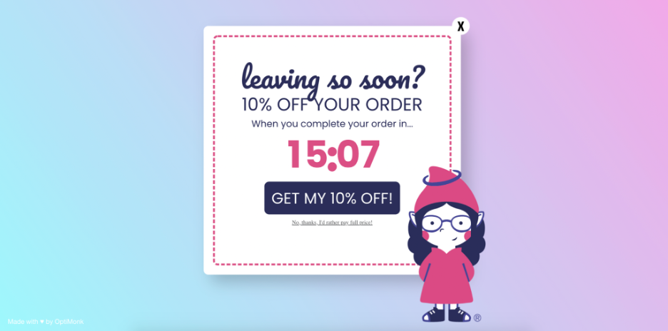
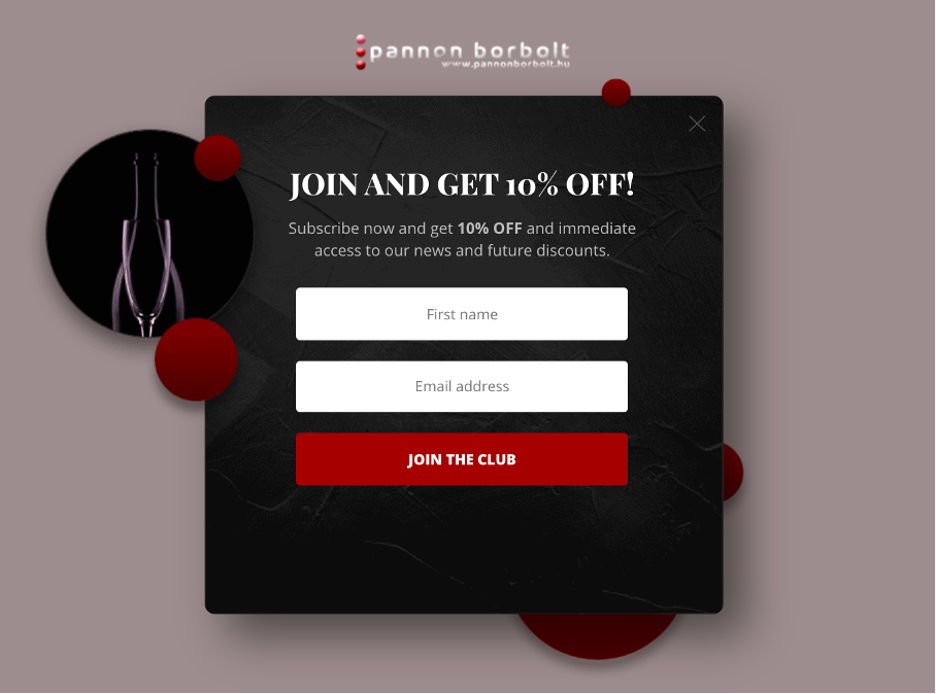
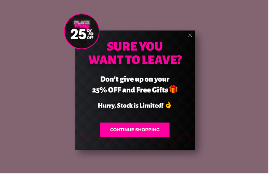
Having a beautiful, unique exit-intent popup like the one below could get conversion rates of up to 50%! Meanwhile, presenting the same offer (a regular 10% off) in a boring, text-only way would be lucky to achieve a 10% conversion rate. That’s a 400% difference!
Even big brands sometimes get it wrong.
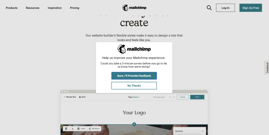
Just look at this popup design from Mailchimp. It’s most likely converting below 2%—which means that 98% of their visitors were disrupted (and thus annoyed) unnecessarily.
5 popup design best practices you need to know
Now that we know why popup design matters and we’ve seen an example of bad popup design that you don’t want to copy, let’s move on to the good stuff: popup design best practices.
1. Use the right colors
Contrary to some online marketing myths, there’s no single color combination that’s superior to all others.
There are, however, two important factors when choosing colors:
- You should be able to create contrast (and thus focus) on your most important elements.
- Your color choices should match your branding and create a consistent, smooth experience.
We’ll discuss both of these tips in more detail in the upcoming sections.
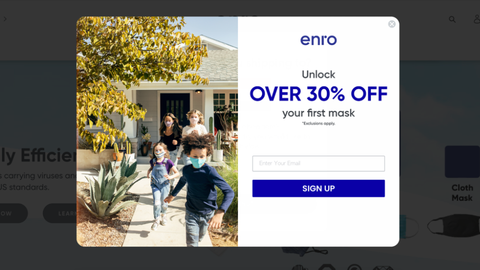
But as a basic rule, you can choose a white background or an image and then remove background and use your brand’s main color as a headline and CTA-button color. This is a very classic, low-risk solution
Check out this example from Enro:
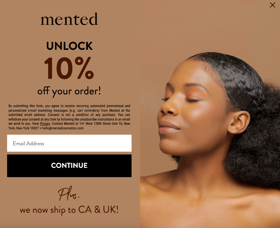
If you’d prefer to use your brand colors as the background, Mented Cosmetics provides a nice example. It not only matches their brand colors but also further emphasizes their company values:
You could also use inverted color palettes with dark backgrounds. In these cases, the fonts should mostly be white or light gray. Using more saturated colors would take away from the readability of your messages.
2. Keep it simple
“Less is more”—it’s a saying that’s all too true when it comes to popups.
Since you have a very limited amount of time to catch attention and generate interest, your message and your design need to be super simple.
Try to be ruthless with every word and element in your popup, and make sure that every single one is necessary.
When you think it’s simple enough, try to go even simpler until nothing is left but one main value proposition and a CTA.
You might be wondering: does that mean that we should limit ourselves to black and white text-only popups like the one below?
The answer is a resounding NO!
Most people will only read a few words of your popup content before deciding whether to read on or simply close the popup. That means that the design of your message (colors, images, aesthetics, etc.) will have at least the same amount of impact on the effectiveness of your message as your headline.
Of course, if the essence of your message is focused on specific products, then (like on a category landing page) you need to keep the rest of your message as simple as possible to let the focus remain on the products.
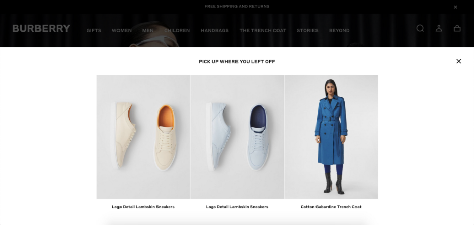
Check out how Burberry does it below: they use a bare-bones, super-simple message with perfect contrast and focus on three recently-viewed products.
3. Match your brand
Your onsite messages do not appear in a vacuum, but as part of your website, even if they appear in an overlay. So it’s important that your website popups blend seamlessly with your brand’s theme.
This means that you should choose elements (fonts, images, etc.) that are similar to those used on your website.
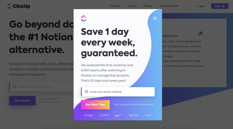
ClickUp is a wonderful example of how to create simple yet effective modal popups, which perfectly match the brand style guide:
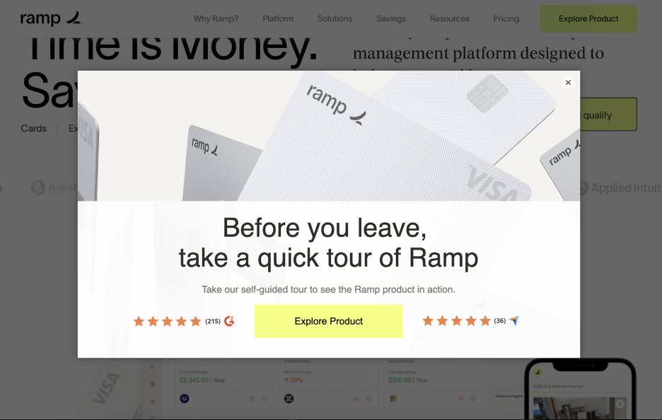
You can easily keep your popups on-brand by using your brand’s fonts and your logo, as Ramp does:
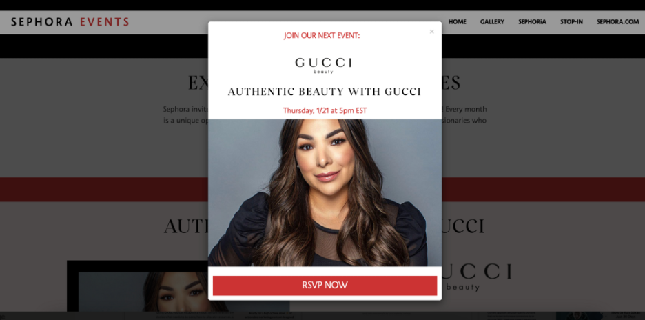
Even if you’re in the B2C world where you’re promoting other brands, you can pull elements from both brands, like Sephora does with this Gucci-related popup:
4. Use contrast to focus attention
Your popups must blend with your brand’s theme, yes. However, it’s also crucial that they stand out and catch the viewer’s eye.
If you have a lot of content (e.g. a bulleted list of things included in your offer), make sure that your value proposition is clear in the header copy.
Also, make sure the CTA color stands out from the rest of the popup, and that the button is large and legible. The headline and the CTA are usually the two most important elements of your popups, so make sure they have enough contrast.
For example, you could choose a bright, contrasting color for your CTA button. This will make it far more eye-catching and your visitors will be more likely to click it.
If your popup is primarily black, you could consider using orange or hot pink for your call to action button.
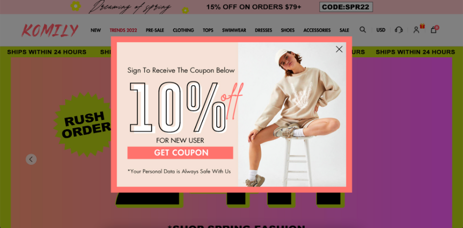
Using different font sizes is the easiest way to focus your audience’s attention on the very essence of your popup.
Even if you have multiple types of texts on one popup, you can use font sizes, colors, and other contrast-increasing techniques to emphasize the main value of your message, like Komily does:
If you have a dark website, you often need to introduce some contrast by playing around with your lightbox color (you know, that gray, half-transparent area around your popups).
For example, if your popup has a dark color, e.g. a blue background, you can use a lighter overlay while it’s being displayed.
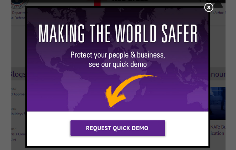
Or you can use a fullscreen version of your popup, covering 100% of the screen—this ensures that your popup will be visible, like in the example below:
If you have multiple buttons, you can use different button colors to emphasize the main CTA, indicating to users in a subtle way which option is a better choice for them:
Another strategy involves inserting design elements like arrows that point toward the call to action button. You could use bright, hand-drawn directional objects to point out your call to action, like in the popup below:
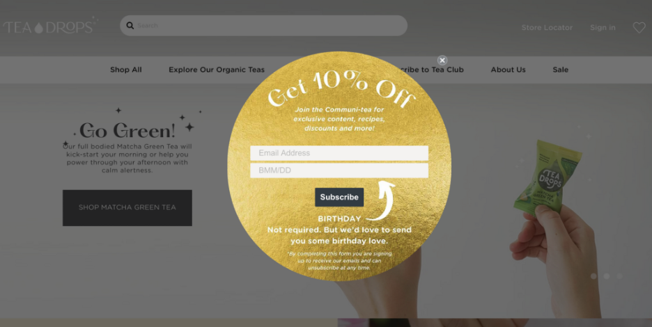
Another way to emphasize your offer through popup design is by using unusual template shapes. These break the pattern of the generic rectangular popups that people see all over the web, and it draws interest simply because they’re unique.
Unusual shapes can include graphic designs, organic curves, or even custom shapes that align with your brand or offer theme.
Be careful not to put emphasis on too many elements. If you have a survey popup like the one below, make sure you use a secondary, less-aggressive button style for your buttons:
5. Use visuals to emphasize your message
As the adage goes, “A picture is worth a thousand words.” This is certainly true for popups!
In fact, the human brain processes images 60,000 times faster than text, and 90% of information transmitted to the brain is visual.
That’s why some great visuals can highly enhance the effectiveness of your onsite messaging.
Utilizing a photo enhancer can elevate your images, making them more impactful and memorable for your audience.
The goal is to choose the right visuals to amplify the written message, like this popup does:

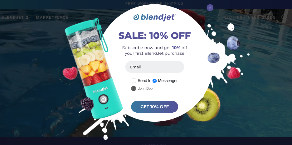
You need to find high-quality images for your popup designs. It’s best to use real photos of your products instead of stock images, like BlendJet does:
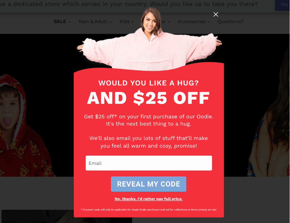
The best approach is to go through your product/brand images and choose a relevant image that’s aligned with your message, like this The Oodie popup:
If you’re running seasonal sales, it’s a good practice to update your messages with the seasons. Being relevant and timely creates the sense that these offers are time-limited, increasing the fear of missing out (and thus, conversions):
Even if you don’t have anything specific to offer, just updating your messages to match the current season could still considerably improve conversion rates, just like this message:
If your products look fun or useful in the photos, people will be more likely to buy them and sign up for your email or SMS lists in exchange for discounts.
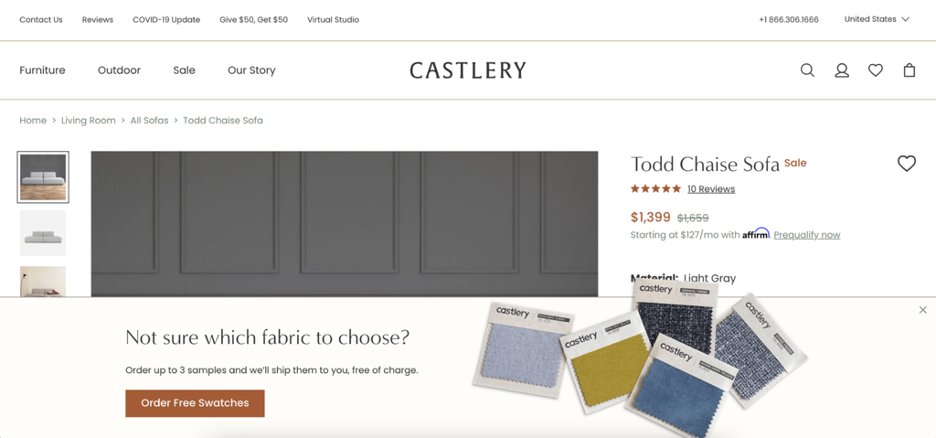
If you’re trying to encourage visitors to request a free giveaway, you could use words and images that connect your message to your audience’s hearts, like Castlery does:
4 extra best practices for your mobile popup
A staggering 63% of ecommerce traffic comes from mobile devices. This means you literally can’t afford to ignore subscribers coming from smartphones.
In this section, we’ll share 4 extra best practices to help you boost the mobile conversion rates of your popups.
1. Be brief with your copy
Being economical with your words is a safe bet for high-converting popups. And it’s especially important when you’re trying to reach visitors who are using smaller screens.
If you need to include a disclaimer, make sure that it’s not distracting from the meat of your message. So don’t mince words.
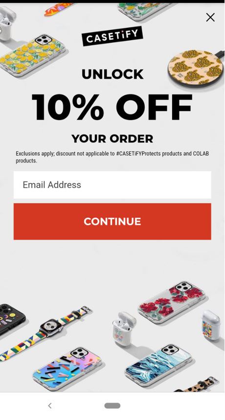
For example, this email subscription popup from Casetify gets straight to the point.
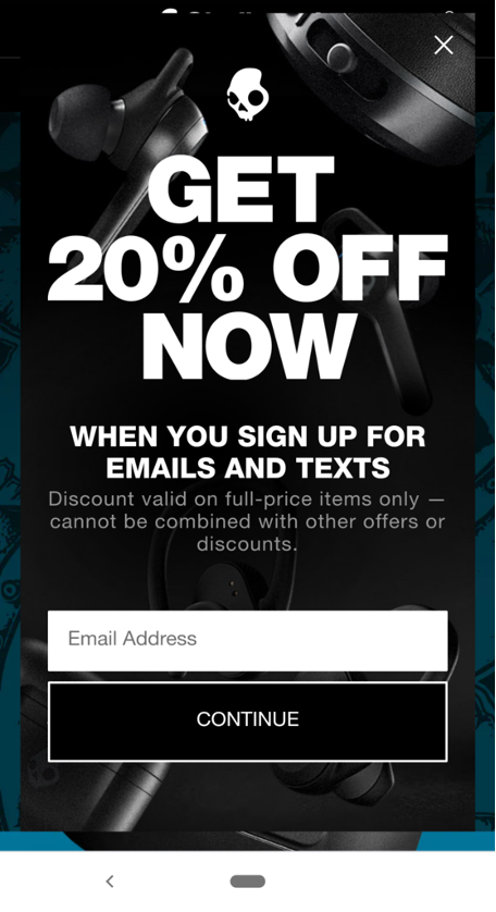
Check out Skullcandy’s popup below. The bright, bold tagline speaks for itself and doesn’t require a ton of clarification for visitors on the fence about opting in.
2. Make your popups as tap-friendly as possible
Engaging with your popup should be straightforward for mobile users.
That said, you’d be surprised how many mobile popups are a nightmare to navigate.
Too many places to tap. Confusing colors. Needless scrolling. The list goes on and on.
Although mobile offers are usually minimalist, you still need to mind some best techniques. This includes:
- Defined buttons (for both opting in and exiting out, if necessary)
- A clear headline and legible copy, ideally fitting on a single page (no scrolling required)
- Colors that separate the various elements of your popup
This explains the popularity of fullscreen mobile popups that tick the boxes above.
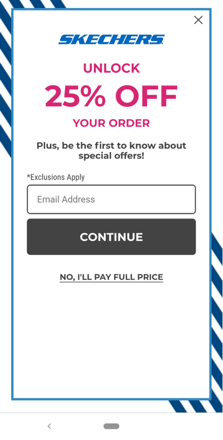
For example, this offer from Skechers is clear and easy to navigate whether someone’s interested or not.
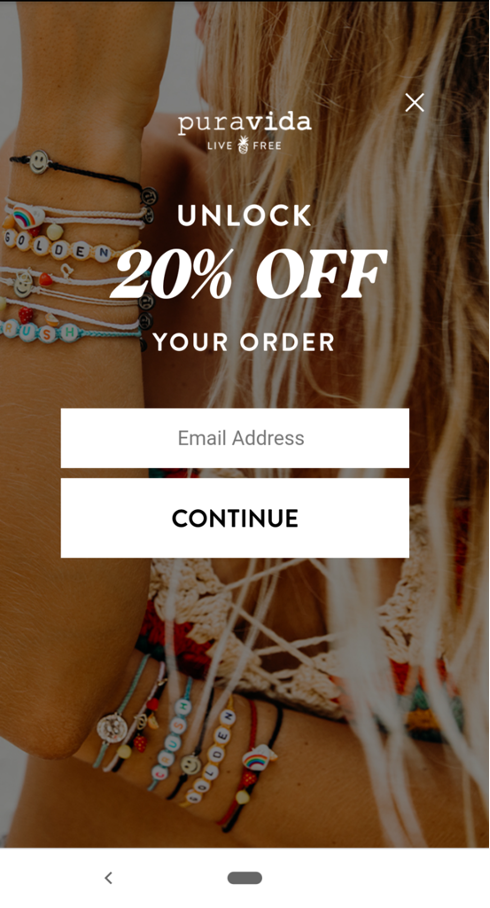
Same for this mobile popup from Pura Vida:
3. Require fewer form fields
It’s no coincidence that all of the mobile popup examples throughout this post require only an email address to subscribe to.
Single fields mean less effort and fewer distractions for your site visitors. This ultimately makes the process of opting in quick and painless.
Saving a few precious seconds with fewer fields could be the difference between a new subscriber and a bounced visitor.
4. Double-check that your popups are Google-friendly
Although popups don’t impact your site’s standing with Google directly, the search engine has taken a stance on “intrusive” content.
Your popups shouldn’t hamper your user experience or otherwise prevent them from accessing the content on your site.
This speaks to why you should be mindful of fullscreen popups, only presenting them after visitors have had a chance to browse around.
Imagine that someone is visiting your site for the first time via mobile. You don’t want to signal your site as spammy or immediately turn new visitors away, right? Doing so could be bad news for your bounce rate.
16 high-converting website popup design examples
When it comes to popup design, a little inspiration can go a long way toward creating awesome offers.
So here are 16 real-world examples of stunning popups, and a breakdown of what they do well.
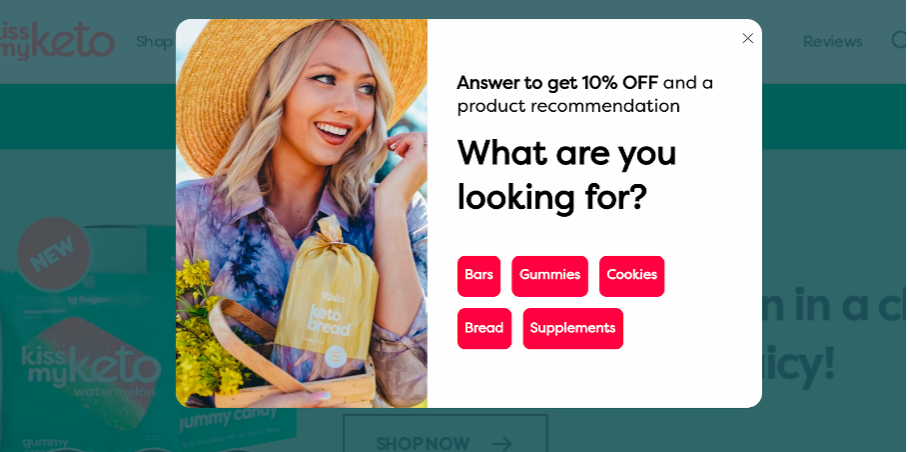
1. Kiss My Keto
This welcome popup starts the process of building a lasting relationship with customers by getting to know them better.
The simple question and equally simple button copy encourage visitors to engage with the popup (not to mention the promise of a 10% off promo code).
Kiss My Keto also used a high-quality image that both displays their product and reinforces their fun, carefree brand identity.
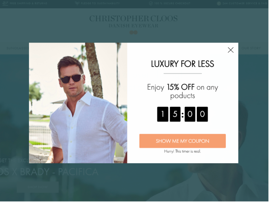
2. Christopher Cloos
Christopher Cloos is a brand with Scandinavian roots, and their exit-intent popup follows the typical Scandinavian aesthetic: sleek, with straight lines and simplistic fonts. This is a great example of a solid popup design that reinforces the brand’s style.
Another important aspect of the popup’s design is the countdown timer, which grabs visitors’ attention and increases the sense of urgency so they will be more likely to use their discount code.
And finally, in what’s becoming a theme, the Christopher Cloos design team chose an image that perfectly represents the “feeling” of their sunglasses.
3. Obvi
Not all popups need images to capture customers’ attention. Sometimes, a popup copy can be strong enough all on its own.
This is especially true when the popup uses bold colors that catch the eye, like the hot pink and black combo below. Notice how Obvi reinforces their message with emojis, which makes the popup design feel more youthful.
To make it even easier to absorb the popup’s message, the circle in the left top corner sums up the offer.
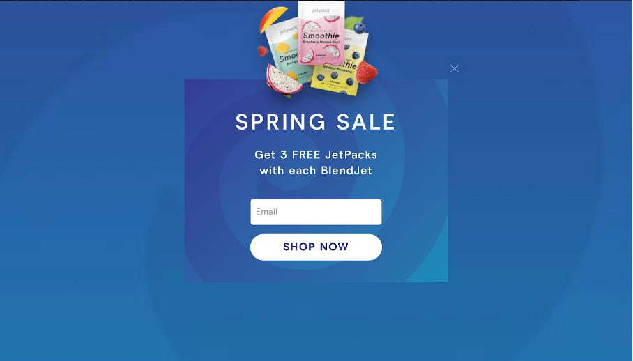
4. BlendJet
This effective popup example illustrates how important it is to make sure that your popup matches your website’s design. There’s a harmony in the choice of colors that looks very pleasing to the eye.
The only contrasts in the color palette come from the images illustrating the offer (what customers will get for free). The products pop off the page, and that’s exactly the goal.
They also did a great job incorporating the email opt-in form within the popup.
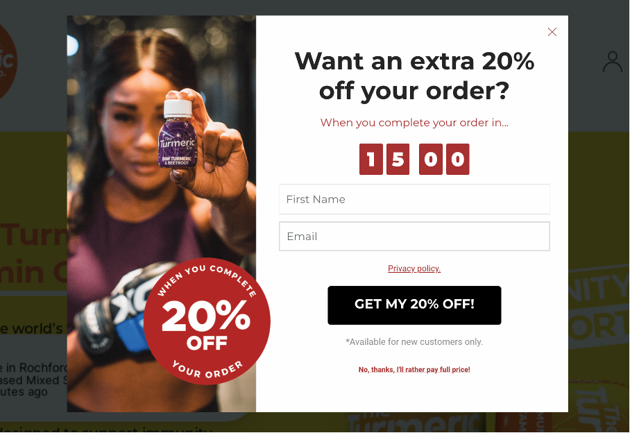
5. The Turmeric Co.
The Turmeric Co. uses a prominent circle design element to highlight their offer.
This popup design is simple, with enough white space to avoid overwhelming site visitors while still incorporating a countdown timer to create urgency and a descriptive call to action button.
The small image shows the product and captures the brand’s active, healthy image.
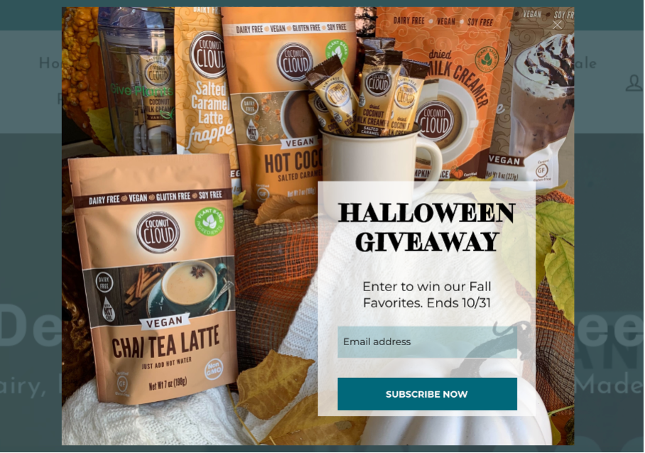
6. Coconut Cloud
Coconut Cloud puts all the focus on their products. And that makes sense… they look delicious!
This popup design was developed in support of a Halloween giveaway. By showing visitors everything they could win, Coconut Cloud draws them in and encourages them to participate.
Finally, this popup includes a deadline. Much like a countdown timer, a firm deadline creates a sense of urgency.
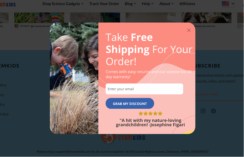
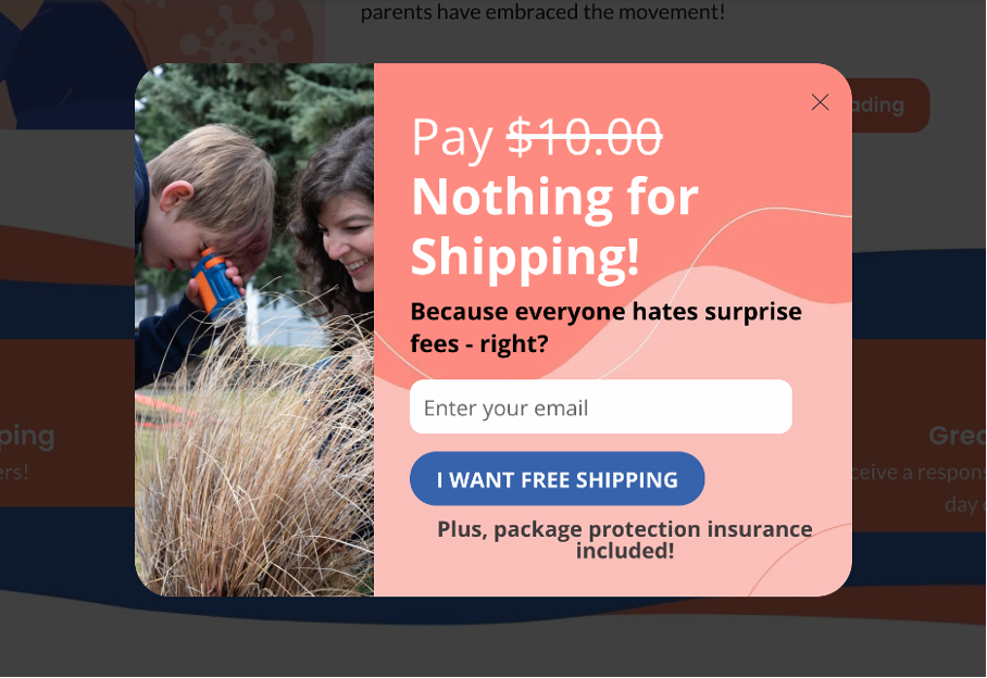
7. TheSTEMKids
The clever copy in this TheSTEMKids popup design example really steals the show.
The popup’s content starts with a strikethrough of the “$10.00” number. When combined with the bolded “Nothing for Shipping,” it makes the exact value of the offer obvious to all their site visitors.
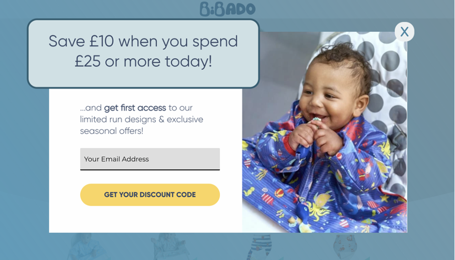
8. Bibado
Like many other popup design examples on this list, Bibado has used a contrasting color for their call to action button. The success of an impression is determined by whether a customer clicks on the CTA button, so it makes sense to make it stand out.
We also love the way Bidabo highlighted the offer in its own outset rectangle.
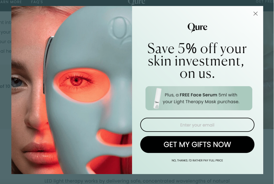
9. Qure
Qure’s popup design is a good example of how to make two offers at once.
The main headline (5% off) is highlighted with large text, but the extra offer is given its own box for emphasis. There’s a nice little image that shows you the free gift you’ll get.
The larger image does a great job of establishing continuity with Qure’s fresh, futuristic branding.
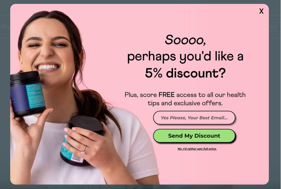
10. Yes Please Health
It’s important to remember that it’s humans who will be looking at your popups. That means emotions are always an important consideration when designing popups.
Yes Please Health helps their customers get excited about the offer with a colorful image of a person smiling and showing the product.
They blend that image with the background of the popup, making it look very well tied together.
Finally, they use fun, playful copy to draw the customer in.
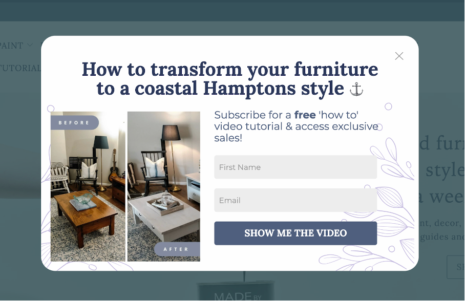
11. Fuller’s Flips
Fuller’s Flips uses images to great effect on this popup. By showing a before and after image, they’re clearly showing the value their service provides.
The use of the anchor emoji is a nice touch too, pairing well with their promise to bring you some “coastal Hamptons style.”
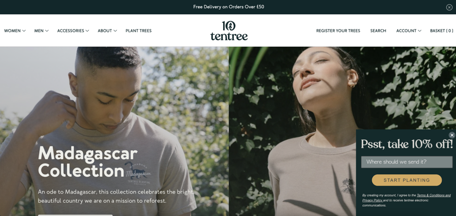
12. Tentree
This sidemessage from Tentree is a shining example of a non-intrusive popup.
Note how the offer’s CTA button stands out from the rest of the site’s color scheme. While the subtlety of the sidemessage makes it feel like it’s actually part of the homepage.
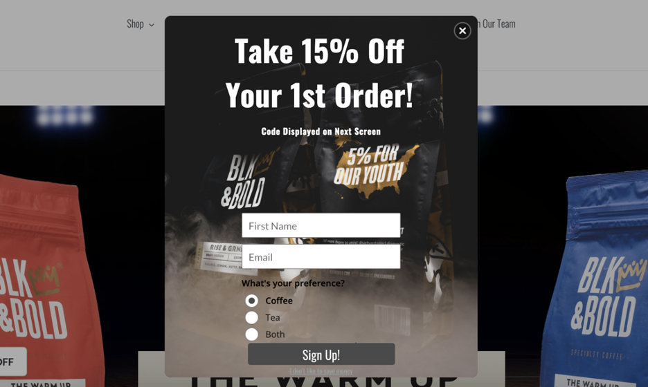
13. BLK & Bold
This offer is, appropriately enough, a bold one with a direct headline that’s hard to miss.
The ability to choose between drink options also highlights how to use personalization and preferences to seal the deal with first-time visitors.
14. Bailly
Sometimes it pays to keep it simple. This email popup from Bailly proves that a popup design doesn’t have to be rocket science.
A straightforward offer in exchange for your visitors’ email is always fair game.
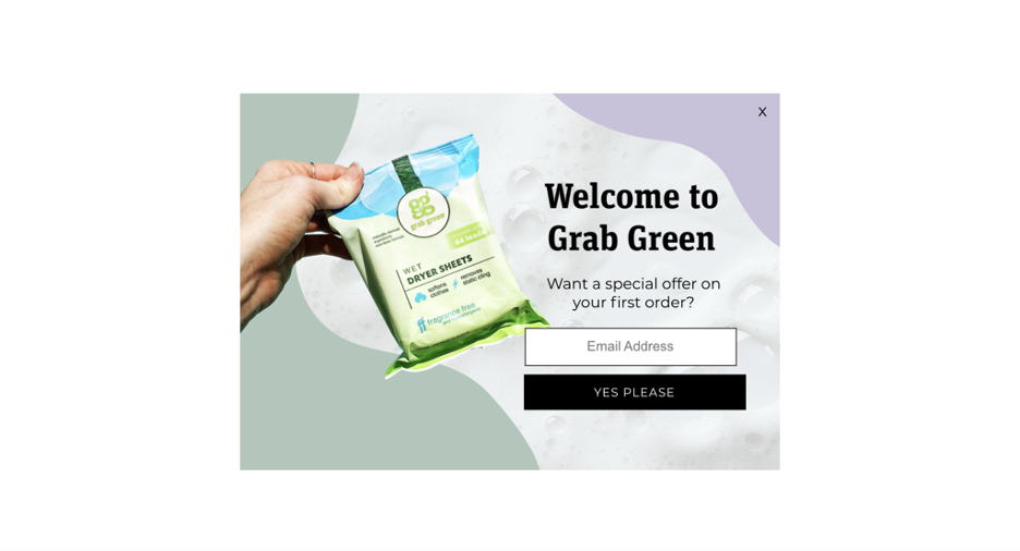
15. Grab Green Home
This is yet another example of a simple but effective popup that helps to grow your email list.
The conversational language (“Want a special offer on your first order?”) and CTA (“YES PLEASE”) showcases how basic copy choices can convince visitors to provide their information.
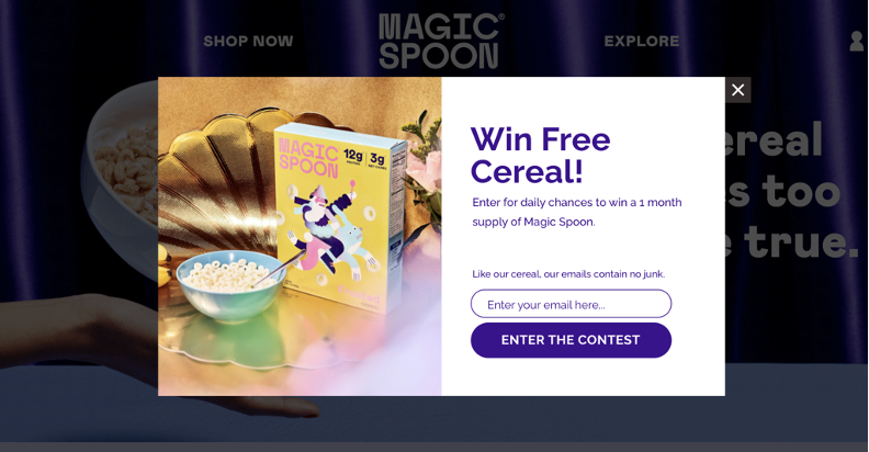
16. Magic Spoon
Ideally, your popup offer should be able to speak for itself. This ad from Magic Spoon promises something big with a chance to win free cereal for a month, using clear language and power words (“free,” “win”) to make a statement.
What are the biggest popup mistakes you should avoid?
Good question! Sometimes the best way to stick to the most important popup best practices is knowing what not to do.
Let’s look at the biggest mistakes that could potentially sink your own popups’ performance.
1. Communicating irrelevant or unnecessary content
“Busy” popups can be jarring. Make sure to limit your text and avoid multiple messages. Stick to one or two sentences with a single theme. It’s less likely to overwhelm site visitors.
2. Presenting an underwhelming offer
Ask yourself: what value are you providing to potential subscribers in exchange for their email addresses? Steep discounts, free shipping, and first-time buyer rewards are often necessary to make an impression on shoppers and drive them to subscribe.
Get creative and brainstorm incentives that go beyond basic updates or a 5% discount.
3. Relying on old-school, spammy popup designs
Here at OptiMonk, we’re on a crusade against bad popups.
Busy. Spammy. Salesy. You know the ones we’re talking about.
The good news? Building stylish, click-worthy popups is possible for any brand—thanks to tools like OptiMonk.
Wrapping up
We hope you’ve found our list of popup design best practices and examples useful!
The importance of effective popup designs is often overlooked. But hopefully, now that you’ve seen what an impact smart design can make, you’ll never go back to boring, ho-hum popups again!
Investing some time into designing stunning, on-brand popups will have a HUGE impact on conversion rates and send your ROI sky-high.
Learn more
Looking for more tactics on how to create effective popups? Check out these articles:
- The 3 Principles Behind High-Converting Popups
- How to Craft An AWESOME Popup?
- Exit Intent Popup Examples, Tips & Strategies: An Ultimate Guide
New to popups? Get started with one of our ready-to-use templates here!
Migration has never been easier
We made switching a no-brainer with our free, white-glove onboarding service so you can get started in the blink of an eye.

What should you do next?
Thanks for reading till the end. Here are 4 ways we can help you grow your business:
Boost conversions with proven use cases
Explore our Use Case Library, filled with actionable personalization examples and step-by-step guides to unlock your website's full potential. Check out Use Case Library
Create a free OptiMonk account
Create a free OptiMonk account and easily get started with popups and conversion rate optimization. Get OptiMonk free
Get advice from a CRO expert
Schedule a personalized discovery call with one of our experts to explore how OptiMonk can help you grow your business. Book a demo
Join our weekly newsletter
Real CRO insights & marketing tips. No fluff. Straight to your inbox. Subscribe now
Share this article
Written by

Csaba Zajdo
Csaba Zajdo is the founder of OptiMonk. As an ecommerce veteran, Csaba has over 15 years of experience in working with ecommerce stores. His mission is to reinvent the ecommerce industry and help stores, by creating delightful shopping experiences for each customer.
You may also like
- Posted in
- Conversion
Partner with us
- © OptiMonk. All rights reserved!
- Terms of Use
- Privacy Policy
- Cookie Policy
Product updates: January Release 2025


