- Blog
- How to Fix Your Leaky Sales Funnel: 7 Easy-to-Set-Up Tactics for Shopify Brands
How to Fix Your Leaky Sales Funnel: 7 Easy-to-Set-Up Tactics for Shopify Brands
-
Barbara Bartucz
- Ecommerce
- 6 min read
Table of Contents
A “leaky funnel” can cause a major headache for ecommerce marketers.
Picture this: potential customers are flowing through various stages of your well-thought-out sales and marketing funnel, from discovery to purchase.
But there are invisible funnel leaks at every corner, leading to a broken sales funnel where your nurtured visitors are slipping away, causing you not only frustration but a significant loss in sales.
To fix your leaky marketing funnel, we bring you seven easy-to-set-up Shopify tactics that cover the entire funnel from the moment visitors land on your page to when they’re returning as loyal regulars. These tips can help you fill those holes and reclaim your lost opportunities.
Let’s get started!
Where do you lose your customers?
Before diving into the specifics of how to fix a leaky sales funnel, let’s take a step back and figure out where things might be going wrong.
Identifying the exact points in your sales funnel where customers are slipping away, often referred to as “sales funnel leaks”, is the first step in plugging those leaks.
So, where do you lose your potential buyers? Let’s break it down.
1. Homepage
Your homepage serves as the virtual storefront for your Shopify store, and that’s why it needs special attention. Losing first-time homepage visitors can happen for various reasons.
First of all, your homepage might not be interesting enough to captivate visitors.
In the digital age, attention spans are fleeting. If your homepage fails to grab attention within seconds, visitors may opt to explore elsewhere.
Implementing visually appealing elements above the fold—such as high-quality images, engaging headlines, and perhaps a featured product or promotion—can enhance your homepage.
On the flip side, information overload is another culprit that might be to blame for losing potential customers. If your homepage bombards visitors with too much information, excessive options, or busy visuals, it can overwhelm and confuse them.
Another possibility is that your value proposition simply isn’t persuasive enough. If your visitors can’t quickly grasp the unique benefits of your products or services, they may lose interest.
2. Product pages
As potential customers navigate from the homepage to your product pages, the risk of losing them remains.
The first issue to address is the product description—it must be informative but also compelling, highlighting the unique selling points and benefits. A wishy-washy product description can leave visitors unconvinced, which can lead them to abandon the page.
Furthermore, it’s vitally important to make it easy for visitors to find the products they’re looking for. If your website’s navigation is confusing or your search functionality is cumbersome, customers may grow frustrated and leave without completing their purchase.
3. Cart & checkout
Cart abandonment is a common struggle for ecommerce store owners. Tons of visitors add products to their carts, only to change their minds at the last minute.
One primary reason for cart abandonment is price concerns, which often deter customers from proceeding to checkout. Shipping-related apprehensions also contribute to cart abandonment: customers may abandon their carts if they think shipping costs are too high or if they’re not sure about delivery times.
Additionally, uncertainty about whether the selected product is the right fit can lead to hesitation at the checkout.
Incorporating customer reviews, a hassle-free return policy, or an interactive chat feature can help address these concerns and provide the reassurance customers need to complete their purchase.
How to optimize your homepage
Now that you know where potential leaks can happen, it’s time to tackle them head-on.
Let’s start at the very beginning of your customer’s journey—the homepage. This is your chance to make a strong first impression and guide visitors seamlessly into your funnel by implementing effective lead nurturing strategies.
Here’s how to optimize it for maximum impact.
Tip #1: Guide and segment your homepage visitors
First-time visitors to your homepage often require assistance in navigating your site, particularly when you have lots of featured products.
One solution involves incorporating a quiz into your welcome popup. A conversational popup is like a fusion between a quiz and a traditional welcome popup, and you can easily set it up by using one of our ready-to-use conversational popup templates.
And the best part is that you’ll kill two birds with one stone: you’ll engage your visitors with questions, but those questions will also allow you to segment them. This means you’ll be able to display relevant products and extend special discounts down the line.
This dual strategy not only enhances the user experience but also enables you to build your email list.
Here’s how it works:
First, you ask your visitors what they’re looking for to find out more about their problem.
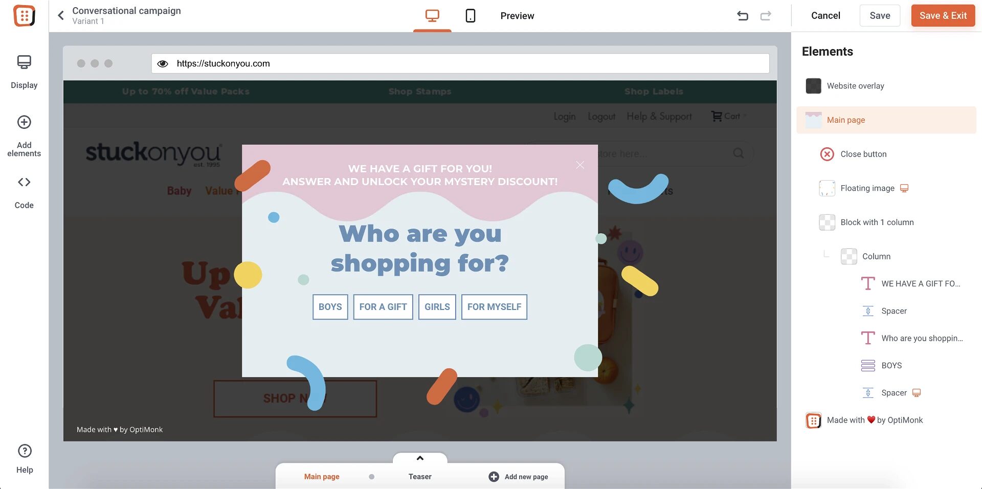
In exchange for an enticing discount, you ask for their contact details.
Then, based on the answers they gave to your questions, you can provide personalized recommendations and show off your most popular products.
If you’d like to segment and guide your visitors while building your list, get started with these popup templates:
Learn more about the full process here.
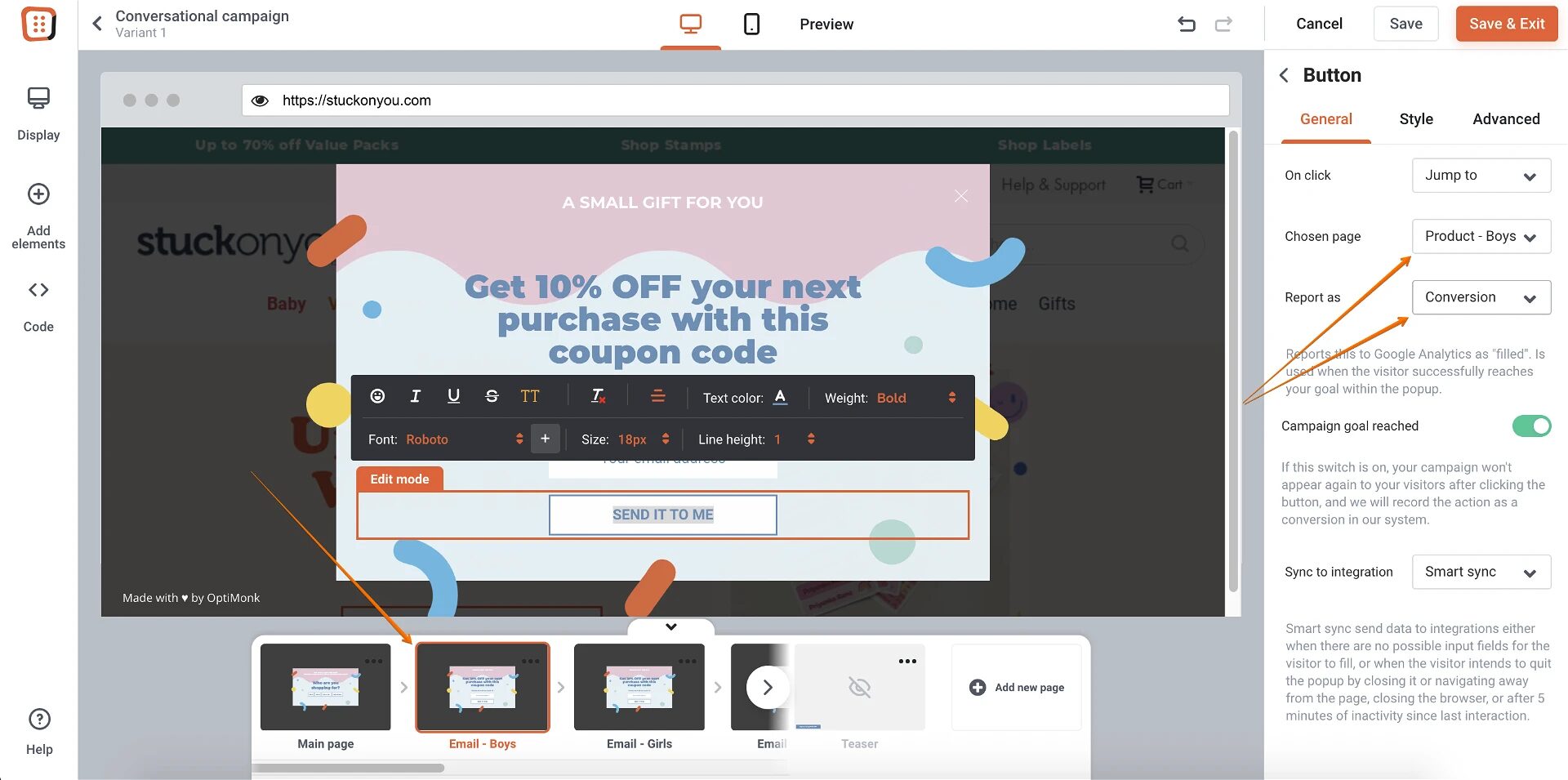
Tip #2: A/B test your landing pages with the power of AI
The messaging on your homepage has the potential to create a leaky funnel. What your first-time visitors encounter (particularly above the fold) is crucial.
This includes your headline and value proposition—they have to be compelling and resonate with your customers’ issues, encouraging them to continue their journey into your site. How can you find out what type of messaging is best? With A/B testing.
A/B testing is a well-known tool in every marketer’s toolset, yet even seasoned professionals often rely on gut feelings.
Why?
Because A/B testing is time consuming and requires a lot of resources. You have to brainstorm ideas, choose the elements you want to test, and then regularly evaluate those results.
Luckily, with the power of AI, you can automate 99% of those tasks. Smart A/B testing is a set-it-and-forget-it solution, meaning it saves you tons of time and effort.
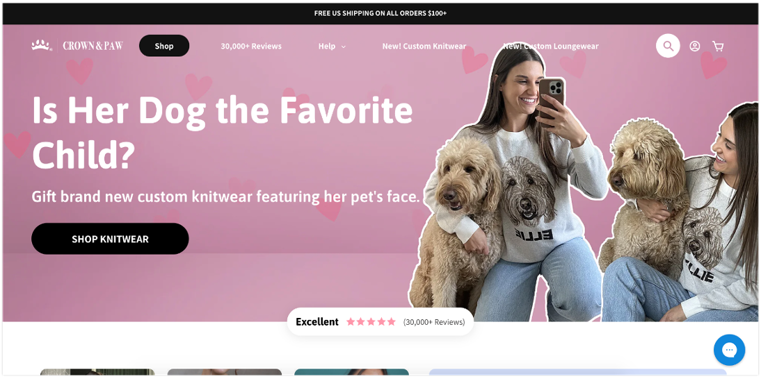
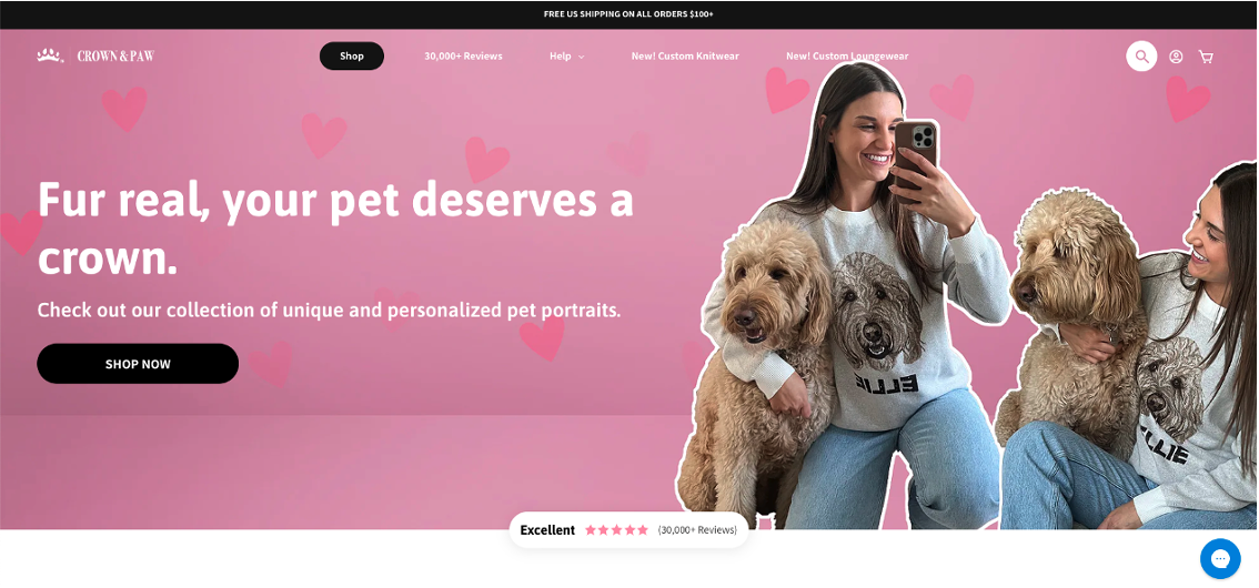
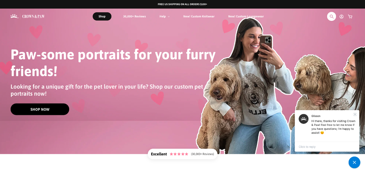
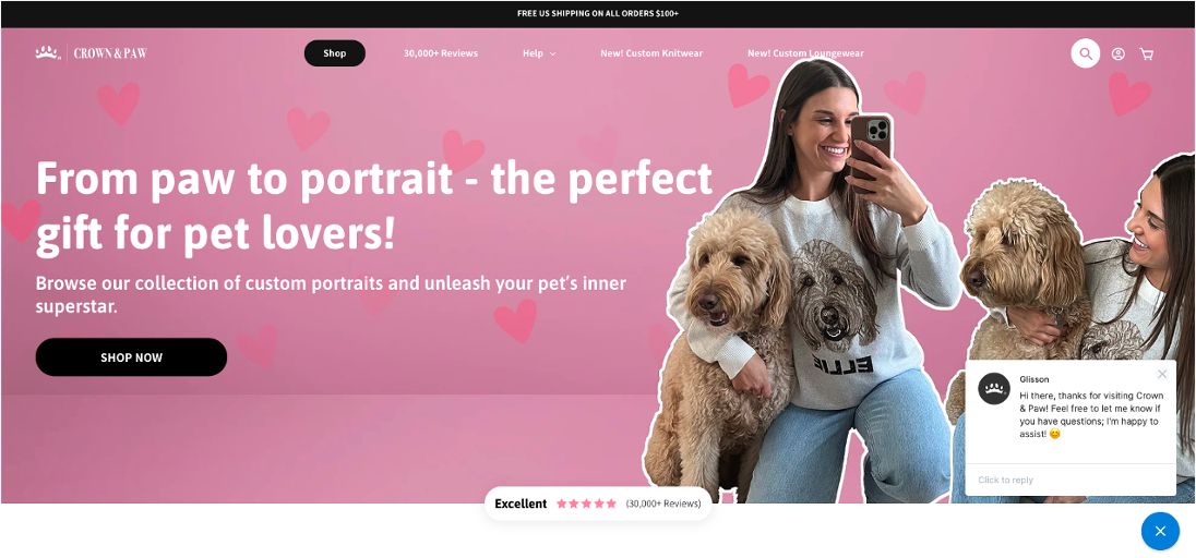
Here’s an example: Crown & Paw decided to run an A/B test on their landing page headlines to find out which one would resonate best with their target audience.
They pitted their original against 3 variants…
- Original: Is Her Dog the Favorite Child?
- Variant A: Fur real, your pet deserves a crown.
- Variant B: Paw-some portraits for your furry friends!
- Variant C: From paw to portrait – the perfect gift for pet lovers!
This strategy boosted their homepage conversion rate by 16% on average.
Learn more about Crown & Paw’s ecommerce journey here!
Tip #3: Help returning visitors by reminding them where they left off
When it comes to returning visitors, it’s time to put your best foot forward.
Your main goal should be to aim for the best possible user experience and make their journey as smooth as it can be.
One way to do this is to show them their previously viewed products on a side message. This is less disruptive than a traditional popup, but still allows them to easily pick up where they left off and continue their journey.
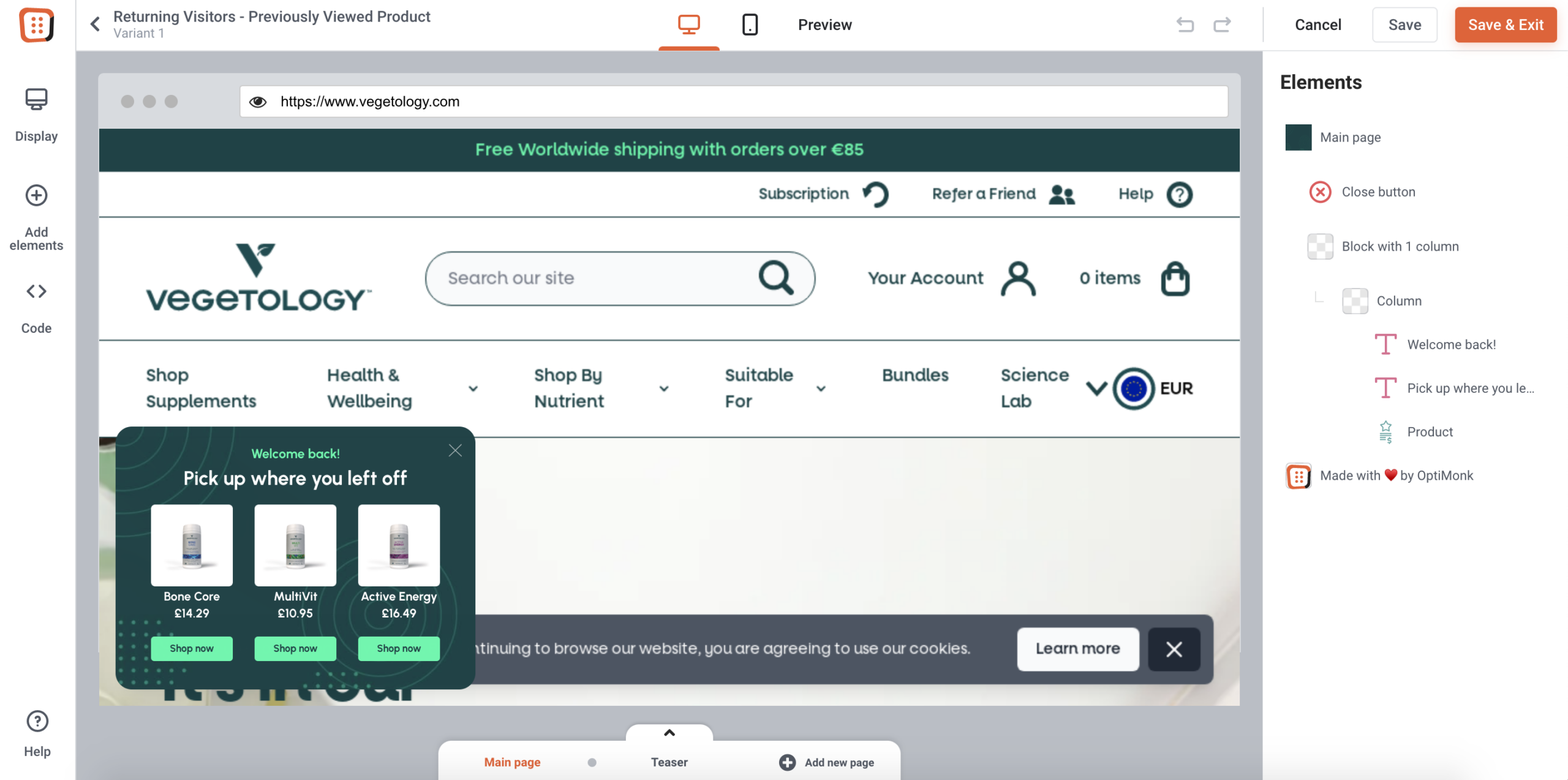
You can try one of these templates:
How to optimize your product pages
Once your visitors are hooked on your homepage, the next stop is your product pages.
This is where the real magic happens—where browsers turn into buyers. But if your product pages aren’t compelling enough, even the most interested visitors can slip away, leading to sales funnel leakage.
Let’s dive into how you can optimize these pages to maximize conversions.
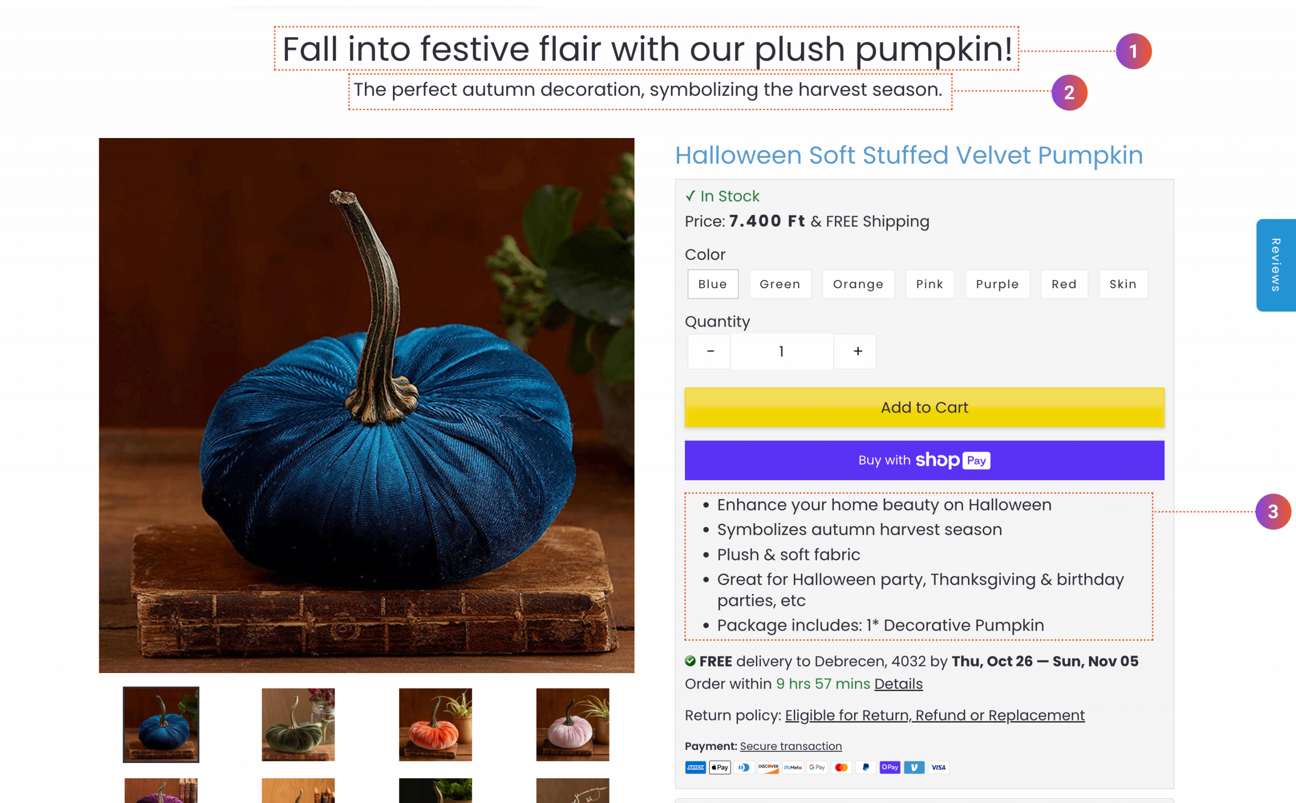
Tip #4: Turn your product pages into high-converting sales pages
Most product pages focus too much on product specifications. The headline is typically just the name of the product, so the visitor has to dig into a lengthy description to find out if it’s the right product for them. That’s why many of them leave without buying.
Instead, you should be focusing on writing a benefit-driven headline and highlighting the main values of the product in an easy-to-scan list of bullet points.
But what if you have thousands of product pages? Manually crafting each one is clearly not a sustainable solution.
Luckily, with the power of AI, it’s now possible to create all these benefit-driven product pages without breaking a sweat.
With Smart Product Page Optimizer, you can create new headlines, descriptions, and other text elements in bulk. You can conduct A/B tests with multiple versions of your copy, pitting them against each other.
Let’s check out an example…
Mounteen, an ecommerce store selling a range of different merchandise, wanted to upgrade their product pages by experimenting with them, which is why they turned to Smart Product Page Optimizer.
Here’s what AI helped them do:
- Add a catchy slogan on the top of each product page
- Add a clear, benefit-driven subheadline
- Add a bulleted list of benefits to highlight the product’s main values
With this optimization, they achieved an 18% revenue boost. Find out more about Mounteen and their impressive results.
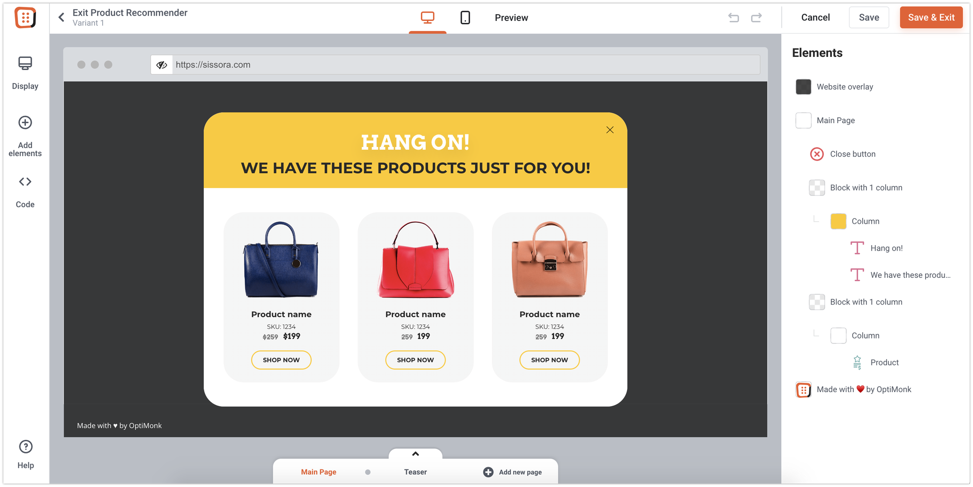
Tip #5: Encourage product discovery on exit intent
Another main reason visitors leave is that they weren’t able to find the right product for them.
To tackle this, you can simply place your best-selling products on an exit intent popup! This will encourage your visitors to explore more—and spend more time on your website.
How to optimize your cart & checkout
Now that you’ve got visitors engaged and excited about your products, it’s time to guide them toward completing the sale. But, even the best product pages can fall short if the checkout process isn’t smooth and reassuring.
Let’s look at how you can optimize your cart and checkout to reduce friction, focus your sales efforts, and seal the deal.
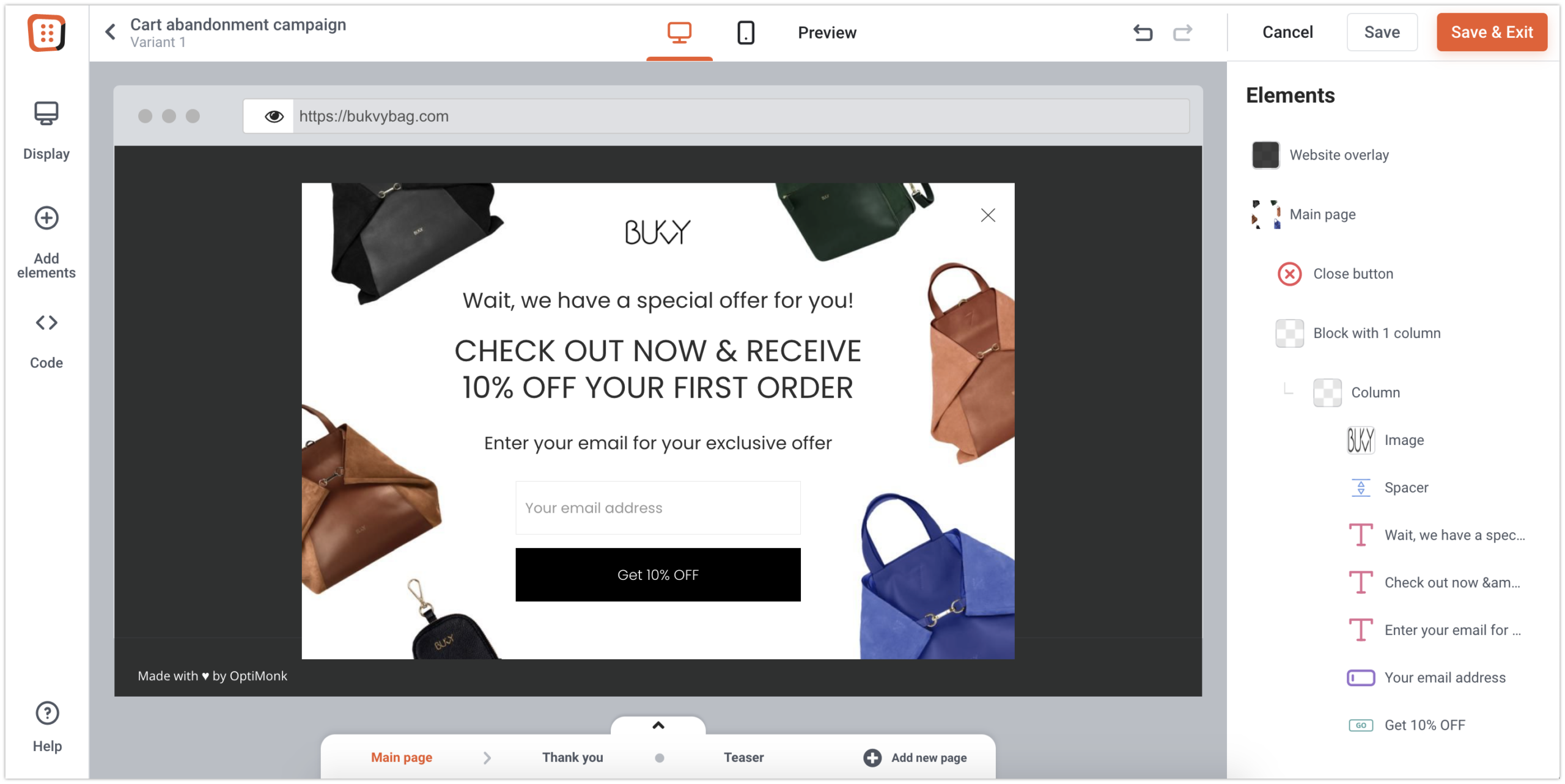
Tip #6: Offer a discount for cart abandoners
As the average cart abandonment rate hovers around 66.5%, ecommerce business owners around the world are constantly on the lookout for solutions.
To tackle this problem straight on, you can consider offering a discount visitors can’t resist.
And it’s incredibly easy to implement: you simply choose a regular cart abandonment campaign, add a coupon for your thank you page, and then target your campaign.
Want to set it up now? Here are some ready-to-use templates:
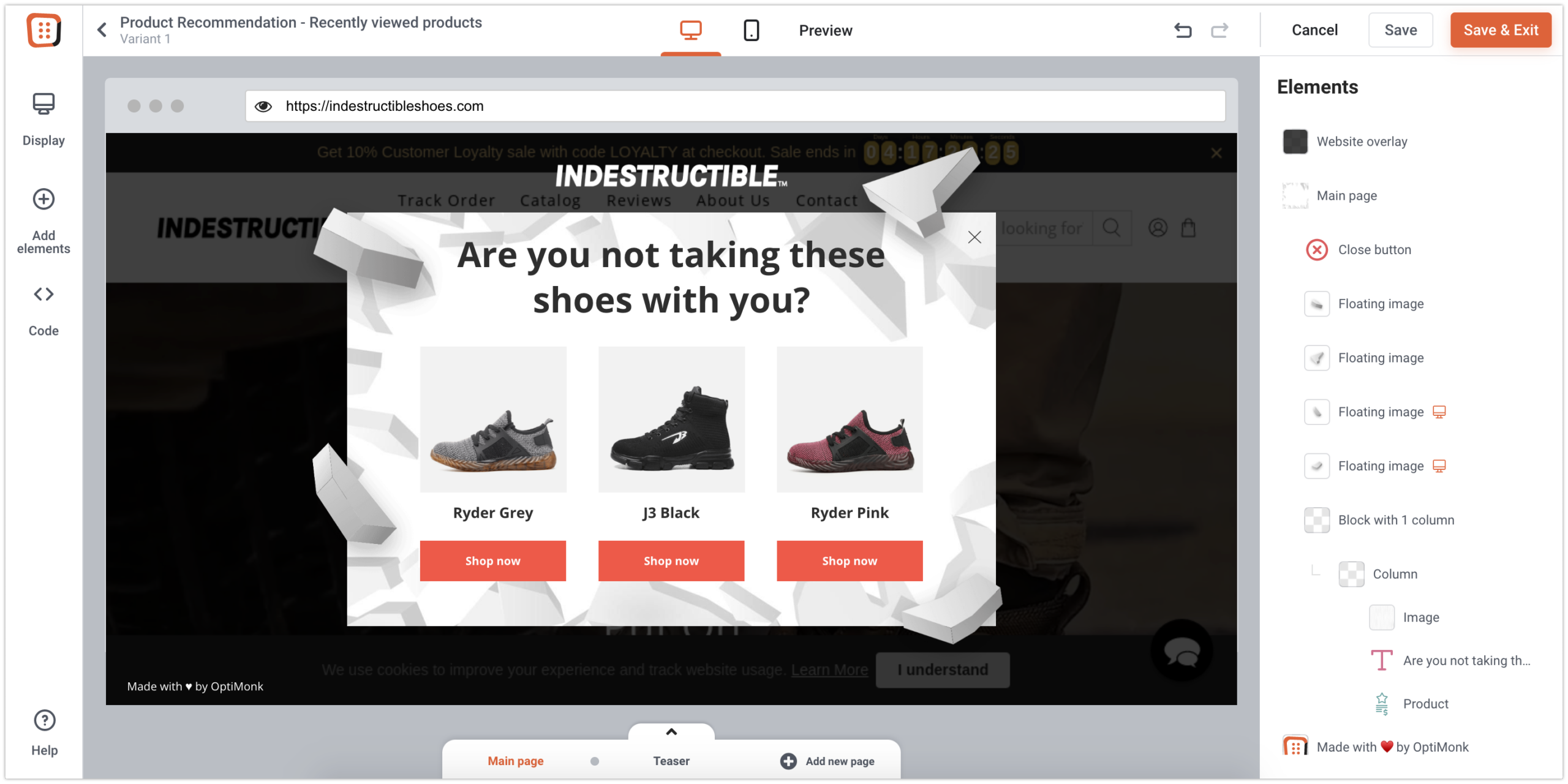
Tip #7: Show products in the cart on exit-intent
Finally, if your visitor has added items to their cart but is about to leave your site, consider reminding them of what they’re leaving behind. This approach can boost both your conversion rates without discounting.
Just create an Exit Reminder popup and launch it.
Pick a template and launch your first Exit Reminder campaign in 2 minutes:
Wrapping up
In summary, fixing a leaky funnel for Shopify brands is crucial for preventing potential customers from slipping away at various stages of the buyer’s journey and optimizing sales funnels.
Here’s a quick wrap-up of the seven easy tactics discussed in this article:
- Guide and segment your homepage visitors: Enhance the user experience by incorporating a quiz into your welcome popup, segmenting visitors, and offering relevant products and discounts.
- A/B test your landing pages with AI: Use the power of AI to automate A/B testing and hone in on compelling headlines and value propositions for your homepage that resonate with your audience.
- Help returning visitors pick up where they left off: Improve the user experience for returning visitors by displaying previously viewed products in a less disruptive side message.
- Turn product pages into high-converting sales pages with AI: Utilize AI-powered tools like Smart Product Page Optimizer to create benefit-driven texts and conduct A/B tests for optimal results.
- Encourage product discovery on exit-intent: Combat visitor frustration by showcasing best-selling products on an exit intent popup, encouraging further exploration and more website engagement.
- Offer a discount for cart abandoners: Address the significant issue of cart abandonment by enticing hesitant shoppers with irresistible discounts through a targeted campaign.
- Show products in the cart on exit intent: Boost conversion rates by reminding abandoning visitors of what they’re leaving behind.
By implementing these tactics, Shopify brands can effectively plug the leaks in their sales funnel, retaining more customers and maximizing opportunities for increased revenue.
Migration has never been easier
We made switching a no-brainer with our free, white-glove onboarding service so you can get started in the blink of an eye.

What should you do next?
Thanks for reading till the end. Here are 4 ways we can help you grow your business:
Boost conversions with proven use cases
Explore our Use Case Library, filled with actionable personalization examples and step-by-step guides to unlock your website's full potential. Check out Use Case Library
Create a free OptiMonk account
Create a free OptiMonk account and easily get started with popups and conversion rate optimization. Get OptiMonk free
Get advice from a CRO expert
Schedule a personalized discovery call with one of our experts to explore how OptiMonk can help you grow your business. Book a demo
Join our weekly newsletter
Real CRO insights & marketing tips. No fluff. Straight to your inbox. Subscribe now
Share this article
Written by

Barbara Bartucz
Barbara is a Content Marketer at OptiMonk. She takes pride in creating different forms of content, whether it’s an article, a video, or an e-book.
You may also like
- Posted in
- Ecommerce
Partner with us
- © OptiMonk. All rights reserved!
- Terms of Use
- Privacy Policy
- Cookie Policy
Product updates: January Release 2025


