- Blog
- One-Step vs. Multi-Step Forms: Definition, Pros and Cons, Examples & Best Practices
One-Step vs. Multi-Step Forms: Definition, Pros and Cons, Examples & Best Practices
-
Barbara Bartucz
- Conversion
- 6 min read
Table of Contents
Ready to dive into the world of multi-step forms but not sure where to start? Curious about the difference between multi-step popups and single-step forms?
You’re in the right place!
In this article, we’ll explore how to build effective multi-step forms, how they differ from their one-page siblings, and provide real-life examples to guide you.
Let’s jump in!
What is a one-step popup?
A one-step (or one-page) popup is like a sleek mini-form that pops up on a website, catching your eye with its visual appeal.
It’s simple and efficient, presenting all the necessary fields—like name and email—in one clean screen. It’s perfect for quick interactions like subscribing to a newsletter.
You can breeze through the entire process within a single view, making it super convenient and user-friendly.
These traditional popups typically keep it brief, asking for only the most essential details—usually just your email address—making sure the whole experience is short and sweet.
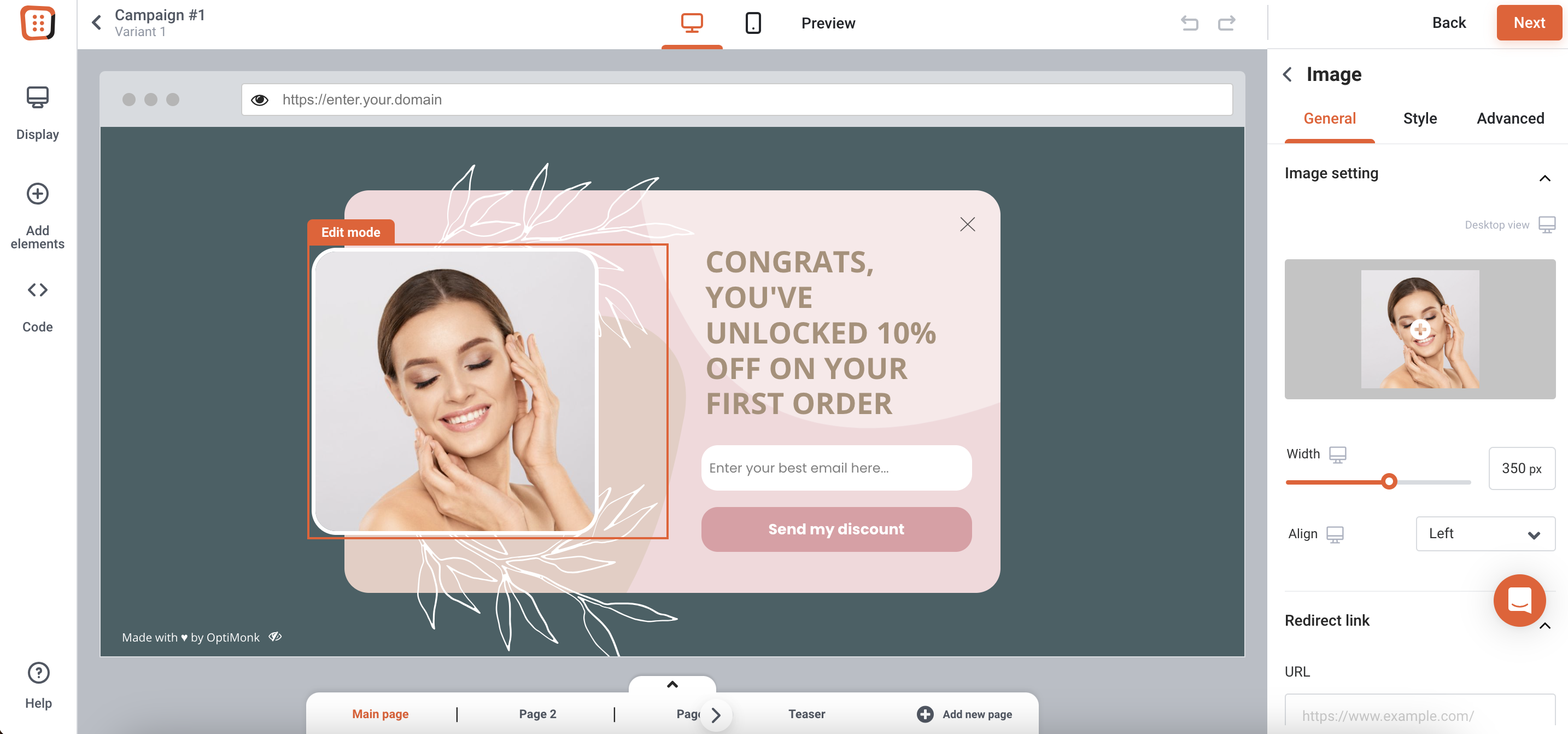
Here’s a classic example of a one-step popup campaign in action:
What is a multi-step form?
In contrast to the straightforward nature of one-step popups, multi-step forms within popups offer a dynamic and engaging way to gather user information.
Rather than bombarding users with all your questions at once, a multi-step form divides the process into manageable pieces, reducing cognitive load and guiding site visitors through a series of screens before they submit their final details.
This approach is highly effective for collecting detailed information while keeping users actively involved.
By gradually revealing questions or fields, multi-step forms prevent users from feeling overwhelmed, ensuring that each step feels achievable and digestible.
Moreover, breaking down the process encourages users to invest more time and effort, which can increase conversions.
Advanced multi-step forms can even adapt dynamically, showing or hiding specific steps based on previous answers, which creates a personalized experience.
Ultimately, by simplifying the information-gathering process into steps, multistep popups reduce the perceived effort, making users more inclined to complete a longer form in its entirety.
Effective form design is crucial in this context, as it impacts usability, completion rates, and user satisfaction.
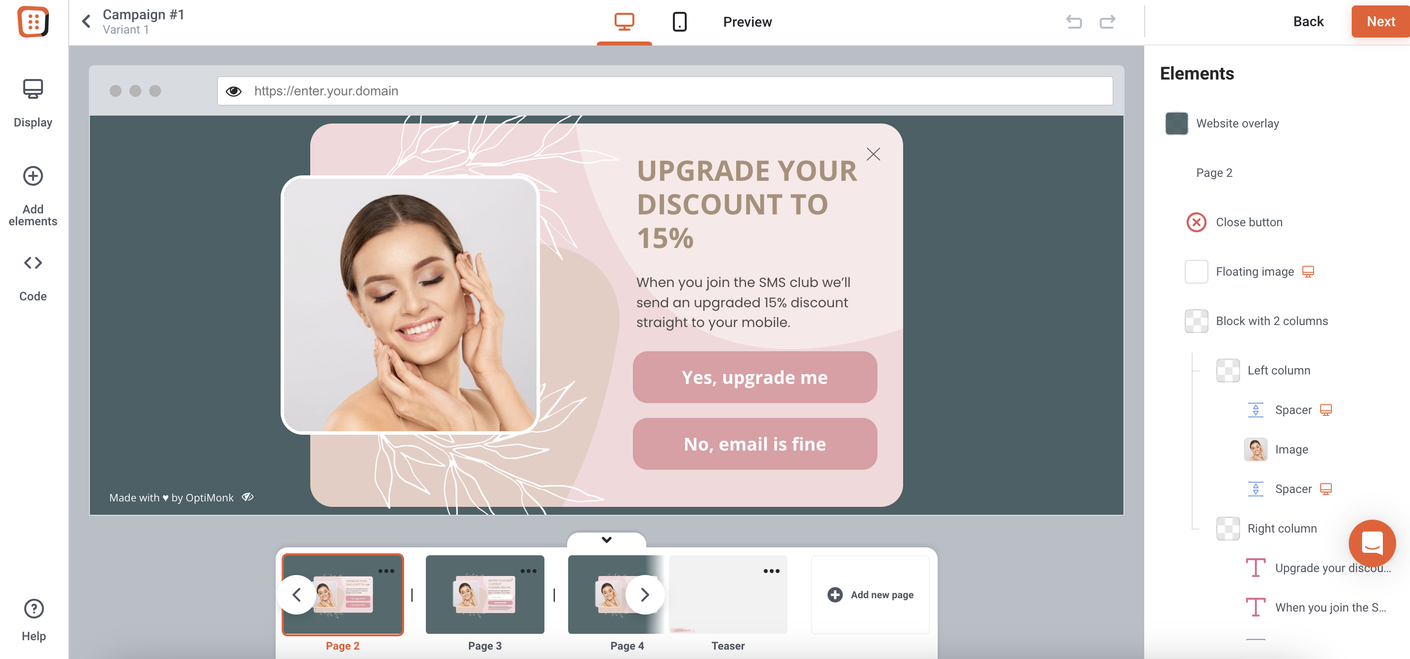
Take a look at this multistep popup example to see it in action. (Click on Preview to see all the steps of the popup.)
One-page vs multi-step forms: The pros and cons
When it comes to choosing between one-page and multi-step popups, it’s important to remember that each brings a unique set of advantages and drawbacks.
Let’s take a look at the pros and cons of both approaches.
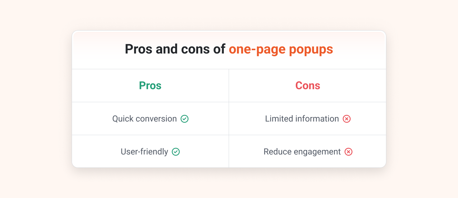
Pros of one-page popups:
- Efficiency: One-page popups are great for swiftly capturing user information.
- Simplicity: The straightforward nature of one-page popups contributes to a smooth user experience, reducing potential obstacles that might deter visitors from subscribing.
Cons of one-page popups:
- Limited detail: Gathering comprehensive user information can be challenging with one-page popups, which typically prioritize collecting only the most essential data.
- Lower engagement: The brief interaction might not foster as much user engagement compared to the more immersive experiences offered by multi-step popups.
Now, let’s explore the advantages and disadvantages of multi-step popups.
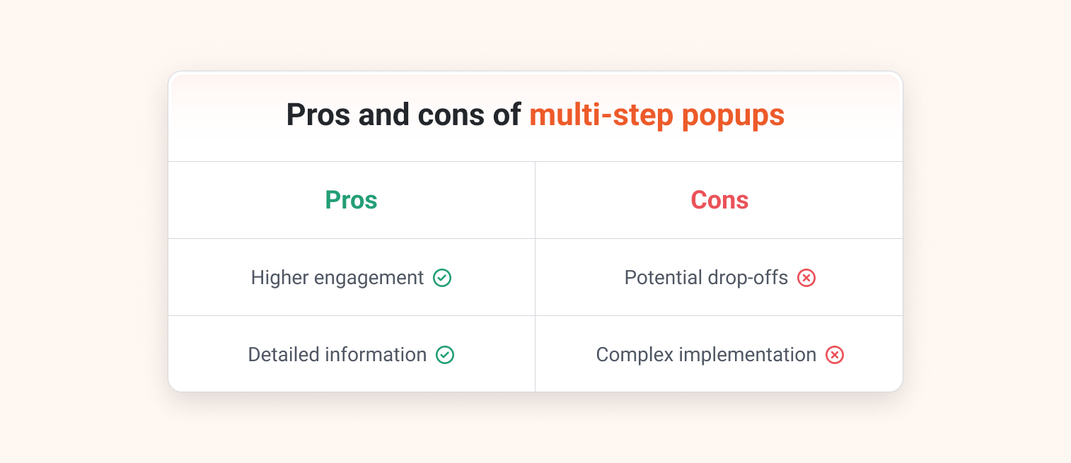
Pros of multi-step popups:
- Increased engagement: Multistep popups encourage users to invest more time and effort, resulting in higher engagement and commitment levels compared to single step forms.
- Comprehensive data collection: By breaking information into multiple steps, these popups allow businesses to collect more detailed and comprehensive zero party data, providing a deeper understanding of their users.
Cons of multi-step popups:
- Risk of abandonment: Completion rates might be lower, as the multi-step approach may lead some users to abandon the process before completion (particularly if the form feels too lengthy).
- Complex implementation: Without the right tools or resources, implementing multi-step popups could potentially be more complex compared to simpler one-page alternatives.
Key factors to consider when choosing between the two
Let’s explore some essential factors to consider before choosing between a single-step and a multi-step popup.
1. Consider the desired level of user interaction
When deciding between a single-step form and a multi-step form, check your goals for user engagement.
If your aim is quick conversions on your landing pages, the efficiency of one-page popups is probably the best fit.
However, if you’re seeking more detailed engagement and sustained interaction with users, multi-step popups offer the opportunity to encourage deeper involvement.
2. Assess the type and amount of information needed
The type and amount of information you need to collect should also influence your choice of popup style. If simplicity and speed are important, one-page popups can efficiently gather all the data you need.
On the other hand, if you want more comprehensive insights and detailed information, long forms broken up into multiple steps provide a structured, effective approach to collecting this information.
3. Define the user experience you want to deliver
Consider the user experience you aim to provide.
One-page popups are ideal for straightforward and streamlined interactions, perfect for users seeking quick solutions.
But if you’re looking to create a more immersive journey for your audience, multi-step popups can help you get there. They guide users through a series of steps, fostering deeper engagement and interaction with your content than traditional one-page popups.
5 real-life multi-step form examples (with different use cases)
Now it’s time to delve into some real-life examples from top brands and see how they’ve effectively implemented multistep popups to engage their audience.
1. Obvi’s email & SMS subscription popup
Our first example of a multi-step popup comes from nutrition brand Obvi.
Their popup campaign begins with a straightforward opt-in offer of 10% and asks visitors to provide their email addresses.
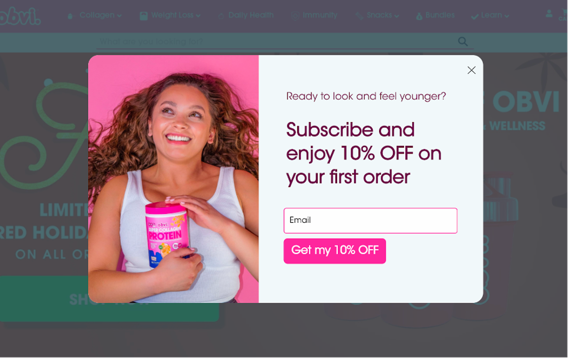
On the second page, they smoothly transition into collecting visitors’ phone numbers, making it a simple process for data collection.
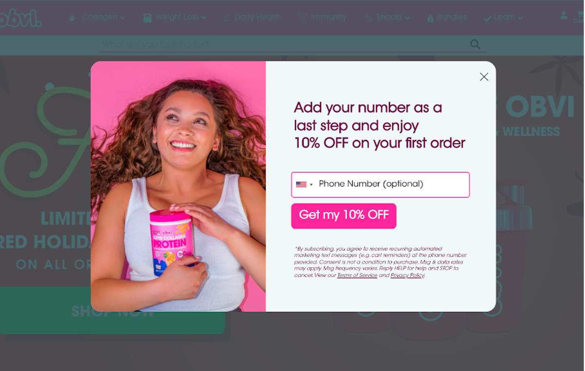
Finally, in the last step, they deliver the promised coupon code, already activated for the visitor’s immediate use.
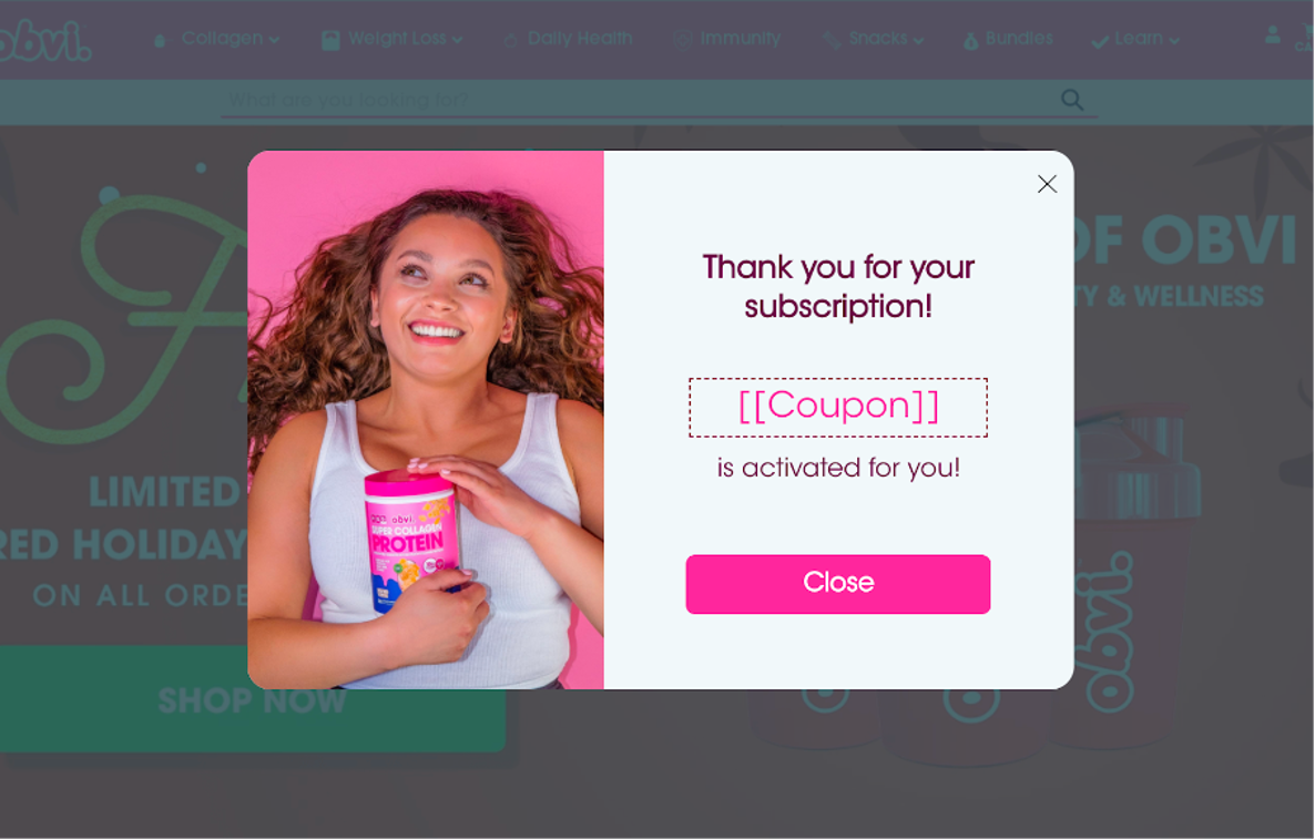
Obvi’s example showcases why you should create a seamless progression with your multi-step form, with each step maximizing both user engagement and data capture efficiency.
2. BootCuffsSocks’ yes-no popup
Our second example comes from BootCuffsSocks, who employs a straightforward yet impactful yes-no popup strategy.
Opting for simplicity, they engage visitors with a single question: whether they’d like to receive a 10% discount or not.
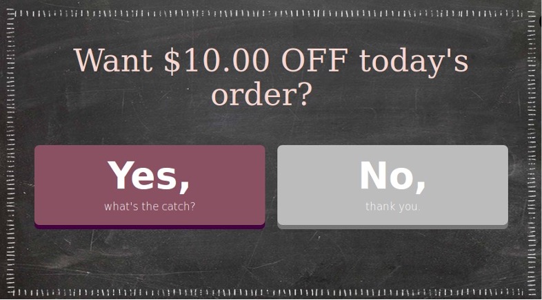
By keeping it simple, BootCuffsSocks ensures quick interaction and encourages high engagement rates.
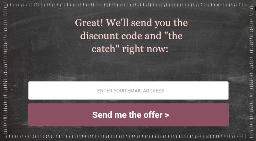
Once visitors fill out the form fields, they swiftly receive the coupon code.

The genius lies in the universal appeal of discounts—who can resist saying no to such an enticing offer?
3. Biktrix’s Trojan Horse popup
Even smart marketers find it hard to build their email and SMS lists at the same time. But let’s take a cue from Biktrix’s Trojan Horse popup, a method developed by Jason K. Williamson.
With this method, you can expect 30-80% of your email subscribers to become SMS subscribers.
On the first page, you ask for the email address. (Also, note how they refer to it as a “mystery discount.”)
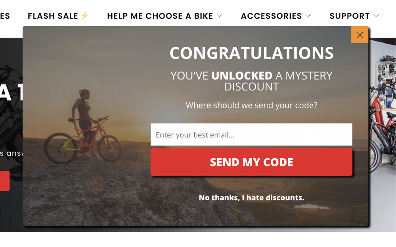
Then, here comes the trick…they invite users to “double up” their discount.
It’s a tough deal to turn down, right?
But the power is still in the hands of the user, because Biktrix includes a simple “email is fine” button, allowing them to opt out if they prefer.
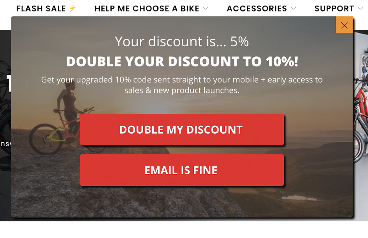
If they choose to double their discount (and many will), they’ll get an invite to the SMS club, where they’ll enjoy exclusive access to sales and product launches.
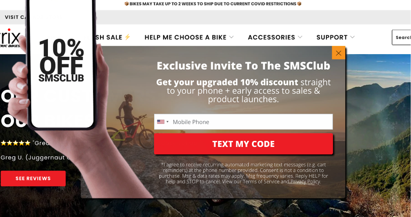
Convincing, right? It’s a smart and effective way of building your email and SMS lists simultaneously!
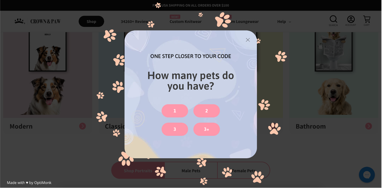
4. Crown & Paw’s segmentational popup
Crown and Paw’s multistep popup example demonstrates how you can simultaneously build and segment your email list.
In the initial step, they entice visitors with an irresistible offer and the promise of personalized product recommendations.
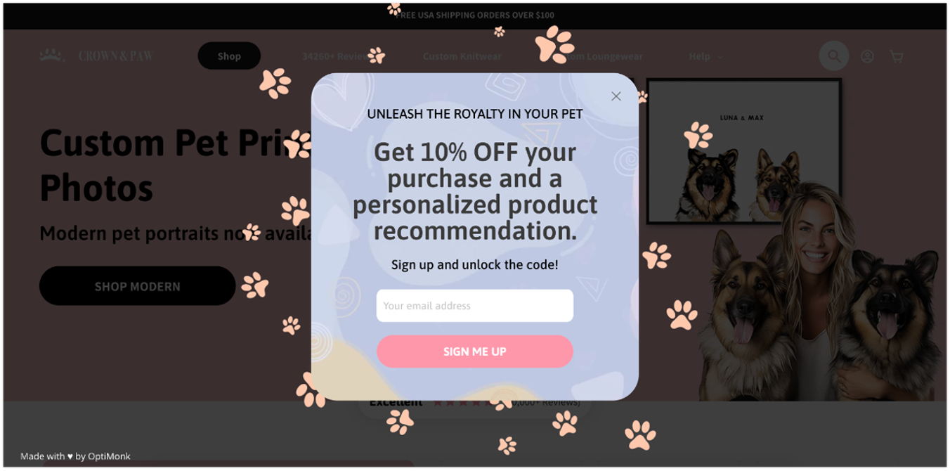
Once they opt in for their 10% discount, visitors encounter a simple question about their pet as the second step.
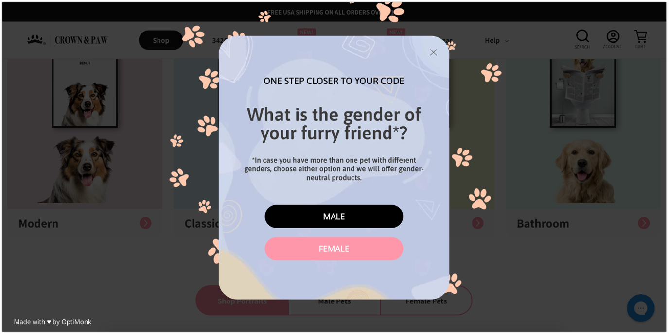
Finally, on the third page, the last question appears, guiding them to the final page where they receive their coupon code along with personalized product recommendations.
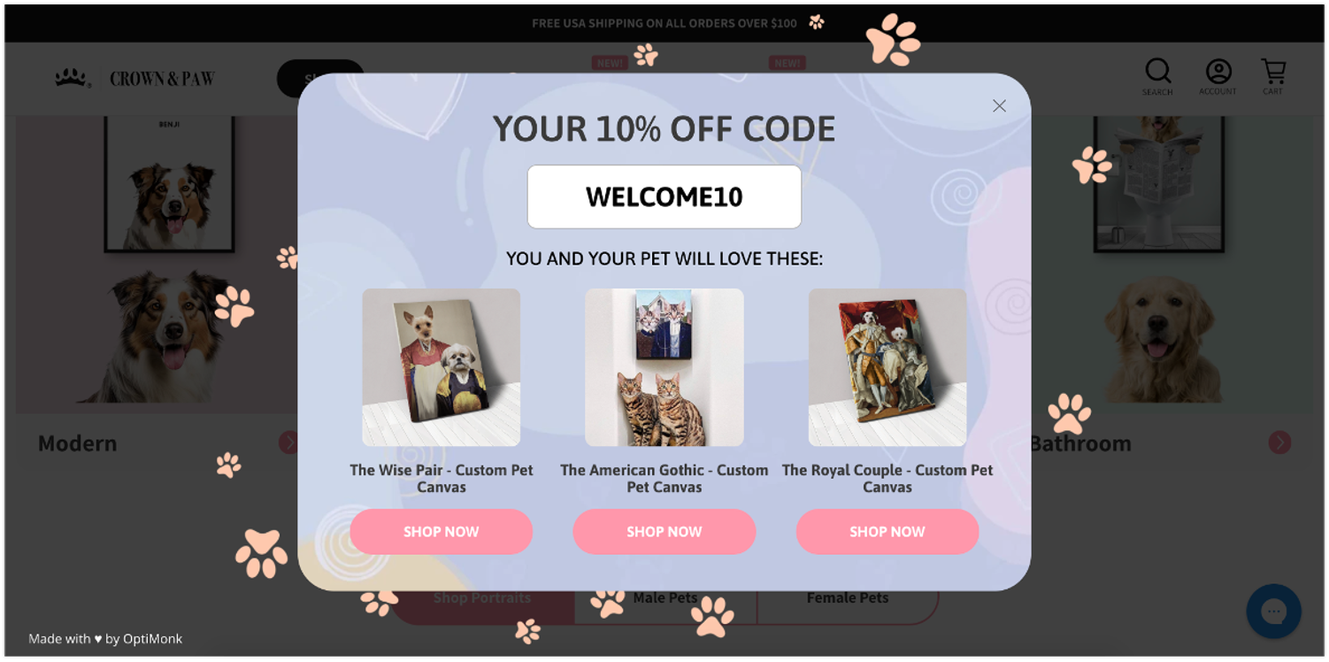
Crown and Paw’s example shows us how breaking up long forms into multiple steps can help you better understand your visitors.
Plus, even if a user decides not to proceed with the segmentational questions, you’ve already obtained their email address!
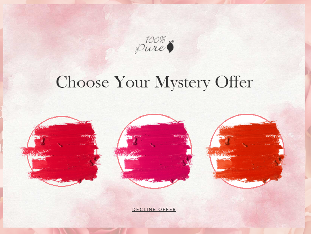
5. 100% Pure’s mystery offer popup
In our final multistep popup example, we showcase Pure’s simple yet effective solution for boosting conversions.
Harnessing the allure of mystery, Pure invites visitors to choose from three options without delving into too much detail about the offers.
Once a user clicks, they’re prompted to enter their email address and offered a 15% discount code.
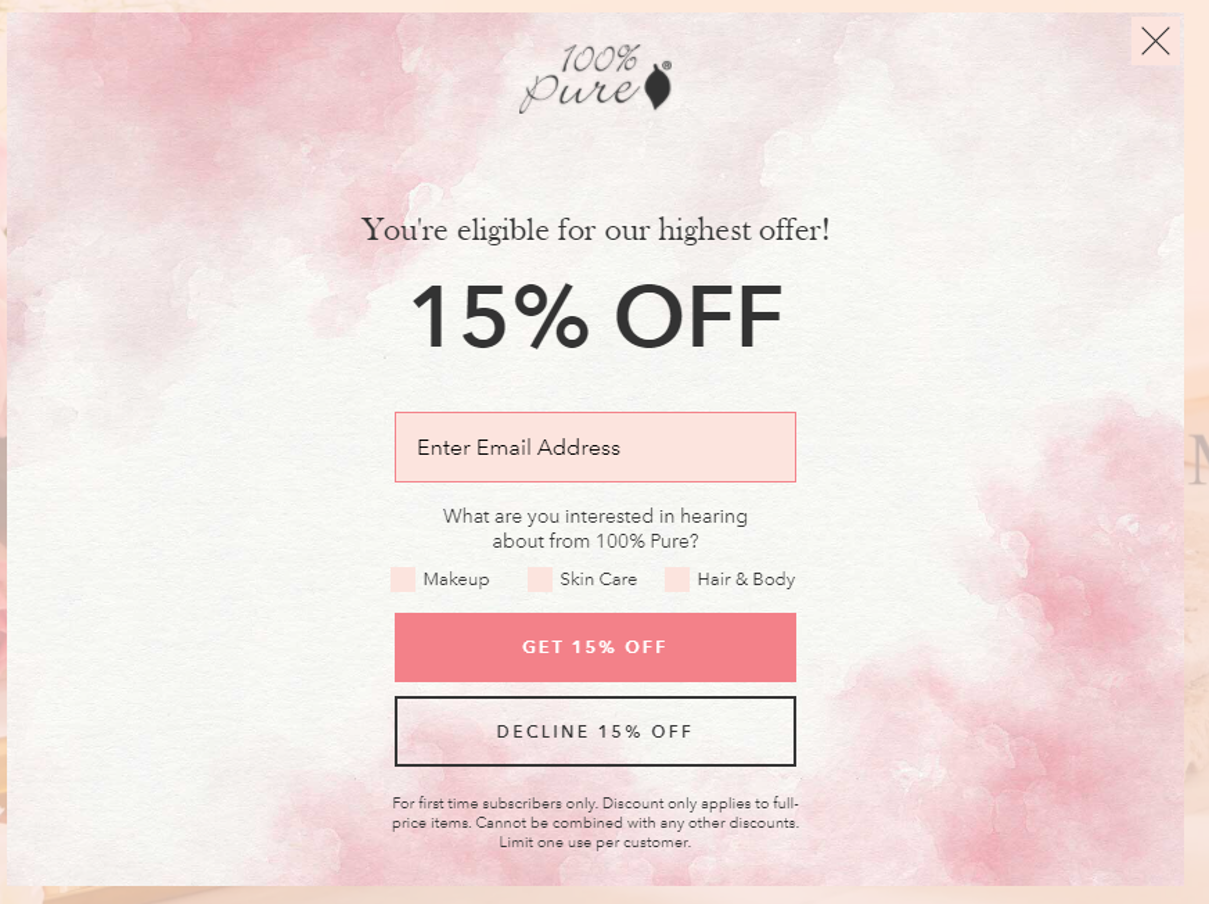
This multi-step form approach cleverly dresses up a specific discount offer, tapping into our natural intrigue for mystery and effectively enhancing its appeal.
How to build your own multi-step form?
OptiMonk is a powerful conversion optimization tool that allows you to implement multi-step popups and multi-step forms with ease.
In this section, we’ll explore how to create one using OptiMonk as a multi-step form builder.
Step 1: Choose a multi-step popup template
Browse through OptiMonk’s selection of multi-step popup templates and select one that suits your preferences.
Note: If you find a one-page popup that you love, you can opt for that and then later transform it into a multi-step form using the drag-and-drop editor!
Step 2: Design the first page of your popup
Customize the initial popup campaign to capture users’ attention effectively.
Create a compelling headline, use attractive images, and include a clear call-to-action (CTA) to encourage user engagement.
Step 3: Edit additional steps
Proceed to edit and configure each additional page of your multistep popup. Design various steps to include different forms, questions, or offers.
If you initially chose a one-page popup, this is where you can add extra steps effortlessly using OptiMonk’s intuitive drag-and-drop editor.
Step 4: Set triggering and targeting rules
Define when and where your multi-step form should appear.
OptiMonk provides powerful targeting options, allowing you to display the popup based on user behavior, geography, and more.
Step 5: Set up your integration
Easily connect OptiMonk with your favorite marketing or email service provider to smoothly incorporate data from multi-step forms into your overall marketing plan.
Step 6: Activate your campaign
Once you’ve finalized your multi-step popup’s design and setup, save your campaign settings and activate it.
Track its performance using OptiMonk’s analytics tools to gain valuable insights and make informed optimizations as required based on the data you collect.
Check out this video, where we break down exactly how to implement a multi-step popup strategy for explosive list growth:
5 best practices to create high-converting multi-step forms
Creating high-converting multi-step forms involves several key practices to enhance user experience and boost completion rates.
Here are some best practices to follow:
1. Low-threat first step
In your multi-step form, always begin with an easy, non-invasive question to reduce user friction.
This approach makes users more comfortable and increases the likelihood of them continuing through the form.
For example, asking for a name or a simple yes/no question can set a positive tone and build initial engagement.
2. Justify data collection
Clearly explain why each piece of information is needed.
If you need their phone number, explain that it’s for order updates or personalized service, which helps users feel more secure in sharing their information.
This transparency builds trust and reassures users that their data will be used responsibly.
3. Clear progress indicators
You can use progress bars to show users how far they’ve come and how much is left. This visual cue helps keep users engaged and motivated to complete the form.
Progress indicators provide a sense of accomplishment as users move through the steps, reducing drop-off rates by giving a clear endpoint.
4. Strategic question placement
Place high-threat questions, such as asking for a phone number, towards the end of your multi-step form.
This strategy ensures that users are more invested in the process before they encounter potentially off-putting questions.
By the time they reach these questions, they are more likely to complete the form since they’ve already invested time in it.
5. Conversational tone
Make the form feel like a dialogue to engage users better. A conversational tone can make the process feel more personal and less like a chore, encouraging users to complete your multi-step form.
Using friendly language and a step-by-step conversational approach can transform the form-filling experience into a more engaging and less intimidating process.
FAQ
Which type of popup is more effective for lead generation?
The effectiveness of a single-step form versus multi-step popups for lead generation can vary depending on factors such as the target audience, the complexity of the offer, and the overall user experience. A/B testing is often used to determine which type performs better in specific contexts.
Are there any best practices for designing one-page and multi-step popups?
Both types of popups should prioritize clarity, relevance, and ease of use. Ensure that the content is concise and compelling, and that the steps or information flow logically. Pay attention to visual design, including colors, fonts, and imagery, to create a visually appealing experience.
What’s the easiest way to build multi-step forms?
The easiest way to build multi-step forms is by using a tool like OptiMonk. It offers an intuitive drag-and-drop interface, pre-designed templates, and customizable features that make creating multi-step forms simple and efficient. It also provides options for integration with various CRM systems and email marketing tools, ensuring a seamless workflow.
Wrapping up
We hope this comprehensive guide has provided you with all the information and inspiration you need to take your lead generation and conversion optimization efforts to the next level with multi-step forms!
By implementing multiple-step forms, you can effectively capture valuable information from your website visitors while simultaneously improving conversion rates.
Don’t forget, this is a never-ending process: continuously collect feedback, analyze your data, and adapt to the evolving needs of your audience.
Ready to generate more leads and increase conversion rates? Start implementing multi-step forms today with OptiMonk—you can sign up for a free account today!
Migration has never been easier
We made switching a no-brainer with our free, white-glove onboarding service so you can get started in the blink of an eye.

What should you do next?
Thanks for reading till the end. Here are 4 ways we can help you grow your business:
Boost conversions with proven use cases
Explore our Use Case Library, filled with actionable personalization examples and step-by-step guides to unlock your website's full potential. Check out Use Case Library
Create a free OptiMonk account
Create a free OptiMonk account and easily get started with popups and conversion rate optimization. Get OptiMonk free
Get advice from a CRO expert
Schedule a personalized discovery call with one of our experts to explore how OptiMonk can help you grow your business. Book a demo
Join our weekly newsletter
Real CRO insights & marketing tips. No fluff. Straight to your inbox. Subscribe now
Share this article
Written by

Barbara Bartucz
Barbara is a Content Marketer at OptiMonk. She takes pride in creating different forms of content, whether it’s an article, a video, or an e-book.
You may also like
- Posted in
- Conversion
Partner with us
- © OptiMonk. All rights reserved!
- Terms of Use
- Privacy Policy
- Cookie Policy
Product updates: January Release 2025


