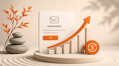
Learn how to create high-converting product listing pages with proven strategies and real-world examples. Discover the importance of product listing pages in boosting ecommerce sales, enhancing search engine visibility, and improving user experience. Optimize your pages with effective categorization, compelling visuals, and user-friendly navigation to turn clicks into purchases and maximize conversion rates.
Creating product listing pages is like designing your online storefront—it’s where first impressions are made and buying decisions happen. If your listings aren’t clear, compelling, and conversion-focused, you’re leaving money on the table.
This guide is here to help you fix that.
Whether you’re a seasoned ecommerce pro or just getting started, we’ll cover everything you need to know to build high-performing product listing pages.
Here’s what you can expect:
- Proven strategies to help your products stand out in a crowded marketplace
- Conversion tactics that turn clicks into purchases
- Real-world design examples to inspire your own listings
Let’s dive in and start optimizing!
What is a product listing page (PLP)?
A product listing page (PLP) is like your online store shelf—it’s where customers browse all your products by category or search. You might also hear them called category pages.
This is where you showcase products with:
- Clear, catchy titles
- High-quality images
- Compelling descriptions
- Key details like price, size, and color
For many shoppers, the PLP is their first real interaction with your brand. That means it’s your chance to make a strong first impression and nudge them closer to the “Add to Cart” button.
The problem? Too many ecommerce businesses treat PLPs as an afterthought. A cluttered or rushed page can instantly turn customers away and hurt sales.
The best PLPs, on the other hand, feel like a warm welcome. They’re easy to navigate, visually appealing, and thoughtfully designed—like this example from ASOS.

Why are product listing pages important?
Product listing pages are super important for an ecommerce site.
Here's why product listing pages matter:
- Search engine visibility: They help you get noticed on search engines. When your products are nicely organized on these pages, search engines can understand them better. That means better rankings in search results.
- Matching customer needs: Product listing pages align customer searches with the right products. That boosts the chances of customers finding what they want and hitting that “buy” button.
- User-friendly setup: These pages make it easy for shoppers to navigate through your offerings. It's like guiding them through your store, making sure they find what they need without any hassle.
In short, product listing pages make your products easier to find, boost your visibility online, and increase the chances of making a sale.
How to categorize your products?
The way you present your products to shoppers on your product listing page not only impacts their convenience but also significantly influences whether they decide to make a purchase.
Creating a good product listing page involves choosing the right format to showcase your products effectively.
Although there are several ways to categorize your products, the two primary methods we'll focus on are grid view and list view.
1. Grid view
This typically shows a product image thumbnail with a small amount of additional information. Sometimes this view will include the product name and price just beneath the image.

Grid view's advantages include:
- More engaging due to more images
- User attention is evenly spread throughout the items
The major disadvantage of this view is that it contains less information. This means that the customer will have to take more time to get more details on a particular product.
2. List view
This usually has a small picture on the left side and the right side contains product information. The highlighted information is often the size, price, product description, or availability.

List view's advantages include:
- Follows the natural F-shaped reading pattern human eyes follow
- Provides more product details (which makes it easier for customers to compare products)
Which one works best for your store?
It depends a lot on the type of products you sell.
If you're running a fashion online store, you might want to have more compelling visuals.
If you're selling electronics, a list view might be best because of the importance of details like specs, warranty, etc.
The general rule is that grid views are for product images and list views are for details. Whatever view you choose, make sure to make a solid first impression on your online shoppers.
What are the key elements of ecommerce product listing pages?
Every page on your ecommerce website should enhance the customer experience, and the product listing page is no exception.
Rather than viewing it as just a transitional page leading to your product pages, consider the category landing page as a critical component where you can control and optimize all the relevant elements to boost your conversions.
So, how can you make the most out of this page? Here are 5 effective strategies:
1. Use beautiful headers
Clear, effective, and perfectly encompassing of the type of products in a particular category. An effective technique is using a high-definition hero image that captures the products listed in the category.

2. Get more from your thumbnails
One key tip with thumbnails is to keep them consistent.
Shoppers like to compare (sometimes with the concentration of mad scientists on the verge of discovering a medical breakthrough), so you've got to have similar backgrounds, consistent/complimentary backgrounds, and similar perspectives for the keen-eyed shopper.
It also gives a professional feel to the website when thumbnails are consistent.
Use a grid layout for visual elements and minimize clutter wherever you can.
3. Put your best-selling products or most popular items front and center
Shoppers often want to know what others are buying and which products are flying off the shelves. Make it a piece of cake for them by displaying best-sellers and popular items clearly.
You can even use this technique to boost sales by product bundling and cleverly upselling.

Tools like OptiMonk help you to promote your best-sellers or upsell products using on-site messages.
4. Use ratings and reviews
Social proof is one of the best things you can use on your product listing page to get more sales.
People are more likely to buy an item when it's been “validated” by others (the more validation, the better). The more you can showcase the number of real, satisfied customers, the better your chances are of selling your products.
Sephora does a great job at leveraging the power of star ratings on its category page:

5. Show available sizes and color options
Give your shoppers options and have intuitive features that show a particular product in various colors/sizes.
Check out how H&M displays the available color options below the product:

This can also be a place where you can effectively encourage users to take action. For example, you can list that a select size is only available for X amount of time or there's only X amount left in green, etc.
Companies like Amazon and Booking.com are experts in properly displaying urgency and getting people to act quickly.
6. Other important elements
Here are some other things you gotta think about for an effective product listing page:
- Easy-to-find search bar: Make sure that your search bar stands out so folks can find what they're looking for in a jiffy.
- Sweet deals: Show off any hot deals or promos you've got going. It'll tempt potential customers to hit that buy button.
- Handy tools: Give users tools like filters and sorting options to help them find exactly what they need without any fuss.
- Personal touch: Make it personal! Tailor the page to each user's preferences to make them feel special while they shop.
- Implement SEO strategies: Sprinkle some SEO keywords around to boost your search engine rankings and bring in more organic traffic.
- Pics and deets: Show off your products with killer pics and detailed product descriptions so shoppers know exactly what they're getting.
- Get them clicking: Add clear and snappy calls-to-action (CTAs) to push users into taking action, whether it's buying or just learning more.
- Trust-building info: Don't forget the boring but important stuff like the Terms & Conditions and Privacy Policy. It builds trust with your customers, so they know you're legit.
How to improve navigation on your category pages?
A recent study by the Baymard Institute shows that not displaying product categories in the main navigation causes enormous navigational issues for shoppers.
So, how can you make sure your product category pages are easy to find and navigate? Check out these simple tips:
- Front and center categories: Stick your product categories right up front in the navigation menu. Make them the first thing your visitors see when they hit your site.
- Smart search bar: Make your search bar super easy to use. Think Google-style autocomplete to help shoppers find what they want faster.
- Let customers rate: Give your visitors the power to rate your products. This way, the best stuff gets the spotlight, and the not-so-great stuff takes a backseat. Plus, it helps you keep tabs on what's popular and what's not.
- Sorting and filtering: Make it easy for customers to sort and filter products. Let them search by color, type, size – you name it. The easier it is to find what they want, the happier they'll be.
How to increase product listing page conversion rates?
You can have the most well-oiled ecommerce funnel in place, but if you fail to optimize your product listing pages, your users’ shopping carts will remain empty.
Ecommerce can be a cruel world….
Throughout this article, we’ve emphasized the importance of being intentional about every aspect of the product listing page design. The product images you choose, the social proof, and the copy you use, all of that plays a role in user experience and ultimately sales.
With that being said, here are some proven techniques you can use to boost your product listing page conversions:
1. Use labels when a product is popular
Use clear labels and markers to let shoppers know about items that are HOT in your store. A good way is using contrasting colors or a tastefully placed bright banner indicating a product's popularity.
2. Make it easy for them to add to the cart
I can't emphasize the importance of simplifying and making checking out a no-brainer for your users.
In 2026, brands are battling for customer attention like never before.
You have less and less time to get users interested in your product and then get them across the purchase line. On every item, you should have an “add to cart” button that drops an item to their cart automatically. Less resistance = a higher likelihood of people buying from you.
Check out below how HoneyGirlOrganics has “Buy Now” buttons on its category pages.

3. Provide more information
You don't have to overwhelm your shoppers with paragraphs on paragraphs on warranty, return policy, etc. You can find quick and clever ways to sneak this important information into your product listing pages.
For example, you can trim the fat and reduce your warranty and return information to one line that contains the “need-to-know”.
Sometimes, less is more.
4. Personalize the shopping experience
Generic messages are one of the biggest reasons why cart abandonment rates around the world are sky-high.
It's as if ecommerce store owners forget that other HUMANS are shopping on the other side of the screen.
Speak to your shoppers like the people that they are and watch your sales grow.
I'm not saying you should go overboard with slang and use the latest hot terms from Urban Dictionary. I'm saying that you should speak to people like they're dynamic individuals, not “Dear valued customers”.
5. Showcase your discounts
Have items on sale? Show them off. Are you offering first-time customer discounts? Highlight that! Have some sort of loyalty program or deal? Let them know about it.
Sales and limited-time discounts can be a great way to boost sales and creating a connection with users.
Check out how BootCuffsSocks.com highlights products that are on sale. They also do a great job of increasing urgency. See how they display a message about someone purchasing a product recently?

6. Improve site speed
47% of customers expect a site to load in 2 seconds or faster. If your site takes longer than that, you're leaving money on the table.
Speed is the name of the game in almost every aspect of the ecommerce world so site speed should be taken very seriously. You should ensure that your website loads fast on desktop and mobile devices to give your users the smoothest and most enjoyable experience.
7. Hone in on your value proposition
What are you all about? What makes you different from the thousands of store owners? Why should people give you their hard-earned money?
Consumers are more conscious shoppers and want to know why a store sells their products other than the obvious (to make money). They want to know about your story, why you started your store, if you're using sustainable practices, etc.
A unique value proposition can do the hard work of convincing customers to shop with you, allowing you to focus on conversions.
How to improve your search engine rankings?
In our search-centered consumer world, being in good graces with the SEO gods can take your store to the next level.
Optify states that websites ranked number one received a click-through rate of 35.4%, number two had a CTR of 12.5%; and number three had a CTR of 9.5%.
Notice the massive difference from 1 to 2 and then 2 to 3? That's how much of an impact SEO can have on your click-through rates, traffic, and sales.
Here's how you can be on your way to SEO mastery:
- Take time to perform some thorough keyword research (Aim for longtail keywords that are relevant to your product. Longtail keywords generally have lower competition thus giving you a better chance of ranking favorably). Use Google's Keyword Planner to do this.
- Ensure your Category Titles include your keywords.
- Use simple URLs that can be understood by both search engines and humans (short and to the point always works best).
- Continue bringing in fresh social proof (Google favors sites that are regularly updated with fresh content. The more product reviews and ratings come in, the more Google will continue to index your site).
- Optimize your images by using the right image sizes and a solid title
- Use alt tags in your product images.
- Use social share buttons (Sharing is caring! The more your site/content is shared, the higher you will rank).
- Have a solid meta description (a 300-word, persuasive meta description with relevant keywords can have a massive impact on your click-through rate).
- Make your product description pop by using benefit-driven copy that clearly describes the value your product will bring shoppers.
- Regularly test and stay open to exploring new ideas when it comes to improving your organic ranking and conversions.
The world of ecommerce gets more and more competitive every day.
The more fine-tuning you do to boost your organic search results, the better your store will rank and the better user experience you'll be able to provide shoppers.
FAQ
How many products should I show on a product listing page?
When deciding how many products to put on your listing page, think about speed and user experience first. Your page should load in a flash, ideally within two seconds. Slow loading times could scare off up to 40% of your customers! So, keep things tidy – don't overcrowd your page with too much stuff. Each product should stand out, showing its price, description, and other important info clearly.
What's the difference between a product listing page and a landing page?
A product listing page is like your big showroom, showing off lots of products from the same brand or category. Visitors browsing here are looking to explore options, not necessarily make an instant purchase. These pages usually have menus so users can easily browse around. On the other hand, a landing page focuses on selling one product or product line. It's all about getting visitors to buy right away. Landing pages are clean and simple, with no distractions to keep users on track.
What are some effective design strategies for product listing pages?
Popular brands use slick design tricks to lure in potential buyers. Check these out: show off your products in the best light, use persuasive language to hook visitors, put your best stuff at the top, make your page look gorgeous with visually appealing headers, keep things easy to navigate, use bold images, give extra info when users hover over items, suggest relevant products, show off ratings from happy customers, highlight any sales, and let users peek at products without leaving the page.
Wrapping up
You now have a decent amount of information to start transforming your product listing pages into conversion machines.
You learned about how to categorize products in your product listing pages, the essential elements, how to improve navigation, proven techniques for boosting your product listing page conversions, and game-changing SEO techniques.
Most importantly, you learned that being intentional and always looking for ways to make the user experience smoother is key to thriving in the ecommerce world.
Related articles


Written by

What should you do next?
Thanks for reading till the end. Here's how we can help you grow your business:
Get tailored website optimization ideas in 2 minutes.
Add your URL and get instant ideas. No email required.
Create a free OptiMonk account
Create a free OptiMonk account and easily get started with popups and conversion rate optimization.
Get OptiMonk free