Discover how website announcement bars can transform your ecommerce store by enhancing user experience, boosting conversions, and increasing sales. This article explores 15 real-world examples of effective notification bars that highlight promotions, improve communication, and build brand awareness. Learn how to create your own announcement bars to guide visitors and optimize your online store's performance.
As soon as visitors land on your website, they’re already looking for answers: Do you offer free shipping? Are taxes included? Where do they find discount codes?
That’s where website announcement bars (aka notification bars) shine.
They instantly address common questions, highlight key offers, and guide visitors toward high-performing landing pages or product pages, making it easier to turn browsers into buyers.
In this article, we’ll cover what announcement bars are and why they’re beneficial. We'll also share 15 real-world examples you can learn from and how you can create announcement bars easily.
Let’s jump in!
What is a website announcement bar?
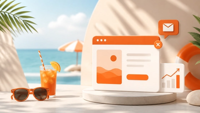
A website announcement bar is a sticky banner that appears at the top or bottom of a webpage.
This small but powerful element is designed to share:
- Important messages
- Promotions
- Alerts
- Announcements
It grabs attention without getting in the way, making sure visitors see key information while still enjoying a smooth browsing experience.
What are the benefits of using a website notification bar?
Using a notification bar can bring numerous benefits to your online store.
Here are some of the most significant advantages of incorporating an announcement bar into your website:
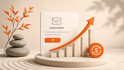
- Increased conversions: By highlighting important messages, promotions, or urgent announcements, you can encourage visitors to take specific action, such as signing up for a newsletter or making a purchase. This can lead to a significant boost in your conversion rates.
- Improved user experience: Notification bars can help guide visitors to specific content or sections of your e-commerce store, enhancing their overall browsing experience. By providing clear and concise information, you make it easier for visitors to find what they’re looking for.
- Enhanced brand awareness: By showcasing your brand’s personality and tone, notification bars can help build trust and establish your brand identity. A well-designed announcement bar can leave a lasting impression on your visitors, making your brand more memorable.
- Increased sales: By promoting limited-time offers, discounts, or special deals, you can create a sense of urgency and convert visitors into customers. This can lead to a significant increase in your sales and revenue.
- Better communication: Announcement bars provide a clear and concise way to communicate important information to your visitors, such as updates, news, or events. This ensures that your visitors are always informed about the latest happenings on your website.
How do announcement bars work?
Announcement bars act like digital signposts on websites, drawing attention to important information or guiding visitors to specific content or a separate landing page.
Typically, they’re designed with vibrant colors, brief messages, and clickable buttons.
The goal of announcement bars is to catch visitors’ attention and encourage them to take a desired action (such as signing up for a newsletter) or inform them about something important (like a discount or free shipping offer).
15 announcement bar examples to inspire you
Now that you know what a website notification bar is and how it works, let’s look at some real examples.
This section highlights how top brands use announcement bars to share promotions, important updates, and special offers while guiding visitors smoothly through their online stores.
1. Artlogo's coupon reminder bar

Most notification bars aim to raise awareness, and Artlogo’s coupon code reminder is no exception.
They remind users about their coupon code in an effective yet stylish way, ensuring potential customers don’t forget about the discount they can use in their shopping cart.
Based on our experience, these floating coupon reminder bars can help to increase coupon redemption rate by 50%.
2. BioZoo's free shipping bar

BioZoo's notification bar example taps into emotions, which is a great way to encourage even more visitors to purchase.
Their navigation bar says: "Please your pet a little more!" Who doesn't love to treat their little pets (and get free shipping too)?
Free shipping bars like this one can help to increase your average order value by 30% on average.
3. BlendJet's subscription bar

BlendJet's subscription bar is for first-time visitors. They encourage visitors to subscribe to their newsletter in exchange for 10% off their first order.
Their navigation bar fits their brand perfectly and gets attention without disrupting the user's journey on the website.
With this website notification bar campaign, BlendJet collected more than 20,000 subscribers in just 4 months.
4. Bukvybag's free shipping bar

Next on our list of website notification bar examples, we find Bukvybag's elegant website notification bar.
The slim bar on the top of the website matches their website's aesthetics to perfection.
They also personalize the notification bar with the country name and a tiny little flag. To achieve this, they used OptiMonk's Smart Tags feature which automatically updated the country name and the flag for each visitor based on their location.
This website notification bar helps them provide each visitor with a tailored experience.
5. Coconut Cloud's coupon reminder bar

Coconut Cloud's coupon reminder bar shows up after a visitor subscribes on an email popup, and its goal is to draw attention to the discount code they received in exchange for their email address.
It comes in quite handy to the visitor—it doesn’t interrupt them while browsing, but they still see a site notification bar with their exact coupon code on it.
6. Crown & Paw's coupon reminder bar

Crown & Paw's notification bar highlights the importance of using attention-grabbing, creative copy.
Floating bars are a great place to boost your marketing efforts and use copy variants that match your brand’s tone of voice. Great copy has the power to increase engagement and leave your visitors with a strong impression of your brand.
Crown & Paw’s wordplay on their website notification bar resulted in a 38% increase in orders.
7. Gisou's free shipping bar

Gisou’s free shipping bar blends naturally with their web page (look at the color scheme!) and helps execute the brand’s aesthetic seamlessly.
The limited-time offer is a great way to create urgency and inform your visitors that if they don’t act quickly, they could miss out on free shipping.
Displaying this offer on high-performing landing pages can further enhance its effectiveness by converting visitors into customers.
8. Joovv's Black Friday sticky bar

Joovv's Black Friday website notification bar shows how you can use sticky bars to direct visitors and inform them about seasonal deals.
It's less intrusive than a popup, but with a little creativity you can still make sure your visitors see important information or drive traffic to specific pages.
9. Kiss My Keto's coupon reminder bar

Kiss My Keto's coupon reminder notification bar is a clever way to follow up with your customers.
If they’ve opted in but haven't yet used their coupon code, take a cue from Kiss My Keto's notification bar example and display a discount reminder bar.
With this campaign, Kiss My Keto was able to achieve a 19.32% increase in conversion rate.
10. Solagarden's product reminder sticky bar

Website visitors often browse for certain products and then leave.
Solagarden's notification bar exemplifies how you can subtly remind them of the products they were looking at last time while also highlighting how fast they can get the product if they order now.
This product reminder notification bar was clearly working well for Solagarden, as it helped them achieve a 66% increase in orders.
11. Transformation Academy's special offer bar

Next up on our list of notification bar examples, we have Transformation Academy's special offer bar.
Note the countdown timer, which certainly helps to capture leads by increasing FOMO in website visitors.
If you have a flash sale and want to boost engagement, a countdown timer is a clever way to do it.
12. WishGarden Herbs' offer notification bar

Take a page from WishGarden Herb's marketing strategy: note how they implemented almost every single important piece of information into their notification bar.
They have a big, bold countdown timer in the middle, and they use different font sizes to draw more attention to their main message.
13. Skims's announcement bar

Skims provides an excellent example by clearly stating that duties and taxes are included in the price, which helps inform visitors upfront.
This kind of transparency is especially useful for international customers, as it eliminates any uncertainty about additional costs during checkout.
By displaying this information in the announcement bar, Skims enhances the shopping experience, builds trust, and reduces potential cart abandonment due to unexpected charges.
14. Kylie Cosmetics' new product announcement bar

The Kylie Cosmetics website features a dynamic announcement bar promoting the launch of a new product, the pomegranate lip butter.
It reads: "Just dropped ❤️ pomegranate lip butter ❤️ shop now."
The bold, direct message grabs attention with a playful tone, inviting customers to explore the latest addition to the collection.
The announcement bar is designed to drive immediate interest and encourage visitors to make a purchase by emphasizing new arrivals in a visually appealing way.
15. Drunk Elephant's announcement bar

Drunk Elephant’s website announcement bar subtly highlights that when you spend $95 or more, you'll receive a free puffer bag and a deluxe cleanser sample.
The announcement bar is small and unobtrusive, designed to catch the eye without interrupting the shopping experience.
How to create an announcement bar?
Now that you’ve seen our notification bar examples, it's time to get your visitors clicking and start boosting your conversions.
Let's see how you can create your own announcement bars with the help of OptiMonk.
Step 1: Choose a sticky bar template
The first step is to choose one of the many notification bar templates that you can personalize with just a few clicks.
Step 2: Customize the design of your sticky bar
Next, it’s time to customize your sticky bar design. Choose your main colors and the fonts you like from the drop-down menu.

Step 3: Set triggering options
Once you’ve finished with your designs, it's time to set the triggering options for your sticky bar.

Step 4: Segment your audience
Now, you’ll need to segment your visitors and decide who you want to see your sticky bars.

Step 5: Activate your sticky bar
As the final step in this process, it’s time to unveil your website notification bar to the world. By activating it, you'll be opening the door to more leads, more opportunities for engagement, and more sales.
FAQ
What is a sticky bar?
A sticky bar is a persistent element on a website that remains visible as users scroll through the page. It typically contains important information, announcements, or calls-to-action, ensuring they're constantly within view for visitors.
How do I add a notification bar to my website?
There are several tools on the market—like OptiMonk and Hello Bar—that help you create your very own sticky bar. With OptiMonk, you can seamlessly integrate your notification bar into your website without the need for plugins or coding, making the process efficient and hassle free.
What are some best practices for website announcement banners?
When creating a website notification bar, it's important to keep messages concise and clear. Use eye-catching colors and ensure responsiveness across all devices. Include a clear call-to-action (CTA) and regularly update content. Experiment with variations to find what resonates best with your audience.
How can I use a free shipping offer in my announcement bar?
You can display a free shipping offer in your announcement bar to immediately capture visitors' attention. Highlighting this offer at the top of the page encourages users to complete their purchase without worrying about additional costs, potentially boosting conversions.
Wrapping up
We hope you’ve gained some great insights from this article. But why stop here? With 12 sticky bar examples in your pocket, and armed with plenty of useful advice, it’s time to roll up your sleeves and embark on the journey of creating your own!
With OptiMonk’s user-friendly interface and powerful features, creating compelling popups and sticky bars has never been easier.
Seize the opportunity to transform your website's performance and make a lasting impression on your visitors. Create a free account now!
Related articles


Written by

What should you do next?
Thanks for reading till the end. Here's how we can help you grow your business:
Get tailored website optimization ideas in 2 minutes.
Add your URL and get instant ideas. No email required.
Create a free OptiMonk account
Create a free OptiMonk account and easily get started with popups and conversion rate optimization.
Get OptiMonk free