- Blog
- 34 Email Newsletter Popup Examples to Get More Subscribers in 2025
34 Email Newsletter Popup Examples to Get More Subscribers in 2025
-
Nikolett Lorincz
- Conversion
- 6 min read
Table of Contents
Did you know email marketing is one of the most effective ways to engage customers? In fact, for every $1 you spend on email marketing, you can expect an average return of $40.
Seeing this stat, it’s no surprise that 81% of small businesses use email marketing to build customer relationships, launch new products, and drive sales.
But before you can use email marketing to do all that, you need to build your email list. And without a doubt, email popups are the best way to generate more email subscribers by catering to your target visitors.
In this article, we’ll guide you through how you can get new subscribers using newsletter popup forms and show you 34 email popup examples to get inspired.
Let’s get started!
What are email popups?
Popups are overlays that appear on your website based on different targeting and triggering options, and they usually promote a secondary offer for website visitors, such as:
- A lead magnet like an ebook or content upgrade
- Newsletter subscription
- A discount or free gift
- Product recommendations
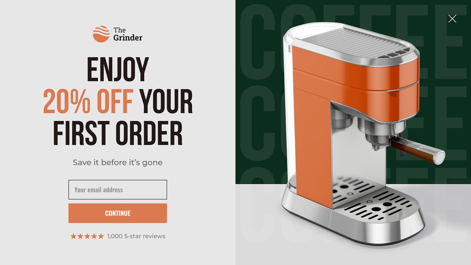
Email popups (also known as newsletter popups or email subscription popups) are the most popular type of popups. As the name suggests, email popups are used to collect email addresses from your visitors with an email capture form.
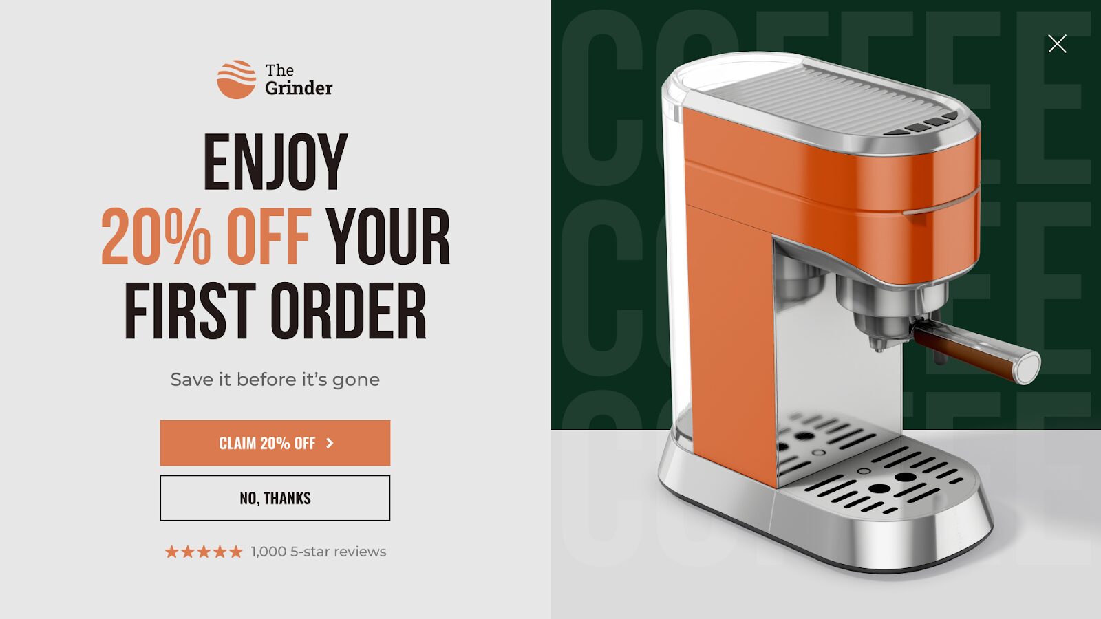
Here’s an example of a newsletter popup:
How effective are email subscription popups?
Email popups are highly effective tools for growing your subscriber list, though conversion rates vary depending on the incentive offered.
Here’s what our data shows:
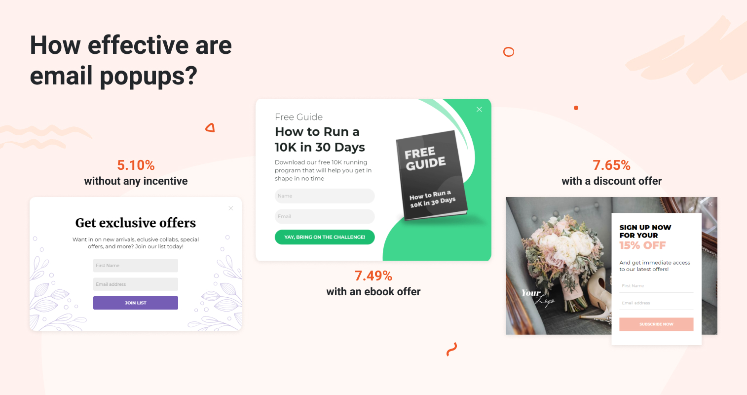
Incentive-free email popups have an average conversion rate of 5.10%, proving that compelling messaging alone can persuade visitors. But Brand Growth Experts was able to achieve an 8.33% conversion rate with a simple newsletter promotion popup.
Offering something valuable like an ebook can increase this average conversion rate to 7.49%.
If you tie a discount to the signup, the average conversion rate jumps to 7.65%, with some brands achieving much higher rates. For example, Vegetology achieved a 13.8% conversion rate by offering a mystery discount.
These statistics show that email popups work best when tailored to what your audience values most.
34 email popup examples (and why they work)
Now that you’ve got the basics down, here are some great and eye-catching email popup examples to inspire you.
1. Framebridge
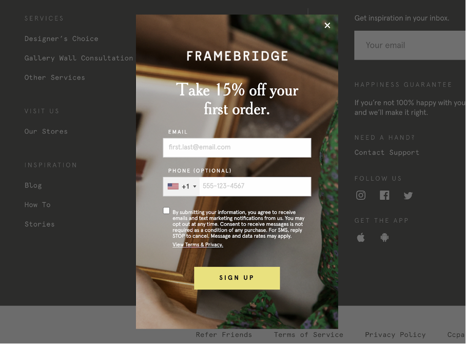
What’s great about this email popup example:
- The muted tones in the background make the yellow call-to-action button stand out even more, which leads to a better conversion rate.
- Clear value proposition. Visitors know right away that they’re receiving a 15% discount on their first purchase.
- Framebridge is collecting phone numbers for SMS marketing, too.
What could be better with this example:
- The background image makes some of the text hard to read.
- The call-to-action button is generic. Try being actionable by saying something like “Yes! I want my 15% discount.”
If you’d like to create a similar popup form that promotes a coupon code, you can get started with this popup template:
2. Indigo
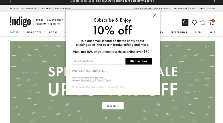
What’s great about this newsletter popup:
- “Subscribe & Enjoy” evokes a pleasant feeling about joining the mailing list and enjoying Indigo’s amazing offers.
- This is a great example of not beating around the bush. The visitor knows right away that they can receive 10% off.
- Simple, one-step opt-in. Website visitors enter their email addresses and click the button. The process is over in a second, which is appealing to busy people.
What could be better with this example:
- Too much text. Sometimes less is more.
- Including a first name field would allow some personalization in future emails.
Try this popup template:
3. 2X eCommerce
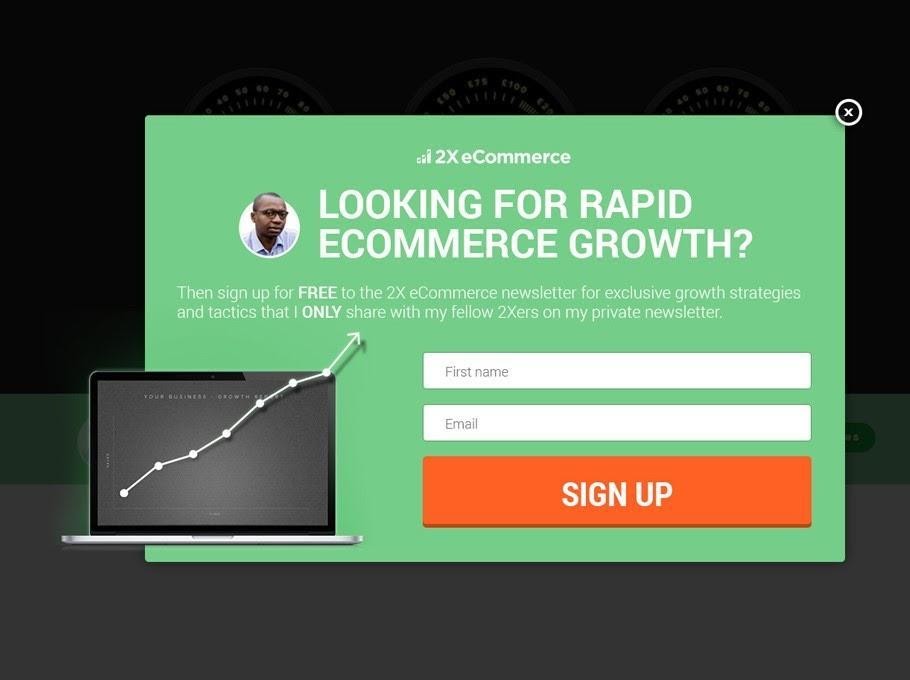
What’s great about this email popup:
- This email popup example visually looks great. The CTA button contrasts with the popup’s background, immediately grabbing visitors’ attention.
- The pain point and value proposition are clear in the text, enticing visitors to subscribe. Who doesn’t want rapid ecommerce growth and exclusive growth strategies?
What could be better with this example:
- The CTA might not be specific enough. By adding “Sign up for my private newsletter” to the call-to-action button, visitors would know right away what they’re getting even if they haven’t read the smaller text.
- The subheading is hard to read, especially for visitors with visual impairments.
If you don’t want to offer a discount and simply want to promote the value of your newsletter subscription, try these email popup templates:
4. Ollie
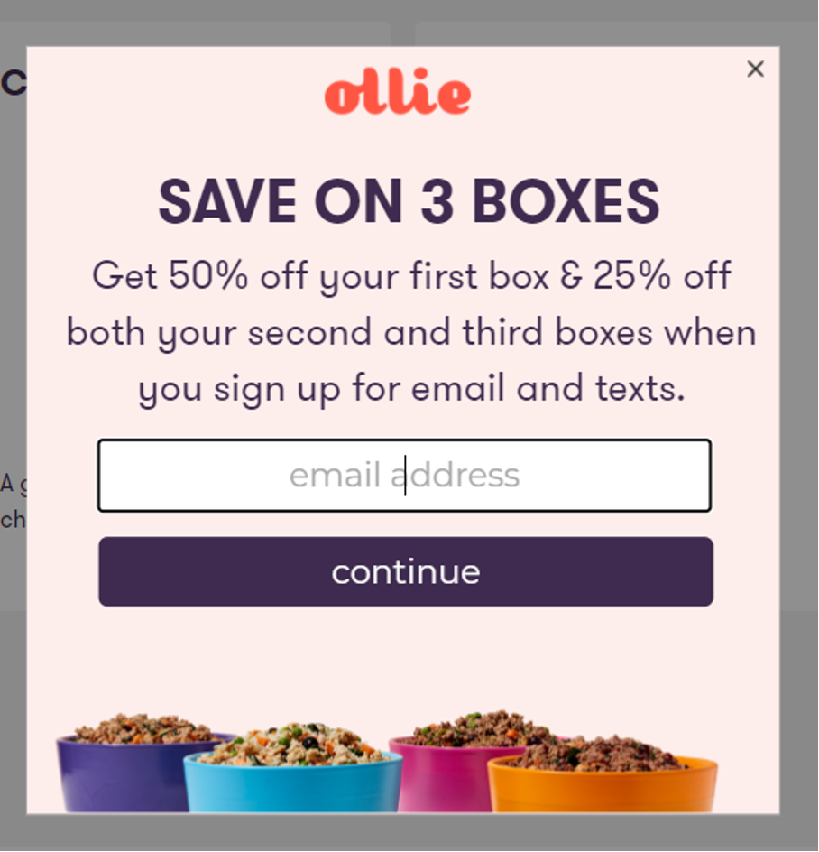
What’s great about this email popup:
- This lightbox popup example uses bright colors and strong branding to grab visitors’ attention.
- It has an easy-to-read, straightforward offer.
- The upfront offer is compelling and highlights a long-term commitment from the company (50% off, then 25% off twice).
What could be better with this example:
- The call-to-action button isn’t enticing or particularly special. Rather than “Continue,” something like “Send Me My Special Offer” would be far more likely to increase conversions.
- The CTA button could pop a bit more by using a contrasting color that stands out.
5. BlendJet
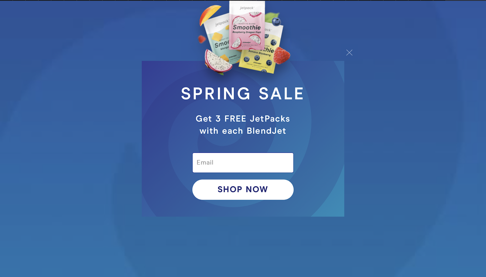
What’s great about this email popup:
- BlendJet uses a fullscreen popup that blends seamlessly into the background, increasing engagement.
- You know exactly what you’re getting when you sign up.
- They don’t require a lot of personal information. They only ask for an email address. Requiring minimum effort from visitors is a great trick for spiking conversions.
What could be better with this example:
- Asking for a first name would help create more personalized user experiences in the future.
- A horizontal layout might be better for this email popup example. Moving the image to the left would help guide visitors’ eyes to the sales copy on the right.
6. Fully
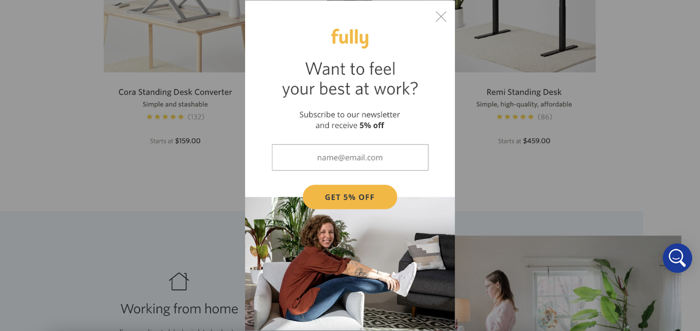
What’s great about this email popup:
- This elegant email popup example is aesthetically pleasing with legible text and a stylish, real-world photo.
- Visually, the CTA button is clear and identifiable (and aligned with the brand’s color scheme).
- The message behind the popup is simple: get 5% off.
What could be better with this example:
- The discount could be larger to make it worth the visitor’s time (think 10% or 15% off).
- The CTA button and copy could be a bit more exciting.
7. Mala the Brand
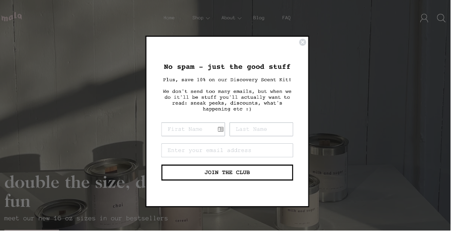
What’s great about this email popup:
- The informal, conversational language gives this email popup form more personality.
- “No spam – just the good stuff” helps reassure skeptical visitors who might be hesitant about opting in.
- The “Join the Club” call-to-action creates a sense of community and exclusivity.
What could be better with this example:
- This lightbox popup could use some sort of imagery. The format has personality, but the appearance is dull for visitors.
- The “save 10%” offer could be bolded for emphasis.
8. 100% Pure
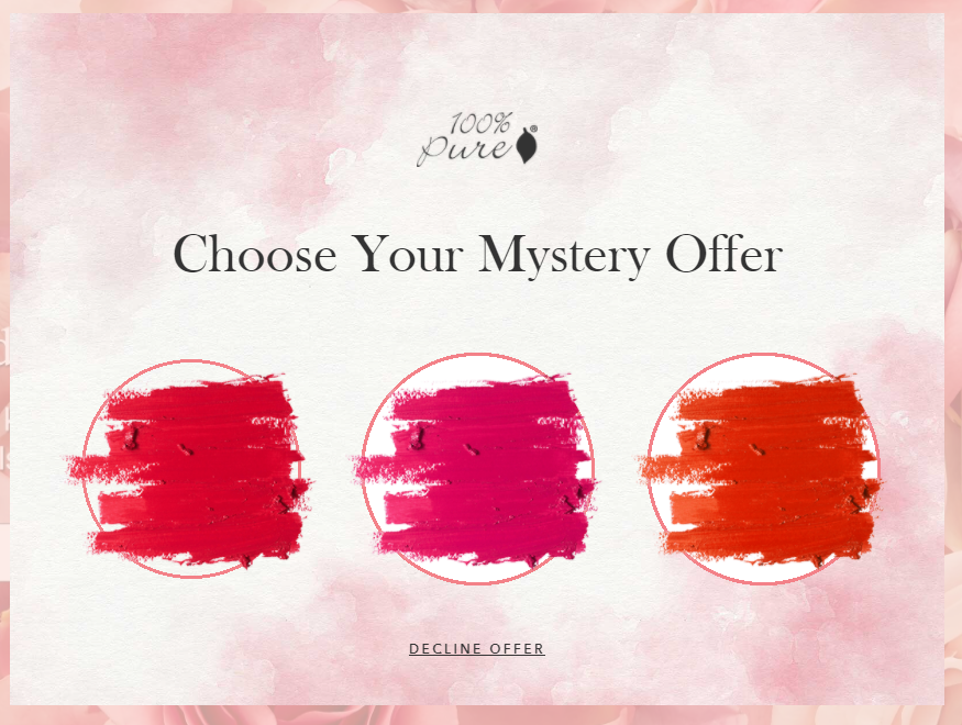
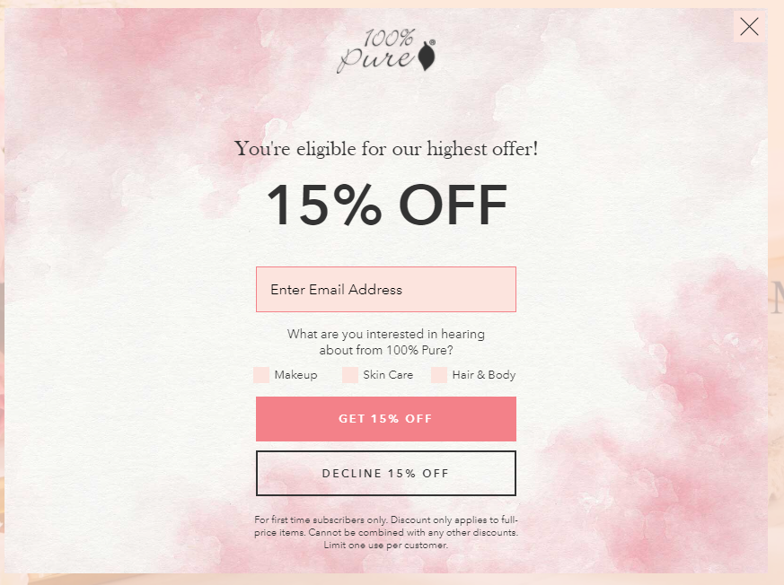
What’s great about this email popup:
- This interactive, two-step signup popup is playful and provides a refreshing change of pace.
- The tone and colors of this popup example are very much on-brand with the site.
- The “15% OFF” coupon is not only compelling, but it also gives the visitor an opportunity to personalize their offers.
What could be better with this example:
- The use of pink could be a bit much, muddying the CTA, input field, etc.
- The initial “mystery offer” might be off-putting. People might not realize that they’re getting a deal or what the scratch-off popup is.
9. Paddywax Candles
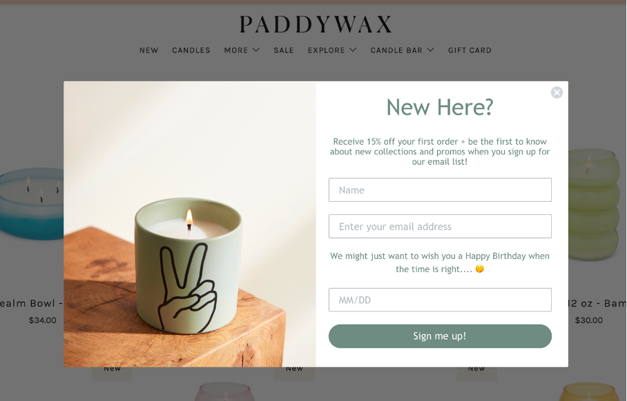
What’s great about this email popup:
- This is a visually appealing popup design that blends well with the brand.
- The image is attractive and simple, and gives you a calm vibe.
- Unique offer. When visitors enter their birthdate, there’s an insinuation of a birthday surprise.
What could be better with this example:
- There’s too much text on this email subscription popup.
- The text color against the white background is a bit tough to read.
- They don’t emphasize the 15% discount (which is the main value proposition). Visitors care more about that than the “New Here?” heading.
10. Structube
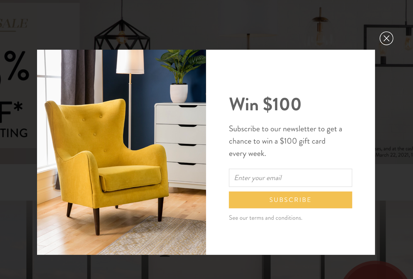
What’s great about this email popup:
- The incentive is clear: Win $100. The text is large and bold without being overdone.
- People love to play, so giving them a chance to win something is a great idea.
- The color palette is effective and on-brand. The yellow makes this design very attractive.
- The image is appealing and gives visitors a sense of what they could purchase with their gift card.
What could be better with this example:
- The subtext is wordy and not entirely clear: is there a chance to win in a weekly draw, or will the winner get a $100 gift card every week?
- The CTA button text could be a bit more exciting, like: “Sign me up!” or “I’d love to win!”
11. Hello Fresh
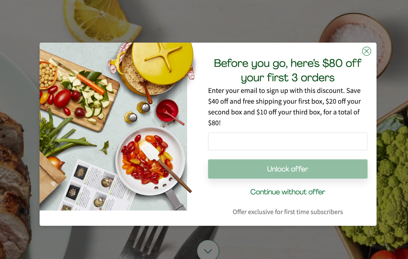
What’s great about this email popup:
- It appears on exit-intent with copy that will definitely stop abandoning visitors: “Before you go…”
- The photograph looks delicious, and the colors complement the imagery really well in this eye-catching popup campaign.
- The discount really makes subscribing worthwhile. Who wouldn’t want to save $80?
What could be better with this example:
- This email signup popup might be too busy. There’s a lot of text, making the popup feel cluttered. It could be optimized by cutting out anything unnecessary.
- The offer is complicated, forcing people to stop and think about what they’re getting.
12. Cygnett
What’s great about this email popup:
- Cygnett keeps the popup design simple and clear. Great use of minimalist design.
- They don’t inconvenience the visitor by asking for too much information, just a first name and email address.
What could be better with this example:
- A CTA like “Get My 10% OFF!” would be more specific and unique.
- Although the button color creates a good contrast, it’s worth A/B testing different colors to find out what visitors like most.
13. Monoset
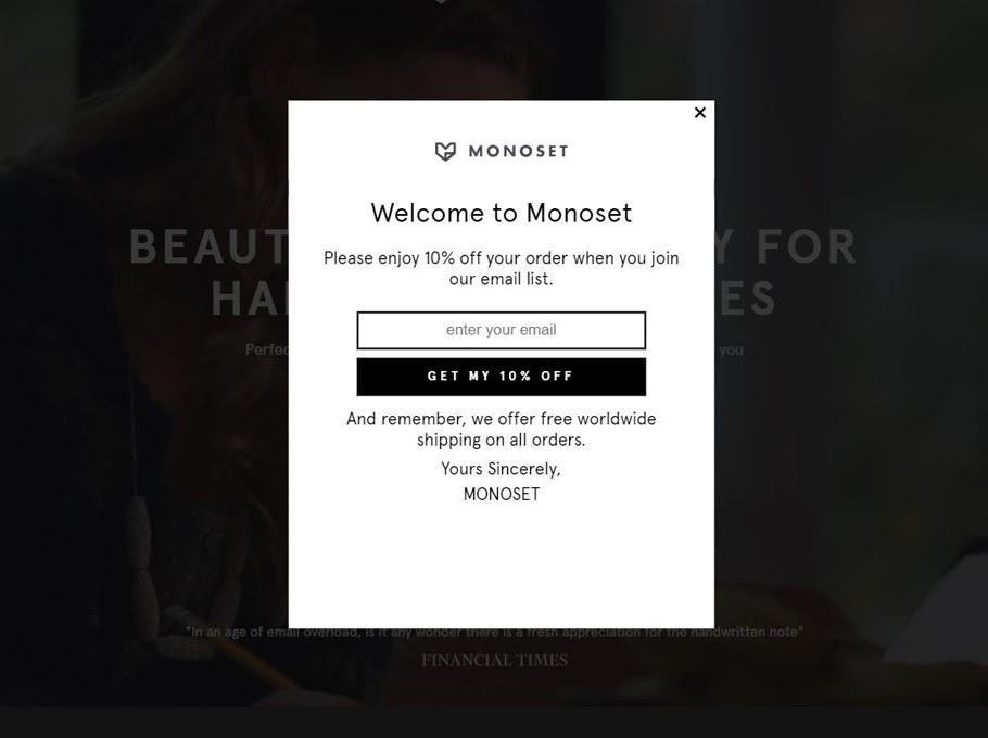
What’s great about this email popup:
- The black and white design gives a simple yet elegant feel to this email signup popup.
- The message is clear and direct, leaving no room for confusion.
What might need some work:
- Although the text at the bottom of the popup is a lovely sentiment, it increases the noise. Deleting this and spacing out the rest of the popup text would help simplify this visually.
- This popup might work better as a sidemessage to avoid annoying visitors.
14. Knix
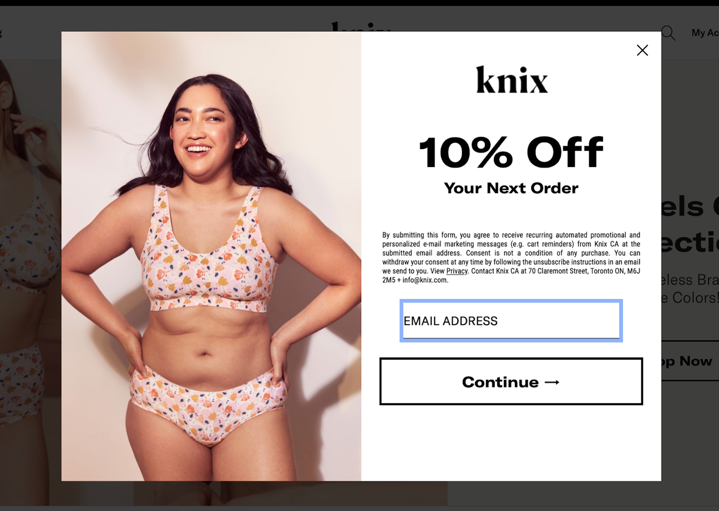
What’s great about this email popup:
- The imagery aligns perfectly with the brand, and the color scheme looks great too.
- The value proposition is clear and easy to understand. Visitors know exactly what they’re getting.
What could be better with this example:
- There’s a lot of fine print. This could confuse or overwhelm the reader.
- Adding a name field would help to create a more personalized experience in the future.
- The CTA button insinuates that there are more steps involved to receive the 10% discount. This won’t help increase conversions and might even increase the bounce rate.
15. Klymit
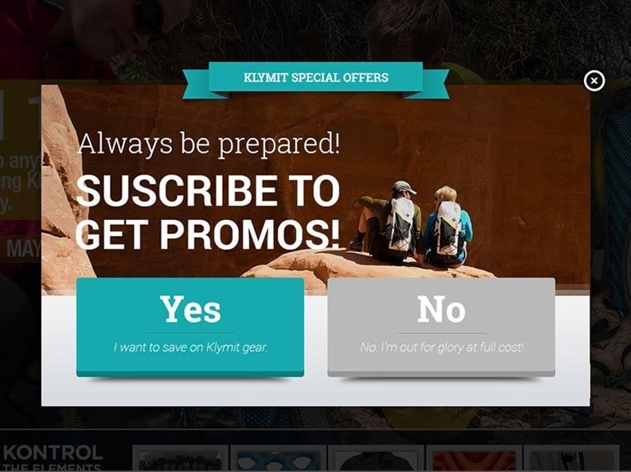
What’s great about this email popup:
- The “No” button does a great job telling visitors that they’re passing on exclusive discounts.
- The color of the “Yes” button really grabs the reader’s attention.
- The “Yes” button also reiterates the value proposition (subscribers will save on Klymit gear).
What could be better with this example:
- Parts of the image make the text difficult to read.
- This email signup popup could be A/B tested without the image.
- It’s not clear that the special offers are only available to email subscribers.
16. P.E. Nation
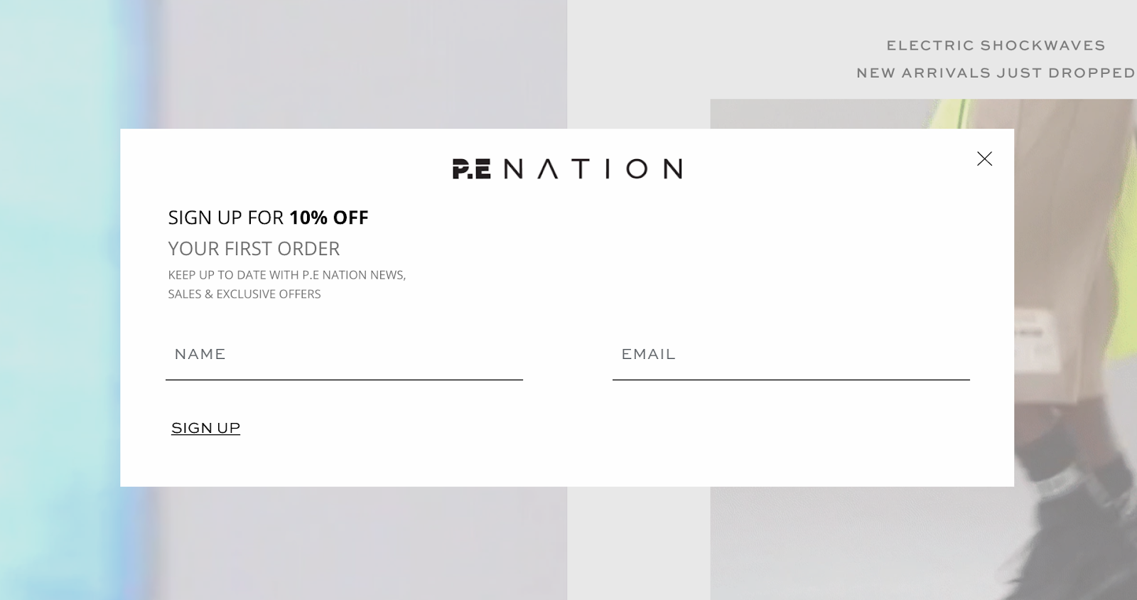
What’s great about this email popup:
- Nothing is confusing about this popup email form. It’s straightforward and easy to understand.
- Bolding the “10% off” draws attention to the discount, which will motivate visitors to enter their email addresses.
- The black and white popup over a colorful background makes the email capture form stand out.
What could be better with this example:
- Despite being clean and simple, this example is a bit on the plain side.
- P.E. Nation doesn’t mention the type of products they sell. That could drive first-time visitors away.
- The CTA could be more unique.
17. Mydeal.com.au
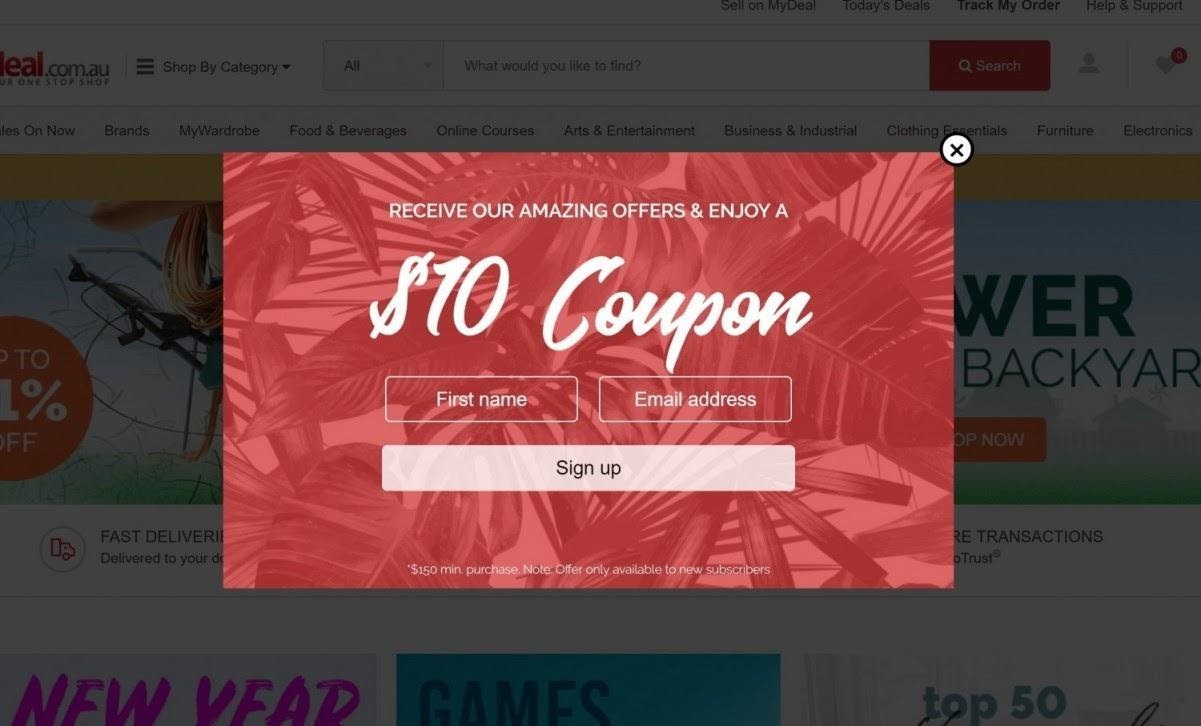
What’s great about this email popup:
- The first thing visitors notice is the $10 coupon, which is a great way to motivate them to opt in.
- This discount popup is straight to the point. There’s no wordy subtext that could confuse the visitors or stop them from converting.
What could be better with this example:
- The CTA button text is generic. Instead of “Sign up,” they could try saying something like “I want to save $10.”
- The CTA button should contrast with the color of the background.
- A variant without a background picture could drive even more attention to the offer.
18. Soggy Doggy
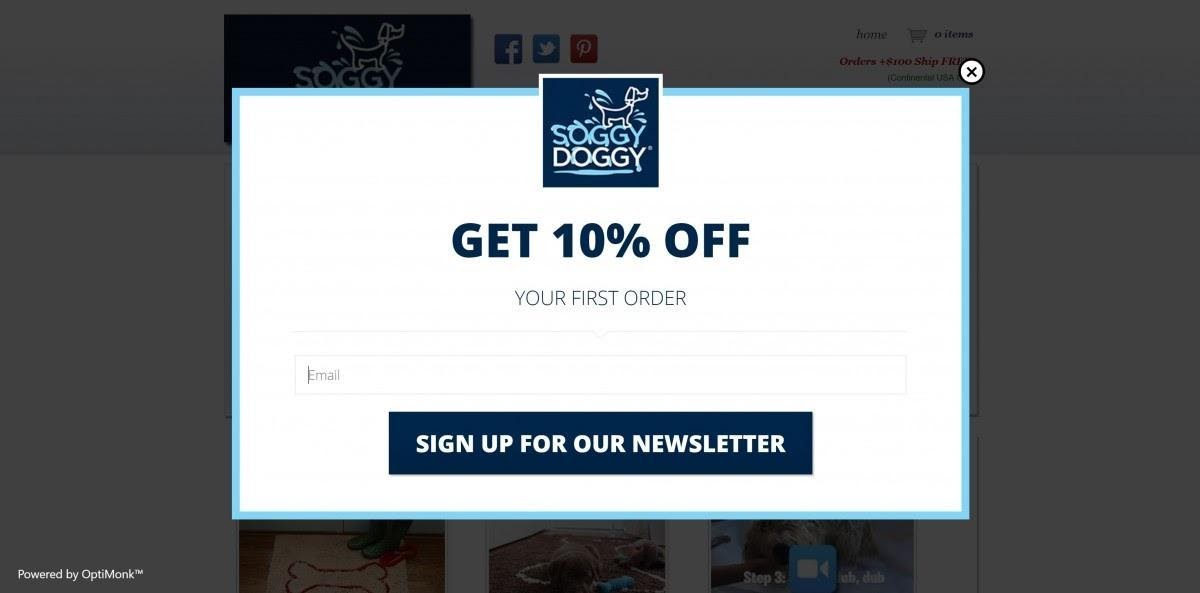
What’s great about this email popup:
- This email list signup form has a simple, clear, and minimalistic design which makes the 10% discount stand out. Visitors will know the benefits of joining the mailing list just by glancing at the popup.
- This popup has a clear, short headline.
- The color scheme complements the brand logo, giving the popup a professional feel.
What could be better with this example:
- There’s a lot of unused space on this popup, which makes it feel like something’s missing. Adding an image of a product would help.
- It’s difficult to see where you’re supposed to enter your email address. If your input fields are hard to read, you could miss out on conversions.
19. Bathing Culture

What’s great about this email popup:
- The out-of-the-ordinary design of this signup form immediately grabs visitors’ attention.
- The message is simple and easy to follow.
What could be better with this example:
- The input field and the CTA button are the same color, which could be confusing at first glance. Making the CTA text bolder or choosing a different button color could help.
- The “No thanks” button should be larger so visitors can see it clearly.
20. BLK & Bold
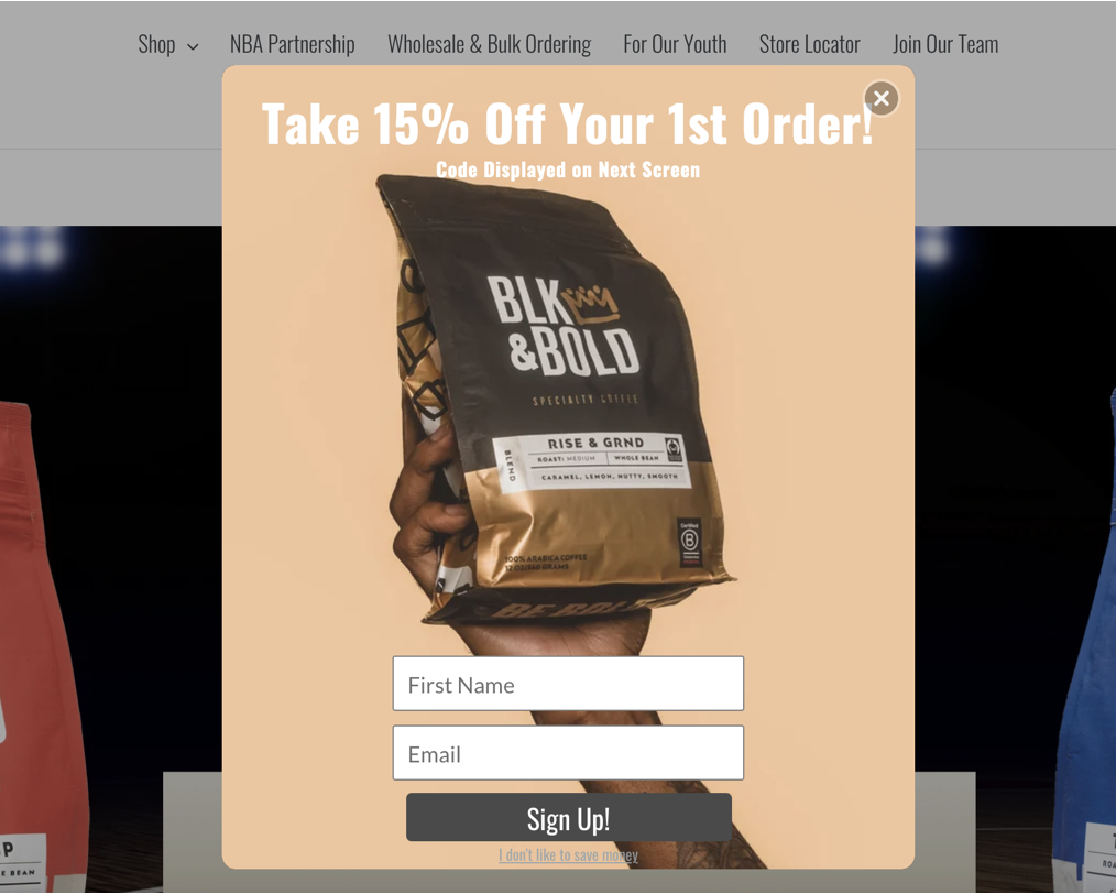
What’s great about this email popup?
- The product takes center stage on this popup, tempting the visitor to sign up in order to get a discount on their first order of premium coffee. Showcasing your product in a well-lit, high-impact image is an awesome way to encourage new shoppers to purchase.
- This popup offers a tempting 15% off, making it a powerful incentive for driving sign-ups.
What could be better with this example:
- The call-to-action button is pretty basic: visitors have seen similar ones used by many websites before. Get visitors to take notice and drive action by styling your CTAs more creatively.
21. Tentree
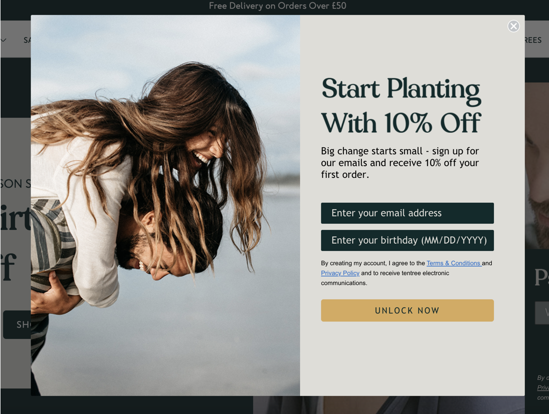
What’s great about this email popup?
- People (especially humanistic decision-makers) connect to images of people that show human emotion. It helps them feel emotionally connected to a brand. Tentree’s image choice here is an awesome way to connect with these kinds of prospects.
- Another cool aspect of this popup? The sharp copy. The “unlock now” call-to-action button creates a sense of elite exclusivity, making it a smart way to collect emails.
- In addition, they also connect the action of signing up and using their 10% off discount code with a desirable outcome: “start planting” (and help save the planet!).
What could be better with this example:
- To help foster a sense of relationship between the brand and visitor, Tentree should also ask for a first name.
22. MFMG Cosmetics
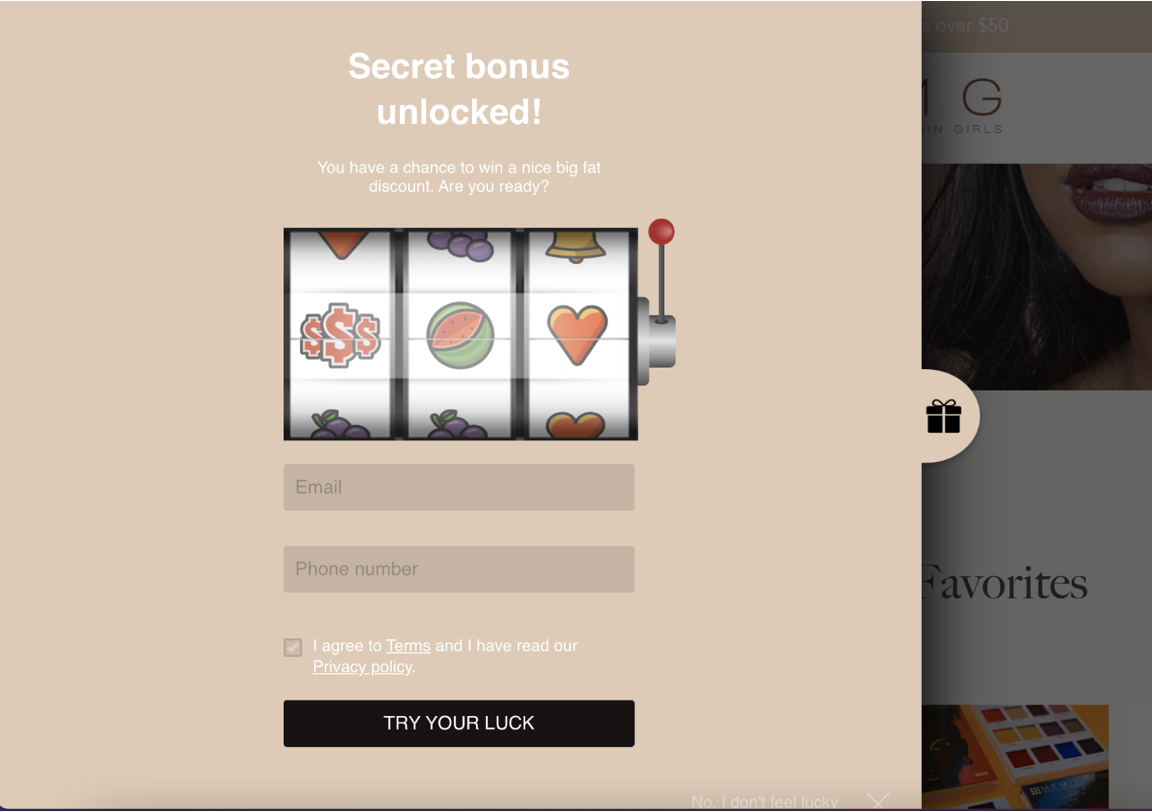
What’s great about this email popup?
- MFMG uses gamification like a pro in this sleek popup example. One aspect that makes a great game so fun is the sense of suspense. MFMG plays into this by offering a secret bonus behind the digital lever pull. Visitors have to drop their email and phone number in the boxes provided to play and find out what they’ll win.
- The fun call-to-action “try your luck” adds to the sense of fun and suspense.
What could be better with this example:
- On the flip side, the popup text is small and hard to read, which could irritate visitors and cause them to close the popup. Remember to keep your text readable for every visitor, no matter their age or the strength of their eyesight.
23. Kotn
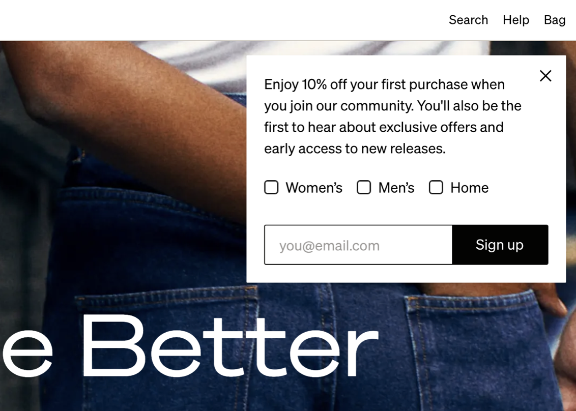
What’s great about this email popup?
- Kotn does an awesome job of putting the focus on the visitor with this sidemessage. They use “you” frequently (rather than “we” or “our”), they let the visitor decide what kinds of content they’re interested in (women’s, men’s, and/or home), and they highlight the benefits of signing up.
- In addition, this sidemessage uses the company’s brand colors. This ensures brand consistency, which builds trust with the audience.
What could be better with this example:
- One way they could improve is by breaking up the text for better readability. Having too much text too close together can be tiring for readers.
24. Flourist
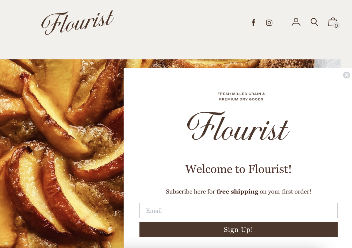
What’s great about this email popup?
- Flourist keeps their popup sleek and simple. This helps give it a non-invasive feel, keeping irritation down for visitors who are browsing their site.
- The text hues match the brand colors, with a homely brown that creates a sense of comfort rather than a jarring user experience.
What could be better with this example:
- Many shoppers now expect free shipping, so this may not be a strong enough incentive for them to sign up for the newsletter. Adding a 10% discount to the offer could help drive more conversions.
25. Partake Foods
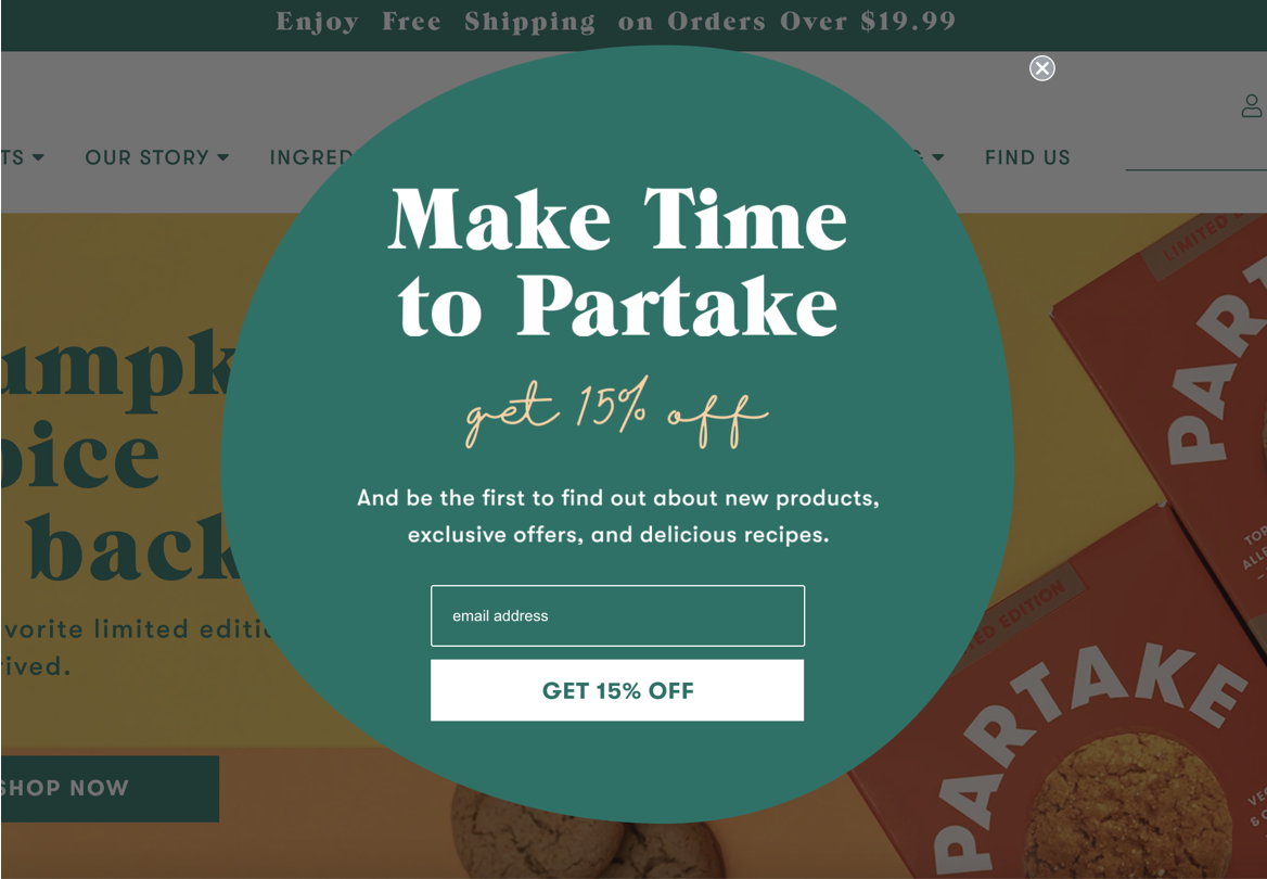
What’s great about this email popup?
- Partake Foods offers a generous 15% off, which is a strong incentive.
- The font matches their brand and the beautiful color choices draw the eyes.
What could be better with this example:
- When it comes to your copy, always go for clarity over cleverness. The opening line is definitely clever, but it could confuse some visitors.
- Featuring an image of one of their products in their popup could help drive more conversions. By showing the product, people would immediately connect their 15% off to a potential future purchase, like a delicious birthday cake or pumpkin spice cookies.
26. Bailly
What’s great about this email popup?
- This popup offers a desirable 10% off, which is awesome for driving sign ups.
- They use minimal text, so readers can scan quickly and decide whether or not to subscribe in a few seconds.
- The featured image is inviting, showing two friends enjoying the products.
What could be better with this example:
- The copy isn’t very inventive. Readers will have seen similar messages many times before, so they might just look past instead of really considering the offer.
27. Tsuno
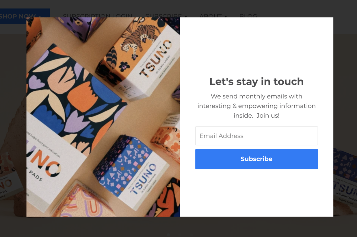
What’s great about this email popup?
- The products are eye catching and beautifully featured. The fun packaging makes this image a delight to look at, which will capture people’s attention and help boost conversions.
- In addition, the bright blue CTA button also matches the blue of the packaging, creating a uniform feel that’s consistent with the Tsuno brand.
What could be better with this example:
- The call-to-action button isn’t the most engaging, they could hike conversion rates by using more creative text.
28. Bésame Cosmetics
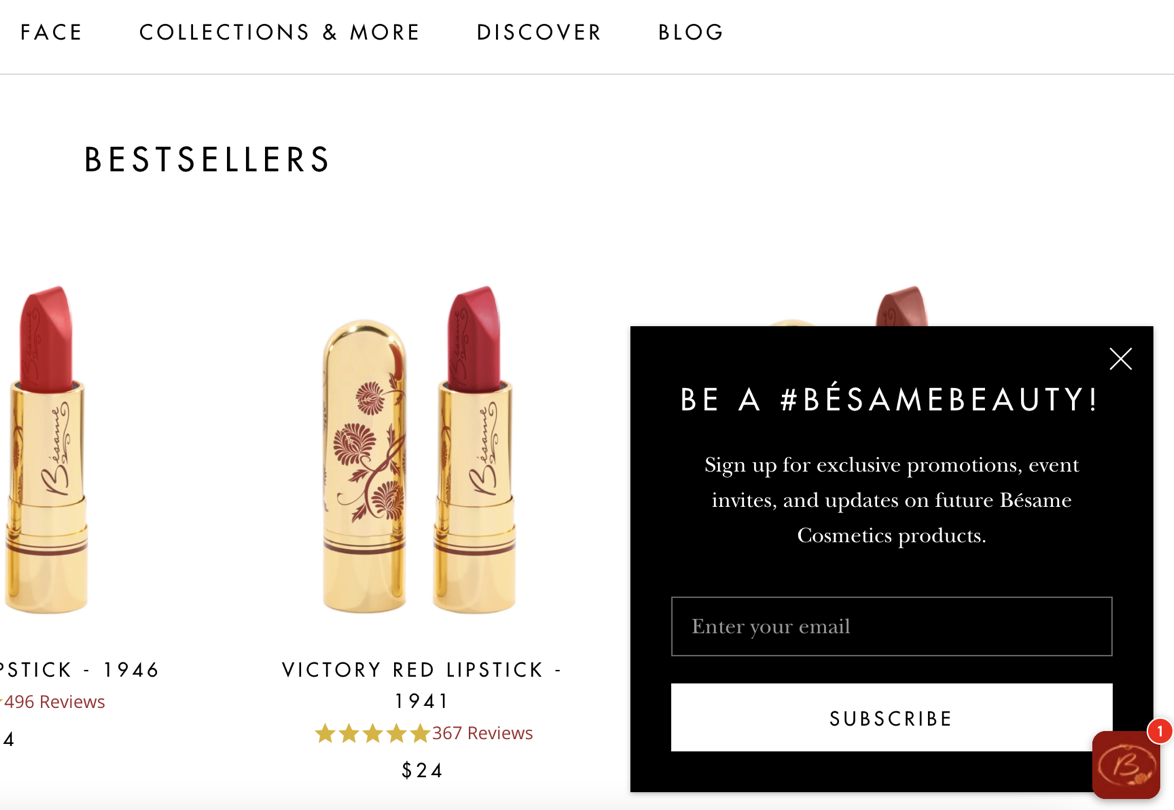
What’s great about this email popup?
- The choice to use a sidemessage ensures that visitors’ browsing experience isn’t interrupted. People can easily drop in their details and subscribe.
- The popup clearly and succinctly illustrates the main benefits of signing up for their email list, making it seem like a winning opportunity.
- The addition of a hashtag also gives the copy a fun vibe and makes it seem like subscribers will be part of a fun, bustling community of beauty lovers.
What could be better with this example:
- While the color choices are chic and go well with the website, the brand could benefit from A/B testing different colorful hues to see if they can boost conversions.
29. Adored Vintage
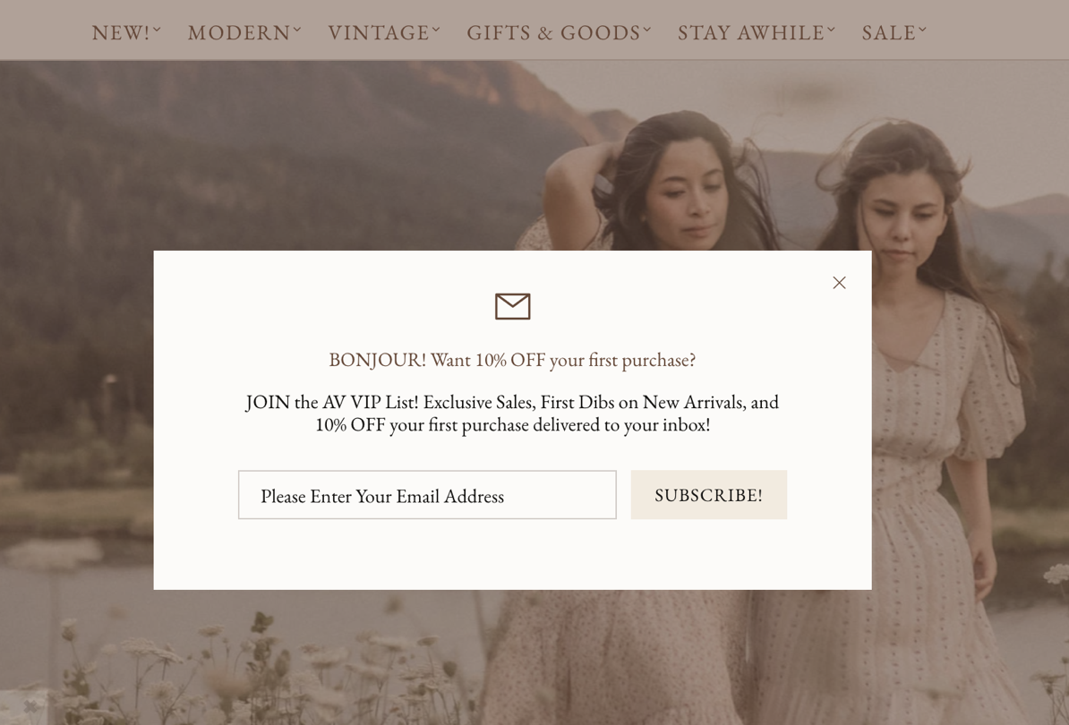
What’s great about this email popup?
- The popup features a fun welcome and offers a clear benefit to subscribing with 10% off.
- The suggestion that people will join a VIP list gives them a sense that they’ll be part of an exclusive “in crowd,” boosting desirability.
What could be better with this example:
- The capitalization of the text makes the popup difficult to read. This can frustrate visitors and negatively impact sign-up rates.
- The white hue somewhat blends into the background of the site. Experimenting with different fonts and colors could provide an uptick in new subscribers.
30. Vegetology
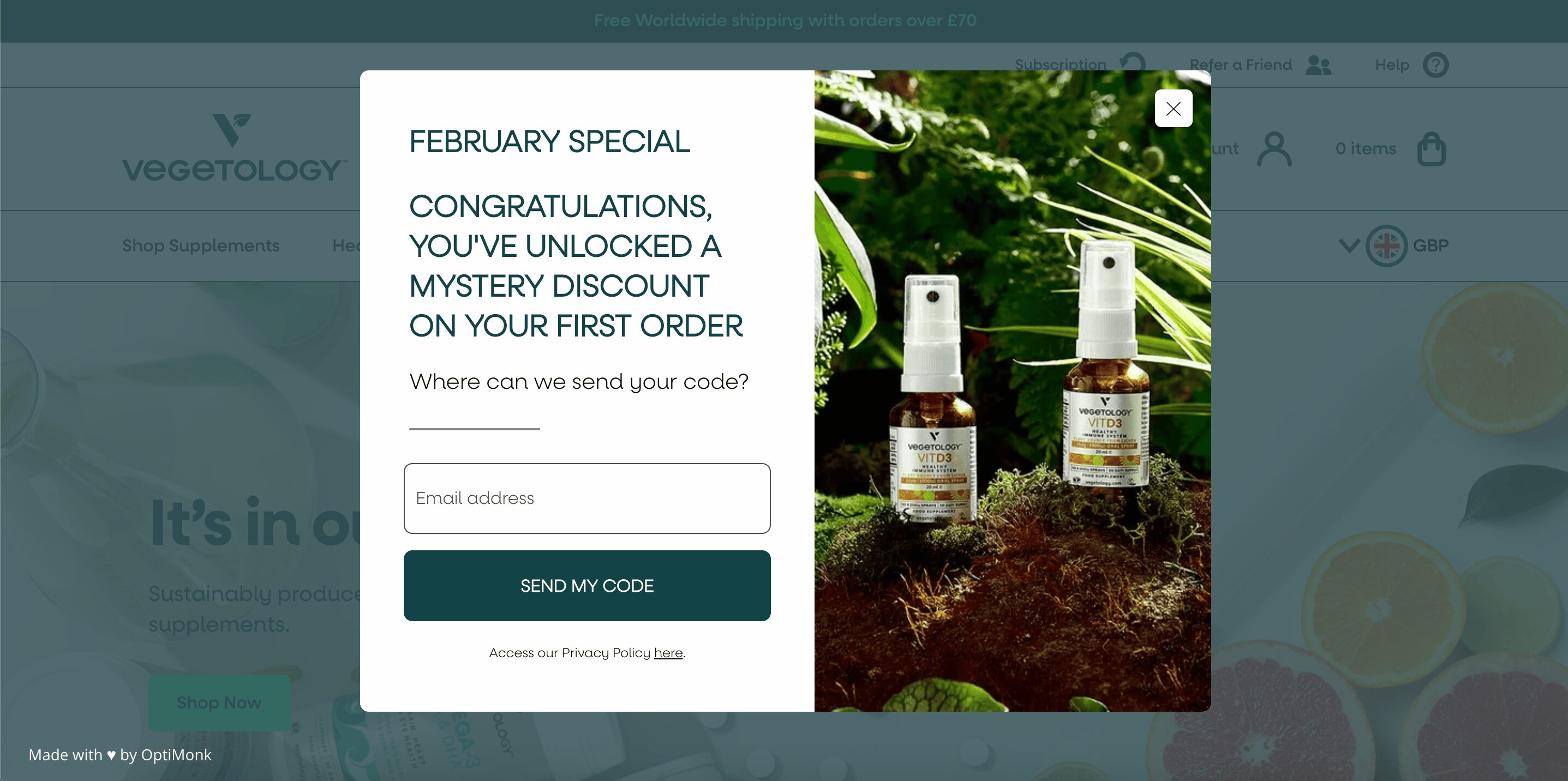
What’s great about this email popup?
- This email popup form offers a mystery discount which creates excitement and entices users to subscribe.
- The “February special” headline taps into seasonal urgency.
What could be better with this example:
- The popup contains too much text, which can overwhelm users and reduce clarity.
- Opting for a bolder font could enhance readability and effectiveness.
31. Brand Growth Experts
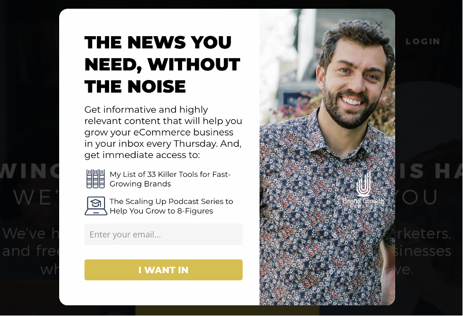
What’s great about this email popup?
- The popup effectively communicates what subscribers will gain, making it appealing.
- The CTA button stands out, drawing immediate attention and encouraging clicks.
What could be better with this example:
- Reducing the amount of text would make the popup more concise and impactful.
- Offering a discount could further entice visitors to subscribe, potentially increasing the conversion rate.
32. Crown & Paw
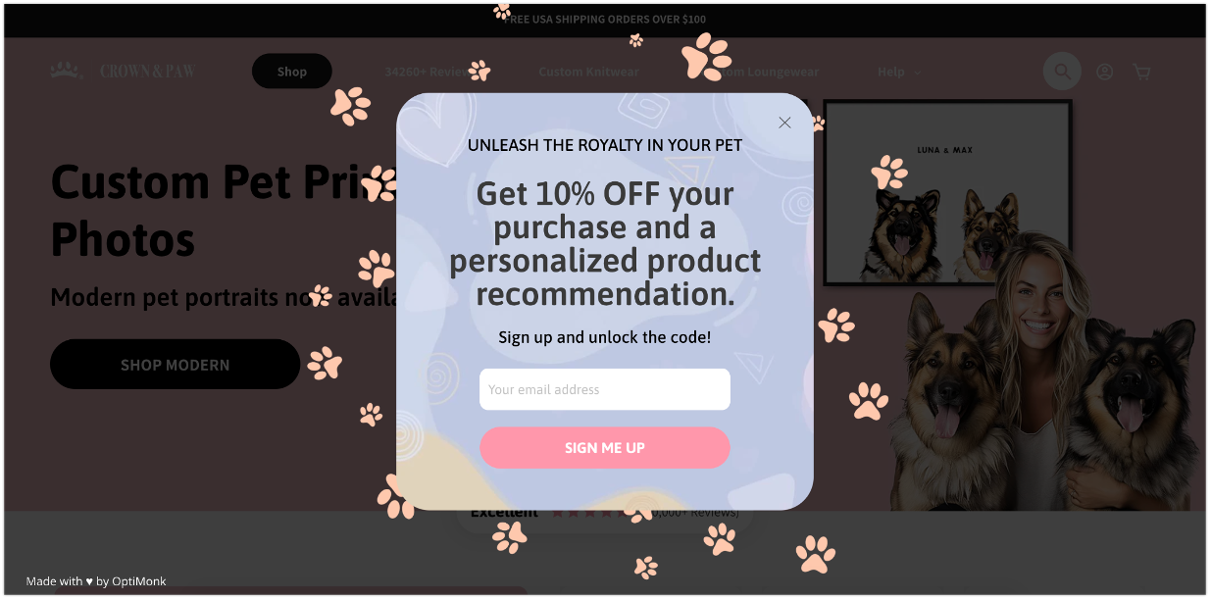
What’s great about this email popup?
- The promise of personalized product recommendations makes the offer more relevant and appealing.
- It’s a multi-step popup that asks segmentation questions in the next step. This helps Crown & Paw gather valuable data while keeping the user engaged.
What could be better with this example:
- Adding an image could make the popup more visually engaging, drawing attention and enhancing the overall appeal of this signup form.
33. The Turmeric Co.
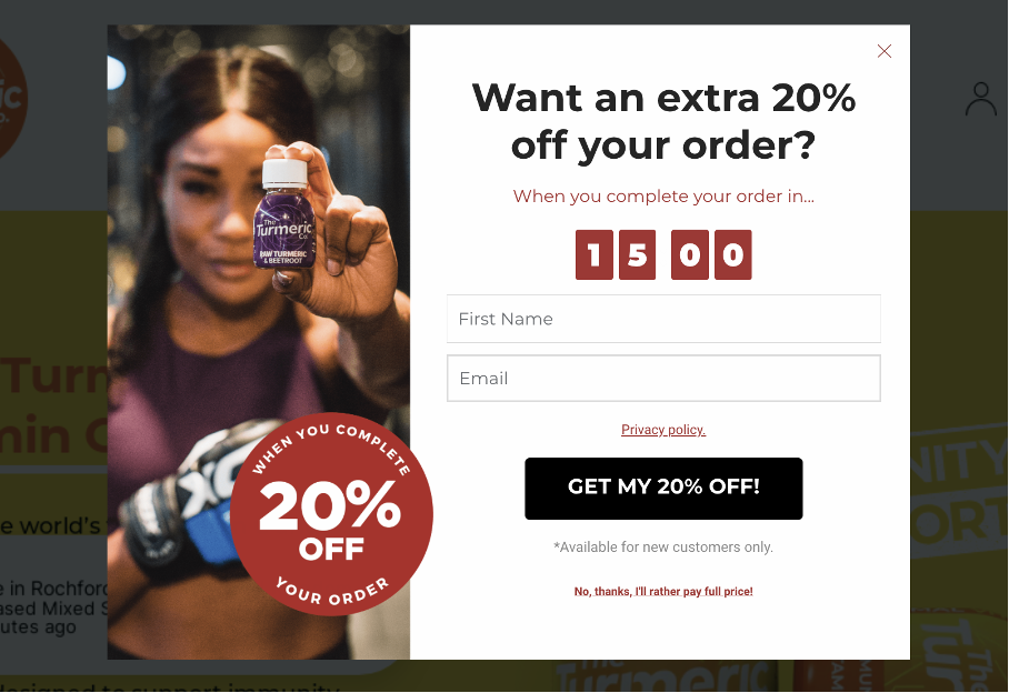
What’s great about this email popup?
- This exit-intent popup appears only to customers with products totaling over £79 in their cart, which makes the offer highly relevant.
- The urgency created by the countdown timer encourages quick action, boosting conversions.
What could be better with this example:
- Asking only for the visitor’s email address could streamline the process, reducing friction and potentially increasing the conversion rate.
34. UNIT 1
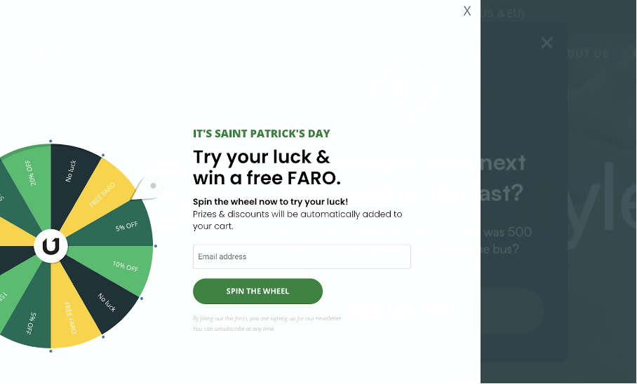
What’s great about this email popup?
- The gamification aspect makes the popup fun and engaging, increasing user interaction.
- Tied to Saint Patrick’s Day, it leverages a timely event to capture the visitor’s attention.
What could be better with this example:
Reducing white and enhancing the overall design could make the popup more visually appealing and effective.
10+1 tips to create the perfect email popup
Creating the perfect email popup is both an art and a science, requiring a delicate balance of creativity and strategy.
First, take a look at the image below, which shows us what the perfect email popup example looks like:
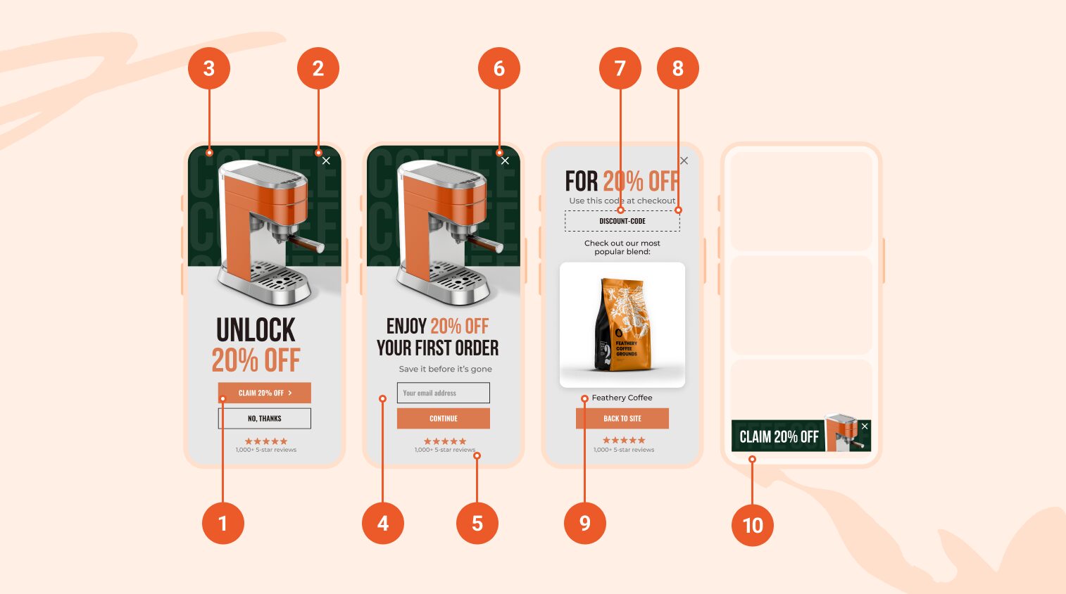
Seems pretty complex, right? Don’t worry—we’re here to guide you through the process, breaking it down into manageable steps.
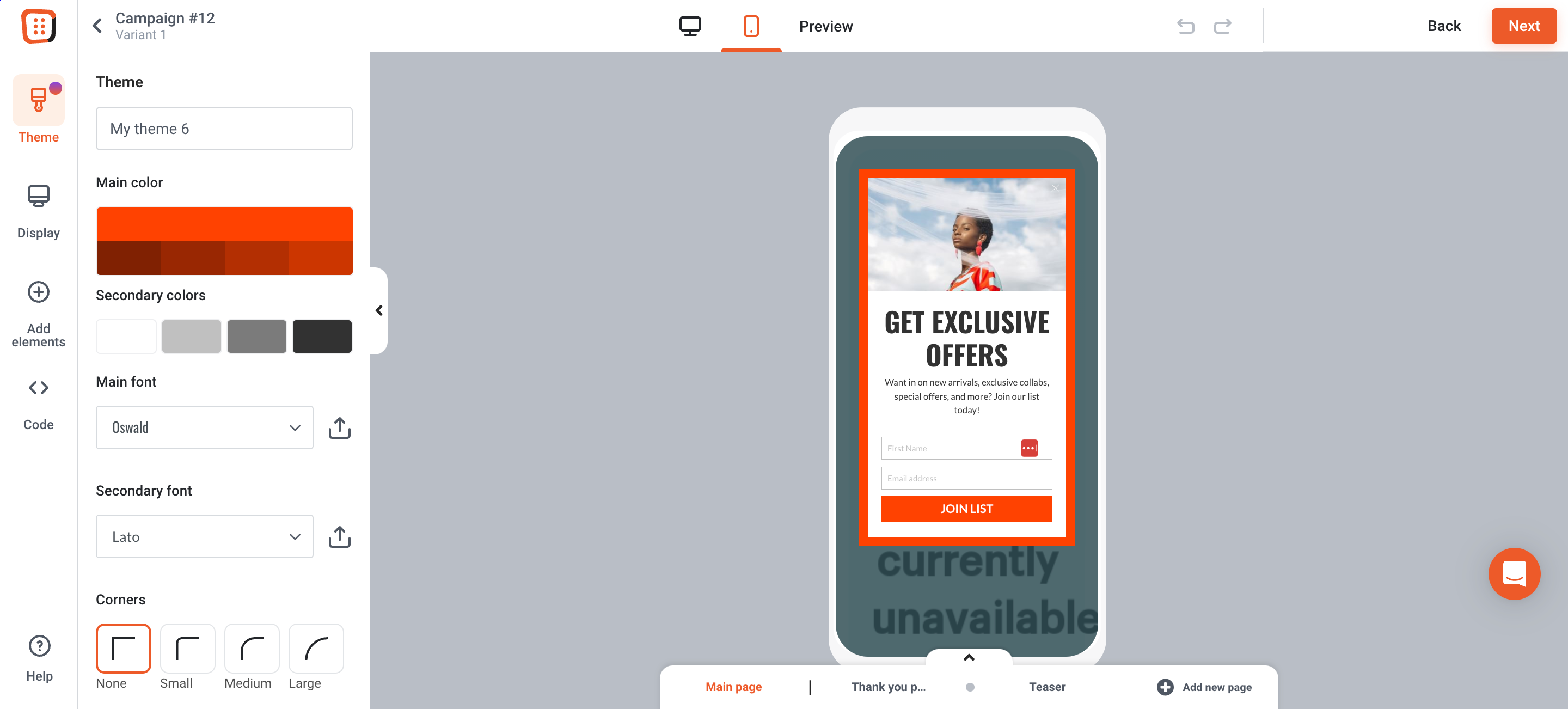
1. Use a multi-step popup
If you try to squeeze too much information into one single popup, it can cause too much noise for the visitor.
Multi-step popups are a great way to divide all that information into digestible pieces so the visitor doesn’t feel overwhelmed.
Start with a Yes/No question to increase the number of new visitor sign-ups.
This method taps into human behavior: by encouraging a small first action, you can play on people’s urge to finish what they’ve started. This can improve engagement and conversions.
Here’s an example of how the first page of a multi-step popup could look:
2. Display on exit-intent
Email popups can be triggered at different times. The best moment to show those popups depends on your goals. While some stores blast visitors with popups right away, others choose to wait a few seconds. Often, the most effective strategy is to use exit-intent popups.
These appear only when a visitor shows signs of leaving and lead to the highest conversion rates.
This strategic timing not only catches the visitor’s attention but also provides an opportunity to entice them back into the fold.
3. Make it full-screen
Full-screen popups—as the name implies—cover the entire screen, causing a temporary interruption.
This attention-grabbing format allows you to get your message across, even on smaller mobile screens.
However, be careful not to cover up important information on your site to avoid disrupting the user’s experience. Moreover, when employing full-screen popups on mobile, it’s crucial to trigger them on exit-intent to avoid potential penalties from Google.
4. Optimize for mobile
As more and more people are shopping from their mobile devices—today, mobile users account for around 42.9% of all ecommerce traffic—you should focus on optimizing the experience for them.
Make sure that your popup elements work smoothly on mobile screens. That means making the buttons easy to tap and correctly sized for touch interaction.
By tailoring your popups for mobile users, you can increase conversions among this critical group of visitors.
5. Add trust-building elements
Adding trust-building elements like logos, badges, reviews, or media mentions is important because it helps your target visitors feel more confident about your brand or product.
When they see familiar logos or positive reviews, they automatically trust you more, making it more likely that they’ll buy from you.
Check out the second page of the popup we showed earlier. You can see that they’ve included their logo at the top and their rating at the bottom to boost credibility.
6. Delay the closing ‘X’
Online shoppers are used to popups. Therefore, they often click the X button without thinking twice. They can’t help it—it’s a force of habit.
Luckily, we’ve found a simple trick that can help you work around this issue and get your message across.
Delay the appearance of the X button by a few seconds (2 or 3) so visitors can absorb the content of your popup before closing.
Are you worried this might annoy your visitors? Don’t be. They won’t have time to get upset, as they’ll be too busy reading your offer!
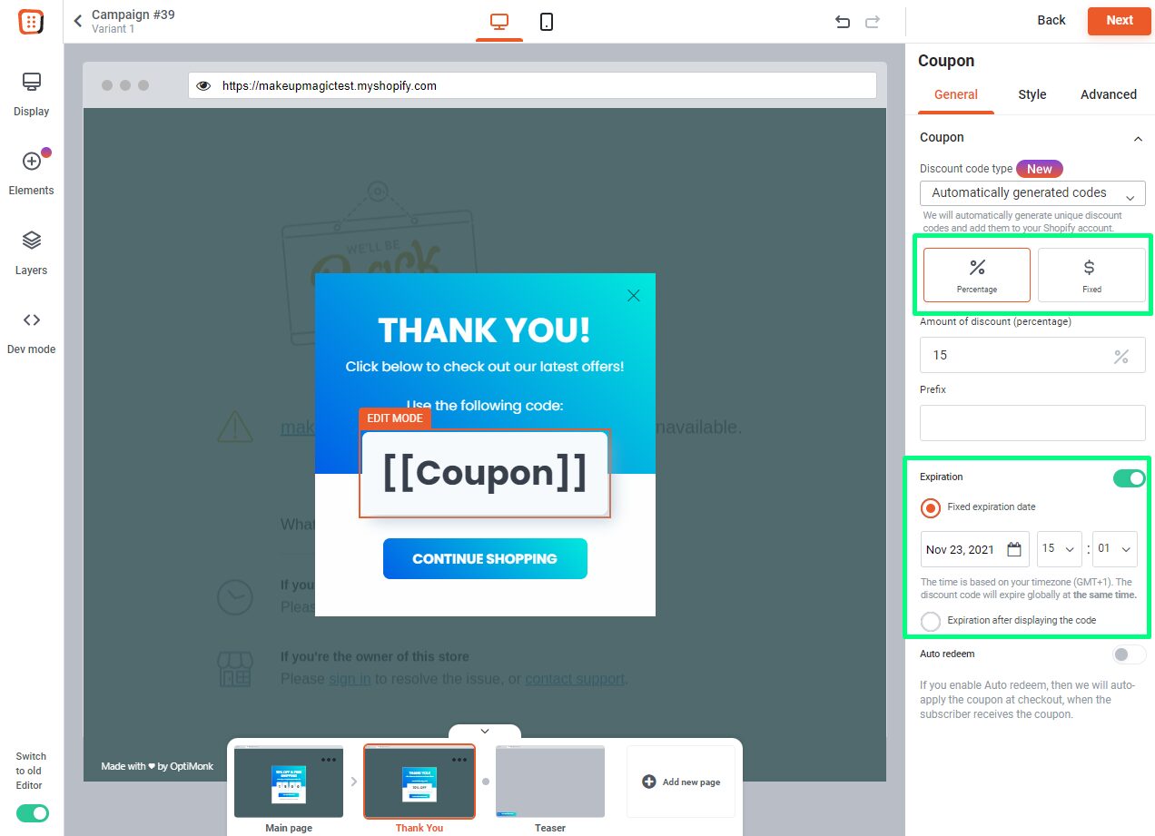
7. Use a unique discount code
Want to provide your visitors with a sense of exclusivity? Give them a unique discount code.
A unique discount code is a one-time-use code, and it has several benefits. First, it can prevent misuse, ensuring that each customer can only use the code once. Second, it can make sure that each offer is personalized and exclusive to the recipient.
Additionally, unique codes can help you track the effectiveness of your promotions more accurately.
Here’s how to set up automatically generated unique discount codes in OptiMonk:
- Set the discount code type to “Automatically generated codes.”
- Choose if the discount should be a “percentage” or a “fixed” dollar amount.
- Add the amount of the discount.
- Set up the expiration.
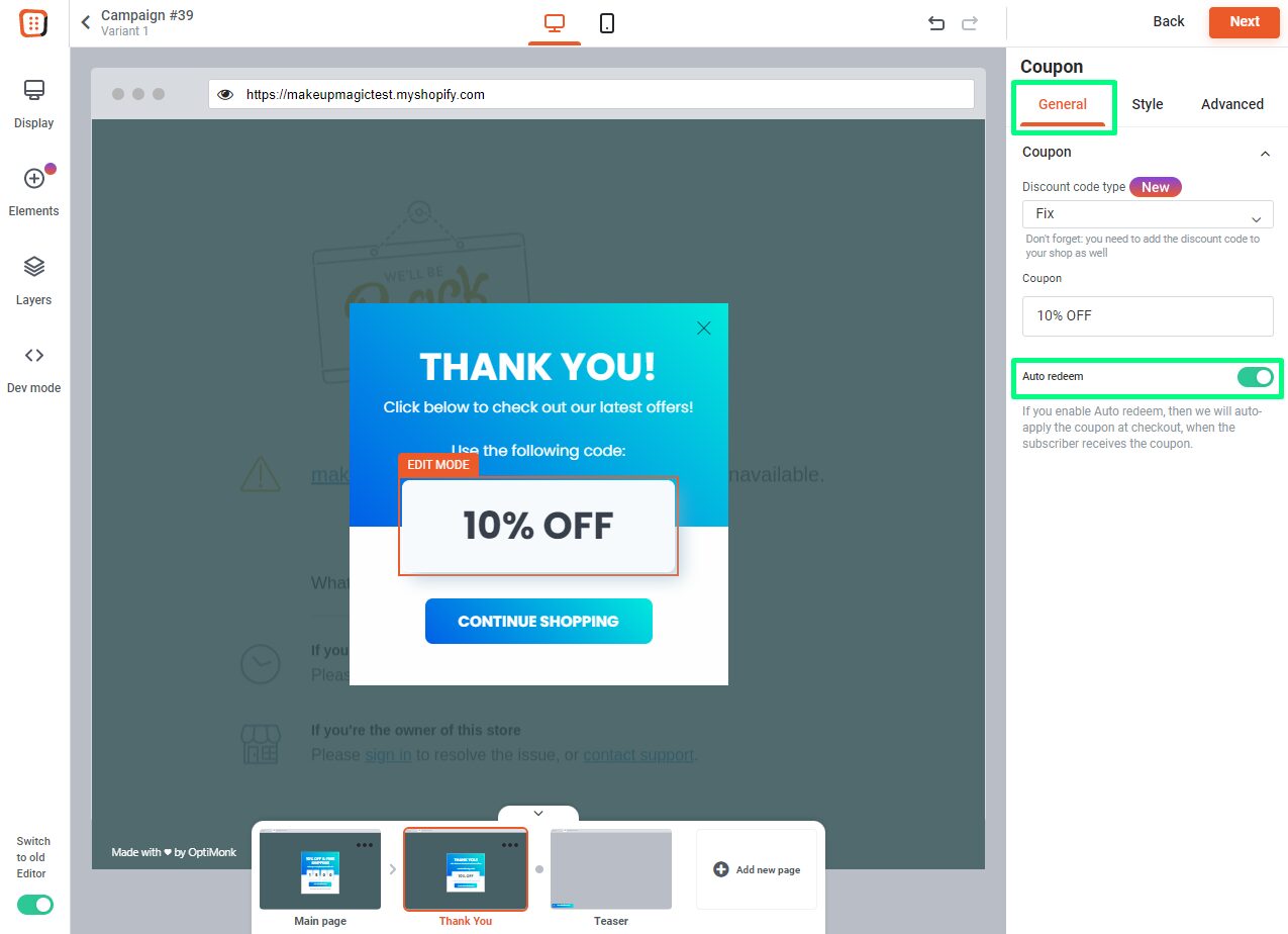
8. Auto-redeem discount codes
Visitors often forget about their coupon codes.
To avoid this, use auto-redeeming discount codes, which will be redeemed automatically for your visitors during the checkout process.
This way, you can ensure they won’t forget about their coupon. Plus, seeing a sweet deal automatically show up at checkout can be a big dopamine boost!
To set it up in OptiMonk, just turn on the “auto redeem” feature in the “General” settings for your coupon element.
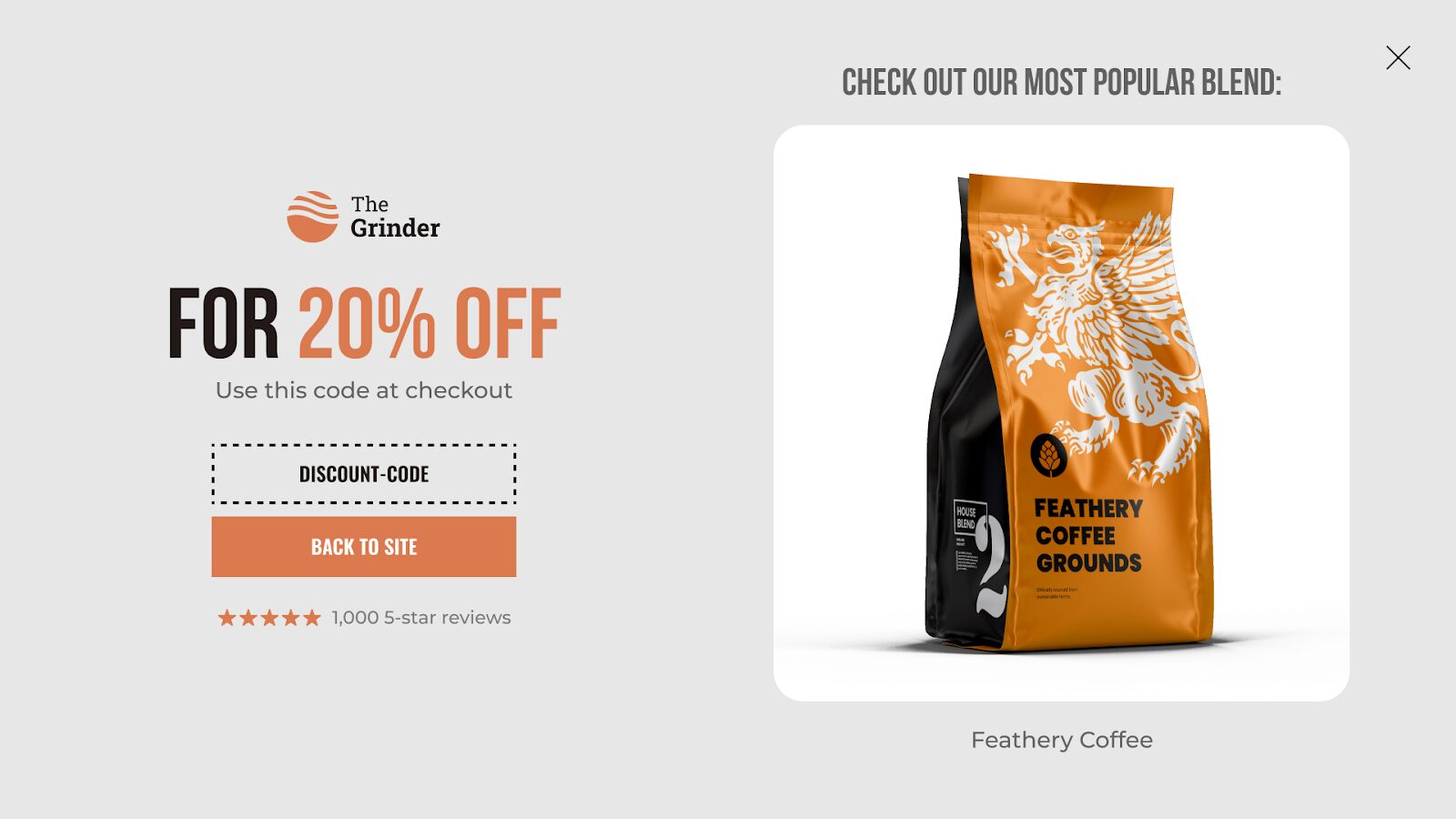
9. Recommend products on the thank you page
After you’ve got your visitor’s email address (or after they’ve taken the desired action) their journey doesn’t have to end there!
Take advantage of the thank you page by recommending your most popular products. By leveraging this opportunity, you can further engage your audience and potentially increase sales.
Displaying product recommendations, such as your bestsellers or items related to their interests, can pique their curiosity and encourage them to explore further.
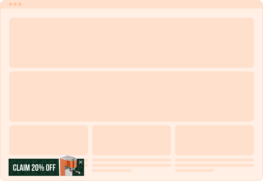
10. Add a sticky teaser
Did your visitor choose not to fill out the form? All is not lost!
Implement a sticky teaser that activates if the visitor closes the popup without filling it out.
This feature will follow them as they navigate your website, gently reminding them of the offer until they’re ready to engage.
+1 Pro tip: Add a discount reminder campaign
Ready for one last tip that will improve the effectiveness of your email popup campaign?
If your visitor is still not ready to use those coupon codes, don’t give up on them. Instead, implement a discount reminder campaign.
A discount reminder campaign is a follow-up sticky bar that reminds visitors about their unused codes and encourages them to finalize their purchases.
Give these templates a try:
Get started with these templates
OK, now that you’ve explored the anatomy of the perfect email popup, you’re probably itching to launch one of your own.
Ready to give it a go? Check out these templates:
FAQ
Do email popups work?
The short answer is yes. According to our own statistics, popups with a discount offer have an average 7.65% conversion rate. But even incentive-free email popups have a 5.10% average conversion rate. And lucky wheel popups (which are also a type of newsletter popups) perform even better, with a 13.23% average conversion rate.
What is the best timing for email popups?
If a popup appears too quickly (right after the site loads, for instance), it can annoy your new visitors. Plus, they probably won’t be ready to sign up for your newsletter yet. Generally, we recommend displaying popup forms on exit intent, but for more details, check out this article.
How to create an email popup?
To get started, you’ll need a reliable popup builder tool that offers customization options and templates. OptiMonk is one of the best popup builder tools out there and it offers a free plan to get you started. Begin by selecting a suitable template from our Template Library.
Then determine the targeting and triggering conditions that will prompt the popup window to appear. Don’t forget to integrate it with your email marketing tool, so you can track email marketing metrics and send email marketing campaigns to your new subscribers.
Wrapping up
Now that you’ve seen some examples of great email popups, are you ready to build your own?
Take a look at our Template Library to see how you can grow your email list with the help of eye-catching email popups like the ones covered here.
We offer a slew of ready-to-use templates and color themes to choose from and add to landing pages, blog posts, or anywhere else on your website.
Building subscriber lists for your email campaigns has never been easier!
Learn more
Would you like to learn more about popups? Check out these articles:
Migration has never been easier
We made switching a no-brainer with our free, white-glove onboarding service so you can get started in the blink of an eye.

What should you do next?
Thanks for reading till the end. Here are 4 ways we can help you grow your business:
Boost conversions with proven use cases
Explore our Use Case Library, filled with actionable personalization examples and step-by-step guides to unlock your website's full potential. Check out Use Case Library
Create a free OptiMonk account
Create a free OptiMonk account and easily get started with popups and conversion rate optimization. Get OptiMonk free
Get advice from a CRO expert
Schedule a personalized discovery call with one of our experts to explore how OptiMonk can help you grow your business. Book a demo
Join our weekly newsletter
Real CRO insights & marketing tips. No fluff. Straight to your inbox. Subscribe now
Share this article
Written by

Nikolett Lorincz
Nikolett is the Head of Content at OptiMonk. She is obsessed with content marketing and loves creating educational content for ecommerce store owners. She truly believes in the importance of quality over quantity.
You may also like
- Posted in
- Conversion
Partner with us
- © OptiMonk. All rights reserved!
- Terms of Use
- Privacy Policy
- Cookie Policy
Product updates: January Release 2025


