- Blog
- 11 Opt-In Page Examples to Help You Build An Email List Fast
11 Opt-In Page Examples to Help You Build An Email List Fast
-
Barbara Bartucz
- Conversion
- 6 min read
Table of Contents
Dreaming of an email list that’s not just extensive, but bursting with engaged customers?
Then you need an irresistible opt-in page. But how do you create one that stands head and shoulders above the rest?
In this article, we’ll show you 11 outstanding opt-in page examples that’ll leave you inspired and ready to create your very own.
Let’s jump in!
What is an opt-in page?
An opt-in page, also known as a squeeze page or lead capture page, is a type of landing page that’s designed to capture the interest of website visitors and convert them into email subscribers or leads.
It’s made to grab the attention and interest of potential customers, encouraging them to provide their information in exchange for valuable content or resources.
In short, an opt-in page can help digital marketers to build their email lists even more effectively.
What are the key elements of an opt-in page?
Now let’s break down the key opt-in page components, ranging from captivating headlines to trust-building security badges.
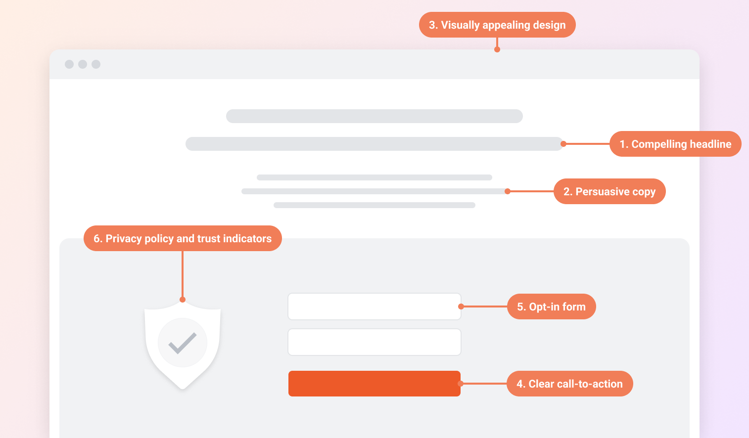
1. Compelling headline
One of the key aspects of a high-converting landing page is a benefit-driven headline that grabs the visitor’s attention.
The goal of the headline is to make visitors aware of the benefit or value they’re getting from opting in.
2. Persuasive copy
The best opt-in pages always have their copywriting on point.
The copy on the opt-in page should highlight the benefits of the offer and persuade visitors to take action.
It should address their pain points, provide solutions, and create a sense of urgency or FOMO.
3. Visually appealing design
The third component of an opt-in page is the design. It should be captivating, clean, and created specifically to drive conversions.
The layout of your opt-in page should be intuitive, guiding visitors effortlessly towards the action you want them to take.
Also, don’t forget about the color scheme (align it with the brand’s identity and the emotions you wish to evoke in your audience), imagery, and use of white space.
4. Clear call-to-action
There are no high-converting opt-in pages without prominent and eye-catching call-to-action buttons.
The CTA should be placed strategically on a page so visitors can take the desired action without hesitation and complete the opt-in process.
Ideally, it should be above the fold, ensuring that visitors don’t have to scroll to find it. However, including additional CTAs throughout the page—such as after an engaging piece of content or compelling testimonial—can also be effective, especially on longer landing pages.
5. Opt-in form
Now, we reach the actual opt-in form, where visitors can input their contact information.
Subscribing should be a breeze, so make sure your opt-in form is user-friendly.
Keep the form short, and only ask for the essential information like name and email address. This can help you minimize friction and increase conversion rates.
6. Privacy policy and trust indicators
The final element is including a link to your privacy policy and trust indicators.
Trust indicators can be security badges or customer testimonials. These help reassure visitors about the safety and confidentiality of their personal information.
Opt-in pages vs. landing pages: What's the difference?
Understanding the differences between opt-in pages and landing pages is crucial for deploying each effectively in digital marketing strategies.
Let’s take a look at the key differences:
1. Goal
The primary goal of opt-in pages is to grow an email list by capturing visitors’ email addresses. These pages are laser-focused on encouraging users to subscribe, often in exchange for something of value like a free ebook, a discount code, a webinar, or a free trial.
Landing pages are more versatile in terms of objectives. Besides gathering emails, landing pages aim to sell products, promote a new service, encourage downloads of an app, or facilitate registrations for an event. The goal can be broader and tailored to any stage of the marketing funnel.
2. Content
Opt-in pages offer free incentives to capture email addresses, focusing on immediate goal achievement, whereas landing pages provide comprehensive details about products or services.
Opt-in pages are often direct and goal-driven, offering minimal detail, while high-converting landing pages can feature more extensive information like product descriptions, benefits, and testimonials—enough to persuade visitors to take action without overwhelming them.
3. Traffic source
High-converting landing pages often receive traffic from ads or specific campaigns, while opt-in pages can be standalone or part of a broader website strategy.
The best landing pages are often designed to align closely with the messaging and targeting of the ads or campaigns that people click through from, ensuring a seamless, cohesive user experience from ad click to conversion.
11 opt-in page examples
Now it’s time to dive in and explore 11 opt-in page examples that are best in class. There’s something special about each one, so grab your notebook and get ready to jot down some ideas!
1. Demand Curve
First up on our opt-in page examples list is Demand Curve. This opt-in page promotes their newsletter, where they share top strategies and tactics used by fast-growing startups.
What do we like about this opt-in page?
They summarize the benefits of joining the newsletter really well without getting into unnecessary details.
Also, they use social proof consistently on the page: by highlighting 97,000 businesses that trust them, by including lots of reviews, and by showing the logos of brands that subscribe. Convincing, right?
2. Marketing Examined
Our second example is Marketing Examined, a blog that sends weekly newsletters to its subscriber base on different topics.
What do we like about this opt-in page?
Their benefit-driven headline stands out and communicates clear value. Note how they systematically divide the content into different areas, so the user has a crystal clear idea of what to expect by subscribing.
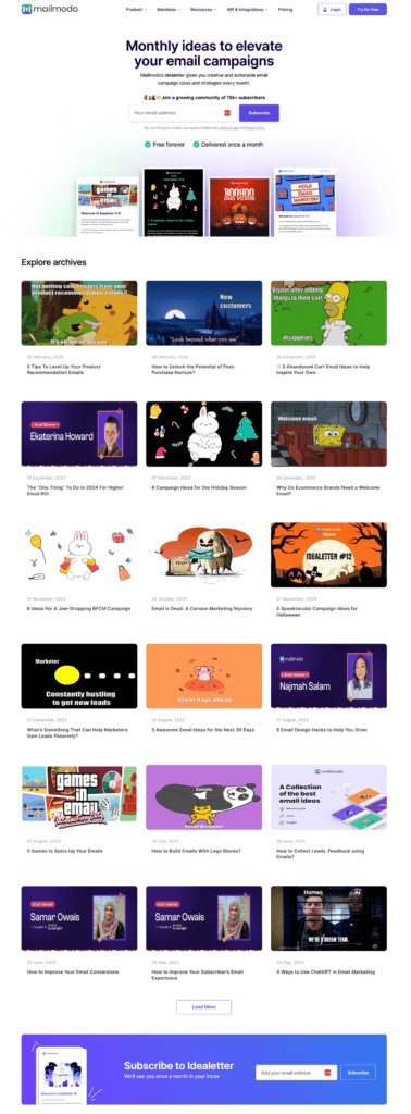
3. Mailmodo
Next up on our list is the opt-in page for Mailmodo’s monthly newsletter, which gives subscribers ideas to elevate their email campaigns.
What do we like about this opt-in page?
Mailmodo’s opt-in page example shows how you can use your existing content to your advantage by presenting it as added value.
They let users explore their archived newsletters, giving them a sneak peek. This is a great, tangible way to highlight the benefits of subscribing.
4. Backlinko
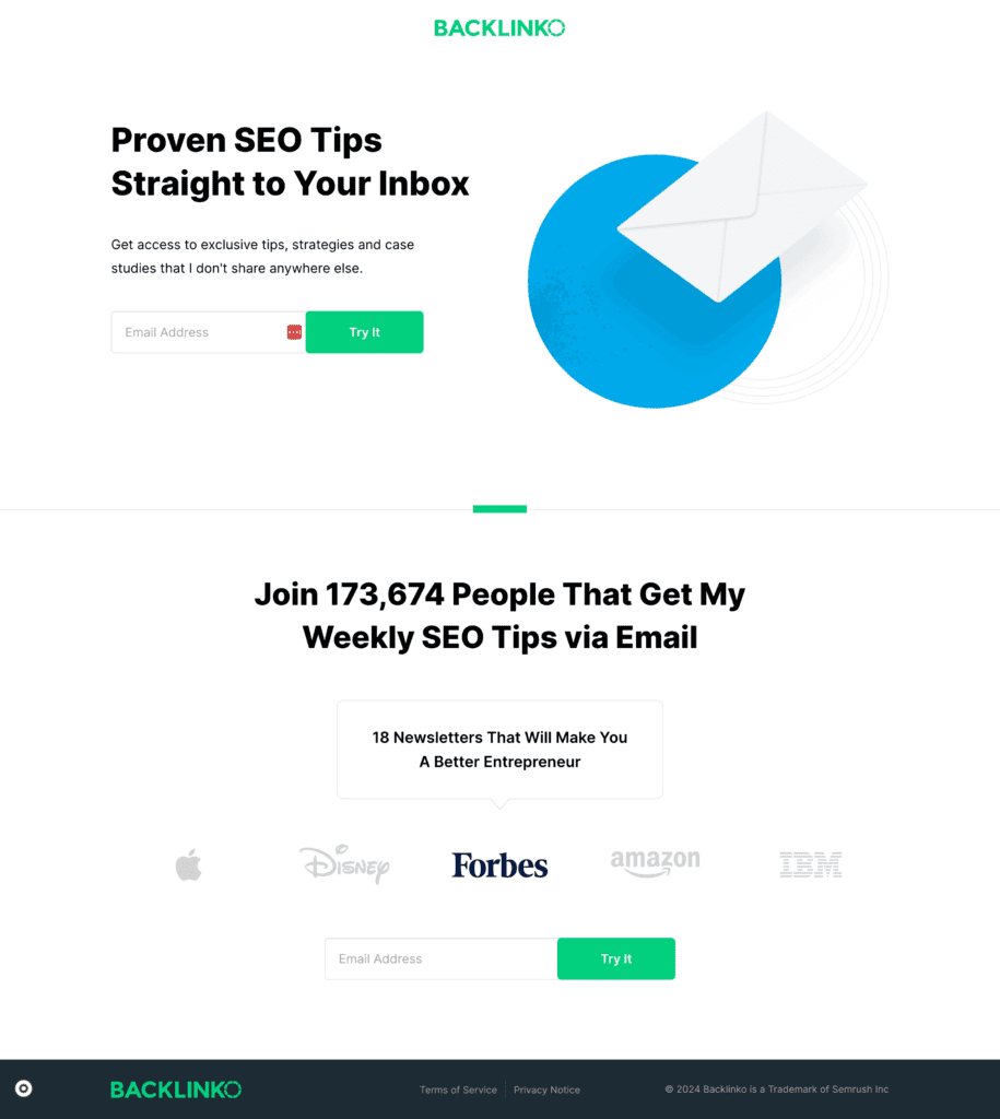
The next opt-in page example comes from Backlinko, which provides next-level SEO training and link-building strategies. Here, they’re promoting their newsletter.
What do we like about this opt-in page?
Backlinko’s opt-in page is the epitome of simplicity. It’s short, sweet, and to the point. They communicate the bare minimum, but they’re pretty convincing at it!
Their headline summarizes the main benefit so the visitor can quickly figure out what they’re signing up for. At the bottom of the opt-in page, they use social proof, with the powerful “Join 173,674 people” statement.
5. Swipe Files
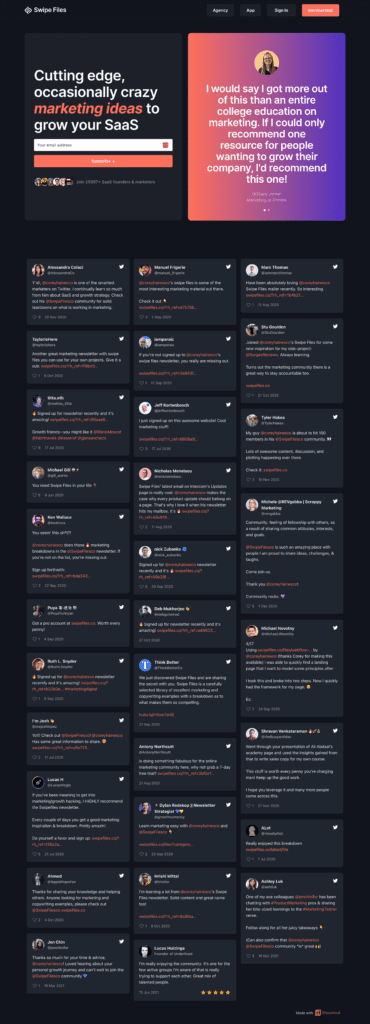
Swipe Files is a marketing newsletter and community for SaaS marketers and business owners. Let’s see why we included them in our list of opt-in page examples!
What do we like about this opt-in page?
Swipe Files’ opt-in page excels at showcasing customer reviews. On the top, they have a simple opt-in form that only asks for an email address, with a simple “Subscribe” CTA button.
Next to the opt-in form, they display subscriber reviews. This means that even if visitors don’t scroll down, they’ll see them!
6. SaaS Weekly
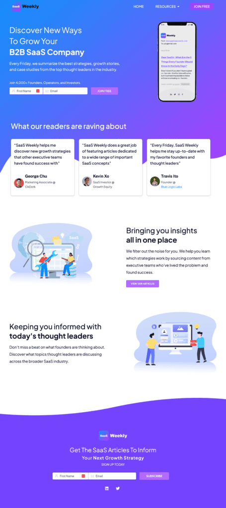
SaaS Weekly’s opt-in page promotes their weekly newsletter, which provides “strategies, growth stories, and case studies.”
What do we like about this opt-in page?
On this page, we find the opt-in form in the above-the-fold section, which is a great strategy. Below that, we find 3 raving reviews.
If you scroll down, they summarize the value they’re providing in just two points. You can also browse their articles, which can help visitors get an idea of what sort of content they can expect in their inboxes.
Finally, the opt-in form appears again at the end of the landing page. This way, visitors don’t have to scroll back to the top.
7. Brand Builder University
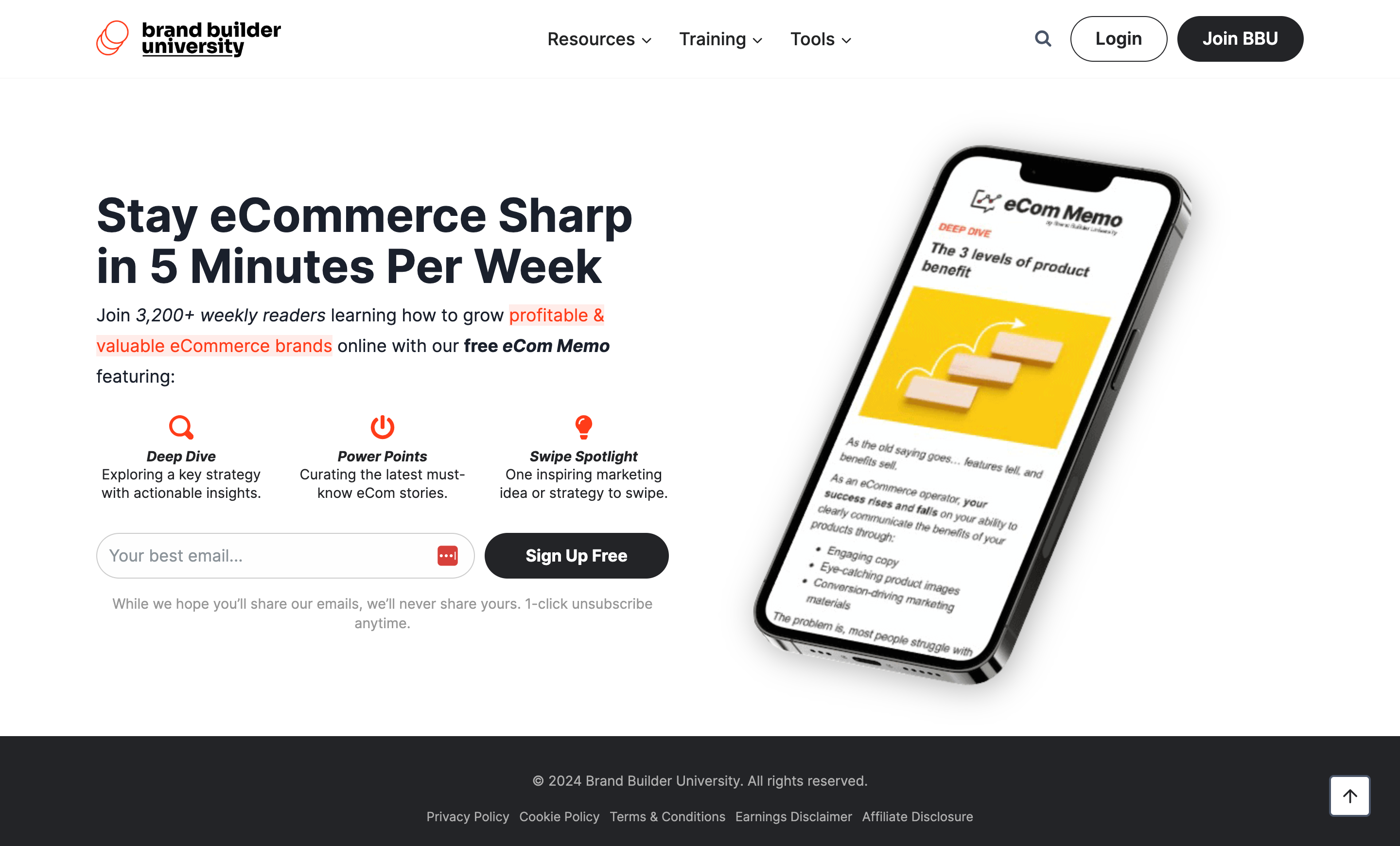
Brand Builder University’s opt-in page promotes the free eCom Memo newsletter for ecommerce business owners.
What do we like about it?
Their squeeze page is rather simple and short, which clearly works for them.
Their main headline contains all the values they want to communicate. Then, in the subheadline, they add some extra value including social proof.
Below that, in just 3 points, they illustrate the kinds of content subscribers can expect to receive.
8. Nik Sharma
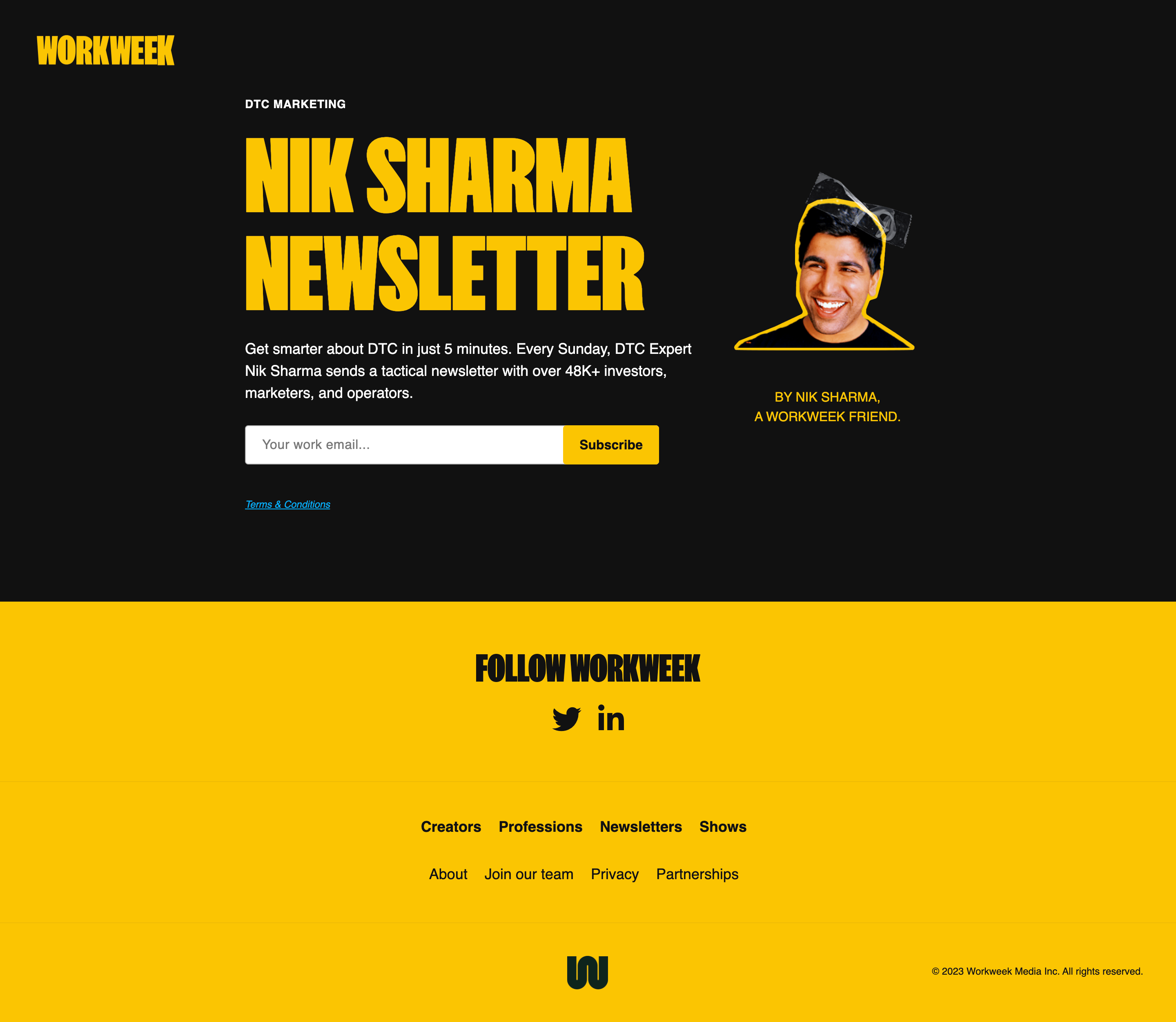
Nick Sharma is a well-known marketing consultant and DTC expert. This opt-in page example promotes his weekly DTC newsletter.
What do we like about this opt-in page?
Nick Sharma’s opt-in page example shows the power of simplicity.
In just two sentences, they summarize what people get by signing up, then include a simple opt-in form where the visitor can type in their email address.
Below that are social follow buttons, key links, and downloadable content including previous newsletters.
9. Good Question
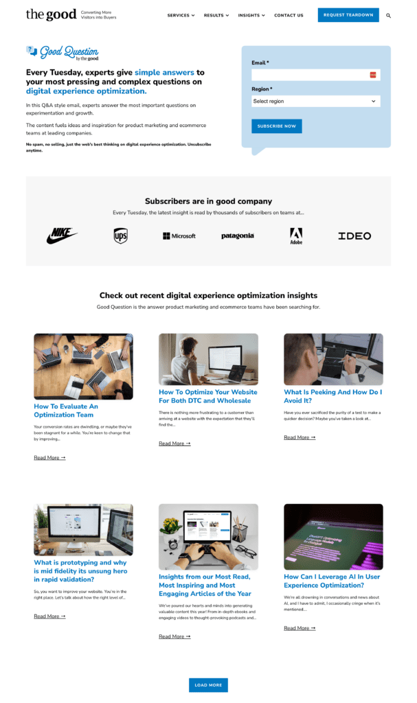
The Good provides a Digital Experience Optimization program which helps businesses to optimize their conversion rate. On this opt-in page, they promote their Good Question newsletter.
What do we like about this opt-in page?
This opt-in page is clear and well structured. They explain in two or three sentences that they only send newsletters containing real value, not promotional emails or spam.
Below, the user can see some of the big brands that have already subscribed. And if that’s not enough, they also display some of their blog posts to show the kinds of topics they cover.
10. DTC Newsletter
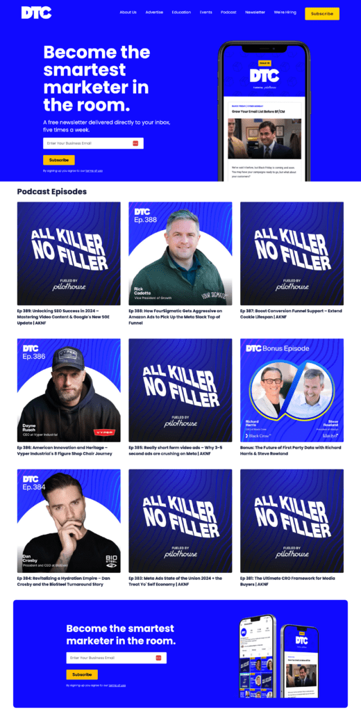
The DTC newsletter is a free newsletter that’s delivered five times a week to subscribers’ inboxes. DTC provides various kinds of content to their visitors: courses, podcasts, and newsletters.
What do we like about this opt-in page?
With a strong headline, “Become the smartest marketer in the room,” the visitor is hooked from the start.
They don’t have multiple form fields; they only ask for a work email from subscribers.
Below the opt-in form, the user can find podcast episodes with well-chosen images. Also, note their CTA button, which is an attention-grabbing yellow and stands out well from the blue background.
11. Shopifreaks
Last on our opt-in page examples list is Shopifreaks, which is a popular ecommerce newsletter that curates the best ecommerce-related news.
What do we like about this opt-in page?
Several things.
On the left side, the visitor can easily opt-in. We love the call-to-action button, which says “Add to inbox,” which is way better than a simple “Subscribe now.”
Then, if you scroll down, a tiny sticky bar comes up, encouraging you to subscribe. It’s also worth noting that they introduce themselves with a picture, making the connection feel even more personal.
4 best practices for optimizing your opt-in pages
Is it time to give your own opt-in pages a facelift? Here are some best practices you can use to improve your opt-in rates quickly!
1. Offer a valuable incentive
The incentive, or lead magnet, is the cornerstone of your opt-in page. It needs to be so enticing that your target audience can’t say no.
Research your audience to understand their challenges and interests. The more aligned your incentive is with your audience’s needs, the more compelling it will be.
2. Use A/B testing
Don’t just rely on gut feelings—you can do much better than that with A/B testing.
Experiment with different headlines, copy, designs, and CTAs to identify what resonates best with your audience and drives the highest conversion rates.
If you don’t want to do it manually—and why would you?—use our AI-powered Smart A/B Testing tool to automate this process.
3. Optimize for mobile
In the era of smartphones and other devices, squeeze pages must be mobile-optimized.
A mobile-optimized page loads quickly, displays content correctly on small screens, and has touch-friendly navigation.
Ensure that your opt-in forms are easy to fill out on mobile devices, and test your pages on multiple devices and browsers to guarantee a seamless experience for all users.
4. Follow up promptly
Last but not least, don’t forget to follow up once someone opts in.
The relationship with your subscriber begins the moment they opt in. Deliver the promised lead magnet immediately to your new email subscribers, and follow up with a welcome email that sets the tone for future communications.
An automated email sequence can help you warm up your leads, providing them with valuable content and gently guiding them down the sales funnel.
Wrapping up
We hope you’ve learned some valuable lessons from our list of great opt-in page examples and best practices!
By integrating these winning practices, you’re not just optimizing your opt-in pages; you’re crafting narratives of engagement as you collect all those new subscribers.
Now armed with this knowledge, go forth and elevate your opt-in pages to new heights!
Migration has never been easier
We made switching a no-brainer with our free, white-glove onboarding service so you can get started in the blink of an eye.
What should you do next?
Thanks for reading till the end. Here are 4 ways we can help you grow your business:
Boost conversions with proven use cases
Explore our Use Case Library, filled with actionable personalization examples and step-by-step guides to unlock your website's full potential. Check out Use Case Library
Create a free OptiMonk account
Create a free OptiMonk account and easily get started with popups and conversion rate optimization. Get OptiMonk free
Get advice from a CRO expert
Schedule a personalized discovery call with one of our experts to explore how OptiMonk can help you grow your business. Book a demo
Join our weekly newsletter
Real CRO insights & marketing tips. No fluff. Straight to your inbox. Subscribe now
Barbara Bartucz
- Posted in
- Conversion
Partner with us
- © OptiMonk. All rights reserved!
- Terms of Use
- Privacy Policy
- Cookie Policy
Product updates: January Release 2025
