- Blog
- What is a Squeeze Page? With 5 Real-Life Examples
What is a Squeeze Page? With 5 Real-Life Examples
-
Nikolett Lorincz
- Marketing
- 6 min read
Table of Contents
Ever landed on a page offering something tempting, like a free ebook or exclusive discount, but only if you enter your email address first? That, my friend, is a squeeze page in action.
If you’re running an online business or involved in digital marketing, you’ve probably heard about squeeze pages. But what makes them so effective, and how can you create one that actually converts?
In this article, we’ll not only break down the anatomy of a squeeze page but also look at five real-life examples to inspire your own.
Let’s jump in!
What is a squeeze page?
A squeeze page is a specific type of landing page designed with one goal in mind: to capture email addresses (or other contact info) in exchange for something valuable.
Unlike other landing pages, which may have several objectives or a more complex structure, a squeeze page zeroes in on a single, laser-focused call-to-action (CTA). Typically, it offers something your audience can’t resist, like a free report, discount, or access to a newsletter.
Why are squeeze pages important?
Squeeze pages are a key tool in digital marketing because they help you build one of your most valuable business assets: your email list.
In an age where algorithms control much of the traffic on social media and search engines, your email subscribers are something you fully own. Unlike paid ads or social media platforms, which can fluctuate based on platform changes, your email list gives you direct access to your audience whenever you want.
That’s why growing this list with a great squeeze page is so critical.
1. Nurturing leads into customers
Building an email list through a squeeze page allows you to create a direct line of communication with potential customers. Once someone joins your list, you have the opportunity to nurture that relationship over time.
Through well-crafted email campaigns, you can share valuable content, showcase products, and slowly build trust. This can eventually convert leads who might not have been ready to buy at first into loyal customers.
Without a squeeze page to initiate that first exchange, many of these visitors may leave your site without ever returning.
2. Driving sales with targeted offers
An email list built from a squeeze page isn’t just a collection of names and addresses, it’s a list of people who have shown interest in your brand. These are qualified leads—people who are more likely to be receptive to your offers.
You can segment your list based on interests or behaviors and send targeted offers that are relevant to specific groups. For example, if someone downloaded an ebook about “Facebook Ads,” you can later send them offers related to advanced Facebook marketing tools or webinars.
A strong email list allows you to drive repeat sales and increase customer lifetime value with personalized marketing.
3. Building long-term relationships
Email marketing isn’t just about making immediate sales, it’s about creating long-term customer relationships. Squeeze pages serve as the gateway to these relationships.
Once someone is on your email list, you can engage them with valuable content, exclusive offers, and regular updates that keep your brand top-of-mind.
Over time, this builds brand loyalty and encourages customers to make repeat purchases.
4. Eliminating distractions and boosting conversions
One of the biggest strengths of a squeeze page is its simplicity. Unlike traditional product pages or website homepages, which may have multiple links, products, and navigation options, a squeeze page focuses on one clear goal: capturing the visitor’s email address.
By eliminating distractions like navigation menus, sidebars, or unrelated content, you create a frictionless experience that guides visitors toward taking the desired action.
This focus increases your chances of conversion because it prevents visitors from getting sidetracked or overwhelmed by too many choices.
5. Collecting valuable data for future campaigns
Squeeze pages don’t just collect email addresses—they can also provide valuable data that helps you optimize future campaigns. For instance, by testing different squeeze page designs, headlines, or offers, you can gain insights into what resonates best with your audience.
Additionally, squeeze pages can help you understand which marketing channels are driving the most traffic and conversions. Over time, this data allows you to refine your approach, ensuring that future squeeze pages and marketing efforts are even more effective.
6 best practices to create squeeze pages that work
Now that you know what a squeeze page is and why it’s crucial, let’s get into how to create a squeeze page that works.
Follow these best practices to increase your conversion rate:
1. Clear and compelling headline
Your headline is the first thing visitors will see—and it needs to grab attention fast.
Think of it as your page’s hook. It should be clear, concise, and communicate the value of your offer in just a few words. A good headline not only grabs attention but also creates curiosity, pushing the visitor to read more or engage immediately.
The trick? Focus on benefits. People want to know what’s in it for them. A headline like “Get Your Free Guide to Mastering SEO” clearly tells the visitor what they’ll gain, while “Unlock a 20% Discount Today” creates a sense of urgency.
Avoid vague or overly creative headlines that leave visitors guessing—make sure they understand the value right away.
2. Irresistible offer
A successful squeeze page lives or dies by the strength of its offer. Why should someone give you their email? The offer needs to be something your target audience genuinely values, and it should be framed as an irresistible deal.
This could be anything from a free ebook, webinar access, or a significant discount. For example, if your audience consists of ecommerce business owners, offering a free “Ecommerce Optimization Checklist” could be far more enticing than a general newsletter subscription.
The more specific and tailored the offer is to your audience’s needs, the better your chances of converting.
The psychology behind this is simple: people are much more likely to exchange their personal information if they feel they’re getting something of equal or greater value in return. Don’t be afraid to sweeten the deal with exclusivity, like “limited time” offers or “first 100 to sign up” incentives.
3. Minimal distractions
When it comes to a good squeeze page, less is definitely more. The goal here is singular: get visitors to take action. Any extra elements on the page that don’t directly contribute to that goal can pull attention away from the CTA, reducing the page’s effectiveness.
That means no unnecessary links, no navigation bar, and no footers packed with extra info. Every part of the page should be designed to guide the visitor toward submitting their email address. Keep the layout clean and focused, with as little clutter as possible.
Think of it this way: each additional element on the page is another opportunity for the visitor to get distracted or click away. Stick to one headline, a compelling offer, and a clear CTA. Remove anything that could potentially disrupt the flow, even flashy visuals or excessive text.
4. Strong call-to-action
The call-to-action is the single most important element on your squeeze page. This is where the visitor either decides to engage—or leaves. A weak CTA can undermine all your efforts, so it’s crucial to make it as powerful and persuasive as possible.
A strong CTA is clear, actionable, and visually stands out on the page. Use action-oriented phrases that create a sense of urgency, like “Download Now,” “Claim My Free Guide,” or “Get Started Today.” Avoid generic phrases like “Submit” or “Click Here,” which don’t communicate the benefit the user will receive.
Visually, your CTA should be impossible to miss. Use contrasting colors to make it pop and place it in a prominent position above the fold so visitors don’t have to scroll to find it. Consider adding subtle animations or hover effects to draw even more attention to the button without overwhelming the user.
5. Trust elements
People are more protective of their personal information than ever, so building trust is essential if you want to create high-converting squeeze pages. When visitors are confident that their data is safe and that your offer is legitimate, they’ll be much more likely to hand over their email addresses.
Trust elements could include testimonials from previous customers or users who have benefited from your offer, as well as badges from security certifications like SSL or privacy guarantees.
For example, you could add a line saying, “We’ll never share your information,” to reassure visitors that their data is secure.
Social proof also plays a big role in building trust. If others have found value in your offer, highlight that on the page. Quotes from satisfied customers or industry experts can go a long way in convincing visitors that your offer is worth their email address.
6. Website popups
Well-timed popups can serve as a backup squeeze page, giving website visitors one last chance to take action before they leave your site. Popups can be triggered based on user behavior, such as when a visitor is about to leave the page or after a certain amount of time spent on the site.
To avoid being intrusive, make sure your popup offers something relevant and valuable.
For example, if someone has been browsing your blog post for a few minutes, a popup offering a free guide to related topics could be a great way to capture their attention.
Or, if they’re about to leave the page, a popup could remind them of the value they’re walking away from.
Just be careful not to overwhelm users with too many popups, as that can hurt the user experience. Keep them well-timed and use them sparingly to boost conversions without being pushy.
5 squeeze landing page examples
Now, let’s look at some real-life squeeze page examples that successfully implement these strategies.
These squeeze page examples are from big names in the digital world, but they offer inspiration for businesses of any size.
1. Slack
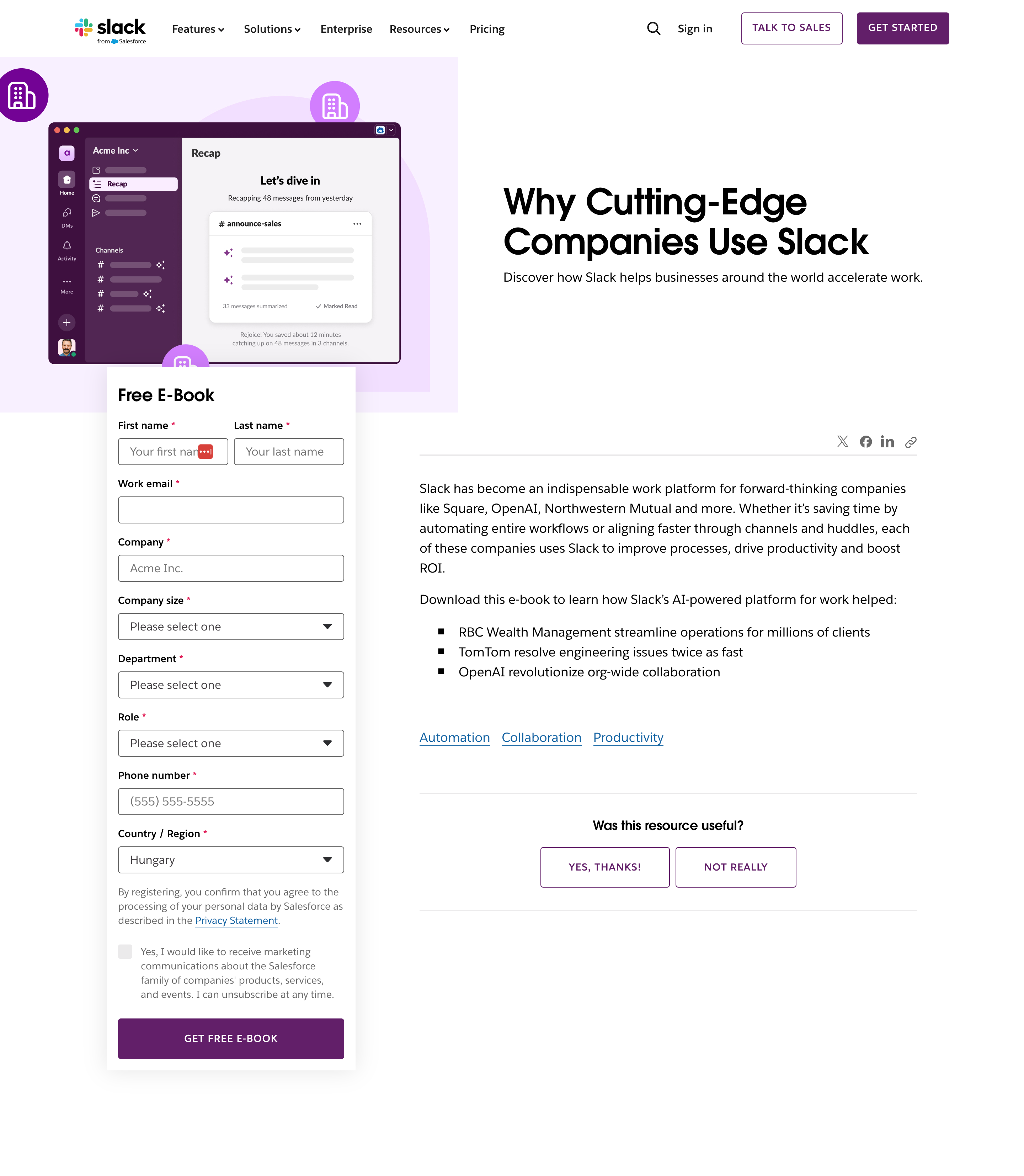
Slack’s squeeze page offering their “Cutting Edge Companies Use Slack” ebook is a great example.
While they ask for a bit more information than usual (name, job title, company, etc.), the page design remains clean and minimalist. The long-form layout works well for their B2B audience, but the focus remains on the high-value content they’re offering.
2. Asana
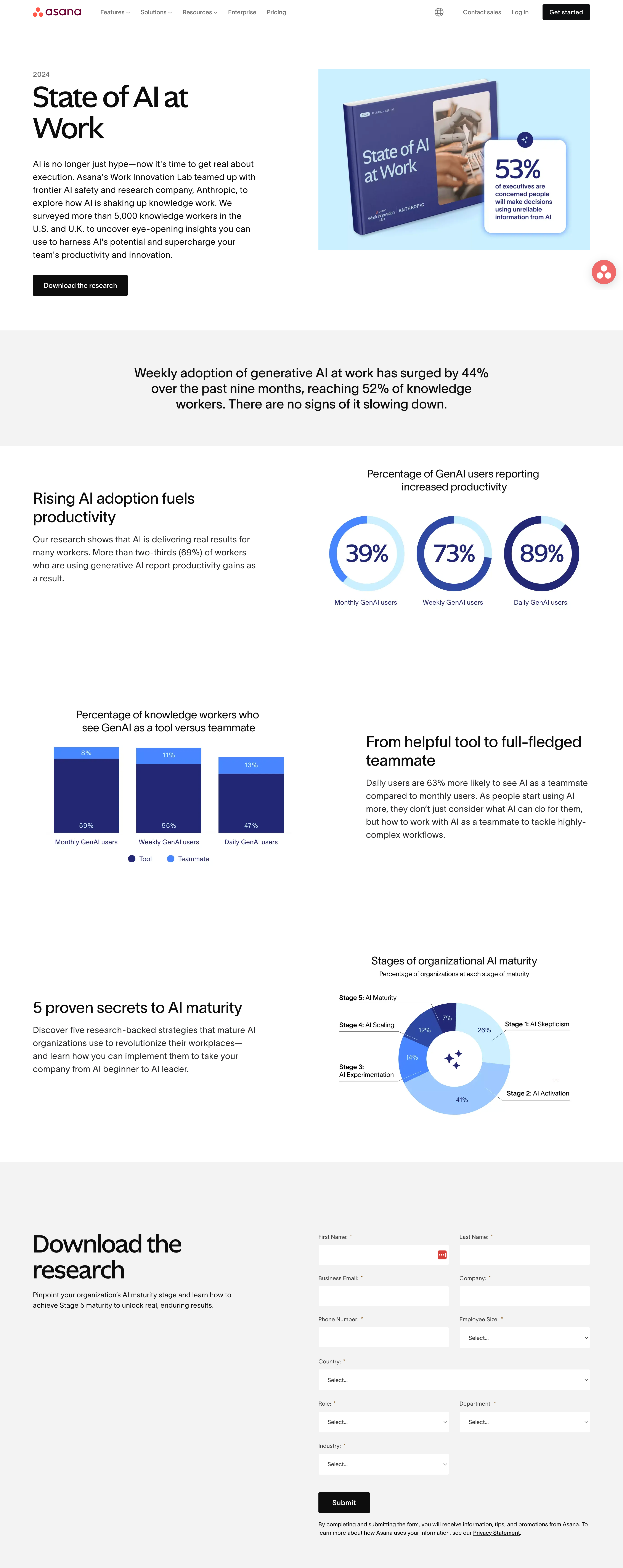
Asana’s squeeze page for their “State of AI at Work” research report is visually engaging, featuring stats and illustrations.
They offer the form at the end of the page, so visitors first get a full picture of the report’s value before deciding to opt in. It’s a great marketing strategy for nurturing interest before asking for information.
3. Hubspot
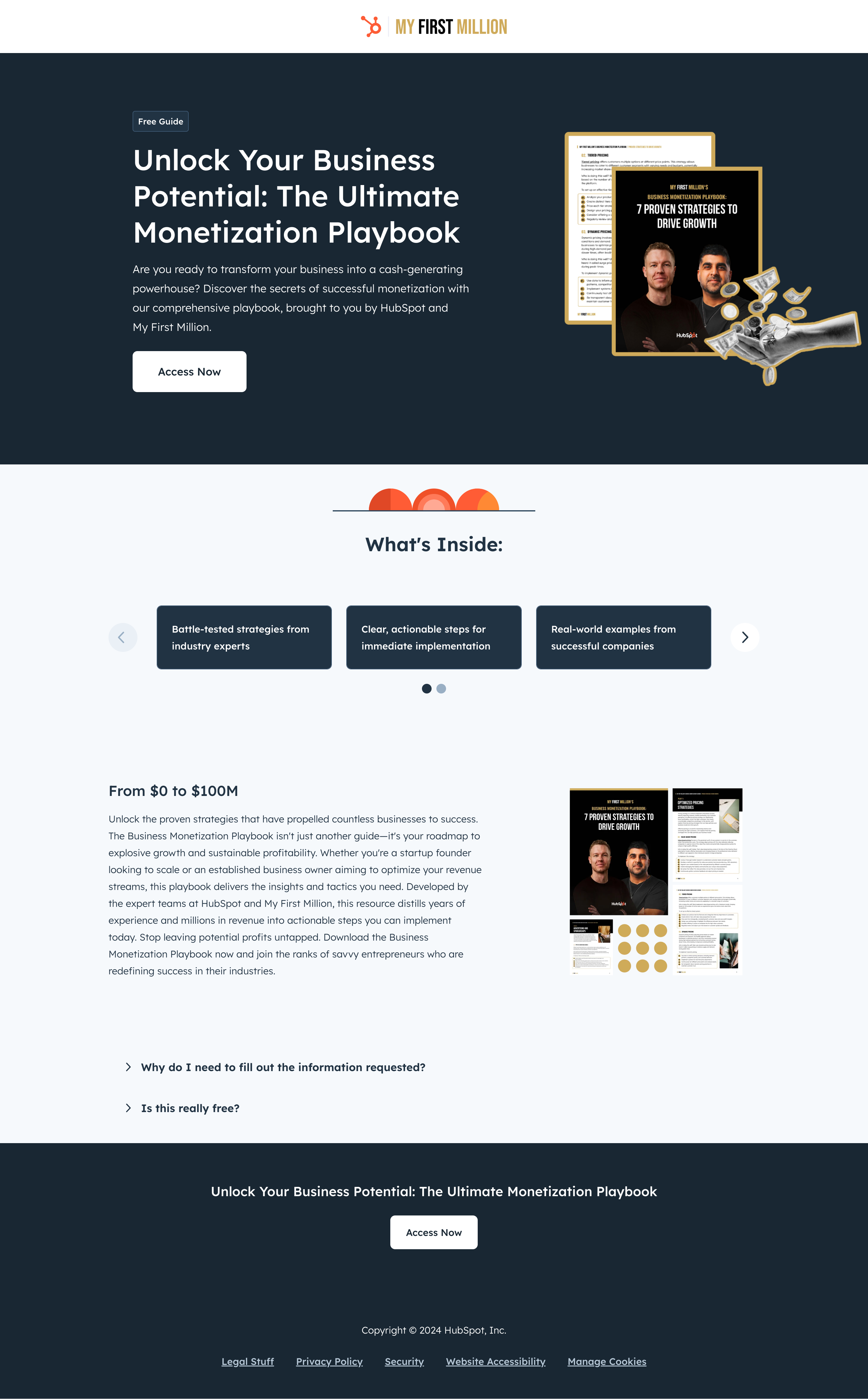
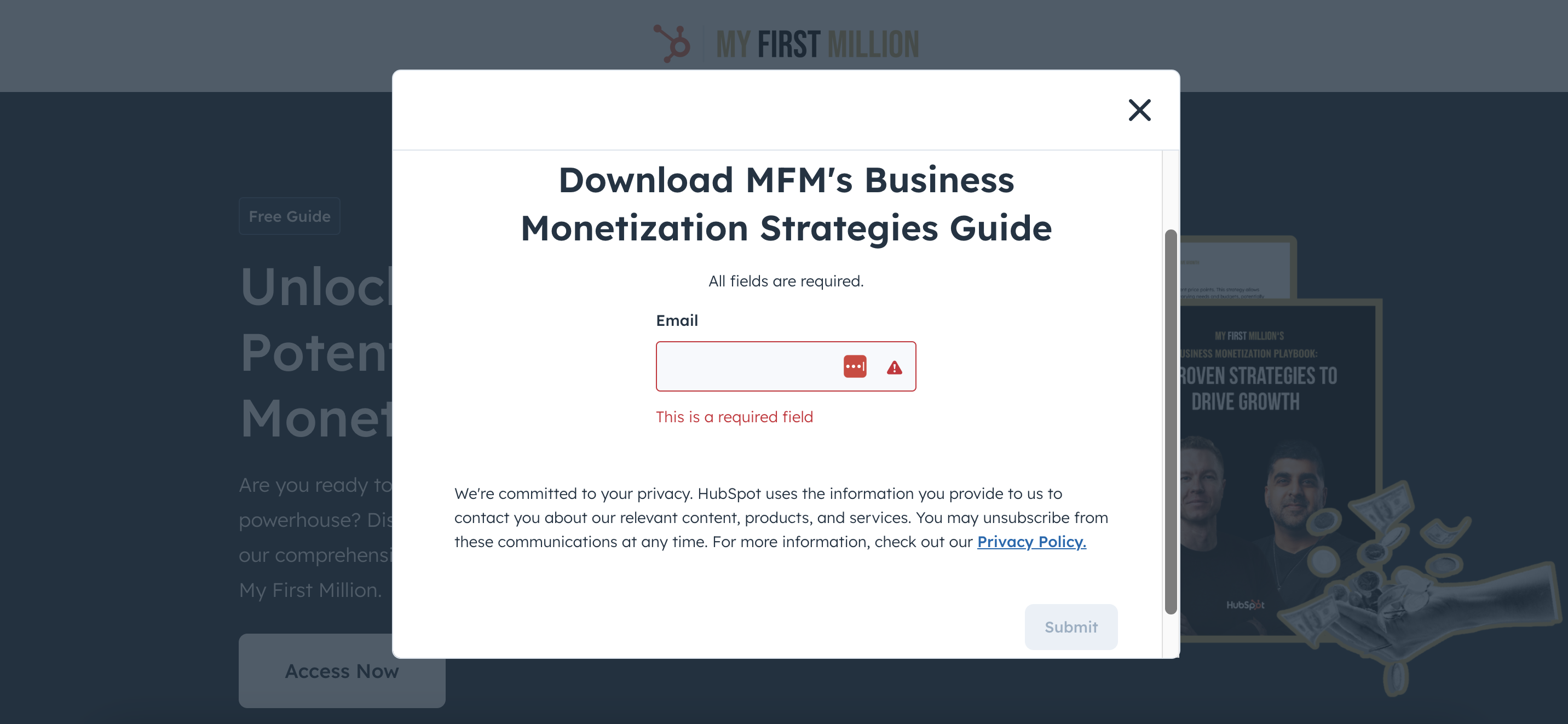
HubSpot’s “The Ultimate Monetization Playbook” squeeze page nails it with a clear headline and CTA.
They provide a detailed “What’s Inside” section, giving visitors a sneak peek at the value they’re about to unlock. The CTA button is simple—“Access Now”—and it opens a popup where you can quickly enter your email address.
HubSpot makes it easy by only asking for your email, removing any friction.
4. Search Engine Journal
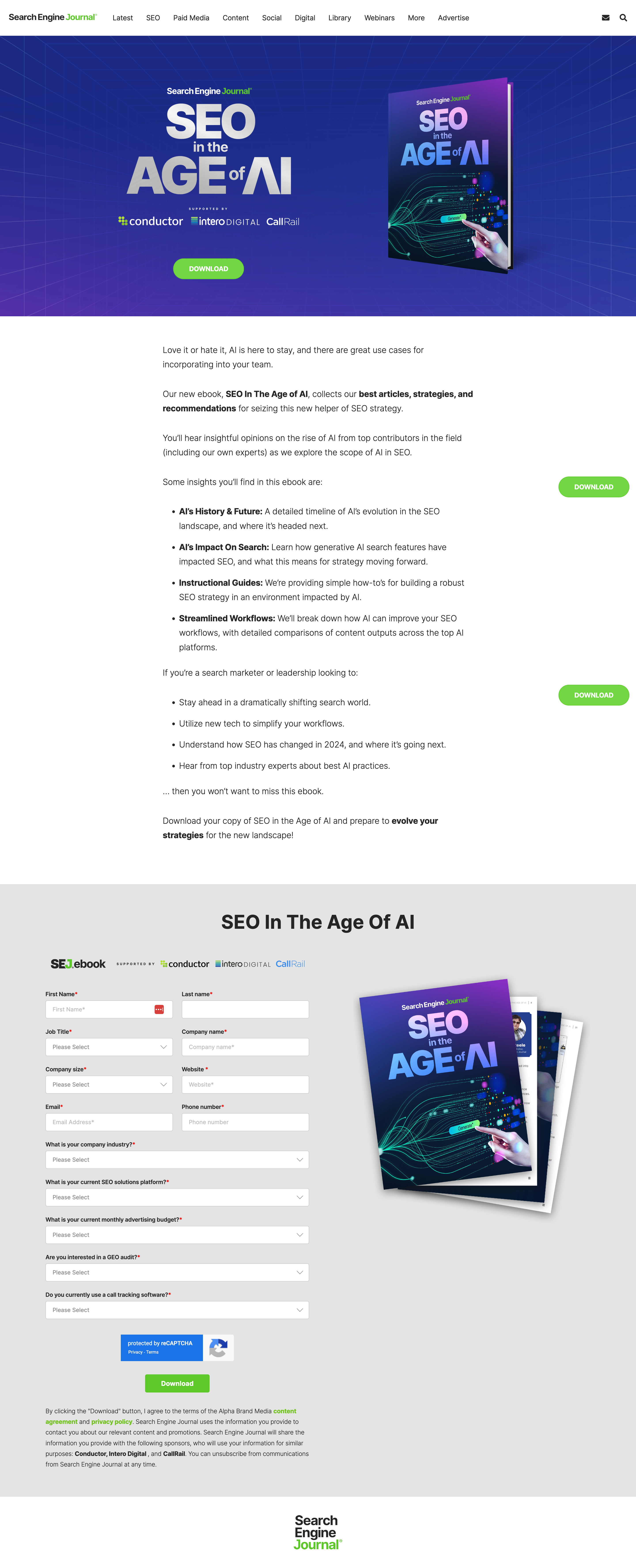
Search Engine Journal’s squeeze page for their “SEO in the Age of AI” ebook is another powerful example.
This landing page is clean, and the offer of insights into SEO trends is extremely relevant for their target audience. The CTA is clear, and the design emphasizes the value of the ebook.
5. Yotpo
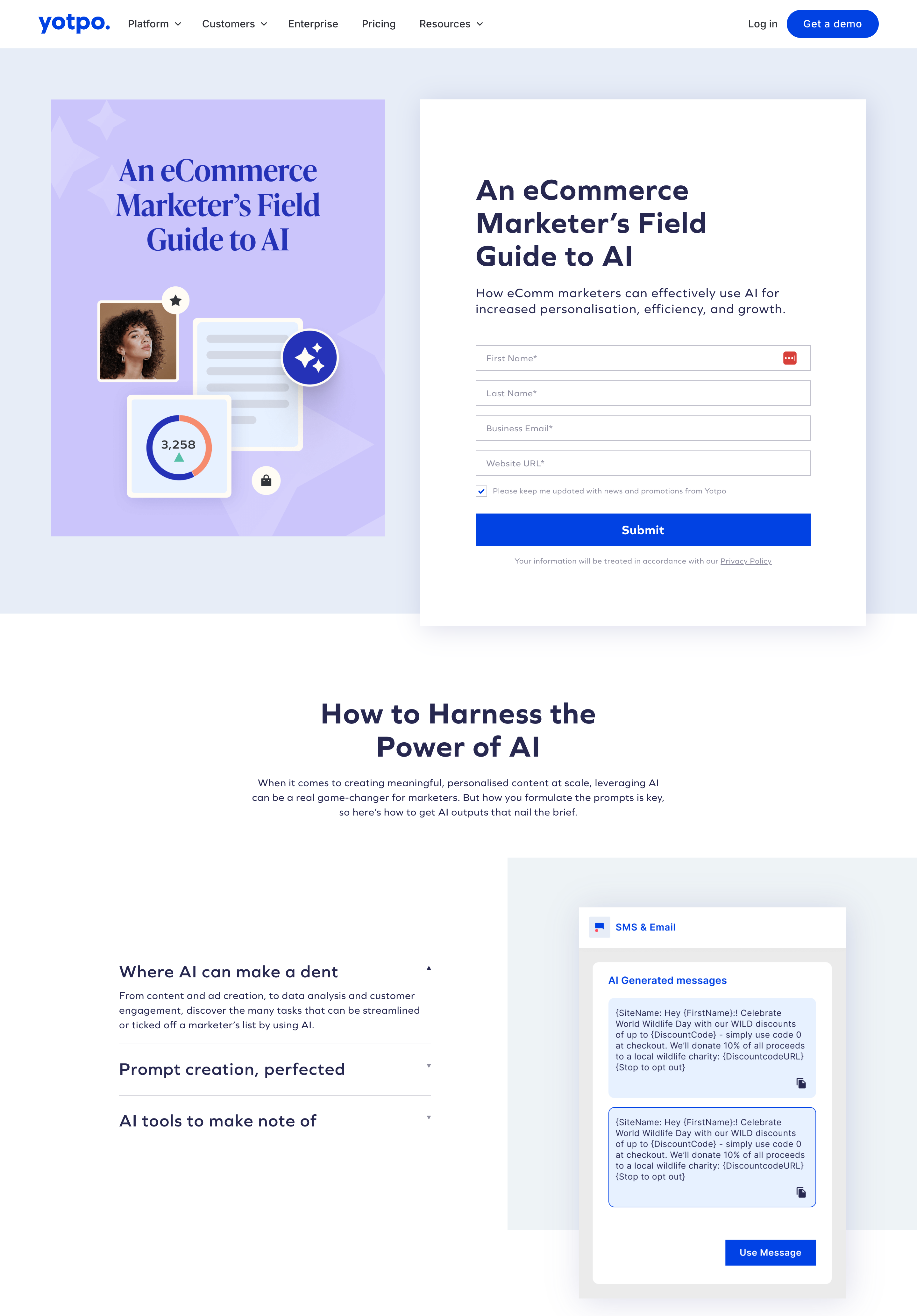
Yotpo’s squeeze page for their “Ecommerce Marketer’s Field Guide to AI” gets straight to the point.
The form is placed above the fold, so visitors don’t even need to scroll to take action. By positioning the offer right at the top of the landing page, they ensure the user’s focus remains on the CTA without distractions.
FAQ
What is the difference between a squeeze page and a landing page?
A squeeze page is a specific type of landing page with a single, focused goal: to capture visitors’ email addresses in exchange for something valuable (like a free ebook or discount). Landing pages, on the other hand, can serve multiple purposes, such as driving sales, generating leads, or encouraging event sign-ups. While both types of pages focus on conversion, squeeze pages are much more streamlined and have a single call-to-action, usually related to email list building.
What is another name for a squeeze page?
Squeeze pages are sometimes referred to as opt-in pages or lead capture pages. These terms all emphasize the main purpose of the page: to encourage visitors to “opt in” by providing their email address in exchange for a valuable offer.
How should I start creating squeeze pages?
To start creating an effective squeeze page, follow these steps:
- Choose an enticing offer: Pick something that your audience will find irresistible, such as an ebook, discount, or webinar.
- Craft a clear, benefit-driven headline: Make sure it highlights the value of your offer in a concise and compelling way.
- Design a simple, distraction-free layout: Limit options on the squeeze page to keep the focus on your CTA.
- Include a strong CTA: Use actionable language like “Get My Free Guide” or “Sign Up Now” to drive conversions.
- Add trust elements: Build credibility by including testimonials, privacy guarantees, or security badges to reassure visitors.
By following these best practices, you’ll be able to create a squeeze page that generates leads and grows your email list.
What are pop-up squeeze pages?
Pop-up squeeze pages are a type of squeeze page that appears as a pop-up window on a website, rather than being a standalone page. Their goal is the same: to capture a visitor’s email address or contact information in exchange for something valuable, like a free download or discount. The pop-up format makes them especially effective at grabbing a visitor’s attention at key moments, such as when they’re about to leave the page or after they’ve been browsing for a certain amount of time.
Here are some pop-up squeeze page templates you can try right now:
Wrapping up
Squeeze pages are one of the most effective tools for growing your email list and nurturing potential customers. By focusing on a single call to action and offering something irresistible in return, you can turn casual visitors into valuable leads.
Use the examples from Slack, Asana, HubSpot, Search Engine Journal, and Yotpo as inspiration for your own squeeze pages, and don’t forget to apply the best practices we covered.
Happy squeezing!
Migration has never been easier
We made switching a no-brainer with our free, white-glove onboarding service so you can get started in the blink of an eye.

What should you do next?
Thanks for reading till the end. Here are 4 ways we can help you grow your business:
Boost conversions with proven use cases
Explore our Use Case Library, filled with actionable personalization examples and step-by-step guides to unlock your website's full potential. Check out Use Case Library
Create a free OptiMonk account
Create a free OptiMonk account and easily get started with popups and conversion rate optimization. Get OptiMonk free
Get advice from a CRO expert
Schedule a personalized discovery call with one of our experts to explore how OptiMonk can help you grow your business. Book a demo
Join our weekly newsletter
Real CRO insights & marketing tips. No fluff. Straight to your inbox. Subscribe now
Share this article
Written by

Nikolett Lorincz
Nikolett is the Head of Content at OptiMonk. She is obsessed with content marketing and loves creating educational content for ecommerce store owners. She truly believes in the importance of quality over quantity.
You may also like
- Posted in
- Marketing
Partner with us
- © OptiMonk. All rights reserved!
- Terms of Use
- Privacy Policy
- Cookie Policy
Product updates: January Release 2025


