- Blog
- Website Overlays: Examples & Best Practices
Website Overlays: Examples & Best Practices
-
Barbara Bartucz
- Conversion
- 6 min read
Table of Contents
Website overlays, such as pop-ups and slide-ins, are powerful tools for engaging users, delivering targeted messages, and driving conversions.
Based on our own experience, a well-executed overlay can boost conversion rates by as much as 10–25%. However, poorly timed or irrelevant website overlays can have the opposite effect, significantly increasing bounce rates.
If you’re here, chances are you’re seeking ways to integrate website overlays into your strategy effectively, while avoiding common pitfalls.
In this article, we’ll explore real-world examples and proven methods to help you strike the perfect balance between capturing attention and respecting user experience.
Let’s dive in!
What is a website overlay?
A website overlay (also called a popup overlay) is a message or form that appears over the main content of a website.
Its purpose? To grab attention, convey a key message, and encourage users to take action—whether that’s signing up for a newsletter, snagging a discount, or completing a purchase to convert visitors into loyal customers and boost the conversion rate.
They’re typically triggered by user behavior, such as time spent on a page or an attempt to leave the site.
6 popup overlay examples
Curious to see how many users and brands use website overlays to engage visitors and drive conversions?
Here are six standout overlay examples that showcase different styles, designs, and strategies—each one bringing something unique to the table.
1. Hero Pet Health’s fullscreen overlay
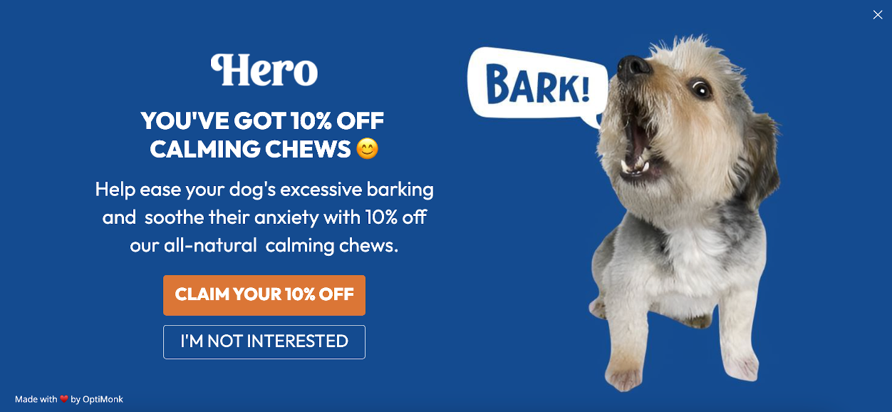
Hero Pet Health nails the fullscreen overlay by making it visually appealing and on-brand.
A humorous pet photo catches the visitor’s attention, while the headline—“Claim Your 10% Off!”—offers an irresistible incentive. The clear call-to-action (CTA) ensures users know exactly what to do next.
Why it works:
- Eye-catching design aligned with their playful brand.
- Simple, actionable language.
- Clear value proposition: 10% off.
- Fullscreen design.
2. WelleCo’s Black Friday overlay
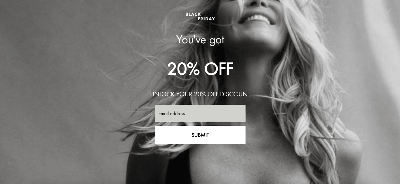
WelleCo proves that less is more with their sleek Black Friday overlay. The monochromatic design sets a sophisticated tone, while the offer—20% off for new customers—requires only an email address to unlock.
Why it works:
- Minimalist design with high contrast.
- Low barrier to entry for users (just an email).
- Perfectly timed for Black Friday shopping.
3. OYO Skincare’s overlay popup
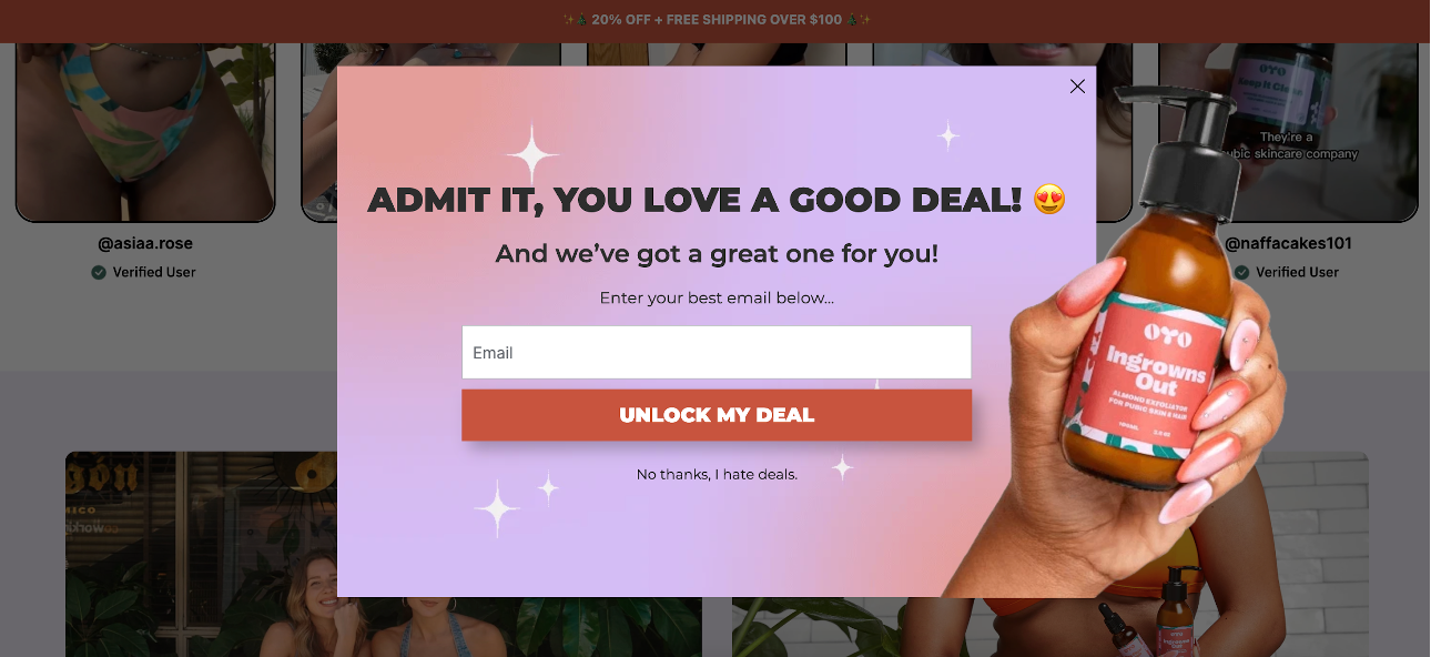
OYO Skincare combines clean visuals with a persuasive copy in their overlay.
A polished product photo balances the playful message: “Admit it, you love a good deal.” They even include an opt-out option with cheeky wording: “No thanks, I hate deals.”
Why it works:
- Striking visual appeal.
- Conversational tone that resonates with customers.
- Clever use of reverse psychology in the opt-out option.
4. Ranchbrand’s overlay
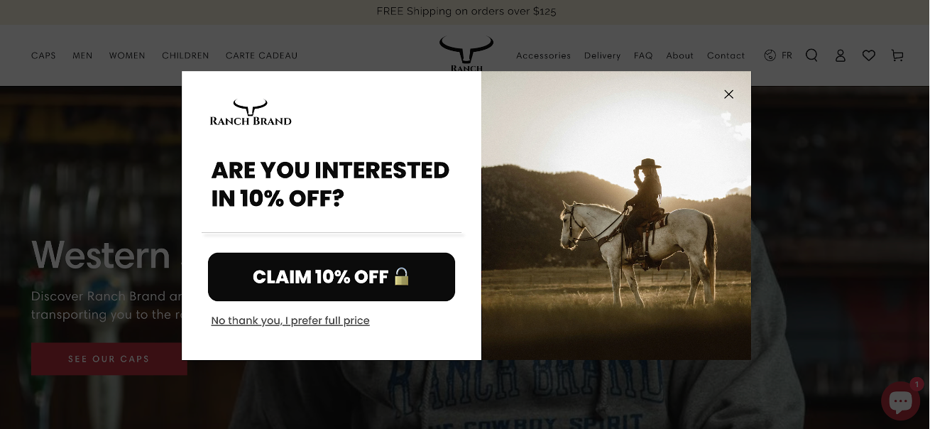
Ranchbrand’s overlay is simple yet effective, seamlessly blending with their site’s aesthetic. Their offer—10% off for new visitors—appears on a clean design, with the website background subtly visible.
What’s truly great about this overlay is its two-step approach. First, it poses a straightforward yes-or-no question, creating a low-pressure environment for users. Only after users click “Claim 10% Off” does the overlay request their email address.
Why it works:
- Clean, uncluttered design.
- On-brand visuals and messaging.
- A strong, clear CTA.
- Multi-step popup overlay.
5. Goldelucks’ exit overlay
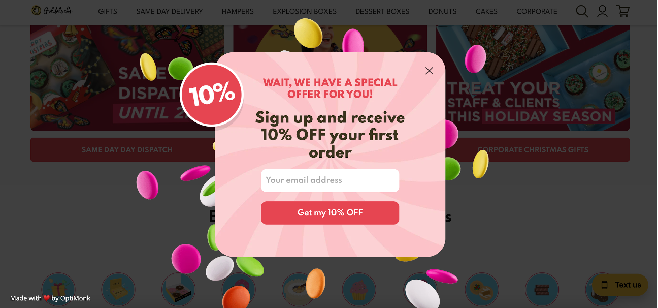
Goldelucks uses an exit overlay to retain visitors about to leave. When users hover near the “X” button, a popup appears, offering 10% off in exchange for an email address.
This timely offer creates a final chance to engage and convert departing visitors, seamlessly integrating into the user journey.
Why it works:
- Smart use of exit-intent technology.
- Last-minute incentive to capture otherwise lost leads.
- Simple and direct offer.
6. Supplement Mart’s overlay
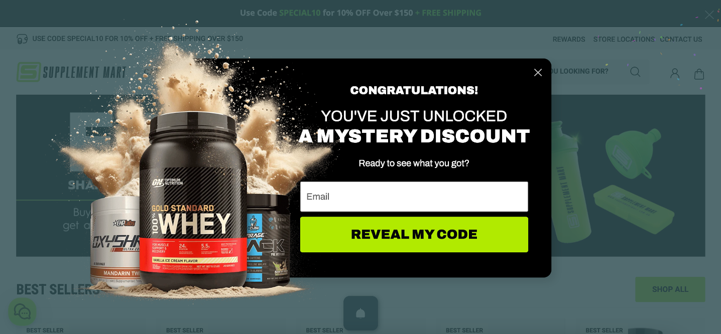
Supplement Mart uses a mystery discount overlay to spark curiosity and engage visitors. The promise of an unknown reward captures attention, making users eager to find out what they’ll receive.
With just an email address needed to reveal the deal, this simple yet intriguing approach encourages signups and boosts engagement effortlessly.
Why it works:
- Builds curiosity with a “mystery discount.”
- Engages users with a fun, interactive element.
- Low commitment for visitors.
5 best practices launch high-converting website overlays
Inspired by those great examples and ready to create your own website overlay?
Let’s dive into best practices to make your website overlays engaging and aligned with the customer journey to attract visitors to your site.
1. Target the right audience
Not every visitor is the same, so why show them the same overlay?
Use behavioral triggers like exit intent or time on page, and segment based on visitor type (first-time visitors vs. returning customers), location, or browsing behavior.
For example, show product-based offers only to users who’ve viewed those products.
2. Clear and compelling messaging
Time is of the essence with overlays. If your message doesn’t grab attention instantly, you risk losing users altogether.
- Craft a benefit-driven headline: Use concise language to highlight the value, such as “Unlock 15% Off Today” or “Free Guide: Boost Your Productivity.”
- Be direct and simple: Avoid wordy explanations—users won’t read a paragraph when they’re about to leave your site.
- Focus on value: Whether it’s a discount, free resource, or exclusive offer, make sure your value proposition is front and center.
3. Relevant offers
An overlay is most effective when it’s personalized.
Tailor the offer to the visitor’s intent or the page they’re on. For instance, promote free shipping on a checkout page or offer a discount for first-time users on your homepage.
Relevance is key to converting curiosity into clicks.
4. Design for user experience
A visually appealing, user-friendly design can make or break your overlay.
- Stay on-brand: Incorporate your brand colors, fonts, and imagery to maintain consistency with your overall website design.
- Prioritize readability: Use large, easy-to-read fonts and sufficient spacing for a clean layout.
- Highlight the CTA button: Ensure the call-to-action (CTA) stands out with action-oriented language like “Claim Your Discount” or “Sign Up Free.”
- Avoid overwhelm: Don’t block critical background content or make overlays difficult to close—this frustrates users and reduces trust.
5. A/B test the overlay
Even the best-designed overlay can benefit from optimization. Regular testing allows you to refine your approach based on real user behavior.
Experiment with headlines, visuals, button colors, CTA text, and timing to identify what resonates most with your audience.
Small adjustments, like changing the CTA wording or tweaking the offer timing, can lead to significant improvements.
What's the best overlay software?
When it comes to creating high-converting website overlays, OptiMonk stands out as a top choice.
It’s known for its versatility, offering solutions for everything from increasing email signups to recovering abandoned carts and engaging email subscribers.
Whether you’re a beginner or a seasoned marketer, OptiMonk’s user-friendly interface ensures you can build professional, engaging overlays with ease and attract potential customers.
Here’s what makes OptiMonk a game-changer:
- Easy-to-use templates: Jumpstart your campaigns with a library of pre-designed templates tailored to different goals, from discounts to lead generation, including social proof elements.
- Advanced targeting and triggers: Show the right overlay to the right audience based on their behavior, location, or actions—such as exit intent or time spent on a page.
- Drag-and-drop editor: Customize your overlays effortlessly without any coding knowledge.
- A/B testing features: Experiment with different headlines, images, CTAs, and designs to find what resonates most with your audience.
- Campaign analytics: Gain insights into how your overlays perform and make data-driven adjustments for better results.
- Seamless integration: Connect OptiMonk with your existing marketing tools, like email platforms or CRMs, for a smoother workflow.
Want to create ace website overlays without the hassle?
OptiMonk’s ready-to-use popup templates make it easy to get started in minutes—no design skills are required.
Browse through some of our most popular templates and pick one to get started:
Wrapping up
Website overlays are the secret weapon of site owners for skyrocketing conversions. From fullscreen pop-ups to exit offers, they grab attention and drive action.
Throughout this article, we’ve explored inspiring examples and actionable best practices to help you design overlays that truly work.
Now it’s your turn. Take the insights shared here and apply them to your webpage strategy.
With a tool like OptiMonk, creating professional, high-converting overlays has never been easier. Create your free OptiMonk account, start with an easy template, and boost sales immediately!
Migration has never been easier
We made switching a no-brainer with our free, white-glove onboarding service so you can get started in the blink of an eye.

What should you do next?
Thanks for reading till the end. Here are 4 ways we can help you grow your business:
Boost conversions with proven use cases
Explore our Use Case Library, filled with actionable personalization examples and step-by-step guides to unlock your website's full potential. Check out Use Case Library
Create a free OptiMonk account
Create a free OptiMonk account and easily get started with popups and conversion rate optimization. Get OptiMonk free
Get advice from a CRO expert
Schedule a personalized discovery call with one of our experts to explore how OptiMonk can help you grow your business. Book a demo
Join our weekly newsletter
Real CRO insights & marketing tips. No fluff. Straight to your inbox. Subscribe now
Share this article
Written by

Barbara Bartucz
Barbara is a Content Marketer at OptiMonk. She takes pride in creating different forms of content, whether it’s an article, a video, or an e-book.
You may also like
- Posted in
- Conversion
Partner with us
- © OptiMonk. All rights reserved!
- Terms of Use
- Privacy Policy
- Cookie Policy
Product updates: January Release 2025


