- Blog
- How to Create Popups Visitors Actually Love
How to Create Popups Visitors Actually Love
-
Csaba Zajdo
- Conversion
- 6 min read
Table of Contents
It’s a common myth that popups are always annoying and negatively affect your users’ experience.
The truth is: great popups can improve the user experience (UX) and can even leave visitors feeling impressed.
There are several reasons why popups can be annoying, and dealing with these issues is often not straightforward.
In this post, I’ll give you five quick tips on how you can utilize and create popups that your customers will actually love.
Let’s take a look!
1. Deliver a WOW offer
Choosing the right message to show your customers is paramount. Why? Because if you don’t send the right message to your customers tailored to the specific stages of their buying journey, they simply won’t care.
Hence, providing a compelling value proposition is the most important ingredient for an effective, and dare we say—enjoyable popup.
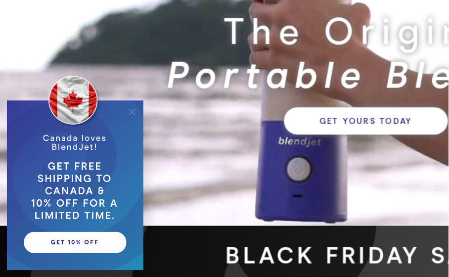
Let’s check out how BlendJet created a personalized message based on their visitors’ country. This example of geo-location customization is a friendly way to provide a great value proposition:
2. Hold your horses
Many stores have good intentions (and reasons) to trigger their popups as soon as customers land on their site. No one wants their visitors to miss an irresistible offer. But unfortunately, it can have an adverse effect. It usually backfires and annoys many visitors.
Instead, you should delay your message to target visitors at the precise moment that they’re about to leave your site. But in the meantime, show your offer in a polite way so visitors who are ready can take advantage of it.
You can do this by using exit-intent as the trigger and displaying a teaser in the bottom corner of your website.
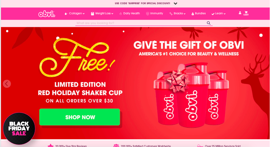
Below, Obvi used a teaser to get their visitors interested in their Black Friday promotion for their big sale. It peaks their attention but doesn’t intrude. It puts the “control of the click” directly into the hands of their visitors. They can click when they’re ready.
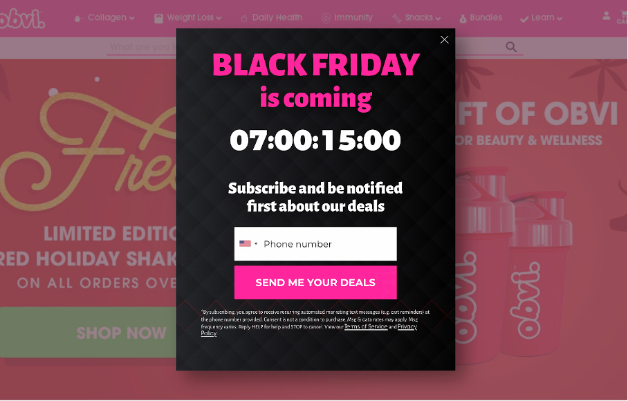
And once visitors decide to click on the teaser or if exit-intent occurs, the popup appears:
3. Aim small, miss small
“Aim Small, Miss Small” is a very popular method taught by many golf teachers. It states that if you aim at a small target, you’re likely to have a small amount of shot error.
This is 100% true for popups as well: instead of targeting a broad audience (worst case: all users), only target the visitors who will most likely be interested in your message.
And if you want to connect with other user segments too, you need to create relevant messages for each one of them.
4. Less is more
The famous saying “less is more” is totally applicable to popups.
If you want visitors to absorb your messages, you need to make them easy and clear. Popups have limited space (especially on mobile devices). And no one wants to read a wall of text or struggle to find the X button.
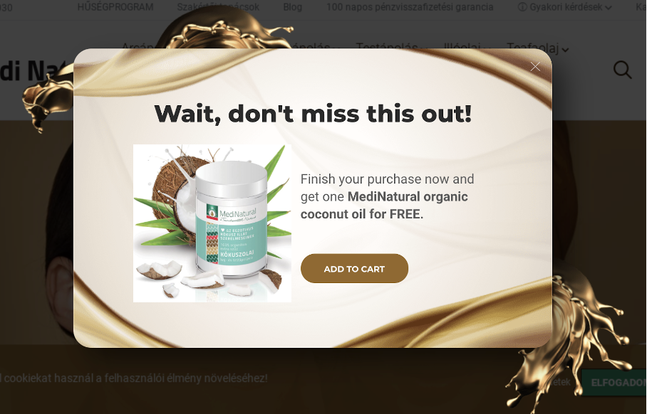
So picking the most important message and communicating it in the shortest and simplest way, is the key to success. This popup below does this perfectly:
5. Be funny and remarkable
In marketing, we deal so frequently with numbers, that it’s easy to forget that we’re humans just like our visitors.
Inspiring some emotions in your customers is the best way to be remarkable. And nothing can help you better than some well-placed humor.
Showing that you’re relatable and understanding is the surest way to get customers to believe in you.
Summing up
Creating a well-converting popup can be challenging. However, we’re confident that you’ll be able to do that successfully with the help of these simple rules.
As marketers, we always want to understand our customers and their needs so that we can deliver a compelling message. With this approach, we can help them in the most effective way possible.
Following this recipe will make your customers love your popups. It will also increase conversions and ensure an overall higher customer lifetime value.
We hope these tips will help you create loveable popups that assist your visitors in their customer journey!
Migration has never been easier
We made switching a no-brainer with our free, white-glove onboarding service so you can get started in the blink of an eye.
What should you do next?
Thanks for reading till the end. Here are 4 ways we can help you grow your business:
Boost conversions with proven use cases
Explore our Use Case Library, filled with actionable personalization examples and step-by-step guides to unlock your website's full potential. Check out Use Case Library
Create a free OptiMonk account
Create a free OptiMonk account and easily get started with popups and conversion rate optimization. Get OptiMonk free
Get advice from a CRO expert
Schedule a personalized discovery call with one of our experts to explore how OptiMonk can help you grow your business. Book a demo
Join our weekly newsletter
Real CRO insights & marketing tips. No fluff. Straight to your inbox. Subscribe now
Csaba Zajdo
- Posted in
- Conversion
Partner with us
- © OptiMonk. All rights reserved!
- Terms of Use
- Privacy Policy
- Cookie Policy
Product updates: January Release 2025


