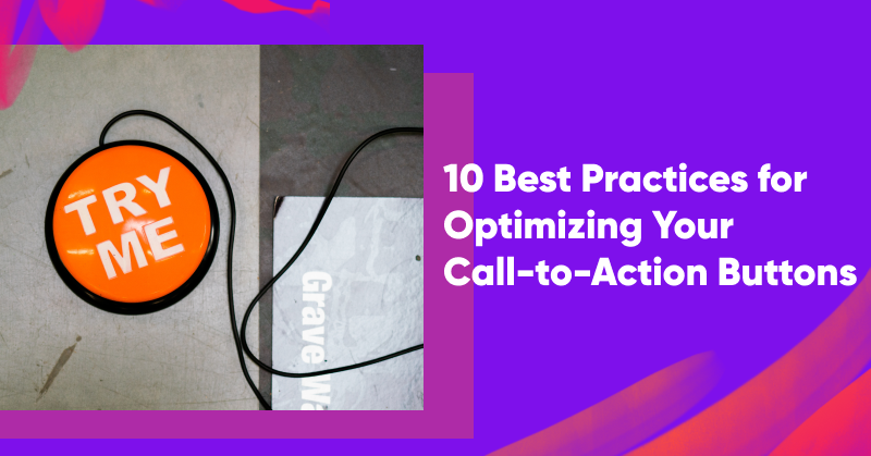
Calls-to-action are some of the most important elements on your website. In just a few simple words, your calls-to-action need to encourage visitors to take the next step and keep moving through your marketing funnel.
Compelling copy can make all the difference in your attempts to increase conversions and nudge your website visitors to follow a specific path. In order to create effective call-to-action buttons for your audience, you’ll need to carefully optimize many small aspects of your web pages.
In this article, we’ll explore how to capture the reader’s attention with powerful action words, bold button colors, and clear next steps. Optimizing these elements can lead to dramatic effects!
Let’s get started…
TL;DR:
- Your website’s call-to-action buttons are crucial for driving conversions.
- To optimize your CTAs, you should have concise text, clear messaging, and a compelling value proposition.
- Action-oriented copy, alignment with landing page content, and strategic use of color psychology are other well-known best practices.
- Creating a sense of urgency, continuous experimentation with different copy and designs, optimizing for all devices, and ensuring a visually prominent CTA button are key strategies to boost engagement and conversion rates.
What is a call-to-action (CTA)?
A call-to-action (CTA) is a prompt or directive designed to encourage an immediate response or specific action from the person encountering it. In an ecommerce context, a call-to-action encourages users to complete your conversion goals like signing up for an email marketing list or making a purchase.
CTAs are typically presented as a button, a link, or another noticeable element that stands out on a webpage, in an email, or within any other marketing materials.
Finally, the language used in a CTA is crucial. CTA copy usually employs action verbs that prompt the user to act quickly or decisively. Short phrases like “Buy Now,” “Sign Up Today,” “Subscribe for Updates,” or “Download Your Free Guide” are usually used on CTA buttons.
Why is it important to have a well-optimized CTA button?
A well-optimized CTA button serves as a catalyst for converting visitors into customers or leads. A call-to-action button that provides clear direction and eliminates confusion can skyrocket the conversion rate on your landing page or product pages.
That’s because optimized CTAs encourage users to interact with your content, increasing overall engagement rates and the likelihood that users will explore your offerings further.
Furthermore, a strategically placed and well-designed CTA contributes to a positive user experience by being visually appealing, easy to find, and straightforward.
By increasing the effectiveness of your calls-to-action, you maximize the ROI for your marketing efforts, ensuring that you’re using resources efficiently.
10 call-to-action optimization best practices
Ready to improve the calls-to-action on your site? Here are 10 best practices you can use to create effective CTAs and increase conversions.
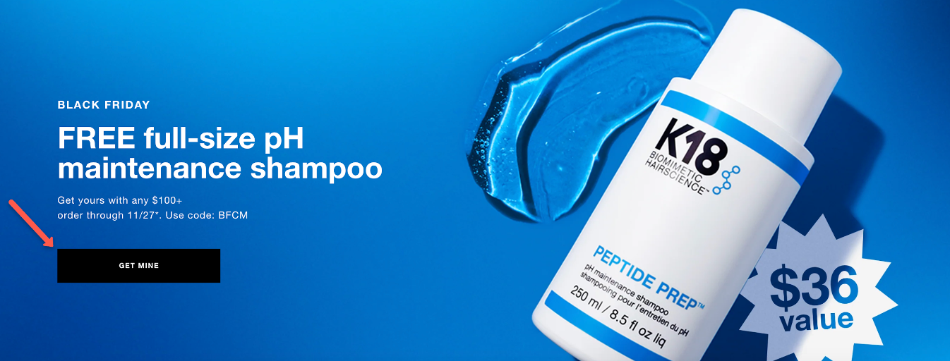
1. Keep it short
Generally speaking, you should keep your CTA text short and sweet—ideally no longer than four words. That means you’ll need to limit your text to essential elements.
In the example below, you can see that the clickable button features just one word: “Buy.”

2. Use clear and concise messaging
You also need to make sure that your button text is straightforward and easy to understand. When you’re changing the text on your CTA buttons, avoid adding unnecessary details or complex terminology. Instead, focus on simple wording that eliminates ambiguity.

3. Have one clear value proposition
Since the entire purpose of a primary CTA button is to convince a user to take a specific action, you need to make sure that you’re clearly communicating the benefit or value of that action. That way, you can draw attention to your offer, whether that’s for a free ebook or a free template.
4. Use action-oriented copy
Make sure your CTA buttons always feature action-oriented text by using verbs like”Buy,” “Shop,” or “Get.”
An actionable text can create a sense of movement and decisiveness in your language and lead to a higher click-through rate.
5. Align it to your landing page
It’s crucial that your call-to-action button makes sense in the context of your landing page content. If you’re not able to ensure consistency between your CTA and the rest of your landing page, the transition won’t feel seamless and relevant.
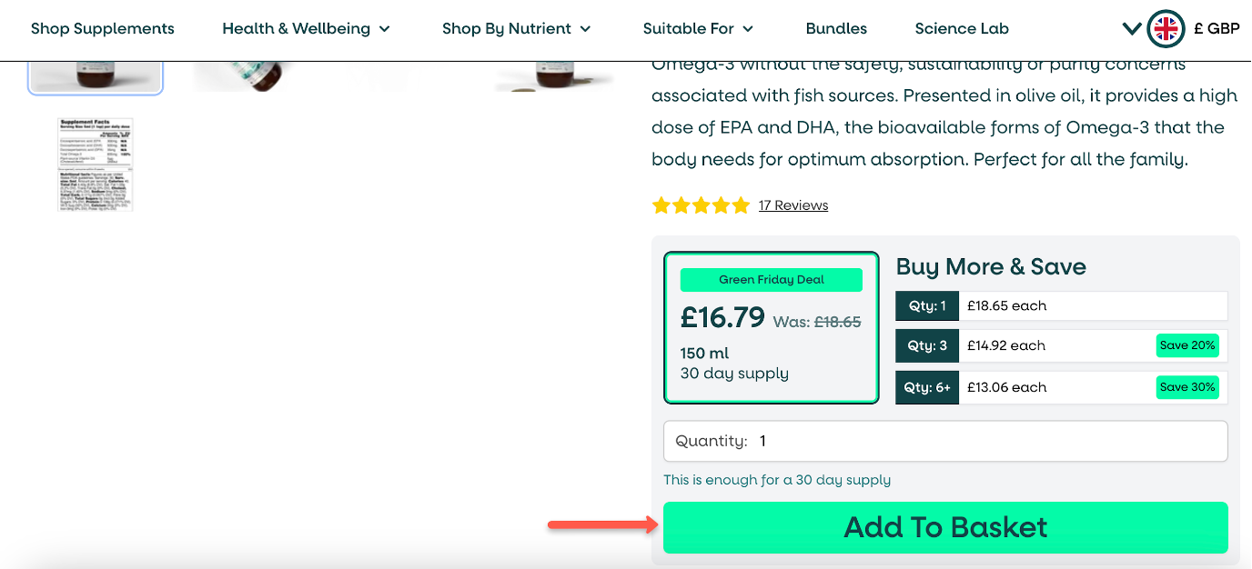
6. Leverage color psychology
A visually striking CTA button captures visitors’ attention. Gray-scale buttons rarely achieve as high of a conversion rate as those using contrasting colors. Different colors tend to trigger different emotions, so choose colors that evoke desired emotions or actions.
Additionally, use plenty of white space around your CTA button so it stands out from the rest of the content on the page.

7. Create a sense of urgency
A sense of urgency is one of the best click triggers to use in call-to-action buttons. Use language that conveys limited-time offers or scarcity (e.g. “now,” “today,” “limited,” or “last”).
You can also add a countdown element on your page to prompt a quick response and generate those valuable conversions.

8. Experiment with different copy
Like any other aspect of your marketing strategy, you should continuously test and improve your CTAs. When you A/B test your buttons, you’ll be able to identify the most effective copy.
You should also use A/B testing to compare the performance of different design choices. For example, you could test different button colors to find out whether red or orange buttons perform better on your site.
9. Optimize for all devices
At least half of your users are browsing your site on a mobile device. That’s why it’s imperative to ensure your call-to-action buttons are mobile friendly. This means that they should be responsive and easy to navigate with thumbs.
Ideal CTA placements differ on different devices, and getting it right on all devices can have a huge impact on your conversion rates.
10. Make your call-to-action button big
Although you don’t want to use threateningly large lettering, you definitely want to design a visually prominent CTA button. By ensuring it stands out on the page and is easy for users to spot and engage with, you’ll get more click-throughs.
Wrapping up
Having a clear call-to-action on each page of your website can help your visitors make their way through your sales pipeline. In order to ensure that your CTAs grab attention and motivate users to take action, incorporate the best practices we’ve gone over in this article!
There’s no reason to lose valuable traffic as a result of ineffective calls-to-action… with a few small changes, you can achieve dramatic improvements. Why not start today?
Learn more
Would you like to learn more about call-to-action buttons and conversion optimization? Check out these articles:
Share this
Written by