- Blog
- 5 High-Converting Landing Pages You’ll Want to Copy + Lessons You Can Learn From Them
5 High-Converting Landing Pages You’ll Want to Copy + Lessons You Can Learn From Them
-
Nikolett Lorincz
- Conversion
- 6 min read
Table of Contents
A great landing page can make all the difference in a marketing campaign. And at the end of the day, there’s only one number that can tell you exactly how great a landing page actually is: its conversion rate.
You can use a landing page to build your email list, introduce potential customers to your unique selling point, or make sales. While your goals for a landing page may vary, you always want to ensure it converts.
In this article, we’ll take a look at some landing pages that convert and share some essential tips and tricks for creating high-converting landing pages.
Let’s get started!
What is a landing page?
A landing page is a standalone webpage that’s made to accompany a marketing campaign.
Landing pages have a singular focus or goal that’s related to the campaign. Many landing pages are geared toward lead generation, while others are focused on convincing users to make a purchase.
How to make a landing page design for higher conversions?
Before we check out some high-converting landing page examples, let’s quickly examine some of the key elements you need to pay attention to when you’re creating landing pages.
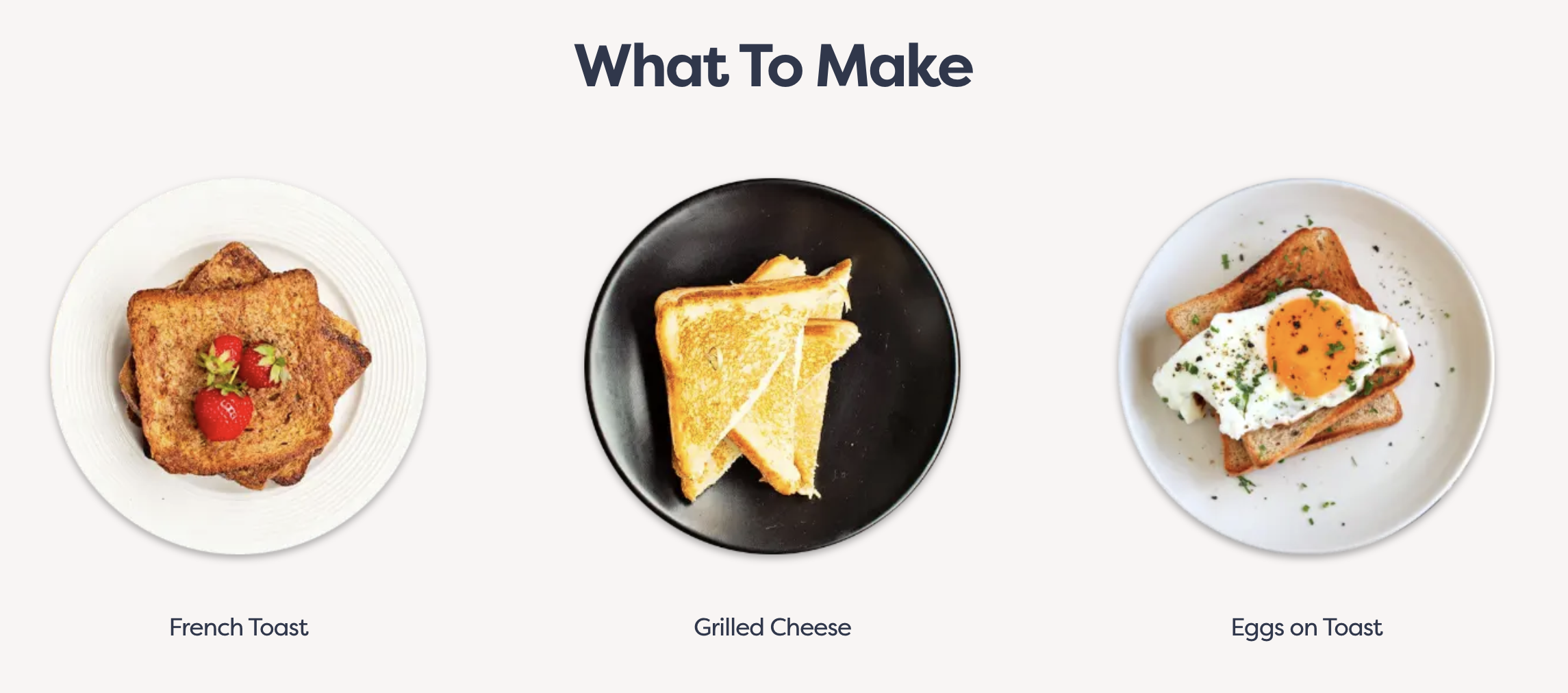
1. Powerful hero banner
Your hero banner will be the first thing your site visitors see when they land on your landing page. Its primary objective is to grab attention instantly and compel visitors to engage further.
A good landing page has high-quality images or videos that showcase the product. You should pair these visuals with concise yet impactful copy that communicates your value proposition effectively.
2. Single, defined call-to-action
If you have several CTAs on your landing page, customers will get confused about which one they want to pick, harming your conversion rate.
A singular and clear call-to-action is essential if you want to create a great landing page. Whether it’s signing up for a newsletter, making a purchase, or requesting more information, your CTA should be prominently displayed and easily identifiable.
3. Clear value proposition
Your landing page is the perfect place to help customers understand the value that your products hold. Inform people about what makes your products different from your competitors’ products.
When writing your value proposition, use language that resonates with your target audience and conveys authenticity and credibility.
4. Compelling headline
A compelling headline serves as a hook that captures the attention of a landing page visitor and entices them to explore further.
Your headline should provide a clear indication of what visitors can expect from your landing page and why they should continue engaging with your content.
5. Benefit-focused features
Highlighting the benefits of your product or service is crucial for encouraging visitors to take action. Instead of focusing solely on features, emphasize how these features translate into tangible benefits for the user.
Clearly communicate how your product will address their needs, solve their problems, or enhance their lives.
6. Personalized messages
Adapting your landing pages to individual customers using website personalization is a great way to improve the customer experience and raise your conversion rates. One-size-fits-all messaging doesn’t work in 2024!
Leverage data and insights to customize your landing page content based on factors such as demographics, past interactions, or browsing history. This can include dynamically adjusting product recommendations, displaying relevant offers or promotions, or addressing visitors by name.
7. Testimonials or other forms of social proof
Include customer testimonials on your landing pages that highlight specific benefits or experiences, and showcase recognizable logos or endorsements from trusted sources.
Seeing reviews from other customers can help address concerns a visitor might have about your products before making their first purchase.
Highlight these customer testimonials prominently to reassure visitors that they are making a wise choice. If you can get video testimonials, that’s even better!
8. Supporting visuals
Great images can really reinforce the story you’re telling about your product. And even more importantly, people can understand them immediately without needing to read a lot of copy.
Visuals should complement your copy and reinforce key messages, making it easier for visitors to understand and engage with your content.
You’ll see these ingredients used in the successful landing pages in the rest of this article. Let’s move on to some examples of high-converting landing pages!
9. Simplified sign-up form
Complex forms can deter potential leads. Keep your forms simple and only ask for essential information. This reduces friction and makes it easier for visitors to complete the process.
For example, instead of asking for detailed personal information upfront, start with just an email address and gradually request more information as needed.
Clear and concise labels, helpful messages, and minimal required fields can improve user experience and increase form completion rates.
10. Mobile-first design
With more people browsing on mobile devices, having a mobile-optimized landing page is crucial.
Ensure that you design landing pages that are responsive and user-friendly on smaller screens. This includes large, tappable buttons, easily readable text, and forms that are simple to fill out on mobile devices.
Mobile-first design not only enhances user experience but also improves your search engine rankings, leading to higher visibility and more landing page conversions.
5 high-converting landing pages
Here are some of the best landing page examples on the internet, featuring top ecommerce brands. While examining these examples, we’ll also share some landing page best practices.
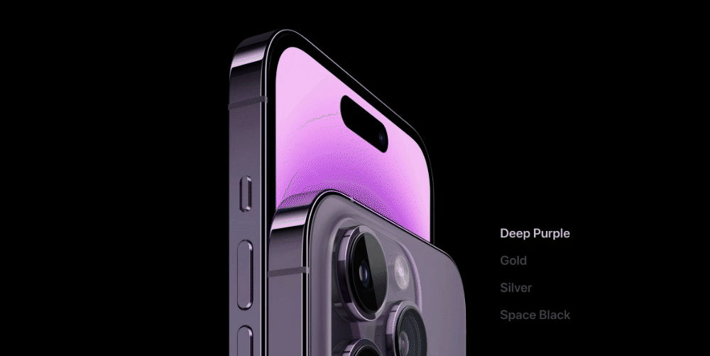
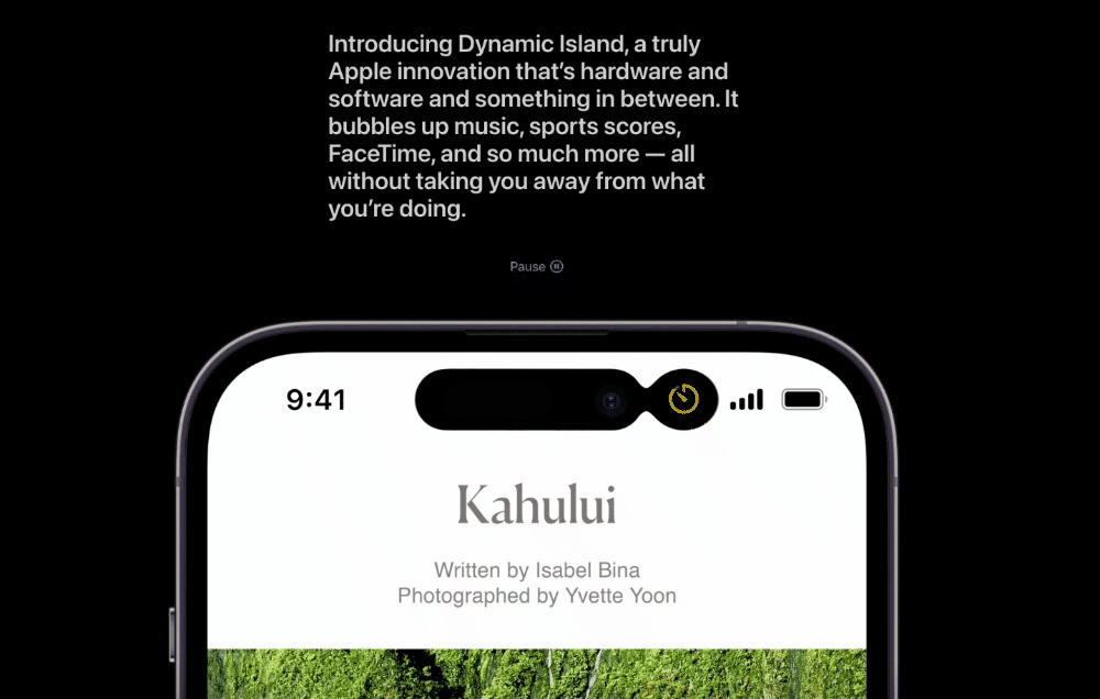
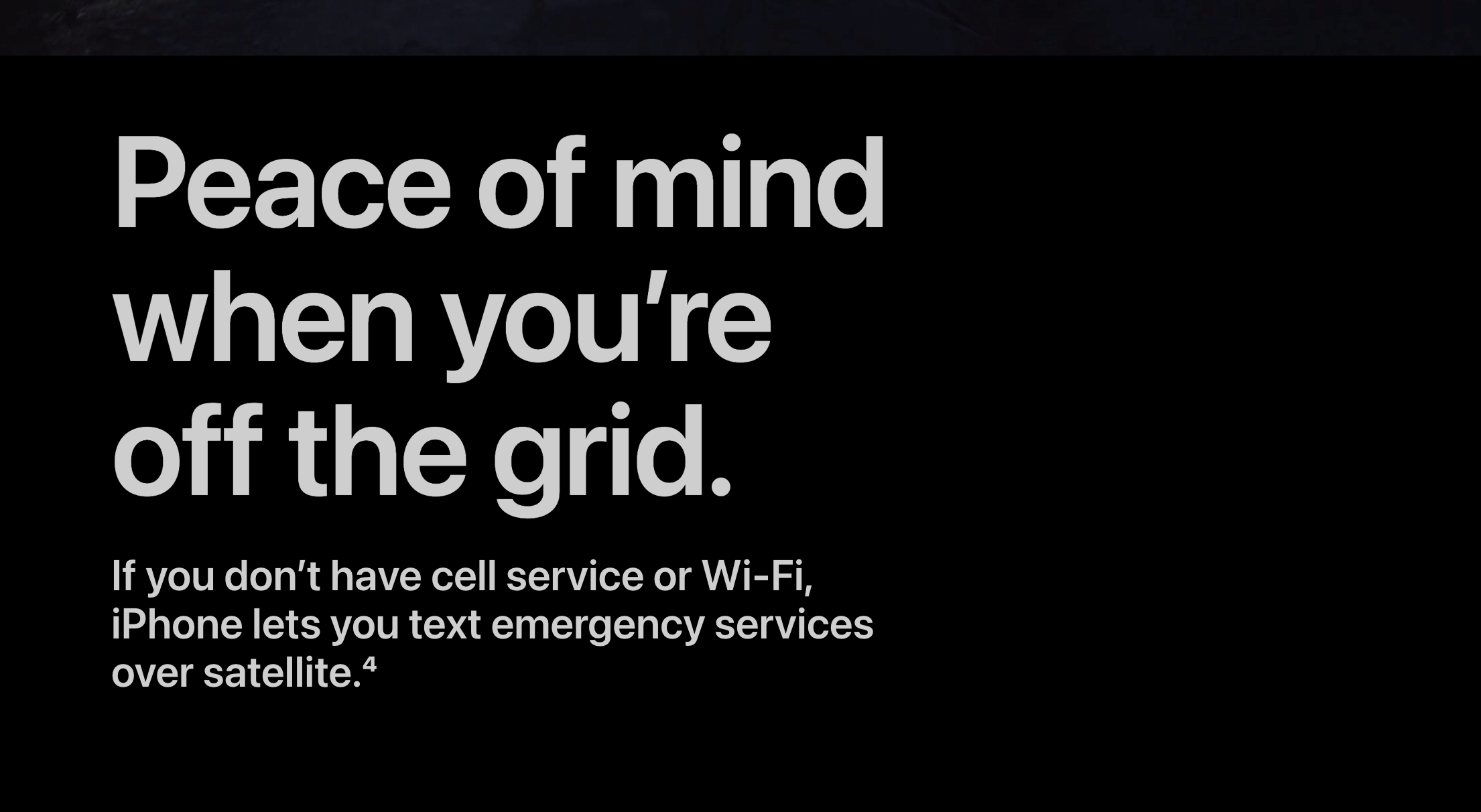
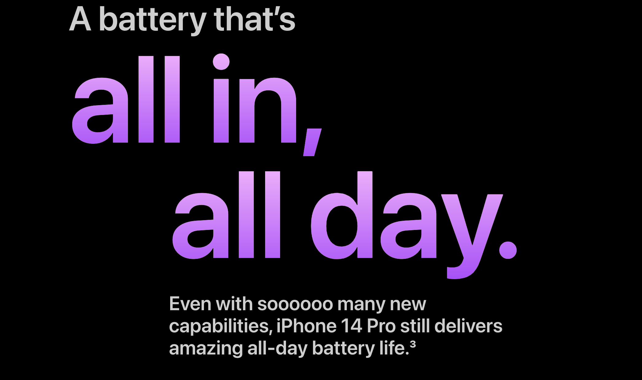
1. Apple
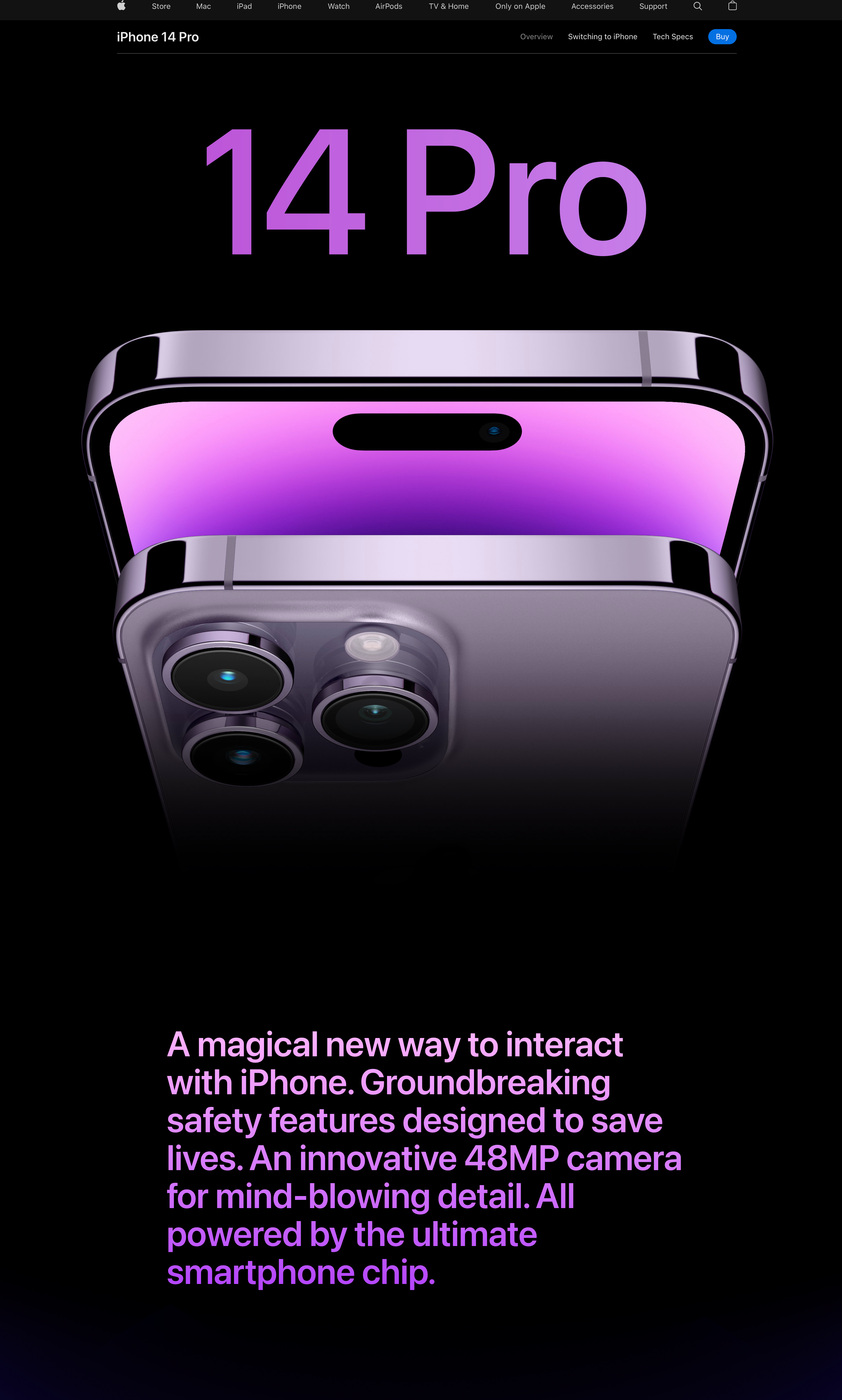
Apple’s landing pages are famous for their design quality, smart use of visual elements, and seamless user experience.
This landing page for the launch of the iPhone 14 Pro keeps the reader’s attention using all these elements.
The standalone page is full of great animations that activate as a user scrolls down the page.
This leads to smooth transitions that help Apple deliver detailed information about the product without overwhelming potential customers.
Apple is also great at using landing pages to explain the benefits of their products with a unique selling proposition.
In just a few words, their target audience understands why the new phone is worth the upgrade.
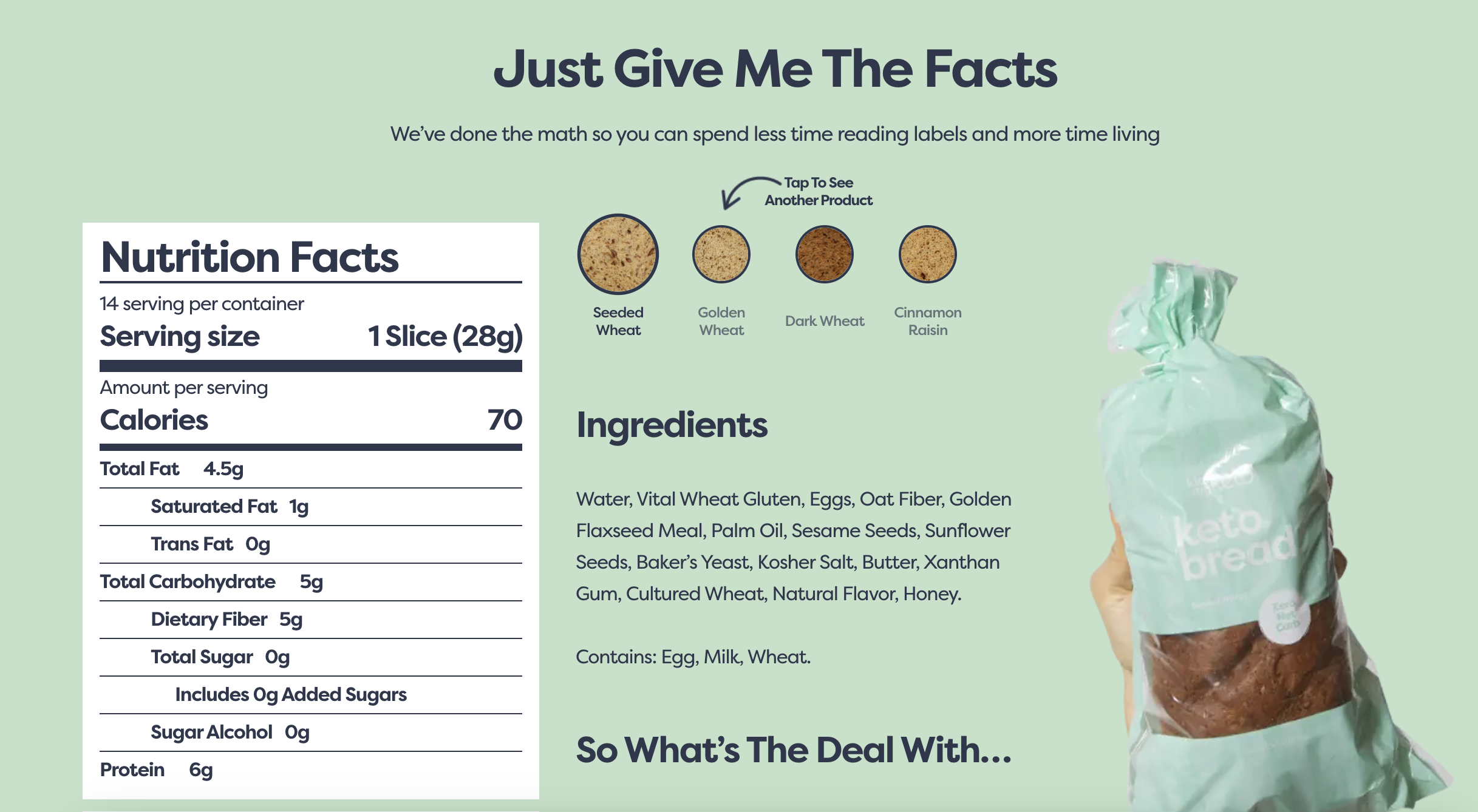
2. Kiss My Keto
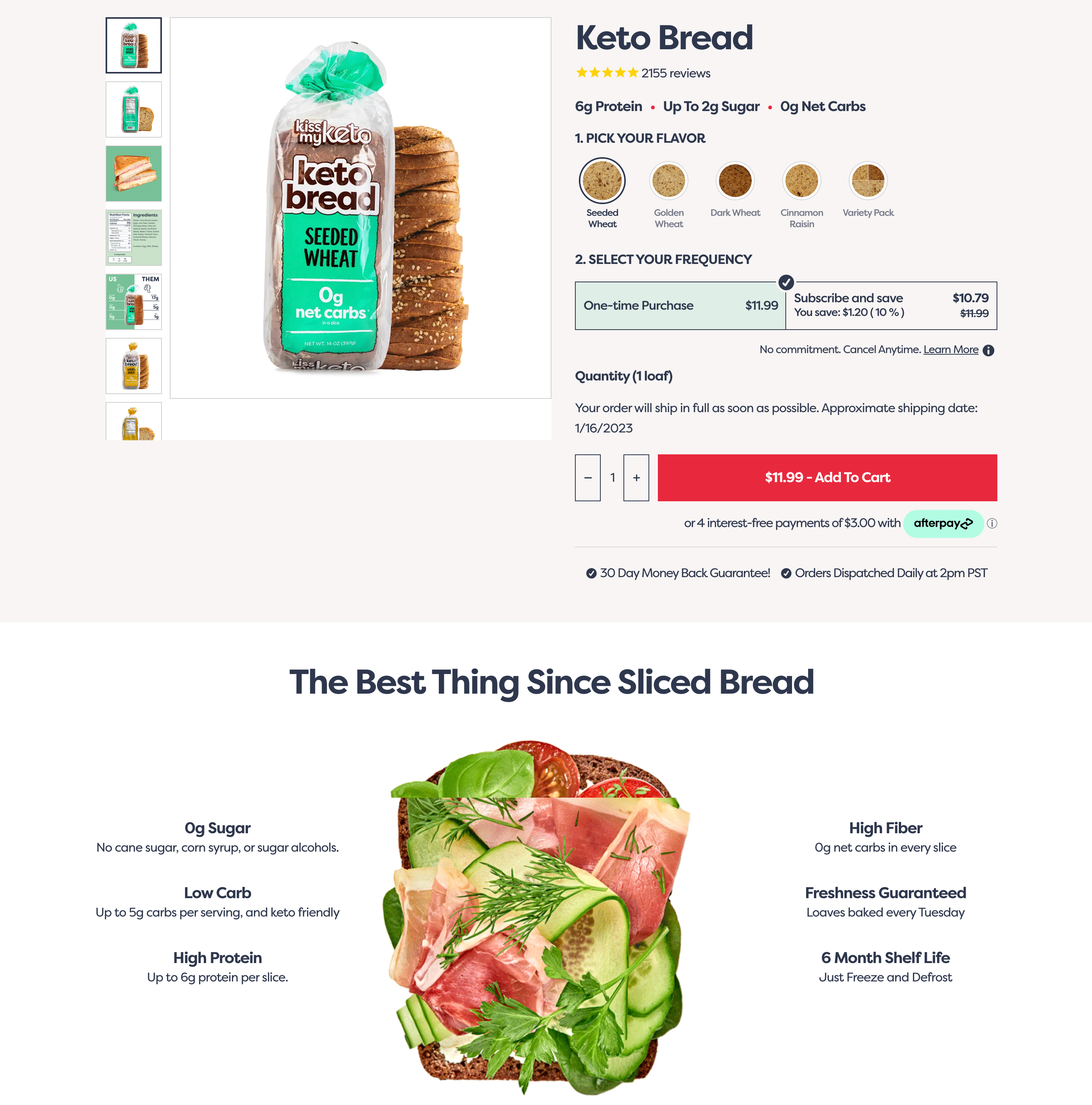
Kiss My Keto creates dedicated landing pages for the specific products they highlight in their marketing campaigns. One of their popular products is their Keto Bread.
The first thing you’ll notice about this landing page is the bright red “Add to cart” button. Really highlighting your call-to-action is a great way to maximize conversions.
They also push their product’s value proposition and explain how it helps deal with the pain point of keto-friendly bread being hard to find. This also helps convert visitors by making it clear how they’ll benefit from the product.
This landing page example also shows the importance of knowing your target audience. People who are interested in keto dieting typically care a lot about what’s in their food, so Kiss My Keto goes the extra mile by being transparent about exactly what’s in their products.
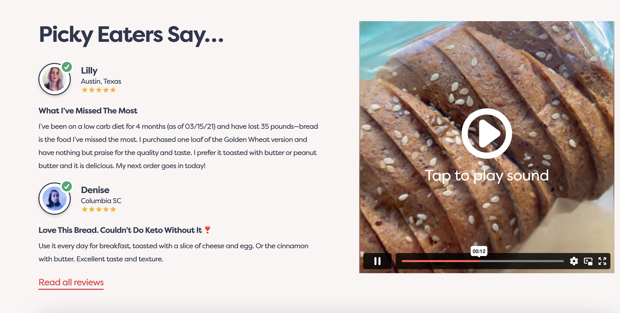
Additionally, they highlight positive social proof and reviews, which is very useful for addressing visitors’ worries about an unfamiliar product.
Showing that other people have enjoyed the product can really boost conversions.
Finally, they also include some nice ideas about how a potential customer could use the product on a day-to-day basis.
The entire landing page is driven toward converting visitors who may have clicked on an ad out of curiosity.
It has all the information they need to decide that Keto Bread is for them.
3. Extreme Lounging
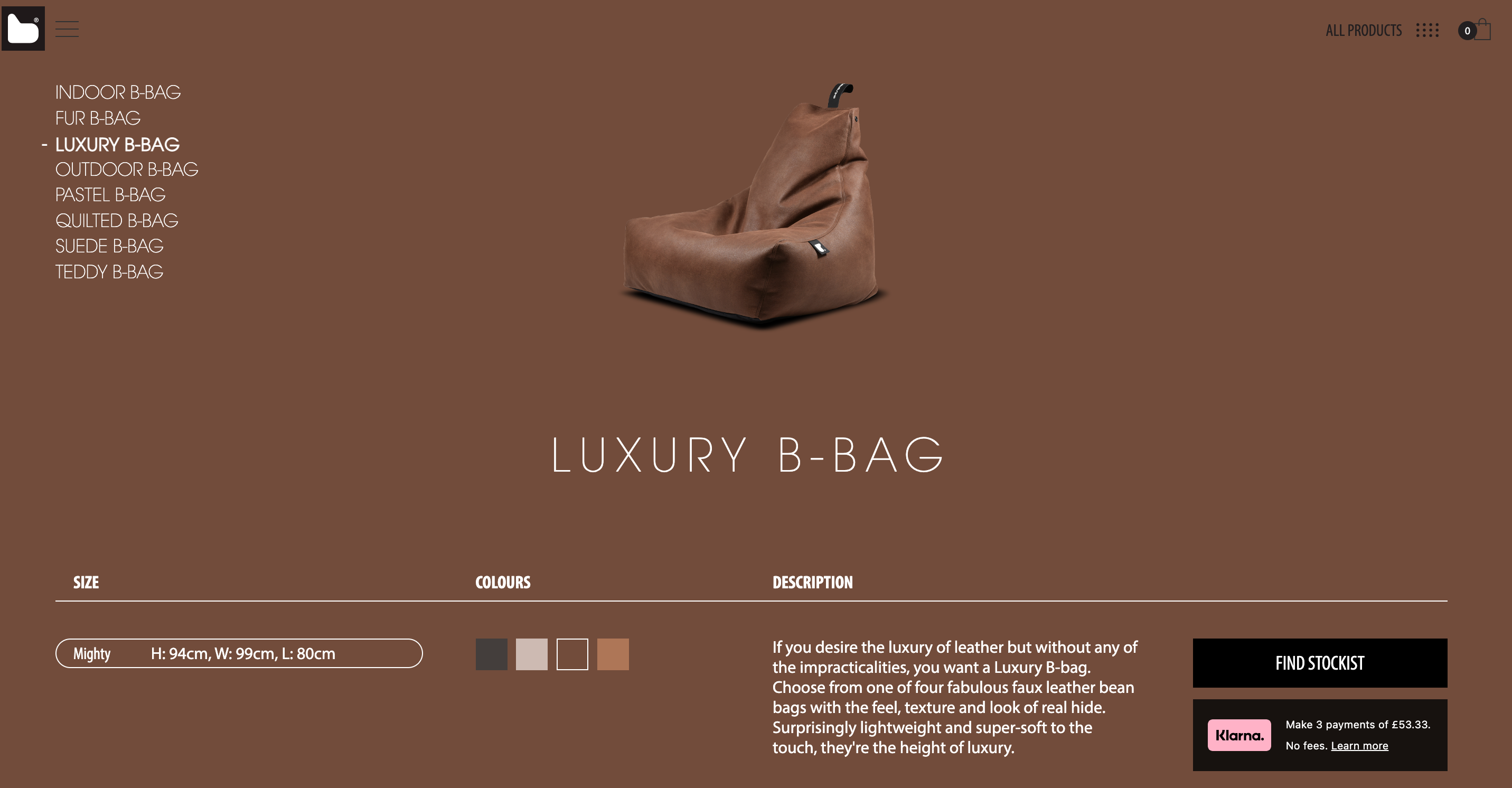
This landing page from Extreme Lounging is very short, but that’s not a bad thing!
Generally speaking, you don’t want your landing pages to be any longer than they need to be. The longer a landing page is, the higher the chance you’ll lose your reader’s interest.
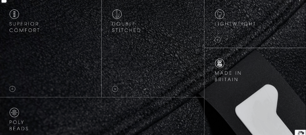
And Extreme Lounging’s landing page design is on point, with clickable boxes that give more info about the features. This is great because potential customers can learn more about the product’s features and value proposition if they want to, but those who don’t won’t get distracted.
Their marketing manager also deserves a pat on the back for choosing beautiful images.

4. LARQ
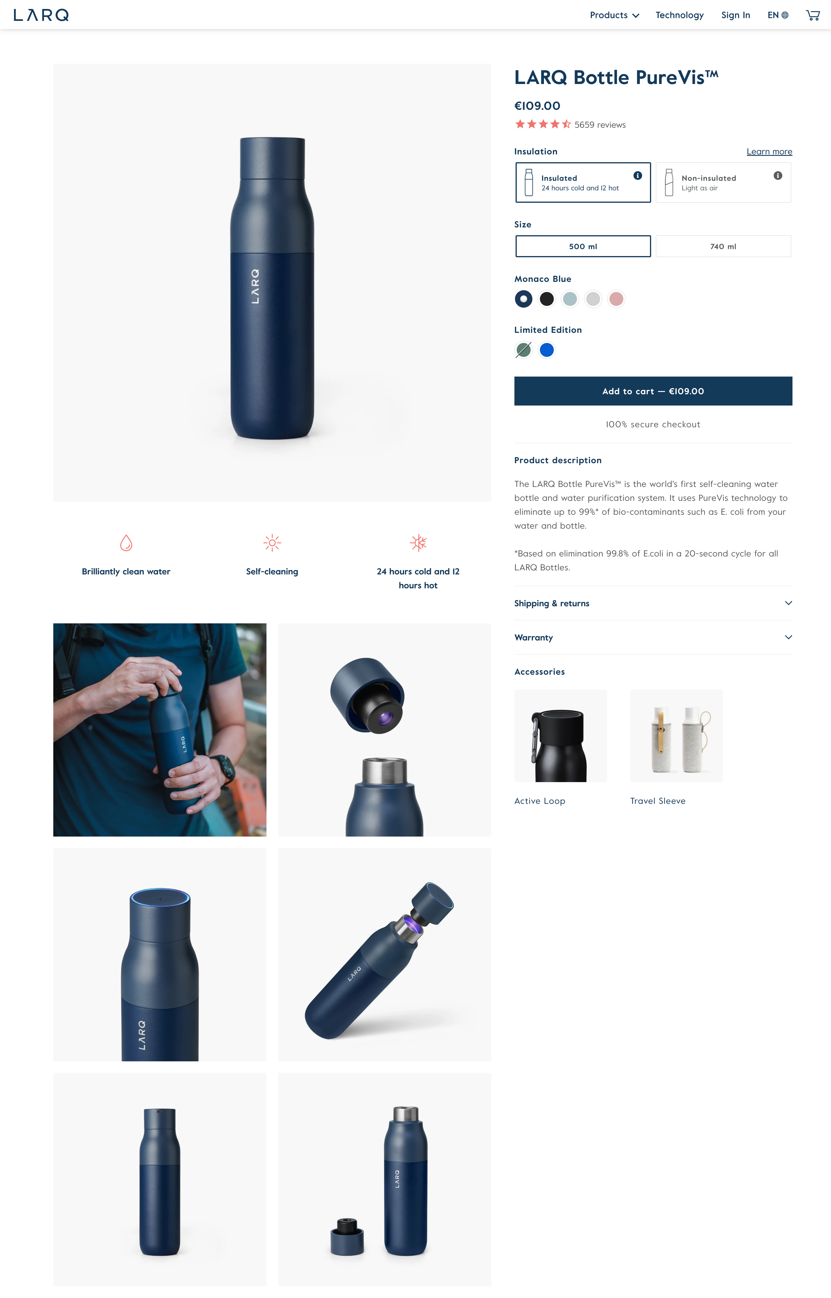
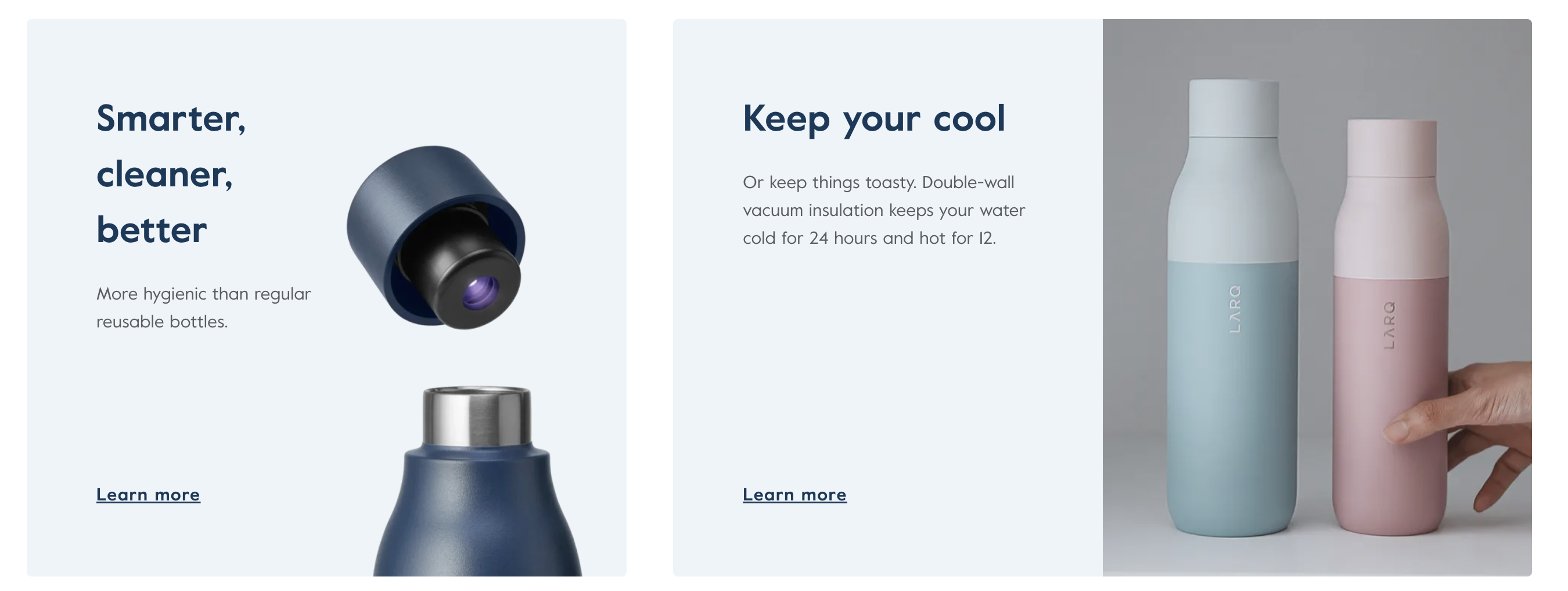
LARQ’s landing page is all about selling their flagship product: a reusable water bottle that uses UV light to clean the water inside.
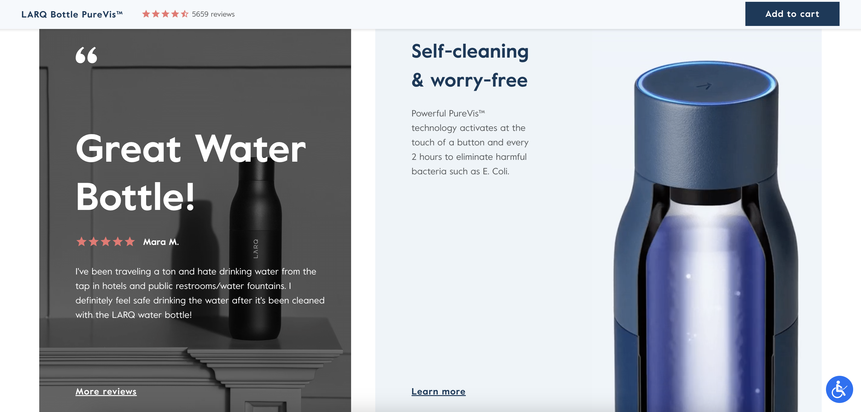
Their landing page delivers a lot of information, as we’ll see, so they use a sticky “Add to cart” button. This keeps their main CTA on the top of the users’ screen as they scroll through the entire landing page. Whenever a visitor decides they want to make a purchase, the button is right there. A little bit of extra convenience like this can make a big difference to landing page conversion rates.
When a visitor lands on LARQ’s landing page, they see simple visual elements and clear landing page copy that provides a brief description of the product, the pain points it addresses, and the value proposition.
This is a great example of a landing page getting straight to the point. You’ll notice that it doesn’t introduce anything extra: everything on the page is carefully chosen to convert visitors.
They also use social proof to back up their claims about how LARQ solves common pain points. The review below singles out a traveler who’s often unsure about how safe the local tap water is when they’re traveling.
High-converting landing pages will often use social proof to make a point more compelling than it would be coming from the business itself.
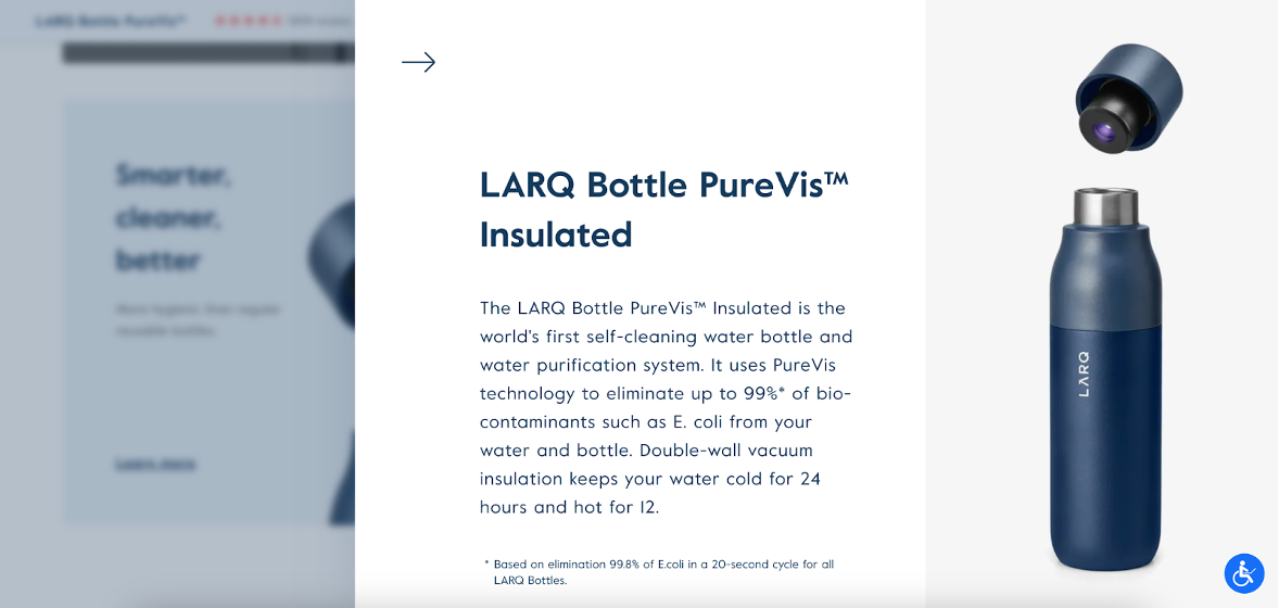
When they need more space to explain the product’s features, they don’t crowd things by putting it all on the landing page’s base layer. And they don’t redirect customers away from the landing page (which would negatively impact the conversion rate).
Instead, LARQ uses an overlay to deliver necessary information about their product’s features.
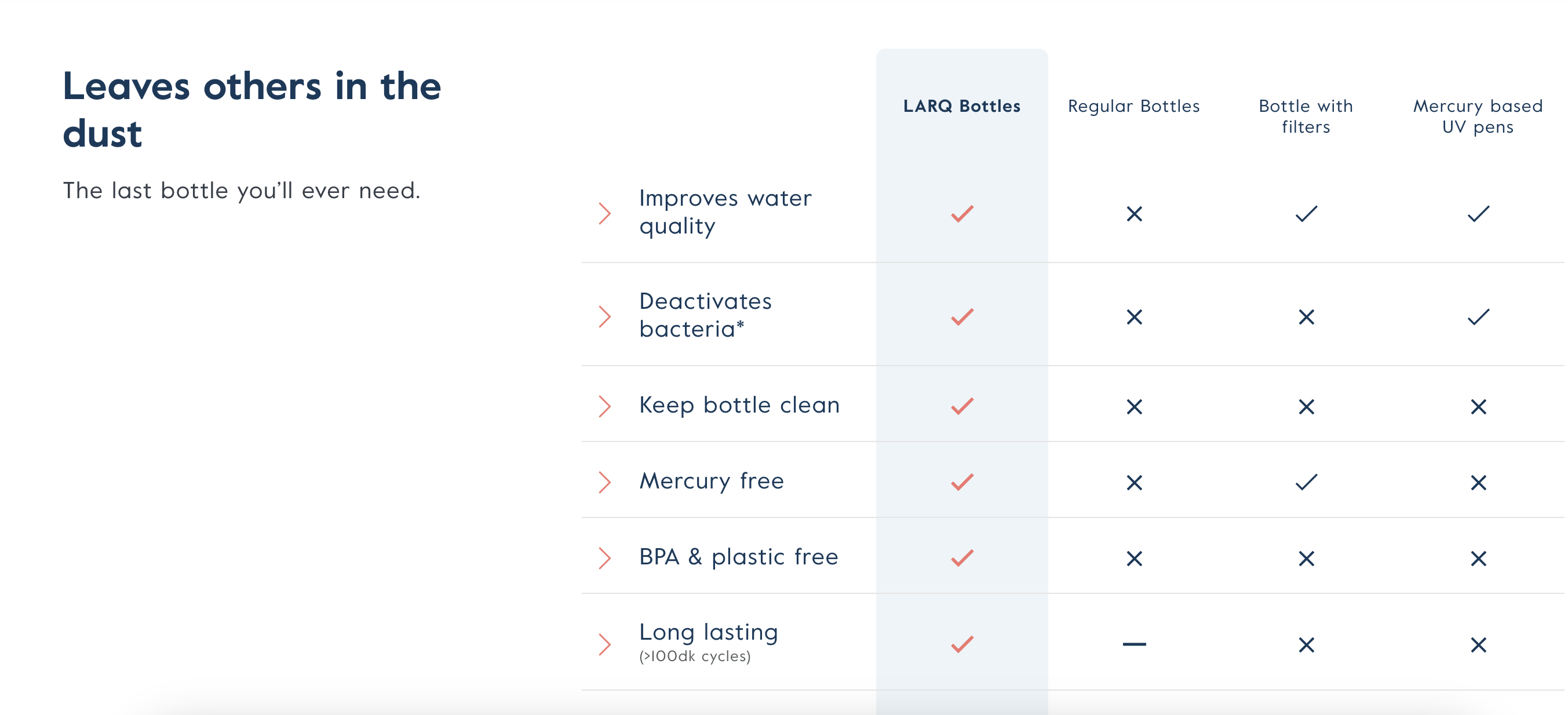
Finally, LARQ uses a comparison chart to drive visitors’ attention toward the ways that their water bottle outperforms other options on the market.
Any digital marketer will tell you that differentiating your product from your competitors’ offerings is a crucial part of convincing them to buy from your store.
5. Dollar Shave Club
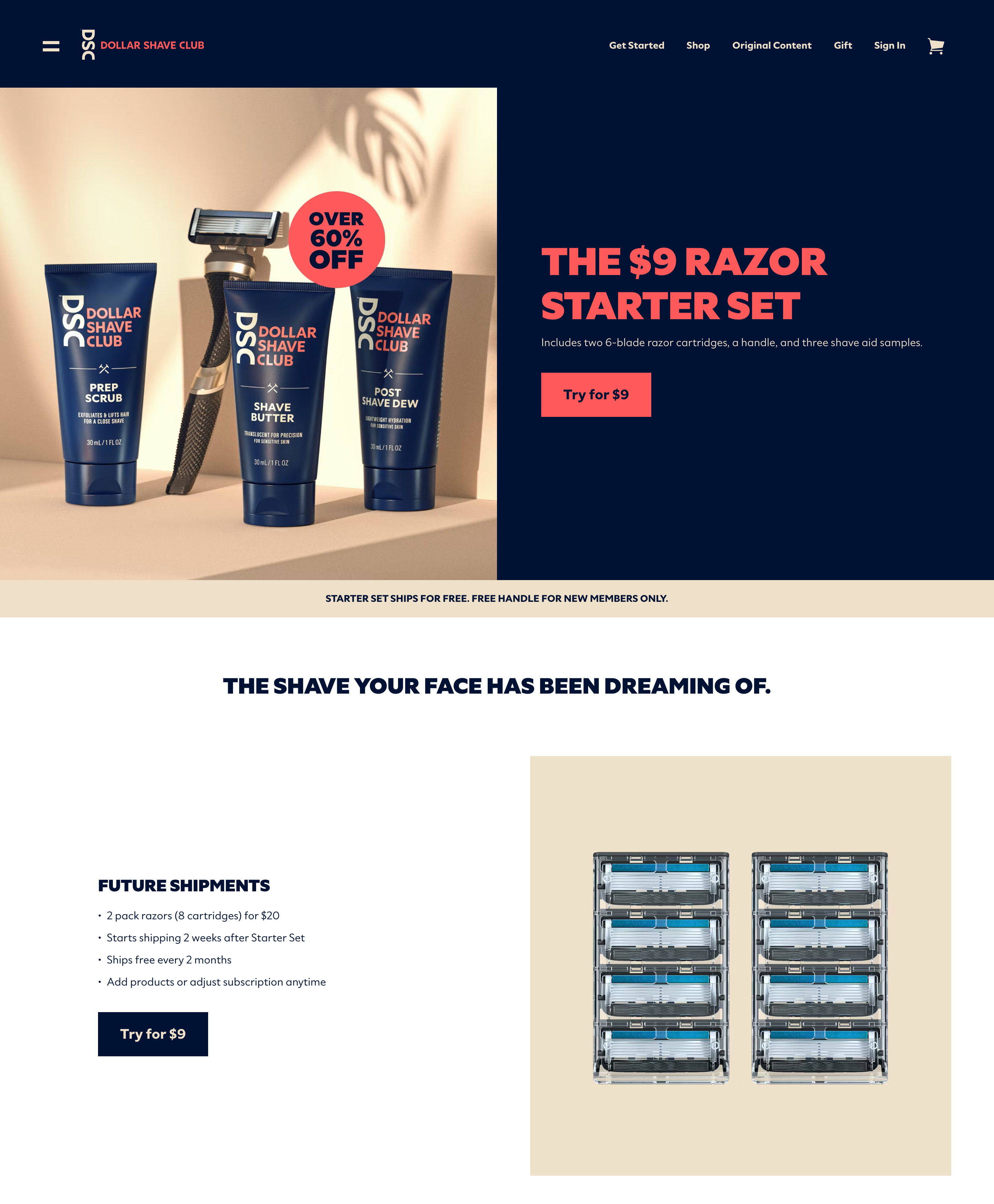
Dollar Shave Club has always placed a lot of emphasis on the value of their offer (after all, it’s in their name).
That’s why it makes perfect sense for them to promote the 60% discount in their hero banner.
The hero image is simple and shows customers exactly what they’ll get, while the simple copy and large call to action button help maximize the conversion rate for this landing page.
Other than that, there’s not much else to this landing page. They show the eight razors that are included in the starter pack, use some bullet points to explain the benefits of signing up for a subscription, and promote their unique value proposition (“The Shave Your Face Has Been Dreaming Of”).
By cutting out all other elements, they’re left with a simple, clear landing page that’s sure to convert.
How to improve the conversion rate of your landing page?
Now that we’ve gone over these five high-converting landing page examples, it’s time to examine how you can improve your landing page conversions.
Traditionally, landing pages have been created for specific marketing campaigns, but they haven’t been adapted to individual visitors. Instead, everyone who clicks on the ad sees the exact same landing page copy, design, and call-to-action.
However, that’s changing.
Ecommerce stores that have had the most success, like Amazon and Etsy, provide their customers with an individually-tailored shopping experience. To customers, it feels like they remember everything about them. And that allows them to provide a seamless user experience.
When you personalize a website based on an individual’s needs and interests, you’re going to see higher conversion rates because you know that the messages you’re sending them are relevant on an individual level.
And this same principle applies to landing pages!
Here are some examples of website personalization tactics that you can use on your landing pages to improve your conversion rates.
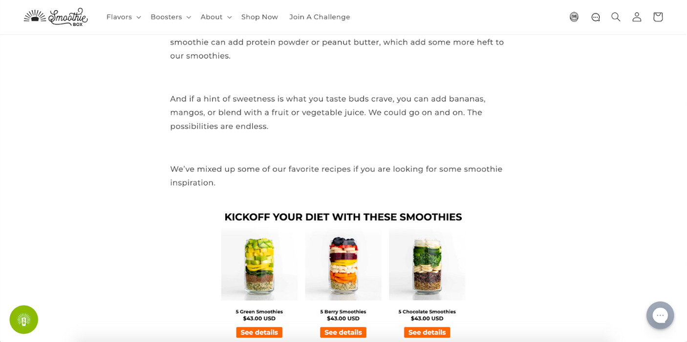
1. Recommend relevant products
Product recommendations are often an important element of landing page design, especially for landing pages that are meant to introduce potential customers to a brand as a whole.
There are a number of ways you can decide what products you want to recommend on a landing page. You could simply highlight your best selling products or the ones that are on sale.
Or, you could use personalization to recommend products that a visitor is likely to be interested in. For instance, if a user clicked on a Facebook ad targeted at women aged 18-24, you could recommend products that appeal to that demographic.
You can also highlight relevant products on an exit-intent popup to save abandoning visitors:
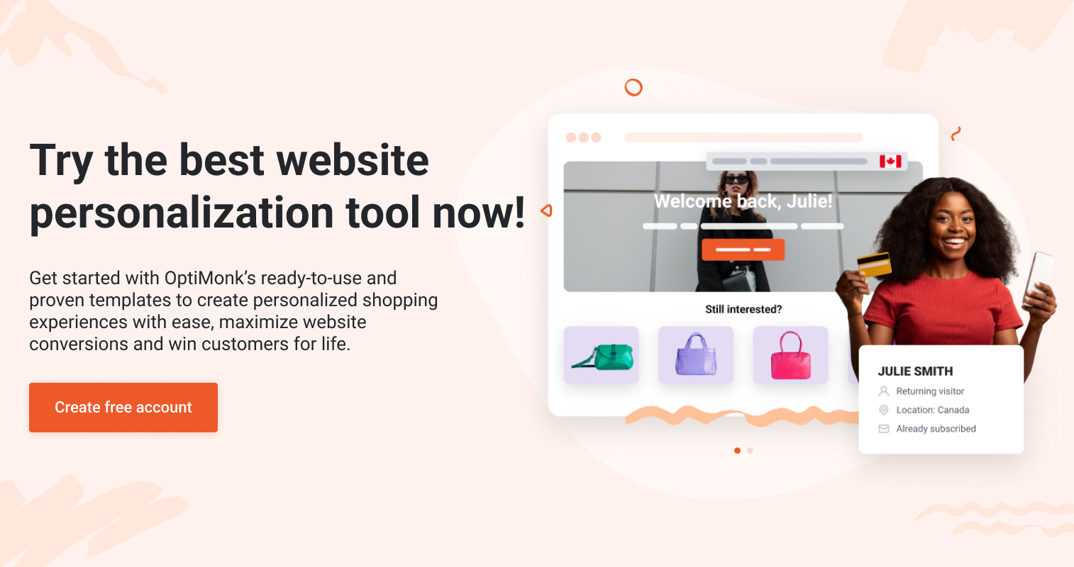
2. Welcome returning visitors
Sometimes, visitors will end up on the same landing page multiple times. When they do, you can direct them to the products they were viewing on their last visit to your site.
This saves them the trouble of having to navigate back to your main page and go through your category pages to find those products.
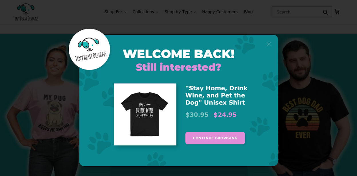
Get started with these welcome back popup templates:
3. Promote special offers for cart abandoners
If the CTA on your landing page is “Add to cart,” you’ll want to use an abandoned cart popup to help prevent users who’ve added an item to their cart from leaving without making a purchase.
Whenever a user leaves without completing their purchase, that’s a hit to your conversion rate.
Cart abandonment campaigns are highly effective at converting landing page visitors because users who’ve added something to their cart are very close to making a purchase. Often, they only need a small nudge to decide to order, which you can provide with a discount offer.
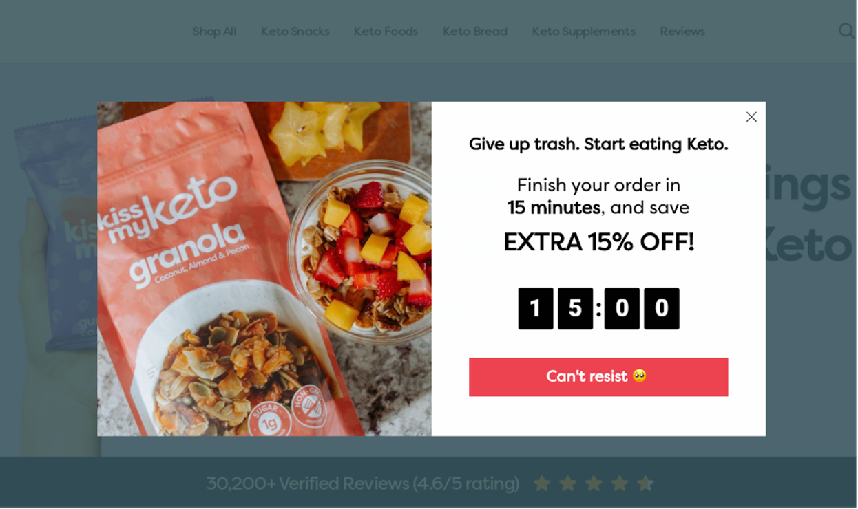
These cart abandonment popup templates can save up to 20% of your visitors:
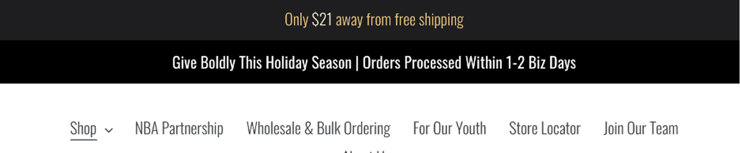
4. Showing dynamic free shipping bars
Online shoppers absolutely love free shipping: it can sometimes be enough of an incentive to get a customer to place an order all on its own.
You can use website personalization to display your shipping policies based on a customer’s location. After all, they’ll certainly want to know whether you deliver to their address!
A related idea is using a free shipping bar to incentivize customers to make a higher-value purchase in order to receive free shipping. It’s a great way to upsell your core product on a landing page.
5. A/B test your landing page
It’s important to remember that there’s no perfect landing page. You can always make changes that will result in a higher-converting landing page.
A/B testing allows you to turn a good landing page into a great one, both in terms of user experience and average conversion rate.
Often, you won’t know which version of your headline or what form placement works best without testing it. Each important element whether it is a chart created by Gantt chart software or a beautifully crafted headline on your landing page should be A/B tested so that you know your page is as converting as successfully as possible.
FAQ
Why are landing pages important for conversion?
Landing pages serve as focused entry points for visitors, directing them towards specific actions or conversions. By eliminating distractions and providing tailored messaging, landing pages can significantly increase conversion rates compared to generic website pages.
How do I know if my landing page is high-converting?
Several metrics can help assess the effectiveness of your landing page, including conversion rate, bounce rate, time on page, and engagement with key elements such as CTAs. Effective landing pages typically achieve a balance between attracting visitors and guiding them towards conversion goals.
What is a good conversion rate for landing pages?
A good conversion rate for landing pages varies depending on factors such as industry, target audience, and the complexity of the conversion action. However, industry benchmarks suggest that a conversion rate between 2% to 5% is considered respectable, with top-performing landing pages achieving conversion rates of 10% or higher.
How often should I update my landing pages?
Regular updates and optimization are essential for maintaining the effectiveness of your landing pages. Monitor performance metrics continuously and make adjustments based on user feedback, market trends, and changes in your offerings or audience. Aim to refresh content and design periodically to keep your dedicated page relevant and engaging.
How to build a high-converting landing page?
Building a high-converting landing page involves several key steps:
- Clear and compelling headline: Grab attention immediately with a strong, clear headline that conveys your main message.
- Engaging visuals: Use high-quality images or videos that are visually appealing to capture interest and convey your value proposition.
- Concise and persuasive copy: Keep your text short and focused, emphasizing benefits over features. Use bullet points for easy reading.
- Strong call-to-action: Make your CTA stand out with contrasting colors and compelling text. Ensure it’s placed prominently.
- Trust elements: Include testimonials, reviews, and trust badges to build credibility and reassure visitors.
- Simplified forms: Use minimal form fields to reduce friction and encourage completion.
- Mobile optimization: Ensure your page looks great and functions well on all devices.
- A/B testing: Continuously test different elements to optimize landing and see what performs best, then make data-driven improvements.
Wrapping up
So that’s our tour through some of the highest-converting landing pages on the internet in 2024. Hopefully you’ve picked up some ideas that you can apply to your own landing pages, whether that’s creating a powerful hero section, using social proof, or highlighting your CTA button.
Good landing pages always have a well-defined goal and are carefully designed to direct visitors’ attention, making a conversion as likely as possible. And they get rid of anything that doesn’t contribute to a higher conversion rate.
If you’re concerned about your landing page conversion rate, website personalization is a great way to boost your sales and lead generation efforts.
OptiMonk allows you to implement any of the landing page personalization tactics mentioned above (and many others). Since it’s a free tool, there’s no reason not to give it a try today!
Migration has never been easier
We made switching a no-brainer with our free, white-glove onboarding service so you can get started in the blink of an eye.

What should you do next?
Thanks for reading till the end. Here are 4 ways we can help you grow your business:
Boost conversions with proven use cases
Explore our Use Case Library, filled with actionable personalization examples and step-by-step guides to unlock your website's full potential. Check out Use Case Library
Create a free OptiMonk account
Create a free OptiMonk account and easily get started with popups and conversion rate optimization. Get OptiMonk free
Get advice from a CRO expert
Schedule a personalized discovery call with one of our experts to explore how OptiMonk can help you grow your business. Book a demo
Join our weekly newsletter
Real CRO insights & marketing tips. No fluff. Straight to your inbox. Subscribe now
Share this article
Written by

Nikolett Lorincz
Nikolett is the Head of Content at OptiMonk. She is obsessed with content marketing and loves creating educational content for ecommerce store owners. She truly believes in the importance of quality over quantity.
You may also like
- Posted in
- Conversion
Partner with us
- © OptiMonk. All rights reserved!
- Terms of Use
- Privacy Policy
- Cookie Policy
Product updates: January Release 2025


