- Blog
- Ecommerce Conversion Rate Optimization: The Ultimate Guide
Ecommerce Conversion Rate Optimization: The Ultimate Guide
-
Nikolett Lorincz
- Conversion
- 6 min read
Table of Contents
If you’re an ecommerce site owner, a marketer, or simply an ecommerce enthusiast, mastering ecommerce conversion rate optimization is your ticket to increasing sales and achieving growth.
Whether you’re looking to fine-tune your existing CRO strategy or embark on a new journey of optimization, this guide is packed with actionable insights and proven techniques that will help you sell more effectively online.
Let’s dive in and unlock the full potential of your e-commerce website!
1. Ecommerce conversion optimization basics
To get started on your journey to increase sales, it’s essential to understand the foundational principles of ecommerce conversion rate optimization.
What is conversion rate optimization?
Conversion rate optimization (CRO) is all about increasing the percentage of site visitors that complete a desired action.
We call the action they take a “conversion,” and it could be anything from buying a product to signing up for a newsletter or registering for a webinar.
But when we’re talking about ecommerce conversion rates, we’re usually referring to purchases.
What’s the average conversion rate for ecommerce stores?
We turned to Littledata for some ecommerce conversion rate benchmarks. They found that the average ecommerce conversion rate is 1.3%.
If your ecommerce conversion rate is above 3.2%, you’re already in the best 20% of stores, so it can be considered a good ecommerce conversion rate.
However, there’s always room for improvement, so having a great conversion optimization strategy is useful no matter what your ecommerce conversion rate is.
How to get started with conversion rate optimization?
If you want to get started with conversion rate optimization, you’ll need to understand the basic steps involved:
- Research phase: This is where you discover the parts of your conversion funnel that need tweaking.
- Hypothesis phase: This is where you form a working hypothesis based on your metrics and research.
- Prioritization phase: This is where you figure out what to attack first.
- Testing phase: This is where you put a variant of your website (based on your hypothesis) up against the existing version of your website.
- Learning phase: This is where you deploy the winning variant and gather information for future tests and planning.
Recommended reading: What Are the Steps of Conversion Optimization: A Conversion Framework
2. Conversion data
The best way to get ahead with conversion rate optimization is by gathering solid, actionable data.
There are two types of data: qualitative and quantitative.
Quantitative data can be defined as “the cold, hard numbers.” This is the information that is not up for interpretation… it just is what it is.
In ecommerce, quantitative metrics include:
- click-through rates,
- time on site,
- visitor counts,
- and really any marketing measure that can be represented numerically.
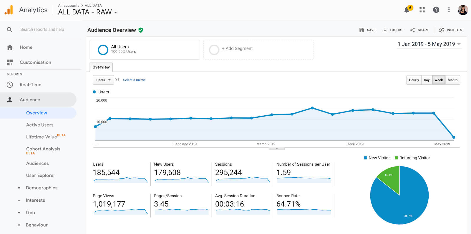
With Google Analytics, you can track almost anything. Leads generated, new visitor conversion rate, returning visitor conversion rate, cost per acquisition, and average order value are some of the top metrics you should measure.
However, quantitative data doesn’t paint the full picture. To dramatically improve your business, you’ll also need qualitative data.
Qualitative data leaves more room for interpretation and can be analyzed subjectively. Instead of just accepting what the numbers say, qualitative data asks “why?”
Some popular ways to collect this data include customer interviews, focus groups, and other observational methods.
Customer surveys are a great way to not only show that you care but also to find solutions to problems you’re not even aware of.
Try using website popups to collect feedback from customers:
Here are 6 examples of the kind of questions you can include in your surveys:
- What convinced you to buy from us?
- What other options did you consider before you bought from us?
- Were you unsure about anything when you made your purchase?
- What are you using our product for? What problem does it solve for you?
- How is your life better thanks to our product?
- What do you like most about our product?
Recommended reading: 30 Customer Feedback Questions to Ask (& Tools to Use)
3. User experience optimization
One of the most important steps when it comes to increasing conversions is understanding the customer journey.
Think of how smooth and effortless browsing on Apple’s homepage feels, or how easy the checkout process is when shopping for something on Amazon (both desktop and mobile).
That’s the power of great UX design.
How do your users find navigation on your ecommerce site? Are you making their experience as enjoyable and simple as possible? Are you providing the same excellent experience for mobile users and desktop users?
These are all important questions you need answers to if you’re serious about optimizing the customer journey.
Now let’s take a look at a few other key factors that could have an effect on the user experience and might be worth optimizing.
Page speed
How fast does your website load?
If you don’t know the answer to that, you may be missing out on an opportunity to convert more site visitors.
Here are some facts about page speed, according to Shopify:
- 79% of customers who are dissatisfied with a website’s performance are less likely to buy from that site again
- 64% of smartphone users expect a website to load in 4 seconds or less
- 47% of online shoppers expect web pages to load in two seconds or less
These percentages could potentially represent thousands of dollars out the window if your website is slow to load.
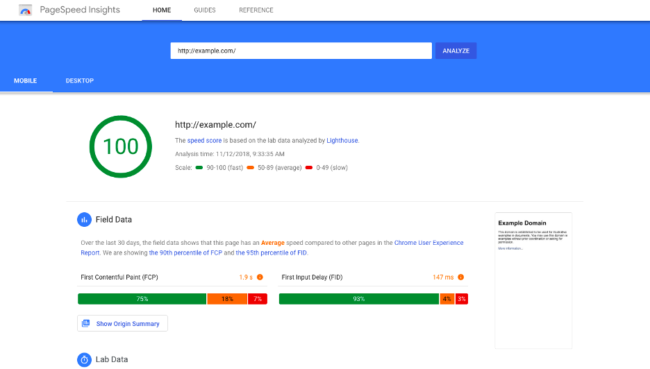
You can check your page speed by using this free Google application:
Mobile optimization
In this increasingly mobile-first world, it’s imperative to optimize for mobile. You’re putting yourself at a serious disadvantage if there’s anything off on mobile devices, like design, navigation, load times, or button placement.
Tools like PageInsights or Mobile-Friendly Test can help you find the places where mobile optimization might be lacking.
When optimizing your site for the best possible experience on a mobile device, ask yourself these questions:
- Might you need to eliminate some of the content on smaller devices to simplify the experience?
- How will your navigation work on different devices?
- Are clickable elements easily tappable?
- How will you handle the layout of grids and images on different devices?
- Are your images beautiful and crisp on retina screens?
- Is the add-to-cart, checkout, and payment workflow optimized for different screen sizes?
4. Ecommerce website optimization
When it comes to optimizing an ecommerce website for conversions, there are a few foundational elements you’ll want to make sure you’ve got covered.
Have a strong value proposition
Creating a strong value proposition is an essential part of running a successful ecommerce business.
Your value proposition is your brand’s identity. It’s what you use to create trust and build a tribe of loyal brand evangelists that will be singing the praises of your store for years to come.
So where do you begin? What is the formula for writing a kick-ass unique selling proposition?
- Identify all the benefits your product offers (Note: benefits are not the same as features)
- Describe what makes these benefits valuable
- Identify your customer’s main problem
- Connect this value to your buyer’s problem
- Differentiate yourself as the best option to provide this value
If you’d like to learn more about how to find the right value proposition for your visitor segments, watch this video:
Build trust
The rise of advertising fraud, fake reviews, and fake influencers has made shoppers very wary of online brands in general. This decline in consumer trust means you’ll have to work that much harder to gain it and keep it.
Here are some other trust-building techniques that can help to increase your site’s conversion rate:
- Using trust signals like testimonials, video product reviews, professional/medical affiliations, celebrity endorsements, etc.
- Showing empathy for the users by making helpful docs, tutorials, and other materials easy to find.
- Validating your user’s beliefs. Some of the most helpful articles start with “If you’ve had enough of wasting time looking for X, you’ve come to the right place.”
- Playing the long game. Trust takes time to build, and you’ve got to keep this customer-centric way of operating in everything you do. Always make sure that they have the easiest, most pleasant experience when interacting with your brand.
Increase scarcity and urgency
Why do some people camp outside (even in crappy conditions) for up to 3 days in advance waiting for the latest Supreme drop? And why do some people literally fight over Black Friday deals at Best Buy (yes, I know it’s ridiculous)?
It’s because these companies have figured out how to create scarcity and urgency and take full advantage of it.
FOMO (fear of missing out) is not just another 4 letter acronym for you to use to show how cool you are… it’s a real, powerful marketing concept that you can use to drive sales in your business.
Of course, shopping online is a little different than lining up at a physical storefront, but it’s still possible to create this “craving” for your products with the right execution.
There are many ways to make your visitors feel there is a ticking clock urging them to make a purchase now.
One of the best ways to create a sense of urgency is with a discount that’s only available for a limited time. A countdown timer can help to emphasize the time limitation and increase conversions even more.
Try these popup templates to increase urgency:
Limited quantity (scarcity) is another great way to create a sense of urgency.
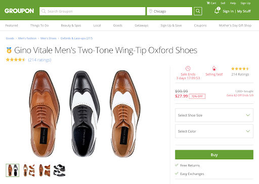
You can even combine techniques, as Groupon does in the example below. They encourage their visitors to buy a product before they run out of time or before the item is no longer available.
Optimize your homepage
Think of your homepage as your virtual storefront. It’s an excellent place to seduce your visitors and turn them into customers using the powerful conversion techniques covered in this guide.
Here are some ways for you to improve ecommerce conversion rates on your homepage:
- Promote your bestsellers to new visitors
- Use browsing history to personalize product recommendations for returning visitors
- Welcome returning customers with a personalized message (see example below)
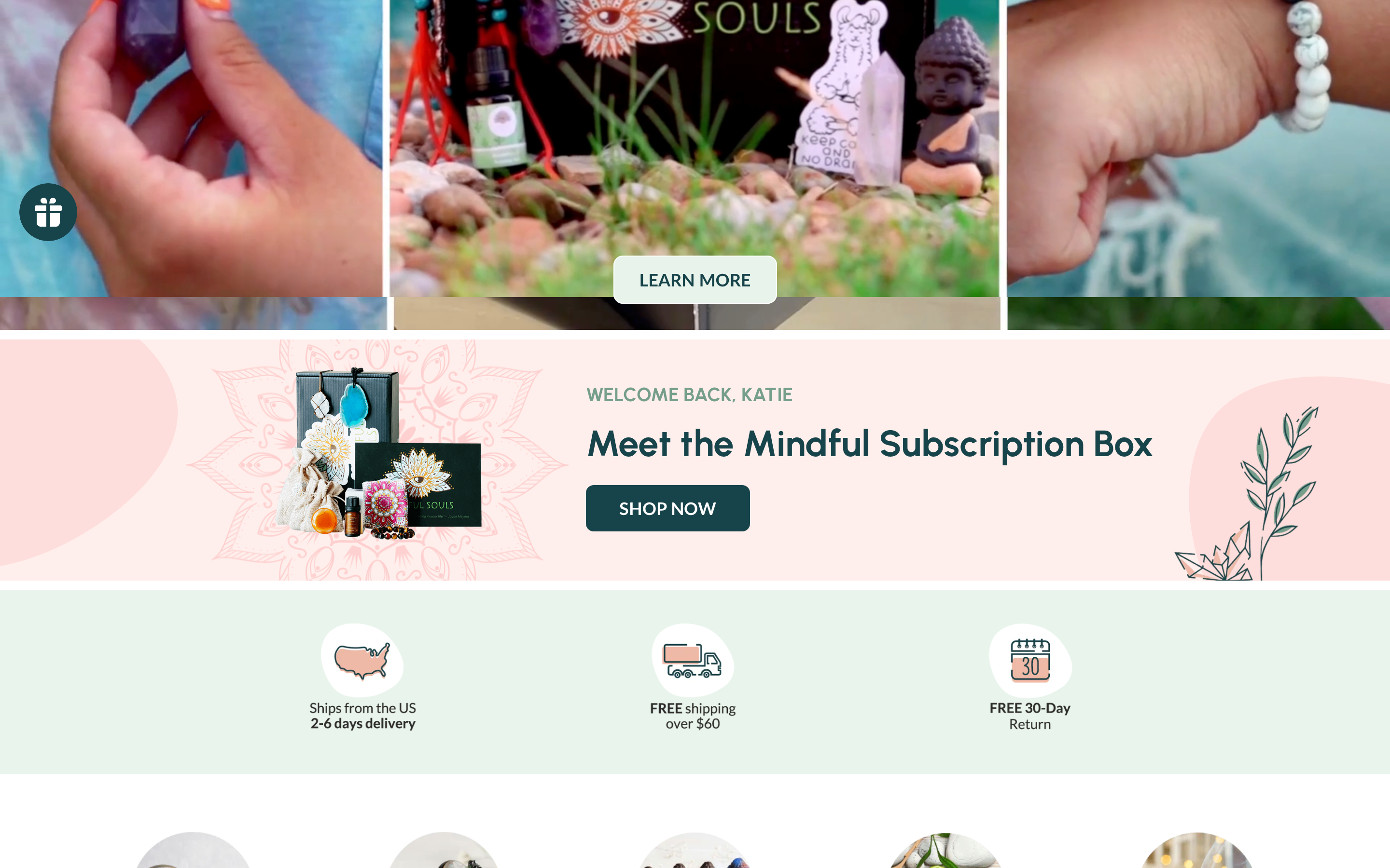
Using OptiMonk’s Embedded Content feature, you can easily create a section on your homepage that’s only visible to returning customers. This will help to improve the conversion rate of this segment.
5. Product page optimization
Your product pages play a major role in your conversion optimization process.
A product page is used to provide your shoppers with information about a specific product or service (and your brand). This is the place where you want to be including all the information they need to make a decision.
Write killer product descriptions
To write solid product descriptions, you need to harness copywriting principles like good storytelling, using magnetic headlines, focusing on benefits, and making your words as clear as possible.
In the example below, Muscle Feast captures the attention of its target audience by focusing on the key benefits of the product, while effectively addressing the concerns of health-conscious consumers, making it clear that this product is suitable for a broader audience, including those with dietary restrictions.
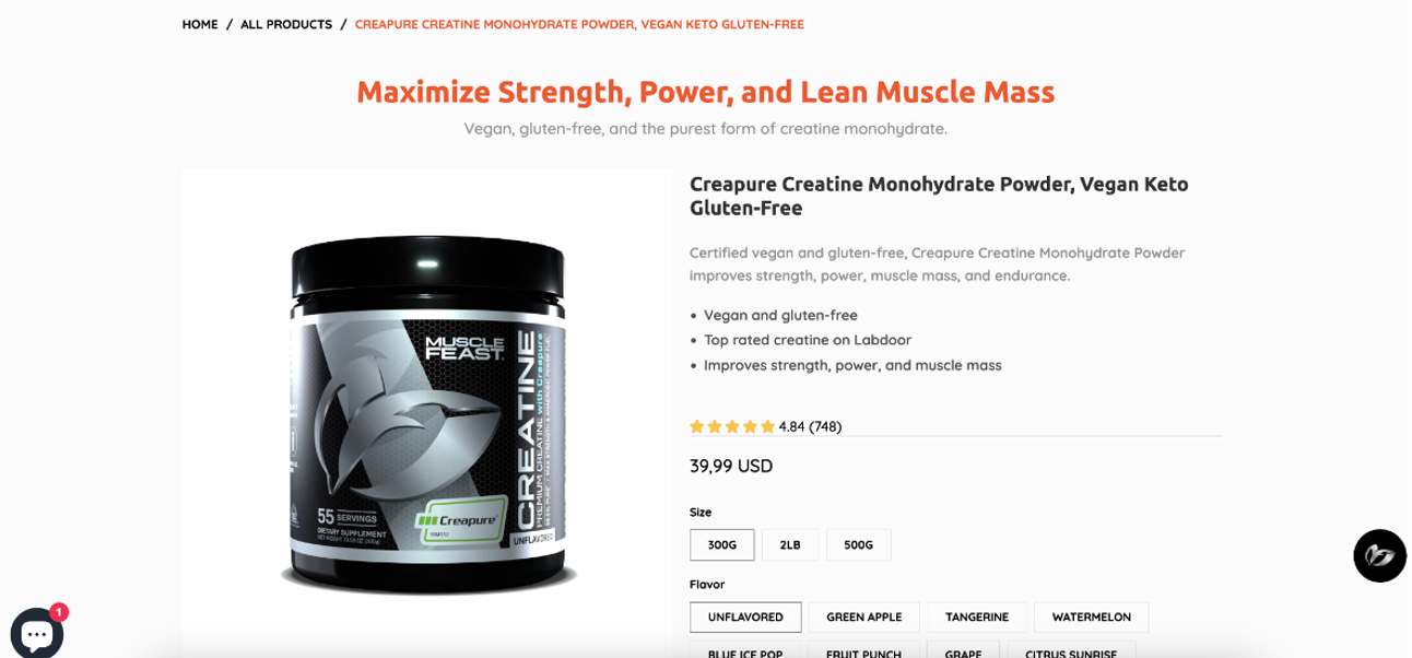
Recommended reading: How Muscle Feast Increased Its Revenue By 15.56% With Product Page Optimization
Using product images effectively
Notice how top companies like Nike, Adidas, Apple, and ASOS showcase their products?
The use of high-quality imagery, multiple viewing options, displaying different angles, using the right thumbnails, and maintaining consistency throughout play a major role in their success.
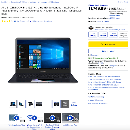
Best Buy is really good at using product images. They use huge, top-quality images and videos to demonstrate what a product looks like.
Use product videos
Here are some interesting stats on the power of video marketing:
- Including a video on your landing page can boost your conversion rate by up to 80%
- Video increases organic search traffic on a website by 157%
With ecommerce, video can deliver a dramatic uplift in leads, sales, and revenue.
Here are 5 powerful ways of effectively using video in ecommerce:
- The “how-to” video: Demonstrate how to use your product.
- The “product-in-use” video: Try to use actors who look like your target audience and demonstrate the product in action.
- The “close-up” video: This zooms in on your product to show the details, the craftsmanship, and other aspects that you want to highlight to entice users to buy.
- The “installation” video: This describes how to install or assemble your product.
- The “story” video: This is where you describe the story of your product and how/why it came to be. This video is a great opportunity to use emotion to draw your shoppers in.
Use personalization
If you sell products that can be targeted to several different customer segments, then you probably realize that the same product can have multiple value propositions based on who you’re targeting!
For example, a blender can be useful for busy parents who just want a quick, healthy breakfast…
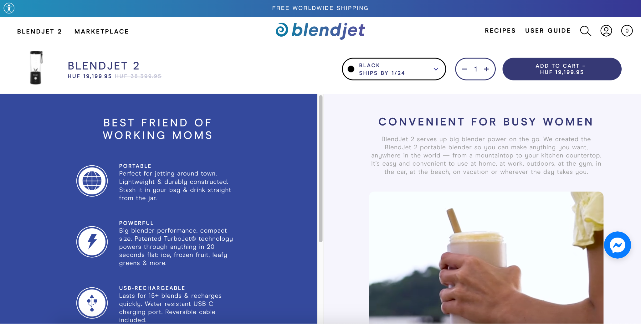
But also for avid gym-goers who would love to elevate their workouts with a protein smoothie…
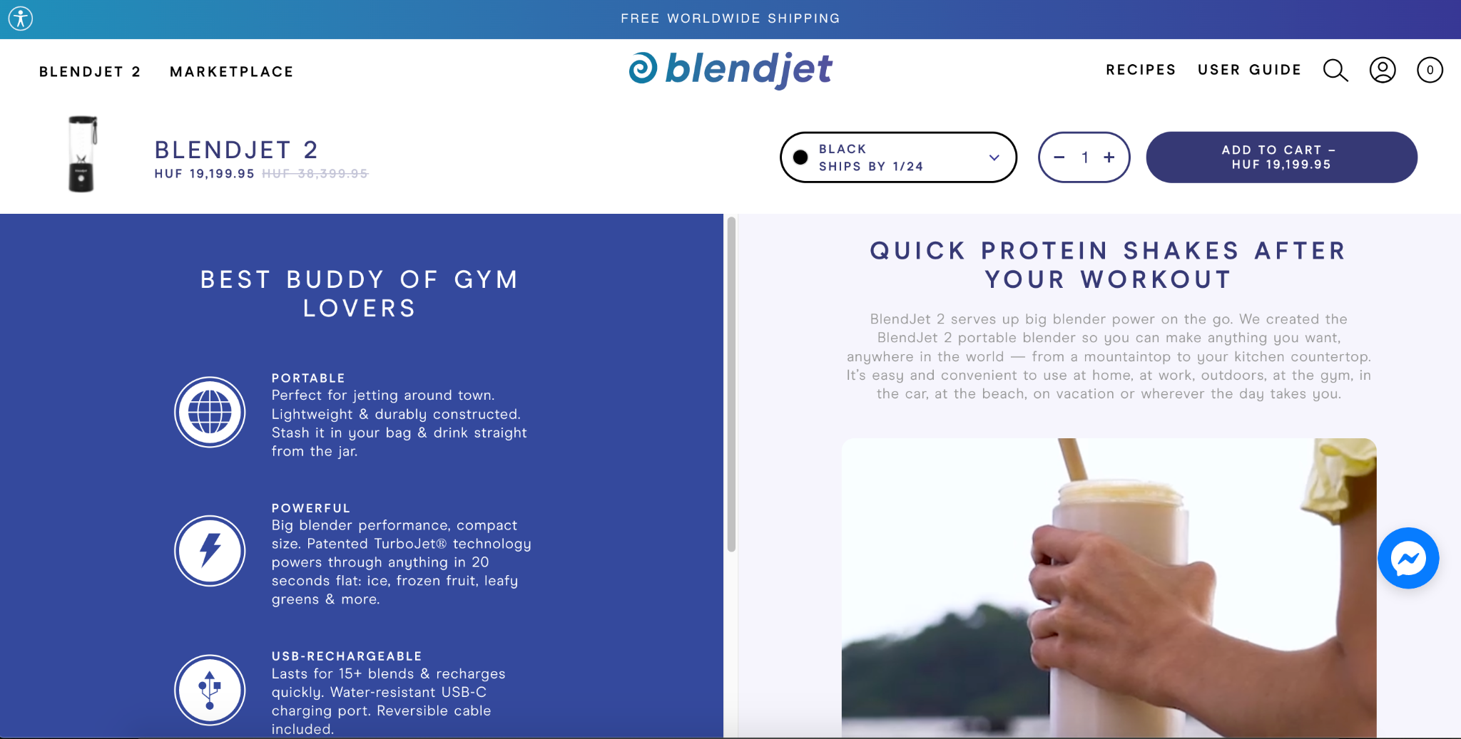
In this case, you probably have Facebook ads targeting different groups of people based on demographics, but they all land on the same product page.
To increase the conversion rate of these ads (and your product pages) you should display personalized product messaging for each customer group. Using our Dynamic Content feature, you can easily personalize your product pages and increase conversion rates by at least 10%.
Testing different value propositions
A low conversion rate could be a sign that your product page is too focused on features (as opposed to benefits), or that you simply haven’t used the right value proposition.
Either way, you should consider testing different value propositions to find out which USP resonates most with your visitors and potential customers.
Finding the best value propositions by using data and not just your gut instinct will increase your conversion rates and drive more sales for your business.
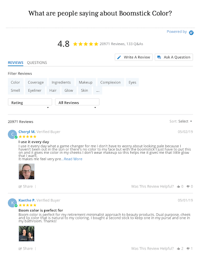
Use social proof to build trust
People are more likely to buy a product when that product has been validated by other people.
You can leverage social proof by displaying customer reviews and user-generated content in many different places, but especially on your product pages.
Check out how BOOM! by Cindy Joseph leverages the power of social proof with 20K+ reviews below one of their lipsticks:
Try upselling
Upselling can be defined as offering your customers a better (more expensive) item when they add a product to their cart or on the checkout page.
However, the most profitable ecommerce sites combine upselling, cross-selling, and down-selling to find the best way to maximize their profits with each customer.
Here’s a 4-step guide to successfully upsell without annoying your customers:
- Install an upsell app/plugin: Huge ecommerce platforms like Shopify, Magento, BigCommerce, and WooCommerce all have different upsell apps for you to try out. These are quick, easy plugins that integrate with your site seamlessly.
- Determine the best products to upsell: Bundle “him and her” products, upsell accessories, create a ”buy one, get one for X% off” offer, promote related or recommended products, and so on. These are just a few ideas to get you going when thinking about cross-selling and upselling.
- Run your offer for at least 1-2 weeks: you’ll want to run your campaigns and then check the conversion rates. By A/B testing things like price, item offered, and copy, you can get a better sense of how your campaign is doing after this period.
- Measure, tweak, repeat: If one of your campaigns works, that’s great news! As mentioned before, always be open to experimenting with other ideas and looking for ways to improve the ones that are performing well.
You can get started with these upselling popup templates if you’d like to increase ecommerce conversion rates quickly:
Recommended reading: 25 Upselling and Cross-Selling Examples to Inspire Your Strategy
6. Landing page optimization
Landing pages act as a tool to persuade website visitors to take action on an offer.
A high-converting landing page uses elements like a magnetic headline, powerful body copy, convincing social proof, and an irresistible call-to-action button to persuade shoppers to make a purchase.
Landing page design principles
There are certain design principles and landing page best practices that are pretty much universal when it comes to increasing conversions on landing pages.
Here they are:
- Dedicate your landing page to one purpose. Don’t confuse your visitors by asking them to do 2 or 3 different things. Each landing page should have a singular call-to-action for a singular goal.
- Make your content skimmable. Your visitors are busy and you don’t have much time to get (and keep) their attention. Leverage a short, sweet call-to-action and balance visuals to get the point across on your landing page.
- Properly display trust indicators. For example, social proof and trust badges.
- Place your call-to-action above the fold. You definitely want to make your call-to-action as obvious as possible.
- Use the right color scheme. The colors you use have a profound impact on your site visitors’ moods, emotions, and experience. Make sure your color scheme makes sense on your landing pages and across your online store.
Personalize your landing page headlines and copy to echo your ad copy
Are you running multiple Facebook or Instagram ads with different copy, value propositions, or designs? And are you driving traffic from all those ads to the same landing page?
There’s a great opportunity in front of you: personalize the copy and the value proposition of your landing page for each ad (OptiMonk’s Dynamic Content feature can help you do that).
This will go a long way toward increasing your conversion rate and the ROI of your Facebook ads.
7. Checkout optimization
Cart abandonment is when a shopper visits a website, views the product page, and adds one or more items to their cart but DOES NOT complete the purchase.
This is a real, persistent problem in ecommerce and an area of opportunity for optimization.
According to our study, the average shopping cart abandonment rate is 66.5%.
This means that millions of businesses are leaving money on the table because their customers are leaving their website right at the finish line.
Here are some ways you can optimize the checkout process:
- Be transparent about prices. (This is one of the top reasons why shoppers abandon their carts.)
- Make the next steps super clear.
- Show a progress bar so shoppers can see how close they are to finishing.
- Offer payment options that people actually use.
More useful cart optimization tips can be found here: Optimizing the checkout process.
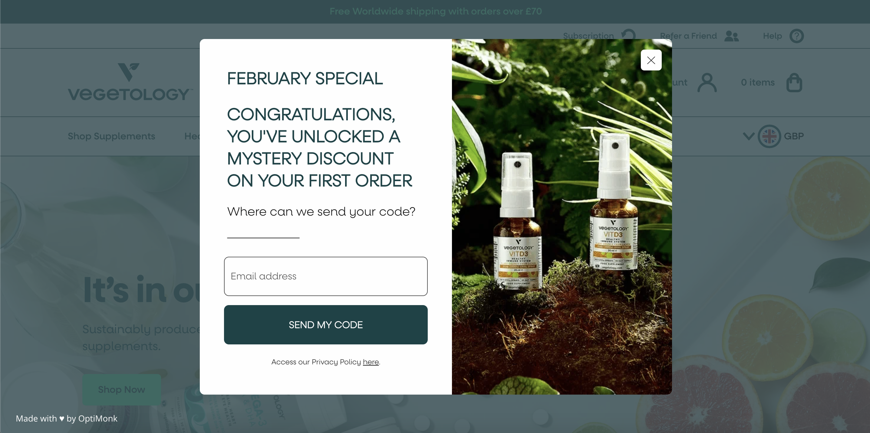
Use discounts and coupons as incentives
Offering discounts can be a great strategy to increase conversions, offload excess inventory, and increase customer loyalty.
A decent discount on the first purchase can lead to more sales down the road:
Or you can offer a post-purchase discount that gives customers a small discount on their next purchase, encouraging repeat purchases.
Read up on the impact of discounts on consumer psychology and check out some great examples of discount strategies here.
8. Lead generation
Jeff Walker, creator of the Product Launch Formula, says having an email list is a “license to print money.”
Pretty bold statement, right?
Despite all the new “get-more-customers” hacks that flood the internet and the “gurus” peddling their latest “become a millionaire in 60 days” programs, good ol’ email still outperforms most channels.
After an analysis of over $1 billion in sales on the Shopify platform, email led the way in conversions at 4.09%, followed by search, direct, and then social media.
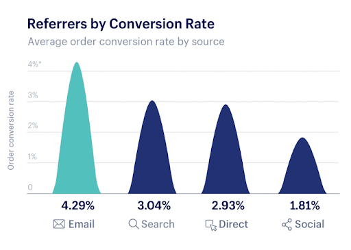
Source: Smartinsights
Email performs well for a few reasons:
- Your list is (ideally) full of people who are interested in your content and/or your products.
- Receiving an email feels more personal than seeing something on social media or a generic ad.
- It’s one of the best places to build trust and create loyal brand advocates (the people who will spread the word about your brand).
Even if you’ve already started building your email list, it’s worth checking out this comprehensive guide that shows you how to build an email list from scratch.
Use popups to build your list
“But popups are annoying!”
Is that what you thought when reading the title?
Fair enough.
There’s nothing like a massive popup with a nearly-invisible exit button taking up 80% of the screen as you’re trying to read something online.
However, the right popup with the right messaging at the right time can work WONDERS for your list building.
For popups to work well, they need the following elements:
- A compelling call-to-action
- A personalized offer
- Eye-catching design
- The right timing
- To be optimized for both desktop and mobile
Here’s a 25-point checklist to help you get started with popups.
Or you can set up one of these list-building popups in just a few minutes:
9. A/B testing
A/B testing (also known as split testing) can be defined as the practice of splitting your audience to test a number of variations of a campaign to see which performs better.
Check out this infographic for the top 6 web elements that you should A/B test.

Source: Convert.com
How long you’ll run your test and when you analyze results ultimately depends on you.
The general rule of thumb is to let tests run for at least 3 weeks to a month before acting upon the results.
Note: The longer you run your test, the more accurate your results may be.
Ask yourself these questions as you look through your results:
- Was the original version better?
- Was the second variation superior?
- Did they both fall short somewhere?
- Where did they both fall short?
- Did they both underperform?
- Were there any outside factors that influenced results (like seasonality)
10. Website personalization
Relevance, relevance, relevance.
That’s the most important factor when it comes to website optimization.
It’s not enough to just have a single one-size-fits-all message on your website. You need your messages to be relevant to your users and for them to feel like they’re being given a custom experience.
Website personalization can help to create a customer journey that’s unique, remarkable, and meaningful on a personal level. It’ll help you boost sales, grow your lists, and win customers for life… all at the same time.
Customization is an essential part of success, whether we’re talking about your landing page headlines, your homepage, or your popups and other overlays.
Here’s how you can create a solid website personalization strategy that will make your brand memorable and lead to higher conversions:
- Analyze your current customer journey.
- Check your data for more insights on your traffic.
- Brainstorm ideas for solutions.
- Prioritize your idea backlog.
- Create the campaigns.
- Run experiments to test different ideas.
- Evaluate results and optimize.
- Go back to step one and repeat!
Click here for a detailed guide on each step of the website personalization process.
Closing thoughts
In this guide, we’ve covered a lot of different techniques that can help you boost your site’s conversion rate.
By understanding your customers, creating engaging content, constantly testing, and keeping an open mind, you’ll be setting your ecommerce store up for success.
With that being said, conversion rate optimization is certainly not an easy process and it will most definitely test your patience. Come back to this guide in those difficult moments.
Remember, real conversion optimization is not about quick tricks and techniques—it’s about truly understanding what’s right for your store and your customers. Good luck!
Want to discover more about conversion rate optimization? This video reveals strategies that can significantly increase your revenue:
Migration has never been easier
We made switching a no-brainer with our free, white-glove onboarding service so you can get started in the blink of an eye.

What should you do next?
Thanks for reading till the end. Here are 4 ways we can help you grow your business:
Boost conversions with proven use cases
Explore our Use Case Library, filled with actionable personalization examples and step-by-step guides to unlock your website's full potential. Check out Use Case Library
Create a free OptiMonk account
Create a free OptiMonk account and easily get started with popups and conversion rate optimization. Get OptiMonk free
Get advice from a CRO expert
Schedule a personalized discovery call with one of our experts to explore how OptiMonk can help you grow your business. Book a demo
Join our weekly newsletter
Real CRO insights & marketing tips. No fluff. Straight to your inbox. Subscribe now
Share this article
Written by

Nikolett Lorincz
Nikolett is the Head of Content at OptiMonk. She is obsessed with content marketing and loves creating educational content for ecommerce store owners. She truly believes in the importance of quality over quantity.
You may also like
- Posted in
- Conversion
Partner with us
- © OptiMonk. All rights reserved!
- Terms of Use
- Privacy Policy
- Cookie Policy
Product updates: January Release 2025


