- Blog
- Product Details Page: An Ultimate Guide for 2025
Product Details Page: An Ultimate Guide for 2025
-
Nikolett Lorincz
- Ecommerce
- 6 min read
Table of Contents
When it comes to creating great product pages for your website, it’s all in the details.
By looking at your product page from a conversion-oriented perspective, you’ll be able to not only analyze each element individually, but also see how they work together to ultimately convert a visitor into a customer.
In this article, we’ll talk about each part of a typical product detail page, check out great examples, and share product page optimization tips that you can use… no matter what you sell.
Let’s get started!
What is a product detail page?
A product detail page (PDP) is a crucial component of an ecommerce website.
It’s a dedicated page that provides comprehensive information about a specific product, allowing potential customers to make informed purchasing decisions.
It typically includes high-quality images and/or a product video, enabling online shoppers to visualize the product from different angles and get a better sense of its appearance and size.
Moreover, a well-designed ecommerce product detail page may include customer reviews, ratings, and testimonials to instill trust.
The primary goal of product pages is to provide all the information that customers need, thereby minimizing uncertainties and addressing any potential concerns.
Why are product detail pages important?
Product detail pages are of paramount importance for any online business for several reasons:
- Product pages are the new homepages: When potential customers click on ads, they often end up directly on product pages instead of going through the homepage. This shift in focus shows how important it is to think of product pages not just as places to learn about a product, but as places to make sales—and first impressions! A product detail page is like the beating heart of shopping online.
- They provide detailed information for website visitors: From technical specifications to dimensions, materials, and usage instructions, product pages offer in-depth details that help potential customers understand the product’s features, benefits, and limitations.
- They help guide purchase decisions and increase conversions: A well-crafted product detail page acts as a virtual salesperson, guiding customers through their purchasing journey. By presenting persuasive content, such as compelling product descriptions, customer reviews, and testimonials, a product page can influence buying decisions and encourage conversions.
- They support your SEO efforts: Each product page can target specific keywords and phrases related to the product, improving its search engine rankings.
- They provide cross-selling and upselling opportunities: A product page is not just about showcasing a single product, it can also present opportunities for cross-selling and upselling.
Key elements of ecommerce product pages
Now that you know why product detail pages are so important, let’s talk about the elements you can use to build a great one. Incorporating these can significantly improve the overall user experience of your product page and boost engagement.
Here are the key elements of a high-converting product page:
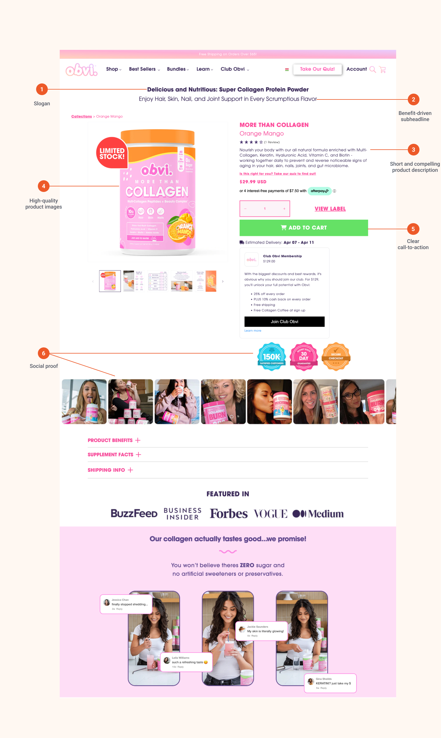
1. Slogan
It’s smart to start with a catchy slogan that tells people what your product is and why it’s special. Make sure it grabs attention and sticks in people’s minds.
2. Benefit-driven subheadline
Follow up with a benefit-driven subheadline that highlights the value proposition and key benefits of your product.
Use words that speak to what your customers want, and include words that people might use when searching for products like yours.
3. Short, compelling product description
A well-crafted product description does some serious heavy lifting: not only does it accurately describe the product, but it does so in a convincing way.
The best product detail pages encourage the consumer to imagine the results of using the product or otherwise envision how their lives could be improved as a result of having it.
Keep your product description short but exciting. Focus on the best things about your product and why people should want it. Make them feel like they need to have it!
If you’re writing a rather lengthy product description for your product detail page, break it up into bite-sized bullet points to make it more visually scannable.
4. High-quality images
A picture is worth a thousand words, and crisp, clear, professional images can truly speak for your product in a way that nothing else can.
Plus, images are often picked up by Google Shopping and other third-party product advertisers, so it pays to have high-quality images taken by a pro.
Use photos that show off your product from different angles and in different situations. This helps people see exactly what they’re getting.
And make sure your pictures load fast so people don’t get impatient waiting for them.
5. Clear call-to-action
Ensure that customers can easily understand what they need to do to purchase your product.
Use big buttons and words that make people want to click. Try different versions to see what works best.
Common calls-to-action might simply implore the user to “order now” or “add to cart,” but they can also throw in persuasive language like “only $x.xx more until free shipping!” or “low stock, only X left!”
6. Social proof
People trust what others say about your product. If other people love it, it makes them more likely to buy it too.
So be sure to show off good reviews, ratings, and testimonials from happy customers. This will go a long way toward alleviating concerns and fostering trust, helping people feel confident about choosing your product.
Other important elements of product pages
Now that we’ve covered the key elements that every high-converting product page has, let’s dive into some additional factors you need for your product detail page.
1. Product name
Obviously, your product name is an important facet of the product detail page.
Not only do you need the name of your product, but it also has to be positioned in such a way that search engines can easily find and rank the product detail page according to the terms that users will search for.
2. Videos
If a picture is worth a thousand words, a video of your product is worth ten thousand.
Like product images, videos can also find their way through the web and can make for a great sales vehicle on their own when used properly.
Videos that demonstrate how a product should be used, how to get started, or even the most common questions about the product can do a lot to ease the consumer’s mind and encourage them to complete their order. Make sure the video is visible on your product page along with the product images.
Like product images and other product information, search engines (particularly Google) can also show your videos in their search results. Since Google owns YouTube, it should come as no surprise that if a video is a relevant part of your product catalog, you’ll want to upload it to YouTube, too.
Not only does this give you an opportunity to showcase your ecommerce website in search results, but it may also help your video show up when users search for product variations or other product features.
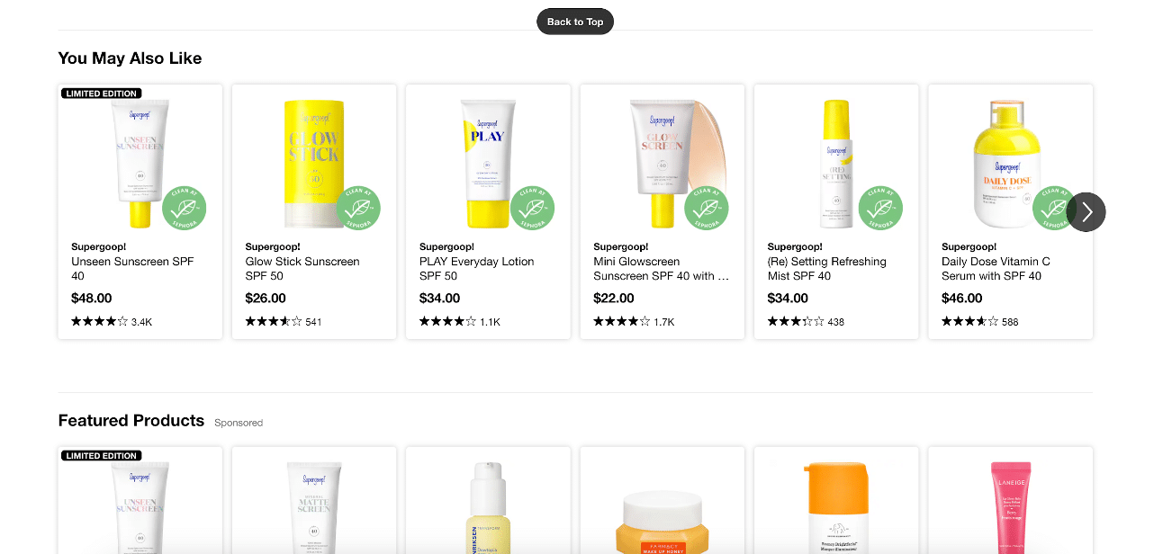
3. Product recommendations
A great way to highlight product variations or complementary product categories is through recommendations.
This is commonly shown on a product display page as “People who bought X also bought Y.” This can be a great way to boost average order value on your online store, too.
This method was originally popularized by Amazon, but is often found on all types of product detail pages (see the example below from Sephora).
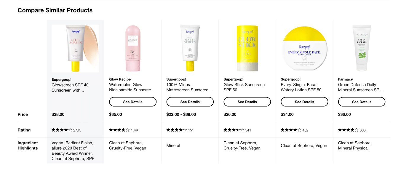
4. Comparisons
Being able to do an apples-to-apples comparison of your product against a competitor (or even against another of your products, if you’re trying to sell an improved or more expensive version) can give users all of the information they need in a visually digestible way, enabling them to make a decision with confidence.
Here’s an example from Sephora that compares similar products for potential customers:
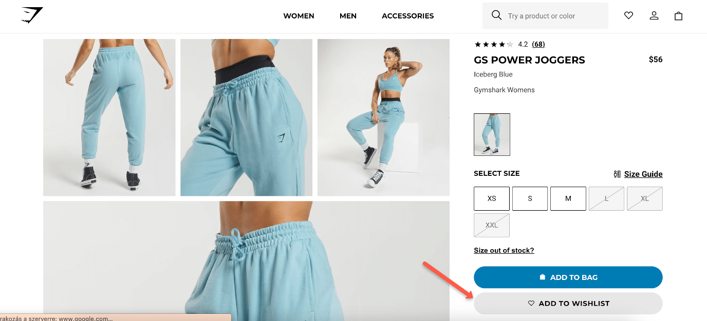
5. Add to wish list option
Giving users the choice between adding an item to their cart or to a wishlist will help them stay organized.
It’s also a great way to get a “foot in the door” and email them about that item in the future, perhaps if the price has changed or if inventory is getting low.
The legal elements of product pages
The parts of the page that inform shoppers about your terms are often overlooked but can nevertheless serve to help convert uncertain customers or those who are looking for some kind of safety net when buying from you for the first time.
They’re also legally necessary to include when selling online.
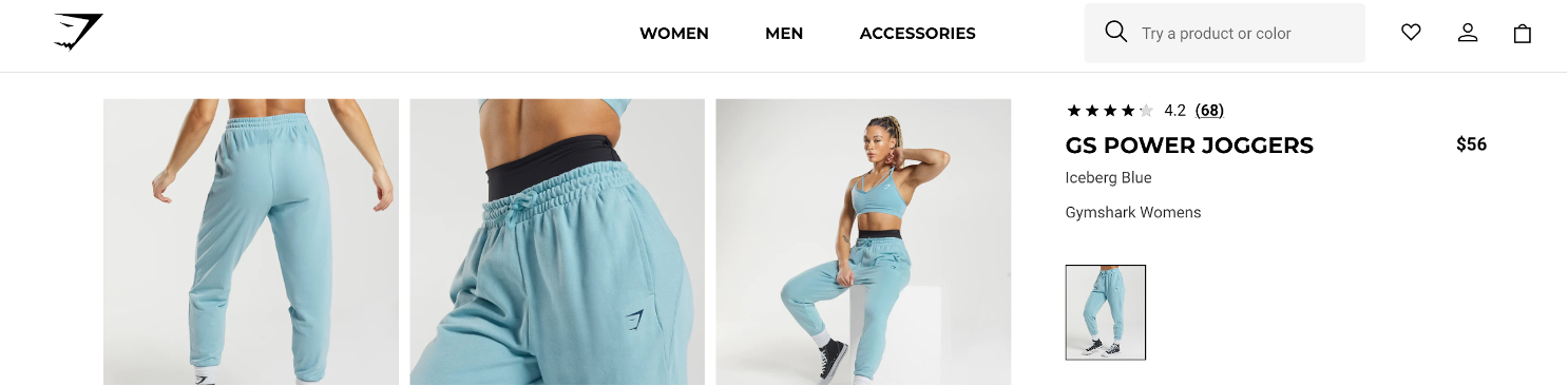
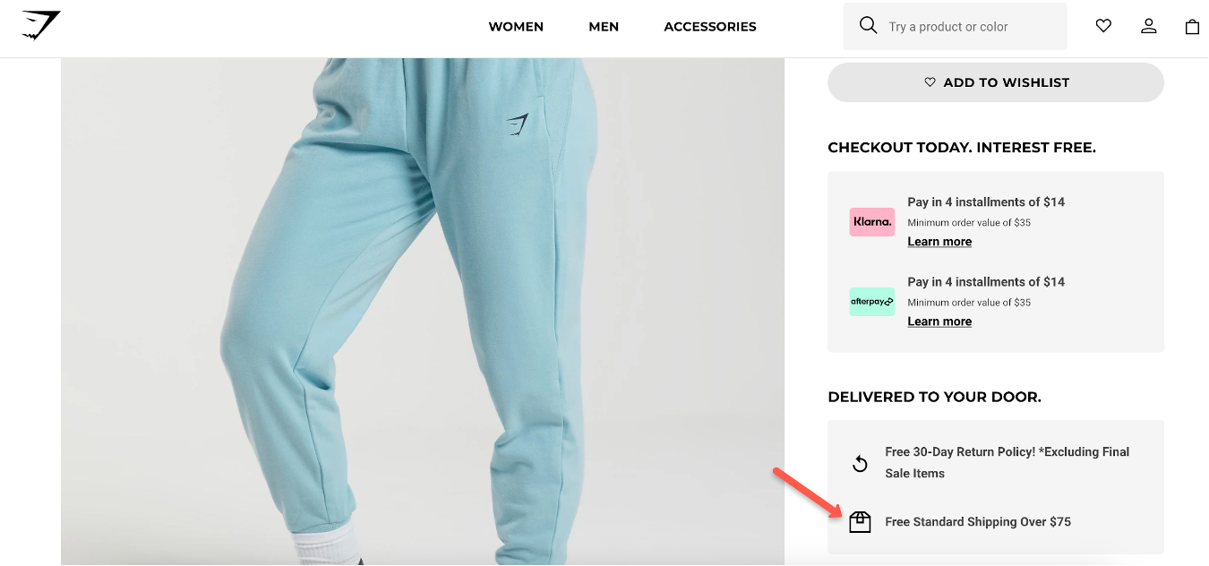
1. Shipping
Free shipping is one of the biggest conversion boosters available. If you can provide it (even if only over a certain amount), it almost always guarantees more sales.
Don’t forget to notify users to let them know when they’re getting close to qualifying for free shipping. You’ll be surprised how much order value goes up in your online stores as a result!
You can highlight shipping information on your product page just like Gymshark does:
Or you can use a sticky bar that appears on all product pages:
2. Guarantee
Another great option to include is a satisfaction or money-back guarantee. Some studies have shown that the longer the time frame, the more credibility it lends to the product and its quality.
3. Chargeback
What is your chargeback policy?
Customers need to know the process in the event that they dispute a transaction with your store.
Plus, this policy often needs to be in place in order to accept certain credit card transactions online.
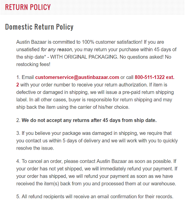
4. Return policy
Return policies are another big concern for many customers. If an item doesn’t fit, arrives broken, or simply needs to be returned, how does your store handle it?
Here’s an example of a return policy from Austin Bazaar, which clearly states timeframes and processes for returns. It also includes contact information that’s visible at a glance:
5. Price
Price is a major factor when it comes to conversions, but it’s not the only one. If an item is of high enough perceived value, made by a well-known brand, or otherwise has a history of quality and practicality, users won’t mind paying a higher price.
How to improve product detail page conversion rates
Have you built the perfect product detail page including all the essential elements, but your conversion rates are still low?
A/B testing is a powerful technique that can help significantly improve conversion rates.
By comparing two different headlines, descriptions, or other elements on your PDP and measuring their performance, you can identify and implement changes that resonate better with your audience.
Here are some steps to effectively utilize A/B testing for improving product page conversion rates:
- Define clear goals: Start by identifying the specific conversion goals you want to focus on, such as increasing add-to-cart rates, boosting click-through rates, or improving overall purchase conversions.
- Select test variables: Determine the key elements on your product page that you want to test. These could include the layout, design elements, call-to-action buttons, product images, product descriptions, or even the placement and visibility of customer reviews. Focus on one variable at a time so you can clearly interpret the results.
- Create variations: Develop alternative versions of your product page by modifying the selected variable. For example, you might create a variation with a different button color, an alternative placement of product images, or a revised product description. You can use OptiMonk to easily A/B test landing page variations against each other. Learn more about OptiMonk’s A/B testing feature here.
- Measure and analyze: Analyze the results to determine which version performed better in achieving your conversion goals.
- Keep it going: A/B testing is an iterative process. Once you’ve implemented successful changes, continue testing other variables or further optimize the winning elements to refine your PDP and continue increasing conversions.
With a systematic approach, A/B testing can become a valuable tool in your ecommerce strategy arsenal for maximizing the performance of your product detail pages and increasing your conversion rate.
5 examples of product detail pages that got it right
There are lots of examples of ecommerce product pages that do a great job of walking the user through all of the benefits and features of a product.
From bullet points to social proof, product descriptions to product images and everything in between, these product detail page designs are worth learning from:
1. Muscle Feast
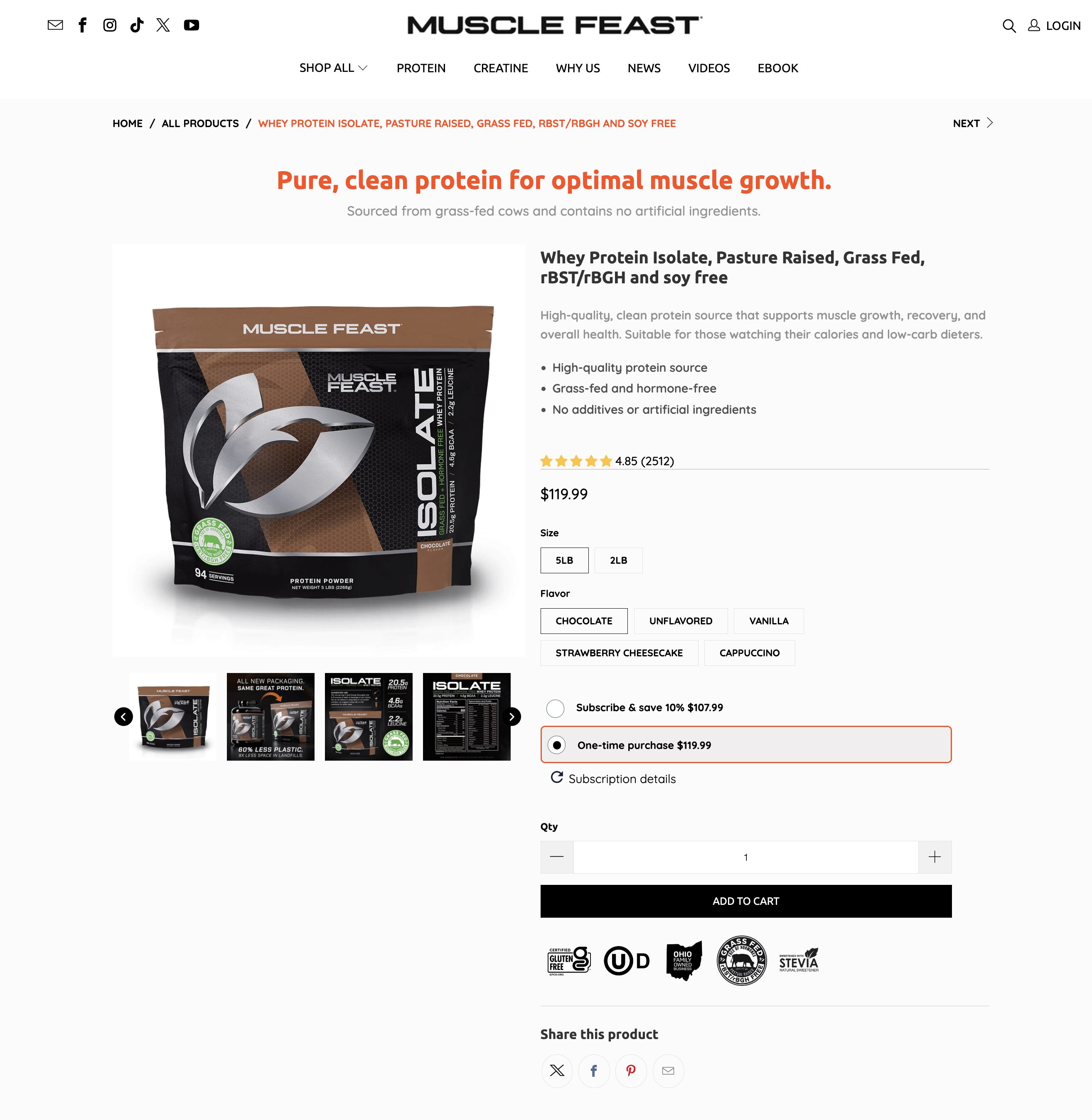
Muscle Feast‘s product page has a strong slogan and a catchy subheadline that tells you why their product is awesome right at the top.
On the left side, you’ll see product page images showing off their whey protein and its benefits. On the right side, you’ll find the name of the product, a detailed description, and a list of benefits.
Under the “Add to Cart” button, there are more benefits and badges.
2. K18 Hair
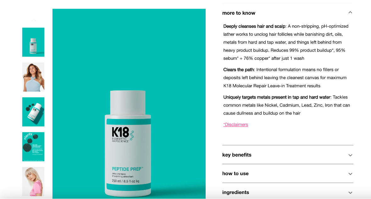
K18’s product page provides clear, concise information about the product, highlighting its key features and benefits.
A section that gets into the science behind the product, a full ingredient list, and a strong FAQ section all help instill confidence in potential buyers.
3. Caraway
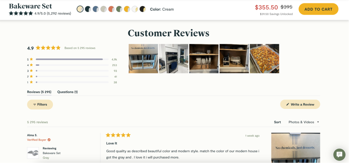
Caraway’s product detail page features high-quality images that showcase the set’s sleek design and versatile functionality, creating a strong visual appeal.
Furthermore, the inclusion of customer reviews and testimonials adds credibility and helps build trust.
4. Hannah & Henry

Hannah & Henry’s product detail page is neat and bright, and it has all the important parts we talked about earlier.
Right at the top, they have a positive customer review. This makes people feel good about buying from them and helps them trust the site.
Below the bag’s name, they have a short, clear description that tells you what makes it special without overwhelming readers.
They also have great pictures of the bags from different angles, so you can see exactly what they look like.
5. Kylie Cosmetics
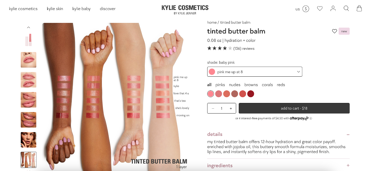
Kylie Cosmetics’ product detail page offers a visually appealing layout with high-quality images showcasing the product’s packaging and swatches of various shades.
Detailed descriptions of the formulation, benefits, and application instructions provide customers with a comprehensive understanding of the product.
Recommended reading: 13 of the Best Product Page Examples We’ve Seen
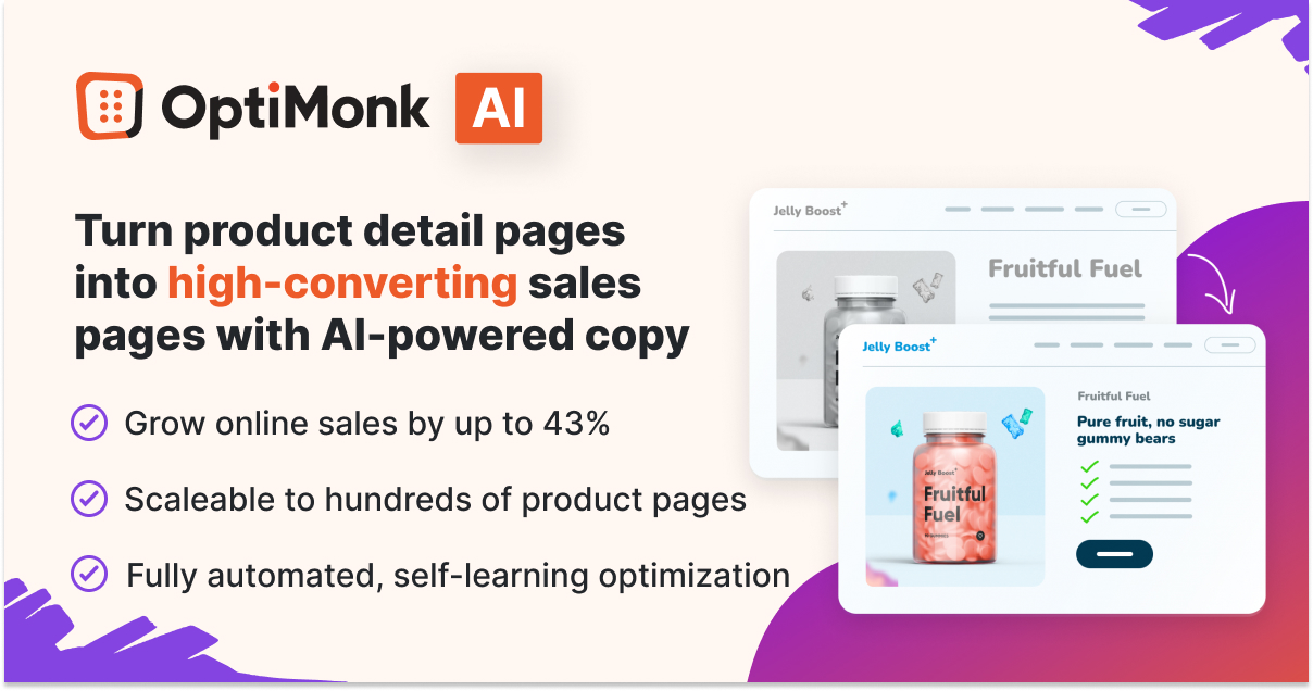
Product page optimization with AI
Product page optimization isn’t easy, even if you know what to include in your product pages. If you have hundreds or thousands of product pages, it can turn into an enormous job.
But guess what? There’s a solution that can help you get it done super fast and more easily than you ever thought possible.
It’s called the Smart Product Page Optimizer, and it’s changing the game for many ecommerce stores around the world.
Whether you have just a few products or thousands, this tool can make them better in record time.
It automatically writes headlines, descriptions, and benefits lists, then runs A/B tests so you can try different versions and see what people like best.
Want to see how the Smart Product Page Optimizer can help you sell more online? Check it out here.
Wrapping up
It can seem overwhelming to look at your product detail pages and think, “I have to change all of that?!”
But depending on how you approach it, you can see a return on investment almost immediately. Compelling product descriptions, vivid photos, beautiful videos, social proof, and reviews can all help you close more sales—even if there are several companies selling the same product.
The good news is that with the right analytics, you’ll be able to see precisely what effect these changes can have on your bottom line, giving you the motivation you need to roll out compelling product detail pages across your site. Your users (and your profits) will thank you!
Migration has never been easier
We made switching a no-brainer with our free, white-glove onboarding service so you can get started in the blink of an eye.

What should you do next?
Thanks for reading till the end. Here are 4 ways we can help you grow your business:
Boost conversions with proven use cases
Explore our Use Case Library, filled with actionable personalization examples and step-by-step guides to unlock your website's full potential. Check out Use Case Library
Create a free OptiMonk account
Create a free OptiMonk account and easily get started with popups and conversion rate optimization. Get OptiMonk free
Get advice from a CRO expert
Schedule a personalized discovery call with one of our experts to explore how OptiMonk can help you grow your business. Book a demo
Join our weekly newsletter
Real CRO insights & marketing tips. No fluff. Straight to your inbox. Subscribe now
Share this article
Written by

Nikolett Lorincz
Nikolett is the Head of Content at OptiMonk. She is obsessed with content marketing and loves creating educational content for ecommerce store owners. She truly believes in the importance of quality over quantity.
You may also like
- Posted in
- Ecommerce
Partner with us
- © OptiMonk. All rights reserved!
- Terms of Use
- Privacy Policy
- Cookie Policy
Product updates: January Release 2025


