- Blog
- Website A/B Testing: A Comprehensive Guide on What Elements to Test
Website A/B Testing: A Comprehensive Guide on What Elements to Test
-
Nikolett Lorincz
- Conversion
- 6 min read
Table of Contents
You’ve likely heard that A/B testing can boost your website’s performance, but knowing where to start can feel overwhelming, especially when every element seems worth testing.
A/B testing can be a crucial part of optimizing a marketing campaign by providing insights into audience behavior and identifying which changes yield the best results for conversions and traffic acquisition.
But if you’re new to A/B testing, you might wonder, “What should I test first?” The key is to prioritize. Testing too many elements at once can muddle your results and leave you with more questions than answers.
Even with advanced A/B testing tools that offer statistically significant insights, choosing the right elements to focus on is crucial.
In this article, we’ll explore the top 6 elements on your website that are prime candidates for A/B testing. Master these, and you’ll be well on your way to optimizing your website for better engagement and higher sales.
Let’s get started!
What is website AB testing?
Before diving into the specifics, let’s quickly cover what A/B testing is.
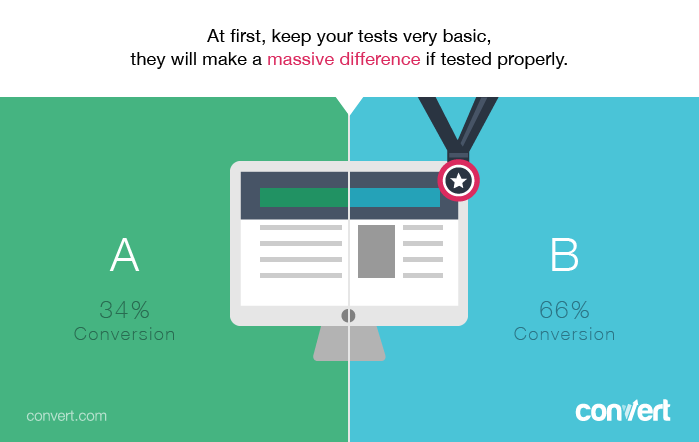
At its core, A/B testing (or split testing) is a method used to compare two versions of a webpage or an element on a page to determine which performs better.
It’s a staple in conversion rate optimization (CRO), helping marketers create the best possible user experience.
But A/B testing isn’t just about tweaking one element, it’s part of a larger strategy that includes understanding your audience, setting goals, and continuously optimizing based on data.
The basics before you start A/B testing
Before you begin A/B testing, it’s essential to gather data on your current website performance and audience behavior.
Use tools like Google Analytics and Hotjar to analyze visitor behavior data and understand your conversion rates on key pages, such as landing pages and homepages, and among different customer segments.
This data, including insights from heatmaps and session recordings, will help you identify which pages and elements need testing and which hypotheses to explore.
Once you have this foundational understanding, you can choose the right key performance indicators (KPIs) to track, such as time on site, click-through rate (CTR), or conversion rate. These metrics will guide your A/B tests, helping you make informed decisions and develop a strong test hypothesis.
What elements to A/B test?
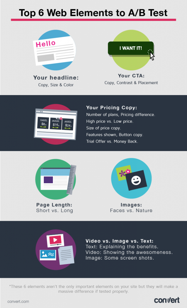
Now that you know the basics, let’s take a look at the top 6 elements you should A/B test on your website and check out some testing strategies for each of these elements.
1. Your headline
Why is it important?
Headlines on ecommerce websites need to instantly grab your website visitor’s attention and effectively explain how your products or services can benefit them. An ineffective headline can hinder your marketing efforts, so it’s essential to make data-backed decisions about the most effective headline for your site.
Your headline is your first (and often last) chance to connect with your target audience. The question you’re trying to ask during an A/B test is, “Which headline resonates most?”
What should you test?
The most important test will be the actual copy you use as your headline. We’d recommend brainstorming 15-20 different versions of, for instance, a landing page headline and then picking your three favorites to split test.
You can also include the following variations in your testing program:
- Text size: large headlines vs. medium size vs. small
- Color: visibility of your headline compared to the background

2. Your CTA (call-to-action)
Why is it important?
Calls-to-action help move your website visitors from one stage of the customer journey to the next.
Since your call-to-action is arguably the second most important part of your sales pages, it’s essential to test all elements related to it.
What should you test?
There are never-ending tips and tricks for A/B testing calls-to-action. The most important aspects of a CTA that you’ll want to test are:
- The copy used on the button and any related sub-text
- The color contrast of the background section, text, and button from the rest of the site
- Placement of the call-to-action (left, right, above the fold, at the end of the page, in the center, etc.)
Start with testing the copy and then move on to testing the color, button size, placement and so on.
3. Your pricing copy
Why is it important?
How you price your products and/or services (and how you frame that pricing) is a crucial component of your success in ecommerce.
There are many different ideas about how to price your offerings from different marketing strategies. As a very simple example, you could ask yourself, “Are we trying to create a sense of luxury or compete on price?”
But remember, it’s impossible to tell what’s going to lead the most customers to your checkout page if you don’t collect data on it!
Until you start A/B testing, you’re just following best practices without knowing for sure what will work best on your site.
What should you test?
Just like testing ad copy, you should try out different versions of your pricing in order to see what leads to the most desirable user behavior.
Here are some split tests you can perform to find out how to achieve positive results on your product pages:
- Higher prices vs. lower prices
- Trial offers vs. money back guarantees
- Limited subscription plans vs. many subscription plans
- Highlighting only the most crucial features/benefits vs. showing an exhaustive list
You can also A/B test the visual aspects of your pricing information, such as the size font you use to display the price, the color, and the copy on the “Buy” button.

4. Long vs. short page length
Why is it important?
If you’ve been reading marketing blogs for a while, you’ll have noticed that there are mixed opinions about short vs. long-form copy.
The truth is that long, scroll-happy sales pages work well for some audiences, but others will prefer a simple page like Dropbox’s, which just features a video and a download button.
Using A/B testing software to gauge visitor behavior on different versions of an entire page can be useful for figuring out how your audience responds to different styles of content.
What should you test?
Here, you should use multi-page testing to see which type of page your audience prefers. Create a few different versions of an existing page:
- one that contains every bit of convincing copy you and your team can muster;
- one that’s shorter but still contains important elements like testimonials, customer logos, pricing, and benefits; and
- one that’s very short and contains just enough information about the product to grab interest and deliver your call-to-action.
You may also want to test multiple variations of each page type, switching the order of elements or logos for testimonials.
Since you’re driving traffic to multiple pages, it can take a little bit longer to gather enough data to achieve statistical significance and accurate results. Make sure the test concludes after you’ve collected enough visitor data, not before.
5. Video vs. image vs. text
Why is it important?
Marketers have had mixed results in testing whether video is more effective than no video at all. Some argue that it’s a distraction, while others say it helps get the point across faster. And then there are some who say nothing outperforms text, while others say that a picture is worth a thousand words.
Once again, an A/B testing program is the ideal way to figure out for sure what approach works best for a particular page on your website.
What should you test?
Test pages that use each of the approaches below to see how much traffic proceeds to the next stage of the customer journey:
- Basic text: Explain the benefits of your product and why your prospect should sign up
- Video: Showcase the awesomeness of your product in an engaging way
- Image: Use high-quality images to show off your products
6. Images
Why is it important?
The images on your webpage are often the first thing a visitor’s eyes gravitate toward. That’s why you want to be strategic when choosing images, which means answering questions like:
- Should you use stock photos or invest in professional photos?
- Should your product photos show people using your product or just the product itself floating on a white background?
- Should you avoid using any photos at all and instead rely on your brand colors and/or illustrations?
What should you test?
A/B test variations of the same page with different types of images to see what your target audience prefers.
How to perform an A/B test
Now that you know what elements to include in an A/B test, it’s time to learn how to perform one. By following a systematic approach, you can ensure that your future tests are both effective and reliable.
Here’s a step-by-step guide to help you get started.
Step 1: Identify your goal
Before you begin split testing, it’s crucial to know what you want to achieve.
Are you trying to increase your website’s conversion rate, reduce bounce rates, or improve user engagement? Defining a clear goal will help you focus your test and measure its success accurately.
Example: If your goal is to increase newsletter sign-ups, your A/B test might focus on different CTA button texts, colors, or placements.
Step 2: Choose the element to test
Next, decide which element on your website you want to A/B test. This could be anything from headlines and CTAs to images and pricing strategies.
Remember, testing one element at a time gives you clear insights into what’s driving the changes in user behavior.
Example: If your goal is to boost conversions on a landing page, you might choose to test the headline first, as it’s the first thing visitors see.
Step 3: Develop hypotheses
Create hypotheses based on your goals and the element you’ve chosen to test. A hypothesis is an educated guess about how changing a specific element will affect user behavior.
Example: “If we change the headline to focus on benefits rather than features, we’ll see a higher conversion rate because it aligns better with our audience’s needs.”
Step 4: Create variations
Now, it’s time to create the different variations of the element you’re testing. The original version is called the “control,” and the new version(s) are called “variants.”
Example: For a headline test, your control might be “Sign up for our newsletter,” and your variant could be “Get exclusive deals straight to your inbox.”
Step 5: Set up the A/B test
Using an A/B testing tool, set up your test by specifying the control and variant versions, and deciding how website traffic will be split between them. Most tools allow you to divide traffic evenly (50/50), but you can also customize the split depending on your needs.
Example: If you’re using OptiMonk, you can create an experiment where 50% of website visitors see the original headline and 50% see the new one.
Step 6: Run the test
Once your A/B test is set up, it’s time to run it.
Make sure the test runs for an adequate period to gather enough data—typically, this could be anywhere from a few days to a few weeks, depending on your traffic volume.
This duration is crucial to achieve statistically significant results, as it allows you to gather enough information to make confident decisions. Avoid ending the test too early, as this can result in inaccurate conclusions and unreliable data.
Example: If your site gets 1,000 visitors per day, running the test for at least a week ensures you get a meaningful sample size.
Step 7: Analyze the test results
After the A/B test has run its course, it’s time to analyze the data. Most A/B testing tools will provide you with detailed reports, showing how each variant performed in comparison to the control. Look for statistically significant differences in key metrics like conversion rate, bounce rate, or click-through rate.
Example: If the new headline variant led to a 20% increase in conversions compared to the control, you’ve likely found a winner.
Step 8: Implement the winning variation
If your test reveals a clear winner, implement the successful variation on your site. If the results are inconclusive, consider running another test with different variations or testing a different element altogether.
Example: If the variant with the benefit-focused headline outperformed the control, replace the old headline with the new one on your landing page.
Step 9: Iterate and optimize
A/B testing is an ongoing process. Once you’ve made changes based on your test results, keep the momentum going by testing other elements. Continuous testing and optimization help you stay ahead of trends and ensure your website is always performing at its best.
Example: After successfully improving your headline, move on to testing your CTA button or experimenting with different images on the page.
An easier way to run A/B tests
Running A/B tests manually can be a laborious, time-consuming task. It involves brainstorming new ideas, setting up tests, ongoing monitoring, data collection, and subsequent analysis.
Handling multiple tests at the same time can become overwhelming, and as your business expands, scaling up your testing efforts can become nearly impossible.
However, there’s a silver lining: thanks to the new advancement of AI, you can bid farewell to these labor-intensive tasks and automate 99% of the process!
With OptiMonk’s Smart A/B Testing tool, you can effortlessly conduct multiple A/B tests simultaneously on various elements of your webpage. The beauty of it all is that you retain control over which tests to run, and our AI seamlessly manages the execution process.
Interested in fully automated, AI-powered A/B testing? Schedule a personalized discovery call with one of our experts.
FAQ
What is the difference between A/B testing and multivariate testing?
A/B testing and multivariate testing are both methods used to optimize digital content, but they differ in their approach:
- A/B testing: In A/B testing, two versions of a webpage or element (A and B) are compared, and only one element is changed at a time. It’s ideal for testing small, binary changes like button colors or headlines. A/B testing is simpler to set up and analyze.
- Multivariate testing: Multivariate testing involves testing multiple variations of different elements simultaneously on a single webpage. It’s suitable for complex optimizations where you want to understand how various elements interact, such as changing headlines, images, and button placement. Multivariate testing is more complex to set up and analyze than A/B testing.
In summary, A/B testing is for simpler, binary changes, while multivariate testing is for more complex, simultaneous changes involving multiple elements.
Is it worth running multiple A/B tests on the same web page?
Running multiple A/B tests on the same web page can be valuable if you have different hypotheses or if you’re optimizing various elements of the page.
However, if you want to generate accurate results and achieve statistically significant results, you need to keep your sample size in mind. If you only have a small sample size, you won’t be able to generate reliable data—no matter how much A/B testing you conduct.
What is statistical significance and why is it important?
Statistical significance is a measure that helps you determine whether the results of your A/B test are likely due to the changes you made rather than random chance. Achieving statistical significance means you can be confident that the changes you observed are real and repeatable, rather than just a fluke. This is crucial for making data-driven decisions that truly improve your website’s performance.
Wrapping up
The number of elements you can test on your website is virtually endless, even on a single landing page. However, it’s essential to ensure that your A/B testing process allows you to properly analyze the results and make informed changes.
Start by nailing down the basics, such as choosing the right elements to test and developing clear hypotheses.
Once you’ve mastered these foundational steps, you can devise a strategic plan for future tests that will continue to optimize your site and boost your conversion rates.
Remember, running tests on one set of element variations at a time is often more effective than conducting a large, complex multivariate test. This focused approach not only ensures more reliable and statistically significant results but also gives you the confidence that any improvements are directly tied to the specific changes you made.
By A/B testing thoughtfully and systematically, you’ll continuously refine your website for maximum impact.
Migration has never been easier
We made switching a no-brainer with our free, white-glove onboarding service so you can get started in the blink of an eye.

What should you do next?
Thanks for reading till the end. Here are 4 ways we can help you grow your business:
Boost conversions with proven use cases
Explore our Use Case Library, filled with actionable personalization examples and step-by-step guides to unlock your website's full potential. Check out Use Case Library
Create a free OptiMonk account
Create a free OptiMonk account and easily get started with popups and conversion rate optimization. Get OptiMonk free
Get advice from a CRO expert
Schedule a personalized discovery call with one of our experts to explore how OptiMonk can help you grow your business. Book a demo
Join our weekly newsletter
Real CRO insights & marketing tips. No fluff. Straight to your inbox. Subscribe now
Nikolett Lorincz
- Posted in
- Conversion
Partner with us
- © OptiMonk. All rights reserved!
- Terms of Use
- Privacy Policy
- Cookie Policy
Product updates: January Release 2025


