- Blog
- What are the Best Call-to-Action Button Colors?
What are the Best Call-to-Action Button Colors?
-
Barbara Bartucz
- Conversion
- 6 min read
Table of Contents
Ever feel like you’ve poured your heart into your website, but the clicks just aren’t there?
You might be surprised to learn that something as simple as color can make a big difference.
Take the iconic red McDonalds logo, for example. Red is known to stimulate appetite—a smart choice for a fast-food chain, right?
Just like color can influence buying decisions in the real world, it can also impact user behavior online.
This article will investigate the psychology behind call-to-action (CTA) button colors and how to choose the best shade to boost your website’s conversions.
Let’s dive in!
What are CTA buttons?
To put it simply, a call-to-action (CTA) button is the hero of your website. It’s a digital counterpart to that charismatic salesperson who compels you to take action. It’s a clickable element, often a button or banner that prompts visitors to complete a desired action.
This action could be anything from “Buy Now” in an ecommerce store to “Subscribe to Our Newsletter” on a welcome popup.
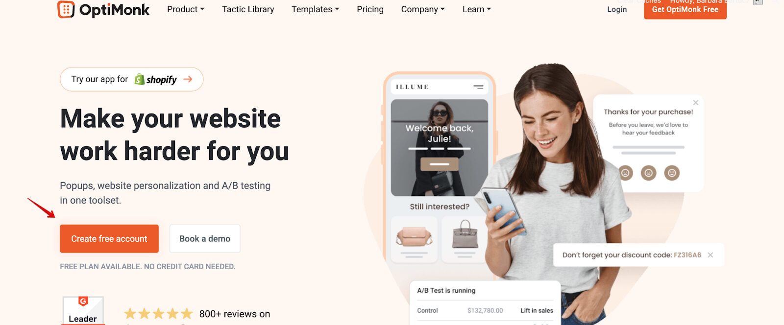
Here’s an example from OptiMonk’s home page, where you can see our orange CTA button, which says “Create free account.”
The psychology of color
If you drive, you’re probably aware of how a stop sign can catch your attention with its bold, vibrant red. On the contrary, shades of ocean blue can actually calm your nerves.
Colors are more than just visual decorations; they’re powerful tools that influence our emotions and behaviors in profound ways.
This influence extends to your website, where the right call-to-action colors can be the spark that ignites conversions…if you understand color theory well.
Here’s an example for you: imagine a small, light blue button on a crisp white background.
It might create a sense of calm and cleanliness, but it also risks blending in, failing to grab attention and encourage action.
Here’s where color psychology comes in.
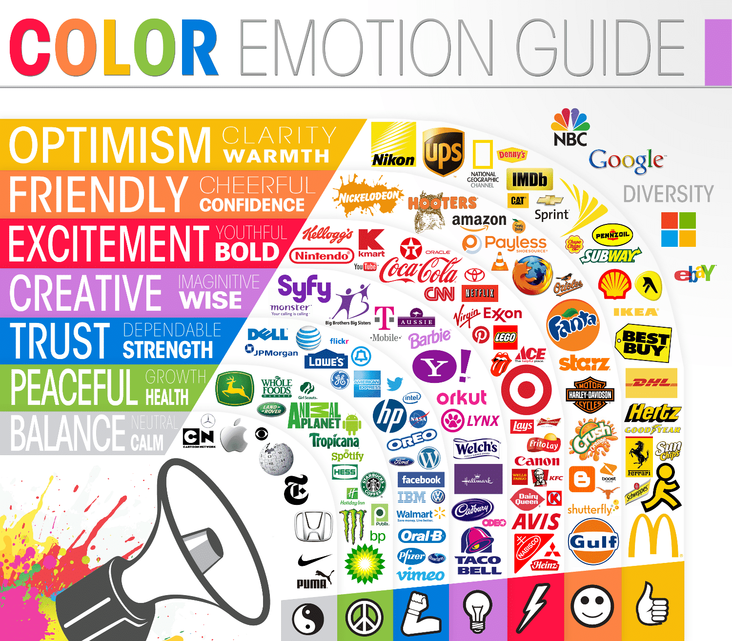
Check out the infographic below to learn more about color psychology.
Does the color of call-to-action buttons matter?
It sure does, and you shouldn’t underestimate the power of color choices. At first glance, it might seem like a tiny detail, but it has a huge effect.
Studies in color psychology reveal a fascinating truth: people make subconscious judgments about a product within 90 seconds of initial viewing, and up to 90% of that assessment can be based solely on color.
This means that different colors on the CTA button might mean the difference between a user clicking through or bouncing away from your website.
And this leads us to one conclusion: make your CTA button stand out! A well-chosen contrasting color ensures your button will pop off the landing page, grabbing attention, driving clicks, and increasing conversion rates.
Popular CTA button colors and their effects
Ready to crack the color code? We’ll explore the psychology behind different CTA colors and how big brands use them to their advantage.
1. Red
Remember that bold red we mentioned earlier? It’s a powerhouse for grabbing immediate attention.
Red, as a dominant color, is often associated with urgency and excitement. A red CTA button can trigger a compulsion to “act now.” Therefore, the color red is a perfect choice for CTAs that encourage quick decisions, like “Buy Now” or “Sign Up Today.”
Psychological impact: Red grabs attention and communicates urgency and excitement.
Why it works:
- Urgency: The intensity of the red button creates a sense that time is running out, prompting users to take action before the opportunity disappears.
- Excitement: Red can evoke a feeling of excitement, making the user feel anxious to take action.
- Attention-grabbing: Red naturally stands out from the background, providing more contrast and ensuring your CTA button gets noticed.
Examples of successful use:
Amazon frequently uses red for its limited-time deals. This strategic use of color creates a sense of urgency so consumers react and take immediate action before the deal expires.

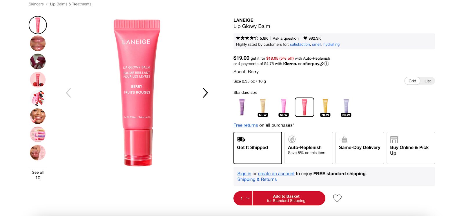
Sephora also uses red buttons on their website. Check out the red “Add to Basket” call-to-action button on its product pages.
Bonus tip: While red is a powerful and bright color, consider using it sparingly. Its intensity can be overwhelming for some audiences.
2. Green
Green isn’t just for leprechauns, it’s a color brimming with positive associations! Evoking feelings of growth, tranquility, and safety, the color green creates a sense of reassurance and encourages positive action.
Psychological impact: Green creates feelings of growth, calmness, and positive action.
Why it works:
- Growth: Green reminds us of the natural world, symbolizing progress and a positive step forward. This makes it ideal for CTAs promoting personal growth, health initiatives, or financial actions, like “Start Free Trial” or “Get Started.”
- Calmness: Green’s calming nature creates a sense of trust and reduces anxiety. This can be crucial for CTAs related to financial decisions or starting new journeys.
- Positive action: The positive associations embedded in the color green subconsciously nudge users towards taking a desired action.
Examples of successful use:
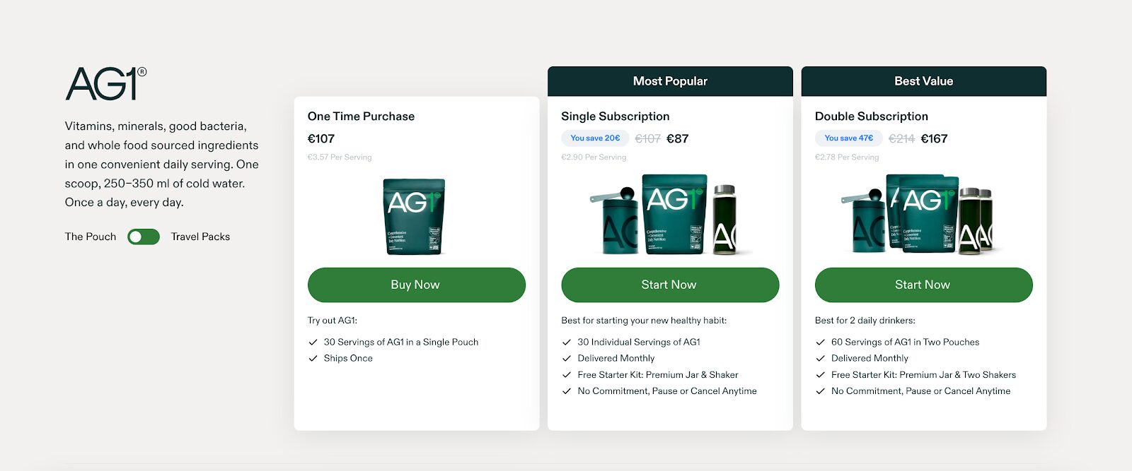
AG1’s green “Start Now” button fosters a positive and welcoming feeling, encouraging a purchase without a sense of urgency or pressure.
Waterdrop uses green CTA buttons to make users feel comfortable taking the next step.

3. Blue
Beyond its calming presence on a sunny beach day, blue offers a treasure trove of benefits for your CTAs. This color is renowned for its calming, trustworthy qualities, making it a good choice for CTAs that require a leap of faith from users.
Psychological impact: Blue exudes a sense of trust, reliability, and calmness.
Why it works:
- Trust: Blue buttons naturally feel trustworthy. They give us the sense that our information and decisions are safe. This is why blue buttons are great for calls-to-action like “Learn More” or “Subscribe,” where users might be a little unsure at first.
- Calmness: Blue’s calming nature reduces anxiety and fosters a sense of peace, making it easier for users to navigate the decision-making process behind a CTA.
- Reliability: Blue signifies stability and dependability, reassuring users that they’re making a safe choice by clicking your CTA.
Examples of successful use:
K18’s “Buy with Prime” button in blue isn’t just an aesthetic choice. It strategically uses the trust associated with blue, ensuring users feel safe and confident when making a transaction on their platform.
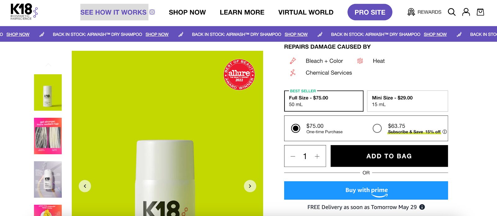
Remember: When your CTA requires users to take a leap of faith, consider the color blue to bridge the gap and encourage action.
4. Orange
Orange isn’t just for traffic cones! It’s a warm and inviting color that exudes enthusiasm and confidence, making it a great choice for CTAs that aim to break the ice and encourage action.
Psychological impact: Orange radiates with enthusiasm, confidence, and friendliness.
Why it works:
- Enthusiasm: Orange’s vibrant nature injects a dose of excitement, making users feel motivated to take the next step. Big orange buttons are ideal for CTAs promoting new experiences or encouraging users to “Get Started” or “Join Us.”
- Confidence: The confidence associated with orange subconsciously communicates that clicking your CTA is the right choice.
- Friendliness: The warmth of orange creates a welcoming atmosphere, making users feel comfortable and less hesitant to engage with your CTA.
Examples of successful use:
The Farmer’s Dog’s “Start Today” call-to-action button in orange isn’t just visually striking. It strategically uses the friendliness of orange, creating a warm and inviting atmosphere that encourages users to take the first step towards a new pet food experience.

Even retail giant Amazon understands the power of orange. They use orange for their “Buy Now” buttons, encouraging action in a confident yet friendly manner.
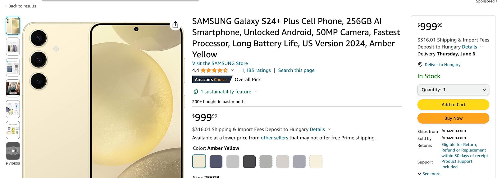
5. Yellow
Bright, cheerful yellow is associated with optimism and warmth, making it a great choice for CTAs when you want to highlight key actions without overwhelming the user.
Psychological impact: Yellow exudes optimism, warmth, and sometimes caution.
Why it works:
- Optimism: Yellow’s bright, uplifting nature evokes feelings of happiness and joy. This optimistic tone can make users more willing to engage with your CTA in the hopes that they’ll see a beneficial outcome.
- Warmth: The warm, friendly qualities of yellow reduce hesitation and help users feel at ease about interacting with your CTA and your company.
- Caution: Yellow’s association with caution can work to your advantage, as people naturally pay attention to things like yellow road signs. This heightened awareness can make users consider your CTA carefully rather than scroll right past.
Examples of successful use:
Best Buy understands the power of a well-placed yellow button. They strategically use yellow to highlight important actions while maintaining a friendly tone, ensuring users feel comfortable taking the next step.
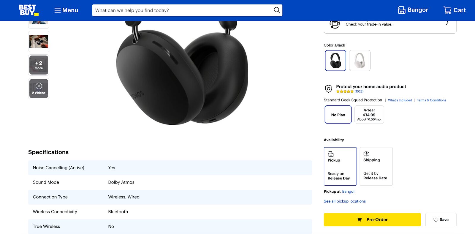
How to choose the best color for your CTA buttons?
You’ve seen some great examples of how big brands are doing it, but you might still feel unsure about how to choose when it comes to your own business…
Here’s a roadmap of things to consider as you choose your own CTA button color!
1. Industry-specific preferences and trends
Did you know different industries have their own color languages?
Tech companies often rely on the trust and reliability conveyed by blue CTA buttons. Meanwhile, health and wellness brands might favor calming green buttons on their web pages to promote growth and tranquility.
Research your industry’s trends to see which CTA color schemes reign supreme and how they perform.
2. Audience demographics and cultural considerations
Understanding the power of color psychology in CTAs starts with understanding your target market.
Consider demographics like age, gender, and cultural background. Younger audiences might gravitate towards vibrant, bold colors, while older users might prefer more subdued tones and minimalistic sophistication.
Remember, color associations can vary across different cultures: red might symbolize luck in some but danger in others.
Tailor your CTA button colors to resonate with your audience’s preferences and cultural context.
3. Brand identity and consistency
Your CTA buttons shouldn’t exist in a color vacuum! They should seamlessly integrate with your overall brand identity.
Consistent color usage reinforces your brand and creates a cohesive user experience. If your brand’s primary color is blue, consider using a complementary or contrasting color for your CTA buttons. This ensures they stand out while maintaining brand harmony.
4. Contrast and visibility on web pages
The whole point of a CTA button is to grab attention, so high contrast is crucial for web page visibility.
A CTA button that camouflages with the background gets ignored. Use color contrast checkers to ensure your call-to-action buttons are easily noticeable for all users, including those with visual impairments.
For a minimalistic touch, consider a black CTA button with a simple outline that pops against a light-colored background on a landing page.
5. Balancing aesthetics with functionality
While visual appeal is important for your CTA buttons, functionality is still important.
The color you pick shouldn’t just be pretty—it should practically scream, “Click me!”
A button that blends into the background, no matter how beautiful, is easily ignored. On the other hand, a flashy button can detract from the user experience. Aim for a balance where your CTA button is both attractive and effective at driving action.
Bonus tip:
Experiment by A/B testing different CTA button colors and shades across your website, including on your landing pages and product pages.
This data-driven approach helps you identify which colors resonate best with your audience and which color converts the most visitors into loyal customers.
Consider using eye-catching yellow buttons or orange buttons on specific landing pages to test their effectiveness at driving conversions. You can even explore using a ghost button with a transparent background and a contrasting border for a unique, modern aesthetic.
FAQ
How can I choose a color scheme for my CTA buttons?
Consider your brand colors and overall website design. Use complementary or contrasting colors to make your CTA buttons stand out. Tools like color wheel generators can help you explore different color combinations. Remember, the best color scheme is the one that resonates with your audience and drives conversions.
Should my CTA button color match my brand color?
Not necessarily! While maintaining brand consistency is important, your CTA button can (and often should) stand out from your main brand color. Use a complementary or high contrast color to grab attention and encourage users to take action.
Wrapping up
Choosing CTA buttons that not only fit your brand’s color palette but also compel users to take the desired action is a huge part of conversion optimization.
The colors you pick can subconsciously influence user behavior, nudging them towards that coveted click.
So, remember: your CTA buttons should be visually appealing, aligned with your brand identity, and most importantly, designed to drive action.
By considering the psychology of color and experimenting with different shades, you can create CTAs that are both beautiful and effective, ultimately turning website visitors into loyal fans.
Want to learn more about how to optimize your website? Watch our course on ecommerce conversion rate optimization! You can start here:
Migration has never been easier
We made switching a no-brainer with our free, white-glove onboarding service so you can get started in the blink of an eye.
What should you do next?
Thanks for reading till the end. Here are 4 ways we can help you grow your business:
Boost conversions with proven use cases
Explore our Use Case Library, filled with actionable personalization examples and step-by-step guides to unlock your website's full potential. Check out Use Case Library
Create a free OptiMonk account
Create a free OptiMonk account and easily get started with popups and conversion rate optimization. Get OptiMonk free
Get advice from a CRO expert
Schedule a personalized discovery call with one of our experts to explore how OptiMonk can help you grow your business. Book a demo
Join our weekly newsletter
Real CRO insights & marketing tips. No fluff. Straight to your inbox. Subscribe now
Barbara Bartucz
- Posted in
- Conversion
Partner with us
- © OptiMonk. All rights reserved!
- Terms of Use
- Privacy Policy
- Cookie Policy
Product updates: January Release 2025


