- Blog
- 30 Hot Ecommerce Brands You Need to See for Inspiration
30 Hot Ecommerce Brands You Need to See for Inspiration
-
Nikolett Lorincz
- Ecommerce
- 6 min read
Table of Contents
Ecommerce has become inevitable. How can companies reach their target audience to showcase their products if they don’t have an online presence?
Keep reading and we’ll explain how these brilliant businesses utilize their ecommerce stores to give their customers a pleasant online experience. Maybe that’s why they’re popular… let’s take a look.
There are more and more e-commerce companies present online, and it’s becoming harder than ever to establish a new business. It’s also increasingly difficult for existing small businesses to capture a larger market share.
Online customers need to have a perfect experience on your ecommerce site—from their first impression to the “Thanks for your order” page.
Many smaller ecommerce businesses face challenges when they attempt to create the ideal user experience for their customers. The perfect customer experience is a result of many detailed factors: from user experience to efficient analytical insights. It can prove to be incredibly difficult for smaller companies to keep up with all of these demands.
In this article, we’ve assembled 30 examples of top ecommerce companies that will give you fresh ideas on how you can improve your customers’ online shopping experiences.
We’ll look at different ways top ecommerce companies organize their websites to make user journeys better, what messages they share successfully, and how they achieve that impression.
After browsing through all of these brilliant ecommerce branding examples, we’re sure that you’ll find some great ideas that will help you improve your visitors’ experiences.
Let’s jump in!
Top 7 ecommerce companies in the USA
First, let’s have a look at seven US-based online stores. These ecommerce companies are a great inspiration for everyone who is on the journey of building their own business.
1. Pipcorn Heirloom Snacks
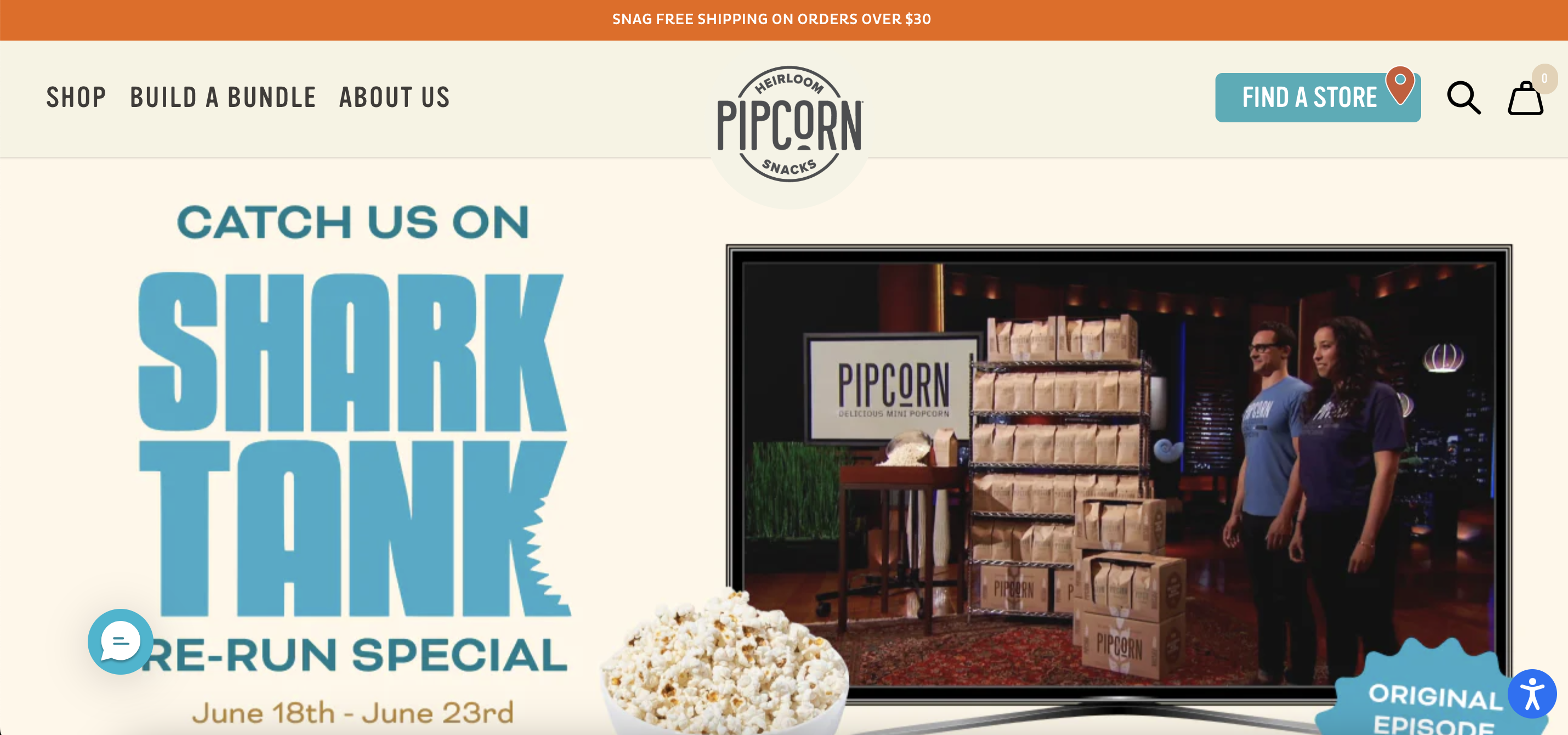
Pipcorn Heirloom Snacks is a gourmet snack company specializing in heirloom corn-based products.
Founded by siblings Jen and Jeff Martin, Pipcorn is known for its delicious, minimally processed snacks made from ancient, non-GMO heirloom corn.
Their offerings include popcorn, cheese balls, corn dippers, and more, all crafted to deliver superior taste and nutrition.
What we love about this website:
- They highlight their feature on Shark Tank above the fold, providing instant social proof and credibility.
- Online shoppers can build their own bundle, allowing for a personalized shopping experience and encouraging more purchases.
- A sticky bar at the top of the site clearly indicates the free shipping threshold, making it easy for customers to know how much they need to spend to qualify.
2. BLK & Bold
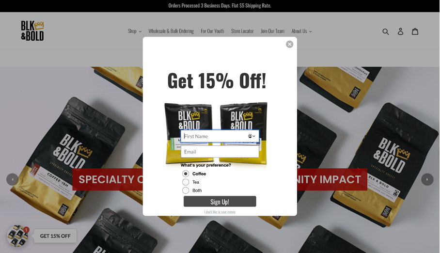
BLK & Bold is a specialty coffee and tea company that not only focuses on delivering high-quality products but also on making a positive social impact.
Their mission is to support underserved communities. BLK & Bold pledges 5% of its profits to initiatives that benefit youth and families across the United States.
What we love about this online business:
- Nicely designed popup idea letting the visitor choose their preference and gives a “Both” option.
- They convey their purchase options, which simultaneously builds trust with their visitors.
- They talk about their background and vision clearly with videos and blog-style informational pages.
3. Meow Meow Tweet
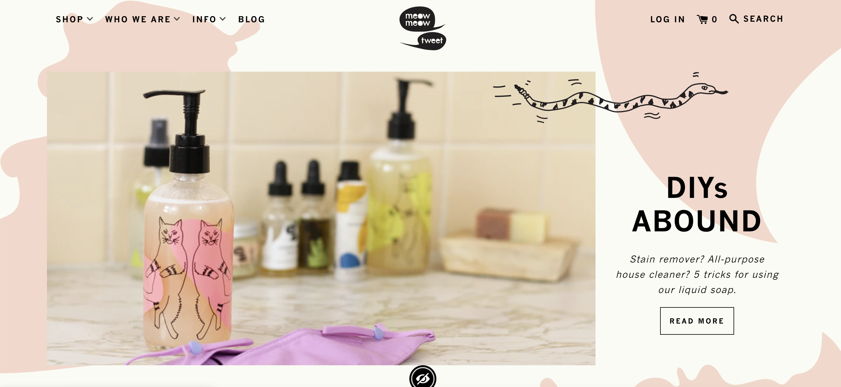
Meow Meow Tweet is an artisanal skincare company known for its unique, eco-friendly products and sustainable practices.
Founded by Tara Pelletier and Jeff Kurosaki, this ecommerce brand is dedicated to crafting vegan, cruelty-free products using organic ingredients.
What we love about this ecommerce business:
- Creative popup usage with the shape of a cat— reinforcing their brand.
- They partnered with UserWay, a software that helps users with disabilities navigate through the site, which is a brilliant idea.
- They demonstrate their fantastic product value with intelligently designed blog posts.
4. Makeup For Melanin Girls
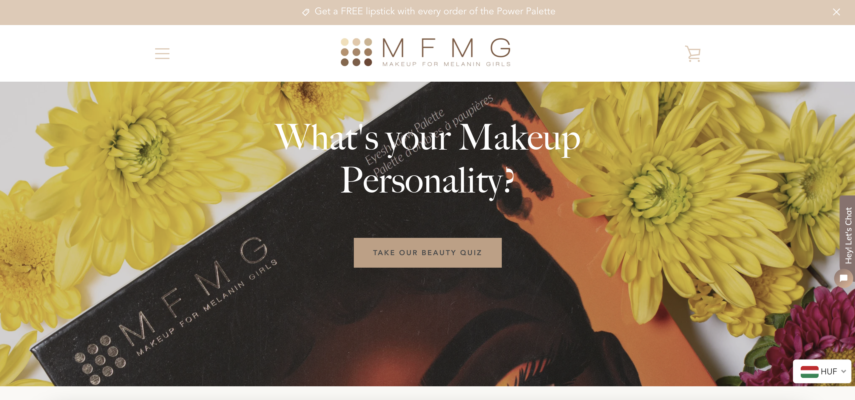
Makeup For Melanin Girls (MFMG) is a trailblazing beauty brand dedicated to celebrating and catering to the unique needs of women with deeper skin tones.
MFMG addresses the gap in the beauty industry for inclusive makeup products. Their range includes foundations, highlighters, and lip products designed to complement and enhance melanin-rich skin.
What we love about this e-commerce business:
- They use a fun lucky wheel popup that encourages visitors to win a large number of prizes.
- Their Instagram integration inspires new shoppers- they can see recent trends from real people using their products.
- They offer a simple quiz that helps visitors find the right product.
5. Kotn
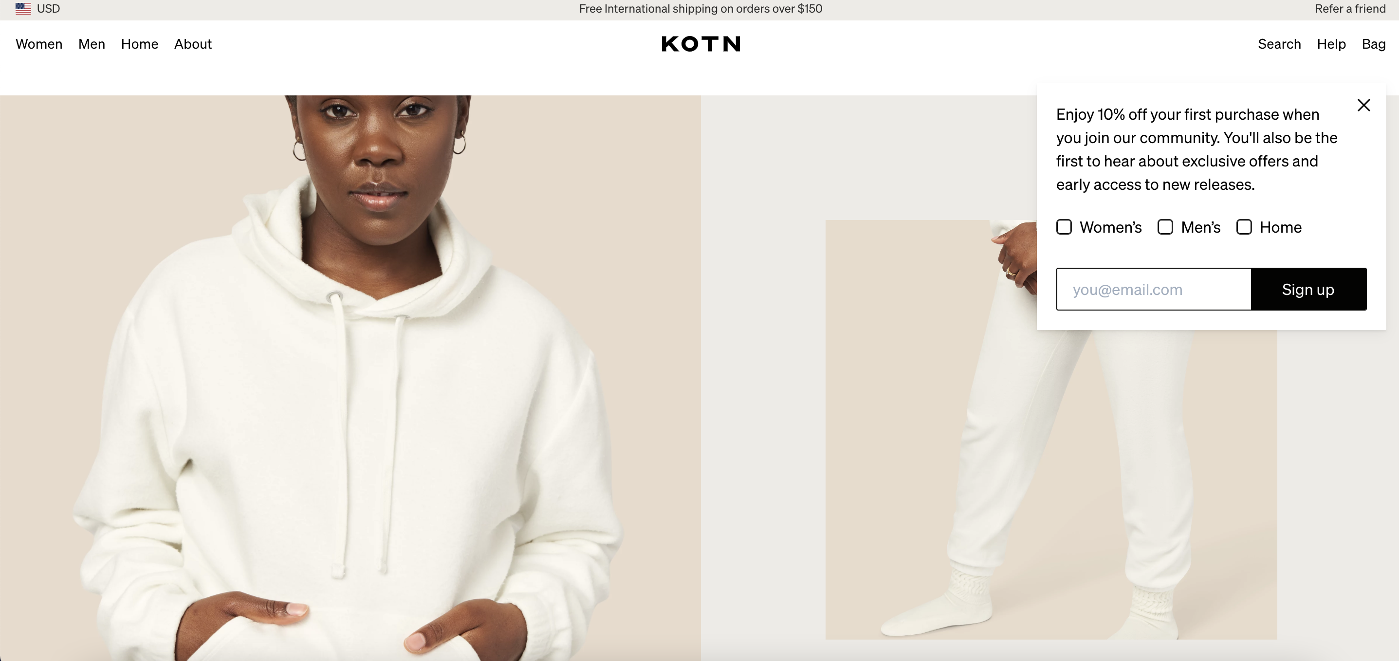
Kotn is a premium apparel brand that blends style, sustainability, and social impact.
Known for their high-quality basics, Kotn sources their cotton directly from Egyptian farmers, ensuring fair wages and ethical production practices.
Their clothing is designed to be timeless and versatile, making it a staple in any wardrobe.
What we love about this e-commerce brand:
- They offer a popup where customers can personalize what gift they would like to receive. Visitors can also select where they’re from, providing a more personalized experience.
- Their brilliantly designed side navigation slides down and then to the right. This efficiently illustrates all product categories without disturbing the visitor.
- They use Instagram posts to motivate their visitors to buy seasonal gifts.
6. Then I Met You
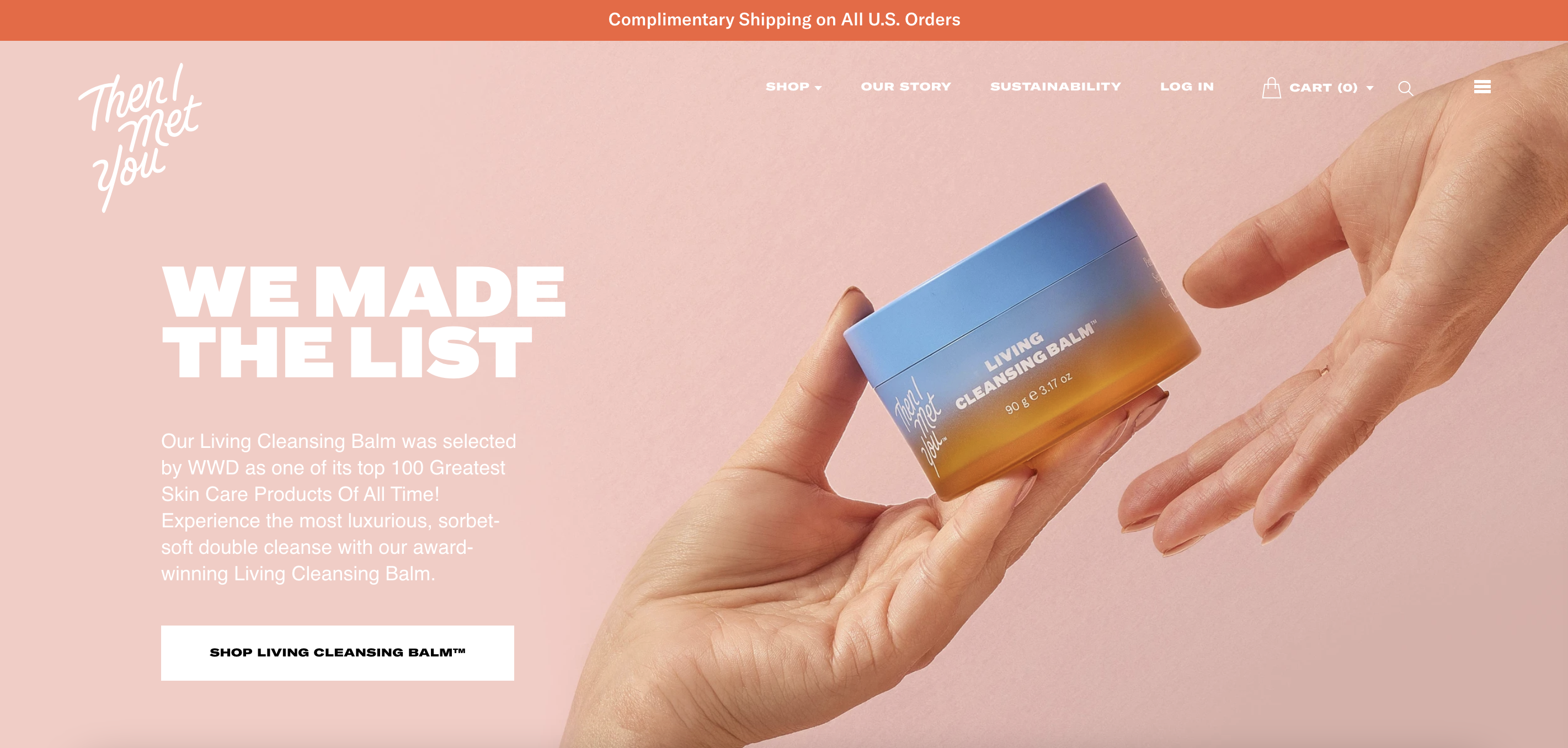
Then I Met You is a skincare brand inspired by the Korean concept of “jeong,” which emphasizes deep connections and heartfelt empathy.
Founded by Charlotte Cho, the brand is known for its high-quality, thoughtfully formulated products that promote a luxurious and effective skincare routine.
What we love about this brand:
- Simple and brilliant design that changes colors while scrolling, so there is a slight transition between different parts of the webpage.
- Easy navigation between product categories and purchasing options.
- Nicely organized product pages that showcase usability details in an easy-to-understand format.
- They include comments from verified buyers, increasing the confidence of visitors.
7. Taza Chocolate
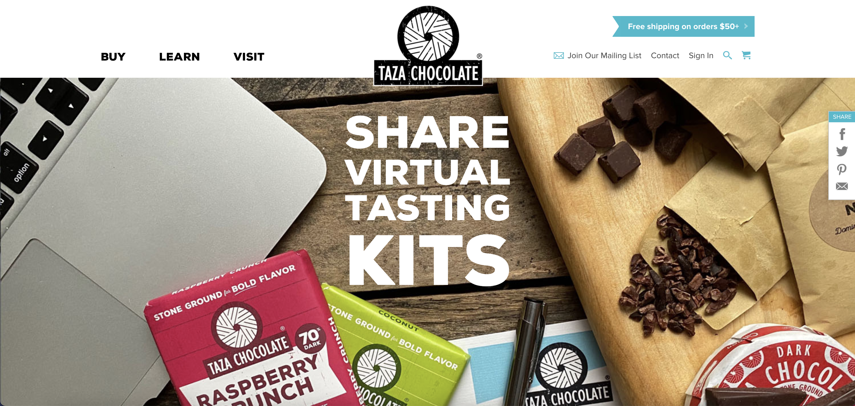
Taza Chocolate is an artisanal chocolate company committed to producing ethically sourced, minimally processed chocolate.
Taza is known for its stone-ground chocolate, which preserves the bold flavors of organic cacao beans sourced directly from farmers.
What we love about this brand:
- Simplistic web layout, that also depicts their products quickly and easily— they have an extraordinary product design as well.
- On their main page, they sincerely talk about their social awareness campaigns, including their mission statement and achievements.
- They include a large number of informational pages including blog posts and recipes.
Top 6 ecommerce brands in the world
We’ve found the most inspiring online stores from all over the world, including India, the United Kingdom, Italy, and more.
They’re all profitable ecommerce companies and are killing it online. Let’s take a look!
8. Suta
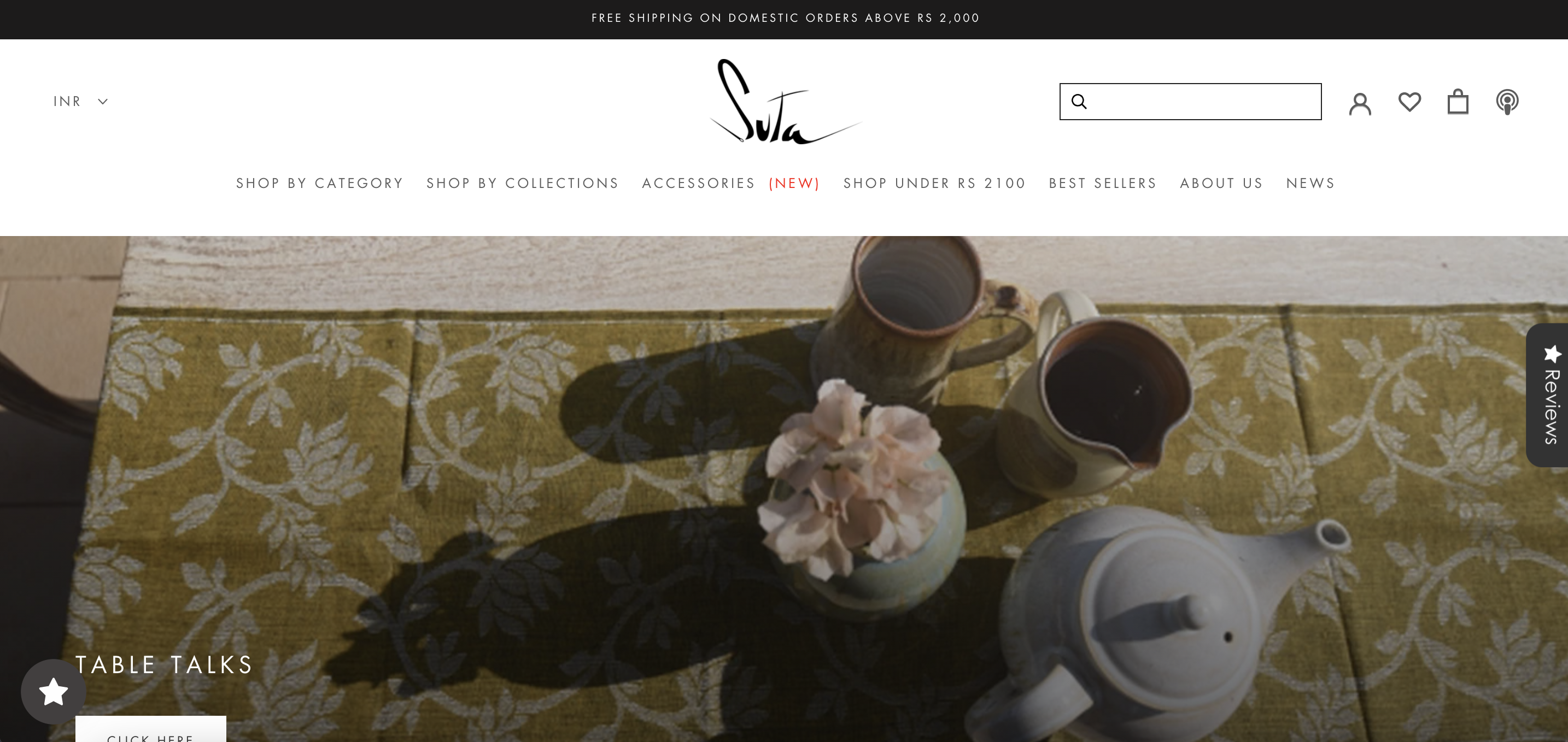
Suta is an innovative fashion brand specializing in contemporary and traditional Indian wear, particularly saris.
Suta combines traditional weaving techniques with modern aesthetics, creating unique and beautiful garments. The brand is dedicated to sustainability, using eco-friendly materials and supporting local artisans.
What we love about this brand:
- Nicely communicates a wide range of products that are available.
- Offers a ‘Buy below’ option for customers who are targeting a specific price range.
- Well-demonstrated company mission with nicely embedded videos and blog posts.
9. Tentree
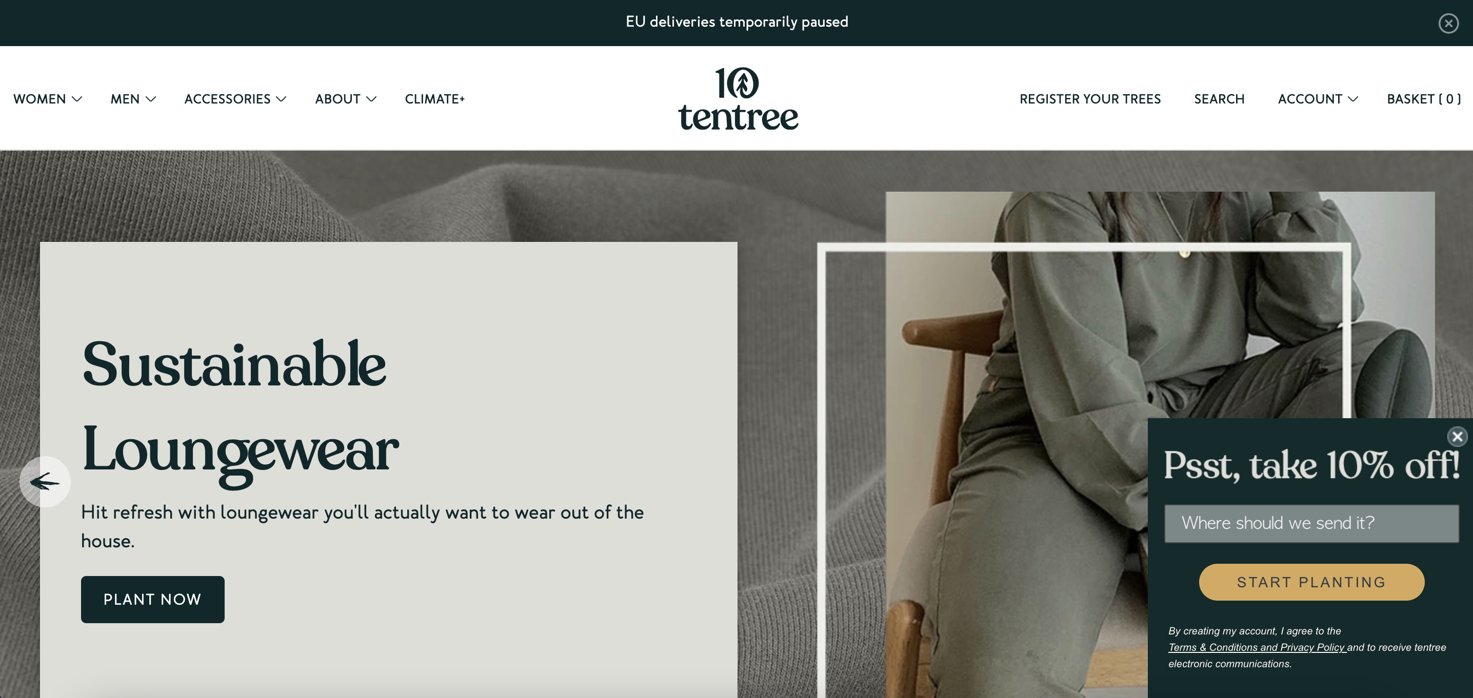
Tentree is an eco-conscious apparel brand dedicated to sustainability and environmental impact.
For every item sold, Tentree plants ten trees, aiming to plant one billion trees by 2030. Their clothing line includes stylish, comfortable basics made from sustainable materials like organic cotton, recycled polyester, and Tencel.
What we love about this brand:
- Nice popup idea of asking the visitor where they’re from (they also check their customer’s IP address), so that they can offer a more personalized experience.
- They offer a lovely popup with a CTA saying ‘Unlock offer’.
- On their main page, they successfully depicted their global mission to plant endangered trees.
10. SUGAR Cosmetics
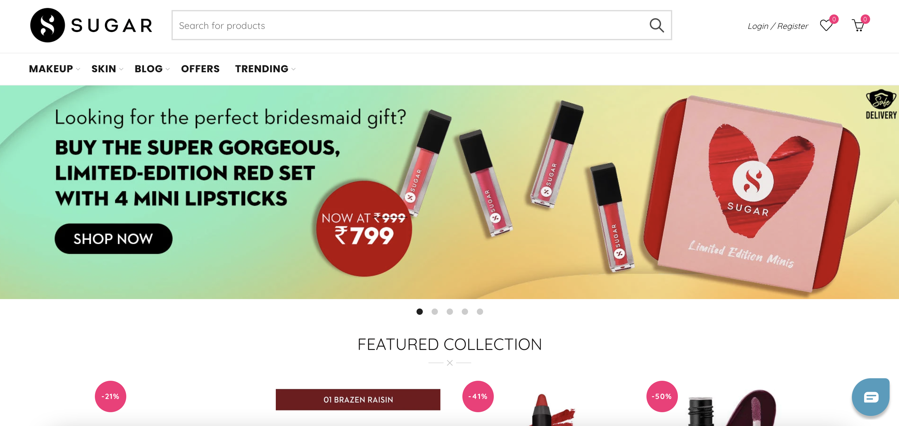
SUGAR Cosmetics is a dynamic beauty brand that offers a wide range of high-quality makeup products designed to suit diverse skin tones and preferences.
Known for its bold and vibrant aesthetic, SUGAR Cosmetics provides everything from foundations and lipsticks to eye makeup and skincare. The brand emphasizes cruelty-free formulations and innovative product design.
What we love about this brand:
- They’re right on target because they include a large selection of their products— essential in the makeup industry.
- Specially dedicated segment for new items— a feature that is useful for informing visitors about trends.
- They have several discount options that are clearly communicated on the main page with images and banners.
11. Velasca
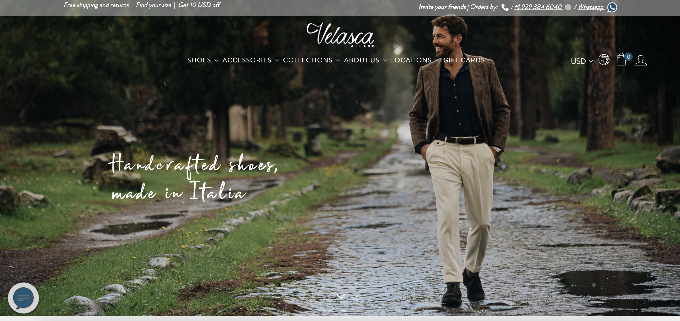
Velasca is an Italian footwear brand known for its artisanal craftsmanship and timeless designs.
Founded with a mission to preserve and promote traditional Italian shoemaking, Velasca offers high-quality shoes for both men and women.
Each pair is handcrafted by skilled artisans in Italy, ensuring exceptional quality and attention to detail.
What we love about this ecommerce brand:
- They offer a discount with a newsletter subscription and offer a Google sign-up on their popup. It’s a brilliant idea to get users signed up for your newsletter quickly.
- They used large gifs to present their manufacturing process which builds trust with visitors.
- They also included customer opinions and ratings on their main page, which helps express value.
- They have a whole blog dedicated to the Italian lifestyle— from popular songs to historic stories about 80s Italy.
12. Woolrich
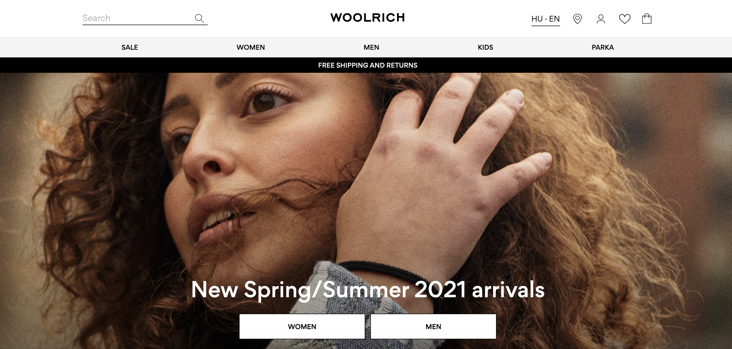
Woolrich is a heritage outdoor clothing brand with a rich history dating back to 1830.
Known for its high-quality, durable apparel, Woolrich offers a range of products designed to withstand harsh weather conditions while providing comfort and style.
Their collection includes jackets, parkas, sweaters, and accessories, all crafted with premium materials.
What we love about this ecommerce brand:
- They use a simplistic but brilliant design with their categories and icons that create an extraordinary image of the brand at first sight.
- They use brilliant quality images for their value proposition pages, inviting the visitor to learn about their mission.
- They use Instagram collection campaigns (also available on Facebook) where they can showcase a number of products on a single model.
13. Clarks
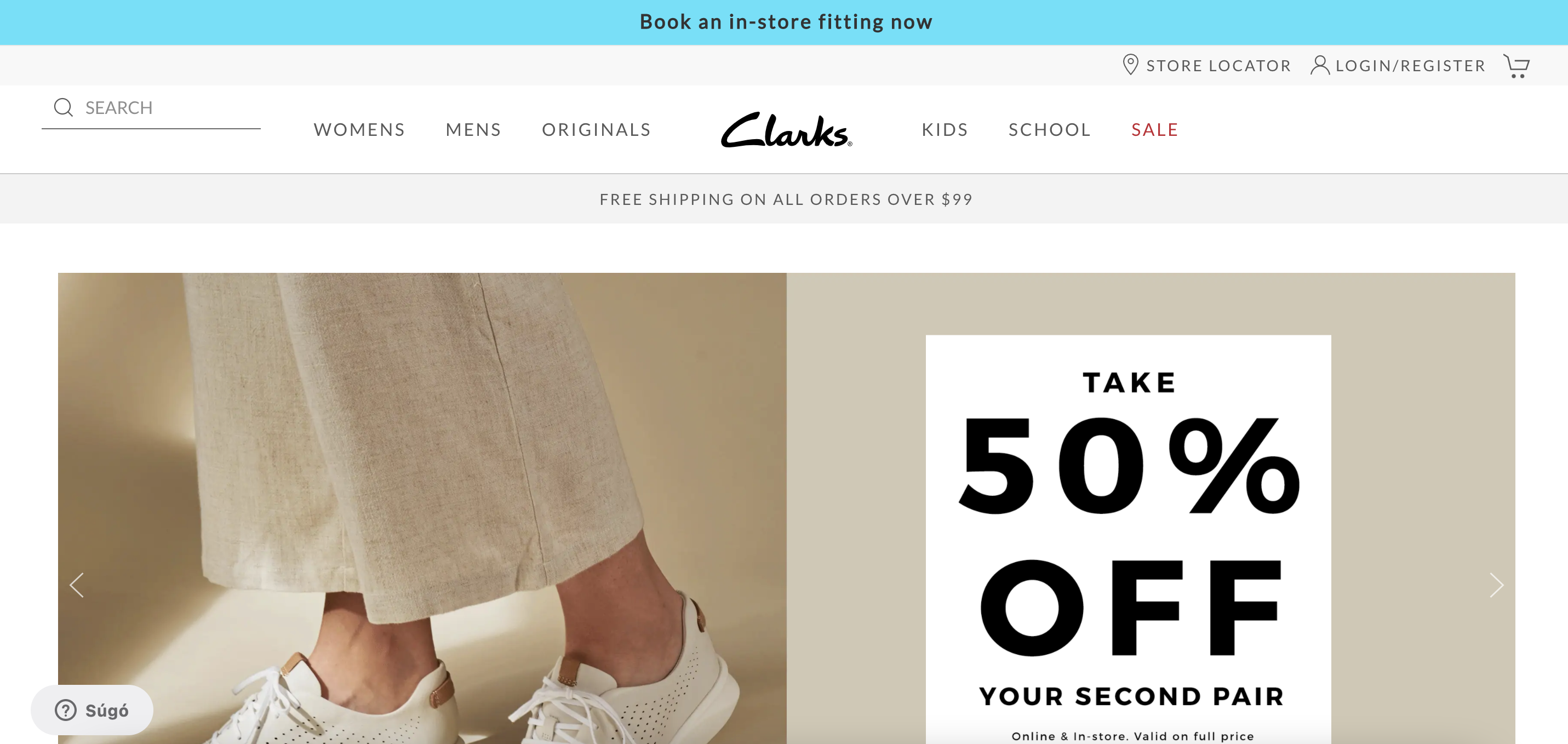
Clarks is a renowned footwear brand celebrated for its blend of style, comfort, and craftsmanship.
Established in 1825, Clarks has a rich heritage of creating high-quality shoes for men, women, and children.
The brand is known for its innovative designs and use of premium materials, ensuring durability and comfort.
What we love about this brand:
- Nice category pages that are brought down into different segments. This not only increases user visibility but showcases a larger number of sub-categories.
- Although popular, a Store Locator link is highly useful for increasing in-store visits- especially if they have high traffic coming from nearby areas (for example, from Facebook campaigns promoting in-store visits).
- They have a well-developed VIP Membership campaign (that only requires a free subscription). These are immensely useful for acquiring returning customers and for building trust with new visitors. It’s a lot easier to engage your previous customers than to acquire new ones.
17 popular ecommerce sites
We’re not done yet! Here are 17 additional top ecommerce companies to explore.
14. Ketnipz
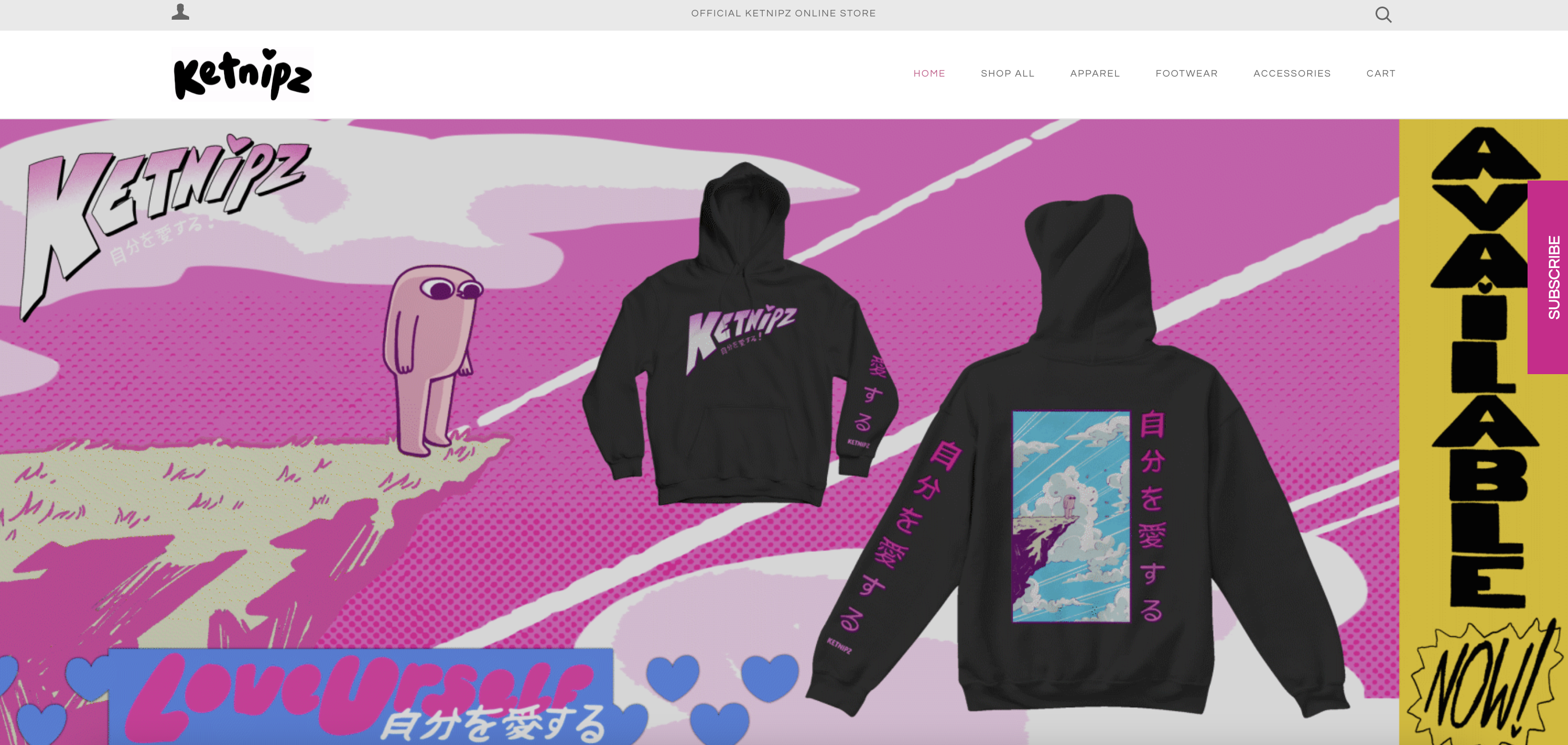
- This store is built entirely around Bean, a fictional character. They use high-quality banners and product images to demonstrate value.
- Their logo lights up and glows like a neon sign, which is a really unique idea.
- Product names are crafted quite interestingly- with creative names given to every product.
15. Skullcandy
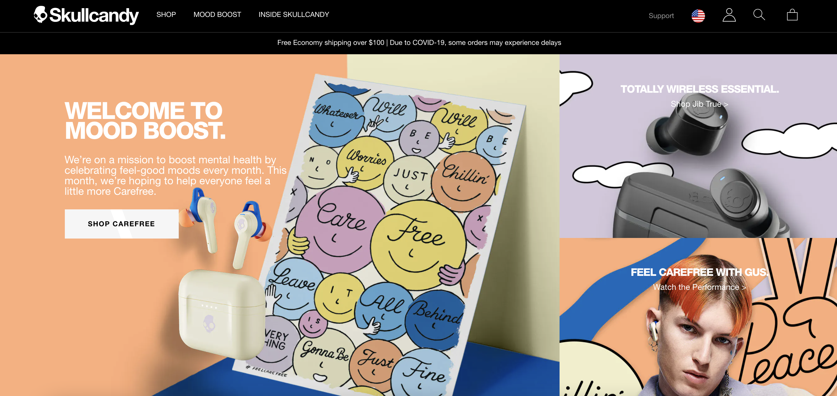
- They have an extraordinary website design with fonts and color pairs similar to Nike.
- They used a brilliant logo idea where the text disappears after you scroll for a bit, easing navigation and increasing category buttons.
- Brilliant category pages with tremendous images— showing product value.
- Product pages are easy to follow and include a lot of useful info with a vibrant and modern design as well.
16. Artisaire
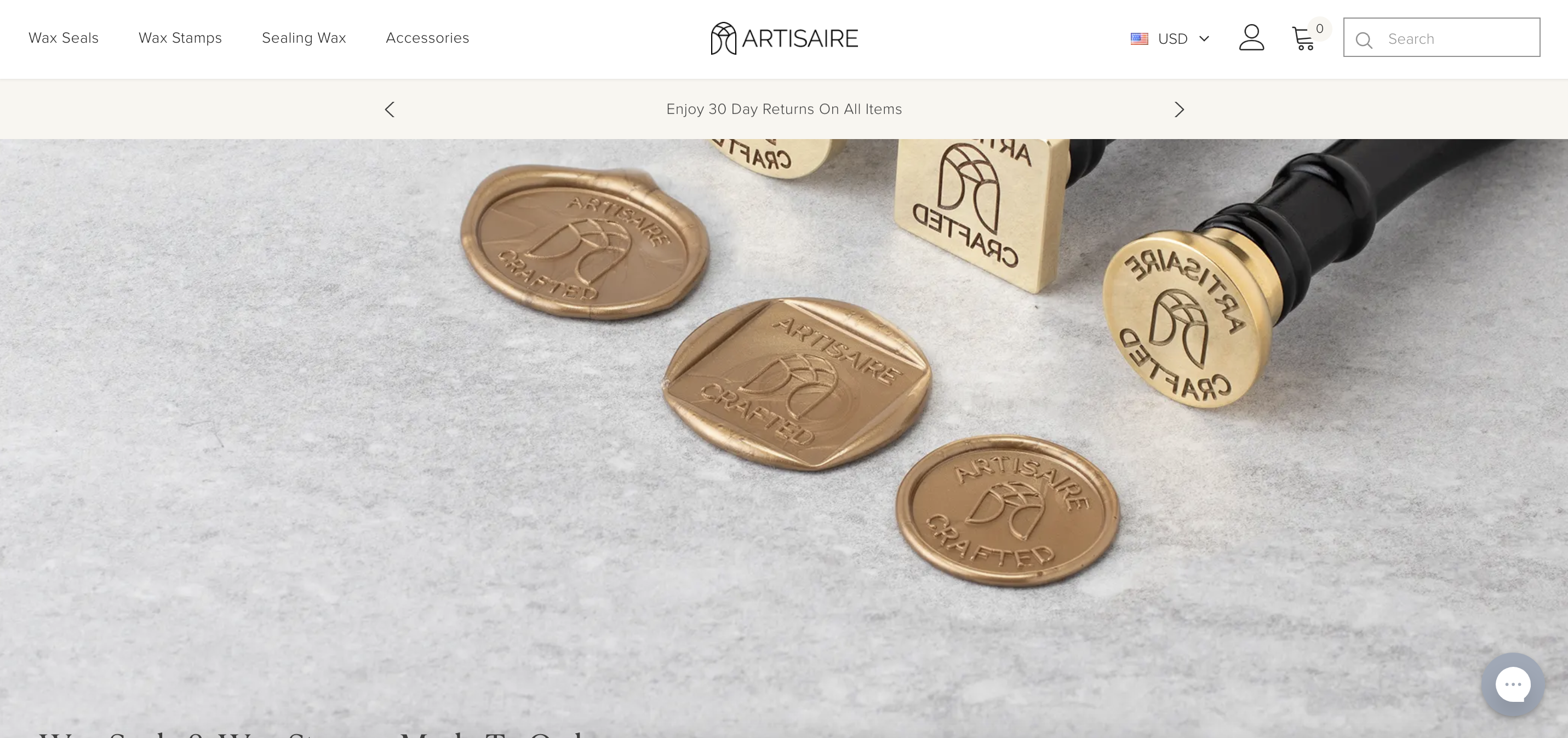
- Their simple but smart design has quality high definition product images— clearly displaying their extraordinary product value.
- They can easily upsell through offering combo items that are commonly purchased with viewed products.
- They offer a sample pack that is geared toward uncertain visitors.
- Great quality blog and info brackets to help customers master the art of sealing wax.
17. Pilot Coffee Roasters
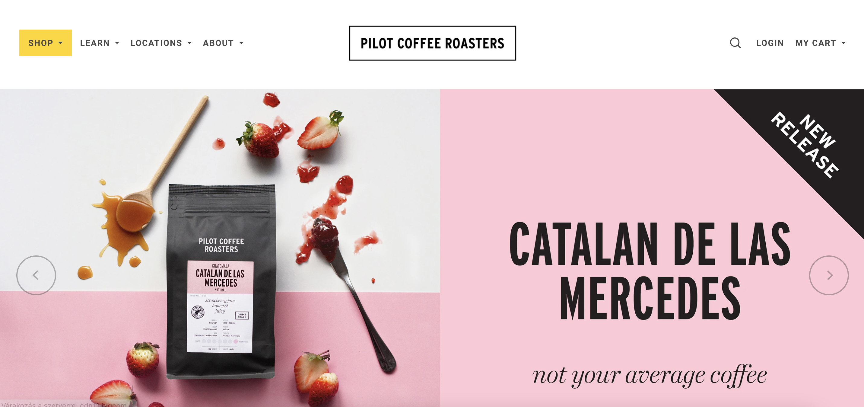
- They use a simplistic background design that makes it easier to showcase products and navigate their site.
- They inform the visitor about all of their buying options on the main page, clearly presenting their prices and availability. It helps build trust with new visitors.
- They’re very “value” informative— whether it comes to their mission or about the use of their products. They make sure you get all the deets before you purchase.
18. Training Mask
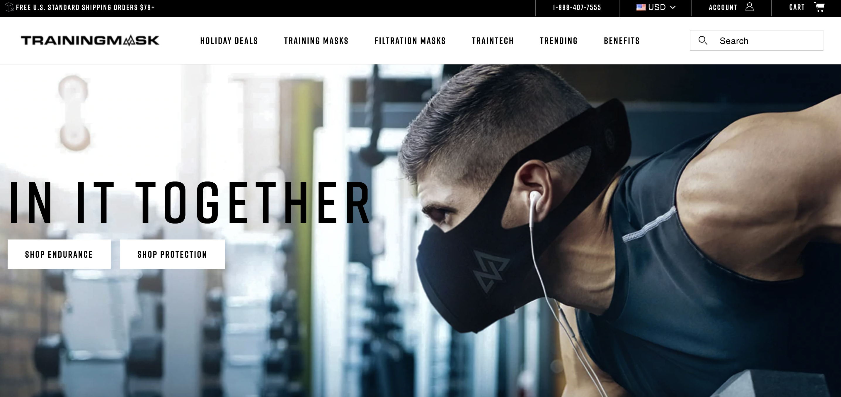
- They have a straightforward design showcasing two main categories. Their subscription popup matches this minimalistic design.
- Nice combination of text and images on their category menu that brilliantly showcases product types.
- They include category comparisons about their products. It helps visitors determine their training mask needs.
- They use a GIF in their subscription popup that is more entertaining than a simple image.
19. Display Rabbit
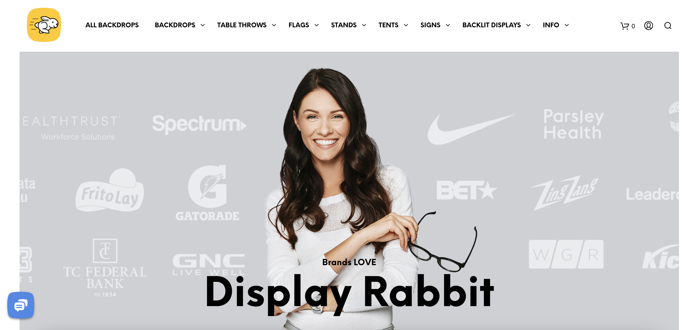
- They have a simplistic website design that uses large product featured images and excellent showcases that display the use of their products. It is a great way to get customers engaged.
- They demonstrate a number of different size options on their product pages that help customers clarify their needs to encourage them toward the checkout.
- They also have a large number of different product categories organized by grouping similar ones together— reducing noise.
- They use a collection of icons with a minimalist design on the top right corner of the page. This option is becoming quite popular among ecommerce business owners.
20. Badgley Mischka
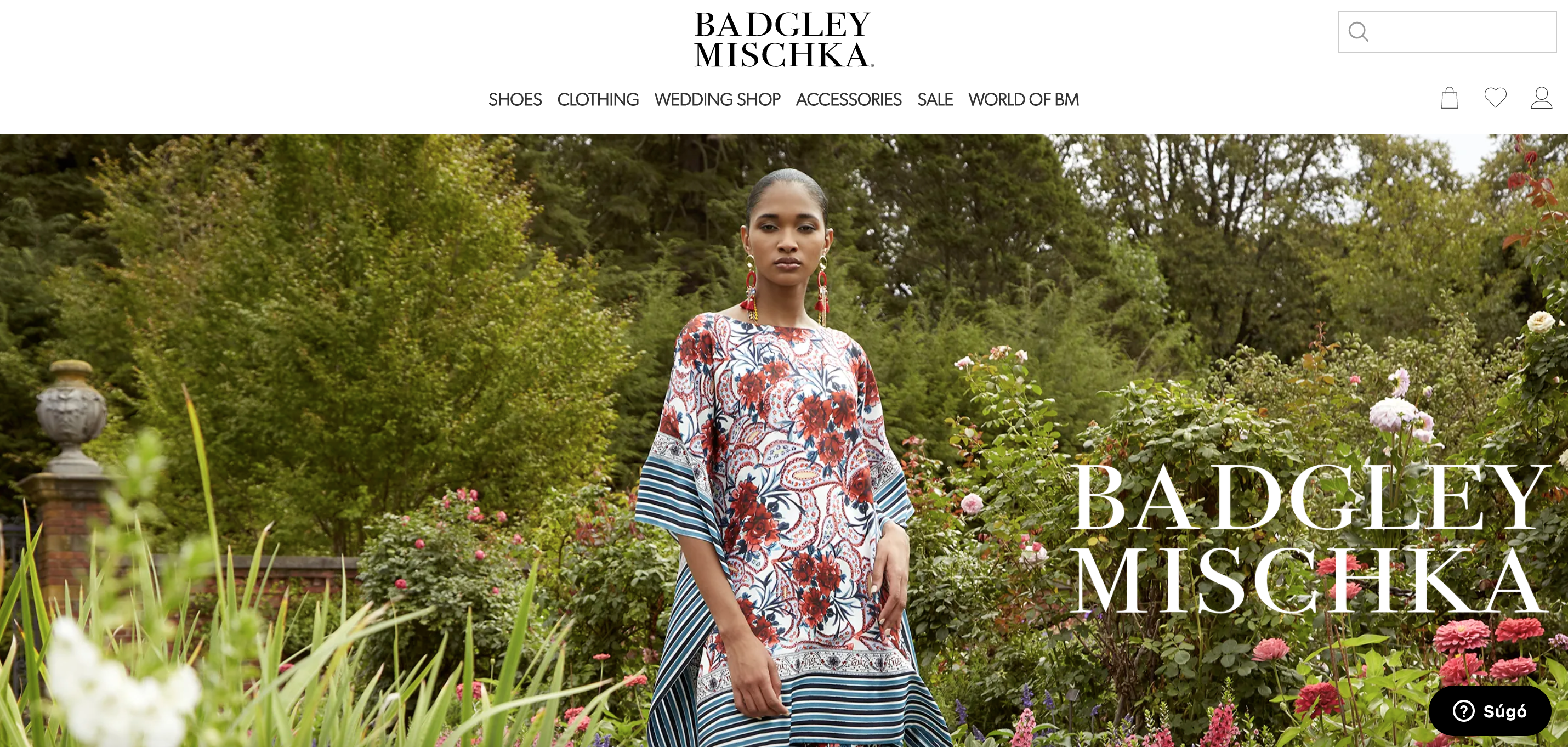
- They use a category page that slides down twice— categorizing products uniquely.
- They use a tremendous banner, combined with large HD product images, quality gifs, and videos, creating instant value— perfect for a fashion company.
- Absolutely astonishing CTA for newsletter subscription: “Become an Insider.” It makes visitors feel extra special when signing up for newsletters.
- Clear communication about order status and steps to complete an order— easing the process of getting visitors through the purchase funnel. They specialize in international shipping, and give detailed options for the process.
21. Pink Lily
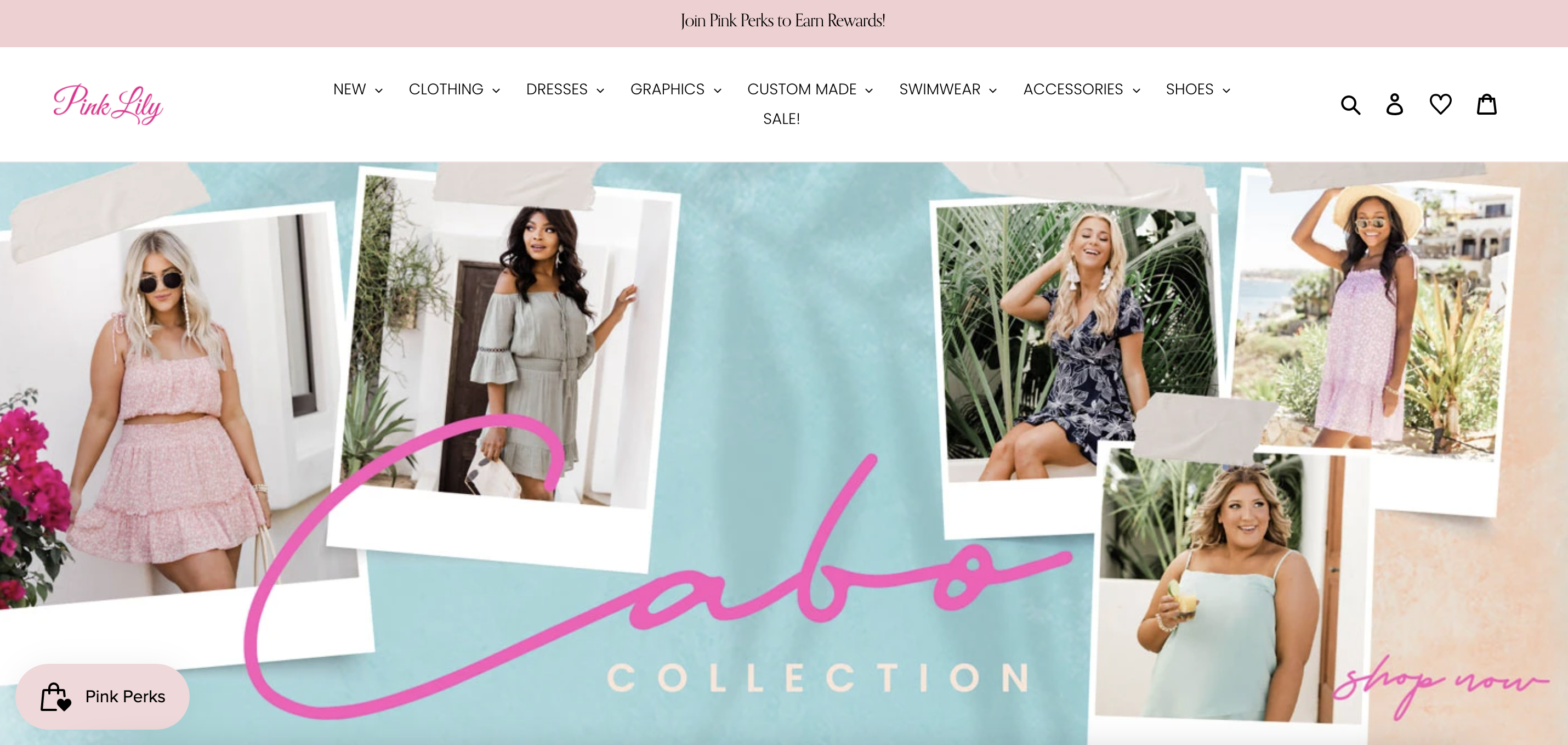
- They offer a ’Shop the Look’ feature, which can be used for a number of different product categories to showcase products better— using Instagram and Facebook stories.
- Astonishing idea of matching their banner with their side message (at the top of the page) so that it looks like a whole complete image.
- A large variety of color options for their dresses— helping visitors customize their views.
- They have a side message designed to show their membership advantages and perks. We love the brilliant idea to hide it in a small teaser, so that when a visitor clicks on it and ‘finds it’, they will feel a bit more special.
22. Wayfair
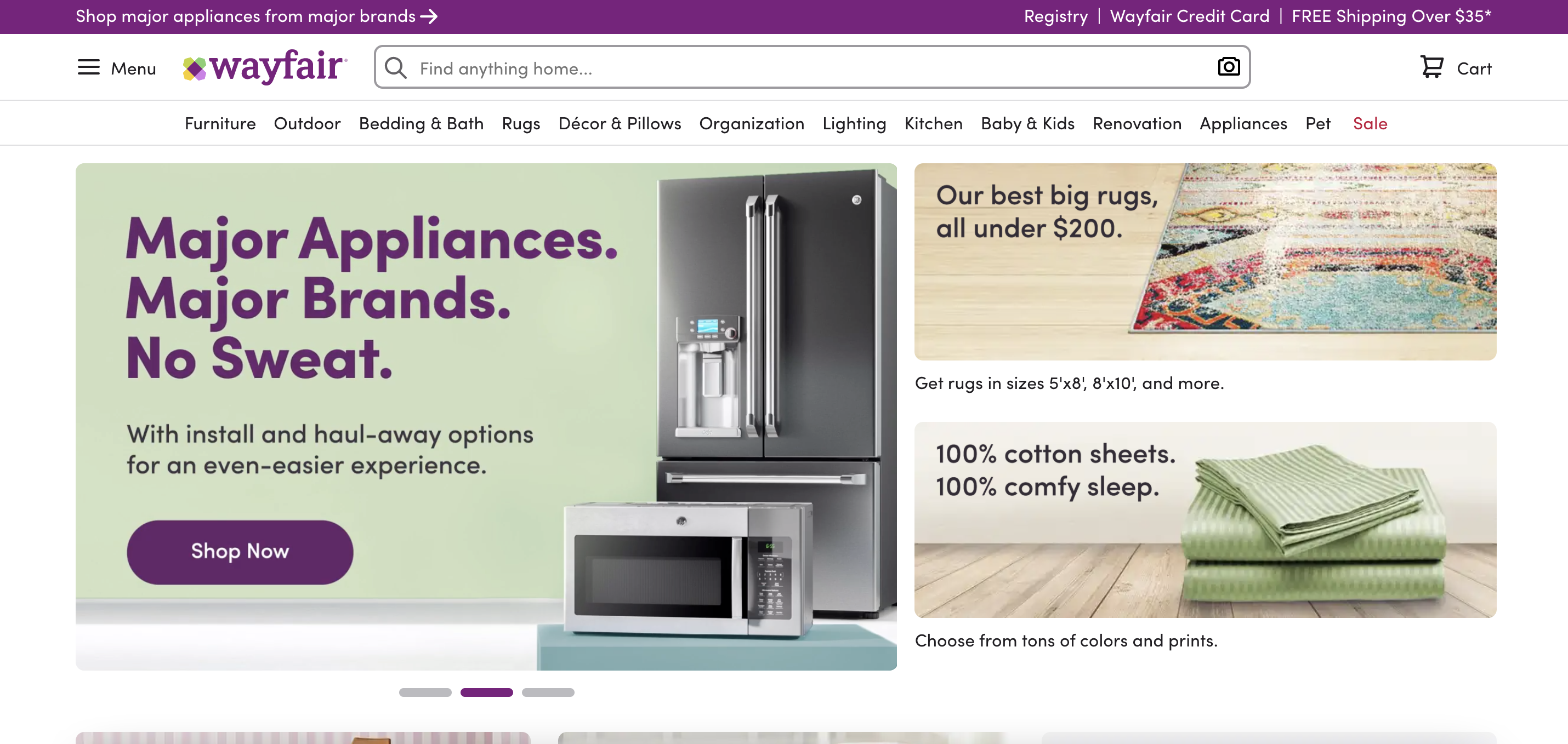
- They offer a visualization tool that helps customers design their homes with their products. Similar AR solutions (like Augment) are available, allowing them to showcase their products in virtual reality.
- Stunning interactive images on their site help them demonstrate different products or different product features in one image.
- They organize their category pages brilliantly by highlighting larger categories. It is a great directory for a large number of different category pages.
- Their “Three different ways to save” option where they list “Offers to shop This Minute”, “Closeout Deals” and “Open Box Deals”, are great customer incentives. They also have a credit card option listed under these.
- Their banners include several direct links to categories. While creating banners like this one is complex, it is immensely useful for visitors.
23. Etsy
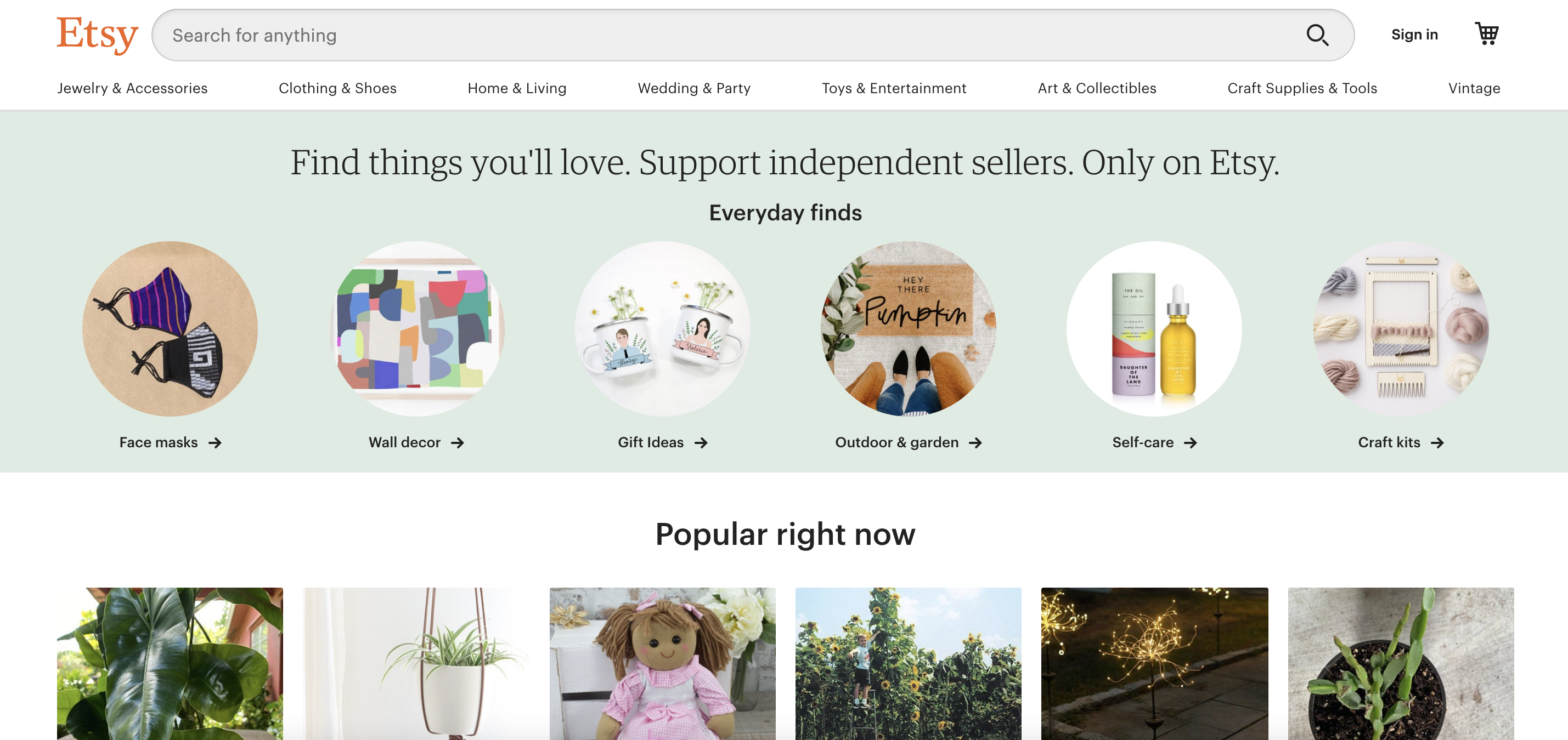
- They have product category brackets, which intelligently demonstrate similar products at the same time. Their prices appear on hover increasing price transparency and reducing bounce rate.
- The category pages are very fluid— organized in a user-friendly list format. On hover, they provide different subcategories to the right while also demonstrating the most popular products in new brackets and showcasing them with images. It is easy to navigate, and customers can enjoy their website effortlessly.
- They have an interactive blog that demonstrates their social awareness and value proposition properly.
- Seasonal products have their interactive collection banner, which allows them to showcase all seasonal product categories at the same time.
24. Decibullz
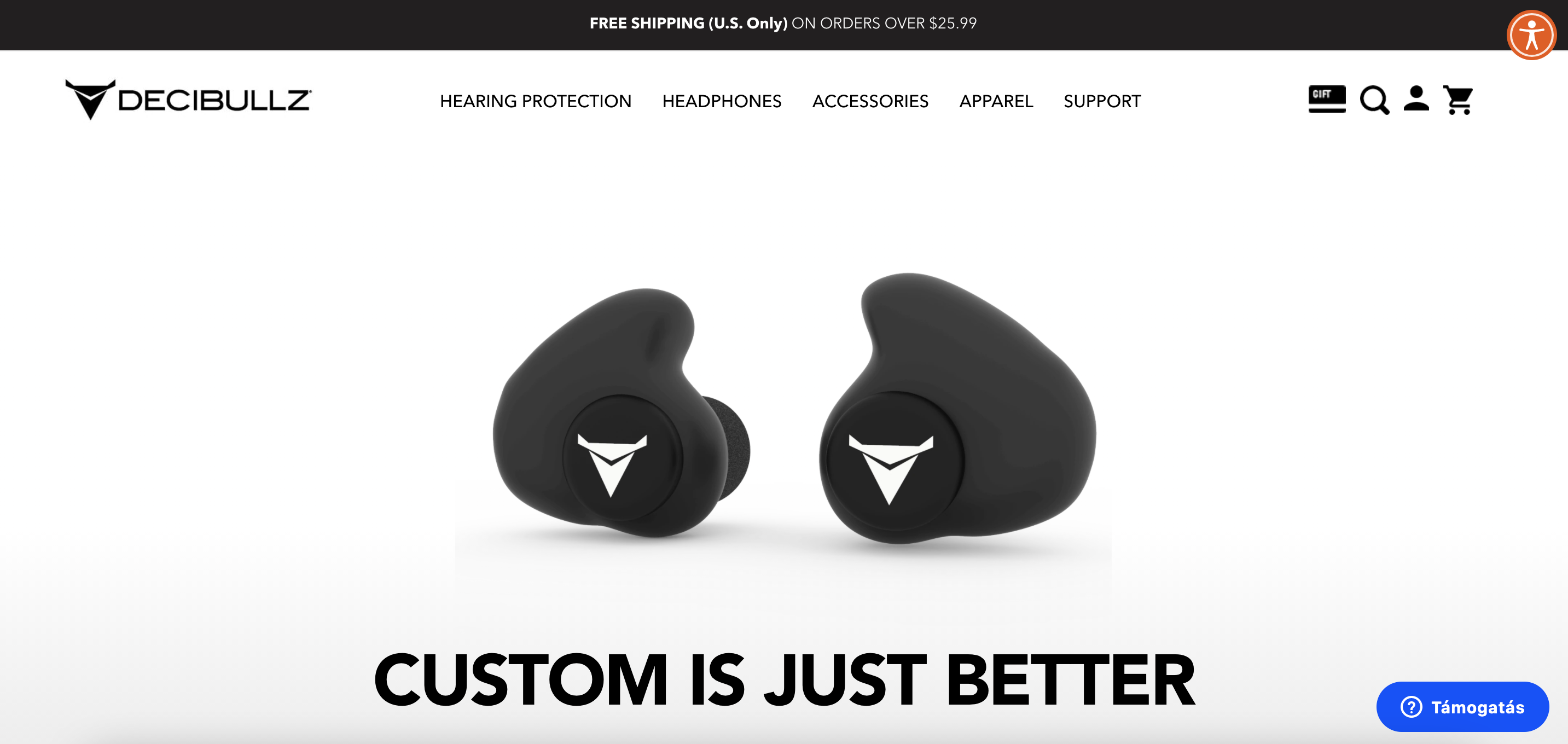
- Their product-feature-brackets are simplistic but are designed brilliantly to demonstrate product value.
- They use social media posts quite well, combining product value proposition and social awareness campaigns.
- They offer a category selector even on their product pages which is useful for reducing bounce rate and increasing session time.
25. Hyphensleep
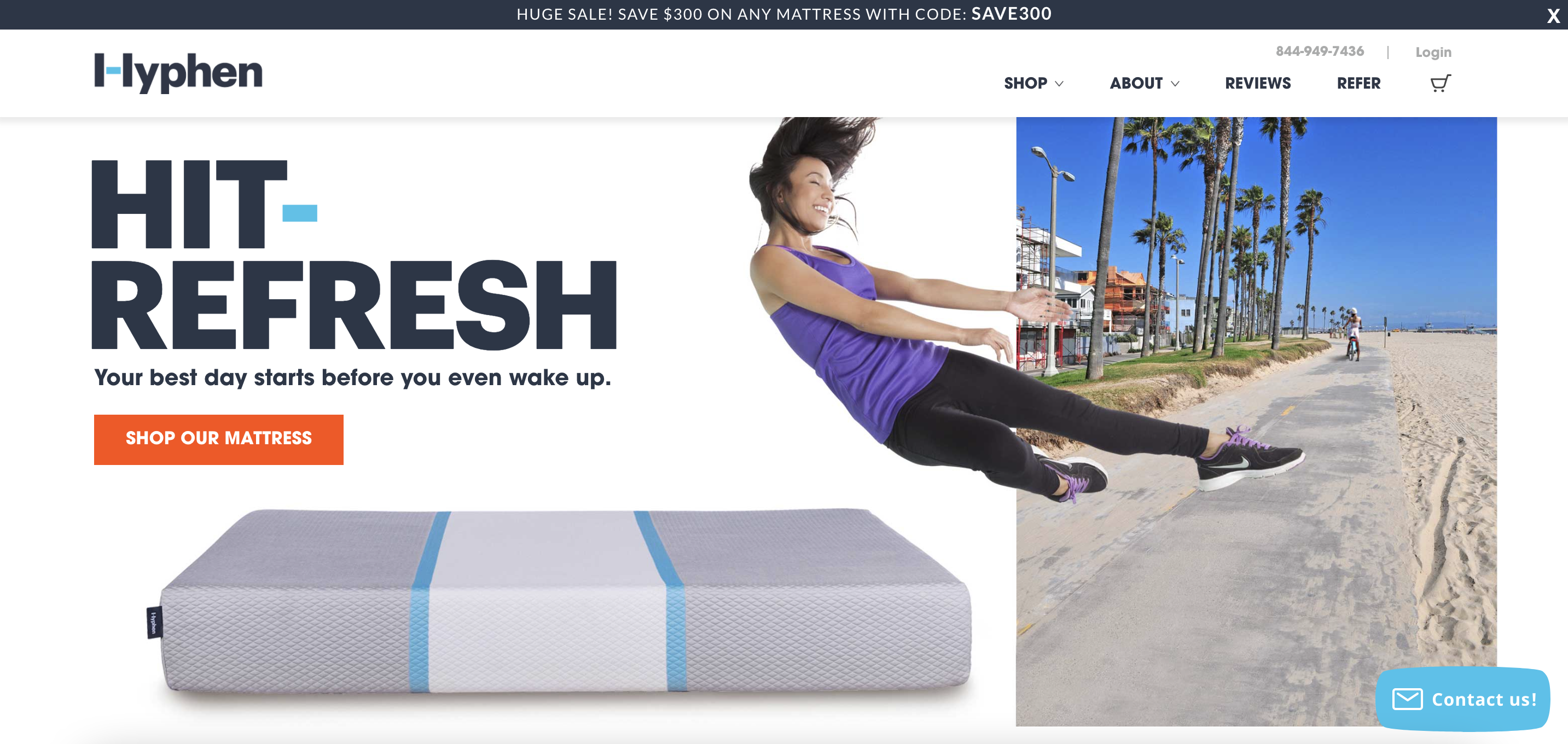
- They demonstrate product value quite extensively using simplistic but nicely designed brackets— from their prices to product features they inform visitors about every aspect.
- They use a similar value proposition about their social awareness and sustainability campaigns, further creating value for newly arriving visitors.
- They commonly compare themselves to other providers while highlighting their value— which is a great technique if you want to compete in the ‘red sea’.
- They offer reviews from verified customers, which soothes the concerns of new visitors who are thinking about making a purchase.
26. Lowe’s
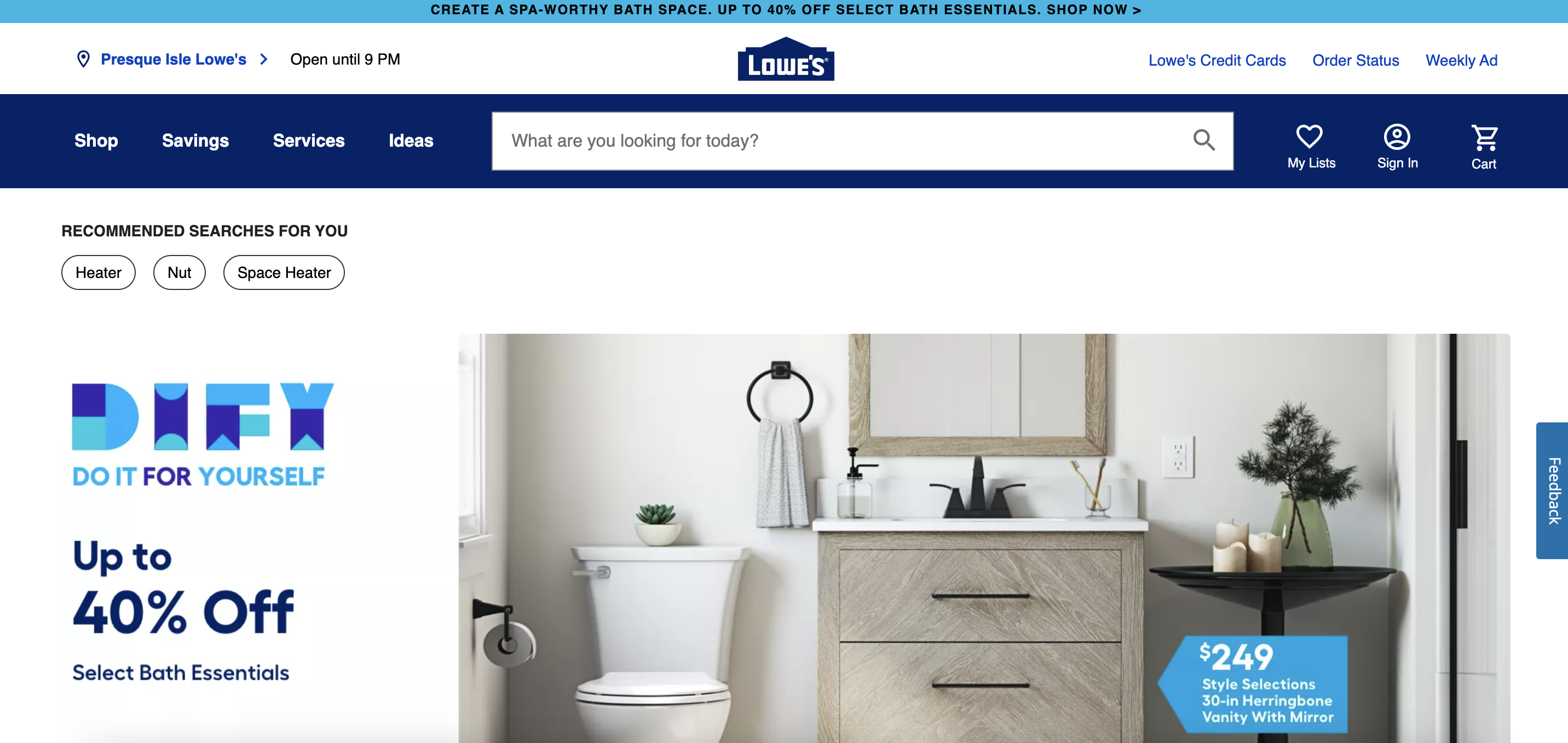
- It is a brilliant idea of using a search bar as their navigation with suggested searches. It greatly reduces noise and automatizes searches.
- They offer a ‘Trending’ blog article that is regularly updated with trending decor options. It gives them an opportunity to showcase products that are similar to the actual trend.
- The site automatically finds the nearest store and shows product availability— which is great for larger companies.
- They explain buying and delivery options efficiently, which increases trust with new visitors.
27. GiveMeTap
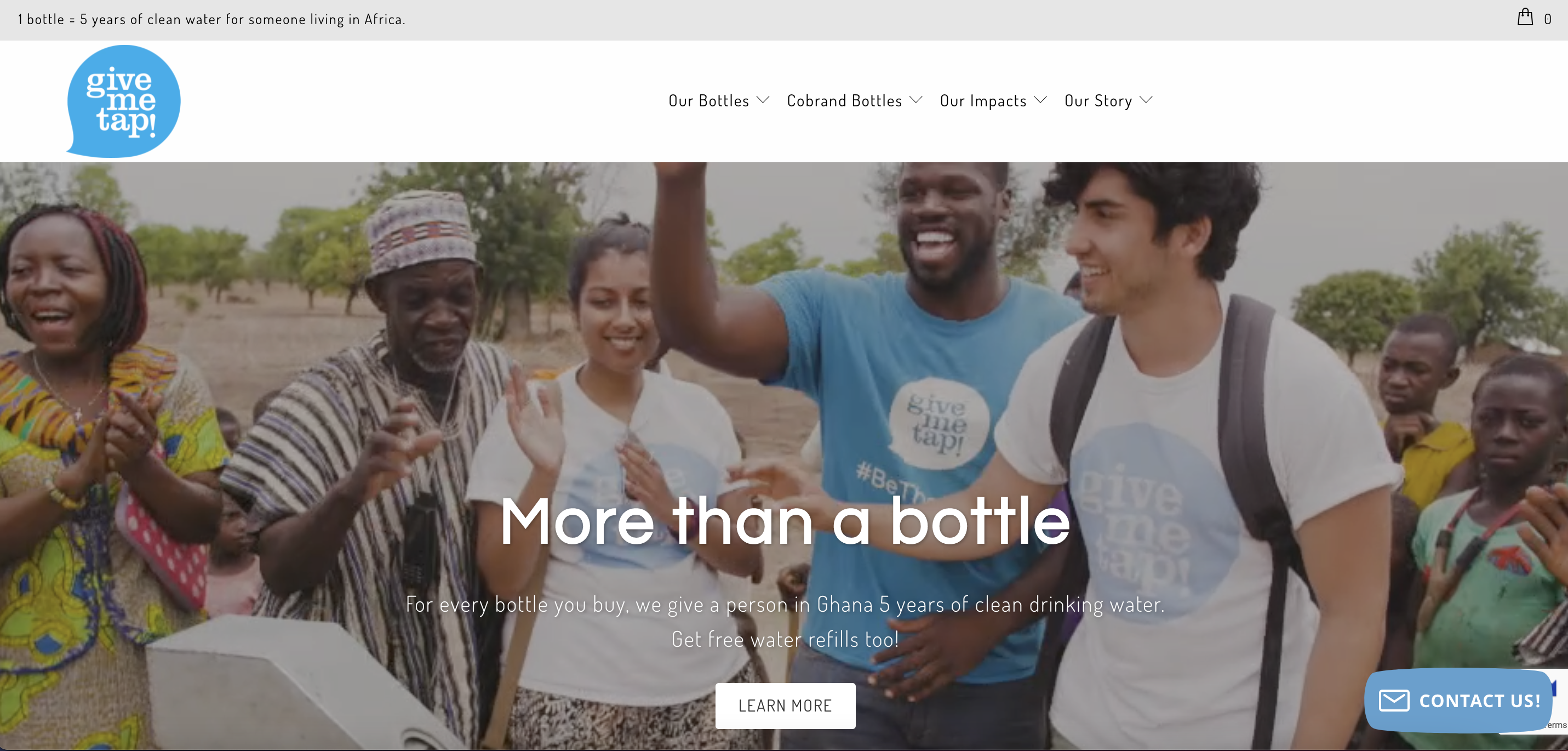
- Nicely shared mission statement with embedded videos and vibrant illustrations. Their mission statement is unique and builds trust with visitors.
- They have a “result calculator”, which shares their mission and goal progress and it is automatically calculated in the currency of the viewer (in some countries), based on their IP address. This creates a personalized approach and it’s relatable for the customer.
- They created an app to increase the usability of their product by offering free refills at 800 stores. Similar apps are relatively easy to develop, and to boot, they can significantly increase demand.
28. Tsuno
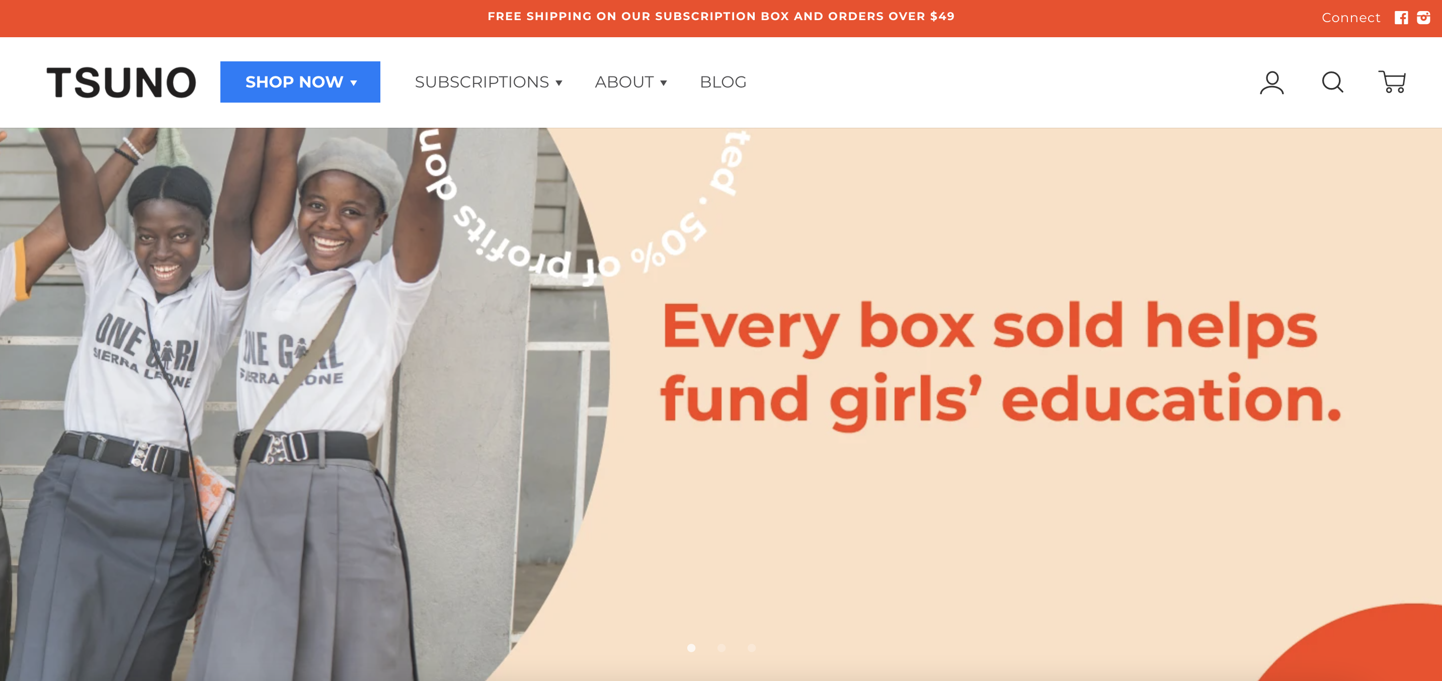
- Nice product demonstration page with features and usability organized simplistically for the visitor.
- Their subscription package is also communicated quite well and in common terms. It is important to offer a discount for regular users if you offer a product category that your customers need often.
- They include a map of all their retailers that is immensely helpful for products that aren’t as well-known. This exponentially raises customer awareness about their inventory.
29. Uppercase
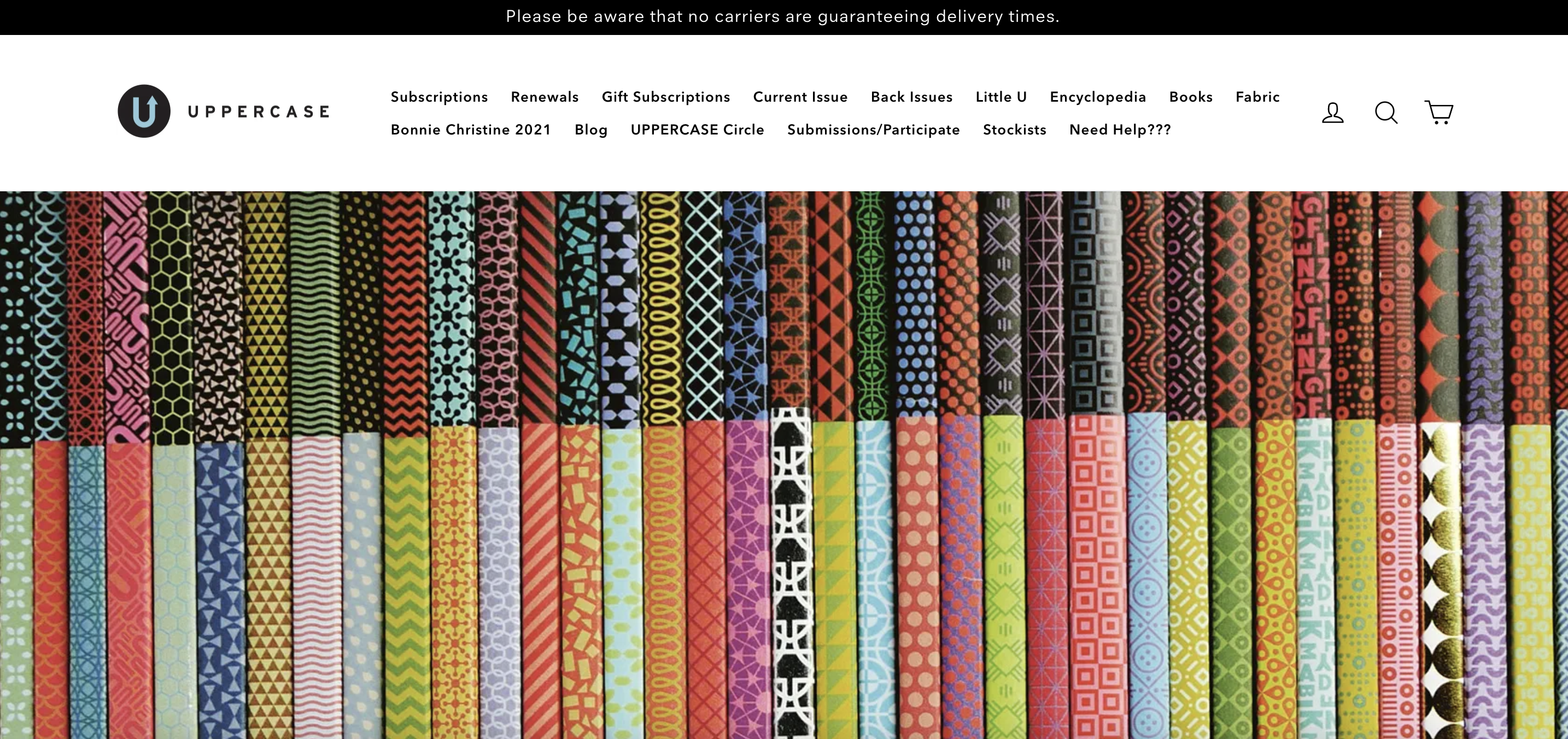
- Simple design with buying options and product features are conveyed efficiently.
- They have a well-designed blog with their creative images that help users identify their needs while encouraging consumer trust-building with their brand.
- They have a membership program for their paid subscribers that increases engagement with their service and reduces the churn rate.
30. Terre Bleu
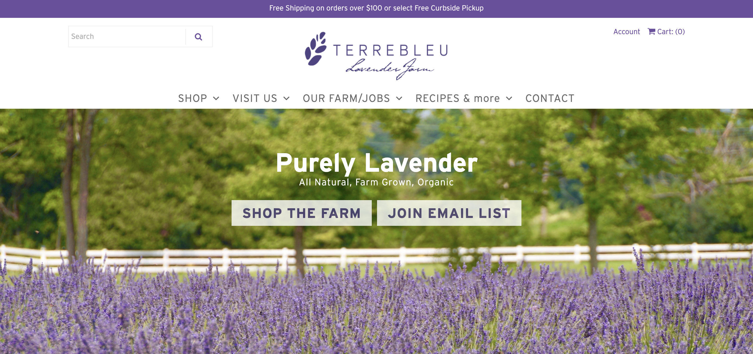
- By using their brand color everywhere on the page, it creates a uniform look and increases trust in their brand.
- When hovering over their products, they use a beautiful combination of item images that smoothly change on autoplay. It’s important for smaller brands with fewer products to use professional photographs in order to create a better first impression.
- They have quite an extensive information page list where they give advice on product usage like recipes and wellness posts. It increases the engagement of new visitors to read the info page.
Wrapping up
These 30 successful ecommerce brands provided great examples of what to look for when you try to maximize value for the customer.
It’s certainly not an easy order to fill because it can take years for even the largest ecommerce businesses in the world to be able to maximize their efficiency when it comes to serving the best customer experience and achieving the largest customer return rate.
But don’t worry, most parts of customer value optimization are highly related and once you start identifying your website’s strengths and weaknesses, it will be easy to progress.
As Steve Jobs said: “You’ve got to start with the customer experience and work back toward the technology – not the other way around.” The same goes for online retailers – it is better to start with customer experience than with your product. This is the “secret” for long-term success.
Migration has never been easier
We made switching a no-brainer with our free, white-glove onboarding service so you can get started in the blink of an eye.
What should you do next?
Thanks for reading till the end. Here are 4 ways we can help you grow your business:
Boost conversions with proven use cases
Explore our Use Case Library, filled with actionable personalization examples and step-by-step guides to unlock your website's full potential. Check out Use Case Library
Create a free OptiMonk account
Create a free OptiMonk account and easily get started with popups and conversion rate optimization. Get OptiMonk free
Get advice from a CRO expert
Schedule a personalized discovery call with one of our experts to explore how OptiMonk can help you grow your business. Book a demo
Join our weekly newsletter
Real CRO insights & marketing tips. No fluff. Straight to your inbox. Subscribe now
Nikolett Lorincz
- Posted in
- Ecommerce
Partner with us
- © OptiMonk. All rights reserved!
- Terms of Use
- Privacy Policy
- Cookie Policy
Product updates: January Release 2025

