- Blog
- 50+ Creative Popup Ideas to Inspire Your Own Popups in 2025
50+ Creative Popup Ideas to Inspire Your Own Popups in 2025
-
Barbara Bartucz
- Conversion
- 6 min read
Table of Contents
Feeling a bit stuck when it comes to creating engaging popup designs for your online store?
We totally get it—we’ve been there too.
Often, a quick glance at others’ popup designs is just what we need to reignite our creativity. That’s why we’ve curated a collection of 50+ innovative popup design examples to kickstart your own designs.
Let’s start from the ground up by exploring the fundamentals of what makes a popup design visually appealing. Then, we’ll showcase 50+ stellar website popup examples to demonstrate these basics in action.
Ready to immerse yourself in inspiration?
4 benefits of a popup
Let’s break down the benefits small businesses can enjoy by using pop-ups.
1. Increased engagement
When pop-ups are done right, they capture the visitor’s attention and help to get them more involved in your website.
According to our stats, a well-targeted and well-designed pop-up can even reach a 40% conversion rate!
When visitors engage with your pop-up, you can also increase the average time on site.
2. Improved lead generation capabilities
Popups are powerful tools to generate leads and grow your email list.
By offering something valuable in exchange for an email address (such as a discount, a freebie, or access to exclusive content), you can entice visitors to sign up and become potential customers.
3. Effective promotion of your products or services
A pop-up provides a prime opportunity for small businesses to showcase their products or services and drive sales.
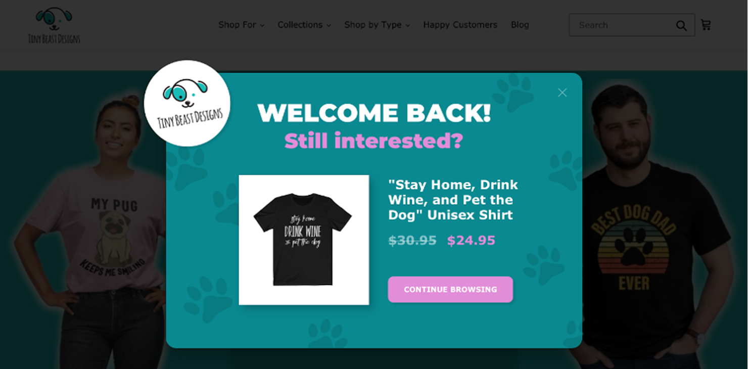
Whether you’re highlighting a new product, promoting a limited-time offer, or announcing special events (if a bestselling product is back in stock, for example), popups can grab visitors’ attention and encourage them to make a purchase.
4. Increased awareness of important information
Popups also offer a quick and easy way to communicate with your target audience.
Whether you’re sharing updates about your business, announcing upcoming events or sales of a product line, or showcasing recent product demos, a popup ensures that your messages are front and center where they’re most likely to be seen.
A popup design example gallery: 40+ popup ideas
Let’s get inspired: browse through our popup design example gallery for 40+ more great popup design ideas!
In 2025, popups are even more personalized, less intrusive, and smarter than before. One notable advancement is the addition of exit-intent triggers that use AI to personalize offers. Brands are gravitating toward designs that feel like helpful extensions of the site, instead of intrusive and loud popups.

Brandon Schroth
Founder, Reporter Outreach
What are the essential elements of great popup designs?
Before we dive into creative examples, let’s outline the key elements that constitute a well-designed popup.
1. Clear call-to-action
Don’t just make a popup for the heck of it… ensure that it has a specific purpose.
Whether you’re aiming to collect email addresses, promote a sale in your online store, or guide users to relevant content, a well-defined goal sets the stage for effective engagement.
2. Compelling copy
To attract customers, compelling copy is key. It can make your popup memorable, so make sure you spend time on it and craft your message with precision and persuasion.
Use concise language that not only conveys your point but also captures the attention and interest of your audience.
3. A motivating value proposition
Make sure you have a tempting offer, or users simply won’t be interested.
A strong value proposition acts as the driving force behind user engagement, enticing them with what sets your offer apart. You should clearly articulate the benefits users will gain.
Your value proposition should be the main focus, highlighting what makes your offer or message valuable to the user.
4. Eye-catching visuals
With our dwindling attention span, it’s more important than ever to catch the eye. Enhance your popup’s appeal by incorporating visually captivating graphics, colors, and images.
These visuals must align seamlessly with your brand identity, creating a cohesive and memorable visual experience for your audience.
5. User-friendly design
Strive for clarity and simplicity. Prioritize user-friendly design, ensuring easy navigation and a seamless experience.
Avoid clutter, which can easily overwhelm users.
Given that more than half of online traffic is now coming from various mobile devices, ensure your pop-up design is easy to engage with for your customer base and that they can navigate on both desktop and mobile platforms.
6. Strategic placement
We’ve all seen annoying popups, but they become truly bothersome when not placed with care and strategy.
Carefully consider when and where your popups appear. Align the timing and placement with user behavior, such as exit intent or scroll depth. By strategically placing your popups, you increase the likelihood of capturing your audience’s attention at the right moment.
10 best popup design examples
Now, it’s time to take some notes as we explore ten excellent popup design examples from ecommerce stores.
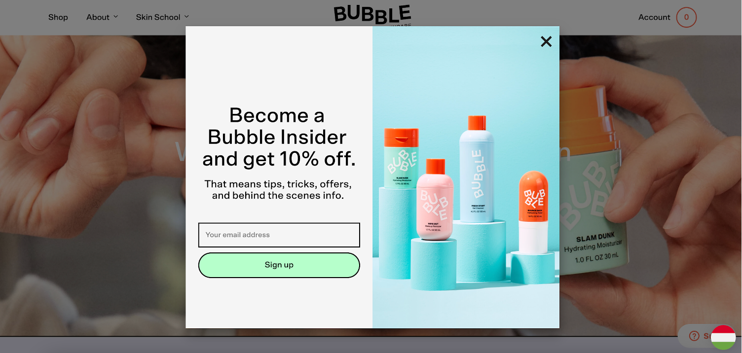
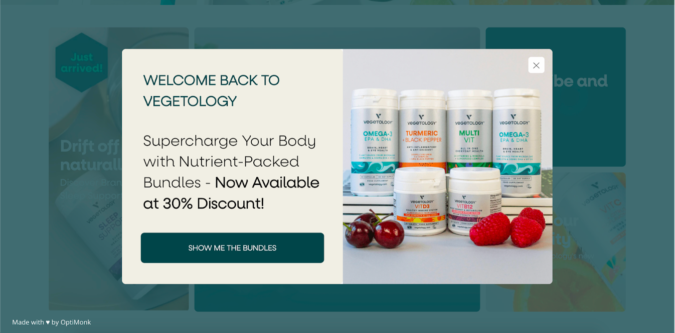
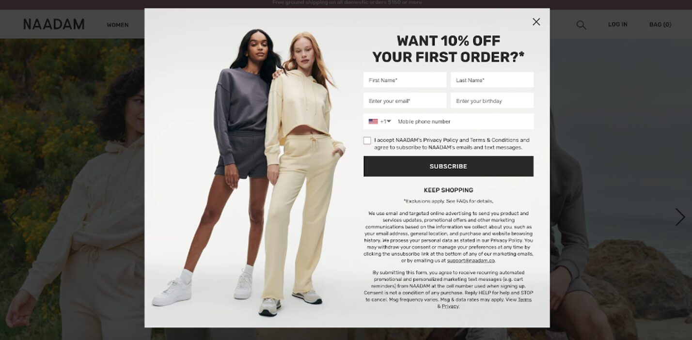
1. RYZE Mushroom Coffee
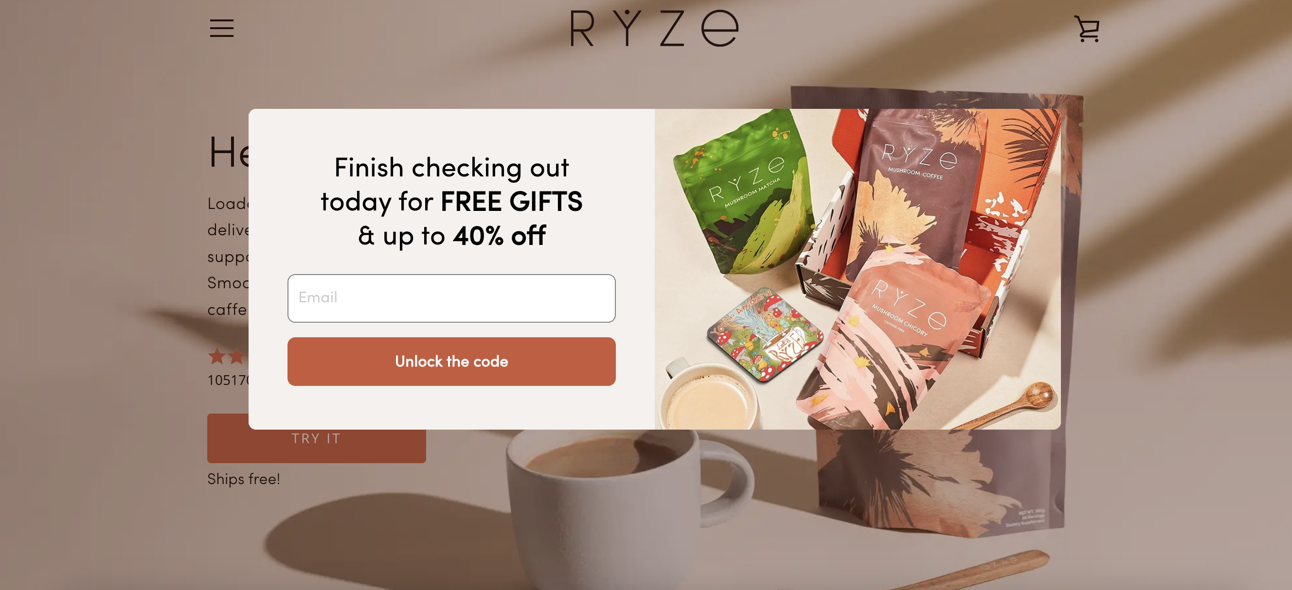
RYZE Mushroom Coffee’s exit-intent popup is the epitome of keeping things simple yet attractive.
The popup’s style is clean, and it matches their website’s aesthetic with the neutral beige color. They offer a free gift and an attractive discount to generate more purchases.
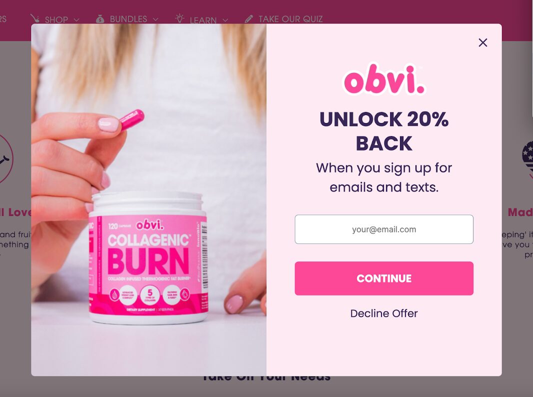
2. Gelpro Australia
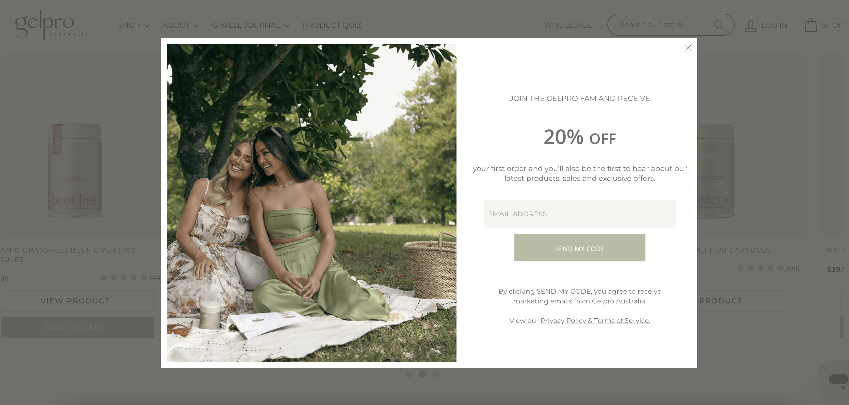
Gelpro Australia’s popup is also a good example, as they offer 20% off for new customers, encouraging them to subscribe and become part of the “fam.”
This gives the customer the feeling of being a member of an exclusive club or a family, not just subscribing to yet another newsletter.
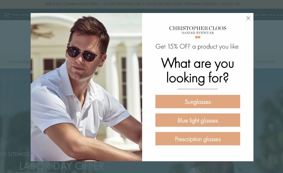
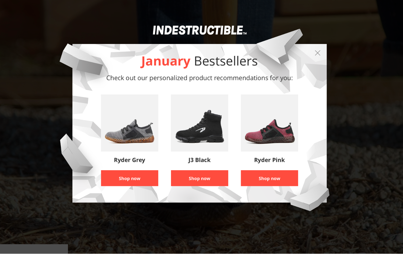
3. Controlled Chaos
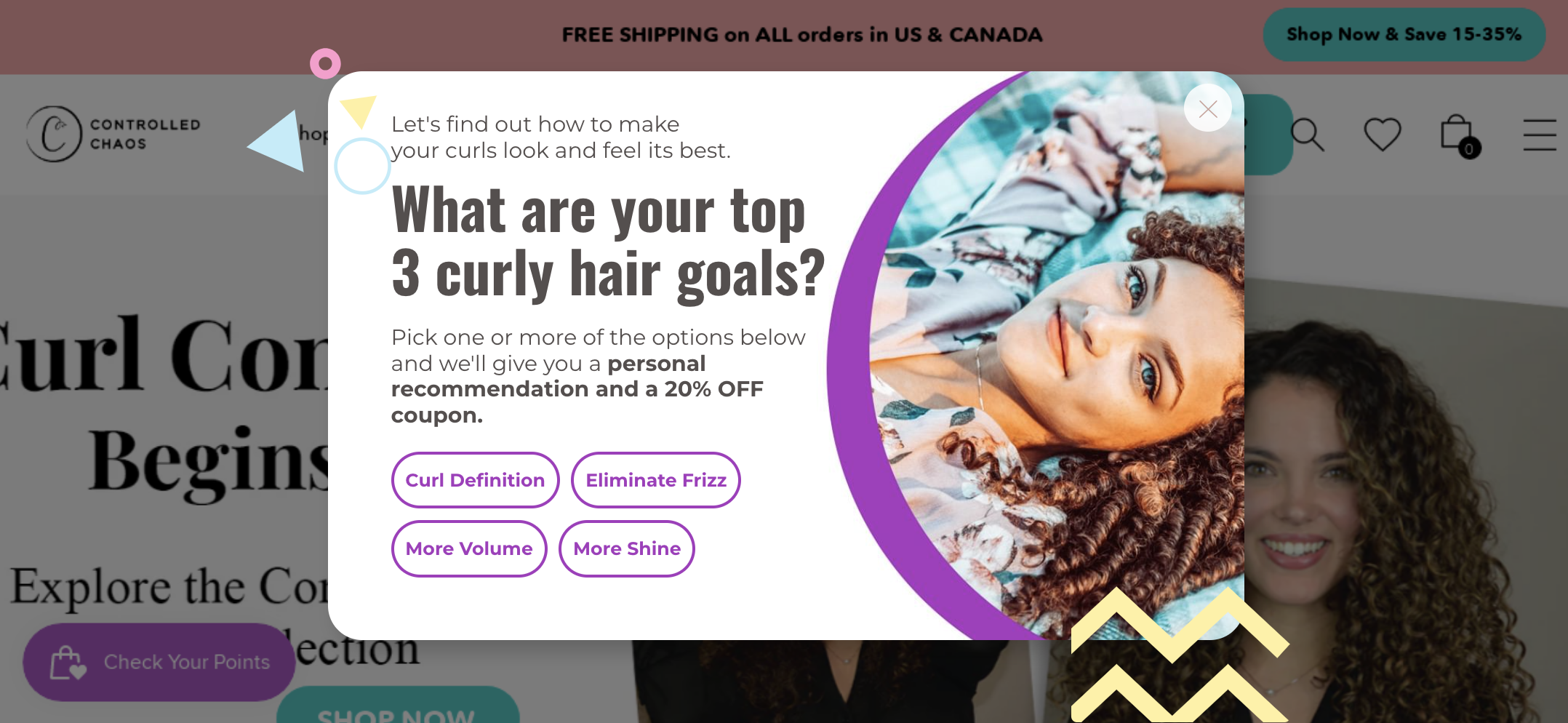
Controlled Chaos’s popup design example offers many benefits, and it’s outstanding for two reasons: they not only offer a 20% discount but also segment their visitors during the very first step and provide them with personalized product recommendations.
This can increase the likelihood that those visitors will make a purchase, since they see only products that align with their interests.
4. Clive Coffee
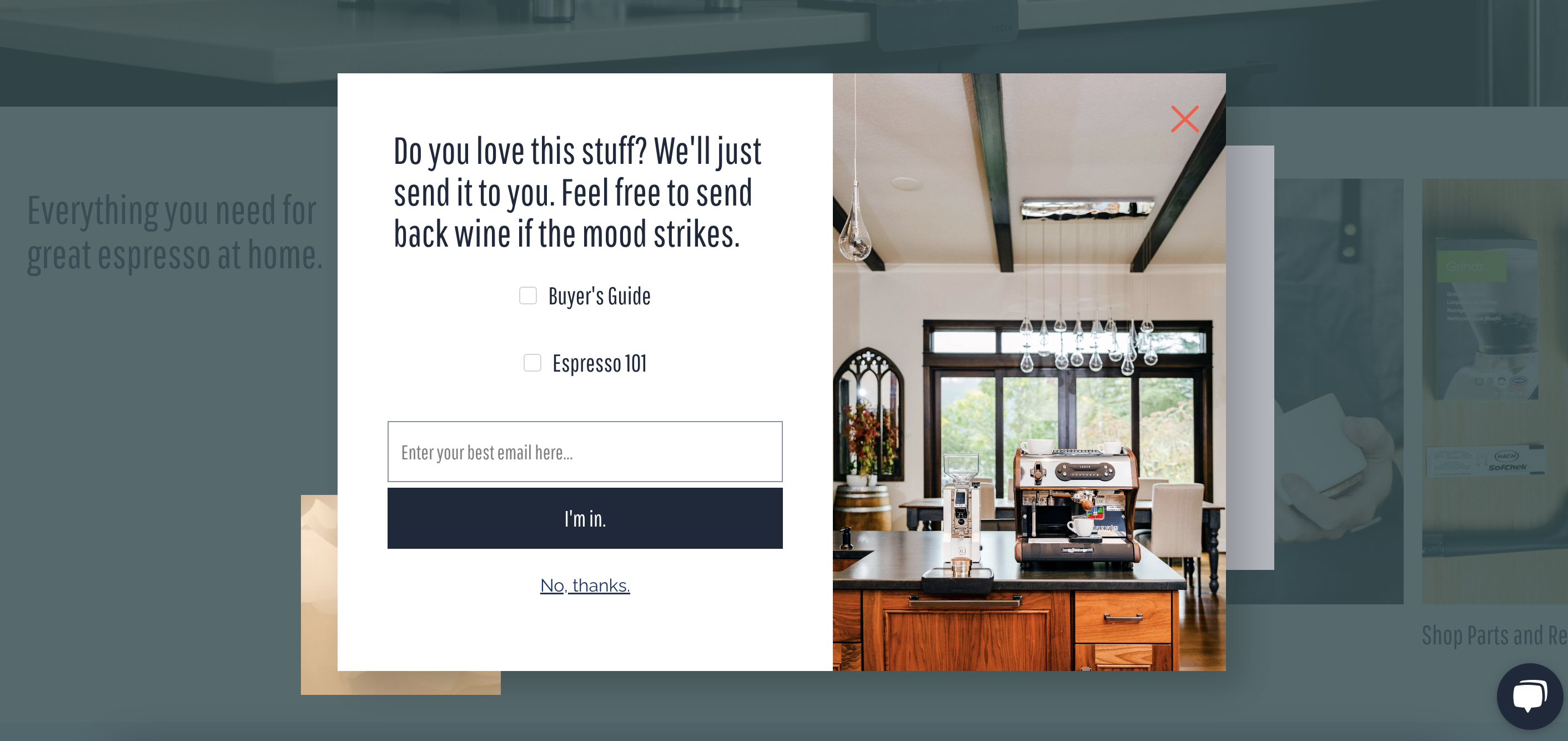
Clive Coffee’s popup design example highlights the importance of great copy and free samples.
If your online store has an easygoing brand voice, don’t be afraid to use this on your pop-ups too—your target audience will appreciate it!
Giving away free samples of your products is also tempting, because who doesn’t like free gifts? Also note the picture they are using: it shows an espresso machine, which is clear and communicates the main value effectively.
5. Rudie Baby
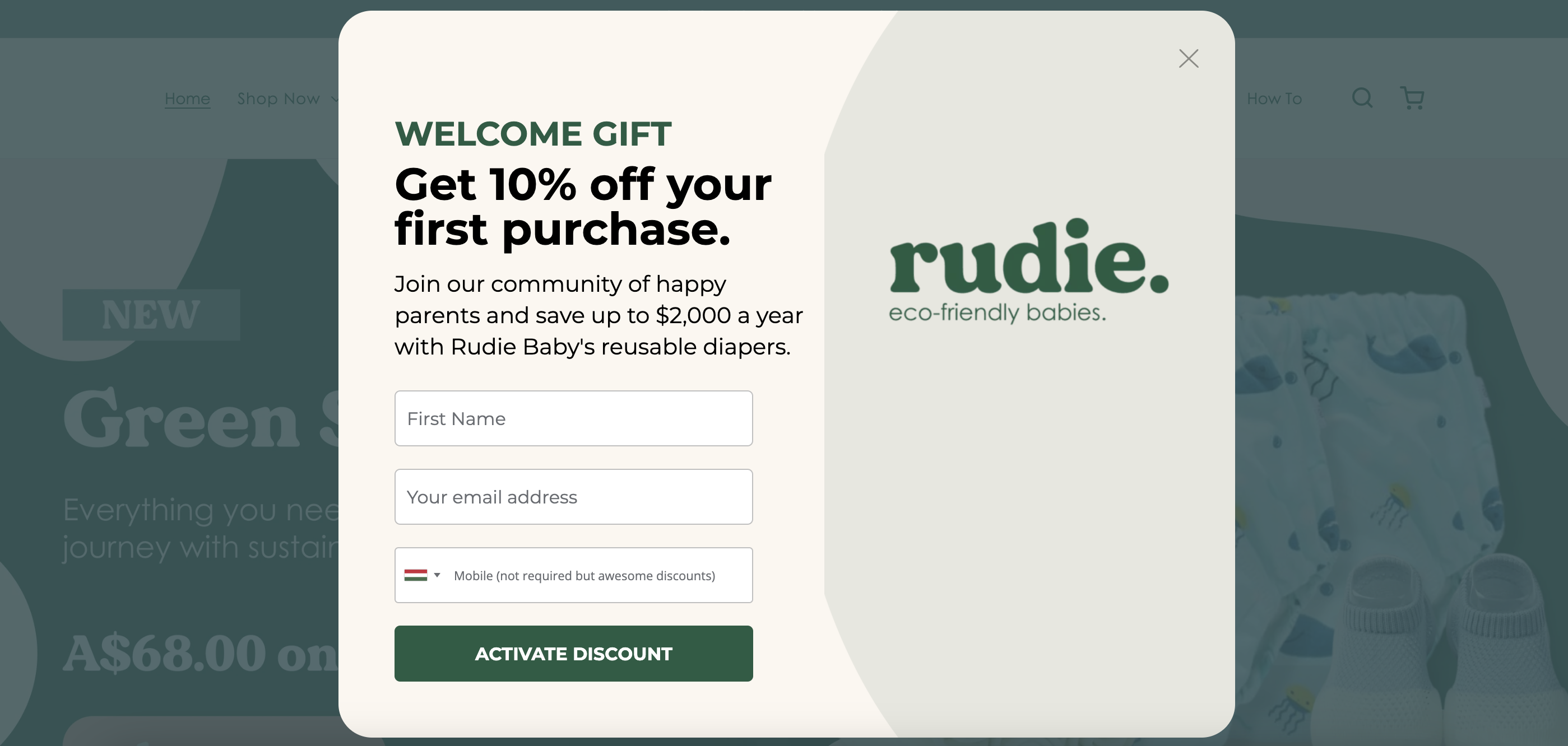
Rudie Baby’s popup example has two main things to highlight:
- By joining the community, you can save huge on diapers (and every parent knows diapers are quite expensive).
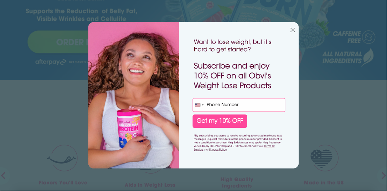
- The optional phone number section. It’s not mandatory to fill it in, but there’s an additional discount customers can earn by sharing their number.
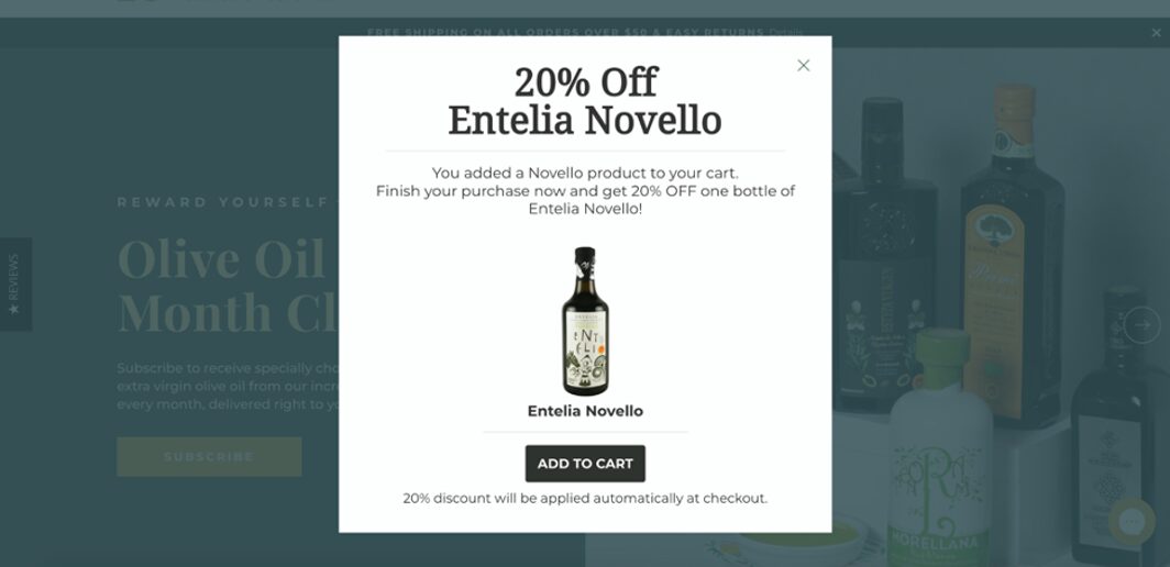
6. Ölich Olivenöl
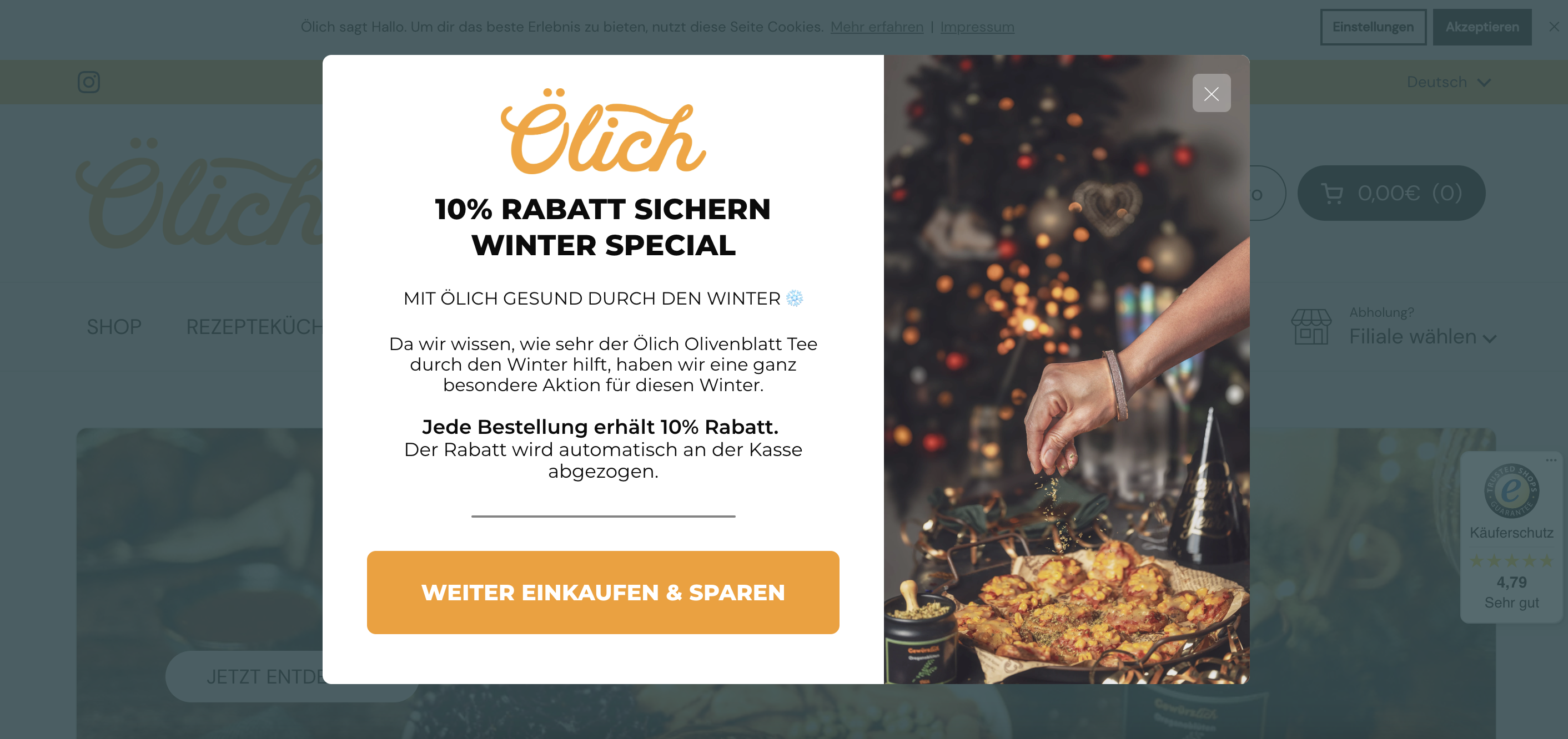
Ölich Olivenöl shows the effectiveness of minimalistic design and seasonal popups.
Packing your offers into seasonal flavors, you can easily boost their effectiveness, not to mention improve your customers’ experience.
7. Organixx
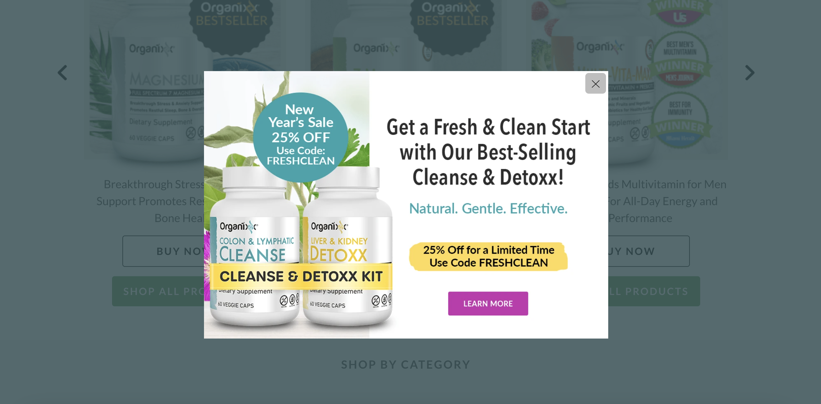
Organixx provides a great example of how to promote your best-selling products. Offering a bundle with 25% off is a very tempting value proposition for potential customers.
Note that in the subheadline they highlight the values of their product, and they include product images to give users a peek at what they can get.
8. Fun in Motion Toys
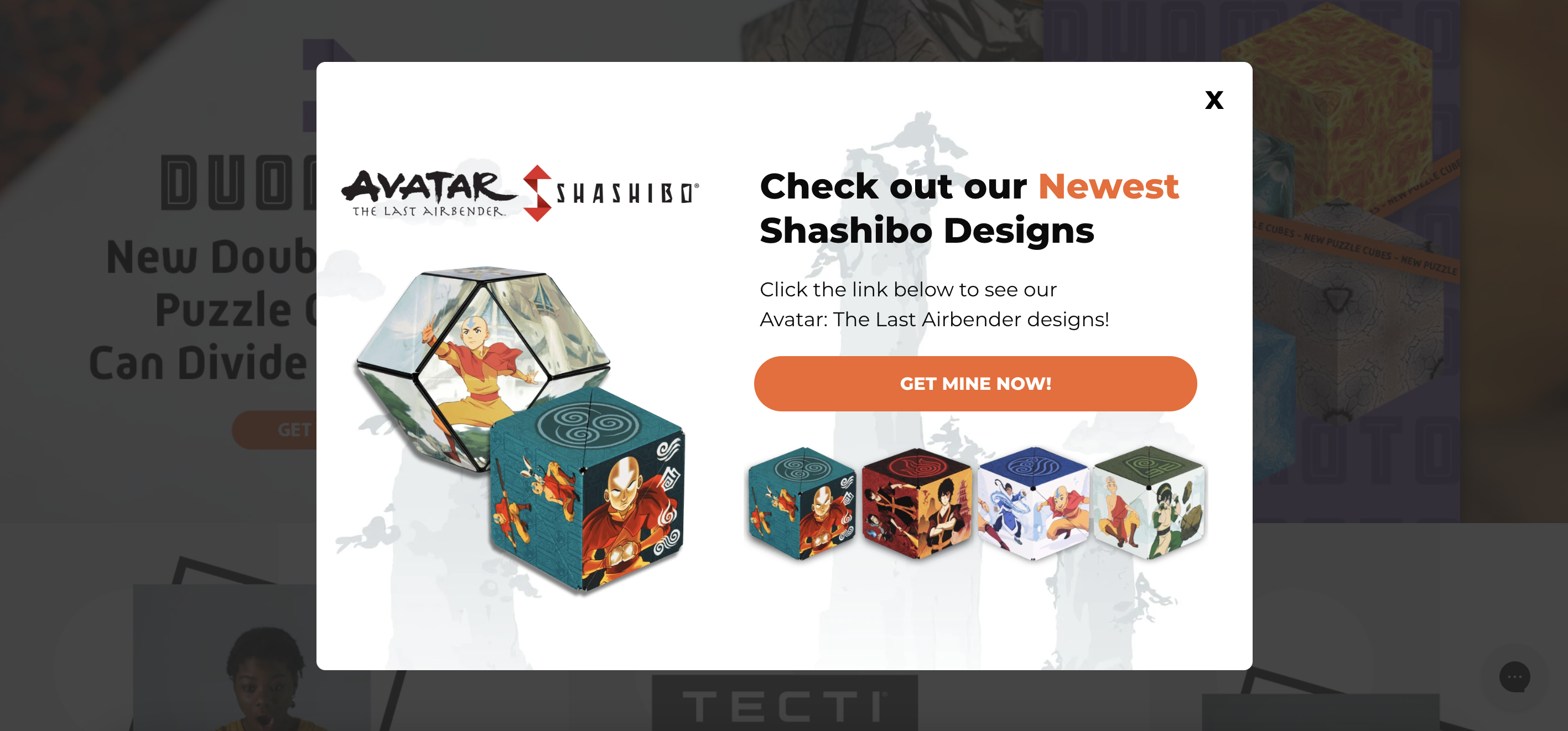
Fun in Motion Toys knows how to grab attention with a unique call-to-action button color (CTA) on their popup.
They splash a vibrant color on it and go for an enticing, out-of-the-ordinary CTA. Instead of the standard “Buy Now,” they make things interesting by encouraging customers to “Get Mine Now.” This tweak likely hits home with their target audience, adding an extra touch of excitement to the shopping experience.
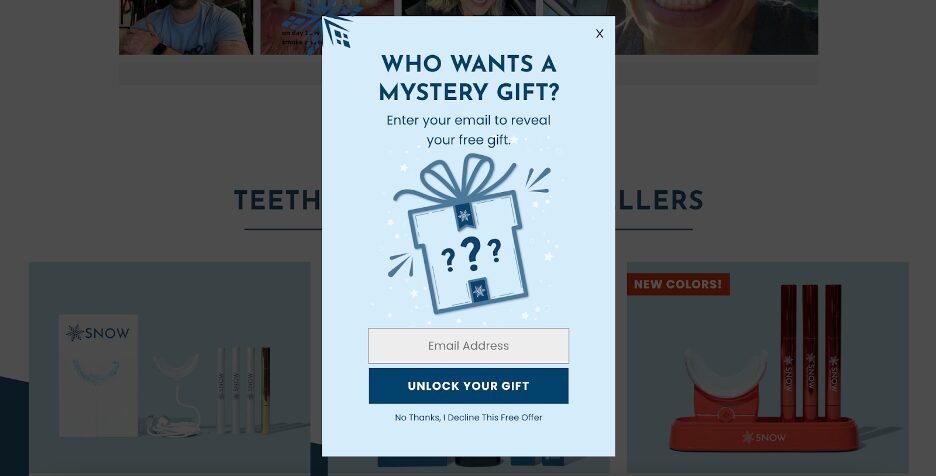
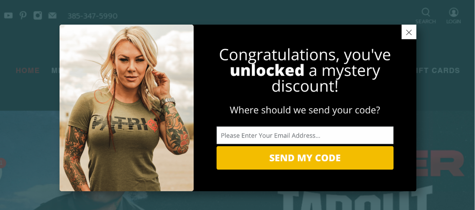
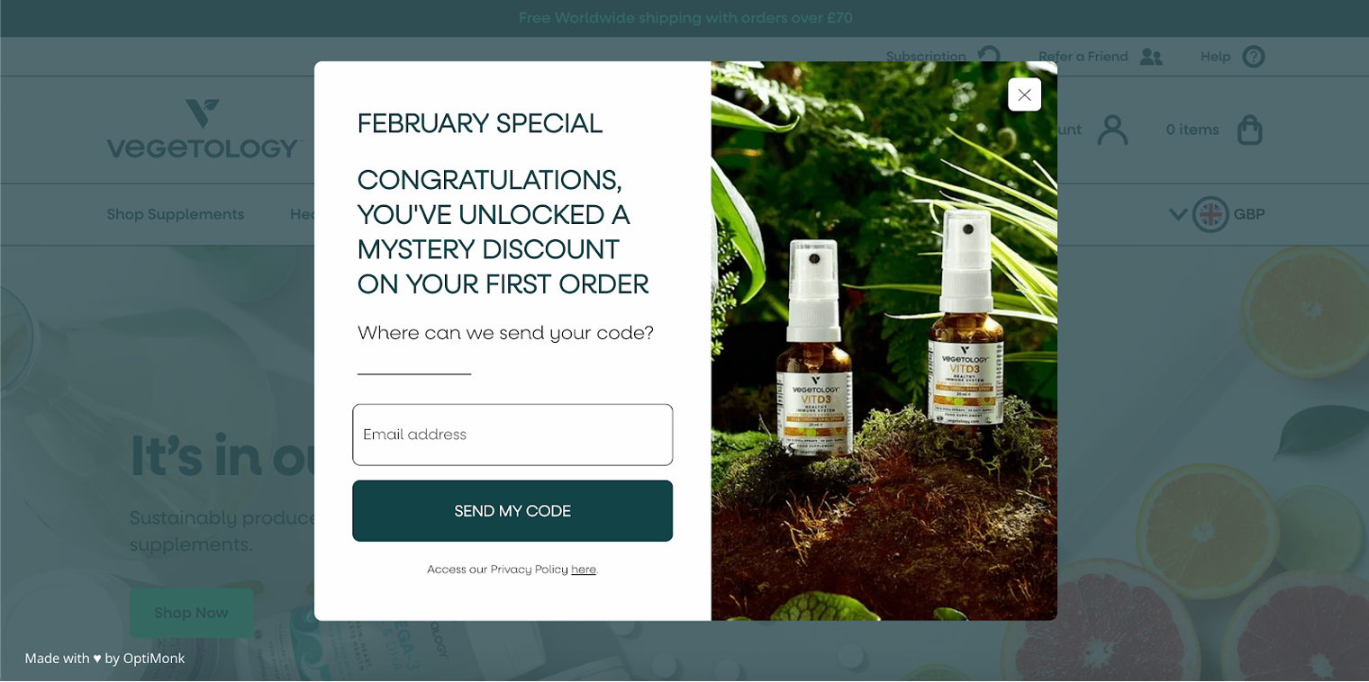
9. The Kopi Luwak Company
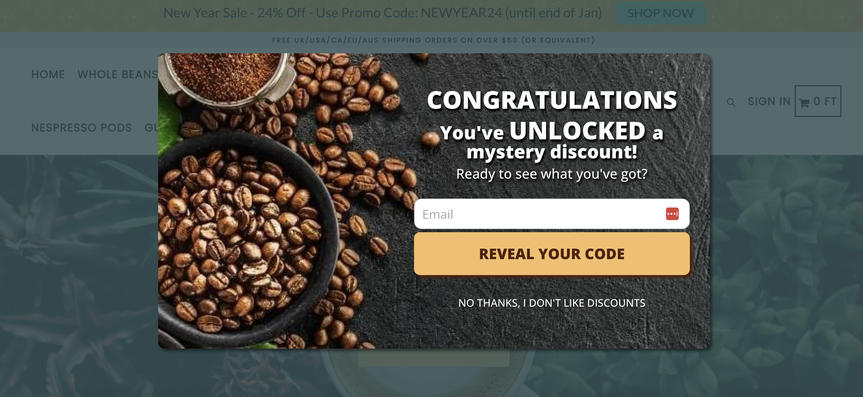
Kopi Luwak Company’s pop-up form employs a clever strategy with its mystery discount.
Mystery discounts work well because they spark curiosity in visitors and generate buzz, potentially enticing more subscribers than a straightforward 15% off offer.
Take a look at the “Reveal the code” CTA and the “No thanks, I don’t like discounts” alternative—it’s a persuasive approach since, let’s face it, who doesn’t like discounts?
10. Crazy Nutrition
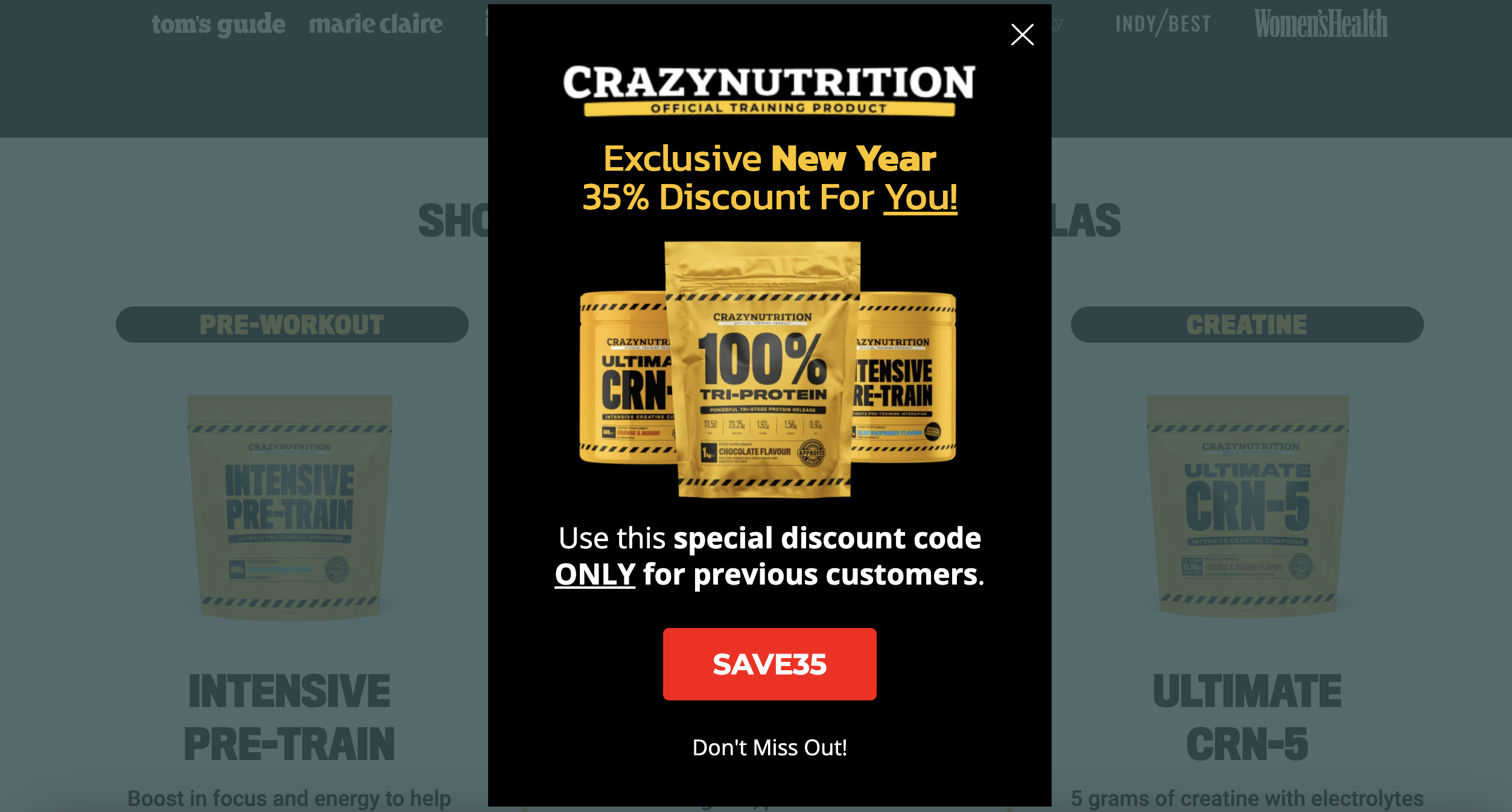
Crazy Nutrition’s popup design is a great example of using a special discount code for your offers, helping returning customers feel extra special.
If you want to treat your existing customer base, giving out special discounts is probably one of the best ways to do it.
3 extra tips for boosting your popup
Once you’re ready with your excellent popup design, it’s time to think about your conversion rate. Let’s see 3 extra tips that will help you boost it.
1. Run seasonal campaigns to increase FOMO
Our first pop-up tip is probably familiar to you if you’re a savvy online store marketer.
Your general 10% discount pop-up can be transformed easily into a seasonal pop-up campaign. With this simple change, you’ll make your pop-up even more relevant to your audience.
Seasonal deals can create a sense of urgency, increasing the FOMO in your website visitors.
Find out how to give your popups a seasonal taste.
2. A/B test your popup messages
Even if you’ve known your customer base for over a decade, it’s always a good idea to test your pop-up messages to figure out which campaign works best.
With Variant A/B testing, you can try different messaging, place your popups in new locations on your website, experiment with bright colors, and much more.
The main point is this: A/B testing is a great way to play around, helping you test your hypotheses and find out which popup designs resonate best with your customers.
3. Provide discount codes (and follow up)
Over 60% of online shoppers claim that discount codes are important factors in their purchase, so they shouldn’t be overlooked.
For example, if you have a special discount for a piece of cheese from the farmers market or you want to promote a special item from an independent manufacturer, one of the best things you can do is to offer them with a special discount. That way, you’ll be able to introduce those products to a wider customer base—not just local customers.
If you promote your discount code on a pop-up, you’ve taken the first step toward putting it in front of more people, but you shouldn’t forget to follow up and remind users to use it.
You can easily implement a sticky bar to follow visitors across your website and remind them about their discount codes.
Wrapping up
We hope that by now you’re feeling inspired and full of ideas about the type of popup you want to design for your ecommerce site!
If you’re looking for a great tool to bring all those popup design dreams to life, OptiMonk has over 300+ templates waiting for you.
And the best part? You can create a free account today and kickstart your creative journey. Happy crafting!
Migration has never been easier
We made switching a no-brainer with our free, white-glove onboarding service so you can get started in the blink of an eye.

What should you do next?
Thanks for reading till the end. Here are 4 ways we can help you grow your business:
Boost conversions with proven use cases
Explore our Use Case Library, filled with actionable personalization examples and step-by-step guides to unlock your website's full potential. Check out Use Case Library
Create a free OptiMonk account
Create a free OptiMonk account and easily get started with popups and conversion rate optimization. Get OptiMonk free
Get advice from a CRO expert
Schedule a personalized discovery call with one of our experts to explore how OptiMonk can help you grow your business. Book a demo
Join our weekly newsletter
Real CRO insights & marketing tips. No fluff. Straight to your inbox. Subscribe now
Share this article
Written by

Barbara Bartucz
Barbara is a Content Marketer at OptiMonk. She takes pride in creating different forms of content, whether it’s an article, a video, or an e-book.
You may also like
- Posted in
- Conversion
Partner with us
- © OptiMonk. All rights reserved!
- Terms of Use
- Privacy Policy
- Cookie Policy
Product updates: January Release 2025


