- Blog
- 7 Multi-Step Form Examples That Boost Conversions
7 Multi-Step Form Examples That Boost Conversions
-
Barbara Bartucz
- Conversion
- 6 min read
Table of Contents
Does your form have lots of fields and a low conversion rate? That’s not too surprising. Long, complicated forms can overwhelm users, leading to high form abandonment rates and lost opportunities.
The solution? Multi-step forms.
By breaking down the process into multiple steps that are smaller and more digestible, you can create a less intimidating, more seamless user experience that encourages completion.
In this article, we’ll explore why multi-step forms are a game-changer and showcase seven real-life examples that prove just how powerful they are for boosting conversions.
Let’s jump in!
What are multi-step forms?
Multi-step forms, also known as multi-page forms, are exactly what they sound like—forms split into multiple steps or pages instead of a single long one. They guide the user through a series of questions, collecting information in a structured way.
Progressive disclosure is a key feature of multi-step forms, gradually revealing information requests to minimize users’ cognitive load and reduce overwhelm.
Instead of bombarding a visitor with a wall of fields, multi-step forms break the process into digestible chunks, which can be much more appealing to users.
Why do they work better than single-step forms?
Multi-step forms reduce the mental load by breaking the process into manageable steps.
Instead of overwhelming users with a long list of fields, they handle one step at a time, improving the user experience and boosting completion rates.
Here’s why they outperform single-step forms:
1. Gradual commitment
When users start a task, they’re more likely to finish it. This phenomenon, known as the “foot-in-the-door” technique, plays a big role in the success of multi-step forms.
By asking users to commit to just one small step—like entering their email—they’re more likely to continue filling out the rest of the form. As they complete each step, they feel a sense of progress, which encourages them to keep going.
This gradual commitment in multi-step forms significantly aids in lead generation by capturing essential contact information and qualifying leads efficiently.
2. Reduced friction
Picture this: you land on a page, and you’re hit with a form that has 20 fields staring back at you. It feels like too much, right? That’s the friction that causes people to bail.
Multi-step forms solve this by presenting just a few fields at a time, reducing that sense of overload. Users no longer feel like the form is going to eat up all their time, making it more likely they’ll complete it.
Additionally, conversational forms can further reduce friction by engaging users in a friendly manner, focusing on one question at a time to maintain engagement.
3. Improved user experience
Multi-step forms aren’t just about reducing effort—they’re about guiding users through a smooth, logical flow. By breaking the form into sections, you can tailor the experience to be more intuitive.
This helps avoid confusion or frustration and leads to a better overall user experience.
Plus, users are more likely to complete a form when the journey feels easy and logical.
7 multi-step form examples to inspire you
Now that we’ve established why multi-step forms work, let’s take a look at some real-world examples of brands using this strategy to drive conversions.
1. Nexus Sports Nutrition
First up on our list of multi step form examples is this one from Nexus Sports Nutrition. They keep the first step simple, asking only for an email address.
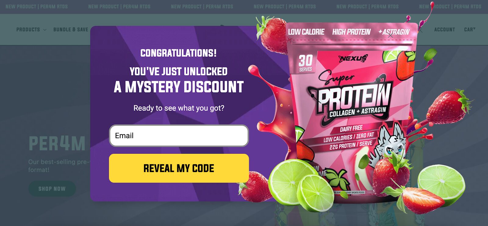
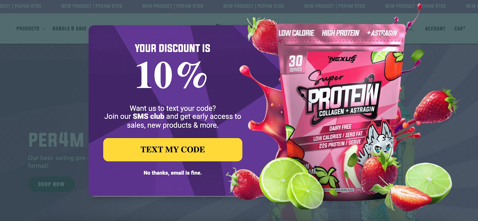
However, once the user opts in, they up their game by offering an exclusive invite to join the SMS club.
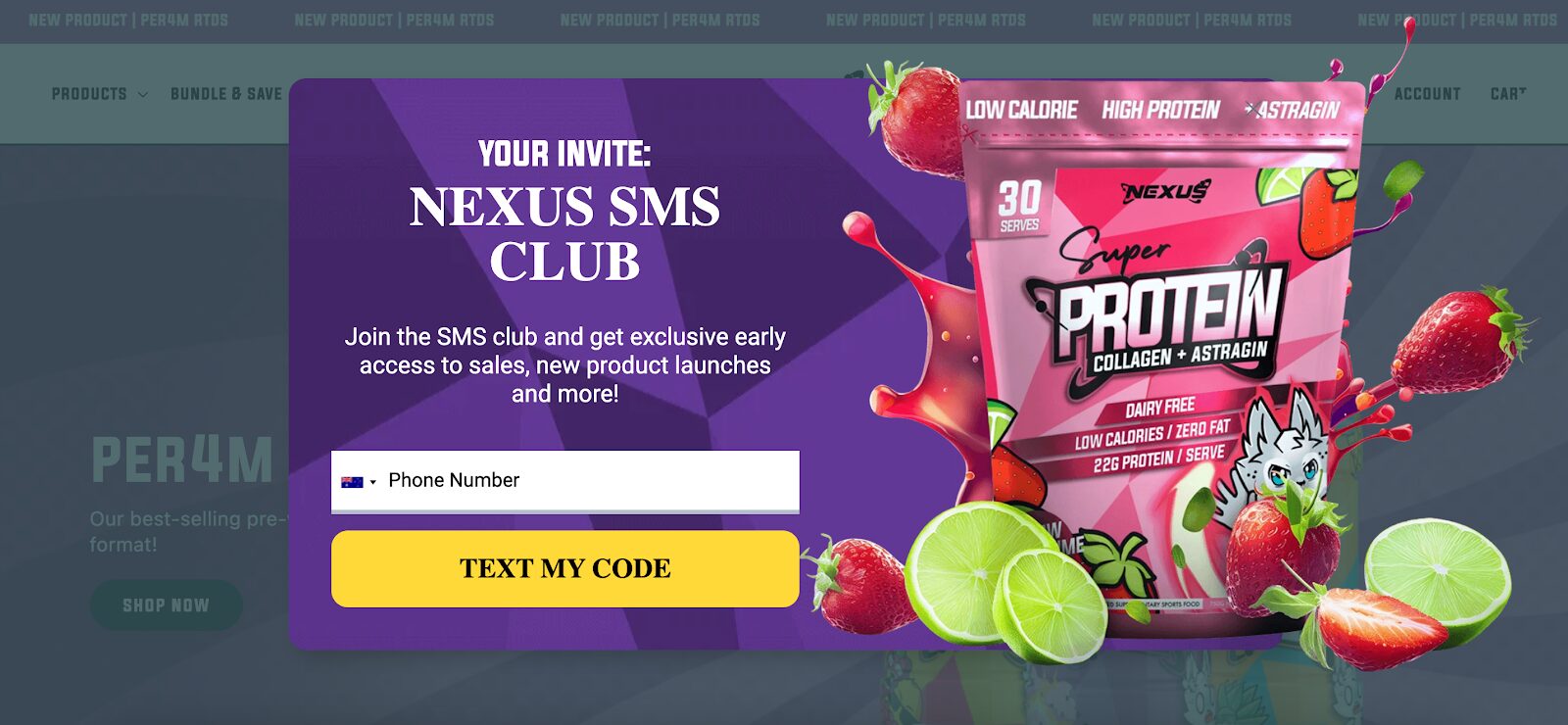
The bonus? Members get perks like early access to new products and sales. This tiered approach not only captures emails but also grows their SMS marketing list—a double win!
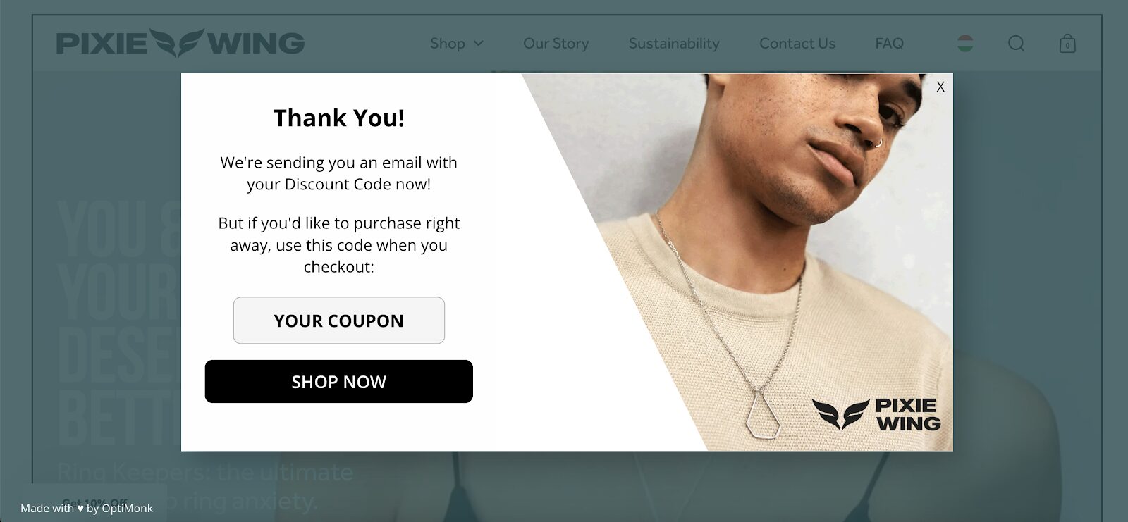
2. Pixie Wing
Pixie Wing’s multi-page form starts with a tantalizing teaser: an “exclusive discount.” Users are prompted to make a simple choice—click “Send my code now!” or pass on the offer.
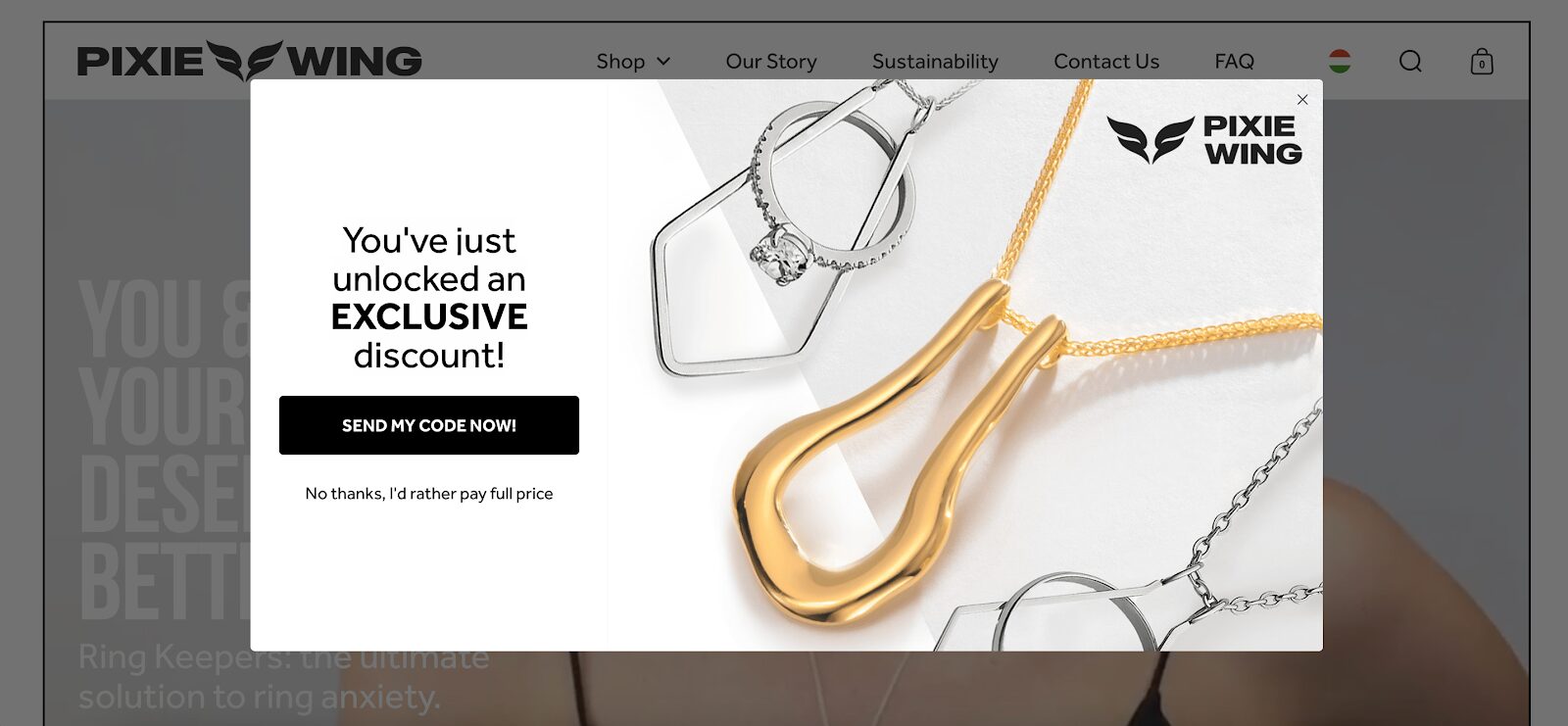
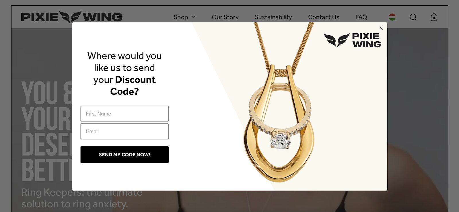
In the next step, they’re invited to provide their phone number (though it’s not required).
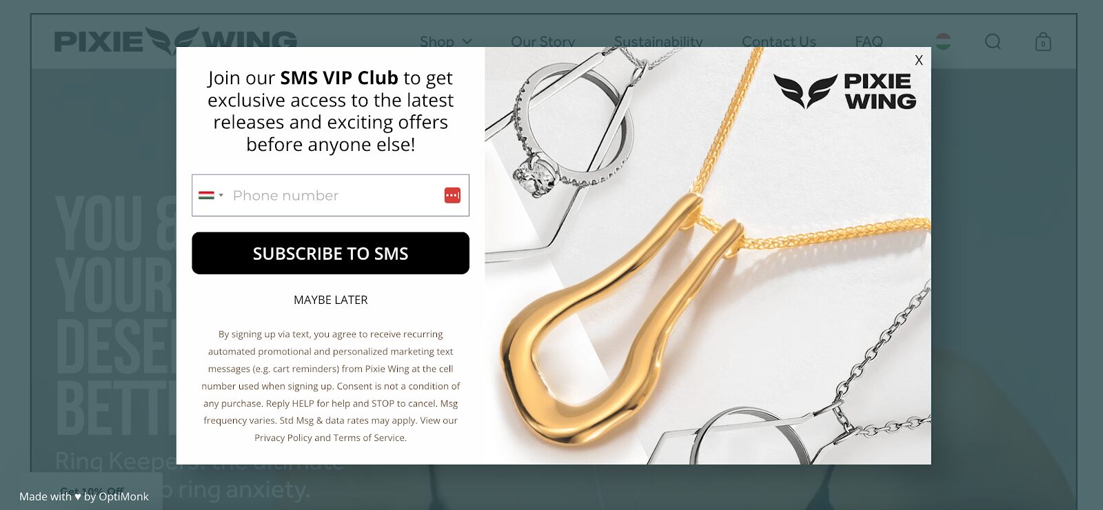
This soft approach helps Pixie Wing grow its SMS list without scaring potential leads away. The final step is a coupon code to seal the deal.
3. Obvi
Obvi’s multi-step form is all about adding value. The first page offers visitors a 10% discount in exchange for their email.
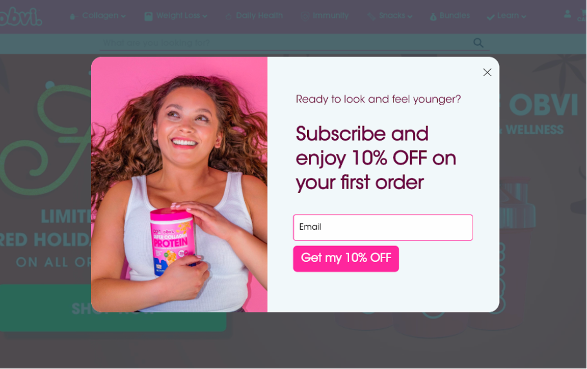
After that, the form asks for a phone number.
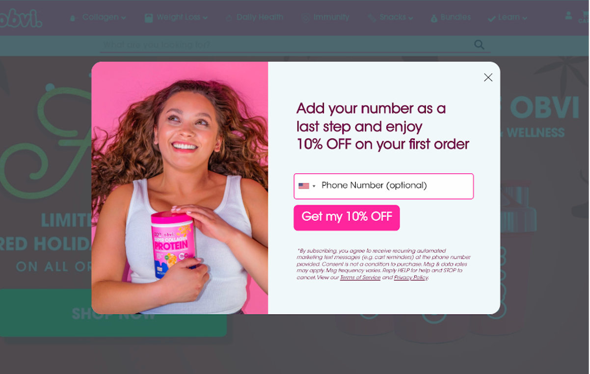
Finally, they deliver an automatically generated coupon code.
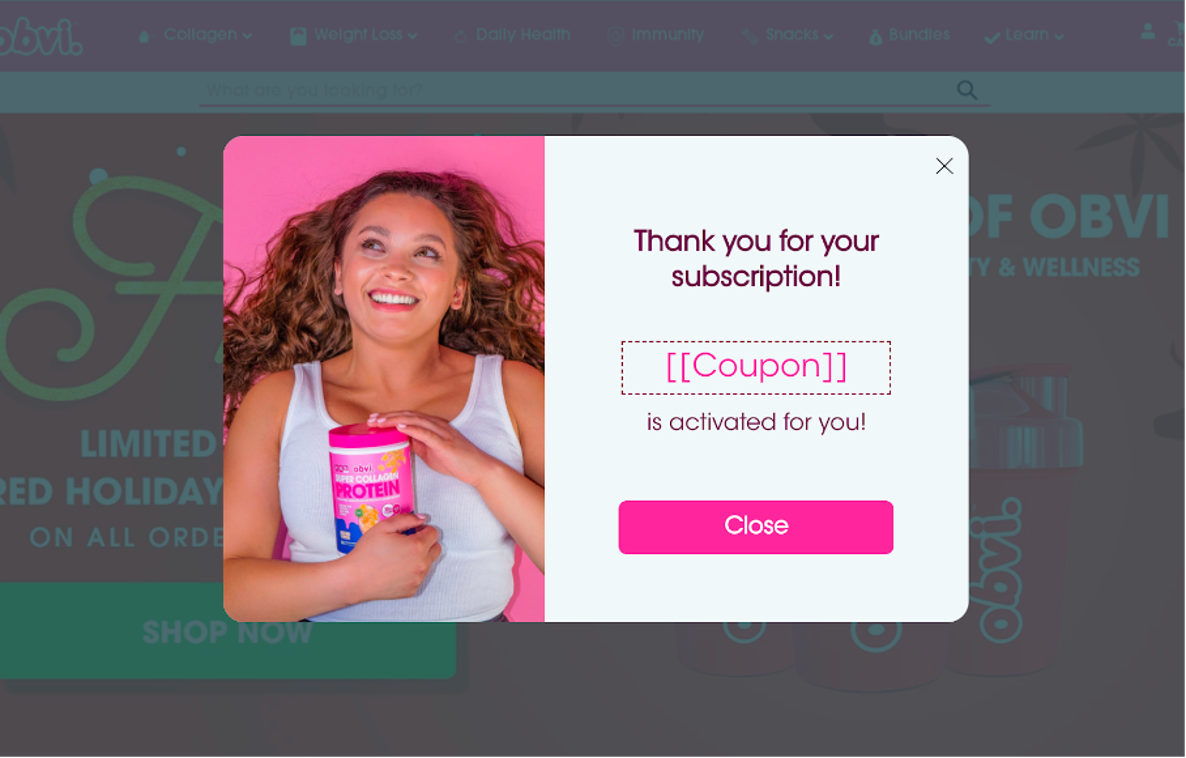
This simple but effective strategy collects both email addresses and phone numbers, setting them up for successful email and SMS campaigns.
4. BootCuffsSocks
BootCuffsSocks uses a smart strategy with a YES/NO question right off the bat.
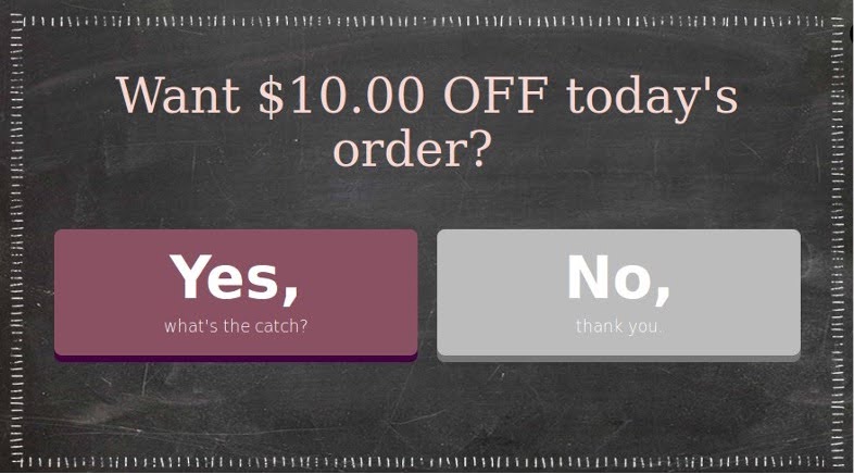
If visitors choose “Yes,” they’re asked for their email address. The process finishes with a thank-you message and a discount code delivered to their inbox.
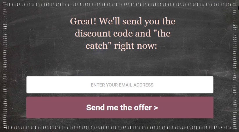
This simple, friendly flow guides visitors through a low-commitment process while collecting key information.
Additionally, BootCuffsSocks employs conversational forms to engage users by focusing on one question at a time, creating an inviting and interactive atmosphere.
5. Crown & Paw
Crown & Paw kicks things off with a tempting 10% off offer.
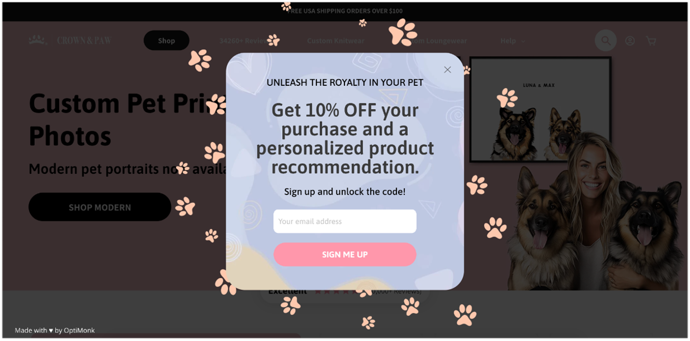
After collecting the email, they ask a few questions about the user’s interests and preferences.
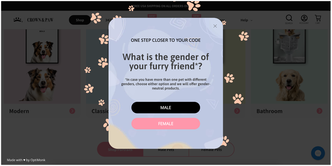
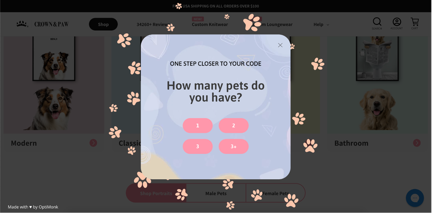
Based on those answers, the final step offers relevant product recommendations alongside the discount code.
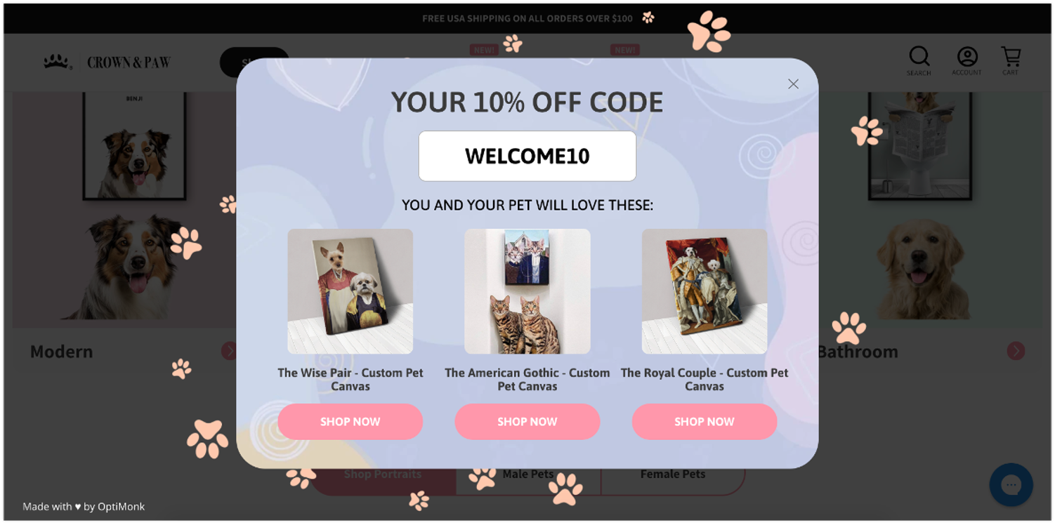
This personalized touch not only boosts conversions but also creates opportunities for upselling and cross-selling based on customer preferences.
Plus, this multi-step form helps generate qualified leads by collecting detailed information from genuinely interested prospects.
6. Desert Does It
Desert Does It’s multi-step form example is a little different. It avoids a long, complex form by starting with a simple Yes/No question, offering a 5% discount just for participating.
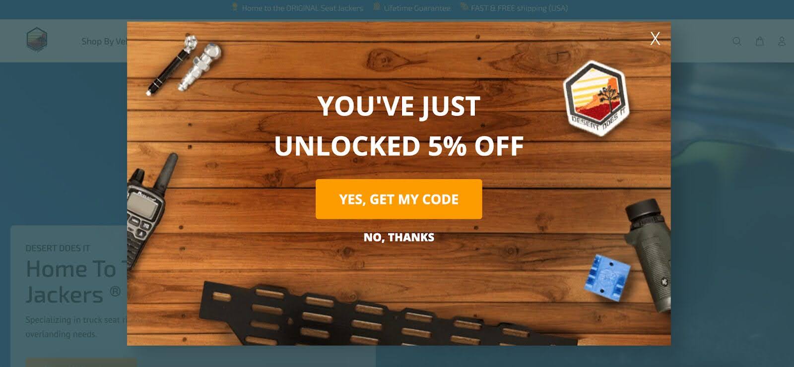
From there, they ask for more personalized information, like “What vehicle are you shopping for?”
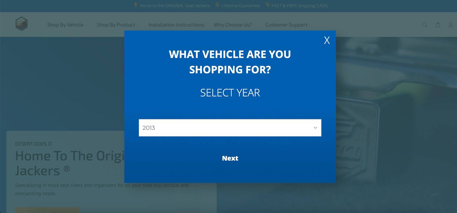
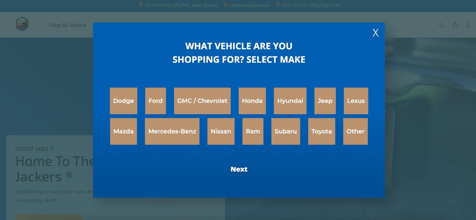
After answering those questions, users can opt in by providing their email address.
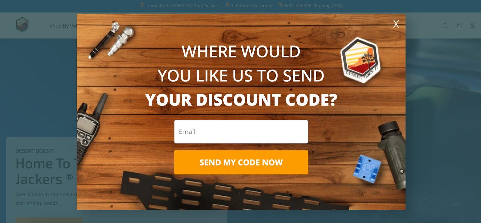
The clever part? Users have the option to increase their discount to 10% by providing their phone number.
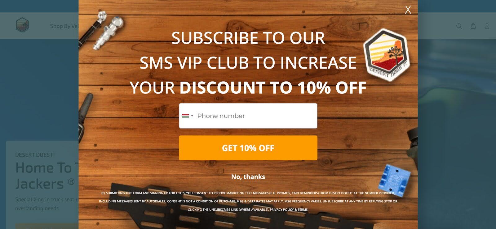
This approach incentivizes users to engage more and provides valuable lead data for SMS marketing campaigns.
7. Sassy Scents
Sassy Scents also uses a multi-step form that starts with a simple Yes/No question.
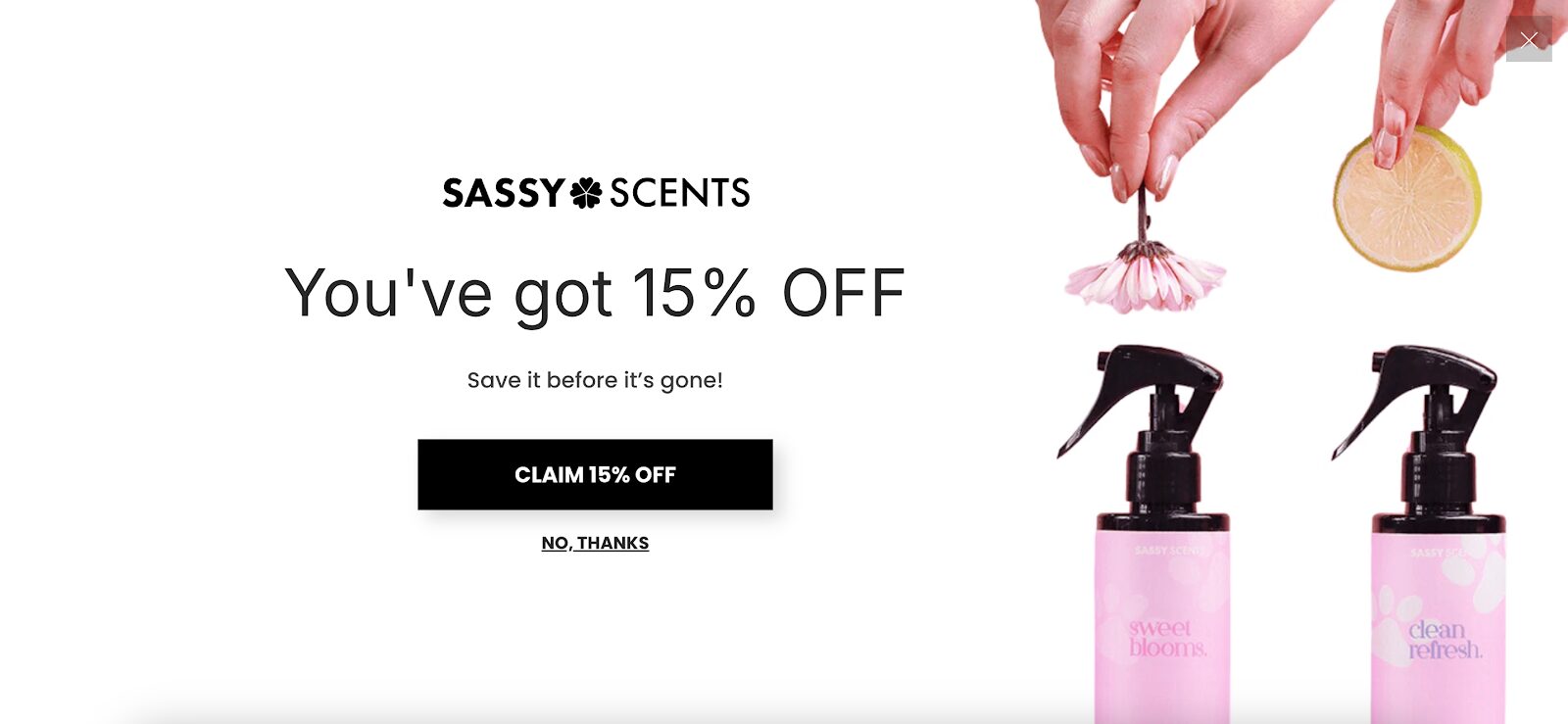
After confirming they’re interested, visitors are asked to provide their email address. In the final step, personalized product recommendations are displayed on the thank-you page.
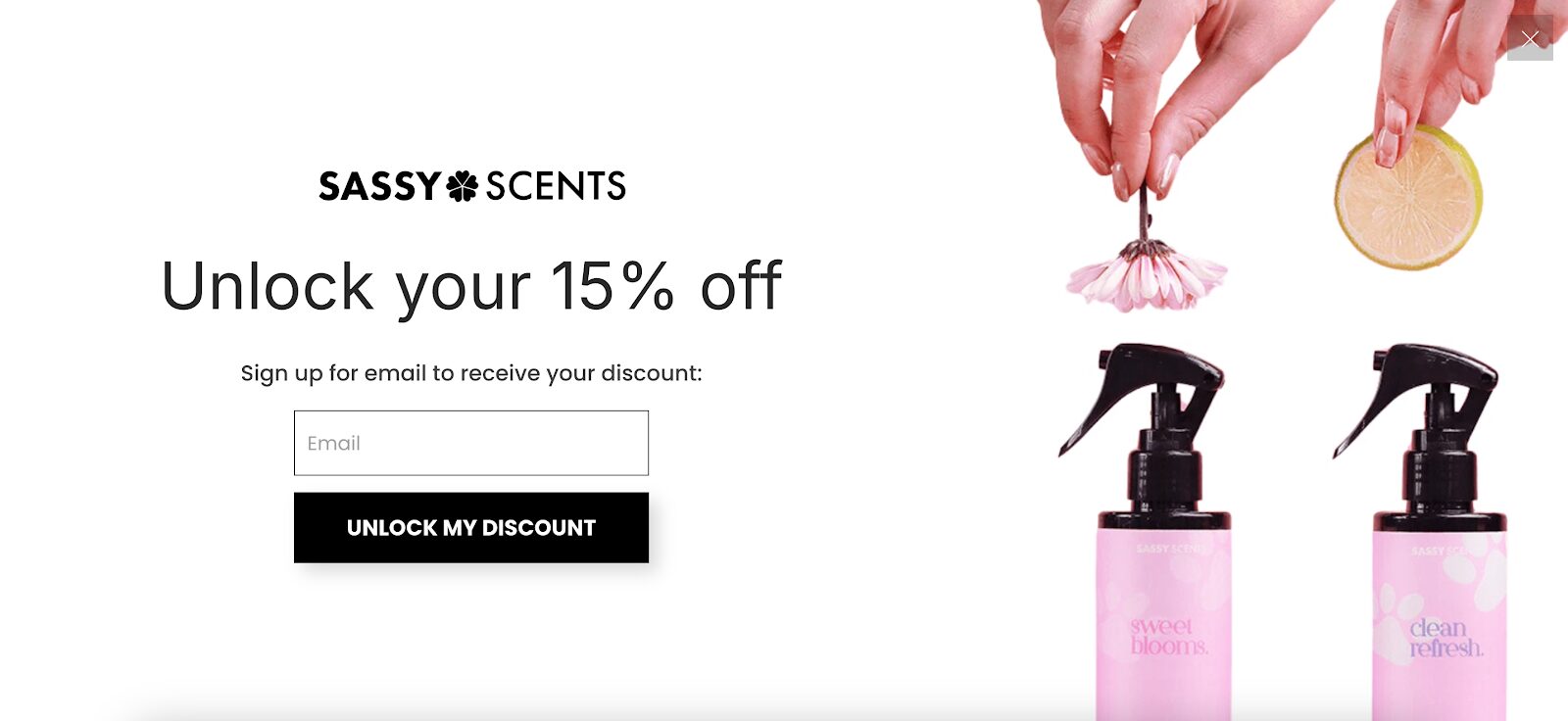
This strategy not only improves the customer experience but also drives conversions through thoughtful cross-selling.
Sassy Scents’ form is considered one of the best examples of multi-step forms for driving conversions.
Common pitfalls to avoid when creating a multi-step form
To build effective multi-step forms, there are a few common pitfalls you’ll want to steer clear of. Avoiding these mistakes is crucial for maintaining high conversion rates and a positive user experience.
1. Overly complex forms
Forms that are too long or complicated can frustrate users, leading to high abandonment rates. Keep each step simple and focused to maintain user interest and ensure completion.
2. Poorly designed progress indicators
Progress indicators that are unclear or misleading can confuse users and reduce engagement. Ensure that your progress indicators are straightforward and that they accurately reflect the user’s progress through the form.
3. Insufficient testing
Failing to thoroughly test your form can result in errors and bugs that disrupt the user experience. Regular testing helps identify and fix issues before they impact your users.
4. Ignoring user feedback
User feedback is invaluable for optimizing your form design. Failing to collect and act on this feedback can result in a form that doesn’t meet user needs. Regularly solicit feedback and make adjustments based on user insights.
5. Not optimizing for mobile
A multi-page form that isn’t optimized for mobile devices can lead to a poor user experience and reduced conversion rates. Ensure your form is responsive so you can provide a seamless experience on all devices.
How to create your own multi-step form?
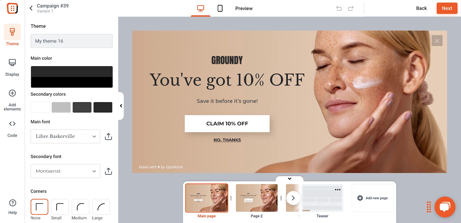
Ready to try a multi-step form for your business? Here’s how you can set one up using OptiMonk, one of the best tools for creating high-converting popup forms.
Step 1: Choose a template
OptiMonk offers a variety of pre-designed templates, which means you won’t need to start from scratch.
Pick one that aligns with your goals—whether you want to collect emails, offer discounts, or grow your SMS list.
OptiMonk also provides multi-page form templates to enhance user engagement and improve conversion rates.
Step 2: Customize each step of your form
Once you’ve chosen a template, it’s time to make it your own!
Personalize the form fields, layout, and design to fit your brand and target audience. Keep each step simple and straightforward to maximize completion rates.
Step 3: Set up targeting and triggering options
OptiMonk lets you control exactly when and where your form pops up.
You can set triggers based on visitor behavior, like exit intent or time spent on a page. This ensures that your form reaches the right people at the right moment.
By using these targeting options, you can generate qualified leads and collect detailed information from prospects that are genuinely interested in what you offer.
Step 4: Connect with your email marketing tool
To make the most of your multi-step form, sync it with your email marketing platform. This way, you can automatically capture essential contact information for new leads, making follow-up campaigns much easier to manage.
Step 5: Launch your campaign
Once your form is live, keep an eye on its performance. Use the data to tweak and optimize each step to ensure you’re maximizing conversions.
Wrapping up
Multi-step forms can transform your conversion strategy, turning hesitant visitors into loyal customers. By breaking down the process, reducing friction, and improving the user experience, these forms can be real game-changers for your business.
Ready to boost your conversions? Start experimenting with multi-step forms today and watch your subscriber list grow!
Migration has never been easier
We made switching a no-brainer with our free, white-glove onboarding service so you can get started in the blink of an eye.

What should you do next?
Thanks for reading till the end. Here are 4 ways we can help you grow your business:
Boost conversions with proven use cases
Explore our Use Case Library, filled with actionable personalization examples and step-by-step guides to unlock your website's full potential. Check out Use Case Library
Create a free OptiMonk account
Create a free OptiMonk account and easily get started with popups and conversion rate optimization. Get OptiMonk free
Get advice from a CRO expert
Schedule a personalized discovery call with one of our experts to explore how OptiMonk can help you grow your business. Book a demo
Join our weekly newsletter
Real CRO insights & marketing tips. No fluff. Straight to your inbox. Subscribe now
Share this article
Written by

Barbara Bartucz
Barbara is a Content Marketer at OptiMonk. She takes pride in creating different forms of content, whether it’s an article, a video, or an e-book.
You may also like
- Posted in
- Conversion
Partner with us
- © OptiMonk. All rights reserved!
- Terms of Use
- Privacy Policy
- Cookie Policy
Product updates: January Release 2025


