- Blog
- User Experience Optimization 101: Enhancing Your Website for Better Engagement
User Experience Optimization 101: Enhancing Your Website for Better Engagement
-
Nikolett Lorincz
- Ecommerce
- 6 min read
Table of Contents
Ever landed on a website and immediately felt lost? Maybe the navigation was confusing, the layout cluttered, or you simply couldn’t find what you were looking for. Frustrating, right?
That’s exactly what happens when a site’s user experience (UX) isn’t optimized.
But here’s the good news: you can prevent this on your own website.
In this article, we’ll walk you through the essentials of user experience optimization, helping you create a site that’s not just functional, but a joy to use.
But first, let’s define user experience optimization!
What is user experience optimization?
User experience optimization is all about making your website as user friendly as possible.
It’s the process of refining every element of your site—from navigation to design—with user experience optimization techniques to ensure that visitors have a seamless, enjoyable time on your website.
A well-optimized UX can increase user satisfaction, boost engagement, and drive more conversions.
What are the 7 key components of UX?
To truly understand UX optimization, it’s essential to break down its key components. These seven elements are the foundation of a great user experience:
1. Utility
Does your website solve a problem or fulfill a need?
Utility is all about providing value by offering features and content that users find useful. If your site doesn’t serve a clear purpose, visitors will quickly lose interest.
2. Usability
How easy is it to use your site?
Even if your website solves a pressing problem, you won’t get far if it’s a pain to use. Usability focuses on how easy and efficient it is for users to interact with your site. This includes everything from intuitive navigation to straightforward forms.
The goal is to make sure that users can achieve their goals with minimal friction.
3. Findability
Can users find what they’re looking for?
If users can’t find what they’re looking for easily, they won’t stick around. Findability ensures that your content is easy to locate, whether through clear navigation menus, effective search functionality, or logical site structure.
4. Credibility
Do users trust your site?
Trust is a crucial factor in user experience. Credibility is about making sure that your website is perceived as reliable and trustworthy. This can be achieved through high-quality content, professional design, and visible security measures.
A lack of credibility can lead to a poor user experience, damaging brand reputation and customer loyalty.
5. Accessibility
Can everyone, including those with disabilities, access and use your site?
Accessibility ensures that your website is inclusive, providing equal access to all users regardless of their physical or technological limitations.
6. Desirable
Does your site appeal to users?
Beyond being functional, your website should also be visually and emotionally appealing. Desirability is about creating an emotional connection with your users through well-crafted design, branding, and content that resonates with your audience.
7. Valuable
Does your site deliver value?
At the end of the day, your website needs to deliver value both to your users and to your business. This means meeting user needs while also supporting your business goals, whether that’s increasing conversions, generating leads, or building brand loyalty.
The UX design process
Creating an exceptional user experience isn’t something you can achieve overnight. It’s a process that involves careful planning, testing, and iteration.
Here’s how it typically unfolds:
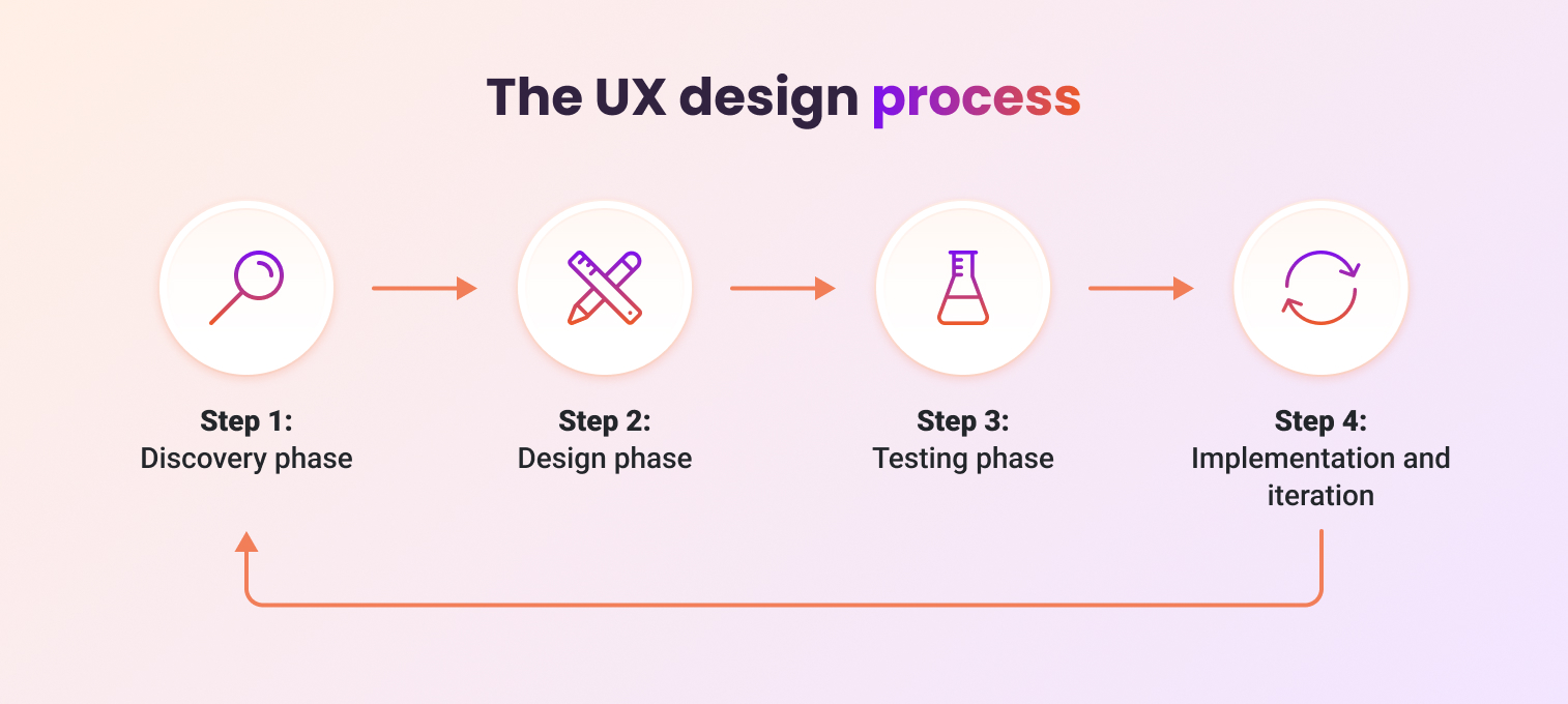
Step 1: Discovery phase
The discovery phase is the foundational step in the UX design process, setting the stage for a successful and user-centric website. It’s where you dive deep into understanding your audience—who they are, what they want, and how they interact with your site.
Here’s a closer look at the key components of the discovery phase:
- Research: Understanding your audience is crucial. This involves gathering data on user behavior, preferences, and pain points.
- Personas: Developing detailed user personas helps in creating a site tailored to the needs of your target audience.
- Journey mapping: This visual representation of the user’s journey on your site identifies key touchpoints and potential areas for improvement.
Step 2: Design phase
The design phase is where your project begins to take shape, transforming abstract ideas from the discovery phase into concrete visual and interactive elements.
Let’s explore the key components of the design phase:
- Wireframing: Think of wireframes as blueprints for your website. They outline the structure and layout without getting bogged down by design details.
- Prototyping: Prototypes are more detailed than wireframes and allow for interaction. They provide a realistic sense of how the final product will work.
Step 3: Testing phase
The testing phase is where your website design is put to the test, ensuring that it not only looks good but also functions effectively for your users.
This phase is critical because it provides real-world validation of your design decisions, uncovering any usability issues or areas for improvement before the site goes live.
The two key components of this phase are:
- Usability testing: Real users interact with your site to uncover any usability issues.
- A/B testing: By comparing different versions of a webpage, A/B testing helps determine which design or content elements perform better.
Step 4: Implementation and iteration
Once the site goes live, the work isn’t over.
This phase focuses on deploying the website, continuously monitoring its performance, and making iterative improvements based on user feedback and data analysis.
The goal is to ensure that your website remains user-friendly, effective, and aligned with evolving user needs and business goals.
10 tips for UX optimization
Looking for quick user experience optimization wins? Here are ten actionable tips to enhance your website user experience:
1. Simplify your navigation menu
A clean, simple navigation makes it easier for users to find what they need.
Too many options can overwhelm users, so stick to the essentials only—typically 5 to 7 primary menu items. This keeps the menu clean and directs users to the most important parts of your site.
Check out this example from ASOS, where they only show two options in the main menu:
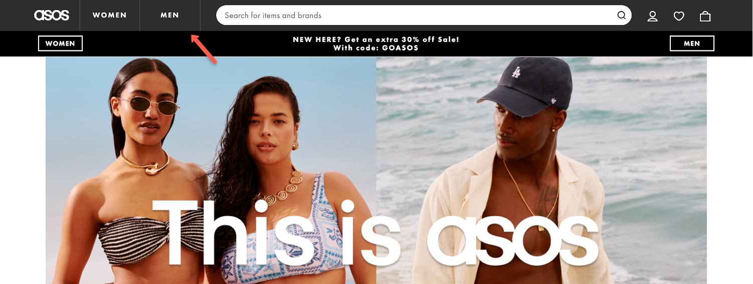
If you have more content to showcase, consider using dropdowns or mega menus to organize it without cluttering the main navigation.
2. Use white space effectively
White space, often referred to as negative space, is one of the most powerful tools in user experience optimization—yet it’s often underappreciated. When used effectively, white space can transform your website from cluttered and overwhelming to clean, professional, and inviting.
White space is the empty space between and around the elements on a page. It doesn’t have to be white—it just refers to any unmarked space that separates different sections, text blocks, images, or other design elements.
Apple’s website is a classic example of using white space effectively. Their product pages are simple yet striking, with plenty of white space around images and text.
This minimalist approach allows the products to shine, focusing the user’s attention precisely where it needs to be—on the product itself.

3. Optimize forms for usability
Forms are often the final step in a user’s journey on your site.
If your form is too long, complicated, or poorly designed, users are likely to abandon it, resulting in lost opportunities. On the other hand, a well-optimized form enhances the user experience, leading to higher completion rates and more conversions.
Keep your forms short and simple, asking only for the information you absolutely need.
For example, if you’re collecting contact information, you might only need an email address, rather than asking for a name, a phone number, or other details. Each additional field you add increases the chances of form abandonment.

4. Prioritize mobile-first design
Mobile devices have become the primary way people access the internet. Whether users are browsing social media, shopping online, or searching for information, they’re more likely to do it on their phones than on a desktop.
This shift in behavior means that if your website isn’t optimized for mobile, you’re likely losing out on a significant portion of potential users.
Make sure your site looks and works great on mobile devices. Here are a few things to keep in mind:
- Simplify your site’s navigation to make it easy for users to find what they need with minimal effort.
- Use concise, impactful headlines, and place the most critical content above the fold.
- Ensure that buttons and links are large enough to be easily tapped without accidental misclicks.
- Optimize your site for speed by compressing images, minimizing the use of heavy scripts, and leveraging browser caching.
- Use scalable vector graphics (SVGs) for icons and logos to ensure they remain sharp at any size.
AG1’s website is a great example of mobile-first design:

5. Test your website across multiple devices
Users access your site from various devices, and these devices have different screen sizes, operating systems, and browsers. This means that a website that looks perfect on one device might not function as well on another.
To ensure a seamless user experience for everyone, it’s crucial to test your website across multiple devices.
Whenever possible, test your website on actual devices. This approach allows you to experience your site as your users do, helping you catch issues that might not appear in an emulator.
6. Use compelling CTAs
A compelling CTA grabs the user’s attention, communicates value, and encourages them to take the next step. But what makes a CTA effective?
- Clarity and conciseness: Avoid vague language like “Click here” or “Submit” and instead use specific, action-oriented phrases like “Sign Up Now,” “Download the Guide,” or “Start Your Free Trial.”
- Visibility: Use contrasting colors that stand out against the background to make the CTA button or link immediately noticeable.
- Actionable language: Verbs like “Get,” “Join,” “Try,” “Learn,” and “Discover” are powerful because they directly invite users to take an action that benefits them.
- Create urgency: Phrases like “Limited Time Offer,” “Only a Few Spots Left,” or “Act Now” encourage users to take immediate action by implying that the opportunity might not last forever.
- Offer value: This could be a discount, a free resource, or access to exclusive content. For instance, “Claim Your 20% Discount” or “Download Your Free Guide” not only tells users what to do but also highlights what they’ll gain.
- Use social proof: If your offer has been used or appreciated by many others, mention it. For instance, “Join 10,000+ Happy Subscribers” or “Download the Guide Used by Top Marketing Experts” leverages the power of social proof.
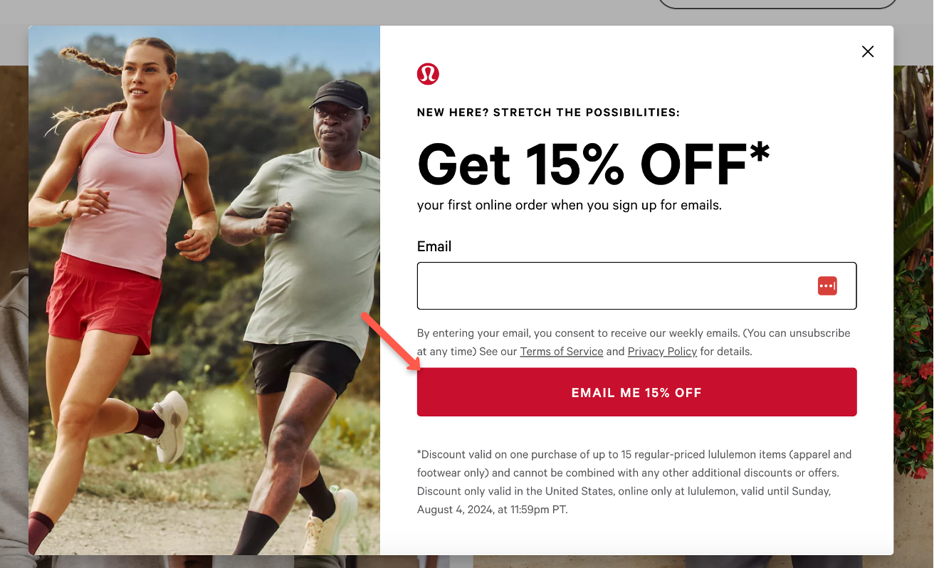
Lululemon’s “Email me 15% off” CTA button on their email signup popup is a compelling example that offers value and uses actionable language. It’s also very clear.
7. Minimize page load times
Slow-loading pages frustrate users and increase bounce rates. Minimizing page load times is crucial to providing a smooth and satisfying user experience that keeps visitors on your site longer.
Here are some quick tips for speed optimization:
- Regularly monitor site speed: Use tools like Google PageSpeed Insights, GTmetrix, or Pingdom to regularly monitor your site’s speed and identify areas for improvement.
- Limit third-party scripts: Scripts from third-party providers (like ads, analytics, and social media embeds) can slow down your site. Limit their use and load them asynchronously when possible.
- Enable HTTP/2: HTTP/2 allows multiple requests to be sent over a single connection, speeding up the load times of pages that require many resources.
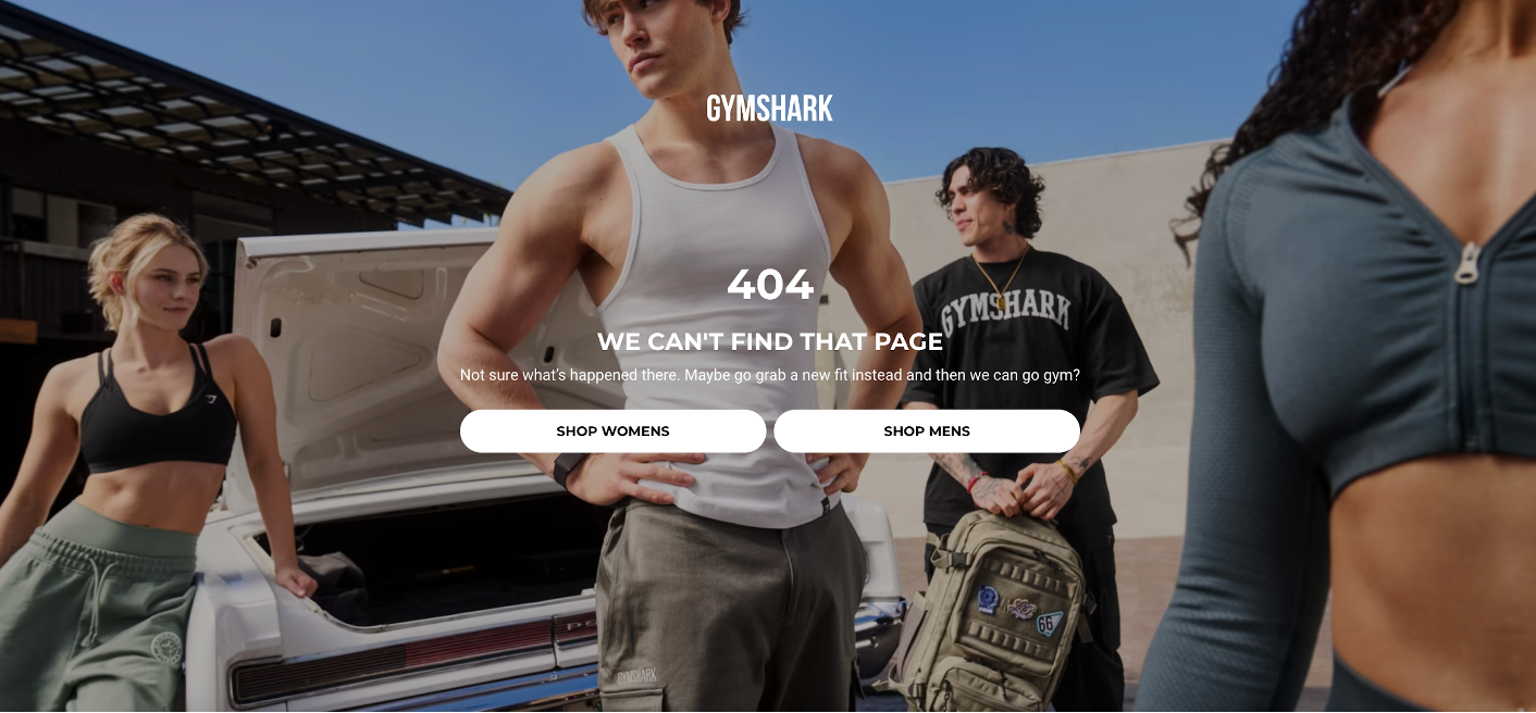
8. Make error messages clear and helpful
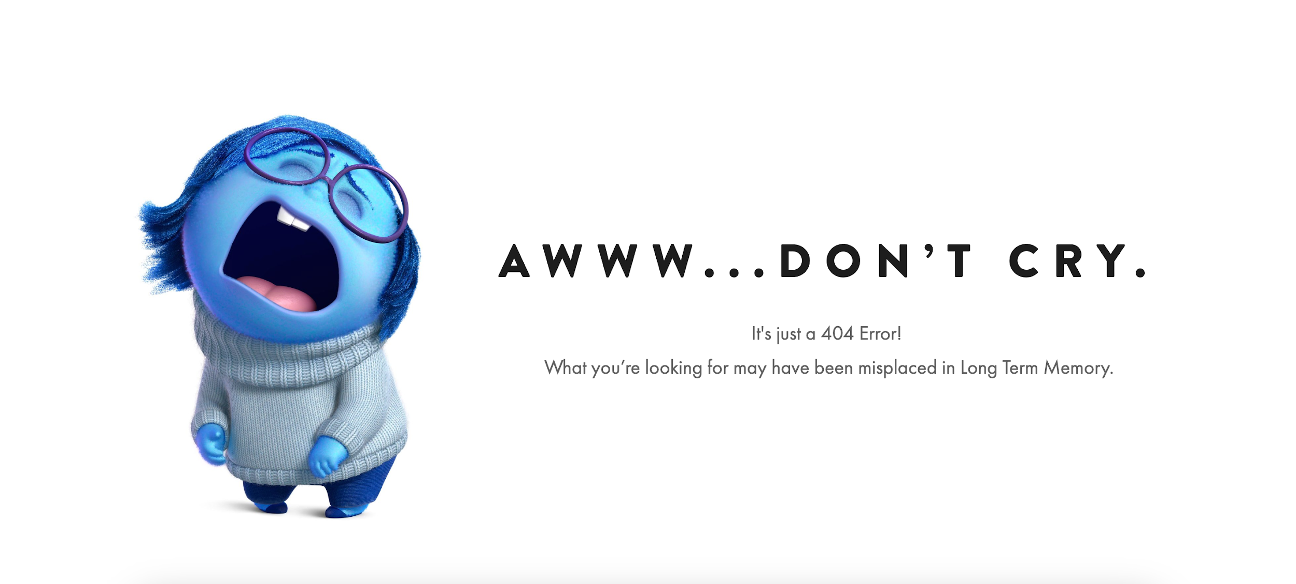
Whether users enter incorrect information, encounter a broken link, or run into unexpected issues, how you handle these errors can make or break their experience on your site.
Instead of leaving users frustrated or confused, use clear and helpful error messages to get them back on track. This can mean the difference between a minor hiccup and a deal-breaker.
Check out how Pixar uses humor:
And Gymshark’s 404 page is another great example:
9. Continuously gather user feedback
User feedback is one of the most valuable tools for optimizing your UX. It provides direct insights into how your audience interacts with your site, what they like, what frustrates them, and where they encounter obstacles.
One of the best ways to ask for user feedback is to use feedback popups on your website. These popups can be triggered after specific actions, like completing a purchase or leaving your website without purchasing.
Keep surveys short and focused on specific aspects of the user experience. Ask questions that are easy to answer (consider using multiple-choice or rating scales) to encourage higher response rates.
Here are some survey templates you can use:
In addition to popups, user interviews can provide deeper insights into user behavior, preferences, and pain points.
Interviews give you direct user feedback and allow you to explore topics in greater detail for a better understanding of the nuances of the user experience.
Choose participants who represent your target audience. You can recruit users from your existing customer base, social media followers, or website visitors who have shown interest in providing feedback.
Here are some questions you could ask:
- Can you describe your experience using our website?
- Were there any areas of the site that you found particularly confusing or difficult to use?
- What do you like most about our website?
- Is there anything you wish our website offered that it currently doesn’t?
- How does our website compare to others you’ve used in the same industry?
4 UX challenges and how to overcome them
Even the best UX designs encounter challenges. Here’s how to tackle some of the most common ones:
1. Dealing with diverse user needs
Your audience is likely diverse, with varying backgrounds, preferences, and goals. Designing a user experience that caters to everyone can be challenging, especially when different user groups have conflicting needs.
For instance, a website might need to serve both tech-savvy users who prefer advanced features and casual users who need simplicity.
Solution: Offer personalization features that allow users to tailor their experience according to their preferences. For example, you could provide customizable dashboards, theme options, or content recommendations based on user behavior.
2. Overcoming technical constraints
UX designers often have ambitious ideas that may push the boundaries of what is technically feasible. However, technical constraints—such as limited development resources, platform limitations, or performance concerns—can hinder the implementation of these ideas.
This can be frustrating, especially when the desired features are crucial to the user experience.
Solution: Overcoming technical constraints requires close collaboration with your development team and a willingness to compromise without undermining the user experience.
3. Handling stakeholder feedback
UX projects often involve multiple stakeholders, each with their own opinions, priorities, and expectations.
Conflicting feedback from stakeholders can complicate the design process, leading to scope creep, delays, or a diluted user experience.
Solution: To effectively manage stakeholder feedback, establish clear goals, use data to support your decisions, and maintain a focus on the user.
4. Continuous improvement
User experience optimization is not a one-time effort, it’s an ongoing process.
Even after a site goes live, user behavior, technology, and market trends continue to evolve. This means that the user experience needs to be continuously optimized to remain relevant and effective.
However, maintaining a focus on continuous improvement can be challenging, especially with limited resources or competing priorities.
Solution: Conduct usability testing regularly, even after the site has launched. Periodic usability tests help you identify new issues, understand how user behavior is changing, and validate the effectiveness of any updates or new features. Usability testing can be scaled to fit your resources, from full-scale user testing sessions to simpler remote usability testing.
FAQ
What is user experience?
User experience refers to the overall interaction a person has with a product, service, or system, focusing on ease-of-use, satisfaction, and emotions elicited during this interaction. The goal of user experience optimization is to create products that are not only functional but also provide a positive user experience.
How does user experience differ from user interface design?
User experience focuses on the overall experience of using a product, including factors like ease-of-use, satisfaction, and effectiveness. It’s concerned with the user’s journey and how well the product meets their needs.
User interface design, on the other hand, is specifically about the visual elements and interactive aspects of a product’s interface—things like buttons, icons, spacing, typography, and color schemes.
While UI design plays a significant role in the overall user experience, it’s just one component of UX. In essence, UX is about the entire experience, while UI is about the product’s look and feel.
How to measure user satisfaction in UX?
User satisfaction can be measured through surveys, user feedback, and metrics like Net Promoter Score (NPS) and Customer Satisfaction Score (CSAT).
What is user engagement in UX?
User engagement in UX refers to how users interact with your site or product. It includes key performance indicators such as time spent on the site, actions taken, and return frequency. Engagement metrics help you understand how invested users are in your product and can reveal areas where the experience could be improved.
How do users interact with a website?
Users interact with a website through navigation, content consumption, and actions such as filling out forms, making purchases, or sharing content.
What role does user research play in UX design?
User research is a foundational element of UX design. It involves gathering data about users, including their needs, behaviors, motivations, and pain points. This research helps designers understand the target audience and create products that are tailored to their preferences and requirements. The insights gained from conducting user research guide the design process, ensuring an effective, user-centric final product.
Wrapping up
Optimizing your website’s user experience isn’t just about improving its look and feel—it’s about making sure it serves your users effectively and keeps them coming back.
By focusing on the key components of user experience optimization, following a structured design process, and continuously iterating based on feedback and data, you can create a website that not only meets user expectations but actually exceeds them.
Good luck with your website user experience optimization journey!
Migration has never been easier
We made switching a no-brainer with our free, white-glove onboarding service so you can get started in the blink of an eye.
What should you do next?
Thanks for reading till the end. Here are 4 ways we can help you grow your business:
Boost conversions with proven use cases
Explore our Use Case Library, filled with actionable personalization examples and step-by-step guides to unlock your website's full potential. Check out Use Case Library
Create a free OptiMonk account
Create a free OptiMonk account and easily get started with popups and conversion rate optimization. Get OptiMonk free
Get advice from a CRO expert
Schedule a personalized discovery call with one of our experts to explore how OptiMonk can help you grow your business. Book a demo
Join our weekly newsletter
Real CRO insights & marketing tips. No fluff. Straight to your inbox. Subscribe now
Nikolett Lorincz
- Posted in
- Ecommerce
Partner with us
- © OptiMonk. All rights reserved!
- Terms of Use
- Privacy Policy
- Cookie Policy
Product updates: January Release 2025


