- Blog
- 21 Killer Shopify Popup Examples to Boost Sales in 2025
21 Killer Shopify Popup Examples to Boost Sales in 2025
-
Nikolett Lorincz
- Conversion
- 6 min read
Table of Contents
Looking to boost your Shopify sales in 2025? You’re in the right place.
Shopify popups are a powerful tool to grab your website visitors’ attention and convert them into customers. But not all popups are created equal. To truly stand out, you need popups that are engaging, well-designed, and perfectly timed.
In this article, we’ll explore 21 killer Shopify popup examples that can help skyrocket your sales. We’ll break down what makes each one effective and how you can implement similar strategies in your online store.
Let’s dive in!
Popups should enhance engagement, not disrupt it
We’ve all been there. You visit a website, eager to explore, and suddenly, you’re bombarded with a barrage of popups. Annoying and irrelevant, they interrupt your browsing and make you want to leave immediately.
Even the creator of popups regrets their invention because of how disruptive they’ve become.
But what if we told you there’s a way to use popups tastefully and effectively?
When done right, popups can significantly enhance your engagement and drive sales. The key is to avoid intrusive traditional popups that:
- Aren’t relevant to the user
- Interrupt the browsing experience
- Are hard to close
These kinds of popups are not only frustrating but can also drive customers away over time.
Even if they don’t leave immediately, the negative experience may lead them to seek out competitors who offer a smoother, less intrusive shopping experience.
So, how do you use popups the right way?
- Relevance is key: Make sure your popups are highly relevant to your audience. For instance, if you’re offering a discount to first-time visitors, target only those new users.
- Perfect timing: Timing is everything. Avoid hitting your visitors with popups the moment they land on your site. Instead, delay them by 10-15 seconds or use exit-intent popups to catch visitors just as they’re about to leave.
Using these strategies, you can create popups that enhance rather than disrupt the user experience. This approach not only keeps your visitors happy but also boosts your chances of converting them into loyal customers.
21 Shopify popup examples to inspire your own
Ready to see some good Shopify popups in action? Below are 21 of our favorite popup examples that actual Shopify brands have created using OptiMonk.
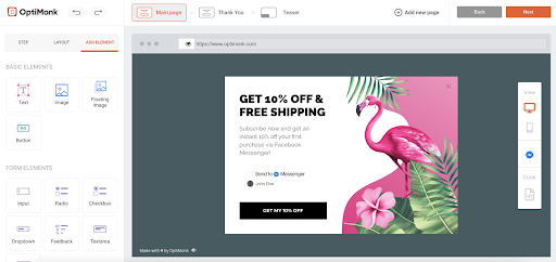
1. ROVUX Footwear
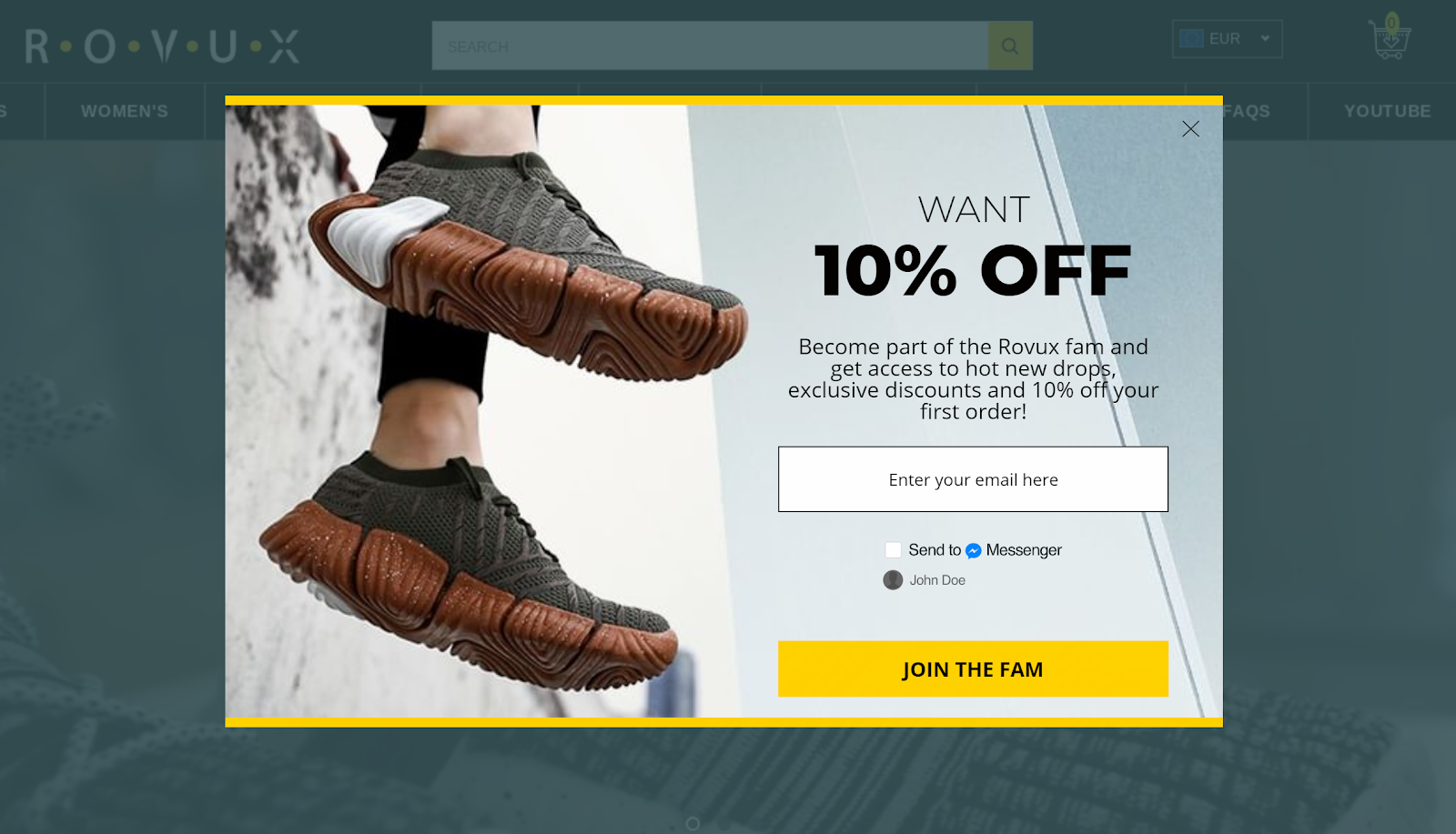
What does this popup do well?
- This popup boasts a clean and stylish design—using contrasting colors to draw attention to the Call-to-Action (CTA).
- The headline gives a straightforward incentive: “Want 10% off?”
- ROVUX uses a conversational CTA, emphasizing that customers will be joining their community. Nice job!
- The popup automatically detects if visitors are logged in to Facebook thanks to OptiMonk’s Smart Display function. This allows them to automatically pick between presenting a Messenger (logged in) or the email (logged out) experience.
How can I copy it?
We suggest using this template since it uses contrasting colors by default.
All you need to do is find a lovely image that fits your brand and change the background of the template.
After that, pick a contrasting color for the popup (we recommend using Paletton), and boom! Edit the text, and you’re good to go.
2. Pillowed
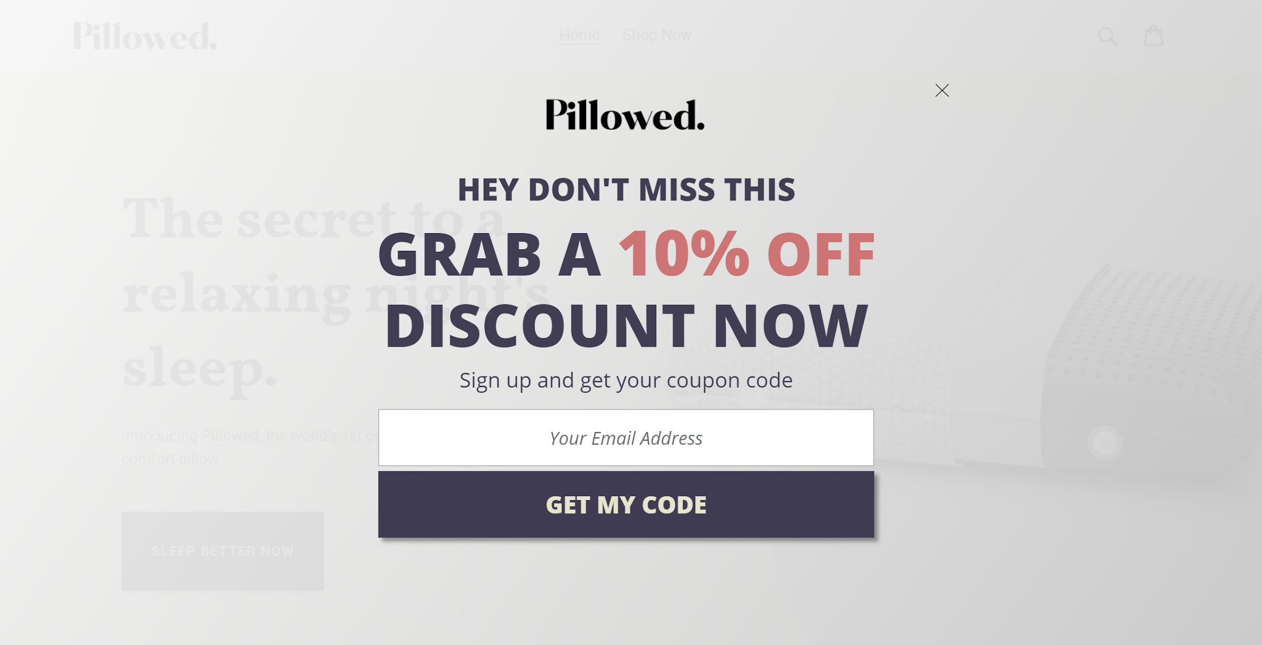
What does this popup do well?
- Fullscreen campaigns represent a great way to grab site visitors’ attention: this popup does exactly that.
- Boasts an engaging headline that gets to the point.
- By not requiring much personal information to complete the form, the opt-in requires little effort on behalf of the visitor.
- The CTA is actionable and crystal clear.
How can I copy it?
Use OptiMonk’s Helsinki template.
Just delete the “First name” and “Last name” fields if you want a simpler form. Next, update the headline, and then you’re done!
This template proves that Shopify email capture doesn’t have to be complicated.
3. Diamond MMA
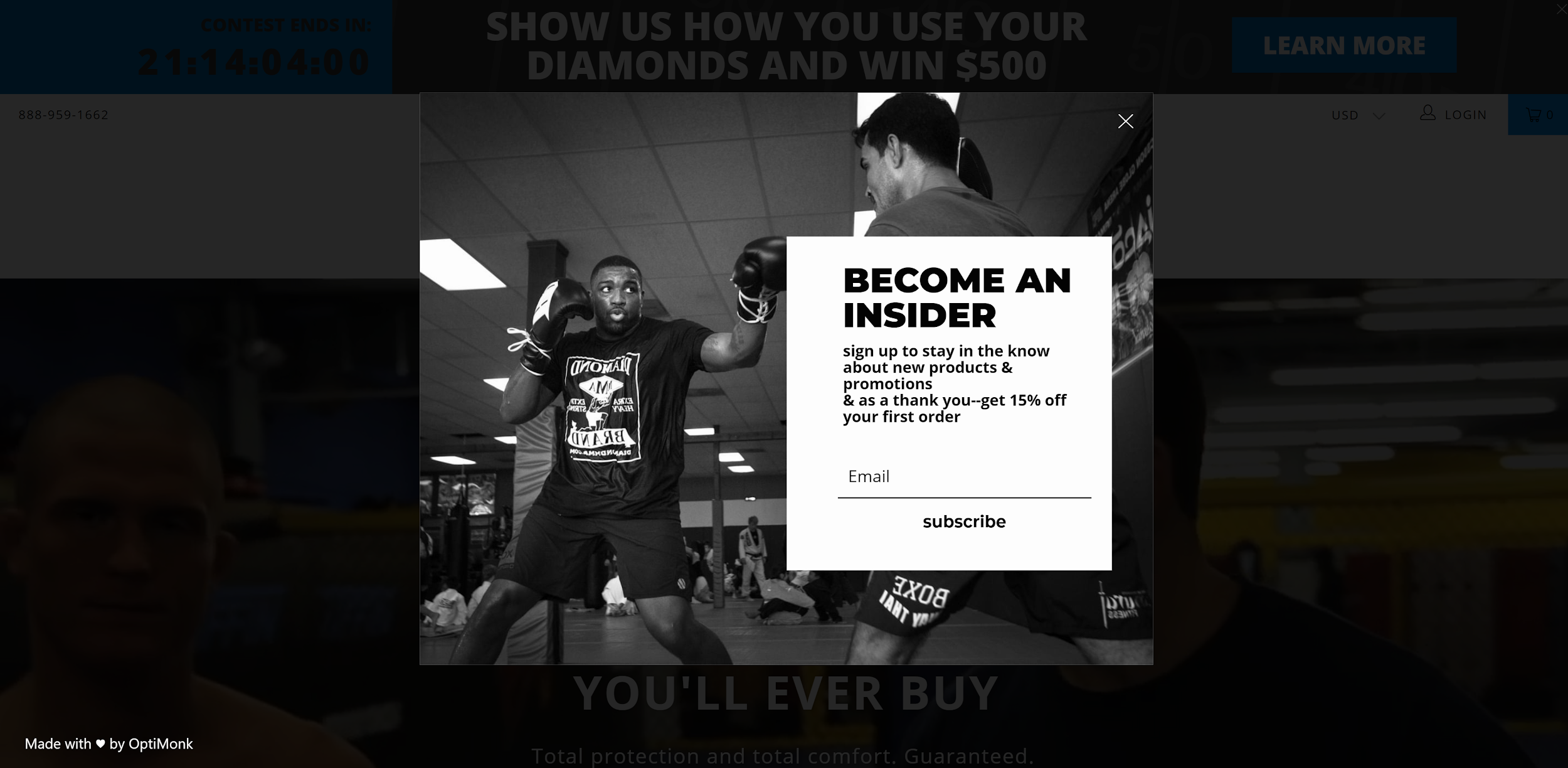
What does this popup do well?
- This popup puts a strong incentive front-and-center: 15% off and exclusives for subscribers.
- The dark background and image make the white form really pop.
How can I copy it?
Use our Paris template. This popup template might seem very different at a glance but you can customize it with a few easy changes.
For starters, change the background to a black and white image. Then, delete every element that is not needed and change the button color.
Lastly, adjust the minimum height for the popup, and then you’re done.
4. TwoTags
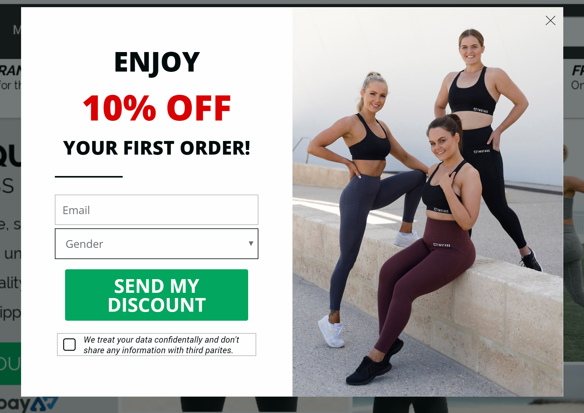
What does this popup do well?
- The data privacy disclaimer provides site visitors with a sense of confidence and security.
- By asking for a visitors’ gender preference in exchange for a discount, it’s much easier to personalize offers and messages for new subscribers.
How can I copy it?
Start with OptiMonk’s New York template.
Just add an Input and Dropdown element instead of the Messenger box. Include a Checkbox element below the button, and that’s it. Customize colors and images to optimize your offer.
5. Local Keeps
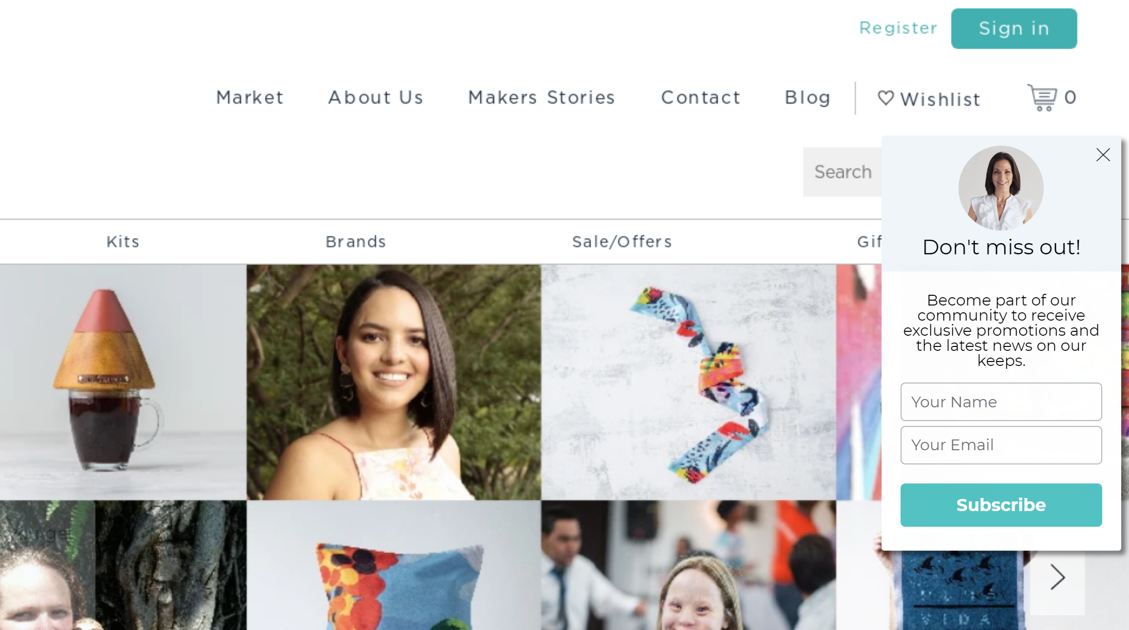
What does this popup do well?
- The sidemessage format is non-intrusive—it doesn’t disturb site visitors while they’re browsing.
- The included photo of the brand’s founder makes the popup feel much more personal.
How to copy it?
Try out a sidemessage template in OptiMonk (hint: we suggest the Mayon template).
Delete the Radiobutton element and add two Input fields instead. Change the header, upload your photo, and you’re good to go. You can also edit the margin of the image if you don’t want it to go over the edge.
6. Best Price Nutrition
What does this popup do well?
- This store uses OptiMonk’s Smart Display function to present a popup via Messenger for visitors logged into Facebook.
- This popup focuses on Messenger subscribers, which is well-documented to outperform other opt-in channels (with a ~80% open rate and a ~25% click rate).
How to copy it?
Start with OptiMonk’s Doha template.
Delete the images in the background, change the text elements, and that’s that!
If you also want to grow your Messenger list, add the Messenger element to your popup and add the Facebook Messenger marketing tool integration.
7. Best Price Nutrition
What does this popup do well?
- Check out that closing link (“No thanks, I’d prefer to pay full price”). This taps into visitors’ fear of missing out (FOMO) and ultimately encourages them to grab a discount.
- This popup is a can’t-miss. The colorful overlay pops and catches the eye.
How to copy it?
We suggest using OptiMonk’s Santiago template.
Start by moving all elements to the blue block, then delete the white one first. Add a colorful gradient overlay and change the button color.
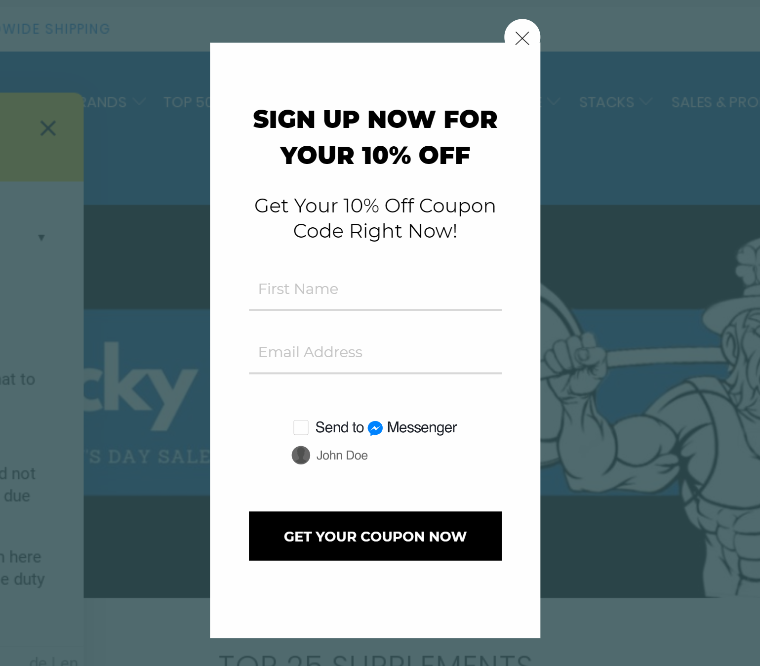
8. Groove Life
What does this popup do well?
- Instead of offering a 10% off discount, this Shopify store offers free rings: that’s a powerful incentive.
- The headline copy (“Wait! Don’t forget about…”) stops readers in their tracks.
How can I copy it?
Use OptiMonk’s Budapest template.
Change the black overlay to white. Change text and button colors to match your brand, and that’s it.
9. Awesome Dice
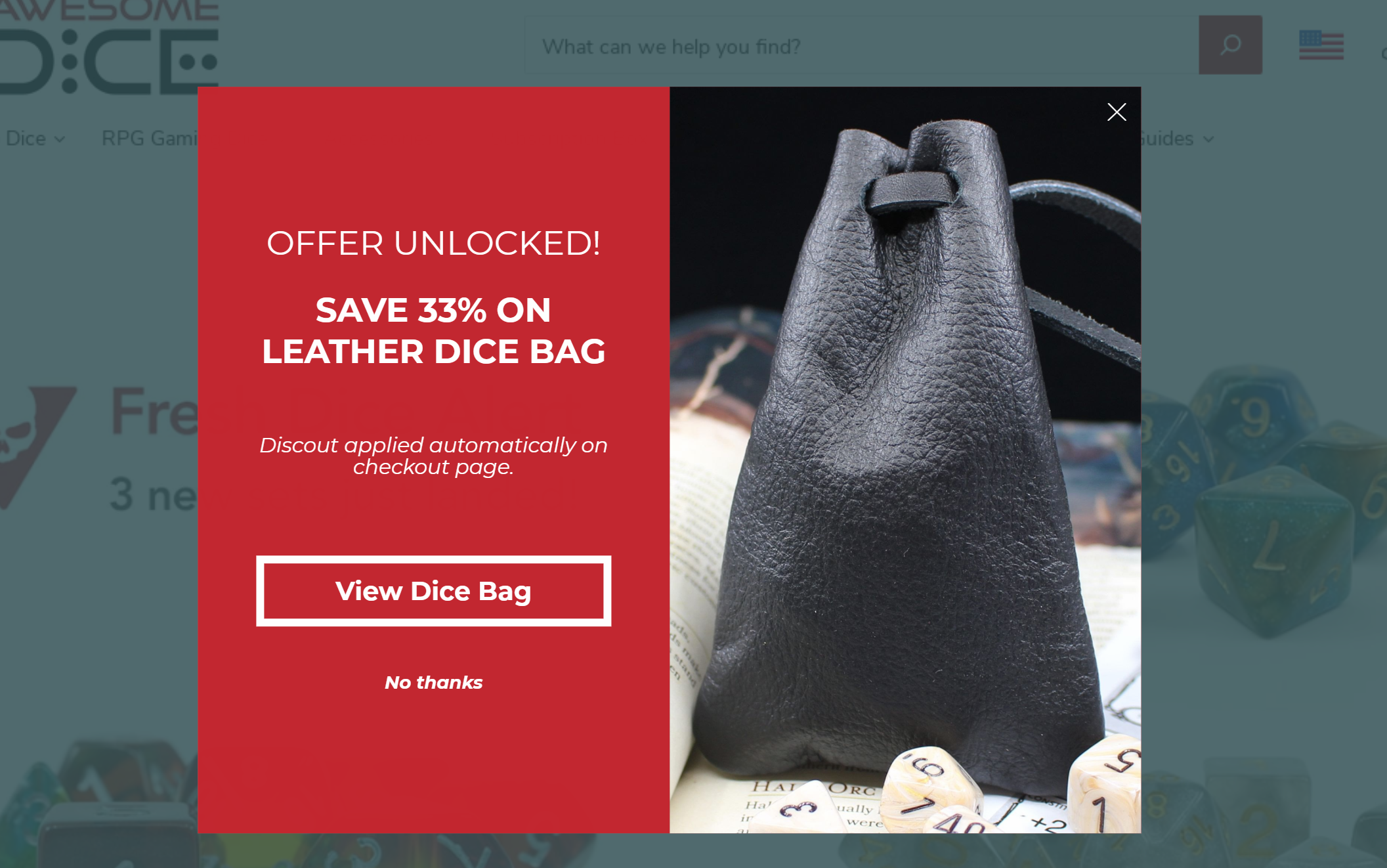
What does this popup do well?
- The “Offer unlocked” headline grabs visitors’ attention and presents an exclusive offer.
- Offering discounts for a specific product is a smart move, especially when the products are personalized—based on the browsing experience.
How can I copy it?
You can use the New York template from OptiMonk.
Just add the product you’re offering to the right as an image. Then, change the background color of the left-hand text block. After that, just change the text and button color to white.
10. Joovv
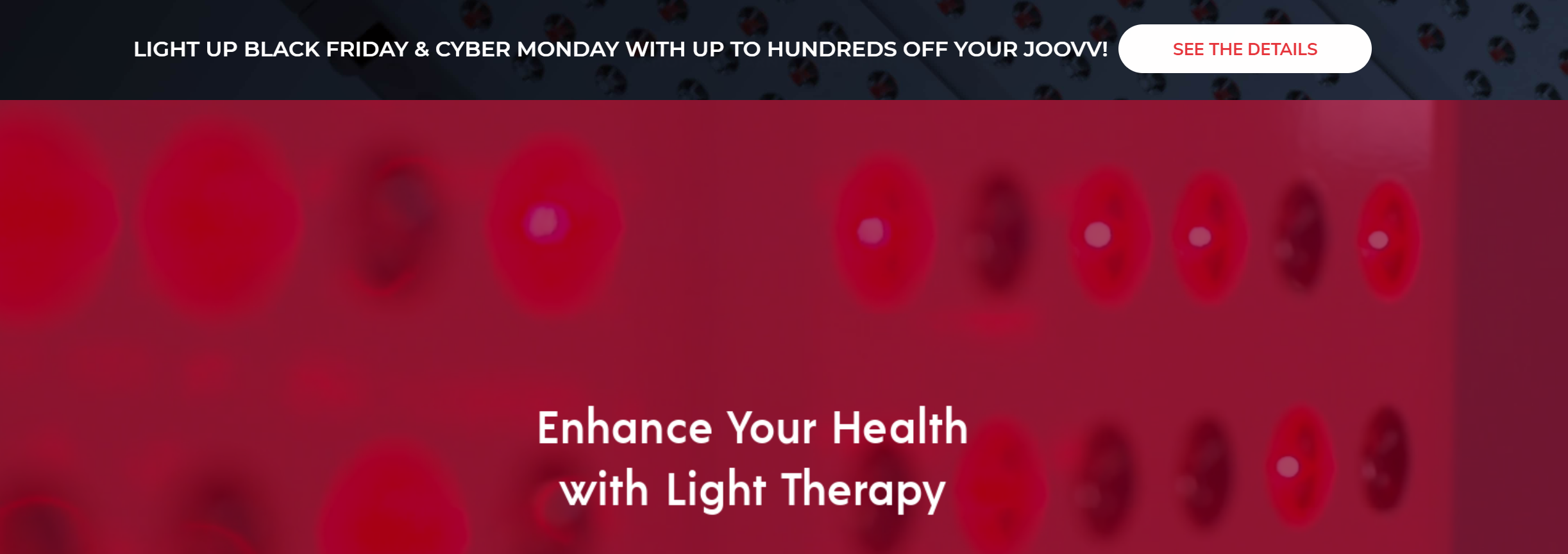
What does this popup do well?
- Nanobars are less intrusive than traditional popups. They can be displayed anywhere and don’t disturb your customers.
- This popup provides a seamless experience by moving visitors from Point A to Point B. Announcing Black Friday and Cyber Monday sales with the nanobar, it redirects them to the right landing page.
How can I copy it?
Joovv’s nanobar was created by using OptiMonk’s GDPR Bar template.
To copy it, delete the image and the checkbox. Then, add a Text element, change the colors, and insert your copy. Done!
11. Bukvybag
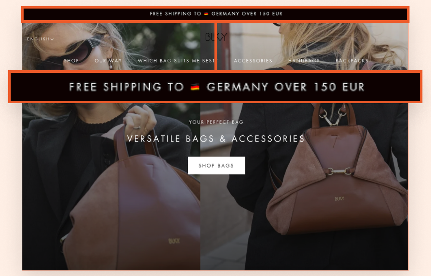
What does this popup do well?
Bukvybag’s free shipping bar effectively nudges customers to add more items to their cart by showing them the specific amount needed to qualify for free shipping.
What’s especially clever is how they tailor the message to the customer’s location. This ensures clarity on the shipping threshold, regardless of where the customer is shopping from.
How can I copy it?
You can replicate Bukvybag’s approach using the free shipping bar template below.
Use OptiMonk’s Smart Tags feature to personalize the text based on location.
12. Crown & Paw
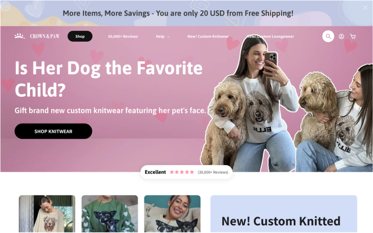
What does this popup do well?
Crown & Paw’s Dynamic Free Shipping Bar offers a real-time, visual reminder that motivates customers to increase their cart value.
The bar dynamically updates as customers add items, showing how much more they need to qualify for free shipping—a gentle, effective nudge to explore more products.
How can I copy it?
With OptiMonk’s Smart Tags, you can easily set up a similar dynamic free shipping bar. The bar will automatically update the required amount based on the items added to the cart.
Get started with this template:
13. UltimatePods
Urgency sales. Just ask the headphones manufacturer, UltimatePods, who came up with a brilliant way to boost sales at the beginning of the year by using the Super Bowl.
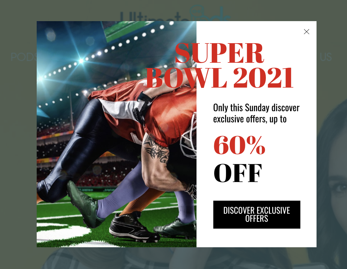
What we love:
- UltimatePods used the Super Bowl, the most-watched sporting event in the United States, as an opportunity to highlight seasonal offers and drive sales.
- The Super Bowl’s popularity in the US and around the world, allowed them to use the event as part of their marketing strategy. It means they could organically become part of Super Bowl conversations.
- The attention-grabbing imagery is hard to forget. Everything about the advertisement leaves an impression.
- The “60% off” immediately captures your attention. Visitors know when they click the call-to-action, they can save big. And, you know what? They’ll probably click.
Who sees this popup and when:
The Super Bowl is popular across all segments of the population, so UltimatePods targeted all visitors with the popup who browsed the page for 10 seconds or more.
They were careful not to disrupt their customers’ shopping experience, so UltimatePods made this an exit-intent popup. Targeted visitors would see the popup just before they tried to leave the website—great strategy.
Try this Super Bowl popup template for your Shopify store:
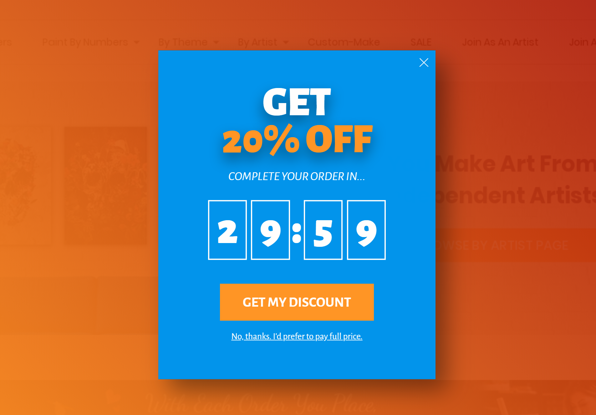
14. Tapestry Girls
Tapestry Girls also used urgency to drive sales. Instead of using a specific event like the Super Bowl, they gave all customers who finalized their order within 15 minutes a 10% discount.
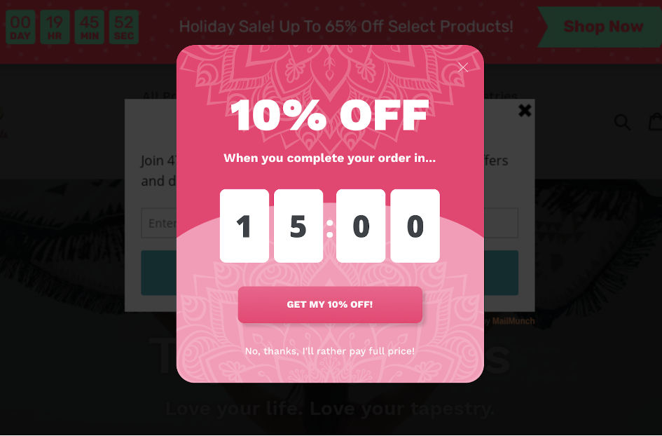
Customers who clicked “Get my 10% off” were shown a nanobar at the bottom of the webpage showing the promo code for their discount.

What we love:
- The countdown timer uses the power of FOMO (Fear of Missing Out) to encourage customers to finalize their purchases. It is an effective way to reduce cart abandonment and has helped companies boost sales by as much as 330% or more.
- The wording of the “No, thanks…” opt-out reminds visitors that they have two choices–buy now or pay full price.
- The nanobar at the top of the website is a non-intrusive way to remind customers that they have a great discount available, without interrupting their shopping experience.
- The popup and nanobar are consistent with Tapestry Girls’ brand. Not only do they match the theme of the website, but they look fantastic.
Who sees this popup and when:
Tapestry Girls used this popup to target first-time customers with at least one product in their cart. Since they wanted to reduce cart abandonments, Tapestry Girls made it an exit-intent popup and showed it to visitors just before they left.
If you’re wondering how the campaign went–Very well! The popup and nanobar helped Tapestry Girls increase first-time customer conversions by 50%.
Copy their strategy using these popup templates:
15. Tiny Beast Designs
Tiny Beast Designs needed a solution that increased sales by targeting curious visitors who browsed their inventory.
With the help of OptiMonk, they created personalized popups persuading potential shoppers to complete their orders.
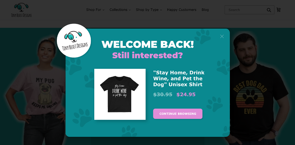
What we love:
- It’s personalized. Everyone that receives a popup is given a message accompanied by an image of a select product they viewed. This reminds customers of the item they were interested in buying.
- They used OptiMonk’s Dynamic Product Recommendation to automatically select the last product the visitor viewed in the popup message.
- Visitors receive a discount, further motivating them to complete their purchase.
- Spoiler alert: It works! The conversion rate of this popup was a jaw-dropping 30.56%.
Who sees this popup and when:
This popup notification needs to be relevant. Otherwise, it won’t work and you could end up annoying visitors who would actually benefit from it.
That’s why Tiny Beast Designs only targets returning visitors, and they use a welcome popup to target them as soon as their customers land on the site.
Here are some templates you can use for your welcome back popup:
16. BlendJet
If you want to increase sales, make your advertisements relevant. That’s what health and wellness company, BlendJet, did when they delivered targeted popups to their Canadian visitors for an exclusive Valentine’s Day sale.
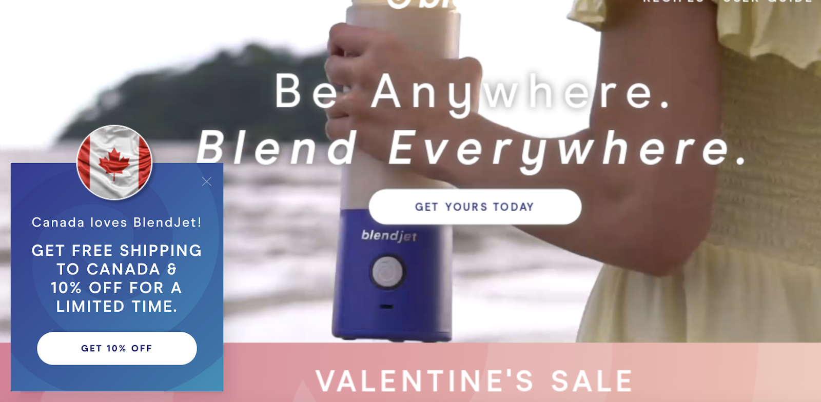
What we love:
- It’s super personalized. BlendJet targets visitors based on their geolocation, presenting them with a friendly welcome message based on their location.
- Offering a 10% discount to new users is an excellent way to turn visitors into customers.
- Not only do they offer free shipping, but they mentioned it in the popup too. Nearly 90% of customers will make an online purchase if there’s free shipping, so advertising is an excellent way to drive sales.
Who sees this popup and when:
BlendJet doesn’t target everyone with this popup, just new visitors. They also wait until the visitor has been on their website for 15 seconds before delivering the message.
This is an awesome strategy for engaging prospective customers—without overwhelming them with messages right away.
17. WeAreFeel
WeAreFeel is a health and wellness company that specializes in supplements that promote a happier, healthier lifestyle.
When WeAreFeel wanted to optimize their financial health, they turned to OptiMonk for help with creating an effective popup campaign.
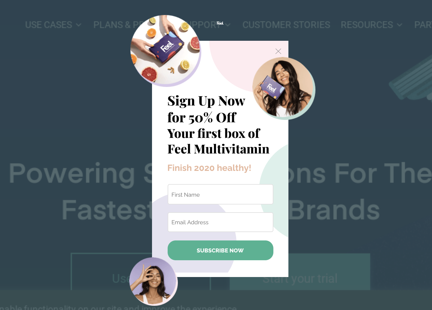
What we love:
- First off, this popup looks great. Its color scheme fits with the website’s theme, and the pictures of happy customers draw your attention while adding a feel-good element to the opt-in form.
- We really love how WeAreFeel used one popup to increase mailing list subscribers and target first-time buyers with a 50% off discount.
- The popup is a great example of how to monetize first-time visitors.
Who sees this popup and when:
WeAreFeel ensured their popups were as relevant as possible by only targeting visitors who aren’t subscribers.
They also choose to make it an exit-intent popup, appearing when targeted visitors try to leave the site. That way, they could persuade visitors to convert and take advantage of the discount without interrupting their browsing experience.
18. Kiss My Keto
Kiss My Keto sells healthy snacks and food for people living a low-carb lifestyle.
But, just because they stay away from sugar doesn’t mean they don’t know how to sweeten the deal with effective popups.
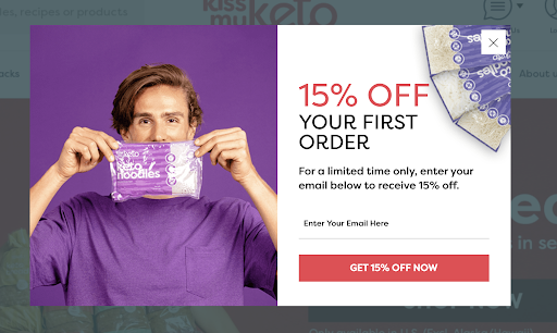
What we love:
- There’s nothing dull about this message. Kiss My Keto uses bold, contrasting colors to grab your attention.
- Adding “Get 15% Off Now” on the call-to-action button draws more attention to the discount. As soon as you see the popup, you immediately know you’re about to save on your purchase.
- They let the reader know the discount is only available for a limited time. This is a great way to use urgency to drive conversions.
- Because Kiss My Keto specifically targeted bouncing visitors with this message, the popup is effective at converting outbound visitors into customers.
Who sees this popup and when:
This popup is part of a lead generation campaign designed to turn visitors into subscribers and customers.
For their popups to work effectively, Kiss My Keto needed to target the right visitors without bombarding customers with irrelevant popups. Only visitors who aren’t part of their mailing list were considered for this popup, and they weren’t messaged unless they spent 15 seconds or more on the site.
Using exit intent, Kiss My Keto waited until visitors were leaving before showing them the popup.
Targeting visitors that browsed for 15 seconds means they’re engaging with people who likely looked through their store—and those are people more likely to become customers when persuaded with a discount.
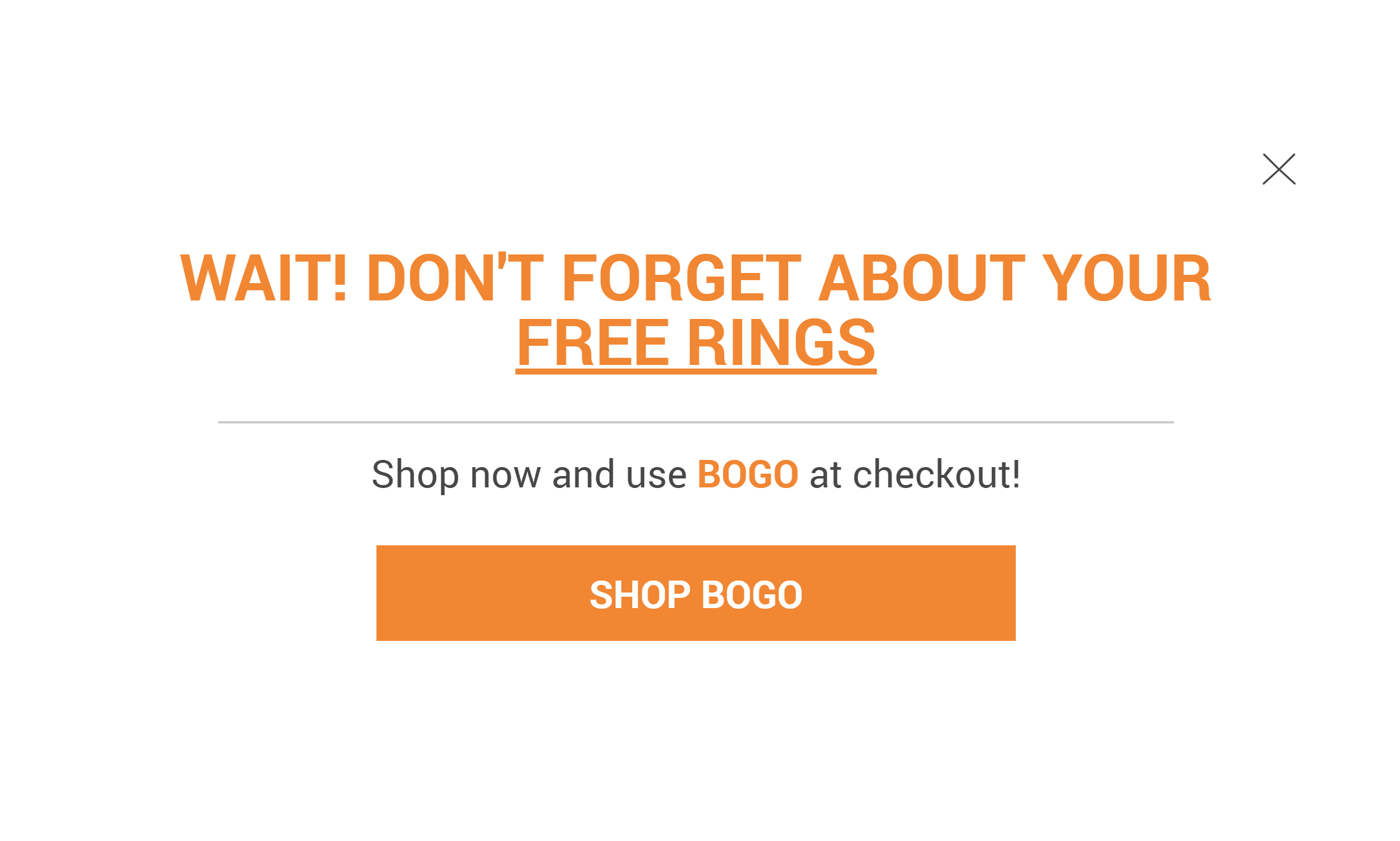
19. Bijuz
Jewelry company, Bijuz, needed an easy and effective solution for reducing cart abandonment.
With the help of OptiMonk, they created personalized popups designed to engage would-be cart abandoners before they leave the site.
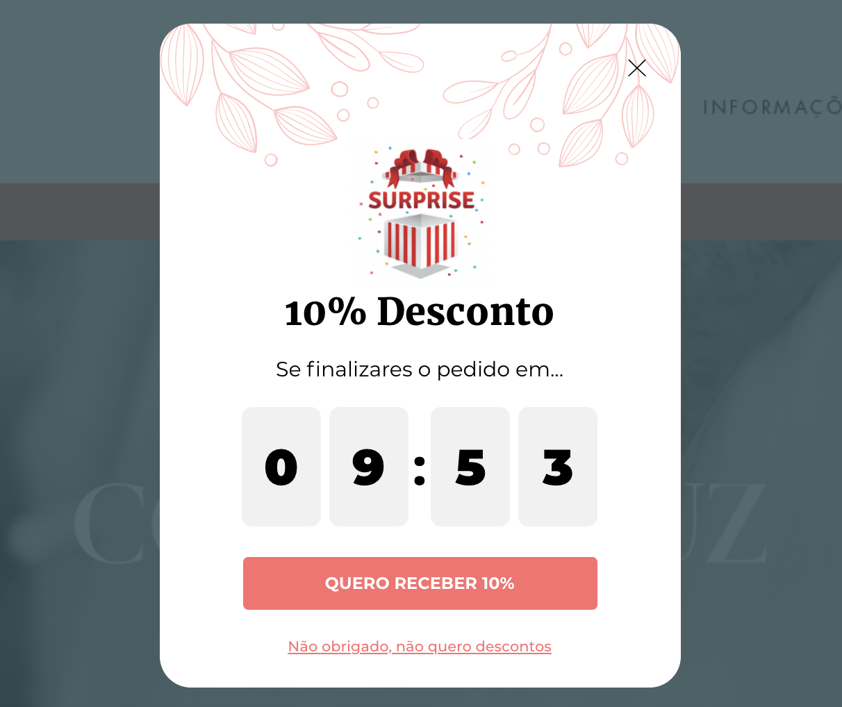
What we love:
- The popup looks incredible. The color scheme is consistent with their brand, and the floral drawing at the top is a nice touch. The message feels less like a popup and more like another part of their webpage—which is exactly what a good popup is supposed to do.
- When visitors see they only have 10 minutes to claim their discount, they’re more likely to finalize their purchase—especially if they were already thinking about buying something from Bijuz. This is how you can use scarcity (“the discount is for a limited time”) and urgency (“you must buy in the next 10 minutes”) to boost sales.
- The surprise icon jumps out at you, and it’s a subtle way to let the visitor know they’re receiving an exclusive offer and it feels more like a gift than a popup.
Who sees this popup and when:
This popup is part of Bijuz’s cart recovery campaign, so they only sent it to visitors with one or more products in their cart.
They also used exit intent, so only visitors leaving the site will see the popup. That way, they can target the group they’re specifically going after—cart abandoners.
20. Pretty Vulgar
Pretty Vulgar is a makeup company that prides itself on helping customers to look and feel great while being 100% themselves. When they created a cart recovery campaign, Pretty Vulgar applied those values to their popups.
They created messages that were visually stunning and helped the customer, rather than bombarding them with annoying sales pitches.
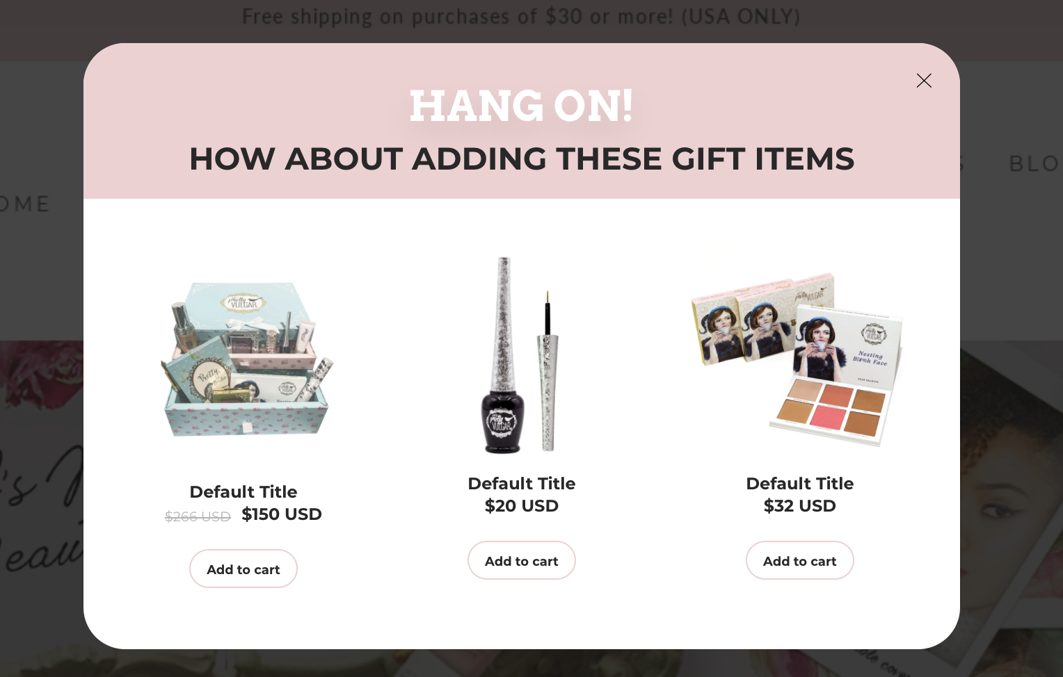
What we love:
- This popup is another way to successfully reduce cart abandonment. Instead of offering a discount or reminding visitors of the items they viewed, Pretty Vulgar gives a list of recommendations.
- By highlighting their trending products, Pretty Vulgar kills two birds with one stone. They promote items that their visitors may be interested in while addressing cart abandonment.
- The “Add to cart” button lets visitors continue their buyer’s journey without leaving the popup—this is convenient and effective.
Who sees this popup and when:
Pretty Vulgar only targeted visitors who were actually considering buying from their store. They did this by sending the popup to people who:
- Spent at least 20 seconds on a webpage
- Visited two or more pages
They also used exit intent, so targeted visitors would only see the popup when (and if) they were ready to leave the site.
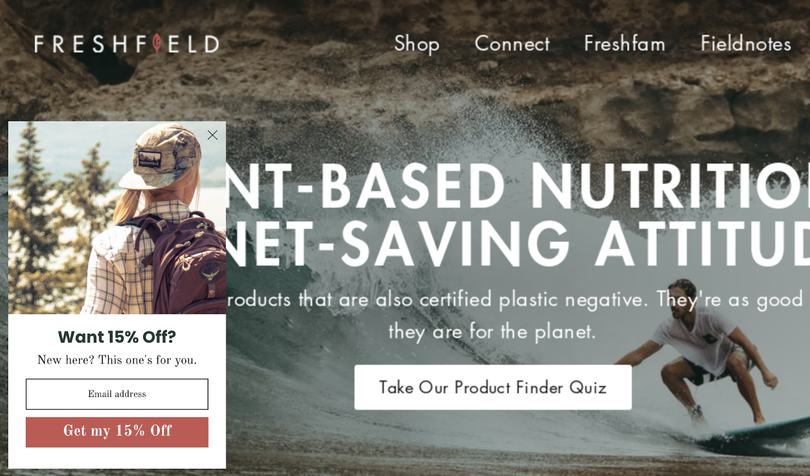
21. Freshfield
Freshfield is a health and wellness company that sells a wide range of plant-based, 100% vegan supplements.
Whether you’re vegan or you simply want to make healthier lifestyle choices, Freshfield wants to help you unlock your body and mind’s full potential.
What we love:
- They acknowledge new visitors in the popup (“New here?”). That way, new visitors can subscribe to newsletters to learn more about living a plant-based lifestyle. This is great if you’re curious about going plant-based but don’t know where to begin.
- The popup image matches the theme of the website–– live a healthy and active life. This speaks directly to the target audience who are interested in healthy, environmentally-friendly supplements that strengthen their mind and body.
- Offering a 15% discount for new subscribers is a win-win situation. Visitors get to learn more about the benefits of a plant-based lifestyle and they get a discount, while Freshfield grows their mailing list and incentivizes first-time purchases.
Who sees this popup and when:
Freshfield uses this popup to connect with people unfamiliar with their brand, so they only target new visitors. They also wait until the visitor has spent 15 seconds on the website before sending the message.
That way, they don’t bombard visitors with messages right away—and as a bonus, they engage visitors who’re genuinely interested in their products (or people interested in learning more about plant-based living).
3 best popup tools in the Shopify App Store
Choosing the right popup tool is crucial for enhancing your Shopify store’s engagement and sales.
Here are three top-notch popup tools available in the Shopify App Store that can help you create effective and tasteful popups:
1. OptiMonk
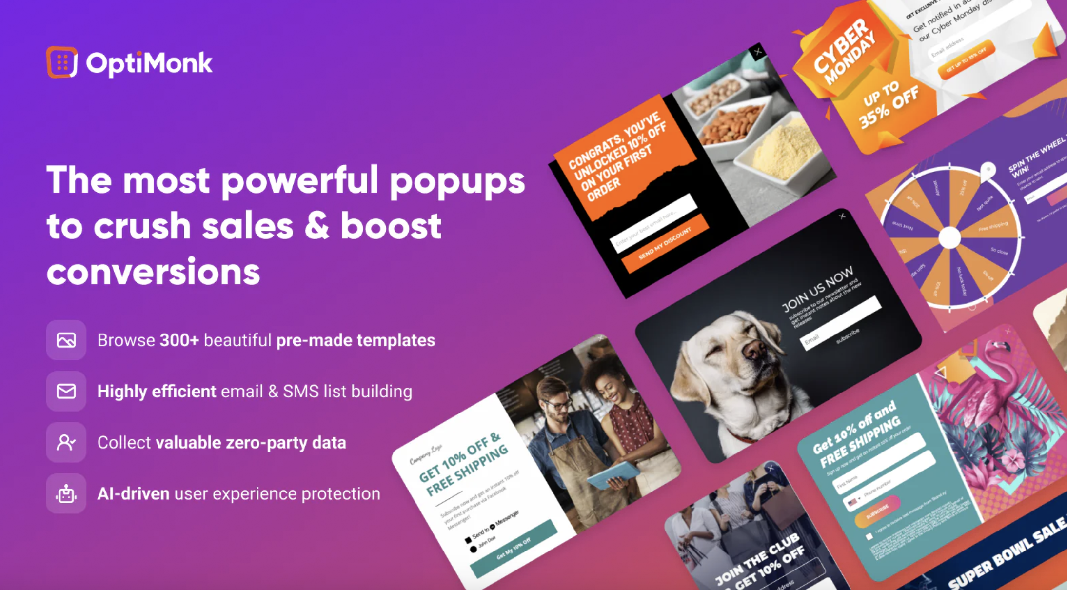
OptiMonk is one of the most powerful popup tools for ecommerce stores. It excels in creating personalized popups that can boost conversion rates.
Its advanced targeting and segmentation features ensure that your Shopify popups are shown to the most relevant visitors.
OptiMonk also offers a variety of popup types, including exit-intent popups, gamified popups, and side messages. The tool’s analytics feature helps you track performance and optimize your campaigns effectively.
2. Privy
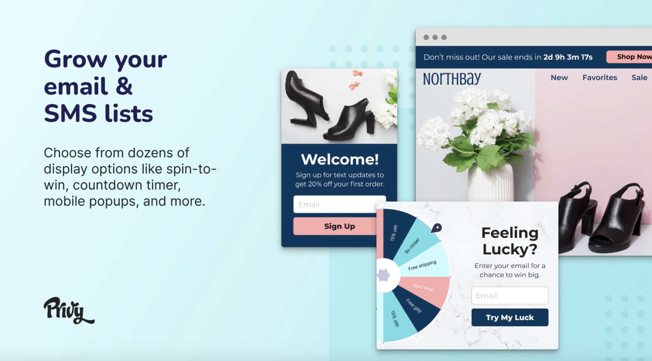
Privy is a comprehensive marketing tool that helps you create engaging popups, banners, and flyouts. With its easy-to-use drag-and-drop editor, you can customize popups to match your store’s branding.
Privy also offers robust targeting options, allowing you to show the right message to the right audience at the right time.
Plus, it integrates with email and SMS marketing, making it a versatile choice for any Shopify store.
3. Justuno
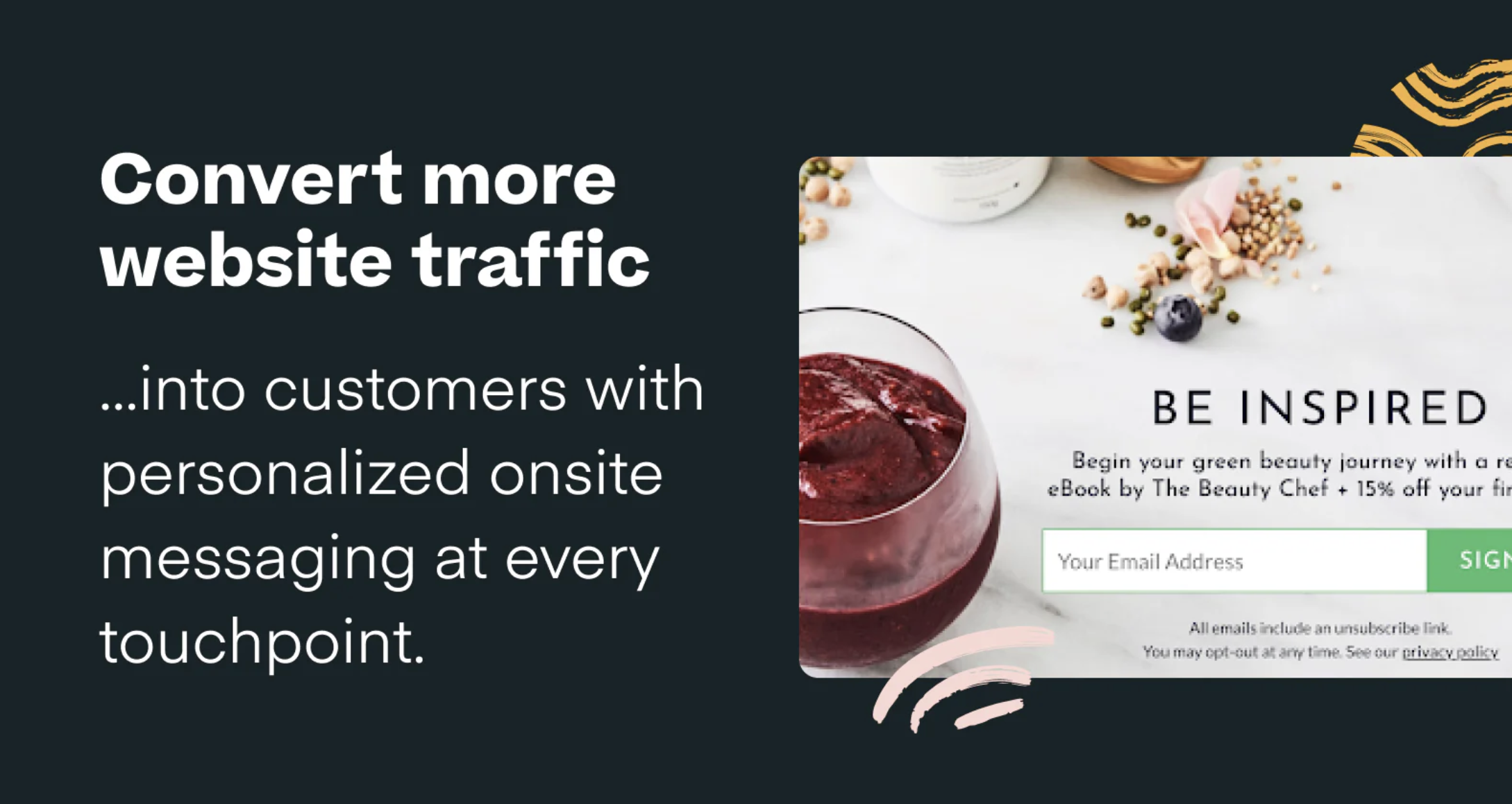
Justuno is a powerful conversion optimization tool that provides a wide range of popup and onsite messaging options. It offers AI-driven product recommendations and personalized messaging to increase sales.
Justuno’s advanced targeting options include geolocation, referral source, and behavior-based triggers, ensuring that your popups are always relevant.
Additionally, it integrates with various CRM and email marketing platforms.
How to create a popup in your Shopify store using OptiMonk
Now let’s dive into how you can create your own OptiMonk Shopify popups. The process is straightforward, and with a few simple steps, you can start capturing more leads and driving conversions.
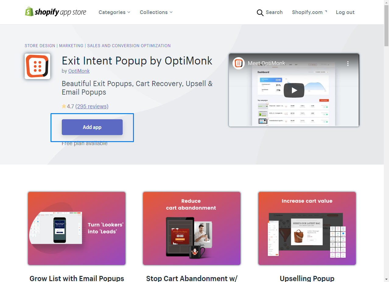
Step 1: You’ll need to add OptiMonk to your online store through the Shopify app store. This can be done in just a few clicks once you select “Add App” on our page.
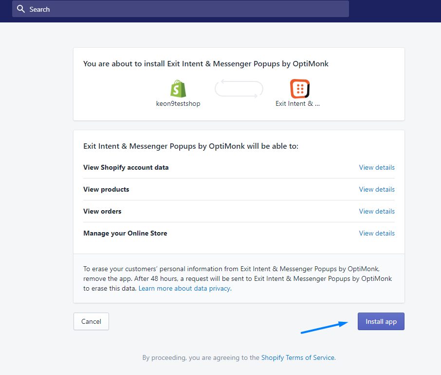
Step 2: After accepting the routine permissions, you’ll be able to install OptiMonk and supercharge your Shopify store with all of our awesome popup templates.
Step 3: Then, your new OptiMonk account will be created automatically. You need to click through the onboarding screens, then choose a goal:
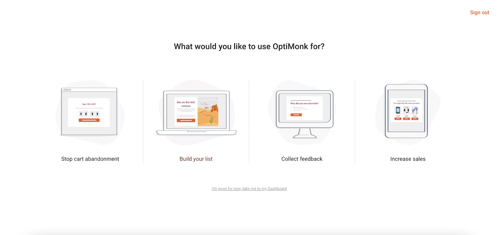
“I’ve added OptiMonk to my Shopify store. Now what?”
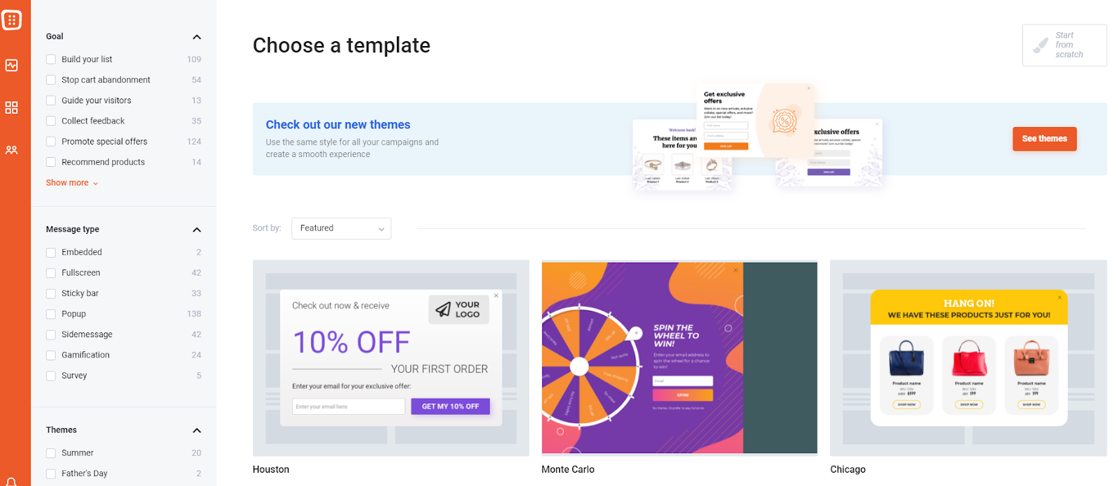
Step 4: Kick things off by choosing a template! Although there are 300+ templates to choose from, you can quickly narrow down your search by choosing a message type or goal.
Step 5: Now, you can start customizing your very own popups using the templates and examples we talked about earlier.
Using our drag-and-drop editor, you can instantly:
- Change the size and position of your images and text
- Alter your color scheme based on your branding
- Edit text boxes to reflect your company’s unique messaging
Keep in mind that our editor allows you to customize each stage of the process, including:
- The main page (your actual pop)
- The thank you page (what appears after somebody opts in)
- The teaser (a preview your popup that visitors can click on)
Step 6: Once you’ve figured out the creative side of your popup, it’s time to decide when you’ll present it to visitors.
For example, OptiMonk lets you trigger your popup based on visitor behavior such as:
- When someone is about to leave your site (exit intent)
- When someone scrolls or clicks through a certain part of your site
- After a certain amount of time (5 seconds, 10 seconds)
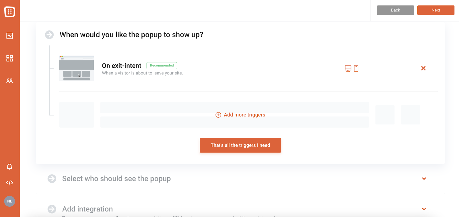
Step 7: Once you’ve decided on all of the above, you’re ready to activate your campaign in your store. Just turn on the Activate button.
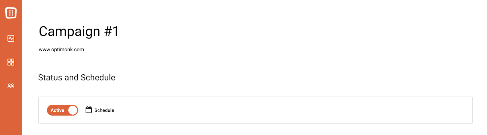
And that’s it! You can now track the performance of your campaigns on the analytics dashboard to see how well your popups are converting customers.
Wrapping up
With the right tools and a bit of creativity, reeling in subscribers and customers with popups is easier than ever.
These 21 real-world examples of Shopify popups can serve as some much-needed inspiration. You can easily recreate them yourself using OptiMonk.
We invite you to do exactly that by creating a free OptiMonk account today! Or you can download the app from the Shopify app store.
Migration has never been easier
We made switching a no-brainer with our free, white-glove onboarding service so you can get started in the blink of an eye.

What should you do next?
Thanks for reading till the end. Here are 4 ways we can help you grow your business:
Boost conversions with proven use cases
Explore our Use Case Library, filled with actionable personalization examples and step-by-step guides to unlock your website's full potential. Check out Use Case Library
Create a free OptiMonk account
Create a free OptiMonk account and easily get started with popups and conversion rate optimization. Get OptiMonk free
Get advice from a CRO expert
Schedule a personalized discovery call with one of our experts to explore how OptiMonk can help you grow your business. Book a demo
Join our weekly newsletter
Real CRO insights & marketing tips. No fluff. Straight to your inbox. Subscribe now
Share this article
Written by

Nikolett Lorincz
Nikolett is the Head of Content at OptiMonk. She is obsessed with content marketing and loves creating educational content for ecommerce store owners. She truly believes in the importance of quality over quantity.
You may also like
- Posted in
- Conversion
Partner with us
- © OptiMonk. All rights reserved!
- Terms of Use
- Privacy Policy
- Cookie Policy
Product updates: January Release 2025


