- Blog
- 9 Landing Page Best Practices to Boost Conversions in 2025
9 Landing Page Best Practices to Boost Conversions in 2025
-
Barbara Bartucz
- Conversion
- 6 min read
Table of Contents
Is your landing page underperforming, and you’re not sure where the problem lies or how to fix it? You’re not alone. Many ecommerce business owners are facing the same problem with their landing pages.
Mistakes like using the same landing page for different social ads, overcomplicating the landing page design, or crafting long copy with weak headlines can hurt your conversion rate.
Great landing pages do things a little differently, and that’s what this article is all about.
So how do you create effective landing pages that convert? That’s the million-dollar question for every ecommerce store owner. Although we don’t have the philosopher’s stone, we do have some powerful landing page best practices to help you boost conversions.
But first, let’s talk about why creating landing pages is so important.
Ready? Here we go!
Why are landing pages important?
Any internet marketing strategy must include landing pages. They’re created with the express purpose of generating leads from website visitors.
A web page designed with a specific goal in mind is referred to as a landing page. Because it has a distinct, targeted call-to-action, it stands out from the homepage and all other pages on the website.
By directing visitors to landing pages, you can track how many people convert on each page, allowing you to analyze and assess the effectiveness of your marketing campaigns. This data can help you optimize your campaigns to increase conversions and maximize your return on investment.
Landing pages are crucial because they enable you to target specific audiences with personalized messages.
You can boost the likelihood that your audience will convert by developing landing pages customized to their needs and interests. This strategy outperforms a single page that attempts to appeal to everyone… by a wide margin.
Moreover, a killer landing page aids in streamlining the buying process for your customers, delivering a clear message, highlighting the advantages of your product or service, and directing your visitor to take action.
4 types of landing pages
There are many different types of landing pages for almost anything you want to do or sell online, each with a specific objective.
Here are the most common ones used in ecommerce:
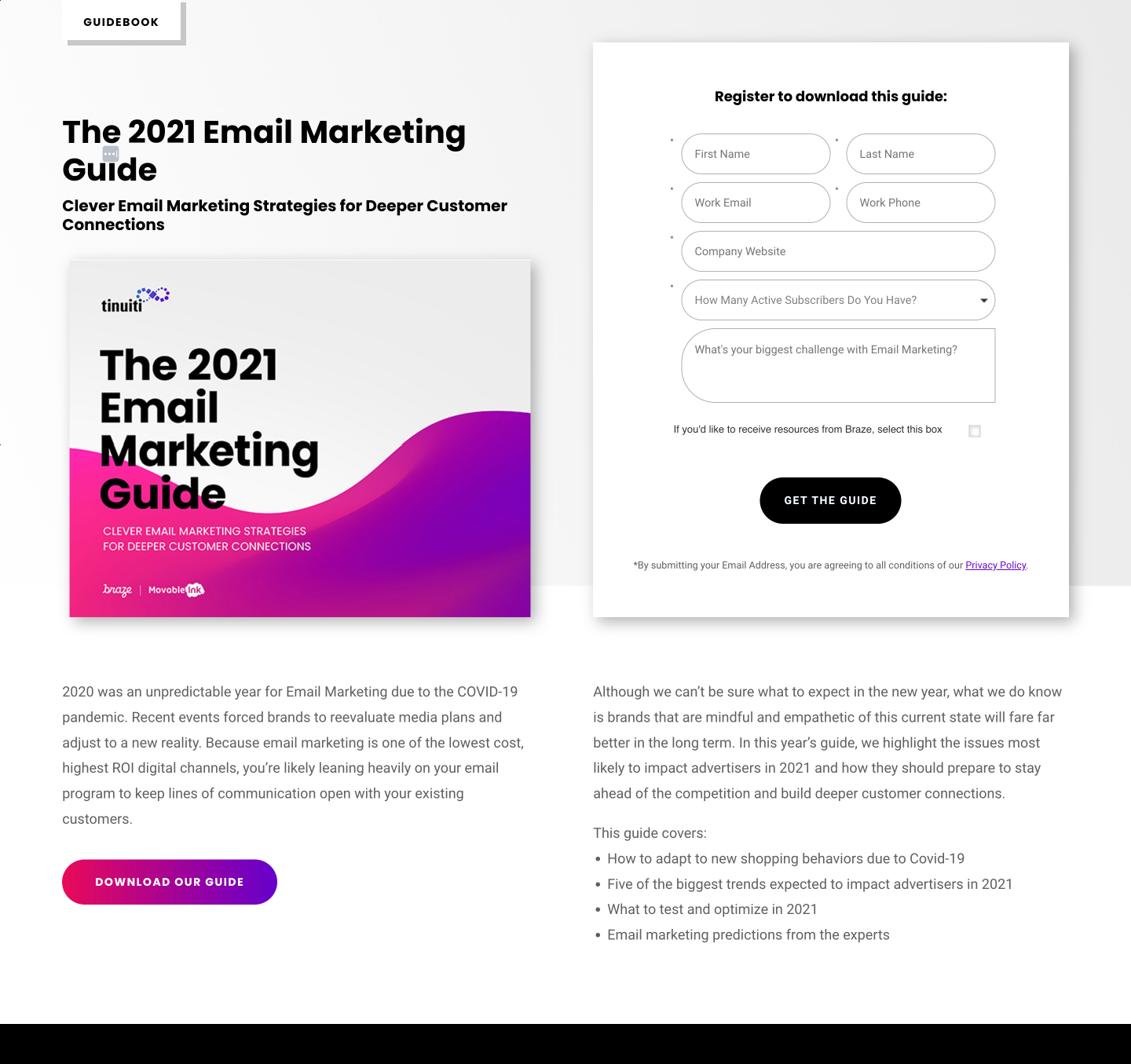
1. Lead generation landing page
A lead generation landing page is made to collect visitor data in exchange for something valuable, like an eBook, whitepaper, webinar, or discount.
This kind of landing page’s goal is to gather contact information from potential customers so that the company can nurture them through the sales process.
A lead generation landing page usually features a form and a clear call-to-action (CTA). Check out this example from tinuiti.com:
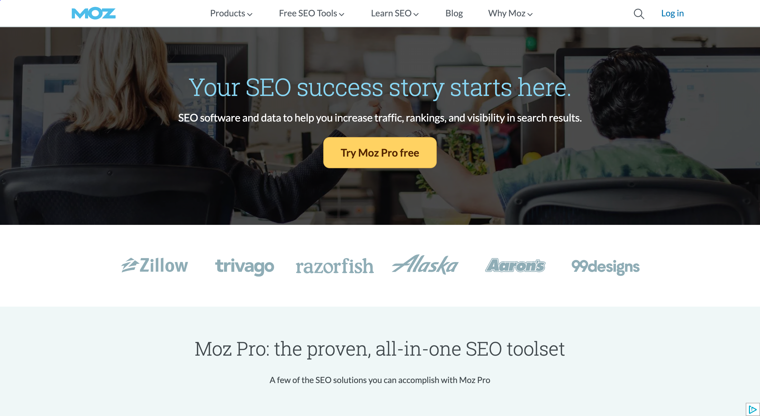
2. Click-through landing page
Click-through landing pages aim to acclimate visitors to your unique selling proposition (USP) before directing them to another page, such as a registration form or a product page.
Here’s a great example from moz.com:
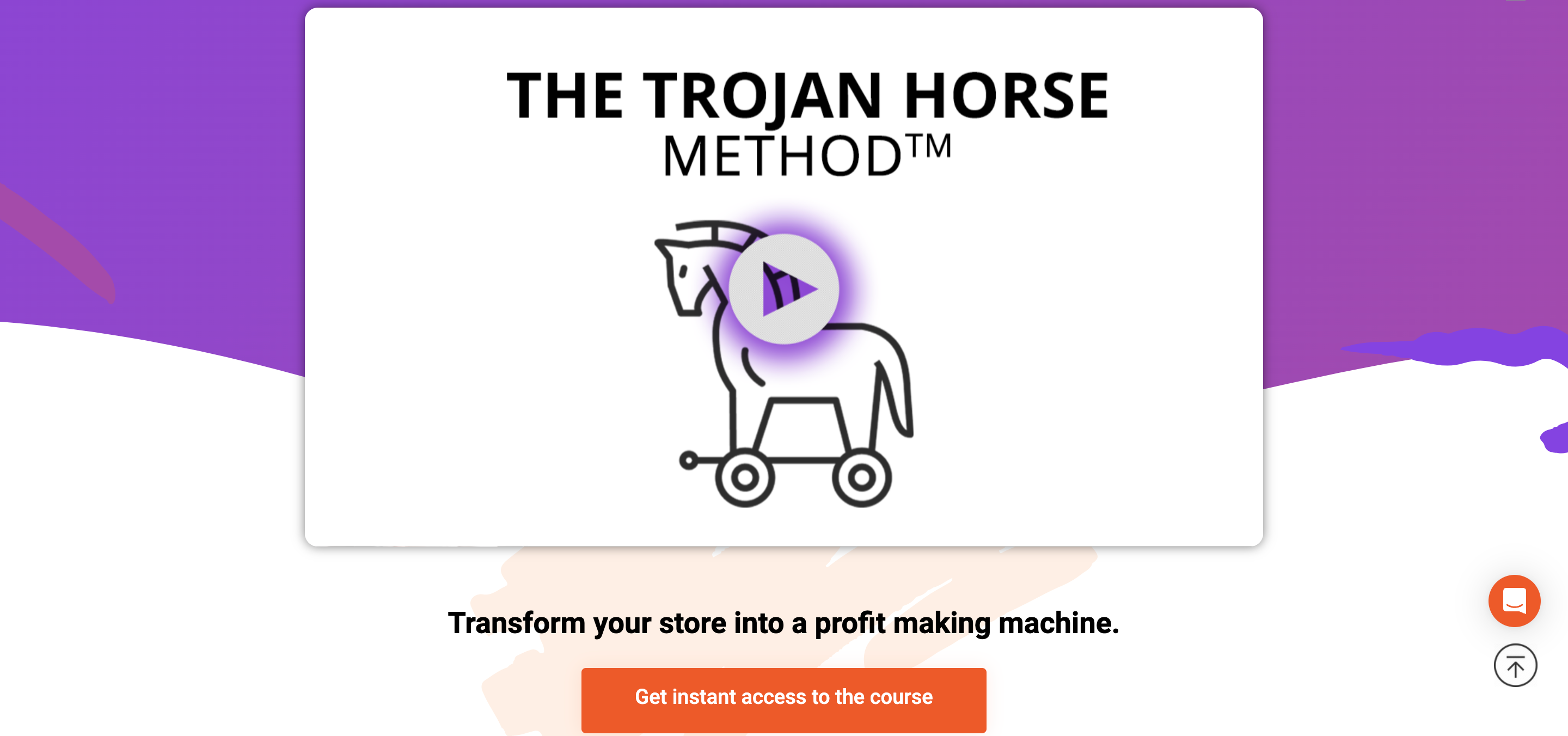
3. Sales landing page
A sales landing page is intended to turn visitors into buyers. By emphasizing a product or service’s benefits and addressing visitors’ objections or worries, this type of landing page aims to persuade them to make a purchase.
A clear call-to-action like “Buy Now” or “Sign Up Today,” compelling copy, and strong customer testimonials are standard components of a sales landing page.
OptiMonk’s landing page promoting a course is a good example of a sales landing page:
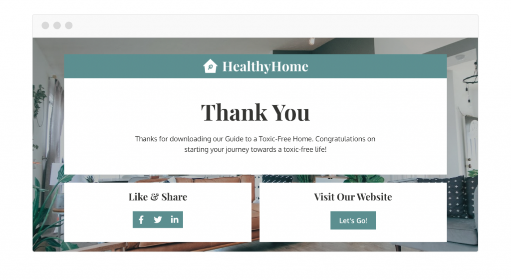
4. Thank you page
Visitors see “Thank you” pages after taking a specific action, like completing a form or making a purchase. These pages can direct them to more information or promote social sharing.
Here’s a thank you page example from Healthy Home:
9 best practices for creating landing pages
There are many different ways to optimize your landing page for success.
But you need to focus on all landing page elements (including headlines, CTAs, layouts, and color schemes) if you want to drive conversions.
Whether you’re setting up a new landing page or optimizing your current ones, here are nine battle-tested landing page best practices to build landing pages that convert. Let’s go!
1. Use clear, compelling copy
According to a report, 30% of landing pages have too much copy, which can hurt conversion rates.
Because your landing page has to convey your value proposition, build a bond with your target audience, and inspire them to act, it’s crucial to use clear, appealing copy.
You need to make sure customers understand what you offer and how it can help them.
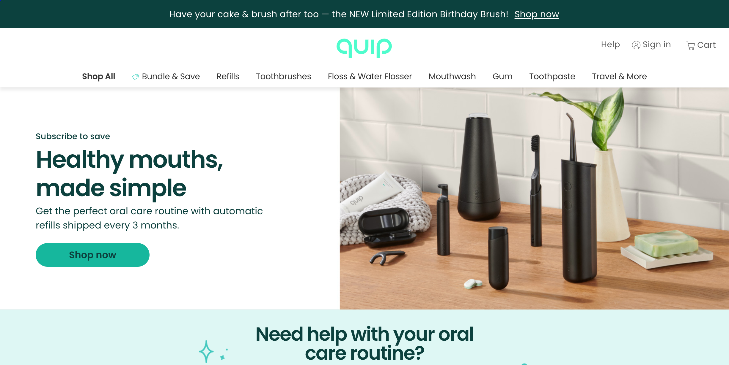
Check out Quip’s landing page as an example. They keep it simple and clear with an engaging headline: “Healthy mouths, made simple.”
2. Put essential content above the fold
In a world where our attention spans are rapidly decreasing, you don’t want your landing page visitors to have to put in the effort to go searching for something on your page that resonates with them.
If they can’t quickly understand what you do and why it matters, you may see a high bounce rate.
The first thing visitors see on your website is the area known as “above the fold.” Keep the most important information above the fold on your landing page because online visitors can see and engage with it without scrolling down.
By placing your key messaging, value proposition, and call-to-action in this section, you’ll increase the likelihood to convert visitors into leads or customers.
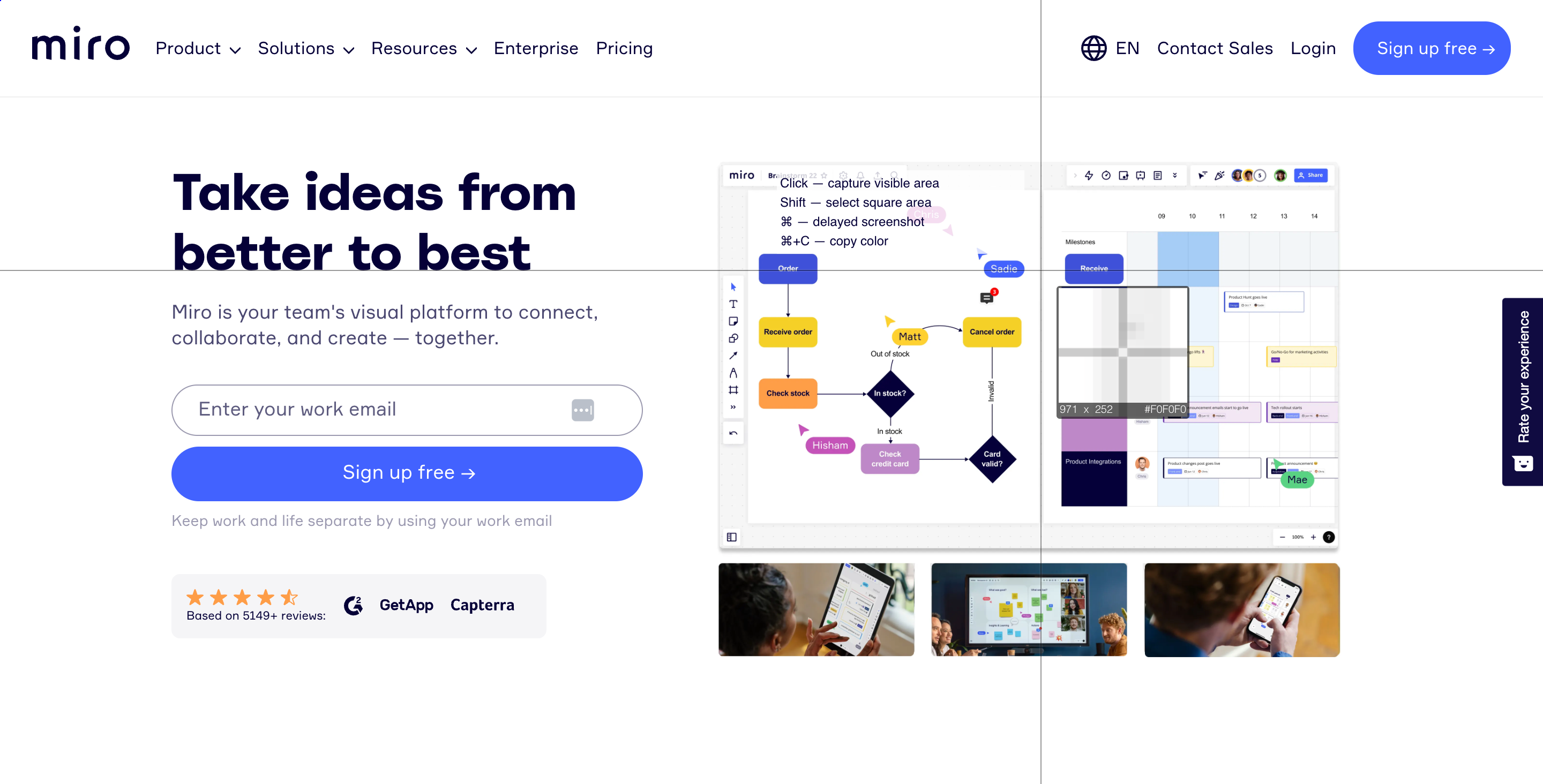
Miro’s landing page is an excellent example of putting all the necessary information above the fold:
3. Personalize the message based on your social ads
Do you have multiple Facebook or Instagram ads running with different copy and value propositions? Are you directing all that traffic to a single, static landing page?
Then you’re almost certainly losing leads.
Try customizing your landing page’s copy and value proposition for each individual ad. This way, you can take your potential lead on a more personalized journey through your funnel.
This simple tactic can significantly boost the ROI of your social ads.
To accomplish this, you can use OptiMonk. You’ll just need to create a new Experience variant for each ad and personalize your landing page’s copy using our Dynamic Content feature.
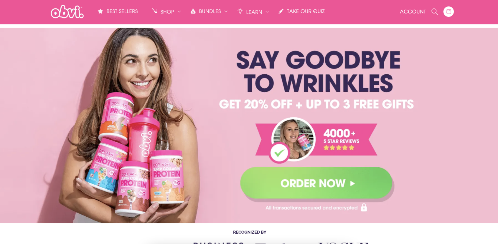
Check out the example below from DTC brand Obvi.
They have many Facebook ads promoting different value propositions. One example is their “reverse signs of aging” banner:
")
People who click on this ad will see a matching headline on the landing page:
4. Keep your landing page design simple
Going overboard with the design of your landing page can confuse users, slow down page loading time, and distract from the call-to-action (CTA).
A simple, clean landing page design helps your message stand out, makes it easier for users to navigate, and increases the likelihood of conversion.
Additionally, optimizing landing page images is crucial as they set the tone for visitors’ experience and can significantly impact load times and conversion rates.
5. Only ask necessary questions on your forms
Asking personal questions on a form (like a newsletter subscription form) drastically reduces the response rate. The goal is to keep the form as short as possible and only ask for the information you really need.
By asking only necessary questions, you’ll reduce friction, increase the completion rate, and improve data accuracy.
6. A/B test your landing page headline
Optimizing your landing page’s performance through continuous testing and best practices is crucial for maximizing conversions.
If you’re experiencing low conversion rates on your landing page, you may not have found the right USP for your product or service yet.
You can test different value propositions in your headline to figure out what resonates best with your target audience.
Your headline is the most prominent text on your landing page (and the first thing people read) which means it’s the perfect place to experiment.
This will allow you to make data-driven decisions and strategic changes to boost your conversion rate.
7. Optimize for mobile devices
With more users than ever accessing the internet on mobile devices, it’s essential to optimize your landing page for different screen sizes and ensure it loads quickly on mobile devices. This will improve the user experience and increase your conversion rate.
Focus on your buttons, and make sure they’re noticeable and easy to click on a mobile device. Keep text to a minimum so you can avoid overwhelming your landing page visitors.
Your website loading time determines a lot about your online traffic retention. According to Envisage Digital, you lose an average of 54% of traffic if your landing page load time is more than 3 seconds, and a one-second delay in load time causes user satisfaction to fall by 16%.
Make sure you’re optimizing your images, too—very large images can hurt your load time.
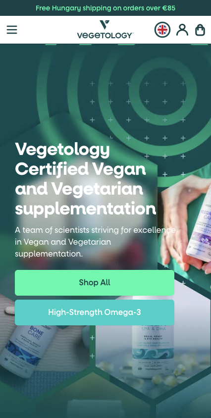
Check out this well-optimized mobile landing page from Vegetology:
Recommended reading: 8 Mobile Landing Page Examples to Inspire Your Own
8. Use social proof
The role of social proof in conversion optimization has been an interesting topic in the marketing industry. Experts say 84% of people trust reviews like personal recommendations.
Social proof allows you to build trust and credibility for your brand while alleviating concerns first-time customers may have. You can use testimonials, customer reviews, ratings, and/or case studies.
Check out this landing page from Athletic Greens leveraging social proof to alleviate hesitations and inspire confidence in the product.
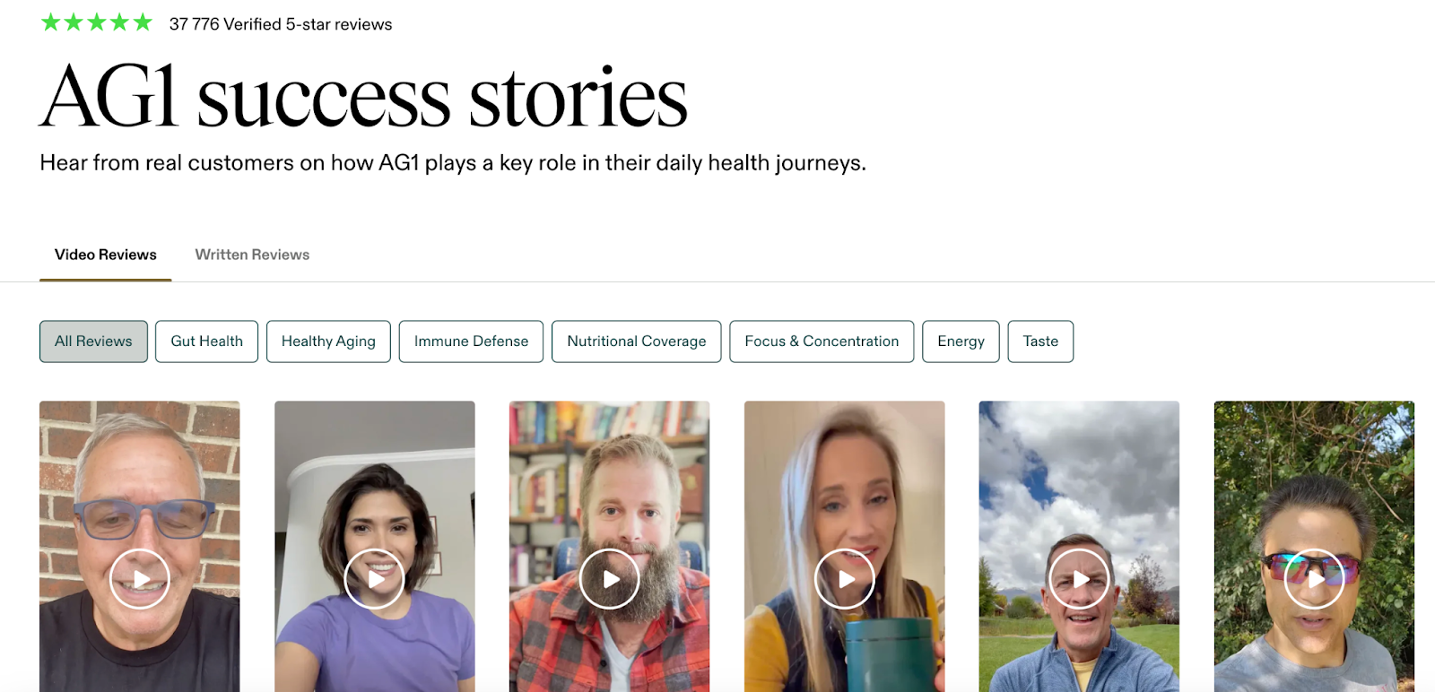
The takeaway is clear: use social proof on your landing page!
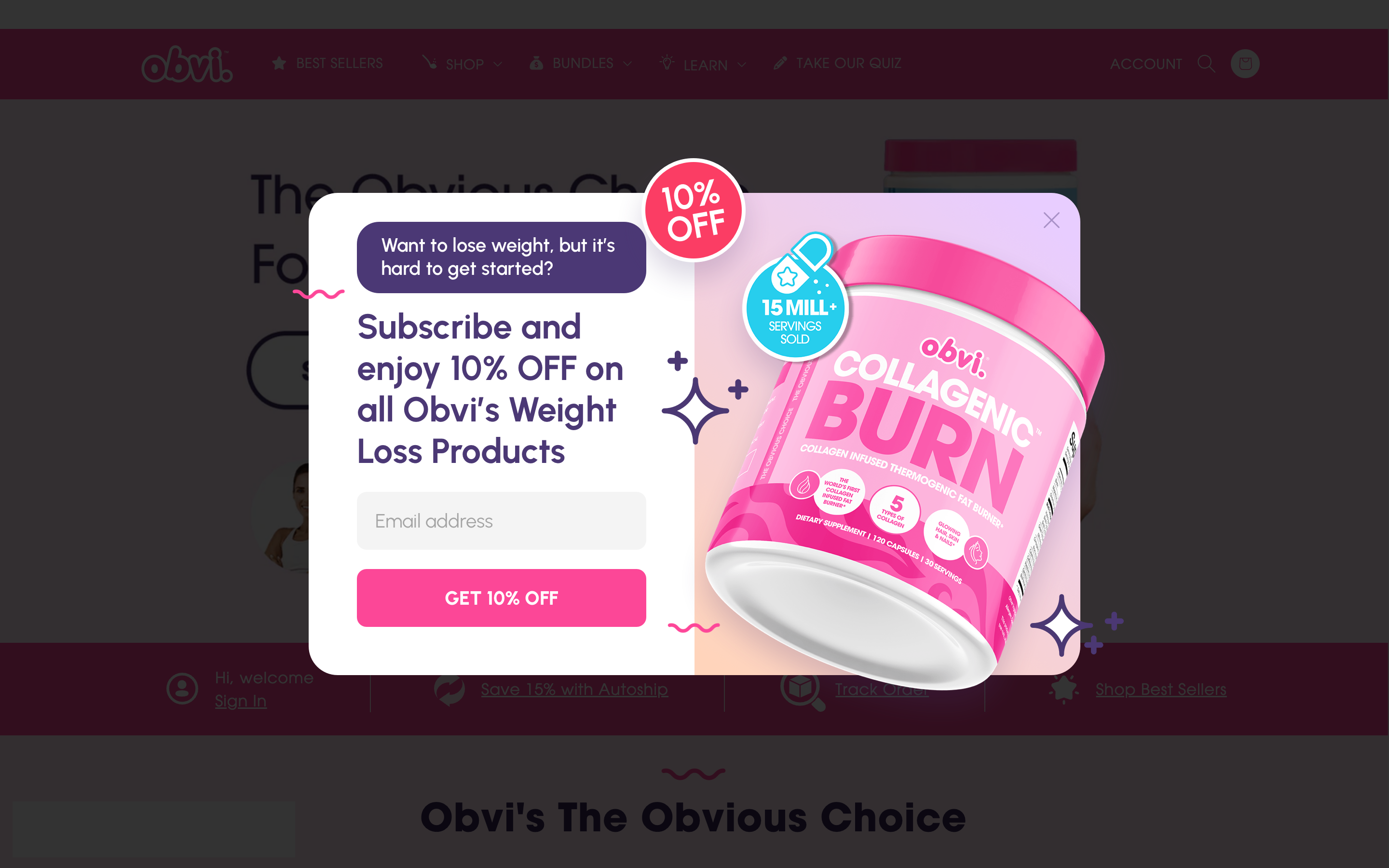
9. Create an exit-intent popup
Launching an exit-intent popup that shows a secondary offer for website visitors can significantly boost your conversion rates.
You can display the same exit-intent popup for everyone. Or if you want to achieve better results, you can segment visitors based on their browsing behavior and personalize messages.
For example, if a visitor clicks on an ad related to weight loss, you can assume they’re interested in weight loss and customize your popup message to appeal to this interest.
This is an example of how Obvi uses this strategy on its landing page:
5 great landing page examples & what you can learn from them
Now that you’ve got 9 landing page best practices that you can use, you’re probably looking for some inspiration to help you put those concepts to work… and we’ve got you covered!
We’ve scoured the internet to find examples of brands with excellent landing pages. The many landing pages below show how companies use the best practices in this article to build successful landing pages.
1. Uber

Uber’s landing page is an excellent example of a simple, effective design focusing on the main message and call-to-action, “Sign up to drive.”
This landing page headline doesn’t just tell you what to do, it instantly communicates Uber’s value proposition. It’s concise, catchy, and gets straight to the point.
What you can learn:
One of the biggest lessons from Uber’s landing page is the power of simplicity. You don’t need a cluttered page filled with unnecessary information. Stick to the essentials if you want to create a well-designed landing page.
Clarity is also key. If you want to encourage visitors to take action, your headline should leave no room for confusion. Uber’s “Sign up to drive” is a perfect example.
2. Grammarly

When you visit Grammarly’s landing page, the first thing you notice is how efficiently it communicates the product’s value. The headline is concise, explaining exactly what Grammarly offers.
Plus, this landing page builds trust with social proof, featuring logos from well-known companies and glowing customer reviews.
What you can learn:
Use a clear, concise headline. Grammarly’s landing page nails this with a headline that quickly tells you what the product does and why it’s beneficial.
Social proof is a powerful tool for building trust and credibility on your landing page. Grammarly does this brilliantly by showcasing logos of reputable companies that use their service.
When you create landing pages, you can include various types of social proof:
- Customer reviews: Positive feedback from satisfied customers can be very persuasive.
- Logos of well-known clients: If big names use your product, let visitors know. It adds instant credibility.
- Statistics and numbers: Share impressive stats about your product’s performance or user base.
3. Slack

Slack’s landing page features a demo video highlighting the product’s key features and benefits. This video isn’t just eye-catching, it’s a strategic tool for showcasing Slack’s key features and benefits in a digestible format.
The headline complements the video, reinforcing its message and enticing visitors to learn more.
What you can learn:
A well-crafted demo video can be a game-changer for a good landing page. It allows you to demonstrate your product in action, highlighting its key features and benefits in a visually engaging way.
4. HubSpot
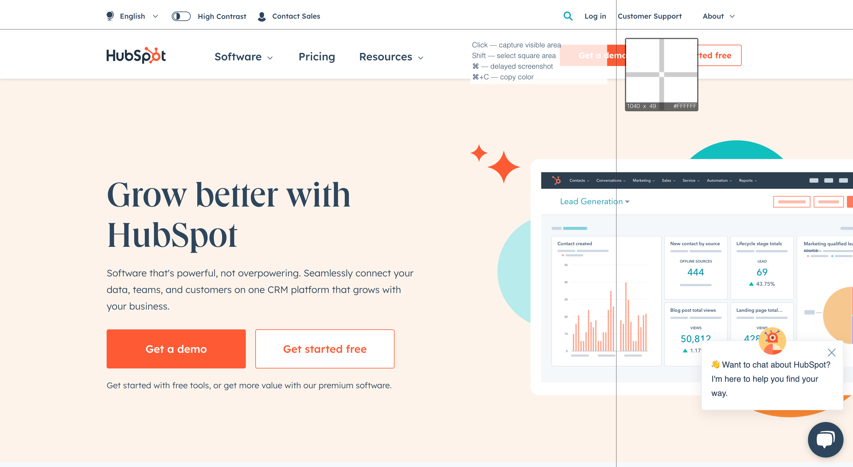
HubSpot’s landing page design is a good example of a highly visible CTA button.
As soon as you land on the page, your eyes are drawn to the prominent orange button that commands attention with the directive “Get a demo.” This effective use of color ensures that the CTA stands out and encourages visitors to take action.
This landing page also features a concise 4-word headline that succinctly communicates the value proposition.
What you can learn:
HubSpot’s orange CTA button contrasts sharply against the lighter background, making it impossible to miss. If you want to design a good landing page, consider using colors that complement your brand while also drawing attention to your CTA button.
5. Kiss My Keto

Kiss My Keto’s landing page is a masterclass in leveraging the power of social proof to build trust and credibility with potential customers.
Instead of bombarding visitors with endless product descriptions and flashy graphics, they let the voices of satisfied paying customers do the talking for them.
They also include a video on the right-hand side to introduce different products so the visitor is aware of their wide range of products.
What you can learn:
Using social proof is one of the most powerful landing page best practices. So don’t be afraid to let it do the talking for you!
Wrapping up
Crafting high-converting landing pages is not rocket science. Like every skill, it can be learned. Armed with the 9 best practices covered above, you can significantly improve your conversion rates and get a good ROI for your ads.
There are many ways to optimize your landing pages for success, like writing clear, concise copy, using social proof, and A/B testing your headlines.
And when you need a bit of inspiration, Uber, Grammarly, or Hubspot provide great examples of effective landing pages you can learn from.
Now over to you—what’s the first thing you’ll improve on your landing page?
Migration has never been easier
We made switching a no-brainer with our free, white-glove onboarding service so you can get started in the blink of an eye.

What should you do next?
Thanks for reading till the end. Here are 4 ways we can help you grow your business:
Boost conversions with proven use cases
Explore our Use Case Library, filled with actionable personalization examples and step-by-step guides to unlock your website's full potential. Check out Use Case Library
Create a free OptiMonk account
Create a free OptiMonk account and easily get started with popups and conversion rate optimization. Get OptiMonk free
Get advice from a CRO expert
Schedule a personalized discovery call with one of our experts to explore how OptiMonk can help you grow your business. Book a demo
Join our weekly newsletter
Real CRO insights & marketing tips. No fluff. Straight to your inbox. Subscribe now
Share this article
Written by

Barbara Bartucz
Barbara is a Content Marketer at OptiMonk. She takes pride in creating different forms of content, whether it’s an article, a video, or an e-book.
You may also like
- Posted in
- Conversion
Partner with us
- © OptiMonk. All rights reserved!
- Terms of Use
- Privacy Policy
- Cookie Policy
Product updates: January Release 2025


