- Blog
- A Collection of The Best Popup Examples Ever: 20+ Real-Life Popups
A Collection of The Best Popup Examples Ever: 20+ Real-Life Popups
-
Barbara Bartucz
- Marketing
- 6 min read
Table of Contents
Searching for website popup examples that catch the eye and boost sales? You’re in the right place!
In this article, we’ll share 23 of the best popup examples, which range from eye-catching discount offers to highly personalized product recommendations.
Whether you’re aiming to reduce cart abandonment, grow your email list, or boost sales, these website popups are designed to inspire and elevate your marketing game.
Let’s dive in!
What are website popups?
First, let’s start with the fundamentals and clarify what website popups are.
A website popup is an overlay that appears on your website as a layer above the base content. Its primary purpose is to captivate the user’s attention and convey crucial information, promotions, or calls to action.
Website pop-ups can be versatile, serving various objectives such as collecting email subscribers, promoting special offers, or alerting users to important updates.
20+ best website pop-up examples to inspire you
Now, let’s look at some of the best website pop-up examples on the internet.
1. Vegetology’s January special popup
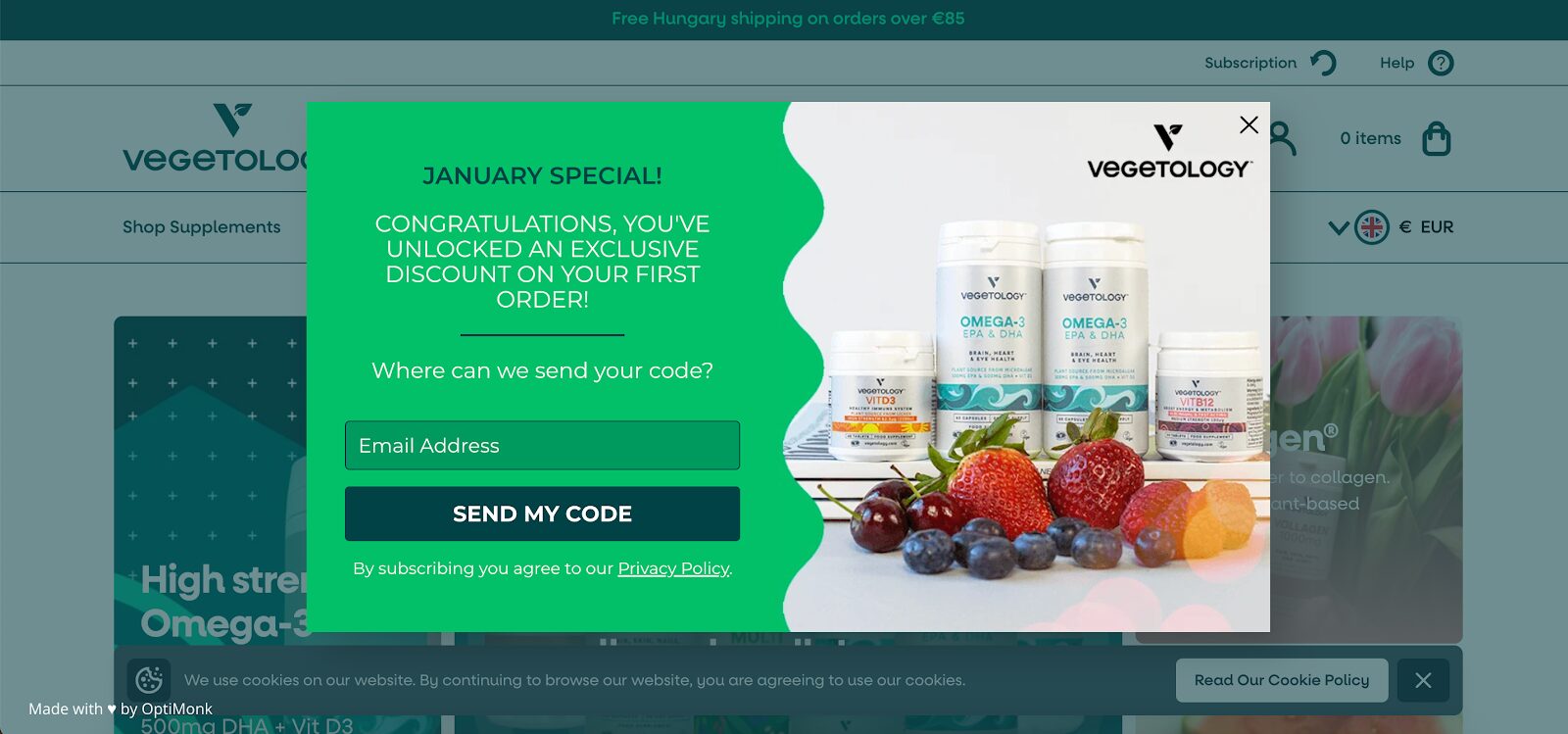
Offering a discount for new visitors but not achieving the results you want?
Instead of providing a boring 10% off, consider introducing an “exclusive discount” like Vegetology did.
They also increased the sense of urgency by incorporating the current month into the headline (“January special”). They did this with our Smart Tags feature, which means that the text is automatically updated each month.
With this strategy, they nearly doubled their signup rate.
2. Lammle’s exit intent pop-up
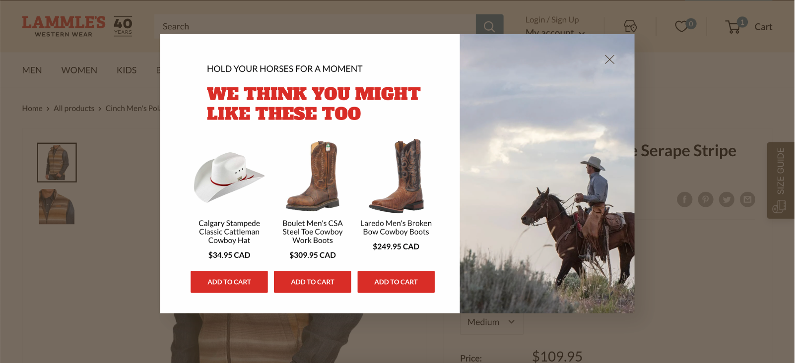
Lammle’s implemented an exit-intent popup featuring their most popular products. This is a good tactic for encouraging visitors to explore more, effectively maintaining their engagement, so they shop around and discover even more products.
By strategically presenting relevant product recommendations, Lammle’s experienced a notable 23.5% increase in revenue from visitors to their product pages.
Looking to create popup campaigns that work? These popup templates are going to put you in the fast lane:
3. Hiut Denim Co.’s email opt-in
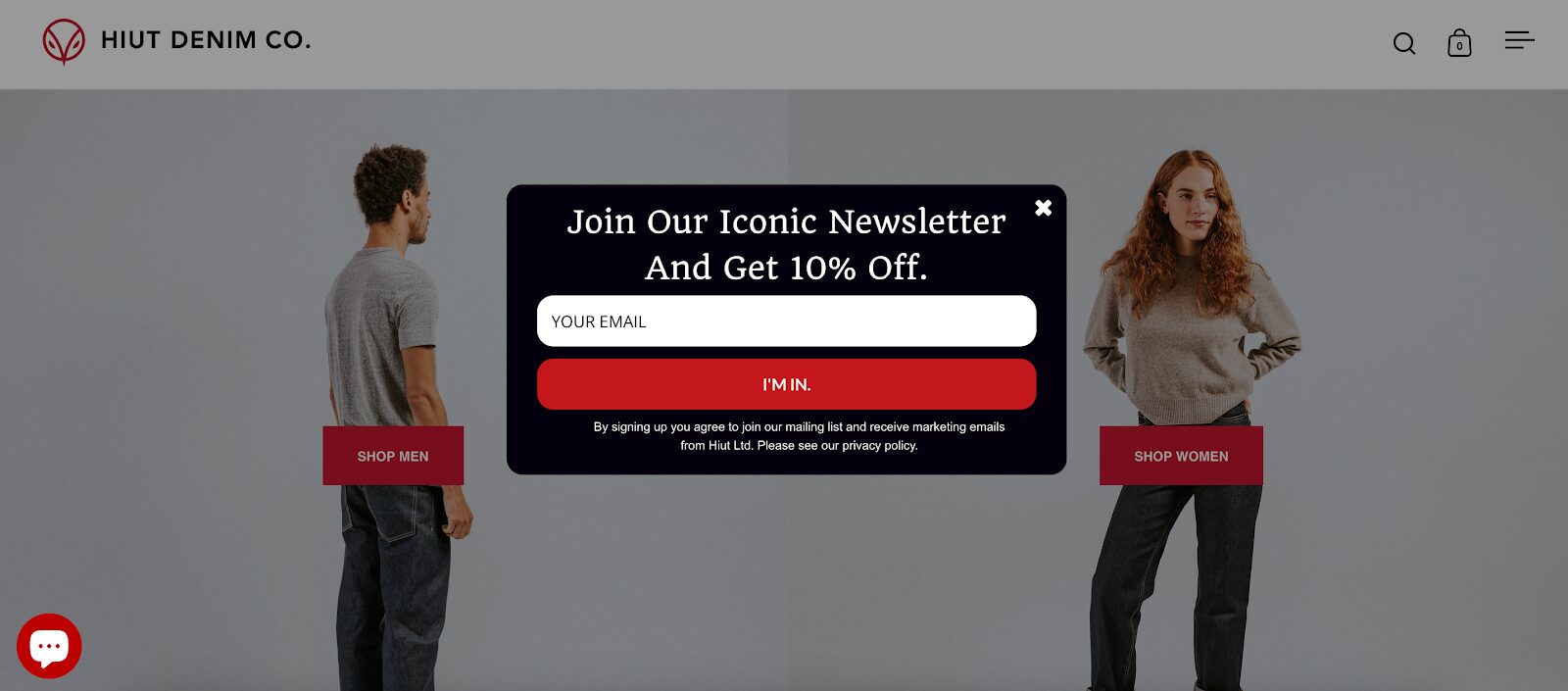
Hiut Denim Co., a fashion brand, uses a popup to gather email subscribers by offering a 10% discount for those who join their “iconic newsletter.”
This is a simple example, but it’s a great one. Take a look at the “I’m in” call-to-action (CTA), which packs more punch than a generic “Subscribe now.”
4. Macguire Shoes’ email popup
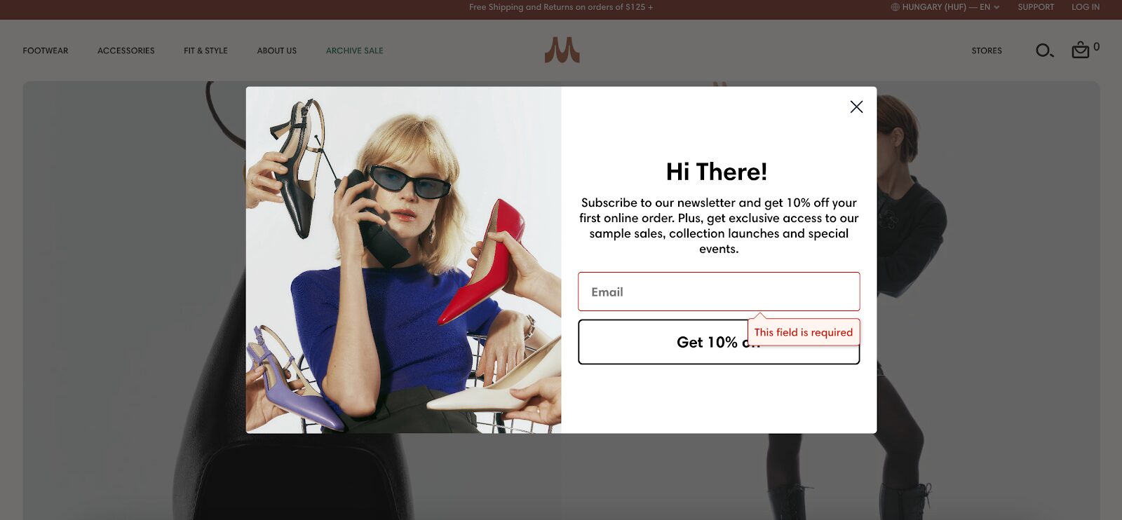
Macguire Shoes elevated their email sign-up popups to a new level: instead of simply providing a 10% discount code, they also offer exclusive access to sample sales and other special events.
This serves as a powerful marketing strategy, creating a sense of exclusivity and capturing the attention of visitors who want to feel special.
Also, note the creative photo on the popup, which shows the product itself, and how they address the visitor with a friendly “Hi there!” headline.
5. Adored Vintage’s VIP list popup
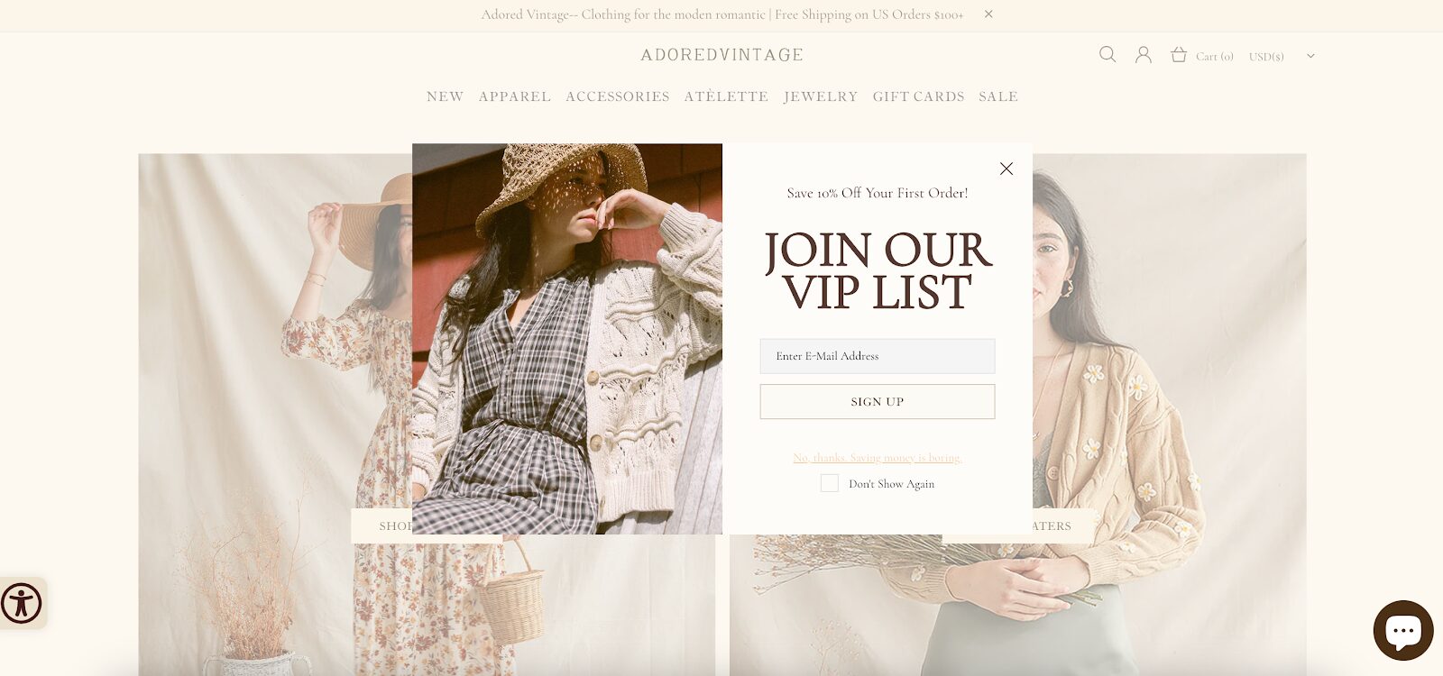
Prioritizing the creation of a unique and special experience for visitors, Adored Vintage included this concept in its marketing strategy. In this popup example, the brand strategically frames their email list, inviting users to join a “VIP List.”
This entices visitors to become part of an exclusive group, where they not only enjoy a discount on their initial purchase but also receive personalized content tailored to their preferences.
6. SolaGarden’s discount popup
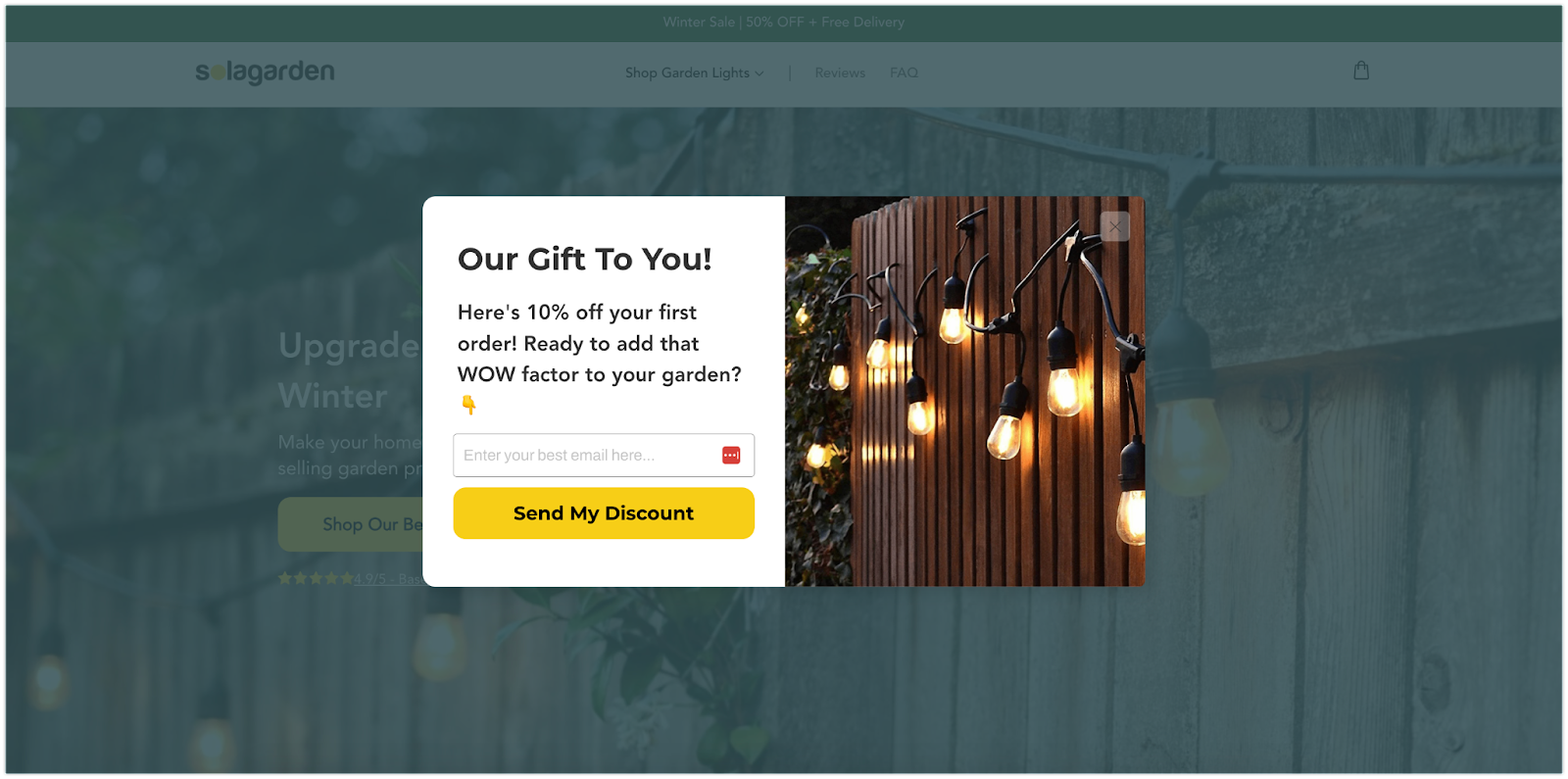
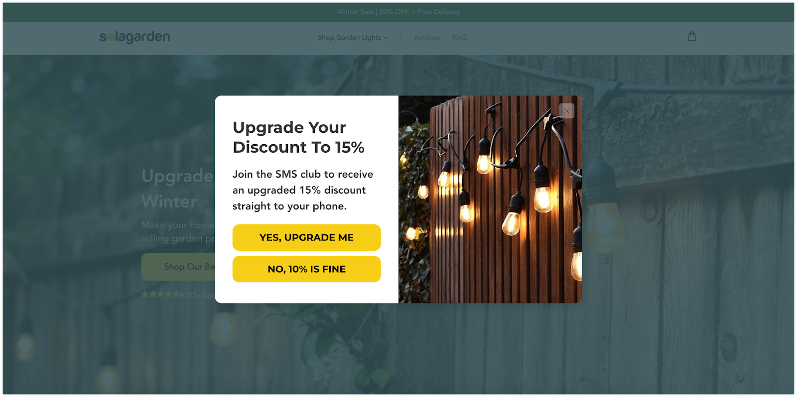
SolaGarden’s pop-up leverages Jason K. Williamson’s Trojan Horse method, an ideal strategy for simultaneously growing your email and SMS lists. Despite the common belief that gathering both email and SMS contacts may hinder conversions, this method ensures success.
Simply request the visitor’s email first, then entice them with an additional incentive in exchange for their phone number. Depending on the discount offered, you can convert 30-80% of email subscribers into SMS subscribers!
Build your own Trojan Horse popup with these templates:
7. Craft Sportswear NA’s SMS popup
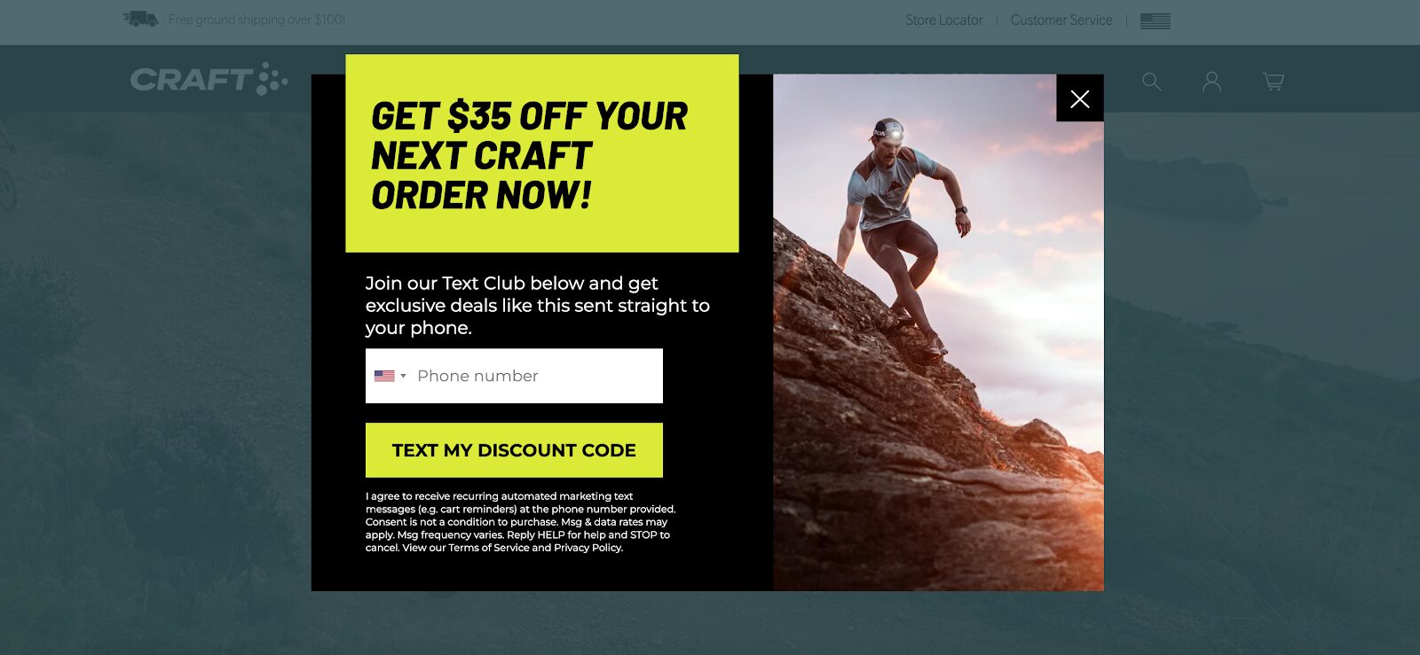
SMS marketing is often deemed more effective than email marketing due to its higher open and click-through rates. Many websites use this strategy to grow their contact lists, and Craft Sportswear serves as a notable example.
This popup was displayed to website visitors who had already subscribed to Craft Sportswear’s email list. Since these customers were already involved in Craft Sportswear’s marketing, there was a higher likelihood that they would also opt to join the SMS list.
Instead of offering a percentage discount, they provide a specific amount in exchange for the user’s phone number. Additionally, they pledge exclusive deals delivered directly to the visitor’s phone.
8. Goodfair’s email popup
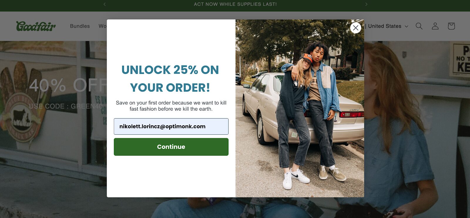
Goodfair employs an innovative approach by integrating a significant discount offer with a larger commitment to promoting conscientious fashion choices.
This strategy not only resonates strongly with their brand voice but also effectively caters to the preferences and values of their specific target audience.
9. Kirrin Finch’s email popup
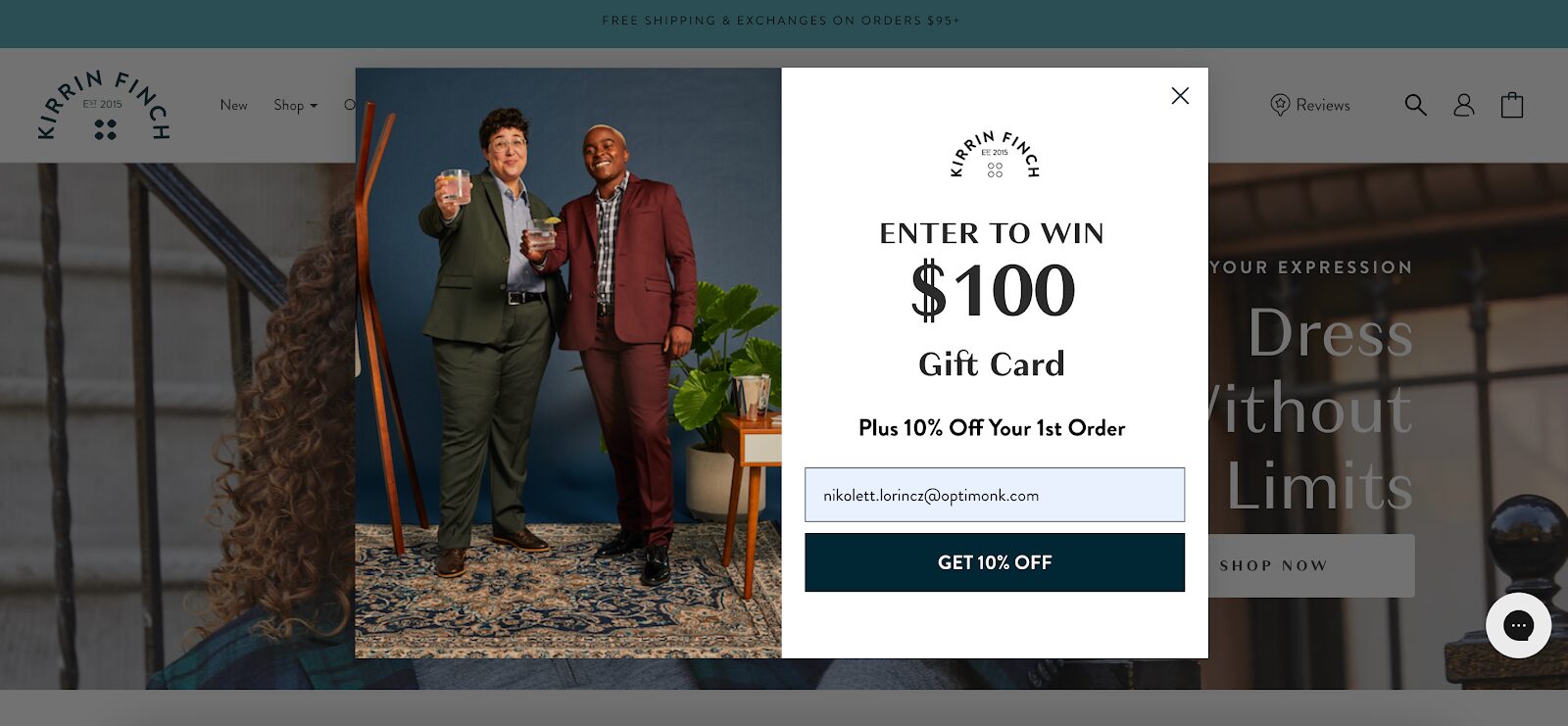
You can easily enhance the impact of your popups by incorporating a chance for visitors to win something.
You can employ a simple popup form, similar to Kirrin Finch’s welcome popup, to play into people’s natural inclination to try their luck at winning something.
By providing the chance to win a gift card alongside a guaranteed 10% discount, you can effectively generate leads and engage your audience.
10. BlendJet’s New Year’s sale popup
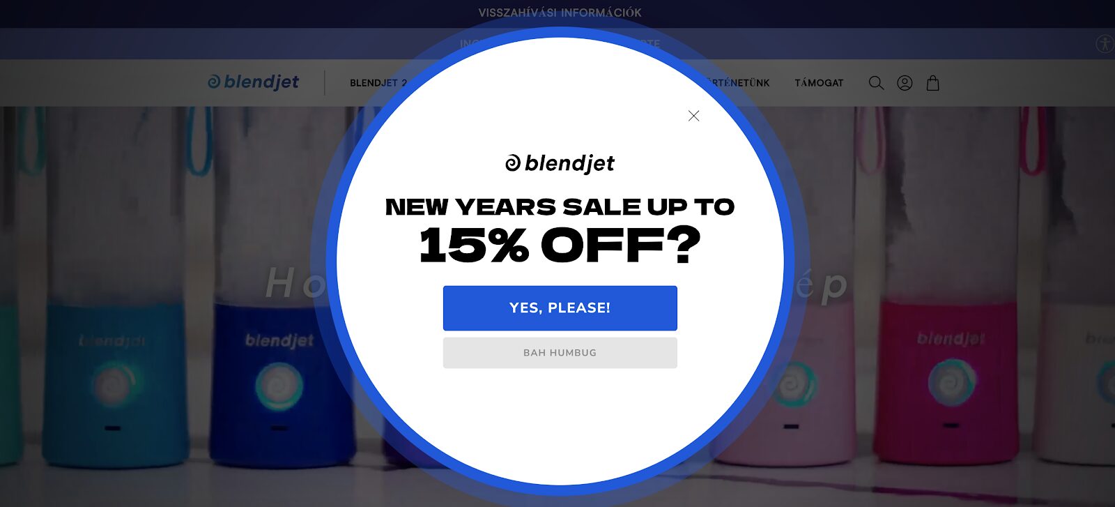
If you’re running a seasonal sale and aiming to boost your lead generation efforts, take inspiration from BlendJet’s unique and eye-catching popup design for their New Year’s sale.
Diverging from a conventional approach, they opted for a visually striking design using a round shape and bold colors that still align with their brand identity. This distinctive approach not only captivates attention but also contributes to their overall brand image.
11. Crown & Paw’s email popup
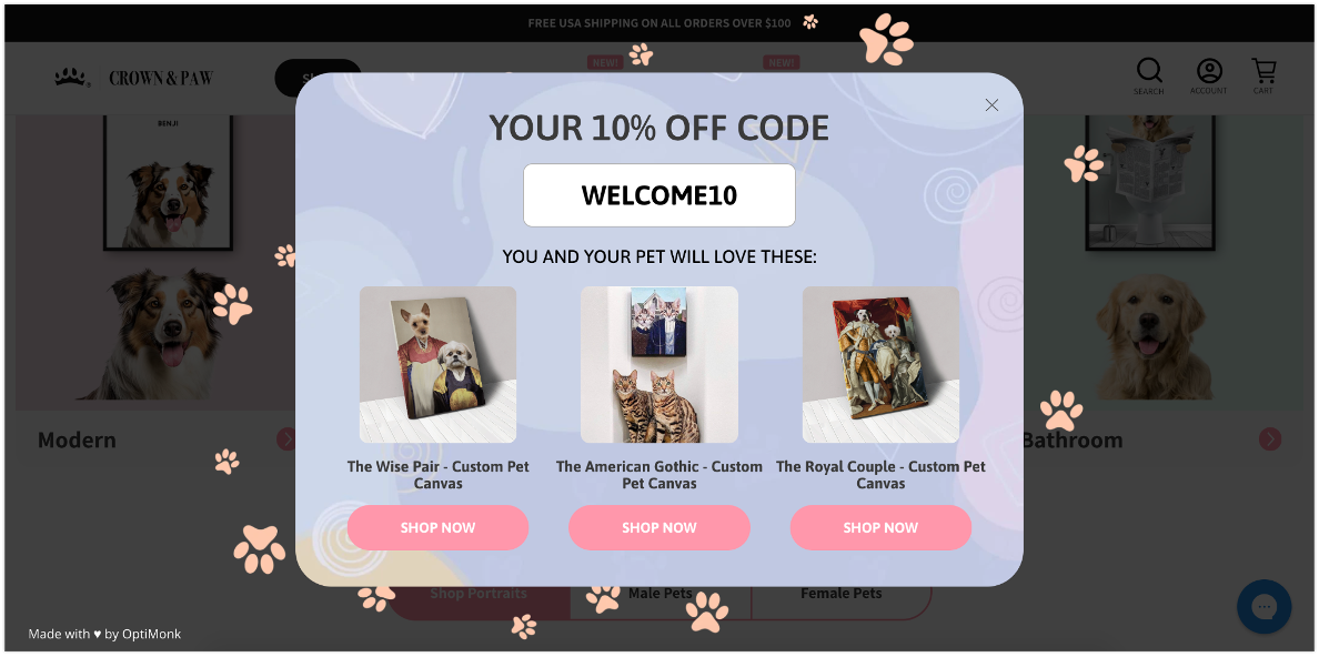
If you’re struggling with low popup conversion rates, similar to Crown & Paw’s, or if you want to learn more about your subscribers, consider adopting their popup strategy.
Start by offering a tempting deal that’s too good to resist.
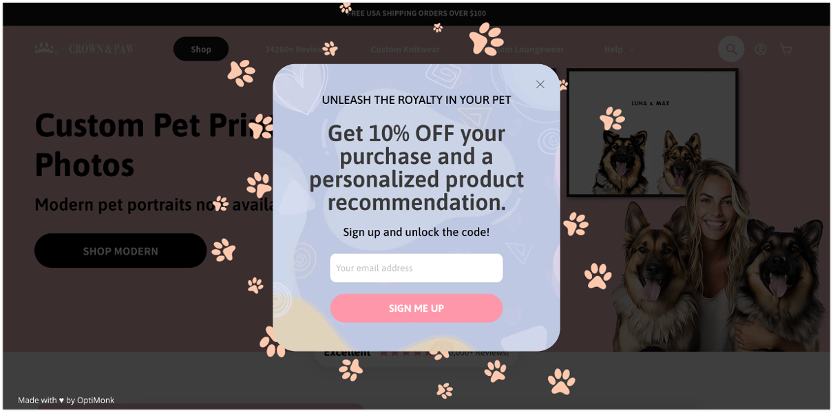
Next, ask a few questions to learn more about them.
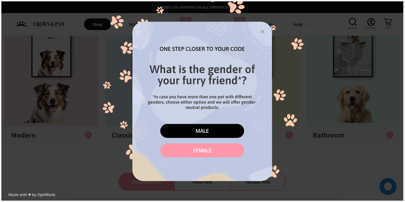
Finally, as the last step, reveal the coupon code along with some personalized product recommendations.
12. Bukvybag’s product recommendation popup
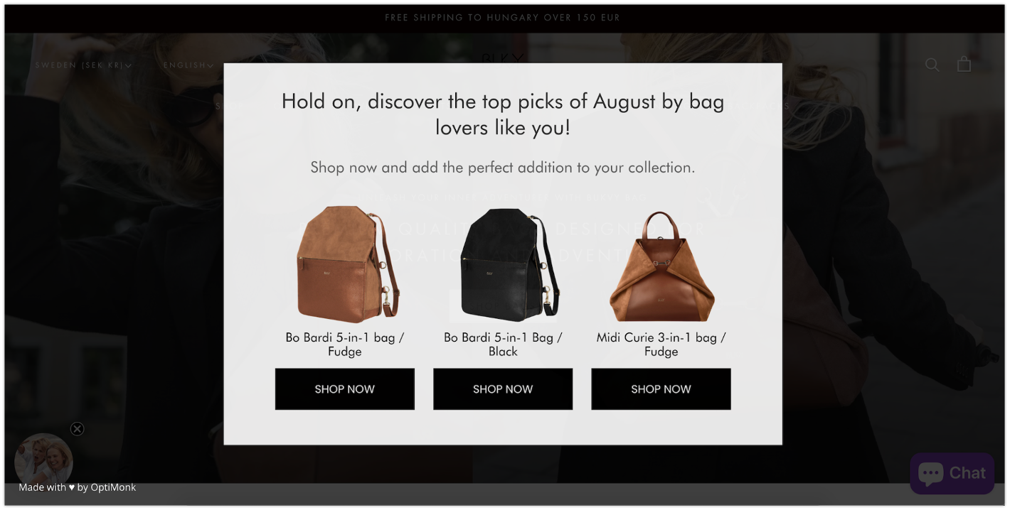
Bukvybag provides a good example of an effective exit-intent popup. Rather than offering discounts, they employed a different strategy: showcasing their best-selling products on an exit-intent popup.
This approach encourages product discovery and helps reduce the bounce rate.
13. MotionGrey’s email popup
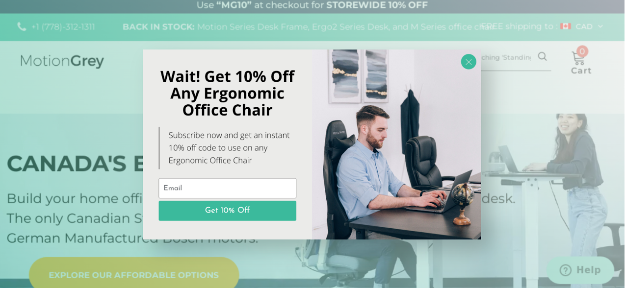
If you’re struggling to generate leads, ensure that your popup provides something valuable for product-aware website visitors. These individuals are already familiar with your products and may just need a final nudge to make a purchase.
Take a cue from MotionGrey, which offered a 10% discount to this audience.
14. Rothy’s alert popup
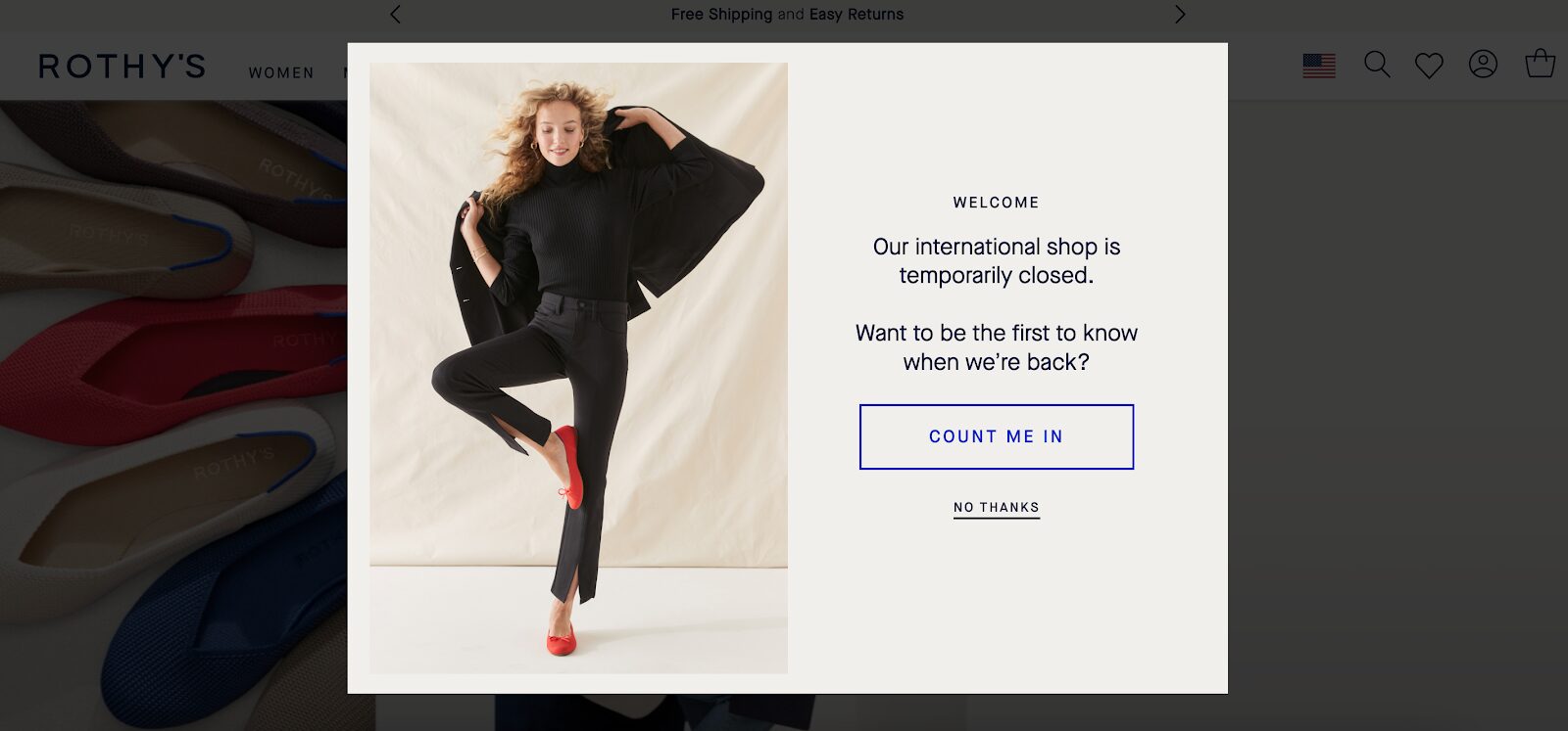
Pop-ups are also a great way of communicating important information about your online store.
Check out Rothy’s alert popup example, where they inform the visitor about an important update. Although the popup is mainly informative, they can still build their list by promising to let subscribers know when they’ll be open again.
15. The Oodie’s email popup
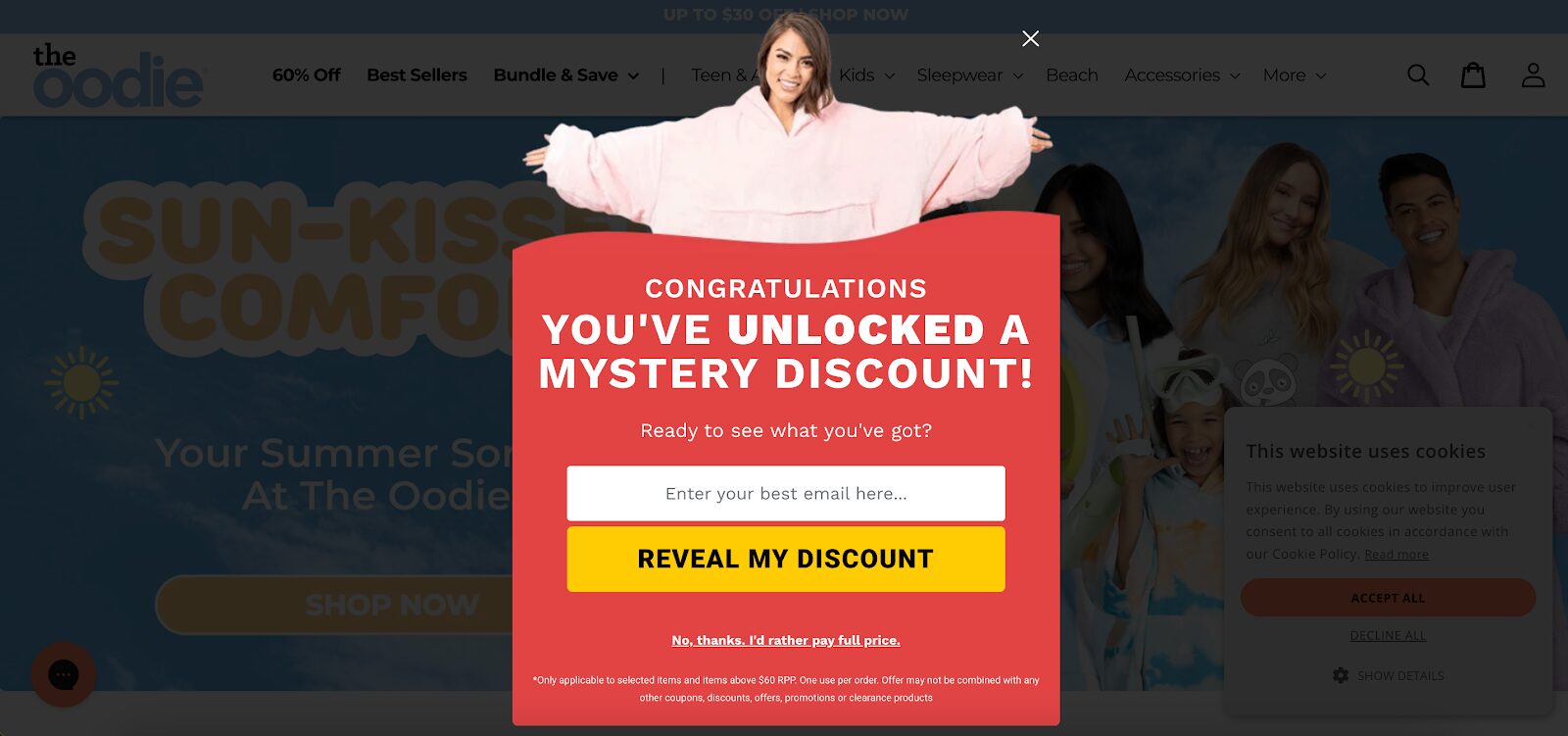
This popup example from The Oodie capitalizes on people’s natural curiosity by keeping the discount a mystery until they unlock it by providing their email address.
Another clever element is the inclusion of the phrase “No thanks, I’d rather pay full price,” adding an enticing touch to their offer.
16. Urban Outfitters’ discount popup
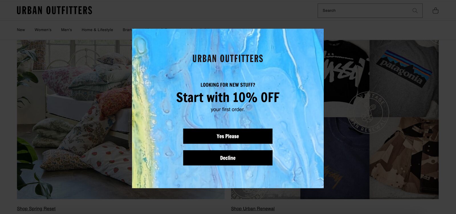
Urban Outfitters uses a simple 10% off welcome popup for generating leads. They grab the visitor’s attention by using contrasting colors, so it’s really hard to miss for new website visitors.
17. Beis Travel’s email popup
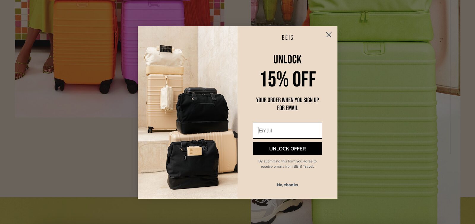
Beis Travel gives us a great example of a simple but eye-catching popup. Take a look at how they displayed their products in the popup and how they aligned their message “Unlock 15% off” with the CTA button, which says “Unlock offer.”
18. Bubble Skincare’s welcome popup
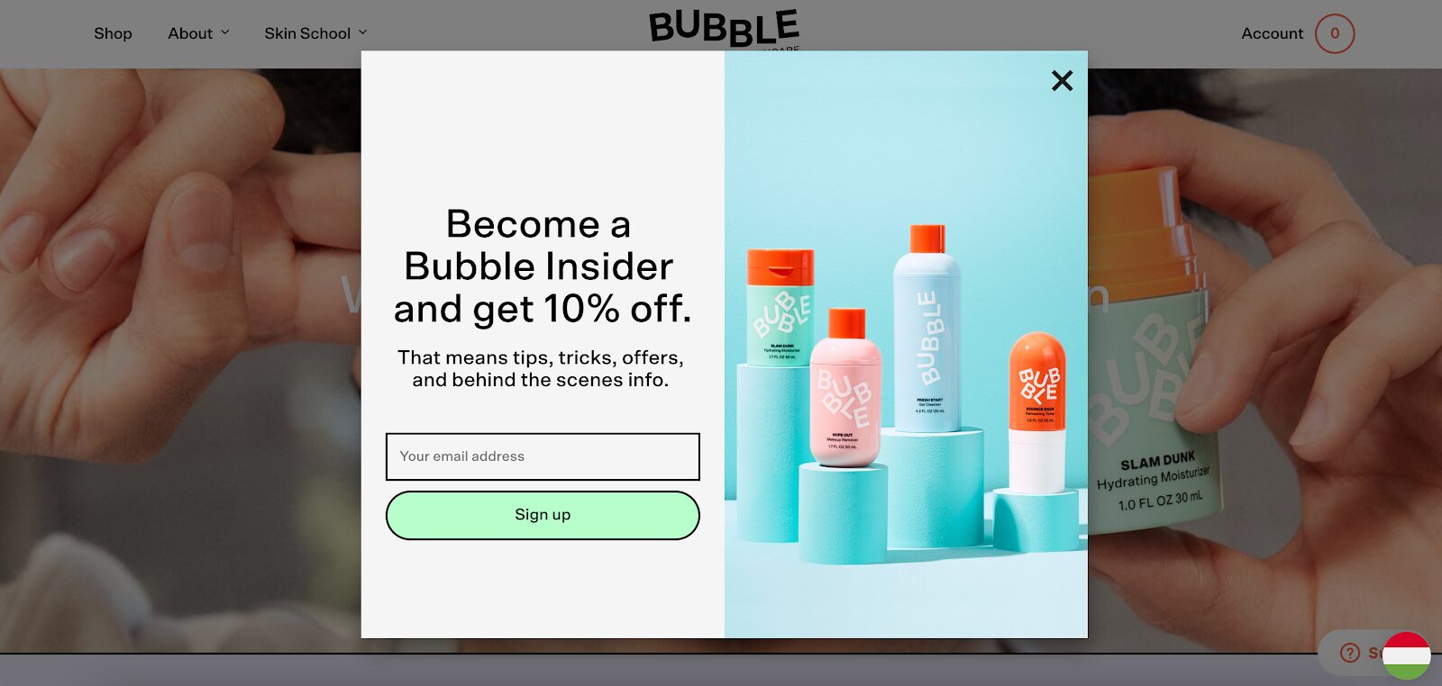
Bubble Skincare does two things in their popup: first, they showcase diversity using vibrant colors, creating a striking contrast with the background.
Additionally, they promote their email list as an exclusive club, which is a savvy marketing move, tapping into our natural inclination for a bit of exclusivity.
19. Caraway’s free shipping popup
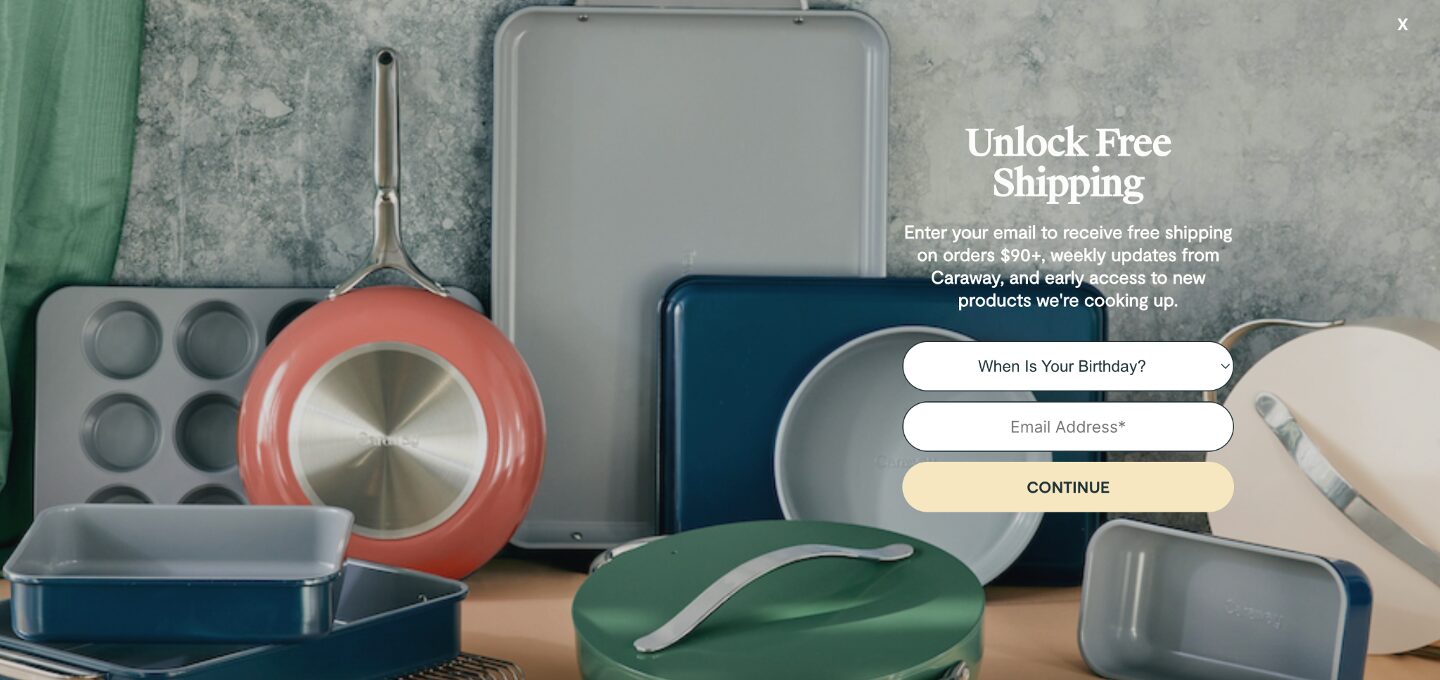
Caraway employs a full-screen popup to emphasize their free shipping offer. In the realm of online shopping, free shipping holds significant sway, which is why it’s crucial to showcase it prominently if you provide this service.
On their popup, Caraway not only displays a variety of products but also includes an extra question, “When Is Your Birthday?” By gathering this additional information, they’ll be able to send special promotional offers to visitors on their birthdays.
If you’d like to promote your offers on a fullscreen popup, try these templates:
20. Glossier’s newsletter popup
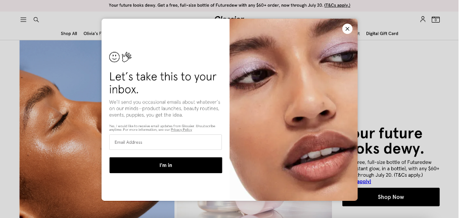
Glossier’s popup provides another effective illustration of aligning your popup with your brand. It’s not just about using suggestive language; take a look at their call-to-action (CTA) that reads “I’m in” instead of the typical “Sign up” or “Subscribe now.”
Additionally, Glossier adds a touch of emojis to their popup, signaling that if your brand has a laid-back and friendly tone, incorporating that into your own popups could be a great idea.
21. Sassy Scents’ fullscreen popup
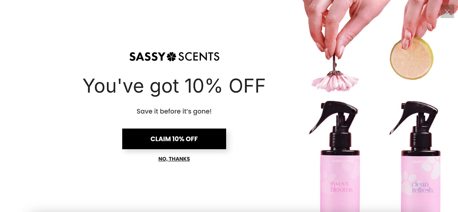
Sassy Scents knows how to capture attention with their full-screen takeover popup that covers the entire screen for maximum impact.
This multi-step popup starts with a simple yes-no question, engaging first-time visitors right away and making them feel involved. By clicking “yes,” users unlock the next step, where they have to share their email address to get the 10% discount.
The clean, bold design of this popup example, combined with the multi-step approach, creates a smooth user experience while encouraging conversions.
22. Nexus Nutrition’s mystery discount popup
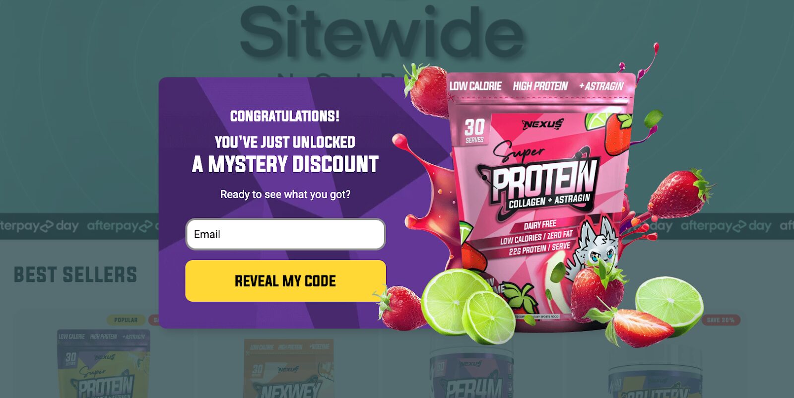
Nexus Nutrition takes a fun and engaging approach with their website popup. The pop-up design is visually appealing, featuring an image of their best-selling product to draw attention.
Instead of revealing the discount upfront, this popup window creates excitement with a mystery discount offer, encouraging visitors to share their email addresses and find out what they’ll get.
This element of surprise adds a gamified experience, which can increase the likelihood of engagement and drive conversions.
23. ParfumeLab’s welcome back pop-up
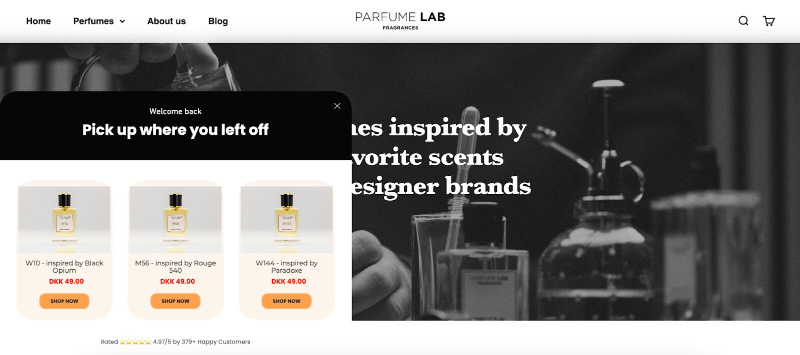
ParfumeLab takes personalization to the next level with their welcome back website popup for returning site visitors.
The clever “Pick up where you left off” copy immediately grabs attention by addressing the visitor directly, making them feel recognized and valued. The pop-up dynamically displays products the user previously viewed, helping to rekindle their interest and encouraging them to complete their purchase.
This approach saves visitors time and boosts their shopping experience by providing personalized recommendations.
What can you learn from the best pop-ups? 5 tips & tricks
Now that you’ve seen some outstanding popup examples, it’s time to cover a few tips to help you get the most out of your own popups.
1. Be mindful of the number of popups you display
Whether you’re using welcome or exit-intent popups, be mindful of how many you’re displaying. If you’re overflowing with them, you’re probably going to ruin your onsite experience, and you’ll soon see that reflected in your bounce and conversion rates.
2. Personalize your popups for your target audience
Personalized messages can help to build a stronger connection with your visitors and increase the relevance of your communications.
By leveraging data like the pages they browse, you can customize your popups and boost the likelihood of conversions.
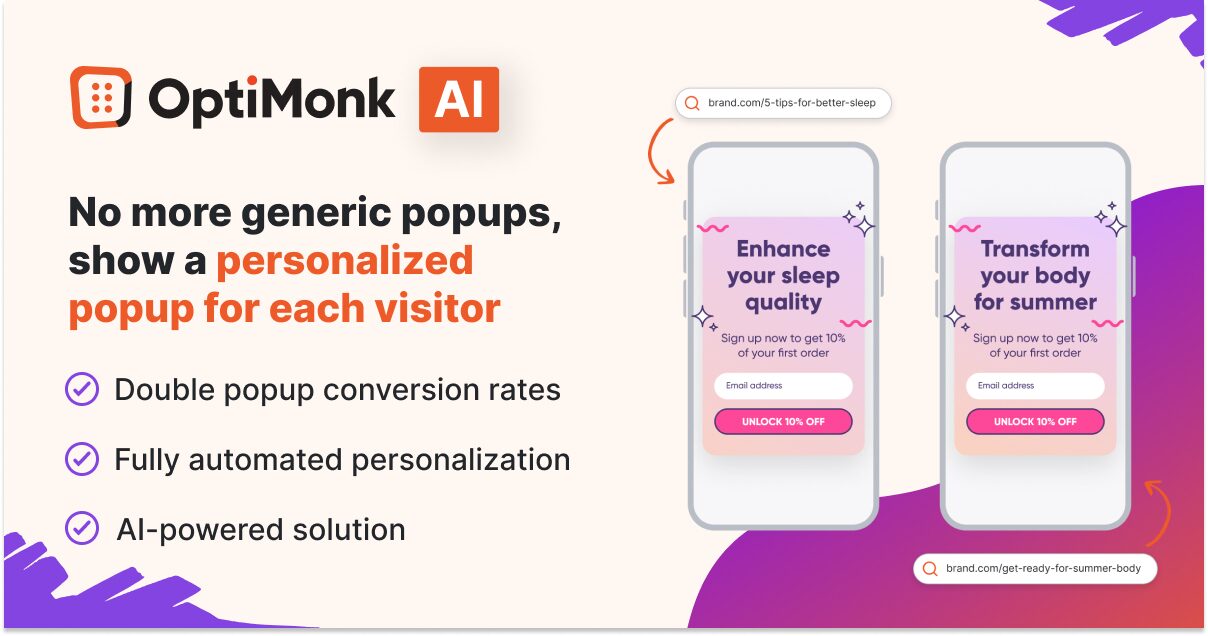
OptiMonk’s Smart Popups tool, powered by AI, makes it simple to automatically tailor your pop-up messages to each visitor’s interests, doubling your conversion rates without requiring manual effort.
3. Use mystery and FOMO in your messages
Standard 10% discounts are something website visitors are quite accustomed to. Instead, consider offering a mystery discount to enhance the sense of suspense and intrigue.
Alternatively, you can include countdown timers to add a sense of urgency to your promotions and activate the fear of missing out.
4. Delay the appearance of the “X” button
Many times, a visitor will click on the “X” button without even reading the content of a popup. If they took a few extra seconds to consider the offer, they might discover genuine interest!
This issue can be addressed by introducing time-based pop-ups with a brief delay of two or three seconds before the “X” button appears. This approach ensures that your audience is compelled to read and engage with your offer.
5. A/B test different popups and messages
Trusting your gut feeling doesn’t always lead to effective pop-ups. That’s why you should always keep testing your popups. You can test different popups against each other, try different templates, and explore variations on the same popup to determine which yields the best results.
Additionally, consider A/B testing various design elements, including color schemes, fonts, images, and wording, to fully optimize the effectiveness of your pop-ups.
Don’t forget to optimize your popups for mobile devices, as most website visitors today are browsing on their phones.
Wrapping up
Gone are the days when website pop-ups were deemed annoying. Our curated examples illustrate that utilizing pop-ups is now an effective strategy for conveying information and generating valuable leads on your website.
We hope you’ve gained some knowledge and drawn some inspiration from the examples above.
Now you’re ready to stay ahead of the curve, so use our templates to kickstart your own killer popup campaigns!
Migration has never been easier
We made switching a no-brainer with our free, white-glove onboarding service so you can get started in the blink of an eye.
What should you do next?
Thanks for reading till the end. Here are 4 ways we can help you grow your business:
Boost conversions with proven use cases
Explore our Use Case Library, filled with actionable personalization examples and step-by-step guides to unlock your website's full potential. Check out Use Case Library
Create a free OptiMonk account
Create a free OptiMonk account and easily get started with popups and conversion rate optimization. Get OptiMonk free
Get advice from a CRO expert
Schedule a personalized discovery call with one of our experts to explore how OptiMonk can help you grow your business. Book a demo
Join our weekly newsletter
Real CRO insights & marketing tips. No fluff. Straight to your inbox. Subscribe now
Barbara Bartucz
- Posted in
- Marketing
Partner with us
- © OptiMonk. All rights reserved!
- Terms of Use
- Privacy Policy
- Cookie Policy
Product updates: January Release 2025

