- Blog
- 9 Types of Popups Every Ecommerce Store Should Have
9 Types of Popups Every Ecommerce Store Should Have
-
Nikolett Lorincz
- Conversion
- 6 min read
Table of Contents
In a brick-and-mortar store, you’ll often see brightly colored signs promoting seasonal sales, or an employee might appear and tell you about their new product line.
Businesses use these methods because they’re effective.
But an online store can’t send an employee over to grab a shopper’s attention. Instead, website popups are the best way to ensure that a customer receives your messages.
It doesn’t matter if you’re promoting a sale, offering a free ebook, or reminding customers about your free shipping, there’s always a popup that will raise your conversion rates through the roof.
There’s a catch, though. You need to make sure that you’re using the right type of pop-up in the right situation. Otherwise, it won’t be nearly as effective as it could be. And, in the worst-case scenario, an annoying pop-up can put off a shopper.
In this post, we’ll take a look at the ins and outs of the best types of popups to use for your ecommerce store.
Let’s dive right in!
What are website popups?
But first: what exactly are website popups?
Website pop-ups (or lightbox popups) are overlays appear on a webpage, typically triggered by user actions such as entering a site, scrolling through content, attempting to leave the page, or after a specified amount of time.
Some users may perceive pop-ups as intrusive, but when used strategically and thoughtfully, they can enhance user experience and increase revenue for ecommerce stores.
By delivering targeted messages at the right moment, lightbox popups have the potential to guide visitors through the sales funnel, encourage them to take desired actions, and foster long-term customer relationships.
Why use popup forms?
Some users may perceive popup forms as intrusive, but when used strategically and thoughtfully, they can enhance user experience.
In fact, they’re a highly effective tool for ecommerce stores looking to boost conversions and revenue.
Here’s why:
High conversion rates: Popups have been shown to deliver impressive conversion rates when used correctly. According to our own study, the average conversion rate for popups is around 11%, with top-performing popups achieving conversion rates as high as 42%.
Lead generation: Pop-ups are excellent for capturing leads and building your email list. Many of our case studies prove that pop-ups can increase email sign-ups by as much as 50% or even more.
Reduced cart abandonment: One of the most significant challenges for ecommerce stores is cart abandonment. However, exit popups can help alleviate this issue by offering discounts or incentives to customers who are on the verge of leaving your site without completing their purchase.
9 types of pop-ups for online stores
Now, let’s explore nine types of pop-ups that every ecommerce store should consider implementing to maximize engagement, conversions, and overall success:
1. Social proof popups
The first popup type on our list is social proof popups and for a reason. Showing website visitors social proof is one of the best ways to build their trust.
This is because they gain more interest when other people are enthusiastic about your brand.
Social proof popups guarantee that your website visitors see those great comments you’ve been getting. Make sure to choose an enthusiastic testimonial from one of your customers that resonates with people.
You can also use side messages to display social proof. This helps to improve your customer’s impression of your site without interrupting their browsing.
2. Cart abandonment popups
Cart abandonment is undoubtedly one of the greatest challenges for any online business. And those feelings are backed up by numbers: the industry-wide rate of shopping cart abandonment is about 70%.
One proven way to reduce cart abandonment is to use exit-intent popups.
When a customer moves their mouse towards the upper right-hand corner of their screen, it’s a sign that they’re about to close the window. That’s exactly when an exit-intent popup appears.
An exit popup is most effective when they offer an incentive.
The exit popup template below, allows you to inform visitors about your 20% off and free shipping. These perks might be enough to convince someone to purchase a product that they weren’t planning to.
You can also include a countdown timer. This creates the impression that the deal will only be there for a limited time which helps to minimize abandoned shopping carts.
There’s also the option to deliver cart abandonment messages on exit-intent popups without a countdown timer.
3. Conversational popups
Conversational popups are among the less well-known types of popups, but they’re extremely effective in lead generation. It’s a great way to start a dialog with your customers through personalized messaging.
This popup type can lead to several outcomes depending on your needs. They can act like a lead magnet that helps to grow your email list, and they can also provide valuable data for your online marketing team.
Conversational popups start by asking website visitors a simple question (like the one below). And answering it is almost automatic.
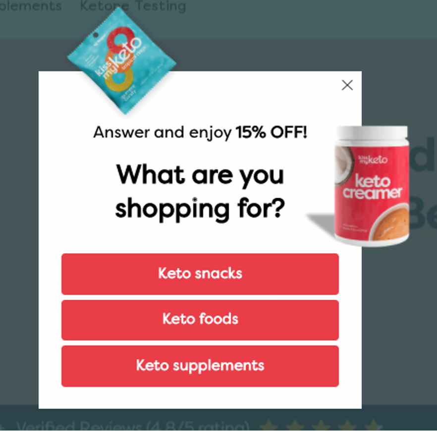
This popup asks what customers are looking for and promises a discount code as an incentive for moving forward.
Once a user clicks on one of the options, the next box pops up. Notice how it responds to the last bit of dialog by saying “Yummy, sounds delicious”?
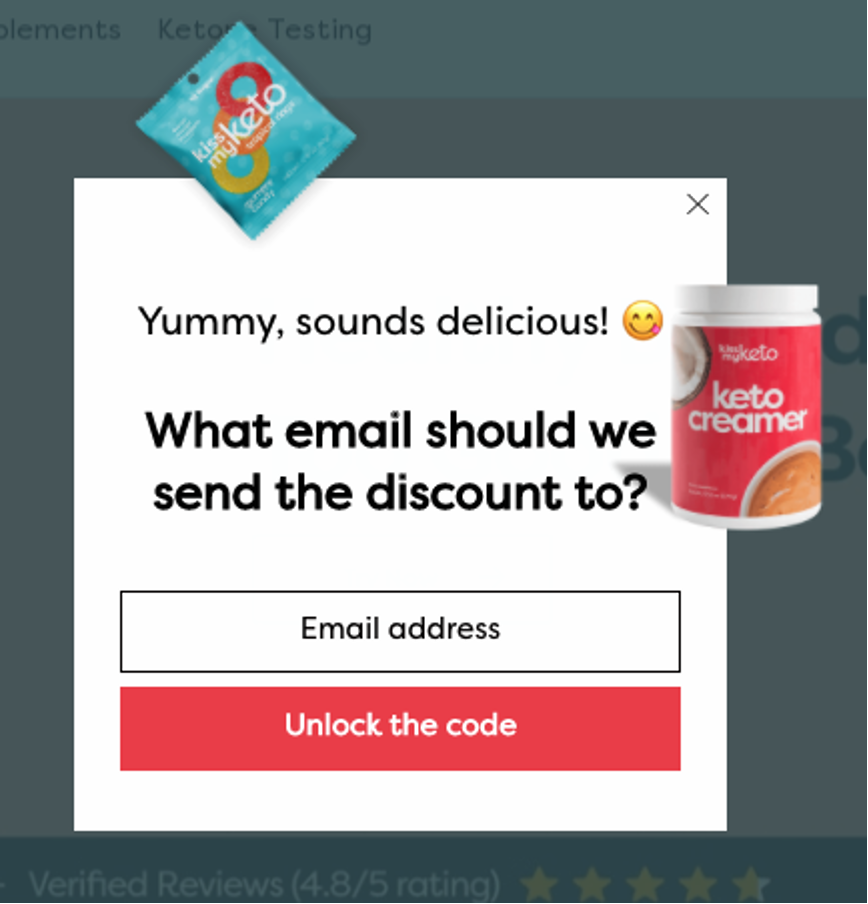
When a visitor clicks through the first page, it means they’re already invested in the process. So they’ll likely put their contact information into the signup form on the second page.
At the end of the process, visitors will see some personalized product recommendations based on their answer.
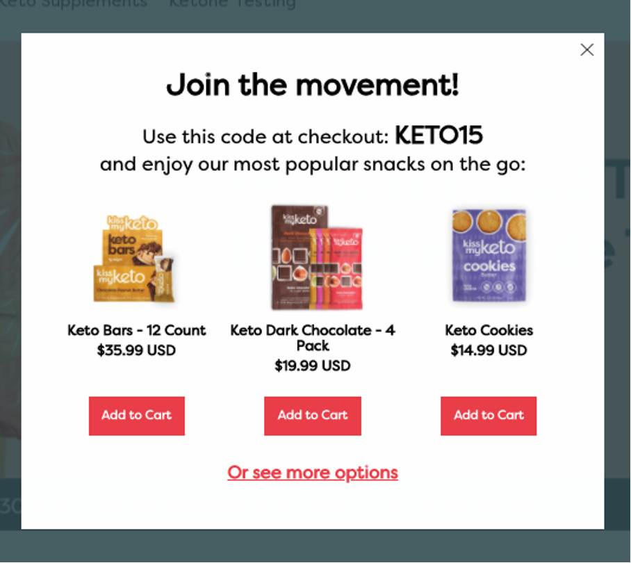
Now you know their email address and what category of products they’re most interested in. You can use this data for targeted campaigns and tailor your email marketing strategy towards their preferences.
Use OptiMonk’s popup templates to create custom conversational sequences that can be suited to your business needs.
You can also check out this post for some tips on how to create high-converting conversational popups.
4. Mobile popups
You’d be making a critical mistake if you think customers only view your popups on a desktop.
Over 50% of ecommerce traffic originates from smartphones. Therefore, you’ll be missing out on half of your website visitors by using popups that are hard to see or navigate on a small screen.
Some popup types work better on mobile than others. Scroll-triggered popups can still work well on mobile devices: appearing when they’re supposed to.
But, a traditional exit-intent popup won’t be able to pick up on behavioral cues on a mobile interface: like moving the mouse to close a window.
Luckily, there are specific popups designed for mobile ecommerce.
OptiMonk has exit-intent popups specifically for mobile users, which appear when a customer:
- Taps on the URL bar
- Opens a new tab
- Clicks the back button
These triggers allow you to time your popups to block cart abandonment.
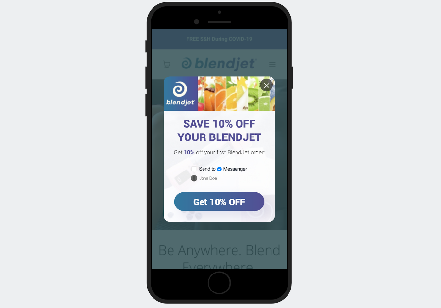
Now it’s time to consider how your users would experience the popup in real-time.
The text on mobile popups needs to be big. And buttons should be big enough to press easily with a finger. Check out this mobile popup from BlendJet that checks all the boxes:
5. Seasonal sales popups
Popups are a great way to promote seasonal products and sales. They can dovetail perfectly with your seasonal marketing campaigns.
Let your customers know that your sales won’t last forever. This can build a sense of urgency that convinces shoppers to buy now.
The OptiMonk template below is perfect to promote your Black Friday sale.
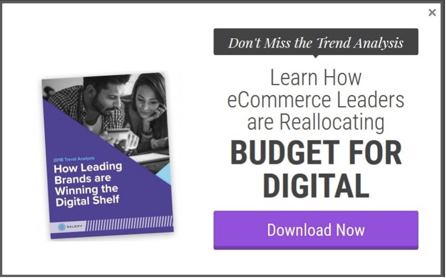
6. Content upgrade popups
Some customers love learning more after reading an article. That’s where content upgrade popups (or lead magnet popups) come in.
You want a website visitor to spend some time enjoying your content before offering them something more. So they are usually displayed on a scroll or a click.
Content upgrades can be offers such as free guides, ebooks or swipe files when paired with collecting email addresses.
This lead generation strategy catches lots of high-quality leads that are interested in learning more about your business field.
Exit-intent popups also work great to promote a lead magnet. See the example below.
7. Product recommendation popups
Website popups that recommend specific products can help shoppers cut down on the time they spend looking for something.
You can increase the conversion rate of popups like these by recommending your most popular items. Or, even better, by using any data you’ve gained from user feedback and tracking to personalize what items you suggest.
You can display recommended products:
- Right after a visitor arrives on your landing page
- While visitors are browsing your site
- Just before visitors leave
On the popup below, ZooShoo recommends multiple options tailored to their customer’s taste—complete with pictures and pricing.
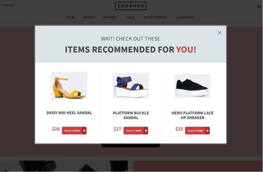
Display your product recommendation popups on exit intent is a great way to prolong your visitor’s shopping time on your site.
Check out OptiMonk’s popup templates for some inspiration.
8. Gamified popups
Gamified popups give website visitors a chance to win prizes like free shipping or a discount. They are usually attention-grabbing with bright colors, and feature some kind of game. To play, visitors only need to give some contact details.
These popups go beyond adding more subscribers to your email list. Gamified popups usually increase conversions because a website visitor wins something and applies the discount to their purchase. The nice buzz from winning a prize will carry over to their decision about buying or not.
Some websites put gamified popups on their landing pages. Others chose to place them on a pricing page to help users feel like they’re getting a good deal on a specific product.
When you use OptiMonk’s gamified popup templates, you’re able to customize your prizes and the odds of winning. All these options will help you create highly profitable campaigns.
9. Fullscreen popups
These types of popups (also known as interstitials) cover the entirety of the webpage, temporarily obscuring the underlying content to focus the visitor’s attention on the pop-up message or offer.
Whether you’re introducing a new product line, announcing a site-wide discount, or soliciting feedback through a survey, fullscreen popups provide the canvas to convey your message effectively, without the distractions of surrounding content.
While this popup type has the potential to captivate visitors, it’s essential to use them judiciously to avoid frustrating users.
Strategic timing and frequency are key. Consider triggering fullscreen popups at pivotal moments in the user journey, such as before exit or after a specific action.
How to boost the conversion rates of these popup types?
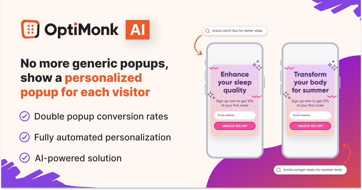
Now that we’ve identified the types of popups crucial for every ecommerce store, the next step is to ensure that these popups not only capture attention but also convert effectively.
Relevance is the cornerstone of successful popup campaigns. Users are more likely to engage with and respond to messages that directly align with their interests and preferences.
By tailoring your popup content to each visitor’s specific needs and behaviors, you can create a personalized experience that resonates with them on a deeper level.
Using OptiMonk’s AI-powered Smart Popups tool, you can easily tailor the messaging of your popups to each visitor’s interest automatically—without any manual work—and double your popup conversion rates.
Summing up
You’ve seen how you can create different types of popups for your ecommerce store. However you decide to use your website popups, they have the potential to increase your conversions.
Some are all about getting more email subscribers for your newsletter. Others are for recovering lost sales. Some types of popups manage to do both, and more!
Related articles:
Migration has never been easier
We made switching a no-brainer with our free, white-glove onboarding service so you can get started in the blink of an eye.

What should you do next?
Thanks for reading till the end. Here are 4 ways we can help you grow your business:
Boost conversions with proven use cases
Explore our Use Case Library, filled with actionable personalization examples and step-by-step guides to unlock your website's full potential. Check out Use Case Library
Create a free OptiMonk account
Create a free OptiMonk account and easily get started with popups and conversion rate optimization. Get OptiMonk free
Get advice from a CRO expert
Schedule a personalized discovery call with one of our experts to explore how OptiMonk can help you grow your business. Book a demo
Join our weekly newsletter
Real CRO insights & marketing tips. No fluff. Straight to your inbox. Subscribe now
Share this article
Written by

Nikolett Lorincz
Nikolett is the Head of Content at OptiMonk. She is obsessed with content marketing and loves creating educational content for ecommerce store owners. She truly believes in the importance of quality over quantity.
You may also like
- Posted in
- Conversion
Partner with us
- © OptiMonk. All rights reserved!
- Terms of Use
- Privacy Policy
- Cookie Policy
Product updates: January Release 2025


